#Type01
Explore tagged Tumblr posts
Text


𓇚 𝗟𝗼𝗴𝗼𝘁𝘆𝗽𝗲 : 心存善念 盡力而為 - - -
#typedesign#lettering#motif#graphicdesign#chinesetype#graphicradar#typography#typographic#type#logo#logodesign#logotype#customtype#goodtype#graphik#eyeondesign#type01#文字設計#平面設計#作字#標準字#字體練習#字体#漢字#디자인#타이포#인생도#타이포그래피#로고#로고디자인제작
16 notes
·
View notes
Text

Quincy Jones | Frankfurt Gips Balkind | Type01
18 notes
·
View notes
Text
Nike X Stussy graphic poster done by me
Follow me on IG for more @blackcherrybuckcherry


#nike#nike sneakers#stussy#sneakerhead#sneakers#graphic design#type01#certainmagazine#posterunion#poster#photoshop#graphic art#glitter graphics
2 notes
·
View notes
Text
But first—what is IMM? It’s a space where creativity meets technology, where we design, build, and play in digital environments. In the coming weeks, different student groups will take over this account. Stay tuned for more! ^IZ
#IMM#sheridan#processing#p5js#motiongraphics#d esign#graphic#typographic#typogra phy#type#creativecodeart#contemp orarytype#type01
0 notes
Text


プラム / PLUMPMOA 5inM 1/35 TYPE01 蒼龍(SORYU) ウルフファング空牙2001 入荷しました!
#ウルフファング空牙2001#TYPE01 蒼龍#SORYU#1/35#5inM#プラム#PLUMPMOA#プラモデル#plastic model#model kit#rohga: armor force
0 notes
Text


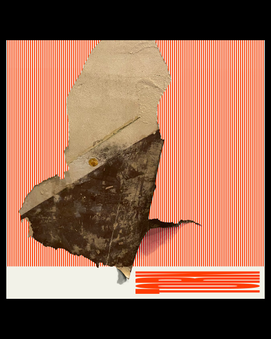
Perfection doesn’t exist. Destroying alignment. Misaligned. Uneven. Broken. Unmeasured. The shadow self. Torn, between ideals and compromise. The soul is forever split and succumbed to these terms.
TORN V
[DIGITAL ARTWORK, 2023]
‘Textural imagery with typography underlay.’
IMAGE SOURCE:
Paper: IMG_1491.HEIC, of peeling wallpaper, Leigh-on-Sea.
TYPEFACE:
‘Anton’ by Vernon Adams.
IMAGE DESCRIPTION:
A Square poster with Red and White lines underneath a torn wallpaper tear, with Beige and Brown segments with Scarlet Red stretched typography in a Sans-serif typeface that states ‘TORN’. All on a Black background.
1 note
·
View note
Text
I recently stumbled upon a fascinating article on a website that focuses on Typography posters. I was really inspired by some of the posters and it got me thinking about the techniques used to create them. It also sparked ideas about potentially using similar designs for music album cover art or creating minimalist movie posters.
0 notes
Text


#voyagergoldenrecord #nasa #graphic #graphicdesign #type #poster #posterdesign #blkmarket #graphicdesign #fkndesign #digitalarchive #episodesproject #grvphicworld #inonica #designerdirect #helveticaposter #theddod #poster_coaster #archivesarea #icographica #typosters #type01 #affiche #graphicdesign #beautifulbizarre #dsgnsociety #graphicplanet #typedesign #graphik #instadesign #designinspiration
1 note
·
View note
Text
【ウルフファング空牙2001】5inM「1/35 TYPE01 蒼龍(SORYU)」プラモデル 7月18日予約開始
【ウルフファング空牙2001】5inM「1/35 TYPE01 蒼龍(SORYU)」プラモデル 7月18日予約開始 【ウルフファング空牙2001】5inM「1/35 TYPE01 蒼龍(SORYU)」プラモデル 7月18日予約開始 Source: ワロタあんてな
0 notes
Text


𓇚 ²⁰²³⁻²⁰²⁴ 🅦🅗🅐🅣🅩🅤🅡🅣🅨🅟🅔 默默的參加超過一年了, 2025繼續加油 ☺︎ - - -
#whatzurtype#typedesign#lettering#graphicdesign#chinesetype#graphicradar#typography#typographic#type#logo#logodesign#logotype#customtype#goodtype#graphik#eyeondesign#type01#文字設計#平面設計#作字#標準字#字體練習#字体#漢字#디자인#타이포#인생도#타이포그래피#로고#로고디자인제작
9 notes
·
View notes
Text

Philip Rempel | Type01
14 notes
·
View notes
Text


Personal Branding: front page variations
I have been looking at how different creatives layout their front pages and how different aspects could be laid out as i have a concern that my current design is too basic and following a normal standard.
one thing that has caught my eye in particular is the page for 'eye on design' because it uses page ephemera like you might see in a book or editorial piece which lends itself well visually to the content it explores on the website.
The scale used on the type01 website is interesting because it is much larger than you might expect, but it allows for the '0' in the logo to be animated. this is a trend which i have been seeing more often, like the logo for creative boom, where the eyes follow the mouse around the page. this is particularly successful on websites which don't have much animation or moving image included in the contents of the work because it allows for a surprising element of engagement which the viewer might not expect.
0 notes
Photo


(vía 20 Type Designers & Type Foundries to Watch in 2024 - TYPE01)
0 notes
Photo


No 84: Hooman Rytes.
The UNHRC is a joke.
"Human rights are not a privilege conferred by government. They are every human being's entitlement by virtue of his humanity."
/Rise Against - Pain Mgmt. 🎧
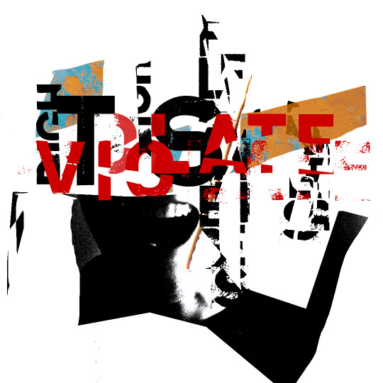
#grunge#design#graphic design#graphic designer#graphic art#grafikdesign#grafik#art#artist#visual art#type#typedesign#Typography#typographic design#experimental typography#typeposter#typographicposter#youaretypography#type01#collage#collage art#collage work#collage artist#abstract collage#grafikmedia#collage club#thedesignblacklist#fkndesign#helveticaposter#abstract
5 notes
·
View notes
Photo

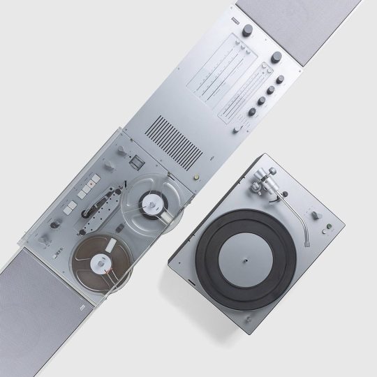
By @braunaudio — #iodsystem #type01 #metamoderngrotesk #kawaiidesign #dailydesign #slantedpublishers #certainmagazine #designinspiration #graphicdesign #typeindex #graphicdesigndaily #designeveryday #typeposter #selectedwork #grafikfeed #graphicfeed #braunaudio #gooddesign #goodsound #worldfirst #wandanlage #dieterrams #heritage #detailsmatter #braun100years #braun #soundsystem #innovation #hifi (at Berlin, Germany) https://www.instagram.com/p/CfEf09KMRYi/?igshid=NGJjMDIxMWI=
#iodsystem#type01#metamoderngrotesk#kawaiidesign#dailydesign#slantedpublishers#certainmagazine#designinspiration#graphicdesign#typeindex#graphicdesigndaily#designeveryday#typeposter#selectedwork#grafikfeed#graphicfeed#braunaudio#gooddesign#goodsound#worldfirst#wandanlage#dieterrams#heritage#detailsmatter#braun100years#braun#soundsystem#innovation#hifi
4 notes
·
View notes
Photo

This typeface began specifically for my poster for the Genova edition of @showusyourtype. I really wanted to experiment with creating a serif typeface and I was very happy with the results, but it’s been quite a challenge trying to expand it since. I have about half the letters done, and I’ve been stuck there, but here is a little taste anyway! . . #typefacedesign #typefacedesigner #typesample #typespecimen #logotype #fontsinuse #fontdesign #typedesign #typedepartment #typographic #typeriot #typecollect #contemporarytype #365typefaces #typeswiss #type01 #lavendrtype #thetypists #generaleclectics #typetopia #typeeverything #heydesign #designcrack #eyeondesignmag #graphicindex #selectedwork #grvphicworld #curatory #visualgraphic #fkndesign https://www.instagram.com/p/CTAOsiALYQ3/?utm_medium=tumblr
#typefacedesign#typefacedesigner#typesample#typespecimen#logotype#fontsinuse#fontdesign#typedesign#typedepartment#typographic#typeriot#typecollect#contemporarytype#365typefaces#typeswiss#type01#lavendrtype#thetypists#generaleclectics#typetopia#typeeverything#heydesign#designcrack#eyeondesignmag#graphicindex#selectedwork#grvphicworld#curatory#visualgraphic#fkndesign
2 notes
·
View notes