#Transparent png 💀
Explore tagged Tumblr posts
Text

dancing with death
#Tf oc#Dragunov!!#My stupid Lil traumatized skrunkle#I was practicing poses and was like#“Hey why not make it a robot”#And then it got super complicated#Aaaand then I wanted to do it in a comic-like style#my art#He's actually a predacon lmfao but uhhhh#transformers#maccadam#Dragunov sniper rifle#<- he's actually named after it#HE ALSO HAS A CHAINSAW#HEHEHHENSNS#MMMMM#He also has funny legs#The funny looking ones#Transparent png 💀
9 notes
·
View notes
Text

THE KIDS !!!!
#if this doesn’t load as a transparent png i’m gonna be pissed 😭😭😭#btw this was supposed to be height chart and then kind of wasn’t anymore but still kind of is idk#taylor swift (not that one)#normal oak#normal oak swallows garcia#lincoln li wilson#linc li wilson#scary marlowe#hermie the unworthy#hermie unworthy#dndads#dndads 2#dndads s2#dndads fanart#dungeons and daddies#dungeons and daddies s2#dungeons and daddies fanart#that’s probably enough tags 💀#cricket legs
248 notes
·
View notes
Text


Silly pngs I found :D
#silly#:3#▄︻デ══━一⌖ ☆ 🧨#☆.txt#transparent png#star#⊹ ⋆꒰ఎ ♡ ໒꒱ ⋆゚⊹#⭐˖ ・ ·̩ 。 ☆ ゚ * 🌸 ˚ ༘♡ ⋆。˚ㅤ ララ月太陽ㅤㅤ꒰ 🍮 ꒱ ⠀⠀⠀⠀イ. ₊ ˚ ׅ ㅤ🥐 。˚ ◟⭐️🎀🌈⭐˖ ・ ·̩ 。 ☆ ゚ *(≧▽≦)⭐️🚎🌈#★ ₊ . ° . ⋆° .🌈🎀🥕(*・ω・)princess⋆˚✿˖°°🧃๋࣭🍊多彩な☘️🎀#▄︻デ══━一๋࣭ ⭑★🦦🪻ᨒ↟ ⋆。°#🌸 ˚ ༘♡ ⋆。˚ㅤ 淡紅色 ㅤ ㅤ꒰ 🍮 ꒱ ⠀⠀⠀⠀イ. ₊ ˚ ׅ ㅤ🥐 。˚ ◟#♱💀🎀୨୧ᡣ𐭩˖ ₊ ⁺#⠀˚‧ ゚ 。゚ ۪ ࣪🎀🥬 ⊹︵︵︵ ⊹ ୨🎀🌈୧ ⊹ ︵︵︵ ⊹ 🎀🥬˚‧ ゚ 。゚#⭐️🎀🌈 🎀 ⊹︵︵︵ ⊹ ୨୧ ⊹ ︵︵︵ ⊹ 🎀⭐️🎀🌈
10 notes
·
View notes
Text

#˚₊‧꒰ა 𝕻𝖗1𝖓𝖈𝖊𝖘𝖘𝕶1𝖙𝖙𝖞 ໒꒱ ‧₊#💗💀(ˆ⌣ˆԅ)#divider#skeleton#butterfly#rosada#pink#spooky#creepy cute#alt#linda#kawaii#cute#my edit#transparent png#:D feel free to use~#shidddd ima be using this myself#💗💗💗💗💗💗💗💗
7 notes
·
View notes
Text

fun lil sketch because i need to do something but spiral
#spacey’s doodles#de#i had a different thing i was working on that was very similar but saved it as a png instead of an editable file#i like this a lot more though#its based off#'you're the mourning' 'the morning? i dont think i understand?' quote#wip#DIDNT REALIZE IT WAS TRANSPARENT 💀💀💀
4 notes
·
View notes
Text


🫁
#lungs#pngs#transparent#op#i was super stoned when i made this i just remember thinking all these looked cool 💀
4 notes
·
View notes
Text
I was bored so I made slendytubbies mood boards or whatever (warning: blurred gore I guess, close ups of eyes)


(Most, if not all, images are from Pinterest. None of them are mine!)
Unfortunately I couldn't find an orange chainsaw that wasn't a regular ass transparent png, so I used that pink one instead. Hey, at least I didn't use a hello kitty one 💀. Also I thought the 'fuck if I know' thing was funny so I put it there.
that's what I used for this. idk it was the first thing that popped up on Google
7 notes
·
View notes
Text
૮꒰ “ . . ꒱ა
Ahh so I started making transparent pngs for Kuras and i'm just NOW realised how intricate his design is . . . But i'm in too deep to back out not so I'm just gonna have to complete this 💀💀 Literally this is so much work, im gonna cry
(By transparent pngs, I mean removing his sprite from the background for editing purposes (example: wallpapers and rentry graphics ) )
8 notes
·
View notes
Text
If you ever feel invalidated by an exclusionist, please remember this post because I can assure you they don't know what they're talking about💀
⚠️trigger warning for of course exclusionist dumbassery, also this gets rant-y⚠️
I swear exclusionists have the most incoherent thought processes known to man dude cuz what is this shit
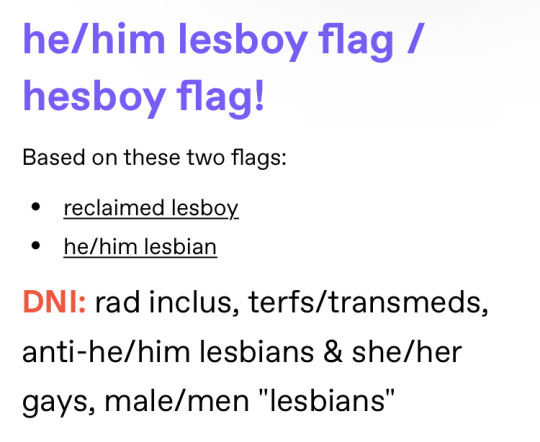
[ID: purple header text reading he/him lesboy flag/ hesboy flag! Under this text is plain black text reading based on these two flags: •reclaimed lesboy •he/him lesbian. Under this, red, bold text reads DNI, followed by rad inclus, terfs/transmeds, anti he/him lesbians & she/her gays, male/men "lesbians" in black plain text. End ID]
'Lesboy flag' and 'no man lesbians' in the same post... my brain is melting. Also... these people 'reclaimed' the term lesboy? Just to exclude a group of people who are lesboys? You do know that lesbians who also consider themselves men are also included in the lesboy term? Apparently not to these people. Butches who also consider themselves men? Sorry, not lesbians anymore. Multigender man lesbians? Nah sorry you're men so you can't be lesbians./sarc
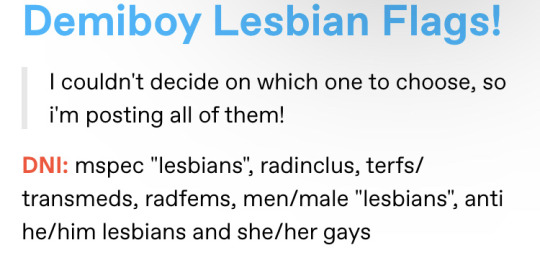
[ID: blue header text reading Demiboy lesbian flag! Beneath this, quote text (at least I think that's what it's called) reads I couldn't decide on which ones to choose, so I'm posting all of them! Beneath this, much like the previous image, OP starts off their DNI with a bold red DNI, followed by black plain text. This text reads mspec "lesbians", radinclus, terfs/transmeds, radfems, men/male "lesbians", anti he/him lesbians and she/her gays. End ID]
Is that,, not excluding demiboy lesbians? Oh my bad, it's fine cuz they're only 'partially male' and therefore aren't ACTUALLY icky men invading lesbian spaces!/sarc
Also can I just say how fucking entitled it is to be all like 'mspec "lesbians"' with the quotes and shit? Like oh my god get over yourself, you aren't the leader of the lesbians™️ [trademark]. Bro thinks they're part of the lesbian council or some shit. 💀
Besides that, this has got to be one of the funniest examples of exclusionist stupidity I've ever seen. I can't get over it bro: 'demiboy lesbian flag!' 'Fuck off icky man lesbians!' In the SAME. POST. BAHAHA–
-----
It's rare that I feel the need to take screenshots and talk about them on my blog, but these are so poetically idiotic that I had to make a whole post dedicated to them. So yeah, sorry about your braincells lmao. But just know you're valid regardless of how you identify as a lesbian, and these are the types of people who think otherwise. Needless to say, they aren't really that credible.

[ID: a DNI banner with a purple background with lighter purple text reading DNI: system/queer exlusionists, TERFs/SWERFs, truscum/transmeds, anti recovery for harmful paraphilia, anti otherkin, anti self dx, pro cringe culture, pro-lifers, anti xenogender. A more detailed DNI is in my pinned post. A transparent png of Shadow The Hedgehog can be seen on the right, beside the text. He's holding his hand to his chest, his body facing the text and his eyes looking off to the distance. End ID]
#tw exclusionism#random rant#demiboy lesbian#lesboy#transmasc lesbian#exclusionism rots your brain and this is proof💀#I sometimes feel like exclus are these little creatures that I'm observing from behind a glass wall or something like it's so bizarre to me#how there are people in the world who actually think like this#and it's like ??????#how??? can somebody be so dumb???#that sounds so rude but like seriously how can somebody sit down#make a lesboy or demiboy lesbian flag#and be like 'lol no men lesbians' and think that's in any way coherent 💀#it's so fucking funny to me#but also frustrating like just let people vibe lmao#anyway#we love lesboys who are lesboys for any reason here#rad inclus#radical inclusivity#radical inclusion
45 notes
·
View notes
Text
how i make scripts aesthetic on google docs (on pc) <33
Part One - Images
! Due to Tumblr's 30 image limit, I'll have to make this in parts. This one revolves around how I sort pictures to make them look aesthetic or just more organised in my script. + I'm not the best at organising tutorials sometimes but I'm trying to not make this confusing <//3
Ignore any typos and errors, thankyou. If you need me to re-explain anything, please feel free to ask. I feel like I haven't explained properly but, idk what else to do, lol :,)
Page isn't broken, to avoid messing up the way images are organised.





— ◦◦◦
What do I use?
Other than Google Docs (obviously), — Fontspace | A background remover [my mains: 1, 2] | Pinterest/WeHeartIt/Google search, and other sources for pretty pictures, pngs, etc. 🤍🌙

bundling images
Using the different text wrapping options, I found that it helped a lot more to "bundle" images together, so that things look prettier + more organised.
! example
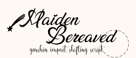

This is pretty simple, honestly; Fontspace provides font text as pictures, transparent bg and not, — so organising the text from it will fall under the tut for this bit.

^ These are the text wrapping options. The first one is the default and limits text placement/movement, the other four allow you to move text where-ever on the document (especially if print view is off) but each do different things.
In order of settings, examples (press images to see properly):
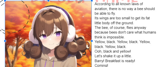


! tip : If you're bundling images that "overlap" too much, make sure to crop at least one (or however many needed) past its actual size so that it won't be a pain in the ass moving them later on.
- You may also use "behind text" for one of them, if it helps, so that it's easier to select the images, this also applies to using image over text (examples in each image).
what I mean:


Using these features, I'll—as per the aesthetic of my script—sort things accordingly. Get creative with the way you're doing this, and keep experimenting 'till you're able to make stuff look the way you want, lol.
"BuT DaRLIng wHaT Do I dO wItH ThIS iNFo??!?!?" bitch idk find an aesthetic 💀💀
like those 2016 fashion sticker books or smthn, idk- whatever u like-
Going into the aesthetics more ;; I usually pick diff aesthetics for each script and refuse to script until I find a pretty one LMFOAOAO- But I especially go for inspiration from (Korean?) bullet journal aesthetics which include lots of image bundling and customised tables.
Why korean ones specifically? Idk the difference, but using "Korean" as a keyword gets the stuff I'm looking for. 💀 But I also search for little pngs I want to add to my script; and if it's a false transparent png or has any background, I use my background removers to make it an actual transparent png.
And, sometimes, I like to search for colours then use my snip tool to screenshot them really thin, like those brown-beige borders you see in all my posts, then use them in my script like highlighter lines, like-

That's pretty much it, really.
! examples from two of my scripts


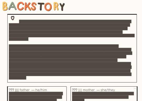
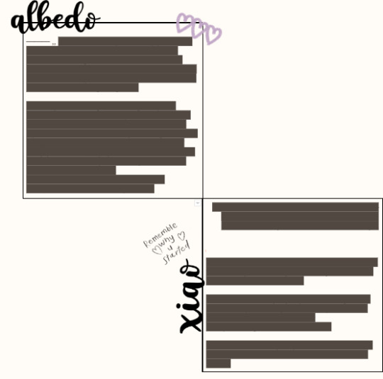
Fontspace fonts apply as well. One thing about Fontspace is that, you can change the colour of the text ;; as well as the background.
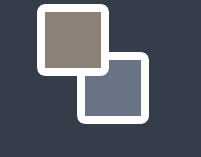
The brown colour is the text's colour, the blue one is the background's colour. You can of course choose to have no background, but it's there as an option.

I don't know of any features where you can save a colour but that's maybe me being dumb ;; but what I do is set a certain colour (i.e. blue) then use the colour adjustment in google docs to change it to black, red, or whatever over colours r in the script.
i.e.:


Anyways I'm p close to the image limit, so that's it for this post.
I hope this makes sense bc explaining this was harder than I thought. 💀💀 Once again I can clear anything up if needed

! tips
Keywords you can use for tiny decorations, are "clipart", "[aethetic name] clipart transparent png", "[aesthetic name] sticker png transparent", etc.
You can have a look at the aesthetics wiki for ideas for your script
Fotor is what I use to crop images into different shapes, and it is how I got the circle/heart shaped pictures in my documents ^-^*
...I'll add more when I remember them.
next up ··· customising tables ✿
#—DARLINQ'S DOMAIN🤍🌙#reality shifting#reality shifting script#shifting script#shifting realities#shiftblr#respawning#idk what else to put#im just using tags bc itll probably help ppl#i feel so shy posting bear w me 😔❗❗❗
115 notes
·
View notes
Text
*Pinned Intro(WIP)!

*Last updated (mm/dd/yy): 11/16/24
[*Last updated (mm/dd/yy): 11/16/24]
*Hi! I'm @ketchupandaxe and this is my web graphics side blog! I enjoy making these and I'll be taking requests for 'em.
[*Hi! I'm @ketchupandaxe and this is my web graphics side blog! I enjoy making these and I'll be taking requests for 'em.]
*Things I do:
[*Things I do:]
🪓Web Stamps
🪓Dividers
🪓Blinkies
🪓Transparent PNGs
🪓Gifs/Jifs
*My tags:
[*My tags:]
#💀🪓stamps (stamps by me)
*I may have more things that will be able to be requested in the future but that's it for now! If I feel that I cannot do a request or feel uncomfortable with a request I won't do it. (sorry!)
[*I may have more things that will be able to be requested in the future but that's it for now! If I feel that I cannot do a request or feel uncomfortable with a request I won't do it. (sorry!)]
!!DNI IF Anti-alterhuman, anti-queer, proship, comship, darkship, anti-agere, anti-petre, MAP, zoophile, k!nk, rad-queer, homophobic, transphobic, anti-xenogender/anti-neopronoun, TERF, racist, xenophobic or if you don't like my content!!
[!!DNI IF Anti-alterhuman, anti-queer, proship, comship, darkship, anti-agere, anti-petre, MAP, zoophile, k!nk, rad-queer, homophobic, transphobic, anti-xenogender/anti-neopronoun, TERF, racist, xenophobic or if you don't like my content!!]

#old web graphics#caard resources#editblr#gifs#gifset#pinned post#pinned intro#pinned info#new pinned#old web#web decor#web graphics#web resources#webcore#web design#pixels#graphics#carrd graphics#f2u graphics#rentry graphics#blinkies#stamps#web stamps#💀🪓 stamps
6 notes
·
View notes
Note
Hi!! I loved your fight club art and I actually stumbled upon your Stay High animatic a few days ago (small internet haha!) and it's like?? So incredibly beautiful and well edited and well crafted AAAH. If you're okay with sharing I'm so curious how you animated specific portions such as when Stan's "falling back down" -- it's so smooth and yet it doesn't seem like a generic pre-built transition due to how the words kinda... slam onto the screen? If that makes sense haha. I'm also in love with how the entire animatic feels very hazy and buzzy. Also ALSO in love with all your transitions -- especially the paint swishes and glitches! Anyway your art is gorgeous bye~
Hey!! Thank you for the ask it fr just made my day (...I always feel so facetious saying that but it's true! 😮💨)
About the editing - First of all, that CapCut project is a whole mess (like the amount of effects and animations I stacked on top of each other is scandalous 💀 but I'm glad it worked out)
How I made that particular part:
-> Exported stan's silhouette & each word as its own transparent png so that I could apply separate animations to each component
-> Put a black background image in CapCut and imported the pngs as overlays on top of it
-> Applied the "slide down" animation to the silhouette & made it a couple seconds longer than default so it wouldn't be so fast
-> Applied the "zoom 1" animation to each word and moved them apart on the timeline to sync them to the song
Hope that makes sense! 😅 If you're curious abt anything else feel free to dm me & I'll over-explain in great detail (being so fr 💯)
#asks#or i can send you the capcut project so you can look at the amateurish editing yourself 😹💀 just lmk lmao#toto-dreamer
10 notes
·
View notes
Text

Time for SPOOKY adopts!! 👻 First up...
Necromancer Rat! 🐀💀
💲20 usd - SOLD
Buyer receives: Full res watermark free, transparent PNG, as well as the color palette! The Ghost Chao IS transparent!
#sonic the hedgehog#adoptables#adopt#adoptable#sonic oc#sonic art#rat#necromancer#my art#tropicalhigh art
16 notes
·
View notes
Note
What do you make your animatics in ✨:0✨ (they are so good)
Thank you!!! 💜💜💜
I use a lot of different things ! I do everything on my phone so it’s all apps teehee. Procreate for all the art drawing (lots of saving parts of shots as transparent pngs), basic picture to video editing on inshot, capcut and cutecut for like the movement and the little bouncey jolts I forget what the term for that is :)


God forbid I delete any picture and everything comes crumbling down 💀
#animatic progress#pictures are of what I’m working on with Draussen ist Freiheit which if I finish will take FOREVER. I finished a minute and I’m like#aw shit I gotta do this like seven more times#bc I’m extra#but we’ll see I probably WONT get that far#biggest worry is gonna be die roten Stiefel#alas#my art
6 notes
·
View notes
Text

Introducing my latest creation: the Evil Banana! 🍌💀 Now available on Etsy.
Get this unique piece in transparent format or as a print.
0 notes
Note
Does it have to be PNG? I know the effect is really cool, but looking at how it appears on Twitter, with the solid white background, it still reads well. If you added maybe a solid black layer behind the burn hole? Or the darkest hue color picked from the charred edges? That way you can preserve the quality and your audience will still understand the burn effect.
it's actually transparent on twitter cuz I resized it to a max of 900px to avoid having it turned into a jpg automatically 👉👈 idk if there's a better way to keep the quality too but I figured it wasn't so bad 😅 I guess I'll have to do something similar for tumblr too, gotta look into it - I really want it to be transparent no matter the background or tumblr theme 💀 worst case I will try as you suggested though, and I'll try and see how it'd look with maybe a wooden surface or smth underneath as if it's on a table 🤔 haven't gotten around to trying that one last night~
#good to know it reads well on white too though!!#thanks for your answer <3<3#I'm not giving up on it haha
0 notes