#This is a design that'll improve more as I draw them kind of like with Yrgna
Explore tagged Tumblr posts
Text

New character! Their name is Font and they definitely say things like "simply splendid!"
#Font#art#myart#artists on tumblr#Clip Studio Paint#oc tag#JoveOC#JoveJunk#May 2023#This is a design that'll improve more as I draw them kind of like with Yrgna#Like I love it right now but I'm not entirely used to drawing this sort of character especially the hair#Btw they're inspired by Style Savvy and me wanting more green OCs
19 notes
·
View notes
Note
I always get so excited when I see a notification from you, I love the comic and the way u draw these two moron, really, amazing job!!! I wanted to ask, if its not a problem, how do you design the panels of a comic? I'm new in that field and it's honestly a black magic to me and I love yours, they're easy to read and also interesting to look at!
Hi!! Thank you!! <3 and sorry I took so long to answer but I wanted to do it Right for your question. SO HERE GOES, MY TIPS FOR PANELING:
First thing's first: I basically visualize stories as film/anime and it helps a lot. The main rule I follow is that 1 shot = 1 panel. I found this edit super interesting because this is basically it, but in reverse. See how each panel becomes a shot?
It'll depend on how much of the action from one animated shot you'll want to show too. Do you have a shot with your character changing expression? While there's only one shot, the expression at the beginning and at the end are both important so that'll be 2 panels, or 3, or even 4, depending on how many key frames you want to show). Is the character traversing the screen from left to right? Is it important to see them at the beginning of their run, in the middle or at the end? Or all three?
Now, there's a big rule in comic :
The bigger the panel, the longer the action will feel. Your eye will take more time to pan over the picture and it'll trick your brain into thinking time has passed in the story. See how different these feel?
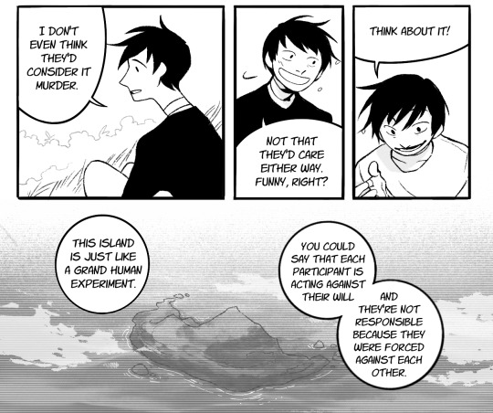
After this one, I'll personally follow a few other rules, but many artists don't, or have their own, so feel free to try these out if you want, or not! The goal is to have fun first and foremost.
Each page makes sense on its own. It has a beginning and an end, and no speech/shot is cut in the middle at the bottom of the page.
I try to at least have one panel per page that has a physical, tangible background, it helps ground the reader in what's happening in the scene.
I mainly use 2/3/4 rows of panels (which is specific to manga, other genres often have more) and I try to mix the shapes of the panels on the rows so no rows look the same, and no pages look the same within the chapter.
Every space in the panel is used for something, no "empty" spaces (I put bubbles in those to fill in the gaps lmao)
Slanted panel borders are for action scenes.
(now that’s kind of a director’s take but) when changing shot/panel, changing the angle always make things more interesting!
When depicting action, I found it the most clear when showing the anticipation, the action and the aftermath. Like with a punch, you'll see the run-up, the contact, and then the guy's on the ground in 3 panels, you know?
(this one's super specific to my brain but) bordered panels are for static camera and "open" panels are for camera movement within the shot
HAVE FUN! most of the time I'm improvising with what feels right, and what READS right. So many times I finished my chapter and went "oh the pacing is so wrong" and changed the paneling just before posting after everything was supposedly already done. So yeah, don't hesitate to have a beta-reader that can tell when the paneling is interfering with comprehension, it always helps improve!!
These work for me, but I’ve accumulated most of these after trial and error, so if some don’t work for you that’s fine, and I hope you find the rules you’re comfortable with!!
70 notes
·
View notes
Text

Hey-ho look at my cool thingo
Redesigned these fire raptors AGAIN and I think I'm finally happy with them.
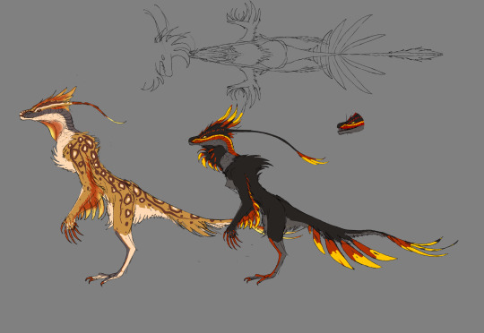
Inane ramblings about them and what I've been up to below. I would put a readmore but well I guess if people dont like long posts they'd have the post shortener on. I'll tag it anyway tho.
It's probably unwise and unfair to my other creations to start the arduous and fraught task of modelling something I've only JUST made but I really wanted to and here we are.
This one is perfect to practice both multires/baking details as well as proper fur. Not super happy with it so far? Its objectively well modelled but it's not really looking like the drawing yet. Such is the struggle of 3d. Ttrrryyying to model them naked/neutral sex-wise first, not sure if that'll work out.
Biology wise, these guys are wierd. They're related to the dragony group, but not suuper closely. After all they lost all their lower limbs while some dragons still have all 8. Unlike them they dont really show any vestigial parts/repurposing, but that may change.
Fun fact, they are not feathered. Their frills are flaps of cartilage covered in hair. Its probably not super soft, since its derived from scales.
I maaaaay be giving them a third eye? Probably not a conplete one though. See, the common ancestor of their group wouldve had 4 eyes, one on the bottom, top, left, right. I will have to do more work to see exactly which ones lost eyes before I say whether these guys do or not.
Struggling a bit with the feeling I never finish stuff, which is true because 'finished' is an arbitrary line, and I never want to feel obligated to stick with something I no longer like just because it's 'done', but, well, then you get sucked into the alluring tornado of only ever redoing stuff and never progressing. Redoing stuff feels soooo fun and rewarding though.
If you made it here, coolio. Have a look at this guys design evolution:
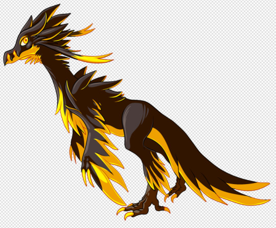
The original, very yellow, always liked and failed to improve on its upright posture and flowing tail
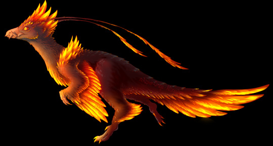
The redo that got a little out of hand, love it, gorgeous, still some of my best detail work, was in a bit of a realism phase, and lost a lot of the orignals uniqueness in it, but still, great
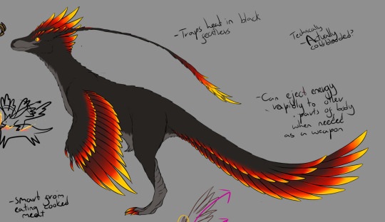
The re-re-do, an attempt, and maybe failure, to recapture the original, but kind of ended up just feeling like a halfway compromise between the two while having neithers good points. At the least I got rid of the beak which was a great choice. Much better hands too. However this one really solidified their inner workings, habitat, etc. that was key to how I went about re-re-redoing it.

The re-re-redo! Theyre now more upright again, woohoo, finally got it, tails awkward and im still not 100% on it, but its much more reflective of its evolution. Made them more bald like a vulture since they live in a desert, plus, for the new theoretical potential 'female' design, a sandy coat. I'm not 100% on them being dimorphic, texhnically I have an explanation for why theyd be black in a desert, but I thought it'd be fun and make them feel more fitting.
Fun fact, their tassels are actually sensory structures, sort of a nose, sort of an ear, picks up vibrations and chemicals on the wind, basically an antennae. Funner fact, the dragons horns are homologous to these, and serve the same purpose, just heavily modified!
2 notes
·
View notes
Text
Blogs I Admire
In no Particular Order
Warning: This is literally just me showering praises over all of these artists and having fan panic attacks. I love of these creators with all of my fragile little heart.
As the title says, this list has no particular order. If you asked me to try, I'd curl up in horror.
----
1. @badgerclaw-of-shadowclan
I'm going to be honest- I came for the awesome gore pic of Swiftpaw's death. It was so detailed and realistic, I keep grinning when I see it. That was a gore standard I aspire to meet. When you get agitated messages from people not apart of the warriors fandom in the notes despite tagging it, you know you did good.
On that note, I'm also very sheepishly thankful for them pointing out that cats are rectangles. That'll probably help me in the long run. Style will be something interesting ro develop and I definitely want them to be an art parent.
2. @climbdraws
Aaah! The acurracy! The fantasy! I think I've bumped into their YouTube account? I'm not certain but if they're the same account I'm thinking of, I'm gonna cry. I love anatomy and the expressions. It's that semi-realism that I'm aiming for with my work.
3. @am-i-too-old-for-warriors-yet
...
Just look at that anatomy. And all of the improvement. That's some inspiring crap right there. And it's not just with cats either because they do dogs and asdhklfk. Okay, okay. I'm calm now.
...no I'm not. Ahshfhfksojeijejldf
4. @eviadriart
Not much for me to say here other than the backgrounds. And i say there's not much for me to say because it goes like this:
Them: *posts picture*
Me (happy): *sobs*
5. @trunswicked
Look. I am a simple cat artist. I don't understand other species' anatomy. So when I see stuff like this, I lose my freaking mind.
Reptiles are not my strong suit (and as an httyd fan, that hurts to admit) and dragons are next to impossible for me sometimes. It's a lot of practice I need to do and I'm aware of it.
So while I came for the awesome cats, I stayed for the AWESOME dragons gah! I need to get on that level.
6. @songsteps-designs/@songsteps
Everything they make is so frickin fluffy and soft looking. The cats are fluffy slinkies that fight like they're dangerous. Their Jayfeather design is amazing and this is a hill I will die on okay?
7. @annoyinghorse
Look. I have a confession to make. I was and probably always will be a Saddle Club gal okay? Horses are terrifying amazing creatures that deserved fear respect from everyone. I love horses but their
Anatomy. Freaking. Sucks.
I praise anyone who can draw horses properly ans especially different kinds of horses. I'm always so happy to see their work cross my dash and they took the Horse!AU idea and ran with it and I-
There is literally one other blog I saw with this but I saw annoying horse first and I will always associate it with them.
8. @clockbirds
...shut up. I'm not crying over art, you're crying over art. Just because they have awesome backgrounds, amazing textures, gorgeous dynamics, faint worthy fantasy creatures-
*sobbing intensifies*
----
@kaisertiger
Okay so this one is a little personal. When I first startes drawing warrior cats, I came across their DeviantArt. I fell absolutely in love with this style and everything about it. This is exactly where I wanted to take my skills and abilities for so long. I loved the art they did for all their rp's ams stuffs. It's a literal goal in life to reach a point where I can look at their art and then at mine and smile concluding I finally got to that starting line.
And I mean it. I've always considered them the starting line. The line where all the well esteemed and fantastic artists branched. That is the level I desire to meet. When I draw my battle cats, this is what I want to achieve and everytime I see their work I'm reminded of it.
This got really long but yeah, they're an art hero of mine. Appreciate them.
---
More to come and this list will probably end up extensive so yeah.
#artists on tumblr#links to artists#pearls being a fan#pearls speaks#i love them all#art drawing#artists of tumblr#warrior cats#dragons#dogs#I just-#i will die for them
7 notes
·
View notes
Text
4 devices that'll take the shakes out of your amateur videos
In the olden days, it was easy to tell the difference between amateur and professional video. Even if the composition was identical, pro video had obviously better picture and sound—and it was stable.
Over the years, the video and sound quality of phone cameras have dramatically improved. But in general, the stability of the picture is still a giveaway. Pros use tripods or Steadicam rigs; amateurs hold their phones in their jiggly, unsteady hands.
To help out, the tech industry has devised a whole raft of mobile stabilizing rigs to hold your phone or GoPro (GPRO), like these.
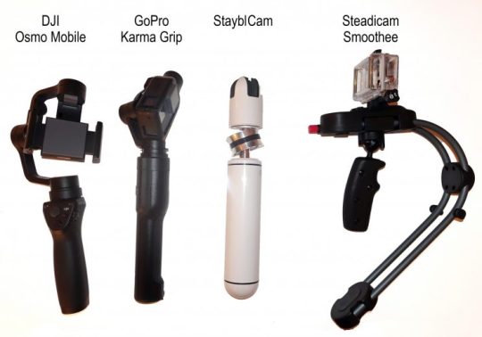
Four ways to stabilize your video.
They’re not as good as an actual Steadicam, the expensive, professional, body-worn rig that lets you walk or even run while still allowing the camera to float, bump-free. (That shot of Rocky running up the Philadelphia art-museum steps was an early, famous Steadicam shot.)

The one and only Steadicam.
But they’re infinitely better than trying to shoot with your hand, as my video above should make clear.
(A note about stabilized phones: Some high-end phones have built-in, optical stabilizers—the iPhone 6s Plus, 7, and 7 Plus, for example, and the Galaxy S6 and S7. They work at least as well as the inexpensive stabilizers described here, but not nearly as well as the motorized ones. Lots of people get truly amazing footage using a stabilized phone in one of these stabilizing products—but lots also report that the two stabilizers sometimes fight each other, resulting in an unpleasant “judder” [shudder/jitter] when you’re panning. The solution would be to turn off the phone’s built-in stabilization—but most phones offer no way to do that. You’ve been warned.)
There are, by the way, dozens of these stabilizers. I tested four of them in a range of designs and price tags. Here’s what I discovered.
StayblCam
Weirdest darned thing you ever have seen. The StayblCam ($75, a Kickstarter hit) is a 10-inch, white or black plastic capsule/stick thing. You wedge your phone into the rubber grippers. You pull the plastic capsule ends apart, revealing a metal extension pole In the center of it with a ring on a ball bearing.
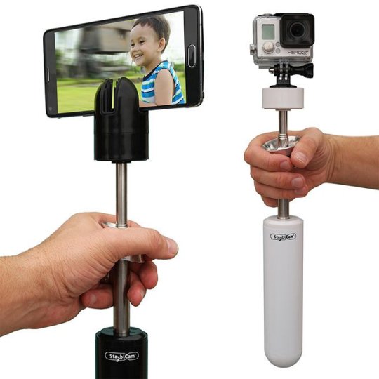
Weird and somewhat effective.
The central idea is that you’ll hold onto this ring, allowing the stick to swing freely like a pendulum.
To set this up, you must first fiddle with the ends of the StayblCam until it balances on that ring horizontally. Getting that right is fussy, and there’s no way to memorize the positions of the end chunks to make the setup faster the next time.
Once it’s perfectly balanced horizontally, you can turn the whole thing vertical. You wrap your thumb and index finger around the ring, and use your ring and pinky fingers on the pole itself, to prevent the whole thing from swinging as you walk. Even then, the swinging can be a problem, especially if it’s windy.
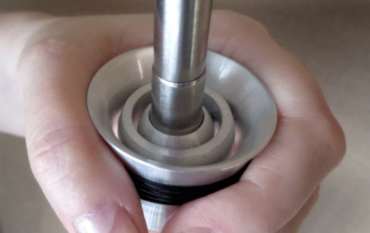
The correct technique.
If you compare the footage, there’s no question: Your video is smoother with the StayblCam than without it.
But this is a polarizing pole; on Amazon (AMZN), people tend to give this thing either 5-star or 1-star ratings. It’s goofy, it’s clunky to set up, and it only kind of works.
On the other hand, it’s waterproof and rugged. It never needs charging. You can unscrew the phone holder and replace it with a threaded mount for a camera or GoPro. You can turn the whole thing upside-down, for smooth ground-level (or pet-level, or baby-level) video that’d be hard to shoot otherwise. And poles telescope out quite a bit—enough for the phone to sit 3 feet above your hand.
Steadicam Smoothee
The Steadicam Smoothee is another steady-er that uses gravity as its stabilizing force ($90). This time, though, you’re holding a pistol grip, and a curved arm places the counterweight directly below your fist.
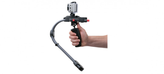
From Tiffen, makers of the original Steadicam.
Here again, the first step is to make sure everything is balanced; this time, you use two little red knobs to tweak the rig’s center of gravity. Also here again, the pendulum effect both helps you—by stabilizing the phone or camera—and hurts you, by swinging as you move. And finally here again, you’re supposed to keep additional fingers on it, to keep it from turning off the axis you want.
The footage is indeed much, much smoother than what you’d get handheld. Like many stabilizers, though, the Smoothee’s weak spot is quick pans. When you’re pointed in one direction—shooting a skateboarder just ahead of you, say—it’s a champ. But if you suddenly whip your hand to a different angle, you get a delayed reaction and an overcompensating swing.
Note, too, that you can’t hold the Smoothee upside-down, as you can the other products here. You can’t shoot those great dog’s-eye-view videos.
Incidentally, the gravity-based handheld stabilizer concept is available from copycat brands at much lower prices. I found these on Amazon:
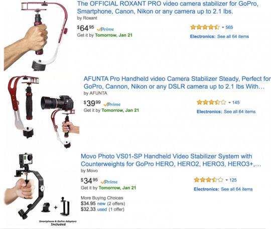
Copycats abound.
I haven’t tried them, but it’s likely they’ll offer the same pros and cons as the Smoothee.
GoPro Karma Grip
You may recall (or maybe not) that GoPro, the struggling sports-camera company, unveiled a drone last fall, the GoPro Karma. (Here’s my review.) One of its chief virtues was the stabilizer that held the GoPro itself—a stabilizer you could pull out of the drone and use handheld.

Incredible smoothness–for GoPro only.
The Karma drone is a flawed product (and not just because it was recalled when a glitch caused some units to shut off in mid-flight). But the Grip, sold separately for $300 (GoPro not included), is a cool idea.
This is a motorized gimbal. You can move your hand all around, and the camera just sits locked in space, as though freed from the bonds of physics. It’s freaky in the way that a spinning toy gyroscope is freaky.
You have to charge it up before you use it; fortunately, the Grip also charges the GoPro attached to it.
The stabilization is unbelievable. It’s miles better than the gravity-based steadiers. In fact, no other product touched the fluidity of the chase shot it produced in my tests (see the video above); I mean, it looked exactly like a Hollywood movie shot. I tried it again, holding the Grip upside-down, with the camera down by my feet. Once again: GORGEOUS, smooth, floating video.
Since it’s just a handle, something like a flashlight, you can also stuff it into your jacket or backpack strap, point it forward, and let it film your skateboard, skiing, or mountain-biking run. You will be so happy with the results.
On the other hand, the Karma Grip has a couple of forehead-slapping drawbacks. First, it can’t hold a phone; the only thing you can put on it is a GoPro Hero 4 or 5 (be sure you buy the correct version).
Second, the gimbal mechanism spends most of its time blocking the Hero’s screen—and covering up one of its microphones. Oops.
DJI Osmo Mobile
DJI is another drone company that has branched out into stabilization products. The Osmo Mobile ($300) is another motorized gimbal, but this time, your smartphone is the camera. (It’s a spinoff of the regular Osmo, a much more expensive device that has a built-in camera.)
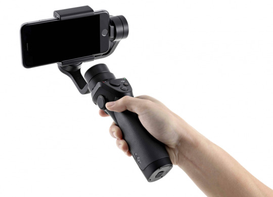
King of the motorized stabilizers (for now): Osmo Mobile.
Here again, the results are astonishing. You just can’t believe this video came from your phone. It looks like it was shot from a helicopter or a camera on a dolly (“train tracks”).
But it gets better—much better. There’s a four-way sliding button on this handle that motorizes the pans (side-to-side) and tilts (up-and-down) of your camera. The Osmo not only stabilizes your phone, but it also motorizes its movements, smoothly and gracefully. Between your own arm’s motion and this button, you can create spectacular, cinematic moves—either at arm height or, held upside-down, way down low.
The grip has dedicated shutter buttons for video and still photos, too. On the far side, there’s a trigger; hold it in with your index finger to make the camera lock its gaze. Now you can raise or lower your arm; the camera tilts to stay focused on the subject.
You can use your phone’s regular camera app. But if you download DJI’s companion video-capture app, you get some bonus features. One of them lets you draw a box around your subject—and then as you move (or it moves), the Osmo automatically tilts and pans the phone to keep the subject in the frame. So cool.
Another app feature is designed for time-lapse video: It stretches out a pan or a tilt over a very long time.
SteadiCam Volt
The whole stabilizer field is about to get a jolt with the Volt, which is SteadiCam’s motorized consumer stabilizer. If it were a movie, it would be called “Volt: SteadiCam’s Revenge.”
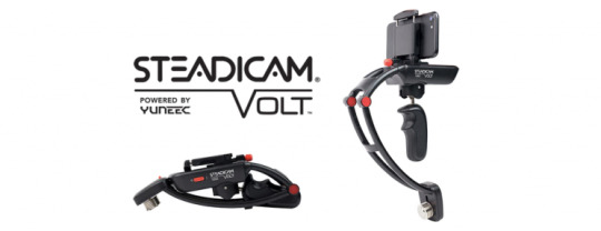
Revenge of the Steadicam.
It’s only a Kickstarter prototype right now (although one that’s already shot way past its goal), so I haven’t tested it. But once it’s a shipping product, it will offer two killer advantages.
First, its price will be $200, not $300. Second, the company says that it doesn’t lag when you do quick turns—like sudden pans or tilts—the way the Karma Grip and even the DJI Osmo Mobile do. If you want to do a whip pan, do a whip pan. (The Kickstarter video shows this feature in action.)
Of course, $300 or even $200 is a lot if all you ever film is your toddler’s waddles or your roommate’s antics. But it’s next to nothing compared with the $50,000 SteadiCam rig whose steadiness these motorized handles resemble. If you’re aspiring to be a YouTube celebrity, journalist, extreme sportster, or budget filmmaker, a stabilizer could be a powerful way to upgrade your work without changing cameras.
And you know what? Even one of the cheapies works better than your hand.
David Pogue, tech columnist for Yahoo Finance, welcomes non-toxic comments in the Comments below. On the Web, he’s davidpogue.com. On Twitter, he’s @pogue. On email, he’s [email protected]. You can read all his articles here (http://finance.yahoo.com/news/david-pogue/), or you can sign up to get his columns by email (http://j.mp/P4Qgnh).
#Pogue#David Pogue#_lmsid:a077000000BAh3wAAD#$GPRO#_revsp:yahoofinance.com#_author:David Pogue#_uuid:99c6fb14-c982-32b8-ae4e-f1c681395236#$AMZN
6 notes
·
View notes