#They don't have a super shortcut tool to smooth all that out and make it easy for them
Explore tagged Tumblr posts
Text
And you just know that if you did notice and take action, you'd be wrong about it that time. There'd be this whole "Why would you do that? I left that/did that the way I did for an important reason!" And it'll be something they think is total common sense but is something you've never thought of in your life and would never have imagined in a million years. But no, you messed up because "Everyone knows that!"
Of course, these 'tests' are coming from a real and valid feeling. They're not the proper reaction to it, but the feeling is real. They think you aren't paying attention to them, or don't care about being there when they need you, or they're just incredibly sick of always being the only one to wash the thing or do the chore. That's a real and valid feeling!
But the answer to that isn't to test, it's to talk. If you're having an issue with someone, you should talk to them. Tell them, hey, I always wash the car. I don't want to always be the only one to wash the car. Can you wash it too sometimes? Be clear and honest and communicate.
I hate that thing some people do where it's like. "I left my wallet on the table to see if you'd say anything" or "I wanted to see if you'd wash the car if I stopped doing it"
Cause like
I dont know about anyone else
But I am perpetually hovering three inches above the strong subconscious belief that everyone knows what they're doing at all times except me, so if you change your normal patterns and I notice, then I will assume it is an intentional choice with a thought-out plan behind it and I will avoid interfering
And if I don't notice, because I won't, because why would I, because not much bothers me and if you don't say anything to indicate you are bothered then how would I KNOW
#Neurotypical people have this social cue super power that helps so much for working with others#But sometimes I feel like they're so used to relying on that#that when it fails they legitimately have no idea what to do#And we get weird unhealthy reactions like these secret tests#Meanwhile people without that superpower have to actually learn to communicate#They don't have a super shortcut tool to smooth all that out and make it easy for them#So many become very practiced at the important skill of#“Oh my gosh please just talk about it”#Maybe a little off topic but like#This is why neurodiversity is so important#I really do think it exists not exclusively as a defect but as an evolutionary advantage#We are here to learn from each other#And to help each other#That's important
75K notes
·
View notes
Note
Help!!! Tips for drawing digitally? Every time I draw digitally it gets and wiggily and lop sided :(

I'm SO sorry about the delay in replying to this!
I guess my main tips for avoiding wiggly lopsidedness in digital art would be to:
flip your canvas regularly so you can see the art with "fresh" eyes, allowing you to spot any weird and wobbly bits more easily
use a line stabilizer (also called smoothing in some programs) if you don't have a steady hand. There's no shame in using the tools available to you if it makes creating more enjoyable and the outcome more pleasing to you!
if you're in the habit of using small, choppy strokes with your pen, try zooming out a bit and using longer, smooth strokes instead (and keep one hand on the undo shortcut so you can draw > undo > draw until you hit just the right line)
if you're really struggling with a piece, or are super unhappy but don't know how to proceed, take a break for a day or three and come back to it. It probably isn't as wonky as you've convinced yourself it is!
I hope that helps a little. I'm no master artist by any stretch of the imagination, and I draw a LOT of wobbly, lopsided drawings. Most of my pieces start out totally wonky, if I'm honest! But the process of ironing out all of that to get to a finished piece that I'm happy with, aesthetically speaking, is often more satisfying than the finished piece itself.
We're all a little wiggly and lopsided here...and there ain't no shame in that :D
169 notes
·
View notes
Text
Shop Beeline Motorcycle Navigation for Seamless and Smart Riding in India
Shop Beeline Motorcycle Navigation for Smooth and Stress-Free Riding in India We should be genuine - riding a motorcycle in India can be a wild ride. From chaotic traffic in the urban communities to those long, twisting streets through the mountains, getting lost or ending up in some unacceptable lane is simple. In any case, don't pressure - that is where Beeline Motorcycle Navigation comes in. This little gadget is your new dearest companion for all your riding experiences in India. It's straightforward, smooth, and gets you where you want to go without the issue of muddled maps or bungling around with your telephone. Whether you're zooming through Delhi's frenzy, cruising along the coast in Goa, or taking off to investigate the slopes, Beeline keeps you on target.
Why Beeline Motorcycle Navigation is Perfect for Riders in India India's streets aren't generally the most straightforward to explore. Between the intensity, sudden downpours, and the consistent exciting bends in the road, you want something solid that won't let you down. Shortcut's negligible plan and clear usefulness make it the ideal contraption for each rider in India. We should separate why Beeline is an unquestionable necessity for your motorcycle:
1. Super Simple Design No fuss, no extra clutter – just a smooth, minimal design that gives you exactly what you need. The round screen looks awesome on your handlebars and shows you clear, easy-to-follow directions without any distractions. Perfect for those chaotic traffic moments or when you’re lost in the middle of nowhere!
2. Straightforward Navigation Beeline’s interface is as easy as it gets. No confusing settings, no crazy pop-ups—just turn-by-turn navigation that lets you focus on your ride. Whether you’re dodging cows in rural India or weaving through Bengaluru’s traffic, you won’t waste time figuring out how to use it.
3. Made for India’s Crazy Roads Rain, dust, potholes, and unpredictable traffic – India’s roads are no joke. But Beeline’s tough enough to handle it all. Built to survive India’s harsh weather and rough conditions, you can trust it to keep going no matter how wild the ride gets.
Cool Features You’ll Love Turn-by-Turn Navigation: No more stressing about missed turns – Beeline will guide you through every twist and turn of India’s roads.
1. Weatherproof: Whether it’s pouring rain in Kerala or dusty winds in Rajasthan, Beeline keeps working. 2. Long Battery Life: One charge lasts for hours, so you can go on those long road trips without worrying about running out of juice. 3. Easy to Mount: Beeline’s mount is quick and simple – no tools are needed, just snap it on and go. 4. Custom Routes: Whether you’re in a rush or want to enjoy the scenic route, Beeline lets you pick your path.
Perfect for All Kinds of Riders in India Every rider has their vibe – whether you’re commuting through the madness of Mumbai, taking weekend trips to the hills, or going all-out on a road trip. Beeline’s got you covered:
1. City Riders: Dodging traffic in Delhi? Beeline helps you take the shortest, quickest routes, saving you time and frustration.
2. Weekend Warriors: Ready to hit the road in Himachal Pradesh or Kerala? Beeline makes sure you don’t get lost while you’re out exploring India’s beauty.
3. Long-Distance Riders: Heading off for a massive road trip across India? Beeline ensures your journey is as smooth as possible from start to finish, whether you're cruising through Gujarat or up in the North.
Why Beeline Makes Riding in India More Fun Riding in India is an adventure, but it doesn’t always have to be a stressful one. With Beeline, you can say goodbye to constantly checking your phone for directions or worrying about getting lost. It’s simple, it’s reliable, and it makes sure you get to your destination in one piece, no matter where you are in India.
Where to Get Beeline Motorcycle Navigation in India Prepared to make your rides smoother? Beeline Motorcycle Navigation is accessible on the web or at select stores across India. Whether you're riding through the roads of Chennai or investigating the streets of Uttarakhand, Straight Shot will be there to assist you with tracking down your direction. So, what are you waiting for? Grab your Beeline now and get ready for smoother, smarter rides all over India!
With Beeline Motorcycle Navigation, the road is yours to explore. Get rid of the stress and enjoy every ride, whether you’re in the heart of India’s cities or out in the open countryside!

#beeline#motorcyclenavigation#ridinginindia#smartnavigation#motorcycleadventures#indiaonwheels#motorcycleroutes#seamlessriding#bikeadventures#exploreindia
0 notes
Text
giffing tutorial
hiii so here's a walkthrough on how to make your gifs clean, crisp, and colorful :-) it's literally so much fun, it's one of my favorite hobbies, i hope y'all enjoy too!!
first off here's what you're going to need
photoshop
this gif sharpening automation
a clip you want to gif! preferably in the highest resolution you can find, 1080p is generally my minimum
adobe premiere (optional, but nice to have only for step 1)
let's get started!
step 1: creating your clip
first off, we need a shorter clip than the average tv episode or movie length. choose a scene or shot you'd like to gif. for this tutorial, i'll be giffing a scene from NOPE (2022) as an example.
now, this next part is semi-optional, it just depends on how smooth you want your gifs to be and what access you have to other platforms.
most movies and TV shows are filmed at a framerate of 23.976 frames per second, while youtube and other online videos tend to be 30fps. you can check the framerate of a video file by right clicking > properties > details

however, if i clip out a scene using the built-in windows video trim tool, it will create the clip at 30fps, causing it to lose some smoothness and look just slightly choppier. and giffing is all about trying to minimize choppiness one small step at a time.
here's where premiere comes in. if you have premiere, go ahead and open it up and create a project. i have one just for gif clip exports. if you don't have premiere, you can either retain the framerate by importing the full original file into photoshop (step 2) or clip it and just work with it in 30fps. no worries either way, in the grand scheme of things it's not that big of a difference and we can still make the gifs super pretty.
open up the full file in premiere's source monitor and locate the section you want to clip. use the mark in/mark out buttons (or the "i" and "o" hotkeys) to select your clip range

then hit ctrl+M or File > Export > Media to export your clip. premiere will automatically set the export settings to match the framerate and resolution of the source clip unless you've used a different preset recently, so make sure the preset menu says "Match Source - Adaptive High Bitrate," name your file, decide where you want it, and hit export.
step 2: importing into photoshop
you're going to import your clip into photoshop by selecting File > Import > Video Frames to Layers, then picking which clip you want to gif. as you can see in my screenshot, i have this set as a keybind* to alt+shift+ctrl+i to make it faster

this will cause a menu to pop up where you can select the part of the clip you'd like to import into photoshop. now that the maximum gif size is 10mb, you can do pretty long gifs, depending on how much movement is in the clip. generally each gif can be a few seconds, but it's up to your discretion.
the clip markers aren't very precise, so don't worry about getting too perfect with the clipping here, you can shave off frames as you please throughout the rest of the process. when you have your range determined, hit OK and it'll bring us into photoshop proper!
*to set a keybind, go to Edit > Keyboard Shortcuts
step 3: prepping for coloring
each frame of the clip will be imported as an individual layer. it's subjective, but i've come to like my gifs having a range of about 40-140 frames, depending on how long i need them to be.
you want to make sure your workspace setting is set to "motion," so you can see the frame timeline across the bottom of your screen, like this:

you can select this workspace setting with the dropdown menu in the top right corner.
next up, scroll to the end of your timeline and shift click the last frame, selecting all the frames. click the carrot next to the number under the frames (the number in my example is "0.04") and select "other" to change the frame delay. i normally use 0.05 or 0.06, depending on how slow and dramatic i'd like the gifs to be. for this one, we'll do 0.06.
now hit "C" to open your crop tool. if you want those nice big gifs people make a lot, i'd recommend putting in 4:3 into the ratio bar at the top. you obviously don't have to crop at all; it depends on how you want it to look. hit enter when you have your crop how you like it to complete the action
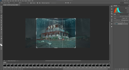
select Image > Image Size or hit alt+ctrl+i to change the size of your gif. no matter what cropping you have, the width of your gif (if you want it to be the only one on its horizontal row in the tumblr post) MUST BE 540PX!! this is tumblr's ideal width for an image post** and will keep it from stretching or compressing when you post it. so go ahead and type "540" into the width column and hit enter.
now, make sure all of your frames on the timeline are still selected, go to the hamburger menu on the top right of the timeline, and select "Flatten Frames Into Layers"
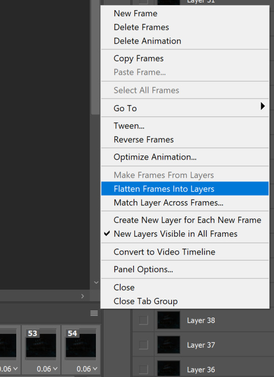
go to the layer panel on the right (NOT the timeline), scroll past all the layers labeled "Frame [1, 2, 3, etc]" until you hit the first one labeled "Layer [number]." click the first layer, then scroll down and shift click to select all the layers labeled "Layer," and hit backspace or the little trash bin icon to delete them. we only want the ones labeled "Frame" now.
click the "Convert to video timeline" button on the bottom left of the timeline, right under the first frame!
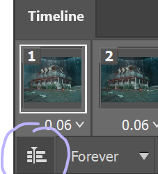
so your screen should now look like this:
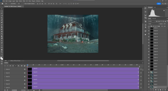
shift click the last frame (at the top) to select all your frames, right click any frame in the layer panel on the right, and select "Convert to Smart Object." this will compress all your frames into one dynamic layer photoshop knows is supposed to move.
**540px is ideal for one image in a row, 268px if you're putting two gifs next to each other, and 160px for three in a row.
step 4: COLORING <3
if you downloaded that gif sharpening tool i linked at the top, find it in the folder it downloaded to and double click to import it into photoshop. this should open the "Actions" tab, which essentially allows users to program in a series of actions in a certain order that they can make photoshop execute when you hit "play" on the action. for example, i had one that essentially did all of step 3 for me before my computer died last winter.
anyway, make sure your smart object is selected in the layer panel, open up the actions tab, select "glossy sharpening," and hit the play button. this is a nice sharpening tool i like that takes out a very difficult step, but if you'd like to play around with your own sharpening settings and get it how you like go ahead!

here's what it will look like after executing the actions.
now, remember what i said about the framerate in step 1? here's where that comes in. if your clip is in 30fps, you can skip this part because photoshop defaults to 30fps motion editing. if your clip (like mine) is in 23.976fps then click the same hamburger menu we clicked for "Flatten Frames Into Layers" before and click on "Set Timeline Frame Rate." Choose the correct framerate from the drop down menu and hit OK.
now for the best part: customizing your coloring!! go ahead and click the folder icon in the bottom right to create a group in your layer panel, but don't put your base layers in here. this is going to be for your color editing layers.
the icon right next to the group icon, the circle with a clear half and an opaque half, is now your best friend. this gives us our adjustment layers. the first one we're going to use, and by far the best one, is levels. levels is magical.
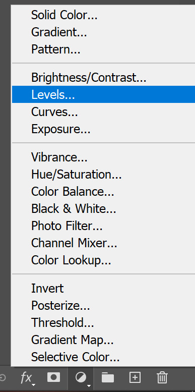
levels basically works by you telling it what "white" and "black" means by selecting pixels in the image. generally you want to use the "white" eyedropper to select the brightest pixel you can find and the "black" eyedropper to select the darkest.
this has the amazing power of being able to smoothly lighten or de-fog or clarify images. now, darker images are always going to be harder to make look good, and there's only so much you can do. but that "so much" is endlessly expanded if you mess around with levels, especially if you layer levels layers on top of each other, then right click > Blending Options > and mess with the fill opacity.
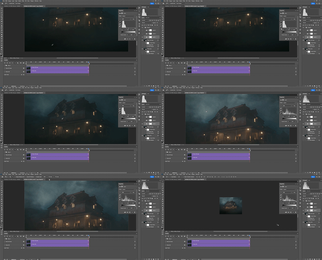
note: the levels layer i'm editing is at 28% fill opacity and 71% regular opacity, which is why it didn't entirely deep-fry the image when i clicked on a mid-grey with the white selection eyedropper.
after messing around with levels until i'm satisfied, i'll add a "vibrance" layer and boost it until it looks good. i also like adding a "color balance" layer and playing with it. for this one i'm adding a bit of blue to the shadows and a bit of cyan and red to the highlights. it's also been trendy lately, especially in gifs of people talking, to add a "hue & saturation" layer and desaturate the yellows by a lot while emphasizing other colors, like here:
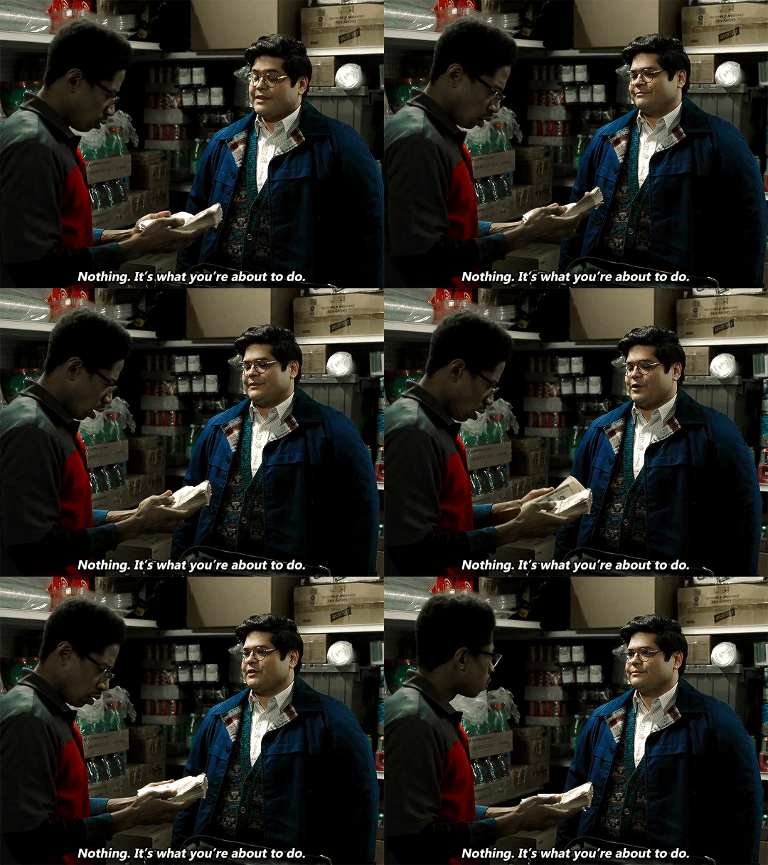
after you have your colors how you like, i recommend toggling the visibility of the group a few times to see what you've done! it's so satisfying to look at the change between the base layer and the coloring you've made.
step 5: text
i try to keep my text pretty standard, but you can get creative with it as you please. to add text you can hit "T" to toggle your text tool or select it from the left tools panel. when you click to add the text it'll create the layer starting from wherever your playhead is, so make sure you move it on the timeline to line it up with the start of the gif. drag the end of the text layer on the timeline to make sure it's the same length as the gif so you don't get empty frames when you export. i like 18pt text, and i use the font Gadugi, but i've also used Calibri before.
caption colors for gifs come from broadcast caption colors, meaning that the first person to speak is given white captions, the second person is given yellow, and the third is given teal, although you can do whatever. i normally use:
1st person: #FFFFFF
2nd person: #fcbe11
3rd person: either a more muted orange or a soft teal
you also want to make sure your text is centered by clicking the center paragraph toggle on the top of the screen while your text layer is selected. using the move tool ("v" or the tool on the top of the toolbar) you can center on the guidelines photoshop gives you. i generally like my text pretty much as close to the bottom as it can get without getting cut off.
once all that's sorted, go over to the "fx" button on the same row as the adjustment layer and group/folder buttons. we're going to add a stroke and drop shadow.
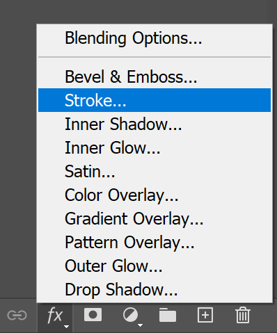
the stroke adds an outline. i do 2px, postition set to outside, normal blend mode, 100% opacity and solid black (#000000)
the drop shadow is more malleable because it depends on how the text looks based on the scene it's overlaying. i tend to change it up to make the text the most legible i can, but here's the settings i start from:
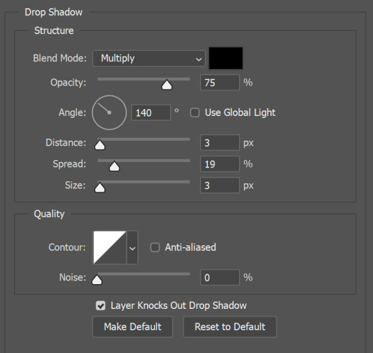
step 6: exporting
to export as a gif, go to File > Export > Save For Web (Legacy) or ctrl+shift+alt+S. this will bring up a menu to configure your export settings, and will tell you how big the gif is going to be (in megabytes) after the export. as mentioned earlier, you want it to be less than 10mb. if you use the beta post editor, try to keep it under 9.8mb because for some reason the beta post editor tends to thing gifs that are almost 10mb are actually over the limit.
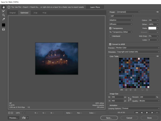
you can see the gif size in the bottom left, 6.507mb, so we're good to go. if your gif IS to big you can go back into the timeline and shorten it by dragging the edges of the timeline layers. if you drag the base layers (the ones labeled "Frame [x]" and "Frame [x] copy") the group above it will conform to that length, but the text layer will not, so you have to manually drag that layer too.
make sure the settings in the top right panel match mine to avoid export errors, and in the bottom right make sure it says "Looping Options: Forever" or you'll have a gif that will only play once.
to double check that you like your gif and see it properly, you can click "preview" in the bottom left. this will open a tab in your browser to view it in its final size and playback speed. if you don't like it, you can go back and tweak it however you want.
so that's that! we've got a gif.

i know this may seem like a lot, but once you get in the groove (or make some automations or keybinds!) it gets a lot faster and the satisfaction of making a good, pretty gif is so nice. i happened to choose a really dark scene to gif for this one so it's not my best work but it was just an example lol.
#cricket gifs#i guess#gif tutorial#giffing#gif making#if you have questions about other specific things feel free to ask!
189 notes
·
View notes
Text
Okay, Cricut digitizing tutorial, part 2:
So, as we went with in the last one, anything that's a solid black-and-white image can translate into Cricut, even if it's not a vector image. The Cricut thinks in vector images, but Design Space is good at two things: converting raster images made to be vectors into vectors, and advertising Cricut Access.
So, since I think this is a little easier than vectors, let's make a design in our image editing program. I use GIMP, and I've been using GIMP for over 10 years, and when you insult it, you insult my children, and I don't have to have a Creative Cloud subscription, so we're using GIMP in my tutorial. It's free. I love me some free and open source programs.
I'm aiming this tutorial at people who aren't super familiar with image editing software. If you are familiar, the answer is "if you can do it with your color mode set to a 1 bit indexed color palette and make a transparent background, you're good."

And no, I didn't crop my screenshots. Start by buying and obviously not stealing a stock image of what you want to make.

Somewhere on your screen (on the right if you have GIMP set to default settings), there's a layer box. Make a new transparent layer (it'll default to transparent) above your layer with your image. Select your reference layer and use the lock button that looks like a paintbrush. This will stop you from editing the layer, also accidentally doing this all on the reference layer and making things hard for yourself. Ask me how I know.

If you have keyboard shortcuts set to default, hit your N key to access your pencil tool. Otherwise, grab it out of your toolbox like this.
Your pencil tool, unlike your paintbrush tool, will paint with a hard edge. There's no gray or semitransparent pixels around the outside of your stroke. This makes it look a lot blockier, but it also makes what we're about to do possible.

Pick where you want to start digitizing, and click there. A nice thing about the pencil tool is that it doesn't matter how hard or soft the brush you selected is designed to be. The pencil tool will make it a hard edge.
If you hold down your shift key now, you'll see a little line stretching from your last click down to your current location on your brush. If you click, it'll draw a line between your last click and your current location.
So start shift+clicking your way around the sections you want to draw. This is a lot easier than trying to freehand it, especially if you're not using a tablet. You can make this a little bit blockier than you might think, because the cricut will smooth things out a little bit when it cuts.
Around tight spots, you might need a smaller brush. There's a size option in the lefthand tool box, but you can also press [ for shrinking the brush and ] for making it bigger.

Once you have your area outlined, grab your bucket tool (Shift+B on default keyboard shortcuts) and fill in the areas you've outlined. Since you used the pencil tool and not the paintbrush, it'll fill the whole area up nice and neat.
If it fills your entire canvas when you click, check to make sure that your outline doesn't have holes in it, and make sure that your paint bucket tool is set on "fill similar colors" and not "fill entire area."
Since you're making this image in a single color, you will need to figure out how to make the different parts of the design clear. I like leaving little gaps between the parts. Figuring this part out is really the secret to good digitizing.

Once you have your design made, you can turn off your background layer by clicking the eye next to that layer. (You can also make things easier for yourself by using multiple layers as you digitize). The checkboard background that shows up means that your background is transparent. That's good.
Then, go to your image tag and hit "crop to content." The computer will cut out all that extra space around your image.
You can then export it as a .png file to preserve the transparency. Go into Design Space and open it up. Since you uploaded a transparent file, you won't need to go through the process of deleting your background.

Design Space likes to interpret my png files as GIGANTIC, which I think is GIMP being set to default at 300 ppi and Design Space thinking it's 72ppi. But you can just go into that top bar and shrink it down to something reasonable. You just use the adjustment option in the righthand corner of this screenshot, and you can change it from 35" down to 6".
Remember to never steal stock images and trace them without paying. Obviously I can't encourage that.
Anyway, yes, you can get smoother lines using the pen tool, but if you're going to use the pen tool, you might as well just use an actual vector software. Shift+click is still pretty good and is pretty intuitive and easy.
Coming up later, we'll have actual vector software involved. But remember, if it works, it works. If you do all your cricut digitizing in microsoft paint, and it looks good, it works.
6 notes
·
View notes