#That's been a very fun thing to develop over time as a - cartoonist? Both traditional and digital artist lol
Explore tagged Tumblr posts
Visit Tumblr Blog
Explore Tumblr blogs with no restrictions, modern design and the best experience.
Last Seen Tumblr Blogs


Fun Fact
Kazakhstan’s Minister of Communications and Informatics has blocked the Tumblr site because it contained 60 sites of terrorism, extremism, and pornography in 2015.
Note
what's your favorite part about making art?
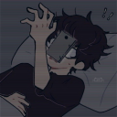
Getting it out of my head (lol)
To give a more complete answer haha, each step has its own charm! Sketching is nice to have it Out of me, alleviates the itch of having a Thought or Feeling that just needs to be Out and onto paper already
If I'm drawing digitally, lining has gotten rather meditative, or if my sketches are particularly scribbly then it's like a puzzle haha
Toning on paper is a fun exercise in tool usage - I have specific pencils I switch back and forth between to get The Effect I'm looking for, or filling in with the same pencil for the whole piece is nice to just have it done all at once, it's satisfying both ways
Editing has kinda fallen by the wayside for me lately (as evidenced by my lack of uploads - I keep wanting to share, but there's a stopper in my brain that says "No, they're Not Done!" which is like......half correct? It's done when I say it's done, but they haven't been edited "properly" so) but it also has its good points! It took a bit to find the fun again because editing is definitely Not my favourite part of the process - it's not Creative or Exciting or Expressive in the same way as the other steps but it is something I can do for my art that makes it appear how my hand, eye, and brain want it to - my hand is messy, my eye is very particular, and my brain parses between the two, takes away the lines that muddle the final image until there's only The Picture left :) And sometimes it's all I have the energy for! Sometimes all I can do is take my backlog and make it pretty rather than make something new - but it's still Making Art :)
The only part I really don't like is scanning lol, it's just annoying, why can't my pictures be uploaded in perfect quality directly from my sketchbook to my computer haha
And most of this is to do with drawing since it's still my main art form, but a lot of the same applies to writing and papercraft and whatever else I try my hand at - it's nice to Have and Do and see where it gets me :)
I'm doing well! I've been writing more than - ever? I think? I think this is officially my up-to-now peak of Finished Writing by wordcount and time spent on it lol, it's been very fun!! And also a little overwhelming haha I still haven't quite found a New Normal about it, it being The Most haha, but I want to work towards that balance! More practice means more time to implement it so lol
#July's had it's ups and downs - as any month lol - but yeah the downs have been noticeable#But they helped me reframe my thoughts about editing :) So I'm happy to have those thoughts in my back pocket#And hopefully I can get my doodles to a point where I'm ready to share them again soon!#Doing all this writing not tag-style or like data gathering or liveblogging - actual creative writing#I feel like I've improved a lot in a Very short amount of time and I'm deeply grateful for the experience <3#If you know you know hehe <3 <3#I still have a lot else I want to work on too! Other kinds of art!#I've been looking to try embroidery lately and actually kind of excited about it so yeah! Art is just - cool#Making something and then Having it - it's cool!#I don't think I exactly have aphantasia - I can hold images in my mind alright but they're kinda murky#But for a long long long while I've just set my hand loose to express whatever Feeling I've got going on#There are specific techniques that I enjoy practicing! I like improving based on what I can see :)#But I haven't had An Image In My Head That I Can't Get Out in ages#That's been a very fun thing to develop over time as a - cartoonist? Both traditional and digital artist lol#Now it's moved on to other mediums! Now I have A Plush or A Papercraft in my head that I get to be disappointed by! :D#Haha#Anyway ♥ Ty for the ask and checking in <3 Very sweet of you <3
1 note
·
View note
Text
zack villere Is Creating a World All His Own [Q&A]
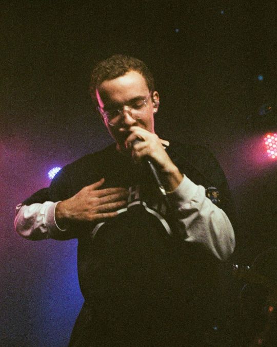
Photo: @projectional
zack villere may not be a concept artist in the traditional sense, but he has a unique talent for creating surreal worlds that are difficult not to get swept up in. This penchant has been seemingly present from the outset, first showing its face in his debut EP, pants, released under his previous moniker, froyo ma. However, it truly came to fruition in his aptly-titled debut album Little World, an encapsulation of villere’s love for well, little worlds.
Each of his projects portrays a kaleidoscopic vision, one brimming with lived-in characters and avant-garde soundscapes. In many ways, even on his sophomore album, Cardboard City, villere becomes difficult to easily pin down. And chances are he likes it better that way. “I think the most annoying part about it is when you think you’re doing something interesting and different, and then everyone says, 'Oh, you’re just like [that guy],'" shares villere when I ask him how he feels about others attempting to classify his music.
Bedroom pop. Anti pop. Lo-fi indietronica. Nothing feels quite right when it comes to succinctly defining villere or the world of Cardboard City. So, in the hopes of better understanding the idiosyncratic artist, I sat down with him over a plate of Mediterranean food to talk chapped lips, nostalgic childhood cartoons, and transcending genre classifications.
Ones To Watch: How has LA been treating you these last three years?
zack villere: I have a lot of friends here so I like that. I was trying to move to New York in January but my friend, who was supposed to move with me, bailed. I was really ready to go so I’m trying to go to New York after I finish the tour. But I like LA. My lips are chapped because we went to Joshua Tree.
For any reason or just because?
Just for fun, but it messed with my lips.
It’s a desert out there. A literal desert.
The desert is not my thing, man.
What does an average day look like for you?
Right now, it’s kind of all over the place. When I was working on my album, I was just going to the studio, but right now I’m just hanging out. I’m working on my next album so whenever I have a thought about a song, I just make it.
Are you still recording a lot at home?
I used to, and I did a lot of my album that’s coming out in the studio, it’s actually down the street, which I really liked. But this one right now that I’m working on, I’m just trying to write all of the songs first and then go in and re-produce them. So I’m just working at home, but I want to make it like a nice, well-produced effort.
So, you’re already working on your third album? Already on to the next thing?
I’m not going to act like I’m a workaholic, because I’m not, but I’m just excited for the next album and all of the ideas that I have for it.
It’s not like the SoundCloud days when you could just drop it whenever you want.
I miss that. Even with Little World, it just felt freer.
Are there any general central themes on your sophomore album, Cardboard City?
Yeah, it’s just about a world called Cardboard City that I just made up. The “Sore Throat” video kind of brings you in and is a third-person perspective, almost like a film. The way I see it, it’s a film version of the world, and the “A Feeling” video was kind of on the street with the character of the world.
youtube
Given that your previous album was called Little World, is it safe to say that you’re trying to create miniature worlds with each album?
I guess so. That’s how it’s been so far. I’m not sure if it will always be like that but, for even the first EP, the Froyo Ma EP, it was an idea about a cereal bowl leftovers that coagulated into a little island and there was a spaceman that landed on it. That was the story behind that project. So, I’ve always gone into it with an idea, but Little World wasn’t totally as conceptual as this one is, and the next one kind of has a different idea and conception.
It seems like you’re really into miniatures.
(Laughter) Yeah. I fuck with small stuff. I think the reason why I’m into small stuff is because I watched a lot of things like Small Soldiers and Stuart Little as a kid. I actually wanted to do a video for Little World where there would be this dance party and it would be super animated. I just didn’t really have any help at that time because I was doing everything myself, so I would have all of these ideas but could never pull them off. And I still kind of feel that, but now I have people.
But you’re entirely independent for the most part. Do you enjoy that freedom of control?
It’s cool. I did like a distribution deal on this project and that gave me a little bit of money to do the “Sore Throat” video, which I did with my friend Dan. Just having a little bit of money and some freedom to like, get a nice camera and pay him to spend his time on it. Before I just didn’t know how to get anyone to do anything. So yeah, it’s cool, but I really want to work with people. I’m tired of the idea of doing everything by myself. There’s nothing really that cool that comes from that. It’s just like, “Oh cool, you did that.” I’d much rather be known for making cool shit than for doing everything by myself.
How is it touring? In previous interviews, you’ve said that you’re not keen on performing live. Has that changed?
(Laughter) No. I played a show in Vancouver that was really fun and I was like “Oh, this could actually be really fun.” But then I played two shows after that and it sucked, so I’m kind of back to dreading tour a little bit. But, I’m excited because the two shows that I didn’t like - one was a festival, where there were people that liked my music, but not too many. And the other was a college show and there was nobody really there for me. It’s more fun when they know the music.

Photo: @alex.tc
I feel like a lot of your inspirations, or at least the ones you’ve noted, are very R&B and hip-hop focused. Do those two particular genres speak to you in particular?
I guess so, but I don’t really know. I like a lot of music. I like pop music, like pop/R&B. I just like R&B melodies, probably because I was into Jazz when I was younger. When I was in junior high, I played the saxophone.
How do you feel about genre classification?
It’s definitely annoying, but it’s not the end of the world. I think the most annoying part about it is when you think you’re doing something interesting and different, and then everyone says, “Oh, you’re just like [that guy].” That’s the biggest bummer for me. I would love to transcend that shit and just be like known for what I do and not for my association. But I think for the stage I’m at, people need to classify me.
How do your parents would describe your music to their friends?
I literally have no idea. I’ll ask them when I go home.
Are they chill with the whole music thing?
Yeah, they’re sick. They’re down with it, which is cool.
Have they seen you live yet?
Yeah, they saw me a few times but the first time with me singing was my last time in New Orleans. I didn’t sing growing up, so I was honestly nervous because it felt like that part of me is like a new development.
What spurred you to start singing?
I’m not really sure. I was in college, and I just kind of wanted to make songs so I just started singing. The first thing I ever did was a cover of “Awkward” by Tyler [the Creator], and then I sent it to my friend Elijah and it was trash.
Wait, where you doing the rapping or singing part?
Just singing. I was just doing the Frank [Ocean] part. But I sent it to my friend Elijah and it was just so bad and I was so embarrassed that I didn’t sing again for a year. And then I eventually did it again. I just wanted to write songs.
youtube
Was there a certain point in your life when you realized that music was what you wanted to do?
I started playing guitar in middle school because I wanted to start a band with my friend, so we both got guitars, but he didn’t really play. Then I just kept playing because I wanted to be in a band or just do something with music.
When I went back home last year I found this book from when I was little that said that I wanted to be a cartoonist or an astronaut or something. Like I wanted to make cartoons and also go to space. So, for a good period of my life, I wanted to do astrophysics, but I’m not science or math-minded. I’m so bad at it, but I was just so into the idea of it and romanticized being an astrophysicist.
When I was in high school I wanted to be a screenwriter and do movies. Also, a part of me wanted to be on SNL because I was really into Jimmy Fallon. But, I was always making music, so I ended up wanting to do that.
You still make cartoons, right?
Yeah, I still draw. I would want to make a cartoon. I have an idea for a cartoon series, it’s just getting myself to that point where I’ll actually do it. One day.
Were there any cartoons growing up that were super formative for you?
I have such a bad memory but, obviously Spongebob and The Fairly OddParents. Just the basic ones. I also watched Arthur because I had PBS. Also, the WB stuff like Static Shock and the old Batman series. The good ol’ days.
The final important question, what were you like as a kid?
I don’t know. I don’t have the best memory. I feel like I was a shithead and probably just lame. Maybe I just blocked it out because I didn’t like that person (laughter).
2 notes
·
View notes
Text
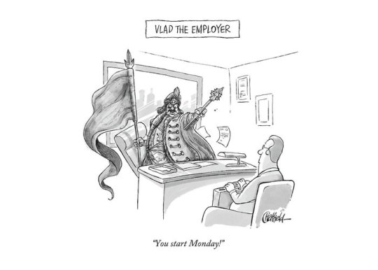
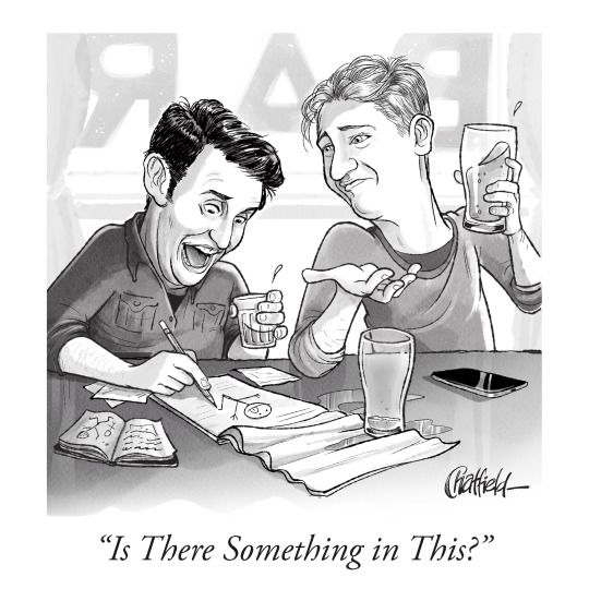
Jason Chatfield.
Bio: I grew up in the far flung suburbs of Perth, in Western Australia, and used to spend my paper route money on MAD Magazines (I cheaped-out and stole my dentist’s waiting room issues of the New Yorker. I think I was the only kid who looked forward to going to the dentist).
I moved to New York in 2014 and started pitching to the mag in person. I’m not sure Bob liked me, so I went back to pitching via email. Then I went in on his last day and finally sold my first piece. I feel like it was his final f—k you to the magazine. “Here! Have a Chatfield!”
Find this print here!
The cartoon was a goofy play on Vlad the Impaler.
I didn’t sell to the magazine again until last month, but I’ve had a handful sold as dailies. And I’m published in MAD often, so they’ve clearly done away with any of their standards.
When I’m not drawing gag cartoons I write and draw a syndicated legacy strip called Ginger Meggs which I took over 10 years ago. It’s been around since 1921 and now appears daily in 34 countries. He’s kind of an Australian version of Dennis the Menace, except he predates him by about 30 years.
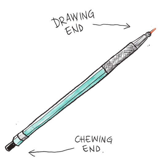
Tools of choice: For drawing/roughs, I use a Prismacolor Turquoise clutch pencil with a red lead and try to find some paper with a little bit of tooth. The mixed media pads at Blick do the trick nicely.
I ink using a Uni-ball Vision Elite Stick Roller Ball Pen… or a Pigma Micron 03.
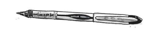
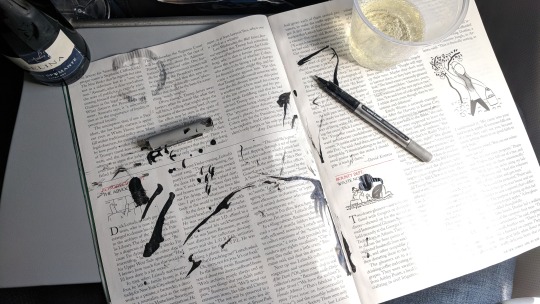
DO NOT use the Uni-Ball Vision Rollerball Pens, Fine Point (0.7mm) if you’re traveling. They explode on planes. And ruin your copy of The New Yorker.
For a wash, I just use watercolor and whatever brush is lying around. Nothing fancy. There’s a scanning app on my phone called “Adobe Scan” which does a nice job of scanning line-art into a PDF when I’m out of the studio and need to email in a quick rough.
I use a Wacom Mobilestudio Pro for finished artwork. I like to get out of the studio and work from a bar or restaurant, so it helps that I can take that with me. I use a little glove that I got on Amazon so I don’t grease up the screen, and the felt-tip nib that comes in the pen-holder makes the friction between the stylus and the screen more like pencil on paper. Unfortunately, they’re not waterproof, as I found on a recent vacation…
youtube
My wife plays piano and sings at bars around the city so I’ll often sit at the bar during her sets and draw. Digital/Traditional depends on what deadlines are most pressing. (She has a weekly residency in Astoria —if anyone’s interested in going, let me know!)
A lot of people email me for advice about tablets —I’ve been trialling/demo-ing Wacom products for 15 years— I think they’re great. If you’re married to doing stuff by hand but want to colour digitally, you can get a decent tablet without going broke. Depends on your workflow.
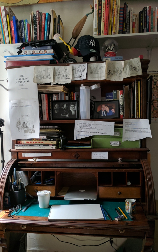
Writing Desk: My wife and I were living upstairs in 5A when my neighbour in 4B died. He was a brilliant poet and had an incredible old writing desk. It’s the only thing that was left in the apartment, so I’m looking after it ’til his grandson moves in at the end of our lease. I work for countless hours at this old thing. It’s beat up, but I’ve patched it together enough that it won’t collapse and bury me mid-brushstroke. I’ve stuck a few of my favourite toons on the top of it.
Tool I wish I could use better: My brain. It really is a sack of cats. Whenever I want to sit and do work, it clocks off. Then it comes up with a pearler of an idea at 3 in the morning when I’m trying to sleep. I write it down in my phone, but autocorrect makes it indecipherable by morning.
I like working with my writer friend, Scott. We both do comedy at night and have developed a nice short-hand. We also seem to have the same library of references and can build on each others’ premises, which tames my sack-of-cats.
Tool I wish existed: The Deadline Extender.® I’ve never missed a deadline, but that said… an extra 3 or 4 minutes to allow for a terrible wifi connection, or a errant scanner wouldn’t go astray.
Also: The Deadline Extender® PREMIUM: Let’s you go back in time to when you were procrastinating and slap yourself in the face. $30 p/month.
Tricks: Ok, well. This is going to sound a bit Dalton Trumbo, but bear with me: I do my best work…in the bath.The most productive 3 hours of my week are during Scotchbath Sunday; an immoveable chunk of time on Sunday evening whereby I lock myself in the bathroom, run a bath, lug my drawing stuff onto a bit of wood that sits over the bath, and just write and draw. Nothing else. I write weeks worth of my syndicated comic strip (Ginger Meggs), I write New Yorker cartoons, scribble up roughs for dailies— and when I feel like I’ve earned it (usually 2 hours in) I tap the side of the bath three times, and my wife peels herself from her piano and I unlock the door to a nice big glass of scotch. It’s a hell of a carrot on a stick to work towards when you’re stuck. (PS. Lest you think I’m some kind of Don Draper-era misogynist; the scotch reward part was her idea. I think she realized it keeps me in the bath and out of her way.)
Anyway. It’s a great way to switch gears creatively. It’s like being on an aeroplane. No wifi, no phones — just the work you need to get done. Get involved. #ScotchBathSunday.
Oh! And if I get my deadlines done for the week, I have a small budget for a solo lunch somewhere where I can eat cheese and draw. I really didn’t know cheese ’til I moved to America. (And yes, I’ve already been to Wisconsin. Good Lord.)
Tips? I always tell younger artists to not even think about touching a drawing tablet until they’ve learned to draw by hand first. Otherwise they’ll always be drawing away, knowing they have the insurance of the CTRL+Z key at their disposal if they screw up a line. That’s not a good habit to have when you’re working to a deadline. But, once you do know how to draw, by all means dive head-first into the digital realm. It’s incredible. Procreate, Sketchbook or Photoshop are all great.
Misc: One of the hangovers from working in advertising illustration is that I’ve had to be a bit of a chameleon style-wise for the last 15 years and haven’t allowed myself to just settle into one style. Lately, I’ve just decided to say “Bugger it!” and try and find a loose, consistent style that I’m comfortable with, that’s an apt conduit to my silly ideas.
I always loved George Booth’s line, and his ability to create a scene with so much movement but just at the right moment in time. Also Sam Gross’ dark, hilarious cartoons with perfect line-economy. And I’d give my left arm (I draw with my right) to know how Barry Blitt has so much control with his washes…
Chatfield’s portrait of Sam Gross
While I’m geeking out, I love seeing younger cartoonists find their feet and thrive in a style that just feels like they’re speaking to you— Ellis J. Rosen, Sofia Warren, Hilary Fitzgerald Campbell, Jason Katzenstein, Amy Kurzweil, and a seemingly endless list of talented younger artists who are putting in the work are a big inspiration.
I know it should be Steig or Thurber or Addams, but my favourite cartoonist is Sergio Aragones.
I was always so enamoured of MAD growing up and studied the lines of Jack Davis, Mort Drucker, Al Jaffee and the Usual Gang of Idiots. I remember being so frustrated I couldn’t even come close to getting my work to look like theirs, but I think I found a style somewhere in between when I fell short.
I think Wil McPhail’s poses are masterful, and I wish I knew how how the hell he did that. One day I’ll trudge up to England and knock on his door to ask him. I find myself doubled-over at John Cuneo’s Instagram, and Ed Steed’s absurdly funny gags. I have a slew of toons I’ve torn out of years’ worth of magazines and taped to my studio wall, or my zillion year-old writing desk. I’m constantly humbled by how generous and welcoming the existing crop of New Yorker cartoonists have been to a goofy Aussie immigrant — Joe Dator, Matt Diffee and Pat Byrnes, Mort Gerberg and an ever-growing list of prolific, talented cartoonists who make the 99% weekly rejection tolerable.
I’ve made some of my closest friends and have been lucky enough to meet my cartooning heroes through the National Cartoonists Society. I got to spend a lot of time with Sergio at the Lakes International Comic Art Festival in the UK last year which made my year. We were signing together for a whole afternoon and I spent more time geeking out with him than signing.
Okay. Enough drooling. Sorry.
I’m a fan of cartoonists.
Website, etc. I have a weekly podcast where I throw around ideas for New Yorker cartoons with a fellow comedian and writer, Scott Dooley. It’s called “Is There Something In This?” It’s a bit of fun. We don’t take ourselves too seriously, but we do take the art of writing gags very seriously. It’s an extremely difficult skill to master, and we’re virtually zygotes at it. We have lots of listeners now, which is bewildering. Talking about drawing is like dancing about architecture, but here we are. Anyway you can find it on iTunes or wherever you waste time listening to podcasts.
My website is jasonchatfield.com and my comedy stuff is up at jasonchatfieldcomedy.com ( I’ve been doing stand-up comedy for 11 years. If anyone wants to come see a show, hit me up! I’ll put you on the door). My instagram is @jasonchatfield. I’m still trolling the British chap who has the @jasonchatfield handle on Twitter to no avail. To that end, I’m @jason_chatfield on Twitter.
If you want more art supplies in your life, A Case for Pencils is on Instagram and Twitter. You can also find me, Jane (the person who created/edits this blog), on Twitter here, which is where I stick the paintings that I’ve been doing instead of interviewing people consistently (I needed to balance working on other people’s work and my own work!). Oh, and If you’d like to support this blog, which is always very appreciated, there are many different ways to do so, which you can find here!
#Jason chatfield#how to draw New Yorker cartoons#artists on tumblr#art supplies#drawing process#artist interview
19 notes
·
View notes
Text
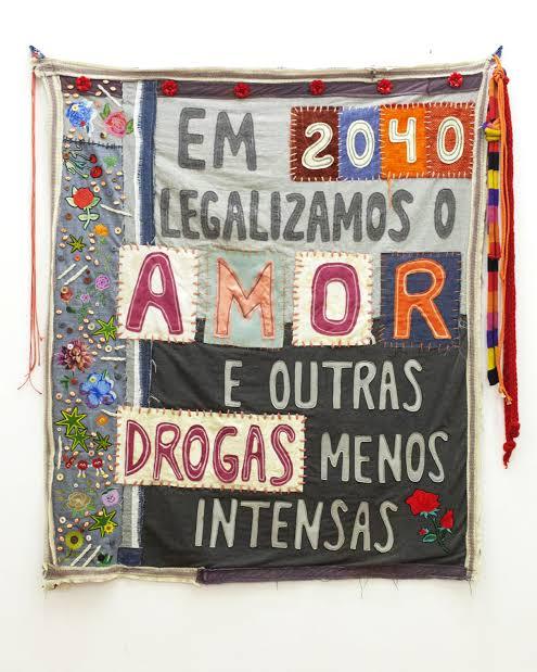
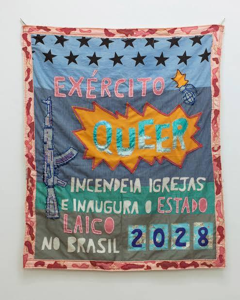
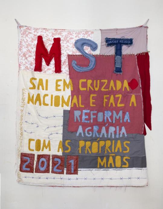
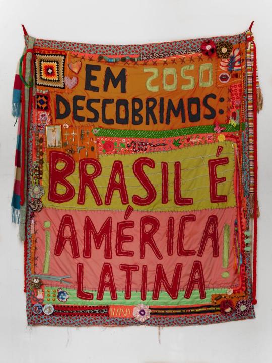
Research: Project Defuture The Future
Randolph Lamonier
Randolpho Lamonier, is a visual artist from Minas Gerais, born in 1988.
He developed several works, specially photography articulated with other languages. He deals with several daily experiences in the city as a form of work, in which photography leads to multiple forms of symbolic exchange.
His work moves between different media, with a leading role in the practice of textile art, drawing, photography, video and installation. In his research, word and image are always together and tend to talk about micro and macro politics, urbanities, sentimental lies, chronicles, diaries and multiple crossings between memory and fiction.
The work done in fabric and embroidery brings sentences like: “ In 2040, we legalized love and other less intense drugs”, and is part of a set of creations in which Lamonier elaborates predictions based on thoughts about the present. “ I always create these works from guidelines that I consider urgent”, explains him.
In the words of the artist himself: “I make flags with what I have. I have never been so foreign. I draw poems, calls for help, war cries, everything is very urgent. The air is contaminated, the floor is covered with debris; sheets, pots, ropes, concrete, broom. Under the rubble the seeds grow in a hurry”.
Perhaps something more interesting than his incredible flags, are the themes he addresses, most of the time making a prediction of the future, about things that could happen in Brazil.
He is indignant with everything rotten that has in Brazil, from the corrupt government, the uncontrollable drug trafficking, the misogynistic society that still exists in Brazil and in several Latin countries, up to the violence itself.
He creates these flags in order to have some kind of hope for Brazil in the future, creating an utopia, where the problems would be thrown away.
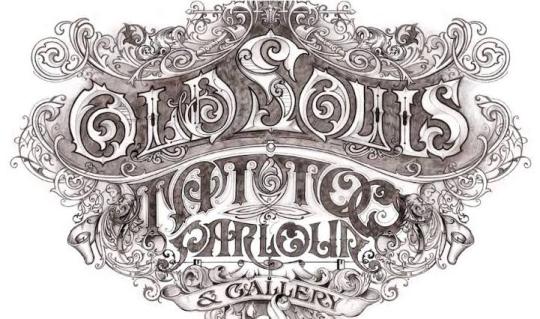
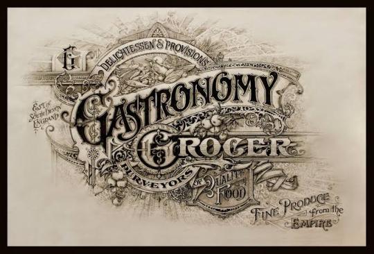
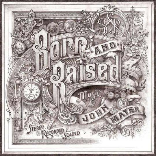
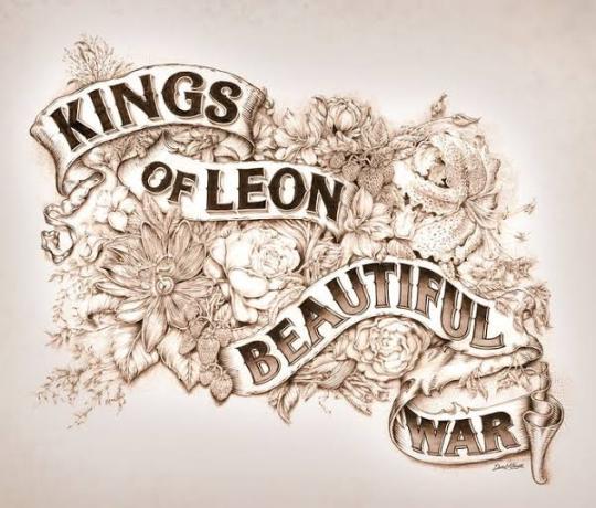
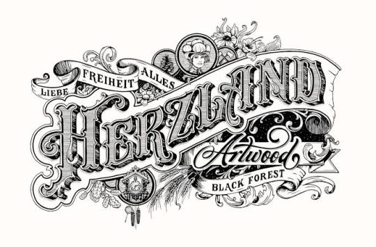
David A Smith
Is a British designer who is specialized in lettering.
He started his own company own sign writing company in 1990 and after 13 years sold the business in 2003 to concentrate more on hand crafting lettering and glass gliding. His main techniques include water and oil gliding, acid etching, French embossing, screen printing and sign writing.
His career in sign writing began in 1984, when he left Westlands school in Torquay, age 16 and was apprenticed for 5 years with Gordon Farr & associates. They were a traditional sign writers, who had come up through the ranks and Gordon, had an uncanny ability to paint letters, accurately laid out, without even a sketch. Under their tutelage, David became an accomplished draftsman, and a accurate letter painter.
This gathering of talented sign artists, carvers and muralists experts. David passion for creating elaborate, ornate mirrors&reverse glass signs of distinction.
In 1992 he set up his own business in England dealing every aspect of sign trade from vehicle graphics to 3D installations.
In 2012, Smith was hired by the singer John Mayer to design the album cover, of ‘Born and Raised’. The cover was styled like 1900 trade card.
He has also worked on posters and other merchandise associated with the album and single.
He was also commissioned by Jameson Whiskey to design a st.Patrick’s Jameson Whiskey bottle for the brand.
David sold the business, to concentrate more fully on gilding, painting e acid-etching glass, adding cutting, so that he could fully replicate the Victorian glass work he admire so much.
Thomas Burden
Burden is a senior designer at the design boutique “I Love Dust”.
He likes to produce work that references the pieces of vintage tat and printed material he gets from car boot sales and junk shops. Thomas Burden has created work for book covers, ad campaigns, music videos and magazine editorial to packaging, and even animations.
Thomas Burden was always encouraged to be creative, he was allowed to draw murals on the walls of his house, when he was very young. He had many references to do his drawings, in his grandparents house, full of Alpine memorabilia and indigenous art.
Toys weren’t allowed in Burden’s life as a child, so he was always looking at catalogs full of brightly colored things.
So in his works he tries to transmit that nostalgic journey to his childhood memories.
In each work there is a maximization of colors and textures and his great influences are: the film director Wes Anderson and the artist Mark Ryden.
On his own words: “ I was lucky enough to have a pretty idyllic childhood. I grew up sailing and skiing and traveling, so our house was full of souvenirs that parents collected, along with various bits of old boating junk and pieces of old cars”.
As an 3D illustrator / Art director from UK. He had worked with many different clients such as Nickelodeon, The New Yorker, Apple, McDonalds, Penguin, Bloomingdales and Ford.
His signature style is mainly the toys that he was never allowed as child, combined with fairground / neon signage and anything bright and fun that catches everyone’s eyes. He create works in Cinema 4D, also using the Adobe Illustrator, Photoshop and After effects.
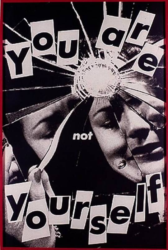
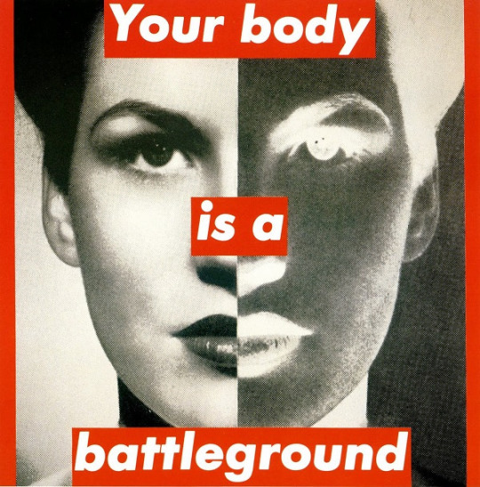
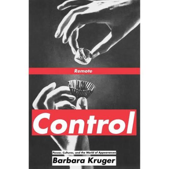
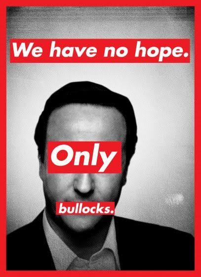
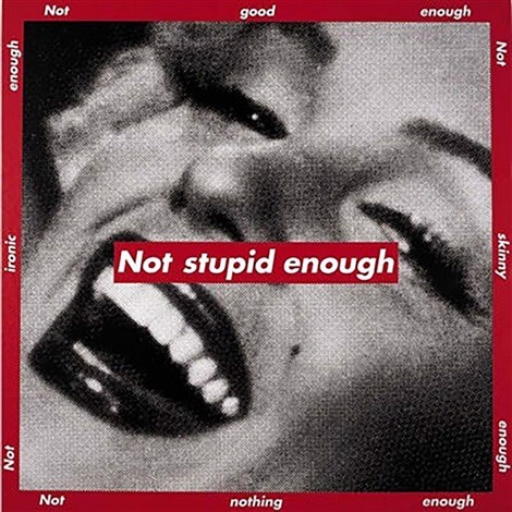
Barbara Kruger
Barbara Kruger is a postmodern artist who was born in 1945 in New Jersey. Having grown up in a middle class family, her first job was as an operator. In 1965 she graduated from The Parson Design School in 1965 and worked as an art director in different magazines. By breaking some barriers of the modern art, Kruger and other women artivists ( art + activism) demonstrated not only against the bonds of patriarchy in society, but also within cultural production. Being an artistic medium an environment built largely by male hegemony, feminist art presents itself as a mean of liberating women. Her works examine stereotypes and the behaviors of consumerism with text layered over mass media images. Rendered with black and white, with a red background, Kruger’s works offer up short phrases such as “Thinking of You” and “I shop therefore I am”. Kruger uses language to broadcast her ideas in a myriad of ways , including through prints, T-shirts, posters, photographs, eletrônico signs and billboards. Despite the work of feminist artists of the twentieth century to change the way women are portrayed in the art world, today this representativeness still confined by a backward ideal. Thus, the work of Barbara Kruger proves to be even more relevant and undoubtedly necessary today.
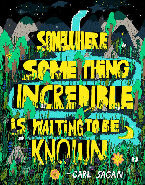
Mike Perry
Mike Perry is an artist that makes paintings, animation, sculptures, books, public art installations, monographs, silkscreens and more. Mike Perry was born in Missouri, United States, and grew up in Kansas City. He started drawing at the age of four. He attended to the College of Art in Minneapolis, and earned a degree in graphic design. Mike Perry's style of using extremely vibrant colors, and making totally stylized designs with a lot of personality is something that draws my attention mainly. His letters are always around a totally imaginative space, which can be both a forest and even a city. The creativity in making those compositions for his posters is something very captivating, not necessarily making a poster that matches with the reality, but doing something perhaps lysergic. His works can be considered love notes to the abstract, unknowable future that is all possible in the present. Illustrator Ana Benaroya said that , “Mike Seems like a modern surrealist to me. His works feels like a childhood memory of slipping down a giant water slide during summer. Slippery and wet and innocent but not innocent. His drawings feel like they just fell right out of his brain onto the paper”. I think he is a great influence, especially for this project. Because I'm wanting to go overboard with the lyrics and the drawings, wanting to do something totally experimental, doing something absurd and creative at the same time. And with this nature theme, I want to make posters with extravagant animals and unconventional scenarios. How he uses photoshop and Procreate for most of his work. I would like to use Photoshop again for this job to continue to learn painting techniques.
Filipe Grimaldi
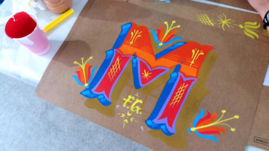
Filipe Grimaldi is a lyricist and designer. He has been working in the graphic design market since 2006 and, in recent years, has been focusing on the study of manual techniques of calligraphy, lettering and letter painting, migrating part of his work to the development of letterings and commercial decorative painting.
He even give practical classes in ateliers of other institutions. His works can be seen on walls, slates and thousands of plaques that circulate around with his characteristic traits.
Filipe Grimaldi works on the primary chromatic contrast, a key element for the graphic construction of the alphabet.
Letters, words and sentences are organically raised, avoiding the precise math of right angles.
I met Filipe Grimaldi at EBAC in 2019, when he taught a class of typography, teaching how to make a freehand letter. I was impressed, because I saw great perfection and lightness when he drew those letters.
In addition to using several very vibrant colors in his works, even looking like a lettering of an entertainment show.
He even painted on a mural at EBAC, where even I had the opportunity to give a light brushstroke in one of his letters.
For 13 years, Filipe has been specialized in manual techniques of calligraphy, lettering and letter painting. In his own words: “ My authorial research and commercial activities ended up leading me to rescue the calligrapher profession, an almost extinct activity in the development of technology and printing and clipping machines”.
Currently, he teaches typography and calligraphy, for college students, with the goal of encouraging people to try more hand-made letters.
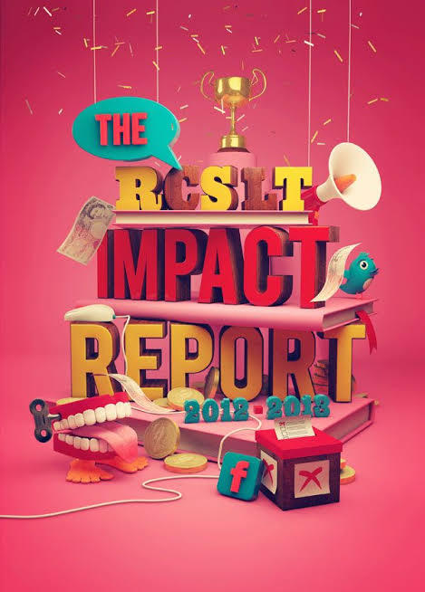
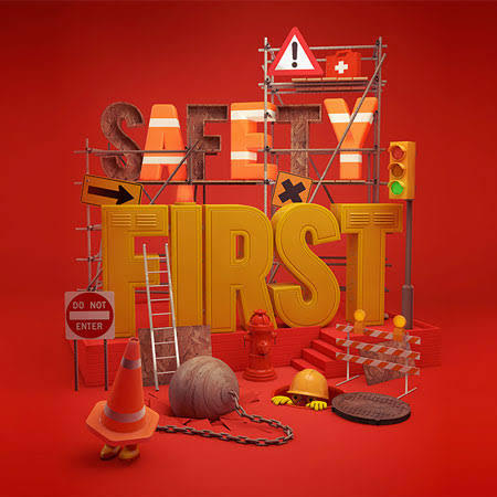
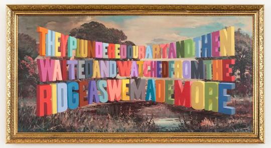
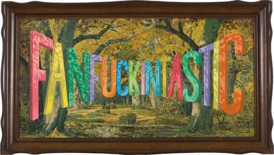
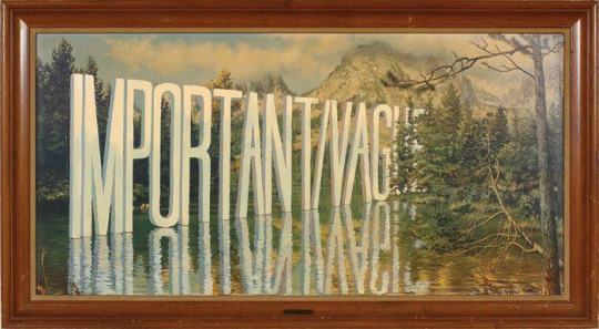
Wayne White
Wayne White is an American artist, typographer, cartoonist and puppeter. A former set and character designer for the television show Pee-Wee’s Playhouse, White produces ironic, often subversive imagery. On Pee Wee’s Playhouse where his work for his set and puppet designs won three Emmys; he also did many voices on the show. He is best known for his word paintings composed of oversized, three dimensional text painted onto cheap landscape paintings he finds at thrift stores and markets. In 2000, he began painting words and phrases, on thrifted lithographs. “When you think about it, you’re surrounded by giant letters and words everywhere”. White said once. “We don’t take for it granted, but the whole American landscape is nothing but a giant letter forms”. One Journalist said his opinion about White’s paintings: “the weirdest landscape painter in America, White uses master painting techniques to create the illusion of words and phrases surreally disappearing into the horizon or jutting out from each lithograph’s place setting.” White’s famous “word art” paintings hang in museums and galleries across America. His paintings features technically proficient and wildly colored phrases that are funny and sarcastic. And critics have praise White’s series for being entryway to the artist mind. Over the past years, White has worked primarily as a fine artist with solo exhibitions of his paintings and sculptures in galleries in New York and Los Angeles. In 2006, he created a giant head sculpture, with a giant lettering next to head. This marks one of White’s other passions, which is sculpting, and he like to exaggerate on the expression, of the characters that he is sculpting.
Joshua Noom
Joshua Noom is a famous illustrator who was born in Australia, in 1988. He is very popular in the social networks, specially in Instagram, where his minimalist illustrations and typography have earned him over 60,000 followers. He had created several illustrations for musicians and major brands like, Miller High Life, Sony, and Warner. Today Noom lives at Florida, and he is specialized in detailed and bold illustrations combined with an organic sense of typography. One of his most recent works, was recreating the Bible’s cover, with many other Christian artists. Each artist offers a visual entry point focused on a particular biblical theme or passage, setting a tone of reflection as readers engage with the Bible. I’ve been looking at Joshua works, and I really like the feeling of gritty and inky that he puts in his illustrations. Some of his works feels military inspired and masculine, while other pieces feel soft and feminine, like some vintage postcards that he produces. Something that Josh uses in most of his work, and that connects with my posters, is the use of wild animals and different situations. It can either make a tiger surfing, or even protest posters for the preservation of wildlife. He has a very intense passion for animals, and he enjoys drawing them in very expressive ways. With strong colors, with its minimalist style, and texts with different fonts around it. In a interview Josh even discusses his style “ My inspirations for my style are mostly from music and other art, but one artist that I’ve been diggin’ is Mark Conlan. My style has just kind of developed over the time and I think I will probably keep evolving. After many attempts of trying new things and figuring out what works for me, and what doesn’t for me. I prefer to draw in a more minimalist style, specially using my ink pens. Animals are one of my inspirations, specially here in Florida, we got many different species of birds and reptiles, so like to sit somewhere, and draw any animal that appears, and try to create a composition with different typefaces, to make future posters.
1 note
·
View note
Text
A Wandering Best Comics of 2017 List
Well hello! It’s this blog, the thing I put on hiatus in order to focus on my degree and then did not check into all year!
If you don’t follow me on any other social media, I have some good news: I have, in fact, finished my library degree! Goal accomplished! I’m in this funny place right now where I was working hard and was completely burned out, and then suddenly wasn’t working, and now I’m enjoying relaxing but also realizing I need to get back to a place where I can work on things again. Write things again. Be focused and productive and not on a mental vacation. Oof.
First, before getting to the fun stuff, I am going to officially announce that I won’t be formally returning to this blog. I may use it as a space to write reviews that are more serious than a quick goodreads review and not serious enough to fit with Women Write About Comics or another venue, but I’m not going to follow a this-many-a-month goal. I want to focus on other projects, so while this blog has served me well, I think I’ve found other ways to discover, support, and signal-boost diverse media that require I step aside from LOS Reviews.
That aside - year end lists! They can be fun! Last year I wrote about comics I love in which ladies smooch other ladies, but this year I am going to do something much more disorganized. A consequence of focusing heavily on school is that my to-read pile has become wild and unruly. As I let things I wanted to read pile up over the year, I did read a few things that were just too good or too exciting - or that I could easily access during a break. My #1 favorite thing that I read this year was Soolagna Majumdar’s Marge Simpson Anime zine, which I wrote about for WWAC’s Small Press Faves of 2017 list. In addition, here are some random titles that helped me stay afloat through a grueling final year of graduate school.
Print Comics
Nightlights by Lorena Alvarez
This big, gorgeous comic released by Nobrow Press contains some of the best art I was privileged to ogle in 2017. Sandy, a young artist, has the unique ability to bring the lush fantasy world of her mind to life. Or, perhaps, she can take aspects of her own imagination and gift them to existing magic within the world, and build a warm, vibrant, safe fantasy space. When the new girl at school takes dangerous interest in Sandy’s abilities, she must learn to own and harness her inner power. If, like me, you are feeling very burdened by work, know that this is a quick read meant for middle or elementary-aged readers. It’s sort of like coming across a stunningly delicious appetizer at a fancy party; it’s brief, but so good that you immediately want to eat another (or read it all over again.)
Space Battle Lunchtime Volume Two: A Recipe for Disaster by Natalie Riess
I reviewed volume one last year so I won’t spend much time giving you plot synopsis etc., but volume two came out this year and wraps up the story. I LOVE these comics; Riess creates a very pretty, kooky alien world in which each creature’s species-specific traits and personality feels immediately well-developed. Riess’ skillful use of visuals to give her characters - human and alien alike - unique personas appeals to me because I quickly feel exhausted when reading lengthy high fantasy that spends ages detailing all the aspects of a culture or society. This is really how I prefer to learn about an entirely made-up world: as quickly and efficiently as possible, with all emphasis on character development. These comics are light hearted, queer, action-filled and fun, Riess just knows how to press all my buttons!
The Lunch Witch by Deb Lucke
I read the first two (only two? no idea) volumes of this series this year, and IT IS SO FREAKING GREAT! The comics follow the spooky exploits of Grunhilda, an older witch who finds herself in need of a job, and ends up working as a lunch lady at a nearby elementary school. Grunhilda is NOT a good witch, or at least doesn’t intend to be, and she doesn’t really like children. The books are fairly dark for a middle grade series, excitingly creative - there’s a page that is actually burned and missing 1/4 of itself - and tackle morality and the value of helping others out of a sense of compassion and desire for companionship versus seeking selfish reward. They are fun, surprisingly deep, and supported by a really cool website that has things like recipes for Engorged-Tick Scones and a Bad Advice column! Love love love it.
So Pretty/So Very Rotten by Jane Mai and An Nguyen
I was lucky to randomly pick up the preview zine for this book at CAKE last year, and as a huge fan of Jane Mai’s comics - I maybe wrote an article about her that feels somewhat like an embarrassing love confessional - I was super excited for this book to come out! So Pretty/So Very Rotten is a mix of comics, essays and interviews about Lolita subculture, from the perspective of two Asian-North American cartoonists (I’m pretty sure Nguyen is Canadian? Correct me if I’m wrong, I have been known to not realize people were Canadian. See: Ellen Page) who either have been or still are very much participating in and deeply connected to Lolita. It is well-researched, accessible and totally engrossing. I am not a femme person and have been on a sort of slow burn, low-key journey in which I try to de-couple gender from clothing in order to feel more comfortable in how I present, and this book hit me at just the right moment. Through interviews and essays, Nguyen and Mai dive into how many view Lolita as a genderless (or perhaps gender-full?) exploration of the feelings the clothing can create both for individuals and communities. The comics get quite dark and often lean into the rottenness Lolita allows; in some ways, that rottenness feels like an opportunity to let the truth of the darkness of ourselves out, or to reveal how tough and ferocious those who dare to dawn frills truly are. I cannot recommend it enough.
Wuvable Oaf Volume 1 by Ed Luce
I purchase-requested this baby from the library and was deeply pleased when they bought it and when, recently, I saw that the cover was beat up a bit, indicating that I truly am not the only one who wanted it! Huzzah! I’ve been meaning to read Luce’s comic since I bought a Divine poster from him a couple CAKE’s ago, and it did not disappoint. This giant tome tells the story of Oaf, a hairy, scary-looking ex-wrestler who is in fact quite squishy, loves cats, and wants romance. It’s a gay subculture-y comic that is strange enough to border on being fantasy (Oaf can do some wild shit with his hair, and one of the cats SEES THINGS) and loaded full with comics/pop culture Easter eggs. The wrestling flashbacks are maybe the best bits, so I’m excited to get my hands on volume two, which looks more focused on the wrestling.
The Less than Epic Adventures of TJ & Amal + Five Years Ago and Three Thousand Miles Away by EK Weaver
OK confession: I read the webcomic and this was actually a reread prompted by my inability to walk past the big, gorgeous softcover collection on the Iron Circus table at C2E2. “I think it’s time I buy TJ & Amal” is I think exactly what I said to Spike Trotman, whose response was something like “of course it is!” (Shout out to Sheika Lugtu who was walking the floor with me and also was like, um yes, buy it, dummy.) I had not read the follow-up short comic previously, in which Weaver posits three possible endings for the boys, two of which keep them together, one in which they break up. It was a perfect, bittersweet tease/companion to a beautiful book about two queer men who kind of fall in love over the course of an emotionally tumultuous road trip. Weaver digs so deeply into her characters, exposing all their weaknesses, failings and fears, and watching these two boys who are strangers at the beginning of the story be completely vulnerable with each other is a gift. I often longingly look at the softcover on my bookshelf and consider rereading it, only to remind myself that no, I need to finish that paper! Except I don’t now, because I did finish school... hmm...
Tabula Idem: A Queer Tarot Comic Anthology edited by Iris Jay and Hye M
I’ve been working through some kickstarter rewards I haven’t yet had time to read, so because I’ve got this big pile I’ve of course had some mediocre reading experiences and some surprisingly stunning ones. This anthology falls into the latter category; while I was interested in it enough to fund the kickstarter, I didn’t expect to love it so deeply upon reading. I only just became interested in tarot this year and there’s so much to learn, but Tabula Idem felt like a perfect way to start considering how to interpret cards on my own, and how to go beyond what might be traditional readings and factor in aspects that account for being a queer person. Each story in the anthology focuses on one aspect of a Major Arcana tarot card, and they range across genres with queer and trans characters of all kinds of identities. I read a lot of anthologies and sometimes they can feel tedious, but this one slowed me down and made me savor each tale, wanting to experience the affect each artist pulled out of each card.
Girls’ Last Tour by Tsukumizu
I’m pretty sure this manga series was recommended to me by the inimitable Claire Napier, and I did not expect to love it as deeply as I do. In this time of high-energy, high-action, sometimes trashy but generally fun dystopian literature, Tsukumizu offers a slow, gay, philosophical exploration of a post-apocalyptic world in which mammoth city structures vastly outnumber humans. The young girl protagonists initially are unsure if they are the only humans left in their world, and slowly make their way through a strange, towering, layered city largely in search of food so that they can continue to survive. They contemplate the value of being alive and sometimes ask big questions, but also generally enjoy each other’s company, get excited about rare opportunities to take warm baths, and recall distant memories or known concepts from the pre-apocalyptic world. It’s definitely not a series for everyone as the pacing is so slow, but Tsukumizu’s rendering of the very tall, very brutalistically designed city is engrossing and makes the pacing worth it. Really, it’s a story about two girls asking deep questions and pondering them over an unlimited amount of time, and that feels just right.
Princess Jellyfish by Akiko Higashimura
I think I started reading this series last year but really got into it this year; I binged volumes 4, 5, and 6 in a single night, and 7 is currently waiting for me in my backpack. It’s kind of the antithesis of Girls’ Last Tour in that the tone is always frantic and wild, in accordance with the high energy of the otaku girls the series celebrates. I love that Higashimura offers up a variety of characters who are obsessed with different things - I always think of mega nerdy people as being into things like games and comics, but of course Tsukimi is a jellyfish otaku. Kuranosuke’s character development has been particularly interesting, as he becomes a sort of emotional-connection otaku, obsessed both with pursuing a fashion career that allows him to submerge himself in the feminine clothing that connects him to his mother and won his heart at a young age, and with being emotionally tied to a group of friends who are actually passionate about things. (We get some glimpses of Kuranosuke’s other friends and they all seem pretty shallow.) The series is very fun, and I love Higashimura’s autobio author comics in which she basically exposes lots of embarrassing things about herself and how nerdy she is.
Webcomics
I read a LOT of webcomics and several ongoing series that I’ve been reading for eons have been faithful comforts this year, including Strong Female Protagonist, Gunnerkrigg Court, Questionable Content and Monster Pulse. I wanted to talk about some comics I don’t think I’ve ever plugged before, so these in theory are all things I started reading this year.
Manners’ Magical Monster School by Jessica and Jacinta Wibowo
This cute comic follows Wilbur, the lone human at a magic school for monsters, and his roommate, Amira, who’s big secret is that she is a demon. The pair are a sort of odd-couple; Wilbur is a sweet, chubby kid who got bullied before the frankly terrifying Amira became his best bud, while Amira is an over-confident punk who isn’t super great at having feeeeeelings. I first discovered Jes n Cin via their webcomic Tales from the Well, which is also very good, but is a bit more serious in tone. I particularly like the coloring - it’s all this warm, sort of watercolor-ish wash (I have no idea what materials they actually use, sorry!) and always look forward to the next update.
Barbarous by Yuko Ota and Ananth Hirsh
I am fairly certain I’ve raved about how much I love the Johnny Wander autobio comics before, but Yuko and Ananth’s forays into fiction are always fantastic and I am especially in love with Barbarous. The series’ protagonist is Percy, a magic-user who was studying magic but maybe dropped out of school (there was some kind of mysterious incident that pushed her to start couch-surfing around) and is sort of OK at using it but also still has a lot to learn. She is hired to do maintenance work by mysterious but classy landlord Cecillia, and her immediate supervisor, Leeds, is a sort of blunt but kind... giant dinosaur? He’s very cute. Anyway, Yuko and Ananth are building a cool magical world that is close to our own but also includes lots of really great, modern fashion/costuming. Percy and Leeds’ friendship is like a baby goat or a calf; its legs are not strong and it stumbles a lot, but it’s really cute. I love it.
Quiet Brain! by Samantha Davies
This isn’t so much a comic as it is a series of illustrations of adorable, sort of anthropomorphic animals saying inspiring, sometimes kinda brutally honest and deep shit. I read nearly all of them in one go on a long train ride and while I’m normally not the kind of person who is into like, inspirational feminist cross stitches and shit like that, something about this struck a chord. Davies has a panel-less comic called Stutterhug that is all about movement, emotion and moments of connection between (anthropomorphic animal) creatures. Quiet Brain! emphasizes how skilled the artist is at communicating emotion through facial expressions; it’s a simple thing that I didn’t know I needed until I read it.
Ascent by Kevin Lam
I’ve been reading this series since probably before 2017, but I found this year that I particularly looked forward to the new comics. Ascent is, simply, the story of a diver lost in the sea, making a mostly lonely journey to the surface. Given an endless amount of time to contemplate general concepts about life, the diver does so. They consider the purpose of making a journey that may never yield a successful end, the point of accepting a friend that literally attaches themself to you - it’s a very cute baby squid - and the merit of just giving into exhaustion. Retrospectively, I think this comic really embedded itself into my psyche this year because my graduate school journey felt similar. I climbed up several difficult hills which were small enough that I could see the top, but knew another hill awaited me. Recently there have been some spooky happenings in the comic, and I’m excited to see where Lam takes the diver next.
Girls Have a Blog by Sarah Bollinger and Tara Kurtzhals
I don’t actually read this creator pair’s main comic, but I’ve really enjoyed this autobio dive into their post-art school life, trying to make comics as a career work. They go through many ups and downs but perhaps uniquely do much of it together, and the act of processing both with each other and via comic is very satisfying. I especially enjoyed the arc where Tara found herself unable (emotionally) to attend a school reunion, because I found myself in the same position when my five year college reunion happened last summer. Often relatable but perhaps foremost a look into how making life work as a freelance cartoonist is TOUGH, this is some really enjoyable autobio! I’m excited for season two to start in 2018.
Everything Shing Yin Khor makes
OK so Shing has some webcomic short stories and projects going on, but I wanted to do kind of a blanket shout-out because I’ve enjoyed everything she’s shared this year, from her delightful watercolor comics to her installation work. I first encountered Shing when I picked up the Blood Root horror anthologies she produced out of Sawdust Press, and reviewed the third issue in one of my first ever pieces for WWAC. This year I was surprisingly and suddenly blessed to briefly attend the American Library Association conference, and the highlight was meeting Shing in person. She was there promoting her graphic memoir The American Dream? A Journey on Route 66 which Zest Books will release in February 2018, and it was such a delightful meeting that I re-engaged with her other work. Whether it’s building art installations and twitter bots that use oracles and fortune telling to explore kindness, or watercoloring stunning sci fi/fantasy worlds that contemplate workplace dynamics, immigration and travel, everything Shing creates takes on a journey that tilts your perspective, makes you gasp in wonder, and gives you a hug. If I were to make a list of creators whose work I’m super excited about in the coming years - it would be a very long list, and honestly I’m sort of constantly making that list through my critical/review work - Shing would be at the top. Funding her patreon will ensure you keep up with all her incredible creations.
2017 was certainly a year but there is always great art coming of the indie self-pub world. I will do my best to keep you informed about all of it.
3 notes
·
View notes
Text
Hyperallergic: When Ritual Performances Slip Dangerously into the Real
Installation view of Cameron Jamie: Domestic Arenas: Massage the History, BB, Kranky Klaus at Gladstone Gallery (courtesy the artist, Gladstone Gallery, New York and Brussels)
The artist Cameron Jamie used to go dumpster diving with his high school friend, a burgeoning cartoonist named Matt Groening. The two teenagers, twisted on a blend of punk rock, horror films, and comics books, were on a mission to reveal the sinister reality behind their plastic, suburban, Southern California neighborhood. A favorite spot was the set of trash bins behind the local public school, where, at the end of a semester, they could find discarded notebooks and scraps of paper featuring violent drawings by delinquent children. Here it was, right in front of them — this is what was really happening. Behind the Leave it to Beaver façade, what actually existed was confirmed in these pieces of outsider art ephemera, a nightmare lurking just beneath the surface.
Although Groening and Jamie’s lives would eventually diverge — the former went on to alternative comics semi-fame before ascending to the pop culture pantheon with The Simpsons — their work would stay rooted in this traumatic break in the suburban real. Groening’s Life in Hell comics, which were syndicated in alternative weeklies across the country, took a satirical pose toward the reality of the suburban childhood home. Parents, teachers, classmates, and coworkers were presented as archetypes, reading from a script. The only way to make it through to the other side was to not listen and keep your head down. These comics, for the most part, were light-hearted, although occasionally real terror would jump out that spoke of things more frightening. In the final chapter of Childhood Is Hell, Groening draws Binky, the main character of these comics, curled in the corner of a room with the menacing shadow of his father hovering over him. “Did I say childhood was hell?” Binky says. “Gee, I don’t know what I could have possibly been thinking.”
Cameron Jamie, “Kranky Klaus” (2002–03), Still from video with soundtrack by The Melvins, 26 minutes (© Cameron Jamie; courtesy the artist, Gladstone Gallery, New York and Brussels)
It is in this unnerving moment that Jamie’s work begins. Currently on view at Gladstone Gallery, three of his short films — “BB” (1998–2000), “Kranky Klaus” (2002–03), and “Massage the History” (2007–09) — present the domestic space as something to be broken apart and rearranged. How each film achieves this is slightly different, but they are all engaged in turning the safety of home into something either dangerous or unseemly. He brings performative gestures — professional wrestling, ritualized dress-up, dry humping of furniture — into spaces that are imbued with artifice, and in the moment of collision they produce the same feeling as when Jeffrey, the main character of David Lynch’s Blue Velvet, finds a severed ear in the woods of his white-picket-fence suburban town. What was once normal, a space of stability, has now become sinister.
You can see this same interest in the unsettling of familiar spaces in “Spook House” (2003), Jamie’s study of amateur haunted houses; “The Neotoma Tape” (1983–95), which collected moments the artist recorded from late-night public access television; and the Gothic series of photographs he produced with Mike Kelley (none of which are not included in the current show at Gladstone Gallery). Indeed, his work shares a striking similarity with artists such as Kelley, Paul McCarthy, and (at least the videos of) Raymond Pettibon, who similarly eroded definitions of performance in their work. Like Kelley and McCarthy, Jamie has roots in noise music, and has tapped the Melvins, Keiji Haino, and Sonic Youth — whose various members have also collaborated with Pettibon and Kelley on different projects — to score his films. The music adds to the uneasiness of what you’re watching.
Cameron Jamie, “Kranky Klaus” (2002–03), Still from video with soundtrack by The Melvins, 26 minutes (© Cameron Jamie; courtesy the artist, Gladstone Gallery, New York and Brussels)
The unsettling soundtrack is most notable in “Kranky Klaus,” perhaps Jamie’s most terrifying film. What’s ostensibly a filmed record of the Krampus ritual in Austria — a pre-Christian tradition where men in furry costumes (think Maurice Sendak’s Wild Things, but much scarier) go door-to-door and terrorize families, accompanied by a Saint Nicholas-like figure who is supposed to ward them off — becomes an exercise in the limits of objectivity. As the camera follows the costumed men from home to home, with the droning tones of the Melvins pumping on the soundtrack, each performance becomes more like a home invasion, with ever-increasing violence. Kids begin to cry, visibly shaking; the costumed men aggressively start fights with both men and women. The more you watch the more you feel uncomfortable. At what point did this move from a performance to a real document of cruelty? And what is the role of the recorder, the artist behind the camera, who is watching this unfold?
Cameron Jamie, “BB” (1998–2000), still from Super 8 film transferred to 35mm with soundtrack by The Melvins, 18 minutes, 20 seconds (© Cameron Jamie; courtesy the artist, Gladstone Gallery, New York and Brussels)
Jamie’s work exists in this borderland between the real and the imaginary, like a surfer riding a wave that at any second is about to break. In “BB,” his camera documents an adolescent wrestling match in all its amateur theatrics: an audience has gathered around a small, poorly constructed ring in a suburban Los Angeles backyard — did the neighbors realize what was happening next door? — complete with a referee and fake championship belt. Each wrestler takes this very seriously, adorned with specialized face paint and their own versions of stage choreography. But this is anything from the polished product you see on television. Jamie allows his camera to move with relative glee alongside the wrestlers, capturing with childlike wonder the transformation of the suburban home into a space of excitement. (Jamie, it should be noted, is a longtime wrestling fan, and has incorporated the sport into various projects, including his own awkward bouts held inside living rooms.) As bodies flail and fluids spray, again accompanied by the music of the Melvins — specifically, the opening of their sludge-rock masterpiece Lysol (1992) — a sense of dread starts to develop from the clumsy reenactments. As one of the teenage wrestlers climbs onto the roof of the home to do a risky flip into the ring, a real fear can be felt; this is absurd but also unsafe. One minute you’re watching with joy, and the next you’re nervous that what you’ve been watching has been a ruse. What you thought was a performance turned out to be something more precarious.
Cameron Jamie, “BB” (1998–2000), still from Super 8 film transferred to 35mm with soundtrack by The Melvins, 18 minutes, 20 seconds (© Cameron Jamie; courtesy the artist, Gladstone Gallery, New York and Brussels)
This is not an easy place to be as a viewer. Jamie’s films share a bond with underground videotapes that were passed around the secondary market and hidden behind the counter of local rental stores, compilations of outtakes and raw footage that unearthed the silly and often startling life behind the fictitious scrim of all types of entertainment. Videos of this nature still exist but they are out in the open, uploaded to YouTube and shared more readily. While it has lost some of its excitement, there is a greater abundance of this kind of footage available now. In “Massage the History,” Jamie uses as his source material videos he found online of African American teenagers performing a ritualized sex-dance performance in their living rooms. Simulating sex with a partner in the form of a sofa, each dancer is engaged in his private fantasy world.
Cameron Jamie, “Massage the History” (2007–09), still from 35mm film with soundtrack by Sonic Youth, 10 minutes (© Cameron Jamie; courtesy the artist, Gladstone Gallery, New York and Brussels)
By using the teenage dancers in his work, Jamie isn’t making fun of them — although what they are doing is very funny — but giving them the platform they desire. Tracking them down, he films them again, this time in 35mm. The private act has been turned public, the home transformed into a movie set. In a sense, the piece reverses the trajectory of his previous films. Where “Kranky Klaus” and “BB” move from performance into a destabilizing zone of the real, “Massage the History begins as something real — videos of personal acts, hidden from view, not for public consumption — and turns it back into performance. The home, it seems, is always hiding something, and always on the verge of revelation. You just need to break it open. Or maybe fuck an ottoman.
Cameron Jamie, “Massage the History” (2007–09), still from 35mm film with soundtrack by Sonic Youth, 10 minutes (© Cameron Jamie; courtesy the artist, Gladstone Gallery, New York and Brussels)
Cameron Jamie: Domestic Arenas: Massage the History, BB, Kranky Klaus continues at Gladstone Gallery (530 West 21st Street, Chelsea, Manhattan) through June 17.
The post When Ritual Performances Slip Dangerously into the Real appeared first on Hyperallergic.
from Hyperallergic http://ift.tt/2qGeM1Z via IFTTT
0 notes
Text
A COMIC LIFE: ERIC MERCED INTERVIEW!
WELCOME TO A COMIC LIFE Episode 3!!
OUR NEW BLOG SERIES FOR MANGA BEGINNERS, A COMIC LIFE, COVERS THE BEST TOOLS FOR CONQUERING THE WILD WILD WEST OF SELF-PUBLISHING AND WEBCOMICS. LAST TIME OUT, WE ADDRESSED HOW TO MAKE YOUR OWN COMICBOOK COVER WITHIN THE COMIC LIFE APP by Plasq.
Today, we interview comicbook artist and Comic Life/ Comic Draw user, Eric Merced!
Saturday A.M: From what I understand you were born in Puerto Rico. What town are you originally from?
Eric: I was, yes. I was born in Rio Piedras but was brought to the U.S. when I was still a baby. So most of my childhood and teenage years were spent living in Brooklyn.
Saturday A.M: What was it like being raised by a Puerto Rican family in New York?
Eric: It was normal. I mean, I never noticed a difference between me, my family and my friends and their family. We spoke Spanish mostly to each other but the majority of the time I spoke English with my friends and cousins.
Saturday A.M: Which of the two cultures do you most identify with and why?
Eric: I think because I was raised in N.Y., I identify more with the American culture. I know this because when I visit P.R., I stand out like a sore thumb. Not in a bad way, but they can easily tell I'm not from there, even though I was born there.
Saturday A.M: How did Walt Disney's THE LITTLE MERMAID influence you to become an artist?
Eric: That movie was incredible the first time I saw it. I had seen plenty of cartoon movies but that one was magical. I remember being awed and just thinking to myself, this is what I want to do for the rest of my life. I want to be a cartoonist. While I had dabbled in drawing on and off in the past, after seeing that movie I became dead serious towards working on realizing my dreams.
Saturday A.M: Did you ever consider a career in animation?
Eric: I did. Like I said, when I saw THE LITTLE MERMAID, I wanted to be a Cartoonist and work for Walt Disney. Later I found out what it takes and I chickened out. Lol. Drawing comics are not easy but they are way easier than animating.
Saturday A.M: How did your love for Disney animation transition into a career in comics?
Eric: Disney, and in particular, the Little Mermaid, were my subtle introduction into story and style. I was able to see, feel and experience the power that the Artist has in capturing the imaginations of people. Comics were a more accessible medium to tell a story versus animation for me. I was already into randomly buying an occasional Comic here or there but, after my desire to become a cartoonist, I began to gravitate towards them, almost naturally and instinctively. That's when my focus towards becoming a cartoonist for Walt Disney shifted into becoming a comic book artist. The constant practice, sweating, and struggles have paid off time and time again when I've gotten the opportunity to do work professionally.
Saturday A.M: What is it like being a professional cartoonist? Is the job what you originally thought it would be?
Eric: It has been a mixed bag of nuts, to be honest. When you're young and starting you imagine so many things. You basically glamorize it all. And then, reality sets in. The constant struggle to remain relevant to clients, the bidding for work, the client demands, the pressure to deliver beyond expectations, these are things you never imagine or take into consideration when you're young. But, that sounds like I'm complaining and really, I'm not. It's been fun and rewarding and it's been more than I expected at times. It just never gets old to hold a book you've worked on in your hands. And it never gets old to read and hear about the impact your work has on others. It's a humbling experience that I do not regret being a part of.
Saturday A.M: Could you tell us a little about your career as a freelance comic creator?
Eric: Well, I started freelancing over 11 years ago really. I began working on small little projects here and there. As for major projects, that really didn't happen until I got the opportunity to draw two 150 page graphic novels for Zondervan Publishing. Since then I have had the opportunity to work on all kinds of different projects from comics to illustrations to character designs.
Saturday A.M: From what I understand you consider yourself a Christian...how does your religious beliefs influence your work?
Eric: I had to learn what it meant to be a Christian (which is basically a follower of Christ), and an Artist. When I began I thought that I had to categorize myself as a "Christian Artist", and I quickly found this to be very limiting and thinking within a box. I had to learn that this wasn't about categories but about living and being true to who you are. So as a Christian I have values that naturally show through my work. One compliments the other and one is not dominated by the other.
Saturday A.M: What are the pros and cons of producing exclusively family friendly content?
Eric: To be honest, I really don't see any cons involved in it. Only because, like I said, this is part of my core beliefs. Creating content that both adults and young people can enjoy is who I am. It wasn't always who I was, but this is who I grew up to be, speaking in terms of growing up as an artist and not physically in age. I'm by no means knocking anyone else that doesn't do family friendly content, but merely speaking at a personal level. You have to be true to who you are and who I am is a person that has grown to love creating content for everyone and not just a targeted group of fans. I don't do many shows, as a matter of fact, the only events I currently participate in is Free Comic Book Day, and I absolutely love getting the opportunity to talk to both adults and teenagers and younger kids about my work and the impact it has on them. I wouldn't have that experience if I did, let's say, rated R content.
Saturday A.M: What challenges do religious comic creators face in an increasingly secular world?
Eric: I think the biggest challenge to religious creators who want to exclusively work in that sort of material is actually showing their human nature. I think a lot of artists who want to work in comics and do religious comics, exclusively, are afraid to be human. To show that they too are no different and that they have the same struggles as everyone else. We have so many bad examples of religion in the world, people holding hateful signs or saying hateful things in the name of God, or people committing terrorist acts in the name of God, that's not it, that's not true religion. So how do we show what being a true believer is? That's the challenge.
Saturday A.M: Was it difficult transitioning from traditional art to becoming a full-time digital artist?
Eric: It was because I had to learn a whole new set of tools I wasn't used to. I had to learn about menus and how features were hidden in them and I had to learn how to properly export work for whatever I wanted to do. It was a new yet exciting world, and that excitement is what drove the desire to learn.
Saturday A.M: How did you develop your unique art-style?
Eric: Time. Lol. Seriously. I just immersed myself in artwork from artists I loved and a lot of their work began to rub off on me until finally, whatever it is I have now style wise, emerged. The style is something that takes time and patience. I didn't know this at first but learned it the hard way. I'm just happy to be at a place in where people realize there is something there that's recognizable.
Saturday A.M: What makes the iPad Pro and Apple Pencil your weapons of choice?
Eric: Everything! I hit this device so hard when Apple first announced it because, like so many other Artists, I was hoping they would follow in Microsoft's path and do some kind of iOS/Mac OS hybrid. But the first time I tried that pencil, that was it. I was sold. I had already used apps like Procreate and Adobe Draw on an iPad mini before, and so once I experienced that pencil iPad Pro combo, my imagination lit up with endless possibilities. And I wasn't wrong. Keep in mind that before the iPad Pro, I was using a Wacom Cintiq and a smaller Windows Surface-like tablet. But none of those felt the way the iPad Pro and Apple Pencil felt like. It is such an amazing device, I can go on but I won't.
Saturday A.M: What makes the iPad Pro and Apple Pencil superior to other digital hardware? Is it the portability, fluidity or simplicity?
Eric: For me, it's pretty much all of those things. I wouldn't say it's superior to a Surface Pro or any other device in general because it's a matter of choice. What works for me, in this case, the iPad Pro and Apple Pencil, may not work for another Artist.
Saturday A.M: What makes the Comic Draw App unique and how does it make comic creation easier?
Eric: Man, I love that app. It's one of those apps that you have to keep at it to really get. It has so many little, hidden nuggets and the developers (which are a really cool set of guys) are working hard towards making it better. I love Procreate, that's my main app for everything that's not related to drawing a comic. And before Comic Draw, I was using Procreate together with the Graphic app and Medibang Paint to draw my comics. So Comic Draw basically took over the job of all those other apps. That's how great it is. It's not the best app nor is it perfect but man, it's good. It's unique in that it's the first iPad app that allows you to compress a lot of the comic creating process into a single app. You can write out your script, Draw, ink, color and even letter your comic all within a single app. And as if that weren't enough, you can use it as a reader to flip through your comic at any stage. Highly recommend it.
Saturday A.M: What is your favorite feature in the Comic Draw App?
Eric: I love the way it divides all the stages into workspaces. But I'd have to say, the perspective tools are my favorite feature. Not so much the tool itself but how Comic Draw handles perspective on a per panel basis versus the way Procreate does it which is on a per canvas bases.
Saturday A.M: Thus far you have worked for many of the big names in comic book publishing, Is there any other company you'd like to work for if given the chance?
Eric: I did work for Marvel and D.C., on a small scale. I'd love to be able to do work for them on a larger scale. But I also dream of one-day publishing through Image comics.
Saturday A.M: What is the most important quality you believe all artists should have?
Eric: Kindness. It doesn't matter how amazing you are, if you're a jerk, that reflects on your work big time. Kindness elevates your work even higher. Remembering that, if you get the opportunity to draw for a living, it's not so entirely because of your skills, but because of people, who become your fans, come to love your work, and you owe it to them to be kind.
Saturday A.M: Thanks for your time, Eric!
0 notes
Text
Bad at Sports Sunday Comics with Tara Booth
By Krystal DiFronzo
Tara Booth’s work is an assertive clash of color that depicts the most humbling and sticky situations. Some relatable moments include trying to pee while wearing a romper, cutting bangs into near oblivion, and stoned Amazon shopping (with the resulting surprise package hangover). My first introduction to Booth’s comics were through her Tumblr back in the golden age of cartoonists using that platform. Since then she’s had her work published by kuš! and Colorama. She regularly posts comics and in progress work on her Instagram @tarabooth.
Krystal DiFronzo: The first thing I noticed about your comics is the density of information, there’s so much color and pattern all piled on top of each other! Also you use gouache like a painter, not like a cartoonist coloring between lines. The ghost layers of paint create this constant atmospheric movement. The reader is made aware of the hand and medium, unlike traditional pen and ink comics. Do you have a background in painting prior to your comics? If so, why the transition to comics or are they all part of a single practice?
Tara Booth: I studied painting and graduated with a BFA at Tyler School of Art. I used to work on big 4×5 foot canvases that I built, stretched, gessoed, and sanded over and over. This time-consuming preparation, combined with the preciousness of the material gradually grated on me. I appreciate the importance of these processes and I’m happy to have access to this skill set, but it wasn’t something that I ever wanted to include in my everyday art practice (due to my extreme and often debilitating impulsivity). Producing work in art school wasn’t a problem for me, but I wasn’t a great student. It became increasingly difficult to connect to ideas being taught in my painting and art theory classes, which were focused more on abstraction and conceptualism than direct representation or narrative, which is where my interest had always been. The language and concepts we studied felt really inaccessible and detached from my experiences as a highly-dramatic, drunk 21-year-old. I started to focus more on folk art, Lowbrow, and self-taught artists. I began reading more comics, and decided I wanted to make paintings that were direct, accessible, and inexpensive to produce—so I transitioned to working on paper with gouache, with the ambition of eventually making my own comics.
KD: Your comics also have a lot of unusual formatting choices that affect how you read it. They don’t have any formal paneling or gutters, they flow across the page almost like an animation or a Muybridge study. You can read the comic either left to right or as a single-paged composition. They are also predominantly dialogue-less other than their titles. What made you come to these decisions? What’s your planning process like?
TB: The unusual formatting in my comics isn’t something that I had planned. For the longest time I felt really stunted by my background in traditional painting. I bought a bunch of comics, and attempted to mirror the techniques I saw, but working in panels always felt totally awkward. I had little experience with Photoshop, storytelling, principles of design… teaching myself how to make a comic felt like an uphill battle. Five years after graduation, I still hadn’t produced anything solid. I had kind of given up, and finally decided that making a shitty comic was better than not making anything at all—that I should worry less about what I think a comic is supposed to look like, and more on painting within the realm of my own abilities. Once I threw all of my preconceived notions out the window and forced myself to get to work, I actually started to get recognition for what I was doing rather quickly. Embracing some of my naivety and focusing on the painterly qualities in my work has compensated for whatever technical obstacles stood in my way. I still struggle with using text in my work. Until I’m more comfortable with my writing, I’m relying symbols, visual cues, facial expressions, and body language to tell my stories.
I like that you mention Muybridge studies, I look at them all the time. They’re one of my main influences. I love them!
KD: It’s a common trope of comics or animation that characters wear the same outfit. Like opening up a closet to rows of one identical dress. Your stand-in wears such incredible outfits in every comic, they almost become characters themselves. Do you have an interest in design? (Please make Fantomah leggings a reality.)
TB: Ha! I would love to work in textile design. In a failed attempt to simplify my life, I’ve ended up with a pretty boring wardrobe. I like to use my little avatar as a paper doll, dressing her up in outfits that I wish I owned myself. (Does anyone want to offer me a job?) I also use the clothing as a way to explore difference ways of drawing. To find different ways to use line, play around with abstraction and incorporate more surreal subject matter. I spend so much time working on this one body of work, I haven’t been prioritizing stylistic experimentation. It’s nice to have tiny t-shirt shaped opportunities to paint in ways that might feel separate from my comics practice.
KD: I’m emailing you while you’re at Printed Matter’s LA Book Fair, what was the show like for you? Could you talk about your new book with Colorama?
TB: The Art Book Fair was great! Like plenty of other artists I have a lot of anxiety in social situations, so it was stressful for me, but wow—so much of that melted away as the fair went on. It felt amazing to be surrounded by so many talented people, beautiful books, and all of the supporters who make this stuff possible. I was able to spy on a lot of my instragam art crushes. I loved watching how excited people were to buy my work. I got to see them laugh as they flipped through my prints, and I had some fun conversations. A few people even brought me gifts! But the most important and exciting part of the Art Book Fair was finally meeting my publisher, Johanna! She runs Colorama, a publishing house in Berlin. We’ve been communicating through email for months now, and it felt like the best blind date ever. The book she published for me, “D.U.I.I”. is the riso printed story of one of the most awful experiences I’ve had. It was also one of the most beneficial things that has ever happened to me. I got a DUII in February 2016. I’m an alcoholic, and this was the culmination of years of increasingly toxic behavior. Court ordered sobriety seems to be the motivation that I needed to change. I’m incredibly thankful that I didn’t hurt anyone. It’s a humiliating story to tell, but I felt a compulsion to draw it all out. I feel so lucky that Colorama decided to work on this project with me. It’s very different from my more popular, colorful work. I’m still dealing with the stressful and expensive results of that experience. Making the book was a huge part of the process of working through it. I tried to lighten it up a bit and make it silly—but yeah, its all true.
KD: Your work is true to life but veers into the surreal. It feels like it’s in the same vein as work by Julie Doucet, Gabrielle Bell, or Dori Seda. Artists who told confessional stories of humiliation and embarrassment but added fantastical elements for comedic or therapeutic effect. What about writing semi-autobiographical work interests you? Do you see yourself leaning more towards fiction or towards memoir?
TB: I’ve always been drawn to autobiographies, in comics and in literature. I really admire a lot of the artists you mention, and confessional work like theirs is part of what inspired me to make comics to begin with. For years I’ve kept a diary filled with drawings, but its tricky. Really putting yourself out there is scary. The paintings that I post publicly, while totally based on my daily life, are drastically different in tone and content than what you might find in my journals. My comics are embarrassing, funny, absurd, relatable… they can be sad, but I think it’s easy to see how I use humor and fantasy as a way of dodging some of the more raw and dangerous territory that can make autobiography so potent. I’m glad that my drawings make people laugh, I don’t want to take myself too seriously and I’ll always make silly drawings… I guess I just hope that as I continue to make comics, I’ll find a way to add more depth to my practice, whether it’s by working on developing more complex fictional stories, or by being brave enough to express some of the heavier, and maybe less palatable aspects of my life.
KD: Outside of comics, what artists or media makers are inspiring you right now?
TB: Well, first I’d like to say how incredibly inspired I am by artists like Marie Jacotey and Aidan Koch, whose work transcends the world of comics. I want the space between the comics world and the art world to keep getting smaller and smaller. These two stand out in my mind as artists that are helping to bridge that gap. I’d love to be a part of that transition. I’m always discovering new painters. Some of my favorites are Misaki Kawai, Austin Lee, Mogu Takahashi, Katherine Bernhardt (I’m inspired both by her paintings, and by the gorgeous Morrocan rugs that she sells) and Danny Fox. These people remind me of how powerful one large stand alone image can be. I follow the work of so many illustrators, but my favorites are probably Aart-jan Venema and Monika Forsberg, I’m always trying to figure how they do what they do. Who else… there’s a lot of really interesting stuff happening with ceramics that makes me want to get my hands on some clay. Benjamin Phillips is making great pots, it looks like it could be really fun to work in that style. Clay reminds me of Janie Korn, who makes really fun claymation shorts. Having access to all of these creative minds through social media sheds light on the infinite avenues that I want to explore in the future.
To order D.U.I.I, head to the COLORAMA webstore.
Dark Noise : An Interview with Chris Hammes
Half the sky, all your attention.
What We’re Doing This Weekend: 3.20-3.22
Endless Opportunities (Or Something)
MAINTENANCE #3
from Bad at Sports http://ift.tt/2mHQxB6 via IFTTT
0 notes