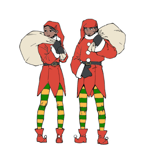
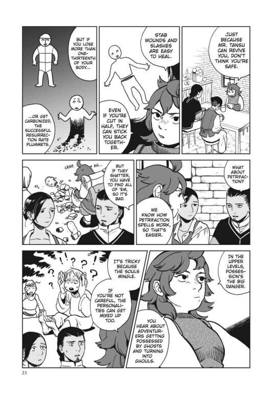
#Thanks for loving the story so much!
Note
Does MariPav Magolor still have horns? I'm wondering because of the Magolor Epilogue shows his ear.
(Tbh, I still think the little cones on his head are horns. XD I always imagined them looking the way they were revealed to look in game, and I never stopped thinking of them as horns even after they were shown to move. Heck, they move in the opening cutscene! But I'm not going to say anymore because I don't want to bring the debate back up. Regardless of what everyone else sees him as, I, personally, would like to be allowed to continue to see them as horns. With that out of the way...!)
Yes, Halcandrans in MariPav still have horns! Fun fact, I've changed exactly ONE line in the script since beating the remake, and it was a very small one.
I may work some additional things in, as I worked some FL lore in after that game came out, but the story will remain essentially unchanged. ...Even if it feels a little stuck in the Star Allies-era of Kirby speculation! ^^
(Some day, I'd like to make a list of what things from the remake I actually predicted in MariPav. Because for all that it jossed a good chunk of my story, it made me feel pretty good about a lot of my theories/choices too!)
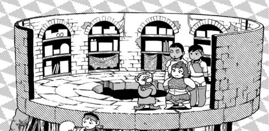
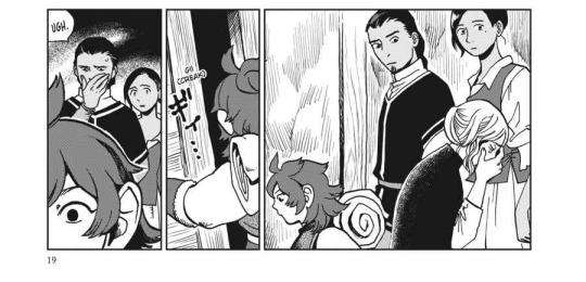
But while we're talking about Magolor's horns... I might as well turn this into the "Extras" post for Chapter 4, which is long overdue! Enjoy!
(MariPav Lore + Sketch Below)
[Magolor - Unhooded]
The "horns" of the Halcandran species are actually a type of growth combining horn and ossicone (furry "horns") that emerge from the scalp but never fully fuse with the skull underneath; this allows a range of movement, giving them an additional biological function in displaying mood, ala animal ears; Magolor's "irises" are a liquid gold, the brightness/darkness of the color acting similar to how the pupil of our own eyes works; they are bright in response to heightened emotions, such as anger, excitement, or pain. They darken in response to lowered emotions such as confusion, sadness, and fear, and will even begin to break apart and (supposedly) warp into unusual shapes...in cases of strongly conflicting emotions...

Magolor's "eyeliner" is also 100% biological.
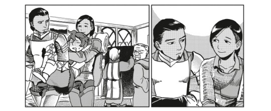
One of the truly -evil- things in MariPav is that Magolor is meant to be unfairly gorgeous when his hood and mask are down. Aka, you almost never get to see him that way!!
...Almost never. ^_-
This is in amusing contrast to Marx, who... well, you'll see. (Though the side story already gives you a good hint that Marx's "perfectly" adorable looks aren't skin deep.)
#MariPav#Magolor#Dess Sketch Post#I can be awoken from hiatus for two things it seems#Marxolor and MariPav (...same thing???)#Thanks for loving the story so much!#Same for everyone else who's enjoying it!#I promise (?!) to make it a good ride!
15 notes
·
View notes
Text
PART 1 of @pokefan-fa 's huuge feederism commission!


#thank you so much for commissioning meeeee!#this was so much fun to do#i love a male weight gain story ^/////^#also thanks for being the coolest commissioner#i tried to plan it as a little book#i hope yall still like the format even though it's not webtoon like#also IT'S NOT FINISHED!#i dunno when part 2 will be finished but it's coming#bigger and better!#heavyheavycream#comic#commission#male gaining#male wg#male feedism
2K notes
·
View notes
Text

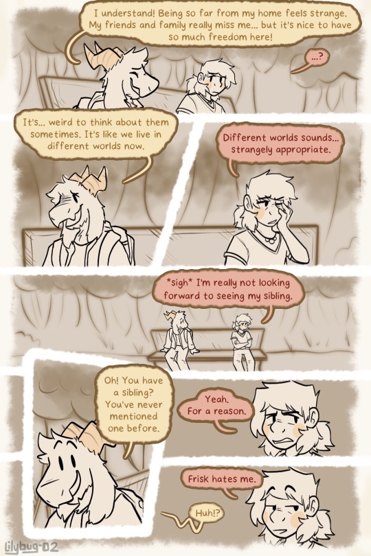
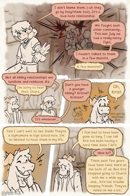

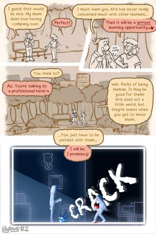
You’re making a lot of promises there Chara…
Part 24 || First || Previous || Next
—Full Series—
I enjoyed doing this little Flashback scene. We’ll be back to our regularly scheduled freakout session soon. Having monochrome color is very nice.
Here is a gif of Chara spilling their water because YES. And I spent way too long on it :)
Wow technology is so cool.
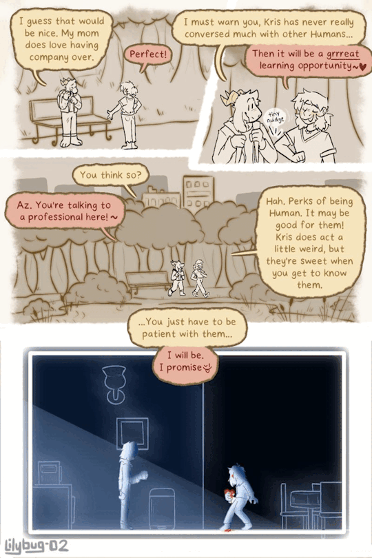
#Frisk is finally name dropped!! WOOHOOO#Az and Chara are my Little Lily bugs and I love writing their interactions#they still have a lot to learn about each other though. it’s only been a few months!#the tiny nudge made me happy#untitled goose game is just chillin in the corner#if you want lol. I ain’t cannonizing anything there#gif#I’m really happy with all this. I was planning on making almost 7 pages but with some help from friends I decided to cut it down a lot#i’ve also really been wanting to solidify all of their pronouns for a while now but couldn’t find a suitable time#anyways…I still have some vacation time planned so the next update will also be somewhat delayed#thanks to all those who are still loving the story#much love#bread#art#deltarune#deltarune chara timeline#chara#Asriel#Kris#my art
2K notes
·
View notes
Text
A lil tribute...

Sappy times today waaah :')
I still remember the first time I watched the movie...I can't believe that was 2 years ago. I had to make a lil something to commemorate 💙✨
Here's a lil something from the past just cuz hehe~
Not quite from a year ago but it's fiiine...
If my memory serves me correctly, the first Rise stuffs I ever did was redrawing screenshots of Leo from the movie. How fitting~
(:
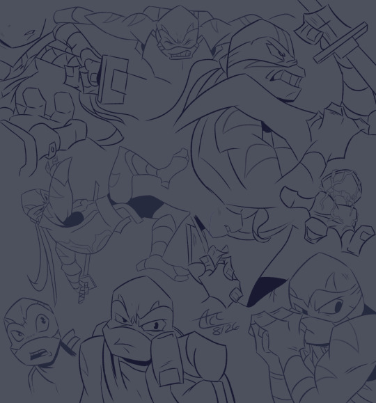
#rottmnt#rise of the tmnt#f!leo#bad future rottmnt#casey jr#fun fact i cried my eyes out watching the rise movie for the first time#true story hehe#it's almost been 2 years of me being in this fandom and i've loved the journey so far#i feel like such a lil fan saying that even tho it also feels like forever gah#anywhizzle#thank you rise for so much#💚❤️💙💜🧡#!!!#:)
947 notes
·
View notes
Note
What are the Lamb's thoughts as they went through their cult life? How does a day in their cult go? (Love the art so much! Hope you have a lovely day!)


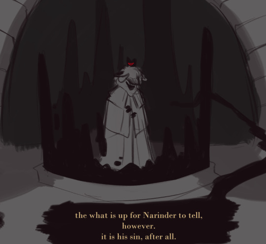
#cult of the lamb narinder#cotl narilamb#cotl narinder#cotl lamb#thank u guys so much for all the love and support!!#to the person who said they wanted to know more of the story too here you go ;;]#there's lots of story and lore to uncover#it's just about asking the right questions#also woah my wrist hurt after that one something nasty
1K notes
·
View notes
Text
he's just admiring the view


(ghost's horse's name is Gob. it's short for Gobshite)

#thank you so much for all the love i never expected people to like my silly little cowboy#you guys are all so cute#i got 4 stories written and i cant wait to share them#ghostsoap#soapghost#simon ghost riley#john soap mactavish#cod#call of duty#cod mw2#yeehaw
2K notes
·
View notes
Text
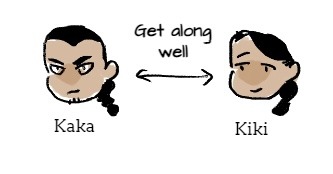
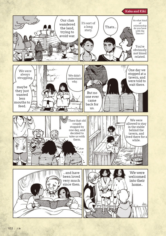
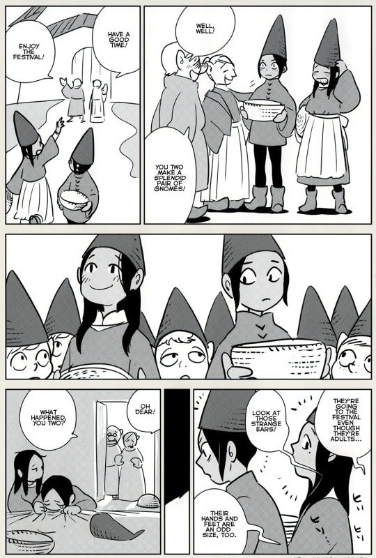
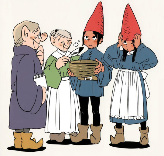
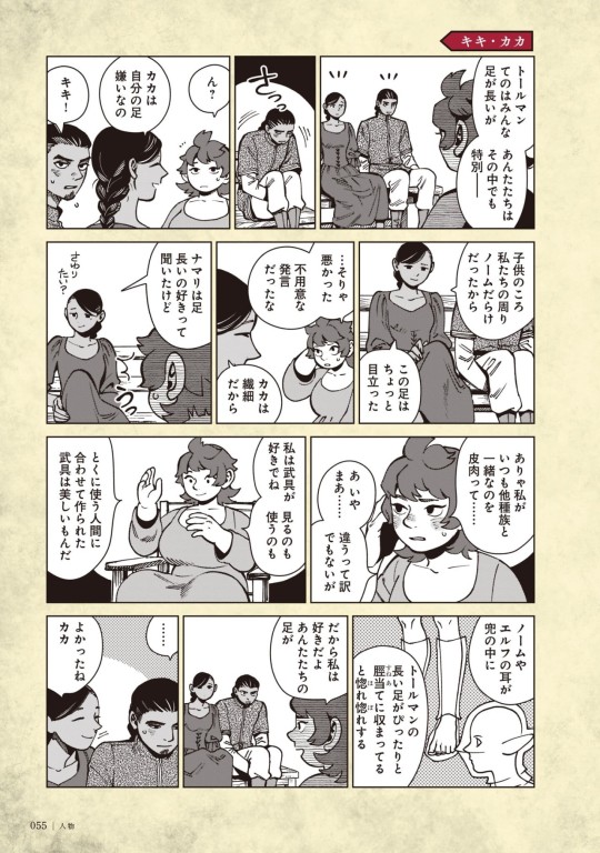


Kaka compilation
Because everyone is sleeping on him. Witness his greatness!!
First two Kaka colored icons were colored by me, lineart by Ryoko Kui though!
Kaka & Kiki are kinda like Laios & Falin… Kaka being stoic and giving repressed energy like early Laios, Kiki being cryptic and always smiling and kinda soft-looking. Autism siblings 2, ostracized and othered as kids and have a deep bond due to sticking together through it all, though unlike with Laios their parents are very loving so Kaka developed family as a big value more than Laios (bc asides for Falin Laios doesn’t care much about it).
In the gnome festival comic you can see Kaka is more emotive than he seems! Full with a :3 face, and he’s the one crying at the end. He’s insecure about his legs and being tall… It really got to him. Conceal don’t feel. In the gnome festival comic you also see him sensing others’ gaze on him and that something is off unlike Kiki, again Laios-like in the way that judgement from others gets to him more than her.
#The twins are so autistic swag#A falin just as chilled out and smiling and a laios who never stopped repressing#They’re so neurodivergent and they’re allowed to just exist I love you Kui. Kaka is just literally me#I looove characters that are hard to know and hard to read/easily misunderstood. They’re my favorite thing#LOOK AT THE WAY HE SMILES THE WAY HE BLUSHESSS HE’S PERFECT and I would take a harpoon to the chest for him thank u#I do love Kiki too btw but I’ve been seeing her in fancontent and posts way more than Kaka so I had to give him some spotlight#But also Laios is my fave of the Toudens so this very much checks out#Their pre-Flokes story would be interesting to analyze too#Dungeon meshi#delicious in dungeon#kaka floke#Kaka#Kiki and kaka#floke twins#As you may guess from my new-ish icon I am in my kaka era#ALSO I SWEAR TO GOD STOP BEING MEAN ABOUT HIS NAME#KA IS A SYLLABLE IN MY IRL NAME. YES I WAS BULLIED AND CALLED KAKA AS A KID. MY NAME ALSO MEANS UGLY STUFF IN A DIFFERENT LANGUAGE#KAKA’S A PRETTY NAME I’LL DIE ON THIS HILL. IT’S NOT WEIRD IF YOU DON’T MAKE IT WEIRD#Oh also another laios falin parallel: they both sort-of-date the same woman
861 notes
·
View notes
Text
why Aurora's art is genius
It's break for me, and I've been meaning to sit down and read the Aurora webcomic (https://comicaurora.com/, @comicaurora on Tumblr) for quite a bit. So I did that over the last few days.
And… y'know. I can't actually say "I should've read this earlier," because otherwise I would've been up at 2:30-3am when I had responsibilities in the morning and I couldn't have properly enjoyed it, but. Holy shit guys THIS COMIC.
I intended to just do a generalized "hello this is all the things I love about this story," and I wrote a paragraph or two about art style. …and then another. And another. And I realized I needed to actually reference things so I would stop being too vague. I was reading the comic on my tablet or phone, because I wanted to stay curled up in my chair, but I type at a big monitor and so I saw more details… aaaaaand it turned into its own giant-ass post.
SO. Enjoy a few thousand words of me nerding out about this insanely cool art style and how fucking gorgeous this comic is? (There are screenshots, I promise it isn't just a wall of text.) In my defense, I just spent two semesters in graphic design classes focusing on the Adobe Suite, so… I get to be a nerd about pretty things…???
All positive feedback btw! No downers here. <3
---
I cannot emphasize enough how much I love the beautiful, simple stylistic method of drawing characters and figures. It is absolutely stunning and effortless and utterly graceful—it is so hard to capture the sheer beauty and fluidity of the human form in such a fashion. Even a simple outline of a character feels dynamic! It's gorgeous!
Though I do have a love-hate relationship with this, because my artistic side looks at that lovely simplicity, goes "I CAN DO THAT!" and then I sit down and go to the paper and realize that no, in fact, I cannot do that yet, because that simplicity is born of a hell of a lot of practice and understanding of bodies and actually is really hard to do. It's a very developed style that only looks simple because the artist knows what they're doing. The human body is hard to pull off, and this comic does so beautifully and makes it look effortless.
Also: line weight line weight line weight. It's especially important in simplified shapes and figures like this, and hoo boy is it used excellently. It's especially apparent the newer the pages get—I love watching that improvement over time—but with simpler figures and lines, you get nice light lines to emphasize both smaller details, like in the draping of clothing and the curls of hair—which, hello, yes—and thicker lines to emphasize bigger and more important details and silhouettes. It's the sort of thing that's essential to most illustrations, but I wanted to make a note of it because it's so vital to this art style.
THE USE OF LAYER BLENDING MODES OH MY GODS. (...uhhh, apologies to the people who don't know what that means, it's a digital art program thing? This article explains it for beginners.)
Bear with me, I just finished my second Photoshop course, I spent months and months working on projects with this shit so I see the genius use of Screen and/or its siblings (of which there are many—if I say "Screen" here, assume I mean the entire umbrella of Screen blending modes and possibly Overlay) and go nuts, but seriously it's so clever and also fucking gorgeous:
Firstly: the use of screened-on sound effect words over an action? A "CRACK" written over a branch and then put on Screen in glowy green so that it's subtle enough that it doesn't disrupt the visual flow, but still sticks out enough to make itself heard? Little "scritches" that are transparent where they're laid on without outlines to emphasize the sound without disrupting the underlying image? FUCK YES. I haven't seen this done literally anywhere else—granted, I haven't read a massive amount of comics, but I've read enough—and it is so clever and I adore it. Examples:


Secondly: The beautiful lighting effects. The curling leaves, all the magic, the various glowing eyes, the fog, the way it's all so vividly colored but doesn't burn your eyeballs out—a balance that's way harder to achieve than you'd think—and the soft glows around them, eeeee it's so pretty so pretty SO PRETTY. Not sure if some of these are Outer/Inner Glow/Shadow layer effects or if it's entirely hand-drawn, but major kudos either way; I can see the beautiful use of blending modes and I SALUTE YOUR GENIUS.
I keep looking at some of this stuff and go "is that a layer effect or is it done by hand?" Because you can make some similar things with the Satin layer effect in Photoshop (I don't know if other programs have this? I'm gonna have to find out since I won't have access to PS for much longer ;-;) that resembles some of the swirly inner bits on some of the lit effects, but I'm not sure if it is that or not. Or you could mask over textures? There's... many ways to do it.
If done by hand: oh my gods the patience, how. If done with layer effects: really clever work that knows how to stop said effects from looking wonky, because ugh those things get temperamental. If done with a layer of texture that's been masked over: very, very good masking work. No matter the method, pretty shimmers and swirly bits inside the bigger pretty swirls!
Next: The way color contrast is used! I will never be over the glowy green-on-black Primordial Life vibes when Alinua gets dropped into that… unconscious space?? with Life, for example, and the sharp contrast of vines and crack and branches and leaves against pitch black is just visually stunning. The way the roots sink into the ground and the three-dimensional sensation of it is particularly badass here:

Friggin. How does this imply depth like that. HOW. IT'S SO FREAKING COOL.
A huge point here is also color language and use! Everybody has their own particular shade, generally matching their eyes, magic, and personality, and I adore how this is used to make it clear who's talking or who's doing an action. That was especially apparent to me with Dainix and Falst in the caves—their colors are both fairly warm, but quite distinct, and I love how this clarifies who's doing what in panels with a lot of action from both of them. There is a particular bit that stuck out to me, so I dug up the panels (see this page and the following one https://comicaurora.com/aurora/1-20-30/):

(Gods it looks even prettier now that I put it against a plain background. Also, appreciation to Falst for managing a bridal-carry midair, damn.)
The way that their colors MERGE here! And the immense attention to detail in doing so—Dainix is higher up than Falst is in the first panel, so Dainix's orange fades into Falst's orange at the base. The next panel has gold up top and orange on bottom; we can't really tell in that panel where each of them are, but that's carried over to the next panel—

—where we now see that Falst's position is raised above Dainix's due to the way he's carrying him. (Points for continuity!) And, of course, we see the little "huffs" flowing from orange to yellow over their heads (where Dainix's head is higher than Falst's) to merge the sound of their breathing, which is absurdly clever because it emphasizes to the viewer how we hear two sets of huffing overlaying each other, not one. Absolutely brilliant.
(A few other notes of appreciation to that panel: beautiful glows around them, the sparks, the jagged silhouette of the spider legs, the lovely colors that have no right to make the area around a spider corpse that pretty, the excellent texturing on the cave walls plus perspective, the way Falst's movements imply Dainix's hefty weight, the natural posing of the characters, their on-point expressions that convey exactly how fuckin terrifying everything is right now, the slight glows to their eyes, and also they're just handsome boys <3)
Next up: Rain!!!! So well done! It's subtle enough that it never ever disrupts the impact of the focal point, but evident enough you can tell! And more importantly: THE MIST OFF THE CHARACTERS. Rain does this irl, it has that little vapor that comes off you and makes that little misty effect that plays with lighting, it's so cool-looking and here it's used to such pretty effect!
One of the panel captions says something about it blurring out all the injuries on the characters but like THAT AIN'T TOO BIG OF A PROBLEM when it gets across the environmental vibes, and also that'd be how it would look in real life too so like… outside viewer's angle is the same as the characters', mostly? my point is: that's the environment!!! that's the vibes, that's the feel! It gets it across and it does so in the most pretty way possible!
And another thing re: rain, the use of it to establish perspective, particularly in panels like this—

—where we can tell we're looking down at Tynan due to the perspective on the rain and where it's pointing. Excellent. (Also, kudos for looking down and emphasizing how Tynan's losing his advantage—lovely use of visual storytelling.)
Additionally, the misting here:

We see it most heavily in the leftmost panel, where it's quite foggy as you would expect in a rainstorm, especially in an environment with a lot of heat, but it's also lightly powdered on in the following two panels and tends to follow light sources, which makes complete sense given how light bounces off particles in the air.
A major point of strength in these too is a thorough understanding of lighting, like rim lighting, the various hues and shades, and an intricate understanding of how light bounces off surfaces even when they're in shadow (we'll see a faint glow in spots where characters are half in shadow, but that's how it would work in real life, because of how light bounces around).
Bringing some of these points together: the fluidity of the lines in magic, and the way simple glowing lines are used to emphasize motion and the magic itself, is deeply clever. I'm basically pulling at random from panels and there's definitely even better examples, but here's one (see this page https://comicaurora.com/aurora/1-16-33/):

First panel, listed in numbers because these build on each other:
The tension of the lines in Tess's magic here. This works on a couple levels: first, the way she's holding her fists, as if she's pulling a rope taut.
The way there's one primary line, emphasizing the rope feeling, accompanied by smaller ones.
The additional lines starbursting around her hands, to indicate the energy crackling in her hands and how she's doing a good bit more than just holding it. (That combined with the fists suggests some tension to the magic, too.) Also the variations in brightness, a feature you'll find in actual lightning. :D Additional kudos for how the lightning sparks and breaks off the metal of the sword.
A handful of miscellaneous notes on the second panel:
The reflection of the flames in Erin's typically dark blue eyes (which bears a remarkable resemblance to Dainix, incidentally—almost a thematic sort of parallel given Erin's using the same magic Dainix specializes in?)
The flowing of fabric in the wind and associated variation in the lineart
The way Erin's tattoos interact with the fire he's pulling to his hand
The way the rain overlays some of the fainter areas of fire (attention! to! detail! hell yeah!)
I could go on. I won't because this is a lot of writing already.
Third panel gets paragraphs, not bullets:
Erin's giant-ass "FWOOM" of fire there, and the way the outline of the word is puffy-edged and gradated to feel almost three-dimensional, plus once again using Screen or a variation on it so that the stars show up in the background. All this against that stunning plume of fire, which ripples and sparks so gorgeously, and the ending "om" of the onomatopoeia is emphasized incredibly brightly against that, adding to the punch of it and making the plume feel even brighter.
Also, once again, rain helping establish perspective, especially in how it's very angular in the left side of the panel and then slowly becomes more like a point to the right to indicate it's falling directly down on the viewer. Add in the bright, beautiful glow effects, fainter but no less important black lines beneath them to emphasize the sky and smoke and the like, and the stunningly beautiful lighting and gradated glows surrounding Erin plus the lightning jagging up at him from below, and you get one hell of an impactful panel right there. (And there is definitely more in there I could break down, this is just a lot already.)
And in general: The colors in this? Incredible. The blues and purples and oranges and golds compliment so well, and it's all so rich.
Like, seriously, just throughout the whole comic, the use of gradients, blending modes, color balance and hues, all the things, all the things, it makes for the most beautiful effects and glows and such a rich environment. There's a very distinct style to this comic in its simplified backgrounds (which I recognize are done partly because it's way easier and also backgrounds are so time-consuming dear gods but lemme say this) and vivid, smoothly drawn characters; the simplicity lets them come to the front and gives room for those beautiful, richly saturated focal points, letting the stylized designs of the magic and characters shine. The use of distinct silhouettes is insanely good. Honestly, complex backgrounds might run the risk of making everything too visually busy in this case. It's just, augh, so GORGEOUS.
Another bit, take a look at this page (https://comicaurora.com/aurora/1-15-28/):

It's not quite as evident here as it is in the next page, but this one does some other fun things so I'm grabbing it. Points:
Once again, using different colors to represent different character actions. The "WHAM" of Kendal hitting the ground is caused by Dainix's force, so it's orange (and kudos for doubling the word over to add a shake effect). But we see blue layered underneath, which could be an environmental choice, but might also be because it's Kendal, whose color is blue.
And speaking off, take a look at the right-most panel on top, where Kendal grabs the spear: his motion is, again, illustrated in bright blue, versus the atmospheric screened-on orange lines that point toward him around the whole panel (I'm sure these have a name, I think they might be more of a manga thing though and the only experience I have in manga is reading a bit of Fullmetal Alchemist). Those lines emphasize the weight of the spear being shoved at him, and their color tells us Dainix is responsible for it.
One of my all-time favorite effects in this comic is the way cracks manifest across Dainix's body to represent when he starts to lose control; it is utterly gorgeous and wonderfully thematic. These are more evident in the page before and after this one, but you get a decent idea here. I love the way they glow softly, the way the fire juuuust flickers through at the start and then becomes more evident over time, and the cracks feel so realistic, like his skin is made of pottery. Additional points for how fire begins to creep into his hair.
A small detail that's generally consistent across the comic, but which I want to make note of here because you can see it pretty well: Kendal's eyes glow about the same as the jewel in his sword, mirroring his connection to said sword and calling back to how the jewel became Vash's eye temporarily and thus was once Kendal's eye. You can always see this connection (though there might be some spots where this also changes in a symbolic manner; I went through it quickly on the first time around, so I'll pay more attention when I inevitably reread this), where Kendal's always got that little shine of blue in his eyes the same as the jewel. It's a beautiful visual parallel that encourages the reader to subconsciously link them together, especially since the lines used to illustrate character movements typically mirror their eye color. It's an extension of Kendal.
Did I mention how ABSOLUTELY BEAUTIFUL the colors in this are?
Also, the mythological/legend-type scenes are illustrated in familiar style often used for that type of story, a simple and heavily symbolic two-dimensional cave-painting-like look. They are absolutely beautiful on many levels, employing simple, lovely gradients, slightly rougher and thicker lineart that is nonetheless smoothly beautiful, and working with clear silhouettes (a major strength of this art style, but also a strength in the comic overall). But in particular, I wanted to call attention to a particular thing (see this page https://comicaurora.com/aurora/1-12-4/):

The flowing symbolic lineart surrounding each character. This is actually quite consistent across characters—see also Life's typical lines and how they curl:

What's particularly interesting here is how these symbols are often similar, but not the same. Vash's lines are always smooth, clean curls, often playing off each other and echoing one another like ripples in a pond. You'd think they'd look too similar to Life's—but they don't. Life's curl like vines, and they remain connected; where one curve might echo another but exist entirely detached from each other in Vash's, Life's lines still remain wound together, because vines are continuous and don't float around. :P
Tahraim's are less continuous, often breaking up with significantly smaller bits and pieces floating around like—of course—sparks, and come to sharper points. These are also constants: we see the vines repeated over and over in Alinua's dreams of Life, and the echoing ripples of Vash are consistent wherever we encounter him. Kendal's dream of the ghost citizens of the city of Vash in the last few chapters is filled with these rippling, echoing patterns, to beautiful effect (https://comicaurora.com/aurora/1-20-14/):

They ripple and spiral, often in long, sinuous curves, with smooth elegance. It reminds me a great deal of images of space and sine waves and the like. This establishes a definite feel to these different characters and their magic. And the thing is, that's not something that had to be done—the colors are good at emphasizing who's who. But it was done, and it adds a whole other dimension to the story. Whenever you're in a deity's domain, you know whose it is no matter the color.
Regarding that shape language, I wanted to make another note, too—Vash is sometimes described as chaotic and doing what he likes, which is interesting to me, because smooth, elegant curves and the color blue aren't generally associated with chaos. So while Vash might behave like that on the surface, I'm guessing he's got a lot more going on underneath; he's probably much more intentional in his actions than you'd think at a glance, and he is certainly quite caring with his city. The other thing is that this suits Kendal perfectly. He's a paragon character; he is kind, virtuous, and self-sacrificing, and often we see him aiming to calm others and keep them safe. Blue is such a good color for him. There is… probably more to this, but I'm not deep enough in yet to say.
And here's the thing: I'm only scratching the surface. There is so much more here I'm not covering (color palettes! outfits! character design! environment! the deities! so much more!) and a lot more I can't cover, because I don't have the experience; this is me as a hobbyist artist who happened to take a couple design classes because I wanted to. The art style to this comic is so clever and creative and beautiful, though, I just had to go off about it. <3
...brownie points for getting all the way down here? Have a cookie.
#aurora comic#aurora webcomic#comicaurora#art analysis#...I hope those are the right tags???#new fandom new tagging practices to learn ig#much thanks for something to read while I try to rest my wrists. carpal tunnel BAD. (ignore that I wrote this I've got braces ok it's fine)#anyway! I HAVE. MANY MORE THOUGHTS. ON THE STORY ITSELF. THIS LOVELY STORY#also a collection of reactions to a chunk of the comic before I hit the point where I was too busy reading to write anything down#idk how to format those tho#...yeet them into one post...???#eh I usually don't go off this much these days but this seems like a smaller tight-knit fandom so... might as well help build it?#and I have a little more time thanks to break so#oh yes also shoutout to my insanely awesome professor for teaching me all the technical stuff from this he is LOVELY#made an incredibly complex program into something comprehensible <3#synapse talks
761 notes
·
View notes
Text
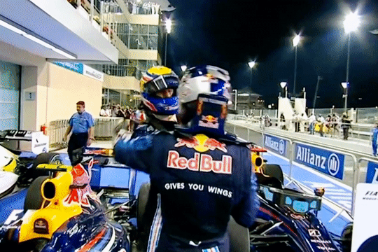
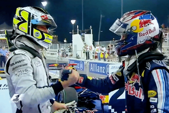
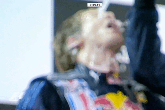
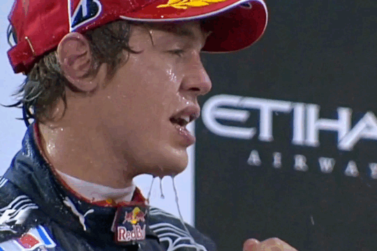
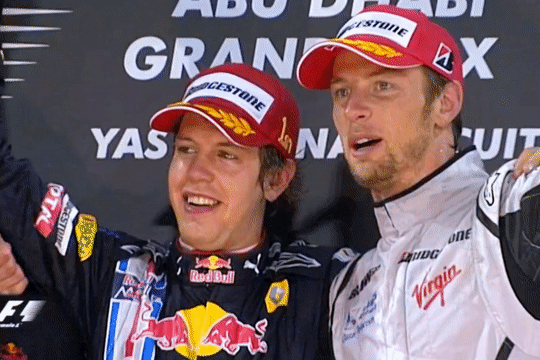
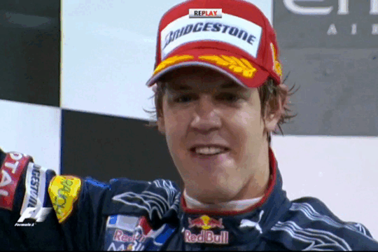
2009 Abu Dhabi Grand Prix - Sebastian Vettel(ft. Mark Webber & Jenson Button)
#fantastic podium!! maybe my favorite of this season?????#sebmarkson podiums are my fav ever nothing can top them#and both mark and jense were being so cute with seb this race aaaahhhhhhh <333333#theres something about seb that makes older men want to cuddle him and pick him up and pour champagne on him#haha thank you to dru for showing me seb getting drenched on this podium a few weeks and making me hype for this race!!#this race was very very good as well. like the last laps battle btwn mark and jense was insane#its very good when i already know the results of a race but the racing still makes me sit on the edge of my seat and scream a bit#i mentioned this before but i love how this race felt like an epilogue and it was nice to see everyone having fun and enjoying themseles#thank you everybody for joining me on another season journey!!! it been so much fun. ive really really enjoyed 2009#brawn is just soooooo cool to me. their story is insane!! im glad ive gotten to watch thru this season before the docu abt them comes out#but also very fun to see the beginning of rbr getting to the top of the field. every good result just felt so rewarding and worth it#anyways dont wanna do too much commentary abt it since ive discussed it a lot. onto 2010 next!!!! i shall miss you 2009#though i will say. it was rly interesting in this race to hear their team predictions for next season bcs a lot of it doesnt pan out#mark webber#jenson button#sebastian vettel#sebson#martian#sebmark#f1#formula 1#formula one#we do a little bit of f1#2009 abu dhabi gp#season: 2009
839 notes
·
View notes
Text
the biggest thing i like about love & deepspace is that it damn sure feeds into the yearning man trope like all of those men are in deep, AGONIZING yearning
#and it doesnt feel rushed either#like i love the slowburn so bad and worldbuilding#thank you for allowing me breathing room to immerse in the story#also pretty much exploring the varying dynamics to find the one (TM)#love and deepspace#love & deepspace#lads#lnds#l&ds#sylus#zayne#rafayel#xavier
335 notes
·
View notes
Text
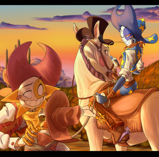
cowboys are ok I guess
@castercassette
#Sun#Moon#Sheriff#Cowboy AU#SB Cowboy AU#Feral Scribbles#THIS BITCH CLOCKS 13 Hours I am die#granted 4 hours were lost#but holy shit#this is the most rendered thing I've drawn in probably 3 years holy shit#pretending i still remember how to do backgrounds#THANK YOU EVERYONE THAT JOINED STREAM AND HUNG OUT it was an absolute blast!#God I love the cowboy au so much. the art. the story. the l o r e.#story for this one is mostly just the boys hassling sheriff YN a little#getting out of jail required a 'casual hostage' for a safe getaway but ya know#it doesn't mean they're gonna cooperate about it#though since they're all together#nothing quite like a sunset joyride while you take your hostage to the dropoff spot#something fun and casual to get them chattin for ol time sake#or something#hard to spend time together when you're on opposite sides of the law after all
4K notes
·
View notes
Text
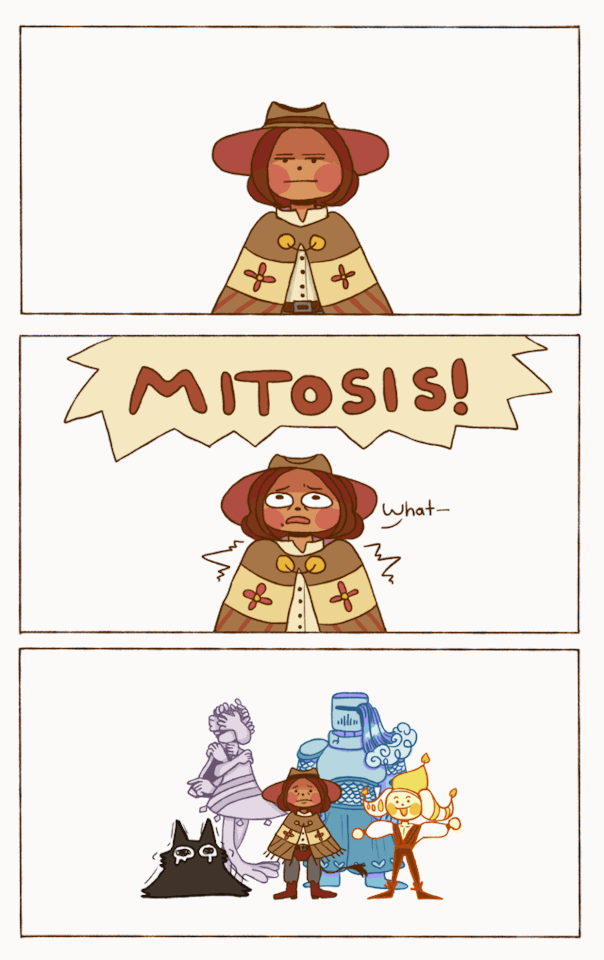
Party of one (divided into four)
#Fourfold Soul#Thing#QUIT#Ruth#Jolis#Finally I can offer some character names!#digital art#I have been hard at work in the character design mines for nearly two months.#I feel like a parent watching my child waddle off to kindergarten....ah...only yesterday you were a wee little mspaint sketch.#The title of 'Fourfold Soul' comes from the 'party' for this RPG being comprised of parts of yourself!#They all have a delightful array of personalities; and by delightful I do mean 'They are personal demons for a reason'.#It's a story about fighting alongside (and against) 'difficult' aspects of yourself.#This is also a story about redemption and reflection. Many other things too - but that is for another time.#(The clown pictured here is indeed the ignored clown from the last comic. Say hello to Jolis!)#If I had more time I would have added more animation and frames...next time...#I'm slowly getting back into my animation practice and experimentation. I will get more powerful! I promise!#Thank you all so much for all the love and support you have shown this project so far!#I was terribly nervous about posting the previous comic...the kindness it was met with meant a lot B'*)
217 notes
·
View notes
Text
20 years of prayer and more...
Happy 20th Anniversary to D. Gray Man!! ✨🎉
To my favorite manga who literally changed the trajectory of my life 🫶
#i cant believe its been 20 years holy moly#i've been into this manga since... first year of middleschool this is actually insane#most insane part is that the real story arc is just about to begin in the manga this year hahahaha i love this series so much#thank you hoshino sensei for this amazing series#literally the backbone of my art journey literally why i began posting art online all those years ago#d. gray man#d gray man#dgm#allen walker#kanda yuu#lenalee lee#lavi#dgm lavi#howard link#nea d campbell#the musician#yes its the lyrics from the 14th's melody#best songs out there fr#d gray man anniversary#my art
277 notes
·
View notes
Text

I dreamed of your voice last night, and it sounded as lonely as I am. Are you trapped in there? Are you... are you real?
Thank you for trusting the process again <3
#stranger things#steddie#steddie art#fanart#art#digital art#steve harrington#eddie munson#no this is not part of any fic#this is me being a hopeless romantic again#and full in love with tragic stories#unless#you consider this a prompt#and write something absolutely cool about it#and if you do please tag me#thank you so much#i really hope you like it
1K notes
·
View notes
Text
the rage I feel when reading Blood of Olympus chapters 45-56 is almost equivalent in magnitude to the absolute joy I experience when reading The Last Olympian chapters 1-23.
remember when percabeth was good? when they meant the world to each other but had other people they cared about (nico, for one. both of them. so much), other worries and other storylines aside from their romantic plot? and when nico's completed arc wasn't repeated for no reason other than to dump more trauma on the youngest character in the series? when background characters were included in the story not for all the unnecessary last minute romantic subplots but because they were fun and fascinating to learn more about? and were actually friends with main characters? remember when grover was percy and annabeth's best friend forever? and antagonists were actually interesting and intimidating and had compelling goals? and the story revolved around friendship and family and loyalty? and death was definite and loss was palpable and battles were thrilling?
yeah. good times.
#rr crit#pjo#hoo#hoo crit#percy jackson#annabeth chase#percabeth#oh how i love them in pjo. how they loved.#grover underwood#<- remember him?#nico di angelo#will solace#dumpster fire of a canon relationship ->#solangelo#anyway!#last olympian will forever be the best book this man wrote#how can you finish one of your series so perfectly then fuck up so bad while ending the next story#cuz goddamn does blood of olympus boil MY blood#ESPECIALLY those last fucking chapters omg#why would you massacre my boys rick#putting nico and will in a room together for the first time just to turn will into a total asshole. great move thanks a lot!#will had so much potential from his previous appearances#you could've left it at that dream message nico had#that was nice!!! actually!!#instead you ruined all of it with a few chapters#justice for tlo-tlh will solace cuz that was one nice background character with potential to become a great main one day#nico deserves THAT will. not this piece of shit he meets#also nico and percy friendship in hoo is... nonexistent???#what is that about#fucking hell richard
180 notes
·
View notes
Text
Kiryu-chan is so dreamy… ❤❤❤
New page of 80s Goromi doujinshi is up on my Patreon now!
#one of the gayest things I've ever drawn DFGFHKSDJKF#I was planning to make this page a while ago but then that flooding happened and I was too stressed out to work with a peaceful mind ;3;#but fuck it we're doing it now! 💪#Also a fun fact for you guys: The flowers around Kiryu are “Morning Glories” 👀#Beside being a nod to the orphanage and Kiryu's kids in Yakuza 3#Morning Glories also "symbolize affection; love; and the beauty of the dawn.#“Sometimes they represent an unyielding love that can overcome all challenges [...]” (thanks Google)#so they're also a symbolism to Kiryu and Majima's relationship in this story and how Majima perceives Kiryu in his heart ❤#and now I'm crying because I LOVE THEM SO MUCH#gaz talks#80s goromi#goromi#majima goro#kazumaji#kiryu kazuma#yakuza#comic
158 notes
·
View notes
Last Seen Blogs

orderisoutofstyle
Order Went Out of Style in the 20th Century

g-cloud10
『見上げる魚と目が合うか?』公式サイト

bubblesbeakboutique
BubblesBeakBoutique
bubblesbeakboutique
BubblesBeakBoutique
sexlustbeauty
Women Rule