#Text and formatting in Affinity Publisher
Explore tagged Tumblr posts
Visit Tumblr Blog
Explore Tumblr blogs with no restrictions, modern design and the best experience.
Last Seen Tumblr Blogs


Fun Fact
Tumblr has been banned in Indonesia for providing people with access to pornographic content.
Text

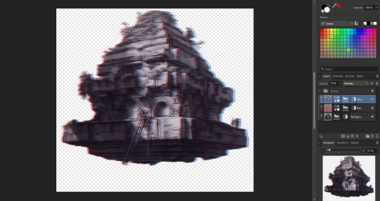
Page 45 of my upcoming fantasy journal book - Armor Revenant
Kickstarter link
#art#ink#drawing#fantasy#rpg#armor#enemy#ttrpg#dnd#book#adventure#story#traditional art#grayscale in clip studio#Text and formatting in Affinity Publisher#fantasy Journal
1K notes
·
View notes
Text
so, you wanted to start bookbinding?
so @princetofbone mentioned on my post for "factory settings" about wanting to know more about the binding style that i used for it. so i thought i might make a post about it.
i was as terrible as i always am for taking in progress shots, but i can link you to the resources i used in order to make my book. i would also like to point out that "factory settings" is my 120th bind, and i have been doing bookbinding as a hobby for just over 3 years now. unfortunately this means some of the methods that i used for that bind aren't particularly beginner friendly, just in terms of the tools and methods i have used, but i would love to point you in the right direction when it comes to resources. i dont say this to sound pretentious which i fear i might come across, just so that youre fully informed. getting into this hobby is fun and rewarding, but it can definitely be intimidating.
with that caveat, heres a list of links and resources that i have used for bookbinding in general, with additional links to methods i used specifically in regards to this bind.
ASH's how to make a book document. it gives you a great introduction into typesetting fics (where you format the text of fics to look like a traditionally published books) and then turning them into a case-bound book (the style i used for "factory settings"). it is comprehensive, and explains how to use microsoft word to do your bidding. it was invaluable to me when i was just starting out! currently i use affinity publisher to typeset/format my fics for printing, but i only bought and learned how to use that after i had been binding books for a year and a half. i made some beautiful typesets with word, and some of my close friends use it still and design stuff that i never would be able to in my wildest dreams (basically anything by @no-name-publishing)
DAS Bookbinding's Square Back Bradel Binding. a great style to do your first bind in! this method requires, when making the case, to attach the cover board and the spine board to a connecting piece of paper, which makes it so much easier to match the size of the case to the size of the text block (your printed out and sewn fic). using this method is what allowed me to get much more accurately fitting cases, and made me much more confident with the construction of the books i was making. a well-made book is something that is so wonderful to hold in your hands!
DAS Bookbinding's Rounded and Backed Cased Book. This is the specific method that i used to create my bind for "factory settings"! even before i could back my books, i found that watching DAS's videos in particular helped me see how books were traditionally made, and i was able to see different tips and tricks about how to make nicer books.
Book Edge Trimming Without... i trim the edges of my text block using my finishing press and a chisel i have sharpened using a whetstone and leather strop with buffing compound on it. i follow the method for trimming shown in this video!
Made Endpapers. i follow this method for my endpapers, as i used handmade lokta endpapers, and they can be quite thin, but they look beautiful! i used "tipped on" endpapers (where you have your endpaper and then put a thin strip of glue on the edge and attach it to your text block) i used for a very long time before this, but these feel like they are much more stable, as they are sewn with your text block.
Edge Sprinkling. this is the method that i used for decorating the edges of my text block. but the principle is basically clamping your text block tight and then sprinkling the edges. i do not believe you need to trim the edges in order to do sprinkles on the edges, and that's what makes it accessible! i personally just use really cheap acrylic paint that i water down and then flick it onto the edges with my thumb and a paint brush.
Double-Core Endbands. i sew my own endbands, which i followed this tutorial for. that being said, it's kind of confusing, and this video is a bit easier to follow, but it is a slightly different type of endband.
Case decoration. i used my silhouette cameo 4 to cut out my design for "factory settings" in htv (heat transfer vinyl). i also used my cameo 4 to cut out the oval of marbled paper on the front, as i honestly didn't want to try my hand at cutting an oval lol. i also glued some 300 gsm card with an oval cut out of the centre of it onto the cover before covering it with bookcloth, to get a kind of recess on the cover. i then glued the oval of marbled paper onto the top of the recessed area once it was covered with bookcloth, so that it was protected. the images i used were sourced from a mix of rawpixel, canva and pixabay. a more accessible way to get into cover decoration is by painting on a design for your cover as described in @a-gay-old-time's tutorial just here. or even doing paper labels, which look classy imo.
physical materials. sourcing these will depend on your country. i am located in australia, and have compiled a list with some other aussie bookbinders of places to buy from. here is a great post describing beginning materials for getting started binding.
@renegadepublishing. this tumblr is great! its what got me started bookbinding, and being in the discord has been inspiring, motivating, and honestly just one of the best online experiences i have ever had. it is full of resources, and most people in there are amateur bookbinders, with a couple of professionals thrown in. the discord is 18+, and anyone can join!
i'm sorry this post got so long, but i hope that this has a lot of information for you if you would like to get started bookbinding. its one of the best hobbies ive ever had, and i genuinely believe i will have it for the rest of my life.
4K notes
·
View notes
Text
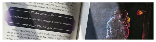
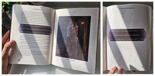
Dirges in The Dark by WixWrites
Before I start, let me just say: Ranchers! Scarian! Hermits and Life Series and Empires characters! Sheriff Jimmy! Sheriff Scar! Criminal Tango! the Wild West! Treebark and Ethubs!
RANCHERS. THE WILD WEST. CREEPING ELDRITCH HORROR.
Whoo, that was a rush.
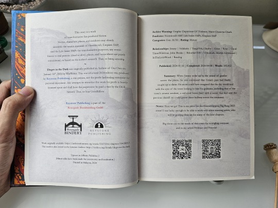
I'll be honest; I think this book would have come out much sooner if not for my decision to add-in a whole lot of stuff into the text and pages. It got to the point that the original cover would have been a wanted poster at the front and a sheriff's report at the back!
I had to restrain myself, lest this book would never get finished at all. It's already been 59 days since my last post, and doing the original cover would have stretched the days even further. So I had to follow the mantra: Finished, not perfect. Besides, nothing says I can't make another version in the future...
From the moment I finished this fic, I knew it would become a book. But at 143,412 words, Dirges in The Dark by @twodiamondhoes would stretch my ficbinding skills to the limit and would be the second-ever bind that would reach past 250 pages (the first was an MCYT Sleepy Bois fic that predates this blog that I want to redo).
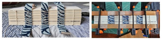
Eventually, the full typeset took up 520 pages! And as such, I finally decided to use extra support for the entire textblock. From an old pair of pajamas, I backed strips of fabric with glue and paper before cutting it into tapes, forming a crucial support for the various weaves along the spine. I then covered the entire spine in brown wrapping paper for even more strength.
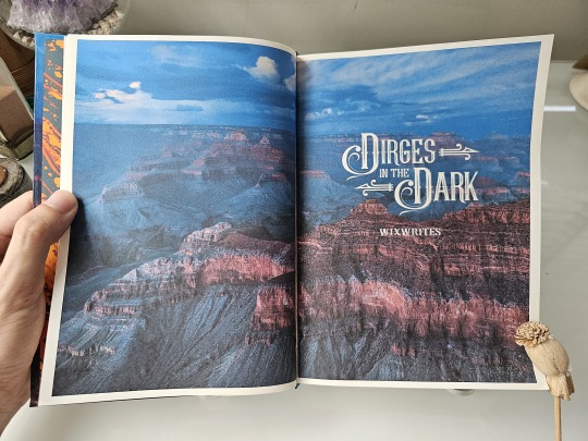
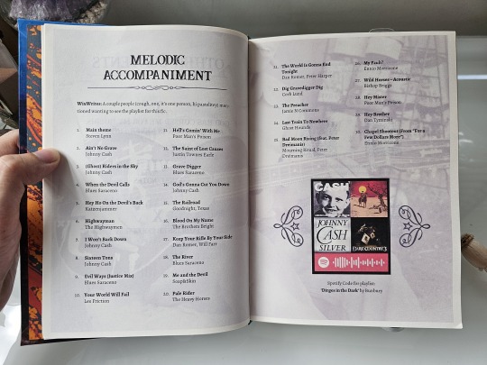
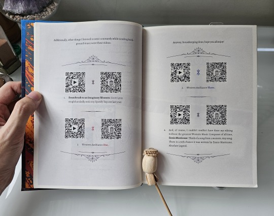
For the title and headings, I scoured for and found several typefaces, dingbats, and vector graphics which really evoked the fic's Western and Gothic vibes. I also took some inspiration from fellow ficbinders in the Renegade Publishing group for the style of layout and formatting throughout the book, such as using faded images in the background of these pre-story pages.
I wanted the reader to be immersed in the Wild West from the get-go, so having such images from the start — before the story even begins — felt very appropriate. I tried to make them thematic to the information presented, like a singing cowboy for the music playlist pages, but I think I made the image too faint to be seen!
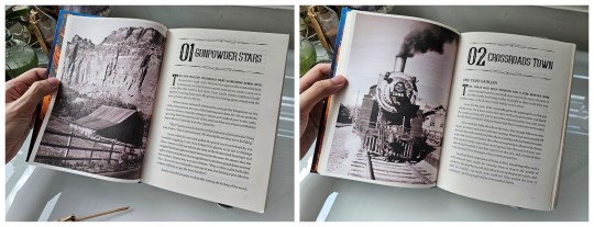
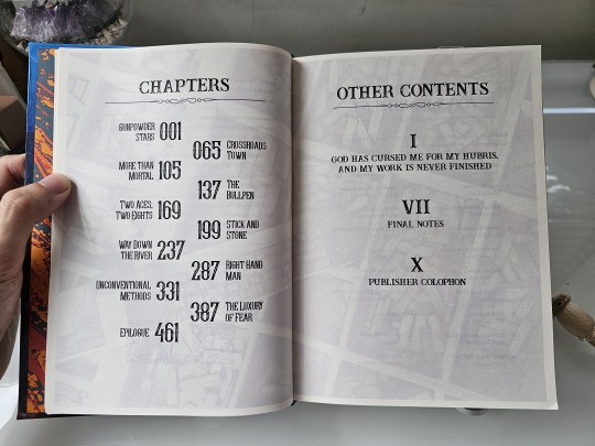
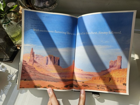
As for the chapter openers, I experimented with some layouts before finalizing on what you see: photos taking up one entire page on the left with the chapter titles and opening paragraphs on the right.
Just like my last bind, I want to make the reader feel immersed in the story and also bring out the mood of that particular chapter. This, however, led me to entire days of scouting and scouring stock photo sites just to find the right pictures for 11 different chapters. 4/10 would not recommend for sanity.
Given that the story uses a number of foreign words, old slang, and specific Wild West-era terms, I added a plethora of footnotes at the bottom of some pages for extra context and meaning.
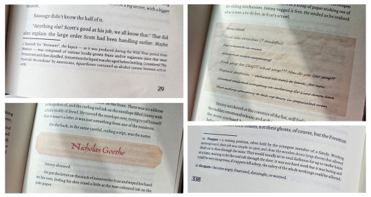
I also wanted to be playful and make certain story parts, such as characters receiving letters and notes, really look like they're a part of the story. So I cropped old paper textures and fished out old fonts from the past to make them look as if they're actually there, pasted against the paragraphs!
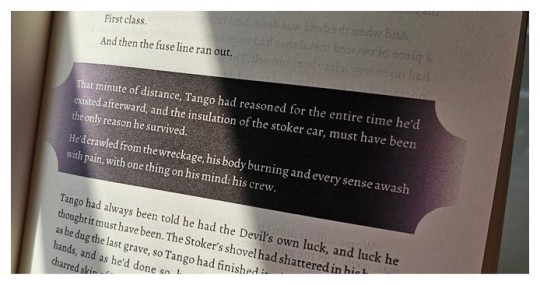
More importantly, there were some specific parts of the fic that felt super important and I wanted to highlight these passages, especially the Deals made by the characters throughout their arcs. Given DiTD has a certain affinity with eldritch darkness, I decided to highlight such paragraphs by backlighting them against a band of pure black. Besides being thematic as hell, I made the bands have curved edges and decorative lines to add a certain western-gothic touch!
It was from this that I begin to think "what if I can color entire pages to convey the mood and setting?"
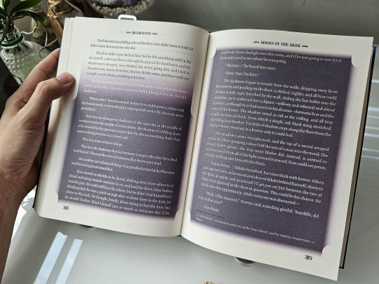
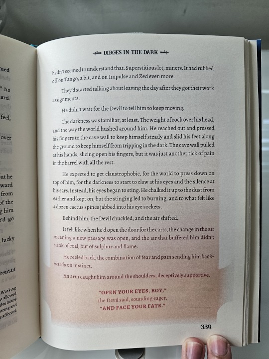
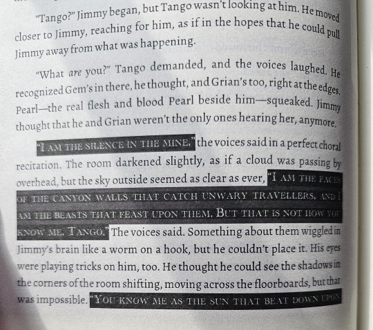
...Which led to the madness in these pages. I can't reveal too much because of spoilers, but there are certain times when the characters end up in situations where the very light turns to dark. Or they end up in hellish situations. Or the eldritch creatures began to speak.
It took some creative brainstorming to figure out how to show the mood of such scenes in printed pages, but I eventually figured out that I need find the right fonts, change their colors from black to white, and then change their backgrounds from white to dark to highlight them all! The power of formatting!
There's a lot more pages where I went wild with such shades and fonts, but I ain't revealing in public because spoilers!
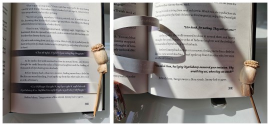
But undoubtedly, this is the biggest experiment I have made with this bind. There is a certain part where Grian and Pearl spoke in eldritch R'lyehian / Cthuvian, and I want to convey the sheer strangeness of the speech and it's meaning. Something outside the box.
Luckily, I have an inspiration in fellow fanbinder @mythrilthread, who made an amazing fanbind that used vellum overlays to showcase the speaking of alien languages and what they mean in English. AND IT LOOKS SICK AS FUCK. When I finished reading Dirges, I knew I had to emulate this form of language translation, so I printed the eldritch speech, cut it, and pasted it onto the spine to give a similar effect of strangeness, and IT LOOKS SO COOL!!!
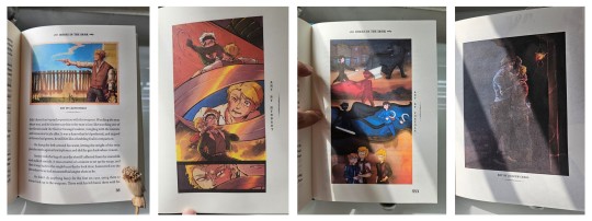
And lastly, I just had to include some of the amazing fanart made by readers into the book! All of these are placed by their corresponding text and chapters, and they all look so cool!
So I want to give a special thanks to @azzayofchaos, @leafdoodles, @hybbart, and @foxyola for granting their permission for me to include their incredible works into this bind! The dark shades and page formatting is one thing, but these works truly make this book feel so much more alive!
All in all, this bind was an odyssey in the making. I experimented with page formatting, layout wizardry, and bookmaking methods that I haven't tried before. While I know I could do better, I am beyond happy to see this work finished!
And once again, a thousand thanks to @twodiamondhoes / WixWrites for crafting an amazing story!
#bookbinding#fanbinding#ficbinding#my bookbinds#mcyt#Hermitcraft#Life SMP Series#Trafficblr#Empires SMP#Dirges In The Dark#jimmy solidarity#tangotek#team rancher#solidaritek#Wild West#Old West#American West
190 notes
·
View notes
Text
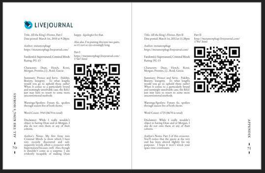
All The King's Horses | As You Are Now, So Once Was I by @samwpmarleau (grumkinsnark)
All The King's Horses [LiveJournal ch1] [Fanfiction.net ch1]
As You Are Now, So Once Was I [LiveJournal ch1] [Fanfiction.net ch1]
Fandom: Supernatural, Criminal Minds
Rating: Teen | PG-13
Category: Gen
Words: ~36,192
All The King's Horses: Protect and Serve. Fidelity, Bravery, Integrity. To what lengths would you go to uphold those oaths? When it comes to a particularly brutal and unsolvable case, the BAU just may have to resort to some more unorthodox methods. SPN/Criminal Minds crossover.
As You Are Now, So Once Was I: Sequel to "All the King's Horses." When Dean catches J.J.'s press conference on the news about a current case and notices a few...inconsistencies, he realizes the BAU is definitely going to need his help. Again. ON HIATUS

About the Book
FORMAT: Letter quarto, flatback bradel binding, french link stitch, no tapes
FONTS: EB Garamond [via Google Fonts], Supernatural Knight [via DaFont], D-Din [via Font Squirrel], Daniel [via DaFont], Permanent Marker [via Google Fonts], Arial
IMAGES: Seal of the FBI [via Wikipedia], Dean's handprint scar [by greenhorn-art]
MATERIALS: 24lb Xerox Bold Digital paper (8.5"x11"), 80pt binder's board (~2mm), 30/3 size waxed linen thread, embroidery floss (DMC #721), 1.9mm cording, brown cardstock, black Cialux bookcloth, gold foil transfer sheet (came with We R Memory Keepers hot foil pen)
PROGRAMS USED: Fic exported with FicHub, word doc compiled in LibreOffice Writer, Typeset in Affinity Publisher, imposed with Bookbinder-JS, title pages designed in Affinity Designer/Photo
.
I first read these stories on LiveJournal back in 2013, some time after I first encountered Tumblr, Supernatural, and the wider world of online fandom. Once I discovered SPNxCriminal Minds crossovers I devoured so many of them. Something about POV Outsider on the Winchesters, the existing connections with investigating monster vs human-crazy cases, and run-ins with the FBI... it's just works so well.
Of all the SPNxCM fics I read and enjoyed, All The King's Horses is among those that bookmarked themselves in my brain. Since it's been living there all these years, I thought it deserved a place on my bookshelf too.
(Rambling below)
Sourcing the Fic
I used FicHub to download the fics off of Fanfiction.net as HTML. Then I pasted them into LibreOffice Writer and created rich text documents of each fic, so I could Place them into Affinity Publisher.
The stories were crossposted, first on LiveJournal and then Fanfiction. I included the metadata from both sites in the appendices.
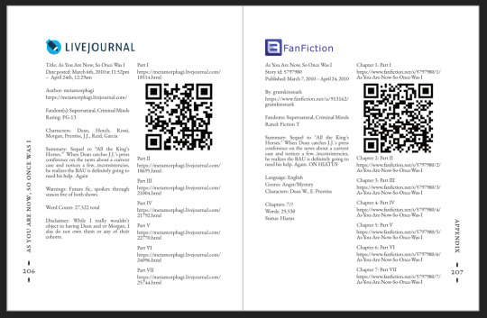
(It's fascinating to see the differences in the same work between platforms. FFN requires genres, so if the author doesn't add them on LJ then by default there's more info on FFN. But FFN limits listed characters to 2, so authors have to pick and choose the most important. Then there's the author's amusing disclaimers and spoiler warnings for these fics, which are only included in the LJ version)
Shoutout to the author for how they linked/listed their accounts on other platforms! Thanks to that I was easily able to track down all the tags/metadata for the fics, and find them here to express my appreciation for their stories!
Typesetting
Fonts
EB Garamond is my new favourite body font, 11pt as per my usual.
The title page is entirely Arial: 1) it was the closest match I have to the case file prop I was copying, and 2) if it was a government doc they wouldn't be using anything but the most basic fonts.
Headings and the the bullets bracketing the page numbers are set it Supernatural Knight, a free font in the style of Supernatural's title.
The location segments are in D-DIN, the closest free match to the font Criminal Minds uses (which is probably DIN).
Daniel is used for Dean's 'rushed but legible' note.
Permanent Marker for the 'thick black Sharpie' case file labels.
Artwork
Title pages designed as FBI case files, copied from a prop found online (specifically Etsy's propfictionstudios', but it's all over the web so no idea who actually created it). I had fun plugging in all the fanfic/bookbinding meta!
The ID# above the author's name is the FFN story ID, and the date is the date originally posted on LJ.
The handprint used in the headings of ATKH is Dean's scar. I traced off of a screenshot from s4e01 Lazarus Rising. I chose to use the handprint instead of the anti-possession tattoo or a Devil's Trap as my SPN art element because 1) it's specific to Dean, and 2) indicates/reminds that the story is not set during the season 3 Agent Henriksen/FBI arc.
Grabbed the FBI seal off of Wikipedia.
Construction
Both fics typeset and printed separately, then sewn together into one book. Title page for the sequel was tipped in like an endpaper prior to sewing.
Endbands sewn with orange embroidery floss (DMC 721) around 1.9mm cording. I chose orange because Dean's being in jail brought to mind the orange prison jumpsuits Sam and Dean wore in s1e19 Folsom Prison Blues.
Black bookcloth for the cover, like the Winchesters' beloved black '67 Chevy Impala. (I'd wanted a Supernatural reference to balance out the Criminal Minds-ness of the FBI case files).
I'd originally planned to make lineart of the front of the car, and have it stretch across the bottom of the cover (maybe even wrap around to the back). Even found a useful reference to trace [from here], but it didn't look as good as I'd hoped. Instead I reused the FBI seal and swapped out its text with the titles.
(The effect of shiny foiled FBI symbol on small black book reminds me of one of those FBI badge wallets!)
The foiling process was an unnecessarily long and gruelling affair. My laptop served as a massive power bank for the hot foil pen as I spent 2hrs ever so slowly tracing the image, and then 15mins on the author name and touch-ups. Did it need to take so long? Moving slowly, pushing down hard, going over everything at least three times? I'm sure it didn't. BUT I did not want to chance peeling up the foil to check how I was doing and risk shifting it. It was worth it in my books (haha) ‒ I feel giddy and kick my feet like a schoolgirl whenever I see it!
New Things
Used 24lb paper for the first time, and I love it! It's a little thicker and heavier then regular 20lb printer paper, feels more substantial.
The page numbers & running/section headers are along the outer margin, instead of in the header/footer. This was my way around Affinity's buggy-ness regarding pinning things inline in master pages. (More about that below). If I had been thinking, I could have formatted them like the tabs on a file folder and cut the textblock to match. Oh well, the things you notice once it's printed 😔
This time I also started new chapters/sections using text flow & paragraph spacing settings, instead of using a master. As always, there are pros and cons.
Pro: much faster and less involved. (find chapter start, apply paragraph style VS working from the end cutting text, inserting a frame break, unlinking frames, inserting new pages with master, relinking, pasting, and adding chapter title to a different text box)
Con: images need to be added manually (whether by adding image directly, or by applying a master with the image). I forgot to do this for the second fic, so only ATKH have Dean's handprint scar.
Difficulties Encountered
Affinity Publisher is fighting me on pinning things inline on master pages. They like to disappear on regular pages I've applied the master to. Sometimes it works, sometimes it doesn't, sometimes it only works on some of the pages. Idk what's up. (The bullet character only faces one way so I had use textboxes, flip/mirror one, and pin them inline to the page number).
So instead of having page numbers in the footer, bookended left and right by text boxes with Supernatural Knight's bullet, I put it vertically down the side.
Updated Publisher and all my paragraph styles' fonts changed/went funny. Something to do with the update's variable font support, I think. What was previously 'EB Garamond' regular, was now something along the lines of 'EBGaramond-Regular' which isn't a font. Issue seems to have ironed itself out in my original (near-complete) doc while I was busy remaking it. 😐
On the bright side, the update brought QR code generation to Affinity!
#All The King's Horses#As You Are Now So Once Was I#grumkinsnark#samwpmarleau#fanfiction#bookbinding#fanbinding#supernatural#criminal minds
109 notes
·
View notes
Note
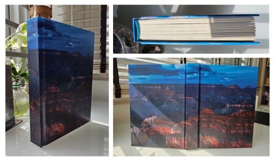
That National Geographic leather binding for Yellowstone is fucking Gorgeous!!! (Pardon my Language)
How long have you been binding, and what would you recommend to someone who wants to try it for themselves?
hello and thank you so much!! I worked really hard on that one (and no pardon needed haha)!
I started binding in February of 2021, which means in a few months I'll have reached 4 years. It's been an awesome journey!!
If you'd like to try it for yourself, I'd recommenda few things!
1) You can 100% try out the basics with near free or cheap materials. People typeset in Word or Google Docs or Pages. You can print on printer paper & use regular sewing thread & scavenge board from old books or notebook backs or do a limp leather binding & use no boards at all. You can make paper pamphlets. Any comments I make following this are about my preferences for best results. The most expensive part that cannot be avoided is printing. On the other hand expenses can wildly escalate if you're committing to it; once you are doing leather it becomes somewhat unavoidably expensive.
2) Check out some tutorials from SeaLemon or DAS Bookbinding on YouTube for the physical construction. SeaLemon is really clear for a beginner starting out, but then I'd move to DAS for better technique (DAS also has a beginner series though). I watched DAS Bookbinding videos for three weeks straight before I was able to start, & while that doesn't maybe work out for everyone I do think it gave me a pretty strong basis of understanding for structural techniques. DAS is *really* good at explaining why he thinks you should do something. The structure of the NatGeo bind is basically DAS's video on a rounded & backed bradel binding (but with leather & sewn on recessed cords). There is some good stuff on Tiktok/IG, but watch short-form videos/reels with caution. They move a little fast and I've seen a couple give instructions that can result in structural flaws (not that this is unique to the form, cross-referencing on instructions from any source is a good practice). They are good for if you're looking for a specific technique (particularly modern decorative ones, like cricut use, edge gilding, HTV application). There are also published books you can buy or maybe request through your library, such as Hollander's Introduction to Bookbinding. Renegade Bookbinding Guild runs a whole bunch of technique-specific in-house zoom classes annually.
3) Look to other fanbinders for tutorials on how to format the text (this is because most pro bookbinders do not do both text design & book creation! it's a pretty unique feature of fanbinding). @renegadeguild has some publically provided resources on our website here and more typesetting tutorials for a whole host of softwares (Affinity Publisher is my choice - one time purchase, fuck you very much Adobe InDesign) located in the discord server. Anyone 18+ can join the Discord. The NatGeo inspired book (text & dust jacket) was created in Affinity Publisher.
4) Join a community of fanbinders! It's really lovely. The space has exploded & there are tons of people to be friends with, trade tips, & cheer each other on. I'm part of @renegadeguild and we do a whole bunch of events throughout the year, and we have an in-person retreat every other year. I've met with over 20 different renegaders so far, in three different countries, and it's been such a blast. Definitely the community helps keep up the motivation. Renegade isn't the only community out there though! There's groups more rooted in IG/tiktok circles that have their own discords, plus a number of FB groups. I do think most people who are comfortable on tumblr enjoy Renegade's vibe.
5) While I learned most of what I do online, some things really benefit from in-person learning. If you want to do leather binding I would really recommend trying to take an in-person class. I did two attempts at a leather binding on my own before I decided to hold off until I'd had at least one in-person class. Leather binding can be extremely frustrating, especially when you can easily end up with a book that looks worse than a cloth binding at your same skill level but for double the cost. Imo this is mostly because the leather specific skills like paring, warp management, and assessing a random piece of leather for bookbinding suitability are all pretty tactile experiences, all of which are difficult to assess through a screen and can result in an unpleasantly bulky/stiff/shapeless book if ignored. For example- while this book of mine is a pretty popular post, I don't enjoy holding it and reading it, especially in contrast to the NatGeo bind. Part of this was the material I chose; part was not being able to adhere to the instructions quite well enough; part was just not knowing enough about what I was doing; part is they're different constructions. This might just be a me thing though; I'm sure others have had success with online only tutorials for leather.
6) I'm not going to get into specific tools bc that could be a whole post, but some things are necessary (printer access), some things are necessary depending on style, some things are "makes life easier but only drop the money if it's stopping you from making books out of frustration", some things are just technique-specific tools. Examples - sewing frames are often brought up but are never necessary unless sewing on cords; cricuts & cutting machines are commonly used in fanbinding circles but I don't have one (& don't intend to atm).
7) Don't be shy to offer the author a copy!! Like other fan activities, fanbinding is part of our fandom community ecosystem. Your fanbinding is in communication with the author's story. Giving a bind to the author is a great way of keeping the ecosystem going. I tend to think of binds as a combo of comment, fic rec, and fan art inspired by the fic.
8) Paper grain sounds stupid but it IS IMPORTANT! My personal hierarchy of give-a-fuck for grain: Board grain, spine card grain, endpaper grain, cover paper grain, text block grain, book cloth grain. The only thing I personally sometimes ignore is book cloth grain; but many people will not worry too much about text block paper grain.
Gonna stop there for now. If you've got specific questions or want elaboration, feel free to ask. As with all things, YMMV, this is my own opinions/experience and may not apply in all cases. There's a whole lot of different techniques out there, and it's hard to ever say something is wrong, per se - but I think it's important to understand if a method has an outcome you may want to avoid. Prioritize your goals & adapt for them - what's your goal? Longevity, readability, aesthetics? You might make different choices depending on them. My choices influence the techniques I chose to focus on, the tools I buy, and thus the final aesthetic of my binds.
32 notes
·
View notes
Note
Do you have any advice/suggestions for getting into bookbinding? What is the process like if you don't mind sharing?
Hello! Very happy to share bookbinding advice/resources 💜 it's a wonderful and delightfully rewarding hobby, and while it can be complicated and easy to get stuck in the weeds with it, you can also get started with some really simple binds with materials you may already have around your living space.
Info below the cut:
First off, there are a lot of instructional videos and guides out there for bookbinding. My favorite YouTube channel for those just starting out bookbinding is Sea Lemon, who has a ton of instructional videos for various styles of bookbinding. Her method of explaining things is clear and concise, and she tends to work with simpler tools and materials that don't cost much and that you may already have on hand. She is not a professional bookbinder with professional tools (afaik) but in my opinion, that's perfect for a beginner because it's not as overwhelming and has a much lower barrier to entry. Perusing her channel and watching a bunch of videos was where I started before even picking up tools to start my first bind.
Another guide I highly recommend is How to Make A Book, by ArmoredSuperHeavy. This is a wonderful step-by-step guide for taking a fic from AO3 and turning it into a book. The most helpful part of this guide, for me, was the typesetting instructions. Typesetting is the act of taking a piece of text (eg. a fic on AO3) and formatting it in the correct way for printing and binding into a book. Note that this guide is specifically for MS Word, though you can also typeset in Google Docs, Libre Office, Affinity Publisher, InDesign, and other programs (even LaTex!).
(Pro tip: save yourself the headache of trying to use Word's bookfold option and just set your document page size to the page size of your finished book (if you're printing on letter paper, this is 5.5" x 8.5") and then use this software to put your pages in the correct order: https://momijizukamori.github.io/bookbinder-js/)
A final resource that I recommend, but that can also get a bit overwhelming, is the Renegade Guild Bookbinding Discord. It's a space specifically for people doing fanbinding, and there are a ton of resources within it, including typesetting guides for various softwares, guides for where to get the tools you need and which tools are best, and people who can answer any questions you may have along the way. It's gotten quite big since I joined, and it can be overwhelming since there's so much information available and so many people who have been binding for a while and thus often offer up solutions or advice that's hard for beginners to understand, but it has never failed me when I've had a tricky question that I needed answered that I couldn't find information on anywhere else.
All that said, here's some more advice from me when just starting out!
Start with a simple bind. A single-section pamphlet bind is easy, cheap, and quick. Here's a Sea Lemon video for how to put together a pamphlet bind.
If typesetting seems intimidating, you can bind blank notebooks. This is also a good way to practice new binding styles if you don't want to go through the hassle of typesetting, imposing, and printing for something you worry you might mess up.
A good word count range for fics when you're learning how to bind case-bound books (ie, the typical hardcover books you see in stores) is 25-50k. Shorter than that, and your books will be thin and a bit fiddly to work with. Longer than that is probably fine, but it will be a quicker process for a thinner book, which is nice when you're just starting out. (And then you don't have to worry about rounding and/or backing, which can be complicated.)
There are very, very few tools that you absolutely need to make a book. There are quite a few tools that will make your life easier, or that will make your book look nicer, or that will make your book last longer, but when you're just starting out (especially if you're trying to minimize cost or deal with space constraints), you can forgo a lot of "required" tools. I'll include a list below of the general bookbinding tools you'll want and some substitutions for them.
You might hear talk about the grain direction of paper or bookboard. When you're just getting started, don't worry about this. Once you get more comfortable with the bookbinding process, then you can start ensuring that your bookboard has the correct grain direction (parallel to the spine) to reduce the warping of your covers. The grain direction of your textblock paper matters the least, and I didn't start using "proper" textblock paper (ie short grain) until about 2.5 years after I started binding.
Bind something you like! Pick one of your favorite fics and bind it, even if it's your first bind and you're worried about it turning out ugly. The excited feeling of having bound your first book will be that much more exhilarating when you're able to put a story that you love on your shelf for the first time.
So you're ready to bind a hardcover book! Here are the tools you will want/need:
An awl, for punching holes in your signatures (groups of paper). You can use a thumbtack for this, or even a strong needle if you have something to cushion the end of it that you'll be holding, like an eraser. Awls are typically pretty cheap, though. You'll want a thinner one so you don't make huge holes in your paper. I have this one and it's worked just fine for me.
A bone folder, for creasing the pages. Historically, these are made out of actual bone, and the reason for using one is to get sharp creases in your paper without tearing or damaging it. You can also use basically anything else in your house that can accomplish this task. When I'm feeling lazy and just need to crease one piece of paper, I use my thumbnail. Bone folders are also cheap, though--I have this one. (As a tangent--when you're making your signatures for your book, you're going to be folding and slotting together usually between 4-6 sheets of paper. Fold the paper normally without creasing with the bone folder, slot them together, and then use the bone folder to sharply crease them all together. Trust me on this--the pages will fit together much better if you crease after putting the signature together.)
PVA glue, for all aspects of gluing involved when making the book. You can, I've heard, use Elmer’s glue for this in a pinch, but I've never tried it. PVA will dry flexible, which is what you need for your book, especially when gluing the spine. For things like attaching decorative paper to your covers, this is less important. If you're making a book that doesn't require gluing the spine (like a pamphlet or coptic stitch book), you may not need PVA. There are also lots of other glue mixtures you can use when bookbinding (paste is a popular one) but I've been a straight PVA guy for over three years now and I can't offer any advice when it comes to other types of adhesives. One note about PVA is it dries quick, so once you've stuck something to it, that's that. Prepare yourself for some crooked books until you get the hang of it.
Gluebrush/paintbrush, for applying glue. I recommend something with bristles; the foam brushes technically work but will absorb most of the glue and will probably cause you a headache. Silicone brushes are wonderful, as you can just wait for the PVA to dry and then peel it off, but a regular glue brush will also work; just be sure to put it in water immediately once you're done with it, otherwise the PVA will dry on it and ruin your brush.
Ruler + pencil, for measuring. Any kind of ruler will do, but if you have access to a quilting square or something similar, this will help you get nice and even right angles.
Needle and thread, for sewing the signatures together. You can use regular sewing needles and sewing thread (doubled up for more strength) if you don't want to buy anything specific for this. An easy step up from this that I recommend is buying a block of beeswax (I got mine for like $4 from a farmer's market) and waxing your thread (running the thread along the block a few times). This will keep your thread from tangling and make it easier to work with. You can also use embroidery thread, especially if you're doing a pamphlet or coptic stitch bind and want some color. I recently upgraded to linen thread (thread weight 35/3), which is the standard for archival-quality books, but you absolutely can use cotton thread and it will be fine.
Paper, for the textblock. You can use your standard white copy paper for this and all will be well. Or, if you want to get a bit fancier, you can use cream-colored paper; 8.5 x 11 hammermill 20lb cream colored paper is easy to find and relatively cheap and will make your books look better, as plain white paper can look almost blue in a book. (That said, I also have some actual published books that use white paper, and I've never noticed anything off about them.) If you decide you want to get really into the proper grain direction, I get my short-grain cream-colored paper from Church Paper. They have both 20lb (typical copy paper weight) and 24lb (slightly heavier) weight. I have both and I actually really like the 24lb; it has a luxurious feel to it, with less bleed from my inkjet printer. If you feel like springing for nice paper, check out their site!
Book press, for pressing your book while it dries and pressing your folded pages before sewing. There are a lot of different kinds of book presses out there, many of which are very very expensive. You can usually make do with some heavy books to weigh down your book while it dries, or thin boards and C-clamps if you have those on hand. If you have access to basic power tools, it's also super easy to make your own press with carriage bolts and cutting boards (this is what I did). There's a lot of videos out there with instructions; here's one from Sea Lemon.
Printer and ink, or a printing service/print shop like Staples. Print shops can get expensive in the long run, and it's nice to have your own printer so you can do test prints of your typesets. If you're going out and buying a printer, I highly recommend either a black and white laser printer (if you're not planning on printing in color; Brother is a good brand) or a tank inkjet printer (like the Epson Ecotank). Do NOT get a new HP if you can help it; their ink subscriptions are brutal. I'm upgrading to a black and white laser this year, but I've been using a very old, cheap HP inkjet that I got off Facebook marketplace for the past few years and it's been reliable (if a bit restrictive). If you do have an inkjet currently that takes cartridges, I highly recommend looking up how to refill your own cartridges. Buying one set of genuine HP cartridges and then refilling them with generic brand ink until they die has saved me probably hundreds of dollars by this point.
Book board, for the covers. Otherwise known as chipboard, which is easy to find on Amazon or at craft stores. This is NOT the same as corrugated cardboard; that will not work. You can cannibalize old three-ring folders, which have chipboard inside them, or even old hardcover books/textbooks. Don't bother with genuine bookbinding chipboard; imo, it's overpriced and unnecessary. You can find chipboard on Amazon for relatively cheap; I recommend the 12x12, as you can get a front and back cover out of one sheet with the correct grain direction. You can use chipboard for your book spine, if you're making a flatback, or you can use a thinner material that you can bend if you're making a rounded book (or for flatbacks as well). For this, thin cardboard (eg. old cereal boxes) or thicker cardstock will work just fine; you don't have to go out and buy genuine bristol board, and I've never bothered with it.
Exacto knife, for cutting things. You could also use a boxcutter, but a craft knife will be easier to handle. You will probably need to frequently change the blade, as cutting chipboard will dull it quickly, so get one that comes with a bunch of replacement blades.
Bookcloth and/or decorative paper, for covering your book board. Bookcloth is basically fabric with a paper backing on it. You can make your own using heat and bond, tissue paper (I use white tissue paper), and fabric; iron the fabric so it doesn't have any wrinkles in it, then iron the heat and bond onto the fabric, then iron the tissue paper onto the heat and bond. There are other methods out there that you may find easier/better, but this is the one I use. The purpose of the paper backing is to prevent glue from striking through the fabric; if you use a thicker fabric or paper, this is not necessary. For your first books, you may find it easiest to just use paper, or to go out and buy some premade bookcloth.
That's a lot of information, but I hope it was helpful! I'm more than happy to answer any more questions you (or anybody else) might have, and happy binding!
27 notes
·
View notes
Text
Ostrichmonkey Hack: Layout Behind the Scenes
Been procrastinating on this enough! So here is a look at some of the process and decisions that went into doing the layout for the Ostrichmonkey Hack.
Let's start with the goals I had in mind:
Keep it simple.
Keep it easy to make.
With those goals set, next step is gathering materials and resources (not all of this was done as cleanly as I'm making it out to be, but this is the gist).
Materials used:
Classic Explorer Template
Affinity Publisher and Photo
Fonts
Art
The text itself
The Classic Explorer Template was critical in getting this layout done efficiently, since it does a lot of the work for you. It's not a replacement for having a rough idea on how to do layout, but it can serve as a nice tutorial/explainer on different elements of layout and typesetting, and honestly, is worth its (digital) weight in gold. There's a free version available if you want to check out what it offers.
I use the Affinity Suite for my layout work. It's a nice set of programs with a manageable learning curve, but there are plenty of other alternatives so go with whatever works for you (one of my favorite elements of using multiple Affinity programs is that within Publisher, you can access both Designer (vector illustration) and Photo (photo editing, illustration etc) functions, which is just a nice workflow).
Here's what my setup looks like, with all the guidelines/base grid stuff turned on;

Normally I start with some style tests and “sketches” to get a feel for what I want the layout to look like, but the Classic Explorer’s does a lot of that heavy lifting for me already so I get to skip this step for this project. Speed and efficiency is one of the main reasons I wanted to use the template - this was envisioned as a “I just need to get something done” kind of project.
So next up on getting it done, fonts!
There are lots of great places to get fonts from, just make sure you're getting them from legitimate sources. Do your homework and make sure that "free" font is actually free to use in commercial projects.
I pulled three fonts from the depths of my collection.
One for the title and main headers (Wallau Deutsch)
One for the second header (Rakkas)
One for the body text (PT Serif)
Technically a secret fourth font for some "bullet points" (1651 Alchemy)

I picked these fonts out because they work together well and are readable. The title/main header fonts are comparatively less readable, but you can get away with that since headers are Big and used less frequently. The second header (Rakkas) is a nice middle ground between a full on blackletter font like the main header, and the classic-y serif of the body text. It creates a transition between the two fonts.
I used PT Serif since it was already in the template, but it also had the bold/italics versions I knew I would need, is readable at a variety of sizes, and had all the special glyphs I would need (it actually did not, but whoops, we'll get to that later).
Normally when I start layout, I do a quick "sketch page" where I try out different fonts and style tests that can look something like this;

But that wasn't necessary for this project (another advantage of the using the template).
Now, let's get to some choices in formatting the text itself.

Each time a key term came up, it was highlighted by bolding and italicizing it. Any time after that, it was just normal text. I went back and forth on highlighting it every single time, but the current format just looked cleaner so it won out.
Additionally, in several places in the text, rather than introducing a third header (which just broke up the page too much, disrupting the flow and clean look), I instead put what would have been the new third header (HP or WOUNDS in the above example) in all caps and behind a colon. This ended up not disrupting the text too much, and was only necessary a handful of times. But when it was necessary, I made sure to stay consistent. Consistent and organized formatting is one of the key ways to make your layout look nice and clean.
Aside from changing some font choices, one of the other ways I tweaked the template was with some spacing (between "sections", like in the above text, introducing an extra line break between the Attributes and Staying Alive sections) and the "bullet points".
The large bullet points that accompany the second headers are actually a glyph pulled from a different font. I picked that one out specifically because its just a little irregular and handwritten looking (1651 Alchemy is a handwritten styled font), and it also helped pull you to the start of new sections, further enhancing the second header. It helps make each section discrete and more "modular".
Back to extra spacing for a second now. So each "chapter" of the text uses the main header to designate it as a full "chapter".

"Characters" up top there is one of those chapter headers. It's nice and big and special, and also takes up a good chunk of space. One a full spread, this also means that the second page of text begins higher up than the text on the first page (compare where Attributes starts vs where Dying starts).
I played around with the format of spreads that did not have a main chapter header on them, starting the first page text up toward the top to have it line up with the second page. Which, probably would have been totally fine, but I preferred the look when each spread had the same kind of spacing. But repeating the main header on each spread was too clunky. So the solution;

Bam! A line!
Blank empty space looked too empty, but slapping a quick line there took up just enough visual space for it to work. Then, I carried that line-design-language to other places (to separate footnotes from the body text, within the tables, and sort of on the cover). This then made the line choice feel even more cohesive and purposeful.
And speaking of footnotes, that was another extra tweak/flourish I added not present in the template (the sidebars are part of the template, but sidebars rule so they would have happened regardless). The footnotes served as a way to share specific references as an informal "works cited". A lot of NSR/OSR design is super iterative, so I thought it would be cool to shout out some of the more direct inspirations and references I used when making my game.
But the footnotes were also kind of not really my downfall. Turns out PT Serif didn't seem to have all the necessary footnote glyphs, nor did it want to make proper superscripts of integers past 3. So, rather than trying to find a new body font (or deal with the headache of using a font solely for superscript notation), I just fudged the formatting some and stuck to asterisks, and restarting "numbering" on each spread. Oh well.
Let's now briefly touch on laying out tables.
It sucks.
My advice is find an example of a really nice looking table and then try and figure out what makes it look nice, and then doing that forever. Luckily, the template saves me again by including multiple examples of tables, ripe for tweaking. Which ended up looking like this;

Nice and clean! Hooray!
Okay, there's a lot of small decisions that goes into making text properly formatted and look nice, but I skipped some of those decisions and didn't go ham on typesetting, but whatever. That all about covers the important parts regarding the text. Now let's talk about art.
Public domain art is your best friend.
I went and trawled through a bunch of art I've saved from the Met's Open Access collection (there's plenty of great open access collections out there, just happened to have some from the Met handy), and settled on this piece;
Which I then dropped into Affinity Photo and played around until I ended up with this;
Nothing too wild, but it Felt Right, so it's done.
I then immediately dropped that onto the cover page, slapped the title on, added a quick border (and also spent some time trying to fix some weird issues that ended up being solved by just rasterizing it, whoops) and bam;

And that's the only art piece used throughout the zine! But I made the most out of it. Between each chapter, I had a single splash page and dropped in different zoomed/cropped versions of the art. Like so (and even on the back cover!);


The original image was high resolution, so zooming in worked, plus the effects/distortions I created hid any imperfections.
So that's the art sorted and the zine finished!
Now, this is getting pretty long, so if there's anything anyone reading this is interested that I didn't touch on, shout in the notes!
38 notes
·
View notes
Note
Hi, I saw your miniature fic-binding (very nice) and I was wondering how you went about formatting the text? This is something I've struggled with for miniatures and so far I've ended up doing it manually - took forever the first time.
Thank you! If you mean imposing the pages, I use https://momijizukamori.github.io/bookbinder-js/ -- for this one I used the "petite" option under "wacky small layouts" and printed on A5 paper, but there are options that will work for A4/letter paper too.
For the typesetting and book layout itself I use Affinity Publisher and set the page size to the actual page size of the finished book, and then just work as I normally do, although there's a lot more manual adjustment of hyphenation etc.
14 notes
·
View notes
Text
I'm typesetting this amazing fic (An Elegant Mechanism by @laughsalot3412) at the moment and I'm using a (to me) new program (affinity publisher). And seriously, I just love typesetting. I get to read the story again and again and I get to try out different things with the presentation of the text.
It really is a lot of fun for me, even though I still don't know how I want to do the whole texting thing. There are several text messages exchanged back and forth and I keep wanting to change the format for them because I'm just not satisfied.
This is what it currently looks like.

Hm.
Not really sure about this, yet. I'll probably end up changing the look of the messages another 23 times before I actually settle on something I like.
Anyway.
I like typesetting. :3
14 notes
·
View notes
Text
Zine Mod Applications Are Now Open!
Hello! Long time no see! For anyone who has been following this project, it's probably obvious that our publicly set deadlines have long passed with no news being posted. This is due to a combination of circumstances that have interfered with the current mod team's ability to keep up with our responsibilities and while we tried to pull through on our own for awhile, we've decided the best course of action at this point would be to look for some extra hands so we can get this thing finished! So we're opening up applications for staff!
The things we're looking for help with are as follows, listed in order of priority:
High Priority
Assistance with communication with members, record keeping, and behind-the-scenes organization. This would entail helping the current staff with contacting participants for deadlines and check ins and answering their questions as needed. You would also be updating spreadsheets as people are contacted!
Graphic design and image-editting help for creating contributor announcements, formatting pages for participants with written submissions, and helping with text-heavy pages of the zine.
Medium Priority
Art assistance, primarily helping one of the current mods with the artwork for the cover page, title page, and back cover, however art being incorporated into other pages would be welcome, but not expected. They may also choose to work with mods designing contributor announcements. If you're willing to help us out with art, we ask that you be able to use .psd files for convenience!
Management of the twitter and tumblr accounts, primarily being around to post announcements, reply to questions, and generally keep people outside the discord in-the-loop on important things!
Low Priority
Zine assembly using Affinity Publisher. This is something the current team is likely fully able to manage on our own, however if someone was interested in helping, we wouldn't say no! Just be aware that Affinity Publisher requires a one-time $60 payment and we do not expect mod applicants to buy a whole new program for us!
Applicants for mods must be at least 16 to apply! Our current hard deadline is September 15th with a plan to post the zine on October 4th, so keep that timeline in mind when assessing your availability, though we set a pretty distant deadline in the hopes of keeping things from getting too stressful! Accepted mods will also be welcome to make their own submissions to the zine beyond the work they put in as a mod if they so choose, but that's in no way required or expected!
Any questions can be asked here on this blog or dmed to @oneformercy if you prefer a private answer! We'll be keeping this form open until we feel we have enough of a team to get this zine finished, so there is no deadline, but we recommend applying ASAP if you're interested. We all truly appreciate the interest this zine has gotten so far and we're dedicated to getting it finished! Thank you to everyone for your patience!
5 notes
·
View notes
Note
how do you format text? i saw your dbh ficbind & am obsessed—i’ve been using google docs for the last year because i was scared to learn anything else but it’s really getting to the point where i NEED to stop
Hi! Affinity Publisher is my go-to. I found it to be a one-time financial and setup investment: I dropped 50 bucks and then spent a horrible week configuring a million tiny fiddly settings on a master document. In the years since I've just duplicated that one doc whenever I need to start a new typeset.
Highly recommend doing the same (and @renegadepublishing has a great Affinity Publisher setup tutorial to walk you through every step). Plus, if you're Adobe-trained you'll find it to be a similar experience.
Let me know if I can help more!
9 notes
·
View notes
Note
Inky paws 2 was great! I have no idea how long it must have took to format 151 pages though i am struggling with 20 lmao
It honestly only took around 4-5 months of on and off work? Honestly I did this issue of Inky Paws in Affinity Publisher so that the text would be selectable and you could, theoretically, be able to bind the book if you really wanted to, which made everything a lot more complicated and take a lot longer since I'm brand new to the program.
I'm super glad you enjoyed it!!!
4 notes
·
View notes
Text


Waptia fieldensis
(temporal range: 510-505 mio. years ago)
[text from the Wikipedia article, see also link above]
Waptia is an extinct genus of arthropod from the Middle Cambrian of North America. It grew to a length of 6.65 cm (3 in), and had a large bivalved carapace and a segmented body terminating into a pair of tail flaps. It was an active swimmer and likely a predator of soft-bodied prey. It is also one of the oldest animals with direct evidence of brood care. Waptia fieldensis is the only species classified under the genus Waptia, and is known from the Burgess Shale Lagerstätte of British Columbia, Canada. Specimens of Waptia are also known from the Spence Shale of Utah, United States.
Based on the number of individuals, Waptia fieldensis is the third most abundant arthropod from the Burgess Shale Formation, with thousands of specimens collected. It was among the first fossils found by the American paleontologist Charles D. Walcott in 1909. He described it in 1912 and named it after two mountains near the discovery site – Wapta Mountain and Mount Field, other specimens
Although it bears a remarkable resemblance to modern crustaceans, its taxonomic affinities were long unclear. A comprehensive redescription published 2018 classified it a member of Hymenocarina (which contains numerous other bivalved arthropods) within Mandibulata.
9 notes
·
View notes
Text
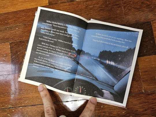
Under The Brine by bonesandthebees
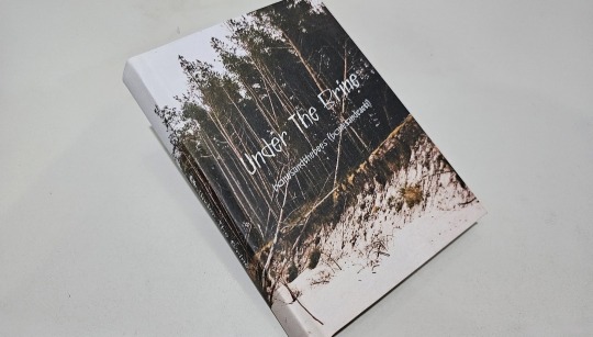
Wow, it's really been nearly two months since I posted! Besides the usual life stuff, I also took the plunge and bought Affinity Publisher just so I could control the typeset to a greater finesse than clunky Microsoft Word. And this is my first result of that!
This fic, Under The Brine by @bonesandthebees is one of my favorite Crimeboys fics, and I had so many ideas to try out to visualize the situations and vibes of the plot. As you will see, the result was a mix of established layouts and new experimentation. The cover itself is made using Affinity, printed onto paper to give a papery feel on the hands!
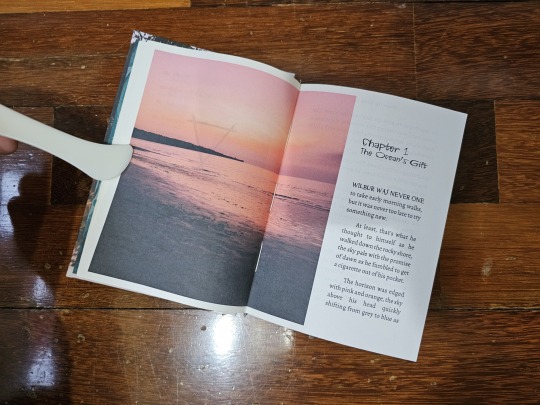
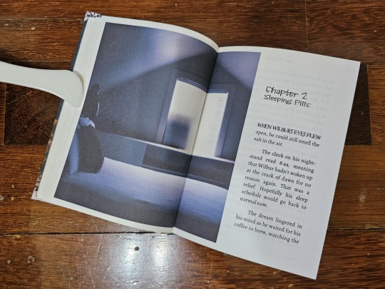
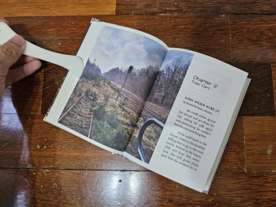
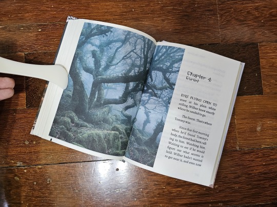
The chapter pages are designed with voluminous double-spread images because I wanted the reader to "fall in" to the story. I want to bring the feel of unnatural uncertainty, fear, and dread into a visual form; if a picture tells a thousand words, the right one can convey the mood of an entire arc. Having the opening paragraphs shifted to the side accentuates the visual feel.
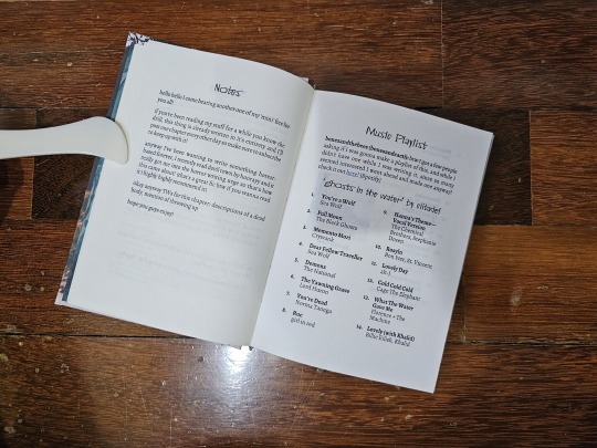
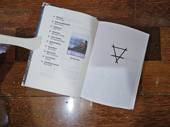
As per usual, I have my layouts for pre-fic notes along with an appendix section for end notes and author comments to curious readers (albeit this time on Tumblr). But I also diverged by adding a playlist, curated by the author for this fic, along with a Spotify code if typing the song names onto YouTube is too much.
With Affinity, I also took the time to lay out the fic's dream sequences. I wanted a complete opposite to a normal page to convey the act of dreaming, and so made the pages all-black. However, the volume of needed black ink did confuse my printer and created a number of paper jams, so I don't think this style is going to be used much.
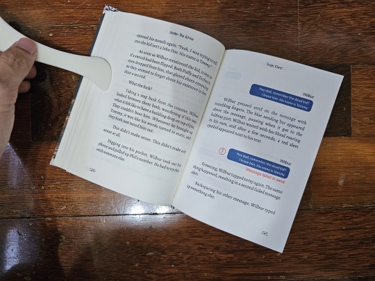
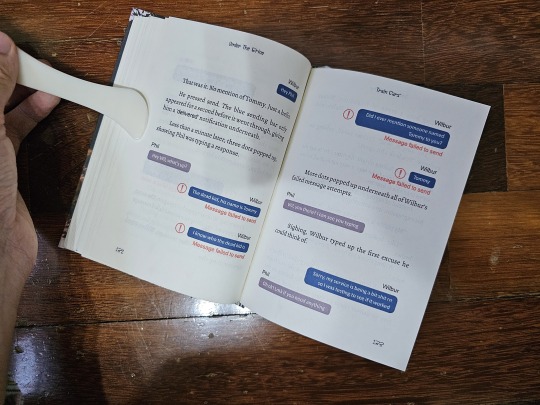
Additionally, I formatted the phone-text-messaging part of the fic so it actually looks like a text message convo! This was one of the most fiddly parts of typesetting as I had to balance not only the text messages, but the error alert symbol and words as well.
And lastly, I experimented with putting last paragraphs and the ending image together, instead of putting them onto separate pages as per my other binds. I do this because I wanted to visualize the moody feel of the ending... and because I was running out of paper and wanted to save pages.
Full thanks to @bonesandthebees for writing this fic!
#bookbinding#fanbinding#ficbinding#Wilbur Soot#Tommyinnit#Crimeboys#Crime Boys#Dream SMP#DSMP#MCYT#Under the Brine#bonesandthebees
203 notes
·
View notes
Text
Why Brands Are Investing in User Generated Content Platforms
The global user generated content platform market size is anticipated to reach USD 32.6 billion by 2030, registering a CAGR of 29.4% from 2023 to 2030, according to a new study by Grand View Research, Inc. User Generated Content (UGC) or User Generated Content Platform can be defined as software-as-a-service (SaaS) that helps organizations curate images, videos, and text from social media and other online resources to repurpose for creating their brand’s authentic story.

The increasing number of internet users with rapid technological advancement is attributed to the growth of the user-generated platform market during the forecast period. Moreover, the user can create their content, such as live streaming videos and live podcasts, to share on multiple social media sites. User generated platform market will continue to grow significantly because of the disruptive evolution of the Internet of Things (IoT) and big data technologies.
User Generated Content Platform Market Report Highlights
Based on product type, the audio and video segment holds the maximum revenue share of 33.7% in 2022. The attributes such as increased engagement with customers, high potential for sharing ability on social media platforms, availability of high-speed internet, and detailed information about the product are expected to boost the market of audio and video (including live streaming) segment
The enterprises segment dominates the market with a revenue share of 63.1% in 2022. This can be attributed to the growing use of user-generated content platforms for brand marketing and advertising purposes
North America is estimated to grow with the highest revenue share of 34.1% from 2023 to 2030. The growth is attributable to the rapidly swift technological advancements, increasing consumption of smartphones, and the increasing prominence of social networking in this region
Major players in the market are consistently investing in advanced and innovative technologies. E-commerce retailers are optimizing user generated content because more consumers become regular social media users. For instance, in March 2021, Yotpo, an e-commerce company in the U.S., announced raising USD 230.0 million in Series F funding. This initiative aimed to accelerate the company’s e-commerce marketing platform to enhance overall performance
For More Details or Sample Copy please visit link @: User Generated Content Platform Market Report
The advent of digital commerce and the extending consumer distaste for intrusive marketing tactics has led many advertisers and brands to introduce user-generated content to engage consumers and connect with them. New formats such as augmented reality (AR) filters & lenses and live streaming have provided consumers with new methods to create content. They have given marketing agencies new strategies to leverage user-generated content as part of their advertising and marketing efforts.
For instance, in March 2020, Twitch, an American video live-streaming service, stated that its viewership increased by 31.0% as more individuals connected with the live-streaming platform. For brands and their agencies, there are many benefits to using UGC for marketing and advertising purposes. Top among them are highly trusted online content, strong brand affinity and engagement, more earned media, strong search engine optimization (SEO), and new research opportunities.
The increasing use of user-generated content platforms for marketing and advertising due to the rise of social media and messaging platforms is propelling the market growth. Publishers, marketers, and advertising agencies are taking notice and capitalizing on this trend in exciting ways. For instance, in May 2020, JD.com, a Chinese e-commerce company, announced a strategic partnership with Kuaishou, a short-video app in China. Through this partnership, the online retailer allows Kuaishou users to purchase JD products directly from the video app, redirecting shoppers to the e-commerce apps.
The increased use of smartphones with high-speed internet technologies, and the introduction of 5G, have resulted in increased data consumption and the creation of user-generated content such as live podcasts and live streaming videos. Adopting emerging technology in the user generated content platform, such as artificial intelligence and machine learning, helps focus on providing better outcomes and interacting with customers in the virtual world, which is predicted to boost market demand in the coming years.
However, the downside of marketing and advertising through user-generated content is connected to the requirement of close supervision as negative content is inevitable. It requires an individual or a team to monitor, filter, and review user-generated content before publishing, which leads to extra costs and time for the organizations. Besides, moderating UGC can lead to a Black Hat SEO attack. A dedicated team of supervisors is required to publish the content. Since people are reluctant to trust a random review or content with no authoritative background and it questions the credibility of the marketing content. Further, accusing the system of fake accounts and aliases is easy with so many different content contributors. Therefore, some consumers are not likely to trust UGC as others.
List of Key Players in User Generated Content Platform Market
Bazaarvoice
CrowdRiff
Curalate, Inc.
Monotype Imaging Inc.
Olapic Inc.
Pancake Laboratories, Inc.
Pixlee TurnTo
Stackla Pty Ltd.
TINT
Yotpo Ltd
We have segmented the global user generated content platform market based on product type, end-user, and region
#UserGeneratedContent#UGC#UGCPlatform#ContentMarketing#DigitalMarketing#SocialMediaMarketing#UGCMarket#ContentCreation#MarketingTech#BrandEngagement#InfluencerMarketing#AIinMarketing#ContentAutomation#UGCTools
0 notes
Text
about Moyra Davey's Speaker Receiver "Moyra Davey’s practice encompasses photography, film, and video, as well as reading and writing. She conceives of the latter two activities as inseparable and equally significant techniques of working... By suggesting an affinity, or even a reciprocal mode of influence, between the acts of reading and writing, Davey locates the point at which the desire for non-differentiated production-consumption makes the two usually opposed sides of the process of communication meet and cross; that is to say, in Davey’s work, writing is reading.
The monograph Speaker Receiver brings the diverse aspects of Davey’s work together. It features “Index Cards”, a new piece of writing by Davey, in which she reflects on subjects such as a recent illness, her personal mapping of Paris and her habit of reading newspapers. Rather than formulating a systematic argument, the essay unfolds in a series of short “takes” or fragments.
Photographs distributed in order of their appearance within the texts interrupt the various writers’ contributions. Furthermore, for Davey’s own essay, and for the interview, the artist chose to reproduce her photographic “Mailers”, a unique series and format of work that Davey likes to refer to simply as “mail art”.
Speaker Receiver was published on the occasion of the same-titled exhibition at Kunsthalle Basel, June 17 – August 29, 2010."
0 notes