#TYYY FOR THE COMPLIMENT SORRY FOR THE LONG READ
Explore tagged Tumblr posts
Note
Look man- just wanna say your art is literally gorgeous bro- It's very catchy and cool- but uh- that aside- I hope ya don't mind the question- but would ya mind giving some few tips on how to draw anatomy and how you color? because your art is so pleasing to look at- like bruh it's so pretty-
first of all THANK UUUUU!!!! im sososos happy u like my art!!!!!!!!!💕🌺🌷💕🌺🌷💕🌺🌷❤️♥️💕🌺🌷💕♥️❤️🌹🌹❤️♥️🌺💕!!!!!
i dont mind the question at all!! ill give u some tips on how i draw!!
BTW! these are just some tips ab what i do to draw the way i do, this is not an universal rule let alone mandatory!!
NOW ONTO THE STUFF U CAME FOR! under a read more so i dont clog ur dash bc i got kinda tecnical w some of it..! IT GOT WAY TOO LONG IM SORRY!!!
lets start with color then!! 🎨
i always see ppl saying that color theory is rlly hard and they never understand it, and tbh u dont need to learn it in depth at all!!
to make colors look good you need to think them as a group instead of choosing them individually...
though what i do is different, theres a post going around that says tinting all the colors w one brings the drawing together, and it does!! its a p good tip if u dont want to eyeball it like i do!!
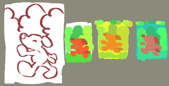
but heres my process; lets say u have a sketch and an idea of what colors you want; your character is in a forest walking through the trees! what i do is choose background color and start from there
if you chose a cool color, when you start painting the rest of the picture drag the hue a little closer to blue or purple! if you chose a warm one, closer to yellow or red! if you want your drawing to have a greenish tint drag it closer to green or yellow! you get the gist of it, bring the colors closer! if theyre on opposite sides of the wheel it might be difficult, but usually bringing them closer to gray does a good job!!

also unless youre trying to get contrast on purpose, choosing colors w similar saturation(intensity!) helps unify the drawing!
say you want a drawing that is mostly grayish tones, make sure all your colors are desaturated (less intense, pigmented)
-
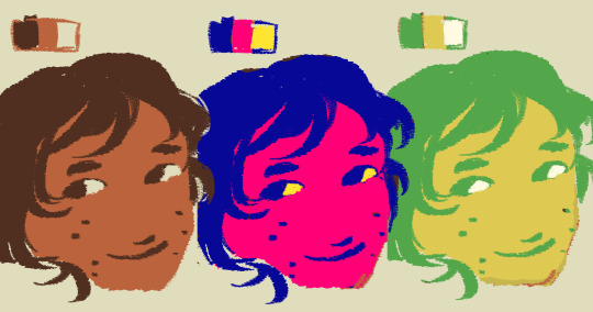
now say you have an existing character w a set color palette (we'll take my character elias as an example) and want to draw him in green and yellow or bright magenta and blue
i saw this explanation on a tiktok long ago but i literally cannot word it better and found it real useful
to translate the colors properly u need to think them on a scale, which ones are the darkest, lightest, and where does the rest sit?? Once you have that you can make ur own scale w the colors you want to use, and as long as the difference between the colors stay mostly the same u will be able to translate them p much to whatever!!
my drawing was done quickly so its not the best example but u get me

i think thats it for color now, but if i think of something else ill add it and tell u!!
now onto anatomy 🧍🧍♀️🧍♂️
and ill be honest w u here, i have no clue how i learned anatomy, let alone how to teach u but ill try my best here!!
and tbh, learning every bone, muscle, etc is smth rlly tedious to me so i cannot assist u there bc i dont know
ALSOO references are ur best buddy, use them!! even if its not the exact pose or angle ur wanting to draw it can help u visualize what u want and tell u what goes where!!
even if its not for the pose or angle, a skeleton can help u see how the body part works!! i look at animal skeleton legs all the time to help me draw my ocs!!!
but yeah!! i think anatomy is smth that u shouldnt take very seriously bc most of what gives personality to characters is exageration!! or made up parts!!
but like, if u want to know my way of drawing smth specific u can tell me!! i have no problem showing u how i do things!!
but since i wasnt very helpful when it comes to anatomy, im taking the liberty of adding an extra bullet point to the post
composition!! 🌇🌃🌆🏙️
composition is the way you show the image, how you place things in your drawing!!
in school they make us take audio-visual production classes, which truly isnt as interesting as it sounds but they taught us some p cool photography tips that also apply to drawings!!
one of them is the rule of thirds! basically, you divide the canvas in 9 equal parts, and the places where the lines join are the places where the eyes are most drawn to!! heres an example i found on the internet

so if you place something on those spots it will get the attention, bc the brain is used to the focus being on the center so taking it out of there makes u want to look why (or at least thats the explanation they gave me!)
also, to draw even more attention to those spots u can make a visual path that leads there!! here some crude examples by yours truly

the first one traces a path up to his head, the second one all start from there outwards
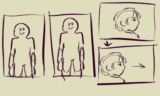
they also gave us tips for cropping images though these dont rlly matter that much, but like for example it looks better if u dont crop it at the joints, and if a character is looking somewhere you should leave some space in the direction they are looking to! heres some doodles to show u what i mean

i used to have a document full of things like that for photography but i cant find it rn, if i do ill tell u!!
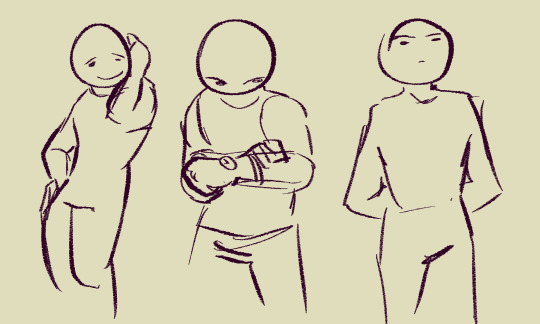
moving onto the final thing, this is not quite a composition thing but rather something to give characters more personality: make them interact w their enviroment!
rather than standing looking at the camera make them use, touch, see whats around them, even if u draw them in a blank space the way they take it up shows u a lot ab them
for ex, if theres a wall they can lean on it, if theres a window they can be looking through it(maybe u can see them from the outside! framing inside framing was also smth that they taught us in that class!) if theyre standing they can be fixing their sleeves, holding their hands behind their back, tucking a strand of hair behind their ear, scratching their neck, etc!

AND YEAH!! thats what i keep in thought when i draw!! i hope u find it at least a little useful or interesting ahdhjska ill admit i got a little carried away but i love drawing and these are topics that interest me
ty for the ask!!! 💕 👋
6 notes
·
View notes