#TYPOGRAPHICAL FRAME
Explore tagged Tumblr posts
Text

"Inside The Mind" is a limited edition art print of 20, featuring a graffiti-inspired piece of a girl's face surrounded by letters, words, and passionate lines expressing her thoughts.
#Inside The Mind#Limited Edition#Art Print#Contemporary Prints#Graffiti Artwork#Typographic Poster#Expressive Drawing#Wooden Interior#Framed Artwork#Dry Plants#Wooden Cabinet#Lamp#Guste Design
5 notes
·
View notes
Text


Typography Tuesday
PLANTS & FLOWERS
This week we bring you a few experimental fonts made with flowers and plants from The Making of Artistic Typefaces by 50 international designers published in 2016 by SendPoints Publishing in Hong Kong. Shown here:
Blossom Type: handcrafted with natural flowers with Photoshp for color correction by designers Nikita Shchykin and Alice Mourou of Oddity Studio based in Hong Kong.
Wanto 3 Aroma Living: letterform overlaid with a flower arrangement from Victor Design Corp.
Garden, Flowers, and Ice: as the name implies, this font, designed by Manuel Persa of Voluminica based in Asturias, Spain, is made using wild flowers placed in letter-shaped silicone molds, filled with water and frozen, and then removed from the mold.
Good Vibes: typographical wooden frame filled with living moss, designed by Camilo Rojas of CR-eate based in Miami.
Good Enough: original clay pottery with small plants as an illustration in the Dutch Volkskrat Magazine from the design studio Autobahn based n Haarlem and Rotterdam.
View more designs from The Making of Artistic Typefaces.
View more Typography Tuesday posts.
#Typography Tuesday#typetuesday#fonts#organic typography#The Making of Artistic Typefaces#SendPoints Publishing#type desingers#type designs#floral typography#flowers#plants
151 notes
·
View notes
Text
Mori Chapter 1 Devlog

Mori's first chapter is out on Steam! Additionally, you can find TCM on the itch.io page too! As always, a special shout-out to the beta testers, your hard work is VERY appreciated!.
Changelog - Here's what got updated besides story content
Added notifications for when you reach a chapter selection bookmark
New backgrounds, sfx, and music tracks
Clamped how far font size and vertical spacing adjustment can go so players can't make the GUI un-navigatable on accident
Implemented custom font styles for each customizable font choice for more consistent quality across all of them
Added brief gamepad/controller tutorials for some custom mapping and features that will pop up upon your first time through the prologue and are dependent on what input device is detected
Fixed resolution issue on the Steamdeck that caused ugly jagged lines
Restructured code to ensure selecting chapters from the chapter menu dovetails correctly into the storyline instead of completing and taking you back to the main menu without moving to the next part.
Added Discord Rich Presence. If you are logged into Discord, you will now see "Playing TCM" statuses in your user profile that change based on various parts of the story when you are in-game.
🢂There is an option to toggle this off in the Options menu!🢀
Updated the Help and About screens to match the rest of the GUI
Adjusted the notification popup frame to be prettier
Added new patrons to the Credits (thank yall!)
Typographical/Text Styling adjustments
UP NEXT

23 notes
·
View notes
Note
Heyy! Just saw your mokoto post.
Can you do the rampage members with s/o who is Shorter than them.
Just Out of Reach


A/N: hi! This is Eribin. I am not a real writer, doing this as my past time. English is not my first language so bear with my English. There’s a lot of grammatical and typographical errors. This is just a fiction from my delusions 😆
Word count: 1k
Genre: rom-com, fluff
CAST: Y/N (fem readers) and Ryutaro Ata

The bell chimed softly as Y/N pushed open the door to her favorite café. The warm aroma of coffee and pastries greeted her, Today is so bright and she felt there's something great gonna happen. Her eyes scanned her usual table by the window, the one with the perfect view of the street outside.
Her heart sank. Someone was sitting there.
There he was. Again.
Ryu.
'What the... Urgh!' She mentally eye-rolled at him. She came near him and crossed her arms.

"Hey, Shortie, Good morning" Ryu called, a smirk spreading across his annoyingly handsome face. Yes, he's handsome but his attitude? Ugly! His tall frame was sprawled comfortably across her table, his dark hair slightly messy as if he’d just rolled out of bed.
Y/N sighed dramatically "Why are you here?"
"To enjoy my coffee in peace," he said, gesturing to his cup. "And to brighten your day, of course."
"It’s my spot," she shot back, marching over and putting her bag down on the table next to his.
He leaned back, his long legs stretching out under the table. "Oh? I didn't see a 'Reserved for Y/N' sign. Did I miss it?" He said, dropping with mock innocence

Her eyes narrowed. "Move." her cheeks are already heating up. Ethan had been her neighbor—and her personal tormentor.. for years. FOR YEARS. At 6'1", he was a full foot taller than her, and he never missed an opportunity to remind her of it.
He didn't budge. Instead, he patted the chair across from him. "Plenty of room for both of us, Shortie."
Y/N groaned but sat down anyway. It wasn't worth the fight, and the other tables were already taken. And beside, she doesn't want to catch attention early this morning.
As she reached for the menu on the counter nearby, Ryu's hand darted out, grabbing it first.
"Looking for this?" he asked, holding it high above his head.

"Ryu!" Y/N hissed, standing up to grab it. But even on her tiptoes, it was just out of reach. She tried to jump but it didn't work.
"You've got to jump higher than that" he teased, his grin widening.
Y/N scowled. "Give it back, or I swear I'll—"
"You'll what?" he interrupted, raising an eyebrow. "Kiss me? Then kiss me Shortie" he added and pouted his lips gesturing to kiss..
Her forehead furrowed with that gesture of Ryu. Without warning, Y/N grabbed the hem of his jacket and yanked him down, catching him off guard. She snatched the menu from his hand and smirked triumphantly.
"Got it" she said, sitting back down.
Ryu blinked, clearly impressed. "Well played, Shortie. Didn't know you had it in you."
Y/N ignored him, flipping through the menu as he leaned his chin on his hand, watching her with a lazy smile.
"Need help picking something? I could order for you. Maybe a kid's hot chocolate?"
"I don't need your help, giant!" she shot back, emphasizing the word.
He chuckled. "Giant, huh? That's new. Kind of like it."
The waitress arrived, and Y/N placed her order with exaggerated politeness, hoping to distract herself from Ryu's amused expression. She ordered her usual, a black coffee and a chocolate croissant.
As they waited for their food, Ryu kept up his relentless teasing.
"So.." he said, tapping the table, "how's the weather down there?"
Y/N rolled her eyes. "Just the same. Got any new material up there?"
"Plenty" he said, leaning forward. "Like, have you ever considered carrying a stepladder around? Could come in handy."

"Have you ever considered minding your own business?" she shot back.
Ryu grinned, clearly enjoying himself. "Not when your business is this entertaining."
When their food arrived, Y/N tried to focus on her croissant, but Ryu wasn't done yet.
"You've got a little chocolate on your face" he said, gesturing to his own cheek.
Y/N frowned and wiped at her face. "Where?"
"Other side" he said, his expression suspiciously innocent.
She tried again. "Did I get it?"
"Nope, still there."
She glared at him. "Are you messing with me?"
"Maybe" he said, popping a piece of his muffin into his mouth.
Y/N huffed. "You're impossible."
"And yet, you keep sitting with me" he said, winking.

Y/N didn't respond, choosing instead to take a long sip of her black coffee. But she couldn't hide the small smile tugging at her lips.
Ryu noticed, of course. "See? You secretly love it."
"I don't" she said quickly, but her blush betrayed her.
"Sure you don't" he teased. "Want me to walk you home later? In case you need help crossing the big, scary streets little girl?"
Y/N glared at him. "If I need help, I'll call someone taller than you and I’m not little."
"You’re adorable" he corrected, grinning when her face turned red.
Ryu laughed, a deep, rich sound that made Y/N's heart flutter despite herself.
For the first time, Y/N found herself wondering, was this just teasing, or was it something more?
She glanced at him, her heart skipping a beat when their eyes met. That familiar mischievous grin spread across his face, and for a second, she couldn’t help but smile back. Maybe, just maybe, Ryu wasn’t just the annoyingly tall guy who liked to mess with her. Maybe, he liked her... just like she was starting to like him.
------ THE END.
what do you think!? Thank you for reading my one shot. I know it's cliche but I work really hard for it. Thank you sooo much. If you like to read my other stories, click here.

#shortstory#fangirl#oneshot#fanfictions#fanfic#my fanfic#my edit#love#boyfriend#exile tribe#jpop#the rampage from exile tribe#japanese#high and low#the rampage#ryu#Ryutaro ata#eribeen#ravers
10 notes
·
View notes
Text
Rune Art:
THE DRAGON AND THE SPEAR (Part I) @gifts-of-heimdall-runes

THE DRAGON AND THE SPEAR was the name given to a design created in the second half of 2023 that subsequently became the title for a 2024 rune art project shared upon Instagram & Facebook.
●
The project began amidst chasing deep labyrinths of Dragons' Earth Energy that wind their way throughout the Anglo-Saxon Futhorc that was helped by a visit to Somerset and Glastonbury in June 2023. This project uses 33 runes of the Anglo-Saxon / Northumbrian Futhorc inspired by the works of Ingrid Kincaid.
●
The Anglo-Saxon runes scribed for this project were created using Serif Draw X8. Backgrounds and textures were developed using original images foraged from various internet sources, developed by MirrorLab app, and assembled via personal aesthetic preferences.
●
An intuitive colour model was used for the respective four eights of the Anglo-Saxon Futhorc:
Red: JOURNEYS OF LIFE
Blue / Black: JOURNEYS WITHIN
Purple: JOURNEYS OF SPIRIT
Green: JOURNEYS OF GROWTH
White: JOURNEYS BEYOND
●
Rune names and translations of 'The Anglo-Saxon Rune Poem' were copied from Stephen Pollington (1995) "Rudiments of Runelore." Anglo-Saxon Books, Norfolk.
●
Image refs:
▪︎ 'Celtic Frames' font by Typographer Mediengestaltung [Copyright©2000.]
▪︎ Old English fonts by Peter S. Baker


These final two designs began "The Dragon And The Spear" Rune Art Project in Autumn 2023.
●
The Dragon & The Spear
Image references:
(all of which were flagrantly adapted with sincerest appreciation):
Celtic Ring
Double Headed Dragon Vector
Ouroboros / World Serpent Vector (Edited)
Celtic Patterns Font by Omega Font Labs
●
Background textures were all adapted from originals found via PINTEREST.
●
This rune art project was created for fun.
It was shared to honour guidance of personal Inner Spirits.
●
GIFTS OF HEIMDALL RUNES (FACEBOOK)
GIFTS OF HEIMDALL RUNES (INSTAGRAM)
●
ML. Birmingham, UK
September, 2024.
#gifts of heimdall runes#gifts of heimdall#Gifts of Heimdall Runes#Gifts of Heimdall#gifts of heimdall rune art#Gifts of Heimdall Rune Art#Rune#Runes#rune#runes#rune art#Rune Art#futhorc#Futhorc#futhorc runes#anglo saxon runes#anglo saxon futhorc#anglo frisian runes#Anglo Saxon Runes#Anglo Saxon Staves#anglo saxon rune art#norse pagan#norse paganism#Anglo-Saxon#anglo saxon runes art#anglo sxon rune designs#The Dragon and The Spear#the dragon and the spear#the dragon and the spear rune art#FUThORC art
13 notes
·
View notes
Note
kaja & łempicka!
good evening :)
kaja: show us your favourite poster (for anything)!
unfortunately I happen to be a bit of a graphic art/poster fiend, as such, choosing the best one I know is an impossible task. so, let me show you the one poster I own physically, the problematic fave:

it's a soviet propaganda poster from 1945 or 1946, intended to glorify and legitimise the shifting of Polish borders from the east to the west and the displacement that went with it. Krzywousty, the phantom king in the background who sets the soldier's path, was known to have given Poland access to the sea by conquering north-western lands: the same lands that the USSR was trying to integrate into Polish borders at the expense of eastern territories. I just really appreciate how blatant and well-made the propaganda is - it served a terrible purpose, arguably, but it's just such a well-made poster.
łempicka: if you were to plan and execute an art exhibition (and had unlimited funds and connections etc), what would be the theme and what pieces would you exhibit?
I've had this idea for an exhibition that would explore the early renaissance and the re-discovery (or reanalysis) of ancient art, architecture and thought as a story of a post-apocalypse. I think I'd like to emphasise the architectural and typographical aspect. the exhibition would frame ancient rome as an alien culture: it was once resplendent but now, grand arches are reduced to marble ribcages picked clean by crows, right, and then, humanists start conjuring up this dead world, trying to resurrect and remake it, copying whatever mutilated artworks they dug out of the ground. the exhibition would probably conclude with the art of (and based on) the unearthed Domus Aurea, when suddenly the dead world was found still full of colour under the feet of the new one. and I want texts and poems from the era tied to quotes from contemporary media about the post-apocalypse
7 notes
·
View notes
Text
I played around with trim paths and tried to create a winding path. I tried to create this game effect with the omino snake effect but it just wasn't working so I found a tutorial to p trim paths. I want the road to come onto the frame just like this and have the word appear ontop. I probably won't be going forward with this idea though, This is because it doesn't focus on the text and it acts more as an animation project rather than a typographic project.
3 notes
·
View notes
Text

Typographical Ornament Frame (16x16) by AnitaNH [in progress]
6 notes
·
View notes
Text
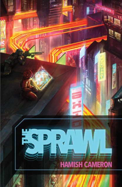

Usability: Great RPG Mechanics #RPGMechanics: Week Nine
Continuing my week of meta-elements which make for great games, I want to talk about physical presentation. There’s a weird mix in my collection of ttrpgs. I have 8-9 shelves filled with physical books and way, way too many accumulated in my badly organized “rpg e-files” folder which has migrated across five different desktops. I’d say pdfs have become the majority at this point. I usually read those on a crappy Samsung tablet, mostly because I have a hard time reading large amounts of text on a screen. So pdfs work better than others– and I appreciate when the designers have thought about these elements.
Printer-Friendly: I love it when a ttrpg has a printer friendly mode. This can take a couple of forms. Some games, like The Sprawl, have a day-mode and night-mode versions. When I first saw the Sprawl’s white text on black background, I didn’t like it. Eventually I found out that was a more comfortable approach for a lot of readers. But I appreciated that Hamish Cameron eventually released a version with standard black on white page design. Other games publishers in the last few years have begun to do this more and more. Star Trek Adventures includes that with the pdf purchase.
The other version of printer/reader friendly is to have layers available in the pdf. This allows readers to turn off distracting page elements: paper textures, watermark art, intrusive page frames. This allows for easier printing, but frankly for me, it makes for easier reading. It just makes me unreasonably angry when I get a pdf with page backgrounds that make it harder for my old person's eyes and I can’t turn those off. Sometimes a pdf will have layers but turning off the backgrounds removes the text as well because they’ve merged the two together. The best games have layers, cleanly separated and cleanly labeled.
Give Me Text: Some games in recent years have offered text-only versions, like The Veil. I love this. It is hugely useful and makes it more likely that I’m going to run that game. I run the majority of my ttrpgs online. Usually that means I’m putting together materials for the players: setting background, cheat sheets, and character keepers. Extracting text from pdfs is a pain, even with a good program. You almost always have to deal with the paragraph breaks and formatting. When a company provides the text, it makes my job significantly easier. If you want people to play your game online, outside of a set VTT package, include the text with the pdf. A lot of folks on itch.io know to do this.
Accessibility: There are a couple of elements which I can’t speak to from experience, but I appreciate when I hear about publishers who spend the extra time getting these things right. My father was color blind and the few board games he played with us often had to be modified to make up for that. Some companies use online tools to check how their material works for the color blind. That’s important where color is used to mark out important information: particularly different colors to indicate different things.
On the other hand, one complaint I’ve heard about certain books is that they’re particularly dyslexia-unfriendly. They choose fonts which look cool but become a pain to actually read for people with this condition. I know tools and resources exist for checking which fonts work better than others. Of course it isn’t just about fonts, but general typographic elements, size, background bits, etc. When I designed the earlier Gauntlet Community revised logos, I had input from a couple of folks who encouraged me to move clutter away from the words and remove some extra type flourishes. It looked better and became more useful as a result.
6 notes
·
View notes
Photo
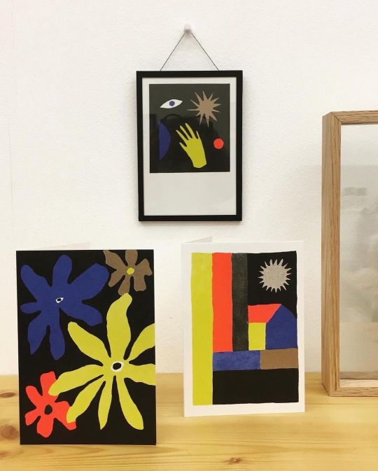
about #universalpostcardframe the @tandemm.grafik sisters well understood the concept of the handmade frames. they are one of the selling points of my work here in bxl. on this moment they have a exposition at their shop with the work of @lysiane.ambrosino (till 11/03). in the expo they use my frames to put the postcards of lysiane in the spotlight. with the simple and clever system you can easily frame / change your favorite postcard and present it horizontal or vertical ! . www.astridfieuws.com rue pletinckxstraat 27, 1000 brussels (open by apointeent or by chance). . ik parle ook #nederlands et du #francais. i’m a #dislectic #graphicdesigner and #typographer with a #passionforpaper and #printtechniques. i grow up in a #printingfamily and i’ve been playing with #paperleftovers all my life. this is my inspiration en red line in my #unique #papetery work. I make #notebooks with #recovered paper + #postcards with #upcycled illustrations from old books + #cards printed with the old #typo letters of my grandfather ; i created a small galery with artworks from (un)known artists - exposed in #handmade frames (you also find in my papetery-work ; ... #nowaste is important, so i do work in small quantities and i compose all the dyes myself by using only #biodegradable products! so... i’m #astridfieuws a #handmadeinbelgium #craftwomen who wounds to share the #artisanalknowledge of #printing by organising #workshops in a #opentypoatelier in #brussels (bij astridfieuws) https://www.instagram.com/p/CohpLVUt90f/?igshid=NGJjMDIxMWI=
#universalpostcardframe#nederlands#francais#dislectic#graphicdesigner#typographer#passionforpaper#printtechniques#printingfamily#paperleftovers#unique#papetery#notebooks#recovered#postcards#upcycled#cards#typo#handmade#nowaste#biodegradable#astridfieuws#handmadeinbelgium#craftwomen#artisanalknowledge#printing#workshops#opentypoatelier#brussels
11 notes
·
View notes
Text
Magazines in the 90s
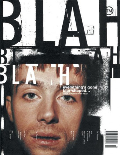
I then wanted to look at magazines from the 90s, more specifically music magazines to get a feel of what the aesthetic was like and kind of layouts and fonts they used. The magazines I found were: Smash hits, Vox, Raygun, Select, Urb and NME.
hhh
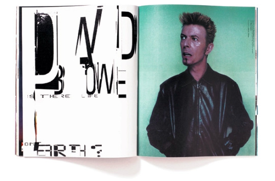
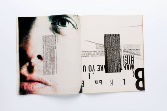
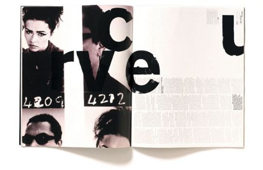
Ray Gun was an American alternative rock-and-roll magazine, first published in 1992 in Santa Monica, California. Led by founding publisher Marvin Scott Jarrett, art director David Carson
Ray Gun explored experimental magazine typographic design and unique angles on the pop cultural currents of the 1990s. The editorial content was framed in a chaotic, abstract "grunge typography" style, not always readable.
I liked the use of the block shape of the body texts in the magazine. They've been made like it on purpose so the kerning between all the letters if different and looks 'wrong'. I think I'll use this in my process book.
Carson also has a good use of negative space in his spreads so I might incorporate that into my project as well as my process book.
6 notes
·
View notes
Text

Inside The Mind
#inside the mind#thouhts#messy mind#chaos#girl face drawing#contemporary artwork#expressive wall art#eclectic art print#modern art#typographic poster#graphical illustration#limited edition#graffiti#grunge design#pink sofa#dry plants#white frame#psychedelic art#graphical prints#guste design
1 note
·
View note
Text
Visual identity and logo
Notes
Yourself
Think about what kind of visual communicator are you?
Are you an illustrator, designer, photographer, typographer, motion designer, animator, art director, problem solver… or combination of these
Think about how you can project and present that through your web portfolio
Think about your identity…
Identity
What is your identity?
A combination of assets that presents and expresses you…
Your identity consists of many things but it is important to think about it as something much more than a logo, logotype or monograph
Typefaces, shapes, colours, patterns images, and tone of voice can all call work together in a system to present something bigger than the sum of its parts.
How you can include little insights into your personality
If you like to be called something other than your full name, it might be appropriate to use that as part of your identity
Remember to keep it simple and don't overcook it!
Logos
They have collected some tips to help you create your identity and logos
Design Process
Brief- consider audience, purpose, message…
Research- contemporary and contextual, consider moodboard
Concept- sketch initial ideas and develop
Critically Reflect- both research and concept
Synthesise and Develop- refine and reiterate
Edit and Present- select a maximum of 3 approaches to present
Black and White
Colour often masks flaws in design so you should always start without colour
If you need more variations, consider using tone first.
Reflection, Rotation and Symmetry
Continually consider reflection, rotation and symmetry in the design and development process
Rotating a logo upside down can often help you identify flaws too
Grid System
Using a grid system can assist in the design stages. When used correctly it can help to create a very strong design
Vectors
Where possible use vectors as this will help you to scale designs easily
Always work very high-resolution rasterised files so that they can be scaled down appropriately
Scale and Orientation
Consider how well it will scale and how it works in different orientations
This is particularly relevant when applying it to your online collateral
Typefaces
Great time and consideration should be given to this aspect
Try to avoid using more than 2 typefaces in your design
Space
Consider negative spaces, this includes when designing the logo but also when placing it in context
Often the brand guidelines will make reference to the space around by using proportions of the elements inside the logo
Line Weight
Consider the weight of the line in various design components, making subtle changes to this will help you to refine the logo and differentiate elements
Framing
Sometimes it's useful to experiment with frames, borders, housing and design details. Begin with geometric shapes and simple lines but do not be limited to this.
Be mindful commonly the more complex these elements get the more difficult they are to reproduce at smaller scales and they can quickly detract from other components.
Non-Destructive working and saving
Keep components separately so you can remake elements easily during your process
Equally, remember to save the versions as this will allow you to revert if you make mistakes or corrupt files
Expand lines and shapes
To expand lines and shapes when you have finished designing and want to test scales
If you don’t you will find that component won’t always reduce proportionally when you scale it.
8 notes
·
View notes
Note
Read your 15x10 spn recap, and I loved the analysis! Really succinctly summed up what the episode was doing and its influences!
I was just wondering if you could expand on the better metafictional stories you’ve read? I’m on a metafiction kick right now, but I’m not sure where to get ones that are more meat-y than the shallow MCU lampshade types. Similarly, I’d love to hear of any metamodern works you like?
Glad you enjoyed the recap! And quite happy to expand more, although with the caveat that my understanding of the 'official' definition of metafiction is a bit fuzzy, so the works below may be more or less metafictional.
If you're into comics/superheros, I'm sure you've heard of / read Watchmen: it's the quintessential "superhero comic about superhero comics," it's a classic for a reason, it holds up even now. It was on my mind while watching 15x10, as well as Opus by Satoshi Kon, which isn't about superheroes but is very much a comic about comics: It's the story of a mangaka who's confronted by characters from his manga in real life and the problems that ensue. While Kon is better known from his films, like Perfect Blue or Paprika (both of which I'd also recommend), imo Opus is an underrated work of his.
For books, there's If on a winter's night a traveler by Italo Calvino, a book about books & reading & stories told through a second-person narrative and the beginnings of 10 different novels. House of Leaves by Mark Z. Danielewski is a complicated book within a book within a book(1) about a spooky house, the family that moves into it, an essay about the short film the family makes at the house, and then the layabout reading that academic essay, plus way too many footnotes combined with some off the wall typographic & printing layouts. Another book that uses the structure & formatting of how text is placed on the page to tell its fictional story is The Raw Shark Texts by Steven Hall, a story about a man with no memory who starts getting letters from his past self explaining he's being chased by a maybe-literal-maybe-not shark who wants to eat him & his identity. If you want to get really old school, there's The Life and Opinions of Tristram Shandy, Gentleman, by Laurence Sterne, with Tristram as a narrator being very aware he's telling a story about his life. (Also, it's quite funny. The 'classics' often are much funnier than people give them credit for.)
Talking plays, I adore Rosencrantz and Guildenstern Are Dead. Delightfully hilarious play within a play, existential questioning, and very metatheatrical. (I haven't read / seen it but I did listen to an interesting podcast on The Knight of the Burning Pestle, which is a play within a play where 2 audience members get disgruntled at the show they're watching and take it over to to add their own story to the mix.)
For video games, I remember quite enjoying Pony Island when I played it a while back.
And to throw in a last one that's a bit more pop cultural, there's "A World of His Own" from the Twlight Zone. I won't spoil the twist, but it's an episode about writers as creators that plays with the structure of Rod Serling's iconic commentary after each episode. (It does have some sexist framing/characterization, however, if that bothers you.)
After all, isn't a "house of leaves" just a poetic way of describing what a book is?
#asks#linisiane#metafiction#i wish i knew more pop culture metafiction / commentaries but hopefully something intriguing here for you :)
4 notes
·
View notes
Photo

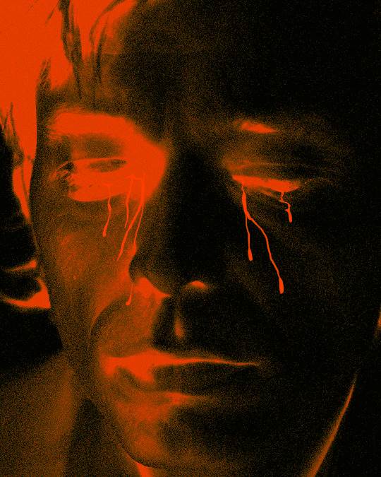
Humans cry. To dictate standards set into binary is to restrict and cause implosion. Toxic, not all. We cannot banish in total. For aggregates and commonalities bed outliers. It is not all men, but too many. Not enough support. Standards of non-feeling make unfeeling people. Cut-off from emotion, birthing shapeless men. Devoid of true humanity, edging further into oblivion. The stifling of oneself is to be shunned, not embraced.
Through the years of sourcing stock images for subjects, often finding there were almost half the results for “Man crying” than “Woman crying”. ‘MOURN’ is a counter to this experience. Adding fragility and serenity, absent from the source.
MOURN V
[DIGITAL ARTWORK, 2023]
‘Existing imagery, rendered in noisy ember effect, with typographic frame.’
IMAGE SOURCE:
Pexels 4098339 - by Cottonbro Studio.
TYPEFACE:
‘BRUTUX — OL’ by Olio Studio.
IMAGE DESCRIPTION:
An oval shaped artwork depicting a close up shot of a Male with several tears streaming down their face. Rendered in a noisy Red and Black, with text on each side in a blocked typeface that reads ‘MOURN V’. All on a Black background.
6 notes
·
View notes
Text
Writing Recap
The last week-ish of November was punctuated by what I'd like to call Self-Editing Fugue, in which I felt like I stopped being able to see typos altogether even though they were right in front of me and started questioning everything I'd written. I excised commas and put them back in five minutes later. I still managed to get the 4 planned shorts uploaded to Ao3 in roughly the time frame I set for myself, to the tune of roughly 20,000 words.
Tentatively on the list still:

What's the difference between WIP and Outlining, you ask?
WIP is if I have enough hubris to think I know how I want the story to end.
I'm working on a better workflow for writing out title/tags/summary/notes during the editing process, because this is the thing that bogs me down the most when posting my stuff. I'm at least remembering to save a PDF of a posted work immediately now. Just in case.
I'm a checklist-oriented person so I'm going to make a goddamn checklist sometime in the next week. I had a whole style doc saved at one point prior to the Great Brain Fog of 2020-2024, but I think it was eaten and I never kept any printed copies. Pour one out, it would've saved me so much trouble remembering my common mistakes.
Some vague goals for 2025 (good luck to me):
Post more WIP stuff (snippets don't have to be promises to finish some little idea that floated through my head)
Stay organized (yikes)
Figure out a better way to organize my plot notes, a process which currently solely consists of:
1. Waking up in the middle of the night and writing something incomprehensibly full of typographical errors in the notes app, 2. Wanting to cry, 3. Thinking of a really great line in the shower and forgetting it by the time I get out
0 notes