#Santiago chunky design
Explore tagged Tumblr posts
Text
BTS Preview | Chunky Retro Design :. Collectors Edition
Building on the Influencer Collection -- here's the latest release added to the custom crafted styles, made in Italy.
#chunky retro basketball sneaker#latest addition to the influencer collection#made in italy#custom collections#sneaker club#Italian leather#new york collectors edition#the big apple#one of a kind sneakers#bts#sneak peek#designed by ace#ace of solutions#organic legen haus#the renaissance kid#Santiago chunky design#BoredACES#sneaker café ©#digital cafe ©#repost#fortheculture#thedigitaldigest🗞️#digitalculture#social media#aceupdates#aos#entrepreneurship#trendsetters#new kicks on the block#Instagram post
1 note
·
View note
Note
question: you talk abt the crew's fashion choices in their intro posts a bit, but what are their comfort outfits that they wear the most? i'm so excited for this game i literally can't stop talking abt it to my friends xD
Okay first of all this is like the sweetest thing anyone’s ever said to me <3 Second of all these got kind of long but your answers are under the cut! (I also know nothing about fashion so bear with me)
King: He has wrangler jeans for every day of the week but the pair that used to have a hole worn into the back right pocket is his favorite because his mom sewed a colored patch to fix them and now he gets warm and fuzzy every time he sees it. His brown leather Ariat boots are well-worn but also well taken care of. (Side note: his moms have a collection of all the boots he’s grown out of that they keep to coo over occasionally because they’re utterly sappy and filled with ooey-gooey love for their baby boy!) His favorite shirt is a navy collared button-down with white zig-zag patterns. He has a bunch of other printed shirts in fun colors that he shows in, but this one is extra soft and he wears it to school his horse/work cattle all the time. He also has a favorite cowboy hat!! It’s white and pristine and he wears it to shows and for special occasions ONLY because his grandma gave it to him so it’s very special.
Charlotte: If she’s not at the barn she’s wearing her favorite pair of pants: pastel green high-waisted corduroy shorts. She usually pairs these with a loose neutral-colored tank top and a long chunky tan cardigan with large faux-wood buttons. She wears ankle-high gardening shoes that are comfortable and cute with little flower designs covering them and spends most of her day in the garden. Unless, of course, she’s working on Jolene. In that case she’ll wear what she calls her grease-monkey outfit, which is a white tee under denim coveralls complete with steel-toed boots. She and King are tied for the most fashionable but her outfits are more diverse, for sure.
Kit: As a working student she’s in riding clothes 99% of the time so her go-to outfit is her favorite shirt (an off-white tee with a faded rainbow design on the front) tucked into grey breeches with a black leather belt that used to belong to her dad. If she’s riding she’s in her tall boots, but when she’s just running around doing errands you can see her Kermit the frog socks that go up to her mid-calf and are paired with worn converse that have all sorts of doodles on the canvas. If given the option her attire would be much wackier but the Mannors are strict about what they consider to be ‘barn-appropriate attire’ and she cuts it close as it is.
Santiago: His soft, fleece-lined denim jacket is a must-have as soon as the weather starts to turn. Otherwise he keeps it pretty casual with a nice pair of working jeans and a comfortable cream-colored henley-type shirt (comfy and harder to notice all the wood shavings on!) He and Kit are the least fashionable but where he takes that as a cue to keep things simple and functional, she’d go all-out camp in a heartbeat.
#how does it feel to hold my life in your hands anon?#also sorry i realize i got away from the question a bit in some places#asks#king jones-smith#charlotte nguyen#kit kelley#santiago vargas
12 notes
·
View notes
Text
Step Into Spring With The Citizenry’s Serene New Collection

The Desert Calm Collection is a soothing assortment of rugs, pillows, and other thoughtful home accents.

The Citizenry’s spring collection makes it easy to bring the tranquility of the desert into your home with muted hues, abstract designs, and a respect for handicraft.

Photo: The CitizenryThe Citizenry works with artisans across the globe to create beautiful, long-lasting products. Wool pillows from Peru use 100% sheep wool and 100% cotton for a new cozy edition to your couch or bed, while their hand-loomed pillows from India use 100% linen for a light, springy update to your home. Many of their rugs are crafted in Northern Argentina, one of the most impoverished areas of the country. Of the artisans they work with, 80% are women, and all are masters of traditional techniques like hand-spinning wool, dyeing with natural pigments, and hand looming.

Photo: The CitizenryAs an added bonus, The Citizenry gives back proceeds to all of their artisans to build their communities and allow them to continue crafting what they love.
The Citizenry Leena Accent Rug

The softest of the soft: a high-pile wool accent rug, masterfully handwoven by artisans in Morocco. If you ever need a soft spot to land, look no further. This cream accent rug is a thing of plush beauty. The high-pile wool is perfect bedside, in a guest room, or anywhere you want to add a touch of luxury. The diamond design and braided tassels give it a just-right amount of visual interest, too. While most Moroccan rugs on the market today are vintage, this one has been handcrafted exclusively for The Citizenry. Each rug takes up to a week to complete, made by a fair trade cooperative dedicated to preserving this lost art. Photo Courtesy of The Citizenry
The Citizenry Zara Lumbar Pillow

Soft colors, hand-stitched details, and lightweight linen. A small lumbar pillow that proves there’s beauty in simplicity. Soft and feminine, this small lumbar pillow is best summed up in one word: perfection. The masterfully hand-stitched detailing – a technique called fil coupé (which means "cut threads") – is highlighted in a beautiful, desert-inspired palette, set against crisp linen. Style it anywhere to add a laid-back, artful touch to any space. Handcrafted by a group of master weavers in Kannur, India, each pillow is made in a fair trade environment. From start-to-finish, it takes about half a day to complete one pillow. Photo Courtesy of The Citizenry
The Citizenry Samaya Pillow

Casual linen and modern craftsmanship combine on this beautifully handcrafted pillow. Every styling situation craves a good anchor. Well, look no further. This beautiful linen pillow works perfectly on a couch or in lieu of traditional Euro pillows on a bed. It’s simple and neutral but with quite a bit of interest – with striking color blocking balanced by a soft, neutral color combo. Handcrafted by a group of master weavers in Kannur, India, each pillow is made in a fair trade environment. From start-to-finish, it takes about half a day to complete one pillow. Photo Courtesy of The Citizenry
The Citizenry Mendoza Chunky Wool Area Rug

Chunky, oh-so-soft wool. All natural dyes. A stunning area rug that effortlessly pulls together any room. With the versatility of jute, but the supreme softness that comes from 100% wool, this rug is durable, unexpectedly neutral...and did we mention oh-so-soft? The super chunky wool gives it a plush feel, and the striking design adds a just-right amount of visual interest. Hand-dyed using natural pigments, this rug is a thing of beauty and truly special. Each rug is handwoven by a fair trade workshop in Santiago del Estero, Argentina. From sourcing the wool locally, to cleaning, spinning, dyeing by hand, and then weaving, they have mastered every part of the process. From start-to-finish, it can take up to eight weeks to complete one rug. Photo Courtesy of The Citizenry
The Citizenry Akshay Area Rug

Equal parts modern and timeless, this textured area rug brings a sophisticated look to any space. Soothing grey palette, dimensional pattern, soft under foot. If this sounds like the rug of your dreams, it’s because it totally is. Handwoven from 100% wool, this neutral rug adds a cozy layer to your space while packing quite the textured punch. Perfect for styling in a living area or bedroom, it begs for you to kick off your shoes and make yourself at home.This rug is handwoven by master artisans in Panipat, India. From start-to-finish, each one takes up to five weeks to complete, all made in a fair trade environment. Photo Courtesy of The Citizenry
The Citizenry Maravi Wall Hangings

Go global with these stunning palm wall hangings, meticulously handwoven in Malawi. Sculptural and a true work of art. That’s how we would describe these statement wall hangings. Each one is handwoven with a weave so intricate, you have to see it up close – and once you do, you’ll notice that the weave is intentionally deconstructed in such a way that the natural palm takes center stage (we meant it when we said they’re art). Available in two sizes: medium and large. These wall hangings look great on their own but even better in a set of two. Mix and match sizes to create your own custom look. Meticulously created and handwoven by artisans in Malawi, each wall hanging takes up to five days to complete. All made start-to-finish in a fair trade environment. Photo Courtesy of The Citizenry
The Citizenry Nora Zanafi Area Rug

Bold and incredibly detailed, an authentic Zanafi rug handwoven by master artisans in Morocco. Woven in the High Atlas Mountains of Morocco, this Zanafi rug is handcrafted by master weavers working to preserve the ancient art and heritage of nomadic tribes in that region. Featuring the signature flat-weave, diamond pattern, and woven stripes, not only does this rug teem with craftsmanship and history — it brings an element of uncommon beauty to any space, too. This authentic Zanafi rug has been handcrafted exclusively for The Citizenry. Each rug takes four weavers two to three weeks to complete, all made start-to-finish in a fair trade environment. Photo Courtesy of The Citizenry
The Citizenry La Forma Pillow

An accent pillow that’s the perfect blend of warm desert tones, luxe sheep’s wool, and abstract design – all handwoven by master artisans in Peru. With its warm palette and abstract landscape design, this pillow takes a cue from Peruvian sunsets to help you create your very own desert oasis. Perfect for all seasons, the blend of neutrals and blush bring warmer weather to mind, and sheep’s wool keeps things cozy when the temps drop. With a durable cotton back, you can style this beauty in bedrooms or high-traffic areas alike. Handcrafted from sheep’s wool, each pillow is made by a group of 26 master artisans in Lima, Peru. All made start-to-finish in a fair trade environment. Photo Courtesy of The Citizenry
The Citizenry Villa Lumbar Pillow

Bold Zapotec design meets an earthy palette. Say hello to the only pillow you need. Inspired by the architectural details found throughout Oaxaca, this oversized lumbar pillow combines earthy, desert hues in a way that’s both bold and neutral. A "one and done" statement piece, this one pillow can single-handedly complete a bedroom or couch look. Handwoven with 100% sheep’s wool and naturally dyed using native plant extracts. From start to finish, each lumbar takes three days to complete, all made in a fair trade, female-led workshop in Oaxaca, Mexico. Photo Courtesy of The Citizenry We love the products we feature and hope you do, too. If you buy something through a link on the site, we may earn an affiliate commission. Related Reading: Deliver Plants Directly to Your Doorstep With Bloomscape’s New Mother’s Day Collection Our 30 Favorite Plush Pieces to Create a Bedroom Sanctuary Source link Read the full article
0 notes
Text
19 winter shoes that will keep you warm and your style game high
f you still haven’t found your perfect pair of winter boots, you’re in luck. We scoured the web to find you the most fashionable winter shoes that meet your style and budget. Whether you’re looking for a chic pair of knee-high leather boots for work, shearling ankle boots for the weekend or practical rain and snow boots, we have you covered.
Above, shop our 19 favorite winter shoe picks.
The editors at Yahoo Lifestyle are committed to finding you the best products at the best prices. At times, we may receive a share from purchases made via links on this page.
Read More from Yahoo Lifestyle:
• 13 gorgeous Valentine’s Day jewelry gifts starting at $38 • Why Meghan Markle’s ‘boring’ outfit is actually perfect for work • Underwear ‘joy checks,’ plus 5 other Marie Kondo organizational hacks that changed my life
Follow us on Instagram, Facebook, and Twitter for nonstop inspiration delivered fresh to your feed, every day.

Winter shoes
It’s not too late to find your dream boots for the winter season. (Photo: Shopbop; art: Yahoo Lifestyle photo-illustration)
Source: Yahoo Lifestyle
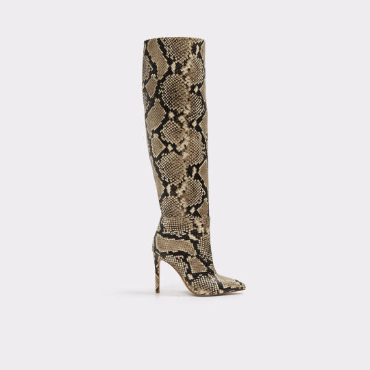
Aldo Zoania Boots
It’s all about the snake print this season — in fact, it’s the new leopard. You will love our favorite new neutral — it goes with absolutely everything in your closet. Get the look of Emily Ratajkowski’s pricy boots for a whole lot less with this Aldo version. Shop it: $150 (was $200), aldoshoes.com
Source: Yahoo Lifestyle

Jeffrey Campbell Lilith-2 Lace Up Bootie
We are mad for plaid, not to mention these booties. Talk about a boot with attitude! This lace-up reaches new heights with a four-inch heel and platform with lug sole. Add in a few silver studded straps and this boot boasts some of the biggest style trends of the season. Shop it: $150, jeffreycampbellshoes.com
Source: Yahoo Lifestyle
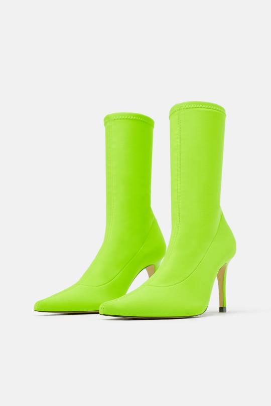
Zara Fluorescent Sock Style Heeled Ankle Boots
The sock boot has enjoyed its moment this fall and winter, but this sleek style is taken to the next level when delivered in runway’s “it” color, neon green. This color super-charges anything you pair it with and breathes new life into last year’s wardrobe. Shop it: $90, zara.com
Source: Yahoo Lifestyle
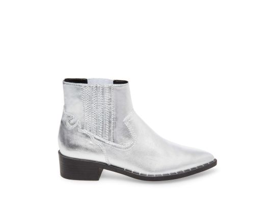
Steve Madden Juke Box Silver Leather Flat Boot
The urban cowgirls out there are going to be kicking up their heels in these metallic must-haves. These fab flat boots pack some punch with two trends in one — the Western trend (arguably the biggest shoe trend of the season) and silver color trend. And with a sale price of $40, this is a great opportunity to try give these two trends a ride at once. Shop it: $40 (was $130), stevemadden.com
Source: Yahoo Lifestyle

Banana Republic Demi Embroidered Smoking Shoe
This season, the loafer is also basking in the glow of on-trend status. Look out for embellished takes in luxurious fabrics like these velvet smoking slippers. We especially love the XO and heart embroidery — the perfect romantic salute to Valentine’s Day. Shop it: $118, bananarepublic.com
Source: Yahoo Lifestyle

Aldo Merurka Sneaker
So, you may have heard of the “Dad” Sneaker trend, but perhaps the moniker “rad” would be more appropriate? Yep, these sneakers take the cushiony comfort of Dad’s favorite orthopedics and give them some edge with exaggerated curves, colors and platform lift. We’re seeing them worn with everything from midi dresses and skirts to trousers and everything in between. Shop it: $90, aldoshoes.com
Source: Yahoo Lifestyle

Moon Boot Classic Low Snow Boots
Yes, the Moon Boot is having a comeback. A 70’s staple, the Moon Boot was first designed in Italy as an after-ski boot and takes inspiration from the boots worn by the Apollo astronauts. And talk about comfort — did someone say zero-gravity? Shop it: $119, asos.com
Source: Yahoo Lifestyle

Dr. Martens 1460 Pascal Darcy Floral
Combat boots stomped their way down the runways this season, and we are loving this fresh floral take from Dr. Martens. Bountiful blooms on a navy base bring an unexpected femininity to the punk-inspired lace-up boots, and they look great with everything from midi skirts to leggings and jeans. Shop it: $150, freepeople.com
Source: Yahoo Lifestyle

Sorel Joan of Arctic Boot
Sorel’s Joan of Arctic boot has become a modern day classic, boasting the best of fashion and function. These waterproof wonders stylishly conquer whatever weather Mother Nature dishes out. So comfy and good looking, you won’t wait for snow as an excuse to sport them. Plus, we love the cozy faux fur detail. Shop it: $190, zappos.com
Source: Yahoo Lifestyle

Diane von Furstenberg Reese Boots
Every woman needs a pair of classic black leather boots in her wardrobe. Style them with a chunky knit sweater and midi skirt for the weekend or with an LBD for the office. Shop it: $249 (was $498), shopbop.com
Source: Yahoo Lifestyle
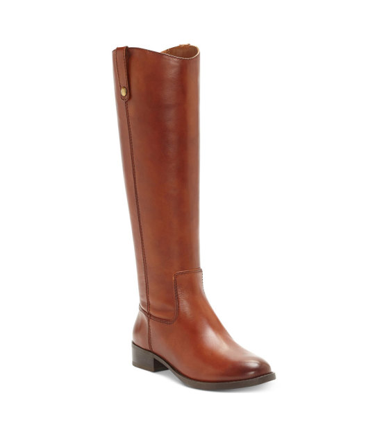
I.N.C. International Concepts Fawne Riding Boots
These I.N.C. boots are top-rated and a best seller at Macy’s, and we can see why. They have a classic equestrian style and hit perfectly at the knee. If cognac isn’t your taste, they come in five other colors, too. We suggest styling them with skinny jeans and a crew-neck sweatshirt. Shop it: $90 (was $180), macys.com
Source: Yahoo Lifestyle

Camper Katie Boot
These two-tone ankle boots have a low block heel for those who love a good boot but hate wearing high heels. You’ll wear these booties everywhere: to work, on a date and to dinner. Shop it: $100 (was $190), urbanoutfitters.com
Source: Yahoo Lifestyle

Stuart Weitzman Jett Boots
Very rarely will you be able to score Stuart Weitzman boots for less than $200, let alone this gorgeous camel pair. They have a wide-leg opening and a tall heel for a slight bohemian feel. We suggest styling them with your favorite paisley dress and cocoon coat for the wintertime. Shop it: $194 (was $645), shopbop.com
Source: Yahoo Lifestyle

Hunter Original Play Boot Tall Rain Boots
If you’ve always wanted to own a pair of Hunter boots, now’s your chance. At just $66, you can own this set of beautiful blue rain boots by the historic British brand. Get ready to splash around in puddles again like you’re 5 years old because rainstorms will never be the same once you own a pair of these. Shop it: $99 (was $110), zappos.com
Source: Yahoo Lifestyle
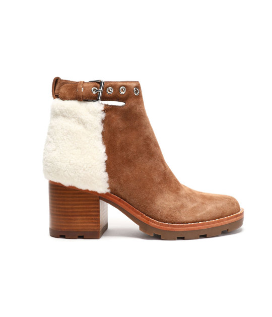
Sigerson Morrison Santiago Shearling-Paneled Suede Ankle Boots
We love the contrast details between the shearling and suede on this stylish pair of ankle boots. If you love a statement winter shoe, look no further. Wear them with jeans or your favorite skirts and dresses — the options are endless. Shop it: $225 (was $450), theoutnet.com
Source: Yahoo Lifestyle
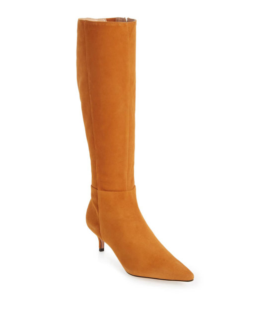
Schutz Knee-High Boot
For the fashionista who is sick of wearing black all the time, these golden knee-high boots will do just the trick to brighten up dreary winter days. Shop it: $118 (was $295), nordstrom.com
Source: Yahoo Lifestyle
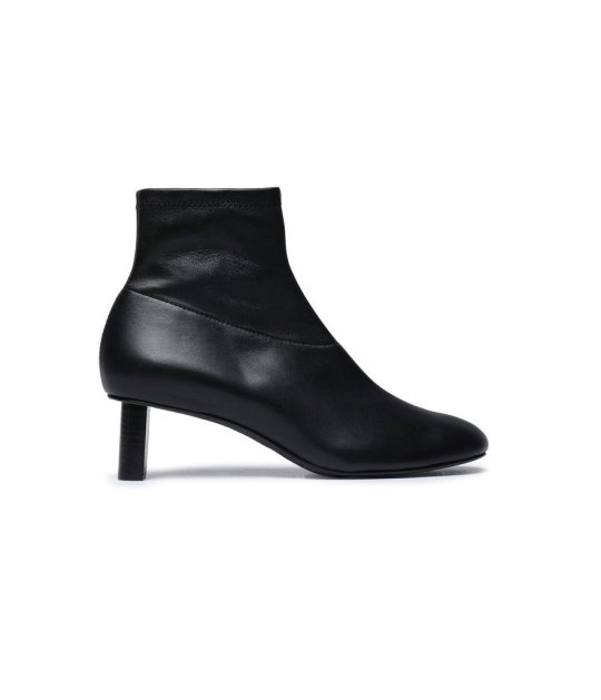
Joseph Leather Sock Boots
We love the cigarette heel on these black leather booties. They fit snugly like a sock, but your co-workers will never know how comfortable they really are. Shop it: $297 (was $595), theoutnet.com
Source: Yahoo Lifestyle
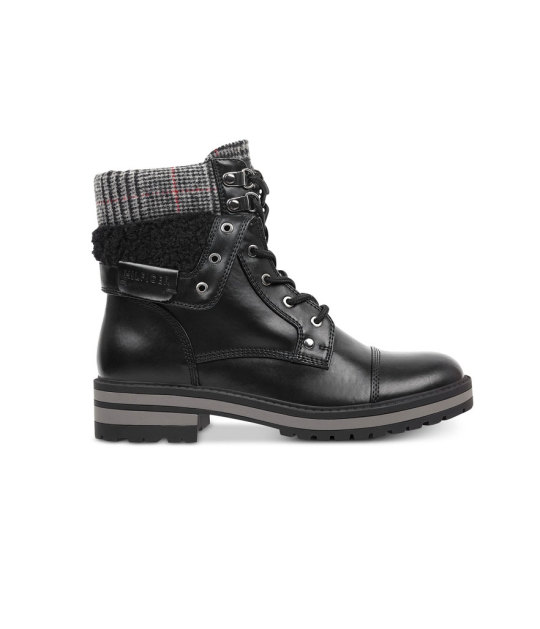
Tommy Hilfiger Dyan Lace-Up Winter Boots
For the shopper who is looking for a more rugged winter boot: This stylish winter hiking boot is perfect for someone who misses ’90s grunge. Shop it: $65 (was $129), macys.com
Source: Yahoo Lifestyle
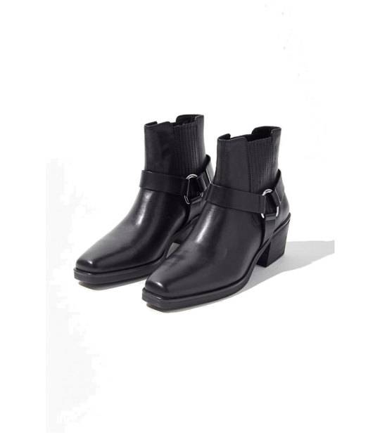
Vagabond Shoemakers Simone Moto Boot
For the woman who has a little edge, these moto boots are tailor-made for you. Style them with your favorite moto jacket, and it’s a match made in heaven. Shop it: $100 (was $195), urbanoutfitters.com
Source: Yahoo Lifestyle
#yahoo shopping#winter boots#winter#_lmsid:a0Vd000000AE7lXEAT#_revsp:wp.yahoo.style.us#_uuid:fb02561b-ea4a-3f3a-b4be-0425e2ecf31c#sale#boots#style#slideshow#boot#fashion#shopping
0 notes
Text
HEADCANON: WARDROBE. i know i’ve talked about kelli’s wardrobe before but i kinda wanted to do a short n messy version of what everyone’s basic wardrobe is like so!
kelli: a lot of black, plaid and leather. lots of leather jackets, combat boots, plaid in a plethora of colors, and faded band t-shirts. limited jewelry or makeup, if any. mostly just jay’s and her’s wedding bands on a chain and sometimes eyeliner/eye make up.
jay: he does wear a lot of lunar eclipse merchandise: various t-shirts with the bar’s logo on them. also wears a lot of plaid, generic men’s work shirts. gold jewelry occasionally.
alyssa: very into nuetral/pastel colors. plain shirts, colored jeans, converse, leggings, hoodies. dresses mostly for comfort.
dan: beanies, too big sweaters and hoodies, fuzzy socks. nails are usually painted, usually in a shade of yellow without any design.
lucas: usually looks like he’s on his way to an important interview. nice sweaters and vests, slacks and black shoes. probably has a skin routine.
honora: has a fairly masculine sense of dress: henleys, plain men’s t-shirts, sweats/jeans and boots. when required to dress up, they will usually opt for jackets/suits vs something more stereotypically feminine.
zelda: very 70’s vibe. everything is flowy and floral, oversized sunglasses, sun hats, sandals. loves jewelry, chunky necklaces, multiple rings on both hands, tons of bangels and bracelets.
angelica: very feminine in color, has and wears a lot of pink / red / gold. favors sweaters, pencil skirts, dresses, heels. very rarely dresses casually, always looks nice / well put together.
santiago: lots of dark colors, black / brown / army green. layers for days, almost always seen in layered t-shirts / button ups.
teddy: lots of leather, but he owns a bike so it’s actually functional. work boots, button ups, plaid, work shirts. whatever he’s wearing probably has oil on it.
leo: cargo shorts, wide shouldered tank tops, sandals. dresses like he still lives on the beach even if its - 45 and snowing outside. will dress reasonably if he uses teddy’s bike, though.
1 note
·
View note
Text
America’s design community comes into its own
A heated plagiarism scandal that rocked design discourse, a splashy return to 1970s maximalism, and independent design came out on top. With New York City’s annual NYCxDesign festival now officially concluded, these are just some of the lasting impressions from two weeks that were chock full of events, launches, and installations.
Held less than a month after Milan Design Week and Salone del Mobile—the world’s largest and longest-standing trade show dedicated to furniture and product design—NYCxDesign is our most comparable stateside counterpart, with several fairs and countless pop-up events spanning the city’s five boroughs. Yet despite the fact that New York is home to a higher density of design professionals than anywhere else in the country, NYCxDesign has often been regarded as an afterthought to industry insiders: Larger brands and furniture houses will often present the same collections just previewed in Milan, and often with activations much less grand than those presented abroad. (It’s hard to compete when Milanese pop-up venues are often ornate, centuries-old palazzos, open to the public just for the occasion.) What’s more, NYCxDesign has rarely been able to contain itself to a single, tidy week—last year, it ballooned to span nearly the entire month of May, making it a marathon event that might dissuade international visitors from being able to take the whole spectrum of events in a single visit.
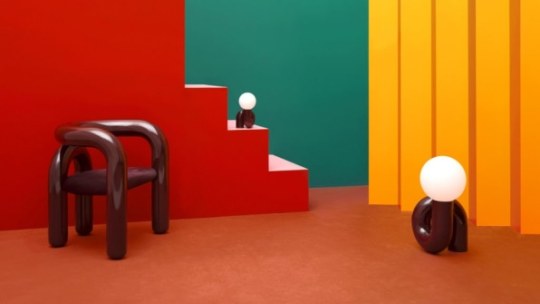
[Photo: courtesy Jumbo]
All of those factors, however, also give NYCxDesign some distinct advantages: There’s no shortage of homegrown talent, and with the high cost of attending and exhibiting abroad, many local designers opt to go all in on their home turf. With cross-disciplinary collaborations, spirited debates, and a host of openings celebrating independent work, this year convinced us that American design may have finally, refreshingly, come into its own as a platform where designers can speak to a broader audience. This year’s edition of NYCxDesign genuinely felt like a cultural event, more akin to fashion week or a film festival than a staid trade show. Read on for our top five takeaways.
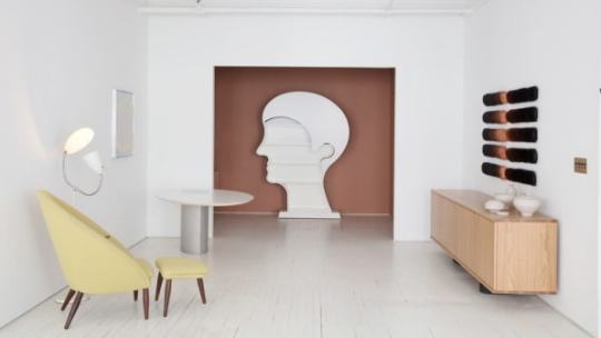
Egg Collective, Designing Women II. [Photo: Egg Collective]
Rise of the designer-curator
In the age of social media, are any of us not curators? This year saw a surge in a particular breed of multi-hyphenate—the designer-as-curator-and-exhibitor—with a number of independently organized group exhibitions in a show of tight-knit community. Last year, in the jarring wake of Trump’s presidential election, the all-women design trio of Egg Collective mounted a show of work by women designers in their downtown showroom, in a positive and constructive flex of dissent against the state of affairs. As a follow-up to the widely lauded effort, this year they teamed with Lora Appleton of Kindermodern on Designing Women II: Masters, Mavericks, and Mavens, featuring an international and cross-generational mix of mixed-media works by Nicola L., Mimi Jung, Mira Nakashima, Bari Ziperstein, and more.
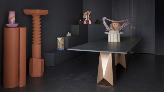
Egg Collective, Designing Women II. [Photo: Egg Collective]
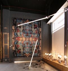
Eskayel, Next Level [Photo: courtesy Eskayel]
Manhattan was particularly hard-hit by the decline of brick-and-mortar retail this past year, with a string of closures in previously high-trafficked districts—look to the formerly boutique-packed stretch of Bleecker Street in the West Village for a prime example of how digital-first commerce has affected neighborhood streets IRL. The vacant storefronts are signs of a changing industry, and for some designers, a serendipitous boon. At a former Superdry clothing store on Broadway—one of several vacancies on the main thoroughfare in Greenwich Village—several studios banded together to present Next Level, a group show of work by their peers and friends, partly looking to channel the cultural fervor that completely overtakes Milan during their design week.
“[Eskayel] exhibited at Salone for the first time ever this past year, and it really opened my eyes as to what was possible,” said Nick Chacona, a partner at the Brooklyn rug studio Eskayel, one of the show’s organizers. “Events are so integrated into the city there, and we wanted to bring some of that approach here to New York.”
In East Williamsburg, the tongue-in-cheek design collective Jonald Dudd (no, that’s not a typo) curated Return of the Living Dudd, a group show housed in a recently abandoned, half-gutted 99 cent storefront. Framed as a “platform for dissenting objects,” it was easily the wackiest batch of works to surface all week—ranging from vessels with live-oozing goop in swirling shades of pink and green, to a seatless chair made of square bathroom tile—all placed in a collage-like disarray upon a swooping, cobalt-blue carpeted backdrop that evoked an appropriately internet-bred aesthetic. As the curators Lydia Cambron and Chris Held held forth: “Punx not dead.”
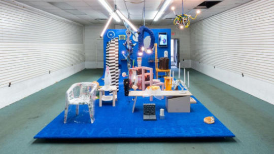
Jonald Dudd, Return of the Living Dudd. [Photo: Jason Mandella]
Their DIY ethos was a refreshing counterpoint to the hallowed halls of Jacob J. Javits Center—home to ICFF, the longstanding trade show anchor to NYCxDesign—and gave the corporate approach a run for its money. New York’s new class of designer-curator-whatever brought out some of the most compelling work of the festival.
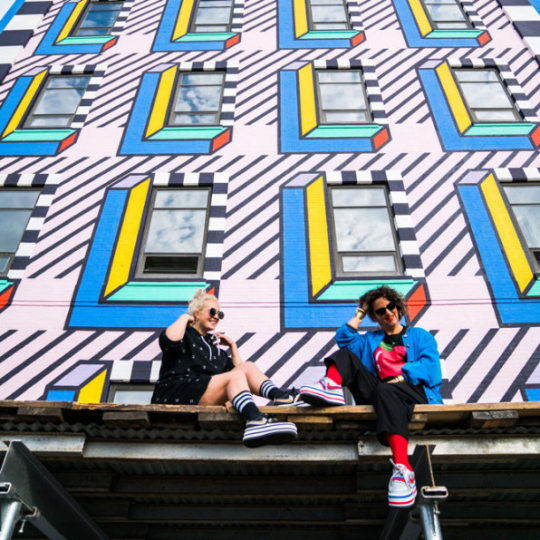
Camille Walala [Photo: courtesy Industry City]
Fashion, design, and internet culture collide
Chunky geometries, tubular forms, furry surfaces, and supergraphic patterns were all out in droves this year. It was a signal that 1970s maximalism and a fashion-influenced approach to interiors are still driving many independent designers. Was a secret memo circulated to all of the cool young makers, or has the Internet given birth to a globalized ur-aesthetic? Seen at the various booths of design fairs WantedDesign, ICFF, and Sight Unseen alike, it stood up alongside the enduring popularity of midcentury and Scandinavian modern design. Seemingly more concerned with form than comfort or function, many of these works channeled an approach to furniture and interiors driven by fashion.
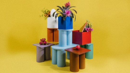
Kamarq [Photo: Travis Chantar/courtesy Kamarq]
The idea of how fashionable trends spread, particularly in our internet-driven society, became a topic of heated debate after Kamarq, a Japanese startup aspiring to be the “Netflix of furniture,” was forced to cancel its debut collection within hours of its launch, after copycat claims on Instagram went viral overnight. The designers of the collection, fashion personality and former Lady Gaga stylist Nicola Formichetti, and PJ Mattan, a consultant behind brands like Hem and Bezar—neither of whom had previously ever designed furniture, and extolled the idea of a “fast fashion” approach to home interiors—suggested their tube-and-slab forms were so basic so as to allude authorship, while many others (including this writer) saw undeniable likenesses to a 2015 Matter collection by independent designer Ana Kras. The Wing cofounder Audrey Gelman, artist Katie Stout, musician Dev Hynes, and Hem founder Petrus Palmer were among the many creatives who commented to weigh in on the controversial topic that, fittingly, cemented Kamarq as a “fast fashion” brand indeed.
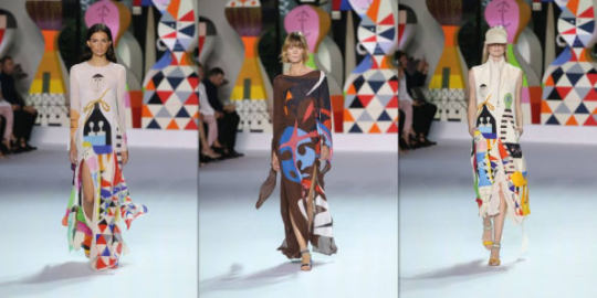
Vitra+Akris+Alexander Girard [Photo: courtesy Akris]
In general, the fashion world played a significantly direct influence in NYCxDesign this year, with trendy downtown boutiques Philip Lim, Creatures of Comfort, and Opening Ceremony among the many fashion fixtures that teamed up with local furniture designers as part of Sight Unseen‘s curatorial project Field Studies, which paired creatives across various disciplines to produce unique one-off pieces, with proceeds going to a range of charitable causes. Even the big brands got cuddly with the fashion world: Swiss furniture juggernaut Vitra launched a series of dresses and skirts with Akris, featuring iconic patterns by the legendary midcentury textile designer Alexander Girard.
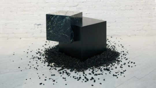
Retrosuperfuture, Slash Objects [Photo: Sean Santiago]
The ecological imperative
The model of a circular economy—by which resources and materials are continually circulated, from by-product to manufacture, in order to drastically reduce waste—has been simmering within critical design discourse for the past several years. And while such thinking has begun to infiltrate even Milan’s luxury-focused design week, it emerged in top billing at NYCxDesign, where some of the most highly attended projects applied the progressive model toward working proofs of concept.
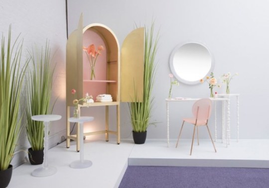
Kim Markel + Glossier [Photo: Charlie Schuck]
At the sunglasses shop Retrosuperfuture, architect-designer Arielle Assouline-Lichten of Slash Objects presented an installation inspired by traditional Japanese rock gardens, but traded stone for rubble-like mounds of shredded tires and recycled rubber. Designer Kim Markel, who often works with discarded plastic bottles to mold translucent, candy-like creations, paired with cosmetics brand Glossier to create a luscious armoire with pink-tinted panels made from the company’s packaging, saved and collected for months by its employees. For her spindly side tables, she lathes spun stone dust, the powdery composite waste left behind from stone cutting. And in Brooklyn, the MINI-backed design incubator A/D/O continued its recently launched, year-long program tackling the global clean drinking water crisis.

Finnish Cultural Institute of New York, Zero-Waste Bistro. [Photo: Nicholas Calcott]
Communal dining proved to be the basis of a winning engagement at WantedDesign Manhattan, a smaller trade show of international exhibitors, where the Finnish Cultural Institute of New York hosted a working pop-up cafe called the Zero-Waste Bistro (full disclosure: this writer will be participating in a program with FCINY this year). Designed and built entirely with recycled materials, it also served a revolving tasting menu of delectable, prix-fixe meals minimizing scrap food waste, with dishes like coconut husk ice cream and chopped asparagus salad, from the chefs of the Helsinki-based concept restaurant Nolla. The project was co-curated by Harri Koskinen and Linda Bergroth, who also designed the space using recycled and compressed Just water bottles and TetraPak waste to dazzling effect, like a pointillist tableau or digital rendering made real. The pop-up bistro was, above all, a tasty sight and experience to behold. The future of design must be ecological, that much is sure—and, as the event’s sold-out seatings proved, style and taste need not go by the wayside to achieve an environmentally responsible outcome.
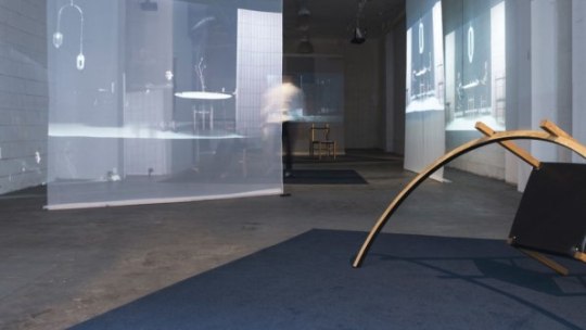
Coil+Drift, Home Unimprov. [Photo: Sean Davidson]
The performative power of objects
The demands of maintaining a creative practice in a highly digital, politically asinine time is not an easy task—which may be why many designers also took to physical works to explore performative and expressive narratives. While also exhibiting at ICFF as part of the curated Collective Concept presentation, Brooklyn-based designer John Sorensen-Jolink of Coil+Drift—a former dancer turned furniture and lighting maker—presented Home Unimprov at a Soho gallery. Bringing both sides of his work together, the show explored our bodily relationship to designed environments, combining live choreography and short films centered around a trio of conceptual chair designs.
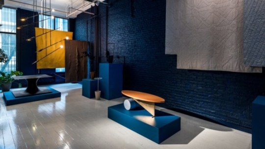
Colony, Balance/Unbalance. [Photo: Alan Tansey]
Over at Colony, an independent design cooperative in Chinatown, founder and curator Jean Lin presented works by Fort Standard, Meg Callahan, Moving Mountains, and more, under the overarching theme of Balance/Imbalance, both physically and sensorially, through color, form, materiality, shape, and even sound. “Perfect balance is a lie, but magic can be found in the space between balance and imbalance,” says Lin, who last year organized a show around the theme of lightness, in response to the tumultuous and heavy American political landscape.
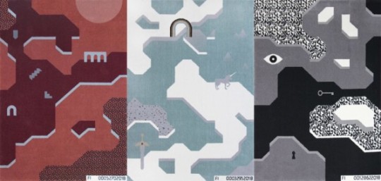
Kosmos Project, Future Illusions. [Photo: courtesy Kosmos Project]
At WantedDesign Manhattan, Polish design studio Kosmos Project presented Future Illusions, a collection of illustrative landscape rugs inspired by video games, complete with a participatory, choose-your-own-adventure element. The designs can be purchased as-is, or uniquely customized through a series of personality quiz-type questions that algorithmically generate a unique variation on a theme. The overall concept, the designers said, was to show both sides of the coin when it comes to big data–and ultimately make viewers more aware of their consequential choices.
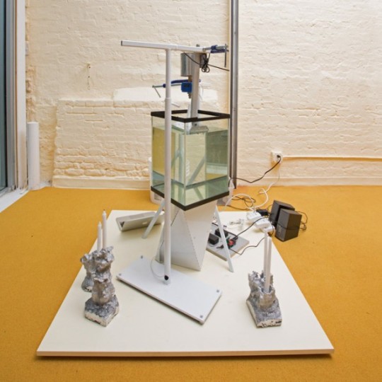
The Principals + Ashley Olson [Photo: Charlie Schuck]
Toying with tech
While big consumer tech brands made a splashy arrival to Milan‘s traditionally furniture and interiors-focused design week last month—with high-profile activations from Google Home, to Sonos and even Instagram—in New York, technology found its way into design show with a decidedly more homegrown and experimental slant.
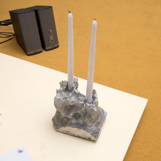
The Principals + Ashley Olson [Photo: Charlie Schuck]
At Sight Unseen’s highly curated satellite show of emerging talents, Drew Seskunas of The Principals teamed with musician Ashley Olsen to create a custom 3D printer. Sound waves of the singer’s voice were translated into physically rendered wax forms, which were then used to mold aluminum candlesticks—rigorously traversing from immaterial to material, it was an undeniably engaging experiment: call it design synesthesia. Hailing from Warsaw, UAU Project exhibited a more market-friendly approach to 3D-printed wares, with a colorful range of lights and small tabletop objects made from a reused corn byproduct. They were available for cash-and-carry, or, for a reduced price, as a digital file compatible with any desktop 3D printer.
Rich Brilliant Willing [Photo: courtesy Rich Brilliant Willing]
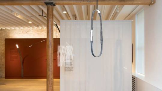
Darlings of the hospitality and contract market, lighting studio Rich Brilliant Willing wowed with a series of conceptual, working prototypes exploring the new formal possibilities of OLED technology and 3D-knit textiles. The team took a minimal, sculptural approach to thin, pliable strips of OLED, which read more like ambient surfaces or screens. Unlike traditional bulbs or LED diodes, partner Theo Richardson explained, OLEDs naturally emit soft, diffuse light—meaning no shade or additional element is required. Instead, the studio added its first experimentation with 3D-knit textiles into the mix, sheathing each of the OLED strips—molded and hanged to gently bend by the weight of its own heft—with translucent, graphic-patterned sleeves.
Design Within Reach, Hands at Work. [Photo: Charlie Schuck]
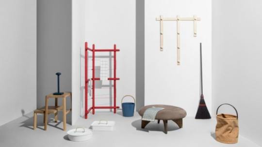
Not all young designers embraced new-fangled technology; some even eschewed it the name of mindfulness. At Hands to Work, the third edition of Furnishing Utopia, a now-annual group show sponsored by Design Within Reach, dozens of designers were commissioned to develop simple, useful items and tools with an intent to engage and transcend the tradition of Shaker design. The overall vibe was gleefully analog, as visitors were invited to engage in “sensory isolation,” and left to their devices in an all-white room containing only a tidy tray of gravel and an immaculately designed dustpan and brush. Among the wares displayed on the main exhibition floor: a wheeled planter by Jamie Wolfond, a basket bound with cable ties by Shigeki Fujishiro, and a wooden dish rack by Studio Tolvanen.
Hands to Work exhibit featuring @patkimpatkim Roomba cover that brings a new sense of life to robotic machines. Shot by @charlieschuck, styled by @natashafelker, creative direction by @ladiesandgentlemenstudio / also thanks to special support from @designwithinreach @norwaynewyork @_sightunseen_ / May 22 is the the last day to see the exhibit/ 158 Mercer, 9am-5pm #furnishingutopia #handstoworkexhibit #dwrxutopia
A post shared by Furnishing Utopia (@furnishing_utopia) on May 21, 2018 at 9:42pm PDT
All conveyed a cheerful attitude to hand labor and daily chores, with the exception of a tongue-in-cheek piece by designer Pat Kim: a handsome cherry wood casing for an automated Roomba vacuum, which amused visitors as it made the rounds and reminded us that not all labor is sacred.
America’s design community comes into its own published first on https://petrotekb.tumblr.com/
0 notes
Text
Córdoba Cultural Centre features an undulating roof that people can walk across
A twisting tower signals the presence of this cultural centre and historical archive in Spanish city Córdoba, which features a huge sloping public square on its roof.
The proposal for the regeneration of a site in Córdoba’s Sarmiento Park is the result of a collaboration between architects Ivan Castaneda, Juan Salassa and Santiago Tissot of STC Arquitectos, along with Alejandro Cohen, Cristian Nanzer and Inés Saal.
Commissioned by the local government, the project aimed to create a new home for a centre commemorating the bicentennial of the Argentine Republic, alongside a historical archive and auditorium.
The brief called for a design that was more like a landscape than a building, enabling the centre to merge with its surroundings while also functioning as a space for hosting large public events.
Its location between two existing museums on a plot that drops 6.5 metres in height prompted a subtle solution that aims not to detract from its neighbours.
"The operation consisted of replacing a piece of land from the natural ground with the planned building," said the project team. "In this way, the square and the [tower] are the only tectonic devices seen as urban pieces and landscape."
The building is made up of three main elements; the slender tower, a pavilion containing the cultural centre, and the plaza, with its various pathways and meeting places.
The fluid surface of the public square forms a thoroughfare connecting the park on one side with the city on the other. Gentle ridges that emerge from the surface of the plaza form steps that negotiate the incline.
As it extends upwards, the surface forms a roof over the cultural centre that sweeps around a sunken sculpture courtyard.
This space is flanked by glazing that enables daylight to reach the interior of an open-plan foyer and library on the ground floor of the main building, as well as the archives and offices above.
A set of steps ascends from a path at one end of the plaza onto this highest part of the roof, which provides a panoramic view of the city skyline.
The roof also rises up around the edges of the plaza to shelter other outdoor spaces. The main entrance is positioned at one corner facing the city, where a glazed curtain walls offers a view inside.
Chunky V-shaped columns arranged around the outside of the building combine with cylindrical columns around the inner courtyard to support the roof. These columns are designed to withstand seismic activity.
A subterranean auditorium and exhibition space situated beneath the plaza are rendered in the same raw, exposed concrete as the plaza to enhance the connection between internal and external spaces.
The tall and slender Pharos tower known as the Pharos provides a highly visible vertical element that contrasts the other low-lying structures.
It is positioned at the far end of the plaza in the adjacent park and is intended to act as a beacon, visible from several kilometres away.
The tower's twisting form is cast from concrete and is illuminated at night, lending it a presence that recalls the ancient Pharos of Alexandria lighthouse, from which it takes its name.
Photography is by Gonzalo Viramonte.
Project credits:
Architecture and landscape design: Ivan Castaneda, Alejandro Cohen, Cristian Nanzer, Inés Saal, Juan Salassa, Santiago Tissot Structural design assessment: Architects Rosendo Dantas and Maria Edel Ruata Landscape assessment: Architect Virginia Pinero. Acoustic and technical lightening assessment: Carlos Zoppi, CIAL, UNC Project development collaborator: Veronica Niedfeld Building enterprise: AMG-REGAM Technical representative: Daniel Gerard Architects: Sebastián Rollino, Facundo Cazorla, Juan Ignacio Rimondi Structure calculation: Engineer Carlos Larsson Landscaping: Architects Ana Sala, Fabia Yazbek Client: Córdoba Province Government Architecture director: Andrés Caparroz
Related story
Board-marked concrete and pleated wood line cultural centre in 17th-century chapel
The post Córdoba Cultural Centre features an undulating roof that people can walk across appeared first on Dezeen.
from ifttt-furniture https://www.dezeen.com/2017/03/04/cordoba-cultural-centre-features-wavy-roof-people-walk-across-architecture-cultural-spain/
0 notes
Text
Córdoba Cultural Centre features an undulating roof that people can walk across
A twisting tower signals the presence of this cultural centre and historical archive in Spanish city Córdoba, which features a huge sloping public square on its roof.
The proposal for the regeneration of a site in Córdoba’s Sarmiento Park is the result of a collaboration between architects Ivan Castaneda, Juan Salassa and Santiago Tissot of STC Arquitectos, along with Alejandro Cohen, Cristian Nanzer and Inés Saal.
Commissioned by the local government, the project aimed to create a new home for a centre commemorating the bicentennial of the Argentine Republic, alongside a historical archive and auditorium.
The brief called for a design that was more like a landscape than a building, enabling the centre to merge with its surroundings while also functioning as a space for hosting large public events.
Its location between two existing museums on a plot that drops 6.5 metres in height prompted a subtle solution that aims not to detract from its neighbours.
"The operation consisted of replacing a piece of land from the natural ground with the planned building," said the project team. "In this way, the square and the [tower] are the only tectonic devices seen as urban pieces and landscape."
The building is made up of three main elements; the slender tower, a pavilion containing the cultural centre, and the plaza, with its various pathways and meeting places.
The fluid surface of the public square forms a thoroughfare connecting the park on one side with the city on the other. Gentle ridges that emerge from the surface of the plaza form steps that negotiate the incline.
As it extends upwards, the surface forms a roof over the cultural centre that sweeps around a sunken sculpture courtyard.
This space is flanked by glazing that enables daylight to reach the interior of an open-plan foyer and library on the ground floor of the main building, as well as the archives and offices above.
A set of steps ascends from a path at one end of the plaza onto this highest part of the roof, which provides a panoramic view of the city skyline.
The roof also rises up around the edges of the plaza to shelter other outdoor spaces. The main entrance is positioned at one corner facing the city, where a glazed curtain walls offers a view inside.
Chunky V-shaped columns arranged around the outside of the building combine with cylindrical columns around the inner courtyard to support the roof. These columns are designed to withstand seismic activity.
A subterranean auditorium and exhibition space situated beneath the plaza are rendered in the same raw, exposed concrete as the plaza to enhance the connection between internal and external spaces.
The tall and slender Pharos tower known as the Pharos provides a highly visible vertical element that contrasts the other low-lying structures.
It is positioned at the far end of the plaza in the adjacent park and is intended to act as a beacon, visible from several kilometres away.
The tower's twisting form is cast from concrete and is illuminated at night, lending it a presence that recalls the ancient Pharos of Alexandria lighthouse, from which it takes its name.
Photography is by Gonzalo Viramonte.
Project credits:
Architecture and landscape design: Ivan Castaneda, Alejandro Cohen, Cristian Nanzer, Inés Saal, Juan Salassa, Santiago Tissot Structural design assessment: Architects Rosendo Dantas and Maria Edel Ruata Landscape assessment: Architect Virginia Pinero. Acoustic and technical lightening assessment: Carlos Zoppi, CIAL, UNC Project development collaborator: Veronica Niedfeld Building enterprise: AMG-REGAM Technical representative: Daniel Gerard Architects: Sebastián Rollino, Facundo Cazorla, Juan Ignacio Rimondi Structure calculation: Engineer Carlos Larsson Landscaping: Architects Ana Sala, Fabia Yazbek Client: Córdoba Province Government Architecture director: Andrés Caparroz
Related story
Board-marked concrete and pleated wood line cultural centre in 17th-century chapel
The post Córdoba Cultural Centre features an undulating roof that people can walk across appeared first on Dezeen.
from RSSMix.com Mix ID 8217598 https://www.dezeen.com/2017/03/04/cordoba-cultural-centre-features-wavy-roof-people-walk-across-architecture-cultural-spain/
0 notes