#Running a k-means Cluster Analysis
Explore tagged Tumblr posts
Visit Tumblr Blog
Explore Tumblr blogs with no restrictions, modern design and the best experience.
Last Seen Tumblr Blogs


Fun Fact
Women make up for the other 50% of Tumblr’s audience.
Text
Week 4: Peer-graded Assignment: Running a k-means Cluster Analysis
This assignment is intended for Coursera course "Machine Learning for Data Analysis by Wesleyan University”.
It is for "Week 4: Peer-graded Assignment: Running a k-means Cluster Analysis".
I am working on k-means Cluster Analysis in Python.
Syntax used to run k-means Cluster Analysis
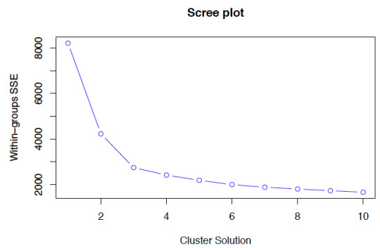
A k-means cluster analysis was conducted to identify underlying subgroups of real machine parameters based on their similarity of responses on 19 variables that represent characteristics that could have an impact on product yield loss. Clustering variables included only quantitative variables measuring different machine parameters. All clustering variables were standardized to have a mean of 0 and a standard deviation of 1. Data were randomly split into a training set that included 70% of the observations (N=116) and a test set that included 30% of the observations (N=50). A series of k-means cluster analyses were conducted on the training data specifying k=1-9 clusters, using Euclidean distance. The variance in the clustering variables that was accounted for by the clusters (r-square) was plotted for each of the nine cluster solutions in an elbow curve to provide guidance for choosing the number of clusters to interpret.
2. Code used to run k-means Cluster Analysis


3. Corresponding Output

Figure 1. Elbow curve of r-square values for the nine cluster solutions

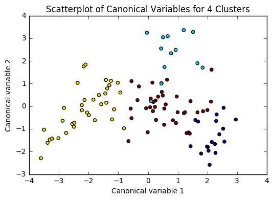
Figure 2. Plot of the first two canonical variables for the clustering variables by cluster.
4. Interpretation
For Figure 1: The elbow curve was inconclusive, suggesting that the 2, 4 and 8-cluster solutions might be interpreted. All 3 were tested, yielding [F-statistic and Prob (F-statistic)] of: [0.5298,0.469]; [6.242,0.000725] and [3.73,0.00156] accordingly. The results below are for an interpretation of the 4-cluster solution (highest F-statistic and lowest Prob).
Canonical discriminant analyses was used to reduce the 19 clustering variable down a few variables that accounted for most of the variance in the clustering variables. A scatterplot of the first two canonical variables by cluster indicated that the observations in cluster 1 was densely packed with relatively low within cluster variance, and did not overlap very much with the other clusters. Cluster 2 was generally distinct, but the observations had greater spread suggesting higher within cluster variance. Observations in cluster 3 and 4 were spread out more than the other clusters, showing high within cluster variance. The results of this plot suggest that the best cluster solution may have fewer than 4 clusters, so it will be especially important to also evaluate the cluster solutions with fewer than 4 clusters.
For Figure 2: In order to externally validate the clusters, an Analysis of Variance (ANOVA) was conducting to test for significant differences between the clusters on product failure rates (BINS_SUM).
A tukey test was used for post hoc comparisons between the clusters. Results indicated some significant differences between the clusters on BINS_SUM (F (3, 85) = 6.242, p<.0001). The tukey post hoc comparisons showed significant differences between clusters on BINS_SUM for cluster vs. 1 and 3, however insignificance of all other clusters among each other. Samples in cluster 4 had the lowest BINS_SUM (mean=60.28, sd=10.89), and cluster 1 had the highest BINS_SUM (mean=76.35, sd=13.08).
#Running a k-means Cluster Analysis#Machine Learning for Data Analysis#Wesleyan University#Coursera#Python#Week4
0 notes
Text
Weak 4 :Running a k-means Cluster Analysis
import pandas import statistics import numpy as np import matplotlib.pylab as plt from sklearn.cross_validation import train_test_split from sklearn import preprocessing from sklearn.cluster import KMeans # bug fix for display formats to avoid run time errors pandas.set_option('display.float_format', lambda x:'%.2f'%x) #load the data data = pandas.read_csv('../separatedData.csv') # convert to numeric format data["breastCancer100th"] = pandas.to_numeric(data["breastCancer100th"], errors='coerce') data["meanSugarPerson"] = pandas.to_numeric(data["meanSugarPerson"], errors='coerce') data["meanFoodPerson"] = pandas.to_numeric(data["meanFoodPerson"], errors='coerce') data["meanCholesterol"] = pandas.to_numeric(data["meanCholesterol"], errors='coerce') # listwise deletion of missing values sub1 = data[['breastCancer100th', 'meanFoodPerson', 'meanCholesterol', 'meanSugarPerson']].dropna() #Split into training and testing sets cluster = sub1[[ 'meanSugarPerson', 'meanFoodPerson', 'meanCholesterol']] # standardize predictors to have mean=0 and sd=1 clustervar = cluster.copy() clustervar['meanSugarPerson']= preprocessing.scale(clustervar['meanSugarPerson'].astype('float64')) clustervar['meanFoodPerson']= preprocessing.scale(clustervar['meanFoodPerson'].astype('float64')) clustervar['meanCholesterol']= preprocessing.scale(clustervar['meanCholesterol'].astype('float64')) # split data into train and test sets - Train = 70%, Test = 30% clus_train, clus_test = train_test_split(clustervar, test_size=.3, random_state=123)
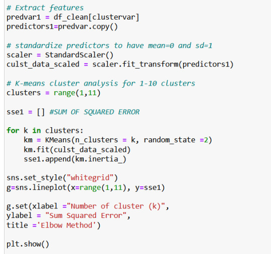
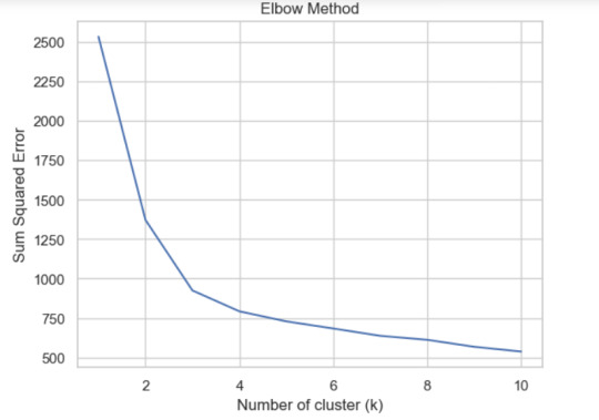
To run the k-means Cluster Analysis we must standardize the predictors to have mean = 0 and standard deviation = 1. After that, we make 9 analysis with the data, the first one with one cluster increasing a cluster per experiment.# k-means cluster analysis for 1-9 clusters from scipy.spatial.distance import cdist clusters=range(1,10) meandist=[] for k in clusters: model=KMeans(n_clusters=k) model.fit(clus_train) clusassign=model.predict(clus_train) meandist.append(sum(np.min(cdist(clus_train, model.cluster_centers_, 'euclidean'), axis=1)) / clus_train.shape[0]) """ Plot average distance from observations from the cluster centroid to use the Elbow Method to identify number of clusters to choose """ plt.plot(clusters, meandist) plt.xlabel('Number of clusters') plt.ylabel('Average distance') plt.title('Selecting k with the Elbow Method')
0 notes
Text
Running a k-means Cluster Analysis:
Machine Learning for Data Analysis
Week 4: Running a k-means Cluster Analysis
A k-means cluster analysis was conducted to identify underlying subgroups of countries based on their similarity of responses on 7 variables that represent characteristics that could have an impact on internet use rates. Clustering variables included quantitative variables measuring income per person, employment rate, female employment rate, polity score, alcohol consumption, life expectancy, and urban rate. All clustering variables were standardized to have a mean of 0 and a standard deviation of 1.
Because the GapMinder dataset which I am using is relatively small (N < 250), I have not split the data into test and training sets. A series of k-means cluster analyses were conducted on the training data specifying k=1-9 clusters, using Euclidean distance. The variance in the clustering variables that was accounted for by the clusters (r-square) was plotted for each of the nine cluster solutions in an elbow curve to provide guidance for choosing the number of clusters to interpret.
Load the data, set the variables to numeric, and clean the data of NA values
In [1]:''' Code for Peer-graded Assignments: Running a k-means Cluster Analysis Course: Data Management and Visualization Specialization: Data Analysis and Interpretation ''' import pandas as pd import numpy as np import matplotlib.pyplot as plt import statsmodels.formula.api as smf import statsmodels.stats.multicomp as multi from sklearn.cross_validation import train_test_split from sklearn import preprocessing from sklearn.cluster import KMeans data = pd.read_csv('c:/users/greg/desktop/gapminder.csv', low_memory=False) data['internetuserate'] = pd.to_numeric(data['internetuserate'], errors='coerce') data['incomeperperson'] = pd.to_numeric(data['incomeperperson'], errors='coerce') data['employrate'] = pd.to_numeric(data['employrate'], errors='coerce') data['femaleemployrate'] = pd.to_numeric(data['femaleemployrate'], errors='coerce') data['polityscore'] = pd.to_numeric(data['polityscore'], errors='coerce') data['alcconsumption'] = pd.to_numeric(data['alcconsumption'], errors='coerce') data['lifeexpectancy'] = pd.to_numeric(data['lifeexpectancy'], errors='coerce') data['urbanrate'] = pd.to_numeric(data['urbanrate'], errors='coerce') sub1 = data.copy() data_clean = sub1.dropna()
Subset the clustering variables
In [2]:cluster = data_clean[['incomeperperson','employrate','femaleemployrate','polityscore', 'alcconsumption', 'lifeexpectancy', 'urbanrate']] cluster.describe()
Out[2]:incomeperpersonemployratefemaleemployratepolityscorealcconsumptionlifeexpectancyurbanratecount150.000000150.000000150.000000150.000000150.000000150.000000150.000000mean6790.69585859.26133348.1006673.8933336.82173368.98198755.073200std9861.86832710.38046514.7809996.2489165.1219119.90879622.558074min103.77585734.90000212.400000-10.0000000.05000048.13200010.40000025%592.26959252.19999939.599998-1.7500002.56250062.46750036.41500050%2231.33485558.90000248.5499997.0000006.00000072.55850057.23000075%7222.63772165.00000055.7250009.00000010.05750076.06975071.565000max39972.35276883.19999783.30000310.00000023.01000083.394000100.000000
Standardize the clustering variables to have mean = 0 and standard deviation = 1
In [3]:clustervar=cluster.copy() clustervar['incomeperperson']=preprocessing.scale(clustervar['incomeperperson'].astype('float64')) clustervar['employrate']=preprocessing.scale(clustervar['employrate'].astype('float64')) clustervar['femaleemployrate']=preprocessing.scale(clustervar['femaleemployrate'].astype('float64')) clustervar['polityscore']=preprocessing.scale(clustervar['polityscore'].astype('float64')) clustervar['alcconsumption']=preprocessing.scale(clustervar['alcconsumption'].astype('float64')) clustervar['lifeexpectancy']=preprocessing.scale(clustervar['lifeexpectancy'].astype('float64')) clustervar['urbanrate']=preprocessing.scale(clustervar['urbanrate'].astype('float64'))
Split the data into train and test sets
In [4]:clus_train, clus_test = train_test_split(clustervar, test_size=.3, random_state=123)
Perform k-means cluster analysis for 1-9 clusters
In [5]:from scipy.spatial.distance import cdist clusters = range(1,10) meandist = [] for k in clusters: model = KMeans(n_clusters = k) model.fit(clus_train) clusassign = model.predict(clus_train) meandist.append(sum(np.min(cdist(clus_train, model.cluster_centers_, 'euclidean'), axis=1)) / clus_train.shape[0])
Plot average distance from observations from the cluster centroid to use the Elbow Method to identify number of clusters to choose
In [6]:plt.plot(clusters, meandist) plt.xlabel('Number of clusters') plt.ylabel('Average distance') plt.title('Selecting k with the Elbow Method') plt.show()

64.media.tumblr.com
Interpret 3 cluster solution
In [7]:model3 = KMeans(n_clusters=4) model3.fit(clus_train) clusassign = model3.predict(clus_train)
Plot the clusters
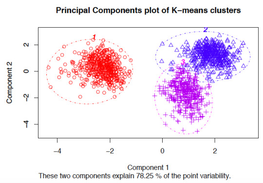
In [8]:from sklearn.decomposition import PCA pca_2 = PCA(2) plt.figure() plot_columns = pca_2.fit_transform(clus_train) plt.scatter(x=plot_columns[:,0], y=plot_columns[:,1], c=model3.labels_,) plt.xlabel('Canonical variable 1') plt.ylabel('Canonical variable 2') plt.title('Scatterplot of Canonical Variables for 4 Clusters') plt.show()
64.media.tumblr.com
Begin multiple steps to merge cluster assignment with clustering variables to examine cluster variable means by cluster.
Create a unique identifier variable from the index for the cluster training data to merge with the cluster assignment variable.
In [9]:clus_train.reset_index(level=0, inplace=True)
Create a list that has the new index variable
In [10]:cluslist = list(clus_train['index'])
Create a list of cluster assignments
In [11]:labels = list(model3.labels_)
Combine index variable list with cluster assignment list into a dictionary
In [12]:newlist = dict(zip(cluslist, labels)) print (newlist) {2: 1, 4: 2, 6: 0, 10: 0, 11: 3, 14: 2, 16: 3, 17: 0, 19: 2, 22: 2, 24: 3, 27: 3, 28: 2, 29: 2, 31: 2, 32: 0, 35: 2, 37: 3, 38: 2, 39: 3, 42: 2, 45: 2, 47: 1, 53: 3, 54: 3, 55: 1, 56: 3, 58: 2, 59: 3, 63: 0, 64: 0, 66: 3, 67: 2, 68: 3, 69: 0, 70: 2, 72: 3, 77: 3, 78: 2, 79: 2, 80: 3, 84: 3, 88: 1, 89: 1, 90: 0, 91: 0, 92: 0, 93: 3, 94: 0, 95: 1, 97: 2, 100: 0, 102: 2, 103: 2, 104: 3, 105: 1, 106: 2, 107: 2, 108: 1, 113: 3, 114: 2, 115: 2, 116: 3, 123: 3, 126: 3, 128: 3, 131: 2, 133: 3, 135: 2, 136: 0, 139: 0, 140: 3, 141: 2, 142: 3, 144: 0, 145: 1, 148: 3, 149: 2, 150: 3, 151: 3, 152: 3, 153: 3, 154: 3, 158: 3, 159: 3, 160: 2, 173: 0, 175: 3, 178: 3, 179: 0, 180: 3, 183: 2, 184: 0, 186: 1, 188: 2, 194: 3, 196: 1, 197: 2, 200: 3, 201: 1, 205: 2, 208: 2, 210: 1, 211: 2, 212: 2}
Convert newlist dictionary to a dataframe
In [13]:newclus = pd.DataFrame.from_dict(newlist, orient='index') newclus
Out[13]:0214260100113142163170192222243273282292312320352373382393422452471533543551563582593630......145114831492150315131523153315431583159316021730175317831790180318321840186118821943196119722003201120522082210121122122
105 rows × 1 columns
Rename the cluster assignment column
In [14]:newclus.columns = ['cluster']
Repeat previous steps for the cluster assignment variable
Create a unique identifier variable from the index for the cluster assignment dataframe to merge with cluster training data
In [15]:newclus.reset_index(level=0, inplace=True)
Merge the cluster assignment dataframe with the cluster training variable dataframe by the index variable
In [16]:merged_train = pd.merge(clus_train, newclus, on='index') merged_train.head(n=100)
Out[16]:indexincomeperpersonemployratefemaleemployratepolityscorealcconsumptionlifeexpectancyurbanratecluster0159-0.393486-0.0445910.3868770.0171271.843020-0.0160990.79024131196-0.146720-1.591112-1.7785290.498818-0.7447360.5059900.6052111270-0.6543650.5643511.0860520.659382-0.727105-0.481382-0.2247592329-0.6791572.3138522.3893690.3382550.554040-1.880471-1.9869992453-0.278924-0.634202-0.5159410.659382-0.1061220.4469570.62033335153-0.021869-1.020832-0.4073320.9805101.4904110.7233920.2778493635-0.6665191.1636281.004595-0.785693-0.715352-2.084304-0.7335932714-0.6341100.8543230.3733010.177691-1.303033-0.003846-1.24242828116-0.1633940.119726-0.3394510.338255-1.1659070.5304950.67993439126-0.630263-1.446126-0.3055100.6593823.1711790.033923-0.592152310123-0.163655-0.460219-0.8010420.980510-0.6448300.444628-0.560127311106-0.640452-0.2862350.1153530.659382-0.247166-2.104758-1.317152212142-0.635480-0.808186-0.7874660.0171271.155433-1.731823-0.29859331389-0.615980-2.113062-2.423400-0.625129-1.2442650.0060770.512695114160-0.6564731.9852172.199302-1.1068200.620643-1.371039-1.63383921556-0.430694-0.102586-0.2240530.659382-0.5547190.3254460.250272316180-0.559059-0.402224-0.6041870.338255-1.1776610.603401-1.777949317133-0.419521-1.668438-0.7331610.3382551.032020-0.659900-0.81098631831-0.618282-0.0155940.061048-1.2673840.211226-1.7590620.075026219171.801349-1.030498-0.4344840.6593820.7029191.1165791.8808550201450.447771-0.827517-1.731013-1.909640-1.1561120.4042250.7359771211000.974856-0.034925-0.0068330.6593822.4150301.1806761.173646022178-0.309804-1.755430-0.9368040.8199460.653945-1.6388680.2520513231732.6193200.3033760.217174-0.946256-1.0346581.2296851.99827802459-0.056177-0.2669040.2714790.8199462.0408730.5916550.63990432568-0.562821-0.3538960.0271070.338255-0.0316830.481486-0.1037773261080.111383-1.030498-1.690284-1.749076-1.3167450.5879080.999290127212-0.6582520.7286690.678765-0.464565-0.364702-1.781946-0.78874722819-0.6525281.1926250.6855540.498818-0.928876-1.306335-0.617060229188-0.662484-0.4505530.135717-1.106820-0.672255-0.147127-1.2726732..............................70140-0.594402-0.044591-0.8214060.819946-0.3157280.5125720.074137371148-0.0905570.052066-0.3190860.8199460.0936890.7235950.80625437211-0.4523170.1583900.549792-1.7490761.2768870.177913-0.140250373641.636776-0.779188-0.1697480.8199461.1084191.2715050.99128407484-0.117682-1.156153-0.5295180.9805101.8214720.5500380.5527263751750.604211-0.3248980.0882000.9805101.5903171.048938-0.287918376197-0.481087-0.0735890.393665-2.070203-0.356866-0.404628-0.287029277183-0.506714-0.808186-0.067926-2.070203-0.347071-2.051902-1.340281278210-0.628790-1.958410-1.887139-0.946256-1.297156-0.353290-1.08675317954-0.5150780.042400-0.1765360.1776910.5109430.6733710.467327380114-0.6661982.2945212.111056-0.625129-1.077755-0.229248-1.1365692814-0.5503841.5889211.445822-0.946256-0.245207-1.8114130.072358282911.575455-0.769523-0.1154430.980510-0.8426821.2795041.62732708377-0.5015740.332373-0.2783580.6593820.0545110.221758-0.28880838466-0.265535-0.0252600.305419-0.1434370.516820-0.6358011.332879385921.240375-1.243145-0.8349830.9805100.5677521.3035020.5785230862011.4545511.540592-0.733161-1.909640-1.2344700.7659211.014413187105-0.004485-1.281808-1.7513770.498818-0.8857790.3704051.418278188205-0.593947-0.1702460.305419-2.070203-0.629158-0.070373-0.8118762891540.504036-0.1605810.1696570.9805101.3846291.0649370.19511839045-0.6307520.061732-0.678856-0.625129-0.068902-1.377621-0.27991229197-0.6432031.3472771.2557550.498818-0.576267-1.199710-1.488839292632.067368-0.1992430.3597250.9805101.2298731.1133390.365916093211-0.6469130.1680550.3665130.498818-0.638953-2.020815-0.874146294158-0.422620-0.943506-0.2919340.8199461.8273490.505990-0.037060395135-0.6635950.2453810.4411820.338255-0.862272-0.018934-1.68276529679-0.6744750.6416770.1221410.338255-0.572349-2.111239-1.1223362971790.882197-0.653534-0.4344840.9805100.9810881.2578350.980609098149-0.6151691.0766361.4118810.017127-0.623282-0.626890-1.891814299113-0.464904-2.354706-1.4459120.8199460.4149550.5938830.5260393
100 rows × 9 columns
Cluster frequencies
In [17]:merged_train.cluster.value_counts()
Out[17]:3 39 2 35 0 18 1 13 Name: cluster, dtype: int64
Calculate clustering variable means by cluster
In [18]:clustergrp = merged_train.groupby('cluster').mean() print ("Clustering variable means by cluster") clustergrp Clustering variable means by cluster
Out[18]:indexincomeperpersonemployratefemaleemployratepolityscorealcconsumptionlifeexpectancyurbanratecluster093.5000001.846611-0.1960210.1010220.8110260.6785411.1956961.0784621117.461538-0.154556-1.117490-1.645378-1.069767-1.0827280.4395570.5086582100.657143-0.6282270.8551520.873487-0.583841-0.506473-1.034933-0.8963853107.512821-0.284648-0.424778-0.2000330.5317550.6146160.2302010.164805
Validate clusters in training data by examining cluster differences in internetuserate using ANOVA. First, merge internetuserate with clustering variables and cluster assignment data
In [19]:internetuserate_data = data_clean['internetuserate']
Split internetuserate data into train and test sets
In [20]:internetuserate_train, internetuserate_test = train_test_split(internetuserate_data, test_size=.3, random_state=123) internetuserate_train1=pd.DataFrame(internetuserate_train) internetuserate_train1.reset_index(level=0, inplace=True) merged_train_all=pd.merge(internetuserate_train1, merged_train, on='index') sub5 = merged_train_all[['internetuserate', 'cluster']].dropna()
In [21]:internetuserate_mod = smf.ols(formula='internetuserate ~ C(cluster)', data=sub5).fit() internetuserate_mod.summary()
Out[21]:
OLS Regression ResultsDep. Variable:internetuserateR-squared:0.679Model:OLSAdj. R-squared:0.669Method:Least SquaresF-statistic:71.17Date:Thu, 12 Jan 2017Prob (F-statistic):8.18e-25Time:20:59:17Log-Likelihood:-436.84No. Observations:105AIC:881.7Df Residuals:101BIC:892.3Df Model:3Covariance Type:nonrobustcoefstd errtP>|t|[95.0% Conf. Int.]Intercept75.20683.72720.1770.00067.813 82.601C(cluster)[T.1]-46.95175.756-8.1570.000-58.370 -35.534C(cluster)[T.2]-66.56684.587-14.5130.000-75.666 -57.468C(cluster)[T.3]-39.48604.506-8.7630.000-48.425 -30.547Omnibus:5.290Durbin-Watson:1.727Prob(Omnibus):0.071Jarque-Bera (JB):4.908Skew:0.387Prob(JB):0.0859Kurtosis:3.722Cond. No.5.90
Means for internetuserate by cluster
In [22]:m1= sub5.groupby('cluster').mean() m1
Out[22]:internetuseratecluster075.206753128.25501828.639961335.720760
Standard deviations for internetuserate by cluster
In [23]:m2= sub5.groupby('cluster').std() m2
Out[23]:internetuseratecluster014.093018121.75775228.399554319.057835
In [24]:mc1 = multi.MultiComparison(sub5['internetuserate'], sub5['cluster']) res1 = mc1.tukeyhsd() res1.summary()
Out[24]:
Multiple Comparison of Means - Tukey HSD,FWER=0.05group1group2meandifflowerupperreject01-46.9517-61.9887-31.9148True02-66.5668-78.5495-54.5841True03-39.486-51.2581-27.7139True12-19.6151-33.0335-6.1966True137.4657-5.76520.6965False2327.080817.461736.6999True
The elbow curve was inconclusive, suggesting that the 2, 4, 6, and 8-cluster solutions might be interpreted. The results above are for an interpretation of the 4-cluster solution.
In order to externally validate the clusters, an Analysis of Variance (ANOVA) was conducting to test for significant differences between the clusters on internet use rate. A tukey test was used for post hoc comparisons between the clusters. Results indicated significant differences between the clusters on internet use rate (F=71.17, p<.0001). The tukey post hoc comparisons showed significant differences between clusters on internet use rate, with the exception that clusters 0 and 2 were not significantly different from each other. Countries in cluster 1 had the highest internet use rate (mean=75.2, sd=14.1), and cluster 3 had the lowest internet use rate (mean=8.64, sd=8.40).
9 notes
·
View notes
Text
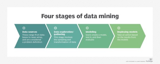
Data gathering. Relevant data for an analytics application is identified and assembled. The data may be located in different source systems, a data warehouse or a data lake, an increasingly common repository in big data environments that contain a mix of structured and unstructured data. External data sources may also be used. Wherever the data comes from, a data scientist often moves it to a data lake for the remaining steps in the process.
Data preparation. This stage includes a set of steps to get the data ready to be mined. It starts with data exploration, profiling and pre-processing, followed by data cleansing work to fix errors and other data quality issues. Data transformation is also done to make data sets consistent, unless a data scientist is looking to analyze unfiltered raw data for a particular application.
Mining the data. Once the data is prepared, a data scientist chooses the appropriate data mining technique and then implements one or more algorithms to do the mining. In machine learning applications, the algorithms typically must be trained on sample data sets to look for the information being sought before they're run against the full set of data.
Data analysis and interpretation. The data mining results are used to create analytical models that can help drive decision-making and other business actions. The data scientist or another member of a data science team also must communicate the findings to business executives and users, often through data visualization and the use of data storytelling techniques.
Types of data mining techniques
Various techniques can be used to mine data for different data science applications. Pattern recognition is a common data mining use case that's enabled by multiple techniques, as is anomaly detection, which aims to identify outlier values in data sets. Popular data mining techniques include the following types:
Association rule mining. In data mining, association rules are if-then statements that identify relationships between data elements. Support and confidence criteria are used to assess the relationships -- support measures how frequently the related elements appear in a data set, while confidence reflects the number of times an if-then statement is accurate.
Classification. This approach assigns the elements in data sets to different categories defined as part of the data mining process. Decision trees, Naive Bayes classifiers, k-nearest neighbor and logistic regression are some examples of classification methods.
Clustering. In this case, data elements that share particular characteristics are grouped together into clusters as part of data mining applications. Examples include k-means clustering, hierarchical clustering and Gaussian mixture models.
Regression. This is another way to find relationships in data sets, by calculating predicted data values based on a set of variables. Linear regression and multivariate regression are examples. Decision trees and some other classification methods can be used to do regressions, too
Data mining companies follow the procedure
#data enrichment#data management#data entry companies#data entry#banglore#monday motivation#happy monday#data analysis#data entry services#data mining
4 notes
·
View notes
Text
Running a k-means Cluster Analysis
Load the necessary libraries
library(dplyr) # For data manipulation library(ggplot2) # For data visualization library(cluster) # For clustering analysis
Load your data set
data <- read.csv("your_data_file.csv")
Select your clustering variables
clustering_vars <- data %>% select(var1, var2, var3)
Normalize the clustering variables (optional)
clustering_vars_norm <- scale(clustering_vars)
Choose the number of clusters (k)
k <- 3
Run the k-means clustering analysis
set.seed(123) # For reproducibility kmeans_results <- kmeans(clustering_vars_norm, centers = k)
View the cluster assignments for each observation
cluster_assignments <- kmeans_results$cluster
Visualize the clusters using scatterplots (optional)
ggplot(data, aes(x = var1, y = var2, color = factor(cluster_assignments))) + geom_point() + labs(color = "Cluster") + theme_minimal()
ggplot(data, aes(x = var1, y = var3, color = factor(cluster_assignments))) + geom_point() + labs(color = "Cluster") + theme_minimal()
ggplot(data, aes(x = var2, y = var3, color = factor(cluster_assignments))) + geom_point() + labs(color = "Cluster") + theme_minimal()
View the cluster centers (centroids)
kmeans_results$centers
In this example, we first load the necessary libraries and our data set. We then select our clustering variables (var1, var2, and var3) and normalize them (if desired). We choose the number of clusters (k) to be 3, and run the k-means clustering analysis using the kmeans() function. We also set a seed for reproducibility purposes. We then view the cluster assignments for each observation, and optionally visualize the clusters using scatterplots. Finally, we view the cluster centers (centroids).
The output of this analysis includes the cluster assignments for each observation (stored in the cluster_assignments variable), the cluster centers (stored in the kmeans_results$centers object), and the scatterplots (if created). The cluster assignments and centers can be used to further analyze and interpret the clusters.
4 notes
·
View notes
Text
Running a K-Means Cluster Analysis
What is a k-means cluster analysis
K-means cluster analysis is an algorithm that groups similar objects into groups called clusters. The endpoint of cluster analysis is a set of clusters, where each cluster is distinct from each other cluster, and the objects within each cluster are broadly similar to
Cluster analysis is a set of data reduction techniques which are designed to group similar observations in a dataset, such that observations in the same group are as similar to each other as possible, and similarly, observations in different groups are as different to each other as possible. Compared to other data reduction techniques like factor analysis (FA) and principal components analysis (PCA), which aim to group by similarities across variables (columns) of a dataset, cluster analysis aims to group observations by similarities across rows.
Description
K-means is one method of cluster analysis that groups observations by minimizing Euclidean distances between them. Euclidean distances are analagous to measuring the hypotenuse of a triangle, where the differences between two observations on two variables (x and y) are plugged into the Pythagorean equation to solve for the shortest distance between the two points (length of the hypotenuse). Euclidean distances can be extended to n-dimensions with any number n, and the distances refer to numerical differences on any measured continuous variable, not just spatial or geometric distances. This definition of Euclidean distance, therefore, requires that all variables used to determine clustering using k-means must be continuous
Procedure
In order to perform k-means clustering, the algorithm randomly assigns k initial centers (k specified by the user), either by randomly choosing points in the “Euclidean space” defined by all n variables, or by sampling k points of all available observations to serve as initial centers. It then iteratively assigns each observation to the nearest center. Next, it calculates the new center for each cluster as the centroid mean of the clustering variables for each cluster’s new set of observations. K-means re-iterates this process, assigning observations to the nearest center (some observations will change cluster). This process repeats until a new iteration no longer re-assigns any observations to a new cluster. At this point, the algorithm is considered to have converged, and the final cluster assignments constitute the clustering solution.
There are several k-means algorithms available. The standard algorithm is the Hartigan-Wong algorithm, which aims to minimize the Euclidean distances of all points with their nearest cluster centers, by minimizing within-cluster sum of squared errors (SSE).
Software
-means is implemented in many statistical software programs:In R, in the cluster package, use the function: k-means(x, centers, iter.max=10, nstart=1). The data object on which to perform clustering is declared in x. The number of clusters k is specified by the user in centers=#. k-means() will repeat with different initial centroids (sampled randomly from the entire dataset) nstart=# times and choose the best run (smallest SSE). iter.max=# sets a maximum number of iterations allowed (default is 10) per run.In STATA, use the command: cluster kmeans [varlist], k(#) [options]. Use [varlist] to declare the clustering variables, k(#) to declare k. There are other options to specify similarity measures instead of Euclidean distances.In SAS, use the command: PROC FASTCLUS maxclusters=k; var [varlist]. This requires specifying k and the clustering variables in [varlist].In SPSS, use the function: Analyze -> Classify -> K-Means Cluster. Additional help files are available online.
Considerations
means clustering requires all variables to be continuous. Other methods that do not require all variables to be continuous, including some heirarchical clustering methods, have different assumptions and are discussed in the resources list below. K-means clustering also requires a priori specification of the number of clusters, k. Though this can be done empirically with the data (using a screeplot to graph within-group SSE against each cluster solution), the decision should be driven by theory, and improper choices can lead to erroneous clusters. See Peeples’ online R walkthrough R script for K-means cluster analysis below for examples of choosing cluster solutions.
The choice of clustering variables is also of particular importance. Generally, cluster analysis methods require the assumption that the variables chosen to determine clusters are a comprehensive representation of the underlying construct of interest that groups similar observations. While variable choice remains a debated topic, the consensus in the field recommends clustering on as many variables as possible, as long as the set fits this description, and the variables that do not describe much of the variance in Euclidean distances between observations will contribute less to cluster assignment. Sensitivity analyses are recommended using different cluster solutions and sets of clustering variables to determine robustness of the clustering algorithm.K-means by default aims to minimize within-group sum of squared error as measured by Euclidean distances, but this is not always justified when data assumptions are not met. Consult textbooks and online guides in resources section below, especially Robinson’s R-blog: K-means clustering is not a free lunch for examples of the issues encountered with k-means clustering when assumptions are violated.Lastly, cluster analysis methods are similar to other data reduction techniques in that they are largely exploratory tools, thus results should be interpreted with caution. Many techniques exist for validating results from cluster analysis, including internally with cross-validation or bootstrapping, validating on conceptual groups theorized a priori or with expert opinion, or external validation with separate datasets. A common application of cluster analysis is as a tool for predicting cluster membership on future observations using existing data, but it does not describe why the observations are grouped that way. As such, cluster analysis is often used in conjunction with factor analysis, where cluster analysis is used to describe how observations are similar, and factor analysis is used to describe why observations are similar. Ultimately, validity of cluster analysis results should be determined by theory and by utility of cluster descriptions.
0 notes
Text

Alternative Analysis Methods for MLB
Betting on Major League Baseball (MLB) offers a unique challenge due to the season’s length and the sheer volume of available data. For a fresh perspective, here are some alternative methods for analyzing MLB games that go beyond traditional stats.
1. Advanced Sabermetrics
Sabermetrics, the advanced analysis of baseball statistics, goes beyond conventional stats and provides deeper insights. Here are a few key sabermetric metrics to consider:
FIP (Fielding Independent Pitching): FIP focuses on outcomes a pitcher can control (strikeouts, walks, hit-by-pitches, and home runs) and provides a more accurate reflection of a pitcher’s effectiveness than ERA, which can be affected by the defense behind them.
BABIP (Batting Average on Balls In Play): BABIP helps identify if a hitter or pitcher’s performance is sustainable. Extremely high or low BABIP can indicate luck (or lack thereof), so regression to the mean is often expected. Bettors can use BABIP to assess if a player’s recent form is likely to continue or if it’s a temporary streak.
wOBA (Weighted On-Base Average): wOBA assigns different values to walks, singles, doubles, triples, and home runs, making it more precise than traditional batting average. Teams and players with high wOBA values tend to create more scoring opportunities, which is helpful when analyzing team offense.
xFIP and SIERA (Skill-Interactive ERA): These metrics adjust for league averages and take into account a pitcher’s control and ground ball/fly ball tendencies, providing a clearer picture of a pitcher’s future performance than traditional ERA.
2. Cluster Luck Analysis
Cluster luck refers to a team’s ability to string hits together in a way that leads to runs, which isn’t always sustainable. A team might have a high number of runs despite a lower batting average due to luck in clustering hits. Using cluster luck analysis helps bettors determine if a team’s scoring is inflated by a lucky streak, indicating potential regression. This is particularly valuable for team totals and run line bets, as it reveals if recent scoring trends are likely to hold.
3. Plate Discipline Metrics
Analyzing plate discipline metrics for both hitters and pitchers can provide insights into offensive and defensive consistency:
BB/K (Walk-to-Strikeout Ratio): This ratio helps identify players who are selective with their swings, often leading to better on-base potential. Teams with high BB/K ratios tend to perform well offensively due to disciplined at-bats.토토총판
Swinging Strike Percentage (SwStr%): For pitchers, SwStr% shows their ability to make batters miss, which correlates with strikeout rates. Higher SwStr% indicates a strong ability to induce whiffs, which is especially useful against teams prone to strikeouts.
O-Swing% and Z-Swing% (Outside and Zone Swing Percentage): O-Swing% shows how often hitters chase pitches outside the strike zone, while Z-Swing% indicates how often they swing at strikes. Low O-Swing% and high Z-Swing% suggest better plate discipline, increasing the likelihood of productive at-bats.
4. Bullpen Strength Relative to Game Situation
Instead of only looking at bullpen ERA, consider how effective a bullpen is in various situations:
Leverage Index (LI): This metric measures the pressure of the game when a relief pitcher enters. A high-leverage situation, such as a close game in the late innings, requires pitchers with strong mental resilience and performance under pressure. Some bullpens are great in low-leverage situations but falter in high-leverage ones.
Inherited Runner Statistics: Assessing how often relievers allow inherited runners to score can reveal how reliable a bullpen is under pressure. Bullpens that consistently allow runners to score might struggle to maintain leads or keep games close.
5. Lineup and Positional Matchups
In-depth lineup analysis allows you to assess matchups based on handedness and positional splits:
Lefty/Righty Splits: Many players perform differently against left-handed or right-handed pitchers. Reviewing lineup splits against a specific pitcher’s handedness can reveal potential mismatches. Teams with strong lefty hitters may perform better against a right-handed pitcher with a weaker slider, for example.
Positional Splits and Ballpark Impact: Certain ballparks benefit specific player positions due to field dimensions and wind conditions. For example, left-handed hitters often perform well in Yankee Stadium, which has a short right field. Evaluating how players perform in specific parks based on their batting side and field position helps refine predictions, especially for player prop bets and total runs.
6. Run Differential and Expected Wins (Pythagorean Expectation)
Run differential (runs scored vs. runs allowed) offers a clearer perspective of a team’s strength than win-loss records alone. Teams with high run differentials tend to be strong performers, but sometimes win fewer games than expected due to close losses. The Pythagorean Expectation uses run differential to estimate a team’s expected win percentage. Comparing this to actual win percentage reveals if a team has been overperforming or underperforming, which helps anticipate future trends.https://riflerivercampground.com/
7. Weather Impact Beyond Wind
While wind is a common weather consideration, additional factors like temperature and humidity affect baseball outcomes:
Temperature: Hotter temperatures generally lead to more home runs, as the ball travels farther. When games are played in warmer climates or during heat waves, expect higher scoring, especially if both teams have power hitters.
Humidity and Altitude: Higher humidity, as seen in parks like Coors Field, results in thinner air and increased ball carry, which often leads to more home runs. Even at lower altitudes, humid conditions can impact total runs.
8. Game Schedule and Fatigue Patterns
MLB teams play numerous back-to-back games, and fatigue is a real factor over the course of a season. Analyzing rest days, recent travel schedules, and upcoming series can reveal fatigue patterns:
Road Trip Fatigue: Teams on long road trips, especially those traveling across time zones, often experience fatigue, which can affect both hitting and pitching performance.
Day vs. Night Performance: Some teams or players perform better during day or night games due to circadian rhythms. Reviewing splits for day/night performance provides insights for betting on totals or team performance based on game timing.
9. Umpire Analysis
Umpires have a bigger impact on MLB games than in most other sports. Analyzing umpire tendencies helps predict strike zones and scoring outcomes:
Strike Zone Tendencies: Some umpires have tight strike zones, leading to more walks and potentially higher-scoring games, while others favor pitchers with wider strike zones, resulting in more strikeouts.
Over/Under Trends by Umpire: Some umpires consistently call games that go over or under the total. Reviewing an umpire’s past game results helps when betting on totals, especially if the game features pitchers who rely on borderline pitches.
10. Betting Line Analysis and Public Sentiment
Analyzing the movement of betting lines and identifying public sentiment can provide valuable insight:
Line Movement and Betting Percentage: Significant line movements can indicate sharp action (professional betting), especially when they shift against public betting percentages. Monitoring where money is flowing allows you to gauge if there’s strong sentiment among sharp bettors.
Fade the Public in Popular Matchups: Public sentiment can inflate odds for popular teams, especially during high-profile matchups. Betting against the public can reveal value in certain matchups where public bias is heavy.
Final Thoughts
MLB betting benefits from a data-driven approach due to the sport’s extensive statistical tracking. Utilizing advanced sabermetrics, in-depth bullpen analysis, lineup matchups, and non-traditional factors like umpire tendencies and fatigue patterns can refine your betting strategy. By combining these methods and adjusting for current conditions, you’ll be better equipped to identify value and make informed bets over the course of the MLB season.
1 note
·
View note
Text
Data Mining Techniques: Unlocking Insights from Big Data

[Image by Jirsak from Getty Images Pro]
Data is a crucial factor in today’s evolving world for completing a task or running a smooth workflow. Extracting relevant data is necessary for various businesses and organizations. To help with extracting and filtering a vast amount of data for these businesses and organizations, we have a process of Data mining techniques. These techniques help an organization solve business problems by sorting out large data sets into patterns and relationships through the process of data analysis. Understanding these techniques helps organizations or businesses improve their customer experience and optimize their operations.
What is Data Mining?
Data mining is the practice of analyzing large datasets to identify trends, patterns, and relationships that can provide valuable insights. The goal is to convert raw data into useful information, enabling businesses to make data-driven decisions. As organizations continue to accumulate massive amounts of data, effective data mining becomes increasingly essential.
The data mining process usually involves various steps such as data collection, data pre-processing, data analysis, and interpretation of results. Various data mining techniques can be engaged during the analysis phase to source insights from the data.
Popular Data Mining Techniques
1. Classification

For example, a retail company might use classification to identify whether a customer is likely to purchase a product based on their browsing history and demographic information. By analyzing past customer data, the company can predict future purchases and tailor marketing strategies accordingly.
2. Clustering

Businesses often use clustering to segment customers based on purchasing behavior. For instance, an e-commerce platform can group customers with similar preferences to create targeted marketing campaigns. Popular clustering algorithms include K-Means, Hierarchical Clustering, and DBSCAN.
3. Association Rule Learning
https://enterprisewired.com/wp-content/uploads/2024/10/1.3-Association-Rule-Learning-Source-mksaad.wordpress.com_.jpg
The most famous algorithm for association rule learning is the Apriori algorithm, which identifies frequent item sets and generates association rules based on these sets. Businesses can leverage this technique to enhance cross-selling opportunities and improve customer experience.
4. Regression Analysis
https://enterprisewired.com/wp-content/uploads/2024/10/1.4-Regression-Analysis-Source-pwskills.com_.jpg
For example, a company might use regression analysis to predict future sales based on historical data, economic indicators, and marketing expenditures. Linear regression, logistic regression, and polynomial regression are common types of regression techniques used in data mining.
5. Time Series Analysis
https://enterprisewired.com/wp-content/uploads/2024/10/1.5-Time-Series-Analysis-Source-imsl.com_.jpg
For instance, a financial institution might use time series analysis to predict stock prices based on historical data. Techniques such as ARIMA (Autoregressive Integrated Moving Average) and seasonal decomposition of time series (STL) are often employed in this context.
The Importance of Data Mining Techniques
The significance of data mining techniques extends beyond merely understanding past behaviors; they enable organizations to anticipate future trends, identify risks, and uncover new opportunities. By leveraging these techniques, businesses can achieve the following:
1. Improved Decision-Making

Data mining techniques provide organizations with valuable insights that inform strategic decision-making. By understanding customer preferences and market trends, businesses can make more informed choices regarding product development, marketing strategies, and resource allocation.
2. Enhanced Customer Experience
Data mining enables businesses to gain a deeper understanding of their customers. By analyzing customer behavior and preferences, organizations can tailor their offerings to meet individual needs, ultimately enhancing customer satisfaction and loyalty.
3. Fraud Detection and Risk Management
https://enterprisewired.com/wp-content/uploads/2024/10/1.7-Fraud-Detection-and-Risk-Management-Image-by-AndreyPopov-from-Getty-Images.jpg
In sectors like finance and insurance, data mining techniques are essential for detecting fraudulent activities and managing risks. By analyzing patterns in historical data, organizations can identify unusual behavior and take preventive measures before significant losses occur.
4. Operational Efficiency
Data mining can help organizations optimize their operations by identifying inefficiencies and areas for improvement. For example, manufacturers can analyze production data to minimize waste and streamline processes, leading to cost savings and increased productivity.
Conclusion
With the continuous growth of data, it has become essential to understand and utilize data mining techniques. By implementing techniques such as Classification, Clustering, Association rule learning, Regression analysis, and Time series analysis an organization can tap into valuable insight that will improve strategic planning and decision-making.
Whether it’s a small business to improve the customer experience or a large business working towards optimization of operations, using these data mining techniques can offer an upper hand in this data-orientated world. By using data mining techniques relevantly any business can grow and can become successful.
0 notes
Text
Machine Learning for Data Analysis-Week4-Running a K-Means Cluster Analysis:


Based on the elbow chart, we see 4 clusters as optimum clusters. We can probably assign these clusters to our dataset and check how the countries are grouped accordingly.This might help understand how the rest of the features are grouped based on these clusters.


Cluster Profiles:Cluster 0: Health Expenditure: Moderate, with an average of $188.46 per capita. Access to Electricity: Fairly low at 70.99%. Sanitation and Water Access: Moderate access to improved sanitation (57.49%) and water sources (87.89%). Fertility Rate: Relatively high at 3.16 births per woman. Mortality Rate (Under 5): Moderate at 46.17 per 1,000. Fixed Broadband Subscriptions: Low at 1.81 per 100 people. Survival to Age 65 (Female): Moderate survival rate at 73.42%. Rural Population: Majority rural with 55.62% of the population. GDP per Capita: Low to moderate at $3,273.65. Life Expectancy: Moderate at 67.71 years. Cluster 1: Health Expenditure: Relatively high, averaging $697.40 per capita. Access to Electricity: Very high at 98.62%. Sanitation and Water Access: High access to improved sanitation (89.54%) and water sources (95.90%). Fertility Rate: Lower at 1.98 births per woman. Mortality Rate (Under 5): Low at 14.50 per 1,000. Fixed Broadband Subscriptions: Moderate at 11.96 per 100 people. Survival to Age 65 (Female): High survival rate at 85.53%. Rural Population: Lower proportion of rural population at 36.55%. GDP per Capita: Higher at $10,972.77. Life Expectancy: Relatively high at 74.68 years. Cluster 2: Health Expenditure: Low, with an average of $79.03 per capita. Access to Electricity: Very low at 28.86%. Sanitation and Water Access: Low access to improved sanitation (28.59%) and water sources (64.85%). Fertility Rate: Very high at 5.12 births per woman. Mortality Rate (Under 5): High at 88.65 per 1,000. Fixed Broadband Subscriptions: Very low at 0.13 per 100 people. Survival to Age 65 (Female): Low survival rate at 57.54%. Rural Population: Higher proportion of rural population at 66.50%. GDP per Capita: Low at $1,708.19. Life Expectancy: Lower at 58.04 years. Cluster 3: Health Expenditure: Very high, averaging $4,843.75 per capita. Access to Electricity: Almost universal at 99.92%. Sanitation and Water Access: Nearly universal access to improved sanitation (98.79%) and water sources (99.69%). Fertility Rate: Low at 1.73 births per woman. Mortality Rate (Under 5): Very low at 4.56 per 1,000. Fixed Broadband Subscriptions: High at 30.32 per 100 people. Survival to Age 65 (Female): Very high survival rate at 91.76%. Rural Population: Very low proportion of rural population at 17.03%. GDP per Capita: Very high at $50,487.41. Life Expectancy: Very high at 81.02 years.
Key Insights:Economic and Social Development: Clusters 1 and 3 represent more economically developed groups with high health expenditure, access to infrastructure, and longer life expectancies. Cluster 3, in particular, represents the highest economic development and best health outcomes. Health and Mortality: Cluster 2, with the lowest economic indicators, exhibits the highest fertility rates and child mortality, along with the lowest life expectancy, indicating a significant need for improvement in healthcare and living conditions. Rural vs. Urban: Clusters 0 and 2 have a higher proportion of rural populations, which correlates with lower access to services and poorer health outcomes, while Clusters 1 and 3 are more urbanized with better access to healthcare and higher life expectancy.


ANOVA Test Summary:
The ANOVA test explored the relationship between the clusters and life expectancy. Here’s what the results indicate:R-squared (0.039): The model explains 3.9% of the variance in life expectancy, indicating that while clusters are statistically significant (p-value = 0.008), they only explain a small portion of the variation in life expectancy. Coefficient (1.639): On average, being in a higher cluster (which typically reflects better socio-economic conditions) is associated with a 1.639-year increase in life expectancy. F-statistic (7.134): This value indicates that the model is statistically significant.
Insights:Health Expenditure & Life Expectancy: There’s a clear positive correlation between health expenditure per capita and life expectancy. Clusters with higher health expenditure (e.g., Cluster 3) have the highest life expectancy. Basic Infrastructure: Access to electricity, sanitation, and water is strongly associated with higher life expectancy. Clusters with better infrastructure (e.g., Clusters 1 and 3) show higher life expectancy. Socio-Economic Indicators: GDP per capita and access to broadband also correlate with better health outcomes and longer life expectancy. Child Mortality: Lower under-5 mortality rates are observed in clusters with higher life expectancy, highlighting the importance of child health in overall life expectancy.
The findings suggest that significant disparities in life expectancy are associated with differences in healthcare expenditure, infrastructure, and socio-economic development. Clusters with better resources and infrastructure consistently exhibit higher life expectancy, reinforcing the critical role of these factors in population health outcomes.

Tukey HSD Test Summary:
The Tukey HSD (Honestly Significant Difference) test was conducted to compare the mean life expectancy between each pair of clusters. The results indicate significant differences between all pairs of clusters, as all p-values are 0.0, and the null hypothesis is rejected for each comparison. Here’s a summary of the findings:Cluster 0 vs. Cluster 1: Mean Difference: 6.97 years. Interpretation: Life expectancy in Cluster 1 is significantly higher than in Cluster 0 by approximately 7 years. Cluster 0 vs. Cluster 2: Mean Difference: -9.67 years. Interpretation: Life expectancy in Cluster 2 is significantly lower than in Cluster 0 by about 9.67 years. Cluster 0 vs. Cluster 3: Mean Difference: 13.31 years. Interpretation: Life expectancy in Cluster 3 is significantly higher than in Cluster 0 by around 13.31 years. Cluster 1 vs. Cluster 2: Mean Difference: -16.65 years. Interpretation: Life expectancy in Cluster 2 is significantly lower than in Cluster 1 by about 16.65 years. Cluster 1 vs. Cluster 3: Mean Difference: 6.33 years. Interpretation: Life expectancy in Cluster 3 is significantly higher than in Cluster 1 by approximately 6.33 years. Cluster 2 vs. Cluster 3: Mean Difference: 22.98 years. Interpretation: Life expectancy in Cluster 3 is significantly higher than in Cluster 2 by about 22.98 years.
Insights:Significant Differences: All pairwise comparisons between the clusters show significant differences in life expectancy, indicating that each cluster represents a distinct group with a unique profile of life expectancy. Cluster 3 Dominance: Cluster 3, which is characterized by high health expenditure, nearly universal access to infrastructure, and a high GDP per capita, has the highest life expectancy. It significantly outperforms all other clusters. Cluster 2 Under performance: Cluster 2, marked by low health expenditure, poor infrastructure, and high fertility and mortality rates, has the lowest life expectancy, significantly trailing all other clusters. Middle Ground: Clusters 0 and 1 fall in between the extremes, with Cluster 1 showing a moderately high life expectancy and Cluster 0 showing moderate to low life expectancy.
This analysis reinforces the earlier findings that socio-economic factors, health expenditure, and access to essential services are crucial determinants of life expectancy. The significant differences between clusters highlight the importance of targeted policy interventions to address the disparities in life expectancy.
0 notes
Text
Running a k-means Cluster Analysis: How the presence of adolescent troubles and dependencies can have an impact on symptoms of negative emotionality
To assess the impact of adolescent troubles and dependencies on depression, a k-means cluster analysis is carried out to detect underlying subgroups of individuals based on their similitude of responses on a wide array of variables - representing typical adolescent problems - to symptoms of negative emotionality.
15 worthy of attention parameters – taken from a dataset from Wave 1 of the Add Health survey including youth in grade 7 through 12 - have been considered as clustering variables, expression of the similarities of responses on the item: they are split into binary variables and quantitative variables as follows, and have been standardized via SAS to get a mean of 0 and a standard deviation of 1:
5 binary variables dichotomising
whether or not the adolescents had cigarettes easily available at home and smoked regularly,
Poverty status, based on whether the adolescent’s mother or father is currently on public assistance.
whether adolescents had ever drunk alcohol without permission, i.e. when they were not with their parents or other adults,
whether adolescents had ever consumed inhalants and marijuana.
10 quantitative variables containing
age as population demographic factor,
a Grade Point Average calculated on a 4.0 scale according to the adolescent’s reported performance at school,
scales rating
exhibitions of violence,
self-esteem,
parental presence at home of a parent when the adolescent leaves for school, comes back from school and goes to sleep, parent-child parent–child activities,
family connectedness assessing the adolescent’s relationship with and feelings toward parents and family members,
school connectedness assessing the adolescent’s relationship with teachers and peers and perceptions of school atmosphere,
the engagement in deviant behaviours (such as vandalism, other property damage, lying, stealing, running away, driving without permission, selling drugs, and skipping school).
Data have been randomly split into a training dataset containing 70% of the observations (N=2.242) and a test dataset including the remaining 30% (N=961).
A sequence of k-means cluster analyses have been performed on the training data setting k = 1-9 clusters, applying Euclidean distance. The variance (r-square) in the clustering variables which has been accounted for by the clusters has been displayed for each of the 9 cluster solutions in an elbow curve to get some insights into the selection of the number of clusters to decipher.
The elbow curve is however questionable, indicating that the 2, 4, 5, 6 and 8-cluster solutions could be interpreted. The results below are for an interpretation of the 4-cluster solution.
Canonical discriminant analyses have been applied to decrease the 15-clustering variable to a small number of variables that accounted for most of the variance in the clustering variables.
A scatterplot of the first 2 canonical variables by cluster shows that
the observations in clusters 3 and 1 have been extensively packed (3 slightly more than 1) and the variance is relatively low within these clusters, i.e. the observations within each of these clusters are pretty highly correlated with each other. These clusters did not overlap so much with the other clusters 4 and 2.
different story for cluster 4 and 2
with regard to cluster 4, it is by and large distinct with the exception of some observations next to clusters 1 and 3 but, although there is some indication of a cluster, the observations are spread out more than the other clusters 1 and 3. This implies there is less correlation between the observations in subject cluster, i.e. within cluster variance is however high.
The situation becomes worse in correspondence of cluster 2: observations in cluster 2 are spread out more than the other clusters, indicating the highest variance within a cluster.
In a nutshell, the best cluster solution could have fewer than 4 clusters, meaning that it would be especially important to further asses the cluster solutions with lower than 4 clusters.
Looking at the output for the 4-cluster solution and, in particular, at the cluster means table to assess the patterns of means on the clustering variables for each cluster,
compared to adolescents in the other clusters
adolescents in cluster 1 have
a relatively low likelihood of smoking cigarettes and marijuana, having cigarettes available at home, being in a poverty status and drinking alcohol,
the lowest levels of deviant and violence behaviours, self-esteem and parental involvement in activities,
fairly low levels of alcohol problems, school connectedness, parental presence, family connectedness and grade point average
adolescents in cluster 2, have
the highest likelihood of having used marijuana, being in a poverty status, drinking alcohol, of smoking without permission,
the highest levels of deviant and violent behaviours,
the lowest levels of school connectedness and performance, parental presence and in activities, and family connectedness,
a moderate likelihood of smoking regularly, being second only to cluster4,
a relative low level of self-esteem, where the worst value is reached by cluster 1.
In a nutshell, cluster 2 clearly includes the most troubled adolescents.
adolescents in cluster 3,
are the least likely to smoke marijuana, cigarettes regularly and without permission, being poor, having drunk alcohol, highest likelihood of having used alcohol, a very high likelihood of having used marijuana
the lowest engagement in deviant and violent behaviours,
the lowest number of alcohol problems,
the best self-esteem,
the best levels of school connectedness and performance, parental precense and involvement in activities, and family connectedness.
In a nutshell, cluster 3 clearly includes the least troubled adolescents.
Adolescents in cluster 4,
are the most likely to smoke regularly,
have a moderate likelihood of smoking without permission, drinking alcohol, second only to cluster 2,
are the least likely to be in a poor status
have relatively low levels of engagement in deviant and violent behaviours, numbers of alcohol problems,
have moderate levels of self-esteem, school connectedness, parental presence and involvement in activities,
have relatively low levels of school performance.
To assess how the clusters differ with regard to depression, an Analysis of Variance (ANOVA) is performed to test for significant differences between clusters and depression, validating the clusters externally. As expected, the box plot depicting the mean depression by cluster shows that,
cluster 3 – including the least troubled individuals - has the lowest levels of depression compared to other clusters, while
cluster 2 – characterized by the most troubled adolescents - have the highest levels of depression.
Finally, the clusters differ significantly in mean DEP1, from each other ((F(3, 319)= 185.36, <.0001), as shown by the results of the turkey test. Cluster 1 and 4 show the lowest difference (2.0455) in comparison to the other cluster comparisons.
Adolescents in cluster 4 present the highest levels of depression (mean= 14.07, sd=8.64), and cluster 3 the lowest level (mean=6.29, sd=4.81).
Hereinafter the SAS syntax code used to run the present k-means Cluster Analysis along with the extract of the output returned by the SAS program which depict the results achieved running the code.
PROC IMPORT DATAFILE ='/home/u63783903/my_courses/tree_addhealth.csv' OUT = imported REPLACE; RUN;
DATA MANAGEMENT ; DATA clust; set imported;
/* lib name statement and data step to call in the Wave 1 dataset of the Add Health survey including youth in grade 7 through 12 for the purpose of Running a K-means cluster analysis */
/* a unique identifier is being assigned to each observation to merge the cluster assignment variable back with the main dataset later on */ idnum=n;
/* creation of a dataset that includes only clustering variables and the depresion quantitative variable to be used to externally validate the clusters */ keep idnum dep1 treg1 cigavail passist alcevr1 marever1 age deviant1 viol1 alcprobs1 esteem1 schconn1 parpres paractv famconct gpa1;
/* delete observations with missing data on the clustering variables (for every variable in the dataset) */ if cmiss(of all) then delete; run;
/* delete observations with missing data on the clustering variables (for every variable in the dataset) */ ods graphics on;
/* Split data randomly into test and training data / proc surveyselect data=clust out=traintest seed = 123 samprate=0.7 method=srs outall; run; / Surveyselect procedure to randomly split present dataset into a training data set consisting of 70% of the total observations in the dataset and a test dataset consisting of the other 30% of the observations; Specification of the name of the managed dataset as clust; Specification of the name of the randomly split output dataset as traintest; Seed option to specify a random number to ensure that the data are randomly split the same way if the code being run again;
samprate command to split the input dataset; 70% of the observations are designated as training observations; The remaining 30% are designated as test observations; Specification of the data being split using simple random sampling; outall option to include both the training and test observations in a single output dataset having a new variable called selected;
The selected variable to indicate whether an observation belongs to the training dataset or the test data set */
/* Training set observations are being coded 1 on the selected variable; test observations are being coded zero on the selected variable */ data clus_train; set traintest; if selected=1; run; data clus_test; set traintest; if selected=0; run;
/* standardize the clustering variables to have a mean of 0 and standard deviation of 1
/* due to the fact that in cluster analysis variables with large values contribute more to the distance calculations, a proc standard procedure is being used for standardization of the clustering variables to get a mean of 0 and standard deviation of 1; Variables measured on different scales should be standardized prior to clustering so that the solution is not being driven by variables measured on larger scales / proc standard data=clus_train out=clustvar mean=0 std=1; var treg1 cigavail passist alcevr1 marever1 age deviant1 viol1 alcprobs1 esteem1 schconn1 parpres paractv famconct gpa1; run; / provided the name of clus_train to the training dataset with the unstandardized clustering variables; generated a dataset named clustvar including the standardized clustering variables; standardized the clustering variables to get a mean of 0 and a standard deviation of 1;
list of the clustering variables to be standardized;
a series of cluster analyses for a range of values for the number of clusters is being run as the amount of clusters actually existing in the population is not kown: a macro named knean is being used to automate the process */
%macro kmean(K); /*The %macro indicates that the code is part of a SAS macro. The macro is called knean and the K indicates that the macro runs the procedure code for number of different values of K whose value will be specified later */
/*The fastclus procedure is being used to perform the K means cluster analysis */ proc fastclus data=clustvar out=outdata&K. outstat=cluststat&K. maxclusters= &K. maxiter=300; var treg1 cigavail passist alcevr1 marever1 age deviant1 viol1 alcprobs1 esteem1 schconn1 parpres paractv famconct gpa1; run; /*The fastclus procedure uses clustvar - the standardized training data - as input; An output dataset named outdata&K is being created for a range of values of K: this dataset contains a variable for cluster assignment for each observation and the distance of each observation from the cluster centroid. A numeric value to the name of the data set is being added; An output dataset for the cluster analysis statistics for range of values of K is being created; the cluster analysis is being run and the maximum number of clusters for a range of values of K is being specified; up to 300 iterations are being used to find the cluster solution;
List of the standardized clustering variables */
%mend; /* stop running the macro */
%kmean(1); %kmean(2); %kmean(3); %kmean(4); %kmean(5); %kmean(6); %kmean(7); %kmean(8); %kmean(9); /* Print of the output and creation of the output datasets for K from 1 to 9 clusters by typing %knean, which is the name of the macro and, in parenthesis, the value of K;
extract r-square values from each cluster solution and then merge them to plot elbow curve: an elbow plot is being created by plotting the r squared values for each of the k equals 1 to 9 cluster solutions, to determine how many clusters to retain and interpret: To do this, the r squared value from the output (for each of the 1 to 9 cluster solutions) */ data clus1; *Creation of a dataset named clus1; set cluststat1; *Usage of the cluster analysis to a statistics dataset for K=1 to create the dataset; nclust=1;
if type='RSQ'; *Selection of r-square statistics;
keep nclust over_all; *keeping the nclust variable and the variable label over_all: the latter containing the actual r-square value; run;
data clus2; set cluststat2; nclust=2;
if type='RSQ';
keep nclust over_all; run;
data clus3; set cluststat3; nclust=3;
if type='RSQ';
keep nclust over_all; run;
data clus4; set cluststat4; nclust=4;
if type='RSQ';
keep nclust over_all; run; data clus5; set cluststat5; nclust=5;
if type='RSQ';
keep nclust over_all; run; data clus6; set cluststat6; nclust=6;
if type='RSQ';
keep nclust over_all; run; data clus7; set cluststat7; nclust=7;
if type='RSQ';
keep nclust over_all; run; data clus8; set cluststat8; nclust=8;
if type='RSQ';
keep nclust over_all; run; data clus9; set cluststat9; nclust=9;
if type='RSQ';
keep nclust over_all; run;
data clusrsquare; *keeping the nclust variable and the variable label over_all: the latter containing the actual r-square value;
set clus1 clus2 clus3 clus4 clus5 clus6 clus7 clus8 clus9; *clusrsquare as the name of the new dataset got by adding together the 9 rsquare data; run;
plot elbow curve using r-square values with the gplot procedure; symbol1 color=blue interpol=join;
display parameters for the plot: the r-square being plotted in blue, each of the plotted r-square values are being connected with a line;
proc gplot data=clusrsquare; plot over_all*nclust; run;
Plot of the name of the variable having R2 values over_all on the Y axis and plot of the variable having the number of clusters nclust on the x-axis;
further examine cluster solution for the number of clusters suggested by the elbow curve to assess whether or not the clusters overlap with each other
plot clusters for 3 cluster solution;
A canonical discriminate analysis is being used as data reduction technique capable of creating a smaller number of variables that are linear combinations of the 24 clustering variables; proc candisc data=outdata3 out=clustcan; *a candisc procedure is being applied to create the canonical variables from the cluster analysis output dataset having the cluster assignment variable created when the cluster analysis is being run; *outdata4 is the name of the dataset for the four cluster solution; *The out=clustcan code tells SASS output a data set called clustcan that includes the canonical variables that are estimated by the canonical discriminate analysis; *a dataset named clustcan including the canonical variables is being output: the canonical variables are being estimated by the canonical discriminate analysis;
class cluster; *a cluster assignment variable named cluster is being specied as a categorical variable because it has 4 categories;
var treg1 cigavail passist alcevr1 marever1 age deviant1 viol1 alcprobs1 esteem1 schconn1 parpres paractv famconct gpa1; run; *creation of a smaller number of variables; *the clustering variables are being listed;
proc sgplot data=clustcan; scatter y=can2 x=can1 / group=cluster; *plot of the first 2 canonical variables using the sgplot procedure; run; *linear combination of clustering variables;
validate clusters on dep1;
first merge clustering variable and assignment data with dep1 data;
/* Extraction of the dep1 variables from the training data set and merge of it with the dataset including the cluster assignment variable. */
data dep1_data; set clus_train; keep idnum dep1; run; *The new variables named canonical variables are being ordered in terms of the proportion of variance in the clustering variables that is accounted for by each of the canonical variables;
/* Sort both datasets by the unique identifier, ID num being used to link the datasets */ proc sort data=outdata4; by idnum; run;
proc sort data=dep1_data; by idnum; run; *Majority of the variants in the clustering variable being accounted for by the first couple of canonical variables;
data merged; merge outdata4 dep1_data; by idnum; run;
proc sort data=merged; by cluster; run;
proc means data=merged; var dep1; by cluster; run; /* Merge of the datasets by the unique identifier into a data et called merged*/
/* Anova procedure to test whether there are significant differences between clusters and dep1 / proc anova data=merged; class cluster; / class statement to indicate that the cluster membership variable is categorical/ model dep1 = cluster; / The model statement specifies the model with dep1 as the response variable and cluster as the explanatory variable / means cluster/tukey; / Because the categorical cluster variable has 3 categories, a 2D test to evaluate post hot comparisons between the clusters is being requested */ run;


0 notes
Text
Run K-means Cluster Analysis
To run a k-means cluster analysis, you'll use a programming language like Python with appropriate libraries. Here’s a guide to help you complete this assignment:### Step 1: Prepare Your DataEnsure your data is ready for analysis, including the clustering variables.### Step 2: Import Necessary LibrariesFor this example, I’ll use Python and the `scikit-learn` library.#### Python```pythonimport pandas as pdimport numpy as npfrom sklearn.preprocessing import StandardScalerfrom sklearn.cluster import KMeansimport matplotlib.pyplot as pltimport seaborn as sns```### Step 3: Load and Standardize Your Data```python# Load your datasetdata = pd.read_csv('your_dataset.csv')# Select the clustering variablesX = data[['var1', 'var2', 'var3', ...]] # replace with your actual variable names# Standardize the datascaler = StandardScaler()X_scaled = scaler.fit_transform(X)```### Step 4: Determine the Optimal Number of ClustersUse the Elbow method to find the optimal number of clusters.```python# Determine the optimal number of clusters using the Elbow methodinertia = []K = range(1, 11)for k in K: kmeans = KMeans(n_clusters=k, random_state=42) kmeans.fit(X_scaled) inertia.append(kmeans.inertia_)# Plot the Elbow curveplt.figure(figsize=(10,6))plt.plot(K, inertia, 'bo-')plt.xlabel('Number of clusters')plt.ylabel('Inertia')plt.title('Elbow Method For Optimal k')plt.show()```### Step 5: Train the k-means ModelChoose the number of clusters based on the Elbow plot and train the k-means model.```python# Train the k-means model with the optimal number of clustersoptimal_clusters = 3 # replace with the optimal number you identifiedkmeans = KMeans(n_clusters=optimal_clusters, random_state=42)kmeans.fit(X_scaled)# Get the cluster labelslabels = kmeans.labels_data['Cluster'] = labels```### Step 6: Visualize the ClustersUse a pairplot or other visualizations to see the clustering results.```python# Visualize the clusterssns.pairplot(data, hue='Cluster', vars=['var1', 'var2', 'var3', ...]) # replace with your actual variable namesplt.show()```### InterpretationAfter running the above code, you'll have the output from your model, including the optimal number of clusters, the cluster labels for each observation, and a visualization of the clusters. Here’s an example of how you might interpret the results:- **Optimal Number of Clusters**: The Elbow method helps determine the number of clusters where the inertia begins to plateau, indicating an optimal number of clusters.- **Cluster Labels**: Each observation in the dataset is assigned a cluster label, indicating the subgroup it belongs to based on the similarity of responses on the clustering variables.- **Cluster Visualization**: The pairplot (or other visualizations) shows the distribution of observations within each cluster, helping to understand the patterns and similarities among the clusters.### Blog Entry SubmissionFor your blog entry, include:- The code used to run the k-means cluster analysis (as shown above).- Screenshots or text of the output (Elbow plot, cluster labels, and cluster visualization).- A brief interpretation of the results.If your dataset is small and you decide not to split it into training and test sets, provide a rationale for this decision in your summary. Ensure the content is clear and understandable for peers who may not be experts in the field. This will help them effectively assess your work.
0 notes
Text
Run a K means cluster analysis
To run a k-means cluster analysis, you'll use a programming language like Python with appropriate libraries. Here’s a guide to help you complete this assignment:### Step 1: Prepare Your DataEnsure your data is ready for analysis, including the clustering variables.### Step 2: Import Necessary LibrariesFor this example, I’ll use Python and the `scikit-learn` library.#### Python```pythonimport pandas as pdimport numpy as npfrom sklearn.preprocessing import StandardScalerfrom sklearn.cluster import KMeansimport matplotlib.pyplot as pltimport seaborn as sns```### Step 3: Load and Standardize Your Data```python# Load your datasetdata = pd.read_csv('your_dataset.csv')# Select the clustering variablesX = data[['var1', 'var2', 'var3', ...]] # replace with your actual variable names# Standardize the datascaler = StandardScaler()X_scaled = scaler.fit_transform(X)```### Step 4: Determine the Optimal Number of ClustersUse the Elbow method to find the optimal number of clusters.```python# Determine the optimal number of clusters using the Elbow methodinertia = []K = range(1, 11)for k in K: kmeans = KMeans(n_clusters=k, random_state=42) kmeans.fit(X_scaled) inertia.append(kmeans.inertia_)# Plot the Elbow curveplt.figure(figsize=(10,6))plt.plot(K, inertia, 'bo-')plt.xlabel('Number of clusters')plt.ylabel('Inertia')plt.title('Elbow Method For Optimal k')plt.show()```### Step 5: Train the k-means ModelChoose the number of clusters based on the Elbow plot and train the k-means model.```python# Train the k-means model with the optimal number of clustersoptimal_clusters = 3 # replace with the optimal number you identifiedkmeans = KMeans(n_clusters=optimal_clusters, random_state=42)kmeans.fit(X_scaled)# Get the cluster labelslabels = kmeans.labels_data['Cluster'] = labels```### Step 6: Visualize the ClustersUse a pairplot or other visualizations to see the clustering results.```python# Visualize the clusterssns.pairplot(data, hue='Cluster', vars=['var1', 'var2', 'var3', ...]) # replace with your actual variable namesplt.show()```### InterpretationAfter running the above code, you'll have the output from your model, including the optimal number of clusters, the cluster labels for each observation, and a visualization of the clusters. Here’s an example of how you might interpret the results:- **Optimal Number of Clusters**: The Elbow method helps determine the number of clusters where the inertia begins to plateau, indicating an optimal number of clusters.- **Cluster Labels**: Each observation in the dataset is assigned a cluster label, indicating the subgroup it belongs to based on the similarity of responses on the clustering variables.- **Cluster Visualization**: The pairplot (or other visualizations) shows the distribution of observations within each cluster, helping to understand the patterns and similarities among the clusters.### Blog Entry SubmissionFor your blog entry, include:- The code used to run the k-means cluster analysis (as shown above).- Screenshots or text of the output (Elbow plot, cluster labels, and cluster visualization).- A brief interpretation of the results.If your dataset is small and you decide not to split it into training and test sets, provide a rationale for this decision in your summary. Ensure the content is clear and understandable for peers who may not be experts in the field. This will help them effectively assess your work.
0 notes
Text
To run a k-means cluster analysis, you'll use a programming language like Python with appropriate libraries. Here’s a guide to help you complete this assignment:
Step 1: Prepare Your Data
Ensure your data is ready for analysis, including the clustering variables.
Step 2: Import Necessary Libraries
For this example, I’ll use Python and the scikit-learn library.
Python
import pandas as pd import numpy as np from sklearn.preprocessing import StandardScaler from sklearn.cluster import KMeans import matplotlib.pyplot as plt import seaborn as sns
Step 3: Load and Standardize Your Data
# Load your dataset data = pd.read_csv('your_dataset.csv') # Select the clustering variables X = data[['var1', 'var2', 'var3', ...]] # replace with your actual variable names # Standardize the data scaler = StandardScaler() X_scaled = scaler.fit_transform(X)
Step 4: Determine the Optimal Number of Clusters
Use the Elbow method to find the optimal number of clusters.# Determine the optimal number of clusters using the Elbow method inertia = [] K = range(1, 11) for k in K: kmeans = KMeans(n_clusters=k, random_state=42) kmeans.fit(X_scaled) inertia.append(kmeans.inertia_) # Plot the Elbow curve plt.figure(figsize=(10,6)) plt.plot(K, inertia, 'bo-') plt.xlabel('Number of clusters') plt.ylabel('Inertia') plt.title('Elbow Method For Optimal k') plt.show()
Step 5: Train the k-means Model
Choose the number of clusters based on the Elbow plot and train the k-means model.# Train the k-means model with the optimal number of clusters optimal_clusters = 3 # replace with the optimal number you identified kmeans = KMeans(n_clusters=optimal_clusters, random_state=42) kmeans.fit(X_scaled) # Get the cluster labels labels = kmeans.labels_ data['Cluster'] = labels
Step 6: Visualize the Clusters
Use a pairplot or other visualizations to see the clustering results.# Visualize the clusters sns.pairplot(data, hue='Cluster', vars=['var1', 'var2', 'var3', ...]) # replace with your actual variable names plt.show()
Interpretation
After running the above code, you'll have the output from your model, including the optimal number of clusters, the cluster labels for each observation, and a visualization of the clusters. Here’s an example of how you might interpret the results:
Optimal Number of Clusters: The Elbow method helps determine the number of clusters where the inertia begins to plateau, indicating an optimal number of clusters.
Cluster Labels: Each observation in the dataset is assigned a cluster label, indicating the subgroup it belongs to based on the similarity of responses on the clustering variables.
Cluster Visualization: The pairplot (or other visualizations) shows the distribution of observations within each cluster, helping to understand the patterns and similarities among the clusters.
Blog Entry Submission
For your blog entry, include:
The code used to run the k-means cluster analysis (as shown above).
Screenshots or text of the output (Elbow plot, cluster labels, and cluster visualization).
A brief interpretation of the results.
If your dataset is small and you decide not to split it into training and test sets, provide a rationale for this decision in your summary. Ensure the content is clear and understandable for peers who may not be experts in the field. This will help them effectively assess your work.
0 notes