#Recoloured Sandman
Explore tagged Tumblr posts
Text
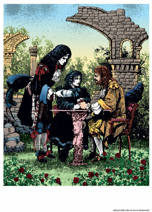
Michael Zulli: Death, Dream and Hob
Now, I know fandom bends over backwards to make this about Dreamling and often slots its meaning in during/after The Wake (or at least hinting at it because of the meeting with Death), but I honestly can’t see it?
I personally believe we need to step back a bit here and consider that this was painted long before the TV show, and Dreamling wasn’t really a thing (at least not in these epic proportions, plus it was always fanon, not canon), hence we can’t really do art analysis through that lens.

If you just put the 1689 meeting (also drawn by Zulli) right next to it, it becomes, at least to me, so blatantly obvious that it is set in the same timeframe. Hob wears nearly identical clothes, so does Dream (also, some of the original comics have been recoloured).
The woman at the table next to them holding the mask? Hm, there’s a famous artwork by Colleen Doran in which Death holds a mask, and she definitely seems to be listening in here. Which she might, considering the conversation Dream and Hob had in 1689. Could obviously also just be a random person covering up smallpox scars 🤣
In the grand scheme of things, I don’t think it matters so much whether Hob already met Death or not and would recognise her, it’s the symbolism of talking to her at this point more than anything.
So would it be totally outlandish to think the missing glass is also for Eleanor? Hence the red roses as well, because Zulli hardly ever uses red roses for Dream apart from one exception (he does so for Daniel though)—they tend to be blue and always hold connotations to grief, I wrote about this before. Or better: Symbolic for all those who aren’t at the table with him? And that’s why Death is there? Both for those she has taken, but also because this is very obviously the point where Hob is at his lowest and might rethink.
I think we really have to think about where Hob is in his life here and not erase Eleanor and his kids again. “To absent friends AND lost loves”, right?
And I can’t look at that angel holding the table and not get references to pregnancy/childbirth (Eleanor and the second baby died during childbirth).
As for the raven looking away/pointing away from the table: Foreboding? Because apart from being Dream’s ravens, ravens were also associated with Apollo, who was also the god of prophecy and an oracle himself. That’s why Apollo himself eventually released Orpheus from his existence as one—long story (plus, Aristeas, who was also Dream’s raven, was Apollo’s raven in Greek mythology. Plus Apollo was also Orpheus’ father in some retellings. It’s all interwoven, but I feel the foreboding is a significant thing here for exactly that reason).
And foreboding-foreboding, of course Death and Hob meet again, and by that time, Morpheus will be gone, and the missing glass is also for himself.
I wrote about Zulli and his symbolism a few times, it’s all linked in my pinned post, but the ruins are one of the less subtle references:
#the sandman#sandman#dream of the endless#hob gadling#michael zulli#morpheus#death of the endless#men of good fortune#1689#sandman meta#sandman x art#sandman art analysis#queue crew
62 notes
·
View notes
Note
Hi, I am a french reader, I just discovered Sandman, which I love, and I have a question about the colors in the restored publication of the serie. In the original publications, the colors were flashy and psychedelic but in the new ones, they are more "realistic", less wild in a sense. Is there a reason for this change ? Were you unsatisfied with the coloring of the first publications ?

It was a combination of things:
The biggest one was the very white glossy paper in the books was very different to the newsprint that the colouring was designed for. The original colouring was a lot more restrained, because it sank into and was absorbed into newsprint. It became "flashy, psychedelic and wild" because it wasn't meant to look like that.
Part of it was that the early colouring, especially in the Sam Kieth issues, especially once it was printed much heavier than intended, hid art details.
Part of it was consistency. We were going to have to recolour the early issues from scratch, to make the colour suitable for modern printing, and to create digital versions of the art. (Basically Sandman colouring was pre-digital until issue 49. I'm fairly sure that Worlds' End on were done on computers, although Danny Vozzo was still colouring by hand, with "Android Images" doing the color separations, and they were done for whiter paper, so they weren't going to need to be recoloured.) So it seemed wiser to let Danny Vozzo go in and just... colour it. He'd coloured over 50 issues of Sandman, and he knew what he was doing.
In my blog in 2006, I was asked:
Dear Neil, the new coloring for the new Absolute Sandman looks great. I have a couple of questions regarding it: 1) Who's supervising the new coloring, and who's doing the coloring? 2) Were the new reproductions made from the orignal inks/art? 3) Do you feel that the new coloring better represents your original vision, the artist's original vision? is it a matter of technology? 4) will the Absulote Sandman be your "Artist's definitive version" in terms of coloring? and I replied: 1) Danny Vozzo is doing Sandmans 1-8, 17 and 18. Lee Loughridge is doing The Doll's House (9-16). It's being supervised by Karen Berger, Absolute editor Scott Nybakken, and me. And I'm signing off on every panel. 2) No. Most of that stuff was sold 17 years ago. We got a few pages, although the most useful thing was a cache we found in my attic of photocopies I was sent for proofing purposes, and some of the artists had clean photocopies of some pages. There are only a couple of pages now, in Sandman 16, where the black line leaves something to be desired. I bet the originals will surface as soon as Absolute Sandman Volume 1 comes out. 3) Yes, to all three. The original technology means that with every new printing on cleaner paper with sharper inks, it looks worse. There was never the time or the money to fix anything in the old days, and stuff simply went out as it was, sometimes to the detriment of the story. As things went on, we got to computerise the colour, and the technology gradually made things better. Compare Preludes and Nocturnes to The Kindly Ones, just from a standpoint of colour and you'll see what I mean. 4) I very much hope so. Maybe in 30 years the technology will have advanced to the point where we have to do it again, but probably it won't.
....
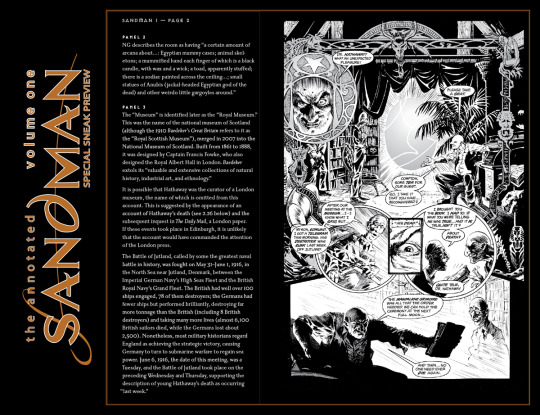
I hope that helps. If you want to see the artwork uncoloured, it's in The Annotated Sandman...
2K notes
·
View notes
Photo
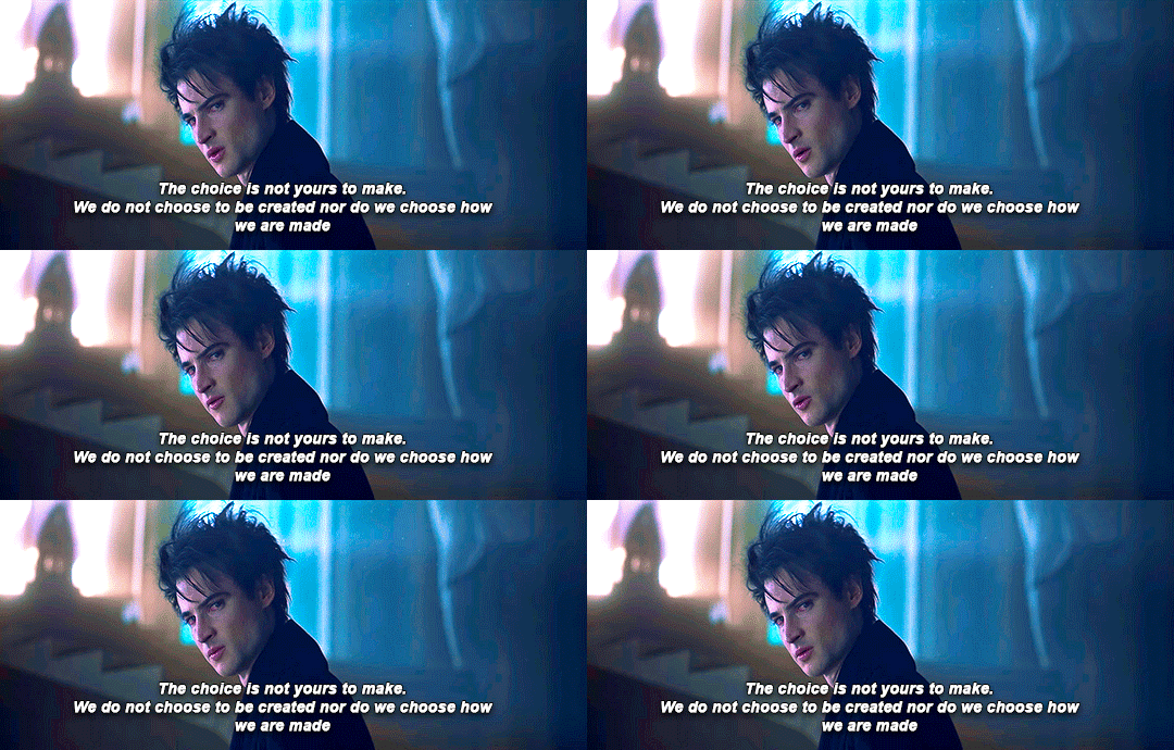
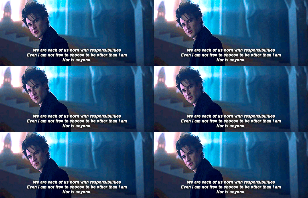
The Sandman | the unchanging nature of Lord Morpheus
We all change, sir. Even you, perhaps. One day.
#the sandman#sandman#tom sturridge#morpheus#dream of the endless#sue's things#sicvita:sandman#love this moment because this is when we first see this wrath#the cold imperious anger of the ruler of the dreaming#and the complete lack of mercy#and the fear and denial of change#and also TOM'S ACTING!#the way he can be so menacing and intimidating#after being a sad wet cat#he deserves more appreciation#drastically recoloured this and really hope it works
1K notes
·
View notes
Text
I posted 3,096 times in 2022
That's 3,096 more posts than 2021!
453 posts created (15%)
2,643 posts reblogged (85%)
Blogs I reblogged the most:
@brutaliakhoa
@salzundhonig
@tumblingxelian
@nonius-the-ninth
@aaaaaarrrghhhhhh
I tagged 1,578 of my posts in 2022
Only 49% of my posts had no tags
#thebirdspeaks - 130 posts
#poetry - 126 posts
#thebirdreads - 89 posts
#violence - 85 posts
#thebirdwrites - 77 posts
#the sandman - 72 posts
#jason todd - 60 posts
#thebirdarts - 59 posts
#nature of stories - 59 posts
#thebirdwillwright - 48 posts
Longest Tag: 140 characters
#never even realized how lost i was without her. but i always was. just some lost soldier who forgot he ever had a home… until she gave me on
My Top Posts in 2022:
#5


See the full post
88 notes - Posted September 18, 2022
#4
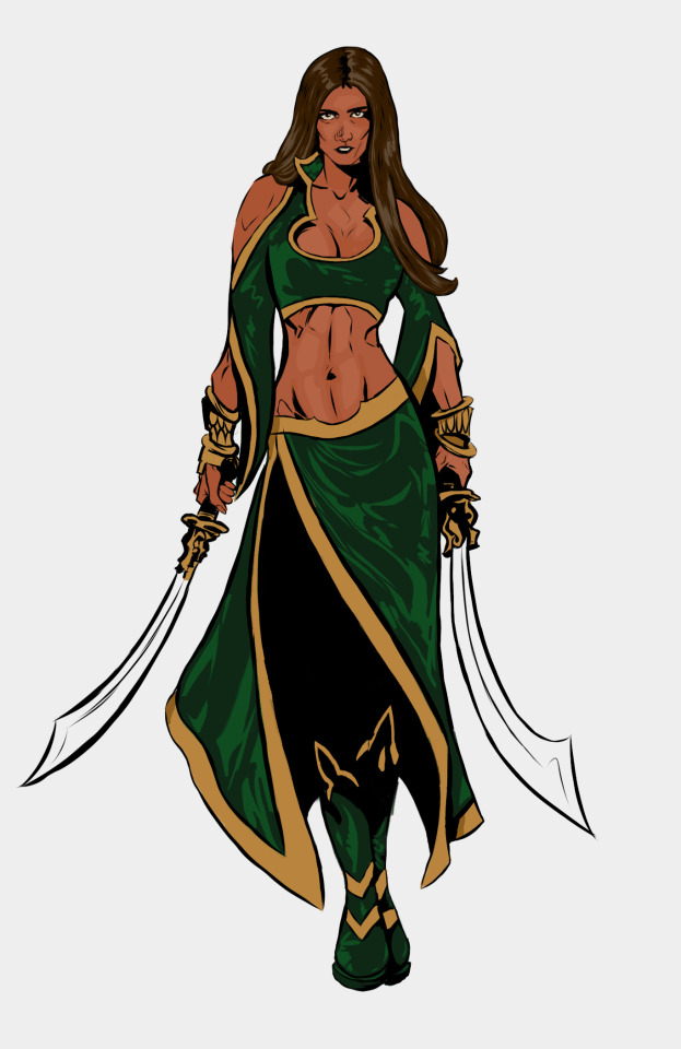
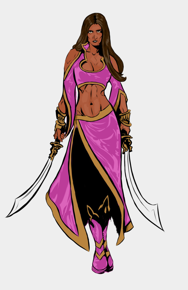
the one and only Talia al Ghul!!! Im so proud of the piece! plus bonus pink version!
massive thanks to @gooseyalghul-gumdrops for there Talia pallet. it was a lifesaver! There amazing recolours of Talia is what inspired me to finally do a proper Talia piece!
108 notes - Posted August 27, 2022
#3
small brain: dick grayson is bad at cooking
big brain: jason get fussy about cooking so dick pretends to be bad at it to rile him up cause jasons scowl is so cute
huge brain: dick now associates cooking w Jason so rarely cooks with others after his baby brothers death because its hard for him to cook alone let alone with someone else
massive brain: dick associated cooking with his mother and father and his family at halys circus so he avoided it but learnt to love it again through cooking with Jason
ginormous brain: damian enlists him to help cook some dishes Damian misses and damian helps dick get over cooking with out Jason and it become their thing
im runing out of size measurements for brains: Damian figures out why dick has complicated feeling to do with cooking and makes jason join them, and now all three do it together as brothers
168 notes - Posted October 21, 2022
#2
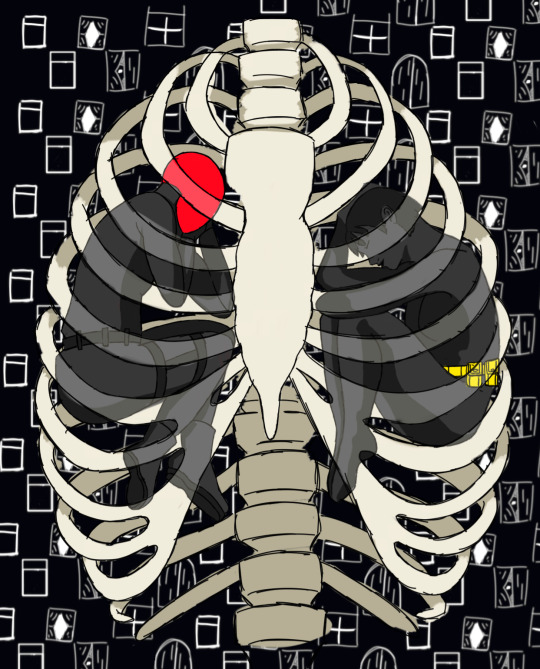
this work is inspired by @finalgirljasontodd ‘s amazing fic household autopsy , more specifically the line:
“And as they curl up against Gotham’s sodden ribs, she realises he’s as familiar with this way of living as she is. They both know how to pick at a city’s carcass”
please read the whole fic its amazing!!
under the cut is the progress and some ramblings and other pieces also inspired by the fic
See the full post
177 notes - Posted September 26, 2022
My #1 post of 2022

im normal about this im ok about this im normal about this(lying)
!!!!!!!!!!!!!!!!!!!!!!!!!!
258 notes - Posted September 16, 2022
Get your Tumblr 2022 Year in Review →
#tumblr2022#year in review#my 2022 tumblr year in review#your tumblr year in review#the jason an cass piece bing second....#also lol the longest tag outing me as buckynat trash..
4 notes
·
View notes
Photo
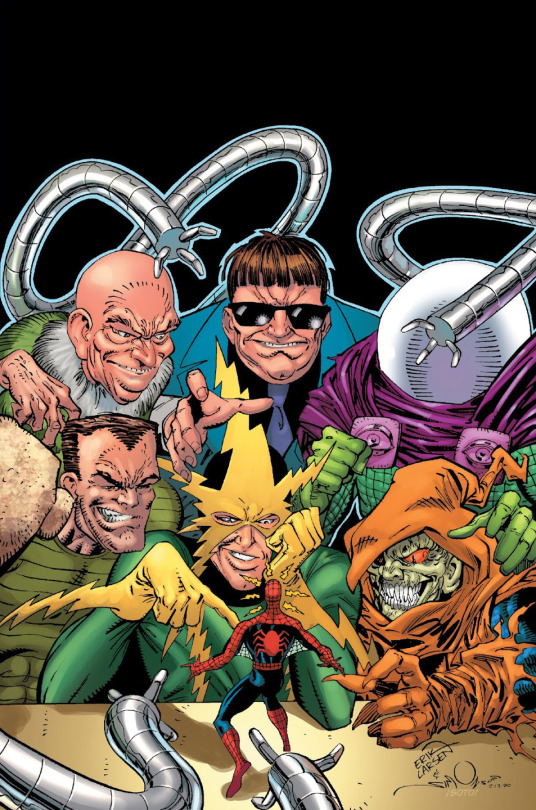
Mysterio and his Sinister Friends... See the MYSTERIO READING ORDER (1964-2015) for more of Quentin's team-ups!
MORE: Mysterio Reading Order - - - Artists: Erik Larsen, Walter Simonson & Chris Sotomayor
From: Amazing Spider-Man #337 (recoloured for the Spider-Man: Sinister Six Premiere HC back cover)
Featuring: Vulture, Doctor Octopus, Mysterio, Sandman, Electro, Hobgoblin & Spider-Man - - - Mysterio’s relationship with the Sinister Six is a serious love/hate thing. When Dr Octopus is in charge, it’s easy to hate getting screwed over by him all the time!
#Mysterio Reading Order#Mysterio#Sinister Six#Doctor Octopus#Vulture#Sandman#Electro#Hobgoblin#Spider-Man#Erik Larsen#Walter Simonson#Chris Sotomayor#Marvel Comics
10 notes
·
View notes
Text
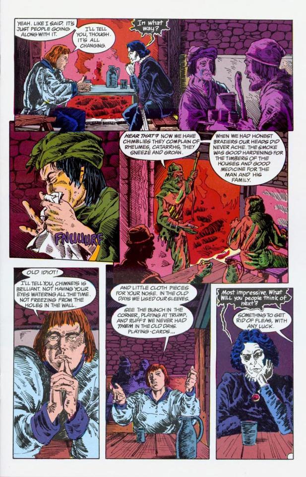

I can see why the recolouring of sandman was controversial :/ parts of it look better but it kind of loses its character
1 note
·
View note
Note
How did you edit those sandman pictures?
Honestly I had no idea what I was doing I would just colour select the darkest part of the image (which was usually dreams clothes) and colour in the eyes, then I’d blur it out and recolour the eyes until it didn’t look super jarring
For the irises I would colour select the lightest part of the image, lighten it just a bit more and do kind of the same thing on a smaller scale
0 notes
Note
Hi lovely! Um, I just wanted to contact you and ask about your Mister Sandman recolours of Peacy's mesh. Since the Cats & Dogs pack, I've been having all kinds of trouble with tons of my beds and have had to purge quite a few of them. I'm only just now getting to your recolours and am finding that as soon as I place the mattress down in Buy Mode, it instantly disappears into thin air. I apologise in advance if someone has already contacted you; I love your recolours so I had to ask!! <3 xoxo
Howdy, friend!
Have you re-downloaded Peacy’s stuff? The Cats and Dogs patch broke ALL CC beds, chairs and tables (and some other stuff but that’s the big thing). My understanding (and I just tested this out to be sure) is that my recolors (and any others you have) will work as long as the originals have been fixed.
Go to @peacemaker-ic‘s page and re-download all of his stuff–not only is it fixed for the Cats and Dogs patch, but he’s done some little tweaks and improvements here and there, and somehow his stuff is even better than before.
I strongly recommend having Sims 4 Studio, if you can. Even if you don’t create CC and have no intention of ever doing so, Sims 4 Studio often puts out what is known as “batch fixes,” where it fixes ALL of the CC in your entire folder when an EA patch messes things up. Just one click! If you have any other CC bedding, it will fix all of them, too! You don’t have to purge anything! You can also use it to delete swatches on items if you don’t like some of them, just to help keep your mods folder a wee bit smaller.
Download Sims 4 Studio Here
8 notes
·
View notes
Text
A Midummer Night’s Dream (Sandman #19) Gets Remastered
Or Shall We Say Recoloured?
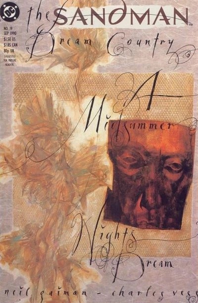
More Info:

How nice would it be if we also got an episode (somewhere, something something Netflix…)?
#the sandman#sandman#neil gaiman#charles vess#steve oliff#a midsummer night's dream#midsummer night's dream#a midsummer night’s dream sandman
12 notes
·
View notes
Note
wow! what a thorough answer 💚
Hi, I am a french reader, I just discovered Sandman, which I love, and I have a question about the colors in the restored publication of the serie. In the original publications, the colors were flashy and psychedelic but in the new ones, they are more "realistic", less wild in a sense. Is there a reason for this change ? Were you unsatisfied with the coloring of the first publications ?

It was a combination of things:
The biggest one was the very white glossy paper in the books was very different to the newsprint that the colouring was designed for. The original colouring was a lot more restrained, because it sank into and was absorbed into newsprint. It became "flashy, psychedelic and wild" because it wasn't meant to look like that.
Part of it was that the early colouring, especially in the Sam Kieth issues, especially once it was printed much heavier than intended, hid art details.
Part of it was consistency. We were going to have to recolour the early issues from scratch, to make the colour suitable for modern printing, and to create digital versions of the art. (Basically Sandman colouring was pre-digital until issue 49. I'm fairly sure that Worlds' End on were done on computers, although Danny Vozzo was still colouring by hand, with "Android Images" doing the color separations, and they were done for whiter paper, so they weren't going to need to be recoloured.) So it seemed wiser to let Danny Vozzo go in and just... colour it. He'd coloured over 50 issues of Sandman, and he knew what he was doing.
In my blog in 2006, I was asked:
Dear Neil, the new coloring for the new Absolute Sandman looks great. I have a couple of questions regarding it: 1) Who's supervising the new coloring, and who's doing the coloring? 2) Were the new reproductions made from the orignal inks/art? 3) Do you feel that the new coloring better represents your original vision, the artist's original vision? is it a matter of technology? 4) will the Absulote Sandman be your "Artist's definitive version" in terms of coloring? and I replied: 1) Danny Vozzo is doing Sandmans 1-8, 17 and 18. Lee Loughridge is doing The Doll's House (9-16). It's being supervised by Karen Berger, Absolute editor Scott Nybakken, and me. And I'm signing off on every panel. 2) No. Most of that stuff was sold 17 years ago. We got a few pages, although the most useful thing was a cache we found in my attic of photocopies I was sent for proofing purposes, and some of the artists had clean photocopies of some pages. There are only a couple of pages now, in Sandman 16, where the black line leaves something to be desired. I bet the originals will surface as soon as Absolute Sandman Volume 1 comes out. 3) Yes, to all three. The original technology means that with every new printing on cleaner paper with sharper inks, it looks worse. There was never the time or the money to fix anything in the old days, and stuff simply went out as it was, sometimes to the detriment of the story. As things went on, we got to computerise the colour, and the technology gradually made things better. Compare Preludes and Nocturnes to The Kindly Ones, just from a standpoint of colour and you'll see what I mean. 4) I very much hope so. Maybe in 30 years the technology will have advanced to the point where we have to do it again, but probably it won't.
....
I hope that helps. If you want to see the artwork uncoloured, it's in The Annotated Sandman...

2K notes
·
View notes
Photo
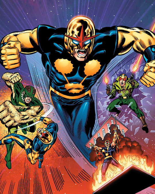
The NEW WARRIORS READING ORDER (1972-1989) includes all of Rich Rider’s appearances before joining the team (as well as Firestar, Namorita and the rest!)
- - -
MORE: New Warriors Reading Order (part 1)
- - - Artists: Rich Buckler, Joe Sinnott & Thomas Mason From: Nova Classic vol.2 tpb (featuring the recoloured cover of Nova 13) Featuring: Nova, Sandman & Crimebuster
6 notes
·
View notes
Photo

Mysterio and his Sinister Friends... MYSTERIO READING ORDER (1964-2015) features the appearances of Mysterio (along with the Sinister Six) all in chronological order! MORE: http://bit.ly/MysterioReadingOrder
- - - Artists: Erik Larsen & Walter Simonson From: Amazing Spider-Man #337 Colours: Chris Sotomayor (recolouring the piece for the Spider-Man: Sinister Six Premiere HC back cover, 2009) Featuring: Vulture, Doctor Octopus, Mysterio, Sandman, Electro, Hobgoblin & Spider-Man
#Mysterio Reading Order#Mysterio#SInister Six#Spider-Man#Erik Larsen#Marvel#Marvel Comics#Hobgoblin#Doctor Octopus#Comic Books
5 notes
·
View notes
Photo
love how you picked out the iridescent hues... The Dreaming is like being inside a soap bubble!
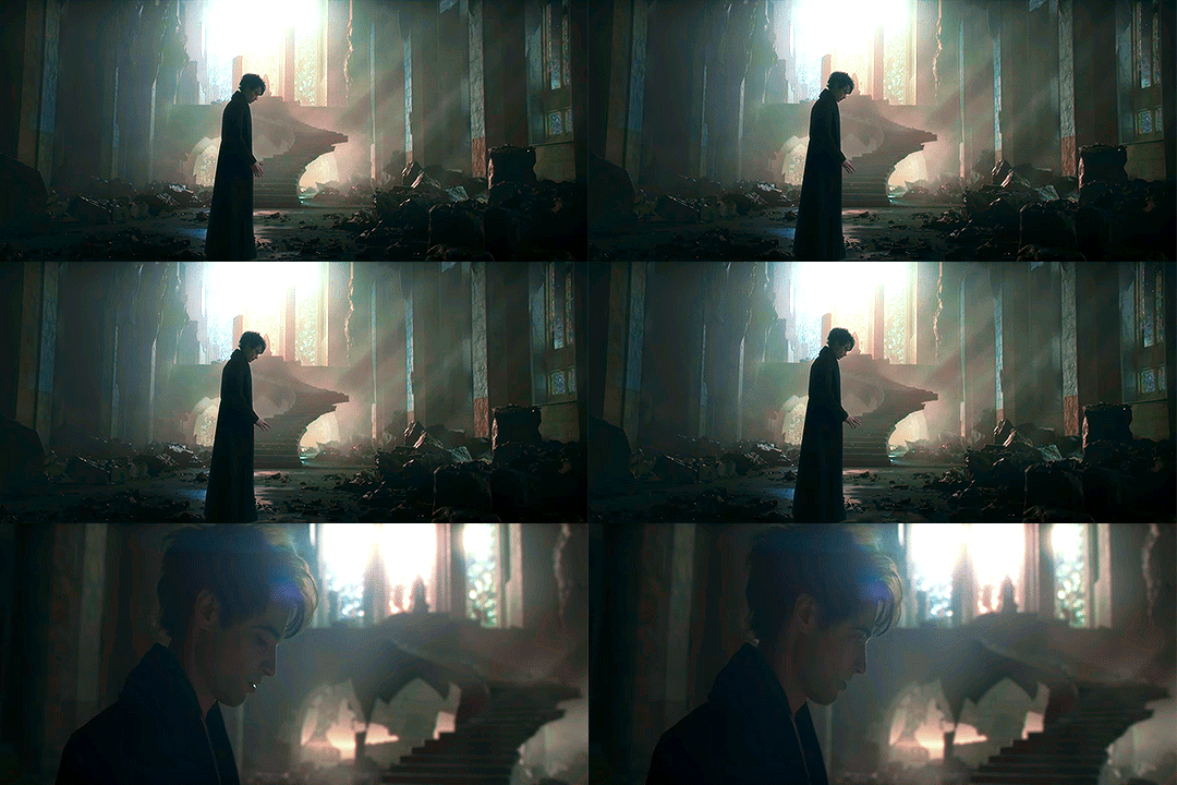
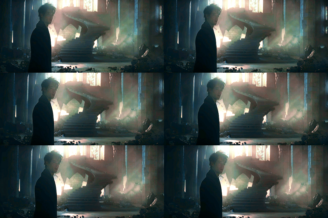
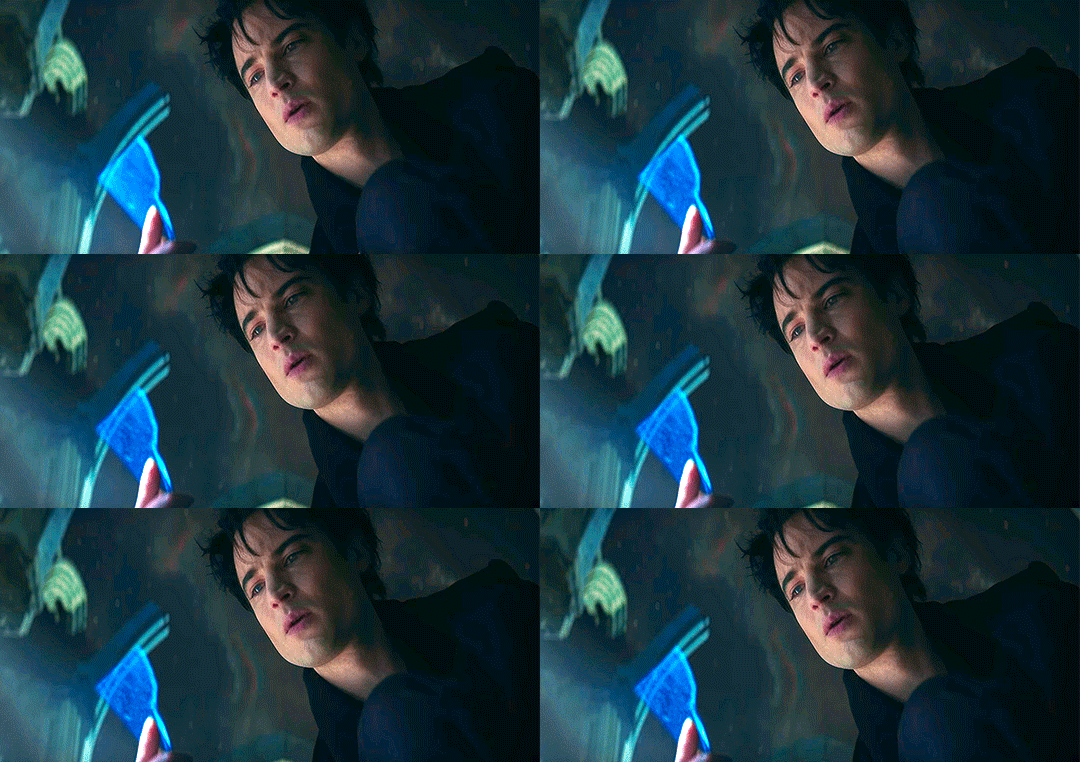
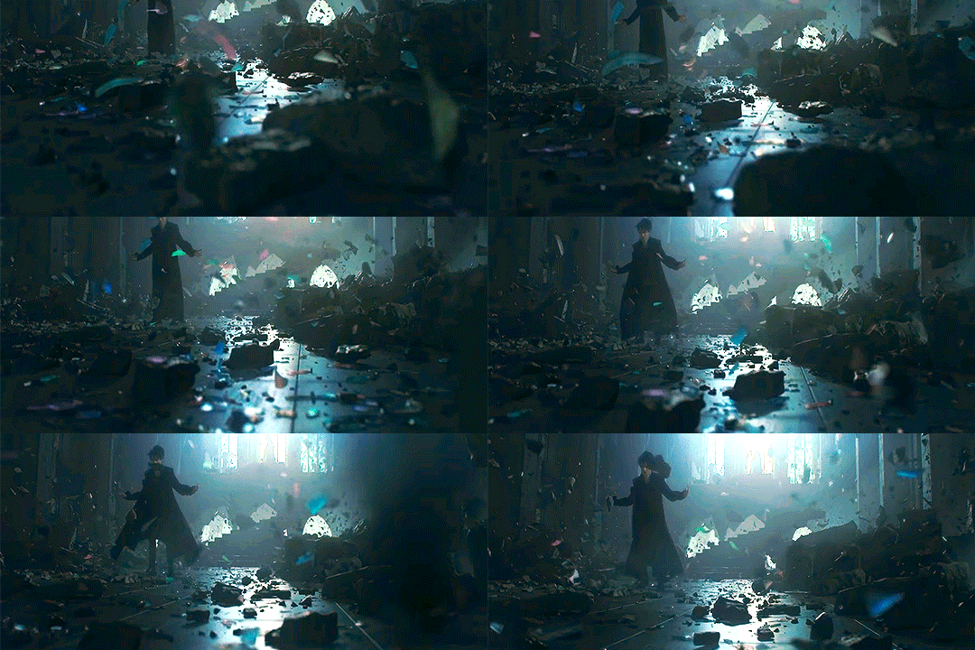

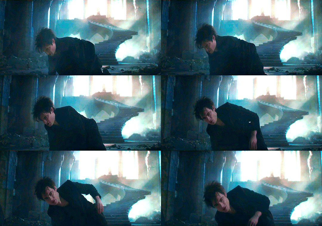
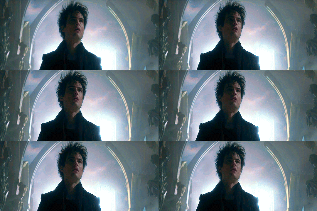
The Sandman | Morpheus repairing his realm
I made this realm once, Lucienne. I will make it again.
My sand, my helm, my ruby. They were taken from me. By my captors. And then taken from them. I know not where. Nor what I am without them.
#beautiful work#gif makers#gifset#recolour#love how you picked out the iridescent hues#fanworks#fan art#video editing#heartbreaking moments#best show#The Sandman TV#the Sandman#Lord Morpheus#dream of the endless#king of nightmares#prince of stories#Oneiros#shaper of forms#anthropomorphic personification#incarnation of the Dreaming#aether of imagination#incompetent sad rag
1K notes
·
View notes