#PROTIP
Explore tagged Tumblr posts
Text
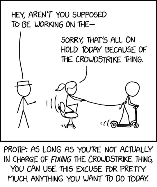
We were going to try swordfighting, but all my compiling is on hold.
Crowdstrike [Explained]
Transcript Under the Cut
[White Hat is addressing Ponytail, who is crouched on a moving office chair, holding onto a rope tied to Cueball, who is riding an electric scooter.] White Hat: Hey, aren't you supposed to be working on the— Ponytail: Sorry, that's all on hold today because of the CrowdStrike thing.
[Caption below the panel:] Protip: as long as you're not actually in charge of fixing the CrowdStrike thing, you can use this excuse for pretty much anything you want to do today.
8K notes
·
View notes
Text

“Two star-crossed lovers reaching out
To the beast
With many names”
- He Is by Ghost
#dan and phil#dnp#phil lester#dan howell#amazingphil#daniel howell#phan#phanart#dapg#dapc#dnpc#fanart#tarot#tarot cards#dan and phil crafts#dapcrafts#dnpcrafts#dap crafts#dnp crafts#crafties#protip#art#digital art#drawing#ghoulish art
590 notes
·
View notes
Text
TW: BLOOD!!

friendship is nothing without creativity!!!
#dan and phil crafts#dan and phil#phanart#fanart#phandom#soft and neat#protip#crafties#digital art#procreate#myart💫🫧
311 notes
·
View notes
Text
Walmart sells men's size S mid-thigh length swim trunks, which fit if you usually wear a women's size S and don't want to suffer the indignity of women's bathing suit bottoms this summer.
#protip#walmart mens/boys shorts have wider hips than target in my experience which is why i like them#and of course if you wear larger sizes you can also wear trunks but menswear that fits short/petite women can be hard to find
56 notes
·
View notes
Text
Yogi Protip #88
We all need to get out of our head sometimes and there are many ways to go about doing it. Playing a game, physically exercising, and enjoying some art or entertainment are just a few options.
But there is also a simple mindfulness method that can be helpful and even profound. And you can do it at an moment.
Instead of getting out of your head, you go into it. Specifically, you shift your attention into embodying the physical sensation of your head.
The practice itself is simple but the actual application of it may be challenging, depending on your personal tendencies. An actor or a dancer may pick up this method a bit more readily but if you persist with the practice, you will get the hang of it.
The technique:
Feel your head from the inside-out. Shift your attention to feel as though you are occupying the space of your entire head. For example, if you were to do a similar practice with your hands, then you would feel your hands as if you were wearing them like gloves.
Be present in the space of your head and allow whatever sensations you notice to be there with you.
You may notice that there are certain parts of your head that you can feel into quite easily while other parts that may feel numb. This tends to correlate with the parts of our body that most often engage with sensations of touch. Feeling your ears from within the space of your ears may be more difficult than feeling your lips or tongue from within.
One way to help orient your attention to embodying the space of your head is to feel your awareness from the center of your head. The center of the head is not in the brain but actually more like at the base of the brain near the back of your throat/nasal passage.
I could write more but really this is a felt practice that you learn more by doing rather than reading. Intellectual understanding will only be so helpful.
Throughout the day, take a few pauses to feel into the space of your head. Remember to be relaxed as you do this. See how much you can incorporate into the sensation of embodiment: the mask of the face, the eyes, the teeth and tongue, the ears, the scalp and back of the head. And don't forget the brain too!
This can of course be a full body practice as well. That is what somatic spirituality is all about. But even just playing around with this method in the space of the head can be helpful in disrupting compulsive thinking and draining mental patterns.
Much love.
LY
46 notes
·
View notes
Text
Jesse Hamm (aka @hammpix )essay on Alex Toth and cartoon realism, archived at the wayback machine.
129 notes
·
View notes
Text

collage of each tour they had + some photocards + the blessed golden pig > : ]
(click for better quality)
#tit tour#interactive introverts#tatinof#dan and phil#phan#were all doomed#golden pig#dont cry craft#protip#brave#pixel art#aseprite
22 notes
·
View notes
Text
Here's another thread I don't want to leave languishing at the old site. It's tough to start a career. I had good mentors and I'm grateful and want to pass it on. These are some notes I made on ways to do so.
1. Promote artists a generation younger than you. Share your platform. RT them, mention them in interviews. (This means being aware of what younger artists are doing!)
2. Hire them if you can. Pin ups, commissions, variants, fill-ins, assists, anything. A small gig can be what helps them make rent.
3. (The same applies to creators a generation older. Many of them helped develop the visual language, the audience, and the industry infrastructure we rely on. Tell your reader how these artists' choices informed your own. Help your fans see what you saw in your influences' stories.)
4. Support anthologies. They've always been a key place where new and marginalized talent can incubate, & established artists can try something new. (They certainly were for me. Many of the big leaps I made as an artist happened on anthology stories where I had freedom to experiment.)
5. Mentor new artists! Even if their subject or style is different from yours, you still have much to offer. Just be sure to frame your advice in terms of goals & principles rather than "the right way" or "the wrong way." You want to help them find their own voice, not echo yours.
6. Suggest strategies for dealing with challenging clients or collaborators. The industry may be very different from when you broke in, but those young artists are still going to face the many of the same problems you did.
7. Steer them towards someone trustworthy when they need a consultant. It's not easy to find an accountant, an agent, or a lawyer who understands what we do. Your contacts are valuable!
If nothing else, make them aware of Volunteer Lawyers for the Arts. https://vlaa.org/get-help/other-vlas/
8. Share your understanding of industry standards for pay rates & professional practices. This doesn't mean posting your rates in public. The main that does is anchor your position when negotiating rates with a potential client. But in private, TALK. This benefits ALL your peers.
9. There will be times when you can't answer a question. It happens all the time. No one knows everything! But you probably know someone who *can* answer it. Use your network of connections and make the introduction.
10. And finally, take questions about the art, the craft, the culture, and the business on your social media. Answer them as honestly as you can.
-end-
101 notes
·
View notes
Text
wow Dan tells Phil not to eat glue multiple times in the glitter faces video and Phil still didn't listen
#but i guess phil and crafts!phil are different people#dan and phil#phil lester#dan howell#amazingphil#danandphil#dnp#dan and phil crafts#don't eat glue#protip
54 notes
·
View notes
Text
This resonated with me sO hard, because I’ve been here on tumblrdotcom for a good long minute now, and I’m always amazed at the absolutely drop dead gorgeous people who lament about their looks—especially women, non-white women and people who identify/present as women. These people aren’t fishing for compliments, they’ve somehow been genuinely convinced that they’re mid when they are everything but. Look, I understand that society and unrelenting, aggressive capitalistic marketing contribute to this, but please dO appreciate yourselves and what you have now. Your youth won’t last indefinitely. Eventually it will pass. Fuck the haters and enjoy whatever you have while you still can. Carpe diem. Carpe diem at every age, but especially now, today.
#advice#life#milana vayntrub#carpe diem#self love#psa#tiktok#protip#enjoy your youth while you still have it#im literally thinking of one particular blogger but i wont mention her by name bc i think i weird her out when i bring attention to her
271 notes
·
View notes
Text

I STILL LIKE DC AND DON'T WANT THIS BLOG TO DIEEE ARGGHHHH abt to make the comeback of the century... when im less tired
#when the soul crushing job bronchitis pneumonia gluten school combo catches up to u smh#protip#dont go in a wavepool and almost drown and get pneumonia#top 10 worst experiences#miss tim drake#hello world
10 notes
·
View notes
Text
me once again On my way! to comment "dont cry, craft" + "protip" on every single youtube video ever

#dan and phil#phan#my mac autocorrected 'omw' to that and i think its objectively funnier so im leaving it#dnp#amazingphil#phil lester#daniel howell#danisnotonfire#dan and phil crafts#dont cry craft#pro tip#soft and neat#protip
38 notes
·
View notes
Text
I can’t believe I got a dan and phil crafts notif in the year of our lord 2024
#dan and phil#amazingphil#dan howell#daniel howell#phan#amazing phil#dan and phil games#phil lester#dan and Phil crafts#protip
26 notes
·
View notes
Text
WHAT THE FUCK DID I JUST WATCH ????????

#dan#danhowell#phil#phillester#phan#phil lester#dan and phil#danisnotonfire#dnp#dnpg#dan and phil crafts#protip#soft and neat
29 notes
·
View notes
Text

don’t cry, craft ! ! !
#dan and phil#dan howell#danisnotonfire#phil lester#amazingphil#phan#daniel howell#dan and phil crafts#soft and neat#protip
22 notes
·
View notes
Text
You know the one. Not the thin, watery glaze that just soaks in and disappears. The one that creates a distinct, sweet, and tangy shell. Here’s how you get it: ✅ Use Powdered Sugar First: Always put your powdered sugar in the bowl before the liquid. It makes it easier to control the consistency. ✅ Go Thicker Than You Think: Your goal is a thick paste, not a liquid. Think of the consistency of honey or slightly melted frosting. It should be barely pourable. It will thin out as it settles. ✅ Pour onto a WARM (not hot) cake: A warm cake helps the glaze set into that perfect, thin, crackly layer instead of just melting and running off the sides. This technique is a game-changer, and it’s the crowning glory on our version of the iconic Pioneer Woman Lemon Cake. The full recipe for the cake that goes under this perfect glaze is waiting for you on the blog. Link: https://www.simmerrecipes.com/pioneer-woman-lemon-cake/
#kitchen hack#baking tip#protip#food hack#baking#from janes kitchen#simmer recipes#i learned something today#pioneer woman recipe#get in my kitchen#bakers of tumblr#dessert#baking science#recipe#lemon cake
3 notes
·
View notes