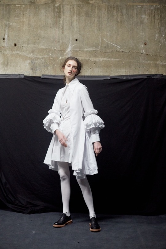
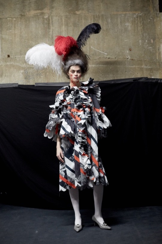
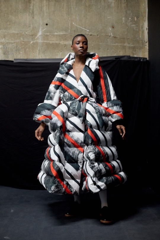
#Nabil Nayal
Explore tagged Tumblr posts
Photo

PHOTOSHOOT: PHOENIX MAGAZINE
Marina graced the cover of Phoenix Magazine’s “Holiday” Summer 2019 issue! The high fashion photoshoot was photographed by Uzo Oleh and shows our girl in front of a simple grey backdrop.
Styling by Natalie Read. Glam by Maria Asadi using M·A·C Cosmetics, and hair by Lewis Pallett.
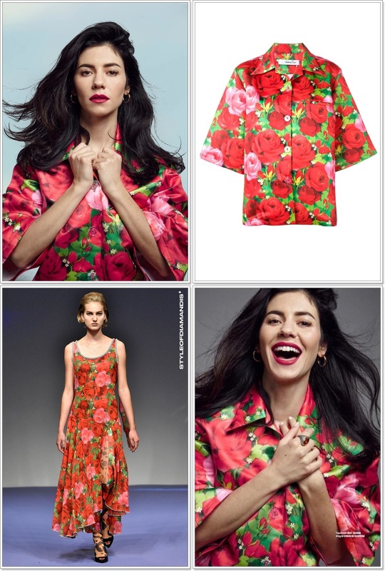
The cover look displays Marina dressed in a rose-printed silk shirt with oversized cut and short sleeves from UK designer Richard Quinn’s Spring/Summer 2019 collection!

Her textured silver ring with large oval-cut orange stone is signed by Giovanni Raspini.
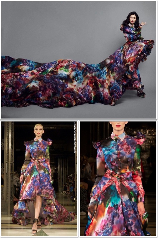
How epic is this money shot?! Marina is a big fan of designer Malan Breton so his design just had to be part oft his editorial. Here, she wears his multi-colored orchid print ruffle gown with extra(aaaaa) long train from the Spring/Summer 2019 presentation.
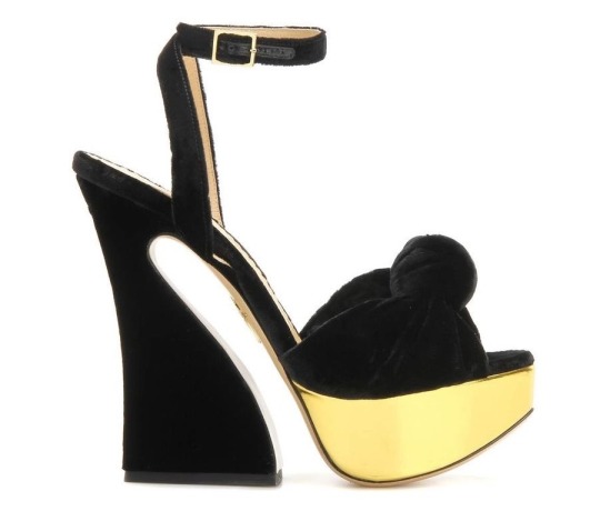
The extravagant look was completed with a pair of Charlotte Olympia’s Vreeland black velvet knot sandals with metallic gold platform.

From Malan Breton’s Fall/Winter 2019 collection, hails this metallic floral jacquard cape coat with self-tie neck. Above, you can see a similar design with the same print.
Underneath, she wore the CAMILLA Friend in Flora long-sleeved paddlesuit, inspired by the lush Turkish boudoirs and women’s quarters throughout Versailles.

She completed the look with these Sophia Webster Spring/Summer 2019 Frida knee-high sandals featuring a stunning flower motif in suede.

Next, the Welsh singer poses for the camera in a Richard Quinn purple & blue cloud-printed plush velvet turtleneck top with built-in gloves which she combined with silver & black metallic jacquard wide-leg pants with self-tie waist from Malan Breton’s Spring/Summer 2019 collection.
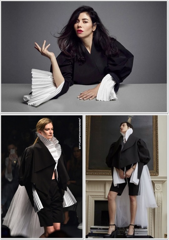
The black wool blouson jacket with slit sleeves and leg-o’-mutton sleeves, and pleated white poplin blouse with elongated cuffs and organza train both belong to 2011 Fashion Fringe finalists Syria-born, Sheffield-raised Nabil Nayal‘s Spring/Summer 2018 collection titled “Elizabethan Sportswear Part V”.
Nabil studied at the Manchester School of Art, where he gained a First Class Honours degree in Fashion.
After graduating in 2008, he went on to win many prestigious fashion awards including the Royal Society of Arts Award, the GFW Best Womenswear Award and the BFC MA Scholarship Award, enabling him to study at the Royal College of Art.
#CAMILLA#Bodysuits#Richard Quinn#Tops#Dresses#Malan Breton#Outerwear#Pants#Nabil Nayal#Jackets#Giovanni Raspini#Jewelry#Sophia Webster#Sandals#Charlotte Olympia#Pumps#MAC Cosmetics
7 notes
·
View notes
Text

Karen Elson
for Nabil Nayal | AW 2018
shot by Tim Walker x Vogue Italia
#karen elson#model#nabil nayal#aw2018#aw18#fw18#fw2018#tim walker#vogue italia#vogue magazine#fashion#style#beauty#fashion design#lookbook
10 notes
·
View notes
Text

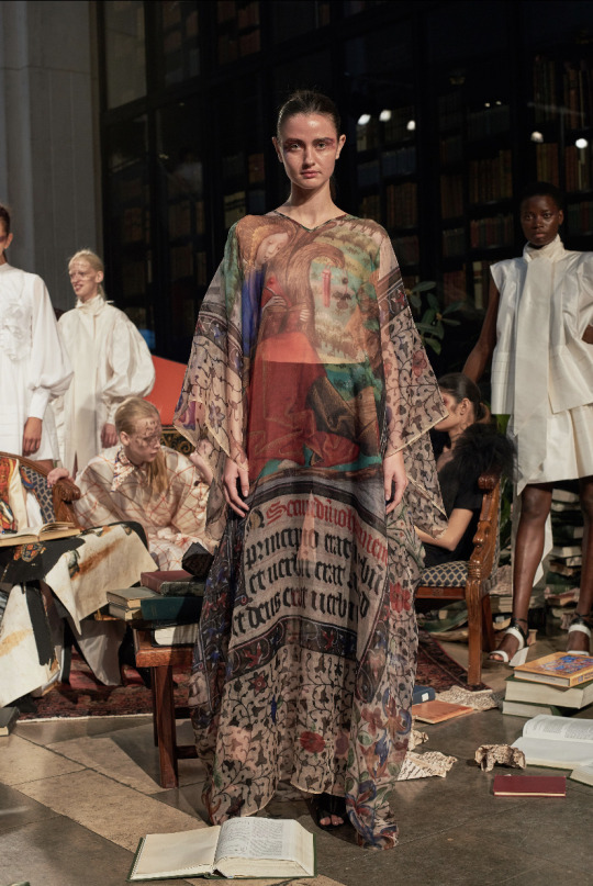
nabil nayal spring 2019
4 notes
·
View notes
Photo
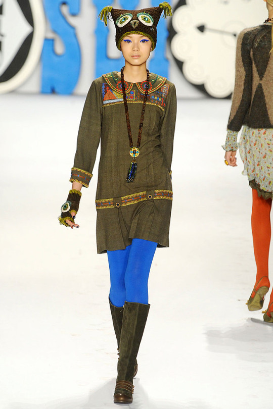
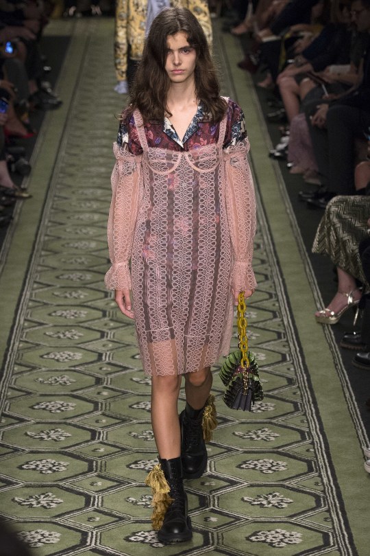
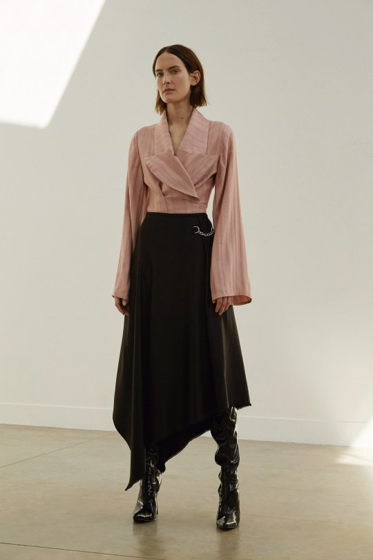
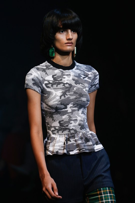
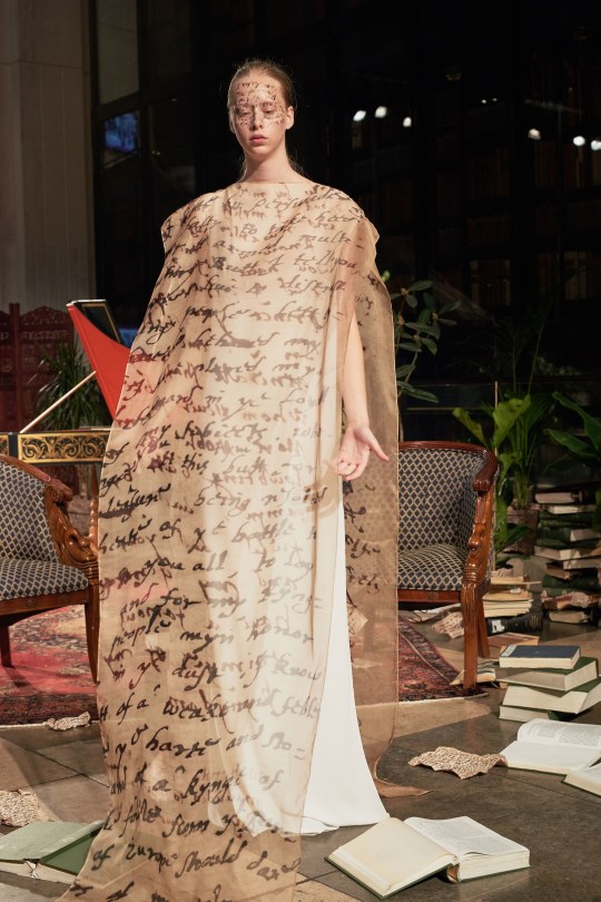
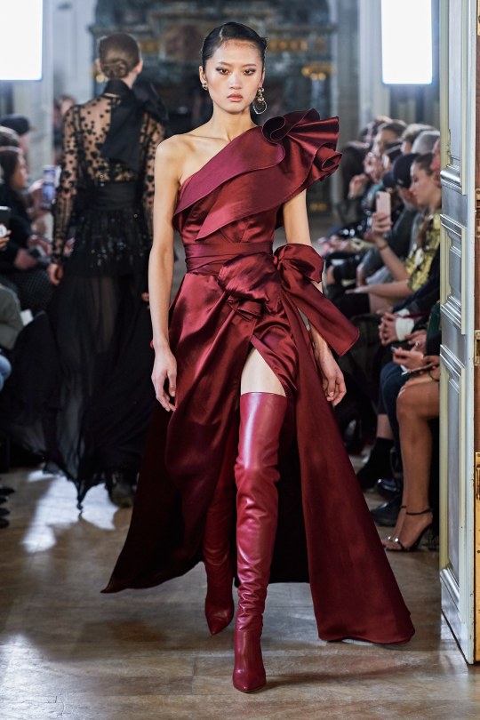
#Yilan Hua#Elie Saab#Fall 2019#Jane Moseley#Sid Neigum#Spring 2018#Maya Gunn#Burberry#Fall 2016#Dipti Sharma#Balenciaga#Xiao Wen Ju#Anna Sui#Fall 2012#Noa Abbenhuis#Nabil Nayal#Spring 2019#models#fashion#faves
9 notes
·
View notes
Photo
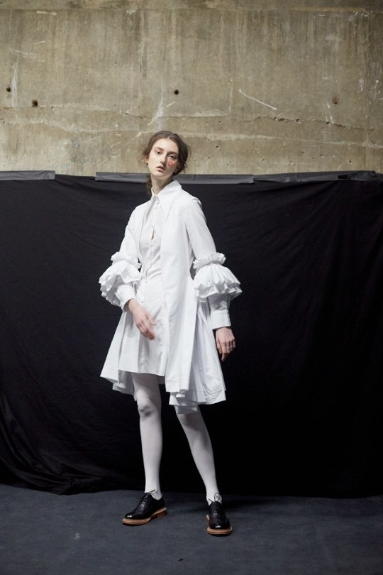
Nabil Nayal, Fall 2019
18 notes
·
View notes
Photo
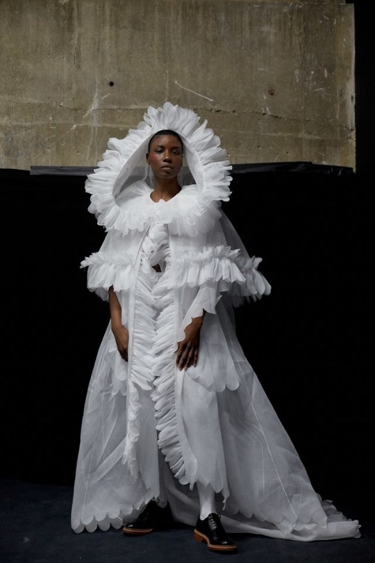
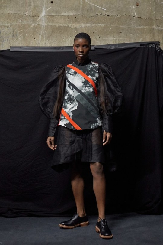
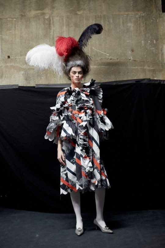
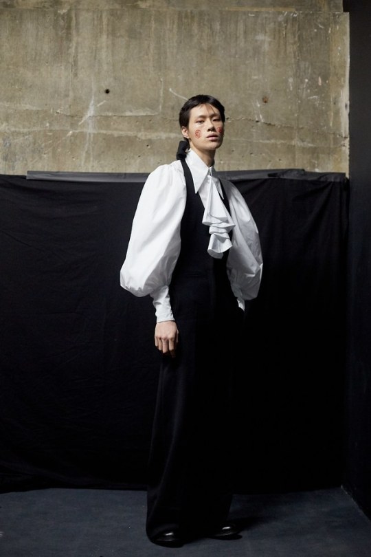
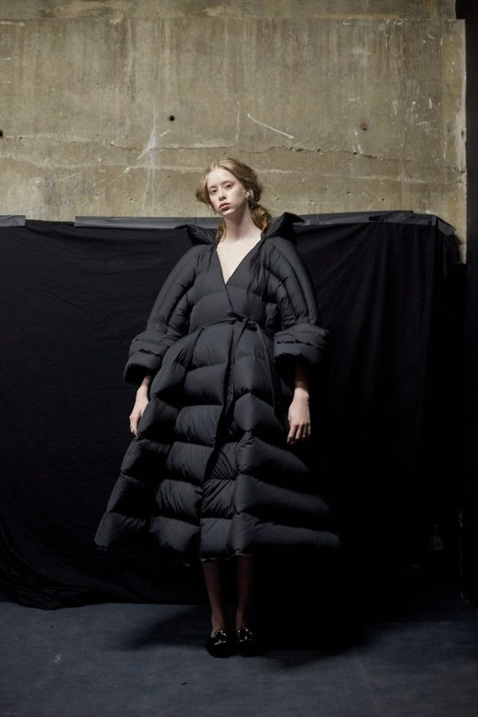
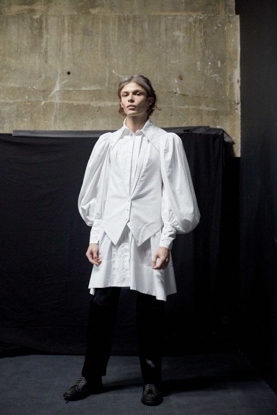

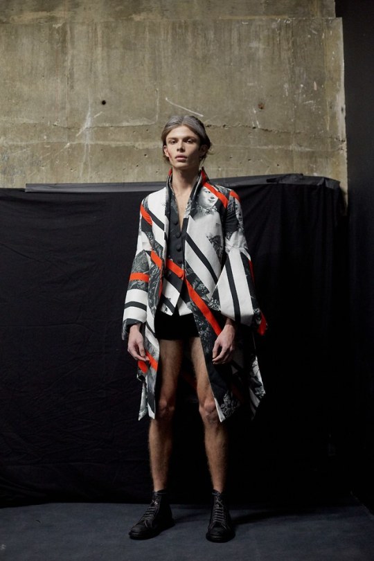
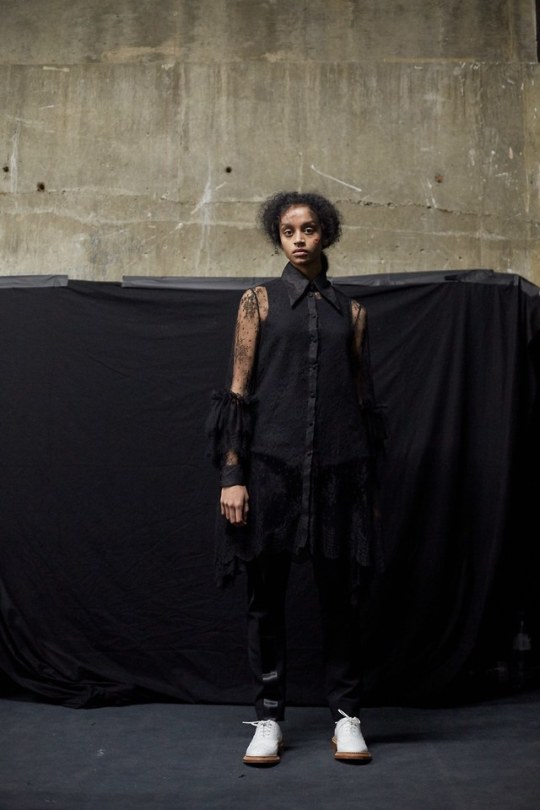
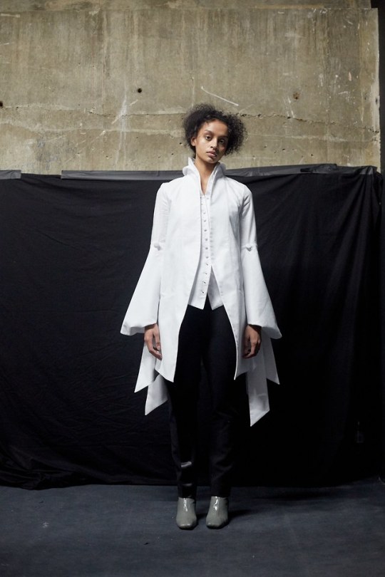
Nabil Nayal Fall 2019 Ready-to-Wear
9 notes
·
View notes
Text
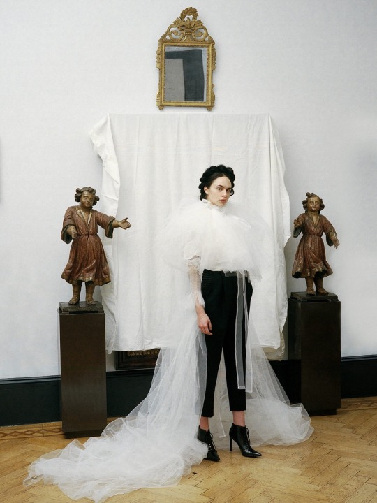
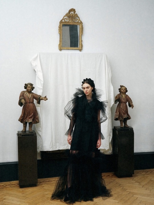
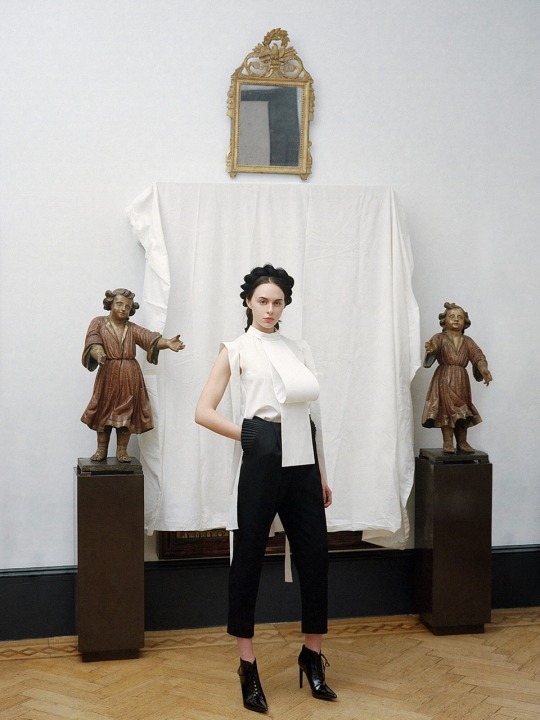
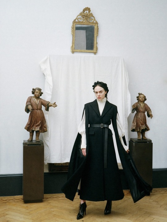
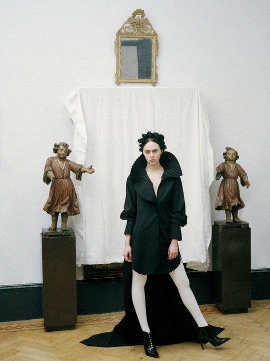
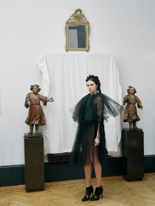
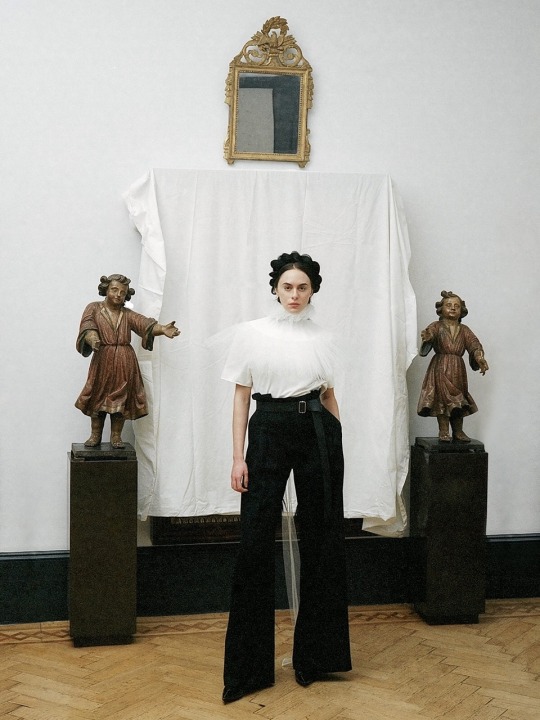
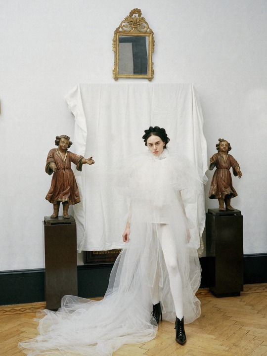
nabil nayal fw18 by chantal amari
105 notes
·
View notes
Photo
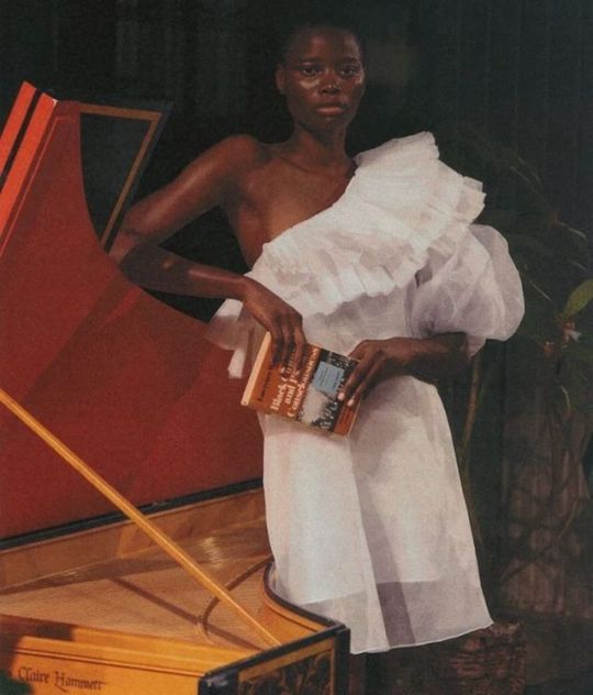
Jackson Bowley / Nabil Nayal
29 notes
·
View notes
Photo
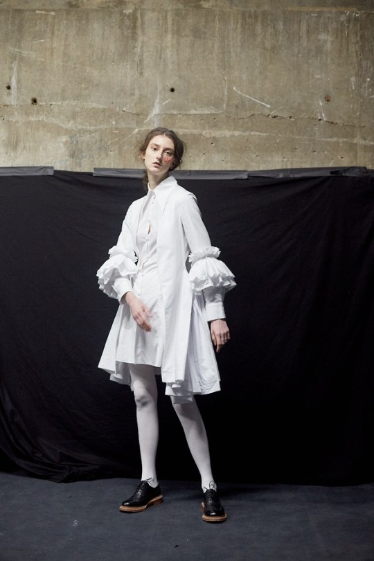
Nabil Nayal Fall 2019 RTW
9 notes
·
View notes
Text
S/S ’19 in Review; Presentations and Lookbooks
Back when I first made this blog, I made a promise to myself to review all the collections that made me Feel Things. Of course, that was before the season, and before my list of collections grew to over five dozen. Similarly, it was before NaNoWriMo, where I lost four weeks progress on this blog. After doing a little math, I realized there was no way I would be able to finish all the reviews before couture week kicked off. Considering I want to review all the major couture collections (plus the miscellaneous posts on other topics I wanted to throw in), as well as my current pace, there was no way that was happening. So here we are; I’m going to attempt to knock out every S/S ’19 collection shown as a presentation or lookbook in this one post. As a separate challenge for myself, I’m also going to try to limit each review to under two-hundred words. It’s an exercise in brevity, the archnemesis in all my writing ventures. Can I do it? Let’s find out!
—PAULE KA Of the sixty-some-odd collections that made my favorites list this season, Paule Ka ranked last. Not necessarily a bad thing, considering it actually made the list, but not a ringing endorsement. To put it plainly, while I liked some looks, I was indifferent about most. There were a few, such as the ones with the large heart appliqués, that I actively disliked. The bows that are a signature of the brand occasionally tended towards comically large, or even very young, but I’m generally not a fan of large bows anyway. Many of the dresses felt like things I’d seen before…in the Macy’s prom section. But perhaps that is a testament to the influence of brand, which just celebrated its thirtieth anniversary. The looks I did like were the ones that included sheer panels. For example, the grey-and-white dress in the first page of the lookbook, which was an interesting take on the half-cape (even if it did include a big shoulder bow). While the placement of the placement of the sheer panel in looks 16 and 17 might not be practical for a night out, I enjoyed them as well. Paule Ka isn't the most expensive brand on this list, but the clothes fit the pricetag.
—ALEXIS MABILLE Alexis Mabille's namesake brand inhabits a strange place in my mind. His couture collections veer into saccharine for me; all cloying sweetness with no depth, no edge to balance it out. However, his ready-to-wear collections are more restricted, and that's probably for the best. Not to mention the possibility that individual pieces can be incorporated into less cutesy outfits. This time, it wasn't hard to imagine. The lookbook model wore a reflective shield over her face, adding a delightfully surreal element to the collection. It was still undeniably an Alexis Mabille collection, however. Season after season, Mabille finds new and creative ways to sew a collared button-up or trench coat. The craftsmanship in tailoring deserves special mention, particularly on the pieces where patterns were matched across seams. Looks 1 and 6 used this method to create a beautiful chevron. Unfortunately, the collection suffered from familiar drawbacks in Mabille's work. Some of the satin silk pieces felt...off in a way I can't accurately describe. Look 24 throws a lot at you in terms of pieces and color. However, I would consider wearing each of the pieces individually.
—ELLERY Of the designers on this list, Kym Ellery's concept was probably the most, well, conceptual. Literally; it was inspired by Paul Kos' conceptual piece "Sound of Ice Melting". Like the artwork that inspired it, this collection was meant to be perceived through multiple means. The campaign, film, and presentation were all meant to be part of the collection itself, not just a way to advertise the pieces within it. So what does this mean for the clothes themselves? On one hand, aside from the occasional shared design element, there aren't too many obvious themes. The looks covered many occasions and styles - from casual sportswear to sparkling crop tops that would be perfect for a night out. However, all the pieces look like they could belong in the closet of the same woman. While the garments were more individually-focused than others on this list, they are also some of the most wearable. My only major complaint is for the lookbook itself. Some of the poses, as well as the bright lighting on lighter fabrics, made it difficult to see the clothes. And, trust me, I wanted to see the clothes.
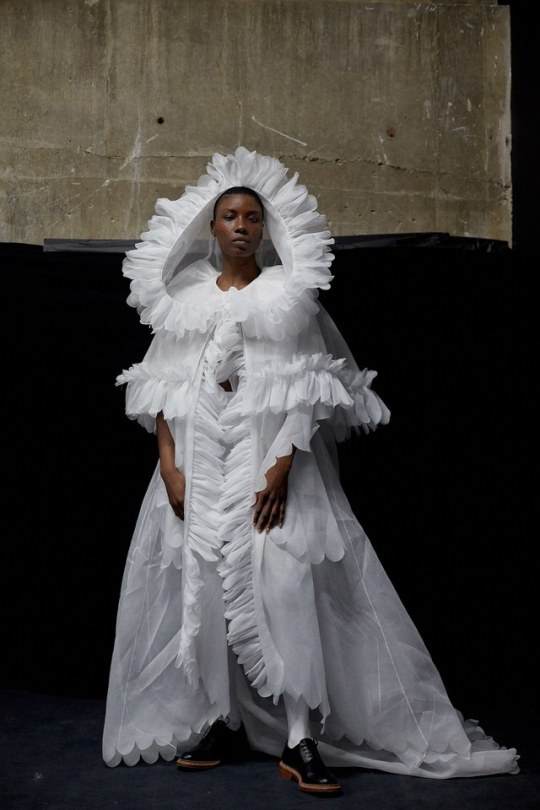
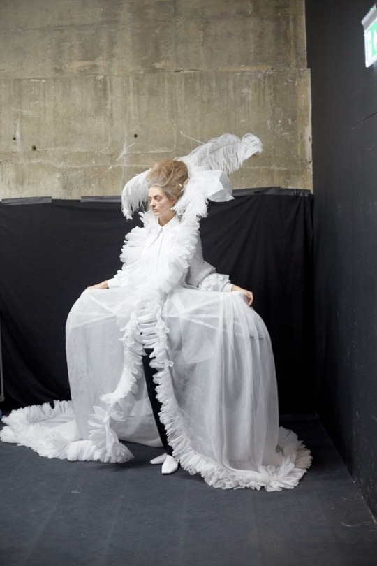
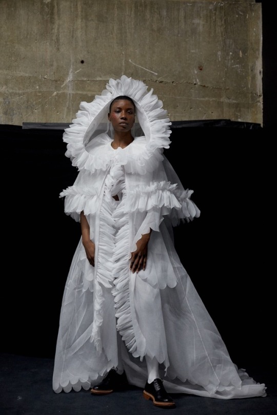
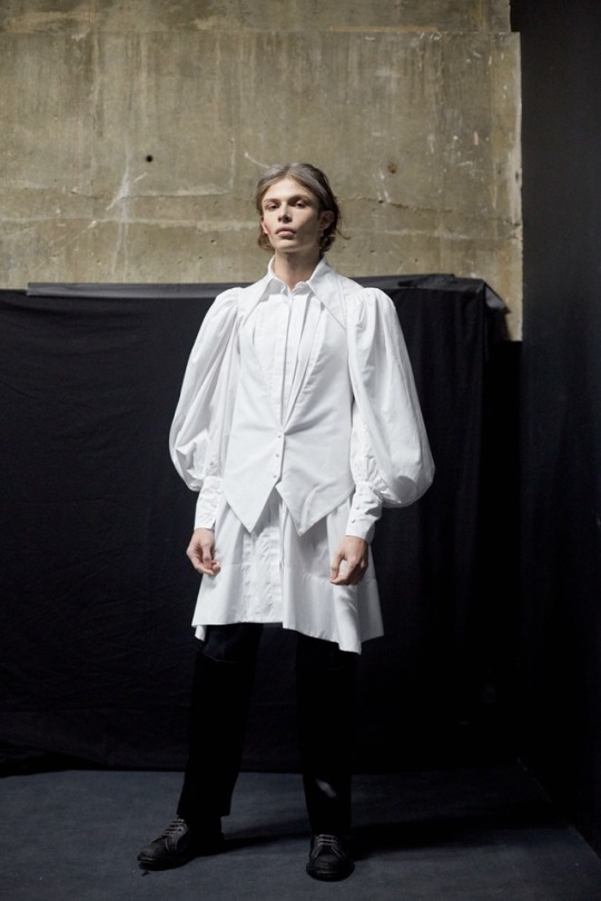
—NABIL NAYAL Nabil Nayal has been designing for over a decade now. He's won all kinds of awards, dressed everyone from Florence Welch to Rhianna, and collaborated with both Christopher Bailey at Burberry and Karl Lagerfeld at Chanel. Yet this is the first year I've heard of him, and that's a shame. All his artist statements and biographies mention his love of English history - particularly the Elizabethan era. He even earned his Ph.D. in the university where this collection was presented. That inspiration was quite literal in this collection. Prints included both original transcripts of famous Queen Elizabeth I speeches to depictions of the queen herself. In other places it was less obvious, such as the front ruffles or frilly collars on everything from shirts to trench coats. Previous collections by Nayal have been more sportswear-focused, but this collection was breezier. At times a little shapeless, the intricate prints and tailoring still made the garments beautiful. The makeup, which mimicked the script print of some pieces, also deserves a mention.
—VERA WANG From Elizabethan England to pre-revolutionary France. Where Nayal used his source of inspiration quite literally, taking the designs in a modern direction, Vera Wang went futuristic and avant-garde. Her designs are all about shape and volume, and there was a lot to play with in her chosen time period. This mix of past and future was clear from the first look, which included a style of cap sleeves (called "engageantes") popular among King Louis XIV's court, but rendered in black lace on a babydoll dress. Other times, the classic silhouette was used, but recreated with hard lines and sharp edges. Neck ruffles and puffed sleeves abounded, but the little details were also beautiful. There were several versions of seams made up of grommets, which added a hard edge to the romantic, lacy garments. Some of the pieces in the collection might not be the most wearable, but that hardly matters. They're art.
—WENDY NICHOL Is it possible to exude downtown grunge and uptown glamor at the same time? Wendy Nichol may have just cracked the code. In this collection, she combined clean lines with sheer fabrics to brilliant effect. All the looks in the campaign were styled by the models who wore them, showcasing not only their personalities, but the versatility of the garments. (One of these models happens to be Ilana Glazer, probably most known for her staring role in "Broad City", and a favorite actress of mine.) Some were dressed more casually, in shirt/pants/jacket combos that would be perfect for grabbing lunch with friends at a café. Others wore mini-dresses that looked ready for a night out clubbing. There were also creative takes on this season's staples, like bike shorts and belted blazers. My favorite (look 2), a gauzy black dress, was particularly beautiful; like something a member of the Unseelie Court might wear. Or, you know, me on a Friday night.
#paule ka#alexis mabille#ellery#nabil nayal#vera wang#wendy nichol#ss19#spring summer 2019#blog posts#tfg articles
14 notes
·
View notes
Text
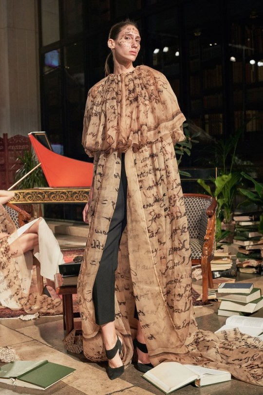
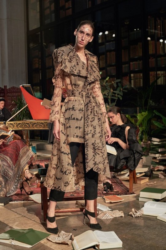
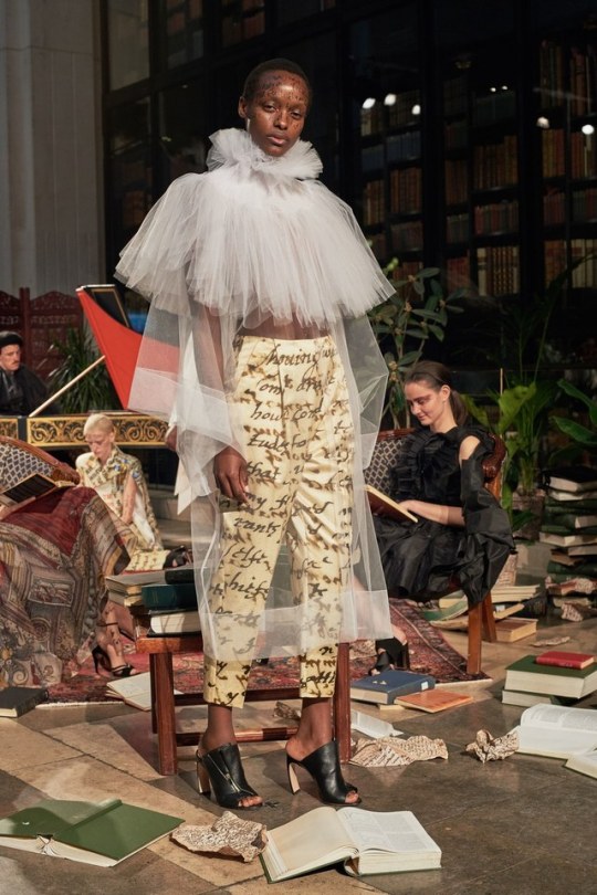
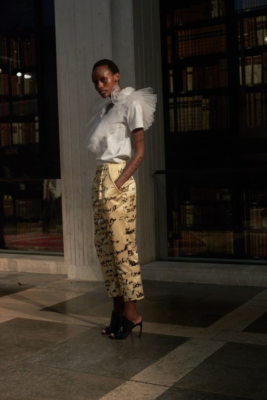
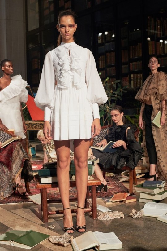
SPRING 2019 READY-TO-WEAR
Nabil Nayal
1 note
·
View note
Photo

Nabil Nayal Spring 2019 Ready to Wear
5 notes
·
View notes
Photo

Nabil Nayal, Fall 2019
8 notes
·
View notes
Photo

Cassey Chanel styled by Fabio Merche for Office Magazine Online LVMH Prize Finalist - NABIL NAYAL Spring/Summer 2017
#fabio merche#fashion editorial#fashion photography#cassey chanel#office magazine#lvmh prize#nabil nayal#ss17#kazuhiro naka
89 notes
·
View notes
