#Me reusing an art I did and just color shifting changing the hues? More likely than u think
Explore tagged Tumblr posts
Text
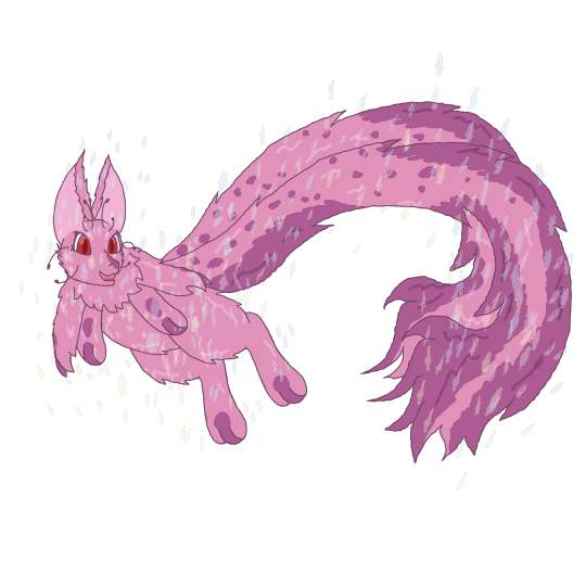
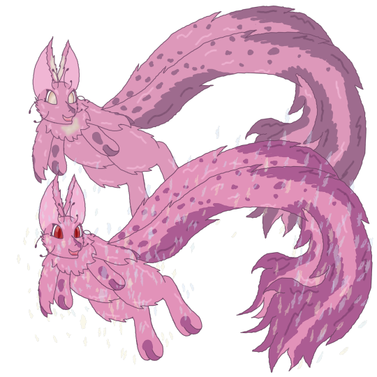
Was thinking about how Vismays different to when he was first made so made a first attempt of a young Vismay, he was probably a lot more sparkly gas cloud color and whimsy when first first made since literally made from stardust but a slightly more vibrant boiii
#my art#my oc#Vismay the beta mew#Vismay#Mew oc Vismay#Beta mew oc Vismay#Old world mew Vismay#Vismay the old world mew#He's so many things XD officially I think he is a beta mew the mew before the true mews beta access game#But calls himself old world as he's the only thing left from that old ancient time anyways#Me reusing an art I did and just color shifting changing the hues? More likely than u think#Baby boy lost his pretty eyes in the war#Sun took they color
5 notes
·
View notes
Note
is ok i ask can you do some tip for coloring? ps i try to coloring for my sun and moon but they look so bad X'D
HI. FUN FACT I DREW UP A RESPONSE TO THIS AND WAS LIKE "okay ill upload the photos and annotate it later" AND THEN I FORGOR. HERE'S WHAT I MADE FOR YOU.
This is generally my process when it comes to creating art as a whole and choosing colors for my art. I didn't use to do this, but recently I've begun using color-balancing tools to bring everything together! They really help in unifying the colors and pushing the contrast to where you want it to be. I used to feel guilty- like it wasn't "my own work" when I used these tools- but I spoke with a group of other artists and I came to realize that in the end, I still chose the colors and it was still Me! These tools are meant to be used in this way, and it's silly of me to not take advantage of wonderful tools because of my own pride.
This is going to be a long post, so all of my steps are under the cut!
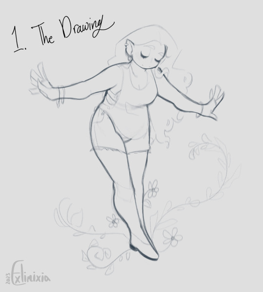
1. The Drawing!
Pretty self-explanatory! Draw out the thing you want to draw. I like to keep my art as a sketch most of the time :)
2. Flat Colors!
I'll be honest- usually I approach colors more intuitively and based off of the ones I like the most, but I wanted to show you a more conscious approach! This image has a lot of information so I'll go through it step-by-step!
I made the background darker for higher contrast against the light colors of the design.
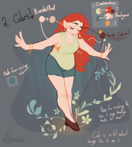
First, we'll look at the palette on the top right!
It's a little easier if you first have some colors to work with. This is my sona, and I already know it has red hair and light skin, so I can work with the colors around that! Depending on who you ask and what color wheels you look at, red is complimentary to both green (most commonly in color wheels) and cyan. Knowing this, and wanting the shirt to stand out against the red hair, I made it a pale green! I did similarly with the skin tone. The peach color is only a light tint of orange, so the complement would be blue! I noticed I had a lot of light tones so I chose a darker, desaturated tone of blue. Remember- complementary colors are more than just vaguely "complementing" the other color. Putting two complementary colors next to each other makes both of the colors stand out!
I felt as though I still needed another color, though! Because my red and peach colors are directly next to each other on the color wheel, they are analogous colors. I experimented a little bit and ultimately settled on using another analogous color as an accent- yellow! The brown of her eyebrows is more of a rogue color that might not necessarily fit most of the time- that's because it's more so meant to represent my Real Self, who has eyebrows naturally darker than its hair. Still, because brown is a darker tone of red (and orange), it worked out! The blush is also the skin tone, just slightly darker and with the hue shifted just slightly on the color wheel.
Next, we can look at color placement!
When choosing where to place your colors, it can help to have places where the colors are 100% locked in- for example, the hair and skin tone aren't something subject to change in this design. That means you can choose to place the colors around these two elements! Like I said earlier, I made the shirt a pale green because I wanted it to stand out against the red of the hair. I try to add variety in where the colors sit next to each other so that two different elements of the design aren't the same color. Knowing this, I made the shorts dark blue!
An important part of color choice is knowing when to reuse colors as well! Generally, the fewer colors you use the easier it is to work with them and make them work together. Using 2-3 main colors and finding places to reuse them throughout the design or drawing is a good way to keep your colors simple yet effective! You can also add an accent color that's meant to draw the eye to the most important parts of the design or piece! The two colors I reused within the design was the yellow accent color and the brown color of the eyebrows. The brown color is the one I want to focus on here because of its strategic placement in the shoes! I almost made the shoes yellow as well, but I found that the dark color of brown shoes against the light skin and the pose itself brought leads the eyes downwards. This is important so that the viewer takes in the entire piece! I also reused the pale green color (and some of the blue) as environment elements because I hadn't reused it in the design itself!
As a last note here, it's also very helpful to color your lines! This is totally subjective and up to you, though, depending on how it fits into your style and workflow. Because of the way I work, I set my lines to multiply and recolor them based on the colors around them.
Sometimes I explore with different color choices I wouldn't have normally chosen- like the purple around the edge of the skin! Without even realizing it, in hindsight, I believe I chose complementary colors for the lines as well (purple & yellow/orange).
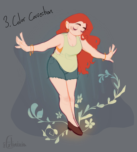
3. Color Correction
Here's the finished base colors (without all of the writing over it!)
First things first- let's check the values!
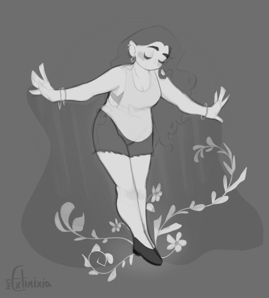
What I'm looking for is to see if the values stand out well next to each other, and where my eyes are drawn to. What I see right now is that the shoes are where my eyes are drawn to first because of their dark color, and how my eyes are led back up by the plants and line of action. What I'm most aware of, though, is the lack of contrast between the hair and background. I could try to fix that!
Here are a few snapshots of my color-balancing process. I use a variety of the available tools, but most often I'm using Color Balance and Curves. These color changes are completely up to you and what you think looks better and more unified!
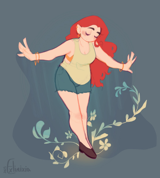
It's easier to see the differences if you open the images in new tabs and switch between them all. Notice the background becomes bluer, the colors change, and the values deepen?


These were the final colors I chose! Let's look at the values again.
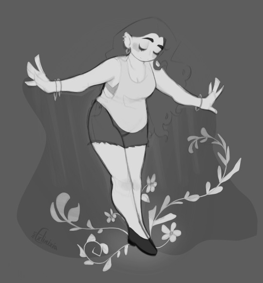
Hm.. better! The values stand out better, but the problem with the hair still persists. I'll try to make the hair pop more with the final touches, but if it doesn't, I'll settle! I'm happy with all of the other color choices.

A little better! The white highlights help show the edges of the hair, and I attempted using a halftone to break up the hair and the background. They still blend in together, but I won't fiddle with it more! I've got a post to make, you see.

What do you think? C: Thank you for the ask, I hope this helps!
Here are some other resources that helped me with some similar topics! The colors you choose don't always have to be the actual color of the object you're drawing- the colors around influence how we perceive other colors. Knowing how to use these colors is useful!
youtube
youtube
#My Art#Art Tutorial#ig#Art Advice#Exli speaks#Long Post#artists on tumblr#hope this helps a little!!#the art I made isn't the most polished but it didn't need to be for the purpose of this ask I think!!
27 notes
·
View notes