#MODULARTYPE
Explore tagged Tumblr posts
Text
Typographic Design
EXPERIMENT + REFLECT
Poster Design Cont.
At this point I decided to experiment with adding the full name of my alphabet to see how it looked against my background prints.


I wasn't keen with how these turned out and preferred my initial experiments highlighting just the one letter.


I was keen to see how other letters might work on the front and I am quite pleased with how the G looked, but in the end I decided to stick with developing my poster design highlighting the letter P.
I had another play around with my previous P designs and decided on the version below as my final poster.

7 notes
·
View notes
Text
Typography Brief - Jaipur
When creating my type, I really wanted to take shapes from the real world. I thought about the shapes I found most satisfying in typography. I was really drawn to modular type that features curves and circles, and so I wanted to find something I could create to reflect this.

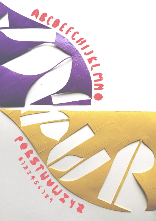
I decided to create a font that would be a love letter to my trip to India. I focused on examining the shapes, particularly of the Hawa Mahal. I remember seeing the landmark for the first time when I was 18, and it was one of the most beautiful pieces of architecture I had ever seen.
I decided to work with these shapes to create a modular font. I particularly wanted the font to be bold and elegant, but also playful. I think the mixtures between curves and straight lines provides this. Once I had worked with the shapes a few times, I built up my font, and named it Jaipur.
When utilising this into my type poster, I really wanted to have playful movement and diversity of the type. I really enjoyed looking at the work of Hey Studio and loved how bold and beautiful the designs were.
I also wanted to incorporate the bright colours and bold styles of the Hawa Mahal, and I felt the style of Hey Studio matched what I wanted to achieve. I tried a few different layouts on illustrator but felt I wasn’t able to get the effect I wanted.

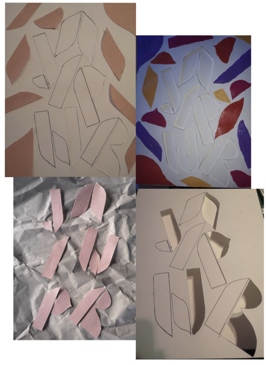
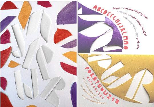
I decided to go back to cut-outs to play with analogue ways to play with type. I really liked the idea of using the modular shapes for the backgrounds as well as the empty space left behind.
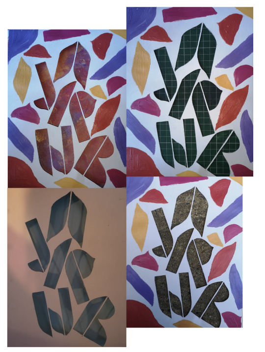
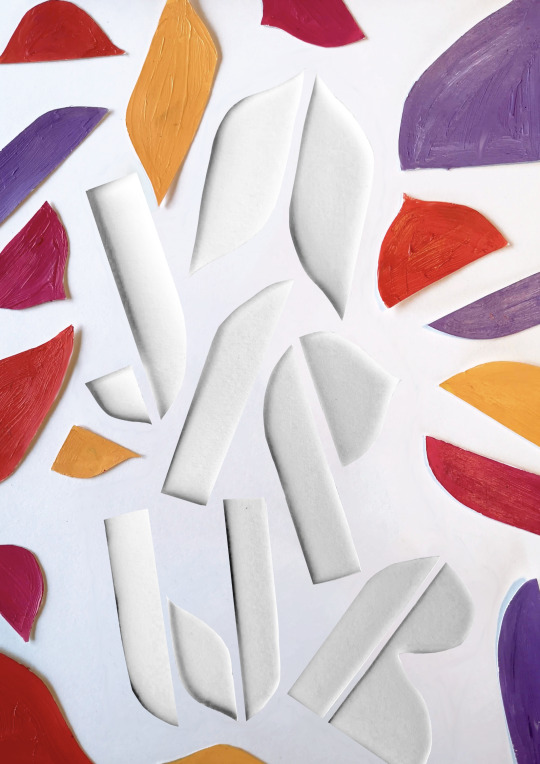
Once I was happy with the layout, I tried a few different backgrounds with the cut-out font. I liked the idea of it having a stone background, however when I tried it, it felt to dark and rough for the feel of the font. I also tried different colours but my favourite was the white on white. Finally, I cut the shapes out and lay them on top to give a very slightly 3d effect.
For the back, I wanted to follow a similar theme, and so I followed the same idea with cutouts, only this time I cut out painted shapes. The large dome shapes split in half left me with a page that was well divided. I like the way it halved the page. I also loved the idea of using the curves as a path for the type to follow, and really accentuate the shapes of the font.
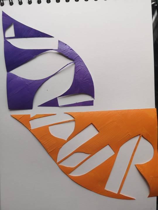
Finally, for my typographic system, I again wanted to relate back to the curves. I decided to try a dilatational style. I felt for the amount of content I wanted to share, and for the style and feel of the poster that I wanted to convey this worked really well.
Reflection
I was really happy with my final font and poster, as it reflected well my initial intentions for the project. I do wish I had given myself a bit more time to experiment with lots of different typographic systems, as I think there could have been some interesting ways of incorporating grid and axial systems as well, and I would have liked the front and the back of the posters to flow a little better, perhaps reflecting the dilational shapes on the back.
I also think in general I would have liked to have tidied up the design, but it was fiddly work with those cut-outs! Perhaps with a bit of free time, I will update the poster with some bolder choices.
5 notes
·
View notes
Text
Moduler Typeface
“[T]ypography underpins modern Western life. Every day we wake up to type from our first glimpse of an alarm clock, through the tuning of a radio, to the brands of shampoo, toothpaste and cereal we use, we are bombarded by typographic messages all vying for our attention - and all this before we have even glanced at a newspaper.” — Baines & Haslam
Most of us probably aren’t sitting down to a morning cup of coffee and thumbing through a newspaper these days, but you get the gist.
Modular typeface is EVERYWHERE and has a big impact in matters of design. It’s based on a system where letters are broken down into smaller parts called modules. “Typography means writing using repeatable units, [while] lettering is unique” (Baines & Haslam, 2005).
The photos that follow are some unique modular typefaces, which I think have all been designed by students. Finding these more basic, kind of “in your face” (in a good way), modular systems helped me better understand the visual aspects of designing typefaces based on a system.

Morgan Warren

Sarah Mitrano

Mags Brekka
References
Baines, P. & Haslam, A. 2005, Type & typography. Laurence King Publishing, London
2 notes
·
View notes
Photo


SH OFF-SIGHT FULL ANNOUNCEMENT 🦷🛰🗿 A modular display typeface consisting of seven different shapes found in the 🕳 dark spots of Helvetica Neue LT Std 85 Heavy. The Setting was: Little time, lots of fun! 7 Elements, 2 dudes & 2 Stylistic Sets 🗝 Type developing and design together with @andrevanrueth made with and for @stanhema @andren @toomanydesign @designeverywhere @lebenliebegrafik
#typedesign#typography#type#typo#schrift#displaytypeface#modulartype#helvetica#shoffsight#andrevanrueth#glyphs#letters#lettering#lebenliebegrafik#toomanydesign#puretypography#andren
19 notes
·
View notes
Video
instagram
Hey. You were born on a different day than them. Don't let them forget why you're so unique
#alukodesign#madeinaffinity#zodiacposter#zodiacsociety#astrologyposter#blank_poster#typeposter#typeposters#modulartype#posterjam#posterartist#designard#designfeed#abstractpattern#abstractdesign#posterdesigns#greekgods#mythologyart#livingroominterior#posterdesigncommunity#posterunion#wallartdecoration#visualgraphics#posteraday#posterlabs#posterart#dailyposter#designposter#wallartprint#eyeondesign
2 notes
·
View notes
Photo

Acaban de llegar las piezas que diseñe para Golosilandia, desarrollando una tipografía modular. #modulartype #display #displaytype #typography #brand #design #veraestudio #localshop #pamplona #pamplonacascoantiguo #comerciopamplona
#brand#pamplona#comerciopamplona#pamplonacascoantiguo#veraestudio#localshop#typography#design#display#modulartype#displaytype
1 note
·
View note
Photo


1 note
·
View note
Photo

Warning ⚠️ this post could make you feel dizzy. It’s a modular type I made in 2014 called Digitile. The name came from binary digit + dizzy. It’s made out of binary tiles and it makes you feel dizzy. I wanted to make a font and still did not finish it yet. #tbt #throwbackthursday #modulartype #typography #taekyeom https://www.instagram.com/p/B1v-kO6JHvM/?igshid=tkiv9ytvkom0
0 notes
Photo

alternates . . . . #typography #type #typedesign #moderntype #font #blackandwhite #typedrawn #thedailytype #typespire #pmostudio #experimentaltypography #geometric #modular #modulartype https://www.instagram.com/pablogmoreno/p/BuuLHQIggHE/?utm_source=ig_tumblr_share&igshid=v3sr5qkeq0sl
#typography#type#typedesign#moderntype#font#blackandwhite#typedrawn#thedailytype#typespire#pmostudio#experimentaltypography#geometric#modular#modulartype
0 notes
Photo

Cheeky Modular Type experiment I did today. Gave myself an hour to concept and build so a bit of a speed play...
0 notes
Text
Typographic Design
REMEDIATION
In order to achieve the correct balance, I had a look at a Typographic Systems resource I was sent by my lecturer, however, I felt that none of the systems suited my type.
I decided to revisit earlier research and have a look at the work of Matt Willey to spark some inspiration.

Below is further development work focussing on type setting on the back of my poster.
V1 & V2

In both of these versions I have used a two column grid to bring more uniform to my copy. I do like V1 but I feel like I need to make my modular type more of a focus, there is a little bit too much empty space and everything looks like its floating. In V2 I attempted to use my modular letters to spell out the name of my font - Punkt, again I have used a 2 column grid but the poster is far too cluttered.
V3 & V4

In V3 I had a go at including my entire alphabet, gradually getting smaller, inspired by Matt Willey’s design. Although this worked quite well on the page on its own, the layout didn't work when I added the copy. I decided to go back to a single column in V4 and I really liked how this version turned out so decided to see how it would look side by side with a new version front cover.

I decided to highlight more of my modular alphabet on the front of my poster, I still wanted to include my punk print, however, I decided to lighten the colour to match the back of the poster.
V5 & V6


At this point I think I was finding a flow with my modular type characters and in these versions, I think I have done a good job of showcasing a selection of numbers and letters. I also managed to set my copy really well alongside my artwork.
V7 with Cover

I tried a rotation of my V6 design, switching the artwork to the bottom with numbers on the left. I also decided to increase the vibrancy of the print on the front of my poster and I think this works much better.
V8 & V9

At this point I decided to stop and have a look over my work to see if there was a version I’d quite like to develop further as a final version of my poster. I really liked V5 but wasn't happy with the vibrancy or placement of the print. I also wasn't sure what side I wanted my design to sit on so decided to mock up a couple of versions without copy to see how they looked. I really liked V8 with my artwork placed on the left and numbers on the right - next step, add the copy.

V8 including copy and new version poster front.
I love how this turned out and I think its much better than the first poster I submitted. I think I have managed to showcase my modular type really well whilst retaining the punk theme from my initial inspiration. The back of the poster is striking yet balanced, again pulling through the punk theme from the front.
6 notes
·
View notes
Photo

Kombinette, a modular typeface, 1932, Ludwig & Mayer #typespecimen #modulartype
14 notes
·
View notes
Photo

New Shapes light up in chrome! @puretypography
#typography#typedesign#type#typo#glyphs#lettering#letters#shapes#chrometype#hardbass#modulartype#displaytypeface#graphicdesign#puretypography
5 notes
·
View notes
Photo

A sale is afoot folks 15% OFF at etsy.com/shop/alukodesign #zodiacsigns #modulartype #zodiacwallart #birthdaygift #christmasgiftsideas
1 note
·
View note
Photo

A severe fire broke on late 19 September, Sunday, in the migrant camp on the Greek island of Samos which will be shut down very soon. This incident has forced the prompt evacuation of the refugees. As per Associated Press, there were no serious injuries or damage recorded from the magnitude of the fire. The camp authorities clarified that the fire erupted in several deserted buildings inside the camp. Around 550 refugees were relocated to an empty field nearby the camp's entryway. Credits: Republicworld #Manufacturers #fire #firesafety #safetytools #madeinindia #firealarm #extinguisher #fireextinguisher #firefighter #smokevents #safety #drychemicalpowder #fireworks #NaazEngineeringWorks #firefighterlife #firedepartment #firesigns #firetruck #fireservice #firerescue #naazengineering #ABCfireextinguisher #modulartype #Samos #Carbondioxide #Explosion #careless #NewEx #cleanagent #Maharashtra https://www.naazengineering.com/ (at Greek Islands) https://www.instagram.com/p/CUCPH-ktbE1/?utm_medium=tumblr
#manufacturers#fire#firesafety#safetytools#madeinindia#firealarm#extinguisher#fireextinguisher#firefighter#smokevents#safety#drychemicalpowder#fireworks#naazengineeringworks#firefighterlife#firedepartment#firesigns#firetruck#fireservice#firerescue#naazengineering#abcfireextinguisher#modulartype#samos#carbondioxide#explosion#careless#newex#cleanagent#maharashtra
0 notes

