#LogoEvolution
Explore tagged Tumblr posts
Text


Vertex Overlook: A Visionary Brand Mark Elevating Real Estate Excellence
"Crafted with precision and a vision of excellence, the Vertex Overlook logo captures the essence of sophistication and trust in real estate. The abstract 'V' merges seamlessly with a rising sun, symbolizing progress, potential, and a view from the top, a perfect reflection of their slogan 'The Peak of Real Estate Solutions.' A blend of modern lines and sleek gradients ensures that this brand mark stands tall, setting a professional yet approachable tone across all platforms."
To visit full slide project: https://www.behance.net/sadekulsayad
#Branding#VsualIdentity#CustomLogo#BrandMark#CreativeDesign#ModernLogos#LogoArt#BusinessIdentity#IconicLogos#DesignStudio#MinimalistDesign#LogoConcepts#BrandCreation#UniqueLogos#LogoInnovation#ProfessionalBranding#SignatureDesign#IdentityDesign#LogoInspiration#DigitalDesign#ElegantLogos#CustomBranding#CreativeBranding#LogoEvolution#ArtisticLogos
0 notes
Text


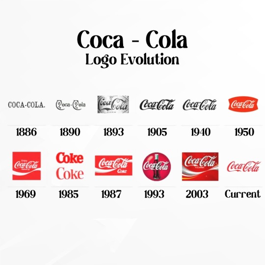
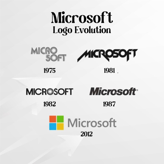
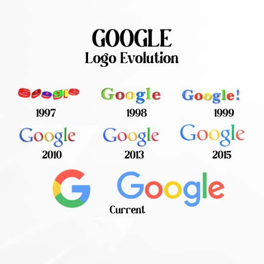

LOGO EVOLUTION
Logos are not just graphics, they are 𝐩𝐨𝐰𝐞𝐫𝐟𝐮𝐥 𝐛𝐫𝐚𝐧𝐝 assets that have a profound impact on how your business is perceived and remembered.🐾
Here is the visual evolution of the 𝐰𝐨𝐫𝐥𝐝’𝐬 𝐥𝐚𝐫𝐠𝐞𝐬𝐭 𝐜𝐨𝐦𝐩𝐚𝐧𝐢𝐞𝐬, Each change is a chapter in their success story, reflecting 𝐞𝐯𝐨𝐥𝐮𝐭𝐢𝐨𝐧, 𝐚𝐝𝐚𝐩𝐭𝐚𝐛𝐢𝐥𝐢𝐭𝐲, and 𝐜𝐨𝐦𝐦𝐢𝐭𝐦𝐞𝐧𝐭 to staying ahead.📈
𝐌𝐨𝐫𝐚𝐥 𝐨𝐟 𝐭𝐡𝐞 𝐬𝐭𝐨𝐫𝐲- "𝐋𝐞𝐚𝐫𝐧 𝐭𝐨 𝐂𝐡𝐚𝐧𝐠𝐞 𝐰𝐢𝐭𝐡 𝐭𝐡𝐞 𝐓𝐢𝐦𝐞🕓"
The Digital World is Waiting for your Knock 📞Call:+𝟵𝟭 𝟳𝟴𝟯𝟳-𝗕𝗜𝗭𝗗𝗘𝗩
#LogoEvolution#SocialMedia#CocaCola#Microsoft#Google#SearchEngine#BestCompanies#MarketingStrategies#Philadelphia#India#UnitedStates#BizDev#AgilityForGrowth
0 notes
Text
Analysis of report: Elon Musk reveals new ‘X’ logo to replace Twitter’s blue bird (Associated Press)
Elon Musk unveiled a new "X" logo to replace Twitter's blue bird logo as part of a major rebranding effort.
The haphazard removal of the blue bird logo from Twitter's headquarters without proper permits signals chaos in implementing the rebranding.
The rebranding risks further confusing and alienating existing Twitter users and advertisers, which the platform can ill afford.
The vague "X" logo lacks the distinctiveness and meaning of the blue bird logo, making the rebranding difficult to succeed.
Musk's focus on creating an "everything app" like WeChat diverges from Twitter's core proposition as a messaging platform.
Rebranding after over a decade of using the blue bird logo may make sense, but Musk's personal reasons and haphazard implementation suggest ego motives over strategy.
The rebranding negatively impacts key stakeholders like users, advertisers, employees, shareholders, brand partners and government agencies.
Analysts and experts criticize Musk's rebranding decisions, indicating a consensus that the move is ill-advised and poorly thought out.
The psychology behind Musk's decisions shows egocentrism, impulsiveness, a need for control, disregard for others and overconfidence.
The rebranding exhibits logical fallacies like hasty generalization, anecdotal evidence, apprehension problem, and cherry picking.
In summary, Musk's Twitter rebranding to "X" appears to be a risky, poorly planned move driven more by ego than strategic vision.
Here is a summary of the document in bullet points:
Elon Musk has unveiled a new "X" logo to replace the blue bird logo of Twitter.
He projects the X logo on the Twitter headquarters building in San Francisco.
Workers were seen removing the blue bird logo from the Twitter headquarters but they did not have the proper permits.
The X logo first appeared at the top of the desktop version of Twitter but the blue bird logo is still dominant in the mobile app.
The rebranding to X is part of Musk's vision of creating an "everything app" like WeChat in China.
Some analysts think the rebranding to X will confuse Twitter users and advertisers.
Musk has long been fascinated with letter X and renamed Twitter 's corporate name to X Corp. after his purchase of the company.
The Twitter blue bird logo had been used for more than a decade before Musk's acquisition of the company.
The designer of the blue bird logo said "it had a great run" but rebranding after over a decade makes sense.
Here is an evaluation of the situation described in the document:
The rebranding of Twitter from the blue bird logo to the "X" logo is a risky move by Elon Musk that could further confuse and alienate existing Twitter users and advertisers. Some key points:
Rebranding is a major undertaking that requires planning, communication, and execution. Musk's haphazard removal of the blue bird logo without proper permits shows a lack of care and signals potential chaos in implementing the rebranding. This could undermine confidence in the rebranding.
Twitter users and advertisers have already been souring on the platform due to Musk's other changes like the $8 subscription. A major rebranding risks further confusing and losing more users and advertisers, which Twitter can ill afford.
The "X" logo is vague and lacks the distinctiveness and meaning of the blue bird logo. It does not immediately convey what Twitter is about. This could make it difficult for the rebranding to succeed.
Musk's focus on creating an "everything app" like WeChat diverges from Twitter's core proposition as a messaging platform. Forcing Twitter to be something it's not risks alienating its existing user base.
While rebranding after over a decade may make sense, Musk's personal reasons for the "X" logo and haphazard implementation suggests the rebranding is driven more by his ego than what's best for Twitter.
In summary, Musk's Twitter rebranding to the "X" logo seems like a risky, poorly planned move driven more by his ego than a strategic vision to actually improve the platform. The downsides of further confusing users and advertisers appear to outweigh any potential benefits.
Here are the main stakeholders affected by the situation described in the document and how they are impacted:
Twitter Users: They are the most directly impacted as they have gotten used to the familiar blue bird logo. The rebranding to the vague "X" logo risks confusing and alienating existing users. Many may stop using Twitter as a result.
Advertisers: They have built brand associations with the blue bird logo. The rebranding threatens those associations and risks confusing advertisers. Many may pause or reduce ad spending on Twitter until the impact of the rebranding is clear.
Employees: Workers removing the blue bird logo without proper permits shows a lack of planning and communication. The rushed and chaotic rebranding creates uncertainty for employees about the future direction of the company.
Shareholders: The rebranding risks further alienating users and advertisers, which impacts Twitter's revenue and profits and in turn affects shareholder value. Unless properly implemented and communicated, the rebranding threatens shareholder interests.
Brand Partners: Companies that have partnered with Twitter using the blue bird logo will now have to adjust their branding. The rebranding imposes costs and disruption on brand partners.
Government Agencies: Agencies that have used Twitter to communicate with the public under the blue bird brand now have to adjust. The rebranding complicates their efforts and imposes costs.
In summary, the key stakeholders - users, advertisers, employees, shareholders, brand partners, and government agencies - are all negatively impacted to varying degrees. The gains from the rebranding appear tenuous at best, while the drawbacks and disruption are more tangible and immediate. Musk does not seem to have considered all the consequences and complications his haphazard rebranding would cause for Twitter's various stakeholders.
Based on the information in the article and common consensus, Elon Musk's decisions regarding the Twitter rebranding appear misguided and poorly thought out:
The blue bird logo was well established and recognizable, with strong brand associations for Twitter. Changing logos is a major undertaking that requires careful planning and communication. Musk's rushed and haphazard implementation suggests a lack of consideration for these best practices.
Musk seems to be driven more by his personal fascination with the letter "X" than by a thoughtful strategic vision for Twitter. Rebranding for ego's sake rather than to improve the product or better serve customers is not wise business strategy.
Creating an "everything app" like WeChat diverges from Twitter's core proposition and risks alienating its existing user base. Forced diversification often does not work, especially for a platform with an already well-defined purpose.
The rebranding to the vague "X" logo risks further confusing and losing Twitter users and advertisers at a time when the company can ill afford it. Major rebranding efforts usually take months or years of planning and rollout to be successful.
Musk's chaotic and rushed removal of the blue bird logo from headquarters without proper permits shows a lack of due diligence and planning. This suggests broader issues in his management and decision-making skills.
Analysts, experts and even the designer of the blue bird logo have criticized Musk's rebranding decisions, indicating a consensus that the move is ill-advised and poorly thought out.
In summary, based on best practices for branding and repositioning, analysts' views, and even the company's own employees, it seems clear that Musk's Twitter rebranding decisions depart significantly from accepted consensus and established wisdom. The haphazard, ego-driven nature of the changes suggests Musk did not properly evaluate the potential consequences and ramifications of his rebranding decisions.
Based on the information in the article, the psychology behind Elon Musk's decisions regarding the Twitter rebranding seems to include:
Egocentrism: Musk's personal fascination with the letter "X" and renaming Twitter to "X Corp." after buying it suggests an egocentric focus on himself rather than what is best for Twitter. His decisions appear driven more by his own ego and interests than by sound strategic thinking.
Impulsiveness: The rushed and haphazard removal of the blue bird logo from headquarters without proper permits shows a lack of planning and forethought. Musk seems to make these rebranding decisions hastily and impulsively without properly evaluating the implications.
Need for Control: By hastily rebranding Twitter and changing its logo to "X", Musk is asserting his control and personal stamp on the company he recently bought. It seems more about controlling the brand in his image than strategically evolving it.
Disregard for Others: Musk does not seem to have considered the impact that confusing the Twitter brand would have on its existing users and advertisers. There is a lack of empathy and concern for how the rebranding would affect various stakeholders.
Overconfidence: Musk seems overconfident in his own judgment and abilities, believing he can disruptively change even the basic brand identity of Twitter without negative consequences. This demonstrates a lack of humility and openness to input from experts.
In summary, the psychology behind Musk's decisions regarding the Twitter rebranding appears dominated by egocentrism, impulsiveness, a need to control, a disregard for others, and overconfidence. These point to a poor ability to evaluate decisions objectively and strategically, putting Musk's own wants and needs above the broader interests of Twitter and its stakeholders. The rebranding comes across more as an ego exercise rather than an effective strategic move to improve Twitter.
Based on the information in the article, there seem to be a few logical fallacies in Elon Musk's decisions regarding the rebranding of Twitter:
Hasty generalization: Musk appears to generalize from his own personal preferences for the letter "X" to conclude that a rebranding to "X" will be good for Twitter as a whole. There is not enough evidence to support such a generalization.
Anecdotal evidence: Musk cites the example of WeChat as justification for creating an "everything app." However, one anecdotal example is not sufficient evidence to conclude such a strategy will work for Twitter.
Apprehension problem: Musk does not appear to have properly considered all the potential complications, confusion, and drawbacks the rebranding would cause for Twitter's users, advertisers and other stakeholders. He only seems focused on his own positive vision for the change.
Egocentric bias: Musk's personal interest in the letter "X" and desire to assert control over Twitter clouds his judgment, preventing him from objectively evaluating what is best for the company. His decisions are biased by his own ego and interests.
Cherry picking: Musk selectively cites the small number of people who like the idea of rebranding Twitter to "X" while ignoring the criticisms and concerns raised by many experts, analysts and users.
In summary, Musk's decisions regarding Twitter's rebranding exhibit logical flaws like hastily generalizing from anecdotal evidence, failing to properly consider all factors, being clouded by egocentric bias, and selectively citing only information that supports his preferences while ignoring opposing views. These logical fallacies undermine the very reasoning behind the rebranding decisions, calling into question whether they were made in a thoughtful and rational manner.
8mGKTIte9ZKtaigutwHD
#TwitterRebranding#TwitterLogoChange#ElonMuskDecisions#XLogo#BlueBirdToX#QuestionableStrategies#BrandingMistakes#EgomaniacCEOs#LogoEvolution#SocialMediaBranding#Twitter#Musk#ElonMusk
1 note
·
View note
Photo

#designprocess and #branddevelopment with @chase_theescape Contact @jake_arthur_design with your design questions or ideas. #designtimeline #designevolution #brandevolution #logoevolution #JAD #jakearthurdesign #logobrainy #logobuckey #logoinspire #logoinpiration #logoinsight #designinsight #logoprocess #logodevelopment #branddesigner #brandbuilder #logoinsider #brandinsider #logoinsight #brandinsight #4wdlogo #offroadlogo #4wdbrand #adventurelogo #adventure brand #campinglogo #campingbrand (at Levuka 4wd Park) https://www.instagram.com/p/CpBi5IJhG7_/?igshid=NGJjMDIxMWI=
#designprocess#branddevelopment#designtimeline#designevolution#brandevolution#logoevolution#jad#jakearthurdesign#logobrainy#logobuckey#logoinspire#logoinpiration#logoinsight#designinsight#logoprocess#logodevelopment#branddesigner#brandbuilder#logoinsider#brandinsider#brandinsight#4wdlogo#offroadlogo#4wdbrand#adventurelogo#adventure#campinglogo#campingbrand
0 notes
Text
What’s the Best Bengals Logo of All Time? Join us on a fascinating journey as we explore the… What’s the Best Bengals Logo of All Time? Join us on a fascinating journey as we explore the evolution of the Bengals Logo through the years! From its inception in 1968 to modern designs, this video showcases the transformations of the Cincinnati Bengals’ logo, highlighting the creative changes that reflect the team’s identity and culture. Discover the stories behind each logo, the design elements that have come and gone, and how they represent the franchise’s spirit. Whether you’re a die-hard Bengals fan or a lover of sports design, this retrospective is sure to captivate! #Bengals #CincinnatiBengals #LogoEvolution #SportsHistory #NFL #Football #TeamIdentity #GraphicDesign #BengalsFans #NFLHistory #LogoDesign #CincinnatiSports What’s the Best Bengals Logo of All Time? | Sports History Group Chapters 0:00 Intro 0:53 Brief History 2:04 1968 - 1970 Logo 2:27 1970 - 1981 Logo 2:58 1981 - 1990 Logo 3:28 1990 - 1997 Logo 3:38 1997 - 2004 Logo 3:59 2004 - 2021 Logo 4:42 2021 - Present Logo 5:10 Wrap Up ============================= ★We welcome you to this Sports History★ ★Official YouTube Channel of Sports History Group★ Hello, everyone! Today, we’re excited to introduce you to a brand-new channel dedicated to sports and historical videos. IMPORTANT: YouTube will not display our new videos unless you… 🔔 ★彡 ᴛᴜʀɴ ᴏɴ ɴᴏᴛɪꜰɪᴄᴀᴛɪᴏɴꜱ 彡★🔔 * LIKE | | SHARE | | SUBSCRIBE* ✅ Subscribe To Our Channel For More Videos: https://www.youtube.com/@sportshistory5/?sub_confirmation=1 ✅ Important Links: 👉 Website: https://ift.tt/XL4U0Ex 👉 Website: https://ift.tt/QoFvYU8 👉 Website: https://ift.tt/e4PLZxa ✅ Stay Connected With Us: 👉 Instagram: https://ift.tt/aEl9W0J 👉 TikTok: https://ift.tt/xu3UHZi 👉 Facebook: https://ift.tt/iby9feu 👉 Pinterest: https://ift.tt/fbwMqZk 👉 LinkedIn: https://ift.tt/M7wK8uD 👉 Twitter(X): https://twitter.com/sportshistoryg ============================== ✅ Other Videos You Might Be Interested In Watching: 👉 Why the Arizona Cardinals Have the Coolest Logo in the NFL https://youtu.be/tWmw5J0n_0w 👉 Detroit Lions Logo: How the Iconic NFL Emblem Changed Over Time https://youtu.be/uducYEQ8u8g 👉 The FOOTBALL FAN’s Guide to the Chicago Bears Logo History https://youtu.be/2BS2P4ZDNaY 👉 The Hidden Truths of the Kansas City Chiefs Logo Exposed! https://youtu.be/rbxYAU_KhdQ ============================= ✅ About Sports History Group: ►Welcome to Sports History Group, your destination for the best historical sports videos! Dive into an extensive collection of content featuring football, basketball, baseball, hockey, soccer, and much more. Whether you’re passionate about iconic plays or significant moments in sports history, you’ll discover it right here! For collaboration and business inquiries, please use the contact information below: 📩 Email: [email protected] 🔔 Subscribe to our channel for more videos: https://www.youtube.com/@sportshistory5/?sub_confirmation=1 ===================== Disclaimer: We do not accept any liability for any loss or damage incurred from you acting or not acting as a result of reading our publications. You acknowledge that you use the information we provide at your own risk. Do your own research. Copyright Disclaimer: Under Section 107 of the Copyright Act 1976, allowance is made for “fair use” for purposes such as criticism, comment, news reporting, teaching, scholarship, and research. Fair use is a use permitted by copyright statute that might otherwise be infringing. Non-profit, educational, or personal use tips the balance in favor of fair use © Sports History Group via Sports History Group https://www.youtube.com/channel/UCrpczskdW9Ki5QpWZDKjYUQ January 24, 2025 at 08:00PM via Sports History Group https://ift.tt/IXiQN9w January 24, 2025 at 08:03PM
0 notes
Text
What’s the Best Bengals Logo of All Time? Join us on a fascinating journey as we explore the… https://ift.tt/vkcDdqE What’s the Best Bengals Logo of All Time? Join us on a fascinating journey as we explore the evolution of the Bengals Logo through the years! From its inception in 1968 to modern designs, this video showcases the transformations of the Cincinnati Bengals’ logo, highlighting the creative changes that reflect the team’s identity and culture. Discover the stories behind each logo, the design elements that have come and gone, and how they represent the franchise’s spirit. Whether you’re a die-hard Bengals fan or a lover of sports design, this retrospective is sure to captivate! #Bengals #CincinnatiBengals #LogoEvolution #SportsHistory #NFL #Football #TeamIdentity #GraphicDesign #BengalsFans #NFLHistory #LogoDesign #CincinnatiSports What’s the Best Bengals Logo of All Time? | Sports History Group Chapters 0:00 Intro 0:53 Brief History 2:04 1968 - 1970 Logo 2:27 1970 - 1981 Logo 2:58 1981 - 1990 Logo 3:28 1990 - 1997 Logo 3:38 1997 - 2004 Logo 3:59 2004 - 2021 Logo 4:42 2021 - Present Logo 5:10 Wrap Up ============================= ★We welcome you to this Sports History★ ★Official YouTube Channel of Sports History Group★ Hello, everyone! Today, we’re excited to introduce you to a brand-new channel dedicated to sports and historical videos. IMPORTANT: YouTube will not display our new videos unless you… 🔔 ★彡 ᴛᴜʀɴ ᴏɴ ɴᴏᴛɪꜰɪᴄᴀᴛɪᴏɴꜱ 彡★🔔 * LIKE | | SHARE | | SUBSCRIBE* ✅ Subscribe To Our Channel For More Videos: https://www.youtube.com/@sportshistory5/?sub_confirmation=1 ✅ Important Links: 👉 Website: https://ift.tt/XL4U0Ex 👉 Website: https://ift.tt/QoFvYU8 👉 Website: https://ift.tt/e4PLZxa ✅ Stay Connected With Us: 👉 Instagram: https://ift.tt/aEl9W0J 👉 TikTok: https://ift.tt/xu3UHZi 👉 Facebook: https://ift.tt/iby9feu 👉 Pinterest: https://ift.tt/fbwMqZk 👉 LinkedIn: https://ift.tt/M7wK8uD 👉 Twitter(X): https://twitter.com/sportshistoryg ============================== ✅ Other Videos You Might Be Interested In Watching: 👉 Why the Arizona Cardinals Have the Coolest Logo in the NFL https://youtu.be/tWmw5J0n_0w 👉 Detroit Lions Logo: How the Iconic NFL Emblem Changed Over Time https://youtu.be/uducYEQ8u8g 👉 The FOOTBALL FAN’s Guide to the Chicago Bears Logo History https://youtu.be/2BS2P4ZDNaY 👉 The Hidden Truths of the Kansas City Chiefs Logo Exposed! https://youtu.be/rbxYAU_KhdQ ============================= ✅ About Sports History Group: ►Welcome to Sports History Group, your destination for the best historical sports videos! Dive into an extensive collection of content featuring football, basketball, baseball, hockey, soccer, and much more. Whether you’re passionate about iconic plays or significant moments in sports history, you’ll discover it right here! For collaboration and business inquiries, please use the contact information below: 📩 Email: [email protected] 🔔 Subscribe to our channel for more videos: https://www.youtube.com/@sportshistory5/?sub_confirmation=1 ===================== Disclaimer: We do not accept any liability for any loss or damage incurred from you acting or not acting as a result of reading our publications. You acknowledge that you use the information we provide at your own risk. Do your own research. Copyright Disclaimer: Under Section 107 of the Copyright Act 1976, allowance is made for “fair use” for purposes such as criticism, comment, news reporting, teaching, scholarship, and research. Fair use is a use permitted by copyright statute that might otherwise be infringing. Non-profit, educational, or personal use tips the balance in favor of fair use © Sports History Group via Sports History Group https://www.youtube.com/channel/UCrpczskdW9Ki5QpWZDKjYUQ January 24, 2025 at 08:00PM via Sports History Group https://ift.tt/ipxH8We January 24, 2025 at 08:03PM
0 notes
Text
What’s the Best Bengals Logo of All Time? Join us on a fascinating journey as we explore the… https://ift.tt/m1dbC7S What’s the Best Bengals Logo of All Time? Join us on a fascinating journey as we explore the evolution of the Bengals Logo through the years! From its inception in 1968 to modern designs, this video showcases the transformations of the Cincinnati Bengals’ logo, highlighting the creative changes that reflect the team’s identity and culture. Discover the stories behind each logo, the design elements that have come and gone, and how they represent the franchise’s spirit. Whether you’re a die-hard Bengals fan or a lover of sports design, this retrospective is sure to captivate! #Bengals #CincinnatiBengals #LogoEvolution #SportsHistory #NFL #Football #TeamIdentity #GraphicDesign #BengalsFans #NFLHistory #LogoDesign #CincinnatiSports What’s the Best Bengals Logo of All Time? | Sports History Group Chapters 0:00 Intro 0:53 Brief History 2:04 1968 - 1970 Logo 2:27 1970 - 1981 Logo 2:58 1981 - 1990 Logo 3:28 1990 - 1997 Logo 3:38 1997 - 2004 Logo 3:59 2004 - 2021 Logo 4:42 2021 - Present Logo 5:10 Wrap Up ============================= ★We welcome you to this Sports History★ ★Official YouTube Channel of Sports History Group★ Hello, everyone! Today, we’re excited to introduce you to a brand-new channel dedicated to sports and historical videos. IMPORTANT: YouTube will not display our new videos unless you… 🔔 ★彡 ᴛᴜʀɴ ᴏɴ ɴᴏᴛɪꜰɪᴄᴀᴛɪᴏɴꜱ 彡★🔔 * LIKE | | SHARE | | SUBSCRIBE* ✅ Subscribe To Our Channel For More Videos: https://www.youtube.com/@sportshistory5/?sub_confirmation=1 ✅ Important Links: 👉 Website: https://ift.tt/XL4U0Ex 👉 Website: https://ift.tt/QoFvYU8 👉 Website: https://ift.tt/e4PLZxa ✅ Stay Connected With Us: 👉 Instagram: https://ift.tt/aEl9W0J 👉 TikTok: https://ift.tt/xu3UHZi 👉 Facebook: https://ift.tt/iby9feu 👉 Pinterest: https://ift.tt/fbwMqZk 👉 LinkedIn: https://ift.tt/M7wK8uD 👉 Twitter(X): https://twitter.com/sportshistoryg ============================== ✅ Other Videos You Might Be Interested In Watching: 👉 Why the Arizona Cardinals Have the Coolest Logo in the NFL https://youtu.be/tWmw5J0n_0w 👉 Detroit Lions Logo: How the Iconic NFL Emblem Changed Over Time https://youtu.be/uducYEQ8u8g 👉 The FOOTBALL FAN’s Guide to the Chicago Bears Logo History https://youtu.be/2BS2P4ZDNaY 👉 The Hidden Truths of the Kansas City Chiefs Logo Exposed! https://youtu.be/rbxYAU_KhdQ ============================= ✅ About Sports History Group: ►Welcome to Sports History Group, your destination for the best historical sports videos! Dive into an extensive collection of content featuring football, basketball, baseball, hockey, soccer, and much more. Whether you’re passionate about iconic plays or significant moments in sports history, you’ll discover it right here! For collaboration and business inquiries, please use the contact information below: 📩 Email: [email protected] 🔔 Subscribe to our channel for more videos: https://www.youtube.com/@sportshistory5/?sub_confirmation=1 ===================== Disclaimer: We do not accept any liability for any loss or damage incurred from you acting or not acting as a result of reading our publications. You acknowledge that you use the information we provide at your own risk. Do your own research. Copyright Disclaimer: Under Section 107 of the Copyright Act 1976, allowance is made for “fair use” for purposes such as criticism, comment, news reporting, teaching, scholarship, and research. Fair use is a use permitted by copyright statute that might otherwise be infringing. Non-profit, educational, or personal use tips the balance in favor of fair use © Sports History Group via Sports History Group https://www.youtube.com/channel/UCrpczskdW9Ki5QpWZDKjYUQ January 24, 2025 at 08:00PM via Sports History Group https://ift.tt/OkNwUmr January 24, 2025 at 08:03PM
0 notes
Text
What’s the Best Bengals Logo of All Time? Join us on a fascinating journey as we explore the… What’s the Best Bengals Logo of All Time? Join us on a fascinating journey as we explore the evolution of the Bengals Logo through the years! From its inception in 1968 to modern designs, this video showcases the transformations of the Cincinnati Bengals’ logo, highlighting the creative changes that reflect the team’s identity and culture. Discover the stories behind each logo, the design elements that have come and gone, and how they represent the franchise’s spirit. Whether you’re a die-hard Bengals fan or a lover of sports design, this retrospective is sure to captivate! #Bengals #CincinnatiBengals #LogoEvolution #SportsHistory #NFL #Football #TeamIdentity #GraphicDesign #BengalsFans #NFLHistory #LogoDesign #CincinnatiSports What’s the Best Bengals Logo of All Time? | Sports History Group Chapters 0:00 Intro 0:53 Brief History 2:04 1968 - 1970 Logo 2:27 1970 - 1981 Logo 2:58 1981 - 1990 Logo 3:28 1990 - 1997 Logo 3:38 1997 - 2004 Logo 3:59 2004 - 2021 Logo 4:42 2021 - Present Logo 5:10 Wrap Up ============================= ★We welcome you to this Sports History★ ★Official YouTube Channel of Sports History Group★ Hello, everyone! Today, we’re excited to introduce you to a brand-new channel dedicated to sports and historical videos. IMPORTANT: YouTube will not display our new videos unless you… 🔔 ★彡 ᴛᴜʀɴ ᴏɴ ɴᴏᴛɪꜰɪᴄᴀᴛɪᴏɴꜱ 彡★🔔 * LIKE | | SHARE | | SUBSCRIBE* ✅ Subscribe To Our Channel For More Videos: https://www.youtube.com/@sportshistory5/?sub_confirmation=1 ✅ Important Links: 👉 Website: https://ift.tt/XL4U0Ex 👉 Website: https://ift.tt/QoFvYU8 👉 Website: https://ift.tt/e4PLZxa ✅ Stay Connected With Us: 👉 Instagram: https://ift.tt/aEl9W0J 👉 TikTok: https://ift.tt/xu3UHZi 👉 Facebook: https://ift.tt/iby9feu 👉 Pinterest: https://ift.tt/fbwMqZk 👉 LinkedIn: https://ift.tt/M7wK8uD 👉 Twitter(X): https://twitter.com/sportshistoryg ============================== ✅ Other Videos You Might Be Interested In Watching: 👉 Why the Arizona Cardinals Have the Coolest Logo in the NFL https://youtu.be/tWmw5J0n_0w 👉 Detroit Lions Logo: How the Iconic NFL Emblem Changed Over Time https://youtu.be/uducYEQ8u8g 👉 The FOOTBALL FAN’s Guide to the Chicago Bears Logo History https://youtu.be/2BS2P4ZDNaY 👉 The Hidden Truths of the Kansas City Chiefs Logo Exposed! https://youtu.be/rbxYAU_KhdQ ============================= ✅ About Sports History Group: ►Welcome to Sports History Group, your destination for the best historical sports videos! Dive into an extensive collection of content featuring football, basketball, baseball, hockey, soccer, and much more. Whether you’re passionate about iconic plays or significant moments in sports history, you’ll discover it right here! For collaboration and business inquiries, please use the contact information below: 📩 Email: [email protected] 🔔 Subscribe to our channel for more videos: https://www.youtube.com/@sportshistory5/?sub_confirmation=1 ===================== Disclaimer: We do not accept any liability for any loss or damage incurred from you acting or not acting as a result of reading our publications. You acknowledge that you use the information we provide at your own risk. Do your own research. Copyright Disclaimer: Under Section 107 of the Copyright Act 1976, allowance is made for “fair use” for purposes such as criticism, comment, news reporting, teaching, scholarship, and research. Fair use is a use permitted by copyright statute that might otherwise be infringing. Non-profit, educational, or personal use tips the balance in favor of fair use © Sports History Group via Sports History Group https://www.youtube.com/channel/UCrpczskdW9Ki5QpWZDKjYUQ January 24, 2025 at 08:00PM via Sports History Group https://ift.tt/ELgfQbm January 24, 2025 at 08:03PM
0 notes
Video
vimeo
Experience the Magic of Our Animated Logo. from Pacewalk Private Limited on Vimeo.
#LogoAnimation #BrandReveal #LogoDesign #AnimatedLogo #BrandIdentity #LogoEvolution #CreativeDesign #BrandAnimation #LogoMagic #DesignInMotion #BrandTransformation #LogoLaunch #VisualIdentity #DynamicLogo #BrandVideo
0 notes
Text
The True Story of Musica in Extenso - Part 6.
Last week was a CrazY one, so please excuse us for this late new episode of our beloved reminiscence series, here at Musica in Extenso.
Today we will take a quick look on our logo evolution, from 2014 to present (good, old times... haha). It’s a real history, because we had a lot of logo changes. Pick your favourite one and leave a message in the comment section!
Editor-in-Chief

#musicainextenso#musica#musica in extenso#logo#logoevolution#history#story#true story#truestory#logos#art#music#classicalmusic#classical music
9 notes
·
View notes
Photo
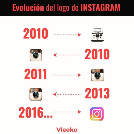
Evolución del logotipo de Instagram #evolucionlogo #logoevolution #instagramlogo #agenciademarketing #vleeko https://www.instagram.com/p/CK2dCGzsBHO/?igshid=1imgqbrfby1z1
0 notes
Text

Crafting logos that tell your brand's story with every curve and color. ✨ From bold and modern to elegant and timeless, let your logo leave a lasting impression. Your brand's identity, beautifully designed. 🌟
Get an custom logo: https://rb.gy/qpuwk4
#Branding#VsualIdentity#CustomLogo#BrandMark#CreativeDesign#ModernLogos#LogoArt#BusinessIdentity#IconicLogos#DesignStudio#MinimalistDesign#LogoConcepts#BrandCreation#UniqueLogos#LogoInnovation#ProfessionalBranding#SignatureDesign#IdentityDesign#LogoInspiration#DigitalDesign#ElegantLogos#CustomBranding#CreativeBranding#LogoEvolution#ArtisticLogos
0 notes
Photo

#DidYouKnow - Samsung Logo Evolution seems to have a striking resemblance to its Korean culture
0 notes
Photo

#fradhyt_creative_consultant #logoevolution Brand value dapat dianalogikan sebagai citra atau kharisma pada diri seseorang atau produk yang dapat membuat seseorang atau produk itu memiliki daya tarik yang kuat. 🎥#ian_fradhyt_adhyatman berkarir di lebih dari 9 top #advertising_agency sebagai #Creative_Director serta salah satu #startup decacorn terbesar di Asia, berpengalaman menangani lebih 100 brand dan lebih dari 700 #iklan komersial di televisi dengan lebih dari 50 top selebriti serta PULUHAN RIBUAN konten dan BTL di berbagai media dan digital sosial media. 🎥 Selain berkarir sebagai aktor dan acting coach untuk ratusan iklan TV, fradhyt juga dikenal sebagai #penulis telah menghasilkan #novel- novel bestseller bergenre #lifestyle cosmopolitan seperti sequel_novel BeautyForSale, beautyForKilling, dan BeautyForPower and Revenge, serta Memoirs_of_G! 🎥Multinational brands that have been handled include: Volvo, Nissan, Jaguar, Lucky Strike, Nivea, Pantene, Yakult, Ford, Suzuki, Hitachi, Mitsubishi, Gatorade, FujiFilm, Toshiba, Lucky Strike, TrimSpa, Sony, Standard Chatered, National/Panasonic, Sunkist, Caprisone, Hilton Hotel, Thai Airlines, Cussons, Singapore Airlines, Marie France Bodyline, Hada Labo, Rohto Eye Flush, Quipper Video, Grab, dsb. 🎥 As well as hundreds of other multilocal brands such as: [INDOFOOD]Supermie, Bogasari, [MAYORA] Torabika, Roma, Energen, Astor, Kopiko, Kopi Ayam Merak [SANBE] Sanaflu,Poldamig, [SANTOS-#KAPAL_API] Kopi Kapal Api, kopi ABC, Relaxa, [SOHO] Laxing, Curcuma Plus,Fitkom, [SIDOMUNCUL] KukuBima Ener-G, [#KALBEFARMA] Susu Zee, serta Susu Ultra, Gudang Garam, Kacang Dua Kelinci, Minyak Cap Lang, Pigeon, Hufagrip, Marimas, Lipovitan, Miwon Mamasuka, Bimoli, Filma, Softex, Top 1, Marimas Drink, BCA, BNI, BTN, GrabKios, dsb. #Fradhyt_Fahrenheit_Adhyatman #fradhyt_fahrenheit #brandingindonesia #advertisingagency #copywriting #contentcreator #contentmarketing #marketingtips #marketingdigital #artdirector #senidigital #campaign #grapicdesign #motivation #quotes #content #contentwriter #personalbranding (at Pondok Indah, Jakarta Selatan) https://www.instagram.com/p/CHk1_RjnsKK/?igshid=1986ie3ws1x3x
#fradhyt_creative_consultant#logoevolution#ian_fradhyt_adhyatman#advertising_agency#creative_director#startup#iklan#penulis#novel#lifestyle#kapal_api#kalbefarma#fradhyt_fahrenheit_adhyatman#fradhyt_fahrenheit#brandingindonesia#advertisingagency#copywriting#contentcreator#contentmarketing#marketingtips#marketingdigital#artdirector#senidigital#campaign#grapicdesign#motivation#quotes#content#contentwriter#personalbranding
0 notes
Text
SHOCKING Minnesota Timberwolves Logo Changes Over the Years In the captivating video SHOCKING… SHOCKING Minnesota Timberwolves Logo Changes Over the Years In the captivating video SHOCKING Minnesota Timberwolves Logo Changes Over the Years, viewers are taken on a visual journey through the evolution of the Timberwolves’ logo, exploring how each design reflects the team’s identity and connection to Minnesota. The video highlights key changes, discussing the inspiration behind each logo and how they resonate with fans over the decades. From the early designs to the modern-day emblem, fans will gain insights into the creative process and the significance of branding in the NBA. Whether you’re a Timberwolves superfan or just a lover of sports design, this video showcases a fascinating aspect of the team’s history that you won’t want to miss! #MinnesotaTimberwolves, #TimberwolvesLogo, #LogoEvolution, #NBA, #SportsBranding, #BasketballHistory, #TimberwolvesFans, #LogoDesign, #NBAHistory, #BasketballCulture, #CreativeProcess, #DesignChanges, #Timberwolves! via Sports History Group https://www.youtube.com/channel/UCrpczskdW9Ki5QpWZDKjYUQ January 18, 2025 at 07:00PM via Sports History Group https://ift.tt/YsyRHfE January 18, 2025 at 08:02PM
0 notes