#Liva Dudareva
Explore tagged Tumblr posts
Text
Food walker - Sunlight & Shade
This project 1 was started under the overpass in the Rama IV road. This space was changed from an ordinary area into an economic area by the food vendors which use the shade and the structure of the overpass to be their shelter. I decided to observe this area because I interest in one of the food vendors. so I create the game which is related to this area in term of movement of people because the food vendor which I have been selected is there for 8 years so it will have a lot of customer in this area.
2 notes
·
View notes
Photo
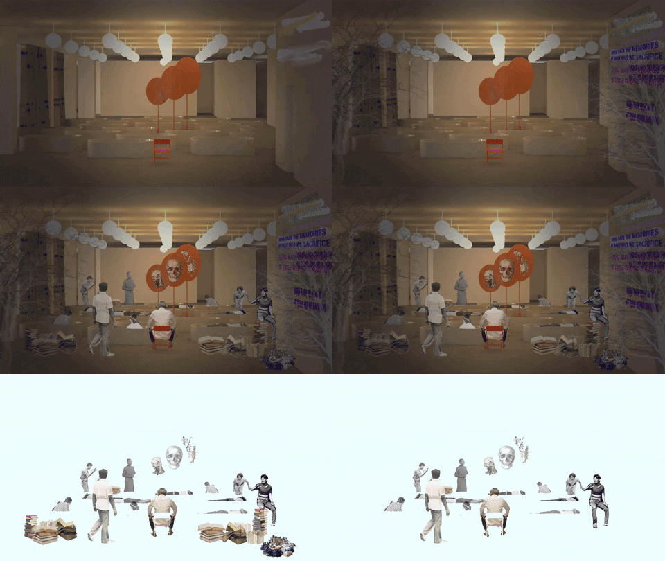
Space of Political Expression, “The Everyday assembly”
To consider the subject of people's rights in true perspective, the project is started with the human architectural scale. I observed how students were playing an important role in the crucial political debates and protests in many countries. For example, in the Athens school of architecture, the Thammasat Massacre, and the Tiananmen Square student protest, and many other movements. Even though some of these movements are quite violent, they bring about some changes no matter large or small.
From my research about democratic space, it stated, "There may not be one right way to design a democratic public space, but by learning and experimenting, testing assumptions, and responding, and by putting the citizens or users in the center of the process, we are performing democracy."
Also similarly from another reading, the idea of "setting diversity as the goal, and by understanding context, culture, and users’ needs are being emphasized.” These statement is proving that the free people’s space should start with the people centre design.
After interviewing some of my friends to understand how much people in my generation participate in political talk, I could categorise them into two groups, the active and the passive participants. To make people talk about politics, there is a need for a trigger that would make them relate more to the topic and engage in the conversation; therefore, the idea of sensory experience and the immersive theatre play is being use as the base of the design.
The site that I am choosing for the design is at the faculty of architecture, Chulalongkorn University.
One of the reasons why this location is chosen is because there is usually an event or a ritual every year that would encourage people to participate and transform the space for other use. The design would be possible to be active in this space.
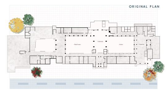
Fig 3.1. Architecture building original plan
The cafeteria space is specifically picked also because it is a space that is already active for interactions. People normally participate in a group talking.
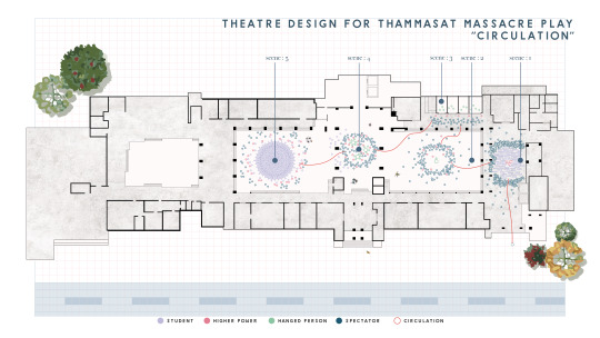
Fig 3.2. Circulation Plan of the Thammasat Massacre Play Design
The overall design is started with the sequence of the Thammasat Massacre event because it is one of the most significant political events in Thailand which people still recall. The sequence of the events is being translated onto the circulation plan on how people should act in the space, and how they are divided into each of the categories. By allowing people to act on the reenactment, it would also make them understand the situation more, like how the police are investigating the cases.
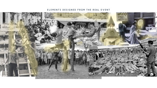
Fig 3.3. Inspiration of the Furniture Design
From that, the specific elements from each scene of the Thammasat Massacre are being use as inspiration for the furniture design for space.
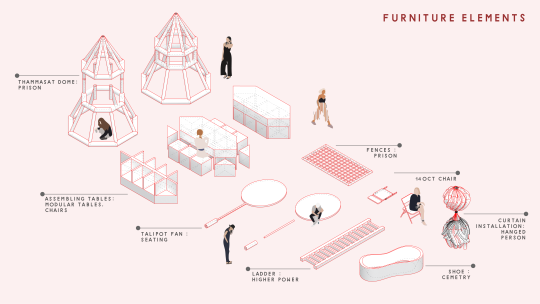
Fig 3.4. Furniture Design
These pieces of furniture are modular and movable, so it could be used in the transformation of the space from the theatre space to the cafeteria, then the assembly space. The pieces are the Thammasat dome which is transforming into a prison, the assembling tables which is inspired from the building window, the Talipot fan which is used for poster exhibition, the ladder, the fences, the 14th Oct chair which is being during the Thammasat Massacre to hit the students with, the curtain which symbolized the hanged person, and the shoes which are enlarged to be the cemetery.
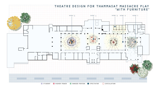
Fig 3.5. The Thammasat Massacre Play Design “with Furniture”
Afterwards, the design of the furniture layout is based on the base circulation of the play as you can see that it is separated into five scenes in sequence from right to left.
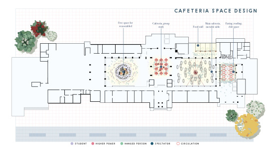
Fig 3.6. The Cafeteria Space Design
These spaces after being used as a part of the immersive theater play, the furniture are movable to transform into cafeteria space. The cafeteria spaces are for eating, reading, club space, group study, and a free space for a reassemble.
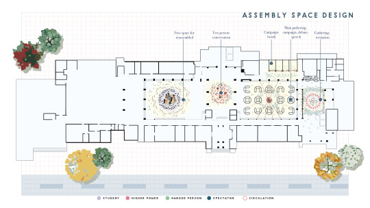
Fig 3.7. The Assembly Space Design
Also, the space is transformable into assembly space for a political gathering, talk, debate, speech, or campaign space based on any issue referring back to the quote that I stated earlier that the space of freedom does not fit into one.

Fig 3.8. SCENE I
For background information, the Thammasat massacre happened because the Thai press reported on a play staged by student protesters, on 6 October 1976, which allegedly featured the mock hanging of then Crown Prince Vajiralongkorn causing the attack by Thai state forces on student protesters on the campus of Thammasat University. But prior to the massacre, four to five thousand students from various universities had demonstrated for more than a week against the return of former military dictator Thanom Kittikachorn to Thailand from Singapore, so it is said that students were blamed unjustly by the press.
During SCENE 1, the monk is trying to receive alms from the dead students on the 6th October, while one student walks across the death to ask for permission to go to exam.
For scene one of the theatre design, I put the cemetery to symbolize the death students that were on the ground, and put the TalaPad fan to symbolize the Monk, and make the layout hard for the students to struggle to go past the area.
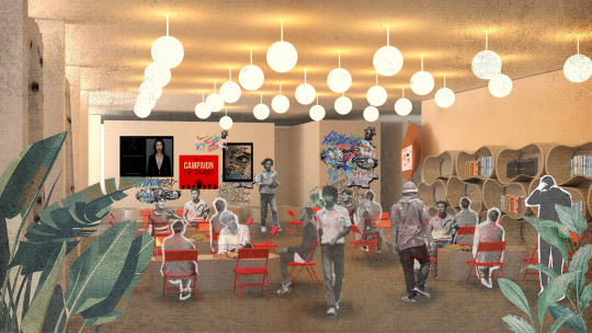
Fig 3.9. SCENE I, Cafeteria
For cafeteria space, this is an eating space which can be used for reading and club space.
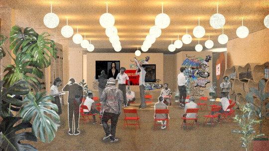
Fig 3.10. SCENE I, Assembly
For assembly purpose, the space is used for gathering, recitation, and the exchange of ideas in large groups inspired from the circular plan
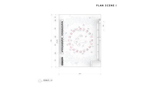
Fig 3.11. SCENE I, Plan
This is an architectural diagram of the space.
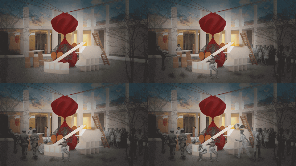
Fig 3.12. SCENE II
For SCENE 2, the main actor was hung down from the tree with the soldier to symbolize the the hanging of the Electric Authority in going against the monk.
So in the center, I designed the curtain installation that would symbolize the hung person where the furniture around symbolizing the people watching the event.
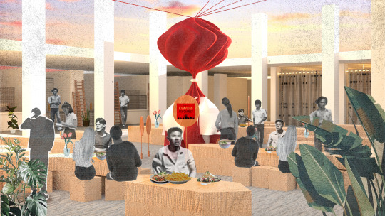
Fig 3.13. SCENE II, Cafeteria
For the cafeteria, it is transformable into the main cafeteria space and the table are movable up to the students' needs.
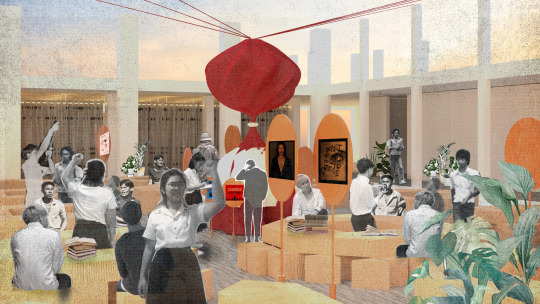
Fig 3.14. SCENE II, Assembly
The space is also used for campaigning purposes, debate speech, or a club space.
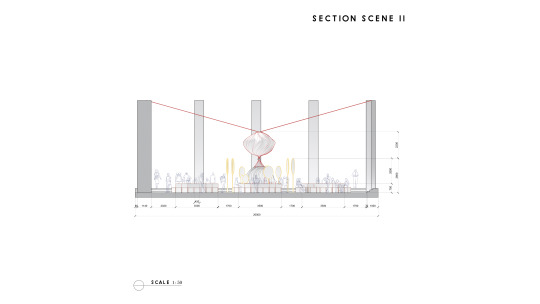
Fig 3.15. SCENE II, Section
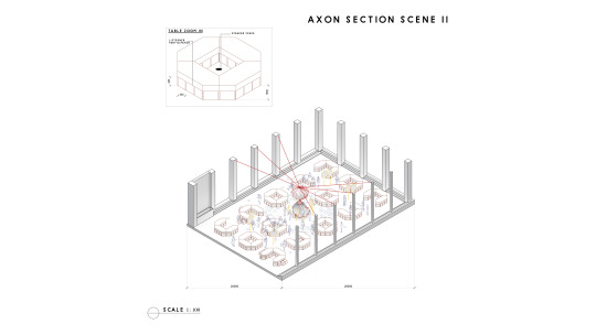
Fig 3.16. SCENE II, Axon
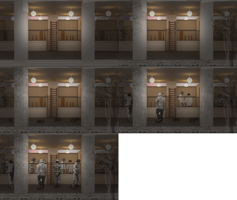
Fig 3.17. SCENE III
For SCENE 3, the police deceive all the main actors and put them in jail without warning.
The fences that used to protect the shooter of the Thammasat Massacre were used as the design of the movable fences of the prison design in the theater play, and the ladder is symbolizing the higher power that are watching over the innocent students.
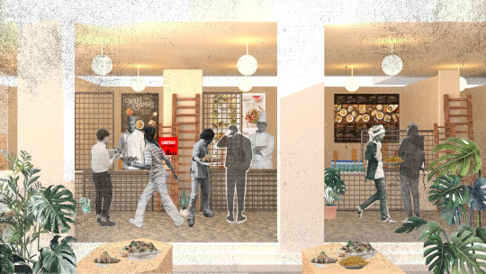
Fig 3.18. SCENE III, Cafeteria
For the cafeteria, the space is used as a food stall.
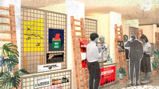
Fig 3.19. SCENE III, Assembly
The space is also transformable into the campaign booth area.
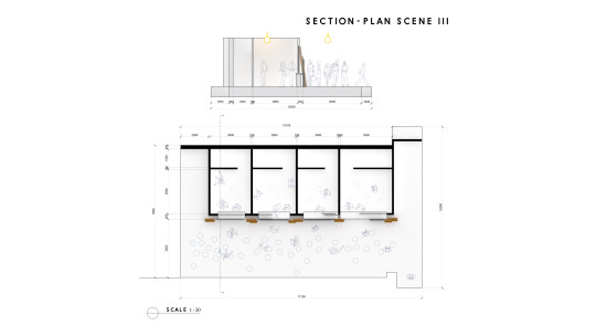
Fig 3.20. SCENE III, Section and Plan
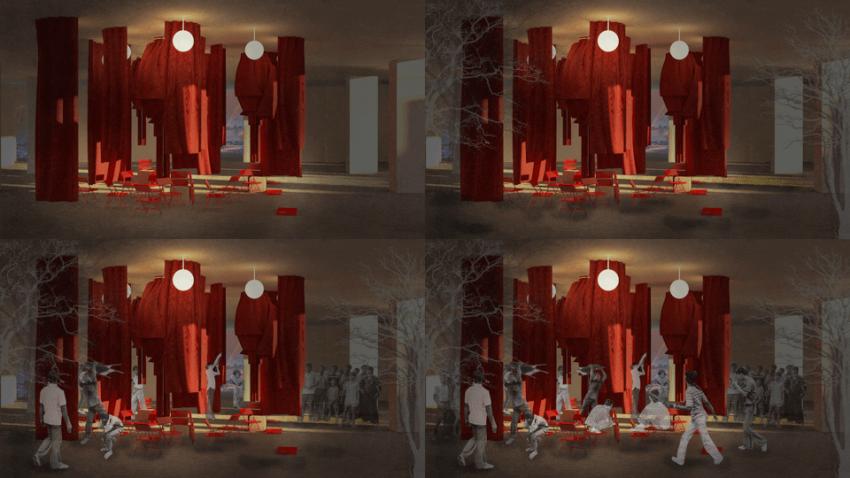
Fig 3.21. SCENE IV
For SCENE 4, the higher power were taking the students outside to hang them on the tree and start hurting them while most student got arrested.
The chairs that were used for hitting the death students were laid all over the place and a curtain symbolised the innocent death.
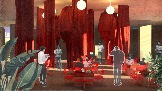
Fig 3.22. SCENE IV, Cafeteria
The space can also be used as an eating area and for studying in groups.
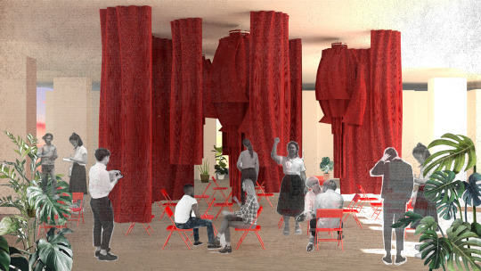
Fig 3.23. SCENE IV, Assembly
The assembly is for two person conversation which is influenced by the church confession box design where people are allowed to talk about anything without being judged on.
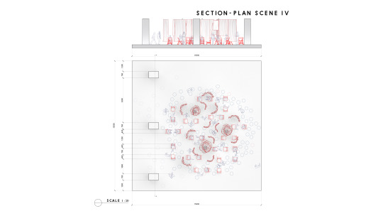
Fig 3.24. SCENE IV, Section and Plan
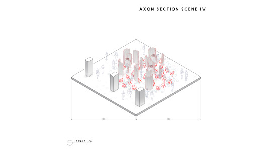
Fig 3.25. SCENE V, AXON

Fig 3.26. SCENE V
For SCENE 5, the uprising of the protest within the space were happening. Then the police forces were mass shooting from outside the fences of the University. Lastly, the space is lockdown, and everyone were laying on the ground with the soldier around them.
This is the last scene, and it is the most significant one because it is a space where the students were forced to surrender to the higher power, so this space is designed as a pile of wreck objects. The fences are symbolizing the higher power that is being protected behind these fences. This space is being planned for no alteration because it symbolises the ruins of democracy.
To summarise the design, these section of axon drawing of scene one to show clearly how the space is being transformed and reorganise for each of the purposes.
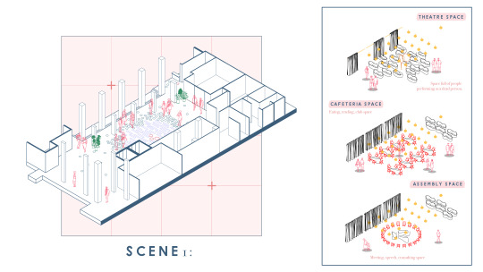
For scene I, I emphasised on the table and the chair reorganisation of the space.
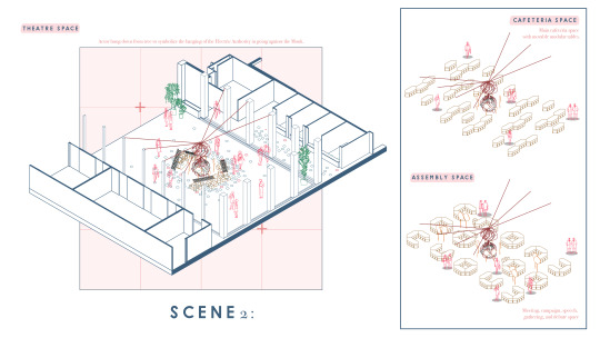
For scene two, the space is being emphasized on the rearrangement of the table plan to achieve the goal of each space.
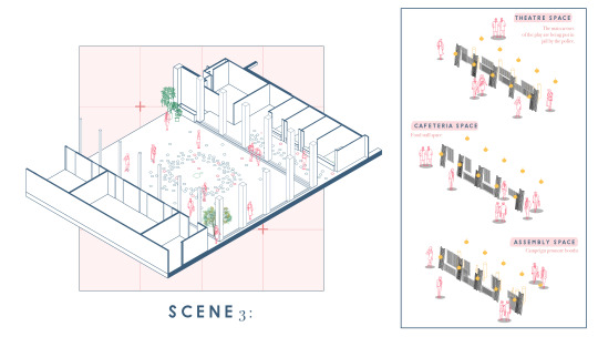
Scene three is emphasized on the reorientation of the fences.
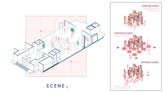
Scene four is emphasised on the reorganization after 14 October chair.
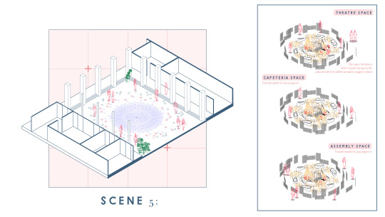
The last scene is where I stated that it would stay the same throughout and can be adaptable and transformable according to the students' needs.
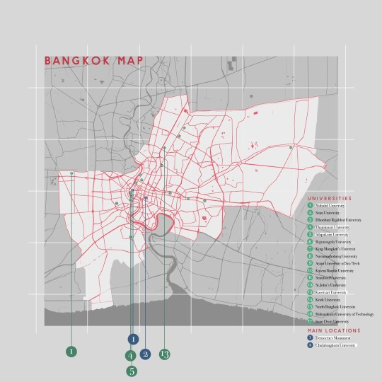
For the urban scale, I mapped out the significant universities relating to the government that this design could be placed to make a statement.
5 notes
·
View notes
Text
PHASE 1 ANT FARM


Architect in the phase 1 is Ant farm architecture. They designed and got the idea from science toy and also observing. And the building that was selected is Dolphin embassy. Dolphin embassy is the inflatable structure, kind of the station between dolphin and human. This space is decided into the space for human which is living part and dolphin which is lab and also the sharing part in the middle of the embassy. So from the point of the embassy is about the relationship between human and animal that was the point of this designed.
3 notes
·
View notes
Photo


Chonburi Coastal
I am categorized it by the province in chonburi that has the depth of coastal differently
First province is bangsaen that has deep sand topography and alot of port and very have only one beach
Next is Pattaya City this province is the most popular area in chonburi and has a middle depth of sand topography because . this area also have alot of tourist and recreation activity in this area
Last one is Sattahip province that has the most steep topography and has a preservation center in this area.
What the problems of Coastal in Chonburi is the coastal erosion that is very intense.
This is showing the timeline of the beach reclamation that government trying to fight back to attractive tourist and increase economy in this area
This showing big sand reclamation that happens in 2018 and 2019
And another way that we can slowdown the coastal erosion is coastal protection that using the break water or jetty to slow down the waves before hitting the coastal
Then I using the scientific data that have the prediction of the situation that will happens in the future just like sea level rise the caused by global warming and make the waves more bigger.]��
This diagram is showing the cause and effect of climate change how it effect to coastal
Then i categorized 3 aspect that have in chonburi coastal which are biodiversity tourist land and coastal
Now these 3 aspects are having conflict. Just like if we are doing beach reclamation it is increasing the land and area for tourist but the biodiversity will got disturb
Then i using the old data and the scientific prediction to generate the situation that can be happen in future
Like this one that in between 2040-2060 the sea level will rise 1 to 1.5 meter and the sand reclamation that done in 2019 will eroded
First i trying to increasing the height of the original beach to prevent the coastal flooding in future but then i trying to combine 3 aspect together and use it the most efficiency
Then i look into the problem of beach nourishment that where the sand come from
Rangkwean island that they use this island to sucking the sand and do the beach nourishment in pattaya beach
And I found that there are 2 types of coastal protection that they use: hard solution and soft solution. Then i research the effect of hard solution the the break water cause the damage to the coastal more than not having it
Like this one หาดแสงจัน and other place in thailand that have this problem
Then I am trying to solve the problem of sucking sand from another island by finding the process of how we can produce sand by yourself . we can this crushing machine to crush rock or gravel into sand but it mean we have to get rock and gravel from somewhere again
Then i trying to use the recycling process of glass bottle that can crushing into sand and use for beach nourishment
1 bottle can crush into 200 gram of sand then i do the quick math of beer consumption in thailand that how many bottle we have in each year
We can get 48,380 tonnes of sand per years this number is more than the big reclamation in pattaya for around 23 times
If you don't know how much it is, you can see in sansar that the small one is pattaya beach and the bigger one that we can produce every year.
But in reality we can not gather all of the bottles in thailand but we can use the benefit of tourists in pattaya city that have alot of tourists that drink beer to become part of it.
The process if crushing the bottle and then gathering the sand for the geobag or beach nourishment and if it have leftover this sand can be used for construction material
What is geobag used for in the past in pattaya that use geobag to be the coastal protection but they put it on the beach and the wave also hit and eroded the sand inside and left over the garbage on the beach. I will using geobag as a base for the island the newly construct
This is my design intervention that uses a soft solution to prevent the problem in the future and can be a long term solution. This is part of Pattaya beach that i chose.
Duration to construct
I compare to the palm island in dubai that is more bigger than pattaya that use 6 year to finished but they are using the boat to do the reclamation if we are using the boat the duration will take 1years or faster
This is the depth and where the island is located
From first that is the original beach that will move all the activity to the center area of the island and to go island by island people can walk through island by island because there are the path of sand that steep enough to walk
This is how the activity moves from the original beach to the center area.
And also the bottle crushing machine that will be place in center zone for drinker to use the machine and the island can be use for function by function like this that we can have a bar at the center
The outer part island that will become an ecology island that will bring back the ecology that got disturb and lost from the past and also become the second barrier to protect the original beach from eroded and become the maintenance area that we can maintain or do the beach nourish every time.
0 notes
Text
Chulalongkorn University presents 10 student design projects as part of INDA Parade
An educational programme based on a train and a cultural funhouse are included in Dezeen's latest school show by students at Chulalongkorn University, Thailand.
Also featured is a digital display exploring the river species in the Gulf of Thailand and a bus stop that also functions as a florist.
Chulalongkorn University, Thailand
School: Chulalongkorn University, Thailand Courses: Architecture Tutors: Design Studio Instructors, Dr. Surapong Lertsithichai, Dr Sorachai Kornkasem, Dr Scott Drake, Christo Meyer, Marie-Louise Raue, Tijn van de Wijdeven, Paul Francis Feeney, William Bertram Hulbert, Michal Jurgielewicz, Patrick Donbeck, Payap Pakdeelao, Pratana Klieopatinon, Takanao Todo, Thomas Lozada, Chon Supawongse, Ekapob Suksudpaisarn, Pitchapa Jular, Eduardo Cassina, Per Stefan Svedberg, Hseng Tai Lintner, Warisara Sudswong, Liva Dudareva, Oliver Losser, Juan Cuevas Duran, Ema Hana Kacar and Kamonsin Chathurattaphol Design team: Takanao Todo, Wasutop Viriyasuebpong, Nattha Dhamabutra and Santasak Apasuthirat Video Team: Wiput Vitayarueangdej and Thanapat Chintanapramote
School statement:
"INDA is the International Programme in Design and Architecture of Chulalongkorn University in Bangkok, Thailand. It aims to nurture diversity in design approaches and methodologies based on a clear framework of constructive dialogue.
"The school is a four-year bachelor programme with a strong emphasis on design studios through architectural design, topics and methodologies relevant to contemporary architecture, with a particular focus on South East Asian dynamics and specificities. Although INDA has adopted architecture as its main course topic, it aims to show how architecture connects to other disciplines, such as landscape architecture and urban design.
"INDA Parade is the main event of the school held at the end of each academic year. It aims to enable the community of students, instructors, alumni, guests and the public to discover and celebrate students' works collectively as an ongoing conversation.
"Today, we are bridging between physical reality, AR/VR, and online platforms for communication. INDA annual student show, INDA Parade 2021 – The Butterfly Dream represents the seamless dialogues between these realities."
Atlas by Jew – Chinnapat Asavabenya
"Atlas is an autonomous digital platform created to govern change and enable the flow of data. To map time, the transaction, proposition, and interaction of our nature are discussed without making assumptions. Different systems and ideas of ownership are contextualised in various layers.
"Where the hierarchies of each layer are established through their relevancy among each inhabiting entity. Usage of the 'map' is done in parallel with the simulation of time, allowing us to envision the consequences of each decision consciously.
"Each map becomes an artefact of dialogue, an archive of the past discussion and simulation of the future."
Student: Jew – Chinnapat Asavabenya Course: Year Four, Semester Two Tutor: Michal Jurgielewicz Email: chinnapat.asavabenya[at]gmail.com
Bureau of the Urban Commons by Orm – Santhila Chanoknamchai
"The 'Bureau of the Urban Commons' is redefining the rule of engagement within the public realm of Bangkok through a series of civic-scale interventions that stitch the urban fabric vertically and horizontally.
"The project capitalises on the spatial potential of The Green Mile, a hidden 1.3-kilometre linear bridge that stitches across central Bangkok. It deploys multi-level connectivity strategies to promote active participation and co-creation engagement, operating on a feedback system expressed through the performative structures. Where along with the commonalities throughout the Green Mile, our everyday life would never be the same."
Student: Santhila Chanoknamchai Course: Year four, Semester one Tutor: Christo Meyer Email: Santhila.ch[at]gmail.com
Funhouse by BamBam – Rachapon Jidapasirikul
"The project challenges the notion of symbolism and ornament in architectural design. It explores a new typology of a public building, destabilising the increasingly obsolete libraries, cinemas and museums today.
"Instead, this building, its architecture, and its interior apparatus act as an interface between the physical world and the virtual world of the internet.
"Through a series of interactive sensory media rooms and AR and VR devices, visitors interface with information, education, communication, gaming, multimedia consumption, exhibitions and other forms of exchange. It is the spatialisation of the internet in the form of a recontextualised funhouse."
Student: BamBam – Rachapon Jidapasirikul Course: Year four, Semester two Tutor: Per Stefan Svedberg Email: rachapon.jidapasirikul[at]cuinda.com
Quarantine Cities: The Continuous Journey by Minnie – Anchalika Thepnumsommanus
"Quarantine Cities: The Continuous Journey" approaches the civic as an architecture for the instrumentalization of mental and emotional conditions as a consequence of the essential solitary quarantine during pandemic society.
"'Quarantine is a disease towards mental health', explores the possibility of offering 14-days quarantine as a continuous trip where travel is fearless."
Student: Minnie – Anchalika Thepnumsommanus Course: Year three, Semester two Tutor: Payap Pakdeelao
Against the Dry by Khem – Thongthat Harnvorrayothin
"This era's consummation of 'dryness' has contributed to the rise of inequality throughout architecture and society. Dryness criticizes the in-create disconnection between existing and new builds. This project compares 'wet' and 'dry' design. It explores architectural ideas and modern needs and how theory influences design in the contemporary era.
"It explores the connection between them, discussing the widespread usage of architectural approaches in modern design through the observation from indigenous living in Bangkachao Bangkok. The natural layer is separated from the concrete coating.
"It concludes with the utopian planning proposal, which touches on all the subjects that made the city more 'wet'. The plan was called "fluid design," which included the allocation of the site, the architecture, and the community."
Student: Khem – Thongthat Harnvorrayothin Course: Year three, Semester two Tutor: Eduardo Cassina Email: fahkhem[at]gmail.com
GoogleExpress by Than ��� Thanapat Limpanaset
"GoogleExpress is an educational programme situated within a train. It critiques traditional institutions, and is a proposal built off of the upcoming 'Google Institute' with the ambition to disrupt the college degree by launching a new programme on digital citizenship and business start-up.
"Google Culture is embedded in the programme, treating education as a hectic, crash course to be completed together alongside the company, allowing levels of intimacy to be formed in every aspect of life on the train.
"To conquer the train, it strips away schedules, exams and uniforms and pushes friendships and connections, where the emphasis is not the courses, but a rather hectic sprint towards digital citizenship. Here, trainees are fully in control of their own education."
Student: Than – Thanapat Limpanaset Course: Year three, Semester one Tutor: Liva Dudareva Email: Tansinstagram[at]gmail.com
Responsible Incinerated Passing (R.I.P.) by Poon - Tassaporn Sukhumhanakul
"Responsible Incinerated Passing (R.I.P.) is a site-specific methodology that aims to offset the carbon emitted into the atmosphere of Bangkok in the process of cremation.
"R.I.P. merges the technology of direct air capture with the sensitivity of Buddhist belief and aims to not only redesign the three existing temple typologies (the temple for The Commoners, The Monks, and The King) to decrease their environmental harm, but also acts as a behavioural guide on how to reduce one's carbon footprint, both before and after your remains are emitted into the sky, in the form of harmless mist rather than smoke."
Student: Poon - Tassaporn Sukhumhanakul Course: Year two, Semester two Tutor: Ema Hana Kacar Email: sukhumdhanakul.t[at]gmail.com and poonsukhumdhanakul[at]gmail.com
Dressed for the dead by Pann – Nara Lojanatorn
"This project investigates a range of informal to formal outfits. They are explored through contrasting rituals of the Teochew Cemetery, the everyday routine of a cemetery that has become a public park and an annual gathering place for ancestral worship.
"The typology of the cemetery presents no end. The tomb tiers are developed from traditional tombstone forms and construction, while the wood scaffold facilitates changing activities throughout the years. The visits may cease, but the spirit remains."
Student: Pann – Nara Lojanatorn Course: Year two, Semester one Tutor: Pratana Klieopatinon Email: pannnara[at]gmail.com
The Crustacean by Poon – Poonyapa Arakwatan
"The Crustacean explores the sea and river species in the Saen Saeb canal and the Gulf of Thailand. It is a series of cabinets of curiosities inspired by exoskeleton sea creatures and the darkness of the polluted canal.
"To express aesthetic sea creatures through digital display in contrast to pollution caused by people living along Saen Saeb canal and to encourage people to take responsibility for our waterways and the ocean.
"The cabinet includes two main displays; the AR texture is hidden in part of the cabinet, and the VR effect for experiencing the whole cabinet creatures come alive in the digital world."
Student: Poon – Poonyapa Arakwatan Course: Year one, Semester two Tutor: Per Stefan Svedberg Email: poonyapaarakwatana[at]gmail.com
The Petal of Time by Poon – Poonyapa Arakwatan
"Every place has character uniqueness, similar to Wat Kheak (Sri Maha Mariamman Temple) Hindu temple. Focusing on transportation and the rotting process of organics offering to the god, The Petal of Time is a kiosk where arrival and departure are waiting for the bus and interacting with flowers.
"The main programmes of The Petal of Time are the bus stop and the flower shop. Providing an opportunity for passengers waiting for the bus, buying flowers, and composting them after use. The essential concept that makes these programmes run harmoniously is inspired by organic transformation."
Student: Poon – Poonyapa Arakwatan Course: Year one, Semester one Tutor: Patrick Donbeck Email: poonyapaarakwatana[at]gmail.com
Partnership content
This school show is a partnership between Dezeen and Chulalongkorn University, Thailand. Find out more about Dezeen partnership content here.
The post Chulalongkorn University presents 10 student design projects as part of INDA Parade appeared first on Dezeen.
0 notes
Photo
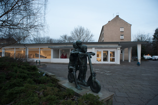
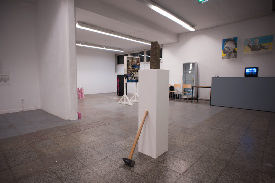
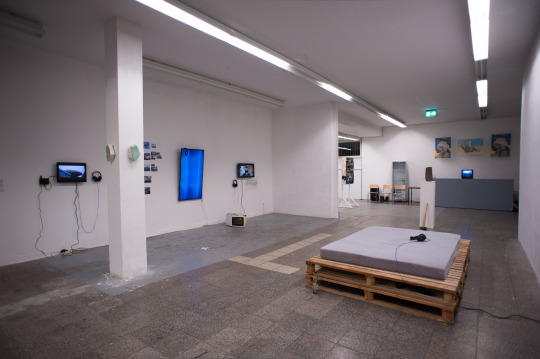
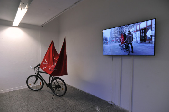
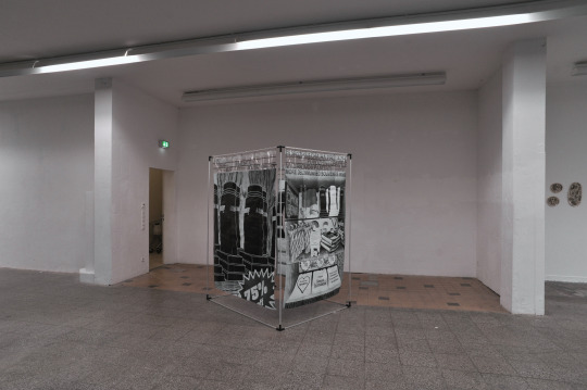
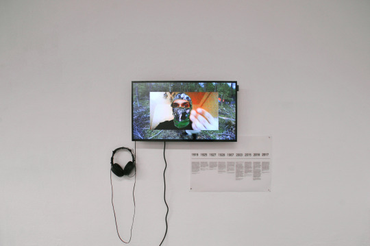
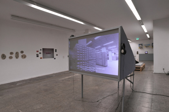
DECOMMUNI_ATION (part 1)
Exhibition 25 January - 8 March 2019 / Kunsthalle am Hamburger Platz, Berlin
Artists: Roshanak Amini, Kristina Bekker, Merle Dammhayn, Abie Franklin, Yaroslav Futymskyi, Alex Hennig, Kamila Juruć, Eva Karduck, Pavel Khailo, Nina Langbehn, Elena Lystarkhova, METASITU (Liva Dudareva & Eduardo Cassina), Denys Pankratov, Richard Paul, Maxine Puorro, Jan Robert von Raußendorf, Katharina Sophie Reinsbach, Belen Resnikowski, Daniil Revkovskiy & Andriy Rachinskiy, Valeria Schiller, Katharina Shafiei-Nasab, Manuel Strube, Beata Anna Targosz, Leo Trotsenko, Nadine Trushina, Kateryna Tykhonenko, Illia Yakovenko, Olga Zovskaya
0 notes
Text
Book Review: Archifutures - Apocalypse
The Archifutures is a publishing project accompanying the Future Architecture platform, set up by the Museum of Architecture and Design in Ljubljana.
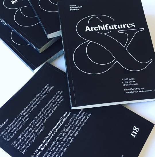
Originally conceived, edited and designed by the publishing collective &beyond, it has evolved into a pioneering digital and print project masterminded by dpr-barcelona.
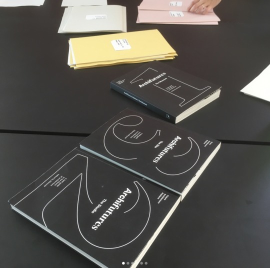
The series features projects and initiatives from Future architceture emerging architects that are helping to shape the architecture, cities and societies of tomorrow. The project merge the possibilities of critical editorial work, innovative printing and active user intervention allowing readers to select texts from the series online and order their own custom compilations.
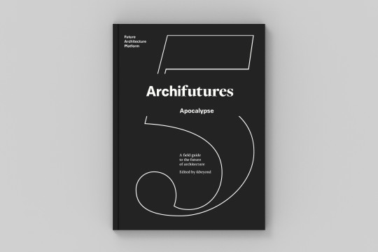
The latest publication in the Archifutures series entitled Apocalypse: A field guide to surviving the future of architecture is not searching for the drama of the apocalypse, but tries to present the reality as it is; “is actually far more mundane and surviving it is not about building bunkers, it is about building resilience.”
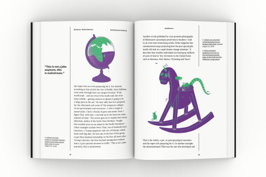
The volume 5 deconstructs and remoulds the notion of apocalypse; to neutralize its drama and to reconsider what it means to live in an age of revelation. What are the futures that these young practitioners aim to reveal? What are the new prototypical mechanisms of resilience and survival under construction as we speak? How will they manifest themselves in the built environment?
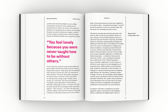
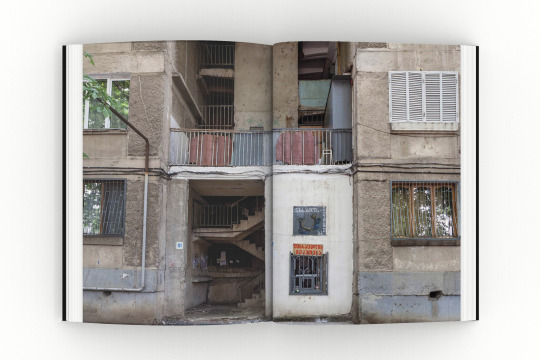
The book has seven sections with seven guidelines, which are intended as a provocation for architects to share them, work with them, improve them, and above all use them to help build a better future. From Everyday end of the World, Adapt and Survive, Radical Hope, Between consensus and dissent, Progressive regrowth, Interdependent individuality to Our future.
As for people around the world living under apocalyptic conditions is an everyday reality, we need to recognize how different facts as climate change, resource shortages, disasters and mass migration changes our future. The book states that surviving is about changing approaches and building resilience in an everyday way. To built a better future far from apocalyptic process requires constant negotiation to deconstruct the inefficient and exploitative systems of today within the technologies of the digital age, that are becoming tools against oppression and empowerment. What about your future?
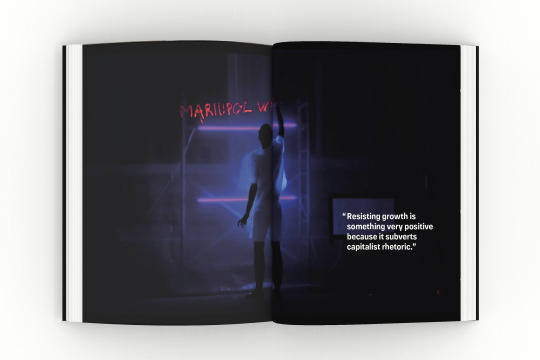
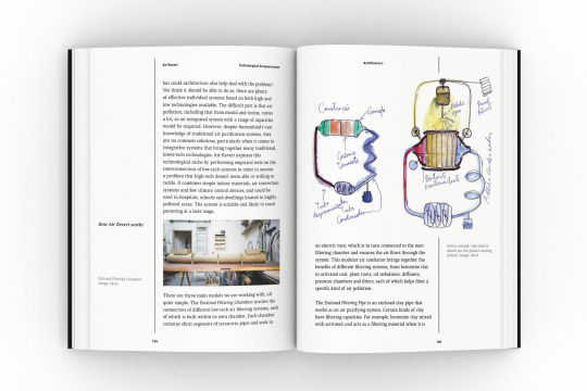
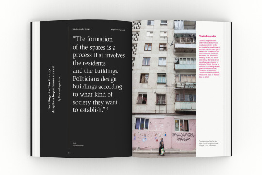
Contributors are Bora Baboci, Maite Borjabad, Eduardo Cassina, Trajna Collective, DOMA, Liva Dudareva, Stefan Gruber, Jason Hilgefort, METASITU, Anh-Linh Ngo, Phi, RESOLVE, Skrei, Anastassia Smirnova, Space Transcribers, TAB Collective, Tania Tovar Torres, Stephan Trüby, the Unfolding Pavilion team and many more.
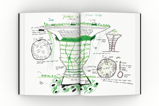
Book data: Title: Archifutures. Volume 5 Apocalypse: A field guide to surviving the future of architecture. Editors: George Kafka, Sophie Lovell and Fiona Shipwright — &beyond Design: Diana Portela Languague: English Cover: Softcover with flaps Size: 17 x 23 cms Date: 2018 ISBN: 978-84-949388-1-8 Archifutures Open bookshelf: Anne-Sophie de Vargas Publisher: dpr-barcelona
PRE-ORDER NOW with special price! (limited units)
0 notes
Photo


Old Hand Corner : Project 2 Task 3 - The Climbing Cocoon Drawing
The drawing above shows the skeleton and skin of a folly. Getting the idea from the chair structure, the main structure of it is the steel wire. The exterior of folly is covered with leather. The interior is cushed by sponge and covered by genuine leather. From the section drawing, the folly is about 5 meters wide and 7 meters in height. When placing the folly in Samyan attach to the shop, the car could drive through it.


The Digital Climbing Cocoon
The cocoon folly is designed for knowledge sharing purpose, people can come to participate in chair repairing show. The folly is opened every day during the day time. There is a show every Tuesday and Thursday, at 10 am or 2 pm. People can also come in to climb, sit, or relax in this open-air folly. The window seat allows people to experience many kinds of leather from the shop. The seat is designed to fit the human body according to the ergonomic purpose.
1 note
·
View note
Photo


Old Hand Corner : Project 2 Task 3 - The Hybrid Climbing Cocoon
From the constructive feedback in the previous task, my clay model is not matched to the materials I have selected in the mood board. My folly shape should generate the softness feeling and showing the combination of materials such as leather, sponge, and wood.
Inspiring from cocoon architecture, I made another physical clay model to be more soft and curvy. This clay sculpture turned out into 3 hollow cocoon shells. After processing the clay model with 3d scanning, the other parts were added up by the digital technique: the window seat, the climbing net, the structure support, and the ladder
1 note
·
View note
Photo

SMELL CONSTELLATION
Boundaries | Thresholds | Peripheries [Project 1/2]
During the site observation, I was walking pass the hospital without even realizing. But then i smell the scent of the hospital and it came to my realization that i am standing right in its territory. And this sparks the whole project on how smell can create a unique identity and define invisible boundary for anything. For the first project, I observed all the smells on the site and came up with a system that defines shapes and colors of each smell to create a visualisation of my smell experience.
Site Analysis
I observed interesting qualities of the site related to Boundaries, Thresholds, and Peripheries. Then I explored different smells existing in the site and analyse all crucial characteristics such as intensity, duration, source, hazardousness, etc. I also did a research on background context of Samyan in aspect of smell management.


Free Document
In addition to site survey, I did a research on the components of hospital smell and conducted an online survey to see how people think and feel about it


Visualizing Smells
I created my own system of translating smell information into shapes, colors, and sizes in order to create 3D shapes that represent each smell
Here’s the link to full Guide to Visualizing Smells


Video
This is the video of lighting sequence that resembles the real smell sequence from my site observation
vimeo
Link to High-Resolution Photos: https://drive.google.com/open?id=1eIvMTIC_jf3eNYQL99ELHhRDa7P52cId
#Liva Dudareva#6 Fai Phatharawarong Chierakul#Project 1#inda#smell constellation#scents#smell#odor#olfaction#olfactory system#olfactory senses#olfactory experience#smell experience#odor effect diagram#visualisation#smell visualisation#translation#color translation#smellscape
1 note
·
View note
Photo


Project 2 started with my maker, Candle seller. I focus on an indispensable relationship between
customers and shop. I make a preliminary idea of different btw 2020 and 2030. My folly developed a new way to make a merit, tell the narrative in Chinese mythology through a structure, and make a feeling to people. My folly is a physical form of the people who believe that making merit would be changed in the next ten years, where as a part for more people to interact and fulfill a good feeling.
1 note
·
View note
Photo


Old Hand Corner : Project 2 Task 2 - Design Development
Inspiring from the treehouse, tree trunk, and the cave city. I was thinking about the climbable folly with the small rooms inside for the chair repairing show. There are many small rooms that are covered by material. Each room covered different kinds of material such as genuine leather, artificial leather, or sponge. Visitors are allowed to sit or lay inside. At the top of the folly, there is a sky seat for viewing the Samyan neighborhood.
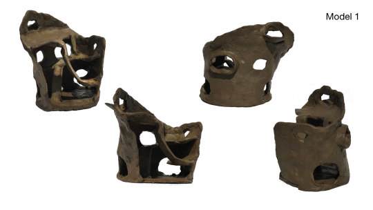

I experiment with the possible folly shapes by using clay. This is my first physical clay model. However, when placing this folly on the street near the shop, it will block the traffic.


The second clay model is modified in an arch shape, it will not block the traffic in the real site. However, folly still seems unsafe and unstable.
0 notes
Text


Social Shade - Final
After project 1 that I have research about over path and community in the area, I have concluded to take information about the shade of an umbrella and create folly under that information. This folly not only has shad property but community space also has a big impact on my folly design. Using material that durable and fit to the aesthetic in the area helps my folly blend into location. Folly also gives benefit to maker which is a food cart which using folly act as their restaurant frame.
0 notes
Text


Social Shade - Sketch Folly
After project 1 that I have research about over path and community in the area, I have concluded to take information about the shade of an umbrella and create folly under that information. This folly not only has shad property but community space also has a big impact on my folly design. Using material that durable and fit to the aesthetic in the area helps my folly blend into location. Folly also gives benefit to maker which is a food cart which using folly act as their restaurant frame.
0 notes
Text
Social Shade - History & Future
After project 1 that I have research about over path and community in the area, I have concluded to take information about the shade of an umbrella and create folly under that information. This folly not only has shad property but community space also has a big impact on my folly design. Using material that durable and fit to the aesthetic in the area helps my folly blend into location. Folly also gives benefit to maker which is a food cart which using folly act as their restaurant frame.

0 notes
Photo
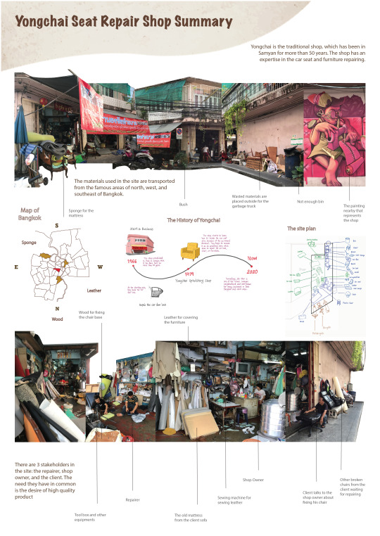


Old Hand Corner: Project 2 Task 1 - Maker 2020 vs 2030
There are 3 stakeholders in the shop: the owner, the repairer, and the client. I choose the repairer as a maker because he is the person who delivers high-quality repairing service. A repairer is also the person who manage the materials on the site.
In the poster 2020 Maker , shows that there’s no clear zone for the repairer and the materials. His routine duty is to repair the chair, clean the shop, and upload the chair to the client's car. Since Yongchai delivers customize and handmade services, the skill should be preserved in some way. In 2030, the maker is not only a repairer but also a demonstrator. Moreover, The waste materials outside the shop will be shredded and reused for various purposes instead of throwing away.
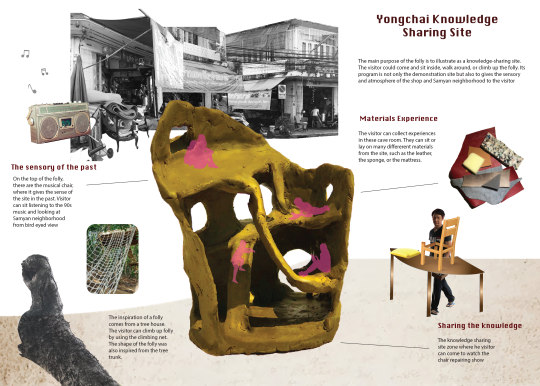
Yongchai Knowledge Sharing Site
Since the maker is both repairer and demonstrator in 2030, the folly will be illustrated as a knowledge-sharing site where the visitor will participate in the seat repairing show. The visitor could come and sit inside, walk around, or climb up the folly. Another purpose of the folly is to give the sensory and atmosphere of the shop and Samyan neighborhood.
0 notes