#LinoTYpe
Explore tagged Tumblr posts
Text

On May 11, 1854, Ottmar Mergenthaler was born in Württemberg, Germany. Mergenthaler, a watch maker by trade, came to the United States in 1872. In 1885, he invented the Linotype Machine and revolutionized the printing industry. The Linotype eliminated the tedious need of hand setting type, especially for publication work like newspapers and books. Using a keyboard, the operator would tell the machine to send a matrix (a mold for each letter) to the assembly area. The Linotype would pump molten lead into the matrices, casting a line of type. The Linotype was in common use in newspaper offices until the mid-1970s when offset printing became the norm.
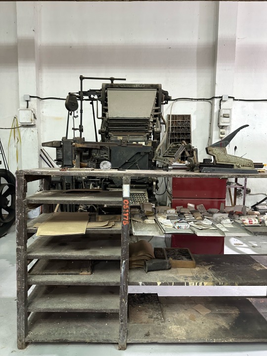
On display at the Sacramento History Museum’s print shop exhibit is a Model 8 Linotype, serial number 16618. This Linotype was made in 1913. While our Linotype is fully operational, we lack the electrical power and ventilation to use it. Want to learn more about our Linotype and how it functioned? We have an extensive video of Howard explaining the operations on our YouTube channel.
68 notes
·
View notes
Text



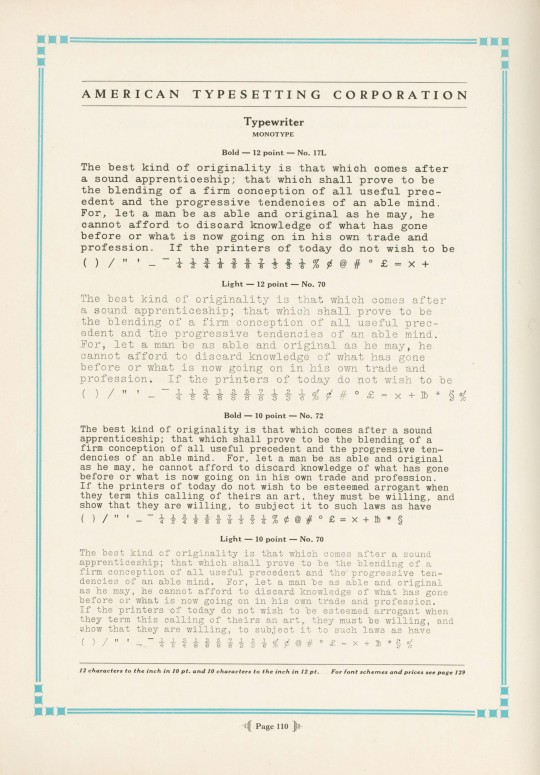


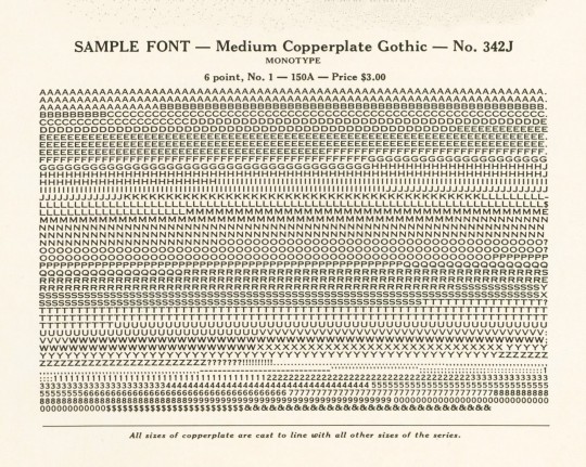
Typography Tuesday
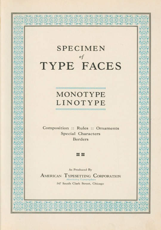
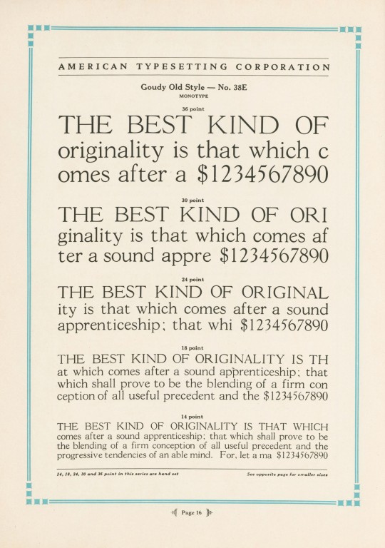
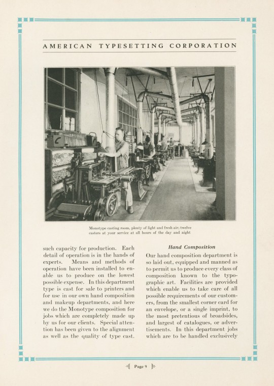
Specimen of Type Faces Monotype Linotype was produced ca. 1930 to display the range of typefaces used at the American Typesetting Corporation of Chicago, "the largest of its kind in the world," established in 1919. The plant operated 24 hours a day, offering day and night services. Their Monotype Department boasted ten keyboards and twelve casters, and their Linotype Department operated ten machines. The typefaces shown here are Goudy Old Style, Cloister Text (a Gothic face, not the Roman Cloister designed by Benton), Typewriter, Monotype Accents, and Copperplate Gothic.
View our other Typography Tuesday posts.
#Typography Tuesday#typetuesday#monotype#linotype#American Typesetting Corporatioin#Goudy Old Style#Copperplate Gothic#Cloister#Typewriter font#type setting#type composition#20th century type
83 notes
·
View notes
Text
youtube
Farewell, Etaoin Shrdlu (1978)
The last day of hot metal typesetting at the New York Times.
Well worth a watch. The Linotype machine was a genuine, mechanical wonder.
21 notes
·
View notes
Text

Artwork made from Linotype slugs..... St Louis City Museum
#photographers on tumblr#original photography#b&w photography#b&w#macrophotography#linotype#art#st louis
23 notes
·
View notes
Text
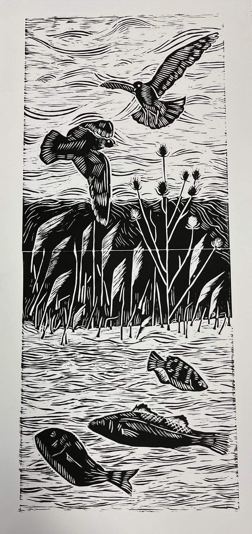


linoprint finals for college
white cartridge / watercolour paper / procion dyed paper
#art#linoprint#reduction print#printing#printmaking#lino printing#linotype#linocut#linocarving#lino#nature#world#birds#fish
13 notes
·
View notes
Text

#print#linotype#ink#stars#original#this one was really fun to make until it started started scratching myslef 😢
50 notes
·
View notes
Text

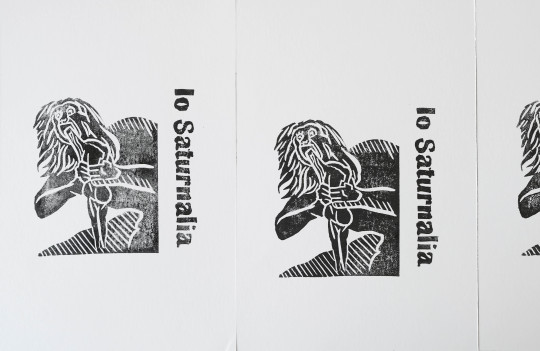
Pomegranate cookies and handprinted programs for our annual New Year's Eve Saturnalia
#minneapolis#minnesota#saturnalia#new year's eve#linotype#linocut#block printing#printmaking#original art#baking#royal icing cookies#cookie decorating#roman empire#history#mythology and folklore#antiquity#pomegranate cookies
9 notes
·
View notes
Text

LINOTYPE OPERATORS
In this century, making and spreading news has never been easier. However, this was certainly not the case around the 1960s. People then used to rely on “Linotype Operators” who used to press down articles on newspapers piece by piece with the help of a metal typesetter.
This occupation naturally demanded patience and time, which people actually gave into gratefully as there was no other medium of retrieving news then. Soon after, though, this occupation slowly lost its place when Phototypesetting was introduced.
3 notes
·
View notes
Text
youtube
Please watch this if you have even the slightest interest in machines
#gotta be the pinnacle of mechanical engineering#don't get me wrong#computers are neat#but I need contraptions#engineering#linotype#Youtube
5 notes
·
View notes
Photo
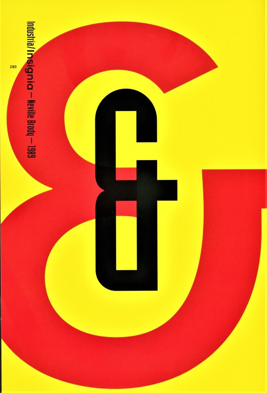

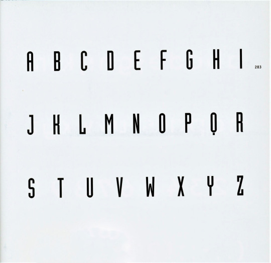
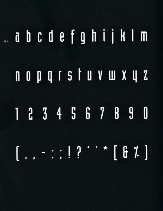
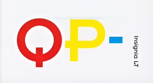


Typography Tuesday
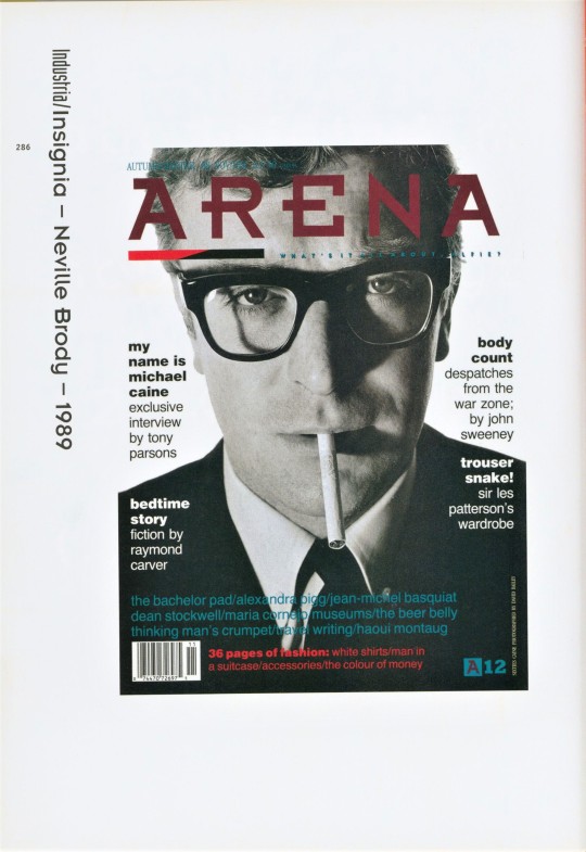
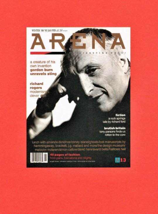
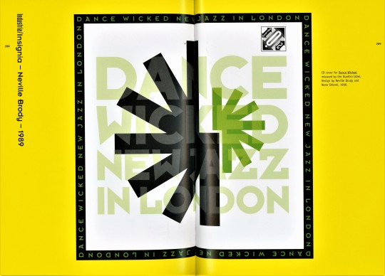
NEVILLE BRODY -- Industria and Insignia
English graphic designer and typographer Neville Brody (b. 1957) is noted for his record cover designs and for his work for the culture magazine The Face, the men’s magazine Arena, and the London magazine City Limits. Brody’s typographic style uses aesthetic elements from Art Deco and non-European influences. His graphic language has become an international model for computer-oriented design. Among his earliest fonts are Industria and Insignia.
Industria was originally designed for The Face in 1984 and released as a font by Linotype in 1989. Industria is a condensed san serif face with abbreviated, essential forms. It has a systematized mechanical structure of straight stroke with rounded outer corners and rectangular counter-spaces. It’s possible that you might recognize the font as it was used for the logo of The X-Files and is currently used for the logotype of the Oklahoma City Thunder basketball team.
Insignia was originally designed as a headline face for Arena magazine in 1986 and released as a font by Linotype in 1989. It has the basic forms of constructed Grotesque fonts and was influenced by the New Typography of the Bauhaus from the 1930s.
These images come from the 2005 book Creative Type: A Sourcebook of Classic and Contemporary Letterforms by Cees W. de Jong, Alston W. Purvis, and Friedrich Friedl, and published by Thames & Hudson.
View another post from Creative Type.
View our other Typography Tuesday posts.
#Typography Tuesday#typetuesday#Typography Tuesday#type designers#Neville Brody#Industria type#Insignia type#Linotype#san serif type#Grotesque type#Creative Type#Thames & Hudson
23 notes
·
View notes
Photo

Was passiert eigentlich, wenn man da drauf drückt? 🧐😲 #linotype #elektron #button #pushthebutton #surprise #spannend #typorama #bischofszell #thurgau #museum #schweiz #switzerland (hier: Typorama) https://www.instagram.com/p/CpR2PpdIBm5/?igshid=NGJjMDIxMWI=
#linotype#elektron#button#pushthebutton#surprise#spannend#typorama#bischofszell#thurgau#museum#schweiz#switzerland
4 notes
·
View notes
Text
The original linotype artist is selling t-shirts of the design. Also check them out on Instagram @ reinpress

43K notes
·
View notes
Text
Un día como hoy (28 de octubre) en la tecnología

El 28 de octubre de 1899 fallece Ottmar Mergenthaler, ingeniero germano-americano inventor de la máquina de Linotipo, el primer dispositivo que permitía de forma rápida y sencilla colocar un juego de tipos para su impresión y revolucionó el arte de la imprenta #retrocomputingmx #linotype
0 notes
Text

of composing machines
mention of the term composing machine summons in the mind of most typographers the late 19th century class of composition caster that finally gained prominence over hand composition—most notably linotype [1885], & monotype [keyboard, 1885; caster, 1890]. however, these composition casters were preceded by an earlier class of machine that composed from foundry types, i.e. did not cast. the image is the young & delcambre composing machine [1842]—unique in its use of a piano keyboard; also noteworthy in advocating female operators, as evidenced by the image—further potential savings given women were outside the [male] trade & thus compositors’ pay scale. composing machines that followed added capabilities—justification, distribution. most famous of this class was the kastenbein [1869], notably employed at the office of The Times.
cf, james moran, ‘Farlow Wilson and the Young/Delcambre Composing Machine’, The Black Art, vol. 1, no. 1, 1962, pp 20–7.
image is abstacted from illustration, ibid., p22.
1 note
·
View note
Photo
youtube
You must now go and watch this again. I don't care whether you've already seen it, go and watch it again already!
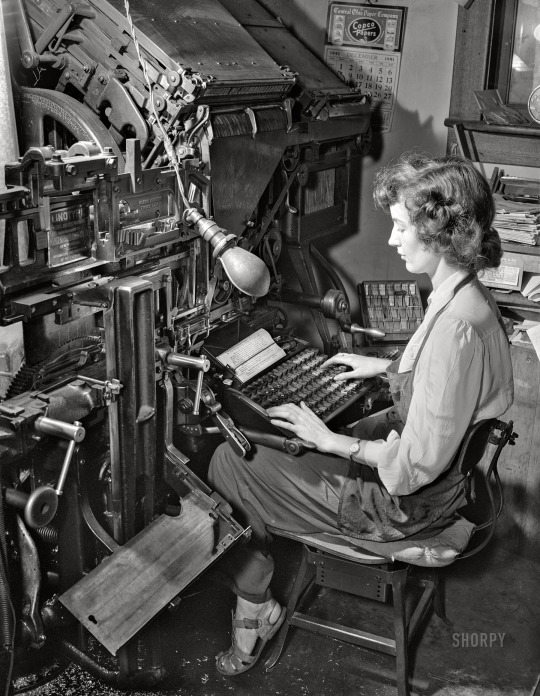
(via Let Me Compose Myself: 1942 | Shorpy)
September 1942. Richwood, Nicholas County, West Virginia. “Lois Thompson, printer’s devil on the Nicholas Republican newspaper, operating Linotype machine.” 4x5 inch acetate negative by John Collier for the Farm Security Administration. View full size.
622 notes
·
View notes
