#Lineless art is fun I should make it more often
Explore tagged Tumblr posts
Text

clinging to life
#chrome draws#RAHHHHHHHH OC ART UPON YE#oc: wish#oc: moss#oc art#Lineless art is fun I should make it more often#chrome’s ocs
37 notes
·
View notes
Text


being economical and borrowing my art summary template from 2019 lol. notes under cut
I did want to do something similar to my 2020 art summary which had notes/thoughts on each digital piece baked into the image itself (and is also the prettiest lmfao) but I haven't been as proactive or even content since then sdfhsdkflds but I'm also of the opinion that artists should talk about their work, even if I still struggle to call myself one T_T
I met my monthly quota of one digital piece per month + one coloured sketch per month except October, which tends to be the month of exceptions since some sort of art challenge crops up. This year I opted to meme countdown loosely for Veilguard, and was the most free and loose I've been with drawing but also kind of burnt myself out a little on that front.
I do appreciate that there have been a few style experiments in the monthly things (March/Sept./Oct/Nov). I always found my style to be pretty generic but able to emulate other styles a little as a result. Except anime/manga evidently. But that means I can evoke different tones with different styles and do really left field stuff, which is always fun and leaves a lot of room for experimentation and a diverse body of work, which I prefer.
Managed to land LNY piece, which is a tradition I want to keep. I think my favourite piece is probably June's, the Lumine/Paimon/Osse/Scylla piece, which I referenced a screenshot because the location in-game was too pretty for me to not draw it. The Lumine/Girl With a Pearl Earring piece I'm pretty fond of, only because it was a genuine study of an old master, and I think it turned out well. The Lucanis minimalist piece is also a favourite, and it was me doubling down on the things I'm better at instead of trying to aspire to whatever the fuck I've been trying to do. Improve in some way I haven't defined yet, or operating on the notion that there is always room to improve (which is true and healthy to think), but also I guess a sense of dissatisfaction that my work is Objectively Broken in some way and desperately needs to be fixed. What's it like being content with your style and process?
The 2019 art summary had a template for Honourable Mentions since I actually managed to do more than one piece per month throughout the year (tho admittedly a lot of those were schoolwork). That's kind of been a struggle since 2021 for Reasons I still haven't fully recovered from, but I did manage a few extra things this year, chief among them the 19/20 Day Countdown mark for Veilguard, which I really wanted to do since I did one for Inquisition 10 years earlier, and I'll probably do one for the next Dragon Age game lol. I'd also like to probably redo the Inqusition one, and do full illustrations for both since I can actually draw backgrounds now. Something for 2025 I guess.
Others among the Honourable Mentions include a twt xlmi event piece I got a ton of "omg it's giving Sailor Moon + Tuxedo Mask" comments which makes it sound derivative as hell 🙃 The concept, was the moon (Lumine) and her night sky (Xiao). He is often associated with darkness and depicted looking at the moon pretty regularly. Also he is literally fading into black in the piece. My interpretation was that the night sky is quiet, and it darkens the sky so we can see the moon. The moon sits in the night sky's embrace. I actually quite like this one, the more I look at it. I've also used Giant Moon in the Middle of a Drawing a lot throughout the years, so that absolutely tracks. Maybe I should do one every year.
Other Honourable Mentions are my friend's commission (she was so patient with me), a noir Neve piece I did around September-ish too (was supposed to be a comic, might revisit the idea. I picked up reading comics again and was inspired to give one of my greatest inspirations a run - comic art, specifically the way they ink), and a quick lineless illustration for the xlmi zine I helped with.
For daily sketching, I only filled about 4-ish sketchbooks this year, all about 30-32 pages, but I've started to double up on pages so each is filled with more than one thing. Some sketchbooks were lazy in terms of what I did than others. Some were great, and had a lot of stuff where the things I practice (people in environments, action-oriented things, foreshortening, the bane of my existence) were abundant and pretty well executed. With the exception of one Lumine sketch that was so very in my own style that I really love and an adapted sketch of an OC, the favourites are all very action-oriented, and I'm glad. I really love the ones with Lucanis and Rook since there's genuine contact and an energy to them that feels very alive, which is something I've been working desperately towards, so it's nice to see it pay off. In a little daily drawing no less~
Around June there's a huge shift in subject and I all but ditched Gnshn immediately, which I think is healthy. I spent an inordinate amount of time in the months leading up to June and throughout with my daily sketches trying to force change my style to be more anime-esque since the gnshn fandom isn't particularly fond of western art styles, of which mine is painfully so. I have a lot of uncoloured sketches of Lumine that I'd like to get around to, but feel like a waste of time now. Leaving trying to make it in the gnshn fandom behind has been good for me, and it's been really nice to go back to the shit I love, which is just fights and blood. It's funny, since I ended my Cybird Ikemen run with swords and blood to jump into soft, cute shippy art for xlmi only to return to swords and blood.
Appropriately, I started my art blog ages ago for my silly little Dragon Age doodles, and I've returned to that. So: thanks, Veilguard. I hope I'm still fixated on you throughout all of 2025 because I have a loooot of ideas. And hopefully the patience and skill to get them out there.
#art summary#2024 art summary#le whiny text post#also around June when I dropped gnshn I started drawing Nadia again. I've mentioned this before but she is the literal blueprint#and foundation of my entire art style. It's not surprising half of my favourite sketches are her doing whatever she gets up to#I hadn't drawn her in about 6 years. The OC I adapted from her design? Yes. Nadia specifically? No.#and Nadia was a lot of leaps and archery and a ton of troubleshooting and learning way back in 2015#her and Cullen are the reason I can draw anything today without too much issue#before 2015 I could not draw men to save my life. I think 2018-2020 I drew nothing BUT men digitally. which is insane to think about#and those men were static and just standing there doing shitall until I was making Nadia leap around and hit stuff. At which point#I could make the ikemen do stuff with swords and weapons#so say thank u to Nadia assorted ikemen and subsequent characters. You all owe her your lives. As do I.
10 notes
·
View notes
Note
for the weirdly specific ask game: super curious about 5, 12, 21, and 27 :>
Thank you so much, I'm gonna respond to all the lovely folks who asked me here too about the weirdly specific art ask game! (Thank you to @phantomseptember, @wyrmzier , @grumpyoldsnake, @philcoulson-redtapeninja @swordsandspectacles and the other anons for asking!)
1. Art programs you have but don't use? I don’t think I have one! I’ve been playing on Photoshop for so long, though I’m thinking on getting Clip Paint Studio for comics at one point!
2. Is it easier to draw someone facing left or right (or forward even)? Mmmm, often find I draw folks looking to the left, but wouldn’t say I prefer one way or the other, especially when I’m flipping the canvas at least three times to make sure they’re all even!
3. What ideas come from when you were little? Mmm, lots of fantasy things, I have this old story about the green man that I made when I was 16 and it’s been rolling and remade ever since! It really needs another go other, it was my first dip into anything non cisgender before I knew, y’know?
4. Fav character/subject that's a bitch to draw? Mmm, probably cars. Hate drawing cars, so annoying.
5. Estimate of how much of your art you post online vs. the art you keep for yourself? Ohhh, probably, 80%, but that’s what happens when you’re chronically online like me lol
10. Favorite piece of clothing to draw? Mmm, love a big floofy skirt or shirt, all those folds, very hard but so satisfying when I get rolling
12. Easiest part of body to draw? Mmm, eyes n’ mouth? I wanted to get good at them ever since I was a kid, cause they’re the expressive bits! I want to get better at Hands, the gay part of the body.
13. A creator who you admire but whose work isn't your thing? I honestly can’t think of any? I guess I try n see the good in any art, even if it’s not my vibe; the colours, the lines… There’s always something
15. *Where* do you draw (don't drop your ip address this just means do you doodle at a park or smth)? At home! I try and keep Digital art to my desk, but If I’m doing ink art for fun, it’s on my bedroom floor, praying that I don’t mess the carpet
20. Something everyone else finds hard to draw but you enjoy? Mmmmmm, mouths and hair?
21. Art styles nothing like your own but you like anyways? Ohhh, mmm, lineless art! the amount of effort that goes into it, love it!
27. Do you warm up before getting to the good stuff? If so, what is it you draw to warm up with? Iiii should be doing it more! But it’s usually a pretty lady with voluminous hair and fangs, it’s a good go to!
30. What piece of yours do you think is underrated? Mmm, I think, it’s this piece, It really vibes with what I want to make at the minute, deep shadows, good lines, good Shapes! Thanks again for asking me!!!
39 notes
·
View notes
Note
Hi pigs "whale yuri Wednesday" with wings!!! I think the colors in your art are very cute nd i was wondering if you have a method with picking them? I struggle a lot with color picking when i dont have smth to work off of!
Also not an ask but you should post more about your original art/reblog it!! ocs too!! :]
well!! i don't have a specific method most of the time I'm eyeballing all of that!! but i can give some general tips on how i personally pick colours...
also: thank you 🫶🫶 ... i do not make art very often so most of the time i feel like there is nothing to post about!! but i will try to reblog my own art more often!! i have been working a lot on one oc of mine so perhaps you will see more of it :]
- i tend to first put all the colours side by side to get a sense of how they'll all look together!!
- usually i start with a very light or very dark colour that i like, and build off of that.


- after i choose a color to work off of, i tend to pick another colour that's similar to the first colour. (black and white can go well with basically every colour if you're stuck!)
i personally try to keep the colours distinct enough that you can tell it's another colour. this isn't totally necessary, it's mostly because i use a lineless style and my shapes won't be distinguishable if i don't make it clear which colour is which. for example with fhese two images - it's easier to tell between the colours on the right than the colours on the left.


specific processes here:
in the top left corner here, i chose the black, then the dark blue/dark purple, then the purple, then the light purple. they're all in the same area of the colour wheel but each one gradually progresses in brightness and moves into another area of the colour wheel.
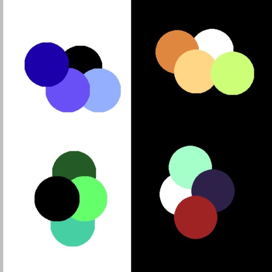
same with the top right corner - i started with the white and chose a shade of orange that was easy to see against it. then a similar shade of yellow to pair with the orange, and then i wanted a highlight colour to stand out. since the general pattern of this colour set is bright/warm colours, we can choose another bright or warm colour that's different in brightness or shade - in this case i chose a bright green, but a bright red would have also gone nicely with this.
the bottom left and right is mostly the same as above, but finding a colour palette like the bottom right can be trickier. i started with a combination of white, cyan, and purple but thought that it looked a bit boring. so i picked a colour that wasn't blue or purple but a bright(er) red so that it stood out. could have also used bright orange/yellow/pink instead, but i think the red gives it an interesting contrast. i like to think that it's all about contrast
i tend to make colour palettes at random just for fun, so i think that practice or just putting colours together to see what looks good can also help!! some more examples below of just. colour palettes or colours that work well together
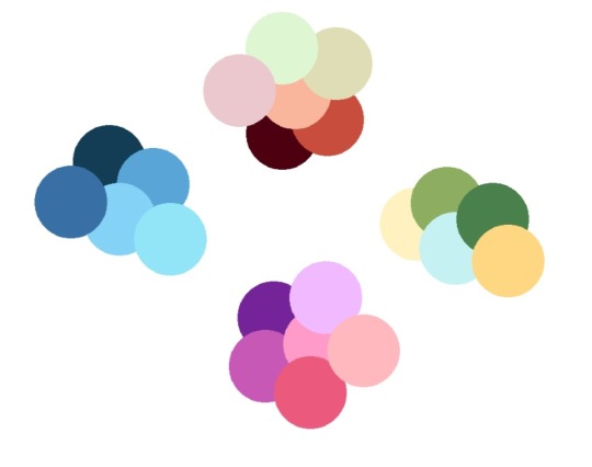
and yeah! to be honest i don't really know what i am doing but i like messing around with groups of colours. do what you want, lay down some colours that you like and most importantly have fun 👍👍👍
#asks#<- kinda... mostly me explaining colours in confusing ways#i hope this helps? also feel free to use any of the colour palettes in here (offer extends to anyone else too)#im fully an amateur so this probably does not make sense#if so feel free to ask again!!
10 notes
·
View notes
Text
Both digital and traditional artist speaking here!!
First of all: ESKEERRR!!!! I love theeemmmm!!!!! That's my favorite space cowboy!!!! You have such a pretty style to look at <333 it's not super often I see traditional colored pencil drawings on here and you've made Esker look so so so nice <3333 I keep trying to draw them but I'm SO BAD at drawing cowboy hats :') you've done an incredible job here!!!! And the angle of the face is really nice too!! I've personally been struggling with more dynamic angles, so I personally admire your ability to do so as well as you have!! Beautiful art, incredibly done my friend!!
Second! I have some digital tips for you!!
I will be first to admit, my exact process is a bit unorthodox, but I feel you may still find some use in it!
See, I'm not actually great at sketching in a digital format, and never really have been. I enjoy coloring digitally and doing line art digitally due to the freedom and forgiveness of digital art- but sketching has never quite worked out for me.
So instead what I do is I do all my sketches traditionally!! All of them :)
And then I try and take clean pictures of my sketches or scan them in, import the picture of the sketch into whatever drawing application you use (I use ibis paint on my phone, but that's a whole other can of worms lol) and from there you can either start line art over the sketch, or you can just go straight to putting down color under the sketch by using a multiply layer for your sketch!
Here are some recent digital works of mine to show you how it can work under the cut! (I really hope I'm not being too forward here or anything btw ;-;


Here are examples of line art I've done over sketches recently! The first one being traditional line art over the sketch as is, the second being digital line art over traditional line art (that's why it looks cleaner) and the third being an example of where I fixed some anatomy during the digital process!


Here are examples of just putting down color underneath the sketch using a multiply layer! The second picture (the clown) and the third (woman with gold horns) are ones I did yesterday, and the clown picture looks way more rough than the bird boy or the other two because I was actually just color testing, not actually wanting to make a finished picture!


These are just some plain line art pictures, so you can see the clean result of doing digital line art over traditional sketches!

And lastly, just one totally completed artwork kinda for fun :3 My style is much different than yours, and I tend to portray a heavily textured, semi-lineless style, which I know is not exactly a common style 💀 but just in case it helps you visualize the end product and help you with thinking of other possibilities, you know?
When I VERY first started doing digital art, I think I was like 14-15 years old? I wasn't very good at art period, and I STRUGGLED transitioning to Digital, and gave it up for a long time. And then I sorta discovered I could import my sketches, and it was a total game changer!! I've been doing digital art this way for nearly 6 years now, and while my style and process has grown and changed significantly in those 6 years, this part of my process has always stayed the same.
And maybe doing this will only be a stepping stone into being able to sketch digitally for you, just a little transitional helping hand- but art has no rules. Remember that! Art has no rules and if you find something that helps you and that you think looks nice and is functional, then DO IT!!! I've been doing digital pieces on my phone for YEARS, and as much as people tell me I should really start using an art tablet or something else, I've found that this method works for me, and I see no urgent need to change that! (Also I'm really lazy and don't want to learn how to use a new program- but that's besides the point lol)
Switching mediums is always gonna be tough at first, and it'll probably take you a little while before you really get a grip on it- but being a traditional artist isn't a downgrade, and I feel that's very important to know. You have AMAZING skill, and I ADORE your colored pencil work on this drawing of Esker!!! Just because it's not "popular' online, doesn't mean it's worse. Traditional art does and will always have a place in the world- INCLUDING fandom spaces! I find that some of my favorite pieces of fan art have been traditional pieces, so don't sell yourself short my friend!
I wish I could share some of my traditional pieces I've done to try and help encourage that, but ah, I've run out of images I can post :')
If you're actually curious, I have some recent oc stuff on my blog you can find if you search using the tag "d&d ocs" directly on my blog, or if you search using "don't repost my art please" you'll be able to find all the art I've ever posted lol
I'm so so sorry for writing like, an essay in your post op ;-; I'm very passionate about art and try and always take every opportunity I can to give pointers to others in my community when I can- helping each other out when we can is the pinochle of actual community after all!
To close; I LOVE your art, you're very talented!!! And I wish you all the luck in your future endeavors my friend :DDD 💛

Traditional doodle of Esker this time. Yk my favourite traveller used to be Riebeck, but recently it's swapped over to Esker. They are one of the founders, but they aren't in the founders photo, and being forgotten on the alterrock, they deserve love and I love them.
I'm struggling. So. Fucking. Hard. To transition into digital. Had a full day yesterday to doodle and everytime I tried I wanted to rip my hair out. I feel like I've also regressed in my traditional art as well, which is uurauagauagah.
If any digital artists have any tips and tricks pls pls hmu.
#outer wilds#outer wilds esker#outer wilds art#reblogged art#art help ramble#sorry op really i didn't mean to get so carried away 😭#ocs pictured:#Angel Iomedae#Penny 'Wishing Star'#Twikk Ellohi#Fable- the aasimar twin#Elias no-last-name#two of these characters are not my own- they are my friend's ocs! Fable and Elias are not mine. i just like to draw them :3 lol#long post under the cut- sorry again op ;-;#this IS meant specifically for you though- I don't want to take over your post at all but i figured a direct reblog rather than-#-sending in a long ask would be better and more connected to you ask for help :')#i hope this was helpful and not an overstep on my part!#if it was an overstep- let me know and i can delete the reblog for you :)#i love your art sm!!!
21 notes
·
View notes
Photo

been playing sky: children of the light and. is good
i decided to do this. at. 10 pm yesterday. and it took at least 7 hours to finish it with like-- 2 short breaks and one long break to just sleep
still, i’m REALLY happy with how this turned out, especially since i don’t usually do lineless (and rarely have the patience) so. even if my hands are probably ruined now it was still totally worth it c’:
#i don't know how i managed to to make it look like envisioned. but i am SUPER proud of myself#maybe i should do lineless more often... it was more fun than fussing over the lineart for 50 minutes#ngl though i want to start drawing wings more because they are very very fun to draw#sky: children of the light#sky children of the light#pitch's art
12 notes
·
View notes
Note
My main grape about the designs (and really, the animation itself) is how bland and unexpressive it is.
you wanna flat 2d lineless art? Okay! Sure, but have some sort of shading or fun details. People made cool ass drawings of plants with only shading to help them.
No? You just want little to no shading with only the most prominent detail so you can differentiate everyone? I'll let it side for now........
Oh, you wanna use basic shapes? Sure, people had cool character design while only using triangle before. Mosiac art is really fucking cool, I would love to see it in more often outside out religion settings.
You're.... using basic shapes to.... draw a person? With no... you know... actual anatomy? Like no shapes that are thicker but get slimmer out to make an arm? Um. I guess you can be minimalist. Not that I like it.
Having only like, five colors to use at a time? It'll be a fun experiment to see how to use them. Wait. Are you only using colors on the pre-made color palettes? And only the first row of colors. You know you could scroll down to see more, and there’s a color wheel right? There’s a slider to choose lighter and darker colors as well.
Really? Only the most basic of all colors without the fun sliders? Fine fine, have fun.
Oh... you want to use the same character model? Uhhhhh, maybe you could use different colors and details to add more favor? You really want all of these people to look like an infinitely large family with only different haircuts and genders? If you’re doing like a horror animation where everyone is the same with only one very slightly different looking character, then go for it. The uncanny valley affect is interesting when the protagonist is the uncanny thing.
No? Then what the hell are you making? Scp Foundation content? Isn't that basically a horror archives with a weird mix of dangerous monsters to a sentimental soup bowl in addition to doctors with interesting characteristics trying to contain them? That’s like, the greatest way to explore character designs and you're wasting it on one simple model with 4 colors max and no shading?! For everything?!
And why are you doing this? What's preventing you from simply going all out?
Quick and simple artwork that can be made easily......? That can be made efficiently to make videos in order to make profits?
...
And Don't Get me Started On the Fucking Animation.
Having your characters move via motion graphics? I could see how that could work, if you mess around with how fast each character or setting move with their animations. That's another layer of detail! But there other ways to animate with better quality.
2d animation is much more interesting for a lot of reasons.
Pieces with slight jitters and fast animations to show how energetic and active they are; Like small animals running away, character who has fast reflexes and is constantly on the move, waterfalls. All of these move fast and look like a blur unless they slow down which they often don't do.
More smooth animation for most movement, add or decrease the amount of stutters depending on what's in motion. Slow on into near stop motion for well, slower things. Either have an extra frame to have them linger.
Y'know how things are sometimes faster than each other? That's what I'm saying.
Steam moves faster than smoke which means slightly faster animation. People move in their own ways. Elderly that are slow and careful with their steps. Teenagers range in the why they walk, popular students with confident strides, average kids just dodging and weaving their way through the crowd, maybe some kids wayy into anime naruto running around. Whoever they are, their animations should be able to highlight who they are.
3d would also work, just need to a model a character and start moving them around and adding little touches. No need to draw a new scene.
Meanwhile, McFuckingLazyAssMf known as Scp expla*ned decided to forgo all these possibilities to churn out truly brain dead content which is very bad for new up and coming Scp fans.
I also wanted to add, WhatInTheWorldAreThoseExpressions? Those are just sad. Actually scratch that! I can't even tell what "emotions" these little breadsticks are making. There's like a 3 second animation where the eyebrows move up or a painfully stupid attempt make a glare with two grey lines and scooching them like, half a centimeter to the left. They don't even bother to add gestures or body language.
These doctors have two different body gestures. Arms up for surrendering and panic which is wayyy to obvious, and the shrimp curl.
Where the hell are my doctors with hunched back? These fuckers can be bothered to sit up straight when there's a breach every 3 days or someone pissed off the senior doctors and now they might be in the cross fire of some revenge plan. Why the hell is everyone the same height? Clef is a manlet and isnt close to Kondraki's height. No, slenderman, siren head, long horse, and the cartoon cat aren't and will not be part of the scp foundation. Even then, it wouldn't be that hard to like, I dunno, block off the areas they live, stamp out amnestics, then start scrubbing through anything mentioning where you can find these spoopy fucks.
Not mention whitewhashing, gender swapping, or the fact LGBT characters are suddenly, well, not LGBT anymore.
-soap
^ All very fucking good points
9 notes
·
View notes
Text
Sooo, someone on Rewritten Belial wanted to know what I see wrong with mid fight masses. Boy, boy oh boy, where do I fucking start
ANIMATION
My god. My god the animation. The problem for the most part isn't the animation itself (except for the title screen, fuck that, it looks so weirdly floppy and stiff), it's the fact the animations aren't aligned properly. Take one good look at Sarv's sprites in the first 2 songs. Look how often her position shifts. There's seemingly no ground whatsoever for her, her feet get positioned up and down seemingly at random with the notes and it's REALLY frustrating. It isn't even bc of exaggerated poses, Week 4 shows that exaggerated poses can work while still making sense with where the floor is. Sarvente continues to be an offender in that regard with the fact the telephone animation looks EXTREMELY choppy and lacks a lot of inbetween frames, not to mention how stiff it feels.
Ruv is a lesser offender, the only thing that bothers me is how his feet curve down on his idle stance, because, again, That's Not How The Ground Works.
Selever. Dear god. His idle animation is so fucked. He goes 3 steps to the left by standing still. And this is purely an XML issue btw, bc there's a gif in the files with the animation in its raw state and it looks just fine
ART
THE BACKGROUNDS, DON'T GET ME STARTED. They're completely fucking lineless. That's NOT what you do with FNF. In FNF, lineless stuff is the environment, a car, the sun, a house, individual objects that are supposed to be in front or behind of one another are lined, always, and the mod NEVER does this, making everything blend in super hard.
Then there's a problem all the sprites share. They are by no means in FNF's style. FNF's art style consists of a lot of thick lines, big shapes, and a generally very street-like style. MFM does none of that. The lines are thin (with sarvente having completely lineless elements, which you should NEVER do for fnf character sprites unless it's pure black) and look very out of place when put next to every other character. Ruv is, again, the lesser offender, although he's definitely still one.
THE CHARTING
Hell. Hell. HELL. SO MANY NOTES THAT AREN'T EVEN IN THE SONG ITSELF, SUCH AN ABSURD OVERUSE OF TRIPLES AND DOUBLES, because god forbid the player actually has fun doing patterns for fast songs, right?! Gospel is safe in this regard, meanwhile Zavodila. Why. Zavodila could have been perfectly fun and difficult without them. Why did you do this. They're not inherently wrong, you just need to implement them really well and chief this ain't it. Jacks and multis aren't to be abused, ever. Patterns are best, always.
THE MUSIC
Subjectivity zone has been entered. Worship, Parish and Gospel are very subjective and down to taste, personally I ended up only liking Gospel out of the three even if I insist it should be a metal song bc demons are just like that.
Now Zavodila I have an objective complaint about, AND IT'S THE BEST SONG IN THE MOD. This isn't too much about the song on its own, but as an FNF song. Listen to it. Listen to it and tell me Ruv's voice sounds like a voice at all. No. It's just hard bass without a smidge of voice on it. If it was a voice with a filter on it that made it kinda sound like hard bass, fine, Whitty is good for that reason, it's a voice with a filter that makes it sound SIMILAR to an instrument. But when it's JUST an instrument, you've gone overboard. Idk what Selever's song is called but it has the exact same issue.
THE WRITING
ULTIMATE SUBJECTIVITY ZONE ENTERED. PROCEED AT YOUR OWN DISCRETION.
The writing is very lackluster. Everything just kinda happens for the sake of it, there's no background motivator or thing that got BF and GF there against their own will, it just kinda. Happens. And the reveal for Sarv's demon form is VERY lackluster, she just goes "lemme show u a secret actually" and transforms for no reason other than an excuse for a harder song. And to be blatant hornybait btw, I saw the namefiles, this demon form was designed with pure libido and no brain processes. Either way; everything just kinda happens for no reason here. It's not good. It's. Very, very bad.
And then you get into the background lore and it all gets so goddamn confusing because Dokki literally dug up OCs from when she was a kid and tried to bullshit up some backstory for them and it all crashed horribly. Every little fact is thrown in just because, like. She's lucifer but also didn't want to become lucifer and did so on accident?? How? It's never elaborated on? And WHY would she help God, who she hates, to bring people to heaven, what kinda consequence is there to not doing it, why is she being told to do this, and yet she's apparently NOT an actual nun and is just wearing a costume. What the hell is going on there. It's a mess. And Ruv. What's going on with Ruv I actually don't know I just know apparently he has dead nerves that make him unable to smile (which btw THAT'S NOT HOW NERVES WORK THEY'RE SPREAD ACROSS THE BODY AND ARE VERY, VERY LONG, THEY'RE NOT DIRECTLY CONDENSED INTO ANY SPOT AND THEN THEY JUST STOP THEY'RE INTERCONNECTED) and that he "kills for a sense of justice and ends up becoming an antagonist because of it"?? It's all so confusing and it makes 0 sense. They should have been remade from the ground up instead of having been picked up and thrown a buncha shit onto. You don't pick up a rotten piece of meat, slap a buncha sauces on top of it and make it taste good. It's still old, rotten meat, and you should just get fresh meat instead. Same type, new start. Remake, don't rehash.
CONCLUSION
In my sincere opinion? This mod had a TON of potential. You could have done a lot more under more capable hands. On every single end. Writing, charting, art, music to a lesser degree, if it had been done by more capable and experienced people it could have been one of the best mods. But then it wasn't. And it got popular anyways. This. This all is why I'm reclaiming it. Because I see what could have been. How much you could have done with this mod. And I wanted to take a shot at the writing end of things, because that's what I'm most capable of, even if it isn't much. That's why I made Rewritten Belial. And why I hope I did a good job of making something worthwhile with these characters.
ALSO THE DEVS ARE SO ENTITLED HOOOOLY SHIT YOU LITERALLY CANNOT POST RECHARTS ON GAMEBANANA ANYMORE WITHOUT GETTING BANNED BC THEY GET MAD WHEN PEOPLE FIX THEIR HORRIBLE CHARTS. THEY NEVER, EVER ENCOURAGE FAN CONTENT THAT ISN'T SUCKING UP TO THEM AND JUST COPYPASTING WHAT'S ALREADY THERE WITH 0 MODIFICATIONS. MIKEGENO UR THE ONLY DECENT PERSON HERE BLESS YOU
7 notes
·
View notes
Photo

PET THAT HAM GOOD YO (͡° ͜ʖ ͡°)
Ayo look some actual coloured properly, sorta at least, art! this is what the wip from yesterday was off, and i am pretty damn happy with how it turned out, this is another one with Stretch dressed up in outfits from Sailor Moon though with my own spin a bit, been wanting to draw him in a shirt saying that for like forever ever since my waifu @mcfudgie drew their pap in one saying the same thing, because Stretch is a bottom bitch pfft xD
And look Ham aka Haminator 3000 is back! The sphynx cat that I came up with for Stretch ages ago, who i really should draw more often because I love that cat, sadly I can’t draw cats for shit but I tried
Anyhow really happy with this, wasn’t supposed to colour this but the sketch turned out so good that I just had to, had so much fun just colouring willy nilly not trying to make it look super good and colouring lineless is always so much fun I should do it more often, really happy with the colours like all of the colours turned out so good, only the shirt ended up a bit too yellow or is that just me who knows, really like the shading on his feet, and his damn face I love how his face turned out the expression is so good yes, and the smoke I thought at first it would turn out bad but I somehow made it look pretty good, he is supposed to be blowing the smoke out of his nose hole but dunno if I succeeded with it, not so happy with those hands tho the one on Ham looks pretty good but the other one is just nope, looks too weird and i was unable to fix it, I also didn’t use any black on the lines on his body which looks a bit weird but I like it, tried to not line with any black except for the gloves and hat, I did want to make him sit on something but couldn’t come up with anything, so floating in the air it is yay :D and my writing style is so bad look at it pfft
#undertale#underswap#underswap papyrus#MessedUpEssy#papyrus#haminator 3000#undertale oc#because Ham is my oc#ye#Essy's Art#Essy's Undertale Art#damn this one was so fun to do#even though it wasn't what I was supposed to work on#but since have I have done what I am supposed to do pfft#he be petting that pussy good yo#I gave up on Ham completely as I have no idea how to draw cats#even though i do look at references etc every time I draw him#if you recall from the wip so did I mention I had trouble with the colours of the pants#which was that they were too green#but after doing something in adjustments I changed it to this and dang it looks so much better#and the turtleneck was at first like yellow but it didn't work so changed it to white#damn am I happy with this#now off to do something else like watching dad of boy with my sis#it's so much fun#and eat i am so hungry and tired and everything yes#why is this guy so beautiful and cute look at that fucking face#I love him so much
124 notes
·
View notes
Note
Whoa I really love your lineless art! How do you do it?
:”ooo thank you so much, it really does mean a lot to hear that— usually bc I don’t go lineless often, it takes me forever lmao
And here’s a lil tutorial- this is just how I do lineless art. It is by no means the correct way, so feel free to mix and match w other artists! Personally, when I do lineless art, I do my best to keep it sweet and simple— i think that’s when it looks best, but if you want to go for a more detailed piece, that is okay too!
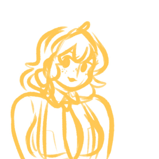
1. As always, start off with your sketch. It doesn’t have to be super detailed; as long as you got the basics of your drawing down you’re good. (Eg, I’ll add in the seams of the clothing and hair partitions later on).
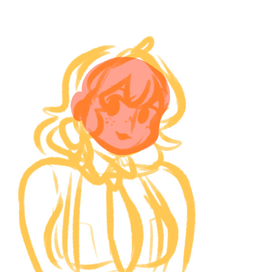
2. Set your sketch layer to Multiply. Create a new layer under the sketch layer. This’ll be your first lineless layer. I usually start with the face and work from there. And another thing I do (that I find helps) is just use random colors for each layer to get the shapes of the layers down, and then go back and properly color them later. This helps me see the shapes I’m working with and refine them if I need to (I usually go with various shades of red and pink).
Some tips about layering:
-It’s easier if you divide your hair into 2 layers— a front (where the bangs usually are) and a back layer. The back hair layer is usually under all the other layers.
-Separating the face layer from the other skin layers helps make shading easier as well.
-It might seem like a pain to separate your clothes into different layers (eg for the collars and sleeves and main body), but it’s a huge help when it comes to the final shading (I’ll admit I’m a little guilty of not separating them myself when I’m in a rush :”) ).
This is what your first layer will look like when you hide the sketch layer:
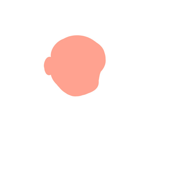
It’s a little messy, but that’s okay— you can refine it if you want, but don’t get too caught up in refining before you actually get your shapes down.
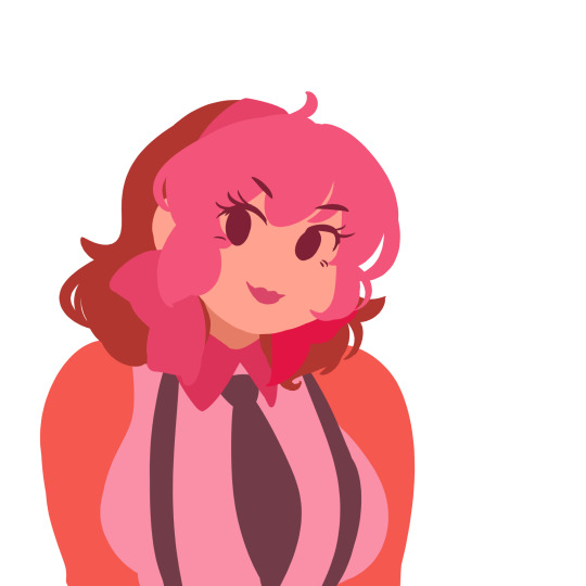
3. Fill in the rest of your lineless layers. The colors look kinda weird, but that’s just to show that each color is a different layer. Note how the hair, clothes and skin are split into different sections. There’s also breast pockets on her uniform, but those’ll be added in later on. Refine your shapes if you need to at this point.
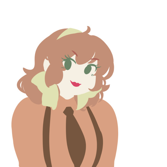
4. Now, go in and recolor everything to the colors you want them to be.
Now, it’s time for the fun part— shading!
So usually lineless art has a combination of gradients and hard shadows, yes? Do the hard shadows first. (At least, it’s what I do.)
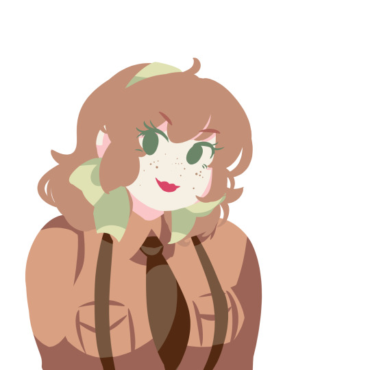
There’s some parts that aren’t shaded yet, they’ll be colored w mostly gradients. Also, you don’t need to create a new clipping layer to add the shadows— you can just do it on the same layer after locking the transparency.

9. Make a new clipping layer over each different layer, and add gradients as you see fit. It’s really up to each different person how they go about adding the gradients. For the eyes, I usually make it graduate from dark to light, and then add a light shine afterwards. I didn’t do the hair yet, bc I have a different technique for it.

10. For the hair, create a new clipping layer over the hair layers. Then, using a default pen at different opacities, draw hair strokes— just enough to not seem overly detailed.
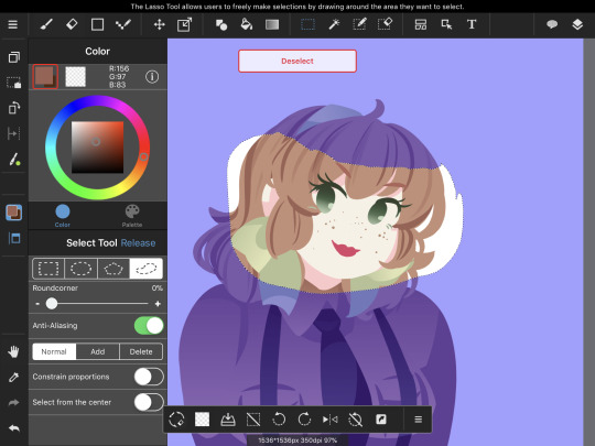
Using the lasso selection tool, create a selection where you want the hair shinies to go. Then, using the Gradient tool, make a gradient with the darkest part on top. After you do so, it should look like this:

Now, repeat the process for the back hair.
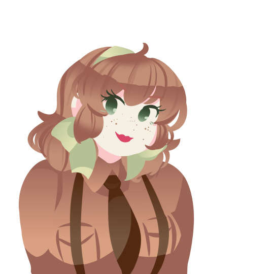
Almost done!

11. Now, create a new clipping over the shading layer. This’ll be your highlights layers. Set the blending mode to add, and add a couple spots of shine along the gradient you made.
And you’re done! ❤️
OPTIONAL STEP: Merge all the layers down, and create a new clipping layer over your merged drawing. Find a paper-like texture and overlay it over the drawing. The blending mode should be set to Overlay for best results.
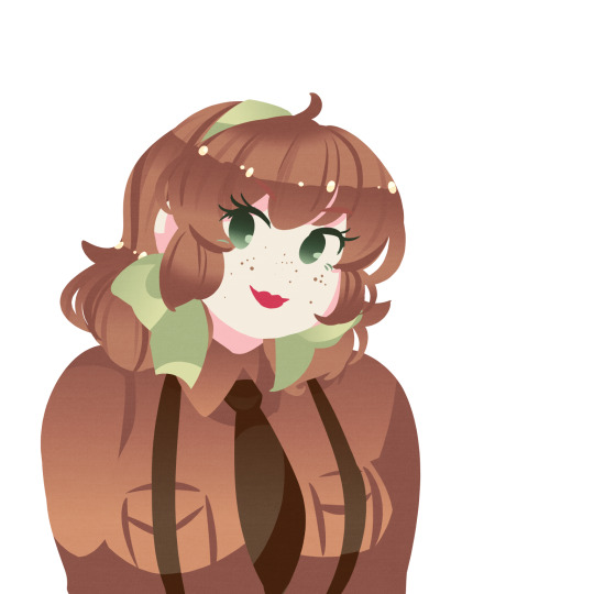
I really hope this helped you a little bit, anon! Lemme know if you have any questions!
208 notes
·
View notes