#Like it's very rare to see a shirt without a design or logo or image
Text
as someone who processes dozens, sometimes hundreds of school photos a DAY for a living, please keep in mind the graphic tee trend in Monster High G3 reflects the audience to whom the dolls are aimed towards.
#Like it's very rare to see a shirt without a design or logo or image#People like to brand their kids ig#Also I wore a lot of graphic tees as a teen but my experience is not universal 🤔#These days I purposely do not wear clothing with logos unless paid to do so#I've had to eat a lot of crow about mattel's design philosophy at this job#But I still don't always agree about dressing barbie in the same clothes as her audience#It makes more sense for MH cause they're younger characters#But Barbara is a grown woman and the ruffle-ication of her wardrobe is jarring#Hennyways
8 notes
·
View notes
Text
Murderbot Reference: Character Descriptions Part 2
Fandom reference! I tried to note every time a person/thing got a physical description, as well as additional info like how augments work, etc. Please note that there may be spoilers for all five books, but especially Network Effect.
This post contains:
ART’s Senses
ART’s Crew
Three
Rami, Tapan and Maro
Tlacey
Tlacey’s ComfortUnit
Targets (Network Effect)
Barish-Estranza: Eletra, Ras, and Supervisor Leonide
Augments (what they are/how they work)
Other Human Personal Tech (Non-Augments)
Other Bots/Machines: Agricultural Bot, Pathfinders, NE Target Drones, MB’s Drones
Other posts: Part 1; Part 3
ART’s Senses
· Besides cameras, sees ship through internal sensors, “which provided data (heat, density, angles of motions, etc.) that didn’t translate into images, at least not visual images useful to humans.”
· MB guesses that gaps in ART’s memory archives might look like “a giant interruption in the constant incoming reports from subsystems like life support, navigation, etc. It was tricky, because for ART these are not like discrete reports from connected systems, but more like the sensory input I would get from the pads on the tips of my fingers.”
· Does have cameras in many areas, cameras hidden enough that MB didn’t know they existed until ART turned them on and provided access via the feed in NE.
· Likes Amena and talks to her more gently than MB or other humans—it’s more careful of Amena’s feelings. Has talked about human adolescents in a positive way. ART is, on a regular basis, a teaching vessel.
ART’s Crew
· Iris: augmented human. Dark brown skin, wearing a decorative woven bracelet when rescued in NE and a light blue longsleeved T-shirt. Small, shorter and slimmer than Ratthi, but not much bigger than Amena. Dark hair is the curly kind that puffs out a lot, but in NE pulled back and tied up in a band. Hair is long enough that she lifted it up so MB could see her back/neck when checking for an implant. Longsleeved T-shirt and pants and soft shoes are the casual version of ART’s blue crew uniform. Some bruises and scrapes at rescue. Seth’s child.
· Seth: tall, very dark brown skin, “with less hair than most SecUnits,” a mostly-hairless head; earlier description from photograph (later context makes this likely to be Seth) says “no hair on the front half of his head.” Iris’s parent, she calls him “Dad.” Captain of Perihelion.
· Martyn is Iris’s other parent (called “Dad); Seth’s marital partner; earlier description from photograph (later context makes this likely to be Martyn posing next to Seth) says lighter skin than Seth, with short white hair; he/him
· Kaede is about the same size as Iris, but skin is lighter and her hair is yellow
· Matteo is small like Iris and Kaede, and has a lot of dark hair that at rescue had come loose from braids. They/Them.
· Turi is young like Amena. They/Them
· Karime uses she/her
· Tarik uses he/him
· On variation of crew uniform (made for MB): dark blue, pants and jacket of deflective fabric, good quality (better than Station Security), with lots of sealable pockets for weapons and drones. Stability fabric boots, probably tough enough to jam a hatchway. Looks like what human security would wear. ART’s crew logo on the jacket, which also has a collar that folds down.
Three
· SecUnit, with projectile weapon built into arm
· Armor flexes if it shifts its shoulders
Rami, Tapan, and Maro
· All wearing variations on work clothes, no uniform logos. Either Rami or Maro has an implant, but none are augmented. Part of a group marriage of 7 people, with 5 children of various sizes. MB thinks all are young—not far from adolescence.
· Rami: tercera, “which was a gender signifier used in the group of non-corporate political entities known as the Divarti Cluster,” te/ter. Purple hair, red eyebrows, light brown skin. Wearing a jacket.
· Tapan: female. Multicolored braids wrapped up around her head, blue jewel-toned feed interface clipped to ear, slightly darker skin than Rami. Wearing a flower-patterned t-shirt.
· Maro: female. Very dark skin, silver-colored little puffs of hair, “almost beautiful enough to be in the entertainment media.”
Tlacey
· Augmented human female
Tlacey’s ComfortUnit
· Physical configuration doesn’t match SecUnit standard.
· Lots of hair, silver with blue and purple on the ends, pulled back and braided like Tapan’s but in a much more complicated pattern.
· Bare arms show no metal, and no gun ports
Targets (Network Effect)
· When fully affected: look like tall, thin augmented humans. Dull gray skin. Narrow human features, dark brows standing out against smooth gray skin. Colorless lips.
· Not completely identical: one Target on ship is slightly taller and has broader shoulders than the other.
· Targets on ships: wearing formfitting protective suits and partial helmets that initially left a lot of their faces bare. One on the B-E explorer wore “more casual human clothing:” dark green-black pants and jacket, black shirt with a collar. Shoes had heavy treads, designed for rough planetary terrain. Hair looked more normal, with reddish brown tight curls cut close to the head.
· Targets and colonists: gray skin is a progressive condition, not natural or cosmetic effect, some still look like humans who were altered rather than aliens. Not all who still looked somewhat human were fighting on the same side. Most of fighting group wore “the kind of rough work clothing normal for colonies or mining, a cheaper, more battered version of ART’s environment suits with hoods but no breathing gear, or a mix of clean work clothes, plus a random collection of what looked like old uniforms and protective gear.”
Barish-Estranza, Eletra, Ras, and Supervisor Leonide
· B-E uniforms are red and brown with corporate logos
· Eletra and Ras both wear B-E uniforms that are disheveled and torn.
· Eletra has brown skin and dark hair that reaches at least to her shoulder blades.
· Supervisor Leonide has “mid brown” skin “that was common to a large percentage of humans,” with an artificially smooth, even tone that indicated cosmetic enhancement. Dark hair wrapped around the top of her head and she has small metallic and gemstones set in the rim of one exposed ear.
Augments
· According to MB, are “supposed to help humans do things they couldn’t do otherwise, like interface with the feed more completely or store memory archives.”
· Augments that aren’t feed interfaces are meant to correct physical injuries or illnesses.
· Augments are meant to be helpful. Implants are different (MB compares implants to governor modules, something the person has little to no control over)
· Normal augment would have filaments extending directly into the human nervous system. Some augmented humans may have dataports/plug-in interfaces in the back of their necks, since MB is able to pass off its dataport as one of these often.
· Normal augmented human (augmented with feed) has interface built into brain; non-augmented humans have removable interfaces (excluding implants, which seem to be regular interfaces just not removable without surgery).
· Augments and constructs work with “machine-readable code written into human DNA”
· Augmented humans can work more fully in the feed; MB thinks that the drugged-up GrayCris assassins wouldn’t be possible to control with a removable interface, so the controller must be augmented (and this proves correct).
Other Human Personal Tech
· Un-augmented humans can’t access the feed unless their interface is working and attached properly. Tapan’s in-ear interface was taken out while ART’s MedSystem worked, and she had to put it back in before she contacted her partners.
· “Normal external interfaces for humans were designed to look like all kinds of things, from carved natural wood to skin tones to jewels or stones or enamel art pieces to actual plain metal with a brand logo.”
· Human voices on the feed sound like their physical voices, and can show emotions. Humans (and augmented humans) usually subvocalize when talking on the feed.
· During killware attack in ES, Pin-Lee, Mensah and two crewmembers each has portable manual feed interfaces they used to shore up SecSystem; allowing them feed access without using their personal on-body interfaces.
· MB says in AC that killware and malware can’t do anything to humans or augmented humans; the killware attack in ES hurts augmented humans enough that one needs rescue breathing. This could be MB’s lack of knowledge, or it could be because the ES killware is rare, essentially a disembodied bot and an extremely uncommon/unheard of tactic.
Other Bots/Machines
· Agricultural bot: almost 10 meters (~32 feet) tall, covered with spikes. Lower body has 10 long spider limbs for moving around without crushing anything, upper part is a long curving “neck” with a long head also covered in spikes
· Pathfinders: like drone for space. Active scanners that can zip around a planet collecting environmental information and terrain imaging, plus looking for comm signals, possible energy sources, and hostiles. Can relay audio as ART uses it to threaten Targets. Very expensive.
· Drones used by NE Targets: model MB is unfamiliar with. Round and as big around as MB’s head, any holes for cameras or weapons hidden despite size. Made of stealth material (or pattern) that can’t be spotted by camera, but regular vision OK.
· Drones used in ASR, pulled from the hopper: “They were the small kind, barely a centimeter across; no weapons, just cameras.”
· Also in ASR, MB mentions that there also exist drones that aren’t much bigger than the hopper drones but include a small pulse weapon (but as far as availability through the company, you have to get an upper tier package)
· MB’s regular drones: small enough that it can have a flock (at least a couple dozen?) land on it and not impede movement in an EVAC suit. MB mentions technique where it can have drone accelerate a drone straight at a target’s face, and if hit an eye or an ear it goes straight to the brain, so probably fairly small. They are also easy to visually overlook when perched in a room recording people, or sneaking through a doorway. They’re also easy to store in MB’s many pockets.
122 notes
·
View notes
Photo
I’ve been meaning to update Mmeeie’s profile + reference art for a bit now, and after a good two weeks of work on it, I’ve finally done that.
The updates to her design is mainly just the different color palette, though her profile is changed a bit more. Most notably, I significantly fleshed out her backstory and added sections talking about the most important relationships she has. I also tweaked a couple other things like her personality and explained some of her powers more in-depth.
The profile itself is written under the cut, but before that a few notes to help clear up some things that may be confusing while reading it:
- I don’t know the names of the DC Earths, so I just tried to vaguely describe each universe she went to in her backstory. If it’s not clear, the universes she went in order are: the Hanna-Barbera Superfriends cartoon, the 2003 animated Teen Titans series, the Teen Titans Go! cartoon, and the Static Shock cartoon.
- Since Teen Titans Go! has no consistent timeline (or continuity in general really), the timeline part of her backstory is based on Static Shock (or how I’m interpreting its timeline at least). She first goes to the Static Shock universe in mid-Season 3 (between “Showtime” and “Romeo in the Mix” specifically), and then the second time is in early Season 4 during the episode “She-Back!”.
- I’m operating under the idea that these universes have parallel timelines of sorts, which is why the modern-day Teen Titans Go! universe exists at the same time as the early 2000s Static Shock universe and Mmeeie can so easily jump between them. (Since the Teen Titans Go! vs. Teen Titans crossover movie those had universes interacting with no timeline trouble I’m going to say that's kinda canon anyway.)
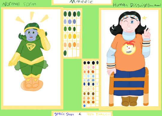
Name: Mmeeie (pronounced as the letters M-E)
Other Aliases: Emmy Maxwell (only used while in human disguise)
Species: Fifth-Dimensional Imp
Age: 15
Gender: Mmeeie doesn’t know nor does she care to find out. Will dismiss people if asked what her gender is.
Pronouns: She/Her; no pronouns (when back home in Zrfff)
Sexual Orientation: Attracted exclusively to girls
Birthday: December 1st (Sagittarius)
Home Location: Zrfff, Fifth Dimension
Alignment: Neutral, leaning towards Chaotic
Height: 2′9″ (normal), 4′9″ (human disguise)
Weight: Weightless
Physical Description: Short and fat. Dark green eyes and matching hair, her hair pulled into low-hanging pigtails, the ends perpetually curled upward. Grayish-blue skin color.
When in her human disguise, still short and fat. Blue eyes and black hair, her hair worn down and the ends still pointed upwards, but split into two sections on each side. Pinkish-white skin color
Clothing Description: A green full body suit with a high popped collar and gold-colored insignia with the letters ‘M’ and ‘E’ inside a pointed-down triangle on the chest. Gold-colored gloves reaching just above the elbow, gold-colored boots reaching just below the knee and curving down in a ‘V’ shape at the top, a gold-colored belt wore at the waist and curving down in a ‘V’ shape, and a gold-colored headband. A light orange flight disc with boot-shaped latches on top.
When in her human disguise*, an orange t-shirt with a "Burger Fool" logo on it and a light blue-and-gray stripped long sleeve undershirt. A calf-length dark blue denim skirt. Tan boots with pale yellow fluff at the top. A light blue headband with orange butterflies on it, and five jelly bracelets (two orange, two tan, and one black) on each arm. A light orange walker.
*Note that the clothing for her human disguise changes based on the universe she's in to try and blend in better. The clothing seen/described here is specifically for when she's in the "Static Shock" universe, since that's really the only time she uses this disguise at the moment. The walker stays the same, however.
Powers/Abilities:
Reality Warping: Like all Imps, Mmeeie has the ability to change reality to her own desires. She mainly uses this power to transform objects/create new objects, though she will sometimes use it to change the physical environment around her into something else.
However, her ability to create new environments is noticeably weaker than her ability to change objects. This is partially due to her inexperience in using her powers (as she simply creates new objects more often in her daily life than changing the physical landscape of things), and partially because wide-scale changes such as environmental ones requires a lot more focus from her, which she doesn’t like to give most of the time.
She also has difficulties disappearing objects once she’s created them, again due to still learning to fully use her powers. This is why she prefers to summon up objects that can easily be gotten rid of (money, food, etc.). To give the illusion that she can just as easily disappear them, however, she hides them away in a pocket dimension she has access to, since that’s where she keeps all of her things when she’s traveling around anyway.
Likewise, her objection creation is limited to only items without a consciousness, so if she wanted/had to create something that was alive, she couldn't summon up an animal, but could a plant. This is because only adult Imps are able to properly create consciousness for their items, which is also why Mmeeie isn't able to bring inanimate objects to life with her environment-warping abilities.
Mild Omniscience: Also like other Imps, Mmeeie is omniscient, though it’s mild. Her omnisciency level requires her to be both physically in a particular universe and near the people she wants to learn about to fully gain knowledge about them. For example, she could learn everything there is to know about a person, including everything they’ve ever done and why, within a minute or two just by looking at them, but she has to be in close proximity to them for it to work, and she can only do it to one person at a time.
This is only the case for learning about people, though; to fully learn about a universe’s history and past major events, she simply just has to be in the universe proper, not near where the actual events took place. However, she tends to focus on just events that particularly interest her or she’s asked about directly, as learning about events/history takes a lot more focus than learning about people, and like with her reality warping, she doesn’t like to give it most of the time.
Further, she can learn about current/active events without being in a universe physically. She has the ability to open “universe windows” to other universes and peak in on them. She can’t interact with the universe’s inhabitants through that window, and can only watch one event in that universe at a time, but she can see everything that’s going on without anyone else being aware of it. She can also open multiple windows at a time if she wants to, but the images get blurrier/less detailed if more than one is being used.
These limitations to her omnisciency are mainly due to her age - only adult Imps have the ability to gain full knowledge of a universe’s history and inhabitants instantaneously - though some of them, such as only being able to have one clear window at a time, is due to her still learning to fully use her powers.
Teleportation: Teleportation is Mmeeie’s method of traveling between universes/dimensions, though it can also be used on a smaller scale to get from place-to-place as well. Similarly, it is also her preferred method of movement when she cannot use her flight disc.
She is also able to take objects/others along with her when she’s teleporting, but only if she’s directly holding onto them. She can’t teleport objects/others by themselves, either, again due to her inexperience with her powers.
Weapons: Mmeeie can conjure up weapons, though she she very rarely uses them as she’s not a physical fighter. Since these weapons are mainly just for fun/show, they are cartoony looking, being black, magenta, cyan, and yellow in color. Her favorite is the giant mallet, though she has a saw blade and a laser gun as well.
Personality: Mmeeie’s main goal is to enjoy herself and live life exactly as she wants it to go. Due to being an Imp and having the powers that comes with it, she views herself as inherently better than most others. She puts her own thoughts and desires before everyone else, only taking others seriously and considering their feelings if she’s fond of them. For everyone else, she enjoys bothering and inconveniencing them just to bother and inconvenience them, ignoring all of the consequences and criticisms that doing so brings.
Despite her self-focused thought process, however, Mmeeie does legitimately enjoy having close relationships and hanging out with others, and was genuinely distraught to find out that her ego and constant ribbing of people weren’t endearing traits to those in other universes like they were on Zrfff. For those she’s fond of, or at least wants to gain some kind of acquaintanceship with, she does attempt to curve her personality to be more likable, but that generally results in her just being overbearing and inserting herself where she wasn't asked to be.
Like other Imps, Mmeeie does enjoy playing games and making deals. She takes deals very seriously, making sure the rules are followed as closely and getting very upset if someone breaks them. She’s also very particular about who can play her games - she makes sure civilians and other people who didn’t agree to play never get involved, feeling like it would be too dangerous for them to do so. Even with that concern, though, her games rarely get violent or even that physical, as she doesn’t find it fun to put people in serious danger and would much rather play a game that involves outwitting or annoying someone. If her games/actions do get physical, it is a cartoony style of violence, one that doesn't leave lasting damage to her or the person attacked (ex. being bonked over the head with an oversized hammer), and likewise serves more as a distraction than an actual attempt at fighting.
Likes:
- Seagulls
- Loud Music
- Layered Clothing
- Puppets
Dislikes:
- People named Richard (She just hates the name that much)
- Being compared to/called a “Mite”
- Authority figures
- Pizza
Fears:
- Animals with long necks [Giraffes, Geese, etc.]
- Very large animals [Giraffes, Elephants, etc.]
- Being mind controlled
Family: Ooccaaer (Father), Ttooniee (Father), Glldngllb (Grandmother)
Love Interest: Jayna (Teen Titans Go!)
Notable Relationships [more in-depth]:
Zrfff
Family: Mmeeie gets along very well with her family. They’ve always been very supportive of her, including when she decided to become the first one of the family to become an ‘adventurer’, and she’ll always defend their decisions when people in other universes question how they raised her.
However, there was a divide in how she was raised in a major way: her father Ttooniee and her grammy taught her to be very proud of her power and to ignore anyone trying to stop her living the way she wants to, while her father Ooccaaer taught her that, even though she is indeed more powerful than those in other universes, there does need to some level of order in the world and that never thinking about others will only lead to trouble.
This never caused any fights amongst her family, but it did cause confusion for Mmeeie when she was first out on her own and couldn’t rely on her family to make important decisions for her. She tries her best to blend the two viewpoints together, but that usually results in her coming off as a hypocrite to those around her.
Mr. Mxyzptlk: Like most Imps, Mmeeie idolizes Mr. Mxyzptlk. She grew up hearing stories of his amazing adventures and exploits, and since she dreamed of leaving Zrfff and exploring the multiverse some day, she wanted to be just like him. When an opportunity to study under him came she took it, taking everything he said to heart, even if it wasn’t very much.
Mr. Mxyzpltk, however, doesn’t think much about Mmeeie. He views her more as a means to the end than a true student, and only ever interacts with her when it is convenient for or required of him.
Teen Titans Go!
Robin: At first, Mmeeie and Robin were just each others’ rivals, trying to one-up each other in an on-going competition to see whose the best. They clashed heavily due to how similar their personalities are, with them both demanding everything be their way or the highway and both being willing to mess with other people to get that to happen. However, they quickly realized that because they're so similar, they could confide in each other in a way that they couldn’t with others/without a feeling of being judged, and began to do that as well.
They’re still not really friends, as Mmeeie is willing to pull out more dangerous game just for him and Robin enjoys it when she gets herself caught up in them, but at the end of the day they can still laugh it off and do appreciate the relationship they have.
Starfire: Starfire was Mmeeie’s first full-blown crush. The two of them got along really well at first, bonding over the fact that both of them were still learning the ropes about certain parts of Earth culture and that they both enjoyed making fun of Robin. However, Mmeeie eventually realized there was a major problem preventing a relationship between the two of them: Starfire wasn’t attracted to her in the slightest, and didn’t even seem to realize Mmeeie was flirting with her. Not wanting to lose her friendship with her, Mmeeie simply pretended the crush never happened (not that Starfire would have minded if she knew). Starfire is still her favorite person on that particular Titans team, though Starfire doesn’t view her as anything more than a causal friend.
Jayna: Mmeeie and Jayna hit it off right from the start: Mmeeie admired Jayna’s dedication to her family, as it reminded her of her own family life, and Jayna not only was glad there was someone capable of being assertive when she wasn’t in the mood, she actually appreciated Mmeeie’s direct and constant affections for her, as (naturally) she did enjoy being treated a separate person from her brother despite their closeness.
As they grew closer, Jayna became one of the few people Mmeeie trusted to be actually caring when she suggests Mmeeie try and improve herself, and not just be critiquing her “for no good reason”. Mmeeie does try to tone down how overbearing she is with Jayna to a more causal level to keep her more comfortable, and even starts to truly consider how Jayna feels when doing things around her (and not just in a “oh pretty girl” way). Jayna, likewise, indeed does actually care about Mmeeie, and does really think Mmeeie does mean well and just needs to learn how to control herself better.
Within a year of meeting one another they decided to try starting a romantic relationship together, and while they haven’t been on any major dates, they (especially Mmeeie) do actively refer to each other as “girlfriend” to other people.
Zan: Mmeeie didn’t think too much about Zan at first, viewing him just as “Jayna’s brother”. She ribbed him just like she did everyone else, and was pretty pleased that he seemed fine with it. However, as she spent more time around him, she realized that the only reason he didn’t complain like most others did was because he was used to being the butt of the joke. Since they had somewhat bonded by then (and also because she wanted to cover up the sudden guilt she was feeling for the first time), she decided to throw herself into defending him and truly trying to become his friend.
Zan, for his part, was overwhelmed by the sudden change in Mmeeie’s treatment of him but did appreicate it - especially since it meant she was treating him like his own person instead of just “Jayna’s brother”. He was receptive to it, and they ended up forming a relationship around trying to improve one another; Mmeeie trying to get him to become more assertive and Zan trying to get her to consider people’s feelings more often and not just when they directly impact her. (Neither of them have been partially effective so far.)
Static Shock
Static: Mmeeie decided that Static would become her rival without her even asking him about it first. In her mind, all she had to do to get him to agree was show off her amazing powers and constantly praise him, which she proudly did. Despite from the slight ego boost her praise gave him, Static was annoyed by her badgering and spent most of the time trying to ignore her, having to angrily trick her into leaving by the end of it. Mmeeie was in complete denial of this rejection, however, assuming it was all acting on the part of their “rivalry”.
When they met for a second time, Mmeeie’s view of Static was slightly more nuanced - but only because she was mad at him for how he was treating Shebang, as that shattered her view that he was a flawless hero. She actually felt a bit betrayed because of it, which Static was able to use to his advantage once he was able to properly confront her again, since she was too emotionally distraught to be as tricky as she usually was.
After Static realized all this was Mmeeie’s strange way of saying she liked spending time with him, he was slightly hesitant to send her back. He did think there might be potential for her to be a halfway decent person - that and having someone with reality-bending powers on his side would be very useful. He did end up still convincing her to leave, of course (as he didn’t want her to stick around that much), but made sure she knew she was welcome back at some point in the future. Mmeeie gladly accepted his offer to return.
Gear: Mmeeie and Gear hated each other at first, with most of the tension coming from Mmeeie’s side. Between her irrational hatred of people named Richard and her belief that Gear was inferior to Static, she took every chance she got to insult and belittle him. Much to her anger, however, Gear retaliated against this and treated her the same way.
Their relationship didn’t improve until outside forces intervened, convincing Mmeeie to consider Gear as a person (and not just a name to hate) and to start treating him with some basic decency. However, even with this change in Mmeeie’s behavior, the two of them still regularly bickered with and insulted one another; they just learned to tone it down when they had to work with one another. Their relationship just changed from pure hatred to reluctant and undesired acquaintanceship. Mmeeie prefers it that way, though, because it gives her an “acceptable” way to act out her instigative nature. (Gear, for his part, doesn’t like to think about their relationship at all, ever.)
Shebang: Mmeeie was attracted to Shebang the moment she met her, both literally and because she felt a connection to her due to their shared desire to make friends. She was incredibly perturbed by the fact that Static and Gear found her annoying, when clearly she was just trying to be nice and offer her friendship to them, which she didn’t even need to do because she was obviously better than the both of them anyway. Because of this self-projection, Mmeeie decided that she was going to be Shebang’s friend, following her around out-of-uniform and purposefully annoying anyone that was even slightly rude to her.
On the one hand, Shebang herself was annoyed at Mmeeie’s actions, finding her to be overbearing and trying too hard to be her friend. But on the other hand, she did appreicate that she seemed to be the only one who wasn't actively avoiding her and was at least attempting to understand her point of view. That, and because Mmeeie’s plan actually somewhat worked and got Static and Gear to quit complaining about her so much. Because of this, Shebang did, albeit hesitantly, vouch for Mmeeie in the end, and was the first one in that particular universe to try and talk her into being more considerate and to think through her actions. (Mmeeie was more receptive to Shebang’s requests because she was already fond of her, but it was still an uphill battle.) She still doesn’t consider Mmeeie that close of a friend, though.
Backstory:
There was nothing about Mmeeie’s childhood that inclined her towards becoming an adventuring Imp more than others her age; no one in her family had ever left Zrfff before - which they were perfectly content with - and she knew very little about the universes existing outside of the Fifth Dimension. In fact, due to one of her fathers, Ooccaaer, working as a court clerk for the Imp court system, she had knowledge about some the more illegal and morally questionable activities adventuring Imps got into that the general public didn’t know, so she even knew that not everything was what it seemed when it came to traveling to other universes.
However, none of that ended up mattering, as Mmeeie fell in love with the idea of becoming an adventuring Imp the moment she heard Mr. Mxyzlptk’s stories for the first time. She adored the theatrics of them, the cunning and wit he had, and most of all, the idea of having a personal rival to compete with, especially if it was someone as famous as he said Superman was. This desire for adventure grew each time Mr. Mxyzlptk returned to Zrfff, and she decided that she was going to leave to explore the Multiverse the first chance she got.
And, at the tender age of 13, she got it.
During one of Mr. Mxyzlptk’s trips back to Earth, he decided to start an “internship program” to help give back to the community that loved him so much; he would select a lucky few young Imps to teach the ways of multiversal travel and relations, so he could make sure the next generation got to experience the joys of adventuring. In truth, it was just a stunt to further deepen the general public’s adoration of him, as he knew perfectly well that the only reason the court never punished him too severely was because they feared a full-on riot. But it was still a successful stunt.
Mmeeie was one of the many young Imps who auditioned to be part of his program. Her plan to win Mr. Mxyzlptk over was to focus on explaining how much he inspired her and how much she would “appreciate the opportunity” to work with him and be the first in her family to travel outside of Zrfff (she made sure to later thank her family for that line in particular). She didn’t think that would be particularly impressed by her powers, anyway, since literally every Imp could do the same things, and she wanted to make herself stand out as much as possible. That and a little praise never hurt, either.
Much to her joy, her plan worked, and Mmeeie was chosen to “study” under Mr. Mxyzlptk. He told her it was because he was impressed with how close she was to her family - closeness is a key component in having a good rivalry with others, he explained - and how supportive they were of her. Unbeknownst to her, however, the real reason she was chosen was because her father was a court clerk, and Mr. Mxyzlptk wanted to leverage that to get some influence into the court system, even if he had to start at the lowest level. If Mmeeie’s explanation of her father was correct, then he certainly wouldn’t risk ruining his child’s happiness by not listening to him, right?
The training Mr. Mxyzlptk gave his chosen students was just a crash course into the powers they had but didn’t really use on Zrfff, such as how to tap into their omnisciency powers and how to tune their teleportation to the proper frequencies so they could get into any universe they want. That was it. No etiquette on how to act in other universes, no suggestions on what to do when they get there, not even a list of the universes that existed. Just “these are your powers so go use them however you want”. Mr. Mxyzlptk promised it was more fun that way, and reminded his students that they were the powerful ones, so it should be those in other universes listening to them and not the other way around anyway.
Mmeeie was a little disappointed with the training she received, as she was hoping to get more information from Mr. Mxyzlptk on how to get a proper rival, but she tried not to dwell on it too much. Especially since her family actually seemed pretty pleased with what she had learned; her father Ttooniee and her grammy were both glad that his lessons focused on maintaining personal pride even in under pressure from other universes, and her father Ooccaaer was relieved to learn that he was sending her off on her own instead of roping her into one of his schemes. With her family believing that she was indeed properly prepared to go adventuring, and with them reminding her multiple times that she could return home whenever she wanted to, Mmeeie went off to explore the universes outside of Zrfff.
Her initial plan was just to follow in Mr. Mxyzlptk’s footsteps until she figured out what to do. The first universe she decided to visit was one that he often told stories about, one in which the Superfriends was the premier hero team. Adopting, with some slight alterations, the uniform the Wonder Twins wore (her favorite amongst the team members she saw there) so she would be taken more seriously, Mmeeie stormed into the universe demanding that Robin be her rival. Since she didn’t know what made a proper rival, she decided that someone she wanted to personally fight would do, and besides, Robin was as well-known as Superman, right?
This plan did not go well for her. Due to the Superfriends already knowing how to deal with Imps because of their past interactions with Mr. Mxyzlptk - and the fact most of them were grown adults and Mmeeie was barely a teenager, which they made sure to reminder her of - they quite easily outsmarted her and convinced her to leave. Humiliated, Mmeeie vowed to avoid all superhero teams with adult members when searching for her next universe.
Staying with the idea that becoming rivals with a Robin was the best way to go, Mmeeie looked around until she found a universe where not only was Robin not working with his Batman at all, but he and his team of fellow teenage heroes seemed to be the only team around, so she wouldn’t have to worry about any kind of adults ruining her plan. So she stormed into that universe, again demanding that Robin be her rival.
This plan also did not go well for her. Much to her shock, The Teen Titans of that universe informed her that they had dealt with an Imp before as well, though that shock quickly turned into anger when she learned it was a Mite they interacted with. Offended at the comparison, she spent more time screaming at Robin than trying to convince him to be her rival, and the Titans were able to use that frustration against her to get her to leave on her own.
Fortunately for Mmeeie, however, the third time was a charm. It didn’t take long for her to find the next universe to go to; she just hoped over to one that was like the previous one she tried but with everyone being very small in stature. When she declared that the Robin of that universe was going to be her rival, that Robin jumped on the opportunity, even reassuring her that he was totally just as famous as Superman. Not only that, that Robin was even more punchable than the previous two, so Mmeeie felt that this universe was were she needed to be.
She spent the next year there, becoming very fond of it in the process. Mmeeie’s rivalry with Robin remained steady, with her often tagging along on the Titans’ adventures just to bother him, his teammates encouraging it most of the time. Through these adventures she developed a mild friendship with the rest of the Titans, most notably Starfire, who she got a major crush on (though it was unrequited and didn’t last long).
In that time, Mmeeie also met the Wonder Twins of that universe. She was immediately smitten by Jayna, and Jayna actually liked her back. (Mmeeie was more indifferent to Zan, though.) She began to spend her time split between the Titans and hanging out with Jayna (and Zan), with the latter being a good influence on her; because she was spending more time with the Wonder Twins as opposed to the more selfish and impulsive Titans (or anyone from back home on Zrfff), Mmeeie began to realize new things about herself, like how she still felt proud of herself even when she did consider Jayna’s feelings along with her own, and how she was starting to feel guilt for how mean she was being to Zan without him ever doing anything to her. These self-realizations didn’t impact her relationship with anyone outside of Jayna and Zan - in fact, it only made her act angrier towards Robin, because she had to get her inconsiderate feelings out somehow (and their whole rivalry was built on that fact anyway) - but it was something Mmeeie kept in the back of her mind the more she stayed in that universe.
Then one day Mr. Mxyzlptk arrived to “check up” on her. In truth, he didn’t actually care how she was doing, but had to keep up the image of mentoring her and the other young Imps. He stayed long enough to take brief, mental notes on what she had been doing to report back to her parents, and then offered a couple of general pieces of advice before leaving, pointing out that staying in just one universe doesn’t really count as ‘traveling’, and reminding her that Imps don’t let those from other universes tell them what to do. Oh, and to call her parents more often.
Though he barely told her anything, Mmeeie took everything she did get to heart and decided to get moving again. However, remembering the embarrassment she felt traveling to different universes beforehand, and not wanting to completely lose the relationships she had already built in this universe, she decided to take a different approach. She would pick a universe she knew ahead of time that she would want to stay in, and divide her time between it and her current universe, making sure to go between them enough to still qualify as ‘traveling’. She didn’t have other ideas on how to judge this universe choice besides her previous plan of finding a rival, however, so that had to be modified as well.
Trying to keep in mind the whole “considering others’ feelings” thing while not going against her Imp heritage, Mmeeie decided to find a universe with two rivals for her - one that she could compete with in an angry, serious manner like she and Robin did, and one that could compete with in a more causal, relaxed one. This meant more ‘research’ into the universes themselves had to be done before she left, but that’s what universe windows were for.
Her plan to only focus on universes with teenage heroes being the premier heroes didn’t change, but her desire to have a famous rival did; She promised Robin he would be her only rival using that codename, so she strayed away from universes that had other Titans teams and instead focused on ones with heroes she hadn’t necessarily heard of before.
During this research she found a universe with a high percentage of superpowered youths, yet Static was the only teenage hero she could find at that moment. Since he just so happened to be working with the Justice League at during that time, she was going to just skip over his universe, until she saw him go against the League’s commands in order to save his friend. That got her full attention. In fact, it got her full adoration.
It didn’t take long for Mmeeie to decide that Static would be a perfect person to have a causal rivalry with, and fortunately for her, it wasn’t much longer before she found someone to have a more serious rivalry with, either. Watching Static’s adventures a bit more, she learned that the friend he had to save also had powers himself, and his name just happened to be Richard. It was like she was destined to be in that universe.
Wanting to avoid the mistakes she made in previous universes, instead of storming into this universe demanding Static be her rival, she stormed in and started praising him hoping that it would get him to listen to her. Static still ended up ignoring her, however, since she happened to arrive while he was in the middle of a battle. Upset that he wasn’t paying listening to her, she tried multiple things to get his attention, up to and including kidnapping Gear, which gave her a chance to go ahead and start up her rivalry with Gear. In her opinion, it was very successful; The two of them spent the time waiting for Static to arrive either yelling at one another or trying to beat each other at trivia games, which is exactly what she wanted.
Once Static finally found where she was, Mmeeie tried again to praise her way into getting him to listen to her, but that kept getting interrupted by her needing to snap at Gear everything time he said anything. She was able to get one thing through during their muddled conversation though: she would leave if Static played along. So, wanting to get rid of her, he made a deal with her that he would become her rival if she left for a while to give him time to “think about how to do it properly”. Mmeeie whole-heartedly agreed, leaving thinking that she successfully got herself two more rivals.
She spent “for a while” back with the Wonder Twins and the Titans, continuing to develop the relationships she had in their universe, most notably starting a romantic relationship with Jayna. (She also started calling her parents more regularly during this time.)
When it was time for Mmeeie to return to Static’s universe, she did not get the greeting she was expecting. In fact, she was barely noticed at all, as Static and Gear were busy dealing with the return of a different person she didn’t know, Shebang. Watching over the situation for a little bit, she decided that Shebang was actually the one in the right, and became greatly upset over how Static was treating her. She flipped her script, starting to praise and focus all of her attention on Shebang instead, and berating Static when he questioned the change in attitude.
This just created a new host of problems between her and Static - not to mention that she wasn’t having a great start with Shebang either considering how overbearing she was being - and unlike before when Mmeeie was confident enough to ignore these issues, she was now too frustrated to do so. So when that visit ended like the last one did in an angry debate, she ended up admitting more than she intended to about why she wanted to connect with a rival so badly. This admission did get the situation to calm down a bit, though it left Mmeeie embarrassed.
It also put Static in a predicament. On the one hand, he could tell that she honestly did want to be his and Shebang’s friends, and thought that she could be a decent ally in battle if she just focused her powers. But on the other hand, he could also tell that it would be a long while before she got the point of dealing with others in a more appropriate way - espeically if her treatment of Gear was any indication - and he didn’t want to spend all his time teaching her how to be a better person.
So Static made another, more legitimate, deal with her. Mmeeie would be allowed to come back and hang out with him and everyone else, but only when they specifically asked for her. (Since she could set up “notifications” of sorts on her universe windows that alerted her whenever something she was looking for happened, it wouldn’t be an issue for her to find out when that was.) That way, they could still maintain a relationship, but without being overwhelmed by her. Of course, Mmeeie agreed to that.
She now spends her time between staying with the Wonder Twins and Titans in their universe and working on her relationships with Static and his friends in their universe. She does tend to stay in the former universe more often, since that’s not only where her girlfriend lives, but where she doesn’t have to focus so much on self-reflection and can just enjoy herself more freely, but she still appreciates the time she gets to spend in the latter when Static calls upon her (especially since these requests slowly start to increase in frequency the more she gets to know everyone there).
Other Important Notes:
- Mmeeie can levitate and fly. However, while she can levitate without issue, her flight is very slow and unbalanced, usually leading to her hurting herself, or at the least getting incredibly frustrated. She uses a flight disc to help her get around, with latches to place her feet inside so she can’t get knocked off of it. When in her human disguise, the flight disc becomes a walker.
- Mmeeie's parents and grandmother are apart of the younger generation of Imps who embraced the use of vowels in naming, hence Mmeeie's and her fathers’ names mainly consisting of vowels, but her grandmother’s not having any at all.
- The act of spelling/saying her name backwards will not banish Mmeeie back to Zrfff.
Trivia:
- Mmeeie speaks in an unnaturally high, chipmunk-like voice. When in her human disguise, her voice is more natural-sounding, but is still high-pitched.
- Mmeeie is squeamish around blood and other serious (i.e. non-cartoony) injuries.
- Mmeeie picked up juggling as a nervous habit and is actually quite good at it.
- Mmeeie gets inebriated when drinking apple juice, but not drinks with actual alcohol in them.
#mmeeie#DC oc#mod's art#i'm actually super proud of the art for the ref though idk what about it i like so much
1 note
·
View note
Text
Serres Malfeasance continued
citizens belt it out only at trivial encounters, sporting events in the past and today at media or financial gatherings. Like victory, the terrain changes hands with each match and every half-time. It is paid in rent.
THE RED THREAD:
COMMERCIAL USES AND ABUSES
And now the second softening. Which event made the twentieth century into a key moment in the history of our species, and even in the process of hominization? It was not the wars or the violence that bloodied the world and monotonously repeated and even worsened those ordinary abominations of the nightmare we call history, but the progressive disappearance of agriculture in those morbidly suicidal countries. The main hominine activity since the Neolithic era was daily cultivation of a plot of land where the pagus carved the hard and fixed place designating property. Around 1900, more than half of our fellow citizens were involved in this activity, or at least half of the working population, while today it concerns only 2 percent of them.
THE OTHER END TO PROPERTY
Those who celebrate and repeatedly sing of those blood-soaked furrows have forgotten, probably forever, about the long line of yokes and ploughshares of earlier labour. As a result, the aforementioned pagus no longer
refers to property. And so the Western countries erased the peasant landscape from the surface of their lands. Henceforth, flattened by the bulldozer over hundreds of connected acres, the soil of France shows only rare fragments of this archaic landscape. No more peasants, no more country.
Henceforth the property reference goes from hard— arable land, the tomb, corpses, and pagan gods—to soft, a simple signature on paper, from pagus to page; the ancient word is repeated as it goes from hard to soft.
FRANCHISES
However, we cannot consider franchises, so common today, as a recent discovery or a brilliant invention due to new markets. When the big corporations get rid of their hard properties, complex machinery, invincible walls, heavy voluminous means of production; when they even desert their premises and retain only their logo, the name, flag, colors, sign, and advertisement, they just perpetuate the movement of deterritorialization begun a few years ago in the peasantry and even earlier, at least two millennia ago, by religion. Evidence of this movement remains in our Roman languages, with the semantic shift I have just mentioned between pagus, the patch tilled by slow oxen and the metal ploughshare, and the page, with writing mimicking furrows. Shall I sign these pages with my soft name?
Unfolding historically, the movement will go from this "natural" hard of bodies to the "cultural" soft of signs. Appropriation especially will tend to occur less through discharges than with signatures on pages, or with images and words, proclaimed, posted, or written; less by blood or urine than by acronym.
However, as we shall see and hear, signs will quickly become just as dirty and polluting as the discharges and will perpetuate the ancient gestures of appropriation with their hard softness.
RE-APPROPRIATION OF SOLD OBJECTS
Let me show how this works by returning for a moment to the mark. When I was young, at the start of the new school year my mother would mark my clothing by sewing my initials, MS, with a red thread on my pyjama collar, on the front of my shirts, on the back of my socks, and the waistband of my underpants. As a boarder at the lycee, this allowed me to recognise my clean clothes delivered by the school laundry. The cleansing appropriated the dirty linen, which, cleansed, became properly our own. I recognised my underwear by the fact that my mother had somehow dirtied them, less by hard blood, both pure and impure, mine or my mother's—we were secretly losing religion, even ancient religion!:—than by a thread, soft this time. Red (the colour mimicked the blood), and thin (it had merely become a sign of the latter). The horror of boarding school was well worth shedding this blood. Even though soft, this new dirt resisted cleaning, just like Macbeth's hands and Bluebeard's key.
And now, companies or manufacturers mark with their stain, imprint, or signature what they sell: food, clothing, automobiles. By a clever strategy, which is inconspicuous because visible to all, they share their possessions with the buyers; what is more, they keep what they sell. From far away, my car does not announce my name (I mean that of the Jean-Jacques-like simpleton who thought the purchase was his) but the brand of the manufacturer. To be sure, we pay the manufacturers, but somehow they keep what they relinquish. We just have a lease. In so doing, they rob us, which enables us to finally understand Proudhon's famous words: Property is theft Even better, they are so good at convincing buyers of the real or alleged excellence of their products that they instil in the public the desire to acquire them. And so the victims stand in line to multiply the advertising that targets them. Still better, not only does such-and-such brand keep my automobile by clearly showing its name and logo in the front and in the back, but the state too demands a registration on which it also affixes its stamp. The objects we buy remain dirty, hence appropriated by those who sell them and by the government. Twice victimised, we become tenants of two ogres, in two soft ways. We no longer buy, we lease! Even better, we advertise for those who rob us; we laud them!
I respect the practice of piercing. I consider it a reappropriation of one's self, one's body or skin, by a personal mark or emblem, after the dreary weariness of wearing other people's advertisement on one's trousers.
DATA
Let us stay with soft signs. Everything that marks me: my name, my birth date, my purchases, my various addresses and those of the places where I like to shop, the list of my calls and food preferences, my telephone and fax numbers, my social security and passport numbers, the numbers of my bank account and my expenses, the figures of my taxable income, the series of illnesses and the medicine I swallowed; I use the first person to let the reader know that all this is properly my own, even intimately mine, as for instance my body and health. Back to blood! In technical language this is usually called my data. To whom have I given them?
A strange term. Traditional philosophy uses the same word for what I feel and see in the world: perceptual data, they call it. Do things offer me for free their profile, their horizon, their forms, colours, sounds, and caresses? As far as I know, as the predators at the top of the food chain, we kill and devour animals and plants without asking their consent. They give us their blood, their flesh, bones, and skin. By what unwritten right do we believe that animals, plants, and the world belong to us, in short that those feeling and living beings were and remain ours? Do we rob the world just as the manufacturer and the state confiscate my car? Bringing violence and death, we become their masters and possessors. We live and eat like the world's parasites.
But on reflection, it occurs to me that my data, name, addresses, and the numbers listed above are soft compared with the hard data of the world, and so very personal. They are distributed and inscribed in different cards, with or without chip, often called loyalty cards, the content of which often belongs much less to me than to several private or public institutions. At least they share with me. To whom do the so-called data banks belong?
Will we as individuals, clients, or citizens allow the state, banks, hospitals, and department stores to appropriate indefinitely our own data, especially since they constitute today an authentic source of wealth? This is a rather new social, cultural, political, philosophical, moral, and legal problem, solutions to which risk transforming our individual and collective horizon. The result might be the pooling of sociopolitical divisions and the arrival of a fifth power, that of data, independent of the four others, the legislative, the executive, the law, and the media. No one can guess whether it will alienate or guarantee other freedoms. Right now, our data do not properly belong to us, I mean completely. Again, we enjoy them only as tenants.
SPERM:SEXUAL ABUSE
After urine, blood, and sign, now sperm. This is another appropriation, another tenancy. Let us revisit two places described indulgently before. First, the uterus. Plato mentions it in the Timaeus when he describes the space he calls (khora), which is sometimes eulogised in our cultures as paradise lost. The matter of this uterine space, according to Plato, acts as a support for imprints or wax tablets to carry marks of traces; today we would call it a base. But which or whose marks, which or whose imprints are we talking about? Those of the owner, a tenant, a passing visitor? And what about this marking, this impression, which is usually called pregnancy or impregnation in the natural sciences? Who holds the ploughshare of the cart or the stylus of those traces?
RETURN TO THE REAL PLACE:
THE THIRD END OF PROPERTY
Now the vulva and vagina. Since immemorial times, the male seeks the ownership of a space where, like the above-mentioned animals, he deposits a product that is not very different from urine, at least in terms of its origin. By ejaculating sperm, he thinks he is appropriating the place where his desire is acted out. There is one evidence of this animal remnant, of this ideology, practice, or myth. It is the ancient theory of impregnation cited above, the telegony, a strange story where a woman, after having had a first child from a certain lover, will for the rest of her life have daughters and sons showing the characteristics of that first child, even when later real fathers do not have those characteristics.
One of Emile Zola's first novels, Madeleine Ferat, well before the Rougon-Macquart series, tells the story of the morbid and fatal jealousy of a husband who sees in his children only the traits of his wife's first lover. This telegony could be formulated as follows: "The first who, by ejaculating on a vulva or in a vagina, says 'This organ is mine' and finds a woman simple and naive enough to believe him becomes its permanent owner." This is the sexual version of Jean-Jacques Rousseau, revised and reissued in L'Amour (a great book in other respects) by Jules Michelet, who cites le Traite philosophique et physiologique de I'heredite naturelle, written by a certain doctor Lucas, the unquestioned authority in these matters at the time. Michelet evokes "the general law among superior animals that auctions off the female to her first love."11 Michelet adds: "The possession by the husband—the first occupier—becomes indelible, while the lover would be the one who is actually betrayed," In a daring article in La Tribune, relying on letters by Marion, laureate of the Institut, Zola defends his book by giving it a moral thrust, saying that scientific physiology is the foundation for lifelong marriage bonds. It should be noted that the belief in telegony also justified the real or imaginary practices of the droit de cuissage; many women remained convinced that if as virgins they slept on the eve of their wedding with a prince, all the children with their husband would be born with the mark of "blue blood" and high lineage. I still remember from my peasant childhood how one of my neighbors could not sell his pups even though they were the offspring of a so-called pure-bred dog, because the village remembered she had first been laid by a mongrel. Everyone said she was marked. Again the mark! At the very end of the nineteenth century, Ibsen and Strindberg still repeat this thesis, which could look like a western and "softened" variant of excision: sperm rather than blood, a flow rather than a wound, a crime and a scandal.
Today genetics deals a fatal blow to these phantasms, the morbid consequences of which are described by Zola. The ideology allowed men to consider themselves the owners of their wives, provided they were the first occupiers of the "place." Did they forget that as children of two sexes, we had already dwelled there?
In a text that I am ashamed to see classified as philosophy, Emmanuel Kant gives this infamy a sort of conceptual dignity by saying that in marriage the woman is the object and the male the subject. She is passive, he is active; she is the hotel and hostess, he is the guest; she is the earth, he is the owner. Crouching down, the squatter of Konigsberg appropriates the space and the objective by spraying it. Dirty beast, bad beast!
A FEW NEW TENANTS
Sometimes I try to assess the volume of hatred that women, treated in this manner for millennia in every culture and everywhere on earth, must eliminate in a few generations! Women's liberation simply sounds like dis-appropriation, decolonisation of those spaces. Let us finally forget the etymology inferred by those humiliating practices. What is more difficult than imagined, women must re-appropriate the organs of their own bodies, while the male should finally be content with the eminently modern role of tenant.
And now, the man will say to his lover, "You are my home, but I am only a co-habitant" (col-locare, I cohabit with you in the same container, we lay down in a
common tenancy, in justly shared spaces). So much for sexuality; now let us talk about genitality. Biologists tell us today that the male sex indeed acts like the parasite of the female by having her carry the burden of the reproduction of his genes. Long live experiments in medically assisted procreation or artificial insemination! In passing, here is a friendly suggestion; wash before making love and belonging to another; but she will not really love you until she loves your own smell. Lavabo inter manus innocentes meas: I wash myself before offering myself to another.
THE RED IRON AND THE GOLDEN RING
Spouses separate and divorce more often if they believe they have been united forever. They thought they owned each other, even though marriage today has become a temporary leasing contract. Ownership in marriage is the equivalent of slavery. Here we have the mark again: the ox and the slave are marked with red iron, the automobile by the Ford logo, and the spouse by the golden ring.
Divorce legislation transforms the ancient property right of the husband over the wife, and the converse, into simple joint tenancy. Similarly, adoption defined at the beginning of the Christian era as by—and in— an integrally adoptive Holy Family has become a tenancy. Father and mother can no longer claim to be the
owners of their children, even when they are marked by their resemblance or more so by their genes.
ADULTERY Why was love born so recently, according to Denis de Rougemont, from adultery in particular? Because it was liberation from appropriation. Marriage sanctioned property; adulterous love brings freedom from it. If as a result of this form of property fidelity is considered a virtue, then women should boldly practice adultery, which should accordingly be considered virtuous liberation from those chains. The ancient conception of property was the equivalent of servitude.
If obedience considered as a virtue results in another property, you children should boldly disobey and stop thinking you are slaves of your parents' neuroses. Did we really free ourselves from our fathers' ancient right of life and death over us? Did they not wage war to enjoy the spectacle of the children of their rivals killing their own children? To enjoy burying them in their properties, under the triumphal arch of their cities? Am I wrong? No, those old men do not pray on the tomb of their ancestors, but on that of their sacrificed sons.
This fourth end to property—sexual, familial, reproductive, human, and pedagogic—will occur, I dare say, in a fifth, giant contemporary global catastrophe.
RETURNING TO THE ORDER OF THINGS
As a preliminary, let me briefly summarise my comments in passing: bodily discharges, that is, urine, manure, or corpses as well as sperm, were used to appropriate places. Animal ethology, anthropology, the history of religions, sexology, the old private right, all confirm this analysis and enable us to understand several forgotten foundations of property rights. Let me remind you that the word pollution, with its religious and medical origin, first meant desecration of places of worship by some excrement, and later the soiling of sheets by ejaculation, usually from masturbation. Although totally forgotten, the evolution of this word will inform the rest of my book.
Let me briefly designate the pattern. Coming from the male body, urine or sperm outlines and founds individual and private belonging on an area thus enclosed, or on one or more consenting and submissive females. The corpses of the ancestors found the area of the pagus or the fields of the farm. Property then passes from a person—or animal—to the family, the tribe. The spilled blood of the victims traces the already public limits of a temple that, so delineated, becomes sacred or taboo. We are dealing here with what characterizes both the god and the city. Henceforth, monuments to the dead will celebrate the shame of the massacre of innocent children by unspeakably cruel fathers, which I call the murder of the sons. They will found the property, now definitely public and collective, of a city, and on a larger scale the nation. The increasing volume of trash or excretions—urine, sperm, blood, corpses . . . —that still are bodily or physiological excretions, marks the extension of appropriated space—nest, farm, city, country—and also the increase in the number of subjects of appropriation—individual, family, nation.
For the rhythm of this increase to stop and then suddenly to change into a vertical spurt engulfing the planet and humanity, it had to go from cemeteries or bodily excretions, subjective or human, to more objective trash: sewage farms, public dumps ... in big cities, industrial waste that is less biodegradable, or world-objects in the world. We have now arrived.
11. Michelet, Amour (Paris: Hachette, 1858), pp. 399-404; emphasis by Michel Serres.
1 note
·
View note
Text
Blurbs or Covers?

It's a serious question, isn't it? I mean the cover is the first impression a book makes on the reader. Authors tend to spend a good chunk of change on cover design. It should be reflective of the both the story contained within the pages and the genre it's supposed to belong to, right? Maybe. I've read a lot of fantastic hardbound books from libraries whose covers were very plain. It was the book description that lured me in far faster than the cover. So I ask, is the cover more important than the blurb?
As a self-published author who is pure indie, I say no way. Not a chance. (I write, publish, and market my books. I don't outsource very much of anything. If someone else is promoting my stuff, you can bet I wrote the ad.)
I have explained my particular style of branding in a previous blog I wrote about the parts of a book (e-book and paperback). If you have questions ask, and I will be more than happy to explain my book covers. I never thought that they were more important than the book blurb though, and the reason why is both important to the reader and to me as the publisher and marketer of the book.
Simply put, the book description or blurb is the true selling point of a book. I don't know anyone who buys anything just based on the packaging. It's the contents we're most concerned with. (With groceries: Where was it grown, caught, raised, how was it treated, free range, wild, whole grain, organic, nothing added/taken away etc...). For example, the dented cans at the grocery store don't sell unless they're discounted heavily. It's not that we care that the can was dented, rather it's that we worry that the dent has somehow caused the contents inside to be damaged.
Sure the labeling needs to be consistent so that customers can easily identify their favorite products. This is why major brands rarely attempt to reinvent their old familiar logos. Even at a reduced rate, we'll still pay more for an out of date brand name or a used version than we'll pay for a brand new top of the line generic version. Marshall's and Ross Dress for Less are well aware of this fact and sell last years Nike and Calvin Kline at a reduced rate, but it still costs more than going to Rainbows and buying their store brand t-shirt.
In the world of literature, e-books don't get dented. The only way you get a discount with them is if the author or publisher runs a sale or the author feels that the market is oversaturated and reduced prices will mean more opportunities. A damaged cover at the bookstore on a paperback will get you the manager special, but you won't buy the book if it didn't already appeal to you. You won't buy Nike looking for a ballgown. That means that the contents must be something you feel you want.
Example Blurb
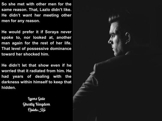
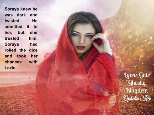
"Lazlo Greyson, a millionaire CEO and descendent from a line of kings, is lonely. He's finished with gold digging socialites and seedy one-night stands. He needs something a bit more permanent.
Peter Elliot might just be able to help him find what he needs, but the man is bad news and Lazlo knows it. When Elliot introduces him to Soraya Heffernon, a beautiful, trained orphan girl, Lazlo is sold.
As Lazlo feared, Elliot had a hidden agenda. The woman he fell in love with isn’t what he thought she was. Things take a serious turn for the worse and his whole life is turned upside down when he lands at Draoithe in need of help from the tiger queen to save his life. Meet the Ghost King of Lyons Gate, a newly crafted outpost kingdom in this spinoff story from the Draoithe saga."
The Reader's Perspective
The blurb can't just hang out by itself. It comes with the packaging. The book jacket is like a candy wrapper. The cover is the image on the front, the brand and item logo. The Book description is like the information on the back of the candy wrapper and what is found on the back cover or inside the flaps. Just like the candy wrapper has a list of ingredients with some ingredients always listed vaguely as spices, a book description always hints at the story without giving away the ending.
Just like the wrapper has the nutrition label on it, the Book description includes information about the author, the genre, and the story that is background information helping the reader decide on a good fit for their mood. (Chocolate versus peanut butter versus cinnamon versus caramel, etc... or Sci-fi versus fantasy versus romance versus mystery, etc...)
Book descriptions are better than candy wrappers though because they get to add details that might matter to the reader that they might otherwise miss, like the idea that there are other books by the author (series numbers or noting that the book is part of a saga). Extra information about the magic, tech or world building that might be just what the reader was looking for or so intriguing that they now simply must know more about whatever might be in the pages of the book.

The Marketing Perspective
This is the reason why the blurb is still more important than the cover from the self-published author perspective. A well-developed book description aids search engine optimization. If the book is published on KDP, Kindle tells the author that the keywords he/she chooses should be words not already included in the title or obvious to the category (genre). If your book is entitled Bear Mate and is published as a Paranormal Romance, then you should not need to use those four words in your key words list. "Search keywords help readers find your book when they browse the Amazon site. You can enter keywords or short phrases that describe your book and are relevant to its content. The best keywords are those that do not repeat words in the title, category, or description, as these are already used to help readers find your book. Some types of keywords are prohibited and may result in content being removed from sale."
The book description blank on Amazon is 4,000 characters. So my blurb gets added with other things my reader might need to help them choose my book (the nutrition facts and ingredients list). This way I offer as much opportunity as I can to increase organic traffic for not just one of my books but all of my books if a reader pauses to browse even one. So this is an example of what gets put in my book description space:
Lazlo Greyson, a millionaire CEO and descendent from a line of kings, is lonely. He's finished with gold-digging socialites and seedy one-night stands. He needs something a bit more permanent.
Peter Elliot might just be able to help him find what he needs, but the man is bad news and Lazlo knows it. When Elliot introduces him to Soraya Heffernon, a beautiful, trained orphan girl, Lazlo is sold.
As Lazlo feared, Elliot had a hidden agenda. The woman he fell in love with isn’t what he thought she was. Things take a serious turn for the worse and his whole life is turned upside down when he lands at Draoithe in need of help from the tiger queen to save his life. Meet the Ghost King of Lyons Gate, a newly crafted outpost kingdom in this spinoff story from the Draoithe saga.
!HEA! NC! PNR Adult Content
Ghostly Kingdom is a spinoff miniseries of short reads set in Lyons Gate in the Draoithe Saga by the Adult Fantasy and Paranormal Romance Author Ophelia Kee.
Fantasy world-building on a grand scale woven together with multifaceted magical characters to create a tapestry of thrilling stories all interconnected in the Draoithe Saga.
Steamy hot, wickedly delicious paranormal romance and adult fantasy stories set in a dream to live for. It became a retreat and a sanctuary for immortals and gifted humans as Luke and Eli discovered love, magic, and danger. They find friends helping dragons, shifters, vampires, wizards, and stranger beings from the nine realms of the dream overcome their problems in exchange for different magic and skills to aid in protecting the sanctuary that is Draoithe. Those who come to Draoithe add to the balance and aid in the fight to restore that balance to the dream. Grab a good drink, curl up in a good seat, choose a book from the Saga, and escape into the dream while you meet the men and women who call it home. A place where myths, legends, and fairytales walk unmolested among the strange and wonderful, where the balance is often found in a lifemate, where the magic from the past lives again! Welcome to the dream...
Titles by Ophelia Kee
Complete Volume Miniseries
Draoithe: Tantalu *Prequel
Draoithe: A Pack Forms Volume 1
Draoithe: The Council Volume 2
Draoithe: Magic Calls to Magic Volume 3
Draoithe: Dragons Come Volume 4
Draoithe:The Ruiri Complete Volume 5
Draoithe: Light and Dark Magic Volume 6
Draoithe: The Dark Gift Volume 7
Draoithe: Elementals Volume 8
Draoithe: Fire and a Gryphon Volume 9
Draoithe: Synner And Sainte *Forbye
Draoithe: Dream Therapy Volume 10
Draoithe: Filth and Death Volume 11
Dread Allies: Shadow King Miniseries *Spinoff
Eyrie Iolair: Prodigal Sons Miniseries *Spinoff
Eyrie Iolair: Sky Dreams Miniseries *Spinoff
Draoithe: Dragon Masters Volume 12
Draoithe: Precious Treasures Volume 13
Draoithe: War Dogs Volume 14
Draoithe: Past in the Present Volume 15
Draoithe: The Library Volume 16
Draoithe: Midnight Magic Volume 17
Draoithe: No Negotiations Volume 18
Draoithe: Shadow Master Volume 19
Short Reads Set in the dream
Draoithe: The Thread *Prologue Volume 1
Draoithe: Arctic Fox *Prologue Volume 2
Draoithe: Drake and Lorelai *Excerpt Volume 17
Eyrie Iolair: Dragonesque *Sky Dreams Tangent
Draoithe: Weaver’s Tale Miniseries *Novela
Draoithe: Smoke of the Fire *Short Read Trilogy
Eyrie Iolair: Risky Rewards *Short Read Trilogy
Draoithe: Still Waters *Short Read Duet
Draoithe: Wizards and Grotesques *Short Read Duet
Draoithe: Fairytale Shadows *Short Read Duet

Notice the breaks allow the reader to read the book blurb then see information about the writing style, related other materials, etc... All the words in this one book description helps increase the chances that any of my books get seen beyond the scope of any keywords I might add. This allows me to use different keywords like shifter, vampire, alpha male, bad boy etc.. without repeating book description terms so that I am optimizing the search engine on Amazon as much as possible not just for one of my books but all of my books.
Shameless Self Promotion

Lyons Gate: Ghostly Kingdom Part 4 is releasing this weekend! It's coming to a reading nook near you! Lazlo get's sucker punched, but he really should have seen it coming. If you haven't started reading this miniseries yet, what are you waiting for? Each part FREE with Kindle Unlimited! Or only $.99 each to buy as ebooks. Y'all know I'm crazy and could get tired of publishing it in parts. Spring break is coming up. I might get time to sneak in an extra part or two.
I hope I didn't bore my readers with the technical jargon. If you stuck it out this long, the rumor is that I have begun work on a new series. I will validate the truth of the rumor. Sorry no details yet. Draoithe will wrap up production by the end of 2022. No time like the present to get a head start on what's coming next. And yeah, I know. I'm gonna finish writing those last three books in the Draoithe Saga. Unless God calls me home, I'm finishing this crazy dream. The slow move to Word Press has begun. Cross your fingers. I made a video book rough draft, but it was trash. I am getting better though. It's going to be super cool when I finally get it good. When you read, please remember to be kind and leave your review. It will make an author's day if you do. I gotta run. Lot's to do and never enough time to do it all.
Be Careful!
Happy Reading,
Ophelia Kee
0 notes
Text
Letting Go
This is kinda all over the place, sorry about that. There’s no specific timeline, each piece jumps in at various times throughout the relationship. And some are mundane but also important to the type of relationship we had, while others are bigger moments.
Anyway, I hope you guys enjoy.
This is one of my first steps in putting it all behind me and trying to press forward.
They were in a nightmare.
There was no other explanation with the sudden and abrupt disjointing of their entire life.
Something had felt off all day; that Thursday. It began with excitement though, the birth of a child was to happen just hours later. The mother checked in at eight that morning. And the birth of that small, precious girl was supposed to be the focus of the day; that happy day.
But then Oikawa called, their hands full of paint as they answered. Maybe it was the tone of his voice or maybe it was the anxiety attacking again, but the air around them changed. A constricting band around their heart that wasn’t connected to any valid reason.
Everything was perfect; they had just told their mother so two days prior.
They wished someone had told them that it was otherwise. Apparently had been for nearly a month with their oblivious smile living blissfully through it all.
It was surreal to watch his car drive away, the remnants of an embrace that wasn’t tight enough and the lingering touch of his lips to the corner of their own. Left only with a note. His way of making up for whatever words he couldn’t force out in the moment.
You have been absolutely wonderful to me and it tears me apart to know I caused you so much pain, because you don’t deserve that.
Then stay; the answer seemed so easy to them. He should’ve stayed to prevent the very pain he caused.
I had to take a hard and honest look at myself and where I am emotionally and I realized that as much as I care about you, my heart is not in the same place.
And why realize that now?
Legs gave out beneath them, that paper clenched in their trembling hands and the grass scratched against their skin. Numb; everything around them felt like a numb abyss that opened underneath them.
You have been my best friend and are truly one of the most beautiful souls I have ever encountered and I am so grateful I met you.
And although I know this means I may lose our friendship and you may never want to talk to me again, I want you to know that if you ever need anything I will always be there for you.
You will always be a part of my soul.
Love, Oikawa
Yes, that extraordinary baby girl was born into a crumbling world.
Loud, pulsing, reverberating.
One could get lost in the crowd, lost in the music.
Bodies were too close, the air was too warm. But everyone moved in sync, their hearts beating in unison and their hands all reaching towards the same sky.
They only had one goal: to lose themselves within it all. To forget who they were for just a moment and be the person they always dreamed of being.
A touch - warm and soft - to their shoulder brought their gaze away from the dancing lights at the front. Eyes locked with milk chocolate ones, a smile accompanying them. He was beautiful - they noted instantly - within those flashing lights and they smile they returned was rightfully earned.
He was leaning forward, his lips touching lightly at their ear before he was speaking, voice working at being louder than the speakers around them.
“You’re insanely pretty,” the words were simple, effective, “can I give you a bracelet?”
Ah, the bracelets. Only that morning they had discovered the meaning and culture behind the very objects that covered his arms. The simple things sparking a contest between them and the two friends - Bokuto and Kuroo - they brought along with them. Who could obtain the most before the night was up, this was an immediate jackpop for them.
Smiles grew as they nodded, their hands rising to perform the simple ritual before their fingers laced for the trade. Touches traveled from their hand along their arm as he situated the bracelet in place, his gaze completely the journey along their skin until he was meeting with their eyes again.
It was their turn to lean, his hand ghosting above their waist. “Dance with me,” it was bold, a command they would never have given in a previous life. One that pays off when his hands find their hips. One that more than pays off when their bodies are too close for complete strangers. One that they would never regret when they find their mouth slotting together with his.
They lost themselves in that night, in the arms of that stranger by the name of Oikawa, in everything that would come from that single chance meeting.
“It just doesn’t make any sense,” they found themselves mumbling again. Surely both boys were tired of hearing the comment. It was all they could say, though, without diving too deep into the underlying meanings, without breaking down again.
Bokuto’s fingers gently dug into their hair, carefully pressing into their scalp before dragging them through the strands. “Whether it makes sense or not, the dude’s a dick.”
A foot nudged against theirs and they raised their legs to allow Kuroo his place on the couch before dropping them across his lap. “Yeah, I mean, talk about a slap in the face,” he added, handing them the glass of red wine they had asked for.
“Feels more like a sledgehammer to the stomach,” they revised before taking a long drink.
There was nowhere for them to rip the reasons apart. Perhaps they were just as Oikawa said: he couldn’t emotionally provide the future he felt they deserved. But it didn’t feel right, didn’t feel complete.
Laying their head back down to Bokuto’s lap, they let out a heavy breath, finding comfort in the presence of her two best friends.
“Ya know, my brother is still single,” Kuroo teased, earning a laugh and a nudge to his stomach. It definitely helped to laugh.
A kiss. A press of warm hands to bare skin. A voice.
“Morning,” Oikawa whispered, his mouth to their shoulder, his arms pulling them back against his chest, “we have to get up.”
“You have to get up,” they countered, body folding into the warmth his provided. It was still dark, a fact that felt disgusting in just knowing it. “It’s too early,” they complained, shifting until they were facing him to shove their face against his chest and feel his fingers dig into their hair.
“You’re the one that wanted to come to work with me,” it was true. But the idea had sounded more appealing the night before. ‘Seizing the opportunity’ they had claimed when they suggested it. They spent so little time together as it was, they couldn’t pass up the opportunities given whenever possible.
“Skip work,” they breathed him in, body relaxing into him, “money is the devil anyway.”
Oikawa huffed a laugh, but didn’t fight it, his own body easing back into slumber. “Just a bit longer.”
And it would only be that bit before he was coaxing them from the blankets. The air cold in the early spring. Their body sought the heat he offered as they trudged to the bathroom together, a comment of ‘fix your windows’ leaving them as he started the water to the shower.
It was warm and his wet skin was comforting against their own. Head resting against his shoulder as they allowed the water spray to arouse their consciousness, their fingers dipping into the muscles of his back. He hummed, a sound that was surprisingly rare as he leaned into the touch.
“Thank you,” he breathed and they knew he didn’t just mean for that morning.
They stared at the screen of the computer. Their eyes taking in the detailed lines of the logo before them. Oikawa sat with them on his lap, waiting for their response. The logo was his own, one that would represent who he was as a designer. And he cared about their opinion, wanted them to critique it for him.
And while they might not have been the right one for the job, they took it seriously. Working hard to remember every conversation they had ever had about the art of graphic design, every complaint he had ever had about any other piece he’d shone them.
“I like the fingerprint,” they finally said, “it brings a personal touch to it without completely breaking away from the professionalism.” And while no one else would know, it was his own print incorporated into the design. “And it is round for a reason? Does the seventeen represent what year it was made?”
“No,” there was a slight hesitation as he spoke, considering, “making it round was just for aesthetic appeal. But I might try something square just to see. And I kinda threw the number in to balance it. Didn’t think anyone would question it.”
“Well, I’m questioning,” they responded as they leaned back against his chest, his arms taking their place around their waist.
He laughed, his nose pressing into their shoulder as his gaze stared hard at the design. “Good, then I’ve taught you well.”
They could tease that he more forced the information on them. He was nearly inconsolable whenever they came across anything that was ill-designed. Hands would rise and he’d groan before asking ‘but why?’ Smiles were always their response, their own eyes taking in the image they would normally take for granted as he listed every possible way it could’ve been made better.
He was always trying to make things better.
Alcohol hummed through their veins, making their head light as they sprawled across the surface of his bed. They were giddy and tired, body sunburnt and salt clung to their hair. A shower sounded refreshing, but above that they wanted him.
“Come ‘ere,” they coaxed when he shut the bedroom door behind him, their arms reaching out to him. He obliged instantly, never one to keep them waiting for long, fitting himself perfectly above them. Fingers traced through his hair and down his back, clinging to the fabric of his shirt lightly.
Lips found theirs, lulling easily into the pattern they were both familiar with since the first day they met. Each time feeling like the bliss they were always meant to find.
“Oh,” his lips parted from theirs as his eyes searched for his phone, “I forgot to text Iwa-chan about tomorrow.”
“Again?” they laughed, hands clinging to him as long as possible before he was entirely out of their reach. Despite being one that always needed a plan, Oikawa proved again and again that he was terrible at actually making them.
Sitting at the edge of his bed, his gaze remained on his phone, only giving them a small nudge for the tease. They shifted and stared; his back hunched slightly as his head bent to watch his fingers move across the surface. And it didn’t take much convincing from their tipsy brain to wedge themselves in his lap, ignoring the small ‘babe’ of complaint as they settled themselves.
Desperate lips found his and their hands pulled at the back of his neck, holding him tight against him. “All you’d have to do is ask,” the words were spilling out before they had time to really think about them, “and I’d marry you tomorrow.” They couldn’t remember what conjured them - a conversation they had earlier that beach day, surely - but they couldn’t stop them; maybe they didn’t want to.
“Babe,” there was a lilt to his voice, one that they had a hard time placing in their slightly intoxicated state - maybe regret? “I’m not ready for that.”
“When you are,” it was an easy answer despite the tears that pricked at their eyes “whenever you are.”
First times moved quick for them, they were finding. It was exciting and terrifying all at once. They didn’t know how to properly respond when he was peeling their jeans from their hips, his gaze drinking in the flesh exposed. Many thing were clear to them when he threw the article to the floor and traveled back up the mattress to kiss them greedily.
One: date number two might be too soon to be jumping into this kind of relationship. This wasn’t usual for them and the closer it got, the more they felt the panic ebbing at their heart.
Two: it could all end tomorrow. They had only known him three weeks at most and they didn’t exactly have the ‘what are your intentions’ talk. For all they knew, this could be what he was investing his time in and that would be it.
Three: they wanted it so fucking bad.
Oikawa’s breath shuddered against their neck, their hands dragging along the expanse of his back. Lust crowded any rational thought beyond that. So when his voice broke through the thick air to ask, “Can I? Is it okay?” they didn’t hesitate with their consent.
A gasp, a groan, and hips rutting together. It was awkward and messy, they were two people discovering each other for the first time, but they had never thought the act could feel this was before.
And they knew, they knew right then that this wasn’t meant to end. Two pieces of the same soul had finally come together.
“Hey,” Oikawa’s voice was soft when he opened the door, eyes already red.
“Hi,” they hoped he heard it, cause they weren’t sure if they could make their voice any louder.
A silence, one that had never been present between them before. It felt strange, unnatural and tainted. They desperately wanted to break it, but they didn’t know how. Didn’t know if they could.
“Are you okay?” again soft and they suddenly became aware of the space that was between them. It was wrong, it shouldn’t be there, it had no right separating them.
Damn the promise to themselves of staying composed. They couldn’t, not when everything was so thinly on the line, not when this was the last time they would see his face. “No,” their voice shook, but they didn’t care, “I’m not okay.” Teary eyes met with his, their jaw clenched and their posture stiff. “Because what you did was unfair and out of fucking nowhere.”
“I know,” they didn’t want him to agree. They wanted him to break, to cry and beg for them to take him back. “I know it was.”
The two talked, never closing that damn space between them and shorter than they would’ve liked. Tears fell and hands grasped for something they couldn’t hold onto anymore. They had gone there knowing they couldn’t change anything; he was too stubborn for that. But they had hoped for some clarity and they walked away unsure they had obtained it.
Because when you loved someone weren’t you supposed to hold on to them?
Anniversaries. A fresh couple coming into their first was the purest celebration of love that they had ever known. Though they knew it was only the first year mark, they felt as though they had known him their entire life. It was a mystery how they had gotten on before he came along.
“Presents now or on the actual date?” Oikawa questioned, his head resting in their lap upon the floor of his bedroom, his hands idly tugging at the few cords that strayed across the carpet.
“I don’t care,” they answered, “it’s up to you.” Gifts were nice but not their focus that weekend. They wanted to head out, marvel in the festival that brought them together and make love long after it's over.
He pondered this for a moment before pushing himself to his feet. “Now, yours might melt.”
“What?”
A laugh, but no more answer than that was given as he made his way out of the room. They shuffled in his absence, hands grabbing for the rectangular box they had wrapped only that morning. The gift itself was cheesy, really. A poorly made paper mache box - each image if lights, owls, and galaxy stars all a reminder of him - with a speaker and T-shirt tucked away inside.
In some ways they wondered if it was too much. In others they wondered if it wasn’t enough.
His return was accompanied with a box of his own. This one a perfect cube with a lid that pops off and a thick paper sticking from the top. “You first,” he insists and their hands reach out for the owl printed item, “pull the top.”
The grin was irrepressible, their fingers tugging at the top to pull more of the paper free, text written across it white letters.
For all those times spent kissing you,
And all those times that I couldn’t.
For the precious times spent with you,
And those times spent apart.
For every smile I’ve experienced,
And those times I had to go without.
For every happy tear that was shed,
And those that fell with sorrow.
For every day I heard you laugh,
And the days only memory could serve.
This is for all the wonderful moments spent with you,
And the moments still yet to come!
Here is 365 days worth of kisses…
In case I missed one.
Water swam in their eyes, their smile to wide to contain. They barely caught the guidance to pull as they took in the length of words. “Huh?” they asked when they brought their eyes up to him.
“Pull,” Oikawa laughed, tapping the top of the box.
Taking hold of the edges, they tugged upward, the top freeing the sides of the box which fell under the weight of the mass amount of Hershey kisses it contained. They gaped, a surprised laugh coming from their lips. “What…?”
“Kisses,” he chuckled along with them, “365 of them!”
“You counted?”
“Yes, actually.”
“I believe you,” they leaned across the space between them in order to bring their mouths together.
“There’s more,” he spoke once they parted, fingers pointing to the barely revealed red heart shape box at the center.
Pulling it free from the chocolate avalanche, they opened it, eyes falling on the glittering silver and green bracelet within. They cooed, finger dipping in to run along the edge of the precious metal, eyes quickly catching sight of the note in the center: I love you.
“Why’d you make me go first?” they were instantly complaining, pulling on the piece of jewelry in order to admire it against their skin, “mine gift is shit compared to yours!” They both laughed, lips finding each other again.
“Doubt it,” he answered, tugging the wrapped box towards him, “if it’s anywhere as pretty as you I’ve already won.”
That box never left his bedside table since that day.
“Can I ask you a question?” Nerves buzzed underneath their skin and they silently wondered if Oikawa could feel their heart pounding against the side of his chest. They could hear his, after all, beating beneath their ear of his chest. It was the steady bu-bum that they tried to follow.
“Of course.”
Here goes nothing. “What do you think about maybe moving in together after I graduate?” It was a dream they’ve had for a long time now, but waiting for him to suggest it was taking too long for their liking. To build a future, they had to move forward together, they figured this would be the next step.
A pause, a shift in body as he turned away from the television to meet with their gaze. It was an important conversation, one that required his full attention and he wouldn’t deny them that. “I just…” he stopped, thinking. But they could already feel the cracks forming across their heart, “it’s always been a dream of mine to live on my own first, ya know?”
It was them that looked away, eyes resettling on the TV screen. “I know,” and they did. He had spent most of his post college life providing support to his mother. He deserved a space of his own for a change.
“Hey,” his fingers tapped at their chin, coaxing their gaze to him again, “it’s not that I don’t want to. There are just some personal goals that I think are important to fulfill.”
“Yeah,” tears were unpreventable now, their head dipping again before they were standing, back to him, “be right back.” They didn’t want him to see them cry over this, didn’t want him to think that they didn’t support his dreams or goals. But they felt that small break, felt the way those words stung under the surface.
Maybe if they had known then that it was never to be a dream of his some part of them could have been spared.
But they walked back into that room, fell into those comforting arms and accepted the small apologizes, the ‘I love you’s with an aching soul. And they drifted off to sleep that night with the fantasy that it would come one day.
The first weekend without him was empty. They didn’t entirely know what to do with themselves, didn’t know how to fall asleep without his body next to theirs, didn’t know how to go through their day without hoping every text on their phone was from him.
So they sat, textbook in hand, silently hoping that the new amount of free time would give them the chance to stop procrastinating - they would be wrong but at least they tried. Anything they could do to keep their mind busy enough not to think about him. They tried to pretend they didn’t care if he was eating or sleeping well or getting home at a decent hour from work. They tried so goddamn hard.
And he may never realize, but their world stopped that day he made his decision. It fell and tumbled and left a black void.
They tried to smile more, to pretend that the something better was coming. But it felt empty compared to everything they had gathered and lost. And they wanted to hate the fact they still loved him, wanted to hate that they still clung to hope that this wasn’t really the end.
But Oikawa had made the decision to move forward without them.
It was time they did too.
#it's long#my feelings out in the open#Oikawa#oikawa tooru#oikawa x reader#tooru#enjoy#haikyuu!!#haikyuu#HQ!!
57 notes
·
View notes
Text
Logo is the clothing
Conclusion: what should the logo beLet us draw a conclusion — what should (a logo) the clothing be?First of all, of high quality. Even when speaking of torn jeans, they still should have legs of the same length and a zipper at the front, not behind.Secondly, the clothing must match a certain aim. If you are to join the ranks of entrepreneurs at a meeting with investors, choose a strict jacket with trousers. Although, if you want to distinguish yourself from others, wear a screamingly bright t-shirt, jeans and a pair of kicks — you would be all the rage against the rows and rows of jackets.Thirdly, you should feel comfortable wearing certain clothes. A guy in a screamingly bright t-shirt is either an eccentric genius or a local mouthbreather, who did not understand that it was necessary to come in a jacket. And if he sweats a lot, stutters and twitches, then probably he has an improper image.But u know, it’s not the clothes that count, but the things the clothes cover.Everyone has an opinion on design. Below every new logo posted you may find comments such as: “I could’ve done this for free”, “a logo has to be simple”, “this one looks just like…”. Design is very simple to judge and that is why everyone thinks they are dead right.

However, not a single professional designer is able to “dot the i’s” once and for all. There is no software that can definitively tell you: “This logo is 46% more successful than the previous one and will attract the core audience of housewives at the age of 30 to 45”. Instead, we are left with MBTI archetypes, brand platforms and communication strategies. But mistakes even the huge agencies and brands make show that the latter do not work all that well.

That is the reason for design to be sprawling with all these myths, misbeliefs and subjectivity. Not to stray off the path surrounded by this chaotic mess, I use the following metaphor that never failed me yet. Hopefully, it helps you understand the design world better.
Analogy
Brands are often compared to people, for they have character, ambitions, friends and enemies. I suggest treating logos and corporate identity just as you would treat clothing. Let us see, how this works:
Asking, “how much does this logo cost?” is basically the same as “how much does the clothes cost?”. The answer is obvious: it depends. On whether you buy it at your nearest marketplace in order to save a few bucks or whether you prefer top tier suit, which, to be honest, not everyone is able to appreciate. Therefore, one should decide based on their earnings and common sense.
“Is logo any important for my company?” is basically the same as “is work clothing any important?”. If you are an attorney at law and hold meetings with your potential clients, then buying an expensive suit will eventually pay off. But if you are a truck driver delivering road metal to your one and only customer then, perhaps, what you wear is not of utmost importance. However, if the aforementioned truck driver is wearing an expensive suit, that is strange. Same goes for logos: an app logo is important, whilst government contractors’ logo would hardly arrest anyone’s attention, for everyone knows it most certainly contains an eagle or a flag or Russian borders outline. And if it does not, that is strange.
“Make a recognizable logo for me” sounds the same as “Make recognizable clothes for me”. It goes without saying, that even a turtleneck with jeans would become recognizable, were you to present a new IPhone every year wearing those. The same goes for logos: a yellow ‘M’ on red background becomes recognizable if it is seen on every single corner. There is no such thing as some special ‘recognizable’ clothing. There is clothing that stands out, but most of the time it is a sore thumb kind of a situation: vulgar and inappropriate. In the end, recognizability depends on what your actions are whilst wearing the clothing and how many people can see you wearing it.
“The logo should be unique” turns into “clothing should be unique”. Being at a party with your friend wearing identical dresses is frustrating. But trying to sew coattails onto your regular jacket because security guards at shopping centers also wear jackets is straight up insanity. The same goes for logos: they should not be alike; everything else is a matter of taste. The fact that a company from a different business field also has a jumping cat for the logo must not bother you — you would not get confused for each other.

Let us apply this clothing metaphor on a bigger scale.
Logo, just as clothing, should not just be pleasing. No one stands in front a café trying to understand whether they like the logo or not. In this instance the design works as a filter “friend-or-foe”: this one, judging by the sign, is a cheap joint for truck drivers, this one is a fast food restaurant and this is one is a fancy restaurant. We all know how they look, after all.
And that is exactly why there is not much sense in asking people “I had a logo made for me, do you like it?”. No one really knows what your project is about and rarely do people judge the logo on the scale of “like it or lump it”. Going back the clothing analogy, you are running the risk of finding yourself at a rock concert wearing a tailcoat. After all, the tailcoat is just a beauty.
But if no one really understands the design, what sense even working on the corporate identity? Once again, back to clothing analogy: people rarely make jackets themselves and follow the fashion trends. However, anyone can draw conclusions based on appearance: this one is a chav and this one is a biker. Whilst, this young lad in jeans and a t-shirt may as well be both a student and a young millionaire — would never know without speaking to one. A programmer may wear whatever he wants, as long as he does his job well. Nevertheless, it is still nice, if it is not a sweater stretched down to the ground.

Conclusion: what should the logo be
Let us draw a conclusion — what should (a logo) the clothing be?
First of all, of high quality. Even when speaking of torn jeans, they still should have legs of the same length and a zipper at the front, not behind.
Secondly, the clothing must match a certain aim. If you are to join the ranks of entrepreneurs at a meeting with investors, choose a strict jacket with trousers. Although, if you want to distinguish yourself from others, wear a screamingly bright t-shirt, jeans and a pair of kicks — you would be all the rage against the rows and rows of jackets.
Thirdly, you should feel comfortable wearing certain clothes. A guy in a screamingly bright t-shirt is either an eccentric genius or a local mouthbreather, who did not understand that it was necessary to come in a jacket. And if he sweats a lot, stutters and twitches, then probably he has an improper image.
But u know, it’s not the clothes that count, but the things the clothes cover.
#design#graphic design#logo#logos#logotype#brand#branding#identity#designinspiration#inspiration#article#business#art#art and design#artpeople#interesting#new
1 note
·
View note
Text
10 Trending 2019 Website Color Schemes
There’s a lot to take into consideration when you’re designing a website: there’s the layout, the architecture, the CTAs, picking your domain name, setting up a host, configuring the backend, picking a theme, perfecting the wording of your value proposition, and deciding which visuals to use. The list goes on and on.
All too often website color scheme is an afterthought.
So many site owners put little to no thought into picking their website color palette, let alone a trending color scheme. They think, How important could website colors really be?
Well, the color choices on your website, and how dated they feel, has a bigger impact on visitors than you might realize.
In fact, research shows that people judge products within 90 seconds of exposure — and 90% of that judgment is based on color alone. Choosing the right colors can enhance readability by 40%, increase comprehension by 73%, and improve learning by 78%.
Colors are one of the most important elements that add credibility to your website. According to HubSpot, 46% of people rank the design of a website the number one factor in determining the credibility of a company.
The University of Toronto conducted an interesting study on colors and how they are perceived by individuals. The results were very intriguing. They determined that most people prefer combinations of simple colors. In most cases, just two or three colors were perceived as appealing. That’s why sticking to a color palette is so important to the success of your site, and ultimately your business.
But there are more than 10 million colors in the world. That’s overwhelming, to say the least. How can you determine which colors are the best for your website?
Whether you have a new site that you’re designing from scratch or an old website that needs a facelift and some improvements, you’ve come to the right place. This guide will show you which site color palettes are trending in 2019, so you can find the best ones for your website. We’ll look at examples of real websites and list some of the exact color codes used for on those sites.
1. Soft tones
Soft tones are definitely trending in 2019. Creations Namale is a jewelry brand based in Canada. Here’s a screenshot from the 2019 look book on the homepage of their website:
The colors are soft, classy, and very appealing. It’s a perfect choice for a brand in the fashion industry selling jewelry. The simple tones work well with each other and the jewelry stand outs.
In addition to the simple color scheme used on this site, the layout takes the same approach. The white space lets the page breathe. This will be a common theme as we continue throughout this guide.
As you can see, there is minimal text. Rather than trying to cram as many products as possible onto one page, this site takes the approach of just one at a time.
If you’re interested in using these colors on your website, here are the exact color codes you’ll need:
As you can see, you need just two or three colors to be appealing to an audience. If this site had used six or seven color tones in the design, the simplicity and trendy effect would be lost.
2. Simple grey, off white, and a pop of red
Let’s continue with the simplicity trend. You don’t need to have lots of busy colors to have an appealing website color scheme. Simple website color palettes are less distracting and allow your audience to focus on what’s important to them. Check out this page from Tareq Portfolio. Tareq Ismail is an experienced designer, so it’s only natural that he chose a powerfully simple design and color scheme for his own website.
This page is a bit different from the previous example. There is more text on the page, but it’s still simple and easy to read. Rather than using a pure white tone, Tareq chose a slightly off-white color to blend with his grey and red color palette. This off-white works well since he’s wearing a white shirt in the image on this page. The subtle hints of red the text really complete the look and take a page that would be otherwise boring and make it pop.
These are the color codes used on Tareq’s site.
This is a great option to consider if you’re looking for a color palette that’s professional, simple, and works well with pages that have bit more text.
3. Gradient blues and greens with white text
Stripe is a payment processing software for Internet businesses. It’s a very popular tool used by ecommerce companies. As a technology brand, Stripe needs to stay up to date with all of the latest tech trends. But they also have a website color scheme that’s trendy as well.
Before we look at what their website looks like today, take a look at what their site looked like six years ago, back in 2013:
Is there anything wrong with this design? On the surface, it just looks a little bit boring and dull. There’s nothing about it that’s really visually appealing.
But Stripe made adjustments. It’s current color palette uses a technique that’s been growing in popularity: gradients. Take a look for yourself:
Shades of blue. Shades of green. White. Very simple.
By using a gradient scale, Stripe takes a very simple blue color and blends it with different tones. The difference between the 2013 site and the 2019 site is like night and day. Even if you’d seen the two homepages without knowing the years, you’d have been able to identify the newest one.
If your website is currently outdated, and looks more like the Stripe site from 2013, try adding color gradients to give your palette a more modern look.
4. Throwback oranges and red tones
Retro color schemes are making a big comeback in 2019. Lots of top brands are using popular colors from the 80s and 90s on their website. But they are putting a modern twist on them.
It’s a bit of an oxymoron. How can something by retro and modern at the same time?
Let’s look at the Spotify homepage.
These orange and red tones have a throwback vibe to them. These are warm colors that give people some nostalgia for their childhood and adolescent years.
Spotify’s polka dot colors are inspired by the 80s and 90s, but the design itself is very trendy and uses gradient scales, which are very current, to blend the colors.
It’s important to make sure you understand who you’re trying to target with your website color schemes. This goes far beyond just picking pink designs for women and blue designs for men. To find a retro color scheme that fits your audience, you can use generational marketing to segment your target audience.
5. Soft pink, bright pink, and jet black
Cowboy differentiates its brand by selling electric bikes on a modern, and very pink, website. Typically, the words “Cowboy” and “pink” don’t normally go hand in hand. But the sleek and trendy design of this website is perfect.
The soft pink tones in the background makes the jet black bike stand out and become the center of attention. By adding the brighter pink accents in subtle locations around the page, Cowboy Bike nails the trendy and modern color palette.
Most people would assume that pink would be used to target females. But there is nothing feminine about this website. The product appeals to both genders. It just goes to show you that you can throw certain stereotypes right out of the window when it comes to choosing a color palette for your website.
If you like this design and think that the modern feel would work well for your website, you can use these color codes as a reference when you’re choosing your color scheme:
6. Grey, soft yellow, and deep green
The QED Group is a website based in the Czech Republic. They offer services to both companies and individuals to help improve organizational development by applying concepts in psychology and behavioral economics.
It’s safe to say that the business model of the QED Group is very unique. Along those same lines, they implemented some of the latest color palettes on their website as well.
At first glance, the color palette of their home page is a bit busier than some of the other examples that we’ve looked at so far. But they still pull it off well with this trendy design.
Normally you would think that yellow, green, and purple tones would be difficult to read and hard on the eyes. By using lighter and dull grey tones in the background, they are able to add brighter contrasting colors to the middle silhouette.
If you like the modern look of these soft yellow tones paired with grey and deep green, check out these color codes:
7. A very light touch of earth tone
Konstantopoulos S.A. “Olymp” sells greek olives. Earth tones, especially olive tones, make sense for its website.
The layout and design of this homepage are very simple. It uses a color scheme that’s visually appealing and fits well with the product that’s being sold. The main color choice here is green — olive green, of course. But as you can see, it’s used very sparingly. This is key for getting that modern look with a more classic color palette.
Rather than going overboard with wall to wall saturation of dark greens, the soft grey background adds a more modern and trendy feel to the website. Behind that grey, there are green leaves that are muted, since they are layered behind the design. This technique allows the green text and logo to have a stronger presence on the page.
For a business that sells olives, the earth tones color palette was a great choice. Refer to these green, grey, and light brown color codes to get a similar look on your website.
You can do something similar if your product has an identifiable color: start with the light grey background and darker grey copy color, and add your accent color in sparingly.
8. Lots of red, balanced with muted tones
If you look back at all of the trending website color schemes we’ve covered so far, you’ll notice a popular color that’s rarely used. Red.
That’s because red is one of the most powerful, but challenging colors to use on a website. One way to effectively use read is to use it lightly to give a pop of color to something as small as a few key words in the text.
Another way is to pair more muted colors with red.
The creative branding agency five/four swung for the fences by using a bright red color on a huge portion of their website.
The reason why this bright red was so successful is because five/four used muted tones on the rest of their page. If they had decided to go with bright yellow, light blue, and bright orange in addition to this red color, it would have been way too much.
But these soft colors pair perfectly with red. This red works really well for the brand, too. It’s bright, bold, and draws lots of attention to the theme of creativity.
So for those of you who want to go modern and bold with your color scheme, consider using these color codes with red on your website.
Just make sure you don’t go too big with the red. You want to be certain that you have enough of the softer tones to let your page breathe, while still capturing a trendy appearance.
9. Futuristic pastels and primaries
When it comes to choosing a color scheme for your website, it’s a good call to follow in the footsteps of those who have experience in this field. No need to reinvent the wheel.
That’s why this list wouldn’t be complete without an example from Anton & Irene. These are professional designers based in New York. They specialize in all aspects of design, including digital products. Of course they have a modern and trendy color palette on their website.
One of the best parts about this website color scheme is the futuristic feel about it. The outfit choices of Anton and Irene are pretty far out.
While this site uses more colors than some of the other examples we’ve seen so far, they are used sparingly, so the page isn’t messy or unappealing.
If you’re looking for an artistic spin for your website color scheme, try using different combinations of these exact colors.
10. Black on black on black
We’ve seen some black on nearly every website that we’ve looked at so far. But the black was always used pretty sparingly. It’s usually used for text, as opposed to the main colors or background.
However, that doesn’t mean you can’t use heavy blacks in more abundance for your website color scheme, especially if you use different black tones like these:
Let’s see what happens when you combine these tones. Check out the JY BH homepage. By combining different shades of black, you’ll get the gradient effect, which you saw earlier with some of our other examples. The heavy black gradient gives the site a mysterious look.
This company is a French clothing manufacturer. They sell luxury garments and accessories for both men and women. Just like in fashion, black is a timeless color. It’s been popular for years, and will continue to be popular in 2019.
But if you’re going to go black on your website, use different shades, like the example above. Just one black will look flat and basic.
Conclusion
It’s 2019. That means it’s time for you to ditch the color scheme you were using years ago. It’s important to switch it up because color schemes can impact sales on your website.
Choosing the right website color palette doesn’t have to be hard. To update your website with a look that’s modern, trendy, and unique, you can use any of the palettes in this guide. You can even use some of the exact color codes that we showcased.
What colors schemes are you using on your website now? What will you update them to for 2019?
http://www.quicksprout.com/trending-website-color-schemes/
Read more here - http://review-and-bonuss.blogspot.com/2019/01/10-trending-2019-website-color-schemes.html
0 notes
Text
Rebranding


‘For those God foreknew he also predestined to be conformed to the image of his Son, that he might be the firstborn among many brothers and sisters.’ (Romans 8:29)
God gave me this Word yesterday; ‘Rebrand’
Which means; ‘To change the image’
Rebranding is a marketing strategy in which a new name, term, symbol, design, or combination thereof is created for an established brand with the intention of developing a new, differentiated identity.
Often, this involves radical changes to a brand's logo, name, legal names, image, marketing strategy, and advertising themes.
Such changes typically aim to reposition the brand/company, occasionally to distance itself from negative connotations of the previous branding, or to move the brand upmarket; they may also communicate a new message a new board of directors wishes to communicate.
Rebranding can be applied to new products, mature products, or even products still in development. (Google)
When we receive salvation, we receive a completely new identity, we become a new creation. I am still ‘Amy’ yet I’m not just ‘Amy’ anymore I am now; ‘Amy -Jesus Christ’ just as though I had married Him (although I kind of did I suppose!) I took His name and with it a new status and a new identity as His spouse. All that He has is mine and all that I have is His.
‘Therefore, if anyone is in Christ, the new creation has come: The old has gone, the new is here!’ (2 Corinthians 5:17)
It is difficult to see the difference in ourselves in the present and it can sometimes feel like nothing too drastic has happened especially when we feel like we are in a bit of a spiritual rut. Yet if we look back we can very much see the difference in ourselves. Some of the things I have noticed about myself that have changed on reflection are;
I don’t have the same interests. I used to be a party animal and live for the weekends. I now enjoy being home with my children and spending time with my family, reading, nature, cooking and writing.
I don’t look the same. Putting youth aside my appearance has naturally changed somewhat but it’s not just that. My features are softer and my skin is brighter. My face isn’t so hard, taut or tired looking anymore. I’m a healthier weight and generally speaking I’m a million times happier which is reflected in my physical appearance.
I don’t struggle with the same things; anxiety has been replaced with His beautiful peace that surpasses all understanding. Where I used to have panic attacks constantly sometimes every day and even in my sleep (they would wake me up) I now very rarely experience them.
I don’t have the same friends. Although I have some non Christian friends who are very dear to me we have naturally drifted apart. I miss a lot of my non Christian friends yet for me I can’t get excited about the things I used to anymore, it just doesn’t do it for me now.
I’m addicted to different things. I used to love a drink a little too much and I used to chain smoke. Over the years the Holy Spirit has delivered me from both with no striving whatsoever, both happened literally overnight. I even switched brands of cigarettes several times because I thought the company had changed the cigarettes!! Eventually I realised God had actually delivered me. I now am genuinely (without sounding cliche) addicted to ‘soaking’ with Jesus.
There have been times I have ‘kicked against the goads’ and tried to ‘go back to Egypt’ but once you start on this journey with Jesus you can’t turn back. Once you know the truth, even when things seem hard, you know deep down you’re going to have to stick with Him.
‘You do not want to leave too, do you?” Jesus asked the Twelve.
Simon Peter answered him, “Lord, to whom shall we go? You have the words of eternal life. We have come to believe and to know that you are the Holy One of God.”’ (James 6:67-69)
God is glorified as we are conformed more and more into the image of Jesus. I could never have dreamt I would be this version of myself in a million years. I used to think people like how I am now were plain and boring. How is it possible to take a ‘washed up’, uneducated, drunkard, wracked with mental health problems and issues stemming from rejection and abandonment to the person I am today?
‘But Jesus looked at them and said to them, “With men this is impossible, but with God all things are possible.”’ (Matthew 19:26)
That is why I am so fierce about the unsaved especially the ones on the peripheral. I saw, I experienced what God did and is still doing in me. I know that if could do that for me and what a hopeless case I was that then He can do it for anyone. Anyone.
The beauty is we become effective witnesses to certain spheres of people because we have walked their walk. They can relate to us because we’ve worn that T shirt, we’ve got the whole outfit. Without even preaching to people what God has done in us will be a witness to these people all in itself.
And God gets glorified in this because it wouldn’t be possible by human effort alone. People can make positive changes in their lives but God gets to the root and not merely the surface of the issues we have. It’s not cosmetic surgery He does, He does open heart surgery, locating the clots and removing them, changing us from the inside out.
(L-R; Old me, Baptism, New me.)
#god#scripture#christianity#christ jesus#jesus#jesusistheway#inspiration#faith#godisgood#blogger#glory
0 notes
Text
How to mock-up your designs
So you’ve created a knockout design—now it’s time to present it to your client. This is where mockups come in handy. A mockup is a full rendering of your design on one or more of the client’s products like labels, business cards, stationery and signage. A more complex mockup might show the client’s book on a bookshelf or in a reader’s hands, showing the world the product will inhabit.
Design by MartisLupus
All in all, it’s a first look at how the design will work for the client and their customers, and a realization of your brand vision.
Making an accurate mockup is important because it shows the client exactly what they can expect from the final product—provided the mockup’s done well. When a designer showcases an overly stylized mockup, the client gets a design deliverable that’s wildly different from what they expected. And if your mockup doesn’t accurately communicate the brand, it’s not planned out well enough.
All of this is why we’ve created this guide to help you understand the concept, technicalities and pitfalls associated with designing mockups.
Start your mockup early on in the design process
—
It all starts the minute you sit down to design. Illustration by Asael Varas
You should start designing your mockup the moment you start working on your design. By thinking about your design as an actual product in the real world through each draft, you save yourself the work of having to translate it to a functional product later.
If you’re designing a t-shirt, sketch it out on a human figure so you can see how your design will cling and stretch and drape on an actual human body. Now go a step further—what else are they wearing? Where are they wearing it? Why are they wearing it—is it part of a work uniform or is it something its wearer might dress up a bit for a night out?
The same principle applies for something like packaging: think about the materials that will be used in the packaging and how it will actually be structured. Who’s buying the product? Why did they choose it over a competitor’s product? What’s their lifestyle like, what do they care about, why are they loyal to this brand?
There’s a lot of information here. You see when you use the app, how you use it and that it’s something you can enjoy with a friend. App design by ufoface.
Not only will these questions help you make an effective design, they will give you a head start on envisioning your design in a real world context—important when it comes to curating images to use for the mockup later. Getting to know a product’s consumer demographic will answer most of your questions for you. After all, a brand that uses hemp packaging and natural dyes caters to a much different demographic than one that uses bright-colored plastic packaging. Get yourself into the consumer’s head. Your client is already in their consumer’s head, so meet them there with your mockup.
Choose the best tools to make your mockup
—
From a software perspective, there are several ways to make mockups. The most common is to make them from scratch using Photoshop, where you can manipulate images you own to show how your design will look on certain objects.
To get started, a rough overlay, using the Skew option (Edit > Transform > Skew) to fit the design over a 3D object, can be useful for a first pass at making sure the design works, that the text is readable and the image isn’t distorted by the product’s shape. With the basics out of the way, you can move on to more complex tools to build out a convincing mockup.
Before you start building scenes in your mockups, use software to format a design onto a 3D rendering of the finished product. This will give you a rough idea of how well the design reads on an object. Product label by Javier Milla.
The techniques for creating mockup templates vary depending on the type of object (whether it is a flat surface, curved, wrinkled, etc), but for the most part, they all come to down to transform tools, blend modes and smart objects.
Make your design a smart object first (Layer > Smart Objects > Convert to Smart Object). This will preserve your original image’s source content, allowing you to easily substitute one design for another and reuse your mockup template for future projects. Learn more about Smart Objects here.
Use transform tools to rotate, skew and position your design correctly over the desired image.
Select a blend mode from the upper left dropdown menu in the Layers Panel to mimic lighting and texture (which one you select will depend on the image in your particular document—Multiply and Overlay are generally good bets).
Additional techniques such as painting, adjustment filters, and Photoshop effects like Liquify will make your mockup more convincing depending on the type of mockup you are designing. Check out this video for an in-depth tutorial for some of the extra tools available!
by Stan Kurkula
You can also use Photoshop Actions to speed up your workflow. With Photoshop Actions, you can record yourself creating the mockup step by step. After saving the steps into an action, you can apply them to new images over and over again to make new mockups at the click of a button. If you want to learn more about working with Photoshop Actions, check out this tutorial.
The simplest way to create a mockup is to use a mockup generator website. With these generators, you just load up your design and drag and drop it onto the object you want to mockup. As you probably expected, you have a lot fewer options when you make a mockup this way and your mockups are gonna look pretty generic. But that is a solution if you are looking for something extra quick.
Always make sure the photograph or Photoshop action you use is licensed for commercial projects. Otherwise, you’re committing copyright infringement. Learn more about how to use stock photography here.
Make presentation the focus of your mockup
—
Don’t mockup to mislead
Start by showing off the flat design and then move onto more creative mockups. Design by dalibor πych
It’s important to show a design in a variety of ways, but start with a flat image of the design so that the client knows what the actual design file will look like. Once you’ve nailed that, feel free to move on to a 3D rendering of a final product bearing the design.
You’re making the mockup to demonstrate exactly where your design fits into the client’s brand. Or if your mockup is their brand identity, how they’ll look in it. With that said, the underlying purposing of the mockup is to create an impression on the viewer, to showcase your full vision to the client without their having to take your word for it. Ultimately, you’re selling a design. But you’re not selling it directly; you’re showing the client what their future could be if they buy the design.
Make the mockup specific
It’s so important that you customize your mockup to the client as much as possible. Generic mockups look, well, generic:
These mockups are serving the purpose of making the designs look 3D, but they aren’t communicating much else to their prospective clients, besides a lack of brand thinking. It’s very easy to trade out one design for another, one company for another. There’s no depth here, only designs slapped onto walls that could be in any building, anywhere. Every company has a rich, unique culture, and an effective mockup extends that culture’s reach by showing where a new design fits into it. When your client looks at your mockup, they should say, “That’s us. That’s who we are. That’s what we need.”
A well-designed mockup looks like a vision of the future. Logo design by goopanic.
Compare these with the design for Lalu Academia Des Artes on the right, and notice how much more effectively a customized mockup communicates what a design will look like on the client’s wall.
Although it’s another wall design mockup, it goes beyond generic mockups by placing the design into a specific and realistic environment. It shows students like the ones who attend the school and puts them in real-life scenes that play out everyday on campus: chatting in the hallway while others work in labs and leaning against the building’s exterior, watching the cars go by.
The ingredients of a great mockup presentation
An effective mockup doesn’t just make a design three dimensional—it brings a design to life. When you’re working on a mockup, keep the following tips in mind:
Show the product in action. Think of it as a diorama featuring the product in its natural habitat.
Keep the mockup focused. If you’re showing a building interior with your design on banners and signage, don’t distract the viewer with lots of clashing elements. Yes, your mockup can be populated with consumers, but they shouldn’t detract from the design you’re showcasing.
Stay away from stock photos. They are not customized to your client and as a result rarely communicate designs effectively.
Consider how the design might adapt to different settings throughout the brand design. Can you make a pattern out of it? Can the colors change?
Showcase multiple, well thought-out mockup “scenes” featuring the design. This will flesh out your vision for the client.
A mockup can make a boring design look more interesting than it actually is. When you’re reviewing a mockup, make sure you look carefully at the flat design first to see if it really meets your expectations. This way, the actual design is anchored in your mind instead of the mockup, which can keep you from mentally excusing away poor design choices and elements that aren’t on brand because you’re excited about the mockup.
Mockup design is the start of a conversation, not the end
—
Design by Teo Decu.
Hopefully by now you’ve upped your mockup game, but that doesn’t mean your work is done. No matter how great your mockup is, at the end of the day it is mainly a presentation tool. Your client might continue to have revision requests for the design itself or for how it looks in the renderings. This is why you share a file with the flat design along with your mockups.
A mockup is a way for everybody involved in a project to see where it’s headed and redirect it if necessary. The goal isn’t necessarily to deliver something the client will enthusiastically approve with no changes (though it’s nice when this happens!) but to get a conversation started that’ll lead you to a version of the design that fits what they’re looking for. Strong mockups make productive conversation possible.
Graphic design is your jam?
Sign up as a designer on 99designs and join our global creative community!
Tell me more
The post How to mock-up your designs appeared first on 99designs.
via https://99designs.co.uk/blog/
0 notes
Text
How to mock-up your designs
So you’ve created a knockout design—now it’s time to present it to your client. This is where mockups come in handy. A mockup is a full rendering of your design on one or more of the client’s products like labels, business cards, stationery and signage. A more complex mockup might show the client’s book on a bookshelf or in a reader’s hands, showing the world the product will inhabit.
Design by MartisLupus
All in all, it’s a first look at how the design will work for the client and their customers, and a realization of your brand vision.
Making an accurate mockup is important because it shows the client exactly what they can expect from the final product—provided the mockup’s done well. When a designer showcases an overly stylized mockup, the client gets a design deliverable that’s wildly different from what they expected. And if your mockup doesn’t accurately communicate the brand, it’s not planned out well enough.
All of this is why we’ve created this guide to help you understand the concept, technicalities and pitfalls associated with designing mockups.
Start your mockup early on in the design process
—
It all starts the minute you sit down to design. Illustration by Asael Varas
You should start designing your mockup the moment you start working on your design. By thinking about your design as an actual product in the real world through each draft, you save yourself the work of having to translate it to a functional product later.
If you’re designing a t-shirt, sketch it out on a human figure so you can see how your design will cling and stretch and drape on an actual human body. Now go a step further—what else are they wearing? Where are they wearing it? Why are they wearing it—is it part of a work uniform or is it something its wearer might dress up a bit for a night out?
The same principle applies for something like packaging: think about the materials that will be used in the packaging and how it will actually be structured. Who’s buying the product? Why did they choose it over a competitor’s product? What’s their lifestyle like, what do they care about, why are they loyal to this brand?
There’s a lot of information here. You see when you use the app, how you use it and that it’s something you can enjoy with a friend. App design by ufoface.
Not only will these questions help you make an effective design, they will give you a head start on envisioning your design in a real world context—important when it comes to curating images to use for the mockup later. Getting to know a product’s consumer demographic will answer most of your questions for you. After all, a brand that uses hemp packaging and natural dyes caters to a much different demographic than one that uses bright-colored plastic packaging. Get yourself into the consumer’s head. Your client is already in their consumer’s head, so meet them there with your mockup.
Choose the best tools to make your mockup
—
From a software perspective, there are several ways to make mockups. The most common is to make them from scratch using Photoshop, where you can manipulate images you own to show how your design will look on certain objects.
To get started, a rough overlay, using the Skew option (Edit > Transform > Skew) to fit the design over a 3D object, can be useful for a first pass at making sure the design works, that the text is readable and the image isn’t distorted by the product’s shape. With the basics out of the way, you can move on to more complex tools to build out a convincing mockup.
Before you start building scenes in your mockups, use software to format a design onto a 3D rendering of the finished product. This will give you a rough idea of how well the design reads on an object. Product label by Javier Milla.
The techniques for creating mockup templates vary depending on the type of object (whether it is a flat surface, curved, wrinkled, etc), but for the most part, they all come to down to transform tools, blend modes and smart objects.
Make your design a smart object first (Layer > Smart Objects > Convert to Smart Object). This will preserve your original image’s source content, allowing you to easily substitute one design for another and reuse your mockup template for future projects. Learn more about Smart Objects here.
Use transform tools to rotate, skew and position your design correctly over the desired image.
Select a blend mode from the upper left dropdown menu in the Layers Panel to mimic lighting and texture (which one you select will depend on the image in your particular document—Multiply and Overlay are generally good bets).
Additional techniques such as painting, adjustment filters, and Photoshop effects like Liquify will make your mockup more convincing depending on the type of mockup you are designing. Check out this video for an in-depth tutorial for some of the extra tools available!
by Stan Kurkula
You can also use Photoshop Actions to speed up your workflow. With Photoshop Actions, you can record yourself creating the mockup step by step. After saving the steps into an action, you can apply them to new images over and over again to make new mockups at the click of a button. If you want to learn more about working with Photoshop Actions,check out this tutorial.
The simplest way to create a mockup is to use a mockup generator website. With these generators, you just load up your design and drag and drop it onto the object you want to mockup. As you probably expected, you have a lot fewer options when you make a mockup this way and your mockups are gonna look pretty generic. But that is a solution if you are looking for something extra quick.
Always make sure the photograph or Photoshop action you use is licensed for commercial projects. Otherwise, you’re committing copyright infringement. Learn more about how to use stock photography here.
Make presentation the focus of your mockup
—
Don’t mockup to mislead
Start by showing off the flat design and then move onto more creative mockups. Design by dalibor πych
It’s important to show a design in a variety of ways, but start with a flat image of the design so that the client knows what the actual design file will look like. Once you’ve nailed that, feel free to move on to a 3D rendering of a final product bearing the design.
You’re making the mockup to demonstrate exactly where your design fits into the client’s brand. Or if your mockup is their brand identity, how they’ll look in it. With that said, the underlying purposing of the mockup is to create an impression on the viewer, to showcase your full vision to the client without their having to take your word for it. Ultimately, you’re selling a design. But you’re not selling it directly; you’re showing the client what their future could be if they buy the design.
Make the mockup specific
It’s so important that you customize your mockup to the client as much as possible. Generic mockups look, well, generic:
These mockups are serving the purpose of making the designs look 3D, but they aren’t communicating much else to their prospective clients, besides a lack of brand thinking. It’s very easy to trade out one design for another, one company for another. There’s no depth here, only designs slapped onto walls that could be in any building, anywhere. Every company has a rich, unique culture, and an effective mockup extends that culture’s reach by showing where a new design fits into it. When your client looks at your mockup, they should say, “That’s us. That’s who we are. That’s what we need.”
A well-designed mockup looks like a vision of the future. Logo design by goopanic.
Compare these with the design for Lalu Academia Des Artes on the right, and notice how much more effectively a customized mockup communicates what a design will look like on the client’s wall.
Although it’s another wall design mockup, it goes beyond generic mockups by placing the design into a specific and realistic environment. It shows students like the ones who attend the school and puts them in real-life scenes that play out everyday on campus: chatting in the hallway while others work in labs and leaning against the building’s exterior, watching the cars go by.
The ingredients of a great mockup presentation
An effective mockup doesn’t just make a design three dimensional—it brings a design to life. When you’re working on a mockup, keep the following tips in mind:
Show the product in action. Think of it as a diorama featuring the product in its natural habitat.
Keep the mockup focused. If you’re showing a building interior with your design on banners and signage, don’t distract the viewer with lots of clashing elements. Yes, your mockup can be populated with consumers, but they shouldn’t detract from the design you’re showcasing.
Stay away from stock photos. They are not customized to your client and as a result rarely communicate designs effectively.
Consider how the design might adapt to different settings throughout the brand design. Can you make a pattern out of it? Can the colors change?
Showcase multiple, well thought-out mockup “scenes” featuring the design. This will flesh out your vision for the client.
A mockup can make a boring design look more interesting than it actually is. When you’re reviewing a mockup, make sure you look carefully at the flat design first to see if it really meets your expectations. This way, the actual design is anchored in your mind instead of the mockup, which can keep you from mentally excusing away poor design choices and elements that aren’t on brand because you’re excited about the mockup.
Mockup design is the start of a conversation, not the end
—
Design by Teo Decu.
Hopefully by now you’ve upped your mockup game, but that doesn’t mean your work is done. No matter how great your mockup is, at the end of the day it is mainly a presentation tool. Your client might continue to have revision requests for the design itself or for how it looks in the renderings. This is why you share a file with the flat design along with your mockups.
A mockup is a way for everybody involved in a project to see where it’s headed and redirect it if necessary. The goal isn’t necessarily to deliver something the client will enthusiastically approve with no changes (though it’s nice when this happens!) but to get a conversation started that’ll lead you to a version of the design that fits what they’re looking for. Strong mockups make productive conversation possible.
Graphic design is your jam?
Sign up as a designer on 99designs and join our global creative community!
Tell me more
The post How to mock-up your designs appeared first on 99designs.
via 99designs https://99designs.co.uk/blog/tips-en-gb/mockup-design/
0 notes
Last Seen Blogs

ava-of-the-forest
Sanctuary of the Forest Creatures

lechasseurblanc
The White Hunter

angeldeposit-moved
moved
caricaturasnelsonsantos
Caricaturas Nelson Santos

stray-arcadia
i can't go back again