#Japan Airlines
Explore tagged Tumblr posts
brianfrench1995 · 1 year ago
Text
Tumblr media
Late night vibes at the Tokyo airport. 
Japan airlines DC-6 postcard 
@postcardtimemachine
104 notes · View notes
runwayrunway · 1 year ago
Text
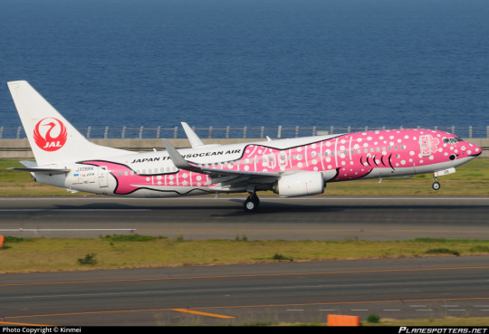
No. 32 - Japan Transocean Air Jinbei Jets
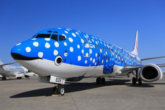
Over the past two days, @lillybean730, @whatmorecouldapoorboydo, and @fungaloids have all tagged me in this post, which contains this image.
Tumblr media
The link beneath is broken, but based on the text below, I would presume it was posted in response to the introduction into service of Japan Transocean Air's two "Jinbei Jets". ('Jinbei-zame' is the Japanese name for whale sharks!)
Tumblr media Tumblr media
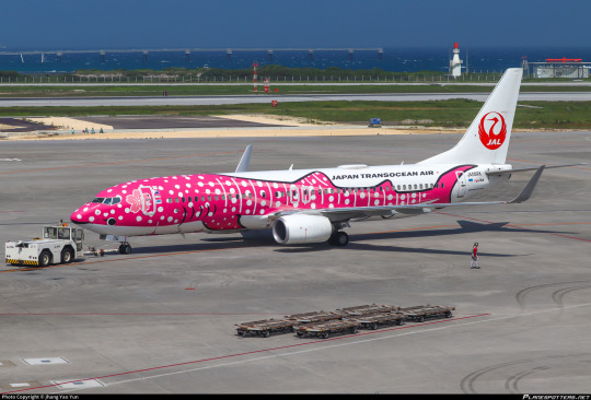
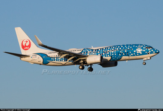
That's right, there are two of them! The Jinbei Jet actually comes with a matching Sakura Jinbei! They're both Boeing 737-800s delivered new to JTA (a JAL subsidiary based in Naha which usually just uses the JAL livery, hence the vestigial Tsurumaru logo on the tail) in late 2017; the blue Jinbei entered service in September while the Sakura entered service in December.
Tumblr media
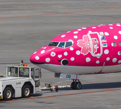
These are adorable, there's just no way around it. The low-sitting eyes, combined with the existence of the cockpits, does make it look a little like the plane has two sets of eyes, or one real set of eyes and one set of false eyes to throw off predators, but just - just look at her!
Tumblr media
Her little eyelash! The little sakura blossom behind her ear! AAAH!
Tumblr media
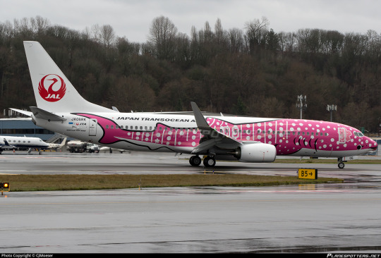
The methods used here resemble those Amakusa Airlines uses for their absolutely darling dolphin plane. The whale shark design is centered at the nose of the airplane and then allowed to diverge from there, which allows for the general shape of the shark to be expressed well. Together with a very clever use of negative space on the bottom half of the plane, this also very easily renders a white underbelly. Blank space is then left above the dorsal fins to write the name of the airline, and the tail frames the tailplane really nicely.
Tumblr media
They're both very well-drawn and pretty designs. While I do wish there was something other than plain white in the background, like maybe a wave design or even just a light blue, I understand the choice, and it's not really what the point is here. The point is the whale sharks. Still, the white feels very sharp as a contrast, and I prefer the way Amakusa Airlines used a lighter blue and limited the white space. The Tsurumaru is also a bit busy. It's a gorgeous logo but I think on a plane like this the whale shark should be the only thing that really pulls any attention. The viewer's eye should be drawn right to the airplane's eye (the drawn on one) immediately, without anything directing it to the tail, like a big bright red logo. While the sharks themselves are incredible, the rest of the plane isn't a particularly good vehicle to present them with.
Tumblr media
Again in contrast to Amakusa Airlines, this design is much more realistic and much less stylized. I don't think that's a good or a bad thing. In fact, I think they're both wonderful. Despite both being sea creatures they are very distinct-looking, which I like. One is a very cartoonish and delighted dolphin with two smiling dolphin engines, and the other is a set of two very charming elegant whale sharks with delightful big round eyes. Both of them make me very happy when I look at them. I feel like my job here is slightly redundant because I think my reaction is completely universal.
Tumblr media Tumblr media
These are just a pair of really pretty and endearing planes, and I could not adore them more. I think I prefer the vivid pink of Sakura Jinbei, but I also do love the classic blue color. And I think the knowledge that these two are a pair improves each of them even more. They're simply lovely.
Tumblr media Tumblr media
An A for Jinbei and Sakura Jinbei!
129 notes · View notes
flymeandtiememaam2 · 1 day ago
Text
Tumblr media
The Signal
“But that’s a signal isn’t it, sir?” the Japan Airlines stewardess said to me, a slight smile on her lips. “Every time you accidentally-on-purpose leave the strap of your bag hanging out of the overhead compartment, it is a sign for your accomplice to drop off another package of drugs in the rest room for you to collect at your leisure.” I glared at the young woman angrily, infuriated at her smug expression and the fact she was completely right and that I was caught. Given that she had bound my hands behind my back when she had first accosted me, I knew she didn’t need me to confirm the scam. The stewardess placed her officious-looking clipboard under her arm and then gripped me by the shoulder.
“I’d better get you safely stowed in the back of the plane for the rest of the flight, sir,” she told me jauntily, “but don’t worry, you won’t be alone for long. Once you are securely strapped in, I’ll go and apprehend your friend. The two of you can discuss why it all went wrong while you both sit tied up, waiting to be arrested in Tokyo!” She beamed happily and I then began my long walk of shame down the aisle.
Source: Pinterest
8 notes · View notes
oldbrain · 2 months ago
Text
Tumblr media Tumblr media
I started making some scans today of things I found at home, this is one of my father's old passenger ticket from the 80s.
9 notes · View notes
japanbits · 23 hours ago
Text
Tokyo in the sky with concrete 🎸
2 notes · View notes
airline-gijinka · 3 months ago
Text
Tumblr media Tumblr media Tumblr media Tumblr media Tumblr media Tumblr media Tumblr media Tumblr media Tumblr media Tumblr media
I draw so much
3 notes · View notes
ricisidro · 10 months ago
Text
Tumblr media Tumblr media Tumblr media Tumblr media
Tragedy after tragedy.
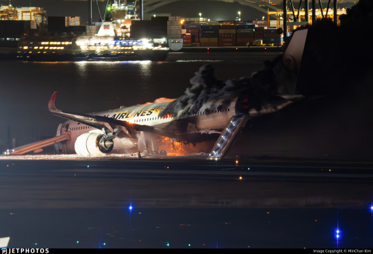
#Japan #earthquake on #NewYear's Day. On the 2nd day, Japan Airlines (Airbus A350) collided with Japan Coast Guard's De Havilland Canada DHC-8-315Q carrying earthquake aid at #Tokyo's #Haneda Airport.
All 379 passengers and crew members on board were safely evacuated. Sadly, 5 crew members of the Japan Coast Guard aircraft were killed with one seriously injured.
A horrible way to start 2024.
#PrayForJapan #JapanEarthquake #JapanAirlines
9 notes · View notes
redsamuraiii · 10 months ago
Video
youtube
Japan Airlines plane on fire at Tokyo's Haneda Airport
One disaster after the other. Earthquake on the first day, and fire on the second. 😟 The only relief is that all 379 passengers and crew had been safely evacuated. 😥
Apparently the plane collided with a Coast Guard aircraft. Not sure how that happened. Considering how strict Japan is when it comes to precision, somebody’s head going to roll. 
This is the type of things that your loved ones are worried about every time you travel. You may find it  stifling having to update them every step of your journey but remember that they just love you.
7 notes · View notes
guy60660 · 1 year ago
Text
Tumblr media
Japan Airlines | Design Reviewed
10 notes · View notes
igiveupmiss3 · 1 year ago
Text
Tumblr media Tumblr media
Incriminating Brake Light
“And so you see, Inspector,” Hikari Kato, the slightly irritating but undoubtedly brilliant Japanese Airlines stewardess and amateur sleuth, told me excitedly as she crouched next to the rear of the car, “this brake light has been replaced. Recently!” I sighed and put my hands on my hips, glancing briefly at Hikari’s prisoner who stood, hands cuffed behind his back, head bowed in shame and certainly looking guilty, up against the front passenger door. “It doesn’t prove Mr Jameson here is our murderer, Ms Kato,” I replied. “On the contrary,” the young woman beamed from behind her mask as she stood up, “I think you will find CCTV will reveal the car I spotted driving from the scene at the time of the killing did indeed swerve into a parked vehicle, shattering its brake light.” I looked at the black uniformed female a little sceptically, but had to admit she had a point. “Besides,” continued Hikari with a light laugh, “when I approached this gentleman to discuss the inconsistencies in his story, he ran away!” I smiled too. “But he didn’t get far?” The woman bowed slightly. “I was forced to restrain him, Inspector.” she agreed. I indicated to my men to arrest Jameson then turned again to the part time detective. “Haven’t you a JAL flight to catch, Ms Kato?” I asked the stewardess hopefully.
Sources: Alamy Stock Photos and Pinterest
6 notes · View notes
informationatlas · 10 months ago
Photo
Tumblr media
A Japan Airlines (JL/JAL) Airbus A350 has been involved in a serious accident at Tokyo Haneda Airport on the evening of Tuesday, January 02, 2024. The aircraft collided with a De Havilland Canada DHC-8-315Q operated by the Japan Coast Guard on the runway at 17:47 local time. 
A significant fire subsequently took hold, with video footage of the firefighting efforts being shared widely around online and traditional media channels. 
The accident marks the first hull loss of an Airbus A350 aircraft. 
(via Japan Airlines Airbus A350 collides with aircraft on landing in Tokyo | Flightradar24 Blog)
4 notes · View notes
brianfrench1995 · 3 months ago
Text
Tumblr media
Japan Air Lines Boeing 747-200 Postcard 
.
JA-8115 
.
@postcardtimemachine
14 notes · View notes
runwayrunway · 1 year ago
Text
No. 11 - Japan Airlines(’s logos)
Last time on Runway Runway, @vultureworth​ asked me to cover the fictional little plane from cartoon animal doing cute things game Animal Crossing. The airline featured in the game, Dodo Airlines, has a logo which is a nod to JAL’s iconic Tsurumaru crane logo. 
Tumblr media
...can we talk about the JAL logo? And the liveries which came with it, I guess, but I’m really here to talk about JAL’s old logos. 
(but someone did request JAL, and the logos and liveries are absolutely not independent from each other, so we will also discuss the liveries.)
Tumblr media
The Tsurumaru, designed by Jerry Huff at Botsford, Constantine and Gardner of San Francisco, has been a mainstay of the airline since its 1959 introduction, but it hasn’t always been the main logo. In that sense there’s been a real on-off relationship with it, and they’ve had some pretty weird stuff in the interim. Like, does anyone else remember this? This...thing?
Tumblr media
From 2002 to 2011 this was the JAL logo. Am I alone in hating this so so so so much? The shaded three-dimensional curve overlaid on the entirely flat black text is, frankly, the stuff of nightmares. I cannot believe anyone would willingly replace the Tsurumaru with this monstrosity, even if you try to jazz it up with a fancy name like 'arc of the sun'. I have an even harder time believing this was designed by Landor Associates. Did something terrible happen to them in 2002? How does something like this get created and approved?
Okay, okay. Fine, it’s ugly. How does the plane look overall? 
Tumblr media
Sure. Sweet and simple. Okay. I like the metallic color framing in the slice of red on the winglets, I like the shade of red used on the plane itself. The fully matte circular cutout is striking. My issue here is that this feels like three liveries hastily stapled together - the logo, the red winglets and fin, and then the full JAPAN AIRLINES text. Nothing is stringing them together at all. Why is the red so matte if the logo is reflective and shiny?! Why are the tail and winglets the only elements that tie into each other in any way?!
Tumblr media
This is straight up blue. This color doesn’t appear anywhere on the rest of the livery. It’s just blue. 
I thought for a minute I was inventing the concept of this and that it was just the same metal color used for accents elsewhere but...no...I got out CSP and did some eyedropping in a bunch of different places just to make sure it wasn’t an artifact of the lighting and
Tumblr media
Yeah, I’m pretty sure that’s blue. I feel like this is definitely blue. Am I insane or is this blue. What in the world. I hate it when a livery has features I like at first glance but then you look closer and it starts falling apart. 
D+. This weird 2002 livery and logo gets a D+. I don’t like this.  
Moving on. Moving on promptly.
Tumblr media
From 1989 to 2002 they also had this wordmark, another Landor design, which I actually don’t hate. For one, they kept the Tsurumaru on the tail throughout instead of canning it entirely - already a huge plus. Also, the typeface is better (darker, better contrasting, DELIGHTFULLY spikey), the red used is a lot nicer, and the uniform flatness makes the text actually pop somewhat, versus the 2002-2011 logo which kind of obscures it. This is fine. I don’t dislike this at all. But okay. Okay. Enough about wordmarks. How does it look on the plane?
Tumblr media
This is very messed up. Last time I hated the logo but thought the high concept of the livery itself was fine. This time I like the logo but I think this livery is sort of nonsense. It’s almost all white, and then it has a bunch of features stapled on - the Tsurumaru, the ‘J Bird’, and the picture of a bird that’s just there? And it has a tiny illegible little ‘Japan Airlines’ written on it, as if people don’t know what JAL stands for. As if they’re not one of the biggest and most recognizable airlines on this planet. And as if this text for ants would help them if they didn’t. 
I really, really like the logo and how it’s integrated here. The grey wrapping around the nose is really fantastic. I like that part. I like that part a lot. 
I still have to give this a D+ because the rest of it is so incoherent. 
At this point I’ve sort of come to a conclusion about JAL - oh, I should probably mention their modern livery while I’m going into this dramatic mental spiral, shouldn’t I? 
Tumblr media
Font choice is good. Tsurumaru looks nice as always. Really a shame they realized this and went “awesome, we don’t need to design the rest of the plane then”.  
D+. Try harder. Apply yourself. Meet me after class. This is making me sad. 
It somehow just feels like all of JAL’s liveries were an afterthought that nobody thought to put any creativity or real consideration into. It sucks because Japan is obviously full of incredible graphic designers and rich artistic traditions to pull on for iconography. (Bafflingly, in the 50s they used an American advertising agency, so the Tsurumaru was actually designed by a Westerner, which feels so wrong, doesn’t it?) Look, I lived in Japan as a child, so even if just having eyes and seeing photographs and accounts wasn’t enough to know this - Japan has way more to offer than a plain white fuselage with elements that feel like they were picked at random to just get the design process over with. The white doesn’t feel clean and intentional and meaningful like it does on some of the nearly-all-white liveries that I actually like (yes, they exist, I have two queued right now!), it just feels like nobody bothered to design the plane! It makes me very sad.  
One of the reasons it’s making me sad is that I have a vision of what this could be. Keep the red and grey logo and the little line that goes around the nose. Keep the red winglets and fins. Maybe make the red circle on the fin larger so it envelops more of the rear fuselage. Put the Tsurumaru silhouette over it, so the bits of the logo which are white are painted over it and you clearly see its head. Does that make sense? Am I conjuring an image in your head? 
Well, JAL certainly doesn’t see my vision. And I don’t currently have a graphics tablet so I can’t do anything to make anyone see it. You’ll just have to use your imagination, I’m afraid. 
And I also have to mark all of these down for not also having the airline’s name in kanji. Especially when JAL’s nickname in Japanese, ‘Nikkō’, is literally written in two characters - “日航” - which would take up next to no space at all and be pretty easy to integrate. I know it’s like three letters, a fairly large portion of Japanese people read at least some English, and even those that don’t can probably recognize the text for ‘JAPAN AIRLINES’, but it kind of goes beyond an accessibility thing. I don’t think Japanese people actually have any meaningful issue with planes only having English text on them, or at least I hope not, because I can’t find a single airline in the country that does feature kanji (or any other form of Japanese text) on its livery, but I actually still think that JAL should do it anyway. A flag carrier is meant to represent the country it flies for. Latin is not the official or most commonly used script in Japan, and it feels very wrong for what is basically the country’s brand to exclusively use it. 
But we’re not here to talk about their liveries anymore, even though they make me sad.. That verdict has been passed. No...what brought me here is their logo. 
JAL first adopted the Tsurumaru in 1959, like I said. The airline, however, has existed since 1951. 
So...what is this mystery logo from the dark ages of JAL’s branding? 
Tumblr media
This Star Wars situation. 
I don’t know what I think about this. I don’t know how to feel. This just isn’t a JAL logo. My mind refuses to comprehend this fact. This is sincerely bizarre. 
Tumblr media
...this typeface is so weird that I almost think I like it. 
I can’t find any properly sourced images of planes from this era, but they seem to only have the logo very small and lack anything except the airline’s name written in plain black kanji on a blank metal fuselage, which is...typical for that period. This is barely about the livery at this point anyway. This post was all an excuse to expose you all to the 1951 JAL logo. 
Well. You’re welcome. 
A D+ for Japan Airlines, shockingly consistent in their shocking incoherence since at least 1989. 
35 notes · View notes
flymeandtiememaam2 · 7 months ago
Text
Tumblr media Tumblr media
Welcoming The Officers On Board
“Yes, we had a little trouble on board this flight, gentlemen,” Japan Airlines senior stewardess Iyumi Ichada said, smiling in tired relief as the Tokyo Airport police officers approached the plane, “but the girls and I have it - or rather him - all wrapped up now!”
“Mmmmmph!” protested the bound and sobering up idiot from the floor of the airbus , who had been rampaging up and down the aisle demanding whisky, until Iyumi intervened.
Sources: Pinterest and the Daily Mail
9 notes · View notes
bring-subaru-back-to-wrc · 7 months ago
Text
Send er in, boye!
5 notes · View notes
memenewsdotcom · 10 months ago
Text
Japan Airlines collision
Tumblr media
View On WordPress
4 notes · View notes