#Jack Teagle
Explore tagged Tumblr posts
Text


The un-cropped artwork for my MTG: Secret Lair card, Benevolent Hydra.
Its power and influence can make regular woodland creatures grow.
This was a lot of fun to draw, and inspired greatly by my young daughter. She makes little nests of all of her soft toys bundled together.
697 notes
·
View notes
Text
This is the work of Jack Teagle, I’m not a huge fan of his work but I do like some, for example, he’s done some trading card layouts with creatures and witches that look very nice and detailed, he has a very abstract, blocky style that looks like something that would have an inspirational quote on it in a primary school or library, which I quite like, while some of his work, like the picture of a can of coke with the character behind it, I’m not a huge fan of as it’s quite dull, his work that’s detailed and colourful I am a fan of.
0 notes
Text
Dead Astronauts by Jack Teagle.

1 note
·
View note
Photo

We march on the bodies of the dead, Jack Teagle
352 notes
·
View notes
Text
Jack Teagle
I love Jack Teagle's art. Especially the Handheld History 88-95 collection.

There's a real charm to the colors and line work, no perfect circles or silky smooth straight lines. Everything feels quite loose and the perspective can even be slightly wonky, for example the batteries look a little off. However I think this is entirely a stylistic choice, as many of the games he is referencing and paying homage to had slightly off visuals, especially the box art

This piece is a reference to the Quickshot Supervision, a budget and slightly crap version of the gameboy, meant to compete with it.


The console and the games that were played on it. With questionable print quality and games that are obviously rip-offs of others (the bootleg mario smoking a cigarette in Teagle's drawing signifying so) The Supervison is an elusive console that I really want just because it's quite funny.

Here is a great piece of art showing the sega game gear, my favourite handheld and the one I recently fixed.
0 notes
Text
Research [Jack Teagle]
Jack Teagle is a freelance illustrator who is based in South England. He has had many clients over the years and his style can be described as kinda cartoony, filled with colour and characters. I'm researching him today as I want to learn more about illustrators and see lots of different styles.

The first one that caught my eye was this one, made for a brewing company with the theme 'adventure'. I really like the colours of the plants, they look very good but also feel unique with the blue colours. The purple and the white also contrast really well and I like how the background looks.

The next one I really liked was this one, an artwork created for a greeting card. The owl is simple but the feathers and the body look really good and I love how the ocean and the night sky looks.

The last one I liked was this advertising campaign for a new VW Jetta that had ambient lighting, demonstrating how colours can drastically change a scene through artwork.
His artwork has simple shapes but he knows colour well and he makes good scenes in each piece. I like a lot of the artworks in his portfolio so it was fun researching him today.
0 notes
Text
Jack teagle

Jack Teagle has a method of working that lends itself nicely to childlike and innocent animations, reminding me of short shows from children programs.

0 notes
Text
https://www.instagram.com/danhipp/
Box Art
What do you think of these games and the artwork? Which catches your eye first and why? Does it make for the best board game cover?
https://www.cbr.com/10-board-games-that-have-amazing-artwork/
https://www.dicebreaker.com/categories/board-game/best-games/best-board-game-box-art


https://www.pinterest.co.uk/michaelheina/display-ads-board-games/
Top 5 game companies & individual style
Asmodée Editions
Asmodée Editions publishes Role Playing games and card games such as Jungle Speed. It has developed some of the best selling board games making them one of the top publishing and manufacturing companies out there. They have worked with The Pokemon Company, Stonemaier Games (Wingspan) and more to publish some of the most well known board games. They publish quite a wide variety of games including family, party and hobby games targeted ay a range of age groups.
Most of the games they have are quite detailed with cinematic artwork.
Goliath B.V.
jvhkfvh,
Grand Prix International
Hasbro
Ravensburger
Who are the top 5 board game companies? What defines them? I.e. what style of game do they promote? Or not? And which would you aim for if pitching? I.e. HASBRO
Hasbro pitch
How would you go about pitching an idea to Hasbro? What would you have to do? What legal requirements would you need to consider: https://spark.hasbro.com/submit/steps
Operation

How have the graphics changed in a game? Look into OPERATION and highlight the change in design, the type/font used and placement and the way in which this impacts who might buy it.
Minions operation


Look into best card games and discuss why? Discuss the audience, the art work and add in your own related to your layout and
theme. https://www.gamesradar.com/best-card-games-compared/
Table top games

And look into table top card games and add to blog with discussion on gameplay and style
Pokemon TCG


The Pokemon Trading Card Game is a tabletop card game I have personally been playing for a long time. It originated in 1996 and has been developed further ever since. As of 2024, it has it's own mobile app which rapidly gained popularity for it's accessibility. Physical Pokemon cards have to be bought to be played with and they are relatively expensive. But in the mobile game packs can be obtained for free. Compared to the physical game, it is also more simplified so games can be shortened.


The game consists of character cards derived from the Pokemon games that can attack and use abilities to take out the opposing player's deck. Each card has its own type and can only attack if it has energy attached of its respective type. Some cards require more than one type of energy but have very powerful attacks in exchange. The game creates a balance with strong moves and fair sacrifices such as losing energy or HP. Many parts of the game are based on RNG and luck making no two rounds the same. Strategy and deck building are utilised, however there is always an element of surprise through luck of the draw, as there is no guarantee that you will have the correct cards you want when you need them.
The Pokemon TCG is still popular with live tournaments happening regularly and being big events in certain countries.
I grew up on the console games more than the TCG, but I still played it very frequently with my siblings and friends as a child and it was a big part of my childhood. Pokemon cards were eventually banned at my middle school because we kept trading and playing with them. Even if I didn't know the real rules when I was younger, I still played with them rather than just collecting them.
Even now, I still play the TCG myself. I have the mobile app and I still play it with my friends and siblings like I did when I was younger. Despite how old the cards are, I believe the TCG will still remain popular as long as the Pokemon Company are around.

Yu-Gi-Oh

Yu-Gi-Oh is another card game I really enjoyed growing up. I didn't play it as frequently because I was more interested in Pokemon cards. I watched the anime A LOT growing up which is how I learnt the rules, but I was more interested in the show more than I was the game. Which is the opposite experience I had with Pokemon, I didn't watch the show as much because I was invested in the games. I still have all of my old cards and it's nostalgic to look back on.
I really enjoy when card games have their own TV shows based on them. Especially for younger audiences, it creates a wider demographic as older players will be more likely to play the game whilst younger viewers are more likely to watch the show. It creates a nice base of people to cater to.
My experiences with board games
Coming from a big family, it's harder to play board games since many of them only have a 4 player limit. However there were games such as Monopoly that can be played with a bigger group which was definitely a big part of my childhood. I played different versions rather than the official growing up, such as The Simpsons and The Minions. These weren't any less difficult than the official one but I have more memories attached to the different characterised releases since I enjoyed having games related to things I liked and seeing references from them. Even now, we have a lot of board games in my house. Another game I mainly played with friends was The Game of Life, one of my friends had it. I wasn’t as interested in this one since it was a lot more complicated.
In particular, I have a lot of memories attached to Angry Birds Space, which is a four player game which is the same concept as Frustration and Ludo, but with Angry Birds. I played this as a child, and we got rid of it after a while. But we bought it again, and my parents play it regularly. I believe this shows the demographic these games appeal to, even though Angry Birds is a children's media, it still appeals to adults. I'm not sure why this could be. This was my favourite board game as a kid because I enjoyed the competitive aspect and how unpredictable each round was, since It's completely up to chance. I was mostly a bigger fan of shorter, simple strategy games that can be played in quick rounds, rather than longer and more complex games such as Cluedo.
https://www.instagram.com/barrykitsonart/?hl=en
Jon Turner
Jon Turner is an artist and illustrator who creates work based on 'strange stories, meandering adventures, retro gaming, literature, mental health, and broken hearts.' He has been commissioned by many notable companies such as BBC Books, No Sleep Records, Threadless and Palgrave Macmillan Publishing.


I think his work is very cute. The use of only black and white with a hint of an accent colour is really charming. Its very well done and this doesn't always look good but his simplistic style allows a lot of room for detail with the shading. He uses a technique called cross hatching to create his shading, and this effect creates a nice texture to more simple drawings.
He sells items with his work on them, a variety including clothing, stickers, blankets and prints. His shop has a good amount of items and has relatively cheap prices for the quality of work.
0 notes
Text
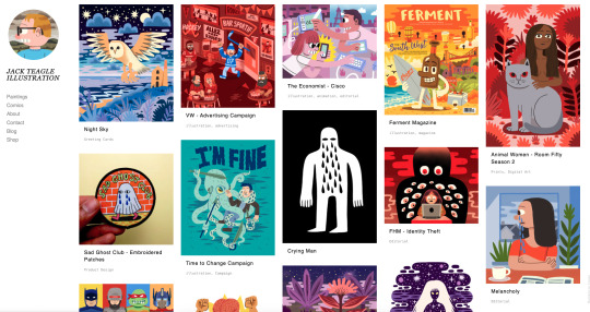
Although I haven't done much illustration work in the course, I can still compare the different ways our work may relate. Jack Teagle is a unique and great Illustrator that has a simplistic look whilst being well made and detailed.
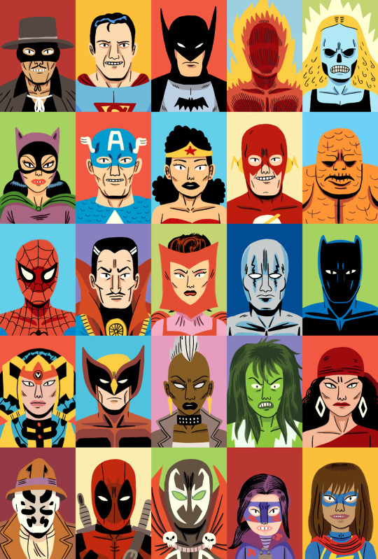
Personally I enjoy looking at his art as it is a combimation of simple art and concepts not usually seen with this style. I also like his character portraits like the one with the different comic characters.
0 notes
Text


Here is the full artwork for the Mulldrifter MTG: Secret Lair card I illustrated.
I wanted it to feel strange and alien, but unaware of its own divinity.
522 notes
·
View notes
Text
Milika Favre

Milika Favre, she is a talented amazing illustrator and artist known for her detailed illustration. Her work often features very bright colours and whimsical themes, and she has worked on a lot of different brands and publication. Milika Favre's art style is very traditional art work and it has digital techniques as well to create stunning view points. That captures the audiences eyes. Her illustration's has been in magazines, books, advertising campaigns.
"The Women in Black" by Madeleine St John
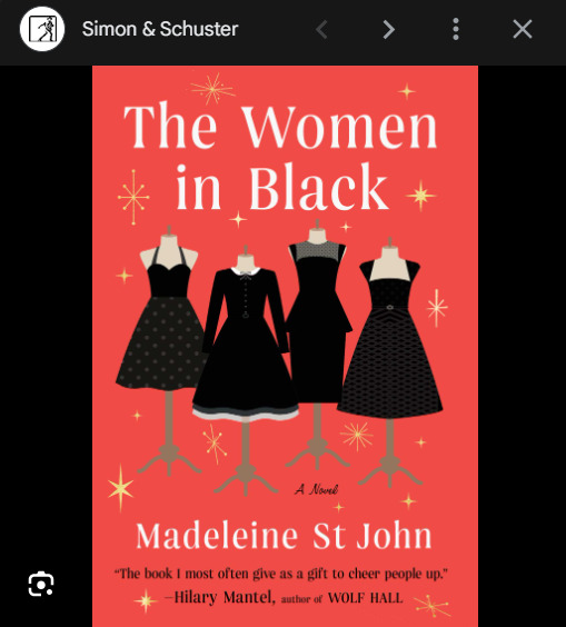
"The Women In Black" by Madeleine St John is a charming and witty novel set in 1950s Sydney, Australia. The story is about a women lives working at Goode's department store.
The narrative follows the experiences of several women who work in different areas of the store, more focusing on Lisa, a young and intelligent schoolgirl working in the Ladies' Frocks section during her summer break. As she communicating with her colleagues, such as the sophisticated and worldly Fay, the bookish Patty, and the glamorous Magda, a Slovenian who is not from this country who runs the haute couture section, Lisa's perspective on life, love, and her future undergoes a transformation.
The novel explores themes of female friendship, societal, the changing roles of women in the 1950s, and the pursuit of personal ambitions. It's a delightful story that captures the scene of a bygone era and the women navigating their desires and dreams in a rapidly evolving society.
I like book cover because its very simple. I like that the dresses are all different and i like all the colours that were used so it looks cool.
Jack Teagle
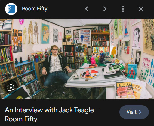
Jack Teagle! He's a talented illustrator and comic artist known for his detailed and colourful style. Teagle's work often has vibrant and playful imagery, blending humour with a hint of the surreal. He has created lots comic books, illustrations for editorial purposes, and has exhibited his artwork in galleries.
Teagle's illustrations showcase as dynamic characters, imaginative settings, and a lively use of color. His style often has a with a mix of may influencers and modern elements, creating visually engaging and quirky narratives within his art. His comics and illustrations often explore themes ranging from the absurd to the fantastical, captivating audiences with their unique charm. The Unmentionables

"The Unmentionables" is a comic anthology created by Jack Teagle. It's a collection of stories that is detailed into the bizarre, surreal, and often humorous realms of imagination. In this anthology, Teagle explores unconventional narratives, characters, and situations, creating a series of offbeat and interesting stories that may touch upon subjects or themes that are not commonly discussed or explored.
The stories within "The Unmentionables" typically showcase Teagle's signature style, characterized by very bright colours in the artwork, quirky characters, and unexpected plotlines. It's a compilation that offers readers a glimpse into Teagle's unique storytelling abilities and his knack for blending humour with the surreal within the comic medium.
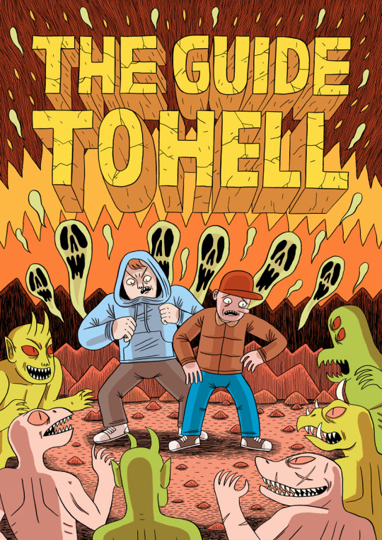
I like that the title is straight on the middle, i like that the front is simple. I like that both characters arms that are pointing out is bigger this suggest its closer. I like the cool goofy eyes and the lighting out from behind them. i like the colours that they used.
0 notes
Text
jack teagle


Jack is a freelance illustrator based in South West England. He has worked in a large variety of fields, including editorial, character design, storyboarding, poster/ product/ textile design, and worked as a cartoonist for Front magazine from 2010-2014. He wrote tutorials and worked as a columnist for Digital Artist Magazine Jack paints in his free time, and has exhibited his work worldwide. He is also a prolific self publisher, with his comics being translated into Polish, and Russian.
0 notes
Text
Other art styles :)
Malika Favre:
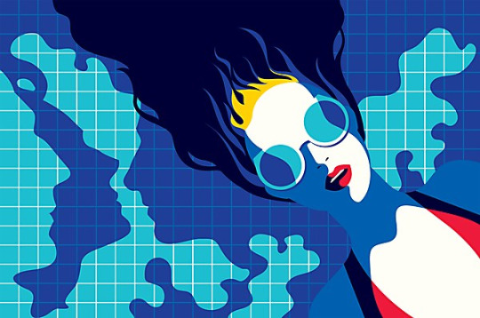
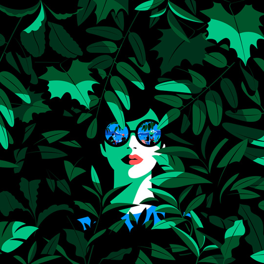

Favre's line-less style is very bold especially when it comes to the colours and shapes used in the pieces. I think this style is very cool and just goes to show that great art doesn't have to be insanely detailed and intricate.
Dan Hipp:
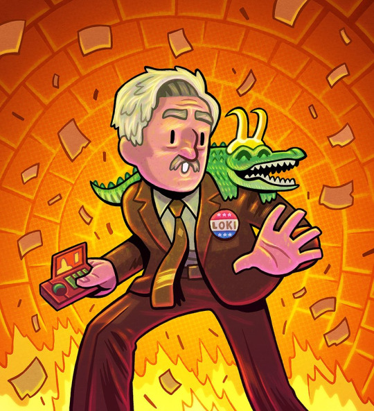
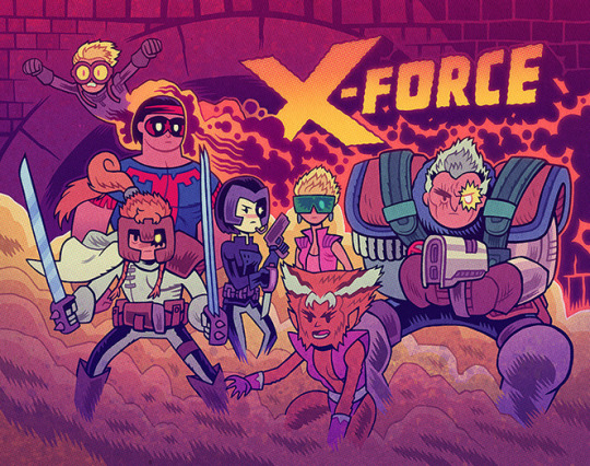
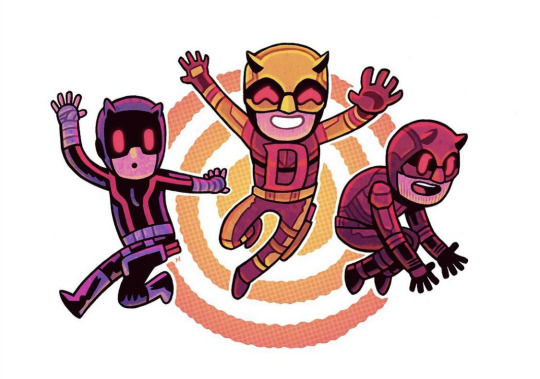
Hipp's style is a bit more on the detailed side but I like it none the less. The use of colour and stylization of the characters makes his art unique. I also like how he portrays the emotion of the character through things like pose and facial expression.
Kei zama:
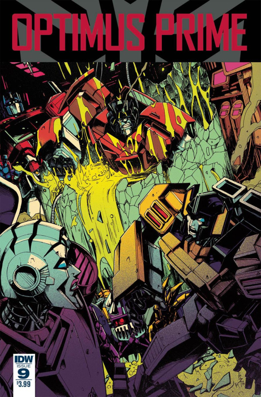
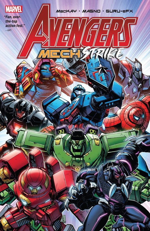
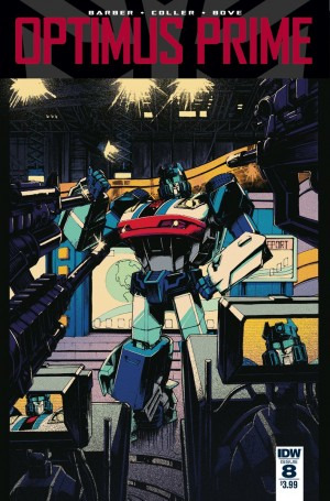
Zama's style is very detailed as most of their art is of robots. I like the use of black in their art style as it helps differentiate the different parts that make up the character. I also like how they change character designs (like on the avengers cover) and turn them into something their quite well known for.
Jack Teagle:
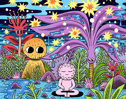
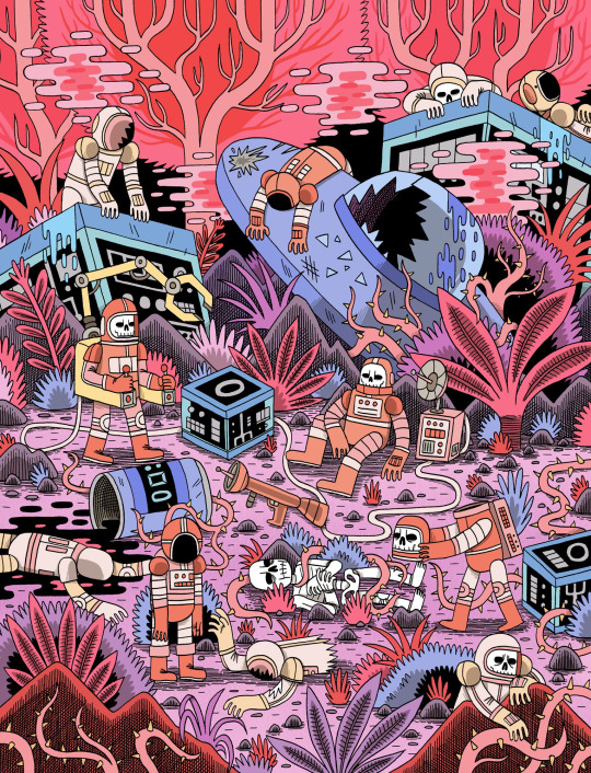
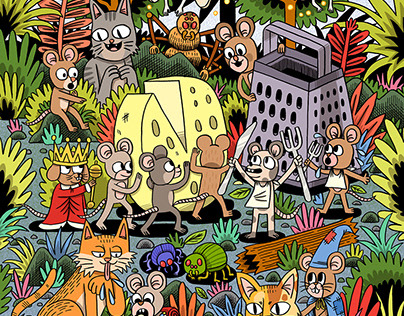
Teagle's style is very detailed an busy as there's always something bizarre going on in his pieces. I like the overall characterization that comes with this art style as it gives personality not just too characters but also the background. The use of bold black lines helps in keeping the elements of the piece separate and easy to see.
Joelle Jones:

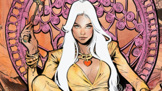
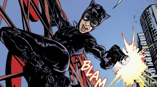
Jones's art style is a nice blend of semi-realism. This style also incorporates the classic black shadows seen in many comics now a days along with a good use of colour. I like how on the "Lady Killer" cover, the victims are coloured in red and there blood is in black.
0 notes
Text
Other artists with unusual style. Part 1
Malika Favre:

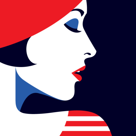
Malika Favre is a French illustrator and graphic artist based in Barcelona. Her style of works could be characterized by pure minimalism within Pop art and Op art, where it sometimes described as 'Pop Art meets Op Art'.
How does Malika Favre create her art?
She does this through experimenting with metaphors, positive and negative space, shadows, layers and many other key tools. Photography is a significant tool in this initial stage, helping Favre to extract colours, patterns and graphic elements.
What software does Malika Favre use?
This is what Malika Favre's answer for this question: ''I've stopped sketching by hand. I now sketch with Illustrator, sometimes in black and white, other times in color, to draft the composition and idea. The most important part of the process is to generate ideas. Everyone has their own way and there aren't any rules.''
What are some interesting facts about Malika Favre?
Favre was born with a severe case of strabismus, or crossed eyes. It was surgically corrected when she was very young, but she still sees perspective differently from the rest of us. “I can't see 3-D, for example, so if you give me 3-D glasses, I see blurry.
My opinions for this artist as her style is showing off, negative spaces mixed with positive spaces as she uses such bright and bold colours as well to show the complex to show the colours compared very well like white mixed with red and different shades of blues which is very well done for Malika.
╰── ⋅ ⋅ ── ✩ ── ⋅ ⋅──╯
Jack Teagle:
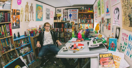
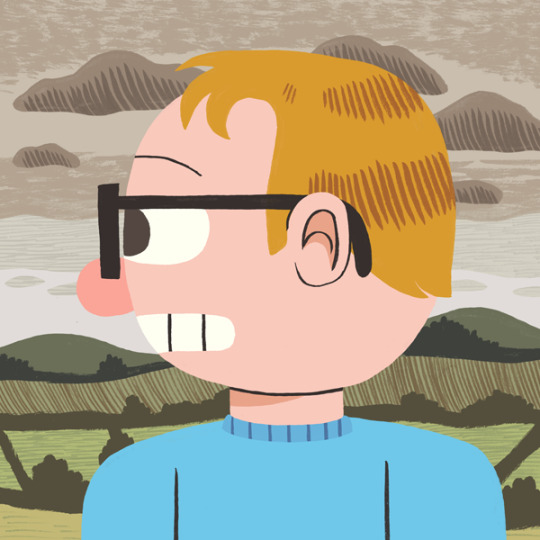
Jack is a freelance illustrator based in South West England. He has worked in a large variety of fields, including editorial, character design, storyboarding, poster/ product/ textile design, and worked as a cartoonist for Front magazine from 2010-2014. He wrote tutorials and worked as a columnist for Digital Artist Magazine Jack paints in his free time, and has exhibited his work worldwide. He is also a prolific self publisher, with his comics being translated into Polish, and Russian.
Jack Teagle comes from a town where more than 250 people applied for a single job at 'Pound Land'. Jack decided to become an illustrator instead. Jack graduated with an illustration degree from the university of Plymouth in 2009 and now works as an illustrator, comic artist and painter.
Selected Clients include:
Time to Change, VW, Adobe, Netflix, Apple, Universal Music, The Vlog Brothers, Iam8bit, Cartoon Network, Minecraft, Landyachtz, Converse, McSweeney's, Ohh Deer, Nick Jr, Bloomberg Business Week, FHM, Front Magazine, Evisu, The Economist, YCN, Research World Magazine, Anorak Magazine, Nobrow Press, Intercity Design, Havana Club Rum, ASP Industries, Daddy Donkey Mexican Grill, Illustrated Mind, Nexus Productions, Texas Observer, The Portland Mercury, Digital Artist Magazine, Future Publishing
Solo Exhibitions:
That's Life!- The R.A.G.E, Dublin, 2011
Zona De Combate- Dama Aflita Gallery, Porto, 2010 Dungeons and Desktops- Nobrow Shop and Gallery, London, 2010
My opinions for this artist, that his style is very cartoony as his own art works has lot of colours which is mixed with dullness, brightness and pastel-ish colours in his art works. I think he making lot of positive shapes on his art works with cartoony style.
╰── ⋅ ⋅ ── ✩ ── ⋅ ⋅──╯
Dan Hipp
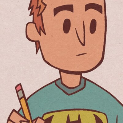
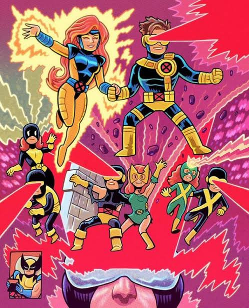
Dan Hipp was born on 11 September 1978 in Fresno, California, USA. Dan is an art director and writer, known for Teen Titans GO! To the Movies (2018), Marvel Snap (2022) and Manga Motion Comics (2009).
Dan Hipp is a cartoon and comic book artist well known for his work with Warner Media, specifically DC Comics.
Prior to working as an artist, Daniel Hipp attended Edison High School in Fresno, California. He went into further studying at the University of California in Irving. Sometime after his schooling was done, Dan got jobs with big name animation studios, including Warner Bros. Animation, Random House, DC Comics, and, most recently, Cartoon Network.
As of right now, Hipp once specialized as an art director in Teen Titans Go!. His own personal art can be seen numerous times throughout the show, as many of the pictures and signs throughout the Titans Tower are Dan's creations. In addition, many Teen Titans Go! comic book cover is the work of Hipp's hands.
My opinions for this artist, that he also creates lot of positive spaces on his art works which I think that he does this to show the more details on the works so that people can see the whole page and not specific parts and he uses lot of bright colours that he used on his arts.
0 notes

