#It now has a symbol for options sliders
Text
I've noticed that since Google Chrome rolled out it's extra data tracking spyware, the targeted ads it's sending me have actually gotten worse
I have a fairly light online footprint, so I literally don't have any search history which identifies interests to sell me stuff for
It's now giving me way less general local interest stuff, and way more clickbait diet ads
For a video suggestion of 'heres how to order coffee in English!' My options were 'dont suggest youtube' and 'not interested in English language'. Which. Does not at all capture why I, a native English speaker, don't want that do be my front page of google.
Like.
Very underwhelming deal with the devil
#Also not loving that instead of the lil padlock on URLs showing its secure#It now has a symbol for options sliders#Customise your privacy here#Because a compromise is all that is available#Not guaranteed security#Google Chrome#Chrome#Google#My posts#My life
8 notes
·
View notes
Text
Cliff notes on the new info on Dragon Age: The Veilguard in today’s issue of Game Informer (magazine hub link):
Edit/update: I tidied up this post. ^^
---
In CC you can customize things like shoulder width, chest size, glute size, hip width, how bloodshot your eyes are, nose crookedness, and more
There are hundreds of sliders for body proportions
CC detail: “Features like skin hue, tone, melanin”
There is nudity in DA:TV, “which I learned firsthand while customizing my Rook” in CC
Rook’s backstory also affects “reputation standing”, along with the other previously-known things like in-game dialogue etc
Lords of Fortune are pirate-themed, “piratic”
Rook ascends because of competency, not because of a magical McGuffin, contrasting with the 'destiny-has-chosen you’ angle DA:I has for the Inquisitor
Rook is here because they chose to be, “and that speaks to the kind of character that we’ve built. Someone needs to stop this, and Rook says, ‘I guess that’s me'”
The 4 voices we can choose for Rook each have a pitch shifter in CC
The game starts inside the bar (as previously detailed in other coverage)
In some dialogue wheels there is a “romantically inclined ‘emotional’ response” option. These are the replies that will build relationships with characters, romantic and platonic alike, but you can ignore them if you want to. Giving a companion the cold shoulder might nudge them into another companion’s embrace however
Bellara’s surname is Lutara
In the streets of Minrathous (in the opening segment of the game), there is a wide, winding pathway with a pub which has a dozen NPCs in it (is this The Swan tavern?)
The devs used the DA:TV CC to make each in-world NPC, except for specific characters like companions
There is smart use of verticality, scaling and wayfinding in the gameplay
If you play as e.g. a qunari Rook, the camera adjusts to ensure larger characters like them loom over those below. The camera also adjusts appropriately for dwarves to demonstrate their smaller stature
Neve Gallus is described as being capable
The Venatori Cultists we fight in the opening segment of the game are seizing the chaos caused by the demons unleashed by Solas’ ritual to try and take the opportunity to take over the city
As you traverse deeper and deeper into Solas’ hideout, more of his murals appear on the walls, and things 'get more elven'. Rhodes says “this is because you’re symbolically going back in time, as Minrathous is a city built by mages on the bones of what was originally the home of the elves”
At the heart of Solas’ hideout is his personal eluvian
Demons are fully redesigned in this game, on their original premise as creatures of feeling that live and die off the emotions around them. “As such, they are just a floating nervous system, pushed into this world from the Fade, rapidly assembled into bodies out of whatever scraps they find”
In the opening, we stop Solas’ ritual and save the world. “For now” anyways. Rook passes out moments later and wakes up in a dream-like landscape to the voice of Solas. He explains that a few drops of Rook’s blood interacted with the ritual, connecting them to the Fade forever. (I guess this is why they said in the Discord Q&A on June 14th that Rook has good reasons to want to avoid blood magic)
He also says that he was attempting to move Elgar’nan and Ghilan’nain (confirming who the two Evil Gods are) to a new prison, because the one he had previously constructed was failing. Unfortunately, Solas is trapped in the Fade by our doing, and the two gods are now free. “It’s up to Rook to stop them”, thus setting the stage for our adventure
Rook wakes up after this with Harding and Neve “in the lair of the Dread Wolf himself”, a special magical realm in the Fade called The Lighthouse. It’s a towering structure centered amongst various floating islands. This is where the team bonds, grows, and prepares for its adventures. It becomes more functional and homier as you do. “Already, though, it’s a beautifully distraught headquarters for the Veilguard, although they aren’t quite referring to themselves as that just yet”.
Because it was Solas’ home base, it's gaudy, with his fresco murals adorning various walls, greenery hanging from above, and hues of purple and touches of gold everywhere. Since it’s in the Fade, which is a realm of dreams that responds to your world state and emotion, the Lighthouse “reflects the chaos and disrepair of the Thedas you were in moments ago”
Clock symbols over dialogue icons signal optional dialogue options
At this point you can head over to Neve, engage in dialogue, and try and flirt with her
There is a dining hall in the Lighthouse. A plate, cutlery and a drinking chalice are at the end of a massive table. Matt Rhodes says that this is a funny and sad look at Solas’ isolated existence, and an example of the detail BioWare’s art team has put into DA:TV. “It’s like when you go to a friend’s house and see their bedroom for the first time; you get to learn more about them”
There is also a library, which is the central area of the The Lighthouse. It’s here that the party will often regroup and prepare for what’s next
The team decides that it must reach the ritual site back in Arlathan Forest. Corinne Busche said that the writer was "missing unique dialogue options here because I’m qunari; an elf would have more to say about the Fade due to their connection to it. The same goes for my backstory earlier in Minrathous. If I had picked the Shadow Dragons background, Neve would have recognized me immediately, with unique dialogue”
The team decide their next move. They go to Solas’ eluvian and back through to the ritual site in Arlathan Forest. However, it’s not fully functional without Solas, and while it returns them to the Forest, it’s not exactly where they want to go. Then a demon-infested suit of mechanized armor known as a Sentinel attacks them, and two NPCs appear to save you: the Veil Jumpers Strife and Irelin. Harding recognizes them, which you would expect if you read the comic Dragon Age: The Missing. They are experts in ancient elven magic. A cutscene ensues and we learn that Strife and Irelin need help finding Bellara Lutara. This cutscene is long and has multiple dialogue options.
“There’s a heavy emphasis on storytelling and dialogue, and it feels deep and meaty, like a good fantasy novel. BioWare doesn’t shy away from minutes-long cutscenes”
For Rook, this story is about what does it mean to be a leader? We define their leadership style with our choices. “From the sound of it, my team will react to my chosen leadership style in how my relationships play out.” This is demonstrated within the game’s dialogue and a special relationship meter on each character’s companion screen
Bellara is deep within Arlathan Forest, and following the events of the prologue, something is up here. Three rings of massive rocks fly through the air, protecting what appears to be a central fortress. Demon Sentinels plague the surrounding lands.
In gameplay/combat, players complete every swing in real time. Special care was taken in development for animation swing-through and cancelling. We can dash, parry, charge moves, and a completely revamped healing system that allows us to use potions at our discretion by hitting right on the d-pad. You can combo attacks and even ‘bookmark’ combos with a quick dash, which means that you can pause a combo’s status with a dash to safety and continue the rest of the combo afterward
Abilities can be used to customize your kit. They can be used on the fly as long as you account for cooldowns
When you pause and pull up the ability Wheel, it highlights you and your companions’ skills. There you can choose abilities, queue them, target specific enemies, and strategize with synergies and combos
Each character plays the same in that you execute light and heavy attacks with the same buttons, use abilities with the same buttons, and interact with the combo wheel in the same way, regardless of which class you select
Sword and shield warriors can hip-fire or aim their shield and throw it like Captain America
Warriors can parry incoming attacks which can stagger enemies. Rogues have a larger parry window. The mage the writer played couldn’t parry at all. Instead they throw up a shield that blocks incoming attacks automatically, so long as you have the mana to maintain it
On the start/pause screen: it has the map, journal, character sheets, skill tree, and a library for lore information. You can use it to cross-compare equipment and equip new gear for Rook and their companions, build weapon loadouts for quick change-ups mid-combat, and customize you and your party’s abilities and builds via an easy-to-understand skill tree. There aren’t in-depth minutiae, just "real numbers". For example, an unlocked trait might increase damage by 25 percent against armor, but that’s as in-depth as the numbers get. Passive abilities unlock jump attacks and guarantee critical hit opportunities, while abilities add moves like a Wall of Fire to your arsenal if you’re a mage. As you spec out this skill tree, which is 100 percent bespoke to each class, you’ll work closer to unlocking a spec, complete with a unique ultimate ability
“Sentinels and legions of darkspawn”
Combat is flashy and quick, with different types of health bars. Greenish-blue represents a barrier, which is taken down most effectively with ranged attacks
The game is gorgeous, with sprinkles, droplets, and splashes of magic in each attack a mage unleashes
The game looks amazing on consoles both in fidelity and performance modes
The mission to find Bellara is called “In Entropy’s Grasp”. You find her. She is the first companion you recruit (as Neve auto-joins). If your background is Veil Jumper, you get unique dialogue here with Bellara. She explains that everyone there is all trapped in a Veil Bubble, and there’s no way out once you pass through it. Despite the dire situation, she is bubbly, witty, and charming. She is spunky and effervescent
Companions are the faces of their factions, and in this case with Bellara, their entire area of the world. She is our window into Arlathan Forest. She is described as a sweetheart and a nerd for ancient elven artifacts, which is why she’s dressed more like an academic than a combatant. Her special arm gauntlet is useful both for tinkering with her environment and taking down enemies. While Neve uses ice magic and can slow time with a special ability, Bellara specializes in electricity, and she can also use magic to heal you. Her electric magic is effective against Sentinels. “However, without Bellara, we could also equip a rune that converts my ice magic, for a brief duration, into electricity to counter the Sentinels”
If you don’t direct your companions in combat, they are fully independent and will attack on their own
You progress at this point through the Forest, encountering more and more darkspawn. Bellara says that they have never been this far before because the underground Deep Roads, which they usually escape from, aren’t nearby. However, with “blighted” (BLIGHTED!) elven gods roaming the world, and thanks to the Blight’s radiation-like spread, it’s a much bigger threat in DA:TV than any prior DA game
The Forest has elven ruins, dense greenery and disgusting Blight tentacles and pustules
The style of the game is more high fantasy than anything in the series thus far and almost reminiscent of the whimsy of Fable. Matt Rhodes says that this is the result of the game’s newfound dose of magic: “The use of magic has been an evolution as the series has gone on. It’s something we’ve been planning for a while because Solas has been planning all this for a while. In the past, you could hint at cooler magical things in the corner because you couldn’t actually go there, but now we actually can, and it’s fun to showcase that.” The Forest’s whimsy will starkly contrast to the game’s other areas. The devs promise some grim locations and even grimmer story moments because, without that contrast, everything falls flat. Corinne says it’s like a “thread of optimism” pulled through otherworldly chaos ravaging Thedas. At this point in the game, Bellara’s personality is that thread
We can advance our bonds with our companions on their own personal quests and by including them in our party on main quests. Every Relationship Level you rank up, shown on their character sheet, nets you a skill point to spend on them. “The choices you make, what you say to companions, how you help them, and more all matter to their development as characters and party members”. Each companion has access to 5 abilities.
Each companion has issues, problems, and personal quests to complete. “Bellara has her own story arc that runs parallel to and informs the story path you’re on” (They’ve said that all of the companions have this too in previous promo material)
You progress deeper into the forest and Bellara spots a floating fortress and thinks that the artifact needed to destroy the Veil Bubble is in there. To reach it, we must remove the floating rock rings, and Bellara’s unique ability, Tinker, can do just that by interacting with a piece of ancient elven technology nearby. Rook can acquire abilities like Tinker later to complete such tasks in instances where Bellara, for example, isn’t in the party
Bellara has to activate three of these in the Forest to reach the castle. Each one you activate brings forth a bunch of Sentinels, demons, and darkspawn to defeat
You can create Arcane Bombs on enemies. It does high damage after being hit by a heavy attack
It sounds like mage characters can charge heavy attacks on their magical staffs. “then switch to magical daggers in a second loadout accessed with a quick tap of down on the d-pad to unleash some quick attacks”
Some enemies are “Frenzied”, meaning that they hit harder, move faster, and have more health
After a few more combat sections, including against a Frenzied sentinel, we reach the center of the temple. In there is an artifact called the Nadas Dirthalen. Bellara knows that this means “the inevitability of knowledge”. Before we can progress, a darkspawn ogre boss attacks, hitting hard with unblockable, red-coded attacks and a massive shield that you need to take down first. It is weak to fire
After defeating it (it’s a climactic arena fight), Bellara uses a special crystal to power the artifact and remove it from the pedestal, which destroys the Veil Bubble. Then, the Nadas Dirthalen comes alive as an Archive Spirit, but because the crystal used to power it breaks, we learn little about this spirit before it disappears. Bellara thinks that she can fix it (fixing broken stuff is her thing), so the group heads back to the Veil Jumper camp. The writer’s demo then ended.
The design of the game is not open world. The devs describe it as a “hub-and-spoke” design where the needs of the story are served by the level design. A version of DA:I’s Crossroads return (the network of teleporting eluvians) and this is how players will traverse across northern Thedas. “Instead of a connected open world, players will travel from eluvian to eluvian to different stretches of this part of the continent”. e.g. Minrathous, tropical beaches, Arlathan Forest, “to grim and gothic areas and elsewhere”. Some of these areas are large and full of secrets and treasures. Others are smaller and more focused on linear storytelling. Arlathan Forest is an example of this, but it still has optional paths and offshoots to explore for loot, healing potion refreshes, and other things.
Each location has a minimap, though linear levels like In Entropy’s Grasp won’t have the 'fog of war' that disappears as you explore like in some of the game’s bigger locations
The game has the largest number of diverse biomes in DA history
The Thedas of DA:TV “lives in the uncertainty”. “the mystery of its narrative”, “the implications of its lore”
The writer is surprised by BioWare’s command over the notoriously difficult Frostbite engine, and by how much narrative thought the dev team poured into these characters, even for BioWare.
---
[source: the Game Informer pages from Issue 367 - the cover story from June 18th (link), two]
#dragon age the veilguard spoilers#dragon age: the veilguard#dragon age: dreadwolf#dragon age 4#the dread wolf rises#da4#dragon age#bioware#video games#long post#longpost#solas#feels#strife#blood cw#gonna tidy and typo check these notes in a moment#edit/update: i've tidied up this post now#dragon age: the missing#dragon age: the missing spoilers
666 notes
·
View notes
Text
Catalyst: Blind Faith is a visual novel set in an apocalyptic world where a strange phenomenon turns mankind into demons.
❤️🩹Shape the fate of a troubled young priest.
🙏Channel the power of the Gods.
🩸Seek a cure.
The new update is HERE and I am SO excited to share with you all!!!
Before playing, select "NEW GAME" from the main menu. This will ensure you encounter no bugs during this major update!
Huge, exhaustive devlog under the cut!!!! I hope you enjoy!
The following is an exhaustive devlog regarding all of the changes and updates made to the current demo version. It is available for you all on the download page. I am so proud to share this with you all and hope you enjoy!!!!
MAIN MENU
New main menu - New game, first playthrough, and saves unlock variants
Ending achievements redesigned
JOURNAL
Holy symbol redesigned
Journal redesigned (WIP paintover)
Bookmarks for all pages are interactable to flip to that section of the journal
Bookmarks flip from left to right to indicate where you are
UI
New textbox - Default, Flesh, Agriculture variants
New default font
New CTC icon - Default, Mercy, Flesh, Agriculture, Time variants
New cursor - Idle and Hover
New quick menu - Default and saves unlocked variants
Quick Menu toggle - Always or hover
Textbox opacity slider
Choice menus - default and several custom screens
New, clear indicator of choices made previously, turns red on hover.
New history menu
New death screen
All options screens redesigned - Default options, specific sound toggle, controls, and gallery
Chapter Titles - Colors, appearance, and quality quality updated - also now has a full stop so it's easier to read
High contrast outlines on all text at all times for legibility
NVL Mode!!! (In addition to the ADV mode used primarily throughout the game)
SPLASH AND WARNING SCREENS
New photosensitivity screen
New autosave screen
New content warning screen
UNLOCKABLE SAVE SYSTEM
Variable to track first completion of the game
New screen to explain save mechanic unlocking
New quick menu once saves unlocked
Custom save/Load screen accessible from quick menu
Custom load screen accessible from main menu
ART
FINAL ASSETS
Pontos (First BG) - Four color variants
Crowd in Prologue - Two color variants, one pose variant
CONCEPTS or WIP
Richard - Protagonist character concept art
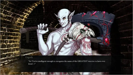
Orgoth - Supporting character concept art (default + color variant)
Malimos - Demon concept art CG
Centipede Demon - Demon concept art CG
Enchanted Stairs - WIP BG (default + color variant)
Holy symbol - Item concept art
Bloody handprints - Item concept art
Buttons during Time travel - UI concept art
ALL OTHER VISUALS ARE PLACEHOLDERS, SUBJECT TO CHANGE
AUDIO
SFX added upon clicking on the choice menus
SFX changed when clicking through the Journal
SFX shortened for Ray, your best pal
SFX added for a burning building scene
WRITING
Several new contingencies added for time travel
Minor adjustments and additional descriptions throughout for clarity!
ANIMATONS
Timelapse - Transitions begin at the end of the prologue, leading into a brand new scene
Skip and pause buttons programmed in the timelapse for accessibility
Softly flashing light on quick menu during Gods monologue in Chapter 1 to point out the journal
Time travel - Variant scenes dependent on if transitions are on/off, or if flashing lights are on/off
Endings - Each of the 8 endings has a custom series of screens
Credits - Brand new, animated sequence accessible from the options menu and at the end of each playthrough
Socials - All of our socials are available at the end of each playthrough. Kickstarter and Steam coming soon!
Whew!! It's a lot, right? We're all working exceptionally hard to bring the final assets to you all. In the coming months I'll be sharing my progress on our socials, and strive to bring the completed demo to you all in 2024!
Please share your support on itch.io if you have fun, by leaving a positive comment or a 5-star rating!
Thank you all so much for your time and enthusiasm. I'll be sharing more updates with you all soon!
#catalyst: blind faith#indiegamedev#vn development#vndev#gamedev#game update#character art#fantasy art#background art#ui#ui ux design#uidesign#my hype is off the fucking charts#seriously cannot wait to see how you all like it#thank you for your support everyone!!!
9 notes
·
View notes
Note
hello hello. i dont know if you're into pokemon but I started playing Violet the other day and I tend to nickname my pokemon after whatever my current hyperfixation is so ofc right now they're getting mysme nicknames (right now my charcadet is (suit) Saeran (gonna evolve into ceruledge), my kirlia is Ray (gonna evolve into gardevior). i plan to catch a sneasel/weavile for unknown (totally didnt get the idea from an art i saw). Trying to pick something for saeyoung but nothing has felt right yet. an electric type? fire? maybe a dog pokemon bc with his loved ones saeyoung is both an excited puppy AND a guard dog)
ANYWAY so I started wondering about everyone's favorite twins and pokemon
What kind of pokemon do you think saeyoung and the various saerans would have? what would they be if they WERE pokemon? in a canon setting would they play pokemon?
i can see saeyoung with fire/steel/electric types, especially robot- or machine-like pokemon. ray/ge saeran with grass types is obvious, but I can also see him with fairy types. theyre deceptively cute but can mess you up. suit and unknown scream dark type teams. maybe some poison types for unknown. like i think he'd have team rocket/[insert region team] grunt-esque pokemon.
saeyoung and all of the saeran's have at least one pokemon (probably their first/partner) that they found abandoned and in bad shape that they took in and it decided to stay with them after it recovered.
maybe they have an espeon (saeyoung) and an umbreon (saeran) to complement their "we're opposites but in a balanced and complimentary way" vibe.
and also bc i must inflict this on all my faves who are convinced they're bad and unlovable: at least one pokemon on their team evolves with high friendship/affection. even better if for some reason he doesn't know what causes that pokemon to evolve and he maybe cries a little when he finds out. what do you mean he's LOVED??
ANYWAY sorry for the really long ramble haha. this was supposed to be a short ask but it kinda got away from me 😅 anyway, i hope you have a good day!! i love your writing and character analyses!!
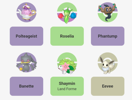
Oh, you've come to the right person today, because I spend my time stressing out over what Pokemon I would use on their teams if I ever wrote a story for it. I've done this a few times before but I can never really make my mind up so I wouldn't say that this is a concrete idea. So, here is a slider I would use for Ray > Suit Saeran > GE Saeran. I think some of it is self-explanatory. I suggest dark, ghost, and grass if anything.
Phantump for a Ray who feels lost and dead to the world. Polteageist for his desire to feel like a prince in his haunted castle. Budew for a boy who can't be fully blossomed just yet... but, he's so close to that chance. Suit Saeran would only use one Pokemon in my mind and it's Banette. A Pokemon that happens to be seeking revenge in the same way he is. It might seem like a major stretch but mega evolution seems incredibly possible in this situation.
Shaymin is the Pokemon of gratitude and I feel like it would appear in the garden when he is in the process of thanking you for being there with him as he finally freed himself from his heavy chains. He and Saeyoung do have a set of Eevee together! I feel like they need to have a matched set, and his Eevee has been tucked away in their pokeball for a while until he realized the error of his ways.


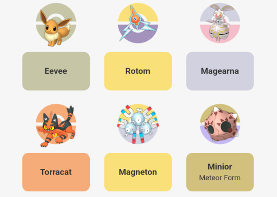
Whereas, Saeyoung is always really tough to work with because there's so many different Pokemon that would work for him symbolically. Sure, we can pick some joke options if we want to do so, but I'm trying to imagine what would work for his work in the agency. Did they give him a team or is it a team he's caught himself?
In the end I just decided to give him a team that he crafted. He deserves to have a cat that shoots fireballs from its mouth. Of course, I don't imagine that'll end well for him since the cat likely gives him a free haircut everyday with burnt edges. Rotom is the given. Everybody who's ever drawn him with the Pokemon always gives him Rotom. It's right. Three heads are better than one! Magneton helps to hack and unlock problems!
His Eevee doesn't battle. It's kept safe in his bunker, or it's Pokeball. He hates to make Eevee sad about not seeing its own twin or Saeran. Magearna makes sense to me, because what is more in character for him than to discover this mechanical Pokemon and help bring it back to life? Minior for the stars! It's either that or Clefairy. I couldn't make up my mind but in the end I decided on stars.
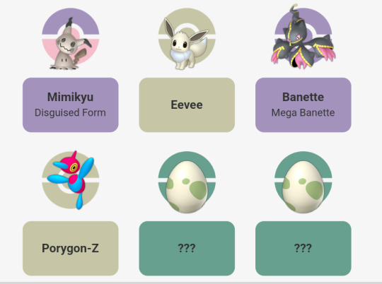
Which brings me to Unknown and SE Saeran. Yeah, SE Saeran will receive that Megearna as a gift from his brother. His Porygon-Z likely was released after Mint Eye was taken down, or it's still in the box for now since that was likely his main partner for being able to hack into the RFA. Mimikyu and Banette are self-explanatory. Budew would be a new addition in his time spent trying to enjoy the clouds and grass! Milcery is a surprise, though! I have a feeling that is a companion he made one afternoon that tried to sample his ice cream and now he's got a friend that helps him craft his own ice cream.

6 notes
·
View notes
Text
why can i not turn off vpn on my iphone
🔒🌍✨ Get 3 Months FREE VPN - Secure & Private Internet Access Worldwide! Click Here ✨🌍🔒
why can i not turn off vpn on my iphone
VPN troubleshooting iPhone
Troubleshooting VPN on your iPhone can be a frustrating experience, but with some basic steps, you can often resolve common issues and get back to browsing securely and privately. Here are some steps to troubleshoot VPN problems on your iPhone:
Check your internet connection: Ensure that your iPhone is connected to a stable Wi-Fi or cellular network. A weak or unstable connection can cause VPN disruptions.
Restart your iPhone: Sometimes, a simple restart can fix software glitches that may be causing VPN problems. Hold down the power button until you see the slider, then slide to power off. Wait a few seconds, then hold the power button again to turn your iPhone back on.
Update your iPhone and VPN app: Make sure both your iPhone's operating system and your VPN app are up to date. Updates often include bug fixes and improvements that can resolve connectivity issues.
Check VPN settings: Verify that your VPN settings are correct, including server address, username, and password. Double-check these details, as even a small typo can prevent your VPN from connecting.
Try a different VPN server: If you're having trouble connecting to a specific VPN server, try switching to a different one. Some servers may be experiencing high traffic or technical issues.
Reset network settings: If you're still experiencing problems, you can try resetting your iPhone's network settings. Go to Settings > General > Reset > Reset Network Settings. Keep in mind that this will erase saved Wi-Fi passwords and VPN configurations, so you'll need to set them up again.
Contact VPN support: If none of the above steps resolve your VPN issues, reach out to your VPN provider's support team for assistance. They can offer personalized troubleshooting tips and may be able to identify any server-side issues causing the problem.
By following these troubleshooting steps, you can often resolve VPN issues on your iPhone and enjoy a secure, private internet connection wherever you go.
Disable VPN iPhone settings
Disabling a VPN on your iPhone is a straightforward process, providing you with the freedom to access the internet without routing your connection through a virtual private network. Whether you're troubleshooting connectivity issues or simply prefer to browse without VPN protection, here's a quick guide on how to disable VPN settings on your iPhone:
Access Settings: Begin by unlocking your iPhone and navigating to the "Settings" app. It's typically represented by a gear icon on your home screen.
Select VPN Settings: Scroll down the Settings menu until you find the "VPN" option. Tap on it to access your VPN settings.
Turn Off VPN: Within the VPN settings, you'll see a list of configured VPN profiles, if any. To disable VPN, simply toggle the switch next to each VPN profile to the "Off" position. This action will deactivate the VPN connection.
Confirm Deactivation: After turning off the VPN, it's advisable to confirm that it's indeed disabled. You can do this by checking the status bar at the top of your iPhone screen. If the VPN icon, usually a VPN symbol or a small VPN badge, is no longer visible, then the VPN has been successfully disabled.
Verify Internet Access: Finally, open a web browser or any internet-dependent app to ensure that your iPhone is now using its regular internet connection rather than the VPN. If you can access websites and online services without any issues, then the VPN has been effectively disabled.
By following these steps, you can easily disable VPN settings on your iPhone whenever the need arises. Whether you're troubleshooting connectivity problems or simply prefer to browse without VPN protection, this guide empowers you to control your device's privacy settings effortlessly.
VPN connection iPhone issue
A VPN connection issue on an iPhone can be frustrating and prevent you from accessing the internet securely and anonymously. If you are experiencing problems with your VPN connection on your iPhone, there are several common troubleshooting steps you can take to resolve the issue.
Firstly, ensure that you have a stable internet connection. A weak or unstable internet connection can cause disruptions in your VPN connection. Switching between different Wi-Fi networks or cellular data can also help identify if the issue lies with the network.
Check if the VPN app is up to date. Updating the VPN app to the latest version can fix any bugs or glitches that may be causing the issue. If updating the app does not solve the problem, try reinstalling the app to reset any settings or configurations that might be causing the connection problem.
Another step to troubleshoot the VPN connection is to restart your iPhone. Rebooting the device can resolve temporary glitches or conflicts that may be interfering with the VPN connection.
If the issue persists, contacting your VPN service provider for assistance is recommended. They can provide specific troubleshooting steps tailored to their service and help you diagnose the problem more effectively.
By following these simple troubleshooting steps, you can resolve VPN connection issues on your iPhone and enjoy secure and private internet browsing on the go.
iPhone VPN won't turn off
If you find yourself in a situation where your iPhone VPN won't turn off, it can be frustrating and concerning, especially if you're trying to access certain apps or websites. However, there are several steps you can take to troubleshoot and resolve this issue.
Firstly, try restarting your iPhone. Sometimes, a simple reboot can fix minor software glitches that may be causing the VPN to malfunction. To restart your iPhone, press and hold the power button until the slider appears, then slide it to power off. Once your iPhone is powered off, press and hold the power button again until the Apple logo appears to turn it back on.
If restarting your iPhone doesn't resolve the issue, try disabling the VPN directly from the settings. To do this, navigate to Settings > General > VPN on your iPhone. Here, you should see a list of configured VPN connections. Tap on the toggle switch next to the VPN connection that is currently active to turn it off. If the toggle switch is unresponsive or grayed out, try deleting the VPN configuration by tapping on the (i) icon next to the connection and selecting "Delete VPN."
If you're still unable to turn off the VPN, it's possible that there may be a more significant software issue at play. In this case, you may need to reset your iPhone's network settings. To do this, navigate to Settings > General > Reset, then tap on "Reset Network Settings." Keep in mind that resetting network settings will erase saved Wi-Fi passwords and VPN configurations, so you'll need to re-enter them afterward.
If none of these steps resolve the issue, it may be worth contacting Apple Support or the provider of your VPN service for further assistance and troubleshooting.
VPN toggle not working iOS
Experiencing issues with your VPN toggle on iOS? You're not alone. Many users encounter difficulties when trying to activate or deactivate their Virtual Private Network (VPN) on their iPhones or iPads. This problem can be frustrating, especially when you rely on VPNs for privacy, security, or accessing region-restricted content.
There are several potential reasons why your VPN toggle may not be working correctly. Firstly, ensure that you have a stable internet connection. VPNs require an active connection to function properly, so if your internet is intermittent or weak, it could prevent the toggle from working as expected.
Another common issue is software bugs or glitches within the iOS operating system itself. Apple regularly releases updates to address such issues, so make sure your device is running the latest version of iOS. Additionally, restarting your device can sometimes resolve minor software hiccups.
If the problem persists, it may be worth troubleshooting your VPN app. Try force-quitting the app and reopening it, or even reinstalling the app altogether. Sometimes, corrupted app data or settings can interfere with the VPN toggle's functionality.
In some cases, conflicts with other apps or settings on your device could be causing the problem. Try disabling any other VPN or network-related apps temporarily to see if that resolves the issue. Additionally, review your device's settings to ensure there are no conflicting configurations that could be impacting the VPN toggle.
If none of these solutions work, reaching out to the VPN provider's support team for assistance is recommended. They may have specific troubleshooting steps or insights into the issue based on their app's functionality and compatibility with iOS.
By addressing these potential causes and trying these troubleshooting steps, you can hopefully resolve the issue with your VPN toggle on iOS and regain control over your online privacy and security.
0 notes
Text
ENDLESS DUNGEON CLOSED BETA IMPRESSIONS
WHAT
After valiantly obtaining a closed beta key via Twitch drops, I could finally try out the latest closed - multiplayer only - beta for Amplitude Studios’ ENDLESS Dungeon. Yet another entry in the overarching ENDLESS universe, it’s a roguelite tactical action game in a similar vein to Dungeon of the ENDLESS. Since I have the latter, there wasn’t any question about being interested in ENDLESS Dungeon. As it’s a closed beta, there’s still time for things to change ahead of its release on 19 October 2023 - provided it’s not further delayed.
youtube
SETTINGS
The options menu doesn’t have all that much to play around, with some settings appearing to be unavailable for tweaking. The beta has the option to toggle an ‘Easy Mode’ which simply states to offer ‘several bonuses’ when you explore, but I didn’t try it out. Besides, I don’t even know if turning it on on my end will apply when I join someone else’s session.
Languages offered are:
German
English
Spanish
French
Japanese
Korean
Polish
Brazilian Portuguese
Simplified / Traditional Chinese
You can change subtitle size which is neat. There’s an interaction prompt background opacity slider, presumably not applicable to subtitles or other text boxes. There’s mouse aim assist alongside the laser sight, so that’s always nice.
PRESENTATION
Moving from the pixel top-down style of Dungeon of the ENDLESS, ENDLESS Dungeon uses 3D models in an isometric view. It does look quite nice, though I found it really hard to see certain area of effects. There are player turrets with red AOEs - obviously friendly - but then you have damaging effects from enemies which are also red. When things get hectic, I have missed seeing the warning triangles, or simply ran into terrain and wondered why I wasn’t going anywhere.
I guess I might need to turn brightness up on my end as well; regardless I hope there’ll be improvements to visual clarity. The markers on the map are at least colour-coded for your convenience with a really long legend you can refer to. Now this kind of begs the question: where’s the colour-blind friendly options? The monster spawners don’t have unique symbols on the map, and the colours are to indicate what they’re weak to. I hope this would be added for accessibility and all.
GAMEPLAY
One thing’s for sure: it’s more, uh, action-packed than Dungeon of the ENDLESS.
Before I get into the meat of the gameplay, there’s a little big problem with the multiplayer only closed beta. Not everyone has it for one, so games are a touch hard to find. At least, games in my region where I could hope for less than 50 ping. I connected to Europe or either United States servers during my playtime where I pretty much had an even harder time knowing when to dodge or even what was attacking me.
I bring this up early because unlike Dungeon of the ENDLESS, ENDLESS Dungeon feels like a much better time with friends as horrendously laggy as it were for me during this beta. I’m more of a turn-based, low speed kind of guy, and without being able to try the single player during this period, I wonder how the scaling is going to be like.
Anyway.
Up to three players can be in a game session at a time to descend into the Core of the space station they find themselves getting repeatedly resurrected in. With the power of friendship, guns and turrets, you and your buddies need to escort a fragile Crystal Bot through the zones while besieged by any assortment of creatures wanting pieces out of all of you. If you go down, your friend can help you back up. If the Crystal Bot goes down, all of you die.
As you might expect, the playable characters all have their own roles. I played Shroom, the medic, just so that I wouldn’t embarrass myself dying rushing in to kill enemies (har har). Her active skill has no cooldown but requires Soul stacks to heal. Ultimates require energy to cast, gained by dealing damage to enemies. I would pretty much just hang on to my Soul stacks and spray and pray to get my ult up for the heals.
As alluded to earlier, there’s a rock paper scissors thing going on, where certain elements are more effective against certain enemies. From the beta, it seemed we’d be more likely to get collectibles than anything usable - much less worthwhile - and in one session, 98% of the weapons from either chests or merchants were only for the Zed player wielding a heavy gun which neither the Bunker player nor me could use. At least if there’s any collectible drops, the loot is locked to you when it appears so it won’t get nicked from you if it’s that crucial.
There are fixed monster spawners instead of randomly just appearing from any old dark room with waves coming in as the danger level peaks or from certain actions, like from researching new tech or moving the Crystal Bot. At least the Crystal Bot can be upgraded this time, using shards you find lying around. That does also call the horde, so best be ready.
Action does feel more emphasized here as turrets have relatively limited range - compared to effectively covering an entire room in Dungeon - so the limited nodes have a greater impact. Likewise, the slots to build resource generators also don't feel as plentiful and monsters will go after these constructs that you can’t rebuild. Once the industry tanks, tough luck trying to make anything.
This game does let anyone be a fixer-upper to restore turret health at least, and they can get upgraded once they see enough action. Should a blackout happen, though, you’re going to have to replace all of them as they can no longer be restored. At least enemies don’t open doors you haven’t, so there’s a bit less crying about them trying to reroute your meticulous funnel.
Unless…
At certain points of exploration, you will be moved to a separate slice of zone, cutting you off from the previous segment. If you forgot anything there, then too bad, they’re gone. You do also leave the baddies behind, so you don’t have to worry about getting ambushed. Instead, you have to be concerned over bosses! These can have their own mechanics and phases, like how the Bug Momma will become invulnerable until you find the nests to enrage her to expose her fleshy underbelly. These so-called arenas can be quite small to maneuver in, so hope you can be quick on your feet.
It’s kinda funny that way because there are some rooms that are just so huge but have barely anything in them.
On clearing a zone, you get scored and earn Scrap that can be later used at the Saloon. This Scrap and most progression is only applicable to the host as far as I’ve experienced, which is a little of a bummer really? I wanted to go check them out in my own time in my own instance, but since I’ve only joined games and not hosted any of mine, I’ve got nothing.
Whenever you return to the Saloon, the hub area will gradually open up with a variety of things to check out and manage, or just chat up the people here.
There’s the Booster Chest at the Kiosk where you can buy a chest for some loot for your next run. Only the host can manage this so people don’t get funny ideas to throw a bunch of materials for junk.
The Library will have all the lore you’ve encountered, as well as ‘quests’ for respective Heroes to check. This is similar to Dungeon, where the characters in between zones in the elevators can have conversations and unlock unique dialogue and / or buffs (or demerits) depending on their relationship with each other.
From the Workshop you can find a list of equippable Chips for a Hero, but only after clearing the first step of their associated quest. The beta shows there’s at least three slots per hero as well as the Crystal Bot. This too, is currently only for the host to change.
The Hacking Post opens up different zones you can start in, so there’s a certain level of control for at least which bunch of monsters you’d prefer to fight first.
The Cafe is home to my current favourite, Fassie. You can find drink recipes as you explore and have him mix them for you. The ones I’ve gotten access to so far pretty much open up several flavours (pun not intended) of risk reward play, so pick your poison.
Normally I’d have a little section about the story of a game I play, but I haven’t been able to unlock all that much so I won’t comment on what piecemeal they have right now.
CONCLUSION
Even as I got sling-shotted across the map from lag after some rolly boys ran over me, I enjoyed the multiplayer ENDLESS Dungeon closed beta. That said, the issues with visual clarity I had are far more easily fixed than connecting to multiplayer lobbies, so if I do get the game eventually, here’s hoping single player doesn’t feel so bad. I fully acknowledge there’s likely to be a degree of skill issue, but until I can give it my best shot, we’ll leave it there for now.
Good luck on your adventures to the Core!
0 notes
Text
How to Curve Text in Cricut Design Space?
A Cricut works only with the Cricut Design Space app. It is because the app is the interface between the computer/mobile and Cricut machine. You can send the designs from the computer to your Cricut machine. Further, you can upload your designs or create new designs on the canvas. Also, the app lets you write, shape, and many other things. You may have to curve the text for some projects if you are writing. It becomes important if you are designing a mug or text for t-shirts. So, we will learn how to curve text in Cricut Design Space.
Curving Text on Your Computer
You can easily bend the text into a circular shape using the Curve function. Let us see the steps involved in Curving the text.
First, open the Design Space software on your computer.
Next, select the new project or open the previously saved project.
Further, you need to click on the Text tool in the Design panel.The text option is present to the left of the Canvas.
Now, type a text into the text box, and then choose the font for the text. Also, you can set the font style, use the Letter Space tool and adjust letter spacing as needed.
Further, if the text contains multiple lines, you need to curve each one. The best is to write the lines in separate boxes, or you can Ungroup to Lines.
Next, you can go to the Text Edit bar and find the Curve tool option. It is present between the Alignment and Advanced tools.
Now, drag the slider to the right to curve the text downward. The Design Space uses an imaginary circle to determine the arc of the text. Also, the size of the circle reduces as the slider moves to the right.
Additionally, you need to note the number in the Diameter field while dragging the slider. It is important to note that the smallest diameter will change depending on your text’s size, length, and spacing.
Also, if you are curving multiple lines of text, you need to quickly match the curvature of previously curved text by manually entering the same number in the Diameter field.
Plus, you can curve the text in the opposite direction. To do that, you need to add a dash before the number as per your need. The dash or – means minus, and the Design Space curves the text in the opposite direction.
Curving Text on Your iOS Device
If you use Design Space on an iOS mobile or tablet, the app contains a curve text option. But it is not currently available on Android. Let us see the Curve text in Cricut Design Space iOS app.
The first step is to launch the app on your iPhone.
Next, you need to select the Text. It will be present at the bottom of the Canvas.
Now, just type a line or word in the text box. Also, choose the font and font style.
You can even use the Letter Space tool and adjust the letter spacing.
You must ungroup if your text contains multiple lines.
Next, go to the Curve tool. You can find the option by selecting the Edit option and the Curve tool.
Further, the Design Space will take a few minutes to analyze the text for size and spacing. After that, you will have a display slider and a number field.
Now, to curve the text, you must drag the slider to the right side. It will curve the text downward.
For curving the text upwards, you can drag it to the left, where you will notice that a dash is added to the number in the diameter field. So, that minus symbol acts as an indication of the upward curve.
Conclusion
The Cricut Design Space has many features and functions that enhance the project’s outlook. You can add different shapes, colors, text with different fonts and font sizes, and many more. And sometimes, in your text project, you need to curve it to fit the project. For that, you can use the curve feature. The curve text in Cricut Design Space is an easy feature to use, and you can curve the text both upward and downward.
FAQs
Can I edit the text after curving it on Design Space?
You can select the Curve tool function because the text might contain more than one line in the same text box. You can fix the issue by inserting separate text boxes for each line. Or it is just easy to use the Ungroup to Lines options and move the lines of texts into separate text boxes. After that, you will be able to curve each line separately.
Why can’t I select the Curve tool function?
You can select the Curve tool function because the text might contain more than one line in the same text box. You can fix the issue by inserting separate text boxes for each line. Or it is just easy to use the Ungroup to Lines options and move the lines of texts into separate text boxes. After that, you will be able to curve each line separately.
Can I Curve text on Design Space on an Android phone?
No, you can’t curve the texts on your Android phone. The Curve text is only available on Design Space computer and iOS. The Curve text feature lets the user reshape the linear text into curves. You can add a different layer to the original text by curving the text. So, if you want to do attractive projects and design a mug or tumbler, you can use curves to fit the surface.
Visit - Cricut.com/setup
design.cricut.com
www.cricut.com/setup
Cricut.com sign in
#Curve Text in Cricut Design Space#Cricut Design Space#Cricut Design Space Download#Cricut Design Space app#Cricut Design Space login#cricut.com/setup#design.cricut.com#cricut explore air 2#cricut setup
0 notes
Text
Canon 1200d Image Quality
We tried the EOS 1200D with the EF-S 18-55mm f/3.5-5.6 IS II unit focal point, which offers a genuinely standard central reach for a pack focal point and critically incorporates picture adjustment.
Canon 1200d Image Quality
This is significant for Standard, as contenders like Sony, Olympus and Pentax all proposition picture adjustment in their DSLRs. The contrast among Standard (and Nikon) and the others is that Sony, Olympus and Pentax have decided on adjustment by means of the camera body, as opposed to the focal point, which accordingly works with their whole scope of focal points. Ordinance's framework is clearly restricted by which focal points you pick, yet it offers the slight benefit of showing the settling impact through the viewfinder. Group and Nikon likewise guarantee that a focal point based enemy of shake framework is innately better as well, yet the jury's out on that one.
The EOS 1200D's top-mounted shooting mode dial has a huge number of letters and symbols. The alleged Imaginative Zone highlights Customized Auto (P), Screen Need (television), Opening Need (Av), and Manual (M) modes. Ordinance's exceptional A-DEP (Programmed Profundity of Field) mode has unobtrusively been dropped from the EOS 1200D.
The EOS 1200D now includes the completely programmed Scene Astute Auto mode, which examinations the scene before you and naturally picking the best settings, similar as the frameworks utilized by parcel of advanced compacts. The 1200D likewise offer an Innovative Auto mode which permits you to change a couple of key settings utilizing the LCD screen through a basic slider framework for changing the opening and openness remuneration, or Foundation and Openness as the camera alludes to them. Imaginative Auto additionally incorporates Essential +. Basically a more outrageous variant of the deeply grounded Picture Styles, this offers nine choices including Standard, Distinctive, Delicate, Warm, Extraordinary, Cool, More splendid, Hazier and Monochrome, which can all be intuitively changed to suit your taste.
There's a large group of scene modes including Streak Off, Representation, Scene, Sports, Night Picture and, strangely for a tradable focal point camera, a nearby mode too. Most of these scene modes permit clients who would rather not tinker with screen speeds, f-stops, white equilibrium or ISO settings to tell the camera what sort of photograph they are going to take, which helps the EOS 1200D/Radical T5 to advance these settings for that specific subject. We battled to see the place of the nearby mode however, as the nature of one's nearby shots relies more upon the utilization of the right sorts of frill -, for example, a large scale focal point and potentially a ring streak - than any camera setting. The now settled Element Guide choice in the EOS 1200D's menu framework helpfully gives a short depiction of each setting and its impact.
Ordinance EOS 1200D Canon EOS 1200D
Front Side
In the Imaginative Zone, the picture taker will set a ton of shooting factors, including white equilibrium, responsiveness, AF mode, openness pay, drive mode, etc. The vast majority of these capabilities have their own devoted buttons on the rear of the camera, while others can be set on the intelligent status screen open through the Q (Fast Control) button. Models for the last option incorporate record quality settings, metering mode, streak openness pay and Auto Lighting Optimiser.
The accessible white equilibrium settings are Auto, Light, Shade, Overcast, Tungsten, Fluorescent, Glimmer and Custom; it is basically impossible to enter a Kelvin esteem physically. You can adjust any of the presets utilizing the White Equilibrium Rectification highlight. The ISO speed can be changed by squeezing the ISO button and turning the control wheel or utilizing the bolt fastens on the route cushion. You don't need to hold down the button while changing the setting. The ISO speed can be set from ISO 100 to ISO 6400 in full-stop additions, and Auto ISO is likewise accessible. The picked ISO speed is likewise shown in the viewfinder.
The EOS 1200D/Renegade T5 offers a scope of three auto center modes (A single Shot, man-made intelligence Concentration and man-made intelligence Servo) and there's a 9-point AF module with a cross-type focus point and eight line-type AF sensors. A single Shot AF is identical to AF-S, while man-made intelligence Servo is exactly the same thing as AF-C on other makers' models. Man-made intelligence Center is like what some other camera creators call AF-An in that it consequently changes from A single Shot AF to man-made intelligence Servo in the event that a still subject beginnings moving. As respects AF point choice, it tends to be done physically by raising a ruckus around town point selector button first, then, at that point, utilizing the four-way regulator to choose the AF point. The picked/dynamic AF point illuminates in red in the viewfinder. Being used, we have viewed the AF framework as lovely fast even with the pack focal point, albeit the center engine was a piece clearly for our preferences (of course, considering that the 18-55mm IS focal point doesn't have USM).
0 notes
Note
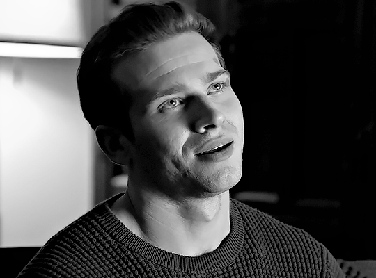
hi can you make a tutorial on how you sharpen your gifs? i especially love the black and white ones you make
Hi Nonnie! Sorry you've had to wait a little bit, I've just been really insanely busy with a thousand things 😅 Anyway, I'm not sure how exactly to do this, but hopefully this makes sense!
We'll be doing this scene, to go from the top gif to the bottom gif:


(This tutorial assumes basic knowledge of gif-making and smart filters, and is probably long-winded because I haven't been making gifs for very long, but this is the way I do mine.)
Tutorial under the cut:
Couple things to note that make a huge difference before you even start:
Use high-quality videos! I try not to go below 1080p for anything, and sometimes that means downloading bigger files.
Make sure that whatever application you use to get your frames isn't distorting them, or skipping frames. I use MPV player.
Make sure your gif size is correct when you crop it, if you're posting it somewhere). For example, if you're making a single gif on a row, Tumblr's optimum width is 540px. If you make it 500px, or 550px or whatever, it's going to look super crunchy and weird after you post it, so stick to their sizes.
We're gonna begin at this page (if you need a tutorial on how to get here, let me know, but I'm assuming you know!)
First, make sure your gif is a smart object! If your gif isn't a smart object, you won't be able to apply the smart filters. If it is, you'll see this symbol next to it. To convert all your layers to a smart object, select them all, right-click, and select "convert to smart object."

Next, duplicate your gif layer so you have two. Hide the top layer and select the bottom layer. Your layers should look like this:
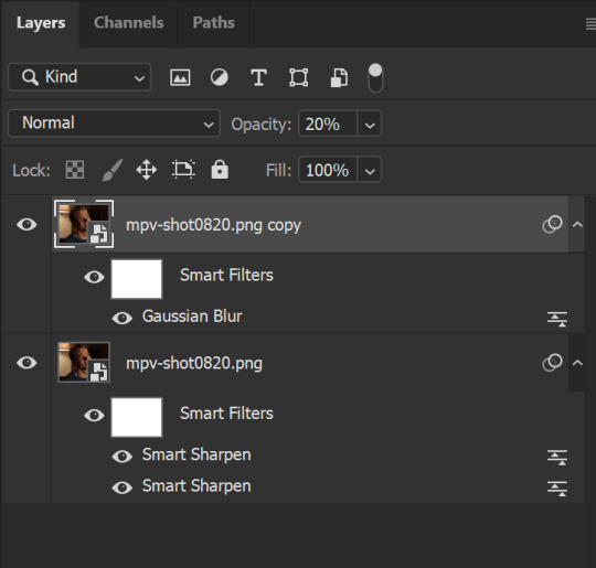
Remember we're working on the bottom layer first! Go to Filter > Sharpen > Smart Sharpen. Use these settings, depending on what looks best for your gif/video quality:
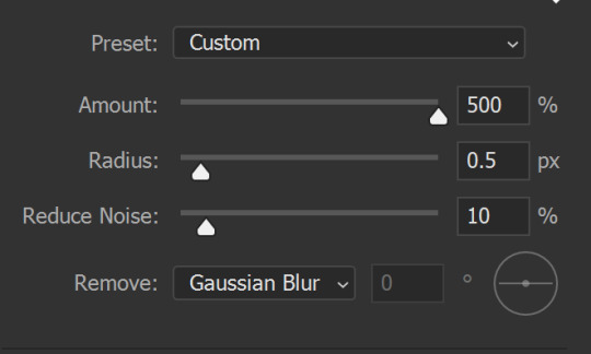
The radius can be set to 0.2px to 0.5px depending on your quality/preference. You can also choose to remove Lens Blur instead of Gaussian Blur but these are my preferred settings. (I don't do anything with the Shadows and Highlights section)
Next, do another Smart Sharpen, but this time, use these settings:

(a popular choice for this second smart sharpen is 10%-10px, but I like the clarity 20% gives just a little bit more.)
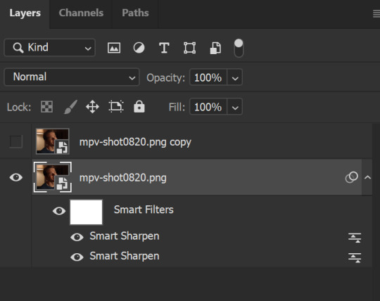
This is what my layers look like right now:
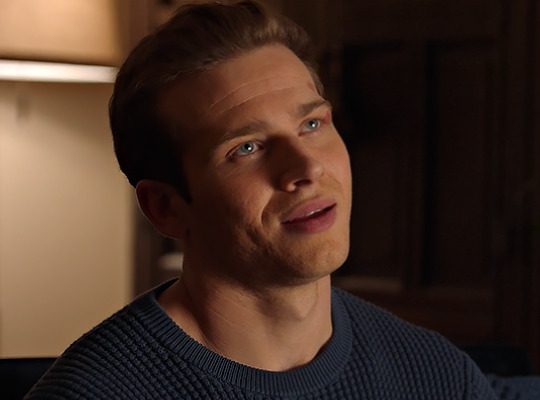
And this is what my gif looks like. I removed the sharpening from the right side of the image, and while it's not super obvious like this, I think you can see the difference best in Buck's eyes. The eye on our left has much more detail and depth, while the one on our right isn't as clear:
You can stop right here if you want to, if you're happy with the way your gif looks. However, my preference is always to soften the crisp edges just a little so it doesn't look over-sharp, and also give it some clarity, which is where that second layer comes in.
Select that top layer and un-hide it. Remember that there are no filters on this layer so far. Go to Filters > Blur > Gaussian Blur. Choose a radius of 0.4-0.7px, and click enter. The gif will look like this:

Next, change the opacity of this top layer to 20-25%. You should have your sharpened gif back, but it will look just a little softer and less harsh along the edges. You can change this opacity depending on your scene, so it's really like a slider you can control to go back and forth.
Your layers will look like this:
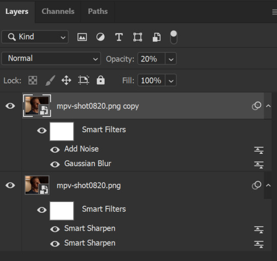
Then, one more optional step that I like to do is add a noise layer. This seems counter-intuitive, but when you have big blocks of color, the noise helps disperse them just a little bit.
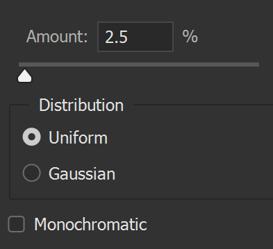
Go to Filter > Noise > Add Noise. Use these settings:
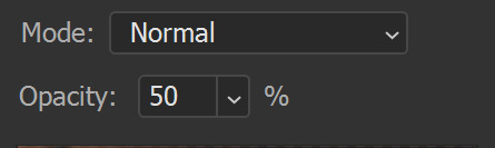
Then, in your Layers pane, right-click where it says Add Noise, and in the menu, click Edit Smart Filter Blending Options. You should get this dialogue box, where you can change the opacity of that filter to 50%.
I know it kind of seems like "what's the point?" when this particular layer is already low-opacity, but it does make a difference (to me, at least) in some gifs where there's a lot of color/light, especially after you color the gif in!
This is what your layers should look like:
And this is what my gif looks like after I run it through the frame animation, all sharpened!
Here it is colored the way I color my gifs xD (and also slightly slowed down):
And here it is in black and white (I love black and white, too xD):
I hope this helps, Nonnie! Feel free to drop me an ask if something here doesn't make sense.
Last tips:
Don't be afraid to play around with multiple settings until you find the one that works best for you.
Make. An. Action. I can't tell you how much actions save time when I'm working because then I don't have to remember every last detail. The first few times, just get in practice of doing it yourself, but after that, actions are amazing. Some people on tumblr have actions you can download and use, too.
Different scenes/lighting will result in different outcomes of your sharpening, so you might have to play around with it. Sometimes, I add an extra Smart Sharpen layer to that bottom layer to help clarify some of the details, and other times, I just change the existing settings to fit the scenes.
Sharpening tends to be a personal preference thing, so just play around with all the settings until you find one that works best for you.
Happy giffing!
#zee's tutorials#tutorials#gif tutorial#sharpening#photoshop tutorial#resources#ps help#dailyresources#userkosmos#userrin#tuserkay#usermarsy#userphotoshop#completeresources#usermare
297 notes
·
View notes
Note
Do you think the peacock miraculous would have looked better if instead of blue and pink, it was blue and turquoise or seafoam green?
Yeah it would've been better. Cause peacocks, while associated with blue, that isn't the only color to them. They have a little bit of white, silver, and turquoise specifically in their tail feathers.

And the first time we saw the peacock pin, I thought it reflected a peacock well with the tail feathers, though I might've tweaked the bird body to be all blue. I also really liked it having 9 feathers to it, as it reflected a full spread out peacock tail than what they settled with, the 5 feathers. It isn't as appealing to me. For the timer, could've set up that 2 go out at the same time until that 9th center feather goes out alone.

But I guess design wise, they couldn't figure out how to make Duusu match with the pin, or maybe s/he came out too green for their liking, and they had Turtle for green, which I could see as her tail would be very eye catching and the biggest part of her. Now the easier solution might've been to switch Turtle to blue and let Peacock be green, there are green peacocks out there.

I also had done and edit to see what Turtle would look blue, just so it could better aesthetically match with Nino who is blue coded.
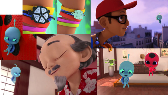
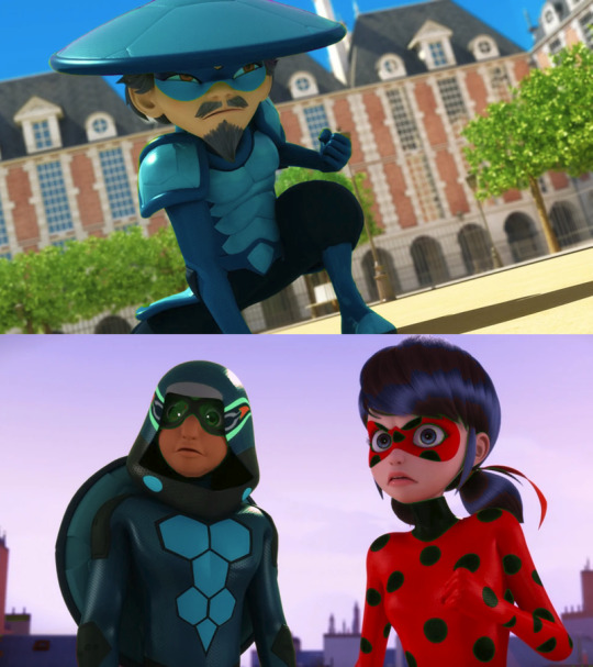
Another solid possibility to do was just let Peacock represent blue AND green, for in Chinese culture, in terms of symbolism, those two colors are pretty close. They both can represent the element Wood, they both can represent growth and advancement, are associated with longevity, harmony, prosperity, and the heavens. Peacock could've been a really solid way to reflect this as this bird is associated with blue and green. Also could've made it clear by coloring and symbolism that Peacock represents Wood of the 5, and the 9 tail feathers could've been a nice small nod to the Azure Dragon as the number 9 in Chinese culture is associated with dragons.
Here's an edit I did a few years ago to explore what Duusu might've looked like if s/he was closer to the pin's first on screen design.

As for what alternative color to do for Turtle, there are a lot more options than green. It easily could've taken Fox or Bee's slot for orange or yellow with an eastern box turtle.
Red eared slider have a lot of yellow on them.
They also could've done indigo for Turtle so all colors of the rainbow could be there. Or pink if you want to mix it up. Could've also done white as there's no white amongst the core 7.
Either way, yeah, Peacock would've been better as a mix of blue and turquoise, or entirely representing blue and green.
Most I'll give to Duusu's currently design is that they're a nice inverse of color for Marinette, who has a little bit of blue but a lot of pink, while Duusu has a lot of blue but a bit of red-pink. So if you like clever color coding, Duusu could've really worked for Marinette (Mouse also works with the white, black, and pink to the over all colors to Marinette).

#ask Punchie#kwami swap#slight ml salt#kinda#peacock miraculous#peafowl miraculous#duusu#turtle miraculous#long post
41 notes
·
View notes
Text
Things I Want In the Character Creator of Dragon Age 4
- Better Hair Styles. Just...better.
- LONG HAIR. I KNOW IT CAN BE DONE AND I KNOW IT CAN BE DONE WELL. LET ME HAVE GLORIOUSLY LONG LOCKS BIOWARE.
- If Dalish elf is an option, different styles of vallaslin. They’ve been different in every game and I love the idea of regional differences among clans.
- If Qunari is an option, please, for the love of God, BETTER. HAIR. OPTIONS. The Qunari hair/horn options were seriously tragic in Inquisition.
- The FUCKING OPTION to make my characters as muscular as I damn please. It makes no goddamn sense for a greatsword-wielding elf to be this stick-thin little beanpole without an ounce of musculature in their arms. It also makes no sense for a Circle mage (who, from what I can tell, live largely sedentary lives) to be thin. LET ME MAKE A CHUBBY CHARACTER. Please, Bioware, just diversity in body styles.
- The option to have dyed hair. I know there’s someone in Thedas who has come up with the idea of hair dye. Let us have characters with outrageous hair colors for no other reason than because we can.
- Better. LIGHTING. No dingy green filter, just bright, clear light where you can actually see the proper colors.
- I really liked the idea of being able to choose what your character sounded like, so that would be cool to have again, but I understand this would be hard to do.
- Body tattoos. Just...body tattoos. And let them be visible when wearing armor (Iron Bull, I’m looking at you).
- Cyberpunk 2077 gave the option of allowing you to make a transgender character by allowing you to customize your own genitals. Considering we have both Krem and Maevaris in Dragon Age, I think this should be an option in the new game.
- Bring back the Black Emporium. Being able to change how your character looks mid-playthrough is super fun, and for some people, adds a level of immersion to the game. (I had a Trevelyan who symbolically cut his hair to sever ties with his family.)
- Now that I’m thinking about it, hair growth would be a really cool idea. In Witcher 3: the Wild Hunt, Geralt’s beard grows out over time and you can go to a barber and get it trimmed. That would be a neat feature to have in this game, but I doubt it’ll happen. Still, a girl can dream.
Character Creation is something that a lot of developers really sleep on. It’s important, though, because it allows the player to really get into their characters and brings a new level to the roleplay. Giving more options, more sliders, more colors, just more, can really bring a lot to the game and I hope Bioware does us right.
#da4#dragon age#dragon age dreadwolf#bioware#dalish#qunari#I want to spent three hours creating my character#just becasue I can
26 notes
·
View notes
Text

COMPREHENSIVE GIFFING TUTORIAL (vapoursynth + ps cc 2018)
+ some tips and tricks on color correction, blending and subtitles
You guys asked for it, so here we are! This is by no means the gold standard to giffing. Rather, this is simply my process and my own preferences. Take it as you will. Additionally since I use a mac some of my controls/panels may look different than what you would see for windows users.
DOWNLOADING YOUR SOURCE
This step is extremely important to the quality of your gifset. If you want high-quality gifs I would recommend giffing sources in 1080p whenever possible (especially if you’re going for larger dimensions). You may get away with 720p for smaller gifs. For kdramas, your go-to source would be dr*maday or torrents. (you can search my faq tag if you’d like to know specifics on finding and downloading torrents).
IMPORTING + PROCESSING YOUR FILES WITH VAPOURSYNTH (VS)
Please note that this tutorial does not cover basic installation and set-up of vs. If you would like to know how to download and set-up vapoursynth (it works for both mac and pc) along with some of it’s basics you can find more information at: https://hackmd.io/@nibreon/vapoursynth-book/%2F%40nibreon%2Fvapoursynth-book
Once you’ve identified what portion of your video you’d like to gif, simply drag your video file into VS. Specify the start time and duration of the clip you’d like to import. Typically you’ll be aiming for ~3-8 second clip depending on how big your gifs will be. I am very lazy when it comes to importing. The less of it I have to do, the better. Therefore, I often import clips that are 10-15 seconds long, sometimes even up to 20 seconds. I wouldn’t recommend going over 15 seconds most of the time though, because this will usually bring you over the 500 frames photoshop allows you to import at once. (when I do go over, I will sometimes import the processed VS file into PS in segments). You can also choose to import the VS output as segments if you want all your gifs on separate canvases. (I'll go into more detail on this later)
Once you’ve imported the clip into VS your screen should roughly look like this once the resizer pops up:
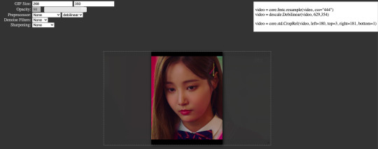
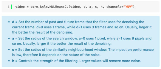
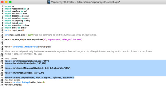
In the top left is where you will be applying your cropping, sharpening and denoising filters. Cropping: Keep in mind the Tumblr dimensions: 540px for full-width gifs and 268px for half size gifs, 177/178/177px for 3 gifs across. The height is completely up to your own preference. Usually I work in 540x300px. Once you edit those parameters you can drag/resize your video file to fit your new canvas. Sharpening + Denoising: You can choose to skip this if you would rather sharpen in ps. I personally do all my cropping, denoising and sharpening in vs. I use finesharp and KNML for sharpening and denoising respectively. Once you select those two filters from their drop down menus, be sure the select the checkbox as well. You should now notice 2 additional lines of code in the top right box. The line that reads: video = core.knlm.KNLMeansCL(video, 0, 6, 4, 1.2, channels="YUV") is where you will adjust your denoising parameters. You will only be adjusting those 4 numbers. I usually use: 0, 1, 0, 1.2. Now find the line that reads: video = hnw.FineSharp(video, sstr=0.22). These are your sharpening parameters. once again we’re only adjusting the number at the end. I typically use somewhere between 0.33-0.55. Depending on the quality of your source and preferences these parameters may change.
Here is a breakdown of the KNML parameters (source: @/nibreon HackMD):
Once you have finalized your parameters, copy all the code in that top right box and paste it into your vapoursynth editor. Note: you can ‘inactivate’ certain lines of code by adding the # symbol at the start the line. That line of code will then be greyed-out. This is what your code should now look like (the highlighted section is the part I just copy and pasted):
If you would like to preview your filters and see if you need to make any adjustments, simply navigate to the top bar and select script > preview. If you like what you see, great! If not, you can adjust the parameters directly in the editor until you see a result you’re happy with. Once you’re happy you can move onto the final step in vs: processing.
Processing: Once again, navigate to the top bar and select script > encode video. Another window should pop up. Make sure you set ‘header’ to ‘Y4M’ then click ‘start’. Patiently wait for that to finish processing. The longer your clip is and the more filters you add, the longer it will take.
IMPORTING YOUR CLIP INTO PHOTOSHOP (PS)
Now you’re done with the vapoursynth section! Not too hard, right? I use the timeline method when I gif. To import your video file into ps navigate to file > import > video frames to layers. Here you can use the sliders to further specify what range you would like to import. Make sure the ‘make frame animation’ box is checked. To optimize smoothness of your gif, avoid checking the ‘limit to every _ frames’ box. Hit ‘OK’ and wait for the frames to import. Depending on the size of your clip, ps may notify you that you are importing a large file and it may take a long time to process, simply say ‘ok’ to this. UNLESS you get a message saying it will limit to 500 frames. This means your clips contained more than 500 frames and you should select a smaller section to avoid cutting out any critical parts. (Note: you can always go back and repeat this process to select a smaller range of frames from the same video clip until you’ve imported all the frames you need).
Timing: You can adjust the timing of your gifs before converting to timeline. Select all the frames (Navigate to the icon with the 4 bars at the bottom right of you screen. Select “select all frames”). Click the drop down next to the timing of any of the frames. Select ‘other’ and input a your preferred timing. I personally use ‘0.04′ but I've seen people use anywhere from 0.4-0.8ms. Also as a note: when you convert your gif to timeline it has a tendency to mess up your timing so even if you input 0.04 or 0.05 it won’t actually be that timing later. If you want the true frame rate you can set your timing right before saving. You can also adjust timing at the end. (see export/saving gif section for more info)
Now the next part can be tedious and for that reason I’ve created numerous actions to speed up this process. But for the sake of this tutorial I will walk you through the steps. At the bottom of your screen is your timeline. As you can see, it defaults to frames, but we want to convert this into a smart object so that all your coloring/edits are made to all of the layers. To do this: 1) Navigate to the icon with the 4 bars at the bottom right of you screen. Select “select all frames” 2) Now select all your layers in your layer panel. On mac you can use cmd + option + A as a shortcut. 3) Back to the icon with the 4 bars, select “convert to video timeline” 4) Right click on all layers (which should still all be selected) and find “convert to smart object”
(Aside: Actions) actions are SUPER helpful to streamlining your giffing process. you can find actions people have made available on resource blogs like itsphotoshop OR you can choose to make your own custom actions. To do this, all you need to do is locate your action panel. Then from the controls at the bottom of the panel select the one that looks like a sheet of paper to “create a new action” Once you’ve named it and hit ‘ok’ the record icon should now be red. PS will now basically ‘record’ whatever you do. To stop recording hit the square icon. Now whenever you want ps to execute the same set of steps you just did, you can locate the action you just made and ‘play’ it by selecting the triangle icon. I highly recommend making an action for the steps I just outlined above to convert your gif into a smart object timeline. It will make your process much faster and more painless.
COLORING
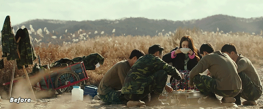
Now the fun part! I focus on emphasizing the colors already present in the video source or getting rid of some less-than desirable overtones when I color. It gives the gif a natural look, but makes everything pop a little more. We will be working with selective color, curves, levels, and brightness/contrast mostly. This is the original gif I will be using to demonstrate coloring:
Curves: I always start with curves. The first curve layer I use to set a desirable black point. To do this, locate the top dropper icon from the curves panel and select the darkest point of your image. This will set that section to “true black” Feel free to play around with this until you find a desirable outcome. Now add another curves layer. This one we will be using to adjust the brightness/contrast. First, I always start off with ‘auto’ and see where that takes me. If you like the outcome, great! If you don’t play around with the different curve points until you get an outcome you like.

Selective Color: This adjustment layer will be your best friend. For me, I will typically work with reds, yellows, and black. If the source has a lot of blue/cyan I will use those too. Basically look at your source and determine which base colors you’d like to emphasize/alter. For blacks I usually up the black by +1-5 depending on the source. For reds, it also depends on the source. But I will typically either decrease cyan (to make red stand out more) or increase cyan (to make the red not look so overexposed). You want to be careful here. Overexposing the red can make your skin tones look like red tomatoes! And for my content base, where most of the actors are of asian descent, we should be emphasizing the yellows and NOT the reds (see aside on color correction + skin tones for more info). After altering the reds to my liking, I do the same process for the yellows. To bring back natural skin tones and color, you will likely want to darken the yellows, expose them a bit more and maybe even up the yellow slider. A common rule of thumb: if you want to make any of the colors less exposed, increase the cyan. If you want to increase exposure on any of the colors, decrease the cyan. If you want a color to appear more strongly or prominently, increase the black. The magentas and yellows I use more to adjust hues. You can add multiple selective color layers to further emphasize your changes.
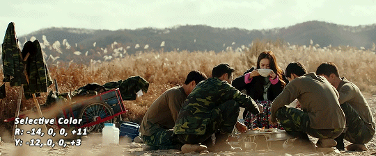
Levels: Now we will work on the lighting some more. This creates more contrast and depth to your gif, often making them look ‘crisper’ To emphasize the bright parts, move the right-hand slider to the left. The emphasize the dark parts, move the left-hand slider to the right. You may also choose to move the middle slider to adjust more neutral lighting. Do so until you find a setting to your liking.
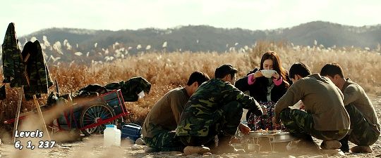
Miscellaneous: Depending on your gif you may need to play with other adjustment layers. Some other ones I often use are the brightness/contrast and exposure to adjust lighting and add more dimension to the gif. For additional color correction I use color balance and to a lesser extent hue/saturation and vibrance.
(Aside: Color correction + skin tones): We are anti-whitewashing and anti-redwashing when it comes to asian media. Like I mentioned earlier, natural asian skin tones have yellow undertones, not red/pink. Therefore when you’re bringing in color you should be mindful of this delicate balance. Adding more red does NOT equal un-whiteashing. Be VERY careful how you balance the yellows with selective color/hues/color balance.
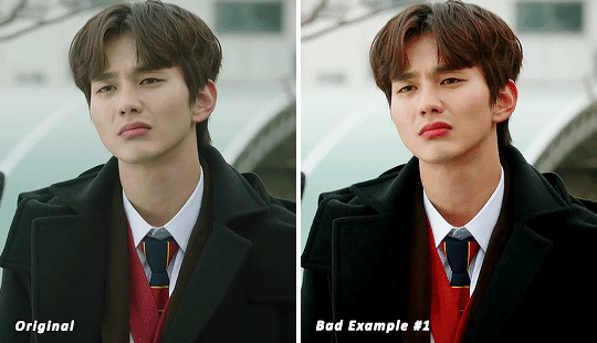
^^ Here is an example of what I mean by overexposing the reds. Poor seungho is looking as sunburnt as a cherry tomato. Note: if your original source is already overexposed with red, fix it! You can do this by applying the same basic principles I explained earlier. Try upping the cyan on the reds in selective color, or shifting the color balance to favor cyan over red with the color balance adjustment layer. You may also choose to favor the yellow over blue.
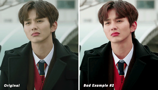
^^ Now this is straight-up whitewashing. This is what happens when you are not careful with your correction of yellow. I’m not saying you can’t touch the yellow slider or get rid of some yellow form the overall image (because sometimes it is very much needed), but you should be very mindful how your corrections can affect skin tones. If you decide to decrease saturation of yellows, or decrease yellow in the selective color section of the reds, do so with caution. If your reds are looking too pink, add some yellow in the red selective color, up the yellow and black of the yellow selective color.
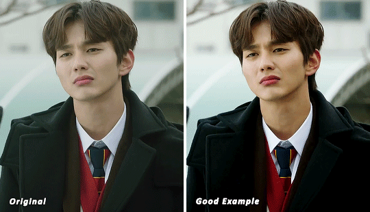
^^ If you hit that happy medium, you can emphasize the natural skin tones without overexposure. Here the underlying tones are very much still in the yellow range.
(Aside: Blending): I will very briefly talk about how to blend two gifs together. First make sure you’ve imported both your gifs into ps and converted them into the timeline format. On one of the gifs, right click the gif layer in the layer panel > duplicate layer > select the canvas of the gif you’d like to blend the gif with. On the canvas you just copied your second gif to, you can now drag the two layers around the on the canvas to get your desired positioning. On the top gif apply a layer mask. This can be found in your layers panel at the bottom, and is indicated by the white rectangle with the circle. Next, make sure you select the mask in the layer panel (it will show up as a white rectangle on the layer you applied the mask). Grab your paintbrush tool and make sure your color is set to black. Now you can effectively ‘erase’ the part of the top gif you don’t want to show anymore. I recommend setting your brush hardness to 0% to get a smoother transition. You can also play with the opacity settings. If you want to add back in a part you erased, just switch to a white paintbrush and you will be able to undo what you had just ‘erased’ with the black. When you merge the gifs, they will play the same number of frames. This means your blended gif length is limited by the gif with the fewer number of frames. You can move around your timeline layer and shorten the included portion by dragging either end of the timeline layer in until you get both gifs to play the parts you want.
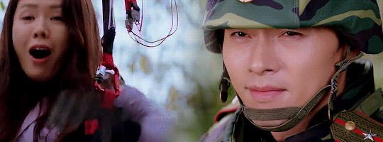
CAPTIONS/SUBTITLES
I often get asked about my subtitle font/styling settings. Personally I find the best fonts for subtitles are calibri and arial. I use calibri with the following settings: 12-14px, bold italic plus faux bold, 1px black stroke (optional: drop shadow set to ‘multiply’ at around 85% opacity), and tracking (VA) set to 75. If you would like your subtitles to fade-in or fade-out you can apply the ‘fade effect’. Locate the b/w square icon in your timeline panel. Select fade and drag it onto your text layer in your timeline. You can then right click on the wedge shape to adjust your fade duration. I usually use 0.35s. If you drag and drop the effect towards the beginning of your text you can get the fade-in effect. To get the fade-out, simply drag and drop your fade towards the end of your text layer.
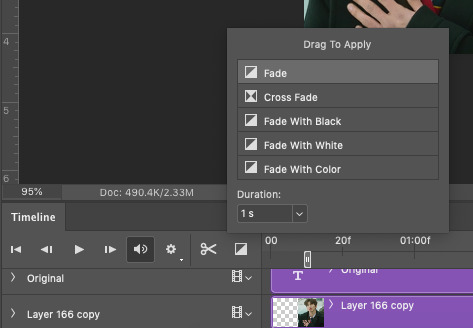
SAVING/EXPORTING YOUR GIF
We’ve reached the final stretch! If you need to adjust your frame rate timing: you will need to revert your timeline to frames. To do this: 1) Navigate to the icon of 4 bars at the right of your timeline panel. Select convert frames > flatten frames into clips. 2) Navigate to the icon of 4 bars at the right of your timeline panel. Select convert frames > convert to frame animation > when promoted hit ’ok’. If at this point you see more than one frame in your timeline panel, delete the frames until only one is left. In the example below I would delete the first frame by hitting the trash icon from the timeline panel.

If there is only one frame, leave it as is. 3) Navigate to the icon of 4 bars at the right of your timeline panel. Select ‘make frames from layers’ You will most likely need to delete the first frame in your timeline panel (it won’t have your coloring). Sometimes ps adds in some ‘blank’ frames as well, delete those too. Now you can adjust your timing.
Once your timing is set: When you’re saving your gif, just keep in mind it must be under 10mb. Navigate to file > export > save for web. When it comes to your save settings I typically use either selective diffusion or adaptive diffusion. I also also occasionally use adaptive pattern (I find this is best for dark scenes without a lot of contrast). Set colors to 256, quality to bicubic and looping options to forever. If you want to preview your gif, hit the preview button in the bottom left. Otherwise, go ahead a hit ‘save’ and you’re DONE!
ADDITIONAL RESOURCES
Feel free to check out my ‘ps things’ tag for more photoshop stuff/mini tutorials. Additionally @/nibreon and the hackmd site I linked previously are your best resources for vs questions. If you would like to see my giffing process in motion feel free to check out this video. It’s sped up but you can slow down the playback. Additionally be sure to check out resource blogs like itsphotoshop for more helpful tutorials and resources.
If you reached the end of this beast, kudos to you! I hope this helps and never be afraid to reach out with any questions.
531 notes
·
View notes
Text
upscaling pics!
a sort-of “tutorial” for upscaling pictures (making them larger & increasing quality)
*lots of pictures below the cut
so for the treasure world pics i used adobe photoshop 2020.
the first thing i do is open up the picture in photoshop (it usually has a ~500px width at the beginning), and i go to image → image size:

when you click on image size, you should get this:

i change the input in the “width” box to 1000, but you can go larger than that if you like. make sure the resample is preserve details 2.0
afterwards it should look something like this. i like to make copies of each layer as i work. you can make a copy either by pressing “command + j” on mac (i believe “control + j” on windows), or you can go up to edit → copy and then edit → paste

you can make the “layer 1 copy” into a smart object by right-clicking:

— or by going up to filter → convert for smart filters:

making it a smart object just helps when you want to go back in and make adjustments.
then i sharpen. filter → sharpen → smart sharpen:

this is the window that should come up. i put in 500%, 0.3px, 10, but the larger your image size the more you can play with those settings. 500% gives you very harsh lines, and the higher the “px” number the harsher the lines become.

hit “ok”. i repeat the same process, except this time instead of 500, 0.3, 10, i use 10, 10, 10.

hit “ok” again.
for this picture i set the opacity of this layer to 40%, but you should use whatever percentage you think looks good:

after this, i made another copy of “layer 1″. again, you can do this by going to edit → copy and edit → paste:

then i converted this new copied layer to a smart object as well.
now i go to filter → blur → gaussian blur:

this is the window that should come up:

i make the radius 1.0 px and hit “ok”.
for this picture, i wanted to denoise it a bit more. filter → camera raw filter:

then go to the “details” category and find the slider that says “noise”. i moved it up to 12:

afterwards i wanted it a bit sharper, so i smart sharpened with 500%, 0.3px, 10 again.
next, i set the opacity of the layer to 28%. again, you should do whatever suits the picture you’re editing.

then you’re pretty much done!
but if you like grain, you can add that.
first, i made a new layer with the existing image. (this is different from making a copy of “layer 1″, because “layer 1″ is the original, unedited image. but “applying” the image gives you a new layer with the actual edited image on it.)
i did this on mac with “shift + option + command + n”, which gives you a blank new layer, then with “shift + option + command + e”, which gives you your edited image on top of the layer.
you can also do this by clicking on the little box with the “+” sign in it, next to the trash symbol at the very bottom right of the screen. this creates a new blank layer:

then, go to image → apply image:

then this window comes up. keep the opacity 100%!

hit “ok”. now convert this new layer into a smart object, too.
after you do that, go to filter → filter gallery:

under the “texture” category, you should find “grain”. i made the intensity 30 for this one; i would recommend keeping the contrast 50. for “grain type” i kept it regular, but you can try out the different options:

after this i just changed the opacity of the layer to 50%:

now just colour as you like (i won’t give a colouring tutorial since this is so long and honestly i kinda just click stuff until it looks ok. i don’t really know how to colour either). since this is an example i just did some basic colouring stuff:

and then you’re done!
↪ for the ask from @milkypotter
#so sorry i haven't really done a tutorial before lmk if u need clarification!#hope this helps & sorry it's so so long#also probably better viewed on mobile ? not sure if the images come up when u click on them but i can also replace them if need be
47 notes
·
View notes
Text
VI a. UV_0
(Previous: V. Adding missing body parts / Frankenmeshing / Finishing touches)
As promised, I'll finally talk about uv maps today. About time! Sorry it took so long; I hope at least you'll feel that it was worth the wait.
Generally speaking, uv maps are 2D representations of a 3D mesh. A mesh cut into pieces and made flat. TS4 meshes use two of them, called – very originally – uv_0 and uv_1. You can see them listed if you click the little triangular symbol in the panel on the very right (if you hover over the triangle, it says 'Data').

Why are there two? Because they serve very different purposes. To put it simply, uv_0 is responsible for the texture of your mesh, while uv_1 makes the mesh move with body sliders. Therefore we'll need to discuss them separately. Let's start with uv_0.
As you can see, uv_0 is the one selected by default. If you switch the mesh shading to 'Material' or 'Texture', you're going to immediately see any changes you make to it. The map itself is located in the window on the left – the one which we haven't used so far at all. Let's go into edit mode and then make that window bigger, so that we could see all the icons at the bottom.
Right now nothing is happening there. But let's just try selecting a random part of the mesh...
Important: when you use shortkeys, pay attention to your cursor's position! E.g. if you press b with your cursor in the uv map area, it'll activate the selection tool for the map, not for the 3D mesh.

You can see that a bunch of little dots appeared on the map! Those are your selected vertices.
Now, I don't know why this is the default option for Blender – your vertices being invisible on the uv map unless selected – but you can easily change it, so that you could always see them. You just have to click one of those tiny icons at the bottom. If you hover over it, it says 'Keep UV and edit mode mesh selection in sync'.
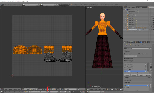
I find it way easier to work with this way: you can see all the vertices, and the ones which you selected are highlighted now, just like in case of the 3D model.
Then there's another important tiny button, right between 'UVs' and 'New'. If you click it, you'll see a list of all texture files associated with your mesh. In my case it's only two basic files: the body texture and the texture of the top I used as a base, but if you're frankenmeshing, that list can get much longer. Let's choose the original diffuse map.

You can see that the map reflects perfectly whatever is going on with the 3D mesh. The parts not covered by any texture use the skin texture instead. Not the whole texture of the top is used, because at the very beginning I cut off the bottom part of the mesh. There's also an abundance of vertices in the waist area, because I extruded the lowest row of vertices to make a skirt; and, as I didn't make any changes to the uv map yet, the new vertices appeared right on top of the original ones. In fact, if you select that lowest line on the uv map, you'll see that the whole skirt gets selected.
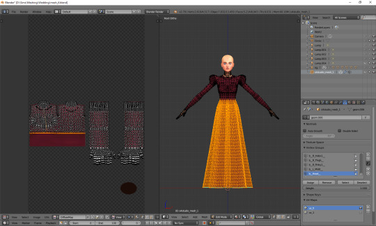
UV maps can also be useful for detecting weird stuff happening to your mesh. I can see that there's some line going across the top. I switched to edge select, selected it and found out it really is some completely useless edge going through my 3D mesh. No idea how it got there, but thanks to the uv map I could spot and delete it.
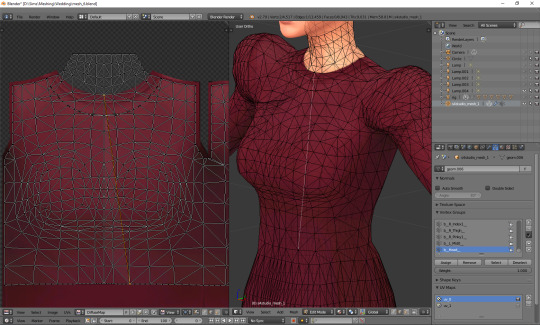
Just a couple of other tiny icons before we proceed to fixing our uv_0 map. Firstly, there's the little pin, which let's you – unsurprisingly – pin the currently used texture, so that Blender wouldn't switch to any other ones (yep, it likes doing it). Just click it and you're safe.
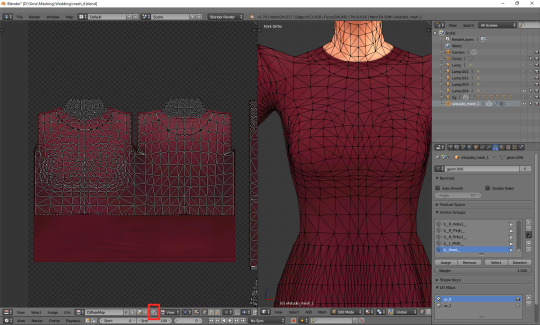
And then, right next to it, there's a little cross. Remember what I said about the list of used textures getting super long if you're frankenmeshing? It can get annoying if you don't need 80% of them, but have to scroll through them all whenever you want to switch from texture A to texture B. If you're sure you don't need a certain texture, select it and then shift-click that little cross. That'll tell Blender that this texture is not used, so it doesn't have to load it. You'll need to save your mesh, close Blender and reopen it for the changes to be applied!
OK. Now that you have an idea what's what, we can finally talk about editing the uv_0.
In case of TS4 diffuse maps, it's very important where you put your texture. Each category has its designated part on the map. It looks like this:
You can download the template in default, EA size (1024x2048) HERE, and a twice bigger one (2048x4096) HERE. In my own creations I always use the 2048x4096 format – it lets me fit in way more details without stuff getting badly pixelated – but that's obviously not a must. Now, at the bottom of the uv window, click 'Image' and then 'Open image'. Find the template you just downloaded and double-click it (or choose 'Open image').
Whatever you do with your uv map, there are two basic rules you have to follow. One, fit the vertices only in the place meant for the category you're working on. If you're making a dress, you can ignore the top/bottom division (although be aware that if you do ignore it, you won't be able to split your dress into separates), but that's the only exception. Don't let your vertices go into the shoes or face area. If you're making a skirt, stick to the area marked as bottom. If you're making a top, fit them all in the area marked as top. It seems obvious, but I've seen sooo many CC pieces which are incompatible with each other, because their textures overlap. Some of them are beautiful and even made by really well-known, established creators. So I think it doesn't hurt to overstress this point a bit. Please pay attention to it!
And two: don't move anything which is supposed to be bare skin. Or half-transparent texture printed on top of the skin (not 3D). It's an absolute no-no. Terrible stuff will happen if you do it. If you accidentally did it, then... Oh boy. You may try to move it back into the right position, but maybe it'd be easier to just delete those parts altogether and just append them anew (as explained in the previous part).
As for the parts which you intend to texture – so, in this case, your dress – you can theoretically put them anywhere you want (that is, as long as you stay in the top/bottom area and don't overlap the bare skin parts). Your map doesn't necessarily have to look like the ones made by EA. However, I think not following the EA style (top on the left, bottom underneath, sleeves on the right, any extra deco in the free slots) may result in your clothing being sunbathing-incompatible. I can't say for sure, as I don't have Island Living, so my sims don't tan, but I suspect the tan lines depend exactly on your uv_0 map. I don't think it makes any difference in case of Victorian dresses, but if you're making something more modern, which could leave some visible tan lines, you probably shouldn't go too wild while making your uv_0 map.
Let's go back to our dress. Because we used the top as a base, half of the work is already done. We only need to 'unwrap' the skirt (and any decorations, if you added them). There are 4 ways in which I usually approach it:
1) Selecting the rows in 3D view and moving them manually (g, y) on the uv map
It's not very practical now, when the skirt is already full of those horizontal lines, but at an earlier stage it would have been very quick and easy. The important thing is, you should do it before adding 'fillers' (i.e. those lines which you don't move, scale or whatever, but just add them and leave them as is). Depending on the size of your dress, you probably achieved the desired shape with 3-5 lines. Move them on the uv map, make sure the proportions look correct (you can always try to open some patterned image for a second, to see if everything looks ok – see part VI b) and only then add the fillers. They'll automatically appear in the right places on the map.
2) Cylinder projection
You can also decide to unwrap the skirt. Select it, either in the 3D mesh or uv map window. Now, with your cursor in the 3D mesh window, press t to unhide the panel on the left and go to the 3rd category: 'Shading/UVs'. In the UVs section you'll see a button called 'Unwrap'. If you click it, a drop-down menu will appear, with different unwrapping styles/options. Choose 'Cylinder projection'. Watch out: your viewpoint matters! Before you unwrap, go to the right side view (num 3).
I took the screenshot from the wrong side, please pretend you didn't notice (-.-)
A whole bunch of new vertices should appear on your uv map – in a completely wrong place. We'll have to move them under the top. You'll notice, however, that if you try to move, scale or do whatever else with your skirt, it affects the lowest line of your top as well. That's because the top line of the skirt and the bottom line of the top are actually the same vertices, just duplicated on the uv map. You could select only that one line and edge split it (ctrl + e, in the 3D view), but an easier way around it is simply switching from vertex select to face select. Face select has some special powers when it comes to uv maps: it lets you not only move stuff separately, but also select parts of the mesh with L (multiple select with shift + L). Neither of those things works when in vertex or edge select mode.
Now you can simply scale the selection down and put it under the top. Adjust it in any way necessary, so that it'd align with the top nicely. Make sure that the faces are in the right places! Select the bottom-left face of the top and then, in the 3D view window (left side view, ctrl + num 3), click the face right underneath it. Is it the top-left one of the skirt on the uv map? If so, perfect! If not, you've got some manual moving to do. Just select any faces which are in the wrong place and move them along the x axis (g, x) till they are placed properly.
It should look fine by default though. That's exactly why we went to the right-side view before unwrapping.
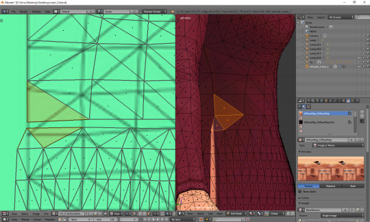
If your skirt goes into the shoes area, scale it down along the y axis! (g, y)
Now the only thing left to do is to weld the vertices and get rid of the gap between the skirt and the top. Go back to vertex select and select the second vertex from the left. You'll see that – just as before – a vertex of the top gets highlighted too. Press W and, from the drop-down menu, choose 'Weld'.
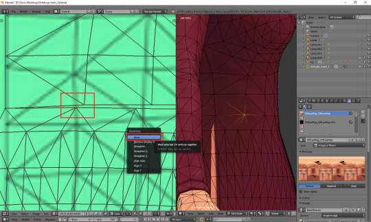
Do the same for all the vertices in that line, except for the first and last one.
What about the first and last one? The problem is, they are all actually the same vertex. If you select any of them, you'll see that the other one gets highlighted as well. Welding them would make them meet in the middle, and that's not something you want to happen. So what can you do? This time there's no other way around it than splitting. Select the whole vertical line (either the left or right one), move the cursor to the 3D view area, press ctrl + e and choose 'edge split'.
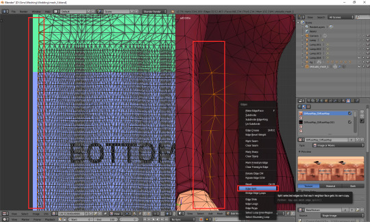
Now you should be able to weld each of those vertices separately. When you're done, select all (a) and (in 3D view) remove doubles (w).
And that's basically it. Of course, if you want to, you can dedicate some more time to your uv map, making sure everything looks absolutely perfect. You can, for example, edit certain lines – or all – and make them perfectly straight. Just select a line, press w and choose 'Align x/y'. It's especially useful for deco parts – you'll see what I mean once you get to texturing.
3) Professional tailoring (marking seams)
This method is quite crazy, but can be very useful in some cases – e.g. if you're making a patterned dress with a huuuuge skirt and want the pattern to look even. To use it, you have to imagine for a second that you're a tailor/seamstress and that your mesh is a real dress, made from real pieces of material. Where would this material be cut and sewn together?
Once you know where the seams would be, go to edge select mode and, well, select those edges. Then press ctrl + e and choose 'Mark seam'. Make sure you really mark all the seams which would be there in case of a real dress!
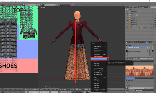
Once you're done, select your whole dress (or whatever it is that you're making). Do not select body parts! Once again go the panel on the left (if it's not there, unhide it with t) and this time simply select 'Unwrap'.
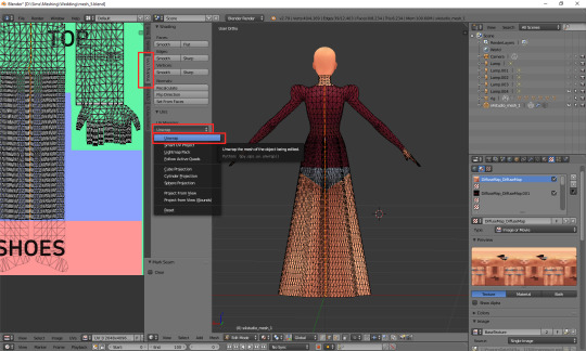
And now just go to face select, scale down the results of your unwrapping and put them anywhere (but in the right category :P). If something looks wrong, that most probably means you forgot to mark some seam. You'll have to go on a search for it. I'll be honest: I have zero idea of sewing, so using this method is quite tricky for me and I'm struggling myself with marking all the right edges as seams. I used it only twice so far, in my last 2 projects. Here's how my 1843 dress looks like after unwrapping:
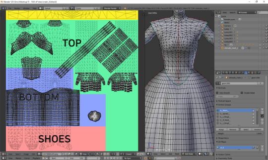
As you can see, the uv map is plain crazy and, as mentioned before, definitely not tanning-compatible, but thanks to it later I didn't have to adjust the pattern to each part of the mesh individually – I could just fill the whole texture with pattern and only had to erase it from the parts which were supposed to be uncovered. It does make your life easier if you make 66 swatches :P.
4) Projecting from view
Yet another unwrapping option, useful mostly for smaller, decorative elements. Or in general: for stuff which you can see properly. I use it mostly for bottoms (I mean... That thing 'closing' the dress at the bottom). Go to the bottom view (ctrl + 7), select the whole bottom part (might be easier to do on the uv map, now that you've unwrapped the skirt!) and, from the unwrap drop-down menu, select 'Project from view'.
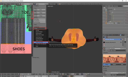
Go to face select, scale the thing down and put it somewhere in the area for decorative elements. For example here:
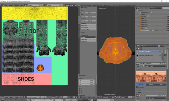
Done!
***
Here's also a small general tip: it's always better to separate clothing parts from body parts on the uv_0 map. I'm thinking especially of the neckline. It's the only way to get a sharp, clear line; if you just paint the neckline in your graphic editor, it'll become blurry in game. It seems that the devs realised it at some point too, as at least some pieces from later DLCs have a gap in the uv_0 between the neck and the collar. Just select the whole top-bottom area, deselect the neck and move the part which should be textured a bit down.
***
Whichever method you chose, your dress has a ready uv_0 map. Now there's only one thing left to do: you should export the uv layout, so that you'll know where to put your texture. At the bottom of the uv map area, click 'UVs' and then choose 'Export UV Layout'.
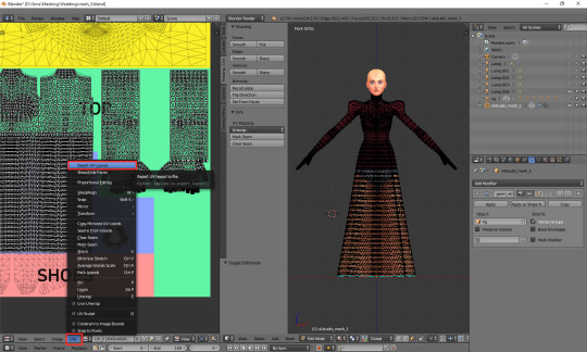
A new window will appear. Save it wherever you want, under whichever name. The only important thing is, you must tick that little box on the left saying 'All UVs'. Then just click the 'Export UV Layout' button.
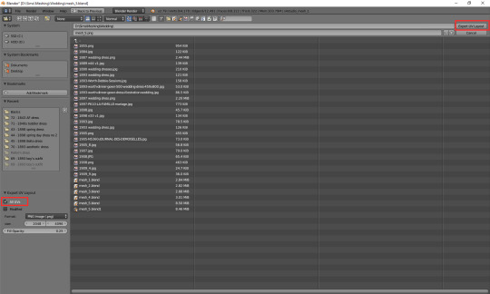
And that's all. Congratulations! You're fully done with your uv_0 map.
(Next: VI b. Changing the texture displayed in Blender)
75 notes
·
View notes
Text
The Sims 3 Game and Memory – What to do and what NOT to do
What will NOT work:
The 4GB patch for sims 3, the game already HAS this patch, it was integrated in one of the updates. This patch will do absolutely nothing to you game.
Edit some game files to “give it more memory”. Not gunna happen. It is a 32bit program, it physically CANNOT use more than 4GB of RAM. You can test this yourself by watching your memory usage.
Give your PC more RAM. If you have over 12GB or so already its not going to do much for sims. Only if you have very little RAM (like 4GB) will more help as it frees up the 4GB for sims as you will have enough left over.
What TO DO if you have memory crashes:
Play smaller worlds. The large worlds take up a lot of memory! This is why I now mainly build small or medium worlds.
Play less sims in the game. Either less playable sims (my max is like 40 in one world) or remove/block NPCs with nraas Register and Story Progression (disallow immigration).
Save frequently so the game doesn’t have to save as much when you do save. Also good idea to save in cycles. Nraas Saver does all this for you! I save every 15mins. Also this gives you the option to save in town view which uses less memory.
Clean or reduce your CC. By cleaning out excess image files or shrinking your file size the game has to read less. Less CC is also good. Merging in CC Magic can also help.
Use less clutter in your houses or do not play with like 10 sims in one household. The less the game has to work with, the better it will work. Also try not to play on 64x64 lots!
Disable shop mode, memories etc in settings, again less for your game to have to work with.
Avoid traveling to other worlds or delete the travel world in your save file afterwards, as these massively bloat your save.
What else makes the game run better?
Save Cleaner to reduce the size of your save files
Use CC Magic to compress files
Rename any packages in your game so they dont have spaces and symbols like %&[] in them (_ is okay).
Make sure your game recognizes your graphics card
Never install houses as sims3packs, they usually include up to 600 pieces of CC! We recommend installing everything as .package
Run all your CC (except mods, poses, sliders) through s3rc to compress them.
Use Reshade instead of an HQ mod
Use Overwatch and Errortrap from nraas
If you have money, buy an SSD, the game loads faster ;)
362 notes
·
View notes
Photo
so here’s my disclaimer: I hardly know what I'm doing. This is my glued together homemade giffing method that I’ve created over months of just random experimentation and bits and pieces from all kinds of tutorials. there are probably better or more correct ways to do a lot of these things! this also isn’t a completely universal tutorial, some of the specifics are geared towards giffing skam, specifically skam france.
I gif in photoshop cc 2020 on a macbook. Some things like keyboard shortcuts and little things about the photoshop interface will probably vary if you are on a pc/ other version of photoshop!
this is very long and very unprofessional, but I hope there is something in here that someone will find helpful!
we’ll be going from this:
to this:

up to date as of October 25, 2020
downloading clips
selecting what part you’re going to gif
cropping
my action for resizing, converting to a smart object, and sharpening
coloring
exporting and setting the delay
tldr tips
1. downloading clips
4k video downloader (which you can get for mac or pc here) is great for things posted to youtube, especially from skam france because all the clips are on their youtube with no weird geoblocks or anything! it’s really easy, you just have to open the clip in youtube, copy the link, and go into the program and hit paste link. I like to put on smart mode first and set the destination folder so all my clips go into the place I want.
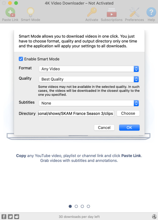
There is a 30 video per day download limit, so if you’re thinking you really want to gif lots of stuff from the show, and want a big chunk or a full season it’s definitely worth hunting for a mega or google drive with full episodes to download because it’s just less hassle! I might come back to this post later and compile a list of all of those, but for now if you type “[remake] no subs google drive” or “[remake] no subs mega” into a google search, you’ll probably find something! the all of skam website has no subs for several remakes, but not all!
If you don’t have enough space on your computer to be keeping full seasons, I know there are methods to get screencaps without having to download (generally for giffing movies and regular tv I think this is a common method), but I’ve never done it so I’ll redirect you to this tutorial that explains it! you should probably just go there for the whole thing tbh it’s much more coherent than this, but I digress.
2. selecting the piece of the video you want to gif
now that you’ve got your episode or clip you’ll want to just open it in photoshop! if you go the screen capping route the way to do that is a bit wonky, so you can keep following the tutorial I linked above and join back in here at coloring if you like!
if the timeline at the bottom doesn’t pop up automatically you can go to window > timeline and turn it on! now you can use the scrubber bar thing to find the moment you want to gif!
The advantage of this over screen capping is you can scrub with more precision. the arrows circled in blue below let you jump only one frame, where in screen capping I'm pretty sure you can only go by ten second or one minute intervals.
I usually drag the scrubber as close as I can to the start of the shot/moment I want to use, fiddle with the arrows circled in blue below to jump forward or back one frame at a time until I'm at the first frame I want. I move the left grey handle to the scrubber and then I hit the play button and let the whole shot/moment play. Pause and repeat the shuffling with the arrows until you’ve landed on the last frame you want to use and move the other grey handle.
the moment you want to use should be between your handles (it’ll look like what I have circled in red), and if you hit play, you should see the thing you want to gif playing on loop above the timeline. the speed will probably be weird, but we’ll deal with that at the end.
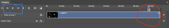
now I recommend doing command or control + s to save your gif as a psd (photoshop document). this is a working, editable file which means if photoshop crashes you can open your file right back up and keep working as long as you’re hitting command or control + s at regular intervals as you work. later we’ll go through exporting in gif format that can actually be uploaded to tumblr.
3. cropping
next I crop out any logos or black space at the top and bottom. Just click on the crop tool on the lefthand side of the screen, drag the edges and hit enter when you’re done. you can of course crop out more than just that, but regardless of what you crop out, now is the time to do it.
you can set an aspect ratio for your crop at the top of the screen if you’d like to be positive that all the gifs in your set will be the same:

4. my trusty action: resizing, converting to a smart object, and sharpening with one click
Now is when I use an action I made that does all the resizing, converts to a smart object, and sharpens. I’ll take you through the steps so you can conceptually get what’s going on, but I highly recommend using the actions window to record your process as you follow along so you have this action as well. It easily shaves at least 5-10 minutes off of the whole process, and these steps will be the same every time.
here’s how you make an action: go to window > action and open the action panel. click the plus symbol to start recording a new action:
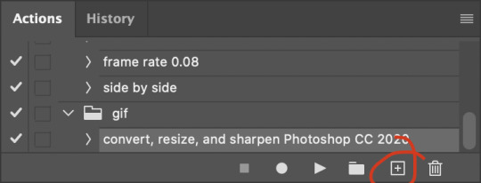
in the window that pops up, give it a name and hit record:

now just continue with the steps below, and it will save them!
first you flatten frames to clips (I think it says flatten to layers on older versions of photoshop). this is in the menu at the top right corner of your timeline:
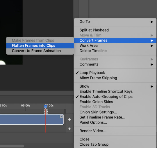
next you convert to frame animation by clicking on the symbol in the bottom left, circled in red:
if there is more than one thing in the frame animation, delete the extra one. you don’t need to keep the last one but it won’t let you remove it until there are other frames in there. also go into your layers and delete video group 1 and its contents. don’t ask me why these steps are necessary, I don’t really know, but I’ve noticed it sometimes gets wonky if you don’t do this:

now you want to make frames from layers and delete that first frame that was there before:
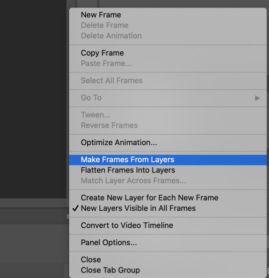
then we return to the timeline:
use command + option + a (control + alt + a for pc I'm pretty sure) to select all layers and then right click within your layers window and select convert to smart object. It’s important to convert to smart object after you go back to the timeline, or the gif won’t move:
next I resize. gifs for tumblr should be 540 pixels wide. for recording your action you should just go into image > image size and only change the width to 540 in case you ever have gifs cropped to different aspect ratios. don’t touch the height, let constrain proportions figure it out!

now, here’s what our base gif looks like, no sharpening, no coloring:
now to sharpen. go to filter > sharpen > smart sharpen. this is up to personal preference, but my go to settings are:
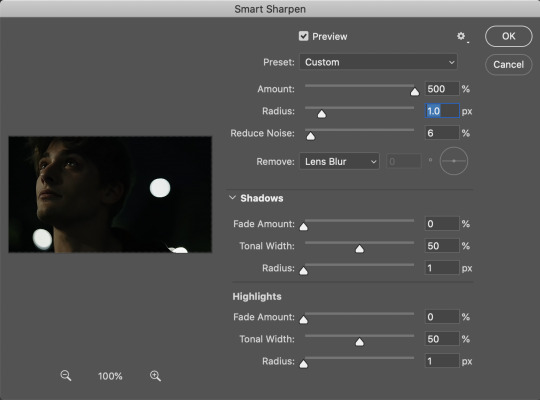
this is what we have after sharpening:

now is when you can stop recording your action.
just press the stop button in the action window:
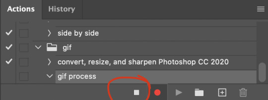
this action is pretty much universal and after I select the moment the gif will be and crop however I want, I use it on every gif I make! so although this initial setup is tedious, now you’ll never have to do these steps again, and the process is magically much quicker.
5. it’s time to jump into coloring!
I typically start with exposure and sometimes some brightness/contrast. with really dark gifs like this, you kind of have to make it worse before you make it better. I did this:
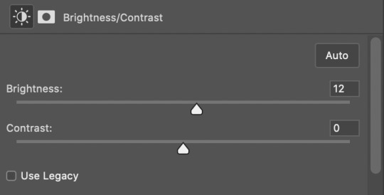
now the gif looks like this:
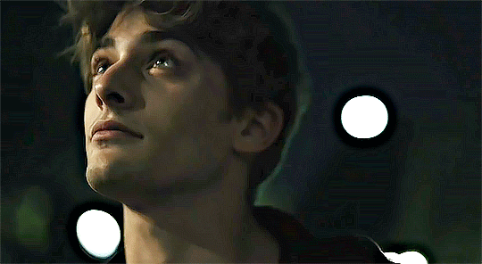
we have some static and some ugly bits, and this is where selective color comes in to fix it! boost blacks like this:
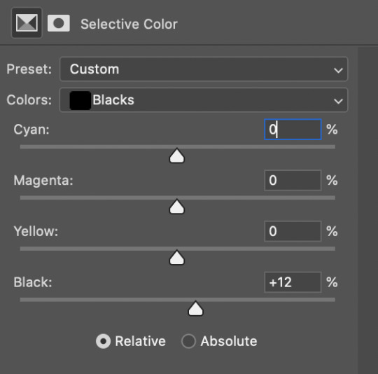
and now your gif looks like this:

the skin tone is looking a little sickly and weird, so I go into the yellows and reds in my selective color layer to fix it! I also messed with the greens here because I didn't want color in the background (that part is totally optional and just up to your preference):
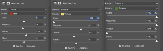
now we have this:
to really take the color 100% out of the background, I did one more separate selective color layer for cyan (again, I just felt like it but this is optional!):
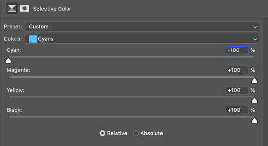
and now the finished gif:
there’s lots of fun extra things you can add like text and tints and overlays and all that I won’t get into, but feel free to reach out for help on those types of things!
this gif was certainly not the most complicated to color. some ridonkulously dark clips (*cough cough* vendredi 20h27 *cough cough*) take tons and tons more effort than this and a lot of the time you’ll want to use color balance layers and vibrance layers and all of that to mess with your coloring.
with all of this coloring business, I really just learned by doing. I don’t know all the technical purposes of each type of adjustment layer, and I tend to stay away from curves just because I find them confusing and annoying. The bottom line is that you should always experiment and find out whatever coloring works for you and run with it! I’m sure every gif maker you talk to does things at least a little differently!
I highly recommend taking the time to go through all the types of adjustment layers and just move the sliders around to see what they do! That’s honestly one of the best ways to learn and decide what you like!
6. now to export and adjust the delay!
the keyboard shortcut for exporting on mac is command + option + shift + s, control + alt + shift + s for pc, otherwise you can go to file > export > save for web
my settings are here:
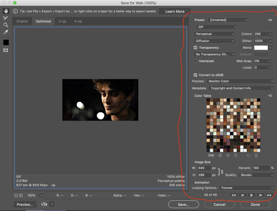
the settings only need to be configured once! otherwise just hit save and follow the pop ups to choose where to save and what name you want to give your gif. Since you saved as a psd way back, that will be the name it’s automatically given, but call it whatever you want!
then I adjust my delay by opening the gif I just exported (not the psd, the .gif file) and using one of my delay actions. I’ve made an action for each delay between 0.05 (real time) and 0.08 (really slow mo for certain super short shots, typically for more ~artsy~ sets).
all my action does is select all frames:
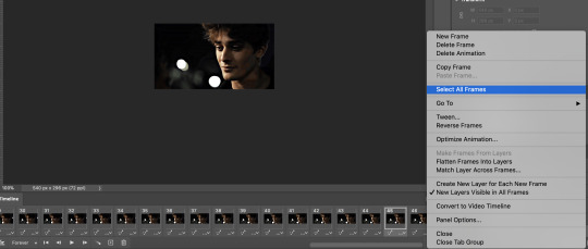
adjust the delay (which will differ based on whether you want them slowed down and by how much):

for reference, this is a 0.05 delay:
and this is a 0.08 delay
now you just export the same way you did before!
remember if you’re recording this as an action, you don’t want to touch the file name, just say yes when it asks if you want to replace the file. if you always save your gifs to the same place, your action will now enable you to override any gif with the incorrect delay with the correct one with one click!
7. tldr: the main tips
for downloading 4k video downloader works well for non geoblocked youtube videos, the all of skam website is another place you can look to download with no subs, here’s the screen capping method if you don’t want to download
The main way I combat dark lighting is to bump exposure to the right, gamma correction to the left, and then enhance black in a selective color layer. The amount of these three adjustments will vary gif to gif. I know lots of people use curves, but I find them really confusing for some reason, so this is my method! As my graphics teacher likes to say: there are always at least 3 different ways to reach the same result!
there’s a little bit of additional coloring on this one, but here’s another before and after example so you can get an idea of how those steps get you a better lit result without making the lighter parts super over exposed:

besides those three steps, you have free rein to use the other selective color channels, as well as color balance, vibrance, hue/saturation, etc. to restore color that was lost or to change the colors altogether! mess around with it and have fun experimenting!
7a. bonus coloring tip:
sometimes you can make use of selective color to completely alter an isolated color in your gif. You can get very adventurous with this, but here's a simple example of changing blue tones to teal (I got away with these gifs being longer because they were in rows of two in the set I posted them in. I'm too lazy to trim frames so I can put them here at 540 px without going over the 10mb limit so just ignore the quality ok):
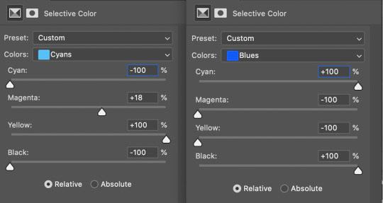
7b. actions, actions, actions!
if you find yourself doing a certain thing over and over, always record it as an action. the amount of time they will save you is honestly really impressive.
You can duplicate actions, so, for example, if you have different sharpening preferences for different shows or scenes, you can duplicate your gif process action and go into the steps, double click smart sharpen, and alter it however you want!
This could also be good to do for the different widths for tumblr if you ever do sets with rows of two or three! Duplicate actions is also how I made my actions that set delay at 0.05, 0.06, 0.07, and 0.08!
when in doubt, always make an action! it’s worth minimizing the tedious bits of the process as much as possible so you can focus on the fun part of seeing your awesome gifs come to life! any little task you find yourself doing often, make an action!
and for now that’s all I have. if any of this made no sense, if you want to suggest a correction or addition I could make, if you’re ever curious how I did something on any gifs I post, or if you have any other sort of questions, feel free to send me an ask or a dm! if I can’t answer your questions I’ll be happy to try to direct you to someone who can or a tutorial to help! again, I'm no expert, not even close, but I hope at least one person will find one thing in this mess that helps.
#this got . so long omg#mystuff#mytutorial#gif tutorial#tutorial#resources#fellow gif making peeps feel free to correct me or give input on how to improve or add to this tutorial!
31 notes
·
View notes
Last Seen Blogs

swordfisherking
can i be a dragon?

huseyinpektass
Hüseyin

sxcrudooficial
SxCrudo

colourfulmourning
شجرة القمر

swordsman3794
Swordsman3794