#InkFlowing
Explore tagged Tumblr posts
Text


Plant of the Day
Thursday 20 July 2023
In this terraced hotel garden, on Shetland, the flowers of oriental poppies were providing colourful splashes of red and pink. The single, bowl-shaped, salmon-pink flowers were Papaver (Oriental Group) 'Prinzessin Victoria Louise' (oriental poppy) which is a vigorous clump forming perennial. These poppies are summer deciduous after flowering.
Jill Raggett
#Papaver#orientalpoppy#poppy#herbaceousperennial#herbaceous#pinkflowers#plants#horticulture#gardens#garden#gardenterrace#shetland
171 notes
·
View notes
Text


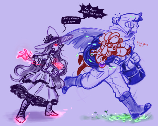


been meaning to post my fantasy au scraps, kept forgetting
#tips hat to liko who started it all by saying “hey. Grimoire but. Big creature”#and then whoever said werewolf grim#because then I felt like I had to make Sally a design to match#and then I went what about my favorite trio what about my favorite guys what if I put them in here#anyway#tangle tower fanart#tangle tower#detective grimoire#sally spears#fitz fellow#poppy pointer#fifi fellow#emery inkflow#myart#razzart
52 notes
·
View notes
Text


Some sketches i made!
#greenflame#ninjago#kai ninjago#lloyd garmadon#fanart#dandys world fanart#dandys world#bendy the dancing demon#inkflower#dandy x bendy#bendy x dandy#sketches#genderbend#shelly dandys world
7 notes
·
View notes
Text
that i cannot outrun the setting sun, that tomorrow is waiting outside my front door with a crowbar, that i’ll never know you the way they did back when i was first shepherded into your house in 2016: you should have seen the way i held my bitter tongue when i saw them bouncing on their heels to the music, cramming you into their ribs. sorry that i laughed at you, mouth full of acid, sorry that i could only picture you as an ugly, wretched thing.
all this to say: i was twelve when i wanted to grow up faster and twenty-three when i wanted to stop. my hands have dug too many graves - i know the gentleness of the soil after rain, so soft it’s sweet, but i still don’t know you the same way. is it too late? i want to see you in the gems of light splashed across the ocean’s skin, in the pyramids of overripe fruit at the grocery store, in the forgiving slope of a lover’s neck. if i dig far enough, will i find you? if i dig long enough, will you come?
i hold yesterday in my palms and i cannot forgive it. which is to say - imagine a pack of wild dogs, imagine a man with a gun; loving you seems a violent, corrosive thing, but i am too envious of the faithful. I’ll find you, i’ll split you open with my teeth, i’ll empty my stomach out, i’ll shift my bones around, i’ll make room for you. i see you here now: moss in a city puddle, mushrooms in a dormitory bathroom. life for life’s sake, in every possible way, sick rising to my throat. but i’ll try to look past it if you can, i’ll keep my hands soft, i’ll make room for you.
-(j)
#spilled ink#poets on tumblr#inkflows#poetry#spilled words#poems on tumblr#first piece in a looooong time its so good to be back#this is about god btw
6 notes
·
View notes
Text

Months ago i bought the wrong gel pen and the inkflow is soooo bad so I had to do a little autopsy on this one
#wip#doing the subtitles for my video yesterday like how many times do i have to say inkflow.#well i'm not done
4 notes
·
View notes
Text
youtube
0 notes
Text
Calligraphy Ink Control: Master the Flow

Calligraphy Ink Control Secrets Revealed: Become a Master of Flow in No Time!
Welcome to our comprehensive guide on calligraphy ink control. If you're a calligraphy artist looking to enhance your skills and create stunning pieces, mastering the flow of ink is essential. In this article, we will delve into various techniques and tips to help you perfect your ink flow in calligraphy. Get ready to take your artwork to the next level! Key Takeaways: - Understanding the different types of calligraphy pens and their ink flow requirements - Proper preparation and cleaning of nibs for optimal ink flow - Adjusting ink viscosity to achieve the desired consistency - Preventing feathering and bleeding in your calligraphy by using the right paper - Techniques for achieving stroke variation and smooth nib movement
Understanding Ink Flow in Calligraphy

In calligraphy, achieving optimal ink flow is essential for creating smooth and consistent lines in your artwork. Different types of calligraphy pens, such as dip pens and brush pens, require specific techniques to manage ink flow effectively. In this section, we will explore various ink consistency techniques, dip pen ink flow, brush pen ink management, and the usage of waterproof ink. When it comes to ink consistency, finding the right balance is crucial. Ink that is too thin can lead to ink pooling or smudging, while ink that is too thick can result in clogged nibs and uneven lines. Experimenting with different ink dilutions, such as adding distilled water or gum arabic, can help you achieve the desired consistency for optimal ink flow. Understanding the dynamics of dip pen ink flow and brush pen ink management is vital for calligraphers. Dip pens require regular dipping to replenish the ink supply, while brush pens need to be periodically squeezed to control the amount of ink flowing onto the bristles. By mastering these techniques, you can maintain a steady flow of ink and execute your calligraphy with precision. Table: Ink Consistency Techniques Technique Effect Adding distilled water Thins the ink for smoother flow Adding gum arabic Increases viscosity to prevent feathering Experimenting with ink dilutions Allows for customization of ink consistency Using waterproof ink is another important consideration, especially if you plan to apply watercolor or other wet mediums to your calligraphy. Waterproof ink ensures that your delicate letterforms won't smudge or bleed when exposed to moisture. It's essential to choose a waterproof ink that is compatible with your preferred calligraphy tools and paper. Next, we will explore the process of preparing and cleaning nibs for optimal ink flow, which is crucial for maintaining consistent calligraphy lines.
Preparing and Cleaning Nibs for Optimal Ink Flow

Properly preparing and cleaning your nibs is crucial for achieving optimal ink flow in your calligraphy. By following these steps, you can ensure that your nibs are in prime condition for creating beautiful artwork. Preparing Nibs When you purchase a new nib, it usually comes with a protective coating that needs to be removed before use. Gently clean the nib using warm water and a mild soap to remove any residue. This will allow the ink to flow smoothly onto the paper. Once the nib is clean, you can further enhance its performance by "priming" it. Dip the nib in ink and let it sit for a few minutes to allow the ink to saturate the metal. Wipe off any excess ink before you start writing to prevent blobs or smudges on your paper. Cleaning Nibs Regularly cleaning your nibs is essential to prevent clogging and maintain consistent ink flow. After each use, rinse the nib with warm water to remove any dried ink. Use a soft toothbrush or nib cleaning tool to gently scrub away any stubborn residues. Avoid using harsh chemicals or abrasive materials that could damage the nib. If your nib becomes clogged with dried ink, you can soak it in a mild ammonia solution overnight to loosen the debris. After soaking, rinse the nib thoroughly and gently dry it with a soft cloth or paper towel. Keeping your nibs clean and well-maintained will ensure that they perform at their best, allowing you to create smooth and flawless calligraphy. Nib Cleaning Techniques Description Warm Water Rinse After each use, rinse the nib with warm water to remove dried ink residue. Nib Cleaning Tool Use a soft toothbrush or nib cleaning tool to gently scrub away stubborn residues. Ammonia Soak If your nib becomes clogged, soak it in a mild ammonia solution overnight to loosen the debris.
Adjusting Ink Viscosity for Better Flow
When it comes to calligraphy, achieving optimal ink flow is essential for creating smooth and consistent lines. One factor that significantly affects ink flow is the viscosity of the ink. Ink that is too thin can lead to frequent re-dipping, while ink that is too thick may cause the nib to stick and result in uneven flow. In this section, we will explore the techniques and methods to adjust ink viscosity and ensure better flow in your calligraphy. Understanding Ink Viscosity Ink viscosity refers to the thickness or consistency of the ink. Each type of ink has its own viscosity, which can be affected by factors such as the pigmentation and additives used in its formulation. Adjusting the viscosity allows you to find the perfect balance for your specific calligraphy style and tools. Techniques to Adjust Ink Viscosity There are several methods you can use to adjust the viscosity of your ink: - Adding Gum Arabic: Gum arabic is a natural binder often used in calligraphy to adjust ink flow. By adding a small amount of gum arabic to your ink, you can increase its viscosity and achieve a smoother flow. - Thinning with Distilled Water: If your ink is too thick, you can gradually thin it by adding small amounts of distilled water. This allows you to control the viscosity and ensure a consistent flow. - Experimenting with Ink Brands: Different ink brands have varying viscosities. Exploring different brands and formulations can help you find an ink that naturally flows well with your calligraphy tools. By adjusting the viscosity of your ink, you can achieve a better flow that suits your calligraphy style and preferences. Remember to experiment with different techniques and find what works best for you. Pros Cons - Allows for a smoother and more consistent ink flow - Enhances control over lettering and strokes - Can be tailored to suit individual calligraphy styles - Requires experimentation to find the perfect viscosity - Mistakes in adjusting viscosity can affect ink performance - May require additional materials like gum arabic Remember, adjusting ink viscosity is a personal process, and what works for one calligrapher may not work for another. Practice and experimentation are key to finding the right balance for your ink flow. With time and dedication, you'll be able to achieve the perfect viscosity and create stunning calligraphy pieces.
Ink feathering control and ink bleeding prevention

When practicing calligraphy, it's essential to prevent ink feathering and bleeding to ensure clean and precise letterforms. Feathering occurs when ink spreads along the paper fibers, resulting in fuzzy lines and a loss of clarity in your calligraphy. Bleeding, on the other hand, happens when ink soaks through the paper, causing smudging and smearing. To overcome these common challenges, there are various techniques and paper options you can explore. Choosing the right paper The type of paper you use plays a significant role in controlling ink feathering and bleeding. Smooth watercolor paper and bleed-proof marker paper are excellent choices for calligraphy. These papers have a dense surface that prevents ink from seeping into the fibers, resulting in sharp and crisp lines. When selecting paper, consider its weight as well. Heavier paper tends to be more resistant to ink feathering and bleeding. Using thicker inks Another way to mitigate ink feathering and bleeding is by using thicker inks. Thicker inks tend to have a higher pigment concentration, which helps them stay within the intended writing area and minimizes the chances of spreading. Experiment with different ink brands and formulas to find one that suits your calligraphy style and produces the desired results. Paper Type Ink Feathering Ink Bleeding Smooth watercolor paper Minimal feathering Minimal bleeding Bleed-proof marker paper No feathering No bleeding Remember, the right combination of paper and ink can make all the difference in achieving precise and flawless calligraphy. By using the right paper and ink, you can control ink feathering and bleeding, resulting in clean and professional-looking calligraphy. Remember to test different paper and ink combinations to find the ones that work best for you. With practice and attention to detail, you'll be able to create stunning calligraphy pieces with minimal feathering and bleeding. Key Takeaways: - Choose smooth watercolor paper or bleed-proof marker paper to minimize ink feathering and bleeding. - Consider using thicker inks with higher pigment concentration to control ink spreading. - Experiment with different paper and ink combinations to find the ones that work best for you.
Achieving Stroke Variation in Calligraphy

Stroke variation is an essential technique for elevating your calligraphy and adding visual interest to your letterforms. By mastering stroke variation, you can create dynamic and expressive artworks that captivate the viewer's eye. Here, we will explore various stroke variation techniques that you can incorporate into your calligraphy practice. One technique for achieving stroke variation is using a more flexible nib. A nib with more flexibility allows you to apply varying pressure, resulting in thicker and thinner strokes. Experiment with different nibs to find one that offers the level of flexibility you desire for your calligraphy style. Another technique is to rotate your arm while writing to exert more or less pressure on the pen. By adjusting the angle of your arm, you can create thicker downstrokes and finer upstrokes, adding a sense of movement and dimension to your letterforms. Remember to practice this technique to develop control over the pressure you apply. Adjusting your grip can also help achieve stroke variation. Loosen your grip slightly to allow the pen to pivot in your hand, naturally creating thicker and thinner lines as you write. Experiment with different grip positions to find the most comfortable and effective one for achieving the desired stroke variation in your calligraphy. "Stroke variation is the key to bringing life and personality to your calligraphy. It adds depth and character to your letterforms and makes your work truly unique." - Calligraphy Master Remember, achieving stroke variation takes practice and experimentation. Don't be afraid to explore different techniques, nibs, and grips to find what works best for you. With time and dedication, you can master stroke variation and take your calligraphy to new artistic heights.
Ensuring Smooth Nib Movement and Avoiding Scratchiness
In calligraphy, achieving smooth nib movement is essential for a satisfying writing experience. Scratchy nibs can be frustrating and can disrupt the flow of your ink, resulting in inconsistent letterforms. To avoid these issues and maintain a smooth nib movement, consider the following tips and techniques: 1. Light Touch and Shallow Angle When writing with a calligraphy pen, use a light touch to avoid putting excessive pressure on the nib. Applying too much force can cause the nib to catch on the paper, leading to scratchiness. Additionally, holding your pen at a shallow angle can help prevent the nib from digging into the paper, ensuring smoother movement. 2. Choosing the Right Nib The choice of the nib plays a significant role in achieving smooth nib movement. Nibs come in different flexibilities and tip shapes. Consider using less flexible nibs, such as firm or stiff nibs, as they tend to glide more smoothly on the paper. It's also a good idea to select nibs with rounded tips rather than sharp ones, as they are less likely to catch on the paper. Pro tip: Experiment with different nibs to find the one that offers the smoothest writing experience for you. Each calligrapher has their own preference when it comes to nibs, so don't be afraid to try out different options. 3. Proper Cleaning and Maintenance Regularly cleaning your nibs is essential for ensuring smooth nib movement. Ink residue or debris can accumulate between the tines of the nib, causing it to scratch on the paper. To clean your nibs, rinse them under warm water and gently rub them with a soft cloth or toothbrush. This will remove any ink or debris and keep your nibs in optimal condition. By following these tips and techniques, you can achieve smooth nib movement in your calligraphy and prevent scratchiness. Remember to practice regularly and take your time to create beautiful and flowing letterforms.
Dealing with Fibers and Threads in Nibs
https://www.youtube.com/watch?v=qfPp-B7r8Ig When it comes to calligraphy, achieving clean and smooth ink flow is crucial for creating beautiful letterforms. However, fibers and threads can often find their way into the nib, causing unsightly lines and blotches in your artwork. Fortunately, there are effective techniques to deal with this issue and maintain optimal ink flow. To prevent fibers from catching in the tines of your nib, it's important to choose the right paper. Smooth paper, such as high-quality calligraphy paper or smooth watercolor paper, can minimize the presence of fibers and threads. By using the proper paper, you can significantly reduce the chances of these particles interfering with your ink flow. In addition to selecting the right paper, it's also crucial to regularly clean your nibs. Cleaning your nibs removes any accumulated fibers or residue that might hinder the flow of ink. You can do this by gently wiping the nib with a soft cloth or using a nib cleaner specifically designed for calligraphy nibs. Table: Tips for Dealing with Fibers and Threads in Nibs Technique Description Choose smooth paper Opt for high-quality calligraphy paper or smooth watercolor paper to minimize the presence of fibers and threads. Regularly clean your nibs Gently wipe your nibs with a soft cloth or use a nib cleaner to remove any accumulated fibers or residue. By implementing these tips and techniques, you can effectively deal with fibers and threads in your nibs, ensuring a clean and smooth ink flow in your calligraphy. Remember to regularly inspect your nibs for any obstructions, and don't hesitate to clean them whenever necessary. With care and attention, you can maintain optimal ink flow and create stunning calligraphy artwork.
The Importance of Good Lighting in Calligraphy
Dedicated calligraphers understand the crucial role that good lighting plays in their artistic practice. Adequate lighting not only enhances the visibility of intricate letterforms but also ensures consistent ink flow on the page. When it comes to calligraphy, proper lighting is key to achieving precision and capturing the nuanced details of your work. Proper lighting conditions can help reduce eye strain and fatigue, allowing you to focus on your calligraphy without interruptions. Natural light is ideal, as it provides a balanced illumination that brings out the true colors of your ink and paper. If natural light is unavailable, consider using a daylight-simulating bulb to replicate the brightness and clarity of sunlight. Position your workspace near a window or light source, ensuring that the light falls directly onto your work surface. Avoid shadows or glares that can distort your perception of ink flow. Experiment with different angles and intensities of light to find the optimal setup that suits your needs. Investing in a high-quality desk lamp with adjustable brightness and color temperature can make a significant difference in your calligraphy practice. Look for a lamp that provides a warm white light, which closely mimics natural daylight. Adjustable features will allow you to customize the lighting conditions according to your preferences and the specific requirements of your projects. Remember to consider the overall ambiance of your workspace as well. A clutter-free and well-organized area will aid in creating a calm and focused environment for your calligraphy practice. Avoid harsh or distracting background lighting that can interfere with your concentration.
Conclusion
Mastering calligraphy ink control is an ongoing journey that requires practice, patience, and attention to detail. By implementing the techniques and tips discussed in this article, you can effectively control the flow of ink in your calligraphy and create stunning artworks. Remember, experimenting with different pens, nibs, and inks is key to finding what works best for you. Every artist has their own unique preferences and style, so don't be afraid to explore and discover what resonates with your artistic vision. With dedication and perseverance, you can elevate your calligraphy skills and unlock your full creative potential. Embrace the joy of lettering, embrace the fluidity of ink, and let your imagination flow through each stroke. Happy calligraphing!
FAQ
What is calligraphy ink control? Calligraphy ink control refers to the skill of managing the flow of ink in calligraphy. It involves techniques to achieve smooth and consistent lines in your artwork. Why is ink flow important in calligraphy? Ink flow is crucial in calligraphy as it determines the quality of your lines. Smooth and consistent ink flow is essential for creating stunning calligraphy pieces. What techniques are involved in managing ink flow? Techniques such as ink consistency, dip pen ink flow, brush pen ink management, and the usage of waterproof ink are all important aspects of achieving optimal ink flow in calligraphy. How do I prepare and clean nibs for optimal ink flow? Properly preparing nibs before use and regularly cleaning them are essential steps in ensuring optimal ink flow. Read the full article
0 notes
Text
youtube
Meet Artist @Kamilafreitas.art <—Follow
The 2nd place winner of the New You art competition hosted by @startshows.
Kamila Freitas graduated as a biologist in 2014 from the Federal University of Vales do Jequitinhonha e Mucuri (UFVJM) in Minas Gerais, Brazil, specializing in Management, Auditing, and Environmental licensing. In 2017, she completed an interdisciplinary master's degree in Health, Society, and Environment concomitantly specializing as an Agricultural technician.
Her entire academic career focused on the ecology of small mammals, reptiles, and environmental education. She also worked as a taxidermist.
In 2019 she moved to New York where she has lived ever since. In 2020, faced with panic disorders and away from her family, she started painting as a hobby, using acrylic spill techniques. This became a refuge from her panic syndrome. Abstract art and acrylic flow enabled her to experiment with color, movement, surfaces, and ink flow which made unpredictable results.
“Raizes” became her first collective art exhibition in her hometown of Diamantina, in January 2022. Through bright colors and strong distorted lines, her family origins were evident in each art piece. She held her first international exhibition at the Polish & Slavic Center, an event sponsored by the Polish Consulate in NY, where her art called attention to the biggest environmental and human disaster in the history of Brazil with the rupture of iron mining dams in 2015 and 2019.
Art softens her pain and suffering adapting to a new world where most times she feels confused and reflective. She has been experimenting with several different techniques and styles as a way of challenging herself. Her “Novo Eu” theme aims to seek new things that warm her heart. It’s continuous change in search of something unknown.
See more art here: kamilafreitas.com
#kamilafreitas#brazilianartist#acrylicart#inkart#abstractart#acrylicflow#acrylicspill#inkflow#nyartist#artcompetitionwinner#artislife#weknowcity#startshows#Youtube
0 notes
Text
Move people, Nuala's president, coming through to fix it.
All Nuala ships end on "flower" because it's a very easy way for this one mod (me) to keep track of all Nuala content across all platforms.
Here are some of the main Nuala centric ship names:
SandFlower - m!Morpheus x Nuala (immovable force of a ship name, I slayed that one and the 120 people who voted for it on Twitter a year ago)
ImmortalFlower - Hob x Nuala (this one is with Sandflower, has existed for a year)
SapphicFlower - f!Morpheus x Nuala (it's close to sandflower, and it rings easy)
InkFlower - Lucien/Lucienne x Nuala (books, letters and all written is in ink, bookflower sounded stupid and I hated it, inkflower is pretty)
FairyFlower - Gault x Nuala (because Morpheus has canonically given them both fairy appearances in the eyes of the dreamers, so they are the fairies in love)
If the mods have any Nuala related inquiries of any kind, I urge them to DM me, and I would be more than happy to assist.
Love,
Li 🪷🩷
Ship Name for Gault/Nuala
Hey everyone! The mod team is still hashing out potential ship names for some of these pairings, since most of them are rarepairs to high heaven and back lol. We're currently considering Gaultuala for Gault/Nuala, but we'd love to hear from y'all if you have other ideas!
--Mods Sunbreak and Honey
#nuala#nuala the sandman#nuala of the faerie#sandflower#sapphicflower#immortalflower#inkflower#fairyflower
18 notes
·
View notes
Text


“maybe it’s not as bad as I thought.”
(him and poppy went shopping and she got it for him, plus the hat)
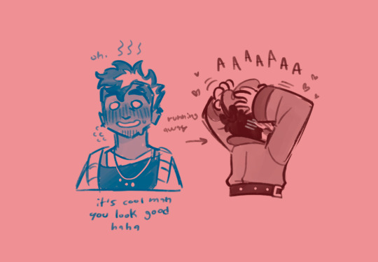
ain’t he pretty? (internally thanking poppy for her service)
#detective grimoire#tangle tower#tangle tower fanart#fitz fellow#emery inkflow#tangle tower oc#oc x canon#fitz experimenting makes me strong no one talk to me /lh#this will happen again#with poppy included mayhaps I want to draw her in something punk#their all my barbie dolls/hj#razzart#myart
24 notes
·
View notes
Text
Ok so recently I saw a post about "Oh, Aziraphale's handwriting in the Edinburgh minisode is so dainty! So angelic!"
And like... no. No it's not. Now, this is coming from someone whose handwriting has never been described as pretty or dainty or anything. In fact, my teachers once wrote on my report that it was "legible." Yep. That one hurt. Anyway.
Also, I am not an expert in fonts, but... What is this?
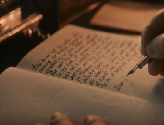
He's printing! Why is he printing? He should be writing in the most elegant English Cursive. Instead, he's just barely connecting his printed letters. And with that fat kind of nib, too!
This is what English Cursive should look like, according to the calligraphy books I've been hoarding in hopes practicing that would improve my own handwriting:
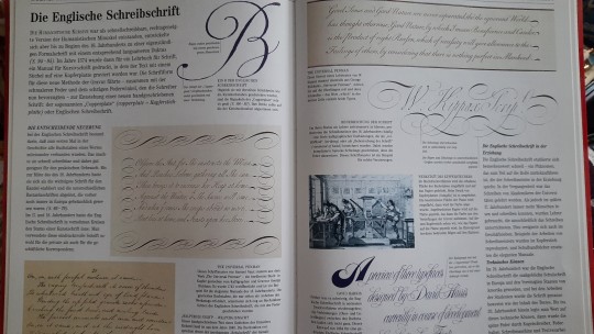
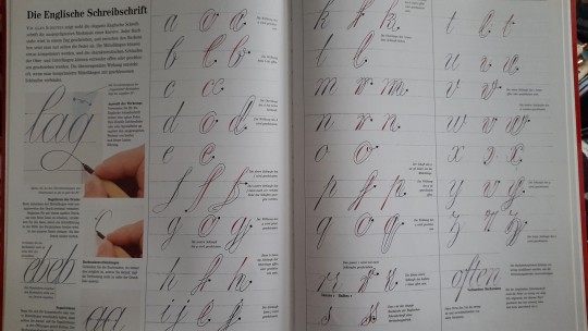
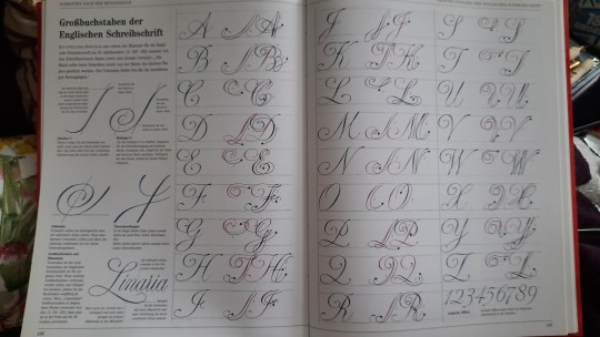
Now this is dainty and angelic. And it needs to be written with a quite fine nib.
And it's not even that difficult! Look, this is what I did in about half an hour (most of which was spent wrestling with inkflow and bleeding and prying open inkwells):
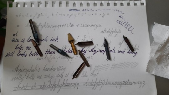
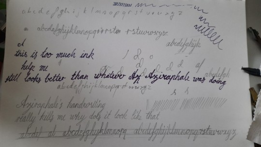
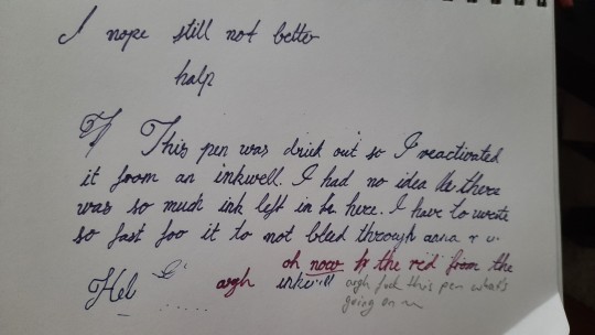
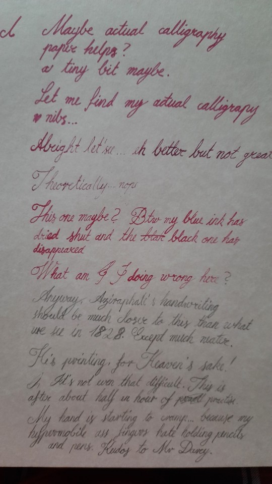
Imagine how much prettier it would be if I actually put in, let's say, a week of practice. Which is not too much to ask of a professional actor.
No shade to Michael Sheen, I don't know the bts of the writing scene, but it just actually grinds my gears. It would have been so easy to have, let's say, an actual calligrapher stand in for the shot where you onyl see the hands, or just to tell MS to practice his Cursive. Again, when it comes to preparing for roles, the amount of work this would take is well within what you can expect (I would know, I'm a performer myself after all). I'm just confused why that didn't happen.
Gripe over.
#this has bugged me ever since I first saw that scene#btw i know i wrote 1828 but is that correct? i didn't check#anyway#now i want to do calligraphy again this was fun#and in this post you see me turn a turnip - uh i mean...#good omens#Aziraphale#aziraphale's handwriting#why is it so bad (in the context of the scene! MS's handwriting is actually pretty good i think just... why here)
13 notes
·
View notes
Text
a scene from a book made me cry today. it was not particularly extraordinary, or earth-shattering, and i was surprised to feel the familiar drop in my stomach, the twinge in my chest, the tingle in my nose.
ive realised as ive gotten older the way the list of things that make me cry grows longer with each passing heartbreak. (the death of a pet. the sacrifices of a parent. the loss of a friend. the betrayal of a lover.) the way my body has collected each and every one, tucked them into the crevices of my being. hidden, but never forgotten. ever-growing.
#inkflows#spilled ink#poets on tumblr#its been so long ive forgotten how to tag my writing#but oh how ive missed this#frankly ive been robbing myself of opportunities to write because it meant confronting my feelings#and ive had many big feelings for a while now#but it might be time for me to return to the ring
1 note
·
View note
Note
hi pen friend!! I got a pilot kakuno pen recently and I am playing around with it. However!!! I learned that I really like having thicker bold lines and I’m kinda sad that the non on my shiny new pen is so so very fine. Is there a way to broaden the nib a little or do you maybe have recs for a pen with a slightly broader nib? (I have been preferring pilot pens with a 1mil nib size, those have good thicc lines that I like. Even a little thicker without being a marker would also be IDEAL) This is gonna be a work pen for me so being durable would also be a nice bonus.
ooh so!! there are a couple things you can do in this case!!! IM PUTTING IT UNDER A READMORE CUS I RAMBLEEEE letsgooo
• swapping out the nib pilot kakuno nibs are compatible with many other pilot pens including the 78G, Prera, Plumix, Penmanship, and Metropolitan! it can be hard sometimes to find spare nibs for this brand, so if this is what you wanna do i'd suggest hunting around any local pen shops that might carry nib replacements + ebay/facebook marketplace/etc.
• grinding the nib down this option is usually not recommended for beginners, but i'm all for fucking around with things i own (sometimes to my detriment) so i'd definitely look into it! especially with something as affordable as a kakuno - most fountain pens are tipped with a somewhat fancier metal (iridium, osmium, gold, palladium, etc) which you Don't want to grind all the way away, but kakunos are not tipped with anything special. they're just plain stainless steel through and through, and i see no issue in giving grinding a go in that case! you'll definitely want to watch a lot of videos on the process - most involve a whetstone and/or extremely fine grain sandpaper & lots and lots of smooth, confident hand movements.
the two i learned are these: smooth, long strokes where you tilt the pen from a low angle to a high angle, and figure eights. the angle of the pen is extremely important, and you'll have to be careful to ensure everything is balanced.

i've ground down a cheap knockoff lamy to a WIDE chisel before, and it came out better (albeit still a bit scratchy) than it used to write (because it wrote like shit originally) imo, as long as the inkflow is even and consistent i don't mind a little feedback on the page.
• getting a pen with a broader nib ok this is where i recc some more pens!!! if you're looking for a workhorse that's a little broader or juicier than a kakuno, i cannot overstate my love for the platinum preppy in 05 (medium nib). this little thing is an absolute legend. they can sit inked and idle for an entire year thanks to the cool seal mechanism in the cap, and i've never had one dry start on me before. they're cheap, feel amazing, i can go on. since they last so long, usually the first failing point is their bodies rather than their nibs, so if you want something a little more durable you can upgrade to a platinum plaisir (which is just a preppy with a metal body!)
i can also highly reccomend Lamy safaris for their ease of nib swappability and range of options! you can go all the way from an EF to a 1.9mm chisel tip >:)
the pilot metropolitan is a universally beloved pen for its quality, though i don't have one so i have no personal stuff to say! this and the lamy are a little pricier than the preppy/plaisir/kakuno but with that comes the bump up in quality and longevity. things to consider!
in general i'd say that any fountain pen with a snap cap rather than a screw cap will work well for work - since unscrewing and rescrewing a cap all day as you do things is sort of a pain in the wrist. i find myself leaning to my lamys & preppies when im working since its so much faster and easier to pop that thing lol.
15 notes
·
View notes
Text
Artfight 2024 is over-
So here are all the attacks I could make :)


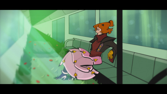

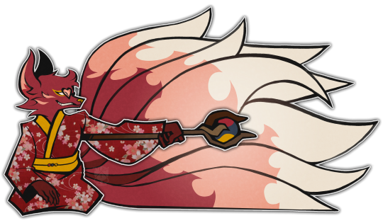



Character credits ( in order from left to right, top to bottom )
-
MARIANA & MIHAI ★ from Mush_the_possum
Kuroba from wildflowercryptid
Robin Wild (one-off) from richynepp
Anne Vestigator from ToonIRL
☆Washi☆ from Wilted-Ribs
Grov from Leaf_1
Miss Dulciumi / Alison Sweet from seeninmydreams
Anya from Amandart
DETECTIVE PEPPERINE from RalphRiptide
Kora from 1whowalkbutnosmile
Seashell ❁* & Rex ❁* from RockyHorrorCacti
Terry & Yayo (Rudolf) from Rikoicoico & Salsalsal
Ingrid Morgan from violixir
[Sona] Bungee from Ottosbigtop
Emery Inkflow from totally_razzical
18 notes
·
View notes
Text
#shorts add-ons on this sleeve. #throwback #inkflower #tattoo
youtube
0 notes
