#ITC bookman
Text

ITC Bookman è un font molto adatto per blocchi di testo leggibili. Edward Benguiat nel 1975 ha rivisitato per ITC il carattere Bookman creato nel 1860 da Alexander Phemister per la fonderia scozzare Miller & Richard. Il carattere originale, ora noto come Bookman Old Style, fu creato quale alternativa al Caslon, migliorando quelli che erano ritenuti difetti, ovvero alleggerendo le grazie e accorciando i tratti ascendenti e discendenti. ITC Bookman presenta nuovi pesi e una più ampia altezza x, per ottenere un aspetto più semplice che ben si adatta a lunghi testi e a titolazioni.
0 notes
Text


From the fontsinuse website:
“There were many iterations of Milton Glaser’s cat and Catskills posters which were produced for the New York Board of Tourism. Dates on these posters go all the way back from the late 1970s to the mid-90s.”
Fonts:
ITC American Typewriter, Kitchen, Century Oldstyle, ITC Bookman, and Times New Roman
1 note
·
View note
Photo

ITC Bookman ITC Bookman was designed by Edward Benguiat and published by ITC. ITC Bookman contains 8 styles and family package options.
0 notes
Photo


Linotype QuickDraw GX Font collection preview
#Linotype#Font#Quick Draw GX#apple#mac#macintosh#avant garde#Helvetica#New Century Schoolbook#ITC bookman#Courier#Times#palatino
29 notes
·
View notes
Text
Tranquillo

0 notes
Note
silly string and bold
silly string: do you play an instrument? is there anything you’d like to play?
i play flute and piano! i like flute more as it feels more personal (which is why i gave him a name) but piano’s okay too. i’d really like to play guitar or ukelele bc it feels so much more direct and its easier to create bases with them, but i also have a cheap amazon violin that has two snapped strings in a closet somewhere, so i’d like to fix and restring that someday.
bold: favorite font?
centaur for more personal things, bookman old style for more professional things, and lemonada for casual things, as well as bradley hand itc if im communicating with someone. im picky
(x)
1 note
·
View note
Photo
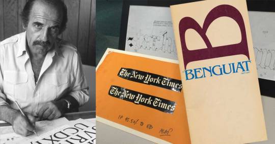
Ed Benguiat (1927-2020)
Ed Benguiat may be best known to the general public for his eponymous typeface, but he designed many typefaces. While working for Photo-Lettering, Inc (known as PLINC), and for ITC (International Typeface Corporation) Benguiat designed Barcelona, Bookman, Caslon No. 224, ITC Century Handtooled, ITC Edwardian Script, Souvenir, Tiffany and other popular faces. He was a teacher and a mentor. He inspired a collection of typefaces by House Industries.
Designer and typographer, David Quay, related this story upon hearing of Benguiat’s passing: Many years ago I designed three titles in a trilogy of novels for Penguin Books. They were novels set in Russia. I had just received the latest U&lc magazine from New York displaying Ed Benguiat’s new typeface ITC Benguiat, it was perfect for the subject. I photostated the alphabet and pasted up the 3 headlines. Penguin gave the ok, then I realized ITC Benguiat was not yet available, U&lc was pre-release publicity! I was stuck, Penguin wanted the artwork very quickly and there was not enough time to hand letter all the long titles or retouch the rather crude photostats! I phoned my friend Tony Di Spigna who worked with Herb Lubalin. He said “I will take care of it.” Four days later by special post, an envelope arrived with 3 photographic prints with the titles perfectly set and ligatured. A note enclosed said, “I am pleased you like the typeface, you are the first to use it, Ed.”
Release announcement for ITC Benguiat in the December 1977 issue of ITC’s U&lc magazine.

1 note
·
View note
Text
Avantgardelt Book Font

Download Popular Fonts. The 10 most popular fonts right now. AvantGarde-Book Comments. Download AvantGardeLT Book OpenTypeOpenType font. Download 186,286 Free fonts at ufonts.com. AvantGarde-Demi Regular DHBK Tp. HCM:231:AvantGarde-Demi AvantGarde-Demi 1. 0 AvantGarde-Demi.
Avant Garde Lt Book Font
The best website for free high-quality Avantgarde Book Bold fonts, with 24 free Avantgarde Book Bold fonts for immediate download, and ➔ 47 professional Avantgarde Book Bold fonts for the best price on the Web.
24 Free Avantgarde Book Bold Fonts
Book4 StylesHideShow
DevilBreezeBoldHideShow
Book Antiqua BoldHideShow
BaselBook, BoldHideShow
Gogating BookHideShow
Sudbury2 StylesHideShow
Open Book Bold RegularHideShow
Comic3 StylesHideShow
Gentium2 StylesHideShow
BaaBookHmkBoldHideShow
Bookvar BoldHideShow
Bookman Old Style2 StylesHideShow
BookHeadsHideShow
Book JacketHideShow
book stack2 StylesHideShow
Book Illustrator's HandwritingHideShow
Sketch BookHideShow
Bruno BookHideShow
Angleterre BookHideShow
Jumble BookHideShow
Ashby BookHideShow
Comick BookHideShow
Sanford BookHideShow
Devil BreezeHideShow
AvantGarde Book Bold Free TrueType Font Download - ufonts.com
Download AvantGarde Book BoldTrueType font. Download 151,703 Free fonts at ufonts.com
Download AvantGarde Book Bold Font - Download free fonts ...
Enter the code to download AvantGarde Book Bold. Please verify that you are an organic, carbon-based life form, not an automated computer program!
Font AvantGarde-Book Bold Bold www.911fonts.com - Fonts ...
Font Family: AvantGarde-Book Bold: Subfamily: Bold: Full Font Name: AvantGarde-Book Bold: Postscript Name: AvantGarde-Book-Bold
avant-garde free download () - Abstract Fonts
Download, view, test-drive, bookmark free fonts. Features more than 13,500 free fonts.
ITC Avant Garde Gothic® - Webfont & Desktop font « MyFonts
ITC Avant Garde Gothic is a font family based on the logo font used in the Avant Garde magazine. Herb Lubalin devised the logo concept and its companion headline ...
Free Avant Garde Book Font Download - FreakFonts
Download avant garde book font for Windows and Mac OS at FreakFonts.com - largest collection containing more then 115995 TrueType and OpenType fonts.
1 Free Itc Avant Garde Gothic Font · 1001 Fonts
Itc Avant Garde Gothic Fonts Fonts 1 - 1 of 1. itc avant garde gothic x; bold; italic; regular; …more
AvantGarde LT Book Font - Free Cufon and CSS Web Fonts ...
The best fonts for you have collected, and also of all the fonts on your web site for you to use css @font-face cufon and property.
Please note: If you want to create professional printout, you should consider a commercial font. Free fonts often have not all characters and signs, and have no kerning pairs (Avenue ↔ A venue, Tea ↔ T ea).
Check it for free with Typograph.
Moki
Related and similar fonts
Chronica Pro
Qanelas™
Stolzl Display™
Volte Rounded
Brandon Text
Volte
Sofia Pro
FF Schulbuch™
Touche
Andes Italic
MEGA SLANT LINE
Mauve
bb-book A
bb-book Contrasted
Kettering 205
Kettering 105
Galano Grotesque
Urbani
Galano Classic
Intro Rust™
Sofia Pro Condensed
Arnold Samuels™
FF Roice™
FF Max® Demi Serif
Soin Sans Neue™
Core Sans C
TT Corals
Andes Condensed
Kessel 105
Nanami
Naive Inline
Kamerik 205
Kamerik 105
Hiruko™
Kessel 205
Nanami Rounded Pro
Nanami Rounded
Core Sans G
Moki™
PowerStation
Deliscript™
Soin Sans
Nanami Handmade
Naive Inline Sans
Envisage
Shine Pro

Other users also search for: itc avant garde gothic, dj, magazine, rounded, modern, itc, chino, futura, gotham
Discover a huge collection of fonts and hand-reviewed graphic assets. All the Fonts you need and many other design elements, are available for a monthly subscription by subscribing to Envato Elements. The subscription costs $16.50 per month and gives you unlimited access to a massive and growing library of 1,500,000+ items that can be downloaded as often as you need (stock photos too)!
Avantgarde Book Font
The best website for free high-quality Avantgarde Book fonts, with 28 free Avantgarde Book fonts for immediate download, and ➔ 33 professional Avantgarde Book fonts for the best price on the Web.
28 Free Avantgarde Book Fonts
Book4 StylesHideShow
Devil BreezeHideShow
BookHeadsHideShow
Book JacketHideShow
book stack2 StylesHideShow
Book Illustrator's HandwritingHideShow
Book Antiqua BoldHideShow
Sketch BookHideShow
Comic BookHideShow
Bruno BookHideShow
Angleterre BookHideShow
Jumble BookHideShow
Ashby BookHideShow
Comick BookHideShow
Sanford BookHideShow
Centabel BookHideShow
Orange BookHideShow
DeluxeBookHideShow
Candela BookHideShow
Jura BookHideShow
Arcade BookHideShow
KacstBookHideShow
Daela-BookHideShow
BaselBookHideShow
Holy BookHideShow
Brixton BookHideShow
Quicksand BookHideShow
Gogating BookHideShow
AvantGarde-Book Free TrueType Font Download - ufonts.com
Download AvantGarde-BookTrueType font. Download 151,703 Free fonts at ufonts.com
Download AvantGarde-Book Font - Download free fonts from ...
Enter the code to download AvantGarde-Book. Please verify that you are an organic, carbon-based life form, not an automated computer program! Not sure?
ITC Avant Garde Gothic® - Webfont & Desktop font « MyFonts
ITC Avant Garde Gothic is a font family based on the logo font used in the Avant Garde magazine. Herb Lubalin devised the logo concept and its companion headline ...
Font AvantGarde Bk BT Book www.911fonts.com - Fonts ...
Download fonts, free fonts, zephyr font, microsoft fonts, gothic fonts, scary fonts and graffiti. More 40 000 fonts on 911fonts.com!
ITC Avant Garde Gothic® Book - Fonts.com
Buy ITC Avant Garde Gothic Book desktop font from ITC on Fonts.com.
Avant Garde Book BT - free font download on AllFont.net
On this page you can download the font Avant Garde Book BT version mfgpctt-v1.52 Tuesday, January 12, 1993 3:55:26 pm (EST), which belongs to the family AvantGarde Bk ...
Avantgarde Bk Bt Book : Download For Free, View Sample ...
Download AvantGarde Bk BT Book For Free, View Sample Text, Rating And More On Fontsgeek.com
1 Free Itc Avant Garde Gothic Font · 1001 Fonts
Itc Avant Garde Gothic Fonts Fonts 1 - 1 of 1. itc avant garde gothic x; bold; italic; regular; …more
AvantGarde LT Book Font - Free Cufon and CSS Web Fonts ...
The best fonts for you have collected, and also of all the fonts on your web site for you to use css @font-face cufon and property.
Avantgardelt Book Font Free
Please note: If you want to create professional printout, you should consider a commercial font. Free fonts often have not all characters and signs, and have no kerning pairs (Avenue ↔ A venue, Tea ↔ T ea).
Check it for free with Typograph.
ITC Avant Garde Gothic Medium
ITC Avant Garde Gothic Medium
ITC Avant Garde Gothic Medium
ITC Avant Garde Gothic 1 Volume
ITC Avant Garde Gothic Book
ITC Avant Garde Gothic Book
ITC Avant Garde Gothic Book
ITC Avant Garde Gothic Book Oblique
ITC Avant Garde Gothic Book Oblique
ITC Avant Garde Gothic Book Oblique
ITC Avant Garde Gothic Condensed Bold
ITC Avant Garde Gothic Condensed Bold
ITC Avant Garde Gothic Extra Light
ITC Avant Garde Gothic Extra Light
ITC Avant Garde Gothic Complete Family
ITC Avant Garde Gothic®
Related and similar fonts
Chronica Pro
Volte Rounded
Galano Grotesque
Volte
Qanelas™
Urbani
Galano Classic
FF Schulbuch™
Touche
Sofia Pro Condensed
Arnold Samuels™
Stolzl Display™
FF Roice™
FF Max® Demi Serif
Brandon Text
Sofia Pro
Noyh
Other users also search for: avant garde, dj, magazine, rounded, modern, futura, itc
Avantgarde Bk Bt Font

Discover a huge collection of fonts and hand-reviewed graphic assets. All the Fonts you need and many other design elements, are available for a monthly subscription by subscribing to Envato Elements. The subscription costs $16.50 per month and gives you unlimited access to a massive and growing library of 1,500,000+ items that can be downloaded as often as you need (stock photos too)!
0 notes
Text
Film Typefaces


Being Inspired by Film Letterforms
Pulp Fiction: “The opening scene and titles bring together many of the movie’s characteristics: casual conversations, violence and references to the 1950s to 1970s. Two idlers discuss the business opportunities of a robbery in an all-american diner, give each other a kiss and pull their guns. He shouts that this is a robbery, she shouts: “Any of you fucking pricks move, and I’ll execute every motherfuckin’ last one of you!”. The movie freezes and Dick Dale’s 1963 surf hit “Misirlou” kicks in while the title sequence starts rolling with two titles set in ITC Busorama (1970).
Unlike the film scenes, which jump back and forth through time, the title sequences are slow, symmetric and static. While the film logo set in Aachen (1969) becomes smaller and smaller at the slowest possible pace, it is covered by names of actors, producers etc. set in ITC Benguiat (1977) with enlarged and lowered initial caps. Halfway through the titles, someone seems to be looking for new music on the radio, bored with Dick Dale who is replaced with Kool & the Gang’s pounding disco funk: “Jungle Boogie” (1973).
During the film new storylines are introduced with simple intertitles: a black screen shows center-aligned all-caps text using ITC Bookman.
The end credits follow the classic model: a long row of text scrolls upwards, again using Bookman. Like all typography in Pulp Fiction, the end titles show a penchant for meticulously executed quirkiness. The type is compressed just enough to evoke the right kind of nostalgic amateurism. Things like the (faux) small cap A in “LaMarr” show an attention for typographic detail.”
Juno: https://www.artofthetitle.com/title/juno/
American Horror Story: “The font used in the title card as well as the promotional poster for its title is very similar to Rennie Mackintosh designed by Charles Rennie Mackintosh in 1993.”
Star Trek: “There is a typographic connection between Star Trek and its competing franchise Star Wars: the typeface of the tagline is the exact same ITC Serif Gothic that was used for the tagline on the poster for the first Star Wars movie.”
Star Wars: “The new Star Wars films use a version of News Gothic for the title of each film and for the crawl text itself. This flies in the face of previous films which used Universe for the title to establish a sense of importance and gravity, while using News Gothic for the crawl text.”
(Links to websites via the quotations)
0 notes


Text
Assignment B
The purpose of this assignment is to identify some ‘good’ and ‘poor’ signs, identify their type, and determine if the signage is successful.
Step 1:
Journey and I collaborated and came up with the following examples for ‘poor’ and ‘good’ signs.
Here are some examples of the ‘poor’ signs that we found:


The following are examples of the ‘good’ signs that we found:


Step 2:
I am going to choose the first sign for the ‘poor’ example and the last sign as my ‘good’ example.
The ‘poor’ example features a Slab Serif typeface, as well as a San Serif one.
The ‘good’ example features various San Serif typefaces.
Using What The Font on font.com, I was able to identify the fonts used in these signs.
Poor: facial waxing - Bookman Old Style Pro Bold. services available - Blooming Elegant Sans Bold.
Good: THINK & FIRST - Futura ND OsF Bold. LOCAL & We’re better together - ITC Avant Garde Std Bold. 2017 Member - Myriad Pro SemiExtended Black
Step 3:
Poor: I think that the typeface chosen in this sign is fine, it isn’t very dynamic, but it does get the message across and isn’t distracting. I do wish that the message made use of capital letters and punctuation. I think this typeface would appeal to its audience because they would see it on the door of this salon and it would be easy to read quickly. The message is clear and they may go ahead and add that service to their appointment.
Good: I think the typeface choices in this sign work very well with the design. The weight of LOCAL works very well to balance the shape. It seems a little unnecessary to use so many different typefaces. I feel as if the bottom text could all be in the same typeface. I think this typeface appeals to its audience because it is bubbly and clean; it is easy to read and works with the illustrated elements.
Step 4:
Poor:

When I redid this sign I changed the type to align right so it was against the photo, and aligned it to the bottom of the photo. I think this makes better use of the white space. I also went with all capital letters and a simplistic font to grab people’s attention as they are entering the salon.
Good:

This one was a bit more fun to work on, since it had some illustrative elements. I went with Arial Black for all the writing. I didn’t feel the need to use three typefaces like the original did. I made slight changes to the bottom text; I capitalized all the words and changed “2017 Member” to “Member Since 2017.” This leaves the sign more open ended and will remain relevant as the years pass.
0 notes
Text
Font Experimentation

Here are some of the fonts I looked at and played around with. I compiled them all into one post instead of taking each individual screenshot of the word. I wanted something clean and simple, yet I did experiment with other styles of fonts as you can see.
The font is an important part of the magazine as you need to be able to read it clearly yet not have it too boring as it will deduct from the whole aesthetic of your magazine. As my magazine was planned and is very minimalist I wanted a clean but bold text.
The fonts I have above are: Bahnschrift Light, Arial Nova, Bookman Old, Lucida Fax, Sitka Small, Viner Hand ITC, Arial Black, Courier New, Georgia, Rockwell Condensed, Harrington, and Palatino Linotype.
0 notes
Photo

USA typografisch. Font: ITC Bookman Swash DemiBold Italic. Foto: @britta #typographytravel #usa #californien #walking #food #ilovefreedom #harmonie #typohype #schriftarten #typotravel #citypography #typography #typo #typografie #typophile #ilovetypo #typedesign #goodtype #typematters #thedailytype #typoart #fontoftheday #typoworld #streetphotography #streetart #strassenfotografie #photooftheday #bestoftheday #pictureoftheday #artefakt (hier: Santa Cruz, California)
#photooftheday#typografie#typo#typoart#food#californien#goodtype#ilovetypo#citypography#typohype#typophile#typographytravel#typedesign#typoworld#bestoftheday#streetart#usa#schriftarten#ilovefreedom#harmonie#strassenfotografie#thedailytype#streetphotography#walking#typematters#pictureoftheday#artefakt#typotravel#fontoftheday#typography
0 notes
Photo

ITC Bookman Medium - Fonts.com ❤ liked on Polyvore
0 notes
Photo

ITC Bookman Medium - Fonts.com ❤ liked on Polyvore
0 notes
Photo

ITC Bookman Demi Bold ❤ liked on Polyvore
0 notes
Last Seen Blogs

fingertip-radiance
she itunes when i listen

myfatherthehero-1994
myfatherthehero-1994

eternalzia
Eternal

angel-status
♡︎𝖕𝖎𝖘𝖈𝖊𝖘 𝖛𝖊𝖓𝖚𝖘♡︎

oitreles-blog
ANELIR