#I've posted this before but it was a scan of a print in a book; this file is SO much higher quality!
Explore tagged Tumblr posts
Text
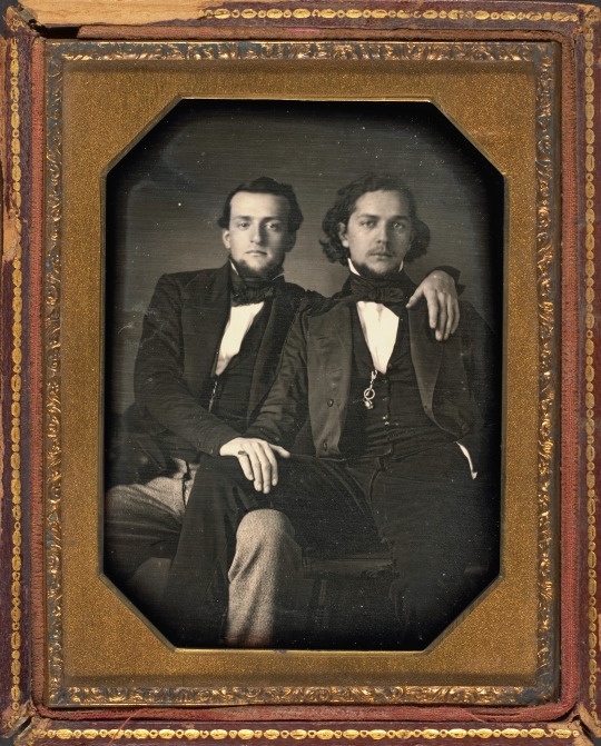
Unknown Photographer, Two Young Men, c. 1850
#I've posted this before but it was a scan of a print in a book; this file is SO much higher quality!#please note however that I've edited for contrast—click link to see original at Met Museum site#19th century#1800s#1850s#19th century fashion#men's fashion#historical fashion#fashion history#early photography#19th century photography#daguerreotype#gay interest
364 notes
·
View notes
Text
music notes of the heart
Genre/Tropes: Study dates but its unestablished relationship? Floyd is flirting with you LMAO + Slow Dancing!!
Summary: Your tutor for musicology may not be other people's first choice, but he's yours.
Author's Comments: inspired by this tumblr post!! we truly do need more intelligent floyd content and i've already written for jade's dorky goofy silly side so many times sigh. also seriously, do not ask about the slow dancing merpeople rituals. you can infer. LMAO (@tinyletterz i hope you dont mind me tagging you but i was thinking of you when i wrote this bc yk. Floyd Leech. C:)
~~~~~
You set your books down on the table tucked in the corner of the library and sit down, shifting anxiously as you await your tutor. The smell of old papers and the sound of scratching pens from a few bookshelves away does nothing to dispel your nerves. If Ace and Deuce could see just who you’d asked for help, they surely would have yelled at you for hours and wrung out your neck in frustration.
It’s not like anyone else held the same passion for musicology, though. Besides, Floyd Leech wasn’t that bad once you got to know him.
Speak of the devil and he shall appear, you think as he waltzes into the library, a lazy smirk on his face and his hands shoved into his pockets. His back is hunched slightly as he looks around the library, eyes scanning over each face with an almost predatory grin. You raise your arms and wave him over, trying not to make much noise to avoid being yelled at by the crabby librarian.
Floyd does not share that sentiment.
“Shrimpy!” he yells (honestly you don’t think he’s capable of yelling any louder) and bounces over to you.
He sweeps you into his arms in the blink of an eye, cackling madly as he nuzzles you. The librarian shoots the two of you a glare, and you shrink into his chest with shame. You’ll have to apologize to him later.
“Were ya trying to hide from me?” he breathes, sharp teeth on display as he grins down at your bundled-up form, “You know I’d sniff you out, right?”
“I wasn’t.” you protest, but it falls on deaf ears and Floyd squeezes you closer. His nose brushes against your cheek and he borderline snuggles you and you’re glad you’ve picked a table in the corner because if you were any closer to the center everyone would be staring.
“Alright Shrimpy,” he murmurs, setting you down in your chair with two quick taps on your head, “Ya said you needed my help with musicology?”
“I didn’t know who else to ask.” you say, sliding your textbook over to him with a furrowed brow, “You’re the best in that class and I can’t seem to grasp any of it.”
Floyd sits down next to you and leans in close, so close that you can smell the cologne on his clothing. You let him read through the notes you made on the sheet of lined paper you used to mark your page, gnawing at your lower lip self-consciously. You know you aren’t the best at this subject but it’s Floyd’s best, and you don’t want him to think you’re stupid.
He seems to be able to read minds because Floyd looks over at you with a pout.
“Shrimpy, I’d tell ya if you were stupid. So quit worrying.” Floyd scolds, snatching your hand up and squeezing it as he intertwines your fingers, “The fun thing about musicology is that you can analyze and learn from any angle ya want!”
“Freer subjects are harder to work with, though.” you confess, “I’m not sure how to go about...figuring something out when it doesn’t have structure.”
Floyd sticks his tongue out and blows a raspberry as if to say “Boo, Shrimpy. Now you do sound stupid.” You can almost hear his voice.
“Just pick something and we can start from there. What kind of music do ya like?” he bumps you with his shoulder, a huge grin on his face, “Ya gotta have something.”
You answer him, and he makes an “ah-ha!” noise. He mumbles a page number and flicks through the textbook before coming to a stop at a chapter that goes into that exact type of music. There are music scores printed on the right page and some kind of tree diagram on the left one. You stare at the words incredulously, already lost.
“Come on now, Shrimpy. Work that tiny little brain of yours.” Floyd teases, jabbing your temple with a giggle, “I know you can do it.”
You swat his hand away and wiggle your hand out of his hold, feeling a foreign heat creep up on your cheeks. Floyd giggles again as if he knows, and leans in even closer to you.
“Hey Shrimpy.” he whispers, eyes gleaming in the corner of your vision, “I changed my mind, let’s ditch the reading. I’m getting bored. What are ya gonna do about that, huh?”
You’re not sure you can do anything honestly, but you expected him to leave pretty early on in your study session anyway. It’s a miracle you got him to agree in the first place.
“Oh, you can leave.” you offer him a quick smile and turn back to your textbook, pouring over the words, “I didn’t expect you to stay the whole time- Woah!”
You’re swept out of your chair but the second time that day, and your body thumps against Floyd’s. He stares at you with a cheerful grin as he takes your hands and places them on his arms. You jump a bit when his lanky arms wrap around your waist, but when he starts swaying slowly you get the idea.
“Let’s try something else, yeah?” he snickers, “Can you tell me why people slow dance?”
“Um...to feel emotional closeness?” you say, eyes glued to his rumpled purple shirt so you don’t have to look him in the eye.
“Bingo.” he chuckles, “Merpeople also have dances like this.”
You’re tempted to ask what those dances are for, but you don’t. Floyd sweeps you around and your feet lift off the floor for a second, but you don’t feel like you’re going to fall. Floyd squeezes you a bit tighter as he guides you, somehow avoiding any tables and chairs and bookcases with master precision.
“I didn’t know you could slow dance.” you whisper, “I thought you were more of a fast paced dancer.”
“Meh. Normally.” he shrugs, “But I like dancing like this with ya. It’s fun.”
Your heart flutters.
“Can ya tell me anything else about it?” he hums, lifting his arm and spinning you around. Your breath catches in your throat as he dips you, the arm carefully holding up your waist your only support.
“Um...” you stumble over your words, grasping for any thoughts as you stare into his eyes, “Uh, it’s- um, slow dancing brings people physically closer too? Because you can feel their movement and everything-”
“Good little Shrimpy.” he giggles, hoisting you back up and resuming his more soothing swaying, “See? You’re doing good. I told ya you’d figure it out.”
Did he? You don’t even remember.
“I think I need more instruction.” you mumble, eyes darting away once again.
Floyd laughs loudly at that, but this time you don’t care when the librarian shushes you.
#auburn's fics <3#disney twisted wonderland#twisted wonderland x reader#twisted wonderland#twst x reader#disney twst x reader#floyd leech x reader#floyd fluff#floyd leech is a silly guy#floyd x reader#floyd leech fluff#uhhh i dont rlly know if this counts as intelligent floyd?#I HOPE IT DOES.....#I GOT SIDETRACKED#uhhhh its fluffy and thats what matters#BYE NOW LMAO
324 notes
·
View notes
Note
do you have any tips for scanning old magazines/catalogs? i'd like to help archive some of the publications i have, but i don't really know where to start ʕ´•ᴥ•`ʔ
i'm mostly concerned about binding (especially on glbs) and what scanner specifications to look at, but any other advice or resources would be appreciated too!
So, I'm not actually an archivist, I'm a web developer by trade. I own a relatively inexpensive flatbed printer/scanner, mostly because it was what I could go out to a physical store and buy for relatively cheap when I started out scanning old magazines and catalogs.
For anything that is staple bound, like a magazine, and can be put flat on a table while open, scanning is relatively easy. You just need a flatbed scanner that is bigger than the pages, and a book to put on top of the lid to keep it flat (don't use too heavy of a book or you will damage the scanner 1-2 magazines is usually good. Also, don't forget they are there, open the lid and fling them across the room). Line up a corner of the page on the corner of the scanner and you should be golden. Scan in photo mode if your scanner software has options. Ideally, for things like the GLB, you would either want a copy you can destroy (which I kind of think is what some of the 'latest magazines' scanning farms were doing in the 2010s) and to carefully unbind the whole thing and scan the pages flat (which I have no personal interest in doing because destroying books pains me and I'm not trying to digitize "clean" digital copies for any professional reason). OR, my understanding is you want something with a V-shaped cradle of some type that is specialized for scanning books, either as an actual scanner or a camera setup with software. The problem is last time I looked those were like 10K and up if you get a piece of specialized equipment.
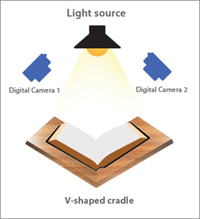
I've vaguely dabbled with the idea of doing a very hacky version of a DIY build with boxes cut down to the right angle and some panes of glass and my DSLR for my pink house catalogs because they are too big but I never really got it fully figured out. I will admit, I haven't tried super hard. I kept getting reflections, and I had to worry about the glass scratching the pages, and I didn't feel like getting a proper light.... I know I should really try again, and try a little harder, but it's a lot and I have a lot of other stuff I need to do so it just keeps getting kicked down the road.
That said, if you want to get into trying a DIY build, there is a whole community of people who were doing that in the 2010s that have posted good info on types of glass and way more detailed suggestions than I can make here: https://diybookscanner.org/forum/index.php This box scanner is essentially what I was trying to set up and it theoretically should work, I'm pretty sure my whole issue is that I was trying to do it all quickly at like midnight one day and did not have the right lighting and didn't try too hard to fix that. Like... I could have tried a lot harder than I did https://www.instructables.com/Bargain-Price-Book-Scanner-From-A-Cardboard-Box/ (good pictures of one here: https://diybookscanner.org/forum/viewtopic.php?f=14&t=1202)
And then I needed to take it apart because I needed the table back...
But yeah, if you don't want to invest thousands or destroy them, I would say try a cardboard box scanner for things like the GLB, see if you can get it to work for you?
And then for things that can go flat, a combo scanner/printer that is good enough for photographs will be more than good enough for the print resolution of most magazines and the scanner/printer combos are way cheaper than dedicated scanners because they think you are going to become an ink customer and buy printer ink, so they make it cheaper. But the joke is on them. My combo scanner printer has never had ink in it before. (Note: do read reviews and make sure it's not stupid enough to require it's ink to be full to scan. I wouldn't put it past some companies to add that to their software). If you are really passionate about this, there are a lot of people who are way more dedicated to archival book scanning who have developed all sorts of DIY solutions for speeding up the process, automating parts of it, etc, and searching for terms like DIY book scanner should get you in the right place on the internet.
7 notes
·
View notes
Text
Guess whose financial mistake arrived early...
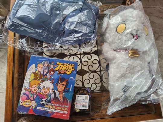
I will give more in depth looks later (I have to work to afford such questionable purchases), but a quick individual review of what I got:
Neil Demon Plushy

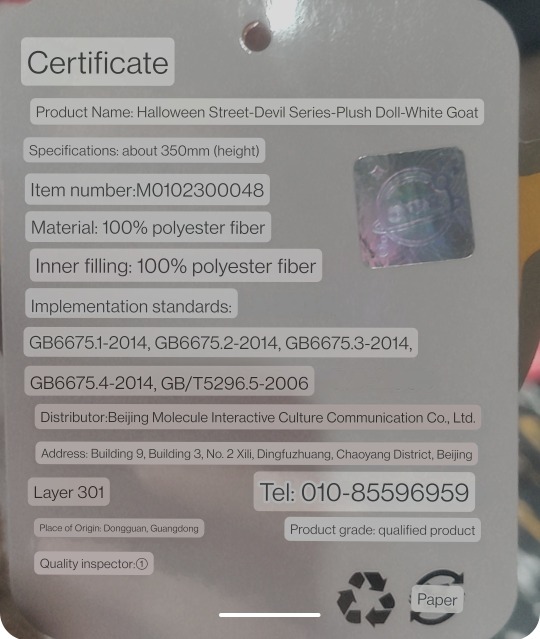
Not a plush toys collector at all; my closest reference is the IKEA shark. He is heavier than he looks, very sturdy (?) if that makes sense. Doesn't seem like he will deform any time soon. The details are adorable and I don't see any glaring defects.
All Saints Street Hoodie
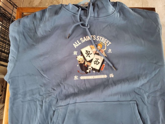
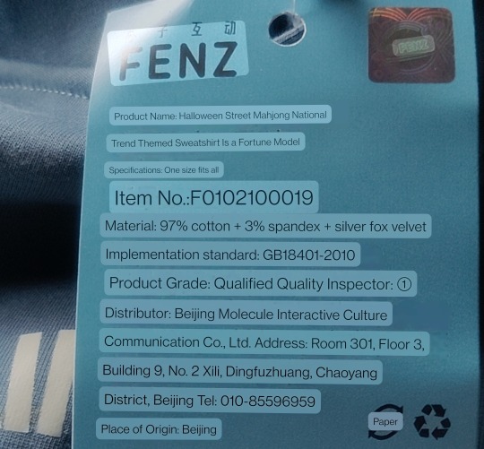
Surprisingly large for me. I was worried they only had one size made for the Chinese market. I'm 1.7m (5 foot 7) tall for reference and this is still a bit too big for me. Will likely get too small for anyone over 6 feet tall. The quality is good! Very soft. Velvet interior. I don't know much about shirt stamping, but since it's not in the fabric I'm guessing the stamp might start to crack after multiple washes.
All Saints Street Vol. 1-3 Collection
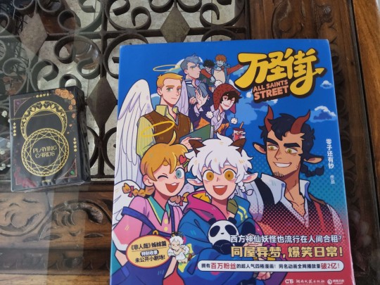
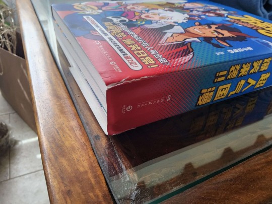
Now this is something I can talk about more. The sleeve was unfortunately damaged in shipping and the books have very minor damage in the spine and vol 2 has a minor case of dog ears. The quality of the paper is great! It is color paper, not glossy one you see in comic book issues, but it's thicker than the black and white you see in manga. Would still make sure to have a dehumidifier if your storing place is not dry. I've already experienced book wrapping and it's painful.

Each volume contains around 80 chapters with one extra chapter not on bilibili. They also contain a message from Lingzi and WSJ's editor, plus all character bios even for ones we never got one (Enrique, Eduardo ans Anthony). And if a Weibo post is correct some might have been updated from the ones online (Axel grew 1 cm in the book bio).
Of course later I'll look over everything to see if there are any significan changes to make a note of. Also it came with this lol.

I have the Alice in Wonderland art somewhere, I'll post it later as well.
All Saints Street Anniversary Playing Cards

The playing card decks from the 6th and the 7th anniversary. As you can see I haven't opened the 7th, but I got the 6th a while ago on AliExpress so I expect them to be similar.
This is something else I can review more in depth, coming from a family that loves playing poker. The quality of the prints is beautiful, however I keep them in the box all the time because the quality of the cards itself is not good!
The cards feel like store bought cardboard; good playing cards are made out of cardboard, but this deck doesn't have the same treatment. They are so fragile, even by just handling them to get the face cards I've already made slight damage to the edges. I wouldn't play any game with them, much less shuffle them. I don't even want to imagine how much they will bend. Also the Crystal card came with damage (the small white spot on the edge) from the store. Pain.
Anyways. I'll frame the face cards because they are so pretty and I want to keep them in the best condition... I don't know what I will do with the rest of the 36 cards. Maybe practice magic tricks? Lol. Before all this I've been working on how to scan all the face cards and post them, but it's been more difficult than expected. If you have ever tried to digitize prints you will know. Once I have them, I'll post them alongside high quality scans.
When it comes to my review of PandaBuy... On one hand it was an excellent service and experience. On the other... I don't even want to reveal how much the shipping was. I wouldn't recommend anyone else do it unless you are stupid with your money (like me), even then
I would advice to do your own research. PandaBuy and all agents to buy from China are definitely better when you buy in bulk. My package was 'only' 2kg. Many people buy over 10kg to make it worth it. I'm already committed so if new volumes come out I will buy them, and maybe also get counterfeit Gucci shoes or something since that's what most people use this agents for...
That's all for now. Feel free to reply or send any questions you have.
34 notes
·
View notes
Text
;/ Bit of a rant that went beyond the tags limit
#Related to the last post I bought the last guidebook volume and I really like it!!! #Even if there's not this many in it I really like concept arts it's always been a favourite of mine to look at them #And I would be lying if I said 90% of the reasons I bought the book wasn't to take a better look at the 20×7cms of Akutagawa in the new outfit character sheet. But I digress #I've been rolling around trying to scan it for a month now but I'm STRUGGLING. It's really so hard. #All my options seem to be paid which. is wholly unfortunate but it seems like it can't be helped #The libraries I asked to don't give access to scanners for free. #So my options are either to go to my university library and (pay) take the scans myself or (pay) go to a photocopy shop #I don't think there's any relevant difference in price.
#Pros of going to the library scanner: I take the scans by myself #(don't have to go through the humiliation of giving someone a 200 pages anime illustrations book and ask them to scan it) #Cons of going to the library: I have little to no idea how to make scanners work and am afraid I will mess up if I do it by myself #The scanner is right in front of the front desk and to be there for like two hours scanning as the front desk person watches me sounds. awful. #Not to mention the likely chance they could ask me “do you need help” at any time or come and check what I'm doing #Which sounds endlessly embarassing. #I suppose I could go there for multiple days but I don't have classes right now and to walk to university four times when it's not even– #likely I will find different personnel on the front desk... I don't know... #I'm not even sure they won't give me any trouble for scanning a book since most books is illegal to scan here. #I suppose it's legal if it's for completely personal use but uhm. I'm afraid there's a chance they could give me trouble. #Especially since university students are under surveillance for reprinting textbooks which is illegal to do #Or they could leave me alone and I'm just overthinking it.
#Pros of going to the printing shop: Have a professional person do the job #Cons: The terrifying ordeal of going to a shop that most exclusively scans / prints / sells university textbooks with my silly anime illustrated book #and say “hey! I would like to fully digitalize my silly anime illustrated book!! 😄 ” 😭😭😭😭😭😭😭 #Honestly I don't think I would be able to do that 😭😭😭😭😭 #Additional cons is that I'm not monitoring the scanning process. How do I explain there needs to be a scan of the cover and backcover first #(before it gets damaged from stretching the book) and that there needs to be another two separate scans with the promotional band on #(because that's how you actually archive things) without sounding completely insane #How do I explain the promotional band needs a separate scan who does that
#It's just. UGHHHHHH I don't know how to get unstuck. #And every time I ask for advice to my friends I'm looked like I was completely insane which is largely humiliating. But I really want to scan it 😭😭😭 #That's to say if anyone has any tip / advice at all I'd be forever grateful 🥺🥺 #I think it's fair to mention for context that I NEVER talk about anime with people I'm not close to. Let alone mentioning my hyperfixations. #And I've always been precisely considerate to never let any of my fan persona transpire at university. #I've mastered the art of masking in ways you can't imagine #Me going with baseball cap facemask and thick black sunglasses dressed all in black while it's 23° because I'm too embarassed to be recognized as I scan my silly anime book
8 notes
·
View notes
Note
Hi! I saw your post about the tickets. I’m really sorry that happened. I have a bad habit of offering potential solutions rather than empathy when empathy is what is needed, so please feel free to ignore this.
May I suggest that along with calling the box office, you have screenshots available of the money coming out of your bank account on your bank app, the confirmation email, screenshots from the website of the seating charts with your seats circled, and a nice picture or digital scan of your ID to prove who you are legally. Make sure you mention the address you would have sent the tickets to and the email address you used in the ordering process. Offer to email all of this to the box office. Actually get the email draft ready with all of these screenshots and details and be ready to just input any email they give you and click send. The more information you have the better, not just because it may help them track down your tickets, but also because it shows that you are willing to try and are a real person, as well as because it gives you a plan of action, which is super helpful for high anxiety situations such as this. Remember to ask for Will-call.
Even if you don’t get tickets ahead of time, if you are able, show up at the concert venue and give them your confirmation receipt at the door. They might not let you in, but they might send you to the correct humans that will actually be able to help you.
If all else fails, make different plans for you and your mom. Don’t let the day be a waste! You have a hotel room, so turn it into a spa day by going to the nearest store and picking up some fancy lotions or face masks and nail polish. Maybe go out and do a scavenger hunt where you challenge each other to find things like “a shoe that would never fit a human” or “a vinyl record of an artist with pun on it” don’t go back to the hotel until you’ve crossed off everything on your list.
I’m sorry if that was a weird or unhelpful message to receive from a stranger. Feel free to ignore this. ❤️
Hey, thank you, I actually genuinely appreciate this.
I was freaking out 6 hours ago, but I have since had a couple of hours sleep (got woken up by the world's loudest and clunkiest air-conditioner) and I have a plan of action to call the box office at 9am and find out exactly what they need from me. I've got my confirmation email up on my phone already so I don't have to find it again, and I've got all my I.D on me and stuff. Hopefully they can either print my tickets at the venue or send them digitally (preferably the first option).
I booked these tickets a year ago, and there were no follow up reminders, and I vaguely remember something about "you will receive your tickets one month before the event" (which I did not) which is dumb why not just send them when they're paid for? Or better yet have the "this email is not your ticket" section of the email be at the tippy top of the email, instead of "you're in!" Followed by my seat information. Which looks suspiciously like a ticket!!
When Pink was last in my city my mum was supposed to come with me and she got the flu the day of the concert and couldn't make it. She'll be devastated if she misses out again just because I'm a moron, particularly after the shitshow of the last couple of years with her getting cancer and going through treatment and beating it and everything.
Like at minimum she might just never speak to me again.
3 notes
·
View notes
Text
Uncovered: 75 Dollar Bill - Power Failures
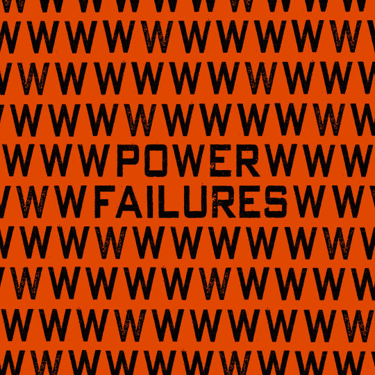
The shortlisted album artworks have been announced for our annual art prize Best Art Vinyl 2023. We now begin to delve into the creative process behind some of the 50 nominees. First up is 75 Dollar Bill's re-release of Power Failures for the first time on vinyl. We were lucky enough to catch up with the band's guitarist and album cover designer Che Chen.
Che Chen founded 75 Dollar Bill in 2011 with percussionist Rick Brown. He tells us, "I wanted to be a painter before I wanted to be a musician, so the visual aesthetic of the band has always been really important to me. I've done the artwork for all of our physical and digital releases, and many of our posters and fliers too."
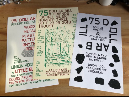
Che Chen flyer design work for 75 Dollar Bill
Che Chen explains, "Power Failures first came out as a digital release on Bandcamp in July of 2020. It was our first pandemic summer, Trump was still president (hopefully for the last time!) and George Floyd had been murdered by Minneapolis Police Officers earlier that summer. There were protests everywhere, against police violence, institutional racism, wage inequality for essential workers, etc. The title of the record was very much a response to all of this, the way the pandemic exposed the failures of the state on all these different fronts."
The use of text-based artwork has in fact been a consistent theme for the artist, he told us, "Text has always been central to the visual language of the band, and many of our record covers feature text as the only "image" in the designs. This approach made sense to me for Power Failures, since the title was very evocative of everything that was going on, but also open-ended enough that I didn't want to add an image that might get in the way of whatever associations someone looking at those words might have. I wanted to push the idea of a text only image a bit by using the typography to create a pattern (of W's in this case) which is only broken by the album title. The digital album just had the single square image as its artwork, so when Karl Records in Berlin offered to make a vinyl edition of the album as a gatefold double album, we got to expand the art significantly. I repeated this process on the back cover with the band name and changed the background colour. The LP centre labels refer back to the font and colour schemes of the front and back cover. I should also mention that the beautiful inside layout was done by Roland Küffner at Karl who did a fantastic job."
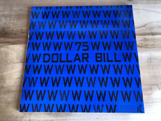
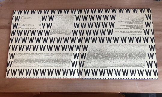
We asked Che Chen about the techniques he uses for his artworks, he explained, "The fonts I've used in most of my designs are actually from industrial moveable rubber stamp type. I've scanned physical prints of each set, several versions so that there are multiple versions of each character with slightly different imperfections, etc. I like the physical character of these fonts, how each impression is unique. For our first LP, Wooden Bag, Rick and I actually hand stamped the covers for the entire first edition using this rubber stamp type, but these days I mostly do the type setting on the computer."
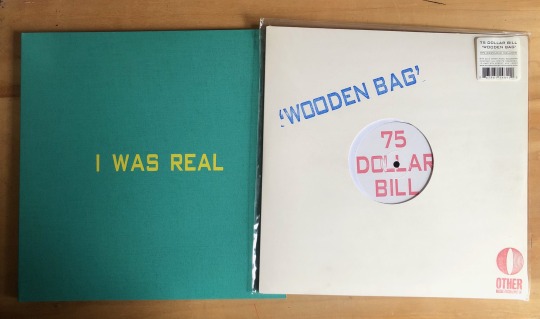
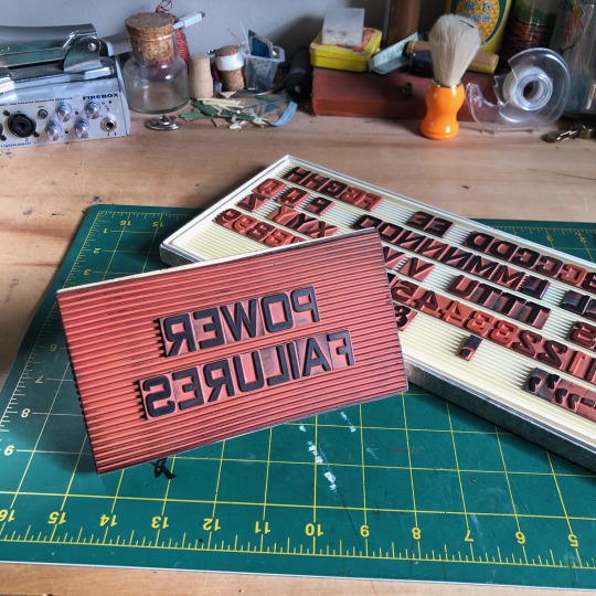
Chen Chen got into music as a teenager in the suburbs of Washington DC in the 1990s when the post-hardcore scene around Dischord Records was thriving. The DIY ethos of bands taking control of their own production, from running their own labels and booking their own tours, to playing protests and benefits for local causes and working the door at their own shows, was and is still a big inspiration to him.
He tells us, "I've tried to carry those ideals on in my own work as best I can. Doing the art and the design for music projects I am involved with (and occasionally for friends) feels like an obvious extension of this. I love bands and labels that have a strong visual aesthetic and also really respect when artists are resourceful and can make striking designs using sometimes limited means. Sun Ra's home made jackets covers for his Saturn Records LPs and Harry Partch's Gate 5 Records are both examples of this for me."

Taken from the 'Sun Ra: Art on Saturn' Book - The Album Cover Art of Sun Ra's Saturn Label
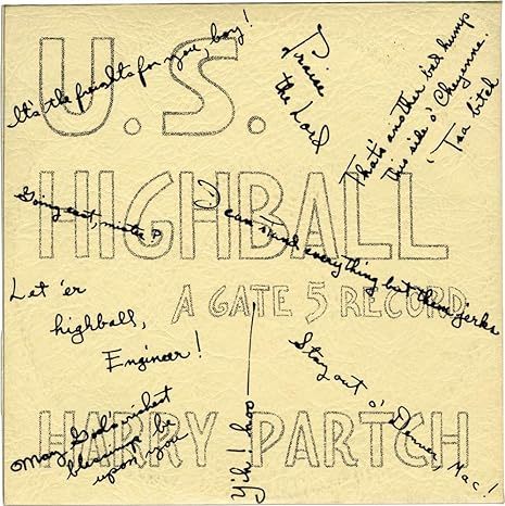
U.S. Highball |Gate 5 Records, Issue No. 6 (First pressing, inscribed to Amos Vogel in 1960) Hardcover – January 1, 1956
Che continues, "Lisa Alvarado’s screen printed album covers for the Natural Information Society records and her paintings that hang while they play (she plays harmonium in the group too) are another perfect fusion of visual and musical aesthetics to me."
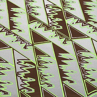
Mandatory Reality by Joshua Abrams & Natural Information Society. Artwork by Lisa Alvarado
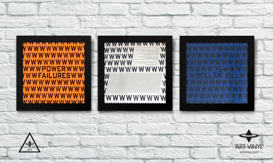
Power Failures by 75 Dollar Bill on Karl Records is shortlisted for the Best Art Vinyl 2023 Award. Artwork by Che Chen.
#bestartvinyl2023#record cover art#record frame#75 dollar bill#album artwork#contemporary art#art and design#best art vinyl#flip frame
2 notes
·
View notes
Text
Bonus! - A Trip Through The Des Moines Register and Tribune With Peanuts (1957)
So I've been reading a book called “Only What's Necessary: Charles M Schulz and the Art of Peanuts”. It's basically a bunch of stuff from the Charles M Schulz Museum including comics, toys, original art and promotional material that got scanned in with a bit of commentary/explanation added for some of it. It's a fantastic book and I highly recommend it if any of that sounds interesting to you. It's available on Amazon HERE.
Anyways, While reading it I came across this cool promotional comic for the Des Moines Register drawn in 1957 by a man named Bob Davenport. I found it to be a pretty interesting peek into how newspapers were produced in a time before computers and figured that maybe some of you might also appreciate it.
Let's dive in!
Page 1
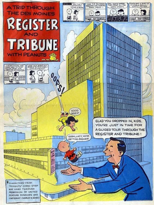
Charlie Brown: Free at last! We have escaped reality itself and shall no longer be bound to that monochromatic prison!
Some guy: Hi Charlie Brown! Want to tour a 1950's newspaper building?
Charlie Brown: Hell yes I do!
Page 2
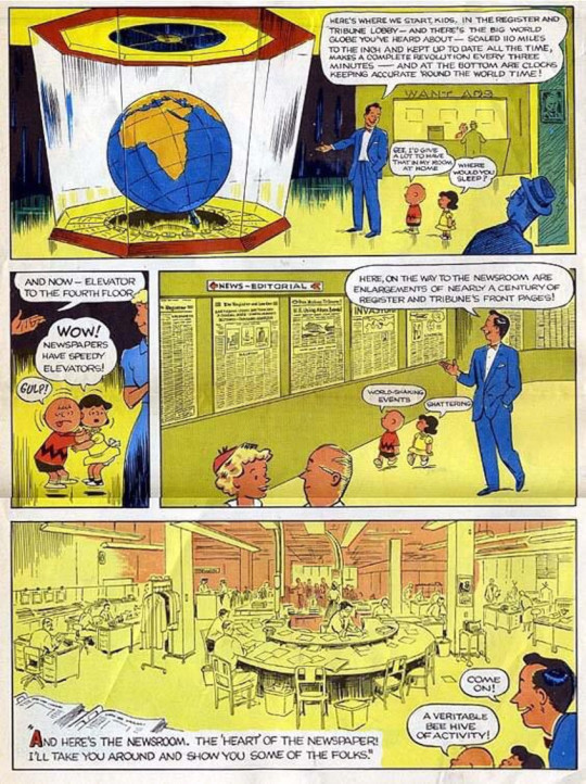
I love that they're bragging about the speed of their elevators.
Page 3

I want to explore the photography labyrinth.
Page 4
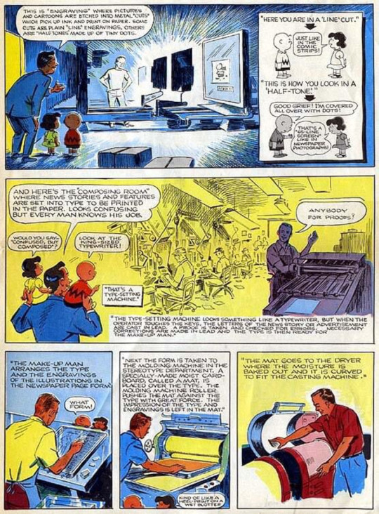
This stuff here is particularly interesting to me. We take for granted just now much more efficient computers have made the printing process.
Page 5

In case you were wondering what this stuff actually looked like:
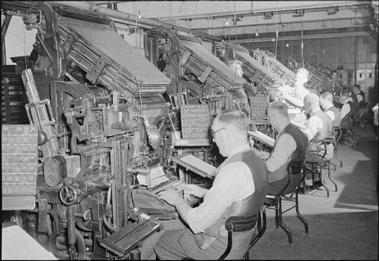
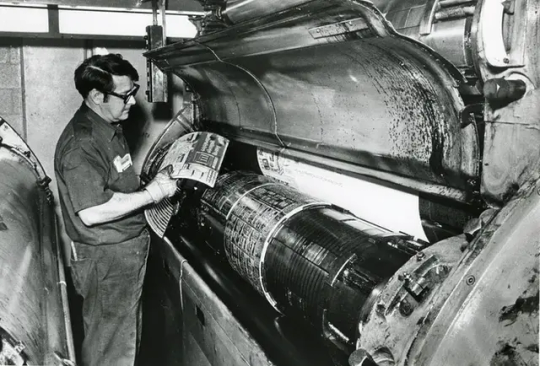

*EDIT: To be clear, these are not actually pictures of the Des Moines Register. Just newspaper equipment from around that time.
Page 6

The one thing that bugs me about this comic is that for some reason they decided to have Lucy be the mature one of the two.
Also, I literally just now noticed that that top panel is different from the one in the book for some reason. Some of the departments on page 3 and the first panel of page 5 also seem to be different from their online versions. I guess they did a revision at some point?
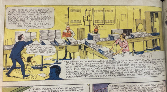


Bonus: Please notice this very good Charlie Brown drawing.

Page 7
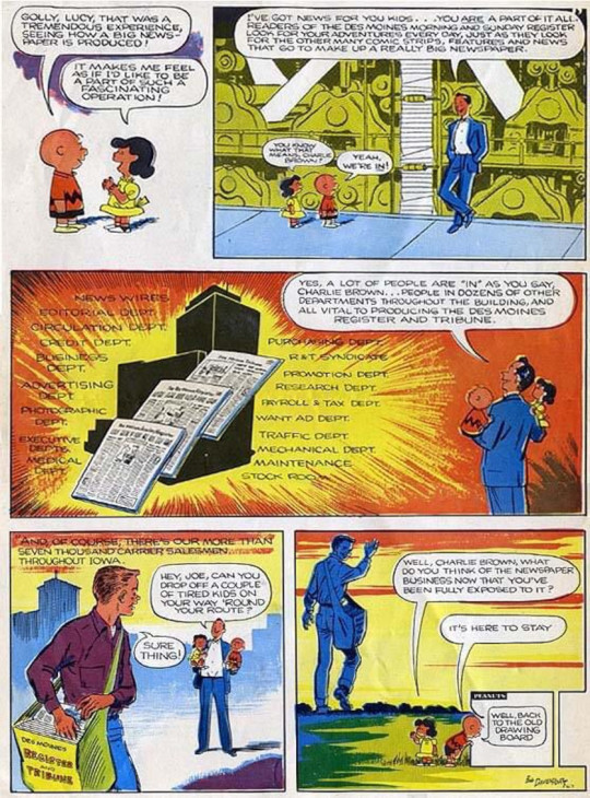
Morgan Freeman voice: “It was not here to stay”
Though to the DMR's credit it still seems to be alive and kicking.
Page 8

Charlie Brown: Incredible! I'm going to get myself a newspaper job right now so that I too can be a part of this noble profession!
Later:

And that's the whole thing! Apologies for the questionable quality. The only version of this that I've been able to find online was scanned in 2007 by this guy. If you click the link be sure to read the comments because a couple of Bob Davenport's family members apparently responded to the blog post providing additional information.
Here's hoping that someday somebody does a better quality scan because it's a neat little piece of comics history that deserves be be kept around in a readable format.
Hope you all enjoyed it!
#I was tempted to wait until we got to 1957 and post this then but I do NOT have the executive function for that level of planning.#peanuts#charlie brown#lucy#The Des Moines Register#comic strips#comics#peanuts comics#charles schulz
6 notes
·
View notes
Text
I worked a couple more days after my post last week. The first day, I started off the day by adding more books to the book inventory system I made. Through the process, I have learned a lot more about ISBNs than I ever expected to. I have also learned that not every book's information is complete, or even correct, in Google's books database, so we will definitely have some work ahead making sure everything is correct. However, it's provided an excellent start and saved us having to enter a ton of data manually.
Then, I used the scanner I set up last week to scan a zine my partner Cam made. I still need to work on cleaning up the scans to reprint it, but it's been great to work with professional-grade equipment rather than a basic home scanner. The level of quality I was able to get is honestly kind of absurd.
Later that night, we had our monthly collage night, but we also did a Polaroid transfer demo. The person demonstrating the process used a Polaroid of Cam and I that I printed from my phone using the Polaroid Lab.
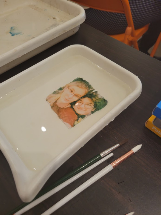
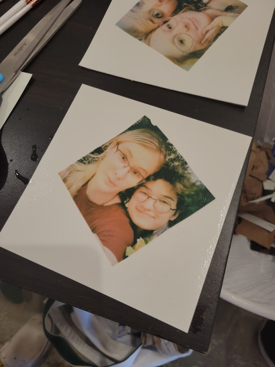
Basically, you remove the protective plastic top, soak the Polaroid in hot water until the emulsion detaches from the back, then transfer that into cool water and carefully spread it out over a sheet of paper. I was shocked by how simple the process was in concept...
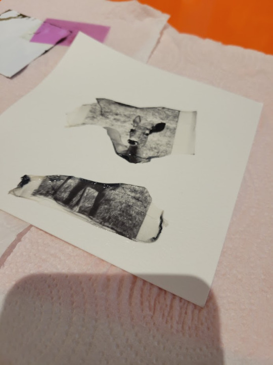
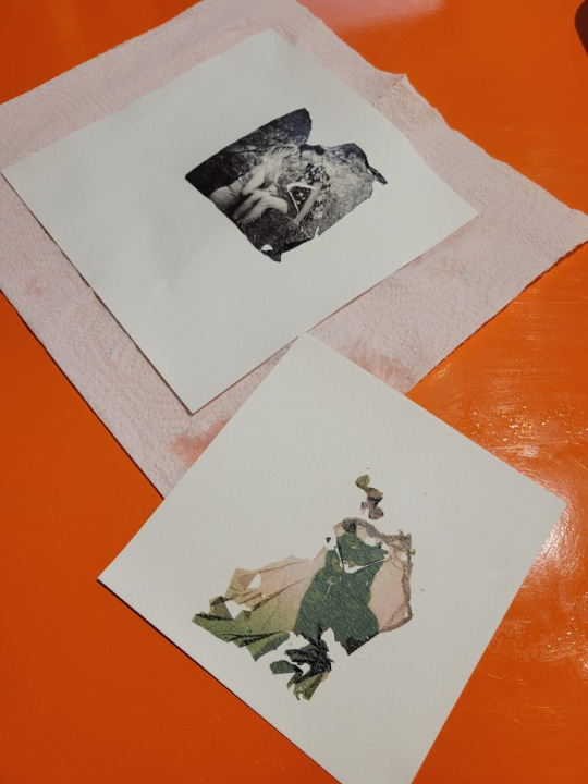
... and less shocked by how difficult it was in practice. Above is my one attempt, and below is Cam's two attempts. The emulsion layer is easy to damage and hard to get to stay in place. The most frustrating part is when one side would be in place but would then get messed up trying to smooth out the rest of the image. Black and white is even more frustrating, because it is harder to peel off the protective layer and the backing tends to flake instead of come off in one piece. I'm definitely going to try this process again and see what I can make with it, though! The event ended up running later than we planned because everyone was so engaged with what they were working on.
The next day was pretty slow, and I had to leave early for an appointment. However, I did learn to add products to our online Squarespace store. I added some books I had unpacked and inventoried the previous day, grabbing images and descriptions from the publisher and making sure to categorize them properly on our site.
Today so far has been more book inventorying, but we are approaching the end of that process! Once that's done, we will be able to import the data to our payment system to speed up checkout and make sure inventory levels of books are properly tracked.
I've only got a couple more days this week before I'm out of town next week to visit Cam's family. I'm hoping to finish the inventory before I leave.
2 notes
·
View notes
Note
No thats ok! thanks. I just wanna let u know that i wasnt saying youre doing wrong or judging u i was just wondering if i could use the photos u editted.. to profit off of it? is that bad? idk whats ur thoughts and opinions? i think u should profit on it as well!! much love
Aw I appreciate that. This is gonna be long. And i dont feel like adding kaomoji! (๑•́o•̀๑)
I'm not sure how you could profit? I suppose you could make collages with images i have shared, as I have done, and properly credit the artists or brand etc of the edits within the collage...but even then I am against the selling of collage art like that since the artists within it don't ever properly get paid for their contributions. I think collages are fun to make and pretty to look at and share for free use but shouldnt be sold...but plenty of people do it on etsy and other art websites, heck people have made galleries with these types of collages. I dont think its right though. I post my collages for free as well and would never sell them. Other things people do with pngs of others works for profit that I find wrong is make knockoff physical stickers or products with the images on them and sell them. I have joked about taking my pngs and printing off your own sandylion stickers since people sell them on ebay for wayyyy too much but that suggestion is for your own personal use and not for selling or profiting. Selling them would once again be wrong in my opinion, but again, people do it, there are entire websites that do this.
That all being said, like I've said before, I can't stop anyone from using these edits however they want so you can do you but I dont condone profiting by selling others works which I will not do and have not done.
Which brings me to the next point of me "profiting", which tbh I dont deserve for editing and sharing images. I originally said I won't ever enable tips as I dont believe its right as its not my art, and I still somewhat believe this, also tumblrs tip system is shady... but I have broken my rule and linked my paypal before since I have become a sahm and also shared my child's baby registry. I removed paypal and never got a donation anyway but still I felt guilty even sharing it for voluntary tips bc of my personal reasoning before but I have returned my child's wishlist, because I would be using any donations for him anyway, and before he was born a couple people were so kind on his registry and he still loves his little fox toy and goodnight moon book gifted to him by kind people here and I realized if people want to continue to share their kindness with my family as I have shared images I like with them I will happily accept that and how is it different from me sharing his registry with friends and family for gifting? Is it bad I've used the reach this blog gave me to accept a present for my baby from kind people with similar interests? To put in perspective I have 11,600 followers and 3 have gifted me(all my sons baby registry before he was born) in 6 years. I'm not beg posting for donations or demanding payment for pngs bc again this blog is for fun and a scrapbook collection to share with others.
I realized plenty of other tumblr bloggers ask for tips and donations for posting others art, or just running a blog where they reblog other people, post memes they didn't make, tweets they didn't make, pinterest links, weheartit links, Spotify music, etc. You could easily profit that way, you could just reblog or repost my posts you like the most and enable tipping on your blog or ask for donations and profit. People on here run art "curation" blogs, scan artbooks, share others Flickr posts, share snippets from old magazines or newspapers, share eBay or etsy links to listings or crafts that aren't theirs, or make tv/movie/videogame/anime gifs and then have tip and donation buttons just for sharing others works, products or resharing things from the met art museum or fashion history websites etc etc. And there's even the good handful of meme blogs and viral animal video and image blogs who blatantly spam links to Chinese knockoff overpriced items/stores in between memes and animal posts who get a cut for selling and advertising these storefronts.
I realized why shouldn't I just have my sons registry available if anyone wants to voluntarily gift? Everyone else has no problem asking for more when they also have blogs dedicated to posting others works. Is this profiting? Maybe??? Thats all the potential profit I will allow from this blog though and I dont consider it profit as much as people just being nice? Maybe I'm wrong and hypocritical for that but I dont really think so when I have seen people ask for actual money and donations on tumblr simply for existing. I'm not here selling stolen art, I don't claim the original work is mine, and anyone who wants to contribute $1 to a copy of chicka chicka boom boom for my baby isn't being held at gunpoint or guilted or told they have to in exchange for transparent images.
1 note
·
View note
Text
#although I have to wonder why such an accomplished writer would have grammar software at all
(Sorry for the formatting on this; I'm on mobile.)
Why use grammar software? Because I'm a human who makes errors, and it can be helpful to have tools that I, as a writer and editor, can fall back on to catch very basic things that sometimes get missed.
I don't rely on it because sometimes (quite often, as of late) it can be wrong, but it can be helpful when checking your work. I use them to scan quickly for excess commas or the occasional homonym before I fire my files off to another human to give them the final pass. Or I used to.
I've talked a lot about how the integration of AI is making a lot of grammar software dumber. This is because they are not being trained exclusively on grammar rules anymore but on user-suggested data.
It's why, for a long time, when you tried to type "quirked" into Google Docs, GD would suggest "querched" instead because that is how a lot of people misspell the word "quirked."
It is a flawed, lousy system that is getting exponentially worse. Especially now, so many of them have "Let AI rewrite your sentence for clarity and engagement" options.
It's not really an issue for me because I have the knowledge and the support to turn things like this into an annoying issue that makes for an amusing post on social media.
But if I were a less experienced author and didn't have an editor who knew my writing style well enough to know something was wrong, that manuscript could have gone to print as is, and that's also why I suspect a lot of books right now read like carbon copy clones.
People aren't being taught these skills, but they are being trained to appease the software, which is, in turn, trying to please an algorithm.
Pro-Writing-Aid has become very bad for this, offering a "grade" at the top of your file. And yeah, it looks just like getting your term paper back. The last time I accidentally turned on the grading system, it gave me 50% out of 100 for grammar and style, based on what the algorithm thinks Romance should read like.
When I asked it to find grammar and style errors, it couldn't find any. It just didn't like that I was different from what it was being trained on. (Girl help, I was assigned Not Like Other Girls by the Algorithm and got a bad grade in vampire smut.)
And again, were I not me, were I a younger or inexperienced author, I might take that to heart and start altering my style to get a Good Grade based on what the machine wants.
And that's how I know we're in the Bad Place because there are people doing that. They think the machine is smart because someone tacked the word "intelligence" onto it, and they are writing to appease the software instead of using it like a tool that you can and should ignore.
And that's an issue.
For me, it was worth it to pay for those tools for a long time. Now it's not, and I'll be saving my money for other things.
So, anyway, I say as though we are mid-conversation, and you're not just being invited into this conversation mid-thought. One of my editors phoned me today to check in with a file I'd sent over. (<3)
The conversation can be surmised as, "This feels like something you would write, but it's juuuust off enough I'm phoning to make sure this is an intentional stylistic choice you have made. Also, are you concussed/have you been taken over by the Borg because ummm."
They explained that certain sentences were very fractured and abrupt, which is not my style at all, and I was like, huh, weird... And then we went through some examples, and you know that meme going around, the "he would not fucking say that" meme?
Yeah. That's what I experienced except with myself because I would not fucking say that. Why would I break up a sentence like that? Why would I make them so short? It reads like bullet points. Wtf.
Anyway. Turns out Grammarly and Pro-Writing-Aid were having an AI war in my manuscript files, and the "suggestions" are no longer just suggestions because the AI was ignoring my "decline" every time it made a silly suggestion. (This may have been a conflict between the different software. I don't know.)
It is, to put it bluntly, a total butchery of my style and writing voice. My editor is doing surgery, removing all the unnecessary full stops and stitching my sentences back together to give them back their flow. Meanwhile, I'm over here feeling like Don Corleone, gesturing at my manuscript like:

ID: a gif of Don Corleone from the Godfather emoting despair as he says, "Look how they massacred my boy."
Fearing that it wasn't just this one manuscript, I've spent the whole night going through everything I've worked on recently, and yep. Yeeeep. Any file where I've not had the editing software turned off is a shit show. It's fine; it's all salvageable if annoying to deal with. But the reason I come to you now, on the day of my daughter's wedding, is to share this absolute gem of a fuck up with you all.
This is a sentence from a Batman fic I've been tinkering with to keep the brain weasels happy. This is what it is supposed to read as:
"It was quite the feat, considering Gotham was mostly made up of smog and tear gas."
This is what the AI changed it to:
"It was quite the feat. Considering Gotham was mostly made up. Of tear gas. And Smaug."
Absolute non-sensical sentence structure aside, SMAUG. FUCKING SMAUG. What was the AI doing? Apart from trying to write a Batman x Hobbit crossover??? Is this what happens when you force Grammarly to ignore the words "Batman Muppet threesome?"
Did I make it sentient??? Is it finally rebelling? Was Brucie Wayne being Miss Piggy and Kermit's side piece too much???? What have I wrought?
Anyway. Double-check your work. The grammar software is getting sillier every day.
25K notes
·
View notes
Text
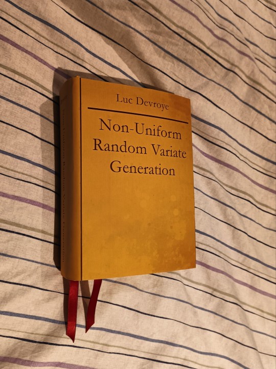
Non-Uniform Random Variate Generation by Luc Devroye
One of the nice things about making books is the level of customisation you can apply, not to mention giving physical form to something that, for whatever reason, can't be published traditionally.
This doesn't just extend to fanfiction. Last week, my fiancé requested me to make a bound copy of an academic textbook they use frequently. This textbook is long out of print, thanks to fuckery from the publisher. Mr. Devroye explains in detail, but in essence, for greedy reasons, this textbook only had one limited print run despite being a text my fiancé references frequently nearly forty years post-publication.
The whole text has been shared on the author's website in the form of a PDF scan of the pages. The author has given carte blanche permission to reproduce the textbook in any form.

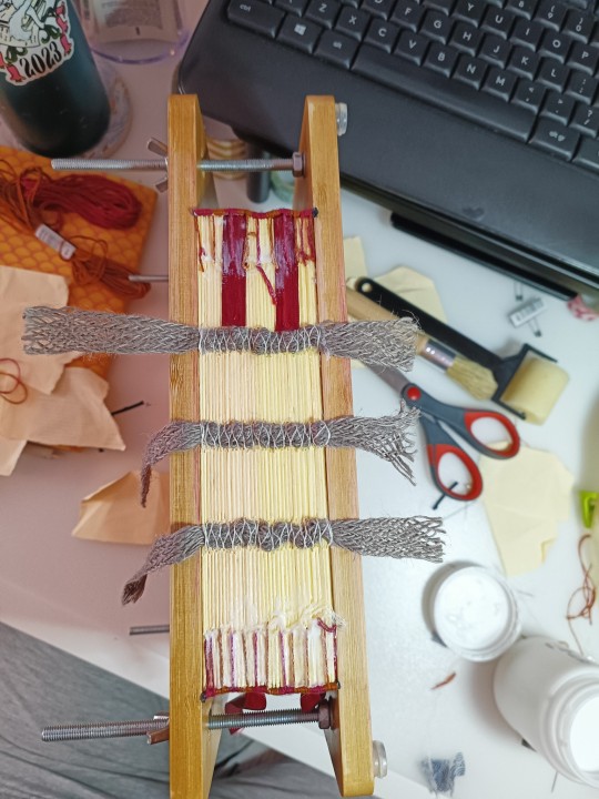
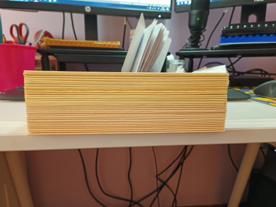
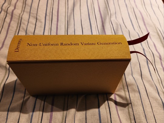
At a whopping 866 pages (including errata and the author's amusing web preface), it was an intimidating prospect to bind. I'm slightly concerned this chonky boy will fall apart after a few years of use. The spine is about 6cm thick. But, hopefully, I've done enough to reinforce the textblock, endpapers and spine such that it will last a long time.
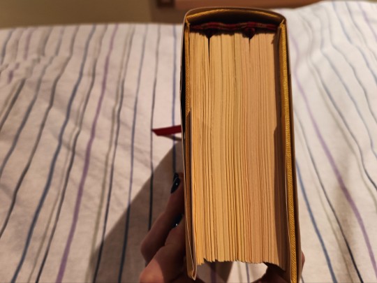

Anyway, technical details:
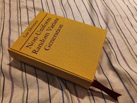
Three piece bradel binding using yellow bookcloth. I wanted this copy to look like the original, minus the pesky publisher's details. The plan was to do a regular case binding, but the bookcloth wasn't wide enough to accommodate all three cover pieces. Three piece bradel doesn't seem as sturdy as a regular case, so fingers crossed it holds up.🤞
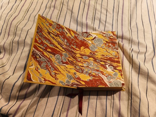
Marbled endpapers I made at a local workshop. My teacher intervened with turpentine to rescue this particular design, because I do not have a knack for marbling. I used DAS's sewn endpaper method for extra strength.
The signatures are 6-7 sheets long, for a total of 18 signatures including the endpapers. I trimmed each signature using a guillotine before sewing them together with French link. Jupe cord for support, which I frayed and glued down onto the endpapers along with mull before casing in.
Double core endbands around some jewellery cord, with dual bookmark ribbons. They're offset to the left, since the last three to four signatures of the book contain the references, index and errata.
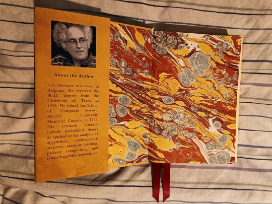
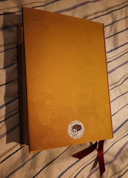
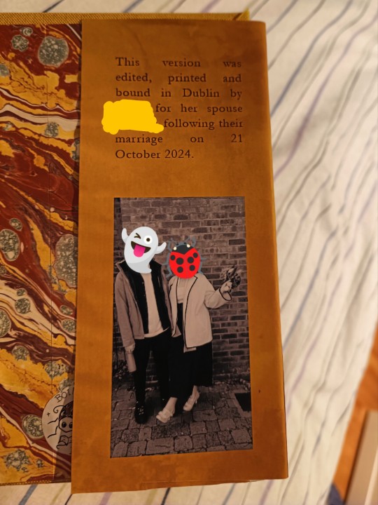
This book also got a homemade dust jacket, similar in construction to my last bind. Since my fiancé became my spouse on Monday, I took the opportunity to cheese it out with the dust jacket 💞 I figure it's a nice marriage gift / future heirloom, provided the thing lasts long enough to get passed on.
#bookbinding#non uniform random variate generation#academia#statistics#probability#mathematics#boin de bindery#I'm yapping but i like drawing attention to the stories behind some of the non-fandom binds I do#thanks for reading if you made it to the tags!
1 note
·
View note
Text


This is from a gift I'm working on for my father: he recently gave me the book of children's tales that he used to sometimes read to me as a kid, which his mother read to him as a kid.
My dad's in his mid-70s, so you can imagine how old the book is - the cover disappeared before I was even born, and the pages are badly yellowed and crumbling at the edges, unable to take more than the most gentle handling. I get a pretty bad allergic reaction to old books (I used to get migraines if I went into used bookstores, which was a major bummer, and now I avoid them completely), so it spends most of it's time living wrapped in multiple layers of tissue and bags, and when I do take it out I have to wear gloves and a face mask then wash my hands and face afterwards (mast cell diseases are also a major bummer).
Point is, this book is very sentimental for my dad and me, and I hated the idea of it eventually falling apart completely, especially when a good third of the pages have broken - not pulled, not torn, broken - loose and are just resting between the intact pages. So I decided to carefully scan our five favorite stories to bind into something new, which I'll make two copies of: one for him, one for me.
Then I decided to take it a step further: I popped the pages into photoshop and isolated the images, which I cleaned up as well as my meager photoshop skills allow, then typed up all the text in word, placing the images into the document and arranging it all to look as close to the original as I can get it. The extra challenge came when I decided to do a horizontal-oriented japanese stab binding, because the original pages are in 'portrait' layout, so I really had to mess with it a good bit, especially because I want the spacing of the text to mirror the original as well.
The images above show my initial efforts to figure out the margins and gutter to work with my chosen binding method, as well as a paragraph repeated in four fonts that I thought looked similar to the font used in the original, with the circled one being what I went with. Doing that was harder than I expected since some fonts actually looked closer to start, but when I shrunk it down to a point size that was both a close match for the original and still fit the compressed page size, it ended up looking much different, and adding in indents, quotes, and so on changed the end effect futher.
At this point I've typed up all the text, finished cleaning up the art, and formatted the first story, so the next thing I'll do is typset/format the remainder, put together whatever little extras I want (a dedication, a colophon, fun stuff like that), then print it out and get to the physical binding process. I found this pretty lokta paper on amazon, sold as wrapping paper, that I'll use for the cover, and a light-gray bookcloth for the spine, as well as a thicker red waxed thread for the stab binding. I'm still dithering over liner paper choices, and I'm considering adding a couple pages of vellum at the front and back as sort of a sensory callback to the fragile pages of the original.
I'm also toying with the idea of using one of the images from our favorite story, which we still quote to each other to this day, to make a sort of frontispiece. And I plan to print it on a cream-to-ivory color paper that will hopefully help mask some of the yellowing I couldn't get out of the images, as well as be another callback to the original.
The name of the book/collection, as well as the author(s) and artist(s), have been lost to time, but if anyone who sees this post happens to recognize the book and knows any of that info, I would be incredibly grateful to any who share!
#riker.binds#bookbinding#covered up some of the text just in case for copyright reasons though this may be public domain at this point#process#typesetting
1 note
·
View note
Note
Thank you so much for uploading your scans !!!!!!! I love all the lil details added in the Complete Almanac & was always bummed I couldn't find any of it except in bits & pieces; I'm looking forward to the final pdf & thoroughly enjoying your posted pages in the meantime !!!!!!
Always happy to share! I'm happy you're enjoying em too, it hass been quite a challenge to get them scanned + editing (still in progress) but well worth it. I've been wanting to digitize the complete thing for ages so I can keep a copy on my ipad for art ref when work's got me away from home for a long time. I thought, hey might as well share it too since the book's been out of print a long time.
Might be another day or 2 before I can get them all cleaned up & organized tho, I was aiming for late tomorrow but I got called into work :'D
1 note
·
View note
Text
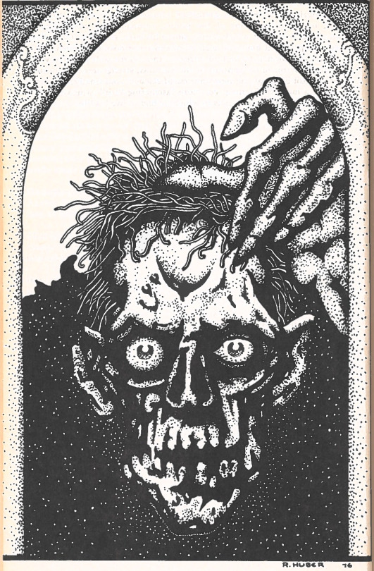
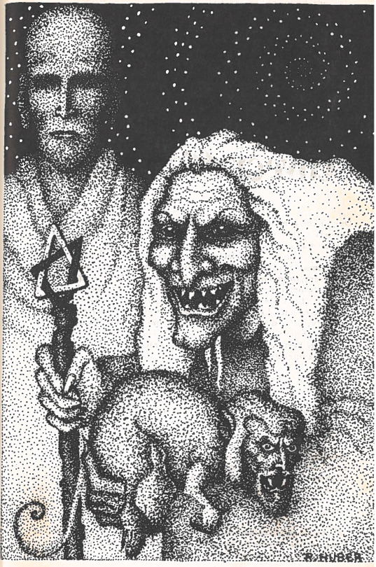
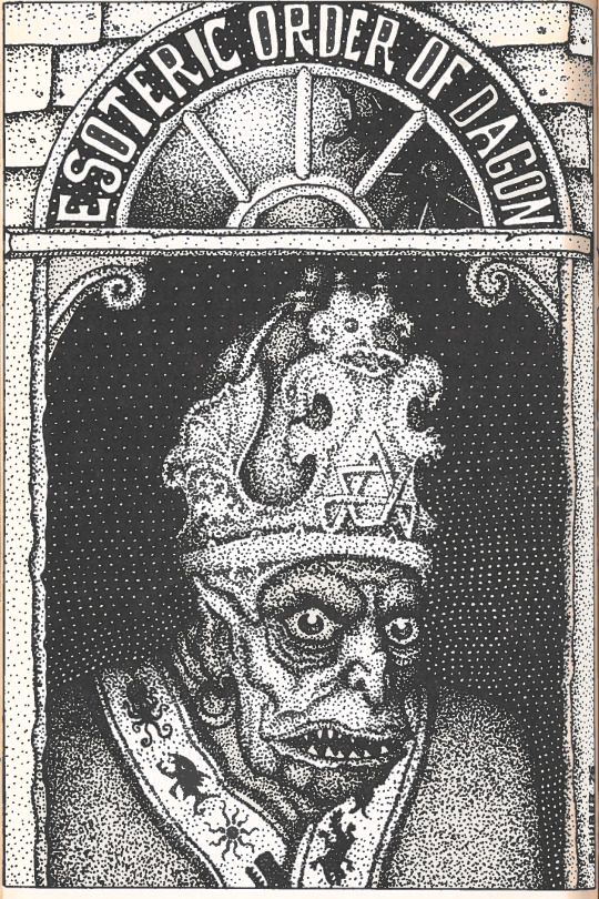
I mean that my dreams last night were so upsetting and disturbing that I went into the stacks and found a book of essays on Lovecraft and picked out the most horrifying images in it and scanned them at 300dpi, then printed copies to post in my bedroom and behind my desk. I am turning to cosmic horrors so I can scrub my brain clean. I've already decided that I'm gonna watch Nekromantik 2 tonight before bed. I'd rather dream about that.
0 notes
Text
Modern Futurist: Promising Technologies and Strategies
If you had asked me in the future, say in 1990, what lay ahead, I could have told you something different than I would in 2023. It develops as the reality of what will happen. The bulk of futurists will be mistaken moving forward if you hold their predictions against them. People frequently make references to or have conversations regarding the predictions made by Hugo Wells in his book about what is to come. Despite the fact that the majority of them didn't, many of them did as expected. I've come to terms with the fact that we're in for a celebration that will essentially be just out of reach. As a result, I'll strive today for the future that is physically impossible to achieve. Several breakthroughs that will impact society are what I'll be talking about; I'll also let you know how I feel about the outcome. If it's not too much bother, please be aware that any predictions given are merely evaluations; they are not predictions of reality; rather, they are conjectures. They aren't even really the stage after a gas. They are only gases, which is merely a generalization. Until further notice, they are essentially conjectures that may eventually develop into theories.
The 3D printing and scanning industries will continuously advance. I tested over 20 various 3D scanners, and I can confidently declare that today's technology is far superior to that of a few years ago when it comes to 3D scanning. As technology advances, so do 3D printers. The 3D printing market has exploded in terms of capacity. I can use a laser to create something out of wood or metal, and 3D printers let you add plastic or perform laser etching. Finding out how to perform 3D filtering is something I've been working on. By using 3D filtering, I can examine actual goods and then print them on a 3D printer. The next invention to go off will be 5G. With 5G, that being the case, and in the event that you are sufficiently fortunate to be in some of the great data transmission 5G regions and the company you use supports them, you'll discover that having a conversation and connecting to the Web with one more device through your phone is simple and successful. The fact of biological effect is my final expectation for the near future in this futurist mix post. Green things are definitely in store!

Value: $509
Flexible Build Plate
Hands-free Auto Leveling
Impressive speed
Auxiliary Cooling Fan in Chamber
Overview:
Among fans of 3D printing, the new Creality model has drawn a lot of attention. The speed of the Creality K1 High Speed 3D Printer is one of its key characteristics that has generated the greatest curiosity. Smooth printouts are transmitted at speeds up to 600 mm/s, which is many times faster than a typical 3D printer. K1 delivers a boot-up fast help and is assembled and calibrated before shipment. Simply start printing the moment your K1 arrives. Give K1 a tap, and it will independently test the extruder, heatbed, camera (at your discretion), fan, evening out, and other items. Any deviation noticed will influence the presentation. Clients can proceed in this manner without incident. It works well with many textiles and is tacky and heat-safe. The model base is clear and smooth due to the lightly frozen surface. Flexible for quick print evacuation. Look at the 3D Printers Online Store, if you're more interested in purchasing a quick machine. I should clarify that my theories about the future go beyond conjecture. They are, in fact, valid deductions. Yet, they are not theories. Even if I live in a fantasy world where I wish they were, reality makes it clear they are not. I really do believe that the future will be bright because of the glare from solar-powered exhibitions, not because the majority of the world's developing species have effectively been wiped off by environmental change.
1 note
·
View note