#I've gotten to the point of having layers and a select tool that actually works so I can make sure the ''sphere'' part is shaped right
Explore tagged Tumblr posts
Text
Fuck spheres
Drawing a goddamn Poke ball should not be this difficult.
#technically it's a premier ball too so it should be even easier#ignore morg#I've gotten to the point of having layers and a select tool that actually works so I can make sure the ''sphere'' part is shaped right#NOW I have to make the red lining around the opening look like it's coming from a sane angle and so far every attempt looks like ass#I can't believe I'm going to do this four times instead of just picking one frame to edit#my edits
0 notes
Note
I saw the Lupin recolors you did (they’re amazing btw) and I’m curious how do you keep lineart so clean on your recolors? I’ve been doing some recolors recently but my technique is usually either trace the lines on top of whatever color I’m changing to which results in slightly-sloppy and inaccurate lines or I spend a million years doing masking. But yours look so clean it’s awesome! How do you do it?
Hello, anon- thank you for the kind words and for sending an ask in!!
The screenshots anon is referring to are in this post!
Sorry it took me a while to get back to you-- I wanted to make some example images to go along with this since this is a question I've gotten quite a few times. I'll try my best to answer as concisely I can!
I personally use Clip Studio Paint (which is what I'll be using to explain this), but I've also done this with Photoshop. I'm hoping this method is simple enough so that its usable for whatever program you (or whoever else sees this guide) uses.
We'll see how it goes ¯\_(ツ)_/¯
Some bits to start:
I know this is kind of a no-brainer, but a big thing that always helps is image quality. The better the image quality, the less obvious your changes will be-- so make sure the screenshot you're recoloring has good resolution. This method (in theory) should work for lower res stuff too, but it'll be harder to avoid messy lines no matter how careful you are when selecting. Here's the images I'll be using for this example:
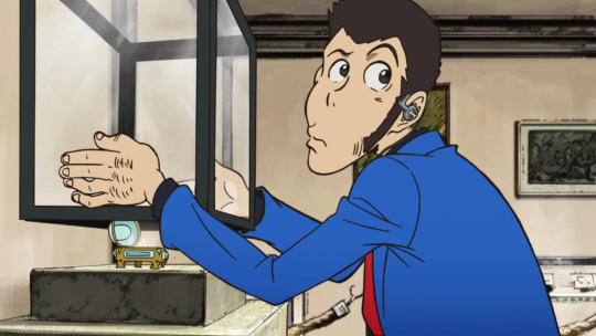
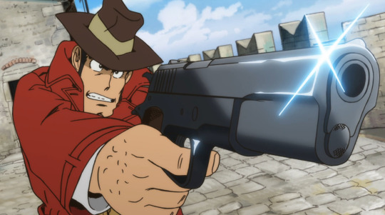
Make sure to have a backup of the original screenshot you're editing!! Even though I didn't include this in these upcoming examples, have the original below the image you're editing so you can check your progress and make sure you didn't miss any changes you wanted to make in your edit.
We'll use this pt. 4 screenshot of Lupin as our first example!
Let's say we want to make his jacket red-- it's as easy as it sounds, but it'll still take a bit of time.
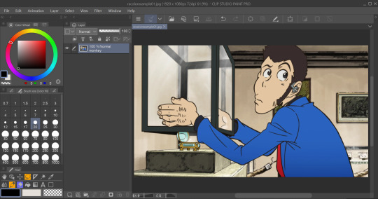
I use selection tools over masking-- primarily the polyline tool. Even after testing with masking and layer overlays, this is the best way I've found to keep line integrity and cleanliness.
When you select with the tool, you'll want to go along the edge of the actual color you want to change, not the linework.

It's going to be time-consuming (which is why I only outlined his sleeve lol) but from all the testing I've done, it's what gives the nicest results. Plus we don't even have to use any layers or masks-- we can just change the color of the screenshot directly!
To do that, we'll want to find the option to change hue, saturation, and luminosity.
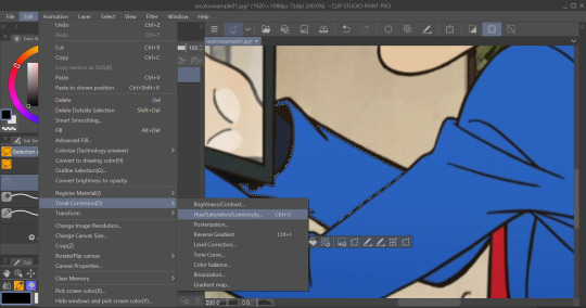
From here we can tweak the colors in whatever way we want without any of that ugly crunchy outline stuff or having to fiddle with a dozen different layer settings.
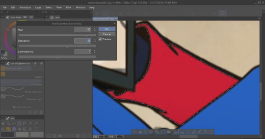
This way of doing it is really good for changing the hue, saturation, and darkness to whatever we want it to be without sacrificing line quality.
Here's the final:

Even though I eyeballed the color for example's sake, the final change doesn't look half bad!
The only catch I've come across is when you need to make something a lighter color. You can bring the luminosity of an image down, but once you bring it up you start having some unavoidable issues.
We'll use one of my favorite Zenigata screenshots for our second example.
Let's say we wanna change his red pt. 4 trench coat to his green one from pt. 3 (again, only changing the sleeve for time's sake).
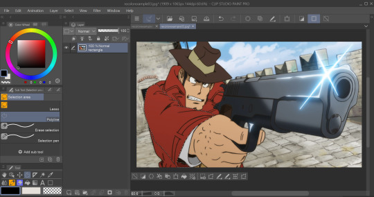
This is a tough change since there are a lot of lines and extra details on his coat that get caught and lightened in the change.
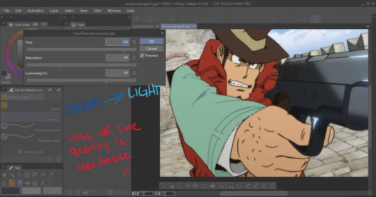
At this point we're going to have to do some line tracing.
Yeah, I'm not a fan of this part either, but unfortunately it's another time-consuming necessity if we want an edit to look as unedited as possible. Every other method I've tried to keep the lines dark ends up really corrupting the linework already in the image.

I'm sure you've noticed the edge of the selection we made in this; even though I skipped this part for time's sake you're going to want to go over those outer lines, too.
I recommend using a simple default brush set to a size that is as close to the actual linework as you can get. If the brush you're using doesn't have tapering or line size pressure just make sure it's slightly smaller than the actual lines. Stabilization isn't exactly a requirement; I'd only suggest turning on line stabilization if you aren't very confident with your linework (practice makes perfect and all that).
When we're done, it'll be pretty obvious that we went over the lines-- there's another really simple fix I found that helps to make this a little less obvious.
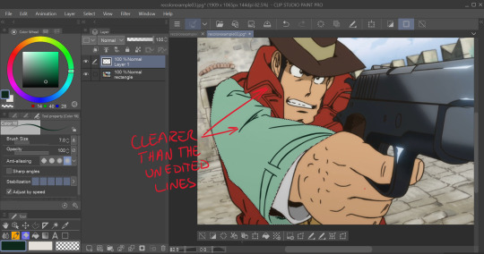
Messing with the layer opacity and the blur filter helps to bring out the linework beneath what you've gone over and makes the lines look less obviously drawn in.
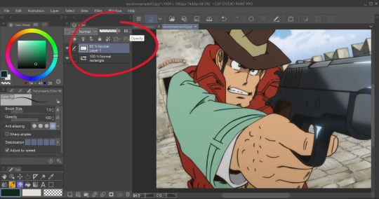
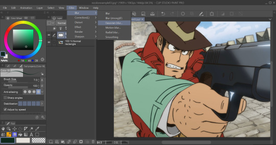
I'm sure you could also tweak the layer's settings until you find something that looks right, too-- it'll be the same sorta "experimenting until it looks right" deal as with changing the colors earlier.
I generally stick within the 2.5/3.5 range when blurring for decent res screenshots. In hindsight I probably went a little too low with the blur for this one, but you get the idea.
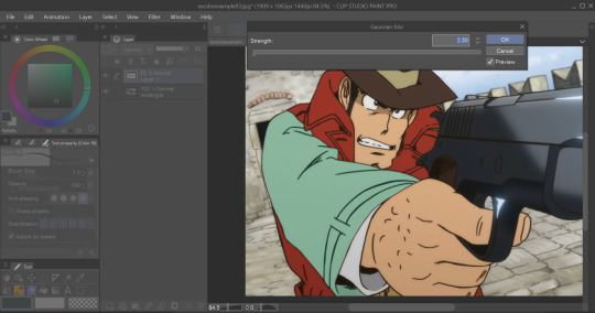
I think that it mimics the semi-blurry quality that lines tend to have in screenshots and helps to make it look less like it was drawn over.
Here's the final:
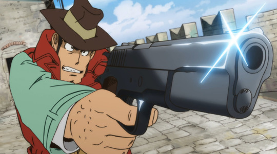
I'm sure if I bothered to do the entire trench coat it wouldn't look half bad, lol.
ANYWAYS that's a crash course on how I make lines not look like doodoo in my edits :3
Hopefully this is helpful!!
Thanks again for the ask, and if you have any more q's don't be afraid to send another ask in!🫡
#lupin iii#lupin iii recolor#lupin iii screenshot#screenshot edit guide#i have no idea what to tag this with lmao#im sure this'll be fine#tackyart#tackyanswers
9 notes
·
View notes