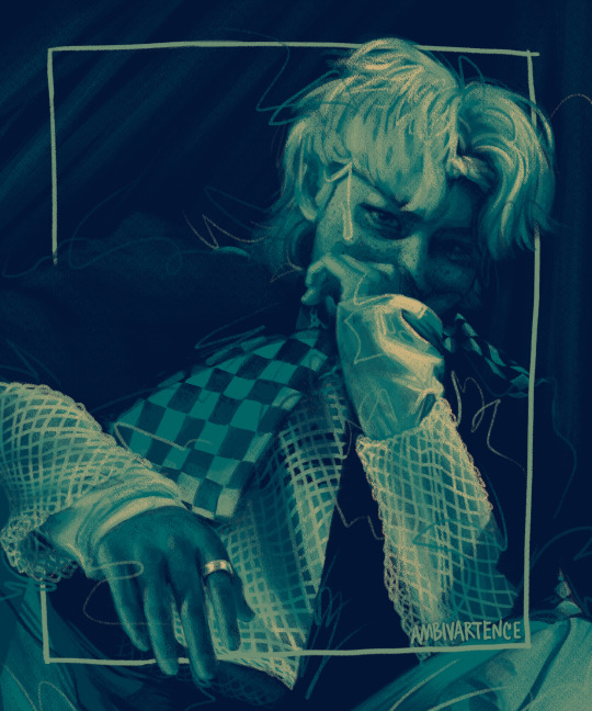
#I've been practicing a lot of realism recently and its made me really want a style i can draw SUPER FAST
Explore tagged Tumblr posts
bleed-more · 6 months ago
Text
Tumblr media
I made some silly little doodles of the boys while doing some cartoon-style studies <3
641 notes · View notes
ambivartence · 2 years ago
Note
sorry in advance if you've already answered a question like this but i just wanted to ask, how do you improve on drawing?? i think especially for things like coloring, shading, and lighting , its been difficult for me to be happy with how it looks because compared to the sketch (that i think already looks nice) the colors just seem sort of flat and muddy and i feel like i dont have a good grip on what colors to put where and how to make it look unflatt if that makes sense! just curious on maybe what kinds of practices and studying you do for this(if any))<33 obv you dont have to answer if you dont want to, and thank you for being one of my inspirations, love youu<33333
hihi!! for simply shading/lighting, i would suggest you only work in black and white until you're totally comfortable with developing values. why? marco bucci explains it really nicely in this video but basically if you have good values u can have absolutely garbage nonsense colors and it will still make sense aka when i did this lol:
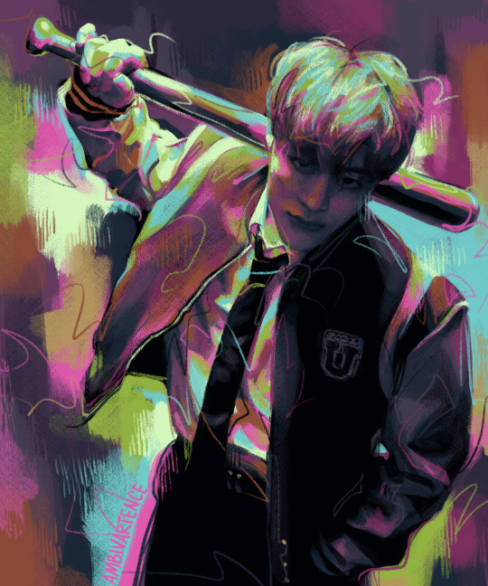
Tumblr media
i'm guessing you're more interested in colored artwork though since black and white drawings can't be "flat and muddy" bc theyre in grayscale lol. for coloring, this is so tough for me too so i thought about this for a day or so and i came up with 3 tips that might help^^ 1) getting colors directly from photo reference or color reference, 2) manually adding filters/color harmony, and 3) studying color theory
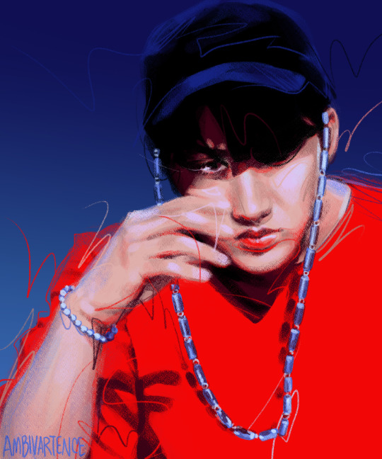
i always work from photo reference so it informs a lot of my coloring/shading/lighting and often when i don't understand what color I'm looking at i directly just eye drop it and realize that what i thought was purple was actually just a gray-red. working from an actual picture helps make sure my colors don't look strange and while i used to think eye-dropping felt like "cheating" when i worked digitally honestly i've learned a lot from it and honestly if i stare at a color long enough i can get it pretty accurately now but i'm just too lazy so eye-dropping just speeds up my workflow (plus i hate digital color pickers anyways they r not built for artists and i wrote an entire paper on it in college once lmao) anyways here's an example of a color study i did by directly eye-dropping from a gif with @quokki's incredible coloring (love u ale <3)
Tumblr media Tumblr media
if you're not working from a picture directly, you can still use other pictures or artwork as a "color reference" which I used to do a lot. i like to look at art from other ppl with pretty colors and create a color palette to use in my own drawings. for example, the color palette for this felix painting came from a piece (idr which) by Simón Prades on instagram but this palette is really easy to use since it's linear values it's like working in black and white but comes out looking cooler LOL
Tumblr media Tumblr media
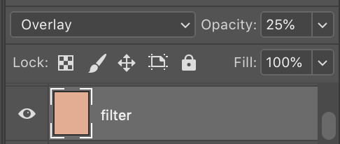
Recently for my lee know kiki's delivery service drawing i felt that the colors seemed a little flat n muddy to me because it was in an animated flat coloring style (lol) so I added a filter layer (just a flat apricot color set to overlay at 25% on photoshop) that livened up the whole thing and made it feel more cohesive. It's a pretty subtle difference to other people but made a world of difference to me :) it helped take the muddiness out of the shadows of his face and the glass reflection and took the painting from gloomy rainy day with stale bread to warm sunny day with fresh bread :]
Tumblr media Tumblr media
and finally if u are interested in actually studying colors and lighting and shading and stuff these r some of the youtube videos and channels that i think do a great job explaining these very cool concepts:
pre-realism vs post-realism is a cool video about the difference between the mentality of how beginners draw vs how experts draw and kinda blew my mind tbh i think the big color takeaway from this video is that something that kids would color (like green grass) might actually be a totally different color to an artist's eye (dark yellow, red gray, even a super desaturated purple) depending on a realistic lighting situation
nathan fowkes did a 3-part guest talk series on understanding color temperature and relationships: (1) (2) (3) also not coloring but i love his video on value massing
this lecture on what charles bernard calls "the mother color principle" takes the "filtering" tip that i mentioned earlier to a much more developed level (it's an hour long so just skip through it.. u get the gist of what he's saying in a few min but the whole demo is also cool too)
i mentioned him earlier but marco bucci has many 10 min digestable videos about color on his channel that i like :) (also this lighting/value video is great too)
sorry i don't really know exactly how basic or advanced i should cater my advice but i hope this helps some anon^^ lmk if u have questions or if u ever want feedback my inbox and dms r always open
25 notes · View notes
llycaons · 2 years ago
Note
Movie haters unite!
YEAHHHHHHHHHHHHHHHH okay anyone who's been following me for 3+ years might remember how often I made posts complaining about that movie; I've been less vocal about it recently but like, that movie sucks ASS I'm sorry but the dialogue is awkward and clumsy, the romantic scenes are cliche and poorly acted, the darcy is ugly as FUCK with ZERO charisma or presence, all the women look like skinny goddamn instagram models, the humor is practically marvel-esque in its shallow quippiness, and it favors ~aesthetic~ over content. historical inaccuracy isn't really important fine but the stupid dresses also pissed me off. might be showing my ass here as a book purist but I'm continuously pissed that it's apparently the only pride and prejudice adaptation a lot of people know because they are MISSING OUT. that movie is so far inferior to the actual story!
it's stupid to say that an unfaithful adaptation 'ruins' the original work and that's not my issue, but it kills me to see people quoting that dumbass movie thinking THAT'S austen. it's not! part of this is a difficulty in adapting a wordy and introspective novel into a visual form, I get that, but austen's writing is far more subtle, far funnier, and far more clever than the cobbled-together dialogue that the movie went with. genuinely unbelievable to me that basic and cliche lines like ~“you have bewitched me body and soul, and I love, I love, I love you. And wish from this day forth never to be parted from you.”~ have more popularity than the realism and sincerity and ACHING romance behind the book's ACTUAL lines, which are all the more romantic for being grounded and believable
so yeah I'm mad at that movie for misrepresenting austen as the kind of hack who would write such corny and shallow garbage. I don't want to quote too much from the actual book because I feel like I'd need to quote entire chapters, entire sections, because the romance and humor is written so well into the bedrock of the story and I think the only way to appreciate it is to experience it, but yeah the mundane-sounding "My affections and wishes have not changed, but one word from you will silence me forever." DOES make me go more wild than any saccharine melodramatic nonsense the movie came up with. it's the respect babey
ALSO THAT KISS SCENE AT THE END!!!! VILE!!!!! I WANTED TO THROTTLE JOE WRIGHT MYSELF!!!
anyway I sincerely think it sucks as a movie even when it's not considered as an adaptation. I hate joe wright and all his choices. thank you
4 notes · View notes
Text
I'm watching the entire series of Game of Thrones for the first time. I've made my way to season 3, making sure to watch as many commentaries as I can. Last night I listened  to the Set Design / Costume Design commentary for S3 Ep 4: "And Now His Watch is Ended".
I know most historical costume Enthusiasts / Critics either don't touch, or make exceptions for Fantasy productions and on the whole I agree with that. But something about the Game of Thrones costumes (and how the show's popularity has impacted costume design on productions actually set in the medieval / Renaissance time period) has just really been bothering me.
Tumblr media Tumblr media
(Perhaps you see what I mean here with Contessina De Bardi in Medici: Master's of Florence and her sneaky mini structured neckline)
It may be a couple of things, but lots of the ... insights from Michele Clapton shed some light on this for me. I have a few questions.
First: North of the Wall, we spend some time in this episode with The Night's Watch at Craster's Keep. Of Craster's wives, Clapton said [Disclaimer this is not an *exact* quote because I couldn't find a transcript anywhere and my sister sent back the Netflix DVD and I do not have an idetic memory - but the important parts of the comment are, in my own estimation, accurate] : "With Craster's wives I got this idea of them just having bits of rabbit, whatever they can get, woven with grass..." this raises in my mind, SO many questions.
Firstly - we ARE north of the Wall, yes? Where,  as we have seen, the ground is just about ALWAYS covered in snow, or 90% mud. So where is the grass coming from? And also what they are wearing is so clearly not grass?
This also provides a segue into my second question.
Do sheep exist in Westeros?
Why is it that this show has such an aversion to wool? Every man wearing protective clothing is wearing Leather (or rather I should perhaps say "vegan leather"). Every Hearty Weave (TM) appears to be an attempt at Linen; and every Fine Lady is wearing Silk satin, or if you're Olenna, silk brocade (in obviously hot weather, because naturally elderly ladies benefit from heat stroke).
I've not seen one woollen cloak. Not. One wool... anything really. I ask myself "Why?"
100% natural wool is wondeful. It's naturally flame retardant; it keeps you warm; it breathes well; it's soft in a light weave; it's strong in a heavy one; its water repellent. So what is with this endemic erasure of wool? Even productions like 2018's Mary Queen of Scots have had costume designers like Alexandra Byrne who, when searching for a durable fabric for cold and rainy Scotland, came out with a wardrobe comprised entirely of DENIM. Which,  as we all know is the WARMEST AND MOST COMFORTABLE of fabrics when damp. Now we all know Byrne's real reason for using denim is because it's cheap. The problem is Byrne tried to justify it by saying all of that guff about wanting a fabric that wears well in rain (Which,  I cannot stress this enough- denim does not) and, of course because denim would be "ReLaTaBLe". But I digress.
All that aside, perhaps the things that bother me most are components and composition. Which is where we get into the wooly (heh) area of me being a person with interest in HISTORICAL costume, critiquing a FANTASY series.
So let's just get this out of the way: I'm not saying that anything that the costume Department did with this series was "Wrong" [with one exception, but we'll get to that when we get to it]. I'm just going to say that I don't like the way it was approached, and my reasons on WHY. 
I think I have a modicum of justification for my opinions here because, fantasy is fantasy, yes but the concepts of "Fantasy" and "Medieval" have become so strongly connected that the line between them has become so blurred in the modern mind as to be almost non-existent anymore. We're in a strange cycle here. "Fantasy" was directly inspired by Medieval and over the years took more and more creative wiggle room because, the great thing about fantasy is, you can make it whatever you want it to be aesthetically. But as Fantasy and Medieval have become so intertwined, more and more creative license has been taken with the latter, so that the original inspiration has become beholden to imitate the art it inspired.
But I'll save my pontification on the modern eye and Medieval fashion for another post, and try to keep on track only as far as this affects my feelings on Game of Thrones.
My justification is that GoT is not just inspired by Medieval England/Europe in the broad sense that most Fantasy of the Sword and Sorcery variety is; it was SPECIFICALLY inspired by ONE ERA of English History, The Wars of the Roses [15th century] (with character inspiration from other eras, as recent as the 16th century).
The thing about being interested in Historical Fashion is, once you know it, you can't UN-KNOW it. For example, my understanding of the medieval approach to clothing composition is "Cut as little as you need to because sewing is tedious". You don't want to have to sew more than you have to because what's the point of that? Practically no clothing in the medieval period was tailored because why bother doing that when you can just sinch it with a belt, or lace it up the sides? Is any of that applied here? Nah. Because when we look at Sansa's dresses, look at those obviously machine stitched, perfectly pristine seams. ~whistles~.
Tumblr media
I'll never throw shade at a costume department for using sewing machines, but I will shade them for not bothering at all to make clothing for a universe that has no sewing machines look like it was made in a universe that has no sewing machines.
  I can agree with not holding Fantasy series to historical standards - to a point. To wit: as long as it's believable IN-UNIVERSE.
AS FAR AS WE KNOW, the GoT universe doesn't yet have Mechanized looms. Now I know that they make some pretty unreal lace in Myr, but I just can't think of any in-universe justification for the texture of Danny's blue number in season 3.
Tumblr media
Another thing that bothers me is the proliferation of corsets and how those corsets are approached.
Here are some historical corset facts.
• the term 'corset' wasn't widely used to refer to structured undergarments outside of France until the late 18th century (1700's). Before tart they were called "stays" (16th-17th century) or "a pair of bodies" (15th-16th century)
• structured undergarments first appeared in the 15th century, as the bodice of under-dresses(kirtles) were lined with reed or Buckram to provide back and breast support and provide a smooth surface for the gown worn over it. It also provided a foundation for multiple layers of petticoats, so the waistbands wouldn't dig into your sides.
• Structured undergarments that existed independent of a kirtle or petticoat aren't in evidence until the 16th century (Elizabethan/Renaissance) and aren't widely used by all classes until the late 17th century.
• Most 16th-17th century boned foundation garments had straps, since they didn't reach down much farther than the natural waist,  unless they were designed with a high back.
• Corsets, stays and other structured undergarments were never worn without a shift/chemise/slip underneath because...
• Corsets chafe.
• Corsets are difficult to clean, but shifts are easy to launder. Shifts protect your skin from chafing and protect your very expensive corset from the oils produced by your skin
Tumblr media
(Reproduction example of 15th century style kirtle, from Prior Attire. Source video here)
Tumblr media
(Sansa's... corset here has this bizarre low back and 18th century style tabs on the bottom? It also seems to lace only down to her navel. Not quite sure what's going on here, it really doesn't seem to be supporting her at all.)
The reason I hate, hate, hate the way Sansa is costumed under her...  very suit-like gowns is  because she never ever is shown (so far) wearing anything under her corset; her gowns are all long-lined, flowing and loose fitting; and show only wears (usually) one petticoat under them. So in short, I dislike that Sansa wears a corset because Sansa has NO REASON to be wearing one.
◇◇◇◇Another Thing◇◇◇◇
I want to spotlight on a little thing from the commentary that really hits on one of my larger problems with the aesthetic interpretation of this show in general.
During one of the scenes with Stannis and Melisandre, Clapton mentions that they made Melisandre's hair a darker shade of red in season 3 than it was previously. She says the phrase "sort of makes her more earthy".
Yes. Let's make the FIRE priestess more EARTHY. LET'S JUST DO THAT. AS OF THIS SHOW ISN'T "EARTHY" enough.
Tumblr media Tumblr media
There's this fantastic quote I read somewhere by GRRM about how he loves fantasy because it's colorful, where real life is gray and brown and olive and dull. Melisandre is arguably the most colourful character in the show/series. In the books, EVERYTHING about her is Red. And not just red. She's scarlet and crimson. When she's introduced there's this fantastic description of her wearing flowing robes of scarlet silk with slashes in it revealing a darker, blood red fabric underneath.
That was passed up for a monotone, very simply cut red gown and I can't stop asking myself why a designer would scrap something like that without even trying to pay homage to it.
This show just sort of takes everything colourful in Martin's world and MAKES it gray and dark for the sake of Gritty Realism (TM). I suppose that's part of trying to appeal to a wider audience, but I just find it increadibly visually uninteresting.
◇◇◇◇ONE MORE LITTLE THING◇◇◇◇
Tumblr media
Is this the sofa from the Study in Clue?
Tumblr media
???
7 notes · View notes