#I was already planning on doing a screenshot redraw thing but now I HAVE TO
Explore tagged Tumblr posts
Text
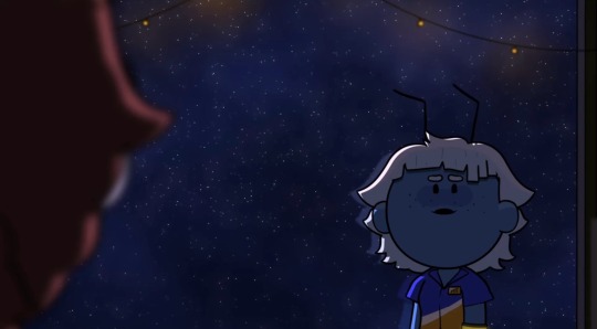

NO WAY. NO WAY. SCREAMING AND SHITTING HOLY SHIT OH MY GOD
#they make me ILL#WHAT THE FUCK#immvee#deep space discounts#sob#I was already planning on doing a screenshot redraw thing but now I HAVE TO#token talks#vimmy#?
589 notes
·
View notes
Note
Hi! So I want to make a Spooky Month OC but I suck at drawing, do you have any tips or advices about drawing characters in the Spooky Month artstyle?
Okay so, I might not be the right person for this, cause I also am not all that great at drawing in the Spooky Month artstyle, but I did some character design at school so I might be able to give a few tips! Please do take everything I say with a grain of salt tho!
Spooky Month's strong suit is definitely character design. It's SO expressive and well done it's genuinely unreal. You might want to know exactly what your character is gonna be doing, or how their personality is gonna be like, because character design in Spooky Month cares a lot about things like these. For example: Radford works at a cinema, so of course he's wearing 3D glasses, but also his HAIR IS LITERALLY SHAPED LIKE A POPCORN.
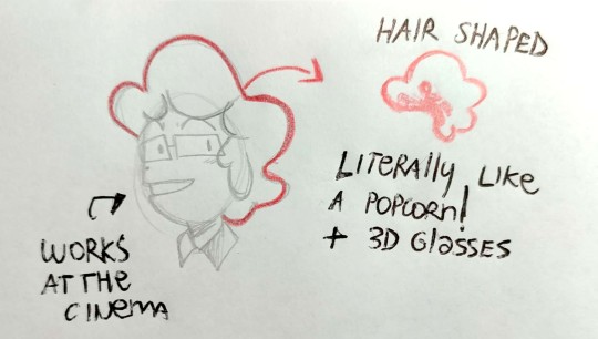
So maybe decide on a job for your character, and try to start from there, get crazy with shapes and have fun! Spooky Month characters have designs that are both extremely simple to draw, since they use mostly basic shapes, but also are extremely thought out and meaningful. Another example of great character design is Pump
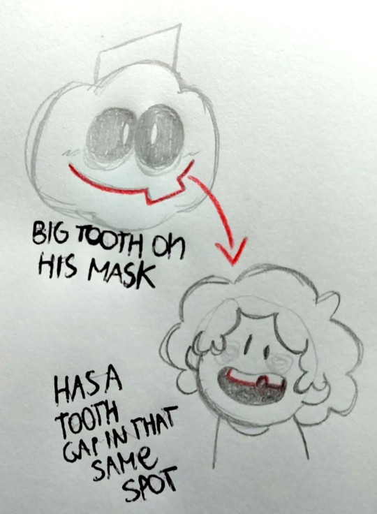
Now, I have no idea if you already had an OC in mind, but make sure to choose the right shapes to represent it. Something I see around in the fandom is people making these OCs that are like, serial killers and dangerous people and stuff, but then give them the "Lila"-like oval head. And honestly, nothing wrong with that, that's a choice you can use! But still, shapes allow us to understand a lot about how a character is just by looking at them. So you might want to experiment around a bit!
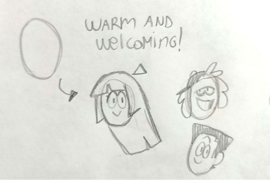
Ovals in Spooky Month are the "good" shape, let's just say. Most character with an oval head are sweet, helpful, kind-natured! It's often paired with oval eyes, so it's mostly a shape that's used for not villainous characters.
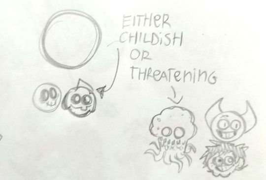
Circles are a bit more complicated, because Spooky Month subvertes the Circle Characters. While yes, they're also used to draw children, such as Skid and Pump, so they may come off as unthreatening at first, most main villains, such as Eyes, Bob and Dexter Doll (which is meant to represent the likes of a child, so that's a nice contrast), are mostly circle-shaped.
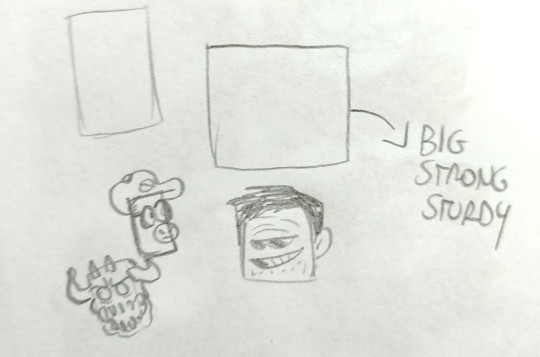
There's a very wide range of Square characters in Spooky Month. Square characters are usually bulky, big and strong. They often come off as threatening (such as Moloch), but there are so many other fun things you can do with them. Like, take Frank. EVERYTHING in his design should alarm us, him being square-shaped, the black eyes, the wide smile. Yet, he has a shape of the eyes that's very relaxed and chill, so we end up trusting him. As for Dexter, he's a mix of circles and squares, so we can't really understand his intentions right away, because he's shaped in the most confusing way possible. He's just made to be unsettling and leaving us to wonder if he's a bad guy or just an oddball.
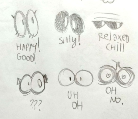
You can do SO MANY fun things by mixing up shapes of faces and eyes it's INSANE. Also, you can mix up other characters' features to create a new one, if you're planning to do a fankid or stuff like that. Look at Ross, he's literally a mixture of all his parents' features!

My main tips for drawing in the Spooky Month artstyle are mostly
1) Play around with shapes. Be as cartoony as possible.
2) Try to be consistent with proportions, because, based on personal experience, if you draw the pupils of the eyes slightly off it changes the whole character's expression drastically
3) don't worry too much about details, Spooky Month has a very simple artstyle. You don't have to draw a perfectly anatomically correct hand, just whip up some cartoony three-to-four fingers and you're good to go
4) try to redraw some pre-existing screenshots from the serie to get familiarity with the way Pelo draws expressions. It helps a bunch.
So yeah, that's all! Good luck with your oc :)
#spooky month#spooky month art#spooky month oc#spooky month au#spooky month fanart#radford spooky month#spooky month radford#sm radford#sm ross#spooky month ross#spooky month dexter#dexter erotoph#sm dexter#dexter doll#sm moloch#moloch#spooky month moloch#sm jaune#spooky month jaune#spooky month aaron#sm aaron#spooky month frank#sm frank#spooky month skid#skid and pump#sm skid#pump wonder#sm pump#spooky month pump#spooky month eyes
122 notes
·
View notes
Text
2023 art review!
Even if this year wasn't the biggest on art, due to my physical condition (especially in last couple of months), it would still be nice to look back on what i did as an artist throughout it!
This is gonna be a fun ride...
So, let's dive straight into it, shall we?
Continuation under the cut
January
2023 started on a high note, with me just having finished the King piece, and moving on to the next big thing, being an AvA3/5 double piece.
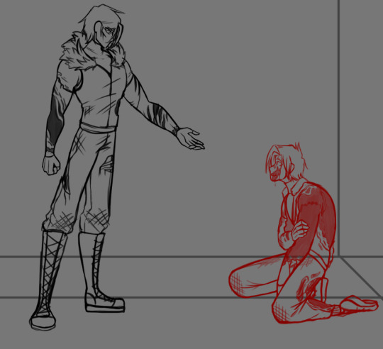


Sadly, during the process i messed up big time which led to me being unable to finish the piece the way i wanted to, rendering this project an eternal WIP. However, i still cherish the idea and do wish to either redraw, or complete it.
February
Doing 2 big projects one after another did end up affecting my overall drive, so i spent majority of that month just making sketches.

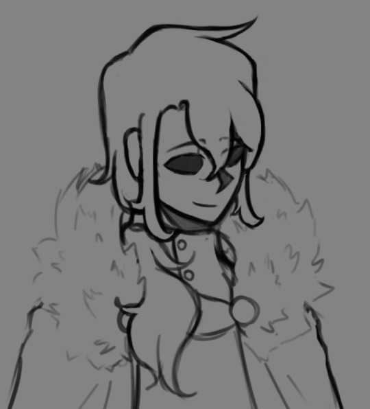
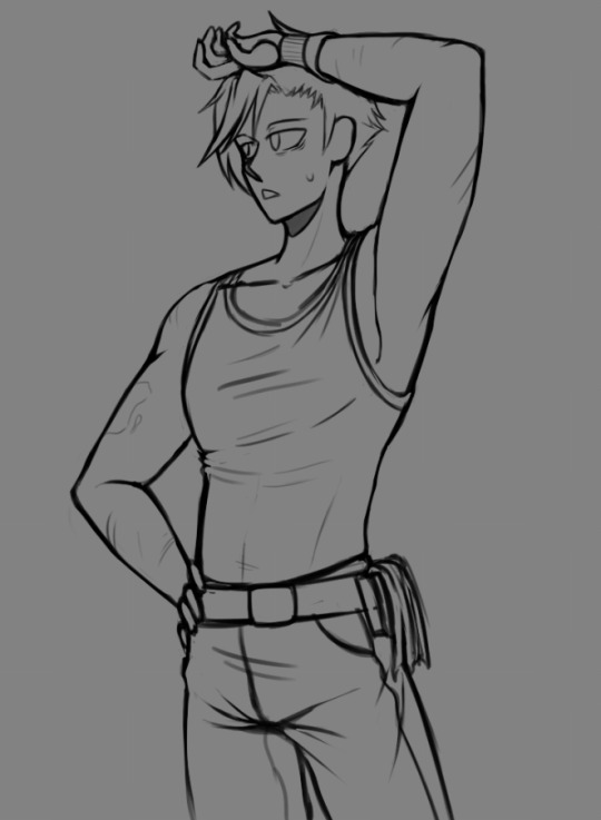
First one is a little redraw/redesign of my old character - Derek, whom i used for a roleplay with my friends like 3 or 4 years ago, and second one is Deach, a character from my fantasy setting.

Also, back then i joined a new fandom, people in which have reminded me of my admiration for SCP, after which me and my friends proceeded to make OCs for it. Was a fun time! (Also this access card was sold by me as a YCH, sadly i couldn't really find buyers, so yikes)
March
By march is slowly started recovering from january's disappointement and was a bit more productive already. One of my friends really helped with it too.
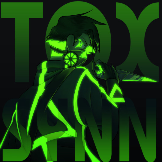
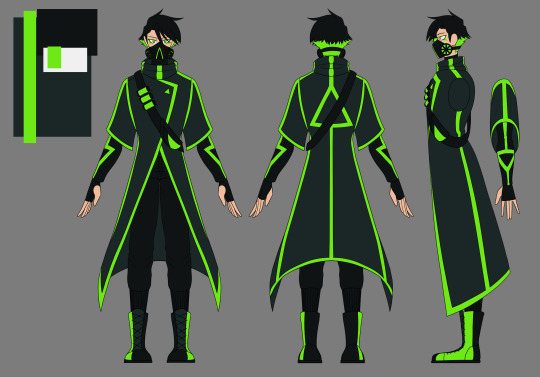
A musician friend of mine reached out to me, asking to develop a design for a villain character in the plot he was working on. After listening to the theme song i couldn't resist. This ended up being one of my favorite designs so far, and i adore its look in neon.


In the meantime, i kept working on my fantasy setting, refining more minor details of designs and stories, yet having to reserve only to making sketches as i was too busy with college and other projects. Characters you see on screen are Ian and Lanfor respectfully. One is a strong yet troubled mage and other is a great Emperor, and even better person.
April
I'd say april was one of the most productive months of this year, mostly because i managed to snatch some time for myself and my setting, which allowed me to complete two full pieces and achieve some extreme progress with my story.

This piece is an illustration to a scene i wrote for two of the characters, Lanfor and Emile, called "Night Visitor". This was a scene of a reunion of two old friends. A bittersweet, yet a lovely work. Love both the written one as well as the illustration.
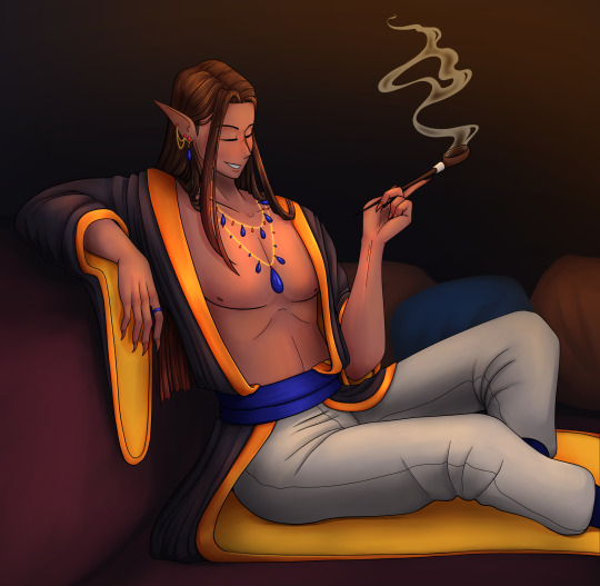
This one was more of a... Proof of concept. Needed to test out the expresiveness of the design for one or a relatively new characters - Covlar. Was originally a simple sketch on paper, but i couldn't resist the urge of making it into a complete illustration. I then proceeded to make a few notes for this scene. Both want to write it properly and avoid it at all cost... Best to avoid it, for my own sanity.
May
May was a bit of trainwreck, because i got a brand new laptop, which took me quite some time to get used to and even more time to reassure myself that it is in fact alright for me to draw on this suspicioiusly thin piece of tech.

Ironically enough, the only vomplete piece i drew that month was drawn on my old laptop. This screenshot redraw was to made to honour the premiere of AvA6 ep.1. Sadly, i did it a bit late because fo technical issues, but i still had a ton of fun doing it.
June
June was... Chaotic, to say the least. Mostly because i finally got comfortable with the new laptop and could now draw a lot more freely due to it being a lot more compact than the original one, which worked almost like a PC. Besides, i got a ton more free time because semester finals ended up being a breeze.
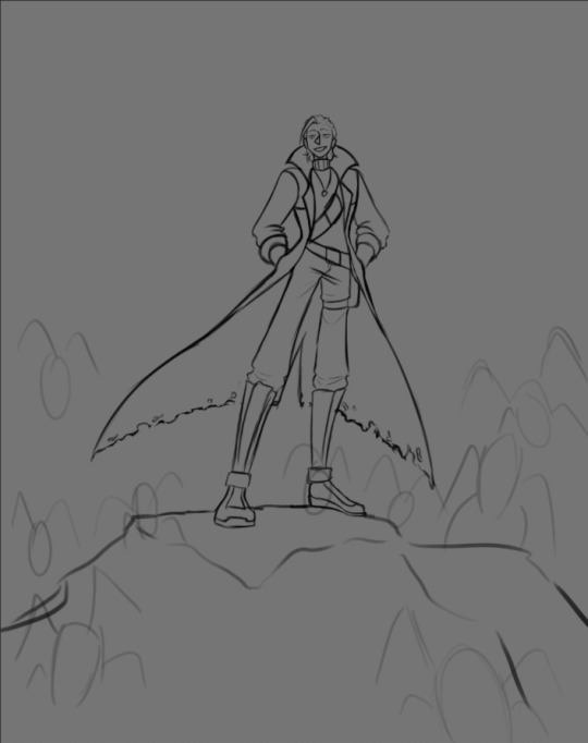

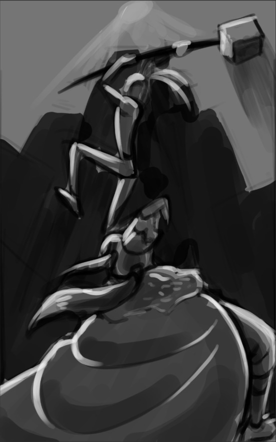
Ended up making a ton sketches and doodles, that i didn't actually plan to finish, but still enjoyed a ton. Here are some of them


Then, ofc, the memes and the gand redesign, because AvA6 just had to break all of my portrayals. But, i mean, after AvM s3 my original designs did become a bit dated.
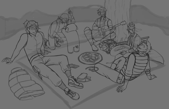
The biggest pride and saddest of failures was this picnic piece, however. I still plan on finishing it, but it is hard doing so, when i have changed quite a bit of my artstyle by now.
July
July was quite lazy. Semester ended and i spent that entire month out of the city. It was a great time, very peaceul indeed.
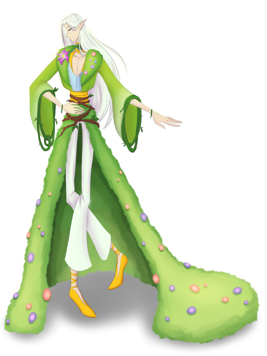
And again, that musician friend from before came into clutch, asking me to develop another design for his other project. And again a villain. He said he really liked how i draw bastard type of characters.
August
Well this is where fun began. End of summer break means i have just this much time to actually draw something i would never have time to draw normally.
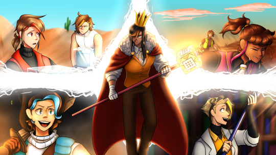
For me to draw something to commemorate a new episode is almost like a tradition at this point. And, given how long it's been since i made anything that would require effort, no wonder i have chosen arguably the most complex piece to pull off energy-wise. Yet i did and now i simply adore this piece, even if it did render me disabled. (I crunched through all of this piece, pulling off 40+ hours of work in just 4 days, so naturaly it ended up worsening my condition by a lot)
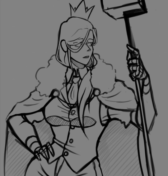
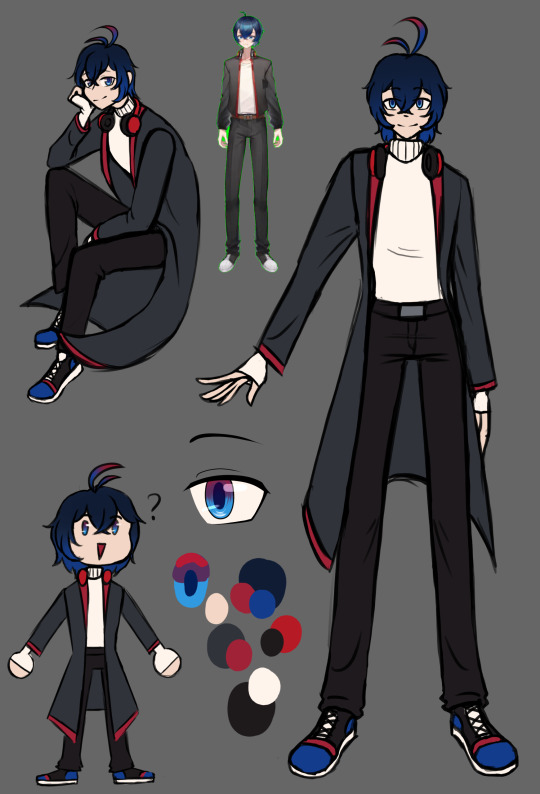
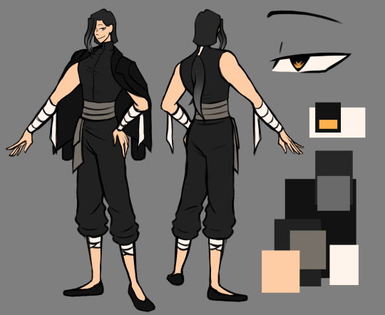
Then i also proceeded to do all of these tiny side projects, like Victim ask, which i couldn't last long at due to my condition, and working on a design for my favourite streamer. (Which i cannot show as the work is not complete an it's best if i avoid spoilers)
September and October
These two months i spent being unable to draw at all via a doctor's advice. Arguably, these two were the hardest months for me to handle.
I assume you can imagine how hard it is to suddenly stop being able to do what you love, regardless of how much you wish to do it.
Novemer
*Nervous laughter* I... actually still wasn't allowed to use my hand, but that didn't stop me and i ended up making an entire series of sketches to celebrate AvA6 ep2.
"Small in big quantity will sure be less exhausting than a single big thing" - (C) Me, proably


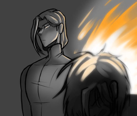
I will admit, i still adore all of these sketches and each of them deserves to become a fully fledged piece in it's own right, but i really better keep them as they are. For my own safety.
December
As you way have expected, this month will stay without a single thing from me. It's not because i don't want to, but because i can't. And, given the circumstance, it better stay that way.
Afterword
I finally got my diagnosis and soon enough i will start active treatment for my condition. It would be a shame to make this worse than it already is with impulses like those that happened in november, so i am making this post as a way to draw a line for myself.
It is still kinda crazy to realize that there are quite a few people interested in what i make, so i will make sure to take my recovery as responcible as possible, and then come back to you with even more art in the upcoming year! Let's be positive about it.
#alan becker#animation vs animator#ava#illustration#ava fanart#animation vs minecraft#avm#artists on tumblr#2023 art#yearly art summary#oc art#original character#digital art#No character tags because there are too many of them#dat's art
29 notes
·
View notes
Text
Already mentioned this in my Discord server, but a couple days ago while I was out, I was doing some thinking about art I want to make next year, so I'm going to go ahead and post a list of the projects I want to do here too, as a sort of 'New Year's Resolutions' thing, but for my art specifically:
-First and foremost, I've been wanting to draw the OTO characters' old families for a while now, since family is…kind of a huge part of the story. I have a couple other OTO projects I want to do before then, but my plan right now is to start this project in March, and draw one set of family members a month until December, and I'm likely going to do a couple other small drawings for the story before and after each new drawing, especially since I was wanting to include drawings in the book, and start on that next year while polishing the story up, and looking for potential publishers. -Some other stuff for the SaSA! AU/SoTF of course--including a series of drawings to go with the next chapter. -A series of drawings with the Daycare Attendant from FNAF: Security Breach and the Ruin DLC, the first of which I actually just finished earlier today. -Maybe Halloween drawings for Scooby-Doo? -A possible fan drawing for an Instagram mutual.
-Maybe screenshot redraws for Danny Phantom, to do something a bit different, and get in practice doing backgrounds and scenery? I have a couple other potential drawing ideas to maybe work on at some point, but those are the main ones right now. Obviously, I'm not going to push myself, and I'm going to pace myself rather than forcing myself to do anything if I'm not enjoying it, but for right now, those are the main projects I have in mind.
So yeah. That's one 'New Year's Resolution' list.
#rhys-ravenfeather signing on#art stuff#sorry if this looks a bit weird--i LITERALLY copied and pasted this from my discord since i didn't feel like retyping the whole thing alsdf#anyway yeah--those are my art plans
1 note
·
View note
Text
This is the complete list of thing I gotta fucking do cuz TOO MANY TIMES I start shit and abandon it!!!!! TOO MANY TIMES!!
This includes both SFW and NSFW things. If you're over 18, you can read and ask me about some points - cuz I'm talking about stuff across l my socials. If you're under 18 you'll get perma-blocked and reported and I will eat your pancreas.
[unless stated otherwise, assume every point is SFW]
THINGS I'VE STARTED AND SHOULD CONTINUE:
Remaking most Pesterquest sprites (Tumblr, Twitter)
Continuing personal Pesterquest route with Beta OT4 and sexual jokes - maybe adding actual sex too (Aethy)
Continuing SLEEPOVER (+18) Solkat comic (Twitter)
Continuing shitty Solkat animation I've posted ages ago (Tiktok)
Actually starting that Solkat animation I've planned and never did (Tiktok)
FINISHING 15 DRAWINGS FOR MY COME BACK ON DAILYSOLKAT (Twitter)
Restarting SFW pale Solkat comic thAT I'VE FUCKING LOST (nowhere cuz i fucking lost it)
Continuing my "list of every possible ship in Homestuck" that, for now, comprehends every possible pairing between the Beta & Alpha Kids & Trolls + the Ancestors + the Guardians + the Cherubins + the Sprites + some extra character (I'm thinking of making a tier list with that)
My COMPLETE ACTUAL analysis of Karkat's fetish for disables (for now I have a "kind of explicative screenshot-version" on Twitter)
Not even gonna list all the fanfics I've started or I've yet to start, I've tried once and almost cried (for only the Solkat ones, go on Aethy)
Continuing my series of "trying different fetishes with Solkat" (Twitter and Aethy)
Those 15 drawings on my request blog
I have a lot of drawings I want to redraw, but mostly my Beta OT4 one that I've envisioned in my dreams (OG already posted on Tumblr, on my abandoned main blog and reblogged here)
Very, very much probably there's something else to add, but for now this is all.
0 notes
Text
CYBERVERSE WATCH
S3 Episode 9, 10, 11, 12
Episode 9
WHIRL NO WHY IS EVERYONE RUNNING oh
Gosh I love that Percy’s alt-mode sucks so he’s gotta hitch a ride on someone
Whirl *gracefully descends from the ceiling* Percy: *PLUMMETS LIKE A ROCK*
No joke I laughed so suddenly and loud at that I startled myself
RODDY PLEASE RETHINK YOUR DECISION TO USE A WAR TITAN TO FIGHT YOUR BATTLES IM BEGGING YOU TO USE YOUR BRAINCELL
Whirl *jumps directly on the Titan’s face* Me: I’d die for you
Roddy: We need Windblade! Me: YEAH YOU NEED SOMEONE SMART ON THIS TEAM
Ok putting the masks on their head to hide from the Quints is actually a smart idea
“I can’t believe that worked” GUYS PLS
Aw I love that Clobber and Roddy do their little fist bump / high-five thing that’s so cute
CHROMIA AND WINDBLADE....Roddy you’re interrupting their date
Roddy: Clobber, you’re a lesbian, can you get through to them Clobber: Sure *picks up Chromia in one hand and walks off*
I feel like the smart thing for them to do would be to wake up Megatron and/or Optimus and use them to wake up other Autobots / Decepticons because like. If I was an Autobot and Megatron wandered by at a parade I’d definitely be on defense. Of course, then Roddy & co. would need to convince Megatron to help them so maybe that’s a no-go anyways
WHIRL NO!!! OH NO
AW I love that everyone’s taking care of Percy, Dead End holding his hand while running was so cute
HELL YEAH USE YOUR FIRE RODDY
HOT ROD NO!!!!!!!!! SOMEONE SAVE MY BOY!! AND WHIRL, WHO ALSO GOT HI--OH MY GOSH THEY KNOCKED THE THING OFF SOUNDWAVE AHHHHHHHHH!!!!!
IF ANYONE CAN TAKE DOWN THE QUINTS AND WAKE EVERYONE UP ITS MY BOY SOUNDWAVE I mean, assuming ripping the helmet off his head rather than waking him up normally didn’t totally screw him up
AHHH SOMEONE NEEDS TO SAVE RODDY
WHOA SOUNDWAVE YOU GOOD BUDDY??? OH NO....
“Something’s wrong with him...” “You mean more than normal?” SHUT UP DEADEND
LMAO HOT ROD STRAIGHT UP SLAPPED A QUINTESSON NICE
OH NO IM GETTING FLASHBACKS TO THE MOVIE
COURT!?!??? PLEASE SAY YOUR FAMOUS LINE RODDY
HEY CAN YOU GUYS STOP BEING BUTTS TO SOUNDWAVE
“There are an infinite amount of universes in the multiverse. The Quintessons judge which ones are worthy of existence” NICE NICE NICE NICE OMINOUS AND NICE
ARE WE GONNA GET TO SEE OTHER UNIVERSES???
WHOA WAIT WHAT SCIENTIST, MACCADAM WHO ARE YOU TALKING ABOUT
IS THIS GONNA BE THE CREEPY WHEELJACK WE SAW IN LIKE EPISODE 3 OF SEASON ONE???
You know I’m realizing the Titan thing doesn’t explain how Maccadam knows about the future, is HE from a different universe / future?? Has he already seen all of this happen before? Is HE the true Homura of this series?
RODIMUS STALLING TO ANNOY THE COURT NICE
Every time Roddy uses his flames I lose my mind in excitement
HEY DEADEND STOP BEING A BUTT TO SOUNDWAVE
HELL YEAH RIP ‘EM A NEW ONE SOUNDWAVE, SHOW THEM WHO’S BOSS
HEY CAN SOMEONE *PLEASE* SAVE HOT ROD
UH OH IS RIGHT RODDY
“I wish I was a jet” He’s not gonna jump is OH HE JUMPED
OH THANK GOODNESS WHIRL WAS THERE, THANK YOU WHIRL FOR BEING AWESOME
SOUNDWAVE!!!!!!!!!!!
Episode 10
I saw Soundwave in the thumbnail and got UNREASONABLY excited
AHHHHHHHHHHH IS THIS GONNA BE THE RODDY AND SOUNDWAVE EPISODE I HEARD ABOUT?!?!??! PLEASE??? PLEASE???
Hot Rod is the ONLY bot who could appreciate Soundwave’s background music PLEASE let them get along or at least be amicable by the end of the episode that would be so frickin good
“The Masters of the Multiverse” man what a good title
I’m so glad Season 3 has been so Hot Rod=focused, HE DESERVES THE SPOTLIGHT
lmao I love that Soundwave and Roddy are both crossing their arms on opposite sides of the bar, guys please you’ve got bigger fish to fry
This is embarrassing but I was legitimately so distracted by how nice Soundwave’s legs looked in this scene I didn’t hear a single thing Roddy said and I had to rewind the episode l m a o.....
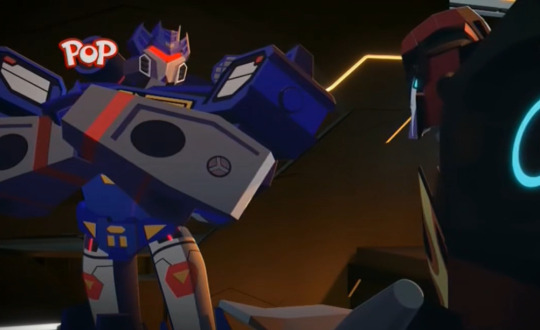
Soundwave: I know you’re no Optimus Prime Me: *MORTIFIED GASP* THAT’S A SORE SUBJECT DON’T BE MEAN!!!
SOUNDWAVE NO!!! NO FIGHTING
I KNEW IT I knew he was improperly removed!!!
THEY FRICKIN SLAPPED HIM ON THE CHEST TO FIX HIM LIKE HE”S AN OLD TV IM CACKLING
OH SHOOT they already tried doing something similar to Hound oof
SOUNDWAVE AT LEAST SHARE WHAT THE PLAN IS
OH SHOOT SOUNDWAVE GETS THINGS DONE
I can’t believe they came up with names / jobs for these things
Aw Roddy I’m sorry Soundwave’s overshadowing your leadership role :(
“Maybe they’re trading beauty secrets” DEADEND PLEASE
I hope Soundwave didn’t tell her to kill him
OH NO HE DID, CLOBBER NO
Clobber: *crying while trying to kill him* This hurts me more than it hurts you! Hot Rod: No, this hurts me more GUYS PLEASE
I briefly forgot DeadEnd was a Decepticon and was like “Wow you’re not worrying about Roddy getting his head beat in?? Really??”
Gosh Soundwave looks so cool
“The evil back-stabbing music box” omg
Hot Rod: That’s not how Autobots do things Dead End: Yeah but like, we aren’t. So can we kill him
SOUNDWAVE’S INTERROGATION STUFF IS SO COOL I mean it’s mean but that’s an interesting method
AHH HE SAID THE INFERIOR SUPERIOR THING
Who IS the scientist
Uh. ok what is that brain thing. I WAS ASSUMING THE SCIENTIST WAS A BOT BUT GUESS NOT
Episode 11
Gosh the backgrounds in this show are such a delight for the eyes
*GENTLE GASP* BABIES!!!!!!!! ARE ANY OF THEM SOUNDWAVE’S BABIES???

AW OMG SOUNDWAVE IS THERE HE’S CATCHING A CASSETTE OMG OMG.....OH MY GOSH....THERE ARE REAL TEARS IN MY EYES
But at the same time SOUNDWAVE YOU CANT JUST FRICKIN NAB A BIRD OUT OF THE AIR AND CALL IT YOURS
Oh well I guess he can lmao alrighty then
OH NO....BOTS ARE DYING....GUYS YOU’RE TAKING TOO LONG TO DO THIS
how on EARTH did that work
OHOHO just Hot Rod and Soundwave I hope they learn to trust each other a bit
I’m VERY worried they’re gonna kill off Laserbeak in this episode
ALRIGHT. WELL. THAT SCIENTIST ISNT FREAKY AT ALL.
OK SUPER FREAKY HE’S WAY TOO INTERESTED IN SOUNDWAVE FOR ME TO NOT BE WORRIED ABOUT THIS HE SOUNDS LIKE A CREEPY COLLECTOR
‘‘A blue one...I don’t have a blue one yet’‘ UH OH UH OH!!!! OH PLEASE DONT HURT SOUNDWAVE CYBERVERSE WRITERS PLEASE!!!
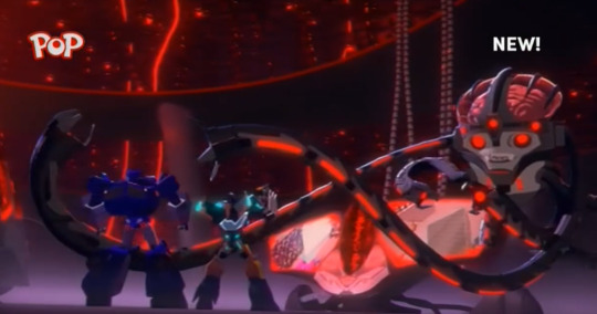
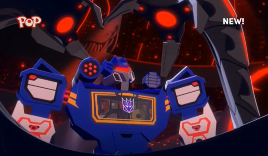
DOES SOUNDWAVE KNOW THIS DUDE??? HOW ELSE DID SOUNDWAVE KNOW WHAT WOULD OPEN THE DOOR???
The fact that we can now SEE Laserbeak in his chest makes me worry we’re gonna lose her this episode 8(((
WHAT THE FRICK
ARE THESE DIFFERENT VERSIONS OF SOUNDWAVE FROM DIFFERENT UNIVERSES??? ARE THESE JUST DIFFERENT BOTS THAT SHARE SOUNDWAVE’S ALT MODE???? IM SO DEEPLY WORRIED
“Why would he collect Soundwaves and not Hot Rods?” RODDY PLEASE THIS IS NOT THE TIME!!!!! That’s a very Hot Rod thing to focus on though lmao
I feel like the Cyberverse writers went “Hm, what would make Ana feel most anxious about her favorite character?” and then proceeded to write this episode exactly about that
Like, on the one hand: Good taste weird tentacle alien dude, on the other, GET YOUR MITTS OFF HIM
“When a judge finds a universe guilty, I like to keep a little...souvenir for myself” WOW THAT’S HALF WHAT I GUESSED BUT HE SAID THAT INFINITELY CREEPIER THAN I THOUGHT HE WOULD
HOT ROD PLEASE SAVE HIM FROM THE WEIRD TENTACLE MAN
I love how this team has exactly one braincell and none of the people currently on the other side of the door are in possession of it
“I keep telling myself I don’t have room for any more, but you would go so nicely right here” me @ me when I’m buying figurines tbh
That’s genuinely so upsetting, like if I were in Soundwave’s place I’d be pissed as HELL
OH BOY ARE WE GONNA HAVE A TOYSTORY 2 SCENARIO wrt THE “You’re damaged!” THING
“I’LL SHOW YOU DAMAGED” LMAO Roddy: *starts listing off all his traumas* Tentacle Dr.: Um,,
LET GO OF MY BOY!!!!

“A parade is the best you can come up with?” ASKING THE REAL QUESTIONS RODDY
HELL YEAH GET HIM SOUNDWAVE and thank goodness he got fixed. Hopefully the guy didn’t do anything weird to him
I KNEW THAT WAS TOO EASY WHY IS THIS DUDE SO FREAKY
WHAT DO YOU MEAN IT”S FEEDING TIME
EW WHAT’S IN THERE
IM GONNA LEGITIMATELY CRY IF THEY KILL LASERBEAK PLEASE DONT KILL HIS BIRD

Why do the words “Laserbeak! Eject!” get me so emotional WHY AM I SO HEAD OVER HEELS FOR THIS CASSETTE TAPE AND BOOM BOX
DONT SHOOT LASERBEAK PLEASE
Ironic for Whirl to be the one to say “hold your fire”
Wow way to abandon Hot Rod and Soundwave
uH OH UH OH UH OH
Off-topic but tentacle dude’s voice sounds SO familiar I just can’t place it it’s a really good fit
OH SHOOT THEY”RE DRAINING THE ALL SPARK TOO
DO IT PERCY SAVE EVERYONE!!!!
Perceptor you are ADORABLE
PERCY YOU GOTTA SAY AUTOBOTS ROLL OUT
THERE WE GO OPTIMUS
Oh boy let’s see how Megatron reacts to Clobber interrupting him
Percy should just summon a hologram of Optimus, that would do it
YEAHHH THEY FREED EVERYONE!!!
DO IT GUYS!!! HEAT AND SOUND!!!!
CHROMIA!!! :D
FIST BUMP!!!!!

AND LASERBEAK IS OK!!!!
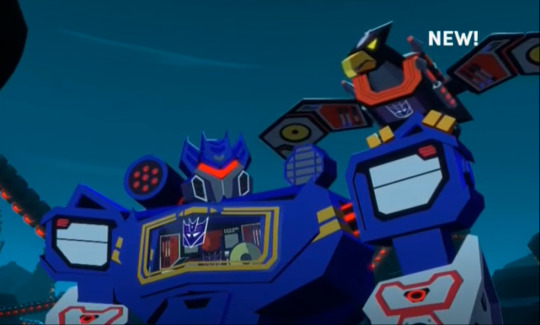
Uh oh spaghettio that doesn’t seem good
OH WOW YOU’RE REALLY GONNA END THE EPISODE THERE??? HECK I FORGET HOW SHORT THESE ARE
Not to sound predictable but I think that was the most interesting episodes of the season so far
Episode 12
Aw man the judge is still alive heck
MY BOYS!!! MY BOYS IN ONE ROOM TALKING TOGETHER AND NOT TRYING TO KILL EACH OTHER!!!
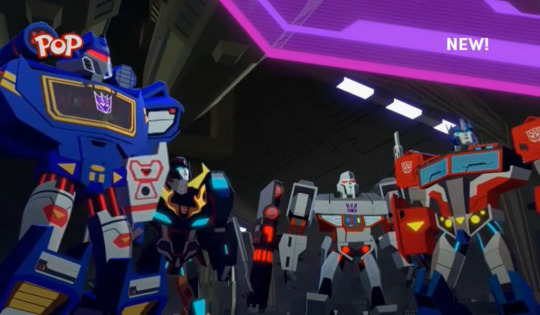
Optimus: We will work together to stop this Megatron: *half-hearted grumble of assent*
Bee please don’t reignite the war by bumping into people
LMAO WHY’S IT SOUND LIKE OPTIMUS JUST ASKED MEGATRON TO MARRY HIM

I love this they’re both like “frick this is so uncomfortable”
MEGATRON COME ON
HELL YEAH YOU TELL EM SOUNDWAVE nice teamwork!!!
KUP!!!! AND STRIKA!!!
LMAO THEY SHOVED THEM IN THE TRAINING SIM guys pls. I mean good effort but
Man can I just say it’s so nice seeing these two (especially Soundwave, the world’s most under-valued Decepticon ever) become respected leaders while getting time in the spotlight? I LOVE that!!!!

I should redraw this screenshot sometime
Bee and Arcee and Shadow Striker and Lockdown!! Such a good combo
OH MY GOSH HE SERIOUSLY DID A TOUCH REFERENCE
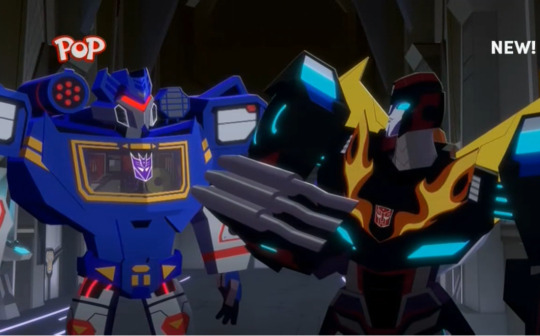
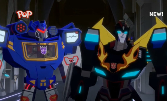
AHHHHHH SOUNDWAVE BACKED HIM UP WITH MUSIC, I KNEW THEY’D GET ALONG!!!! SALING YOU WERE SO RIGHT AHHHHH
I’D DIE FOR YOU TWO!!!!!!!!!!
TEAM SOUNDWAVE AND HOT ROD: THE ULTIMATE CAPTAINS!!!!
SKYWARP!!!!!!
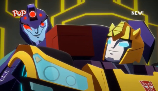
YEAH!!!!!!!!!!
Life-or-death video games really do build friendships
WINDBLADE!!! :D
Aw man are you guys still really gonna wake up this Titan
Windblade: Did you guys ask Maccadam about this first Hot Rod: Oh absolutely he definitely said yes don’t worry about it Windblade: You sure? This dude seems like. Super evil Hot Rod: Nah it’ll be fine don’t even worry about it
THANK YOU RODDY for being the voice of reason for once
Maccadam: Now isn’t the time for this Titan, we need to save that for the season finale
Can’t believe they’re really dragging a bomb through the city
Ok so like. Where is Megatron during all of this. Are you seriously gonna sulk and miss this whole battle Megatron
Arcee with her machine gun is SO cute
Someone please shoot this shark dude and shut him up
AW THEY BROKE ARCEE’S MACHINE GUN :(
GET ‘IM WINDBLADE!!!
HEY MEGATRON OPTIMUS COULD REALLY USE A HAND HERE COME ON
WHOOPS so much for the bomb
OH AND EVERYONE ELSE I GUESS?? FORGOT THAT THE BOMB WOULD PROBABLY HIT THEM
WINDBLADE PLEASE BE CAREFUL
BEE FALLING AND RODDY IMMEDIATELY DROPPING DOWN TO SHIELD HIM, OH MAN THAT GOT ME HURTING SOMETHING FIERCE

HERE COMES IACONUS AND WINDBLADE
Man I hope we get to see Windblade and Starscream duke it out with Titans
THANK YOU FOR SAVING HER MACCADAM I WAS SO WORRIED
“I’ve lost too many cityspeakers this way” OH WOW THAT CONFESSION ACTUALLY LEGIT HURT....Mac how many times have city speakers tried controlling Iaconus? How many people have you seen die apart from the citizens of Iacon?
AW MAN BUMMER PLACE TO END IT ok let’s do a few more episodes after a quick break (I’m still SCREAMING over that Soundwave episode)
6 notes
·
View notes
Text
Update
Hey, ya’ll. Long time no see, huh?
So I’ve been doing some thinking, and I’ve realized something. I made this blog to try and improve my art, but thinking about it, I haven’t actually used this blog to... improve my art. You see, one thing I really wanna do is make a web comic, but I don’t exactly... have the right skills to make one as of yet. So I was planning on using this to focus on backgrounds and panel design, and stuff like that.
So I’ve decided that I’m going to turn back the sands of time on the timeline of this blog, and do a screenshot redraw of Explorers of Sky with the characters. You’ll still be able to ask people questions, it’s just now this blog will have an ongoing timeline.
However, upon doing this, I’m going to be needing to take the time to play through the game again to get the screenshots, and I’m also going to need to redesign everyone. (The webcomic I wanna make is set in a fantasy world, so I want to practice fantasy character designs) I am also going through some techincal difficulties called “my laptop is literally falling apart” so I don’t think I’m going to restart the blog this way until around March or April.
Thanks for taking your time to read this, and I hope you look forward to this blog’s future! (or past?)
And, for those curious, I will still be keeping everything on this blog. So nothing that is already on here is going anywhere. (Except for that hate ask, I think I’m going to just go ahead and delete that.)
2 notes
·
View notes
Text
10 months ago, I decided to make a game.
10 months later, I have a bunch of art and a bunch of interface code and a whole pile of design notes, and not much game.
This is my story.
(Now in bullet point form so that I can stop redrafting it >.>)
I have a treatment-resistant anxiety disorder which significantly interferes with my ability to work - both on my own projects and other things that might be called 'gainful employment'. (I still feel some shame at admitting this so bluntly, even though I feel ideologically that there should be no more shame in this than any physical impairment that resulted in the same. Fuck mental health stigma, defining self-worth by employment is toxic capitalist dogma, etc, etc.)
In part because of this, I had been effectively unemployed and living with my mother for a number of years. (I still did my best to hammer out projects, but nothing, y'know, actually PAID anything... >.>)
Then in late 2017, my mother died (somewhat unexpectedly) of cancer, which left me with no home (we'd been sharing an apartment that she had been covering most of the rent on) and literally zero income. Obviously grief and upheaval did not help with any of my prior difficulties managing employment, either.
After some debate, I decided to combine the savings I had left over from my last stint as a network administrator with a (modest) inheritance from my mother and try to actually make a living at making games. This is something I had always theoretically wanted to do, but never put actual money on the line for. (Okay, in a perfect world, I'd happily give all my work away for free and live on some minimum guaranteed income, but we do not yet live in such a world).
One of my historically biggest gamedev weaknesses was a lack of artistic ability, so this seemed a perfect thing to put money towards. I could hire an artist, which would not only allow me to make a more commercially appealing product, but would also free me up to focus on the mechanical and writing aspects of gamedev, which are the areas I most wanted to be working on and also consider myself best at. (Any followers that remember my work on ToK may recall me complaining there about how it seemed I spent my time on nothing but graphics? >.>
This was shortly after Touhou fangames had been given the official blessing to be sold on Steam, and some had already achieved great success there, so this seemed like a good way to create some instant appeal and interest in my game, while working with a franchise that I already loved to death and had written hundreds of thousands of words of fanfiction for (eg: This or that or this other thing)
And so Chronicle of False History was born!
...and yet I somehow still spent most of my time working on art. You see, having never worked with an actual artist before, I underestimated a number of things:
1) I underestimated how much work it would be to find a suitable artist in the first place (though at least this part is done)
2) I gravely underestimated how much of my time would be spent on 'art direction' or 'project management' or whatever you want to call it.
Every sprite that is created, even for canonical character designs, requires making a large number of decisions regarding:
What attack and spell poses it will have (and how to cover the broadest range of signature abilities with just two 'frames', for budget reasons)
Which of enumerable (and sometimes mutually-exclusive) costume details from canon (and fanon) should be selected (and do you have any idea just how many variations there are on things as straightforward as 'the hilt of Miko's sword'?)
Gathering a pile of reference images that clearly detail every element of the character (and action poses) to be drawn (which is also harder than you might think; a lot of art is sufficiently suggestive of details to view without actually being a good reference to reproduce and anything that isn't exactly what I'm looking for risks my artist misunderstanding my request entirely)
Designing alternate-history variants of this character in a way that can be clearly conveyed with minimal costume and color changes alone (as any significant redrawing would cost far more and the cast of the game is so large already) and doing so before the part of the game they would appear in is even written.
Gathering reference images for all of those things
Writing up a detailed description of all the decisions listed above (and often drawing actual diagrams of action poses and projectile overlays that are ambiguous to express with just words) and handing it over to my artist
Waiting a while, then getting sketches back and finding out that there is inevitably a whole pile of things that need changing (either because the artist misunderstood my request entirely - despite all that previous effort - or because an idea of mine looked far better in my own head than it does, or just the usual 'incremental improvements' to something that is on the right track but not quite there - like a sort of collaborative redrafting.)
Spending hours poking at these sketches in an image editor, testing how well individual details resolve at in-game size, how well the action frames snap together, and how I feel about each questionable element. This often extends to (crudely) adjusting and readjusting the position and angle of individual limbs and eyebrows and projectiles that feel 'off' so that I can figure out what I would like her to do with them (and whether it's even worth making her take the effort to do anything with them at all)
Finally, summarizing that feedback into a detailed list of change requests (often with new diagrams to clarify my words) and repeating the last two steps over and over and over again.
Like, she does great work - don't get me wrong. I'm very pleased with the end results and this is just an inevitable part of the process of making something professional. But it does also mean that my original idea that paying an artist would free me up to work on things other than art has been... laughable in retrospect, to say the very least. In fact, it's very possible that a greater percentage of my dev time is spent on art-related tasks than on previous projects where I was doing all the art myself - I just get better art for my trouble (and money....)
This is especially true given that:
3) I underestimated just how much art work I would still need to do completely independently of her
Raven is doing character sprites. These are arguably the most individually important art content in the game, and certainly the ones that give it the most screenshot appeal, but that has left me to do everything else. Which has included:
Figuring out how to make battle backgrounds that passably match the art style of the game (since commissioning enough of these to fill all the locations needed would absolutely blow my budget)
Designing the entire look and feel of the combat screen to mesh well with Raven's sprites while also being something I am personally capable of making (using only cheap/free resources)
Creating all tweened animations and particle effects
Designing every single little UI element that exists in the game:
Elemental symbols
Dialogue boxes
Spellcard icons (and the entire menu design that requires them in the first place)
Combat action menus
Icons to indicate spellcard usability
Spellcard tooltips
Targeting overlays
A turn order bar
Spellcard availability reminders
Font choice for damage/healing numbers, spellcard names,
More cursors that you can shake a stick at
Lots more stuff, I'm sure
And even the completed sprites I get from Raven still need multiple hours of processing each to split them into component parts with sufficient information to re-composite and animate in-game. (If you've ever wondered why my screenshots seem to only involve Nazrin while I've already shown sprites for multiple other characters, this is why)
It never ends!!
...which is a fact that has been extremely draining. Like, it is probably difficult to overstate just how demoralizing it has been to pay this much money and work this hard and long and still somehow be mostly doing art (or visual-related coding) when I naively thought this project would offer some freedom from this after the endless, endless hours I spent doing this for ToK.
And it has also revealed a very tangible (and extremely stressful and troubling) fact about this game's development:
I am going to run out of money before I am remotely close to having a saleable product
When I first laid out plans for this project, I ballparked a modest but realistic budget for the artwork. I chose an art style that could provide pleasing visuals for a very large cast of characters at a cost-effective rate (for a game, at least). I deliberately limited my cast size based upon the agreed-upon cost per character with my artist (and have repeatedly held myself back from various fun ideas because I felt I simply could not afford to make a habit of such things). I studied sales figures for comparable games to aim for a target that had a reasonable probability of sufficient return (or at least breaking even). Game development is always a gamble, of course, but I felt (and still feel) that I made a sensible budget call and it was an amount I was fully able to pay.
But in all this, I neglected to factor in what has been, by far, my most costly development expense: remaining alive.
You see, at the rate my artist is able to produce work, the cost of retaining her is utterly dwarfed by such banal things as food and rent and not freezing to death in the winter. I live about as modest a lifestyle as possible - a one-room apartment, no car, no eating out, nothing in the way of luxuries (I don't even own a cell phone) - but that is still awfully expensive when you have no income and no prospect of it in the immediate future either.
It's a vicious cycle. The less work I get done, the more I feel future financial pressures breathing down my neck, the less work I'm able to get done (due to stress and general demoralization), the more I feel future financial pressures, etc, etc, etc.
And there's a logistical problem even outside of my own stress and anxiety and being damnably human in my need for actual rest: I've spent nearly 10 months working together with my artist and thus have a pretty good sense of how fast she's able to get character art done. And unless something changes dramatically, the time required for her to finish the art assets for the game will be several years longer than I will have any savings left to pay for them - because, as it turns out, hiring an artist is actually a tiny expense compared to merely continuing to exist.
I... don't really have a good answer for this problem and I've spent a lot of time consumed by it at this point. I have faith that Chronicle of False History can be a great game... eventually. But that does no one any good if I can't stay afloat long enough to make it. I've considered pivoting to another smaller-scope game project in the meantime, in the hopes of generating some modest influx of cash that could be used to fund the rest of CoFH's development, but there are a whole slew of reasons this is dicey (not least of which is that small-scope projects have a tendency to not be nearly as small as one anticipates...)
I've also thought about exploring Patreon, but like... I'm fully aware that I don't currently produce nearly enough interesting content for people to just want to throw money at. Tantalizing glimpses of it, perhaps. The promise that in the future I might. But what do I really have to show for this at the moment?
And so, here I am, exhausted by a marathon of work I did not properly anticipate and without the tangible reward I'd expected to have by this point (not a finished game, by any means, but like... much more of one than I actually have). And every month that passes by in which I get less done on my game than anticipated is yet more cash bleeding out of my bank account, like I'm trapped on a badly leaking boat with no shore in sight. I need a rest from all these stressors (and some more personal ones not described here), but when time spent not working has itself become a stressor these days, where can I even find it?
...wow, this sure sounded upbeat, huh?
In any case, I still care a lot about CoFH and have no intention of stopping work on it. I just... need to figure out some way to allow myself to continue to do so without this enormous capitalist behemoth crushing me beneath it.
(I had originally intended to provide more of an overview of the useful work accomplished over these past 10 months here, with mockups showing the evolution of the game's visual design, but clearly that goes into a future post at this point).
#Chronicle of False History#Gamedev#Game Development#CoFH#Personal (Kinda)#What; surely posting a massive wall of text at 5 in the morning is _completely sensible_#And not at all inane#I am... tired#But these sure are words#So many words#I apologize if I drown anyone in them
5 notes
·
View notes
Text
Unfinished Sketches Compilation!
I realized I have a LOT of unfinished sketches from 2017 I never got to show, and I’ve seen people put together sketch dumps of their unfinished work for the year--so I figured I might as well do that, too!
I’ve shown a couple of these through asks, and I do plan on finishing the majority of them eventually?? At least I hope so. But for now you can just browse through and get teasers of stuff to come, I suppose~
There’s a lot of stuff, so it’s all under the cut to save you from scrolling!
ENJOY
Oh and uhh?? Before I forget to mention it don’t repost any of this stuff anywhere? They’re just WIPs and I really don’t want my scribbles posted anywhere outside of here so. Yeah. They’ll be better once they’re all polished and finished, trust me
I’ll start with my BMC stuff I guess haha

Beep boop this was way way waaaaay back in like? June? When I was first getting into BMC so I hadn’t really gotten the hang of drawing my kids yet but
Here they be
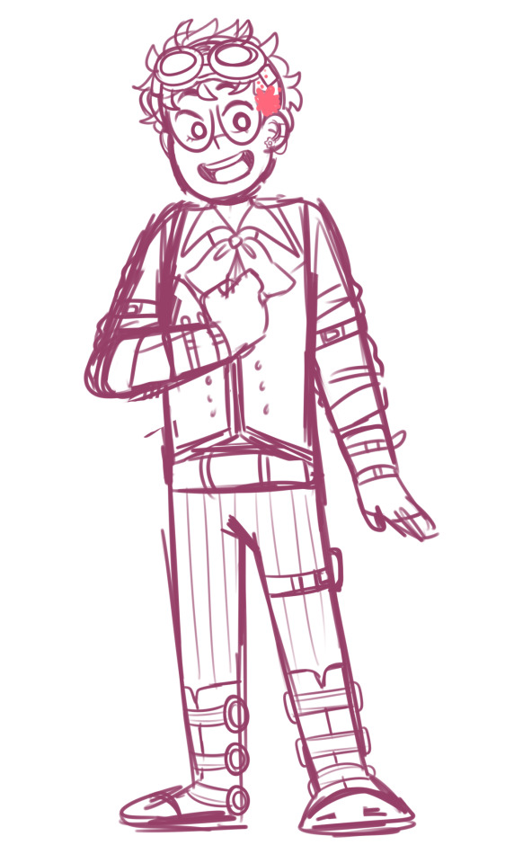
Concept sketch of Micah for my Peculiar Steampunk AU :’)


And some boys for some expression challenge requests I didn’t have time to finish

I’ve shown this one already, but yeah haha
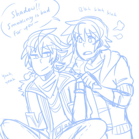

I’ve shown these before too! When I was making concept art for my human version of Shadow, and drawing an older Chris

This was after I finished watching 358/2 days ;w; I LVOE YOU AXEL

AKUROKU... <3
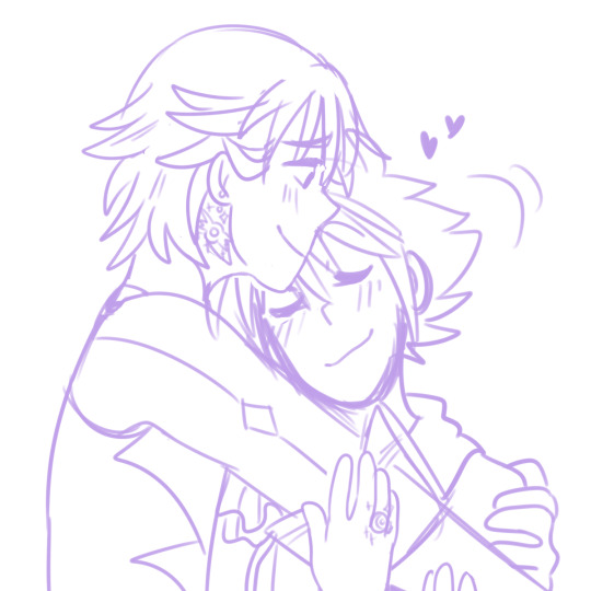
And Soriku for an OTP drawing prompt

MORE GAY KIDS!! From my Eclipse Kingdom AU!
I’ll get onto the miscellaneous stuff now!
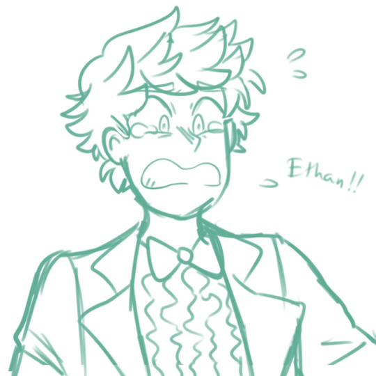
Benny for an expression challenge

I REALLY LOVE RAJI A LOT SO AFTER REWATCHING SHIRAYUKIHIME I DREW THIS

Screenshot redraw from one of my favorite Kamichama Karin episodes!
I’ll tackle the personal stuff now, let’s see~

I don’t even remember what this was for I think it was an announcement on my gaymers blog? But eh

Shima and Riku sketch!

AND HERE’S SOME FUTURE GENERATION KIDS!! CORA LOVES HER LITTLE TWIN BROS KOBY AND KYRAN A LOT
Okay!! Now onto Pokemon stuff

Future Days Gladion! I just wanted to sketch his outfit
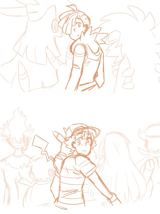
BOYS IN LOVE...I’m gonna finish this one real soon
And now I think?? It’s just PMD stuff from here on out, I did a LOT of sketches as I was doing my playthrough in the spring

This is the best Chimchar I have ever drawn. HANDS DOWN
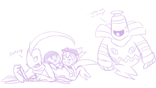

They meet their senpais...(my team from PMD Blue :’D)

THIS WAS GONNA BE TRANSPARENT SO YOU COULDN’T SEE DUSKNOIR UNLESS YOU CLICKED ON IT BUT YEAH A “what if Dusknoir actually DID manage to possess Grovyle’s body and return to the past” situation

THIS IS SO SILLY LOL but I was thinking of a concept where Piplup and Chimchar’s future selves come back to the past and Grovyle finds out he’s dating Empoleon in the future and Dusknoir lies on the ground wheezing for ten minutes after they find out njngsjfgn

GAAAAAAAAAAAAAY There’s nothing else to say about this
AND LASTLY!! VOLTRON STUFF

This is something I’m really excited to color, it’s from my Angelfall AU :3c

KATY’S BIG BROS LOVE HER SO MUCH. SHE’S THE BEST. THE BEST.
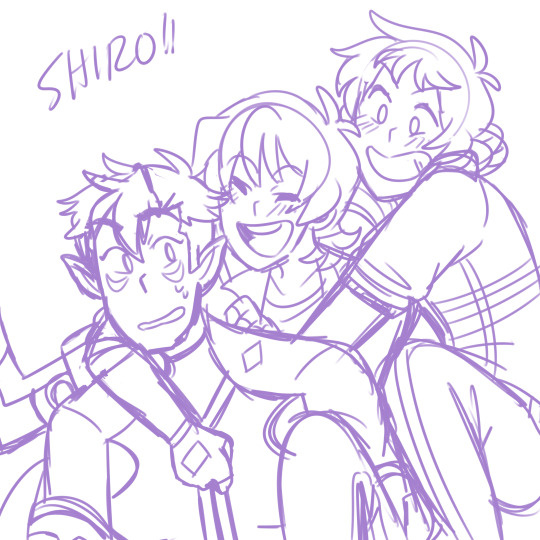
And Altean Shiro in my Sim AU too...!! Lance and Keith love all their teammates

And lastly! An unused panel for the Angelfall comic, but I figured I’d put it here anyway
PHEW!! That’s all haha there’s a lot of things I didn’t finish this year but there’s a lot of things I DID finish and I’m really proud of myself. Anyway I want to try finishing a lot of these over the next few months, let’s see if I can do it!!
#This is a lot to tag uhh. Let's see#Voltron#Pokemon#Kingdom Hearts#Be More Chill#Among the Stars#Sonic#Sonic X#MBAV#ATS#There I got the basic ones;;#Shima arts#Sketches#Look at all these scribbles I never finished#So many#Aaaaaaaa#But I'm going to finish a lot of them soon!! I'm excited#DO NOT REPOST ANY OF THESE UNDER ANY CIRCUMSTANCES#Long post#Really long post I'm sorry.#WIP#WIPs#Shima speaks#shima-draws
121 notes
·
View notes
Text
Creating A Repeat Pattern
Now that I have analysed some repeat pattern designs and know what sort of thing I need to achieve by the end of this task, I will be moving onto producing my own. I will be using illustrator to do this whole process which is good because I wont have to transfer objects from one program to another.
Before anything, I firstly had to decided on what font I was going to use along with what sort of objects I was going to draw as well. I knew I had to do around 3 to 5 objects otherwise the pattern could either look too boring or too complicated. I decided to start with an axe which I did previous mention in my last post. I think this object will be very simple as there isn't really many details to add to this object. This means I can then draw some more detailed objects later on. So I started by getting an image from google chrome. This didn't have to be a high quality picture as I was only tracing it which meant I only needed the general shape of the object.
Below is showing the general shape I traced from the image that I used. Although this screenshot wasn't actually how I left it. Once I tried adding the colours onto he design, it seemed very boring and looked quite messy too. I solved this problem by redrawing this axe completely, so that there was another section at the end of the object. This meant I could add in another colour to the piece. While doing this, I slightly changed the shape of certain places too. To draw this, I used the the ‘pen tool’ and just went around the image that I had placed behind. I had both of these things on a separate layer so that it made it easier for me.
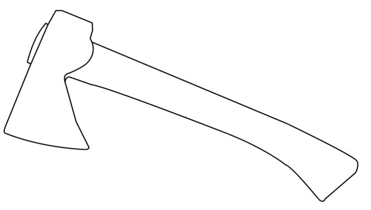
Here, is the final outcome I produced. I think this looks overall quite effective especially compared to when I coloured it before. To do this, I have gone to ‘object’, ‘expand’ and then selected the drawing and clicked on the ‘live paint bucket tool’. Doing this mean you can now choose any colour and click on the areas you want coloured. Although before this, I decided on having this brown stroke as I felt this would add to the outcome. I remembered in one of the repeat patterns in my research did this and I thought it was really effective. I then went ahead and coloured in the rest of the object. Before, this stage, I had actually already decided on what colours I was going to use throughout all my objects. The colours were light brown, dark brown and green. I felt that these reminded me of nature but also looked really striking together.

I have then moved onto my next object which I chose to be a jar of Nutella. The reason for this is because I feel that a lot of people know that this product contains palm oil. But even if the viewers didn't know this, when looking at this repeat pattern design they can then learn form looking at this. As well as this, I asked one of my peers as to what the first produce that had palm oil in came to mind was, to which she responded with Nutella. I think that overall this was a god decision to go with as I found it easy to trace but also as everyone should have at least heard of this product/brand.
Below is presenting what the result of this drawing looks like after tracing it. As you can see, I have added a highlight onto the corner as I thought this might improve the overall look. I decided on only adding in one of these as it could become too much otherwise. Another thing is that I also felt to only draw on the word ‘nutella’ and not the image that would normally be sitting beneath this. This is because it could overcomplicate things and once it has been placed onto a repeat pattern design, this wouldn't show at all.

This is the outcome after adding in colour to the piece. From looking at the jar whilst doing this, I thought to have the letter ‘n’ in green as this would then relate to the real jar. The reason for this is because this letter is a different colour on the real jar so to make this seem as realistic as possible I did the same but with my colour palette. Once I have finished doing this, I was actually very surprised with the end result as it looks so clean and effective. Again, I have added a thin stroke to which this time it is the dark brown colour instead. This now means that the lid and label of the jar standout from the background.

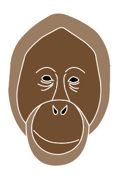
Here, is an orangutan that I have traced once again. This is the object that I did previous plan on drawing as i would say this is one of the most obvious objects that people associate with palm oil. Or at least the main animals that gets effected by this. As you can see from looking below, I have created the lines so that they are thicker this time. I did this because I had already planned on what colours I was going to use. But I also thought that as there are more details features in this drawing, that I would make sure they are all visible. This animal took me quite a lot of time to get right as I couldn't get the line and shape right at first. Although, I ended up manging to do it and I think it has achieved an appealing effect.

This is now showing how I chose to produce this object when adding in the colours. I thought that as this was the main element and the most detailed too, that I would make this a little more prominent when I get to adding it all together. So to do this, I thought to use white as the stroke this time rather than a colour from my palette. I though that this shade would make the lines I drew pop out a little more. Next, I decided to have the outside sections from the mouth areas and face as being the light brown with the centre parts being dark brown. I couldn't add the green colour into the piece as there was no space for it to go, but I feel that this doesn't matter. To finish this off, I chose to have the eye and nose area as being black.
After this, I decided on drawing one more object, but at first I want sure on what this was going to be. I thought of having an inside of a log where I could show the lines that go round. But just as I was about to try this idea, I thought that I could have palm fruit instead. This then relates a lot more closely with my theme but I have also used palm fruit in my collage design as I knew what they looked like. Once I got some images up on Pexels, I wasn't sure at first on whether to go for a single palm fruit or a bunch. I chose to go on Pexels as I knew from previous work that there are some good quality images I could use.
I then traced around one of the images where I decided to only include three of the palm fruits which were the three at the focal point of the image. When I started drawing these onto my page, I wasn't sure at first on how they were going to come as they didn't look like palm fruits to me. However, once I had added the colours onto the piece, I think this completely changed. As shown below, I have put the stroke as being the light brown colour with the main part of the object being dark born and details as green and light brown. Now looking back, I probably could have made the stroke a little thicker as it hardly shows.

Here, is then the font and colour at which I chose to add to my pattern. I did actually use this font in the previous work where I was adding text onto my symmetrical designs. But I thought to use it again as I was attracted by the idea that it was a serif font but had a bit of curve to it. Another thing is that I chose to ever so slightly change the position at which each letter sits at. So to do this, I went to ‘object’, ‘create outlines’ and with the ‘selection tool’ I can move each letter individually. I only repositioned a few of the letters but I just wanted the letters to all be close to one another. This should then work a lot better once put on the design as it wont mix with any other elements.
As you can see, I have also changed the colours so that the first word being ‘palm’ is in dark brown and the other is green. I thought this would give a little more interest to the words and match with the colour theme.

Here, is the first composition I put together, where I have duplicated a couple of the objects to fill some of the gaps. The page that I created for this was 200mm x 200mm. This is a perfect square which is what I wasted as the repeat pattern process will work better this way when it comes to changing the layout later on.
As well as this, I have added another element on the page too, which is another bit of typography. I chose to do this because I thought that having a more messgae based bit of type could help to give a point across as well as for the viewers to understand what this is about too.
I have also rotated the text so that it is no longer written horizontally. The reason for doing this is because it will make the overall pattern become less predictable.
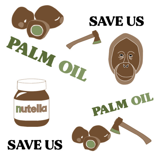
Although, this previous pattern didn't seem quite right as there was areas in which didn't look very effective. Beneath, is presenting where I have drawn a black rectangle behind the rest of the design. I chose to do this because it will help me to know what its going to look like later on when I start adding background colours to the piece. I can now see what areas will show the background and parts are filled. When I did this, I saw that there were two gaps in the palm fruit. I didn't like this so I covered it up with another shape presented behind.
Additionally, I think this new layout works a lot better. I have reflected one of the the axes so they have a complete different look. I have aloes thought carefully about the sizes in which I have each object. Further more, because there is a black background here, this meant I had to change around the black type so that its now white. To me, I feel this achieves a really striking effect as it looks very clean and pops out from the backdrop.
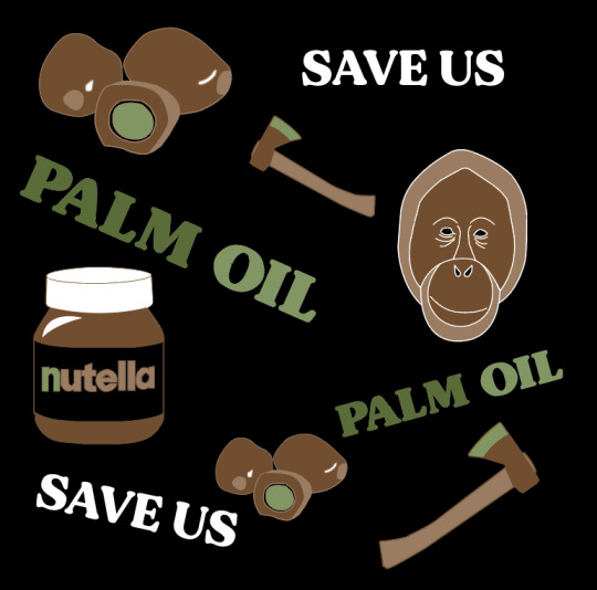
Lastly, this is the exact same composition as the previous screenshot but I have just taken away the black background. The reason for this is because this was only a test to see if it still works with a different colour. Also when it comes to actually turning this square into a pattern, I can’t add a backdrop at this point. This step comes later on.

Overall, I have now completed the hardest and longest part of this process to which I’m very pleased with the results. At the start, I remember I had no ideas on what objects would work well for this but it was actually a little easier than expected. Along with this, I really enjoyed creating this too. This might have been down to the objects that I chose as they were quite simple meaning they didn't take too much time. My next step will be to turn this into a repeat pattern where I can then play around with colours.
0 notes
Text
Evaluation
This was a really interesting project to work on, as it was a task to make a games concept but with a literature based starting point. I came up with the base concept for the game (Halloween Dating Sim) before we even started this project as it’s something I hadn’t really done before yet, and would give me a chance to explore a new aesthetic. I also really wanted to do a game like this as it would allow me to work on my background drawing skills - since they are a huge part of these types of game.
Since I already had a brief idea of what I wanted to do before I started, I chose to research all the books that had supernatural themes or creatures that weren’t regular humans - so that I could relate it to the monster idea I had. I chose these books to research: Woman in Black, Jekyll & Hyde, Frankenstein, Let The Right One In, and Do Androids Dream of Electric Sheep?
The main book that I chose to influence this project was Jekyll and Hyde, since I loved the mystery and secrecy aspect of the novel, as well as the main character - Jekyll - and his issues with split personality and the supernatural. This Victorian Gothic novel combined with my original idea to make the dating simulator meant that I now had a dual genre game. While the initial game appears to be a modern dating simulator set in a cursed town, it is actually a detective game which allows you to expose the darker side of the town’s residents. In that sense, the novel starting point has actually stayed very prominent in my project - there is a character who is based on Jekyll & Hyde who is the main villain, and the main character you play as (Bailey) almost takes on a similar role to Utterson, trying to solve the mystery.
For this project - Cauldron Hollow - I have created many different characters, some background artwork and a book cover, as well as some fake screenshots of how the game-play could look. When I went into the project I had planned to create more expressions and poses for each character and draw more backgrounds, but due to my limited time frame I am happy with the amount of work i’ve been able to produce.
The Characters
I wanted to design a range of date-able characters for this game so that I would have more examples of character design for my portfolio. My poor time management definitely affected the outcome of this work quite significantly - as it was at least a week into the project when I started making the characters. I gave myself some time to think about the designs but did very few concept sketches before jumping into the final artwork, as I was worried that I wouldn’t have any actual finished work to show if I didn’t do it quickly. I wanted to have a decent amount of characters to show a lot of variety in the designs, which led to me having hardly any time to focus on each one.
I did all the artwork over one weekend, which was a very poor idea - as I had no time to come up with several iterations for each. On top of this, drawing 9 characters in such a short amount of time left me severely burnt out by the end, and as a result some character artwork clearly has significantly less effort put into it. The character I made last, Robin, as a result was the one I liked the least - the colours didn’t really fit properly, the pose was a little rigid and the linework was messy. I think that this was partially due to the type of brush I was using, which I don’t think is suitable for the kind of clean line-work I was after - as a result I will change my brush for the next project to try and get a more appealing finish.
If I could redraw these characters, I would do a lot of things differently. I would dedicate more time to each one and really focus on the ‘quality vs quantity’ as my mindset for this project was ‘more work means better’. I would also spend more time creating multiple different looks for each character so I could then pick the best concept and refine it, rather than finalising the first result in my head. On top of this, I would like to spread out the character design across a wider period of time, so that I don’t overwork myself on one - or even just do less characters.
There are some things I did like about the character design - I did try and vary my poses more; each character does have a fairly unique pose (even if the anatomy isn’t great, which I’d like to focus more heavily on in the next project) which I haven’t really tried before, and I think that they definitely look better because of it even if it isn’t a massive change. I also really like the colour schemes of some of the designs, and the outfit design I did, as I think it matches the kind of aesthetic I was going for. One final thing i’m glad I did was to keep the characters consistent in terms of shading, highlights, art style and brush texture - they do all look like they’re part of a set rather than all being drawn in completely different ways. I think the fact that I used a consistent colour palette throughout the project definitely influenced this, as I found that most characters fit pretty nicely together.
The Backgrounds
I came into this project wanting to improve my backgrounds, since they’re a big part of dating sim games and aesthetics. I am actually really happy how they turned out since I’m not normally very confident with them. The first background I made was of a bedroom and window, which I coloured in the same way that I had done the characters. Thanks to the perspective drawing feature, all the features of the room look relatively accurate, which I’m really happy about. It was only the hand drawn features (such as the pumpkin clock) which look a little out of place- but to remedy this I think I just need more practice with perspective.
For the window background, if I could improve it I think I would have added more detail to the walls - as the painting and picture frames are empty. I would have also liked to make the space outside of the window a lot more detailed - but I was too tired after drawing the initial room to bother spending more time on it. To fix this, I could have left it and came back later to finish it off when I was inspired to do it.
I coloured the room with the same colour palette I had used for all the other work, which complimented the character well but also left me with a very limited range of tones that I could use. Overall, I think that trying to work entirely in a certain set of colours was a nice experience, but I don’t think it was really noticeable at all for the most part - I think I should either use 4-5 colours in a palette next time or non at all, but it was still an interesting experience.
I was planning on creating a range of backgrounds but I had not anticipated how much time I would spend on the next one. It took me over 7 hours to draw from start to finish, and while it was absolutely worth it, it didn’t really give me a lot of time to do anything else. This is also an issue which I think can be fixed with practice - as I was still pretty new to the idea. I do really love the Garden background and how it turned out, especially thanks to all the soft lighting and level of detail which I included. For these backgrounds, I actually looked at a variety of reference images while creating it, and it really paid off I think - so hopefully I will continue to do so in the future. While I’m really happy with the few backgrounds I did produce, it would have been nice to have the chance to do more.
The Book Cover & Designs
Having to design a book cover was a pretty challenging part of this project as it’s new to me, so I wasn’t really sure what to put on the front. I did a few different ideas and eventually settled on the one that would allow me to both draw a background and a detailed character. This particular scene involved me having to draw a foreshortened character, which I struggled with. I kept at it until it looked right to me, but in hindsight I could have just looked up a reference to help me. Like the other backgrounds, I looked up reference images for the building rooftops, and as a result I think they turned out really well.
The actual character artwork had some issues initially - her face was too wide, the eyes were slightly wrong for a reason I couldn’t pinpoint, and the whole thing looked a bit flat. I ended up having to change the colour palette at this point just to help the character stand out from the background. I’m glad that I went back and fixed all the issues before finishing the work, as i’m a lot happier now with how it’s turned out, although the face still bothers me a bit. I think if I could do this again i’d love to attempt an actual painting, rather than just soft shading and adding overlay layers, as it’s something I haven’t done in a while. I’m happy with how the character is posed as well as I think it actually looks different from my usual static poses. On top of this, I’m really glad that I went for a handwritten title as it gives it more of a fun feel. I do however think that it doesn’t really show the dating simulator aspect of the game- but I would have liked to create an alternate cover that is a lot happier and more pastel if I had more time, to show the dual genres present in the game.
0 notes
Photo


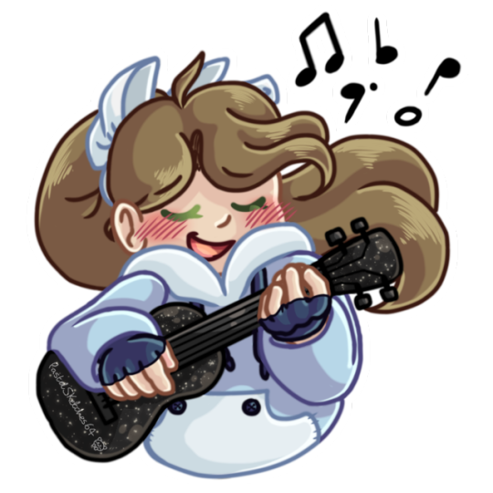
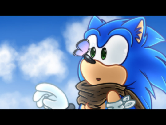
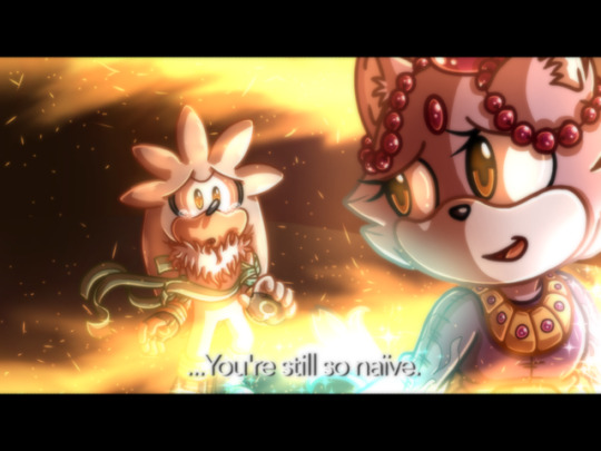


Welcome to Sketches of the Month: June!
Well, this was definitely an interesting month; for more reasons than just my art, but I won’t get onto that stuff here. We’re all here to see the art hopefully! And indeed, I was the productive plush this month; and I would like to say that I’m quite enjoying the direction my art is going, if y'all don’t mind me speaking my mind. I’ve been experimenting with many different factors of my art; such as characterisation, emotion, expression and colour. And I feel like I’ve at least succeeded in some regard to these intentions!
But enough with the introductions now; let’s get on to the pictures themselves, shall we?~
——————————————————————-
Picture 1: Two Player Game!
Yes, the Boyf is back! This was drawn right at the beginning of June, and I’ll admit my obsession with BMC has been toned down considerably to a light admiration; so I don’t have as much artwork pertaining to it. But I still really liked this sketch of them as the Mario Bros, even if I never finished it like I wanted to XD
——————————————————————-
Picture 2: We found one!
Hey, remember back to last month’s SotM (Sketches of the Month) with that pic of me and Silver with the chaos emerald? Yep, I finished it off here, and my god did it turn out amazing! I mean, I feel it turned out amazing. This picture reached a level of detail, colour and atmosphere that I hadn’t reached before then, and it was definitely a pivotal moment for me this month! I swear, I’m not even quite sure how I drew this XD
——————————————————————-
Picture 3: Moment of Music
This was also a sketch that was on last month’s SotM; and while it’s still a simple concept, I still feel like I excelled at experimenting with a softer and, dare I say, pastel colour scheme XD I’ve really noticed how much I love colours and how my brain seems to respond to them; especially when it comes to remembering things! I do indeed have that ukulele as well, sparkles and all XD
——————————————————————-
Picture 4 & 5: I really like 06…
Ok, now that I’ve said that publicly, these are some screenshot redraws that I did after I saw some other artists try their hand at the idea. I immediately went to 06, as I knew my intense focus on character and emotion would be a pretty appropriate combination; as 06’s character models were definitely not the best at conveying any emotion at all if we’re being honest here XD
——————————————————————-
Picture 6: Give them a chance to be happy…
Finished on the 23rd of June; this was basically my 26th anniversary picture for the franchise and the 16th anniversary for Sonic Adventure 2! I started the picture a day after my birthday, which was on the 20th of June, and was mainly attempting to experiment with the new markers that I got.
I was intrigued when I got the main idea for the piece sketched out, as I came to outline the picture with this shape that I’m not sure has a name??? XD Either way, I hoped I was able to convey Shadow’s story well through the picture, for his story was and still is some of the franchise’s best writing; and I can only hope for the best, story and all, in Sonic Forces!
——————————————————————-
Picture 7: *Gasp* I HAVE OCS??!!!
Yes, I am just as surprised my dear followers, but I have somehow miraculously created my own original characters! It’s a stunning feat, I know, but how’s about I stop this degrading talk about myself and actually explain these characters to y'all?
Well, Adabelle is quite the musical geek, and does aspire to join musical theatre professionally despite her fear of performing on stage. She is a quiet girl who stays to herself a lot, and while smart academically, she is usually awkward and nervous socially. She also has a slight fear of water, mainly only shown when near a large body of water or when out in the rain.
Now Layla can be considered similar to Adabelle with her limited social interactions, but she differs as she is more then willing to engage in conversation if someone else provokes it first. She tends to get competitive while playing practically any video game, even when there is seemingly nothing to challenge. Because of an event that she doesn’t speak of, she moved school and eventually became close friends with Adabelle; who she eventually confided in with her secret.
——————————————————————-
Picture 8: Chao are utterly adorable!
I believe this was also another sketch from last month, but I can’t recall at the moment. I’m still planning on doing a full background for it, but since the end of the month was coming up, I hastily made a background so I could make the picture transparent. This was another experiment with colouring, and I even drew myself wearing different clothes! *GASP* It's a miracle! I don’t smell anymore! XD JK, but yeah, I came up with a ‘Sonic’ design I guess you could call it; and I will probably do a ref sheet for it soon!
——————————————————————-
Well, I hope you enjoyed reading this everyone! I know I always write a lot here, but I truly appreciate it if you actually read through it all somehow XD I just always have a lot that I can say about my art, and I want everyone to know about it if they’re going to see my art already. I’m always up for questions in my ask box, or even if you just want to talk about something, I’m up for it!
#pastelsketches64#sketchies#sketches of the month#june#2017#sonic the hedgehog#be more chill#pastel/jennifer#ocs#sonic 06#sonic adventure 2#sonic adventure battle 2#shadow the hedgehog#maria robotnik#amy rose#silver the hedgehog#blaze the cat#chao#adabelle#layla#jeremy heere#michael mell#rouge the bat
8 notes
·
View notes
Text
KNOWING YOUR PARTNER WELL CAN POTENTIALLY MAKE WRITING TOGETHER A LOT EASIER.
BASICS
NAME: I go by Star or Starfire online.
PRONOUNS: She/Her
SEXUALITY: No comment
TAKEN OR SINGLE: Single and not looking
THREE FACTS:
I have an old phone I loved back then, it’s round and when opened has the screen, buttons and mirrors inside, I dream of one day turning it into a communicator that works as a phone! No smartphone, but still! I once started working on that dream with the help of a friend, but that ended in the early parts of the process and right now it’s only covered with... not really yellow, but yellow-transparent-ish mass of color and a few areas aren’t colored like the hinge or the cover for the sim-card slot. (Here’s an image of the phone before working on it for those curious)
I intend to start working on getting better at drawing again, by probably redrawing characters from screenshots I took from TT while iconing.
I’m currently sort-of working on a TT-Music Video (AMV-like), but I’m having problems to get the last minute together as good as I’d wish for it to be.
2. EXPERIENCE
HOW LONG (MONTHS / YEARS?): About 9 and a half months it should be!
PLATFORMS YOU’VE USED: A few guestbook and forum pages, but in a real community only tumblr.
BEST EXPERIENCE: Making a blog here and finding so many wonderful people that interact with me!
3. MUSE PREFERENCES
FEMALE OR MALE: I seem to tend to pick mostly females for myself. As for what I prefer in others, I don’t think I have any preference.
MULTI OR SINGLE: I prefer to have a single blog for each muse I have. I feel it gets a bit too confusing if I have more than one. For others, I can work with multi-muse but it might happen that I only follow once we interacted or I saw quite a few interactions I liked on my dash already.
4. WRITING PREFERENCES
FLUFF, ANGST OR SMUT: No smut, otherwise both I think!
PLOTS OR MEMES: I can work with both I think!
LONG OR SHORT REPLIES: I tend to go longer than I plan to, so longer!
ARE YOU LIKE YOUR MUSE(S): In a way, yes. I very much sympathize with her not understanding all of earthen culture, that sounds stupid because I know I’m part of earth and all, but there are still so many things that I simply can’t understand the reason behind, so yeah. Other than that, we’re probably rather different. My skin is incredibly light whereas hers is orange-ish, she’s so very outgoing and I’m even shying away from liking something. I won’t continue the comparison further, I do think that mostly we are rather different but I still can highly relate to her.
Tagged by: @beastoraboy
Tagging: None, I think I’ve done this before so I also probably tagged ones already! Feel tagged if you want to do it though!
1 note
·
View note