#I thought this was pretty cool
Explore tagged Tumblr posts
Text
So I watched De Palma's Femme Fatale (2002) tonight, and there's this one scene. In short, the MC (blonde woman called Laure Ash/Lily Watts) gets thrown off a bridge into a river while unconscious, and this shot occurs;

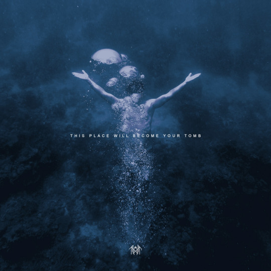
Like, does that or does that not look like the TPWBYT cover?? The hands are in the same position, the bubbles hide the face, and the legs in an earlier shot, and the MC is drowning. That place will become her tomb, in story context, if she doesn't swim up. Of course, the colour grading is very different, but my point still stands!
Clip for anybody who wants it (warning for nudity).
#I thought this was pretty cool#if I'm no one else sees this let me know but it looks *so* similar to me#of course the colour grading and the background is completely different but the muse is definitely still there#admittedly I'd been half asleep for most of the film which I'm finishing tomorrow because I'm 90%sure I'll blackout before I get to the end#so maybe there's something to analyse there#its a bit of a wacky film (although that might just be me being tired) so if anybody else has watched it fully awake and sees a connection#-> do tell!#maybe Vessel's a Femme Fatale fan#who knows#sleep token#vessel#st#this place will become your tomb#femme fatale#just saw the spelling mistake in the upper tags#ignore the *I'm in the second tag please and thank you
31 notes
·
View notes
Text
SHOWING OFF MY FANDOM SHRINE DRESSER TABLE TYPE SITUATION TYPE DEAL.

#Hannibal#Hannibal NBC#Star Wars#HUGH DANCY THE MAN YOU ARE#I thought this was pretty cool#thanks for reading the tags#obi wan kenobi#fandom shelf#fandom desk#?#I don’t know
3 notes
·
View notes
Text
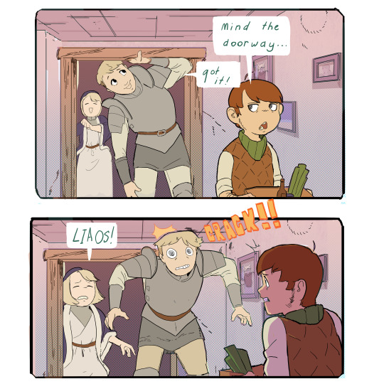
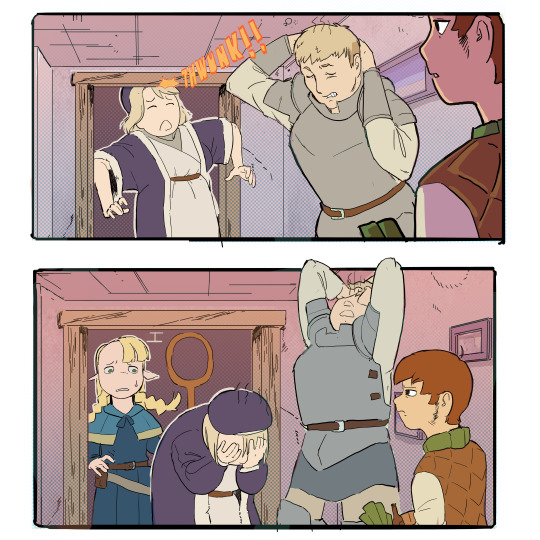
I understand that tall men are our POV characters, but surely being like a foot taller than everyone around them would have some occasional consequences
#youd think thisd happen at least a little bit#I love stuff in fantasy where they'll occasionally talk about how weird humans are. it comes up a few times in the story but honestly I do#love it a lot. especially that troll stuff I thought that was pretty cool#laios touden#falin touden#marcille donato#dungeon meshi#delicious in dungeon#chilchuck tims#arts#GODAMN IT I SPELT HIS NAME WRONG I KNEW I SHOULD HAVNT HAVE RUSHED THE DIALOUGE
93K notes
·
View notes
Text


the hex girls!!! it’s spooky season 💚❤️💜
#i thought they were so cool when i was a kid#(and pretty)#woke up this morning with the urge to draw them so tada#the hex girls#hex girls#hex girls scooby doo#scooby doo#my art#can’t decide if i like cropped or uncropped better so u get both
8K notes
·
View notes
Text

Do you guys fuck with the FNAF books?…
#myart#chloesimagination#comic#fnaf#five nights at freddy's#eleanor fnaf#fetch fnaf#mimic fnaf#fnaf vanny#fnaf vanessa#fazbear frights#fnaf gregory#andrew fnaf#twisted ones#tiger rock#security breach#fnaf fanart#fnaf anniversary#FNAF WEEK still going strong#today the FNAF book ‘VIP’ drops!#SO I wanted to make a lil tribute to the books!!#I tried to fit as many stories as I could into this one panel#IM ACTUALLY pretty happy with how it turned out#Vanessa shouldn’t be scared they seem chill 🙏🏾#idk if this is a hot take but I always thought the books were fun#especially the characters they are so cool#I gotta know which FNAF stories are your favourite
7K notes
·
View notes
Text


so like imagine Undertale characters but they're all crafts supplies Part Triple (Sans and Papyrus) (Undyne and Alphys) (Frisk and Flowey) (Napstablook and Mettaton)
#im REALLY HAPPY about how toriel turned out... honestly one of my best AU designs#some of them are hard to implement ^^;;;#I don't see a lot of people drawing the Dreemurrs with goat markings so I thought it would be interesting if I did it for my AU...#I think it turned out pretty cool !!!#prays at my bedside PLEAASSEEEE someone notice the fucked up symbolism#undertale arts & crafts#undertale arts and crafts#craftstale#Toriel is a fountain pen and Asgore is correction fluid+tape/white out :]#undertale#toriel undertale#toriel#toriel dreemurr#asgore#asgore undertale#asgore dreemurr#fountain pen toriel#correction fluid asgore#white out asgore#undertale au#utmv#cheese draws
2K notes
·
View notes
Text


I love SO MUCH @kianamaiartmaiart "i don't want to be a magical girl" concept and characters and i needed to draw them with my own magical girls ! >w<
#fanart#i don't want to be a magical girl#I saw some people draw theirs characters together like that so i thought it would be fun to try too :D#if you see this I'M A BIG FAN I LOVE ALL YOUR PRETTY ART !!! YOU'RE SO COOL AAAAAAAAAAAAAAAA#sorry for that#magical girl#magical girl oc
1K notes
·
View notes
Text
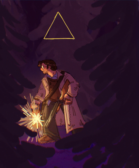
the feeling of being watched or followed
#REALLY GOOD MENTAL IMAGE FROM TBOB. smiles#gravity falls#ford pines#the book of bill#book of bill spoilers#book of bill#id in alt text#I THOUGHT. the book was pretty good. Really cool read overall.#The um. Some of the fandom reactions to stuff in it is what's making me 😟☹️#ANYWAY . This is from an aggie it's like whatever#if u tag this w anything close 2 b/llford you're on thin fucking ice gtfo
1K notes
·
View notes
Text
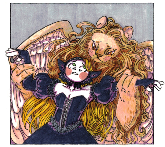
Danse Macabre
[Commission]
#dungeon meshi#dungeon meshi spoilers#marcille donato#winged lion#better drawn mdzs#<- art tag I really need to change.#Turns out the secret to drawing better was having someone offer you money to draw.#I jest. I just had a blast with this prompt and I seriously appreciate the commissioner for letting me have the chance to push myself.#And for giving me permission to post! Hi! If you're seeing this: thank you again!#Let me be clear: no I don't quite know where this came from. It just happened. My chakras unblocked for a few hours.#You too can unblock my chakras with money and commission me to draw cool art B*)#We are so far off from when this is relevant so this one is really just for the manga readers. *****Spoiler notes ahead:#So...As someone who read dungeon meshi monthly for many years....I admit to not seeing Marcille becoming the dungeon lord coming#Hilarious too; re-reading and watching the show made me realize that this outcome is pretty strongly foreshadowed.#Ryoko Kui distracts you by putting the focus on Laios being the 'one to break the curse' but nope!#This was the culmination of her goals and desires.#And - for those who did not have to suffer as us monthly readers did:#YES. WE NEARLY ALL THOUGHT THAT MARCILLE HAD TO DIE.#The last 20 or so chapters were a constant spiral of: 'Oh this story isn't going to have a happy ending is it?'#She just keeps losing herself! The winged lion plays her like a puppet and she is his perfect doll! So full of conviction!
897 notes
·
View notes
Text

Huntress’s Moon 🌕
#did you know one of the many names of October’s moon is the Hunter’s Moon#I wanted to do this last month but didn’t have time until now#anyhow I thought it would be cool this year to do a Huntress version and I was also inspired by seeing a deeply golden yellow moon twice#in that month#it was lovely#last year my Hunter’s Moon themed art was with Hunter (haha) from TOH#my art#adventure time#huntress wizard#adventure time fanart#AT#also I really wanted to use fall colors in this piece and I’m pretty happy with it
2K notes
·
View notes
Text
Ngl it’s hella weird that so many ppl are being extremely sex negative/anti BDSM(not sure if it’s even actual BDSM but idk)about the new banner and even going as far as to compare it to sexual assault…
You can dislike something without shaming/making fun of ppl who’re excited about it along without contributing to purity culture, misogyny/internalized misogyny, and cringe culture.
Since Day 1 Love and Deepspace has always been for women and or afabs to explore their sexualities in a world where women/afabs seeking out anything sexual(or even romantic)whether it be in fiction or irl is seen as taboo, dirty/filthy/unclean, and or shameful. Especially within parts of Asia.
Men are allowed to get straight up hentai tattoos and no one says anything but whenever women/afabs have crushes on/simp for/selfship with fictional characters and or consumes nsfw content of them then we’ve “gone too far” or, “are so delusional/cringe” and get told that we’re mentally ill as an insult and that we should “go to therapy/get help” because of our “parasocial relationships with fictional characters”(and over a period tracking feature within the game out of all things..)
It’s important now more than ever to have more media like this to be created as to lessen the stigma around female sexuality. ESPECIALLY with everything that’s going on in the US right now. Shaming women and or shaming other female/afab fans for enjoying this stuff only contributes more to the problem. You’re not inherently better than anyone for not being into the type of things others may like.
“Infold is mischacterizing-”
First of all idk where yall got that from they seem the same to me, just with more different personality traits/changes added. Plus that’s the point of an Alternate Universe/Reality. AUs are different than the universes we know. Also THEY MADE AND OWN THE CHARACTERS.
There’s a difference between something just not being your thing and contributing to misogyny towards women/afabs in fandom spaces. Just because you’re not into/don’t like something doesn’t mean it’s “not normal” for others to celebrate Valentine’s Day like this. I swear women/afabs can’t do anything without you mouthbreathers demonizing us and saying that we’re inherently predatory/unsafe to be around for thirsting over/selfshipping with fictional characters.
#also idk why ppl are being weird about Sylus’ tongue thing#I liked it and thought it was pretty cool#I’m not talking about the ppl making lighthearted jokes#I’m talking about the ppl who’re genuinely upset about it and having over the top disgusted reactions to it#vent#rant#love and deepspace#love & deepspace#love and deepspace sylus#lads#lads sylus#lads zayne#lads mc#lads xavier#lads caleb#lads rafayel#love and deepspace xavier#xavier love and deepspace#rafayel love and deepspace#love and deepspace rafayel#love and deepspace caleb#caleb love and deepspace#zayne love and deepspace#love and deepspace zayne#love and deepspace x reader#lads x reader#selfshipping community#yumejoshi#yumeshipper#selfshipper
338 notes
·
View notes
Text
It's funny that cuckoldry has such a weird reputation, because it's ultimately a very tame fetish.
#text post#shark thoughts#maybe I'm too poly to get why people don't like it. but if the thought of your partner getting fucked gets you off... cool? great?#even if there's a bit of humiliation thrown in there that's also pretty basic so like. i dunno.
225 notes
·
View notes
Text
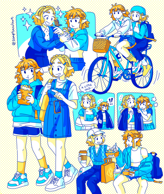
Zelda & Link 🫶
#the legend of zelda#loz#tears of the kingdom#totk#zelink#i drew something#been a minute since i had something to post erm oopsie!#i'm done with my postgrad now :) i'm starting a new job in just over a week tho so i'll be busy again soon#anyone heard of this niche little game called tears of the kingdom i thought it was pretty cool. check it out sometime#is it really possible for a burger king boy and a pret girl to be in a relationship#just kidding. link is a girl too of course#sorry for the british exclusive joke i don't know a more international equivalent of pret
2K notes
·
View notes
Text

#wof#wingsoffire#wof art#mudwing#moccasin wof#blood red egg#my art#art#eyestrain#so i thought the discovery of blood red eggs was pretty cool#dragon#dragon art
441 notes
·
View notes
Text
This is a really specific post but i just wanna talk about how much i like a specific design detail of ichi's witch outfit: the fur pelt

Obvi the fur pelt is there cuz ichi is fucking crazy and loves hunting (it was present on his metaphorical normal uniform too) but i love its function in the silhouette. Usually magical girls have a big dress or big hair giving them a powerful vibe. Not ALL magical girls obvi but more contemporary ones

Heres the cast of wonderful precure for an example. Big hair big dress big personality. But usually magical boys lose that and are kinda stuck being the sleak variety cuz they have no big hair and no big dress
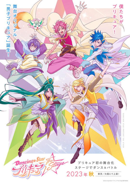
Heres pretty cure dancing stars (the anime poster for consistency) theres an effort to make their silhouette bigger with capes but its still typicially smaller than magical girls

Also heres tokyo mew mew au lait even tho the tokyo mew mew magical girl outfits were always in the sleeker variety more of a sailor moon than a smile precure.
Theres nothing bad with that but i think its good for magical boys to have options rather than only being 1 style of typical magical girl which usually makes them their outfits feel all samey cuz the silhouettes have the same basic shape.
Okay back to ichi
This is why the fur pelt is so cool cuz it bridges that design gap while also seemlessly conforming to who he is a character


I can see here its not stationary either. It moves as tho hair would were it magical girl hair.
i think its just a really neat design choice i wanted to highlight
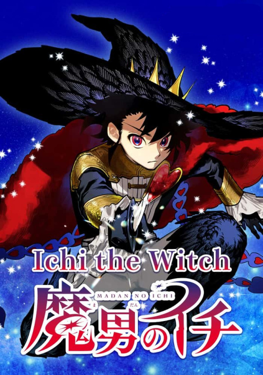
Also i love that its red i feel like we never get red and black magical girls or boys and it really shows off his bloodlust
#Can you tell i really like magical girls#I only included 1 girl example cuz ppl are more likely to have seen a magical girl show than a magical boy show#Cure wonderful and ichi have almost the same upper sillohuete and i think thats really funny#Ive been followinv ichi the witch this whole time but i actually caught up yesterday#Sooo good go read it#ichi the witch#Pretty cure#wonderful precure#dancing star precure#Tokyo mew mew au lait#I used the anime poster for dancing stars cuz i thought it showed off the designs better without the limits of craft being there#Like their conceptual outfits rather than the literal ones present on stage#I love ichis witch outfit so much its so cool
161 notes
·
View notes
Text
so. the wato video, huh...
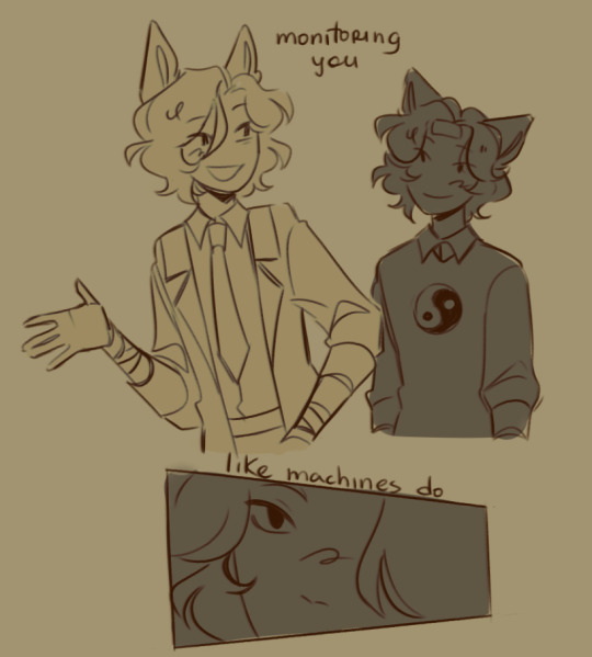
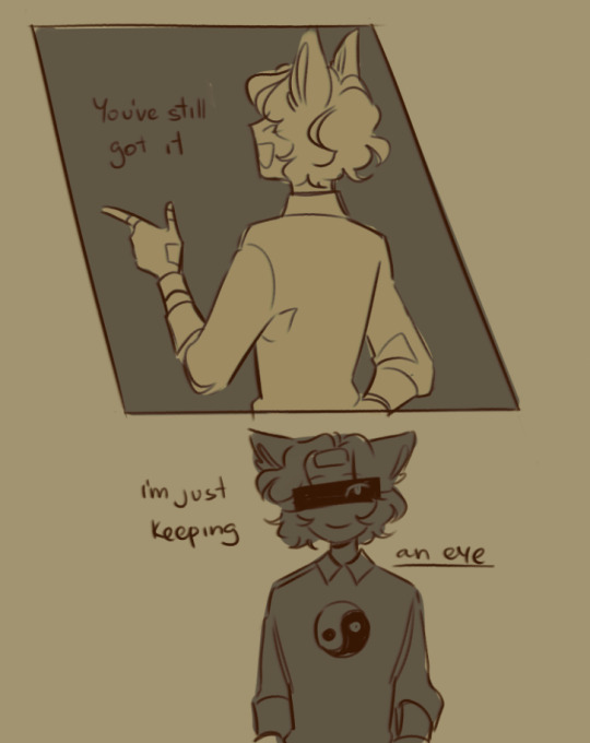
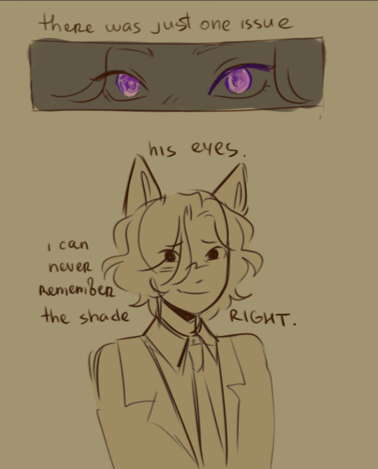
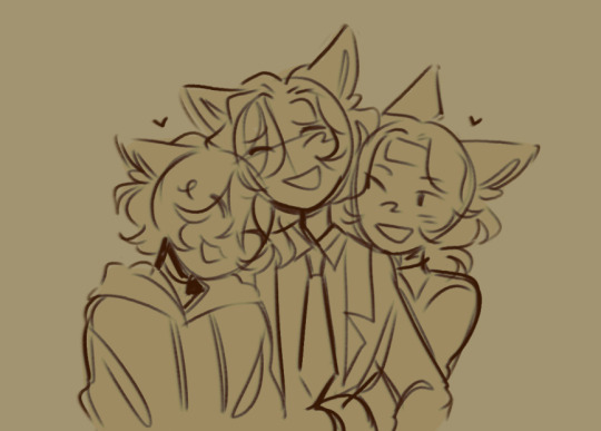
as you can see, i'm very hung up on watfies right now...
#☆ my art .#i need to get those out before i go insane#will definitely draw more kww now#(especially watfies OHMYGOD there's so many brainworms rn)#wato1876#kenadian#wifies#kww collab#wwa.....watfie..s.....#im normal about them#(/lying)#the wato not remembering the right shade of purple in wifies's eyes thing was just something that like#randomly popped up in my head#and i thought it was pretty cool so i wanted to draw something with it#don't feel like rendering rn so just sketches ^_^#headlock fits so well guys trust me#also a little doodle of them hugging and being happy (sobbing on the floor still)
181 notes
·
View notes