#I think this is the first art I post with actually neat lineart
Explore tagged Tumblr posts
Visit Tumblr Blog
Explore Tumblr blogs with no restrictions, modern design and the best experience.
Last Seen Tumblr Blogs


Fun Fact
The average Tumblr user visits about 67 pages every month.
Text

Hana Obore inspired art I finally finished hshdhdhshf
my hand hurts 💔
#project sekai#pjsk#an shiraishi#shiraishi an#anhane#prsk#azusawa kohane#kohane azusawa#my art#this took 22 hours according to the built in Timelapse feature procreate has#Tumblr might decrease the quality but idk#Idek if I like it anymore. but. my hand hurt. so I’m posting it before ocd can be mean to me about it.#art#artwork#digital art#Also I’ll probably be drawing them slightly different in the future just cause I’m still trying to figure out how I wanna draw them#I think this is the first art I post with actually neat lineart#anyways. Hoping for individual Anhane Hana Obore alts#although. Idk how likely that actually is.#no image id
38 notes
·
View notes
Text


have I spent several nights designing RayK/Fraser book covers to vent my obsession with them YES
are they full of imperfections YEESS
do I need to post them to finally stop going over them OH YEAH and I just want to share them because they make me happy.
the color choices are based solely on the materials I have on hand since I am going to attempt to bind them all eventually to have them on my shelves (personal use only, no profit)
you might notice the distinct theme of purely @cesperanza fics because I am obsessed with their writing. I think I've read almost all their due south works by now. Go and read or reread their work and show some love. I am so late to this fandom but it is so alive and the content analysis is on another level.
(1) Eight Sessions using lineart by awesome schadenfreude523 on deviantart
(2) being a big fan of the fanart above this is my first ever attempt at lineart of my own (digital art is something I have never done before if we don't count MyPaint, and it is midblowingly overwhelming. I tried tracing a reference promo photograph. I think I am proud of how Diefenbaker came out but geez Ray is so hard to put into lines!)
(3) just Canva shenanigans but the fic link
(4) the design is heavily inspired by vaulteditions' vintage anatomy book designs. They are just so neat and satisfying. I found the picture of sled dogs on pinterest and can't find the original author so if you recognize it let me know.
(5) This one uses promo picture I subjected to heavy Canva abuse. I have actually finished binding it yesterday. Enduring Distance by speranza. It is my absolute fave, a fandom staple, if you haven't read it, it is sooooo goood. The binding was a pain, the galaxy brain when I finally figured out how to make it work with my joycricut, bookcloth and iron-on... unbelievable. Bookbinding is still something I am trying to get a hang of and it is testing my patience big time (I barely have any to begin with btw). The spine is misalinged, the page margins uneven but otherwise I am pretty happy about it.


So that's it. My first ever due south fandom post (sending love to everyone that keeps the fandom alive, I love each and every one of you even though from a distance thus far) and first fanbinding post *big breath aaaaand post*
129 notes
·
View notes
Text
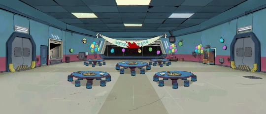
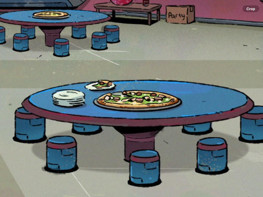
raaaaaaaagh teaser image for the among us animated tv series dropped and I just have to scream about it and analyze it a little bit
(Source)
My ramblings under the cut:
I like the art style! It’s a bit different, I was expecting something closer to the game style/style of images they post on social media and stuff where it’s very clean with sharp lines, but I think this works really well for what it seems like they’re trying to do here. I like the lineart and the kind of texture everything has? It adds a lot to some of the other stuff I’m going to talk about here.
First of all, the atmosphere. Again, really kinda different from what I was expecting, but in a nice way! I was expecting kinda like a clean, cool-toned, space-age look, but this gives me a lot more like run-down office vibes and I am HERE FOR IT.
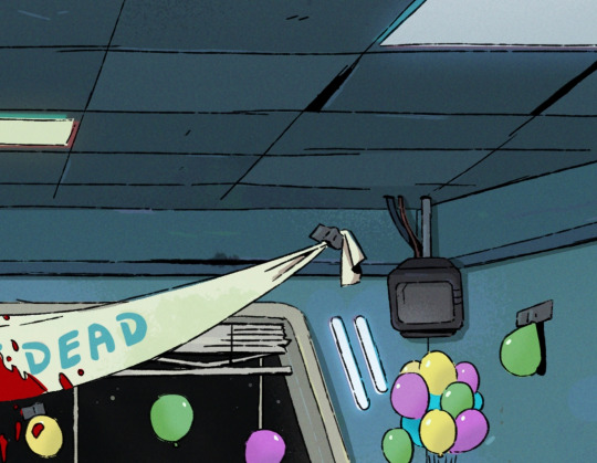

The warped ceiling tiles? The dirt and grime? The bent blinds over the window? The burnt out light by the window and different colored fluorescent lights like one of the bulbs was replaced? It feels like I’m in some old corporate building that hasn’t been properly maintained in years, which is so different and so fun from what you normally see in a spaceship and totally matches the vibes of (at least what I headcanon to be) a sketchy space corporation.
I also love all the little details here.
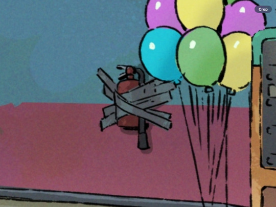
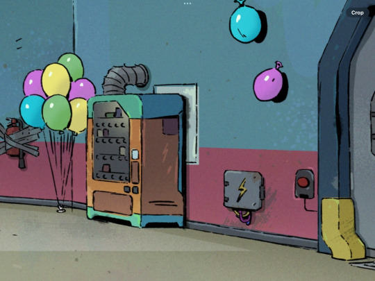
The little food window and vending machine so the cafeteria is actually a cafeteria, the pizza with who knows what kind of toppings on it (why is it green?? I’m so curious), and the fact that everything is held up with duct tape- even the fire extinguisher? It’s so fun I love all of it.

This is also actually a really faithful adaption of the map. Like, I know, of course it is, but I know things have to get changed a lot for animation sometimes and they did a good job of keeping it very similar.
I am going to be that guy and point out a few differences but just because I think they’re neat and interesting!! Not at all bad!
(At least between this and the classic game, I’ve never played Among Us VR)
First of all, the trash task and wires task actually swapped sides, on the map, the wires are on the left and the trash is on the right, but here it’s flipped. I also can’t find the download data task, unless it’s supposed to be the tv? Probably all just aesthetic choices but kinda interesting!
There’s also the big food window and the door, but if you look at the orientation of the walls of the room, it actually checks out! The door and window would be against the left wall, where you wouldn’t actually see it looking from the angle in game.
The vending machine isn’t there in the game, at least on the Skeld map, but that’s ok the beans deserve their snacks! I did notice there’s kinda a panel behind it so I’m counting that as the panel that’s on the right wall next to the download task being there (even though it’s definitely too small to be that). That and the wires are actually on the slanted wall, but again, I don’t care, this is just me pointing out every difference like an I-spy challenge.
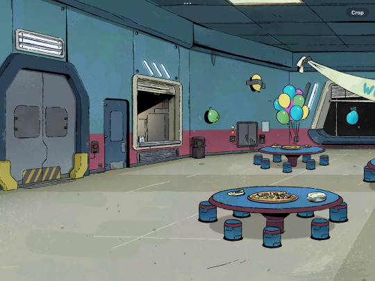
Also the cafeteria tables have stools now instead of benches, and I kinda like that! I also like the stripe of kinda a maroon-ish color added to the tables and stools, really kinda ties together well with the walls and such. And the floor, thank goodness they did something about that floor for the animators’ sake. I like the original floor design but I know firsthand just how hard that floor is to draw, especially at an angle.
I don’t know how to really speculate on the party stuff other than I’m intrigued haha. Maybe it’s like they’re celebrating taking off and surviving or being the only crew with no impostor attacks or something (of course that’s implying a lot about the non-existent lore) and then everything goes wrong? Maybe the red is pizza sauce or ketchup and we’re being misled for the funnies?
I’m kinda hopeful about the humor here, with the “we’re not dead” banner and stuff, I’m really hoping this will be something I’ll enjoy too as an adult and the vibes I’m getting from this are encouraging. Like maybe a kinda workplace dark comedy?
I’m also sososososo curious about what we’ll get in terms of characters (I WANNA SEE THE BEANS SHOW ME THE BEANS) and worldbuilding and lore here, eeeeeeeeeeeeee
Ok, I’ll stop for now, but you know I’ll be following this very closely lol.
tldr: not entirely what I was expecting but I like it and the direction it’s going a lot :))))))
Edit 2/3/24- just noticed there’s no emergency meeting button??? Is it under the pizza?? Has it not been installed yet?? WHERE IS IT 👁️👄👁️
47 notes
·
View notes
Text
*sigh* I don’t know. I don’t even really know why I’m posting this in the first place, I don’t really like it
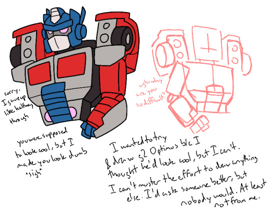
I’d say what it is, but you can read what’s on the tin. I thought it’d be cool if I drew that g2 Optimus design, because I think it’s cool looking and Optimus might look good in black and red, and with pink eyes
This was my reference by the way
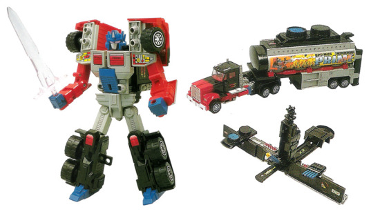
But no, I couldn’t figure out how to make him look right. I thought maybe I could try sketching him in another style, but no, that didn’t work either. But I finished the sketch and thought it looked halfway decent, but when I went to do lineart I realized it wasn’t. But halfway through lineart I just gave up and slapped it together, slapped some colors on him, wrote some stuff on the page, I guess to fill up the black spaces I know I wasn’t gonna fill with actual drawing, and now we’re here
It’s the fucking arms I tell you. I still don’t know how they’re supposed to work, and I don’t know how to pose them either. So they look like shit. But I can’t just not have them, so they have to be there
And I don’t really know what’s happening on the shoulders either, particularly the wheels. I know I made them too small but I don’t know how to make them look how they do on the toy either
I considered trying a more stylized art style since the 3D was fucking with me, but my brain couldn’t figure out how to do that either, so I’m stuck doing the same thing over and over again, drawing in circles and wondering why I’m not getting anywhere, while simultaneously being unable to figure out what I’m doing wrong
So now we’re here. It looks bad. The shoulder pentagons are too small. The face is too tall. The colors on the face are all wrong. The arm is all off anatomy wise. I forgot to color in the black on the back despite going in and adding lines for them. The grill’s off. The chest doors don’t look like doors the open up, they look stuck to the rest of him. He barely looks 3D because I’m bad at doing this
But I got far enough, and I knew that even I start over on a new canvas, I wouldn’t want to delete it by this point, so I might as well finish it instead of having it taunt me every time I see it. So here we are, as I’ve said multiple times
I really wish I was better at drawing Transformers. I should be at this rate, it’s been a couple months. But no, I don’t know how to improve and I keep staying with the same mediocre art, because I don’t seem to like trying. I do try, but it’s not improvement, it’s just me making the same mistakes over and over again. Like with arms and the joints
Why can’t I get better? Am I just not trying? I don’t know how to try better
I have thoughts I want to share with people because I think they’re neat, and I know any thoughts I do have will only gain traction and be seen if there’s art attached, at least here on tumblr, and because I am an artist, I have to try and draw them. Especially because I’m anti-social and a cheapskate, so I can’t ask someone I know who can draw Transformers good and I won’t commission anyone for it either. I’ll only get what I want if I do it. But I’m bad at doing it
So it’s either write it out and see some people like it, but it’ll only be for the next couple days before it gets forgotten and I too forget about it, and it’ll never do as good as if I did draw it, or draw it but not as good as it needs to be, so people won’t really care about it anyways. Because my flat drawings aren’t really good anyways, just mediocre, and I write too much on my drawings and go on tangents, meaning people probably aren’t gonna reblog it with their own thoughts on anything I said either
But this is just me being greedy anyways. No one’s entitled to give me their opinions, especially when I know my thoughts are stupid anyways. I don’t really know anything about Transformers, not like other people do, I’m just some casual person who just got here and should just go back to Cookie Run at this rate, but is stupid and keeps thinking that maybe she’ll get good at this and have opinions people actually care about
And don’t go on here telling me that I shouldn’t put so much emphasis on what other people think, so long as it makes me happy. It doesn’t work like that with me. Drawing the thing’s only half the fun for me, and sometimes that varies. The real fun comes from telling people about the thing I made, and the ideas I made for it, especially when they tell me what they think of it. If I draw something and nobody sees it, and I don’t tell anyone about it, what was the point of me drawing it? Even if I enjoyed it, heck when I do, I’m even more motivated to show it to people, because I’m proud of it, or that pride comes later when I see people really do like it. These things are intrinsically tied together for me, I can’t separate them
What’s even the point of all this? I’m just complaining at this rate about basically nothing, at least nothing to do with what I drew. But I don’t like what I drew. But I made it so I have to show it, at least to get a semblance of what I was going for out there. I’d like to think maybe if it did, someone better could get what I’m going for and do it better, and I can see it better, but no one ever does. I’m not good enough for that. Maybe some people did, but not anymore, I’ve grown too big for my britches. And also we’re not in the same fandoms anymore
And I write all this, but it feels almost performative. Like I’m putting on an act of frustration and disappointment and anger and whatever other emotions I can’t quantify right now. Because this’ll still be on the post. I’m still gonna post this. I’m still gonna diligently put my tags in it like any other post. Like I’m doing this for show. I’m not, but I’m making a deal of it publicly online, aren’t I? So I must be doing this for attention
*sigh* Well I suppose it’s my own fault
I’ll probably try to attempt this again some day, maybe even later today or tomorrow (actually probably not, I work tomorrow), because I never got out what I wanted, but I can’t figure it out right now and I’m too lazy to make it any better. So take this not very good quality art that I really shouldn’t even be posting, but hey, it’s content, isn’t it?
#I don’t know I’ve been a bit frustrated at myself all day#though this is part of the reason why#I can’t do my homework right I can’t understand Latin right I refuse to read what I need to for class#despite all the free time I have that I should be capitalizing on#and I’ll say I’m bored but I won’t touch the stuff that actually needs doing because I’m lazy#and on top of all that I don’t even have anything swimming around my brain to think about#or draw for that matter#this was the best I had and now look at it#*sigh* I did have a couple thoughts when drawing this design though#specifically how I imagine this Optimus to be younger and somewhat less experienced as a leader#but also is pretty adept at fighting#like he’s a soldier who’s character arc is learning to be a better leader since that’s what he is now#maybe I should save that for the better version of this#if I ever make it#I don’t know sorry about all this#I’m still posting it anyways because laziness#transformers#transformers g2#optimus prime#my art#rant
9 notes
·
View notes
Note
hi! this is the bunch-a-questions anon. this wont be an ask ask. thank you for answering! it really gives me so much insight about tools and processes, i really enjoy seeing/reading how different artists have different ways in approaching creation of art. it’s all so interesting to me
and oooh i know what you mean about looking at a lot of different artists! it’s inspiration!! i find those things to be amazing too, it’s so cool. it’s like “this spot is inspired by an artist” “this artist draws this like this, so i wanted to try” “i think the way an artist drew this was neat and i wanted to try an implement it” it reminds me of that one post how we, as people, are a mosiac of other people and i believe it to be the same for how artists are too with their art
i feel inspired by the way you draw….. everything!!! it gets me pumped to try and replicate the way you do some things. like the shapes you create, the colors you choose, the way your lineart seems to be so flowy, how dynamic everything feels and how different each drawing you create is from one another (i saw you reblog that meme of like “why shouldnt i draw characters from the waist up and that is SO me, but it’s shoulders up” because drawing full bodies makes mh drawings feel so stiff, i need to practice more!!), the poses of the characters. just.. every aspect of your art is so, so, so nice!!
the way you draw, in all your styles, it’s definitely one of the ones that is such a good scratch to my brain. it gets me all giddy and happy! i’m not sure if i’ll get into jwri, mostly because my attention span will not let me be able sit and focus on listening before i get distracted and miss context on parts, BUT i still go to your blog almost every day just so i can see your art, no matter what it is, no matter who the characters are because it’s always so so good and i love taking it in. (will eat your art if i could, i am so serious)
this was a long one but yeah! i just wanted to let you know how awesome i see your art is! and how i also think youre a cool person, you seem like such a good peep to hang out it! might be weird to say but if you were a blorbo, you would be one of the most blorbiest blorbos to blorbo ever
hope youre having a good day!!
OH THANK YOU SO MUCH FOR ALL THE KIND WORDS THIS IS SOOOOO

your explanation of taking inspiration from other artists was so poetic and beautiful! truly inspiring in itself
its okay if you can't get into jrwi, i get it! i didn't think i would get into it as well and after binging all the episodes i honestly forgot why i even started listening in the first place. remembered recently tho! it was because i was going a little crazy while making the picrew and needed some actual talking in the background instead of just music. so, if you ever decide to give it a try, or listen to something else equally as lengthy, try to busy your hands with something that doesn't require a lot of thinking! it helps me at least! worked both with jrwi and tma. it's like, doing something monotonous (knitting, sorting files, cleaning the house, etc) can be incredibly boring if i sit in silence and let my mind wonder. alternatively, listening to something long or watching a long movie can be incredibly boring as well because i struggle to pay attention to the same thing for two hours. but combining these is really good, because it keeps both my mind and hands busy, but not overwhelmingly so!
and ough ough ough thank you again for such heartwarming message! im so happy to hear that you feel inspired by my art, and i wish you good luck in your own art journey!!!!!!! remember to have fun and listen to yourself and do things that you find interesting and that you enjoy! don't force yourself to draw stuff you don't like! all art is personal and individual, so don't be afraid to make things "you"! you don't have to do clean line, you don't have to do lines at all, you don't have to do coloring or shading, if you don't like it! and if you do like it or are excited to try, you should go for it! don't be afraid to change and grow but don't force yourself into it!
also don't foget to stretch before drawing its very important!!!!!!!!!!!!
28 notes
·
View notes
Text
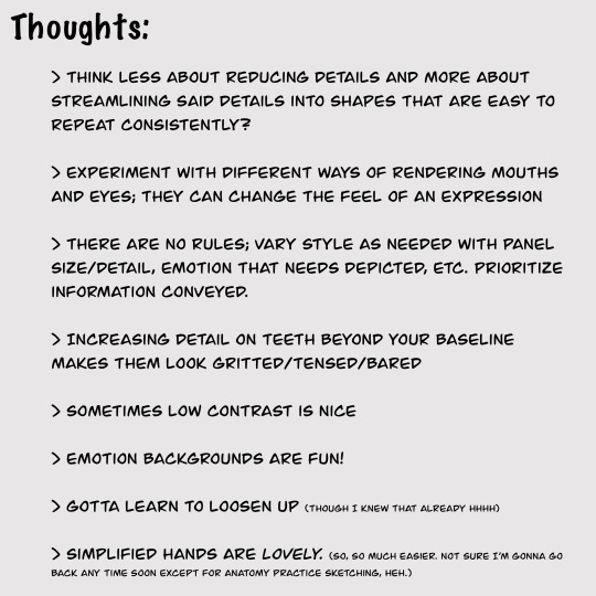
huzzah! 2023 art review!
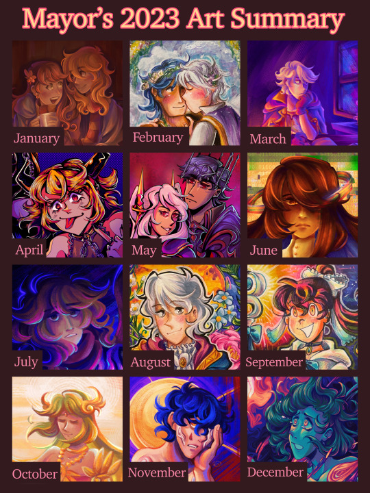
it’s almost the end of the year, wowzers! i always do one of these art review thingies since i always like looking back at the art ive made :> last year i posted the review on my other account and left it at there, but this year i want to actually review each month and notable pieces i made… just for fun!
this post is very much just for me lol, but i hope someone out there enjoys it. month-by-month review + previous year in reviews will be under the cut! 🩷
(also, shoutout to tumblr for going rouge and posting this way way earlier than i had scheduled 😍 luckily tumblr post editor is weirdly based and kept all my embedded links when i pasted it from the old one? hell yeah)
Jan: started off the year with a painting of my beloved ocs after ending last year with one! (and i will be talking about my older year in reviews, rest assured). this was my obligatory cute shared scarf art, and i wanted to try attempting to render something more involved like two characters and draping cloth. i don't think the result was too shabby, though this was before i discovered my favorite rendering brush for procreate, so in hindsight, it looks kinda flat and boring now. where's all the crunch? ah but anyway, starting a whole year with your art in a mid place compared to what you made later on is par for the course.
Feb: probably the month where i had the least art to put here, i remember scraping a little to find one. this was a chrobin piece i made in my sketchbook! nothing too noteworthy... i think i tried doing a slightly different approach to coloring with markers (applying the color before the lineart) and incorporating paint, but i remember this one giving me trouble. first of all, the size i drew this in was really small (it was in a small sketchbook and i decided to mask the margins with comparatively wide masking tape), and second of all the paper was absolutely NOT built for gouache, so it ended up a kind of wrinkly and muddy mess. i mean i'm still not the best with gouache now but still, not my best.
March: a redraw of a robin piece i made back when i was still on amino. i probably won't share the old versions because they're crap, so just trust me on the redraw part. anyway, the last iteration of the concept was in 2019 i think? and while i was proud of it for a while, its luster finally faded and i decided to try doing it again in procreate. this was when i discovered my love for the soft chalk brush in the jingsketch basics brush pack. for a while i've been using the hard render brush in that pack to render, but this one's texture and chalkiness totally changed the game. i was in love!! also tried to be a little more crazy and vibrant with how i applied the base colors, using saturated colors across the board. this process didn't consistently stick, but i think it yielded some neat results here. another hit from this month was my piece of grandmaster robin, since i'm really proud of the detail here!.
Apr: guys, april was MY MONTH! i remember making so much art in just a few weeks, something just clicked in my brain i guess. i chose my drawings of hagane rin and len since this was when i truly began to get comfy in my lineart era (after the grandmaster drawing). this month was full of detailed line drawings at that, but this one was what made me both enjoy the process a lot and do more of it. hell yeah. other hits: vocaloids at mcdonald's (i drew a background omg!!!), alice in ny fanart (just the euphoria of finally nailing a composition for this piece after struggling with it in november was great), and the end-world normopathy fanart (it's a line drawing, and a traditional one at that. i was happy with incorporating gold accents into my typically monochromatic style when it comes to my line-focused drawings as well as getting tamari's mechanical details nailed).
May: hell yeah. evil power couple time. this one was another line-art heavy one since i thought it fit the vibe. the softer colors in the background i feel like could have been executed a little better, but i do like how this came out, especially the armor (good god fe armor is a pain to render, but i think i've gotten better at it this year! middle school me would be so jealous). not much else to say here. Other hit this month would be my alice of human sacrifice fanart, another line-heavy traditional drawing. i think it turned out nice, especially for a crammed composition lol.
Jun: another end-world normopathy-centered fanart. i mentioned it in my og post but i was trying out a slightly different painting style where i did a black-and-white base first and then added colors as an overlay (also in the initial upload of the post i was so fucking meek about posting fanart of mariyam's alternate design teased at the end of the mv?? 😭 sorry about that, i've edited it out but it's still in early reblogs. kind of cringe on my part). i didn't end up committing to this consistently cuz the beginning process was kind of tedious (plus i'm too inept to pay close attention to values anyway), but laying down all the colors after the long rendering process was rewarding! it's a nice alternative with i get bored with my other method to yield basically the same-looking result lol. this month featured some more pieces that tried using this process, like the one with my oc alice, lucina and dark pit hanging out, and f!robin's resplendent design from feh.
Jul: ah yes my typical flavor of "improvised oc art that i invent new symbolism for on the fly that i apply meaning to after i'm finished". kinda just wanted to paint something again because i've been doing a lot of line drawings lately and to go back to my old painting process again. honestly, i mainly picked this one because i wanted more oc art and non-lineart drawings to be in this chart lol. art i made this month that i'm real proud of is this family pic of some young cryptonloids (i really like how the colors came out on this one!) and my birthday drawing for miku's sweet 16, which was originally completed this month. i opted out of considering it for my july art to avoid confusion. also also, this very whack pathological facade fanart (plus some doodles i didn't post) opened my eyes to the beautiful world of NOISE and HALFTONES and just slapping crazy textures onto my art like nobody's business. hell yeah.
Aug: ok this one is kind of another piece i picked to represent this month that isn't quite my favorite but i chose anyway for the sake of variety (in this case, i wanted more traditional pieces and non-vocaloid stuff). for once, i used my bigger sketchbook to make a big n detailed piece for my boy's new brave alt in feh (that game has zero significance to me outside of cool alt costumes for my faves). my actual fave from this month was young miku/meiko/kaito chillin in their house; i'm real proud of the background and lighting! but i still like this robin too ofc, big fan of how the colors came out ;3
Sep: another traditional drawing! felt compelled to draw kandy again, specifically her evil miitopia great sage incarnation :> this one was pretty standard in terms of process, and not much was really done to experiment. just wanted to draw something cool of my girl for my sketchbook. other fave from this month is this sketchy miku i did, i like how loose it came out and how the colors pop.
Oct: pretty palutena!~ i think i went into this trying to do something a little different with my painting process (i think it was to try incorporating more colors in the shading like the blue in the dress or more saturated colors near the focal point, but i can't remember LOL) or try rendering a more detailed character w/ a background (even if the background was pretty vague). i like this one! especially the color cohesion, it's pretty swag imo. other faves from this month was fanart i made for the song "orbit" since i also like how the color cohesion came out for this one, and the maid dress/crossover drawing i made for cringetober. no other words needed to explain why.
Nov: another digital painting! it's yet another ghost song, this time "uncanny". i really loved the aesthetic of this song, especially its bold colors and simplistic shapes, so i wanted to try capturing it in my style. i really love how the colors turned out on this, though i've yet to truly recreate what i like about this particular painting again? regardless, it's one of my faves, deserving of one of my favorite ghost songs. few other highlights from this month would be my obligatory purple robin drawing for the month, my sketchbook drawing of my luka design, and my fanart of utsu-p's song "ga". i like how i was able to do a couple of my different "styles"/processes this month rather than just sticking to just one. they all have their own feel to them that i like to play around with depending on the idea.
Dec: and finally, we're at the end. like july, we have another heavily improvised oc drawing with symbolism i came up with on the spot. that's just how i do things. anyway, this turned out really good in my opinion! i tried to stick to a color palette i saved in procreate a long time ago, and damn is it a fine palette. it helped me get a little loose with the colors and solely focus on creating a strong composition with colors and contrast rather than get hung up on sticking to typical color palettes. i also really like how i did the background by essentially using the liquify tool to swish all the colors around and then polished it a little on top. made for a really cool effect. other notable work would be the companion piece i made with my other oc that had a similar style since i liked the process of this one. there will probably be more as of when i'm drafting this (at the beginning of december) but i just wanna be finished w this post already bro
all around, very satisfied with this year. there was kind of a lot of song fanarts (something that i am somewhat guilty about because it feels like i'm unoriginal or something, but i swear it's cuz i'm really passionate about vocaloid music and need to act on what my braincells do when i listen to certain tracks), but overall i'm happy i was able to maintain some slight variety in the art i made this year through my chosen mediums and "styles" or processes i use.
this was the first year where i really wanted to have a fully rendered piece i'm proud of to represent every month. now, i wouldn't recommend this since forcing yourself to make art is not a good mindset to be in (sometimes, with how early i pushed some pieces out in certain months to get the monthly quota over with makes it seem like i'm getting paid to have a pretty year-in-review LOL). i was pretty lucky to not really have much burnout i guess?
~~~
ok now that all that boring stuff is out of the way, here’s my previous years! this is the sixth year i have made an art review chart.


lightning round review time! (probably just gonna be more boring stuff)
2018: ok, so this was the year where my prime art hosting platform was… amino… specifically smash amino. as much as i could rant about how much i hate that place now, i cant deny that it got me creating a lot of stuff. also it was an actual date archive for my traditional art because i never got in the habit of dating my physical art 🙃 uh don’t mind the absolute horrid graphic design on this one. i grabbed a template which was probably saved from a bunch of other places from amino and… didn’t really know how the formatting was supposed to work. first of all, i edited this in picsart on my phone and the chart wasn’t transparent, and second of all i didn’t know you were supposed to crop only the main focus so it could fit and be a little more clear. hence why its such a visual eyesore. i've been meaning to remake it to make it a little less bad (once i get my hands on the traditional pieces again), but i guess its shoddiness adds to its charm, much like amino. but anyway, 2018 was a bit of a turning point year for me in the smash amino art biz. on amino, i mostly made copies of official artwork from smash (character renders and so forth), and this year i actually tried experimenting with my own original ideas and scenes (my copying roots were still around at this time tho, seen in the november drawing which is based on ssbu’s mural art. i mainly moved on to copying artwork from feh). this was also the year i got my ipad and finally got into making digital art. i didn’t have the knowledge of digital art that i have today obviously, so colors and lighting were usually on the plain side. i also hit my stride with making more ambitious traditional art that incorporated backgrounds and such, and they’re pieces i’m still really proud of!
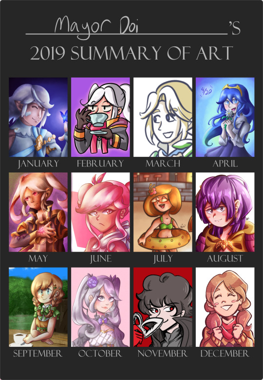
2019: so, i actually made this chart some time in 2021 or 22 because i didnt make an actual chart in 2019 officially (i forgor). which bums me out because i deleted my amino account by then, so a lot of dates for traditional pieces were flushed down the toilet the one time i needed them. so, to compensate, i tried scraping any digital piece i could to fill in some spaces, which is why some are more underwhelming than others. but yeah since this isn’t fully accurate to my art progress that year, 2019 is a bit fuzzy. main thing of note that year is midway through i got really REEAALLY into fire emblem: three houses and drew a lot of art of the characters (not shown much on the chart because they were mostly sketches and whatnot). imo there’s not much improvement or stylistic changes from 2018 in this year to note. 2020 on the other hand…
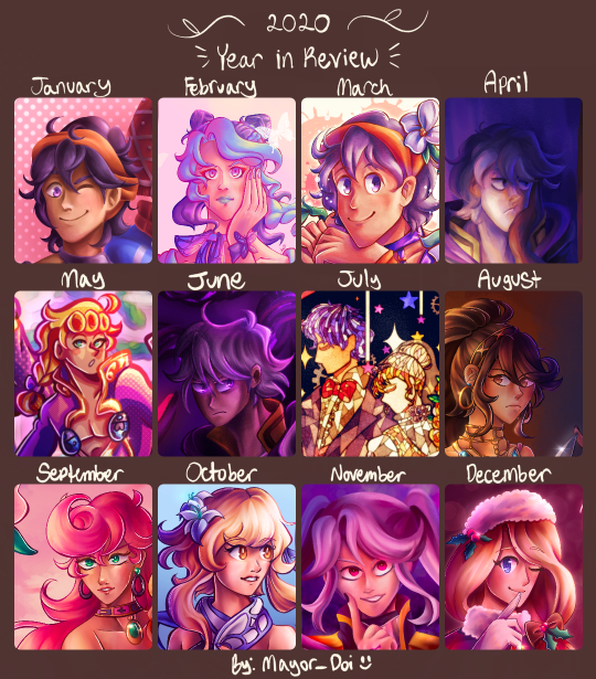
2020: if it wasn’t clear, this was my jojo phase. i got into jojo at the end of 2019 and my downward spiral into jojo hell bled into 2020 :p as such, i made a lot of jojo art. and because i made a lot of jojo art, this was the year where my style shifted drastically. i feel like it’s a common phenomenon for artists getting a total stylistic makeover after getting into jojo. whether it’s to imitate araki’s style or just trying to accommodate the characters’… features, i ended up facing the same thing. gone were big round heads with tiny mouths and in were tree trunk necks and higher effort placed in learning anatomy, both for the full body and well as the face. it was around may of this year i got procreate and moved on from ibis paint for digital art. while i still have my personal hangups with procreate, im glad i ended up investing in it since it really just works for me!!
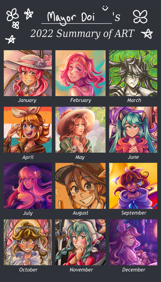
2021: around summer 2020 in peak pandemic mood, i decided to indulge in some nostalgia and listened to some old vocaloid tunes from my middle school days. and then i kept rediscovering more stuff, and then i ended up browsing producers' individual discographies, and uh yeah i am still suffering the consequences of my vocaloid renaissance to this day. while it wasn't prominent in the 2020 chart, it really started to leak its way into my art subjects in 2021. however, i still primarily stuck to my roots with fe/"smash"/jojo fanart. this year was mainly trying to find my style again i suppose? i had already learned the ropes of procreate, its limitations, and the options it has to aid with the art making process, so it was just a matter of flinging a bunch attempts at a ~style~ to see which one i liked the most. i did try finding a painting/rendering style a lot by way of copying (mainly guessing based on speedpaints) other artists' styles and process with digital painting which ended up growing into my own thing. i know they all sort of look the same, but march, april, and october of this year all had slightly different ways of doing all the shading n rendering for painting that i liked experimenting w/ in the future.
2022: by this point, i had fully gotten used to procreate and the methods i used to make art, and the vocaloid train had no signs of stopping. i think the main thing of note this year was that i was able to break out of the "5 million overlays of pink and purple color vomit" box my digital art was set it. while it used to amuse me when i first began abusing it in my art, i guess i just sort of grew out of it? it ended up making a lot of my art look homogeneous, and it took out the fun trial and error of picking the colors to match the atmosphere myself. i also tried to get more experimental with my compositions, mainly in trying to make them more dense with Stuff as well as finally get a little more comfortable with drawing backgrounds. besides those things however, i remember feeling my art progress was very stagnant this year, with not much noticeable change from january to december. perhaps i've gotten a bit comfortable with the state it's in. regardless, still a good year all around.
~~~
whew. THAT'S finally done with. if you made it to the end of this very me-centered ramble, congrats. i will probably make reblog additions in future years to continue this little saga. idk if i'll be as detailed as i was for the 2023 lineup, but we'll see.
#not art#year in review#year in review 2023#art review#fanart#mayors ocs#traditional art#digital art#long post#art#artists on instagram
7 notes
·
View notes
Text
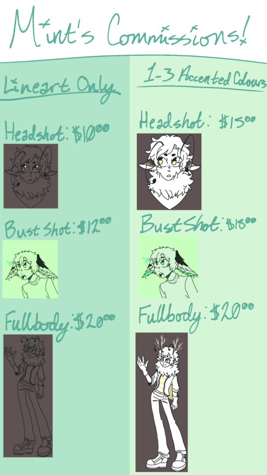
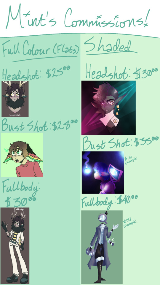
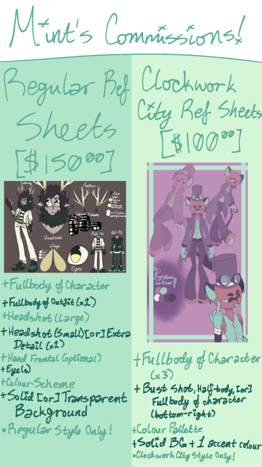
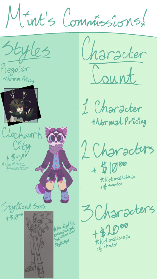
[ HEADS UP ]
In the process of re-formatting comms sheets, re-working pricing, and so on; please note that this post is outdated!
HELLO, FOLKS!
Commissions are open.
Don't ask for NSFW or overly suggestive art; I don't do that on request, and actually feel very uncomfortable drawing sexual nudity.
I asked my aunt for places she thought might be good for advertisement since Twitter sucks at promoting that, so I'm here-
Also posted this on TikTok due to her suggestion, and to no surprise, there's already two toxic fuckers in the comments, but it's kind of hilarious to see [ especially because one of them made me laugh with an insult I've never seen before- ]
Anyways...
Pricing is below in sheets, but for now, some terms.
- Do not use my art for AI purposes of any kind
- Do not trace, recolour, or repost my art [ the commissioner is allowed to repost so long as they give direct credit via a name- or link-drop ]
- Do not use art commissioned by another individual as a PFP, profile banner, etc. unless given direct permission by the commissioner
- Do not use my art for commercial purposes
- When commissioning, provide a reference for the character. Moodboards, "similar images" from searches, and AI-generated ref sheets will not be accepted. If you have art of the character, but no reference sheet, that works just fine; the same goes for low-quality doodles, or images made with things such as Gacha Studio type games, Picrew, or other character creators - those are all fine.
- When commissioning, please specify exactly what you want. This meaning:
*What tier [ Lineart Only, 1-3 Accent Colours, Full Colour (Flat), or Shaded ]
*How much of the character(s) (is/are) visible [ Headshot, Bustshot, or Fullbody ]
*Style [ Regular, Clockwork City (my WIP project), or Stylized Sonic ]
*Character Count [ 1-3 ]
*Specific Pose(s) or Outfit(s) [ Send a reference of the pose or outfit, as well, if needed ]
NOW, onto the pricing. And some examples on the sheets. I'm probably provide more examples below that-
Right, so that's done.
Onto adding more examples-
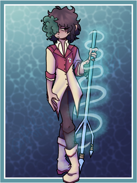
There's this. This was pretty recent. I draw tridents a bit differently currently, but this was also my first time trying to figure them out art-wise, and I like it-
Also, the mushroom pin is cool... At least, I think so; I would wear it cuz it's neat-
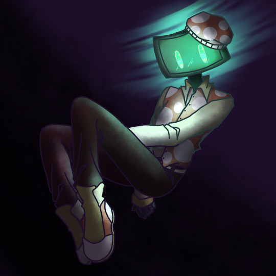
There's also this. I got bored, so I doodled my interpretation of my own Minecraft skin that I made for when I play on Java edition. I think it's cool. It was fun to make.
But yeah, my commissions are open, and if you're interested, you can DM me cuz I'm a broke bitch-
I use CashApp for anything to do with money because PayPal is shitty towards artists, though; hope that's not a hindrance-
#art#character design#oc#commissions#art commisions#art comms open#commissions open#I'm broke#actual artist#real art#iBis on phone with a stylus is a pain in the ass#iBisPaintX
1 note
·
View note
Note
8, 11, 12, and 18 for the artist ask!
dont mind me reblogging the crap out of that post rq-
8. what do i like most about my work
um. uhhhh. hmmm.
I really like my expressions! Its to the point where its gotten kind of hard not to draw faces, I like complex emotions too much. Also the digital pencil I use and just all around not giving a fuck about lineart! I like the way movement looks better without it
and eyes.
thats not really my art specifically but-
11. Favorite comment I've gotten on my art
hard to say. A lot of the times they get lost to time but i must say-
chaireem calling my art style simpable is pretty high up there
12. favorite drawing from this year
(I'm counting until February last year too so)


(also way to choose the hardest one alice ;') )
i just think theyre neat. the first one is still my computer wallpaper
18. do i have any larger projects i want to persue
mayhaps ;)
nah but fr I've had a video game concept in my head for four years now, I really really want to get into animation, try out the new toontuber stuff ScottFalco made, and just all around hopefully continue making weird shit
and y'know
maybe try to actually do fanart for real
#ask game#this took me way too long lmao#digging through my files and being like#“wh- which art do i like better....”#difficult#tw blood#beloved mutuals#ackalice#oh and#chaireem#because i mentioned them#if anyone doesnt believe me about that comment btw i have photographic evidence
3 notes
·
View notes
Text
i don't feel like there's much to say about my art improvement this year. however, in 2023, i wrote a long retrospective about my art in which i mentioned my goals for 2024, so let's see if i achieved all of them ^w^
"so for 2024 i want to study some stuff i feel i'm still lacking in. i think i've always had a good eye for composition, but i've never actually pushed it in my finished illustrations - they depend a lot on the poses because i've always been prioritising drawing over everything else. that needs to change this year."
this was actually one of the first things i did in 2024. just around this time of last year, i was in the process of making 7 fullbody illustrations for class, depicting my ocs from a visual novel i still haven't finished. i never shared them outside of artfight (😂) because i get shy talking about my ocs in public, but they are still fire and almost no one reads these posts anyway so...


i had to use so many references for these pictures, from magazine covers to fashion to layout design. i think this was the first time i was actually putting into practise all the knowledge i had learned in my degree, as up to that point i was getting through it kinda passively.
overall, my 2024 was filled with great compositions. who could have known that paying attention to it would lead to better illustrations, right? here are some other highlights i'm still very proud of:


that leblise piece is probably my favorite piece of art i ever did period. so simple yet so delicious and full of symbolism. the aqours fanart is based on an S shape, from "sunshine", and i felt so smart for coming up with it even though it's really simple. and then there's kanadiamari as always - what i really like about that fanart is that i was able to put my design knowledge into good use again.
"i also want to get better at drawing characters from extreme angles. i've always felt like my poses are a bit flat and i think i can study photos taken with wide angle lenses to improve at that."
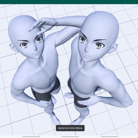
before we get into this let me remind everyone that i trace all the time. sometimes i wake up and forget how to draw, so i open an app called Magic Poser and play with the 3D dolls until i have a decent base for what i'm picturing in my mind. but it wasn't until last year that i started pushing the angles of those scenes so that i could get the best of them.


of course, you need to have good skills in order for your traced pieces not to look like shit. i can work with anime models with innacurate anatomy precisely because i already know where the muscles sit on the body. the suselle artwork is more referenced than traced, in the sense that i first sketched the pose, then re-created it in 3D, then traced it and then re-sketched it. the things i do for yuri orz.
okay this was kind of a tangent. i did improve on this particular point but the reason isn't that i got better at perspective, i just made better use of the tools i have - the result is the same and it's positive, so i'll take it as an achievement!
"and of course i still want to draw faster, which is something i've always struggled with. […] i'm still too slow for the kind of artstyle i want to achieve, which includes having a looser lineart and less details in irrelevant areas of the drawings. i think that overdoing the lineart actually hurts my illustrations, because everything ends up pulling the viewer's attention with the same energy. i also think messy artstyles are neat."
this is a tricky subject. in my 2023 post i showed some examples of what i wanted to keep doing in terms of lineart, and while i certainly got better at not overdoing it, i'm still far from that goal. definitely something i need to keep an eye out for, as i really like it when i manage to get loose with my art.


not much to say here except that i'm sorry i never posted these farcille sketches. they are 12 in total and the rest of them are porn and i'm too shy to share them with the world. also those furry guys i draw a lot (twice) are me and my and my best friend's fursonas, in case anyone is curious.
"as for the stuff i like about my current artstyle, i definitely want to keep the way i color!! and by that i mean the method i have for applying filters that make my colors pop. i could maybe play more with textures too."
i actually think i went backwards here. what i do now is more visually coherent, but my 2024 doesn't shine for the way i use colors in comparison to the previous year. it probably happened because i got too comfortable with the way i post-process my illustrations nowadays, in contrast with how experimental i was when i started playing with filters. a shame, truly, but not a huge downgrade.
"i also like the way i depict intimacy, and people have praised it too. i don't think i'll ever change the content of my art, i eat breathe and speak in yuri. if anything, there are still some ways of conveying feelings that i haven't been able to draw because i lack the skill to do so, but i'll keep trying ;)"
not sure about this one either, but i know it's just because i didn't draw a lot in 2024. among finishing my degree and final thesis, organizing stuff for aqours when they came to spain and preparing for my current job, i didn't have much time for yuri brainrot. my best drawings were dunmeshi and lgts fanarts, and i'm glad i got into both of these pieces of media because they still warm my heart today :)


i'm very proud of all 3 of these artworks, especially the frebkuchen one, i cooked so much there. maybe this skill of mine (the ability to depict intimacy) is the one that's closest to mastery among the ones i have, and that's why i don't see much improvement.
overall, 2024 was a good year, but not my peak. i can't rate it just in terms of improvement, but i can't deny that i like my 2023 artworks more than my current ones either. i think i'm on the right path, and while i don't have any art resolutions for 2025 i hope i can bring better art to the world from now on.
thank you for reading until the end if you did, and i hope you have a nice year!! <3


2024 art summary!! lots of oc art this year :) i also started painting digitally and it's sooooo fun~~~
(template by PEPPERTODE on deviantart)
57 notes
·
View notes
Photo
i don’t really post my art to often but i saw @moomoorare ‘s dtiys and i got inspired so!!! this also technically counts as my first ever hermitcraft fanart so i think that’s p darn neat lol.
to be fair this is also more of a quick sketch art because i was to lazy to actually lineart and shade properly ( i did this at like 5am ... ) but i think its cute either way
429 notes
·
View notes
Note
Hi there! First of all, I love your art -- all your rottmnt stuff is so lively and fun and a joy to behold. Secondly, I know you do commissions, and I was actually wondering if I could ask for a bit of advice? I'm looking to start doing my own commissions, but the process of starting is pretty daunting. I'm a competent artist, but I'd hardly call myself popular, and I have no idea how to advertise that kind of thing. Or how best to organize payments, or deadlines, etc. I don't expect you to have the perfect solutions/answers to these questions, but any tips for a beginner would be greatly appreciated! And, again, thanks for sharing all your lovely art <3
Hi there! So sorry I am soooooooo late to responding to this, but I’d love to help! (Even if I’m not the best at it lol) so I’ll go down the list!
1. I’m gonna jump right out there and say I actually was influenced into doing my first commission by someone who rlly liked my art back in 2017! They told me how to set up PayPal n all that stuff, wish I still had that drawing I made for them, it’s rlly neat thinking of how far I’ve come since then!
2. Getting yourself out there is definitely something you need to do, I’ve learned the best way to do that is have a semi-consistent posting schedule, use LOTS OF TAGS, interact with anybody you can, and get your name out there! Social media IS a lot more work than you’d expect, but have fun with it!! I wouldn’t want that to discourage you. As soon as you get a routine it gets real easy
3. For payments, I recommend sticking to one money transferring app. I use PayPal business’s invoicing system, and I’ve found it’s great! Only issue is it keeps your money until you’ve had ~15 transactions, just to show your business is legit. Something like that. You can use regular PayPal too, but I’ve found this one is easier to use for both me and customers, and you’re less likely to get scammed! (Also my tax lady loves PP it makes everything easy for her)
4. As for deadlines, I usually don’t have any, but that’s just how my system works! As soon as my customers send through payment, I let them know that I’ll tell them when I get started. Give yourself plenty of time though! Your customers won’t mind as long as you keep them updated on how you’re feeling and when you think you’re going to begin work.
They love to see updates on rough pieces, lineart/inking, and color!! Makes the wait time seem shorter, it’s content for them, and they can voice anything they need to when you’re working on their piece!
5. I really really really do strongly recommend accepting payment first, whether it be paid in full or half first then half later. Make sure you’re getting at least something for your time! (And it’s a great motivator)
6. That’s really all I have! It’s definitely a learning process, I perfected the commission system probably just at the beginning of last year, and I’ve been doing this for 5 years! You’ve got this though! I believe in you (:
32 notes
·
View notes
Text

So glad you ask. You’ve almost certainly seen it if you’ve ever googled Enoch before, though you may not have ever realized at the time. Some important context about this image is that it and I entered the OTGW fandom at the same time, so I’ve watched this image propagate in real time.

This image is by Reddit User BrinSmif AKA Breaddoodles, I think it may have originally existed on Deviantart, however I can no longer find it. They sell prints, stickers, shirts, etc of this image here on Redbubble.
I think a lot of people see this image and don’t register it’s not canon because aside from some very minor details, like the teeth, it’s basically perfectly on model. I think this image first cropped up in 2017, and assisted by Redbubble’s ruthless SEO optimization it’s been near the top of google images since then.
Popular was probably the probably the wrong word in my original post- Influential was probably more correct. Most important to the point I’m making right now, note the shape of Enoch’s ribbons here.
The closest pose that the maypole makes in the actual show OTGW is probably this, which is one of the distortions while Enoch pulls himself out of the rafters.

Now since this illustration by BrinSmif has been at the top of Google image results for Enoch, and is so professional, and easily mistaken for a canon image, it has been referenced. Certainly dozens, possibly hundreds of times. You see this particular shape for the maypole, and even this specific arrangement of ribbons crop up in all kinds of fanart. Also specifically fan merch.
I’ve watched this specific pose for the maypole emerge over the past 6 years, and I don’t have time to track every piece I’ve ever seen down. Here’s a small selection that I’m almost certain referenced BrinSmif’s illustration. I’ve stuck with merch, mostly so I can link to it for your perusal.

Here’s a print by chocomilkprints.

Here’s an enamel pin by gallery nucleus. And as a small aside, this exact lineart has been used in other places, though I think it originates with gallery nucleus, but my favorite implementation is here.

Here’s a very cute Lino-cut print by StitchedWitchCrafts.

Here’s an adorable diorama that I would purchase if I had the kind of disposable funds necessary. I was a little on the fence about this one but I’m including it because of the double light green ribbons in roughly the same place as BrinSmif’s.

Here’s a laser cut pin by BentPonderosa.
All of this to say that all of these are a small selection of the art I’ve seen with this exact pose, and I think it not unfair to assume these all probably referenced BrinSmif’s art, and I assume most did so without realizing it wasn’t some sort of official image.
Any way there’s not much point to this spiel, so much as to prove the fact that I’m really interested in really obscure fandom phenomenon and probably way too tuned in to various pieces of Enoch related fanart. I just think it’s really neat, and since I’ve watched this odd butterfly effect in real time I’ve always thought it was interesting.
Do you think Reddit user BrinSmit knows they made the single most popular image of Enoch outside of, and possibly even including Otgw itself.
#This is all pretty armchair just a lil hobby so don’t take any of it too seriously#Just some fun vague connections and the interesting resemblances that crop up in the insulation of fandom
17 notes
·
View notes
Text
A totally self indulgent compilation of my favorite works on this blog of the year June 13, 2020 - June 13, 2021
2019-2020
The following lists are all in chronological order according to the date each post was first published.
Top 10 panel edits:
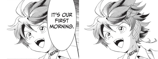
#1: It's our first morning
Date: Aug 20th, 2020 Time: ~ 2:18 h I really like how this one turned out!!! The 2020 Emma b-day edit has a lot of major panel redraws, but this is probably my favorite. I I really enjoy how I made the shadows work!! And the ear banfage looks pretty neat. Nice!!! Immagine
#2: Norman birthday edit 2021
Date: Mar 20th, 2021 Time: ~ 2:21 h Awww, soft Norman :') There was a bit to redraw, but I think everything turned out pretty neat!!! I believe everything works out fine. Though looking back at it, the part of the ID I added is definitely top small :')
#3: Manga dub: Yuugo gets knocked out
Date: Mar 27th, 2021 Time: ~ 5:05 h Here start the Manga Dub redraws to which I gave my everything ahah. This one turned out nice! I think the shoes turned out particularly good eheh. I like how Yuugo's clothing lineart- for the texture, I wanted to go for something heterogeneous, but I'm not fully confident in the final result. Gilda looks very rushed but ¯\_(ツ)_/¯
#4: Manga dub: Yuugo makes his dramatic entrance
Date: Apr 5th, 2021 Time: ~ 4:02 h This is pretty cool!!!! The coat took ages to redraw, but sis it turned out perfect!!! I'm very proud of this.
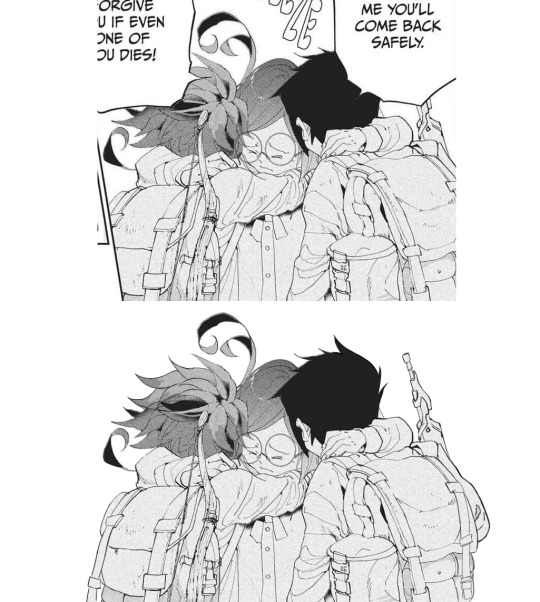
#5: Manga dub: RayGildEmma hug!!!
Date: Apr 9th, 2021 Time: ~ 1:31 h Awww, a beautiful panel I was really happy to have the chance to redraw. Taking into account what there was to redraw, I'm actually surprised with how little this took! Ray's backpack was a pain to make, but I think it turned out fine. I'm very happy with Emma and Ray's heads!!
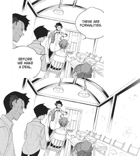
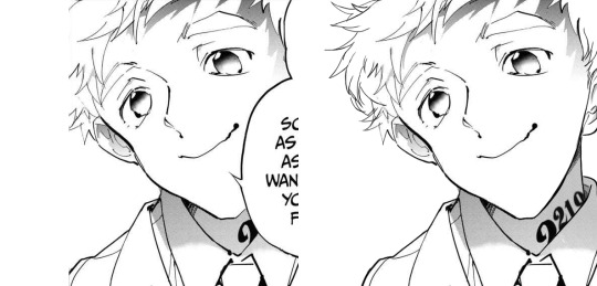
#6: Manga dub: Formalities
Date: Apr 12th, 2021 Time: ~ 5:31 h It is not always easy to give sense to Demizu's perspective, but I do my best!!! In this I am *so* happy with how Don and Ray turned out, they look neat! The background on the other hand... It took hours to make ahah. I'm not fully confident in the perspective, but I'm happy with the details I've added- I really did my best to make it look like athe other manga panels and I think it paid off!!!
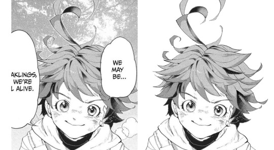
#7: Manga dub: We may be weaklings, but we're still alive
Date: Apr 30th, 2021 Time: ~ 1:37 h This little Emma is so cute!!!!!! I think the redraw turned out pretty perfect. I'm really satisfied with how this one turned out, and it's such a cute little Emma!!!! She's so brave and optimistic, I love her. It's a shame this panel didn't make it to the episode :')
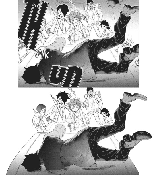
#8: Manga dub: Goldy Pond Gang
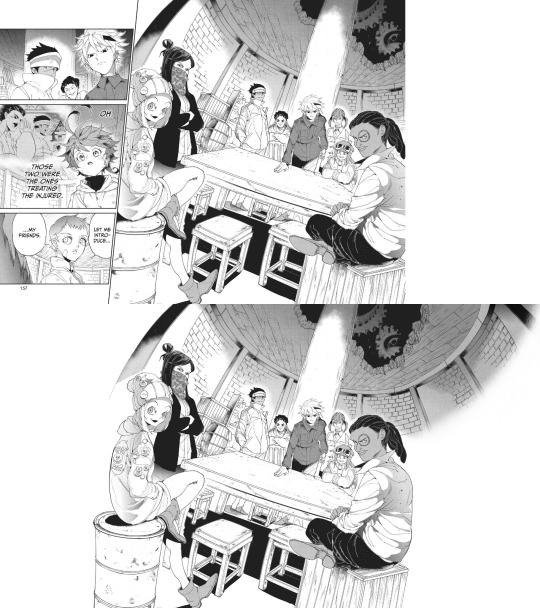
Date: May 7th, 2021 Time: ~ 8:44 h lmao This is probably the panel redraw I'm the most proud of ever :') Just think everyone turned out very nice!! The ceiling is not exactly perfect, but it still works somehow. I'm very happy with how Gillian's back turned out!! I don't really like the fading effect on the right, but 8h in I got pretty tired of working on this ahah
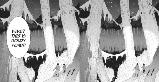
#9: Manga dub: This is Goldy Pond
Date: May 21st, 2021 Time: ~ 1:29 h I'm very glad for how the Manga dub has been challenging me to learn to redraw backgrounds, something I had quite literally never tried before. It can be a little frustrating, but it's so satisfying to see the final cleaned piece!! With this panel, I also learnt to use copy and paste, which is something I had never done before beyond texture
#10: Manga dub: Good morning doctor
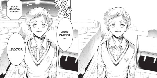
Date: May 21st, 2021 Time: ~ 3:42 h This is another background that turned out pretty good!! That one Norman is one I knew I would have had to fully redraw sooner or lager- the background was a bonus ahah. I'm very happy with the final result!!
Top 5 edits as whole:
#1: The Promised Neverland manga ending edit
Date: Jun 14th 2020 Time: ~ 12h 41min (5h 45min of cleaning panels in the edit + 5h 37min of cleaning panels that didn't make it to the edit + 1h 19min of resizing) + time spent cleaning panels I've deleted the file of so I can't see lmao This is overall very nice!!! The concept of an Emma evolution through her back is cool, and I think overall the edit turned out very aesthetically pleasing. The concept idea came to me while I was working on the 2019 Emma's birthday edit, a long time before the manga ending announcement- back then I wouldn't have imagined using it in occasion of the manga ending, but I think it ended up making a nice tribute. The colors add a nice touch, since so far my edits had always been black and white- it makes a sweet closure. To make that edit I selected 76 panels of Emma framed from her back; I plan to make other versions of that edit using the discarded panels eventually!
#2: Emma - Chapter 181: Beyond Destiny
Date: Jul 12th 2020 Time: 2h 57min My last edit for the manga 🥺🥺 I think this one is my very "manga ending edit" because to me it really signed the ending of weekly chapters and their weekly chapter edits. It makes me a little sad to look at it, but it's also, I don't know, kinda sweet to see how I grew both in my panel cleaning and as a person since I first started my blog. I'm glad I got into TPN!
#3: Emma birthday edit 2020
Date: Aug 22nd 2020 Time: 8h 54min This one turned out so well!!! Though I used the same concept for all the trio edits, I think this one is the best one. The two panels on the left / two panels on the right alternation combo never fails ahah. The colors are nice (shout-out to my sister for making me a palette), despite the fact that it was hard for the lighter ones to make them work with the images without having those disappear. I'm very satisfied with the panels I chose for this, I think they work really good together! Also, it got me very happy to read everyone's comments saying they liked the fading effect in the last panel :)
#4: Emma + Eyes Close Ups [1/?]
Date: Jan 24th 2021 Time: 5h 55min This one was really nice!! Another idea I got when working on the 2019 Emma birthday edit I was glad to finally execute. Started the edit in September, finished it in December. I'm overall very happy with how it turned out... I hope I will be able to make more in the future!
#5: The Promised Neverland Parallels → (9/?) » 114 // 122
Date: Feb 23th 2021 Time: 5h 7min (panel cleaning only) Aaaaahh I really like this one!!!! A parallel I love very much, and I'm really happy with how the edit turned out. All the hair redrawing looks neat!!!! The gif is maybe a little excessive, but I think overall it's a nice edit. I like it!!! Fun fact, I completed it on August 26th 2020, but I couldn't find the right moment to post it ahah.
Honorable mention: The Promised Neverland Parallels → (5/?) » 08 // 16
Date: Aug 30th 2020 Time: 2h 52min (Second picture cleaning only; I deleted the first picture art file so ¯\_(ツ)_/¯ ) I don't have much to say about this one except!! It turned out very nice!!!!! Love the pen lmao.
Top 10 analysis:
Too many analysis,,
#1: Post chapter 181 Emma analysis
Date: Jul 9th 2020 Mmmh a nice analysis. I think it was important for me to put down in words what I think of Emma's characterization and the manga ending, so I'm happy I did it!
#2: A long Oliver analysis because I love him very much
Date: Dec 6th 2020 What can I say I just love Oliver tons 😔😔💕💕 This was very fun to make!!!
#3: TPN s2 previsions
Date: Jan 14th 2021 Really love the effort that went into this + me proving that 11 episodes GP could have possibly worked + it's just a lot of fun to read again after s2 ended pffft
#4: More s2 delusional previsions lmao
Date: Jan 27th 2021 I think the points and previsions I made where pretty neat!! In my defense, it was pretty impossible to predict the anime would have ended with this season. I always feel honoured when friends and Anon ask for my opinion, I'm like "you wanna know what I think? Wow. I'm flattered (◍•ᴗ•◍) " Thank you to anyone who ever sent me an ask!!
#5: Why Emma not wearing pants is 𝕨𝕣𝕠𝕟𝕘
Date: Jan 29th 2021 Really proud of this!!! Pants Emma is important!!!!!
#6: Post episode 5 manga Emma analysis
Date: Feb 4th 2021 A depressed analysis, but a necessary one 😔
#7: Norman analysis
Date: Feb 12th 2021 I love him!!!! And I'm happy I eventually got to put down in words what I love about his character. The day I posted this ww3.readneverland was in maintenance so I couldn't use the volume scans for it- the thought of that post having fan edited and fan translated scans still haunts me
#8: RayDon rambles
Date: May 12th 2021 I had a blast writing this and like. It's likely the post of mine I reread more often of them all. I love this ship tons!!!!! I'm satisfied with how I put down in words what I like about them. I LOVE THIS SHIP
#9: Chapter 58 analysis
Date: May 23th 2021 I've wanted to express this concept since like the first time reading the manga- I'm so happy I finally did!!!! This concept is one of my absolute favorite things about tpn- the feelings that people are good. The concept that kids who got to live in an healthy and supportive environment will always be inclined to kindness and altruism, because humans are just inherently good. From the Three Character Classic: “people at birth are inherently good”. I want to have faith and courage to hold on the goodness in myself, and to hold on the goodness in the world, no matter how difficult it to do that (Chloé Zhao).
#10: Norman and Lambda squad relationship analysis
Date: May 24th 2021 I think this was a pretty sharp analysis and I like what I did with it!!
Other stuff:
#1: Krone birthday edit
Date: Jul 15th 2020 This edit is so good ;; Like not perfect since it was my first attempt at coloring gifs but still I believe it turned out so good ;;;;;; The time and effort that went unto this is crazy, but... Maybe I'm happy to have dedicated time to something I like for a satisfying result.
#2: Get to know my ship- Wolfpack Trio
Date: Aug 24th 2020 Uuuh a good post. A good ship.
#3: Gilda + blank glasses
Date: Aug 27th 2020 This is such a cute nice compilation!!! I love looking at it. A few panels are missing but still :')
#4: Apollo Ray AU
Date: Sep 7th 2020 (Though it was written Sep 2nd 2019 lmao) I'm so happy I finally gathered the courage to post this 😭😭 I really enjoy what I did with this AU, so this one and its other installments are all posts I have a lot of fun rereading. More than everything, I was astounded and overjoyed by the positive response it got: that gave me tons of confidence to put my ideas out there, no matter how unique they sound!!! Here's to hoping I will be able to post my RayEmma Hadestown AU, by other big AU from late summer 2019 :')
#5: TPN timeline project
Date: Dec 2nd 2020 This is like. I don't know it's a lot ahah. Arguably the project I'm the most proud of ever making. I'm just so happy of all the months long hard work and of the final result!! The post didn't receive much response (though the ones I got were extremely kind and sweethearted so that totally makes up for it), but in the end I don't really mind? I'm just so proud I accomplished that idea :')
#6: TPN calendar
Date: Jan 4th 2021 A nice sum of the tpn timeline + everyone's birth dates!!! I really like how it turned out visually. It's a cute little tpn calendar!!!
#7: Ray smiles compilation
Date: Jan 17th 2021 Ray's smile. That's it that's the post :')
#8: Trans Oliver headcanons
Date: Jan 24th 2021 MMMH really like this headcanon I think about it a lot
#9: Thoma and Lani theory
Date: Jan 28th 2021 I really don't want to brag but this is the best joke I've ever made :')
#10: My TPN AUs
Date: May 10th 2021 Ok you gotta admit those are very good AUs, I'm glad to have made a list out of them!!!
#11: Ranking Emma promotional art outfits
Date: May 16th 2021 This is one people seem to have liked a lot which makes me happy ahah. I'm glad to know we can all agree Emma deserves more pants outfits!! Please stop it with the gendered clothing :') This is the post I want to be remembered for
#12: TPN musicals AU part 2
Date: May 20th 2021 A GREAT POST I can't stretch enough how happy I am with those character-song associations. I hope I have time to make a part 3 in the future!!
#13: TPN Drive folder
Date: May 30th 2021 This was born as a way for me to have all the tpn extra contents easily accessible, but I'm happy to have shared it with people- I hope it will turn out to be useful to others too!
#14: TPN s2 recolorings
Date: Jun 12th 2021 A more diverse children cast is good for the soul :')
That's it, this year was really fun!! Thank you to everyone who supported me through it, I can't express how grateful I am for all the kindness and validation I received. Here's to many more months in the fandom!!! (ノ◕ヮ◕)ノ*.✧
#mine#tpn#the promised neverland#tpn manga spoilers#Tumblr: *literally refuses to let me open the post*#Me: *Turns on my computer* B*TCH YOU THOUGHT I'M POSTING THIS TODAY AND NOTHING IS GOING TO STOP ME#Been working on this for four hours now.. I'm literally dead...#Also thank you Tutu for deleting the other post you're the sweetest :')#Once again this is just a personal report you don't have to read all (or any) of it unless you want to :)#Ok to reblog btw#I'll click the post button now I don't want to hear anyrhing else
27 notes
·
View notes
Photo
Progress gif of this: “Would you still recognize me?”
The quality isn’t the best possible, but hopefully you get the idea how things evolved... It’s made from “the preview pics” that I saved in this painting’s draft/wip folder whenever I took a break or wanted to compare/remember something special - and also so that I’d know where I left things and wouldn’t have to open the actual psd file every time, lol. To make the gif size smaller and to have it flow better (and be less eye-hurting), I left some of the frames out.
I admit it, it’s quite fascinating to watch now after everything :D *pats myself on the back*
So that the post doesn’t become too long on the dash, I put some additional notes under the cut, mainly about the refs and wips if you want to take a look! Please, do not repost elsewhere :)
(Btw, you can just read the bolded parts if you want a quick version or get tired of the rambling.)
I want to point out that the main work always happens underneath all kinds of adjustment layers because I like to test things a lot during the process before sticking on something if I don’t quite know yet what I want. Like the colour scheme or where the light comes (or if there are multiple light sources) or if something needs more contrast etc. So I paint with simpler colours first, but already have some ideas/adjustment layers over them, but hidden and waiting until the basics are done. Then I merge things and continue to paint with the “new” colour palette.
I also often test filters to have more texture or bring out some things better - or just to find something interesting to incorporate! Accented edges, crosshatch and watercolor are things that I often test in some way over my sketches and wips at some point when the basics are done or when I need/want some kind of further effect/texture or just something to knit them together better and for balance. And also just for fun!
Then I flatten the things I like (or I am “certain about” at that point) and continue painting over that ...aaaand end up testing something else, keep different versions or parts of things on separate layer groups (to compare or to bring back some earlier things that I liked or alternative lighting solution or object/body part placement, or...) and so on...seriously it’s always a mess controlled chaos! aahahahaha *face palm*
But mainly the things keep building on top of each other instead of having neat groups for sketch, lineart, colours, lighting etc. I mean, I always try to start with that but never have been able to actually keep it very long... And on the other hand I’m too nervous and indecisive to paint with only single layer/canvas from the beginning with (like a traditional painting would be painted). Or with just a few layers for background, character(s), effects on their own and so on... So I have this chaos that swirls towards that something that I had preplanned or wanted to achieve/practise until I’m happy with it.
ANYWAY, BACK TO THE ACTUAL ART :
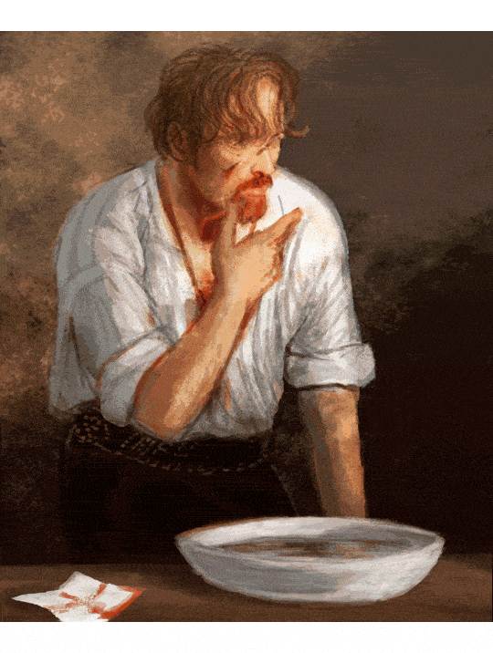
The original “spark” for this work was Flint at the end of the episode 1 with his bloody face and white shirt, and that nice splash of light, which made me think about the aftermath and him cleaning himself in the privacy of his cabin with some nice morning light painting his beard fiery and him lost in thoughts :) At some point that made me think of Henri de Toulouse-Lautrec’s beautiful painting “The Laundress” which I have liked since I was a kid, so I started to steer towards it.
See the resemblance? (˵ ͡~ ͜ʖ ͡°˵)ノ ✧*:・゚✧
Some of the refs for the bowl and Flint. The angle/posture ended up being a bit different and I had more refs for Flint’s face and shirt and hand etc.

Some wips:
1) basically the idea and items that I wanted to include.
2) after a break (weeks? months?) and after I had searched some more references to help. The eyes were at this point (accidentally) absolutely awful so I censored them for the sake of my own peace of mind here, lol (not sorry!)

More wips along the way, although not much difference can be seen as the pics are quite small.. :
3) I mirrored/flipped the painting constantly, to see the mistakes and also because I couldn’t decide which way I wanted him to be! This stage was aaalmost ready but I got stuck and forgot let it be for several months doing other stuff again.
4) I continued it, fixed lots of things with fresh eyes and experimented more with lighting and texture but nothing too drastic stuck in the end. I have two monitors and either (or both...) are calibrated a bit off atm, so it was quite frustrating to navigate and to know which one had the right colours that I was after... and I still don’t know but it looks nice on both screens so ¯\_(ツ)_/¯ At this stage things were basically nitpicking and a bit too much honing.

The finished piece:
In the end I lost some of the things I actually liked more in the earlier versions (for example some had more of a dreamy feeling or better texture or more emotions/wearyness/anger showing that didn’t quite reach the end result again) and I overworked some other things, but nevertheless! I’m very pleased how this turned out! I reached the vision I wanted and learned a lot again :D
Thanks for reading <3
#black sails#captain flint#tw blood#flashing gif#tw flashing gif#progress gif#or is it process gif?#anyway. here's some notes and refs and ideas again#the gif shows more than the small pics later#but I wanted to point out some things from along the way#ask away if you want to know something specific#OH yeah btw this one sparked 'the first mo(u)rning in Nassau' painting with Flint and Miranda!#that I drew a while ago and finished before this#atleast I have a vague memory that these were connected#and also the one where mr Gates is patching up Flint with dr Howell xD#which I privately call 'HURGH' (because of Flint's reaction lmao)#so you see#it's dangerous to start new things because they end up multiplying and then u end up with shitton of wips#that are like 70-90% ready but just.can't.finish.nggggghhhhhh#at least some of them finally saw the light of day...#also I forgot to draw his collarbones again lol#let's pretend there's enough meat to hide them ;)
99 notes
·
View notes
Photo


[Brief image description: A series of illustrations of Gerou teaching in front of a blackboard. The illustrations repeat, each in a different art style; at the end is a collection of doodles mixing the art styles and a few notes reflecting on the exercise. Full description and transcript starting at the heading below the cut. End ID.]
Part one of some recent style studies I’ve been doing, featuring Gerou struggling with student teaching!
I wanted to explore how different artists that I like handle stylization and simplification in comics, and when I asked around several people gave me permission to post the results. I recommend checking them out!
1) Harbourmaster is by @waywardmartian.
2) Never Satisfied is by @ohcorny.
3) Broken is by @yubriamakesart.
4) @doodledrawsthings makes a lot of content that is posted to tumblr, most recently a fair amount of A Hat in Time fanart.
Thank you all for the permission to post! ^_^ I'm having a lot of fun with this.
.
Side notes:
I genuinely thought that the Harbourmaster style would be easiest for me, since it contains roughly the same amount of detail as my own style and since I’m like 75% sure that reading it as a younger teen informed a lot of my own style and character designs. Turns out it was actually the hardest! Perhaps because, since there aren’t as many blatantly fundamental differences, I had to pay more careful attention to proportions and specific forms? .
Never Satisfied was interesting! Alongside the work of Doodledrawsthings it’s definitely the furthest from my own style, and choosing Gerou for this honestly doesn’t do that difference full justice. I looked a lot at Fidelia, Sylas’s mom, and Thierry in trying to figure out how Gerou’s facial features would translate. Part two of my plans is to explore different character designs that might make fuller use of the difference in style, heh. (In other news: Colored lineart looks very neat and studying how it’s handled in NS is the first time I’ve been able to carry it off in a reasonable time frame, hah.) .
Broken is just... very pretty, y’all. xD I don’t think it really saved me any time or much ease of drawing over my own style, but it’s very nice to look at. And I think the style differences and specific simplifications do lend themselves very well towards creating more consistency than I ever manage in my own art. Noticing the patterned way of drawing ear details was a fun moment for me, I’d never really thought of codifying anything that way before! .
I did the first drawing in Doodledrawsthings’s style (the 3/4ths view in the turnaround) and thought “Oh goodness this is lovely and quick and feels nice.” It’s very nearly the first time drawing something in a cartoony style has ever come easily for me. But... I struggled much more with every other drawing in that style, ahah. Still, it was comparatively quick and I do love the expressiveness of the stylized eyes. :D This is another style where I think I’ll need to explore a wider range of character designs, though. I think it’s also worth thinking about how character design is fundamentally changed in some ways by the change in style; some of what I would think about designing a character specifically for that style is very different from the details I would normally think about when designing a character.
.
[Detailed image description:
A series of images repeating the same content in different art styles, followed up by a page of sketches and a page with text notes.
The repeated content is a turnaround of the character Gerou as well as a short two-panel comic showing Gerou as a student teacher in front of a blackboard. Gerou is a thin white man with sallow freckled skin, a large hooked nose, long wavy brown hair, and glowing orange-yellow eyes. In the comic, in the first panel he gestures animatedly with a wide smile and says, “Oh, that’s easy! If you just--” then breaks off. In the second panel he holds up a hand as if asking for a pause, and says, “...wait,” with visible consternation.
The sketches feature continued style experimentation with Gerou making a number of expressions and gestures, including: absolutely failing to maintain a good pokerface; looking stressed; various smiles, from tired to nervous to wide and happy; sighing tiredly; sticking out his tongue with arms crossed huffily; arguing with someone; drinking tea; and fighting off a dizzy spell.
The text image is headlined Thoughts and reads as follows:
Think less about reducing details and more about streamlining said details into shapes that are easy to repeat consistently?
Experiment with different ways of rendering mouths and eyes; they can change the feel of an expression
There are no rules; vary style as needed with panel size/detail, emotion that needs depicted, etc. Prioritize information conveyed.
Increasing detail on teeth beyond your baseline makes them look gritted/tensed/bared
Sometimes low contrast is nice
Emotion backgrounds are fun!
Gotta learn to loosen up (though I knew that already hhhh)
Simplified hands are lovely. (So, so much easier. Not sure I’m gonna go back anytime soon except for anatomy practice sketching, heh.)
End image description.]
#I have been hyperfocused on this for a week straight whoops#art#style study#artists on tumblr#style experiment#comics#my art#my stuff#sketches#Gerou#Imperfect Science#image described
35 notes
·
View notes
Photo
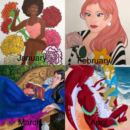
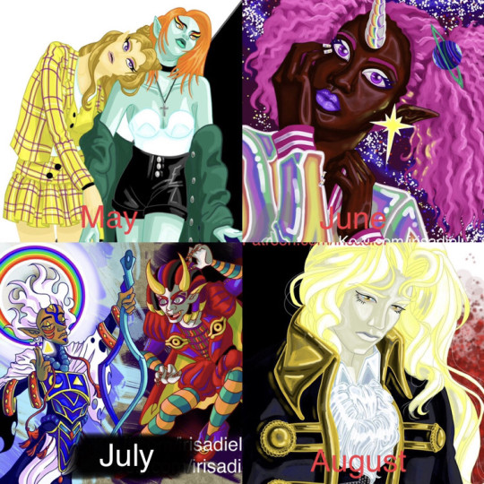
As anyone can attest, 2020 has been a rough year. A punctuated rough year in a string of rough years. My experience has been no different, but as for my personal artistic growth, 2020 has actually been exceptionally good to me. I went from thinking that doing a picture a month was asking way too much, to doing basically a drawing everyday. It’s a bit funny, I’ve been on tumblr since 2012, and i’ve posted some art here and there, but this year is when people finally noticed. I’ve had a couple of people say to me “I didn’t know you did art.” I don’t know how I feel about that, but I’m happy that my art is finally getting notes at least.
January - This is when i’m still in my dark phase. Drawing hurts, but I’m still trying my best to put something, ANYTHING on paper. i’ve spent 2019 drawing lines and squares on paper to just get used to drawing again. I’m trying to do people again. I had an idea that i was going to do a drawing a month for birth month flowers. January was carnation, and i had a sketch for February, but it never made it to completion. I’m still using traditional markers, pen and pencil.
February - This is where I found out that using a reference for art made things %100 percent easier. This is my very old OC Zora, made when i was in middle school. Using references cut out a lot of the initiation process i had when starting a drawing, all I had to do was trace, i didn’t have to think at all and the product was still good. Honestly pretty revelatory.
March - this is when i bought some really neat artists models that i could pose in any number of ways. They have proved their worth over and over again. Still doing traditional, but i did enhance this picture on the computer.
April - My markers were running really dry and I couldn’t afford to buy a new set, so I dragged out my laptop and drawing tablet to see if i could start drawing digitally. I was never really good at drawing digitally, though I got a little better in my animation classes. Colors aren’t true on the monitor and doing lineart feels odd and hollow. i can’t put it into words. but I downloaded Krita because i also couldn’t afford Photoshop. so on top of learning digital art again, i was learning a whole new program. So this picture was a culmination of a lot of things, and a really good first step for the rest of the year.
May - Here, this is when quarantine was in full swing, but drawing is no longer painful and i’m actually looking forward to it. Still learning digital again, so I decided to go with my tried and true love of fashion and clothes because that’s what i know best. Backgrounds suck
June - This month i was doing a lot of sketches and little doodle drawings. i decided that i wanted to try something more realistic, just to see how it would turn out. i think it is a bit of a mixed success.
July- July was busy, so i didn’t do a whole lot. This drawing was based off the designs of another artist that i loved a lot. I’m really big into character design, and I go crazy over a really good design.
August - My busiest month! I did so much in August! i wanted to take a break from all the Zelda art I was doing and decided to try doing an Alucard. Yoshitaka Amano is a big inspiration for me, and the way they do Alucard absolutely melts me. Someday i’ll draw Alucard as pretty as Amano does.
September - I dragged another OC out of the grave and thought to myself “How can i improve on my art?”. It’s amazing that in January i didn’t know if i would still be drawing, but here I am trying to not only draw as much as i can, but also trying to improve. I loved the way this picture came out, but the process that i used to color it took 3 days! I don’t have that kind of time to spend on my art, but maybe someday i’ll do that technique again.
October - This month was a bit of a low point for me. I was getting depressed again and was struggling to draw. I didn’t do a whole lot. But i didn’t want to go back to the way things were at the start of the year, so i just took a break for myself and reminded myself that low points were going to happen, but it didn’t mean that my progress was erased. i went back to trying a more realistic approach because with LOTR characters, i can use actual human models which is great for getting the subtleties of shading.
November - Busy month that i didn’t have a lot of time to draw for. but i did a series that I am very fond of, the picture shown being my favorite of the series.
December - the end of the year! and i’m still drawing. I’m drawing so much! December isn’t over yet, and I’ll have more drawings to show later, but i can’t show them here yet because a lot of them are presents. so, this picture is the one that everyone liked the best, or at least it got the most notes. instead of using my usual ultra saturated color, i went with greys and sad colors. but people liked it a lot, and i don’t know how to feel about that.
8 notes
·
View notes