#I think I might be a very shape driven artist they spark joy in me
Explore tagged Tumblr posts
Note
been scrolling through your art today because the way your shapes flow is such an inspiration and i had a question pop to mind. Machete is part of a religious institution and seems to command some respect as an adult, what's his rank Like bishop, cardinal ect I found myself curious about it!
He's a cardinal!
#answered#justmaghookit#bishops typically got this purplish fuchsia color going on whereas cardinals are themed bright red#all of these start out as basic priests who wear all black and they can continue to wear black even if they get elevated to a higher rank#the pope is the only member dressing fully in white#at least in broad strokes I believe#technically you usually need to be a bishop before becoming a cardinal so he's that too but mostly in name only#thank you! I'm glad you find my shapes flowy#I think I might be a very shape driven artist they spark joy in me
91 notes
·
View notes
Note
Have you noticed the latest edition of Charlie Bowater can only draw one (1) face? She did The Princess Will Save You and Cast In Firelight both YA Fantasy set to be released this year. And they are how you say... the same fucking cover
Ah yes so you saw the same tweet I did
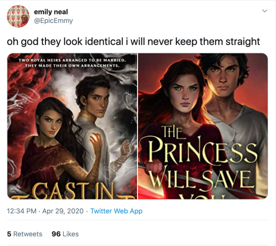
I know I literally just posted that we cannot outlaw book covers from looking like each other, but ! Oof!


The only thing that softens the blow here is that Charlie has improved at representing nonwhite features such that characters look like POC rather than tan white people, although,, that bar was low. Anybody remember the ACOTAR coloring book.

(Would you have guessed that 2/3 of these people are nonwhite? Or even that they’re supposed to be three different men? I guess all the men in Prythian have the same haircut?)
But that minor victory is mostly lost in the quagmires of the fact that Charlie’s style is to give everyone instagram face:
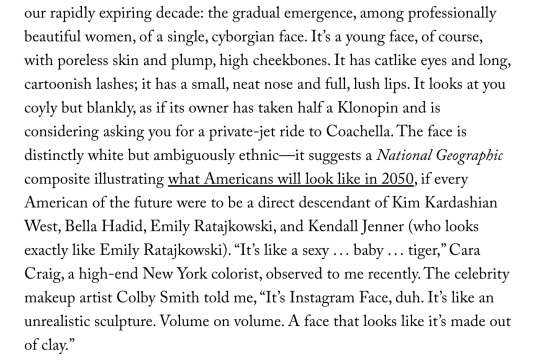
I wouldn’t even call this “Sameface” necessarily: that implies limitation, that an artist is only capable of drawing a single facial structure competently. Bowater is incredibly technically talented, she just chooses to give everyone catlike fae eyes and the cheekbones of a starving nymph. (My previous post on this here.)
But I don’t really blame her for that, or for these hilariously identical, nearly devoid of personality covers. Artists are allowed to do whatever they want. Artists who make art for covers are being art directed by designers and marketing teams who bear responsibility for how the finished pieces turn out.
No, this is our fault, as a community and an industry and..... society, kind of, for valuing character portraits that are “pretty” (“pretty” being an extremely loaded, culturally subjective concept) over art that actually Says Something About The Story. Bowater’s style happens to dovetail perfectly with what we currently collectively find pretty, and so we’ve put her art on a pedestal at the cost of everything else art can or should do for our stories.
And this is understandable: in contemporary western culture, pretty is a value unto itself. Seeing our characters portrayed as pretty denotes them as special, as smart, as powerful. It’s almost impossible to de-program ourselves from that reaction. There are approximately five kajillion studies on how beautiful people are at personal and professional advantages; how they’re perceived to be happier, healthier, more successful, and how those perceptions can translate into realities. (Nevermind how thinness and whiteness enter that equation, see above note about “pretty”.) I would love to see more “average” or weird- looking characters abound (and be accurately visually represented) in the YA/ Genre lit sphere, but for now... everyone is pretty.
Which sometimes means everyone is pretty boring.
But that’s just the specific, "What’s the deal with Bowater’s success in book circles and her style and all the sameiness” part of this equation. What if we backed up and asked: why character art at all? Beyond a question of “pretty”-ness (and general obvious Artistic Quality), why do we gravitate towards it, what's the purpose of it, how does it fall flat in a general sense, and how can it be utilized more effectively?
This is something I think about all the time. I follow writers on social media (because..... I am a writer on social media, regrettably), and we have an enormous collective boner for character art. “Getting fanart [of the characters]” is one of the achievement pinnacles constantly cited when people get or want to get published. Commissioning character art is something we reward ourselves with, or save up for (WHICH IS GOOD AND CORRECT. FREE ART IS GREAT BUT DO NOT SOLICIT IT. PAY YOUR ARTISTS). And like???? Same????? We love our stories because we’re invested in our characters. Most humans, even prose writers, are visual creatures to some extent, and no matter how happy we are with our text-based art, it’s exciting to see our creations exist in that form. So we turn that art into promo material and we advocate for it on our covers-- because it’s so meaningful to us! It goes with the story perfectly!! Look at my dumb beautiful children!!!!!
But on an emotional level, it’s hard to grasp that it only means something to us. Particularly when you take into account the aforementioned vast landscape of beautiful visual blandness of many characters (in the YA/ genre lit sphere, that’s pretty much all I’m ever talking about), character art can be like baby photos. If you know the baby, if that baby is your new niece or your friend’s kid, if you’ve held them and their parent texts you updates when they do cute shit, you’re probably excited to see that baby photo. But unless it’s exceptionally cute, a random stranger’s baby photo isn’t likely to invoke an emotional reaction other than “this is why I don’t get on facebook.”
Seeing art of characters they don’t know might intrigue a reader, but especially if the characters or art are unremarkable-looking, it’s doing a hell of a lot more for the people who already have an emotional attachment to that character than anybody else. And that’s fine. Art for a small, invested audience is incredibly rewarding. But like the parent who cannot see why you don’t think their baby is THE MOST BEAUTIFUL BABY IN THE WORLD???? I think we have trouble divesting our emotional reaction to character art from its actual marketing value, which.... is often pretty minimal. This is my hill to die on #143:
Character portraits, even beautiful ones, are meaningless as a marketing tool without additional context or imagery.
I love character art! I’m not saying it should not exist or that it’s worthless! Even art that appeals to only the one single person who made it has value and the right to exist. And part of this conversation is how important for POC to see themselves on covers, whether illustrations or stock imagery, particularly in YA/kidlit. I’m not saying character portrait covers are “bad”.
I am saying that I have seen dozens and dozens of sets of character art for characters who look interchangeable, and it has never driven me to preorder a book. (Also one character portrait for a high-profile 2019 debut that was clearly just a painting of Amanda Seyfriend. You know the one. There’s nothing wrong with faceclaims but lmfao, girl,,,,)
I’m sure that’s not true for everyone! I am incredibly picky about art. It’s my job. There’s nothing wrong with your card deck of cell-shaded boys of ambiguous age and ethnicity who all have the same button nose and smirk if it Sparks Joy for you.
But if your goal is not only to delight yourself, but to sell books, it’s in your best interest to remember that art, like writing, is a form of communication. The publishing industry runs on pitches: querys, blurbs, proposals, self-promo tweets. What if we applied that logic to our visuals? How can we utilize our character design and art to communicate as much about our stories as possible, in the most enticing way?
Social media has already driven the embrace of this concept in a very general sense. Authors are now supposed to have ~ aesthetics. “Picspams” or graphics, modular collages that function as mini moodboards, are commonplace. But the labor intensity and relative scarcity of character art visible in bookish circles, even on covers, means that application of marketing sensibility to it is less intuitive than throwing together a pinterest board.
Since we were talking about it earlier, WICKED SAINTS, as a case study of a recent “successful” fantasy YA debut, arguably owed a lot of its early social media momentum to fanart.

(Early fanart by @warickaart)
The most frequently drawn character, Malachiasz, has long hair, claws, and distinctive face tattoos. WS has a strong aesthetic in general, but those features clearly marked his fanart as him in a way even someone unfamiliar with the book could clearly track across different styles. Different interpretations of his tattoos from different artists even became a point of interest.

(Art by Jaria Rambaran, also super early days of WS Being A Thing)
Aside from distinctiveness, it's a clear visual representation of his history as a cult member, his monstrous powers, and the story’s dark, medieval tone. The above image is also a great example of character interaction, something missing from straightforward portraits, that communicates a dynamic. Character dynamics draw people into stories: enemies-to-lovers, friends-to-lovers, childhood rivals, platonic life partners, love triangles, devoted siblings, exes who still carry the flame-- there’s a reason we codify these into tropes, and integrate that language and shared knowledge into our marketing. For another example in that vein, I really love this art by @MabyMin, commissioned by Gina Chen:

The wrist grip! The fancy outfits! These are two nobles who hate each other and want to bone and I am sold.
In terms of true portraits, the best recent example I can think of is the set @NicoleDeal did for Roshani Chokshi’s GILDED WOLVES (I believe as a preorder incentive of some kind?):
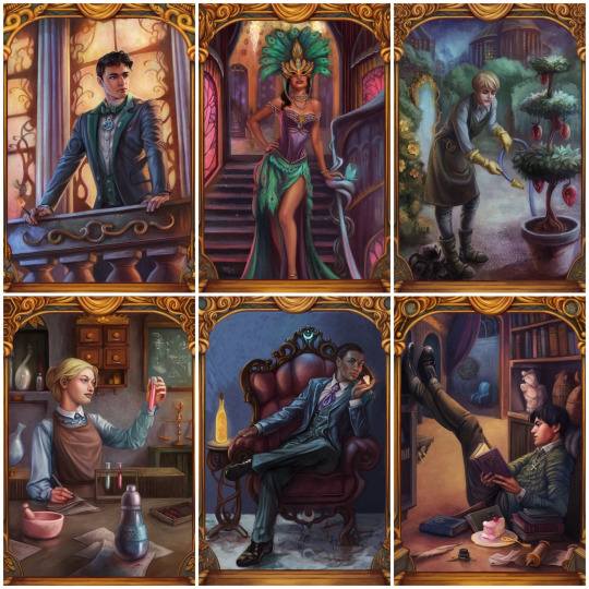
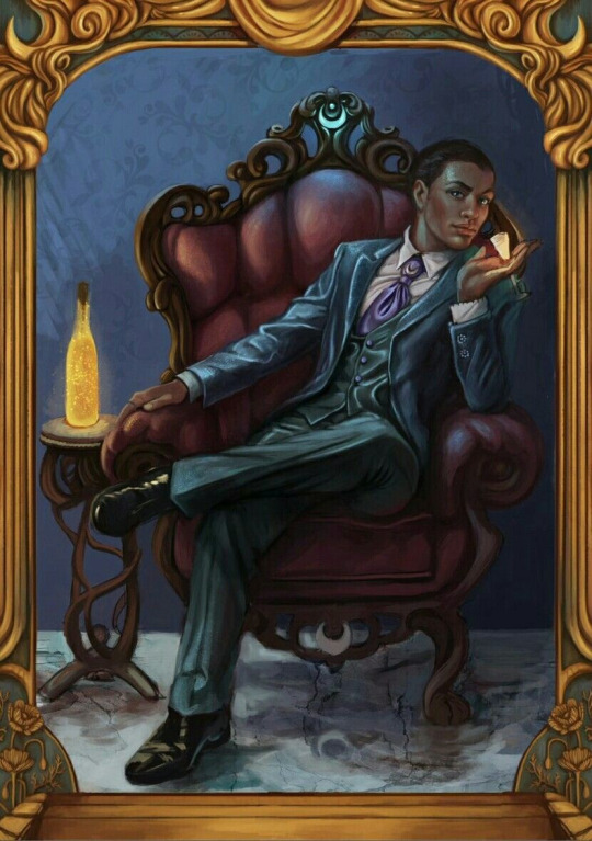
They showcase settings, props, and poses that all communicate the characters’ interests, skills, and personality, as well as the glamorous, elaborate aesthetic of the overall story. Even elements in the gold borders change, alluding to other plot points and symbology.
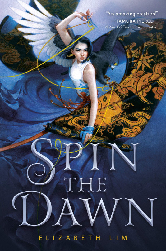
For painterly accuracy in character portraits on covers, I love SPIN THE DAWN. The heroine looks like a beautiful badass, yes, but the thoughtful, detailed rendering of every element, soft textures, and dynamic, fluid composition form a really cohesive, stunning illustration that presents an intriguing collection of story elements.
The devil isn’t always in the details, though: stark, moody, highly stylized or graphic art with an emphasis on textural contrast and bold color and shape rather than representational accuracy can communicate a lot (emotionally and tonally) while pretty much foregoing realism.
The new Lunar Chronicles covers are actually the best examples I found of this (Trying to stay within the realm of existing bookish art rather than branch into All Art Of Human Figures Forever):


Taking cues from styles more typical of the comics and video game industries. (Games and comics, as visual mediums, are sources of incredible character art and I highly recommend following artists in those industries if you want to See More Cool Art On Your Timeline.)
TL;DR: Character art and design, as a marketing tool (even an incidental one) should be as unique to your story and your characters as possible, and tell us about the story in ways that make us want to read it. I tried to give examples because there are so many ways to do this, and so many different kinds of art, and I could give many more! But I’m bored now. So to circle all the way back:

These are not just bad because they look like each other, although that is embarrassing and illuminating. These are bad covers (although,,,,, PRINCESS is the far worse offender, at least FIRELIGHT suggests a thoughtful cultural analogue) because a desire for Pretty Character Art overrode the basic cover function to tell us about the story. We get no sense of who these people are, what their relationships are, what these books are about beyond the most general genre, or why we might care. The expressions are vague, the characters generic-looking, the compositions uninteresting and the colors failing to be indicative of anything in particular.
They’re somebody else’s baby pictures.
(And yes, that’s the CRUEL PRINCE font on PRINCESS. I better not have to do a roundup post but it’s on thin fucking ice.)
330 notes
·
View notes
Text
Klemens interview about his furniture, 24.5.20
On May 24th, an interview with Klemens about the furniture he’s made was published on mbl.is. It’s a pretty interesting one, as he mentions having ADHD, talks a lot about his thoughts on art in a way more elaborate manner than any previous interview, and makes some quirky jokes such as declaring that one of his favorite things to do at home is picking his nose.
Below is a bullet point translation of what's said in the interview (not a word-for-word translation of the entire thing, but everything new said in it is there, and there are a lot of full quotes).
(Content warning: bodily fluids mention.)
The intro explains that Klemens thinks visually and contributes stylistically both to Hatari and his home. He learned carpentry before he joined a band, and he's worked on designing furniture alongside his composing.
"I learned furniture building at the Technical College Reykjavík and then went into product design at the Academy of the Arts, but found my passions lay elsewhere. I needed a broader spectrum to create and found an outlet for my ADHD in visual art. My wife Ronja Mogensen and I are classmates at the Academy of the Arts."
Klemens has always been creating things, for as long as he can remember. "I've always found joy in creating, and nothing is as creative as a childlike nature. After all, you lose your innocence somewhere on an abandoned playground and then spend most of your life trying to find it again. Creativity makes the world go round endlessly in our heads and sparks our imagination, which lets us have the most magnificent adventures, express and cope with loss, grief, fear, disappointment, joy, hope, the entire spectrum of emotions that are often so difficult to spit out. I've always sought out music as an outlet for that, but also carpentry and visual art, whether it's making cucumbers out of mud, making sculptures out of semen and hair, or making chairs out of wood."
The interviewer asks what makes a good home in his mind. "They say that home is where your family is, and there's a lot to that. Some years ago I might not have said that, and would never have imagined being a father of two and engaged in a passionate relationship, but the home and love go hand in hand, and you need to decide on where you want to live and die, so I see the home as more of a state of mind. A good home is a decently healthy mind, but if I were to imagine my dream home as a physical place, it's a house in the countryside with a workshop, a place to make music, some chickens and maybe a goat called Old Túbal, a brook that we can wade into naked, a vegetable garden and a greenhouse with fruit, a giant treehouse castle that we can climb in, and we built the house and everything in it ourselves."
He first discovered carpentry in a woodworking class in primary school; as far as he can remember, the first thing he made was a lamp for his parents with a face carved into it, though he's not sure if it was meant to be a self-portrait. He also made a baseball bat, which was subsequently stolen. The first proper furniture he did was for the Technical College when he was nineteen, a chair and a cabinet in a 70s-esque style with a modern touch. He found joy in creating a unique, useful object that you could carry with you throughout your life and perhaps even longer.
The interviewer says she heard his graduation project was sold on the spot. He corrects her and says he actually made a second copy to interior designer Thelma Friðriksdóttir's specifications, because he wanted to let his grandkids inherit the original.
Klemens recites a poem that he wrote with Matthías to encompass the core of Klemens' art sensibilities. It reads thus: I am a naivist perfectionist. I take making a fool of myself very seriously. I contemplate my own navel with humility. I'm willing to do the work of pitying myself. I capitulate to art. I want to have perfect control over my art.
"I notice that when I myself am in frame, it takes on a different tone than when the painting, the sculpture, the furniture, the evidence get to speak for themselves. On the one hand, I myself take on the role of the artist and the subject, comment on the medium through the medium and poke fun at myself while I'm at it. The artist Klemens creates a photo series that parodies the concept of photo series and simultaneously parodies Klemens. When Klemens takes on the role of 'pop star in a political supergroup' it means a radical staging where he embodies the sexy porn boy, a perverted narcissist in the depths of self-pity. Even if you use humour as a shield, you have to face that in the end, art comes from yourself. Thus, you're always vulnerable before art. It becomes an endless navel-gazing at the same time as I hope it encompasses some wider context - is bigger than my own personal experiences. When I step out of frame you see a totally different tone, like with the cabinet or the sculptures. I'm more humble before my creation and I seek a texture that could simultaneously be called naivistic, expressionistic but also formalistic and colored by a palate-driven compulsion. Unrestrained figures emerge and take on a life of their own without being commentary on the medium of painting and parodying the one who paints it."
When the interviewer asks about his studies at the Academy of the Arts, he admits he was on paternity leave for a year and also missed the second half of the first year because of Hatari's ESC journey, but it was fun and he's looking forward to continuing in the fall.
What can you tell me about the furniture you've made for your home? "It gives the house a certain character and I'm proud of it."
During the COVID-19 epidemic, he made a set of bookshelves for his parents, which he says was mostly them wanting to support a poor unemployed artist in a difficult time. Originally he was going to do something very simple from existing components but then he just kind of unthinkingly started making it all from scratch without even drawing up more than a rough sketch, and he was as excited as his parents to see how it'd turn out.
How would you describe your home? "Muy grandioso!"
Who lives in your home and do you and your fiancée have the same tastes? "The pillar of the household is my wife Ronja, and then we share it with our daughters Valkyrja and Aþena, 'V-kay and A-J'. Aþena doesn't have much in the way of taste yet as she's only ten months old, two-year-old Valkyrja admires everything and thinks everything is art, so she's not picky except when it comes to precisely how you dunk Graham crackers into a glass of milk. Ronja and I may not have similar tastes, but her strengths make up for my weaknesses and she's very patient with my perfectionism."
What's your favorite thing to do at home? "Watching the kids laugh and cry, watering the plants, picking my nose and passing time."
Klemens doesn't currently have his own workshop, but the owners of a small furniture business have kindly given him access to their workshop, and the Academy of the Arts has a good one as well.
As far as Klemens is concerned he's already living the dream, asked if there's anything he'd do with nothing holding him back.
Klemens will mix together furniture he's received for free or bought used and tries to make it work. He tries to avoid mass-produced furniture even though it can be beautiful; what he loves most is uniqueness. He wants to build as much himself as he can.
What time periods in furniture design appeal to you most? "Mid-century modern and slick."
When you look for ideas, where do you look? "Into the depths of my subconscious and to Foucault."
Is a garden or outside area important when you have kids? "Oh yes. The new trampoline, admittedly mass-produced, has really delivered."
What's your favorite kind of wood to build out of? "Oak."
What's your favorite color to paint your walls? "That depends completely on the context of the room, the lighting and the shape of it, but I love really bright colors and want a lot of those."
Is there anything you're good at at home that nobody knows about? "I'm naturally very limber."
36 notes
·
View notes
Text
Your Wall Art Can Make or Break Your Space: Cool Ideas From The Pros
Regardless how beautiful the furniture, an area with uncovered wall surface areas typically would seem not complete. “Art is a lot like punctuation to your sentence - it really is that most-important element and without this an area is lacking in the layers and mindset an important work may bring”., affirms fine artwork professional photographer Erik Cocks. Most of Erik’s projects—no matter if it's a resort or possibly a beachside second home villa—are loaded with personal bits of diverse variations, shapes, and dimensions, as well as very different works can often be found hanging within the same room jointly.
A combination of works of art, photos and sculpture obtained over time intertwines a layered tapestry about one’s interests and visual tastes. Think about which method you favor and where your likes take you before starting to purchase artwork or sculpture. The target is always to identify items that indicate something for your needs, not merely to opt for decoration for filling up the walls in a room.
Art can present multiple lenses to bring an area into focus, even though the right ways to display it could seem to be elusive. We hope the artwork we select does not simply “match the furniture”. We want it to represent a feeling of our preferences and further selves. Therefore, browsing for the right piece — and the best place for placing it — may be overwhelming, challenging actual selection and making us question our tastes. Here's a few concepts to assist you in increasing your chances of trendy success!
You Matter
Most of all, a home should stand for its owner, so one particular shouldn’t be too driven by tendencies to gain acceptance or make a statement that is not you. You’ve actually got to live in the space 24/7, not the people who visit once a year for parties. Something that you are truly attracted to is something that can ultimately stand up the test of your energy day in and day out.
When I help decorate properties, either homes or commercial projects, the art reflects the DNA of our clients.
Literally, interview yourself and ask; “what kinds of images make me feel the way I want my space to feel”? What statement am I making with the art I choose? Am I trying to choose images I like or impress others (hint, choose what works for you).
Combine Your Loves
Artwork doesn’t have to match your room. You may be eclectic, the home you live in may be Victorian. Make a statement. Standard bedrooms will take modern day art, and modern areas might take old-type paintings. Frequently it is better to blend fine art styles. Contrast can be an assertion in itself.
Slow Down
Handle your home fine art purchasing like creating a show in an art gallery. A contemporary gallery’s wall surfaces are a great way of working with artworks of different styles, hues, and designs. Program your “show” upfront, taking just as much time since you need to feel like it’s working for you. As a way to hang a collection wall surface properly, you must curate it appropriately. Curation is regarded as a good strategy because it makes you think about how everything reacts with each other.
Look Deeper Inside
So, you really like that image, sculpture or canvas… Do your research on its history—the procedure may lead to more discoveries that suit your style. When you are drawn to a picture, figure out a bit more regarding the creator, their principles, their history, and don’t be afraid to reach out to the artist. We actually love hearing from patrons.
Filling Up an Open Space with Art That Means Something
With increasingly more homeowners and corporations working with open flooring places, selecting wall art is more difficult than before. The most significant guideline to adhere to when deciding on wall art for open floorplans is always to buy and hang with the objective of clearly supporting themes or elements that you are trying to present.
Build a cohesive look between rooms but position your artwork purposefully in just one area. For example, a wall shared between a cooking area and family room needs to have wall artwork specifically in the kitchen, then additional artwork inside the living room. These two pieces can create a bridge in between the spaces or create thematic separation for the two rooms.
When you’re deciding on wall artwork to bring life to an open flooring space, you have to look at habitation, layout, time spent daily in that room, and how you employ artwork in it. As an example, when your dining area is visible to your living area you might not want classic food items-targeted graphics in this place.
Your Art is You
You are worthy of a home that is secure but suits your fashion sense. Have some fun choosing your wall artwork. A cohesive spot loaded with aesthetically pleasing art can be in your future, but you’ve got to do some planning and you also have to understand yourself a little bit.
Recently I helped a colleague put up some photos in their home. She’d got her walls repainted and was rethinking the location of her pieces. Her focal point was a really sizeable artwork she possessed proudly displayed in the tiny NYC apartment back where she started her career in.
While I helped her find other pieces she loved, this particular photo brought her back to the thoughts of her loved ones, friends and experiences she first had when she moved to New York, so it remained the focal point of the collection.
Artwork is like that. It is able to move individuals.
10 Ideas to Consider When Choosing Wall Art
Choose Art That Brings You Joy
Art is among the simplest approaches to present your character to the world and personalize your home.
Art may spark something in you, remind you of great memories, or inspire you. That is ok. You don’t really need to be a connoisseur or art history major to enjoy art! But at the same time, it is actually kinda entertaining to consider the reason you are driven to a particular piece of art, photo or sculpture. Sometimes, it’s a fun exercise to consider what exactly it is that makes you get pleasure from a particular piece!
Select colors, finishes, and styles that appeal to you. Art is all about experiencing and passion. It draws on the heartstrings.
Think About The Room You’re Searching For
Art completes a room. It can be the entity that ties it all together. So, as you’re picking wall surface artwork consider these concepts:
Take into account the space you’re going to put the actual art in. Is it going to be a theme, an eclectic mix, a statement? Is the space set up for a grand display or an intimate statement?
Which are the colors that are within the room already? Would you like to highlight them?
What frame of mind are you presently looking to generate from the area? Are you currently aiming for unique, relaxed, fun, traditional?
Proportion and balance are two essential values to consider when picking a statement for your walls. Err on the side of too large instead of too small. A too-modest piece runs the risk of coming off as an afterthought. (Except when you are being intentional. If that’s the situation, then by all means, blow up the rules!) Thirty tiny photographs telling a story is sometimes more powerful than one large image.
Use Multiple Kinds of Art Forms
Artwork appears in various styles and sources. Photos, paintings, metalwork, wall sculptures, images, weavings, mats, and fabric can be all in the mix to make a room come alive. A colorful quilt may add pizazz and impact to the area. Framing your kids’ art can add character and fun to the mix as well.
Blend it instead of shooting for every little thing to match. Your artwork needs to be a blend of variations and compositions. If you force a particular look in every place in your home or office, it could easily slide into appearing like a hotel reception as opposed to a property representing the individuality and the folks who reside there (unless you are actually decorating a hotel reception area, then it’s great!). Alternatively, think about using a mix of canvases, framed artwork, oils paintings and images, unstructured element and many others.
Evaluate, Calculate, Analyze
Here’s a quick list of suggestions to assist you to while you discover the best places to position your art.
Hang art with its center 57-60” off of the ground for wall surface hanging pieces. That’s a typical common eye level height. It can help the area you are decorating to really feel grounded and well-balanced.
There are no rules about centering art in the middle of walls or being specific about spacing between frames. In case you have a light, or possibly a taller plant in one side of your room, think about centering between it and also the complete opposite border of the walls.
If your art will be above chairs or couches, provide for 6-8” on top of the top edge of the furnishings. If you are going to place shelves, go with 18 inches. Try this; sit on your furniture, pretend you are 6 feet tall and lean back, will you hit your head on anything? Also, putting shelves with art too close to seating areas encourages guests to put their drinks on your shelves, no matter what the cost of the art that wine glass will be next to!
You Have a Kitchen and Bathroom
The bathroom and kitchen are fantastic spots to add entertaining and lighthearted artwork. These spaces are typically the “workhorses” of the property, and jovial artwork can help you to lighten up the load.
Look at leaning a frame against the wall under your kitchen cabinets on the top edges of the kitchen. Or locate a spot around the walls to include a little panache!
While water-themed items are the mainstay of bathrooms, you are not held to this. Also, finished food plated items are often used for kitchens in model homes you might visit, usually they are not a great idea if you will be seeing them daily. It seems to translate into feeling like you are eating that food every day. You can use herb flower images, abstract elements of gathering food, like farms etc. and you will likely not want to replace them in a year.
Decorative Mirrors Expand Your World
Do not overlook wall mirrors while searching to fill your walls. A nicely positioned mirror will reveal back light, color, designs, and images in the area. Select one with a structure that enhances your decor and watch how the space immediately presents itself larger and lighter. f you’re adventurous, consider using numerous mirrors on different walls––it’s the best way to include a sophisticated, yet straightforward feel to the place. Mirrors are also cool ways of showing off sculpture elements.
It’s OK to Be Negative
Not every walls requires stuff on it. Just as the margin on a book allows your eyes to relax and focus, purposefully placing blank space on a few of the wall surface locations within your space will give you a similar outcome as the well-read book.
Negative space can serve to feature your pieces by driving your vision eyeline to the artwork. It permits the artwork to become the focal point and makes a statement.
Having an excessive amount of artwork about the surfaces of your space crammed too close with each other risks claustrophobia!
Layers Add Layers (of interest)
Whether it is that African statue with a story attached to it sitting on your mantle while watching graphics or perhaps a photo from an obscure place, multiple elements add more attention. A fire feature or unique plant climbing the walls draws the attention into the space to figure out what is going on. Big, little, big is often how designers build scale to a room or draw visitors to the feature they want to show off. One designer I worked with placed a series of my images with textured wall hangings of decreasing sizes to pull viewers onto the enormous water-view balcony for a multimillion-dollar view.
Bookshelves are cool areas to show more compact artwork items from, plus art segments the shelves from books and even freezes visitors’ eyes when they scan the shelves with books. Many designers use this trick to stop viewers then place a medium piece near the break in the books.
Discover the Artist
As I mentioned before, finding about the artist who created works can be fulfilling. Among the most popular reasons for social networking is having the capacity to find out about artists you are interested in and view their methods and backstories. Designers pour their souls into their craft. Learning about them as well as their enthusiasm definitely makes the connection with the art all the better.
Emerging artists with great stories make for interesting conversations with visitors to your home or office. When you can actually speak to the work on your walls, you take your decorating to the next level.
Often, when you learn about an artist, you gain access to their work sooner and sometimes are invited to places you would normally not have access to, and even meeting other artists who you may want to collect.
The Right Frame Can Make A Big Difference
Sometimes, a space simply calls for a clean black frame and white mat like in an art gallery. However, your frames can match your space as well. Driftwood and light colors can accent a nautical theme. Contrasting colors can create interest in a kids room or play space. Grey wood frames can provide a calming presence to bathrooms and media rooms.
ART STYLES
Collect work by a single artist or see who might have similar styles. Plus, seek to curate a supportive feel to the artwork displayed. Pillows, textured or painted surfaces or side rails, and in many cases, sculptures can complement the tone within the art.
Picking Your Art by Style
More than anything, choosing walls artwork by type illustrates your individual taste. A few examples of variations to utilize include old-fashioned pieces, a bright, bold type, or possibly a Bohemian appearance.
A top-secret technique to design is usually to choose a fashion or interior designer you prefer and mimic your property in line with the type of that designer’s style. Grab some magazines, hit the web and see who the top fashion and interior designers are for the space you are decorating.
Make your selections according to what you like after implementing certain guidelines like dimensions or color themes. Are you currently at a loss of how to begin? Try to find some art that could fit in the next categories:
Choose artwork that matches with the design and style of the area, including the furnishings you plan on buying as well as any cool stuff you already have and love.
Purchase one or more important or large pieces you’d love to see for years to come.
Buy matching small pieces. These go wonderful above windows, on shelves or on short wall surfaces.
Use picture frames to highlight your stuff. Frames can be identical to tie in pieces, even if they are different in style, or frames that fit into a theme – like reclaimed wood.
Picking Wall Art By Color
Within Interior Design circles, there is a big difference between room color palettes versus the color palettes of artwork. With art, there is much more allowance for the use of strong color systems or maybe those brights you might only reserve on an accent wall.
There are 2 significant strategies to picking your wall art by color:
Wall Art Strategy #1
First things first, include artwork that features hues already present inside the room. In the vast majority of instances, adhering to a consistent plan is cohesive, sophisticated, and supportive of people’s emotional expectation of rooms. Fundamentals of this strategy involve:
Your most important part of artwork ought to have some coloration that matches your wall base color.
Research the color wheels online (like Adobe’s free Kuler.com) when deciding on complementary colors. Find them and use them.
Utilize the same color, however in diverse tones. A light azure and white colored piece of art seems beautiful with a navy-blue wall surface.
Only choose wall art if it has that specific hue in your room. Most area should never surpass four hues if you want people to understand that you are doing things on purpose.
Stick with black and whites while in doubt about shade. Monochromes match up everything while also contributing to the elegance of the room composition.
Avoid vibrant shades and neon as these almost always don’t match with neutral wall surface shades. They often come off as “cartoony” even in kids rooms.
Maintain the colors with your walls artwork to the same in proportion for their appearance inside the room. For example, should your location focus on grayscale with a couch you love that has reddish chuck cushions, look for contemporary art that is certainly white and black with a bit of red.
Wall Art Strategy #2
Choose artwork for your areas that presents bolder tones about the same color and shade plan. Your wall color does not limit your palette but rather works as a standard for your selection of art based on your personal style.
Select bright items as they will be noticeable against surfaces with fairly neutral backgrounds.
Tie up with each room with similar lines or looks and not just color. Sections from the exact same artist may be distinct shades but drawn in the same style of the other artwork in they space. I once worked with a designer who I did commissioned pieces for that used the same organic materials and power lines to surround all of their industrial equipment to tie in pieces. I also had a family who featured their falcon in every one of their art pieces in each room.
Play with structure and color in wall art, home furniture, and accessories. Get items made out of found supplies like timber and metal as a muted foundation and use bold colors. Adding the colors of the art to the components of your respective room emphasizes the boldness of your wall’s hangings.
Obtain art according to the “undertones” of the images. The undertones of the piece of art are the foundation of your image and set the “tone” for pieces. Dark light brown undertones look fantastic on lighting dark brown walls, even when light brown is just not actually in the artwork.
Expose a whole new color in the room in twos or threes. A dazzling lime could be accidental, but two pieces illustrate that it’s intentional. Repetition increases impact. Just keep it to two or three pieces.
Curating Your Wall Art by Theme
Have you curated your living space or office around a certain style or strategy? It’s a common way of design, from kids’ rooms to restaurants. It’s an easy way of signaling what you’re all about instantly when someone comes in a room.
As an example, a property with a beachy really feel has light walls with bright accents, graphics of ocean lifestyle, pieces manufactured from driftwood, plus more.
A rustic theme is darker, uses reclaimed wood and maybe dark metal as the foundation for the artwork to come into.
Homes using a theme are pretty straight forward to do since you can quickly eliminate items which do not satisfy your design base and include the “standards” for that them.
When finding pieces for your space, keep an eye out for stuff off the beaten path or even in unexpected spots like estate sales. Vintage shops have done the looking for you but are more expensive because they already put in the work to find what you were looking for. Follow estate sale companies on social media and they will post the upcoming events they have and if you become a regular, they will reach out to you with specific items before anyone else. I scored an airplane wing for a photo shoot this way for pennies on the dollar.
Homeowners with patience in beautifying their homes can be on the lookout for several themes and make “picking” a fun hobby. One of my clients opened her own ETSY store after completing an in-home bar project. She continues to find themed pieces all over her state and passes them on to others looking to do themed rooms.
That One Incredible piece
The Hope diamond doesn’t need a whole bunch of stuff around it – it’s the Hope Diamond!
Much like planning around a theme, an central piece is THE piece and everything else in the room supports it. If you hang up an original Andy Warhol of Diane Arbus photo print, you only really want to support that piece.
A matching small piece, some furniture, some plants featured in the image. Something that doesn’t detract from the main show.
My friend had a huge Andy Warhol and had the couch featured in the image custom made with an end table that had soup can lamp on it (yes, it was over the top but it actually worked).
After you have your perfect piece you can emphasize it by:
Match color schemes of your room off of the featured piece. It can be complimentary or contrasting. Stick with one or two accent colors and don’t paint an entire room blue because you bought a Chihuly glass sculpture.
Walls are ok. Don’t paint a room blue, but maybe you can paint one wall an accent color for the featured work to pull the eyes in to where you want them to go in the room.
Trust your gut. This is a labor of love, even in a corporate space. Haters are going to hate, so you get some accent items that make sense to you and that you can tell a story from for your main piece and stick with your guns.
Where Does Everything Go?
Pro Methods for Picking Artwork for Your Home
A standard FAQ with designers is, "Just how do i select the right art for the places it should go?". There are several rules to actually select the right piece for a particular area.
The beauty of art work is that it's an investment and it is possible to take with you while you relocate, and even has the potential to increase in value after a while.
The Bedroom
The bedroom is actually a getaway, a place for rest, so your art should mirror that. The ideal wall surfaces for artwork in the master bedroom are directly over the mattress or on the wall surface opposing the bed. Large scale prints are best but still must be installed at eye level. Search for abstract pieces with relaxing shades or shades. When you choose fine art photography, scenery or desaturated pictures are best. Keep your structure minimal – use a gallery frame or canvases to present work with. Here, we should focus on the artwork piece on its own rather than building out complicated frames with barbed wire and reclaimed steel!
Your Kitchen
Your kitchen is sometimes called the "heart of your home" and even serves as the most commonly visited space of the home. Art belongs in the kitchen. However, there is often limited wall space for big prints or sculptures. Counters or spaces above cabinets are great homes for artwork. Smaller art rules the day here and should not overpower the area. We tend to choose funny or more interpersonal prints that make us smile as we often are in the kitchen in the morning. My friend put some silly Dali small reproduction prints in the kitchen as they were small, playful, and colorful.
Home Office Wall Art and Beyond
No matter if you do business from home or in a workplace, art is a wonderful way to customize your space while keeping you motivated. The most popular way to do this can be by developing a rotating art gallery. To begin, you will need an extended floating ledge shelf. This wll be the foundation of your gallery display. The advantage of this really is that it's the sole thing you will have to hang! After that you just need to find great things to rotate in and out, it is easy to opt for an assortment of art that drives you or calms you. The additional fun part is that if you are really into it, you can utilize holiday themes (maybe just in colors and nothing to blatant). Artists who inspire you are excellent beginnings. You need to combine sizes at the same time, big and small therefore the possibilities are endless. You might have all of them in similar picture frames to get a minimalist look or many different support frames to include some figure. These sections can be rotated or current any time you get bored.
Also, this is an area for prints for printed canvases. You don’t want that limited-edition Erik Cocks print disappearing from work, so opt for inexpensive pieces and open edition prints. You can even buy framed prints online in many cases and have them shipped right to your office.
The Bath
This is one room that usually becomes forgotten, holds terrible art or the art is left too long and becomes damaged. The artwork you select should go with all the atmosphere of the bathroom. By way of example, if it's a guest bath on the primary living levels, stick to more fun and vibrant pieces. If it's a master bath, go with more tranquil or relaxing pieces.
Skinny small pieces or Tryptic pieces work well in bathrooms. They are often two of the identical abstract pieces with 1 flipped on its aspect, or two different parts that fit with similar themes. Smart places for these sections would be across back of the toilet, across the tub, or over the bath towel/robe hooks.
A couple words of warning; first, a bathroom can get “basic” really fast if you go with “typical” pieces, like beaches and sailboats. Go with a different beach and sailboat look, go with different images all together. Second, the bathroom is a wet environment. Framed prints have about a year lifespan in a bathroom. Canvas prints warp in about 6 months in a bathroom. Try acrylic prints, try metal prints, get pieces printed on polyester with plastic frames and mats (they are out there online).
For that Living Room You Have Dreams About
By far the most entertaining area to decorate with artwork, but also the most overwhelming will be the living room area. Choosing the right piece is elemental in provoking dialogue around your art and establishing the ambiance in the space. You can select one particular huge-scale item or perhaps a large gallery wall element. Occasionally you must think beyond the frame. Artwork doesn't always need to be a print or fabric, occasionally it may take other forms. Sculpture, dimensional art and various sizes rule the day in the living room.
The Technical Details of Placing Art on Walls
Here is everything you need to know before starting to deck out your wall space with beauty. (OK, it really isn’t but this information can get you started because it will give you some specs on how designers deal with rooms).
Show off your style with perfectly curated shades of color and art. From placement tips and rules, and design recommendations you can create the ideal room with even dreamier artwork.
Sizing
Determine how much room you actually have available for you and check for items which can fit for the room. A general guideline is to fill up two-thirds to three-quarters of the wall with art or wall treatments. For modern art go bigger in piece size with more space around pieces to maximize impact. Be aware of doors as well, when they open, you want some room past where the door will land on the room and go with larger art near doors, as small art is more intimate and causes people to stop longer and look.
Small
Normally varying between 10 to 17 ins in level and size, small wall art pieces can stand-alone or they can be used as element of a series.
Modest
Tiny wall surface artwork can vary between 18 to 24 “. These dimensions are also most impactful in a group or combined with another print to get a symmetrical appearance. They can be installed in second bedrooms which may have smaller wall surfaces.
Medium
Medium wall art work describes pieces which ar between 24 to 32 " (or about 2 to 3 ft .) in height and size. This size is great for personalizing a house living room, workplace, or foyer without contributing to clutter.
Large
Large wall surface artwork ranges between 30 and 40 ins (about 3 to 4 ft .) in size and width. A wall surface with just a single piece of huge artwork generates a gallery-like appearance and makes a statement about the subject and placement.
Oversized
Oversized is the Fast food “Super-Size” of the art world – you are making a conscious decision to go this big. Their size makes as much of a statement as the work itself in many cases. I’ve seen oil paintings take up a 12 foot wall, and they were amazing!
Oversized art features dimensions larger than 48” (4 feet). Pieces of this dimension can stand alone as key components of a wall structure or space. We suggest calculating your space before the installation of a bit of outsized walls art work as it can certainly overwhelm a compact room.
Where Does Everything Actually Go?
When placing artwork, these tips are industry best practices:
The middle of the artwork (with frame) should hang up about 60 inches from your floor (or at eye levels for most people). If it is holding above an end table or other piece of furniture, make sure you account for what might be going on a table like a plant. Also, make sure there is no less than 6-12 “ between the top of the any chair, sofa and the artwork.
RULE BREAKING NOTE: Instead of the 60 inch middle rule, when you have standard ceilings (8 ft.), split your walls into 4 segments (from the bottom to the top) and hang whatever you are going to hang within the third area.
When hanging art by your stairs, hang a piece every forth step to present a diagonal look.
Conclusion
I hope this article gave you some wall art ideas, provoked some great questions, and helped you create a plan to place some inspiring artwork in your space.
I often work with designers and companies to help them come up with plans of their own at no charge. If you would like some help with your plan, please contact us here.
I have even developed plans for clients, then went out and actually produced artwork to fit their needs. It’s not that expensive and can bring a space, (especially a commercial one) together.
For more resource on Images, check out the following websites:
Interior Design Magazine
https://www.interiordesign.net/
HGTV
https://www.hgtv.com/
Elle Décor
https://www.elledecor.com/
0 notes