#I slapped a bunch of overlays on this drawing lmao
Explore tagged Tumblr posts
Visit Tumblr Blog
Explore Tumblr blogs with no restrictions, modern design and the best experience.
Last Seen Tumblr Blogs


Fun Fact
Tumblr.com is the 103rd most visited website in the world.
Note

Mayhaps you could draw this lady :3

DRAGON OCS BELOVED!!! Ragh ok this is a mess of ideas so idk if its a good composition but I rlly liked drawing her!! She seems like she’d steal my wallet and tbh I would let her do that hehe
#I HOPE THIS IS OKKK#I slapped a bunch of overlays on this drawing lmao#i like the grainy texture what can i say#others ocs#they-thespian666#my art#artists on tumblr#ask
14 notes
·
View notes
Note
hiya, I really love your art, and how you make your latest stuff look really vintage and aged, it’s really super cool and I was wondering if you’d be willing to share your process for that?? thank you so much and I hope you have a wonderful day!!! :D
aww thanks so much! and of course i can share my process, no prob!! ^^
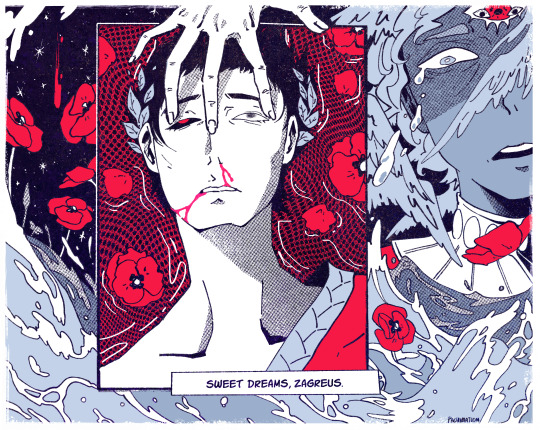
i’ll be using this piece as an example, and uh, for the context of it u might have to look on twitter lol. but whatever

it’ll be a bit long so everything is under the cut
(this is just based on my process, and i know its weird and csp specific.
feel free to pick and choose pieces from my process!)
and also the programs i used were procreate and csp and i have a mac. u could probably do this with other set ups, but this tutorial might not be super helpful near the end
i usually make my lineart in procreate and import it into csp as a .psd file

for this, in procreate, select the file you want to export and click PSD and then I airdrop it to my mac.
i think the only thing about the lineart i have tips on is to keep it toothy/gritty if that makes sense?
i use the 6B pencil in procreate with a bunch of tweaks to the pressure sensitivity and opacity/size change.
but anything with a good size jitter should do the job!
in csp i shade and color the piece.
picking out the colors is a whole other mess
feel free to ask about it but ill skip for now ;v;

flat colors

csp has a lot of nice halftone options!
group up ur lineart and everything thats black rn in a folder and above them set a clipping layer to add
fill it with a color lighter than black; the less pure blacks and white u have on a piece the better
feel free to go to town w the grunge or noise texture of ur choosing! the grittier the better bc during this step i try to get the feel of worn off ink. just make sure the linearts still visible, though. u went through all the trouble to make it after all! ^^
(i have specific brushes but again thats something else u can ask me about)
above all the layers, make a multiply layer and do something similar.
same advice as above

this is ur “paper” texture, tho, so try to keep it more even in tone so things don’t get too messy
(but if it works for u, feel free to do it! find what works is my advice!)
ok time for some super csp-specific steps (sorry to non-csp users)
the csp asset store/website(?) has a lot of nice textures and brushes available.
look through it if u haven't
it will make ur life so much easier
theres a really nice tileable watercolor texture set there
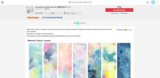
(this one specifically)
(it also had some really good paper texture bc whoever made this is a godsend)
i slap that over the color layer, set it to clipping, and mess with the blending modes
its usually a tossup between soft light, overlay, multiply, and the overlay texture effect tho
theres another optional step of using the overlay texture effect on a paper texture
i didn’t do it on this example sorry :’(
i think i used another watercolor texture set to soft light on this piece?
after that, if u want, i like setting a noise texture at a v low opacity over everything for extra jitter

(i use this one. u can just make it in csp and probably any other drawing software but im lazy lmao)
save it as a png/jpg/etc.
and ur done!
i do some extra stuff to the final image like scale everything down and add a bit of a 3D effect for a bit of extra kick
(but again thats a bit complex and specific so feel free to ask but ill keep it short
for your sanity’s sake)
(and once again, the final image! ta-da!)
some tips to keep in mind i guess
jitter, grit and noise textures are very good things when u want something to look rough
avoid pure blacks and whites; most paper isn’t printed pure black or white and it only gets more faded and colored with time
if ur super lost, look at reference!! theres a lot of good artists and media out there to get inspiration from, and looking at scans of actual old comics is a nice way to see if ur work looks aged
(also u don’t have to use old comics as reference; i like looking at old vcr footage for reference bc of the texture!! :D)
that’s all i have for my general process
uhh for specifics feel free to ask
i can make more tutorials but this one is a general overview, i just didn’t to take up too much of ur time….
but i really hope it helped! and im very sorry if it didn’t
i’ve never made a tutorial so im sorry if it didn’t answer ur question and also im sorry if this one’s not very useful
thank you for reading!!!
and thank you to whoever asked! :D
54 notes
·
View notes