#I saw the reference on Pinterest and just knew I needed us to be drawn like it LMAOOO
Text
A Gift for the Sea

Photographer: unknown (found on pinterest)
August 19th, 2024-
Author: Miss Annabelle
Authors note- I don't often write, and when I do, it's rarely for the wider world to see. This story though, I wanted to share, if only to remind myself to dream. Please note that this is fictional for privacy sake, but adapted from actual happenings.
-
My toes wiggled into the sand, churning it around like a crab looking for safety from the oncoming waves. My charge, a little girl of around six years, scampered with delight from shell to shell, plucking each one up as another dropped from her overfilled arms.
I smiled, as is oft the case in moments like these, at her endless elation when finding a new color or shape, despite her vast collection both here in her arms, and at home.
She stopped, her eyes drawn to something I couldn't see. I joined her side and ran a hand gently through her wild bronze hair, smoothing it in hopeless ambition.
"Miss Belle?" She asked, in an inquisitive tone I knew well.
"Yes love?"
"Why does the sea give us gifts?"
"What sorts of gifts does it give us dear?" I assumed she was referring to the collection in her arms, but I'd learned it was foolish to assume anything of a child's thoughts, especially one with such reckless wonder.
"Well, the shells and rocks and branches and sand, it just drops it all here for us to pick up." She wrapped an arm around my leg, more of her treasures slipping from her grasp to form a crown around her feet.
"Perhaps it has more than it needs, and wants to share with us what it has." A child's imagination should never be wasted with boring facts, but it should also not be taught to take lies as truth. "Or perhaps they simply wash ashore. Do you want to ask it?"
"No...." She hesitated, her brow furrowing deeply in thought, "I think we should give it a gift instead."
I had a moment of concern as I wondered what we had to give the ocean. I had left all my possessions of importance in a satchel by our shoes, waiting patiently for our return.
"What sort of gift should we give it dear?"
The answer seemed to stump my companion as well, and she spent several moments looking around for a worthy token. Gazing back the way we had come, her face suddenly burst into a smile.
"Our feet!" She declared in triumph.
"But we need our feet to walk, perhaps it might like a tuft of grass instead?"
The child released my leg, along with her treasure trove, and sprung over to the waterside. I followed, amusement decorating my expression.
"No, not grass, it likes our feet! See?" Tracing the direction of her gesture, I saw only our footprint trail, broken where the waves had washed sections away.
"Ah, I see now, you'd like to give the sea our footprints?"
I received a delighted nod. "Our feet!"
"Then it shall have our feet. Come love, let's give the sea a gift for a change."
Holding her hand in mine, we rushed down the beach, stomping our feet in earnest, then pausing to look behind us.
Our trail was washed away, the waves taking what we had left for it not moments before. The girl beside me took off once more, pulling me along with a string of giggles as we left our gifts behind.
The sea, it appears, does enjoy receiving gifts.
#spilled ink#journal#flash fiction#children see the world differently#the sea#do unto others#the shipmaster II
2 notes
·
View notes
Text

ROCKY LYNCH, MASCULINE NB, HE/HIM & THEY/THEM. — looks like SAMHAIN SKELLINGTON is attending AURORIA UNIVERSITY in auradon. they're the TWENTY year old child of JACK & SALLY SKELLINGTON, which means they're from THE ISLE. heard they're NURTURING & GENTLEMANLY, but can also be INFLEXIBLE & SELF-PITYING ; we all have our bad days. people normally associate them with SEWING NEEDLES REPAIRING A BROKEN DOLL , A BAG FULL OF BANDAGES, TRYING SO HARD TO BE TOUGH WHEN YOU’RE SOFT , SOFT HAIR HELD BACK WITH A BAT-SHAPED PIN.
❛ when you saw that little girl , and she was in the sandbox
and she was crying , and you gave her your toy truck and
I told you we couldn’t afford to get another one. you said ,
‘ she should have it because she’s sad. she’s sad , mommy. ’ ❜
playlist. pinterest. to listen as you read.
lol u guessed it it’s me , again , by unpopular demand - i am so sorry. third muse already bc i can’t keep myself away from playing absolute CINNAMON ROLLS so that’s what u can expect from sam w/ a pumpkin spice twist. bc nightmare is my absolute favorite movie and ... halloween, motherfuckers. so as usual this will PROBABLY end up long bc i love writing sam so much so yeah , more below !
HISTORY
So as we know , Jack & Sally were sent to the Isle w/ the rest of Halloweentown for trying to steal Christmas ! And unlike Christmas , Samhain was not born in Halloweentown. In fact , he wasn’t even born - he was made.
Magic wasn’t a huge thing on the Isle - but a resource of science was Dr. Finkelstein , and despite the limited resources and technology on the Isle , the couple begged the mad scientist to create another child for them. And from Sally , it took a lot of convincing , but Jack was able to talk him into it.
It took even more of an effort to pull off , again considering the state of the Isle. But a good few months into the project and Jack & Sally were greeted with the cries of a tiny ragdoll baby boy. Keeping up with the holiday themed names , he was named Samhain - Sam for short.
He grew with multiple touch-ups from the doctor to simulate an actual boy growing up - every year , a check-up making him taller , stronger , etc. And in that process he started to look more and more like his mother , with her big eyes and stitched smile and patchwork clothes. But he grew up loved by his brother & parents - though it never quelled the fact he always wanted... more.
He was loved , he was coddled , and as sheltered as a child could be on the Isle. So , much like his mother , he took a habit of sneaking out frequently and trying to fit in with the other Isle kids , even though he knew he didn’t.
He just wanted to fit in. That was it. And it started off with him wearing large hoods and heavy clothes to hide the stitches on his body as well as masks to cover facial stitches. And while some other Isle kids found him odd and sticking out like a sore thumb , some found him cool. Some found him interesting. But nobody really knew what he was hiding - and it added mystery to someone so NICE , because Sam’s overall sweetness could rival that if sugar’s.
Curiosity only reached dangerous points though when Sam snuck out on night to camp out with friends - and when everyone else was asleep , one removed his mask , and of COURSE did Samhain immediately wake up. He didn’t stay to see the reaction of the other when revealing his stitches , too afraid that he’d be seen as scary or repulsive for what he was. And he ran. He ran back home , locking himself in his room , and those friends he routinely hung out with . . . well , he didn’t talk to them much after that. Because what if they knew , now ?? What would they think ??
Villain & Auradon kids coming together was a new chance for Sam to try and fit in - be more in his element. He was immediately acquainted with a magic-practicing individual ( could be an AK or a VK - this’ll be a wc ) who struck a deal with him to offer him glamours so he could look less scary. Of course , these glamours would have to be applied and would wear off until the next application , but it’d make him feel more comfortable - even though he WOULD technically be hiding who he is.
While Christmas , the elder sibling , would be sticking around in Auradon Prep , Samhain would prefer to move immediately to Auroria University to try and figure out who exactly he wanted to be , and how he could do that. Currently he’s majoring in Nursing , given he’s always had a rather NURTURING and charitable nature - never turning down someone else’s request to help.
CHARACTER & FACTS
So lemme get this one thing out of the way bc if I don’t I’ll be itching about it - but all my resources for ( the love of my life ) Rocky were made by me , and while they’re all from multiple eras from both R5 & TDE , I imagine Sam to resemble how Rocky looks around the post-Louder , Heart Made Up On You & Sometime Last Night eras ( basically from like 2013-2015 ). Here , here , & here for some references. I’m nOT DONE GIFFING THOUGH bc frankly I find giffing him therapeutic.
Now I don’t have a drawn reference or anything for this next part so we’re gonna have to use our imagination here but unglamoured , Sam basically looks like his mom in terms of the fact he’s a little ragdoll baby. Putting on a glamour doesn’t change his appearance much save for the fact the stitches disappear and he looks more human.
The glamour is an enchanted bat charm he wears around his neck that can also be used as a hairtie. And it has to be refreshed every so often , so he has to keep going back to whoever provided him with it so it doesn’t lose its effect.
He still has a backup mask just in case , and he’s been practicing with makeup if need be.
Personality-wise , the best one can describe Sam as is sweet and polite. I included tht Stranger Things quote at the beginning 4 a rEASON bc he’s honestly such a sweet kid and will give anything to anyone.
And also bc I imagine Sally as Joyce mom-wise so yEAH bt I digress.
He knows his manners and treats everyone with the UTMOST amount of respect , which makes it extremely easy to get along with him . He’s also maybe a tad bit too giving for his own good , since it’s incredibly easy to use that to one’s advantage and he’s so inclined to believe people have the best intentions. An optimist , even if it’s to a fault. And then when he gets hurt he just sits to the side feeling sorry for himself like “ :’’’(. ”
Now when I say he’s inflexible , I mean that Sam is a very ORGANIZED person who likes things to be done a certain way - like , he can never do anything without a plan , and if even something slightly goes out of what the plan pertains of , he panics. He’s a goody-goody and he’s afraid to break the rules , which is why he’s still hesitant to even do things with the friends who are more “ bad ” than he is.
Everything has to be done BY THE BOOK and if it isn’t then something is bound to go wrong and Sam’s too worried about that happening.
He’s also incredibly insecure about his appearance but I think I’ve hammered in that fact enOUGH ALREADY
But if he takes his glamour off in front u that’s like. A Major sign of trust. So beware.
Again as I mentioned he tries to hang out with kids with the lesser reputations because :
1.) He wants to give them a chance
2.) He wants to make sure they have a friend to look after them
and 3.) He’s so used to trying to fit in with the other Isle kids that he’s trying to be ‘bad’ himself but it never works out bc he’s so sweet and he can dress in skinny jeans and leather and shit as much as he wants but at the end of the day he’s still Sweet Lil’ Samhain.
One thing he’s always had a fascination with would be angels - he’s always believed in them , always though he’s had his own guardian angel watching over him somewhere , he’s always loved the idea of them. He has lots of angel decorations around his dorm as well as ornaments and stuff for the holidays. It’s also pure irony that he just so happens to be just as angelic in nature.
He’s also a big holiday person like the rest of his family and loves helping to decorate for events and stuff !!
One of his greatest talents is his ability to play both the piano & violin , and he’ll often do that if there’s a piano in common areas or so on. He’s also a talented singer , but he’s so used to putting that to the side , making him lack confidence in his voice.
i v much encourage u to listen to the song i linked i find his voice so....soothing.
Like his mom he’s also very good at cooking , sewing , etc. !! Often has to stitch himself back together if he gets hurt - you know , Sally style.
More basic facts are that his final height clocks in at 6′4 , he’s homoromantic homosexual , and identifies as masculine non-binary who doesn’t really care how you address him. He’s very chill. And sometimes he has to walk with a cane of sorts if his stitches are loose or if his legs are feeling especially weak.
but yeah that’s it on that end !!!
WANTED CONNECTIONS
So obviously - the person who provided him with the glamour. Only requirement is that ur character’s good at magic or something of that sort.
AND ALSO - I’d love the person who initially removed his mask !! Sam didn’t stick around to see them react to how he truly looked , so it’s all up to you on how this character feels. But he’s avoided them since that scenario.
Also , his group of friends around the time that scenario happened on the Isle. Maybe they’re a little more rough around the edges than him , but this group was always tight-knit. And then Sam lightning mcghosted bc he wasn’t sure if now they knew what he really was.
Ppl who think his whole sweet thing is fAKE bc we know it isn’t but it’s so easy to THINK it is.
Also would love some folks he routinely cares for maybe in the aspect of like. Bein their shoulder to cry on. Patching up a wound. Just being There for them.
Folks who in general just wanna know more abt him bc he is kind of a mystery !!
Would lOVE sb who his glamour wears off in front of and he begs them to keep his secret but instead they want him to try n be more comfortable w/ himself and who he is. Bc he’s a cute ragdoll let’s b honest he just. Doesn’t see himself that way.
Ppl who Sam crushed on at the Isle and deffo broke his heart bc life just b like that sometimes
Also present day folks who r just ready to break his heart bc again thats so easy to do
also once more i’m open 2 ANYTHINNNNNNG sam is my Baby(tm) and i’d lov any plots thrown his way !! will probs make another wc page for him like i’ve done w/ luke and am in the process of doing w/ trixie !!
#usoa:intro#abt tag tbd#and nOW i hop 2 do replies !#i hope u guys like this tho sam is like. one of my fav muses to write ever.#he's the perfect man bt also not a man.
6 notes
·
View notes
Text
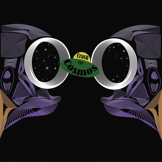
Designing My Final Album Cover
I then tried using the owl skull I drew that was inspired by Patrick Seymour. I previously mentioned that this piece of work is probably my most successful piece from the last 2/3 weeks of work.
Here, I started by placing a black grainy background which I did by creating a square using the ‘rectangle tool’. I then duplicated this to which, I layered it over the top of the original one. I then went into ‘effect’ and ‘effect gallery’, where I chose the ‘grain’ which you can find under ‘texture’. I then played around with the settings as I wanted to still keep the shape being a dark as possible as this would then mean a stronger contrast between the owl skull. I only wanted a slight grain as this would then give a little bit more interest to the whole piece. Once I was happy with the effect, I clicked ‘ok’ but then went the opacity setting at the top of the page. I wanted to decrease the opacity of this textures shape so then the black shape I originally placed can somewhat show through. Doing this would give an overall darker effect, while still showing the grain.
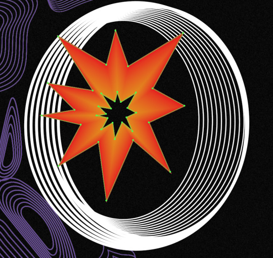
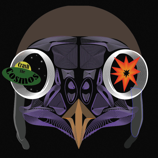
After this, I simply just opened up the file from when I drew this owl skull and copied and pasted it, onto this new page. I positioned this in the centre of the page. I then had the idea to use the eyes to capture the viewers attention as I think this part is the most striking. As the theme is multiverse, I thought of showing stars in the eyes with a spaceship flying into one of the eyes. For the other eye, I felt that I could almost show the impact of the spaceship going through the eyes. To represent this, I had the idea of showing an explosion.
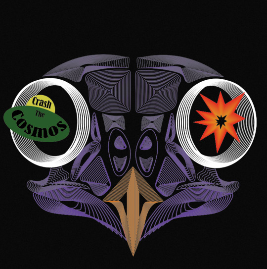
To create the explosion, I knew straight away at how I could produce this. I used the technique that I have recently learnt which is when I used the ‘blend tool’, but this would be a very basic method out of all the other things I created, as I wont do anything special when blending. To get this effect below, I used the ‘pen tool’ to draw the spikey effect for the look of the explosion, where I then copied and pasted this shape and decreased its size. To do this I just held down ‘shift’ and ‘alt’. When drawing the shape, I chose to create a very simply looking explosions I want the viewers to be able to see what it is at first glance. Then, I chose the larger shape to be a red colour and the centre shape to be orange. Next, I selected the ‘blend tool’ and just clicked on the two corners. I double-clicked on the this tool in the settings, where I was playing around with the number of steps as I felt that I didn't really want any of the lines showing. I can’t quite remember what number it ended up being, but it was definitely a higher number than I have been previously choosing. This is the end result of this, to which I think it achieves the look I was hoping for as it is very simple but I felt it needed to be.
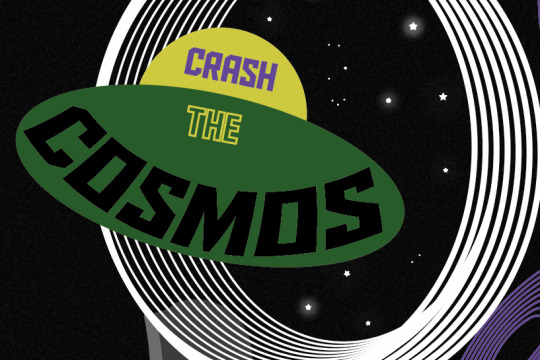
I then created a simple looking spaceship too. I thought to have the band name in this so the type is almost apart of the design. As you can see, I have curved the word ‘cosmos’. I got this idea from one of the scans I did when I was distorting type. I was going to use the actual scan itself but found it could look a bit messy so I just created the same effect but digitally. To do this I went into ‘object’, ‘distort envelop’ and ‘make with warp’. But before I even created this type, I produced the spaceship first. Again, I went very minimal, and used the ‘ellipse tool’ to draw a perfect circle (holding down ‘shift’) for the top part and a circle where I stretched it further out sideways so it created this flying sorcerer effect. My inspiration for drawing it like this, was from old images or drawings from how people used to draw them. I found in old designs, they would be shown in a very simple way. I then show use the two colours, yellow and green. At the time, I thought these colours work so well together and reminded me so much of colours that would have been put together quite often in the past. When it got to creating and positioning the type into the spaceship, I went through all of the past fonts I have used in this project. I saw this font I used when distorting type using the scanner. I felt it looked very attractive. It doesn't scream sci-fi or space, but I was fascinated at how effective it looked. The font is called ‘Bernard MT Condensed’. I felt it gave a sense of professionalism but it wasn't boring nor anywhere near hard to read. I arranged the type do the first word was in the top section of the space ship and the other two words were in the bottom area. I made the word ‘the’ a smaller size than the other words. This is because it is less important and doesn't need to be the first word that catches the viewers attention.
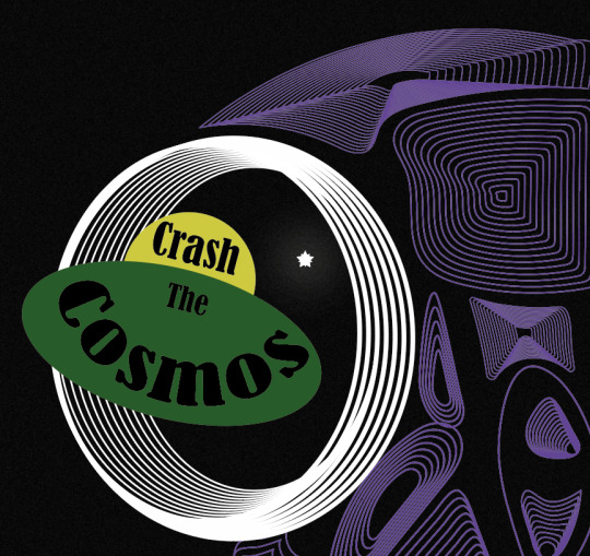
Next, I decided it was time to add the stars which I was going to place in the eyes. I thought adding this element into the design would really help to give the effect to the end result as these objects will show the viewers what their looking at. My inspiration for this was one of the poster designs in my Pinterest board (https://www.pinterest.co.uk/Libbym220/multiverse-ideas/) as the stars easily stood out as the object they the artist was implying them to be.
Below, is the poster I was referring to when creating my own stars. When I looked more closely at how they created them, to me it looked like they have drawn a normal star and then copied and pasted it and slightly rotated it but this new shape has been decreased size. There had then been a glow effect added as well.
This method of how I thought the object was created was exactly what I did to produce my own. Once I had assembled the shapes, I went into ‘effect’, ‘stylize’ and ‘outer glow’. This then brings up a tab, to which I just played around with the settings until I was happy. I started by changing the colour to white as this will then match with the start shade. For the first star, I made the opacity quite high and the blur low. Doing this means the star will be quite bright and the glow won’t be very gradual.

I did generate some more stars which were different to these settings. I copied and pasted all the different ones and arranged them in different places. I also added some very small circles in the design too, as this will then cover more of the negative background space.
As well as this, I added this flying helmet/hat to the owl as I had the idea that this would then relate to the of flying the spaceship. When I was looking for images to use to then trace, I found it very hard to find one where the helmet is from the front as most of the images were from the side. I did eventually find one. I traced the main features of the design where I could have added the goggles as well but felt this wasn't really necessary and could cover some of the owls face.
Here, you can see I have now taken away the explosion from the right hand side. I then added stars to it instead. I did this because I found it didn't really improve the design and almost looked a bit random.
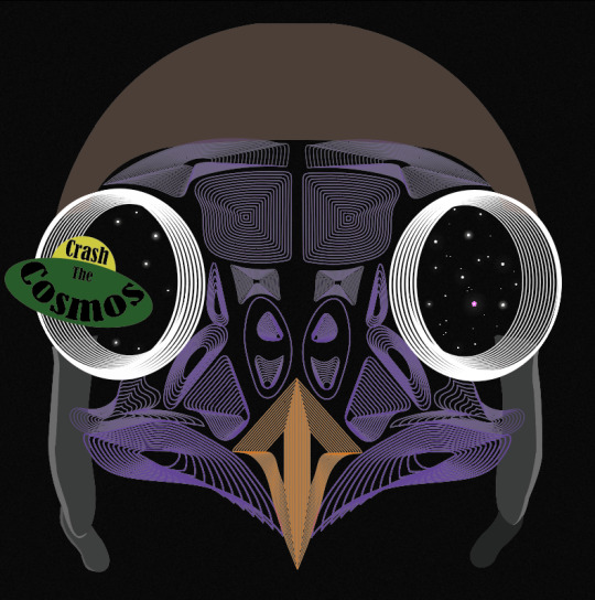
I then wasn't too sure on the hat. I couldn't tell what the problem was so I tried changing the colours so the hat was all one colour. here, I have swapped the bottom section to brown but immediately knew this made it worse. I think its the brown and purple that wasn't working.
I then tried this silver colour to which I think it looked a lot better.

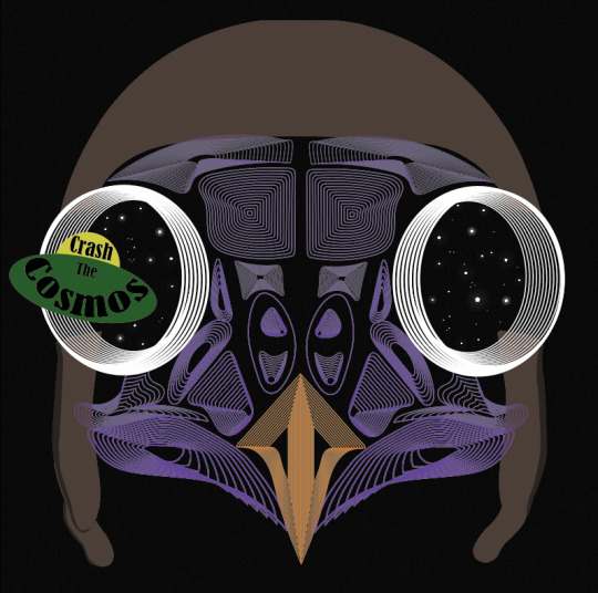
When looking at the screenshot above, I still thought something wasn't right as it almost seemed a it boring, all of a sudden. I thought that it might have been the black type so I tried to add some more interest to this by changing colours and adding just a stroke. As you can see, I have also changed the font as well. This one is called ‘Aldo The Apache’. This gives me a sense of space a bit more so I thought this could add to the design.
Although when I zoomed back out to look at the whole piece, it still didn't seem right. I decided to change it back to the original font and style, to which I had the idea of moving the composition of the owl. I thought as this owl is the exact same on both of the sides it could look interesting to place half the owl on one side of the and the same on the other side. Doing this, meant that the eyes were right next to one another. I slightly moved the spaceship so it now looks like its come from one of the eyes and going through the other. At this point, I can definitely see my ideas of how to arrange the elements are improving. I felt I was getting to a point where I was getting exited on how the end result was going to turn out.
0 notes
Text
Producing A Skull Illustration - Owl
I am now going to use all the skills I have just learnt from the different shapes that I have been creating, to produce a skull image which is inspired by Patrick Seymour. I have analysed his work in the past so I know how he works will his use of lines. The work I have been developing has been helping me to lead up to this piece of work. When looking back at my Pinterest board along with where I analysed three skulls, I think this image below was the most interesting and unusual. I wanted to create something different from a typical deer skull as I felt this has been many times before. I found this owl skull on Pinterest to which I felt this would push me enough to create as only have Patrick Seymour’s work to refer back to. His style of work is very bizarre which I was very attracted to when I first saw his work.

I knew from Seymour’s work that he uses lines where they all touch each other but I found when looking at the details of this owl, that I wasn't sure how I was going to get them to be like his work as the animal I have chose is completely different to what his normal works consists of.
I started by placing my image onto the page where I locked it and created a new layer. There are a couple of reasons for doing this to which one is that you can hide the layer whenever you want so you can look at your drawing on its own while going along. Another positive, is that the image wont move when drawing over it. This new layer that I created would be for drawing the design. I can now start drawing.
To draw the design, I used the ‘pencil tool’ and just drew around the sections that first stood out to me. I felt doing this would then help to to when I got to the more trickier bits as I would be able to see the gaps left and refer to that on what sort of shape to draw. Although, the first shape I decided to draw was the eyes as I feel this is the main element of the animal. To get a smooth circle I used the ‘ellipse tool’ to which I didn't hold down shift as the eyes weren't a perfect circle. I then copied and pasted this oval and sized it down so I could then show a 3 dimensional look but also so I could use the ‘blend tool’. I decided to make the stroke of the eyes quite thick compared to the rest of the lines as this is the section that I want to standout at first glance. From the eyes on, I just created the shapes that stood out to me. At this point of this screenshot, I wasn't sure on how the final result was going to look as it didn't look like an owl.

However, I kept going and kept adding more elements. For all these shapes, apart from the eye, I used the ‘pencil tool’ as I found it this was the best tool. When creating the beak of the bird, I held down ‘shift’ for the sections I wanted the lines to be straight. In this screenshot, it is also showing where I got stuck on blending this certain shape. In the top two shapes on the birds head, it is showing where the shapes are slightly overlapping one another. I found that the shape at the top of the head is a very weird shape and when it came to blending the shape, the lines would go over this original line that is showing in this screenshot. I couldn't have this happening as it would then overlap the other shape I have drawn.

I overcame this problem my drawing this unusual shape so its wasn't so pointy and I also made it curve in some points as well so it wouldn't become a problem again. Doing this also meant I had to chnage the shape of the other one I drew as this screenshot below is now showing that it doesn't really sit or join very well together.

I have now redrawn the shape so it fits the rest of the design a lot better. Although, I still felt there was something wrong with this shape.

I then tried to change the stroke so that it is a thicker stroke on the outside and then gradually gets thinner as it goes into the centre. Another element I altered, was the shape that was in the centre. I decided to make it as small as possible so there would then be no gap showing in the centre. I think this idea was the reason for it seeming off as I now think the stroke being increased, is the reason for it ineffective.

Here, I have now switched the stroke back to being thin as this was how I originally had it. I felt I needed to do this as this shape that I have drawn is quite a large section of the bird already and having the harsh black strokes makes it standout even more. I don't want this as the animal needs to show immediately instead of just one shape striking the viewers eyes. Another element I have added in is, the gap that was in the centre of ala the other shapes I have already drawn. I left this shape till quite late on, as I wasn't sure how I was going to draw it yet, but I ended up just just drawing around the edges of the other shapes. Looking back, I'm not too sure on how I feel about it, as the position that I have placed it at, isn't in the centre, which means it has a very different overall effect.

However, I kept going as I felt I could always adjust some shapes later on when I actually see both sides of the animal. Here, I have now added the last shape to fill the gap. As well as this, I also filled in (using the ‘blend tool’) the two smaller shapes that were showing where the nose would have been. Although, I'm actually not sure about the direction this nose looks like its going. By this, I mean that the gaps in the centre of the both the shapes are quite large and almost seem to large as it looks like I’m trying to show the direction that the nose is facing. However, this wasn't what I wanted.

Again, I put this aside, and kept going. As you can see, I have now got the stage of placing and positioning the other half of the face. To do this, I selected the whole half of the drawing where I copied and pasted it. Then I selected this new half of the original to which I went into ‘object’, ‘transform’ and ‘reflect’. This then brings up a tab to which you want to make sure you are reflexing it the right direction, which you can do by clicking and unclicking the ‘preview’ box. I then just simply placed the new half next the original. Below, is showing the result of doing this.

However, I felt the overall look of the animal seemed slightly off for some reason. I discovered it was because the nose section was too far away from each side. I found it being this far apart, made the final result look very much like the halves didn't match each other. I fixed this problem by moving the nose on the original side to which I then got rid of the new half and went through this process gain of placing the other half back down. Now looking back, I could have just moved each side by the arrows on the keyboard but I didn't think of this way at the time.

Overall, I’m very pleased with this final outcome as I was worried at the start that I wouldn't be able to create something very effective. But, to me, I think this art piece is striking to the viewers. I do think that adding some sort of colour could help the design even more. One thing I didn't notice, was that my way of working is very different to Seymour’s, as he uses a lot less lines than me where he also doesn't show as much of the shapes unlike me. Although, the main difference is that he joins all of his lines together to show the animal as one whole animal whereas I have negative spaces of the background in mine. I can see this does make my design not so put together as almost separates the design up a bit. Nevertheless, I actually really enjoyed retracing the shapes I could see in the skull, where I then used the appropriate amount of lines that I thought worked the best.
0 notes
Last Seen Blogs
afterartist
AfterArtist

1-87th-sane-modeler
Model Railroading

happymoocows
love Halloween

naughtyboyzz
Untitled

isa1vh
zay ☆