#I might go a little insane
Explore tagged Tumblr posts
Text
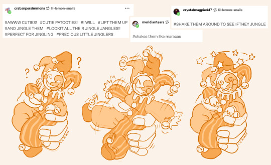
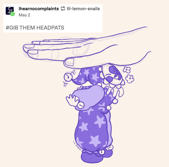
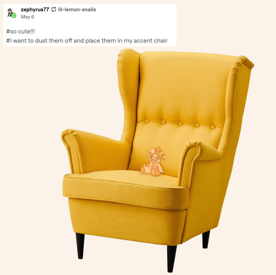
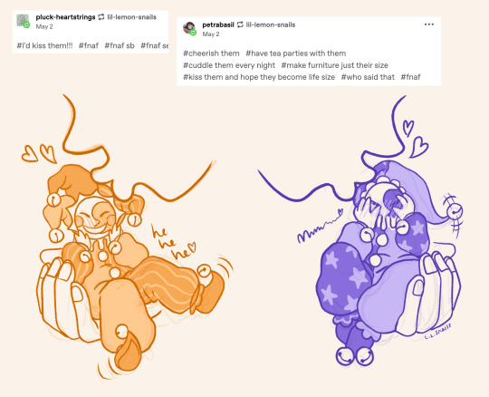
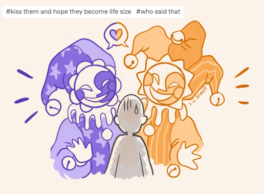
decided to draw some of your guys' tags from my harlequin sun and moon post!!! These guys are so much fun and you're all so funny >w<
#there were so many i wanted to draw!!! I might have to go back and do a part two hehe#also too scared to spam everyone by tagging accounts but i need you guys to know i love you all sm!! sending u all so many little kisses!!!#fnaf#fnaf fan art#fnaf security breach#fnaf daycare attendant#fnaf dca#dca fandom#dca au#fnaf sun moon#digital art#artist on tumblr#harlequin#clowns#answered asks#<- this doesn't really count but because i am drawing other people's tags i'm putting it here!#folks commenting on my art really motivate me to keep drawing ;w; you are all so insanely sweet and absolutely make my day every time!!! <3#just over here crying akjsfhsf thank you all so mucchhhhhhh ;;w;;
1K notes
·
View notes
Text


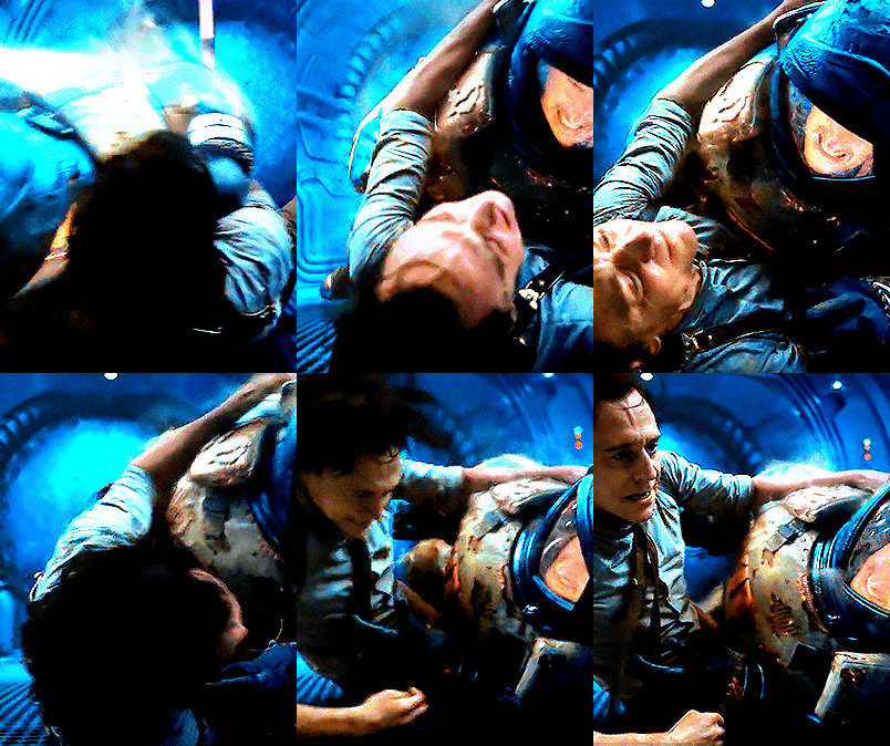


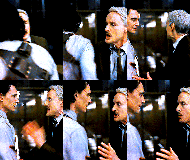
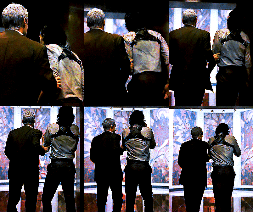
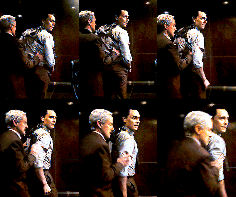

Lokius + a S2 mid season summary 😅
#mobius#loki#lokius#mcuedit#lokiedit#marveledit#loki spoilers#owen wilson#tom hiddleston#i mean?? once more they're insane for every second lmao#figured we might as well bask in the moment before the latter half of the season kicks in and we go back to living and breathing angst 😂���#for a little while we had it all and hey maybe we still will!#so thanks to everyone for hanging in there with me and my silly little gifsets bc it's been a blast#these scenes already set me for life so i'm just in for the ride now let's gooooooooo#loki s2 spoilers#marvel#owenwilsonedit#dianagifs
2K notes
·
View notes
Text
why Aurora's art is genius
It's break for me, and I've been meaning to sit down and read the Aurora webcomic (https://comicaurora.com/, @comicaurora on Tumblr) for quite a bit. So I did that over the last few days.
And… y'know. I can't actually say "I should've read this earlier," because otherwise I would've been up at 2:30-3am when I had responsibilities in the morning and I couldn't have properly enjoyed it, but. Holy shit guys THIS COMIC.
I intended to just do a generalized "hello this is all the things I love about this story," and I wrote a paragraph or two about art style. …and then another. And another. And I realized I needed to actually reference things so I would stop being too vague. I was reading the comic on my tablet or phone, because I wanted to stay curled up in my chair, but I type at a big monitor and so I saw more details… aaaaaand it turned into its own giant-ass post.
SO. Enjoy a few thousand words of me nerding out about this insanely cool art style and how fucking gorgeous this comic is? (There are screenshots, I promise it isn't just a wall of text.) In my defense, I just spent two semesters in graphic design classes focusing on the Adobe Suite, so… I get to be a nerd about pretty things…???
All positive feedback btw! No downers here. <3
---
I cannot emphasize enough how much I love the beautiful, simple stylistic method of drawing characters and figures. It is absolutely stunning and effortless and utterly graceful—it is so hard to capture the sheer beauty and fluidity of the human form in such a fashion. Even a simple outline of a character feels dynamic! It's gorgeous!
Though I do have a love-hate relationship with this, because my artistic side looks at that lovely simplicity, goes "I CAN DO THAT!" and then I sit down and go to the paper and realize that no, in fact, I cannot do that yet, because that simplicity is born of a hell of a lot of practice and understanding of bodies and actually is really hard to do. It's a very developed style that only looks simple because the artist knows what they're doing. The human body is hard to pull off, and this comic does so beautifully and makes it look effortless.
Also: line weight line weight line weight. It's especially important in simplified shapes and figures like this, and hoo boy is it used excellently. It's especially apparent the newer the pages get—I love watching that improvement over time—but with simpler figures and lines, you get nice light lines to emphasize both smaller details, like in the draping of clothing and the curls of hair—which, hello, yes—and thicker lines to emphasize bigger and more important details and silhouettes. It's the sort of thing that's essential to most illustrations, but I wanted to make a note of it because it's so vital to this art style.
THE USE OF LAYER BLENDING MODES OH MY GODS. (...uhhh, apologies to the people who don't know what that means, it's a digital art program thing? This article explains it for beginners.)
Bear with me, I just finished my second Photoshop course, I spent months and months working on projects with this shit so I see the genius use of Screen and/or its siblings (of which there are many—if I say "Screen" here, assume I mean the entire umbrella of Screen blending modes and possibly Overlay) and go nuts, but seriously it's so clever and also fucking gorgeous:
Firstly: the use of screened-on sound effect words over an action? A "CRACK" written over a branch and then put on Screen in glowy green so that it's subtle enough that it doesn't disrupt the visual flow, but still sticks out enough to make itself heard? Little "scritches" that are transparent where they're laid on without outlines to emphasize the sound without disrupting the underlying image? FUCK YES. I haven't seen this done literally anywhere else—granted, I haven't read a massive amount of comics, but I've read enough—and it is so clever and I adore it. Examples:


Secondly: The beautiful lighting effects. The curling leaves, all the magic, the various glowing eyes, the fog, the way it's all so vividly colored but doesn't burn your eyeballs out—a balance that's way harder to achieve than you'd think—and the soft glows around them, eeeee it's so pretty so pretty SO PRETTY. Not sure if some of these are Outer/Inner Glow/Shadow layer effects or if it's entirely hand-drawn, but major kudos either way; I can see the beautiful use of blending modes and I SALUTE YOUR GENIUS.
I keep looking at some of this stuff and go "is that a layer effect or is it done by hand?" Because you can make some similar things with the Satin layer effect in Photoshop (I don't know if other programs have this? I'm gonna have to find out since I won't have access to PS for much longer ;-;) that resembles some of the swirly inner bits on some of the lit effects, but I'm not sure if it is that or not. Or you could mask over textures? There's... many ways to do it.
If done by hand: oh my gods the patience, how. If done with layer effects: really clever work that knows how to stop said effects from looking wonky, because ugh those things get temperamental. If done with a layer of texture that's been masked over: very, very good masking work. No matter the method, pretty shimmers and swirly bits inside the bigger pretty swirls!
Next: The way color contrast is used! I will never be over the glowy green-on-black Primordial Life vibes when Alinua gets dropped into that… unconscious space?? with Life, for example, and the sharp contrast of vines and crack and branches and leaves against pitch black is just visually stunning. The way the roots sink into the ground and the three-dimensional sensation of it is particularly badass here:

Friggin. How does this imply depth like that. HOW. IT'S SO FREAKING COOL.
A huge point here is also color language and use! Everybody has their own particular shade, generally matching their eyes, magic, and personality, and I adore how this is used to make it clear who's talking or who's doing an action. That was especially apparent to me with Dainix and Falst in the caves—their colors are both fairly warm, but quite distinct, and I love how this clarifies who's doing what in panels with a lot of action from both of them. There is a particular bit that stuck out to me, so I dug up the panels (see this page and the following one https://comicaurora.com/aurora/1-20-30/):

(Gods it looks even prettier now that I put it against a plain background. Also, appreciation to Falst for managing a bridal-carry midair, damn.)
The way that their colors MERGE here! And the immense attention to detail in doing so—Dainix is higher up than Falst is in the first panel, so Dainix's orange fades into Falst's orange at the base. The next panel has gold up top and orange on bottom; we can't really tell in that panel where each of them are, but that's carried over to the next panel—
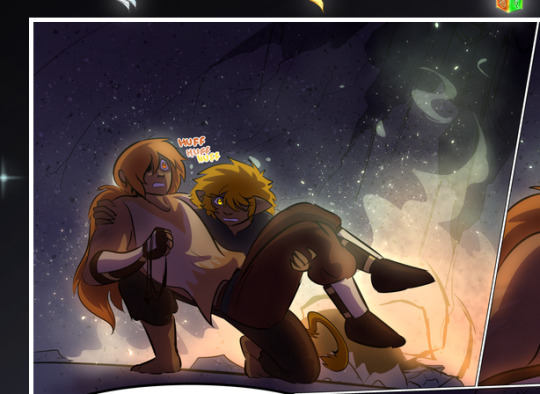
—where we now see that Falst's position is raised above Dainix's due to the way he's carrying him. (Points for continuity!) And, of course, we see the little "huffs" flowing from orange to yellow over their heads (where Dainix's head is higher than Falst's) to merge the sound of their breathing, which is absurdly clever because it emphasizes to the viewer how we hear two sets of huffing overlaying each other, not one. Absolutely brilliant.
(A few other notes of appreciation to that panel: beautiful glows around them, the sparks, the jagged silhouette of the spider legs, the lovely colors that have no right to make the area around a spider corpse that pretty, the excellent texturing on the cave walls plus perspective, the way Falst's movements imply Dainix's hefty weight, the natural posing of the characters, their on-point expressions that convey exactly how fuckin terrifying everything is right now, the slight glows to their eyes, and also they're just handsome boys <3)
Next up: Rain!!!! So well done! It's subtle enough that it never ever disrupts the impact of the focal point, but evident enough you can tell! And more importantly: THE MIST OFF THE CHARACTERS. Rain does this irl, it has that little vapor that comes off you and makes that little misty effect that plays with lighting, it's so cool-looking and here it's used to such pretty effect!
One of the panel captions says something about it blurring out all the injuries on the characters but like THAT AIN'T TOO BIG OF A PROBLEM when it gets across the environmental vibes, and also that'd be how it would look in real life too so like… outside viewer's angle is the same as the characters', mostly? my point is: that's the environment!!! that's the vibes, that's the feel! It gets it across and it does so in the most pretty way possible!
And another thing re: rain, the use of it to establish perspective, particularly in panels like this—

—where we can tell we're looking down at Tynan due to the perspective on the rain and where it's pointing. Excellent. (Also, kudos for looking down and emphasizing how Tynan's losing his advantage—lovely use of visual storytelling.)
Additionally, the misting here:
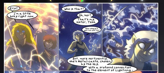
We see it most heavily in the leftmost panel, where it's quite foggy as you would expect in a rainstorm, especially in an environment with a lot of heat, but it's also lightly powdered on in the following two panels and tends to follow light sources, which makes complete sense given how light bounces off particles in the air.
A major point of strength in these too is a thorough understanding of lighting, like rim lighting, the various hues and shades, and an intricate understanding of how light bounces off surfaces even when they're in shadow (we'll see a faint glow in spots where characters are half in shadow, but that's how it would work in real life, because of how light bounces around).
Bringing some of these points together: the fluidity of the lines in magic, and the way simple glowing lines are used to emphasize motion and the magic itself, is deeply clever. I'm basically pulling at random from panels and there's definitely even better examples, but here's one (see this page https://comicaurora.com/aurora/1-16-33/):

First panel, listed in numbers because these build on each other:
The tension of the lines in Tess's magic here. This works on a couple levels: first, the way she's holding her fists, as if she's pulling a rope taut.
The way there's one primary line, emphasizing the rope feeling, accompanied by smaller ones.
The additional lines starbursting around her hands, to indicate the energy crackling in her hands and how she's doing a good bit more than just holding it. (That combined with the fists suggests some tension to the magic, too.) Also the variations in brightness, a feature you'll find in actual lightning. :D Additional kudos for how the lightning sparks and breaks off the metal of the sword.
A handful of miscellaneous notes on the second panel:
The reflection of the flames in Erin's typically dark blue eyes (which bears a remarkable resemblance to Dainix, incidentally—almost a thematic sort of parallel given Erin's using the same magic Dainix specializes in?)
The flowing of fabric in the wind and associated variation in the lineart
The way Erin's tattoos interact with the fire he's pulling to his hand
The way the rain overlays some of the fainter areas of fire (attention! to! detail! hell yeah!)
I could go on. I won't because this is a lot of writing already.
Third panel gets paragraphs, not bullets:
Erin's giant-ass "FWOOM" of fire there, and the way the outline of the word is puffy-edged and gradated to feel almost three-dimensional, plus once again using Screen or a variation on it so that the stars show up in the background. All this against that stunning plume of fire, which ripples and sparks so gorgeously, and the ending "om" of the onomatopoeia is emphasized incredibly brightly against that, adding to the punch of it and making the plume feel even brighter.
Also, once again, rain helping establish perspective, especially in how it's very angular in the left side of the panel and then slowly becomes more like a point to the right to indicate it's falling directly down on the viewer. Add in the bright, beautiful glow effects, fainter but no less important black lines beneath them to emphasize the sky and smoke and the like, and the stunningly beautiful lighting and gradated glows surrounding Erin plus the lightning jagging up at him from below, and you get one hell of an impactful panel right there. (And there is definitely more in there I could break down, this is just a lot already.)
And in general: The colors in this? Incredible. The blues and purples and oranges and golds compliment so well, and it's all so rich.
Like, seriously, just throughout the whole comic, the use of gradients, blending modes, color balance and hues, all the things, all the things, it makes for the most beautiful effects and glows and such a rich environment. There's a very distinct style to this comic in its simplified backgrounds (which I recognize are done partly because it's way easier and also backgrounds are so time-consuming dear gods but lemme say this) and vivid, smoothly drawn characters; the simplicity lets them come to the front and gives room for those beautiful, richly saturated focal points, letting the stylized designs of the magic and characters shine. The use of distinct silhouettes is insanely good. Honestly, complex backgrounds might run the risk of making everything too visually busy in this case. It's just, augh, so GORGEOUS.
Another bit, take a look at this page (https://comicaurora.com/aurora/1-15-28/):
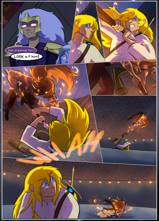
It's not quite as evident here as it is in the next page, but this one does some other fun things so I'm grabbing it. Points:
Once again, using different colors to represent different character actions. The "WHAM" of Kendal hitting the ground is caused by Dainix's force, so it's orange (and kudos for doubling the word over to add a shake effect). But we see blue layered underneath, which could be an environmental choice, but might also be because it's Kendal, whose color is blue.
And speaking off, take a look at the right-most panel on top, where Kendal grabs the spear: his motion is, again, illustrated in bright blue, versus the atmospheric screened-on orange lines that point toward him around the whole panel (I'm sure these have a name, I think they might be more of a manga thing though and the only experience I have in manga is reading a bit of Fullmetal Alchemist). Those lines emphasize the weight of the spear being shoved at him, and their color tells us Dainix is responsible for it.
One of my all-time favorite effects in this comic is the way cracks manifest across Dainix's body to represent when he starts to lose control; it is utterly gorgeous and wonderfully thematic. These are more evident in the page before and after this one, but you get a decent idea here. I love the way they glow softly, the way the fire juuuust flickers through at the start and then becomes more evident over time, and the cracks feel so realistic, like his skin is made of pottery. Additional points for how fire begins to creep into his hair.
A small detail that's generally consistent across the comic, but which I want to make note of here because you can see it pretty well: Kendal's eyes glow about the same as the jewel in his sword, mirroring his connection to said sword and calling back to how the jewel became Vash's eye temporarily and thus was once Kendal's eye. You can always see this connection (though there might be some spots where this also changes in a symbolic manner; I went through it quickly on the first time around, so I'll pay more attention when I inevitably reread this), where Kendal's always got that little shine of blue in his eyes the same as the jewel. It's a beautiful visual parallel that encourages the reader to subconsciously link them together, especially since the lines used to illustrate character movements typically mirror their eye color. It's an extension of Kendal.
Did I mention how ABSOLUTELY BEAUTIFUL the colors in this are?
Also, the mythological/legend-type scenes are illustrated in familiar style often used for that type of story, a simple and heavily symbolic two-dimensional cave-painting-like look. They are absolutely beautiful on many levels, employing simple, lovely gradients, slightly rougher and thicker lineart that is nonetheless smoothly beautiful, and working with clear silhouettes (a major strength of this art style, but also a strength in the comic overall). But in particular, I wanted to call attention to a particular thing (see this page https://comicaurora.com/aurora/1-12-4/):
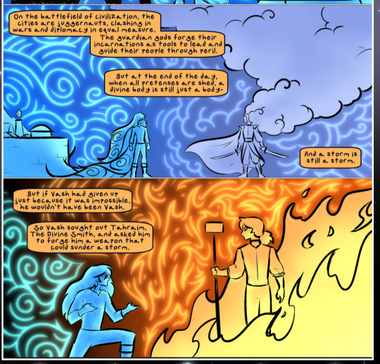
The flowing symbolic lineart surrounding each character. This is actually quite consistent across characters—see also Life's typical lines and how they curl:
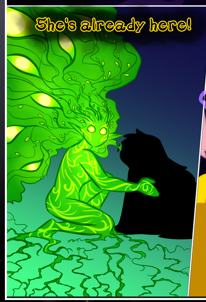
What's particularly interesting here is how these symbols are often similar, but not the same. Vash's lines are always smooth, clean curls, often playing off each other and echoing one another like ripples in a pond. You'd think they'd look too similar to Life's—but they don't. Life's curl like vines, and they remain connected; where one curve might echo another but exist entirely detached from each other in Vash's, Life's lines still remain wound together, because vines are continuous and don't float around. :P
Tahraim's are less continuous, often breaking up with significantly smaller bits and pieces floating around like—of course—sparks, and come to sharper points. These are also constants: we see the vines repeated over and over in Alinua's dreams of Life, and the echoing ripples of Vash are consistent wherever we encounter him. Kendal's dream of the ghost citizens of the city of Vash in the last few chapters is filled with these rippling, echoing patterns, to beautiful effect (https://comicaurora.com/aurora/1-20-14/):
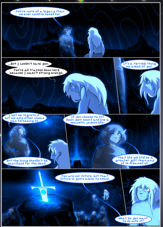
They ripple and spiral, often in long, sinuous curves, with smooth elegance. It reminds me a great deal of images of space and sine waves and the like. This establishes a definite feel to these different characters and their magic. And the thing is, that's not something that had to be done—the colors are good at emphasizing who's who. But it was done, and it adds a whole other dimension to the story. Whenever you're in a deity's domain, you know whose it is no matter the color.
Regarding that shape language, I wanted to make another note, too—Vash is sometimes described as chaotic and doing what he likes, which is interesting to me, because smooth, elegant curves and the color blue aren't generally associated with chaos. So while Vash might behave like that on the surface, I'm guessing he's got a lot more going on underneath; he's probably much more intentional in his actions than you'd think at a glance, and he is certainly quite caring with his city. The other thing is that this suits Kendal perfectly. He's a paragon character; he is kind, virtuous, and self-sacrificing, and often we see him aiming to calm others and keep them safe. Blue is such a good color for him. There is… probably more to this, but I'm not deep enough in yet to say.
And here's the thing: I'm only scratching the surface. There is so much more here I'm not covering (color palettes! outfits! character design! environment! the deities! so much more!) and a lot more I can't cover, because I don't have the experience; this is me as a hobbyist artist who happened to take a couple design classes because I wanted to. The art style to this comic is so clever and creative and beautiful, though, I just had to go off about it. <3
...brownie points for getting all the way down here? Have a cookie.
#aurora comic#aurora webcomic#comicaurora#art analysis#...I hope those are the right tags???#new fandom new tagging practices to learn ig#much thanks for something to read while I try to rest my wrists. carpal tunnel BAD. (ignore that I wrote this I've got braces ok it's fine)#anyway! I HAVE. MANY MORE THOUGHTS. ON THE STORY ITSELF. THIS LOVELY STORY#also a collection of reactions to a chunk of the comic before I hit the point where I was too busy reading to write anything down#idk how to format those tho#...yeet them into one post...???#eh I usually don't go off this much these days but this seems like a smaller tight-knit fandom so... might as well help build it?#and I have a little more time thanks to break so#oh yes also shoutout to my insanely awesome professor for teaching me all the technical stuff from this he is LOVELY#made an incredibly complex program into something comprehensible <3#synapse talks
776 notes
·
View notes
Text
What I loved about Cinderella's Castle is it is so entirely about Ella. We know starkid can handle a show with tons and tons of characters but I found it quite refreshing for it to be so wholly her story? I think it was a lovely choice for this show and man Bryce did such a perfect job of it, she is truly such a star
#starkid#cinderella's castle spoilers#cinderella's castle#cc#cc spoilers#I think I want to rewatch it a couple of times to actually ascertain how I rank it with other starkid shows but. yeah what a great show#they used that money well too every aspect was STUNNING#and I could go on and on about the choreography maybe the best from any starkid show it looked so fucking good#anyway. justice for my girls Justine and Lucy I miss you#OH more things I loved! no romance! starkid write fantastic romances which I love dearly but again it was so nice#to just see Ella discover herself and her power. and yes I know her and Tadius are heavily implied but! I love that it was allowed to#just be the very beginnings of whatever they might become!!!#I will say that I predicted the Justine and Lucy thing which is heartbreaking I miss them#but anyway I loved it as a version of Cinderella and I loved it as a musical and MAN the music FUCKING SLAPPED#I made like 7 pages of notes because I regret that I don't remember my immediate reactions to bf and npmd#they are insane and most of them are just 'oh my god' and 'he's just a little boy' whenever crumb was on#ALSO WHO THR FUCK WAS THAT MASTER DWARF CAN WE GET MORE DETAILS ON THAT!!!!!!!!!!!!!!!!!!!! WHI IS HE AND HIS WOODBLOCK#OK ALSO ALSO oh my god there are too many thoughts in my brain. also. so it's basically confirmed they want to be Beauty and the beast and#snow white now right?#were there any other fairytale references?#ok fuck it finally last thing verrrry intrigued by how much the audience were clearly part of the story
158 notes
·
View notes
Text
i love it when a tv show has lows that are so low you're so ashamed to ever show it to anyone ever but then highs that melt your brain a bit, like, "good fucking god, this is genuinely such an astounding piece of craftmanship... my perception of the medium, and perhaps of myself, has been challenged/changed in 40 minutes" but you cant even express that to ppl without feeling like youre fucking deranged bc my god the lows .....
#Egg.txt#sorry i saw gar watched Hush recently and like#my god thats such a good episode of television . like sincerely fucking solid. like damn man.#and theres other eps of buffy i'd rank among that i.e a certain s5 episode that just still gives me chills to think about#but this also goes for trek + doctor who + farscape + and any and every lame little campy show out there#that just needs to fuck your head wide open sometimes#maybe that why i have enjoyed bsg but i havent like fucking Melded with it yet because its highs and its lows are both there but it doesnt#ever touch the extremes of either#i need something so so bad and so so good at once that makes mefeel like im insane#god i might go rewatch some tos soon#but yeah ok abt bsg maybe its alsojust#laccking a sincerity to it sometimes#and not just in how its a darker/grittier#but just in general i feel like .........hm. idk..#let me ponder
2K notes
·
View notes
Text
Sorry to bring up the Sam classism discourse weeks later but I honestly think a lot of people in hellerblr calling Sam classist are unconsciously deflecting from the fact that vast swathes of destiel fandom have made an entire cottage industry out of regurgitating the same ideas in their fics and text posts about how Dean is too stupid to know what a gay person is and how poor put-upon Sam must explain things to him because somehow attending the same university as Rishi Sunak (during Bush's first term no less!) makes him an expert on queerness. now obviously this does not apply to my mutuals who have been unfailingly supportive in my vendetta against Know-It-All Sam but like. Come on. Some of you need to remove the plank in your eye before you worry about the speck in someone else's.
#coming up on nearly 3 years since i watched s8#and realised an insane amount of destiel fanon revolves around the idea that queerness#is something a poor person could never come to understand#without a benevolent middle class or upwardly mobile person to act as a guiding light#and if it's not that you might get ''people who didn't go to college are violent homophobes until proven otherwise'' instead!#tl;dr - i think Sam is a little classist but a lot of you are exponentially worse!
117 notes
·
View notes
Text
day 38

waitress adeleine is ready for your order at the kirby cafe!
#clean lineart who???? dont know her#im a little insane over the character designs they give in the official art of kirby cafe........#i need to see everybody in a cozy cafe outfit please please please plaease please#might give this one another go someday 😭its one am im v tired#adeleine#adeleine kirby#kirby series#kirby#kirby cafe#day 38
178 notes
·
View notes
Text
Everyone Introduced in Dimension 20's Fantasy High: Junior Year episode 17
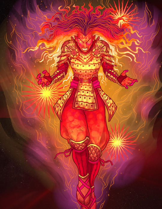
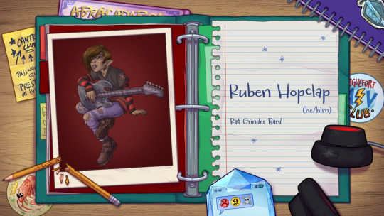
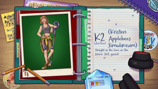
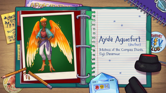
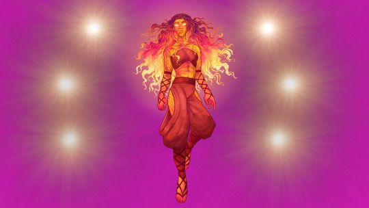
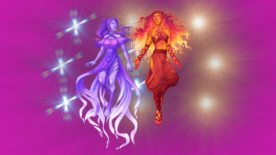
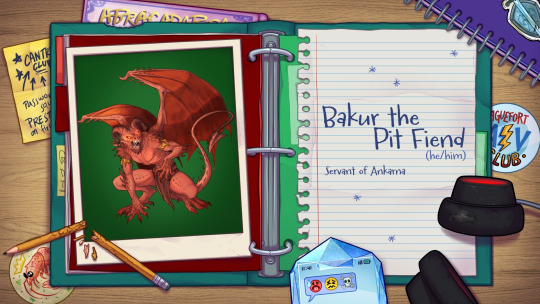
#dimension 20 spoilers#dimension 20#d20 introductions#fhjy#fantasy high junior year#d20 fhjy#MAN what a ride#almost missed that ruben had a new intro card variant too. god bless the transcript search#that large ankarna was art scrolling on screen that i couldn't get in one go‚ so i put a few screencaps together to make that one#of which you can definitely see the lines of because it was actively glowing and moving which was VERY cool but hard to catch smoothly#i think if cait may posts the full Clean shot of ankarna themself i'll reblog that one too for posterity#(this one is also very off center because i had a corner of blank left over because i had to shift one of them to the side#because she was moved just a little bit to the side too#also MANNNNN that scene with bucky and kristen that was so sweet...... i'm really glad she's finally got the time to talk with him#he really needed it#GORGEOUS art this episode..... and oh god this next one is going to have me SO stressed#A BLUE DRAGON ATTACKING THE SHIP?? ALL THE VOTES NEEDING TO BE AT THE SCHOOL BY MIDNIGHT?????#lord HELP me#things are not going to go well i can feel it.#also sad that oisin might turn out to be a Very Not Good guy after all 😭#listen a dragonborn enjoyer can dream#also INSANE. INSANE THAT THE BAD GUY THIS WHOLE TIME WAS#i shan't say. but good GOD i can't believe it#shout out to notoriousmasc who got it right away like WEEKS ago
110 notes
·
View notes
Text
so. uh- i believe we, as a society, all need to have one very, extremely, incredibly serious conversation about these exact 4 pics of taehyun i've come across today.


#wave2tyun thoughts (~˘▽˘)~#first pic is my view every morning#who said that#sorry you guys had to find out this way#regarding the second pic#if i don't grab that pretty little face of him and give him a smooch on the lips#in like the next few seconds#i might actually go insane#like really
72 notes
·
View notes
Text
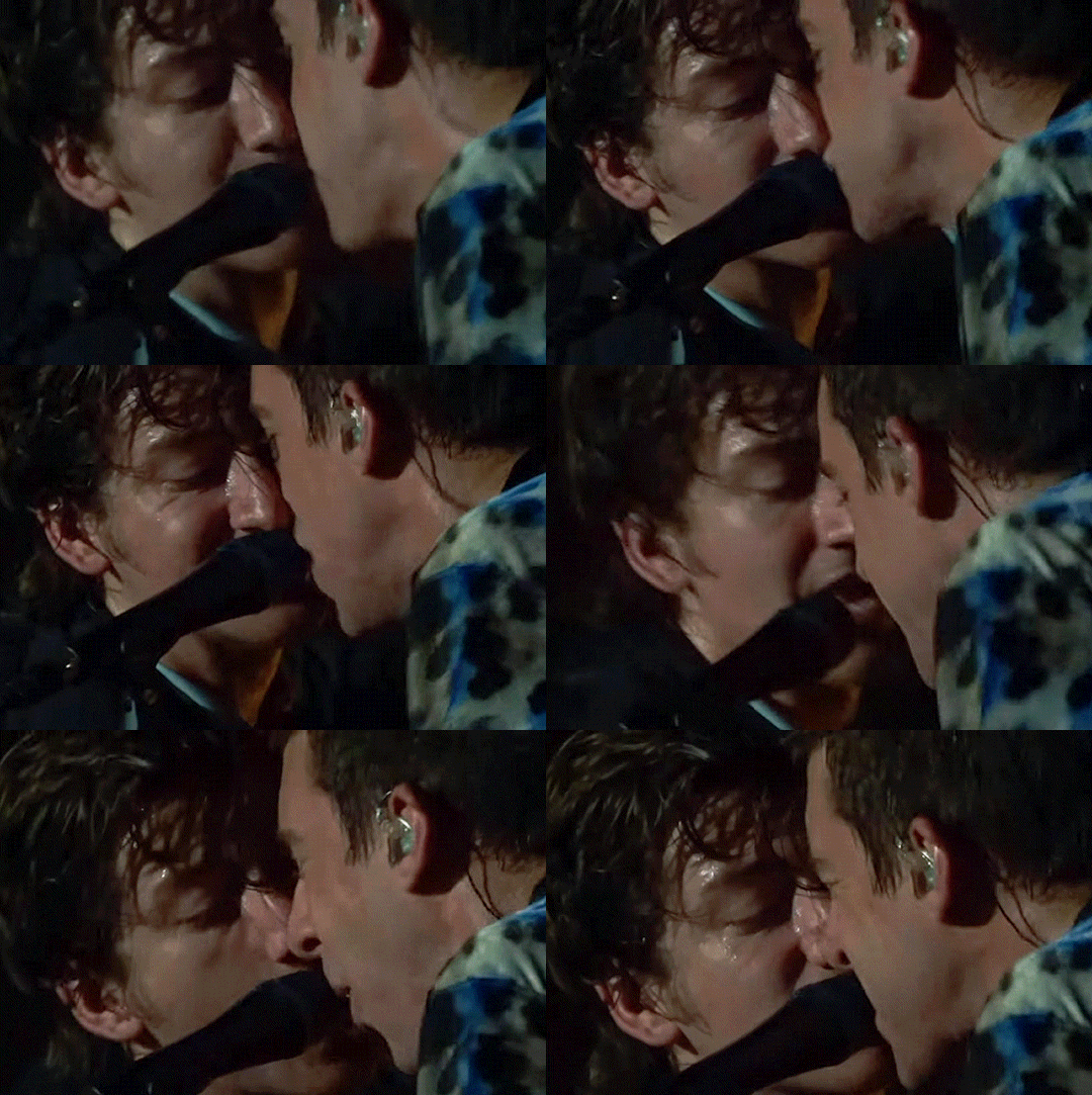
um alex??? just WHAT is your tongue doing??
#are they snogging or singing part 253748#idk what's going on here but something sure as hell is 👀#and when i say something i mean something so far from platonic it might as well be in a different universe#also it's hard to tell bc of the angle but it looks like maybe there was a little kiss or brush of lips first#and then miles pulled away a little and alex's tongue decided it was going with him#i don't even know anymore#maybe i'm insane#but they're also definitely insane#anyway sorry i'll see myself out now#milex#milex gifs#miles kane#alex turner#tlsp#the last shadow puppets#my gifs#lulu posts
274 notes
·
View notes
Text
something something parallels between the two times alicent sees criston off to war.
the first scene in 2x03 was lit much brighter, there are barely any soldiers or townsfolk between them, she easily calls out to him and they converse in surface-level formalities, the tone of the scene lighter even though she’s peeved at him, he loudly asks for her favour almost in mockery of the chivalrous trope, they touch hands briefly but the interaction is emotionally sterile, he mounts his horse and can’t help but sneak a quick glance at her before he goes.
the second scene in 2x06 is lit murkier, the tone of the scene filled with more dread, they’re constantly searching for one another but there’s a sea of soldiers and bustling activity in between them, she’s unable to reach him at all before he’s cast off, sent away, willing to sacrifice his life for the realm she sacrificed her youth for, but he can’t bring himself to turn away before they’re able to meet eyes for maybe the very last time, their last look charged with more meaning and emotion than anything they could ever bring themselves to say out loud.
but in the end he still has to leave, and criston becomes yet another casualty of the duty alicent has dedicated and bound her life to, another part of her that she’s forced to lose, for the greater good, whatever that’s supposed to be anymore.
#alicole#don’t mind me i’m just going a little insane over here#meaningful TO ME#more romance in this episode than any other s2 episode thus far#alicole 99% of this fandom might not get you BUT I DO#😩😩🫠😩🫠😩🫠#unspoken yearning you will always be famous to me#alicent hightower#criston cole#hotd spoilers
63 notes
·
View notes
Text
it's one of my favourite personal headcanons that Scorpius has a grey fluffy pet cat with a clipped ear and three legs that he found abandoned as a kid and was like, yep mine, and bonded over this unwanted creature cause hes like omg people dont like me very much either!! and this cat is intelligent and loyal as hell and hisses at people he doesn't think are good for Scorpius lmao
Scorpius is general has a habit of of collecting unwanted and perhaps damaged things. he has loads of creepy and broken ornaments all over his room. but I do not only mean inanimate objects, pets and people (*cough* albus *cough*) also apply
he collects them all because he can relate to them, and because he knows he can love them
#the cat scratches the fuck outta lucius whenever he was around#when als around he immeidately starts purring and jumps on his lap 🙏🏻#i also have a little scene headcanon where scorpius is in some kind of trouble and has been cornered by bullies or smin and the cat goes to#find albus and just starts cat-screaming at him until he follows and al thinks he might be going a little bit insane running after scorps#cat all over the castle but then he leads al to where scorpius is <3#i also headcanon that al finds ugly freaky trinkets to give his boyfriend and will show them to james and be like what do you think?#and james will be like 😟😟 thats the ugliest fucking thing to exist why did anyone make that??#and als like great perfect#scorpius loves it and james is confused as hell#scorpius malfoy#albus potter#scorbus#hpcc
63 notes
·
View notes
Text
Alright y'all, come gather round, come to my corner over here. Come help strategize with me.
I'm not going to be able to afford to send out holiday cards this year. I've been hit with disaster after disaster and I've been trying very hard to figure out how to work things but the math isn't coming out in my favour no matter how I swing it. Am I devastated? Absolutely. Even though most of you get your cards in like... March... you all still send me the nicest most kind comments and I love being able to make your day brighter.
I feel like a few people are going to say I should take donations, and I might've considered that, except... I don't want to take donations only to then still fall short.
A quick summary of the math is, like, stamps are 2$ for international cards and 1.50$ for non-international. I send out about 200 cards a year which means shipping alone is about 550$, plus about 200$ for sticker sheets, 70$ for envelopes, 150$ for printing the cards, and about 200$ for the everything else of new blades and mats for cutting the dolls on my cricut, thick paper for the dolls, ink for the printer... I'm sorry guys, there's no way I could try to ask people to donate over 1000$ just for this fun little event.
So like. Truly devastated over here as I'm doing the math because I desperately desperately do not want to disappoint people. I'm not even buying irl people presents this year. It sucks. I'm feeling like a failure in a lot of ways and I hate it, because I'm over thirty now, I should be able to have my shit together. But unfortunately I just... don't. And I'm trying to make sure I can afford my cats medication and rent because my roommate has been out of a job for two months and is just straight up not paying her part of the rent.
So. I will continue to feel sorry for myself, but this isn't about that. What I want to know is what ideas do we have. I can't send people physical things, because money. But are there... other ways I could make people happy? I don't know if anyone cares about digital paper dolls, but I could just like. Put my dolls online for people to print out? And draw whatever outfits people want? Like a sort of advent calendar of doll outfits?
Help me out. Brainstorm with me. Is there some way I could make people happy that, this year, doesn't involve funds? I want to keep my 1D Holiday Queen title. Please.
#yes I have covid still#so i have not even been doing inktober#I DO NOT LIKE THIS I FEEL LIKE I AM FAILING SEVERAL WAYS#I THOUGHT I WOULD BE PAST THE BURNOUT BY NOW BUT IT TURNS OUT BURNOUT IS MADE WORSE BY NOT HAVING MONEY#im sorry i am totally using this space to vent#and I am trying not to i am trying to be an adult about all this#but also i have not really Talked to a Person In Person in 3 days#so i might be going a little insane by now#WOOOOO CHRISTMAS
38 notes
·
View notes
Text
okay, here is the first thing i wrote of john in my gale centric clegan fic, not sure when this takes place, just that gale’s psyche has been doing the mental equivalent of punching him repeatedly in the head :) daddy issues don’t care if you’re fighting in wwii, they Will get you :) and so will the voice of your dead mother :)
“John, a ways down the bar, John, as broad shouldered and flare bright as he gets. His mouth is whiskey wet around a canine sharp smile and his narrow eyes shift away from the cluster of baby faced airmen huddled around him, the flick of his eyes too fast to be searching, knowing Gale is right where he left him.
Just like your daddy. It’s Mama’s voice, inflected with Gale’s own self accusation.”
#alright. okay. i’ve done it. i’ve posted something. i’m actually quite happy with this little snippet so i’ll start with this#i wrote this in like april and it’s part of the first thing i wrote in my notes app for this fic#yes. i’m writing all this in my notes app. like a fucking insane person. the next move is going full rust cohle on the walls of my room.#feel free to let me know what you think! 🫶#might as well just tag these posts the same way i suppose?#clegan#clegan fic#forgets fic
69 notes
·
View notes
Text
the way that silver said "I will stand here with you an hour, a day, a year" to flint and "I will wait a day, a month, a year, forever" to madi....I'm sick to my stomach. who is doing unhinged devotion like this man
#I have no doubt this exact post was made ten years ago or whenever the finale aired#but I'M NEW HERE#black sails#black sails spoilers#lauren feels things#the way that silver is just like...'oh there's a strong willed person who wants to change the entire world with their strong will?'#guess they're my life now!#the way that flint and madi are sooooooo similar#except that silver diagnoses flint perfectly! he mostly just wants to burn the world!#whereas madi actually has true strength of conviction and ideals#and silver#who has been living with james 'my way or the highway but also if you outsmart me I might grudgingly respect you#but my whims are going to be IMPOSSIBLE to understand or track' flint#sees madi and is like 'yeah she'll be mad for a little while but we'll move past it'#and maybe they do! but he soooo miscalculates I love it#also the way that he looks at madi when she is looking at flint after they're all safe#is........so insane#loves her knows she loves him#is obsessed with flint#and yet the fact that madi respects and trusts flint#and that they share so much naturally in their thinking that silver has hard won#drives him craazyyyyyy#ANYWAY I'M UNWELL CAN YOU TELL
83 notes
·
View notes
Text
Destiel AU idea (again)
Dean is searching for a flat because he recently divorced Lisa. He wants one that is big and comfortable enough to welcome his children, Ben and Emma. It's been months since he started searching for one. Fortunately, Lisa is understanding enough to let him stay in their old house until he finds something.
They actually aren't in a hard and conflicted relationship right now, their marriage stopped because there wasn't love between them anymore. They still care about each other.
Dean knew he wasn't in love with Lisa anymore and he suspected the same for Lisa, but he was fine with it. Lisa though thought otherwise. She asked for divorce because she said that they both deserved to find love and be loved.
So, Dean is doing his umpteenth visit for a flat that he spotted on Internet. This one seems really nice and clean, his children will be able to have their own rooms. And the kitchen looks awesome with enough place for him to cook.
The real estate agent who give him the tour of the flat isn't bad either. He has blue eyes, which looks surreal, long and dark eyelashes that match his hair and his growing beard. Dean listens to him attentively and can't help but look right into his eyes when he speaks. Dean wants to confide in him and he does that naturally actually.
He tells him that he is sick to search for a home for his family. It's been months, and he's exhausted to be disappointed each time he thinks he found something. But at the same time, he wants his children to feel good in that new home so he is demanding.
That real estate agent, Castiel, is compassionate and doesn't understand why Dean doesn't find one with his solid, complete application. Castiel tells Dean that maybe it's because others real estate agents are struggling right now. There's a lot of people searching for a new home at this time of the year, so a lot of work. Castiel admits that he, himself, is buried in work all day long.
He works 6 days a week constantly. Since Dean is really attentive to what the man in front of him says, he notices that Castiel doesn't seem to have someone in his life to get back to. So, he goes for it. He asks Castiel if he wants to go and get a drink with him once they have finished the tour.
Castiel seems surprised by the offer and looks away. He fumbles with his pen and papers and puts them on the kitchen counter. He takes a deep breath. So, Dean fears his answer.
"Are you asking me on a d-" Castiel starts asking hesitantly.
"Yes." Dean cuts him, because he somehow fears that word. It sounds too official and he's still living with his ex. Plus, it's been a while for him.
"O - okay. Yeah." Castiel agrees, and neither of them is able to look at the other.
#I think my search for a flat is starting to make me insane#I'm sick of it#because I keep getting no as an answer#and I want to fucking settle in my own place#it's exhausting energetically and emotionally#so I might as well write about that#especially because during my last visit the real estate agent was not unpleasant to look at#he had blue eyes and long dark eyelashes#and my thought was 'babygirl'#would supernatural also have changed my taste concerning men?#in addition to my media consumption and my taste in music and my hobbies#and since I won't be able to ask him on a date#I might as well write about dean asking that to cas#I had this thought this morning in my bed#and instead of writing it with one eye closed because it was too soon#I recorded myself pitching this little au idea to me#it turned out to be a 5 min video#might do that little recording thing every time I have another idea#cause it's better than writing in a memo when your thoughts are going faster than you typing#destiel au#destiel fanfiction#destiel fanfic#destiel fic#writing fanfiction#destiel#deancas#castiel#dean winchester#my destiel fanfic
45 notes
·
View notes