#I know red and white are probably the colours with the most recognizable symbolism in Chinese media
Explore tagged Tumblr posts
Text
Thinking about how everyone wears different colours in mlc and how they're all connected...
Li xiangyi wears red. Yes it means happiness and joy and luck (ignoring the wedding symbolism for now) but it is also the colour of blood. He wears this bright, bold colour and still ends up dying on that ship.
Di feisheng's main colours are, for the sake of simplicity, black and red. Red for lxy but it's always darker and more muted on him - there's more blood symbolism for him (based purely on his reputation in the jianghu) but also more wedding symbolism compared to lxy. Black, tragically enough, corresponds with the element of water - it was a pitch-black night when he fought lxy, on a black sea, on a black ship - and that even fits with the western idea of black being for death. But he also wears bolder colours - we've seen him in purple and blue, for example - and this parallels fang duobing's outfits. Inherently a lot of the characters obsessed with the past (jiao liqiao and shan gudao, to name some) wear bold colours while characters who have left it behind/who are looking towards the future wear lighter colours (more to be said about this) and I think this is dfs turning away from the last and towards that future.
Brilliant example of this is qiao wanmian. She wears lighter colours and she gets over lxy and but I think it's important that one of her most iconic outfits is pink. Yes we all know how she and dfs are foils - this is yet another element of that. Pink is white and red: white, for death, for lxy; red, for happiness and weddings, also for lxy. Learning to live with her grief was definitely a long and lengthy process but it also helps her become her own person - she lets go of lxy and eventually learns that she has her own power, that she's strong in her own right, that she doesn't have to rely on men. She leaves xiao zijin and becomes the new leader of the new sigu sect and, while it's likely last her time to become a legend in the jianghu, she's certainly an inspiring figure.
Opposite of this is jiao liqiao. She's firmly still chasing after the past - her desire for dfs to love her back, her one-sided love rivalry with lxy. Her red is wedding red for dfs but it's also a giant fuck you to lxy - look, I'm better than you, I've got his attention and you don't. It's still true to an extent in the present, since she believes it's still dfs' attention that li lianhua wants (it is not). A-mian lets go of lxy (with some help for llh) but jiao liqiao never lets go of dfs, even when he outright rejects her. She's chasing her ideal of dfs, not who he actually is.
(I'm not going to talk about shan gudao. Same colours as dfs but the evilness is boosted to 100. He wears black and red as the classic Evil Colour Combo.)
Then we have the con man himself, li lianhua. In this new life of his he wears lighter colours - some blue, some green, but an overwhelming amount of it is white. As the show progresses he loses the blue and green. Yes he's looking at the future now but it's in the manner as someone staring down the barrel of a gun. There's nothing to say here because llh has it all planned out. He's already started dressing for his own funeral.
Lastly, the one and only fang duobing. He wears lighter colours too (in fact, he and a-mian are the only two I'd truly describe as wearing pastels). It's fascinating to note that there was no distinction between blue and green (his main colours) in old China. The symbolism of it is while it's the colour representing east (hahahahaha) it's also the colour of spring. I will never stop with the fdb/spring symbolism - he brings new life, he brings a new beginning, life will always go on if there's spring. (Spring is also the season when peach trees bloom, and isn't that something.) An interesting note is that he never wears any of li xiangyi's signature red. He really does leave lxy behind because he accepts that he's gone, because he loves li lianhua.
#I know red and white are probably the colours with the most recognizable symbolism in Chinese media#That said other colours are. Hmm just as sad#THAT said. Wikipedia is being a nice resource on Chinese interpretations of colours#There are definitely more characters I could pull this on but I'll leave it here#mlc#mysterious lotus casebook#lian hua lou#li xiangyi#li lianhua#di feisheng#jiao liqiao#qiao wanmian#fang duobing#shan gudao#mlc brainrot is real
58 notes
·
View notes
Text
Pride flags, their meaning, and their history
disclaimer: sorry if i miss any flags!! if i use any of the improper flags, get the history or the meaning wrong please let me know so i can fix it !!!!
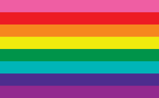
the original pride flag
designed by gilbert baker in 1978
pink was sex, red was life, orange was healing, yellow was sunlight, green was nature, turquoise was magic or art, indigo was serenity and violet was spirit
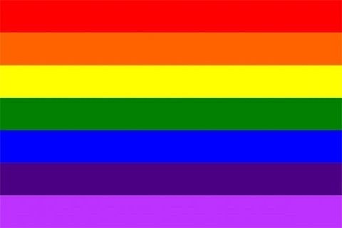
rainbow flag
often used to represent the entire lgbtqa+ community
they got rid of the pink because the fabric wasn’t available
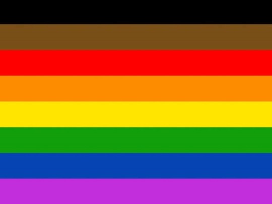
Philadelphia’s pride flag
In 2017 amber hikes, a black queer woman serving as executive director of the city of philadelphia’s office of lgbt affairs led the more pride more colour campaign to design the flag
The black and brown stripes were added to the flag to show inclusivity to black and brown members of the lgbtqa+ community and acknowledged the discrimination they face from both within and outside of the community
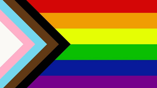
progress pride flag
created by daniel quasar in 2018 adding black and brown striped for people of colour and blue pink and white stripes for the trans community
the flag aimed to shift emphasis to marginalized groups that were important in the current climate and to show that forward movement and progress was still left to be made
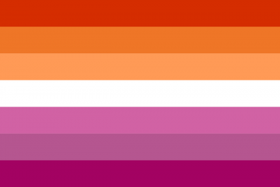
lesbian flag
emily gwen designed the sunset lesbian flag
the flag was inclusive of butch, trans and non conforming women who were attracted to women
the dark orange is gender non-conformity, the coral orange is independence, the light orange is community, the white is the relationship to womanhood, the pink is serenity and peace, the pastel pink is love and sex, the dark pink is femininity
the earliest lesbian flag was made in 1999 by sean campbell which contained the repurpose of a nazi symbol, an axe to show feminisms, and a violet colour to indicate sapphic desires. another version of the lesbian flag is the lipstick lesbian flag made in 2010 by natalie mccray had colour that meant to represent two lips touching, the flag excluded butch, trans, and gender non conforming women
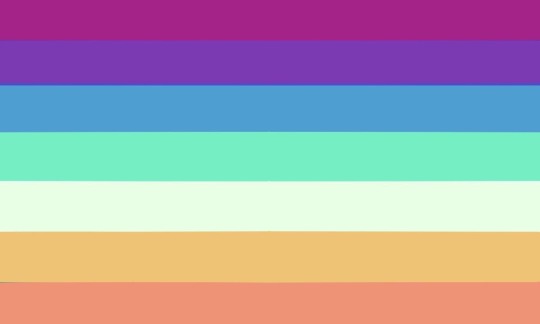
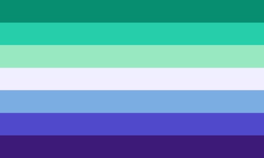
mlm/nblm/gaylm flags
(i am actually not entirely sure which is the proper flag or who invented them because there is still a lot of discourse and different variations of the flag)
the first flag is for mlm and nblm and has the least amount of controversy behind it so it’s probably your safest bet to you but it might not be the most recognizable. from top to bottom the colours represent attraction and beauty, mlm of colour, community and support, acceptance, trans and non binary, peace and warmth, love and romance
the second flag is a gaylm flag which was made by a gaylm trans man, it is the most recognisable flag but it is similar to a flag that has controversy surrounding whether it is a recolour of the lesbian flag (which i as a lesbian don’t mind but others may disagree) which was created by a transphobe. the flag above is for gay men and the colours from top to bottom represent community, healing, joy, gnc nb and trans men, pure love, fortitude, and diversity

bisexual flag
the bisexual flag was designed by michael page in 1988 to increase visibility towards bisexual people
bisexual people are attracted to multiple genders and experience attraction in relation to gender, this can be either romantic or sexual attraction
the pink represents represents attraction to those of the same gender identity, the purple represents attraction to genders, blue represents attraction to those who identify as a different gender
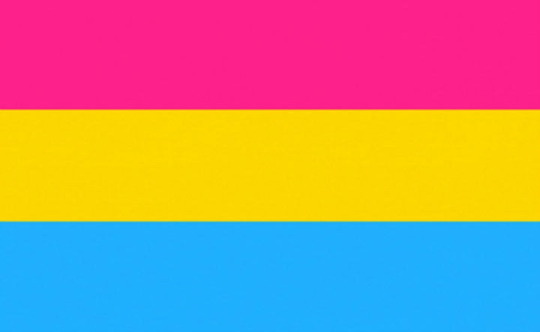
pansexual flag
the pansexual flag was designed in 2010 to differentiate from the bisexual flag
pansexual people are attracted to people regardless of their gender identity, this attraction can be romantic or sexual
pink represents attraction to women, the yellow represents attraction to genderqueer, non binary, agender, androgynous, or anyone who is not within the gender binary, blue represents attraction to men

polysexual flag
the polysexual flag was designed in 2012
a polysexual person is attracted to multiple but not all genders
pink represents attraction to women, green represents attraction to non-binary and gender nonconforming people and the blue represents attraction to men
#lgbtq#lgbt#lgbtqia+#wlw#mlm#pride flags#lesbian#gay#bisexual#pansexual#trans#transgender#non-binary#asexual#aromantic#asexuality#pride#queer
31 notes
·
View notes
Text
Understanding the Different Types of Logo Design
You need to be aware up front that I'm The Logo Handler and not a logo designer. I've designed a few logos previously, but it is not my forte. Clients entrust their logo to me for printing and marketing purposes. While I can not design you a glorious logo, I can let you know instantly if the logo will cause you troubles on the way. I have spent the important portion of my career working with corporate logos. Some logos are excellent and others are an issue. They may be pleasing to the eye, but they pose a multitude of printing issues.
One critical mistake people make at the very beginning would be to offer their designer small to no way. They find a designer, provide them with the company name and inform them to design a logo. Typically no additional direction is given. Perhaps some favored colors or a suggestion or two on a symbol that may be utilized, but that's it. The business owner assumes that the designer understands the needs and parameters of logo design. From my experience, about 50 percent of these logos I encounter are centered on aesthetics only. While an eye pleasing logo is significant there are a number of different things to consider that will play an important roll down the road.
SELECTING A DESIGNER
While it may be tempting to use a buddy or family member that dabbles in graphic design (and therefore are normally very cheap or even free) the logo usually ends up costing you down the road. You're more likely to experience issues with layout egos and must manage time delays. They might also not have the technical knowledge (bitmaps vs. vector, bleeds etc.). That is less of a problem for logo design but has the potential to lead to significant problems on additional projects. On the flip side, don't discredit these individuals. I've seen some great work come in aspiring designers and those who design as a hobby.
Irrespective of where you find your logo designer, make sure you review their portfolio and then confirm these two criteria:
1. Find a designer that will provide you with a vector emblem. If they can not, get a different designer. If they don't understand what a vector picture is, then do NOT hire them!
2. Make sure that they will Provide Aarau one of the following files:
- The first (vector) file in the app the emblem was designed in.
- A (vector). Pdf of the logo.
- A (vector). Eps of the emblem.
- Three high resolution.jpg's of this logo, one 2" wide, one 12" wide and one 24" wide.
Though your computer probably does not have a program that can open the first 3 documents, make sure you have them onto a disc in your workplace and stored away in your PC. Future printers and designers will require these files. See Images 101 for more info on vector vs bitmap.
LOGO DESIGN GUIDELINES
Besides a symbol that looks good and makes sense for your company, make sure your designer follows these guidelines. You also should run their layouts through these factors (color, size and contour):
Colours
Colors play a significant function in a symbol. Ideally you need to keep colors to a minimum, avoid shading and maintain colors separated. When printing full colour digital images you likely won't encounter any difficulties. Digital printers print images just like your colour inkjet or laser printer. In general, electronic printing is more expensive and is not always readily available for non-paper items.
Maintaining Colours to a minimum can save yourself money. Printing applications for apparel, promotional and signage products will cost more for each color. Promotional products generally have a set-up charge plus a run charge per color. Display printing will even cost more for each color. Design a symbol with a couple of colors or have a version which can be utilized as one colour.
Engineered colour enrollment may cause issues. If your colours are touching that is deemed tight registration. Text that comes with an outline around it's a great example. Promotional items that are silk screened or mat printed can not always attain this. Tight registration may also become an issue if you are photocopying something in black and white. Two completely different colors can look like the exact same colour and end up being a huge black blob when photocopied. Avoid tight enrollment or have a version of the logo which doesn't have tight enrollment for these scenarios.
Color fading/shading can't always be printed. Most non-digital printing software print solid colors. When you've got a solid colour that fades or colors to a darker color or another colour you will need a modified version of your logo.
Custom colors may cost cash. Printers carry conventional ink colors for example but not limited to red, navy, royal, dark green, yellow and black. Most printers will charge a fee to combine a particular colour for you. Promotional logo would items are also chiefly available in standard colours. If you picked teal blue to your logo and want to find a teal pen for your business, you'd be quite limited in your selection.
Size
Lines or text which are too small or thin are not effective and can "disappear" when printed or photocopied. The little parts inside a lower case "e" and "a" can also fill-in if they're too tiny. When selecting your logo be sure that you can shrink it (or a variant of it) down to 1" wide. 1 inch is about the smallest size you will print your own logo.
Shape
Shape is much more compared to a horizontal or vertical layout. Shape needs to take into consideration what is known as white space. Avoid layout elements that float too far away from the primary design. If your logo has lots of unusable white area and you would like to publish it in a small area, the white area can prevent you from having room left for contact details which you need to include. View the illustration below. Think of how the logo will appear when paired with your address or website. Ask the designer to put your address block next to the emblem as it may appear on a business card or on letterhead.
An important notice on various versions - You should not feel restricted by any of these guidelines. As an example, a symbol that resembles modern graffiti will probably go against all of the guidelines above, however if that's what you need then that's exactly what you should have. Just ask your designer to create modified versions which may be printed in one colour or smaller distances. I have seen businesses with 10 page booklets and dozens of variations of their logo which may be used for different applications. Be prepared.
Consider color, shape and size when designing and selecting your logo. It's also advisable to have different versions for different applications. Make sure you have the correct files saved away for printing. Keep in mind that the most recognizable and many renowned logos are easy and the colours are restricted. Work it and re-work it till you've got the perfect emblem. It's your logo, take ownership of it and maintain your logo visible!
A logo design can be considered as one of the area which resembles a bit too easy in layman's eyes. However, in its execution, it can be quite hard if it is not correctly designed. The topic of emblem involves everything and anything about grabbing attention. It turns into a massive challenge for the logo designers to successfully mould the emblem by taking all the essential ingredients of the brand identity and implement it to catching everyone's interest.
The main trick of constructing a logo is all about creating a single which will last for ages and should get etched in the minds of their target market even when the business meets its demise. This article would take up some of the elements that are found to be widespread in the logos created in 2013. Becoming familiar with these components ould help you prepare for the next several years.
The Components Which Have Changed the Look of Logo This Year
The Finer sides of Fonts
If you're heavily into Logo Designs, then you're expected to be aware of the font types. Some of the most frequently used fonts for logo design are Lucinda, Tahoma and Verdana but they aren't the sole one. There are a number of fonts which are seen to be used this year. The new logo design for Yahoo introduces fonts such as Optima, which totally changes the firm's outlook. You'll also find the newest fonts for logos online like the Aesthetique in addition to the Operator. The most popular fonts which have being used for Logos this season until now comprise the likes of Fiddle, Songbird, Axe and Anguilette. A thorough research online can help you find not only the stated ones however more.
The illustrated face of Logo
Hand drawn illustrations are making a comeback this year. Gone will be the days when designers employed the stock illustrations and photographs to think of a clone referred to as a logo. This season has witnessed particular changes from this perspective. Logo Designers around the world are utilizing especially designed illustrations to come up with mind-blowing logos. These logos have helped in bringing out the psychological appeal from the ideal target market.
The logos are extensively influenced by the ads which they by themselves represent. They have more influence on the target audience than those being made with using stock images.
The Use of Colour and colors
This specific year concentrates more on the brightest and boldest of the hues and tones. The most important intention of the logo designer is to use certain colours which would grab the attention at a jiffy. The colors this season concentrated on this of the brand colour. The main emphasis was to use a color which may continue to the new identity of the targeted product.
Introducing Flat Design Logo
This season could be termed as the year of their apartment design. Together with Windows introducing Flat layout with Windows 8, Apple adapted the exact same fashion with iOS7, the logo layouts are in for a serious change. Every third party app developers are adapting their emblem to this Apartment change. Logo designing is moving back to the fundamental with colors and basic geometric Contours. The forthcoming 2018 Olympic Games logo is the perfect example of that.
Logo Designs throughout Initials and Letter
Simplicity is the center of the issue using the Logo design trend. The emblem design uses either the initials or one of the significant letters of the brand. It has grown into among the simplest and the easiest way to communicate the brand to the right target audience. The new logo for the famed TV series, Master Chef conveys only that.
In this guide, we will talk about some must-known logo design hints and summarized them to a list with 8 "Don'ts" rules. If you are enthusiast in logo designing, then you might note that an outstanding logo design should identify your brand or company ideas marketing goal and strategy, give decent impression to the general public. Here the subsequent designing tips, Most of them not only aim at a great logo design, but also focus on original and unique creations. Hope that they can help your design logos in a wise way.
Some Don'ts List:
1. DO NOT overlook any flash of inspirations.
Draw any of ideas down with pen as much as you can. Please note that you'd better draw black logos as drafts in the beginning. It is a practical way for you to distinguish better and weak designs.
2. DO NOT combine more than two font styles in 1 logo design.
Sometimes, more means less. More font styles existing in 1 design may cause chaotic problems. Too many factors can't grab the attentions. Folks might not grab the focus of your own design. So if not necessary, please use only a couple of font styles in your own logo. Actually, most of emblem designs are mix logos, which include symbol and emblem text together. In the case, we only need one type of font style for matching.
3. Don't use more than three colors in 1 logo's color scheme.
If you aren't eager to design multi-color or rainbow logos, then do not use three colours in 1 logo. It just made your logo flowery but not beautiful.
4. Don't copy other designs or ideas.
Unique logo design concept is obviously driven by the various business locations, objectives along with your client's ambitions. If follow other's layout, you'll receive nothing but just the accusation of plagiarism.
5. DO NOT constantly draw shapes and symbols with just rectangles and roundness.
Occasionally irregular shapes, unlike many others, may lead the way in logo designs. So keeps your mind ticking over and do a few adjustments on details. It'll make your logo standing out.
Note: using vector instead of bitmap picture since bitmap is not a good choice for stretching. Jagged edges always create the emblem design go down.
6. DO NOT make the logos increasingly more complex.
Simple logos are usually more memorable than others. Don't permit your logo get too complicated, only if you're confident that you could control the intricate huge designs.
7. DO NOT leave logo without drop shadow and gradient.
There are some long-standing effects that many designers often used. As an instance, you can use shadow, reflection, glow, and gradient. Attempt to use them flexibly, but not often. Please note again, less is more and less is better.
8. Don't work behind closed door.
Discover and get inspired from different designers' logo artworks. Try to discover the ingenious creations as well as the shortcomings of their work. But do not copy them. Please refer to the following tip.
0 notes