#I just don't know how to storyboard and definitely don't know how to animate
Explore tagged Tumblr posts
Text
🌟KIANAMAIART FAQ🌟
FAQ wahoooo!!
GENERAL QUESTIONS
Who are you?
I'm Kiana, I'm a queer, Japanese Jamaican woman, and a Director/Storyboard artist who works in animation. I'm currently at Disney Television Animation.
What are your pronouns?
I usually go by she/her but I don't really mind any pronouns~
Where did you go to school?
California College of the Arts (but I dropped out when I was hired at Disney)
How did you get hired at Disney?
My bosses found me on twitter. They liked my drawing style and asked if I wanted to take a storyboard test. I did, I passed, I got interviewed and moved to LA two weeks later to start storyboarding.
Your work seems familiar. What do I know you from?
I've been on the internet for a long time! It could be a number of things. As maimai97 on dA I had a comic about next gen Pokemon characters called Pokemon 25 Years Later. As kilala97 I had some popular next gen ponies and also had a Steven Universe gemsona named Larimar. I'm also @yamujiburo, known most for drawing Jessie x Delia (hanamusa) a lot. I also work professionally! I've worked as a storyboard artist and director on Disney Channel's Big City Greens, I was a storyboard artist on one of the Steven Universe anti-racism shorts and I was a storyboard artist on Pokemon: Path to the Peak. Most recently I've been on season 6 of Dropout's Game Changer!
What program and brush do you use to draw?
Default brush in Storyboard pro. Photoshop sometimes just for compositing or specific effects.
PPPIDWTBAMG QUESTIONS
What is this project?
This is a project that started off as a silly idea that has since grown into me creating a 10 minute pilot animatic.
What does "pilot animatic" entail?
It means that it's effectively a pilot/episode 1 of a (potential) larger series. It's fully voice acted but is not fully animated. It's an animatic, meaning it will be comprised of storyboards in video form.
When and where can I watch the pilot!?
Now and right here!
youtube
What would this series be rated?
Ideally like PG13/TV14! Or whatever they call it. Definitely more geared to a YA audience. Not completely kiddy but also not what most people would consider adult animation to be
What are you planning to do with the project now that the pilot has released?
Don't know yet! There has been a lot of studio interest and even offers, so I'm in the process of talking with them and seeing if I can find this show a home or if I want to try doing it on my own or if I want to even continue with it at all. I know you guys are curious, but even if I wanted to tell you I couldn't. Just trust that I will make announcements as they come~
You said Aika had teammates, will we see them?
Because of the studio interest and potential for more of this show, there's some stuff I'm still holding close to my chest. This is one of them.
Do the characters have parents??
Zira does! As for Aika and Eclipse, this is something I'm still developing and don't really know myself haha
What are the characters' sexualities?
Don't know right now. Headcanon away!
Is "Star Guardian: Guardian of the Stars" a reference to that vine?
Nope! It's more so a parody for just really long and redundant titles which I love. Similar to the title of this project, which is called "Pretty Pretty Please I Don't Want to be a Magical Girl"
3K notes
·
View notes
Text


I MADE THESE FOREVER AGO BUT NEVER POSTED THEM, I'm not happy with the fact I haven't been drawing at all lately, so I fought through the burnout long enough to finish these. They all had a couple small things to finish and somehow that made me not post them for 2 months...
Definitely gonna do that 50 bishop questions thing when I'm done bedrotting, especially now that I have these refs up. But for now: a couple assorted fun facts below the cut
-Leshy is a comic artist, Kallamar is a painter who specializes in frescos and triptychs, and Narinder is an animator who makes flipbooks. So back when the family was all still together, those three would meet up on slow days to storyboard + make backgrounds + animate characters in flipbook form and make the dark ages equivalent to a movie!
-Heket was originally supposed to have tattoos, but I literally forget to add them every single time I draw her and frankly it'd be weird if I randomly added them now. They were those little eyes all over her chest/belly that you can see in her eldritch form, but she also had oak leaves and mushrooms on her collarbone!
-I use they/them for Kallamar by default, and tend to have slightly different ways I draw them depending on if they're feeling masc/fem/neutral in comics. The family jokes that Kallamar is the one who leeched all of Shamura's gender, because Kall is like EVERYTHING AT ONCE and Shamura is just ENDLESS VOID
-You can tell if Shamura likes you if they start using pet names or flowery symbolism rather than your actual name. Their name for Mystic Seller is "Sunshine" because they heard a follower singing that "you are my sunshine" song, and felt that same mushy feeling in their chest listening to it as they get when they look at Mystic Seller.
-I dunno when the *exact* year was that Shamura started to shrivel up and lose their muscles, but it was probably around the ~500 year mark? So you can really kinda time when a comic takes place if Shamura shows up- if they're bedridden but still jacked, it's pretty soon after the schism. And if they're all gangly and disheveled, it's pretty close to the events of the game.
-All of their crown weapons are of indigenous origin because uhhh ummm fuck you that's why. The lore reason is that Shamura was the one to teach them all how to fight, and everybody already knows my Shamura is inexplicably Lakota...also I must say MEDICINE SHIELDS ARE NOT INTENDED FOR COMBAT IRL I just thought it was the *perfect* thing to give Kall.
-I've talked about Leshy's autism a bunch of times, but only once have I said that they ALL got it. It just manifests in very different ways. Heket's most notable autism trait is "something is wrong, I need to correct it or I'll fucking implode"/injustice sensitivity. She's the MF that breaks out the measuring tape when dividing up a snack to be shared. She also is LOUD AUTISTIC so she's not yelling at you but totally sounds like she is. Kallamar is the "I'm gonna projectile vomit if I bite something soft and find something crunchy"/"if I don't cover myself in lotion 24/7 I'll scream over being trapped in my dry skin" type. So a VERY texture sensitive fella. Shamura is obviously an infodumping type who has niche special interests, but will rip you in half with their bare fucking hands if you chew gum around them or breathe through your mouth.
I have so many random stupid headcanons about these guys that I might do an entire gigantic post about it someday but rn I just want to wrap this up and go lay back down lmao
591 notes
·
View notes
Text
ROTTEN: Behind The Foodfight
youtube
Holy chips! It's an exciting time to be a Foodfight! fan, because ROTTEN: Behind The Foodfight is finally out! This really is THE definitive documentary on the insanity behind the movie, and it finally answers the question of just what was going on behind the scenes during production. Since I helped out with research (and I even get a short line of dialogue at 45:19) I've already seen everything that was shown off, but had to keep quiet until all the interviews were conducted and the documentary was finished. But now it's out and everything has been made public, the cat's out of the bag (the Fat Cat Burglar?) and I can talk about all the production material that's been shared.
Before I get into any of that though, I'd highly recommend you watch the documentary for yourself. It's insanely well researched and put together, and having worked together with Ziggy Cashmere (the documentary's creator) I know how hard he dedicated himself towards making this all possible. If it weren't for him, the most interesting Foodfight! discovery would've been finding the novelization, and we would have never gotten any real insight into how this movie came to be. It's also a documentary that really speaks for itself- I don't want to say too much about what it reveals since it's all expressed far better through its narrative and the interviews with people who actually worked on the project. My favorite is the interview with texture artist Mona Weiss- she tells such horrifying stories about how she was treated by Larry and other crewmembers, yet does it all with a sense of humor that makes it clear she's enjoying getting to talk about her crazy experiences. It's clear Foodfight! was an unmitigated disaster from start to finish, and there's nobody to blame for that but Larry Kasanoff himself. The movie was rotten from the top down and despite the countless talented animators and artists working on it, nothing could fix the fact that it was fundamentally mismanaged in the worst way possible. I think the quote from producer George Johnsen summarizes it best: "Foodfight! was a good idea that unfortunately lost its way during production. The technology, the art, and the direction were not in sync. Many very talented people gave their all to make the picture, but more understanding of process from the top was needed for it to succeed."
But if you saw the documentary, you already know all that, right? So instead, let's talk about the behind-the-scenes material that's finally been shared! You can find everything I'll talking about HERE on archive.org-
It's worth following the link and checking it out for yourself- there's so much it'd impossible to discuss everything. Artwork, storyboards, bloopers, models, a nude render of Lady X, an interview with Larry Kasanoff, the list goes on and it's still being updated! Despite the documentary already being out, people who worked on the movie are continuing to share new material! It's pretty incredible- for the past year I've ran this blog all I've really had to discuss are two tie-in books, and now there's so much Foodfight! material I can't even keep up with it.
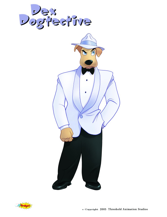
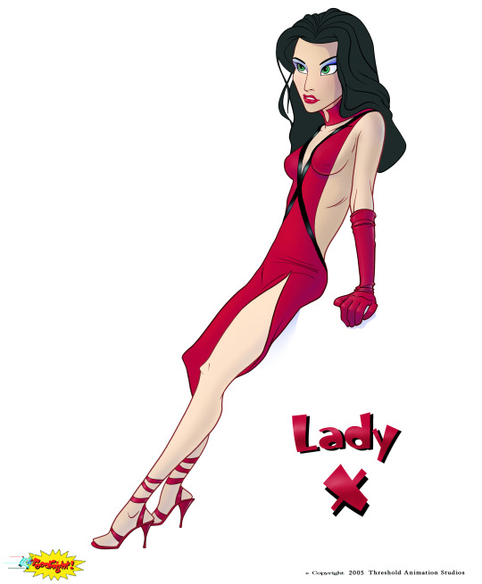
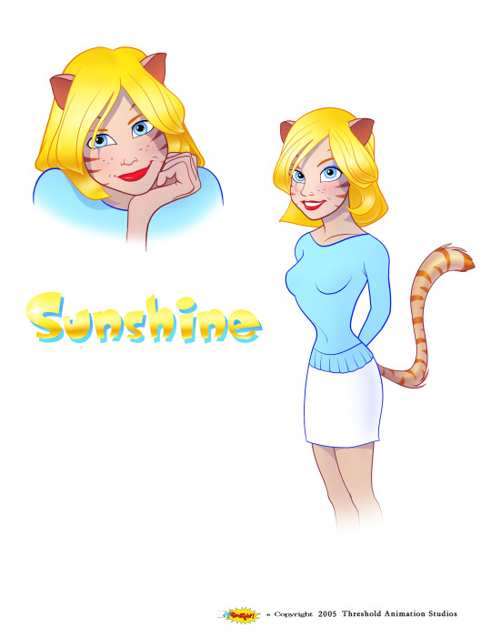
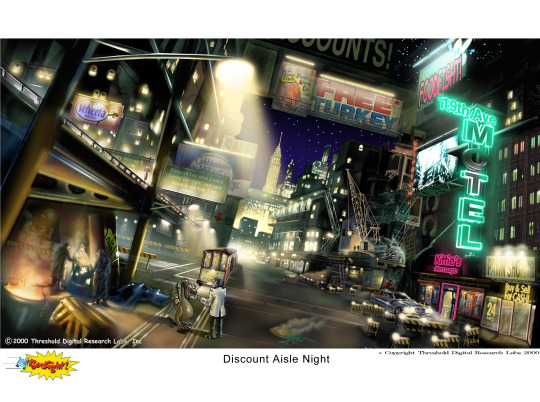
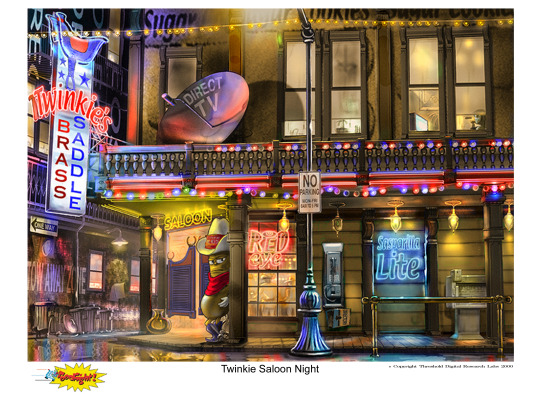
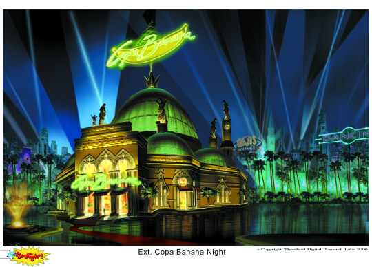
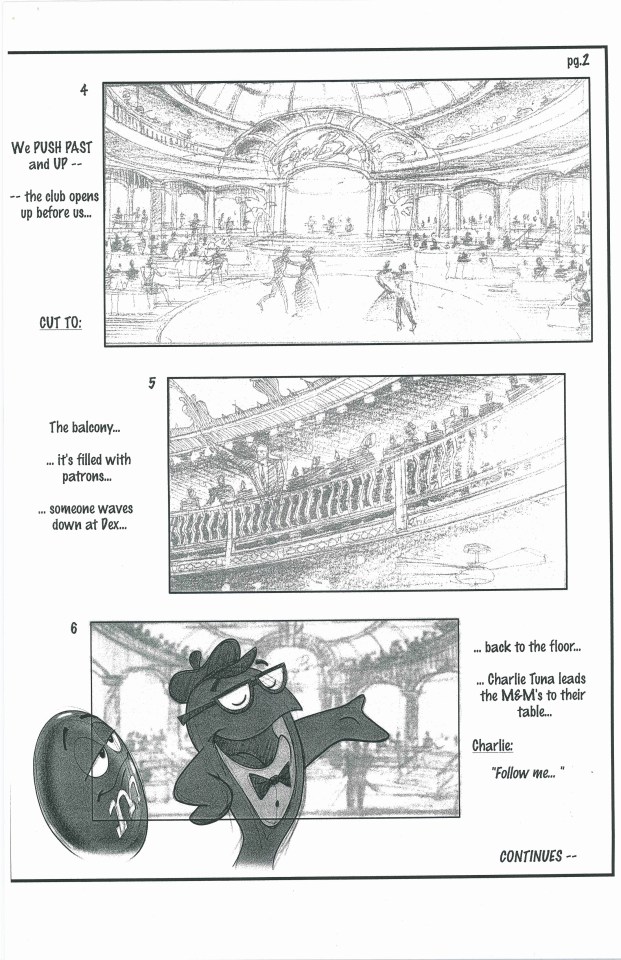
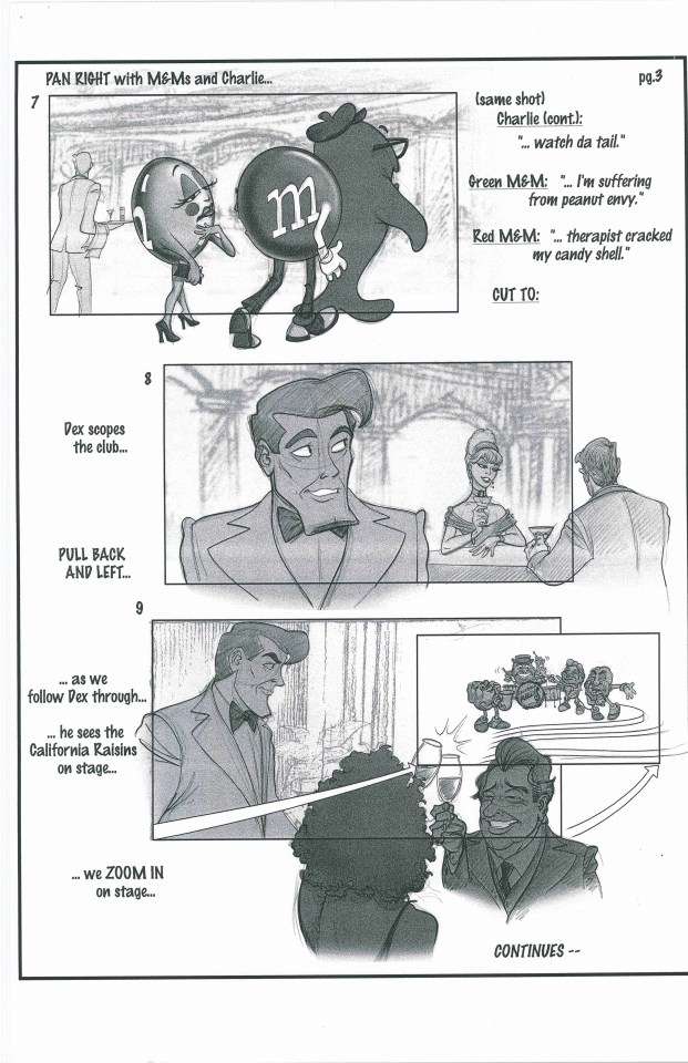
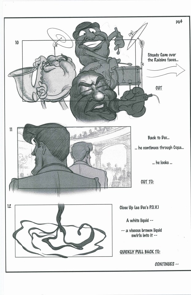
I mean LOOK at all this, isn't it fantastic? The character art by Jim George showing off just how much better these designs originally were, the countless environments showing off just how stunning Marketropolis could've looked as well as the strength of the core idea "what if a supermarket came to life at night", and insanely detailed storyboards for a 7-minute pitch reel that was used to sell the movie to investors. Normally, I'd be ALL OVER this because it's all just incredible, but there's something far, FAR more fascinating than any of it.
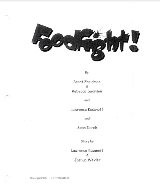
There are even multiple drafts of the script (one from 2005 and one from 2007 respectively) and normally I'd be insanely fascinated by those too, making extremely detailed posts explaining the differences between the drafts and how they compare to the novelization, but there's something else that was found that blows ALL of this out of the water and is easily one of the most monumental lost media discoveries of ALL TIME.
youtube
That's right, a rough cut of the ENTIRE movie from 2005 has been found, containing nearly ALL the completed animation from earlier on in production. I mean, that's mindblowing right? We first got sent this around a month ago, a little while before the documentary came out, and I literally stopped everything I was doing at work to just sit and watch this. This is the closest we're ever going to get to the "original" version of Foodfight! after all- only 7 minutes of footage was ever actually made before they switched to mocap, made solely for the aforementioned pitch reel, and this workprint contains practically all of it! On top of that there are some great storyboards in here, as well as some truly hilarious ones cobbled together from 3D renders, and the plot is far better than what we ended up with, a lot of the more inappropriate jokes being absent. This rough cut is actually pretty similar to the novelization in that regard, and it also contains scenes that we'd previously only read about in there.
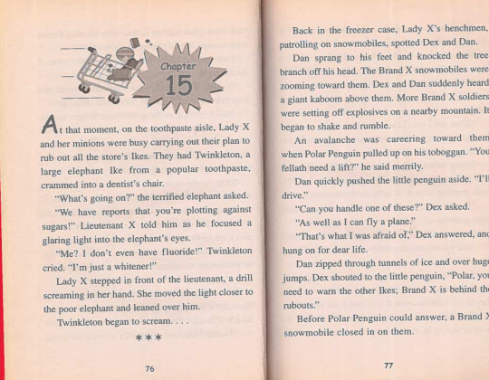
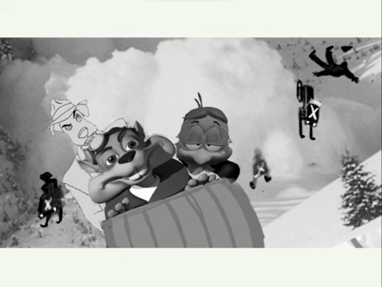
For example, in the novelization there's a snowmobile chase through the mountains, with Brand X soldiers on snowmobiles and a heavy avalanche close behind. This scene was completely left out of the movie itself, but in this workprint it's here! ALL the previously novelization-exclusive scenes are included, and this rough cut is seemingly based on an even earlier draft of the script than that- here Brand X are still defeated by a flood, whereas by the time of the novelization it'd been changed to a lightning storm. There are SO many exciting differences in this workprint, the snippets of original animation we get to see are SO good, and it's SO much better than the movie itself that I think it by far deserves the crown as the DEFINITIVE version of Foodfight! There's so much in it I want to discuss, that there's no way I can fit it all into this one post...so stay tuned, because in the next few days I'll be doing a FULL analysis of the 2005 workprint, pointing out all the extra brand mascots not in the finished film, and generally just gushing about how amazing it is.
I mean, this is it. Just take it all in for a second- the original footage was considered lost media for over a decade, and now it's practically been found in its entirety, embedded in an early cut of the whole movie...isn't that just phenomenal? All the mysteries have been unraveled, all the questions have been answered, and now we can relax, take a deep breath, and watch Foodfight!...the REAL Foodfight! Make sure to enjoy it, and join me next time for my analysis!
1K notes
·
View notes
Text

[source]
i had not seen the "durge/astarion is canon!" post until earlier today with that discord screenshot and honestly ... a writer being like "i managed to shove in all this extra content for astarion/dark urge, but then we simply ran out of time for the other characters" is not good, actually. that doesn't mean your ship is the most canon. it means that astarion kept getting extra attention and other companions kept getting neglected. that other companions simply do not have the amount of content astarion has is not a good thing, it is a bad thing.
and like i'm saying this as someone who really loves astarion/durge. it's unplatable to me and that larian writers are sitting in fan discords going "yeah we just didn't do that for other characters but somehow i found the time for this!" is kind of gross to me
#added the scene tally for context bc this isn't even *just* a durge problem let me know if you want it off the post op#tbh i wasn't even surprised anymore by just how much more content ast*rion had compared to everyone else#larian - for whatever reason - had decided to make him their poster child and writers' pet for the entirety of ea already#so to have it be the same at release was#not surprising#what was surprising though is that they didn't even *try* to even out the content the others had#the difference in quantity and quality and just overall care is so stark#to have it confirmed by one of the main writers and apparently NARRATIVE LEAD DESIGNERS whose job it is to oversee EVERYONE'S development#is... Disappointing to say the very least#to have a writer say sorry#we didn't time and resources for any of the others#but we miraculously have the time to plan storyboard write record and animate them all for ast*rion is Truly Amazing#and instead for the takeaway for the fandom in general from this confirmation to be like#1) see that the writers had to work under crunch and address that#and 2) to be shocked at the disparity of treatment of their own characters from larian and one of their lead designers#the reaction is to celebrate a character and a ship that has been vastly preferred over several others for literal years despite feedback#and take it as confirmation that's it's “canon” and that post has 10k notes#it's absolutely insane to me#like how many wires does thirsting over this character cross for you lol#anyhow once i've wrapped up my own durge pt#which i don't even want to touch anymore because the reactivity of EVERYONE excluding ast*rion just isn't there lmao#even if bhaal kills you in front of you li and friends#i will write up a feedback report to larian#because i honestly don't find that acceptable and that is the only way to really get them to perhaps change anything in a definite edition#or patch#vg: baldur's gate 3#series: baldur's gate#bg3 critical#discourse for ts
4K notes
·
View notes
Text
early birthday gift for the annoying ass stupid ass ring light person qwah pUH
warning ; slightly suggestive 💥
@hexsie @knightedmares @neo91502 @its-a-me-mango
so i had a plan to animate this ish for this stupid silly as a joke due to we share the interest of this green penguin youtuber, isaacwhy, in the summer. to then find out in my storyboarding class my new assignment was just animating/storyboarding a short sound clip... so what better opportunity to do it than now and it time for this silly ass 18th birthday :3c
i realized i forgot a few things, made some mini mistakes at the end but thats okay we ball
okay now for a bday message get out if ur not the ring light bitch /hj
from the moment i first met you... i wanted you to DIE TO GET OUT OF MY LIFE TO OBLITERATE INTO PIECES TO LOSE EVERY ROUND OF PRESSURE TO GO TO BED WITH WARM PILLOWS AND STUMB YOUR PINKY YOU GET A DEAD SCREEN TO POP UP AS YOU FALL INTO THE GROUND DECAYING AWAY AND - cOUGH ough sorry about that ahem the demons came out anywho- DIE- ahem...
nova i know i've given you my heartfelt personal message during my birthday time, so i wanted to give one too- even if most of it you may already know or i already said iuhkjfewds
the past... half a yEAR??? good gracious too long /JOKE has been a very silly and stressing ride gOD /lh. you've definitely changed my life and even influenced me as a person for the better. your silly high-pitch tone, the playful bullying, and even the obsession of your hex3 has just been enjoyable to experience and even participate the past few months. even just recently you getting me into your markipler in space fixation was definitely something i wasn't expecting and im still thINKING ABOUT IT HELLO???? IM TRYING TO BRAINSTORM A DAY TO WATCH IT AND AT THIS POINT WE MIGHT AS WELL DO IT ON THE PARTY OR MONDAY NEXT WEEK AT NIGHT YUIHKJFEDWSUGJH.
even with the characters in my brain i've told you about earlier of this year, hexsy is still checkin in as con {ander's oc} still does and she's been so nicey the following months even if not often i see her, but just like u irl reminds me of ur STUPID HETERO FIC ISTFG- it was genuinely so good holy shit. me and my plane trips istfg its always either me watching the new smg4 episode or reading a fanfic last time it was brain's, an this time is you and josie's IOHKJBFEDSH i love all the silly words in silly plot lines with silly characters so exciting and creative gUH. anyways... u'll get ur silly paragraphs today too teehee :3
but seriously you do bring a lot of good joy and happiness with the people around you, even if your sillyness can be a teeny bit scawey to endure, its also intoxicating and a disease it's personally affected how i even act but in the most positive way possible its raised my silly bar, but also genuinely made me so much more confident?? you've helped me learn to be myself and to be afraid to be silly, EVEN if the chance of embarrassment comes by, its not a terrifying if i have done it when i was my shy anxiety angsty teen ihugjrhefds. i adore and appreciate your company even in moments you scare me and bully me into not reading or looking at your stuff LEAVE ME ALONE YOU FREAK!!!! IMPATIENT!!!! /J /SILLY /LH i still hope your doing good at your school and preparing for your college adventures. i'll still be here to support and help you throughout so dont u dare think u're going thru this alone i gotchu- unless i die or smth but we boutta find out /j uigHJFDS
totally normal and not suspicious at all give me rizz tips pls knight is gatekeeping me all he ever talks about is spongebob did u form into a yellow sponge or smth is that the trick OHHH YEAHH GET IT BC TRICK IS HIS OC NAME AND im so funny please laugh and give me tips COUGHS- /HJ
lastly... if you think i don't have a lil silly idea thingy to share on ur bday, ur horribly mistaken. i dont know either to show it oN the day of ur birth or the birthday party, but we're gonna find out iughjvfredws just remind me till then since i know you will :))) its somewhat cool i think please think its cool its ugly yes but i'll improvise maybe trust
okay the moment your reading and watching this im in my night class sooooo may see ur messages or wait for another hr YES WAIT YOU FREAK until im done with class so we can yap jajajaj 💥
anyways have sum gift art bc i know u will cry if u dont get smth 💥


and yuri too LMAO
#happy birthday YOU FREAK QWAH PUH!!!!#tsb#tsb official#tsb animatic#smg4#smg4 ocs#smg4 animatic#hexsy#mango#neo#trick#isaacwhy#the group chat podcast#animatic#18? i remember when i was 18 /ref
127 notes
·
View notes
Note
What was your process for making the Noelle amv, if you don't mind sharing?
hii! im not sure how eloquently or clearly ill be able to explain it but i definitely have some pictures you can look at!
(the video)
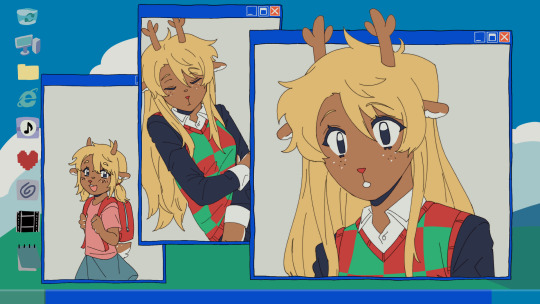
i actually got the idea while i was away on a trip with very limited wifi -- it wasn't Trust Me that i got an AMV idea for first, but instead it was one of 4syu's other songs, There's Nobody. for such a happy sounding song it really made me so sad, to the point where if i tried to sing it to myself id get choked up by the chorus LMAO. it was baddd
but basically i was rapidly trying to find both songs on spotify so i could listen to them offline, and it only took me a few loops of Trust Me and thinking about the original MV to make me go "ohhhh. how can i make this about noelle." And so i did .
i was thinking about doing a storyboard, but in the past, i've found that doing storyboards for animations/AMVs lowkey... kills my motivation altogether... SAD... but i saw the whole video so clearly in my head, and i didnt want to make the same mistake i made before... so i went right to doing quick sketches (while still on my trip...) just so i could get the ideas out of my head
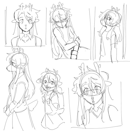
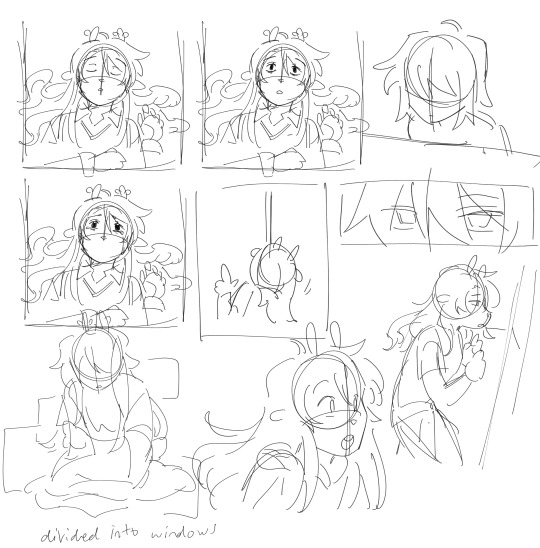
i was torn on what to do with my style at the time, whether i wanted to make it more similar to the original video, or to her canon appearance, or to MY style and how i draw her. i think it kind of ended up as an amalgamation of all three...? at the very least, her light world color palette definitely was more bland and desaturated, like i purposefully wasn't trying to do anything special with her colors.
after that point, and getting maybe a few of the actual drawings done, my motivation crashed again, and i left it all to marinate for nearly a week. it was baking, guys, it wasn't abandoned, listen to me, why are you throwing tomatoes at me,
i had up to about the "I dreamed about that again" animation done and stopped, and it wasn't until i decided to sit down and start editing it anyway that i really got in my groove again. i got all my little assets into a workable state so i could really try to sit down and make the video come to life and all
the really fun part was honestly working on the desktop backgrounds. i really wanted to limit colorpicking from the original video as much as possible, but i decided that making look as similar as possible to the original could help with the contrast i wanted to add later.


i drew these two backgrounds first. i was hoping i could somehow fit the bunker into the second one, but decided to do something different anyway. the second one's ui didn't actually change until later in the editing process.

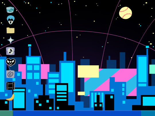
drawing THESE were fun especially, and im happy with how they came out. i think the dark world icons are really cute still. one thing i really did know i wanted to do from the beginning was to turn the soul/undertale icon into the deltarune one.
i was worried if the shift from the Windows Field Background to the dark world would be too sudden, like you would just blink and suddenly it was all different, but i think it ended up all right...?
the not so fun part was drawing all the different boxes, lmao. it go really tedious by the end, so i tried to reuse as many of the same ones as i could.
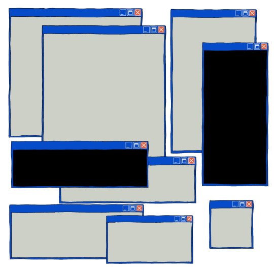
a lot of copy-pasting and tracing rectangles for sure.
i also had to make sure the animations didnt Suck. i brute forced those things and used every last braincell i had in order to make those pictures move bros


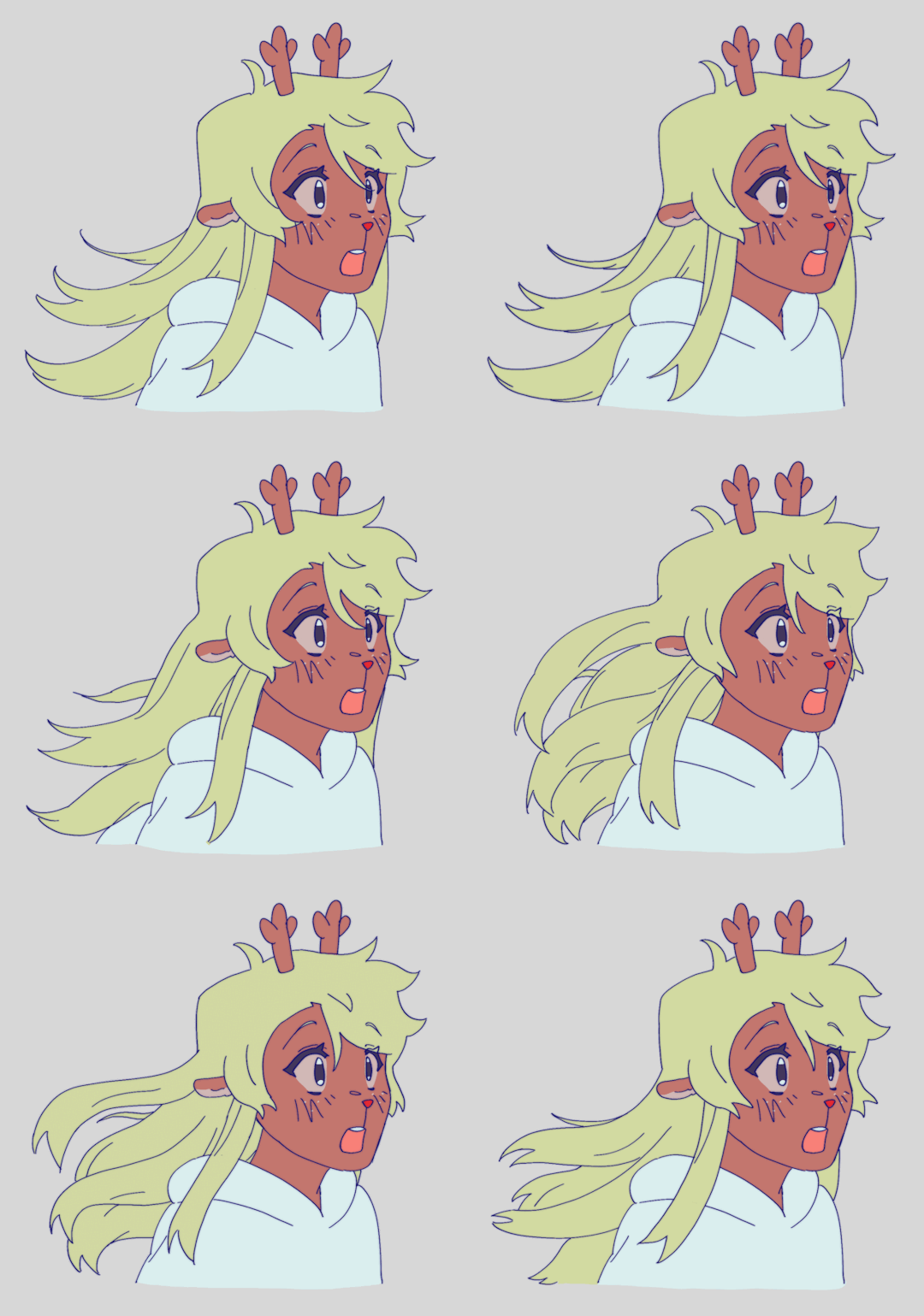
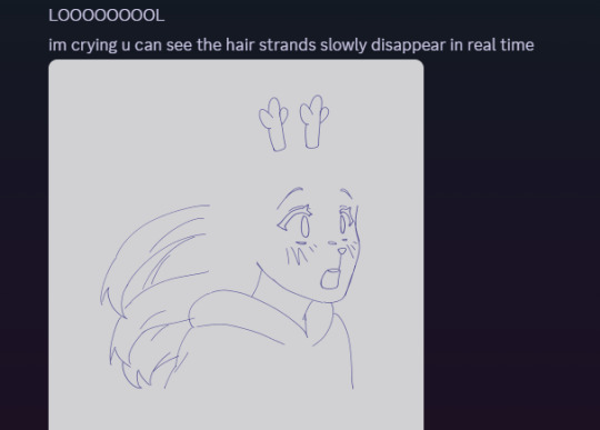
fun fact. ive never animated hair like this before. or in any complex manner really. i had to use sooo much brain here... heres how it started vs. how it ended up
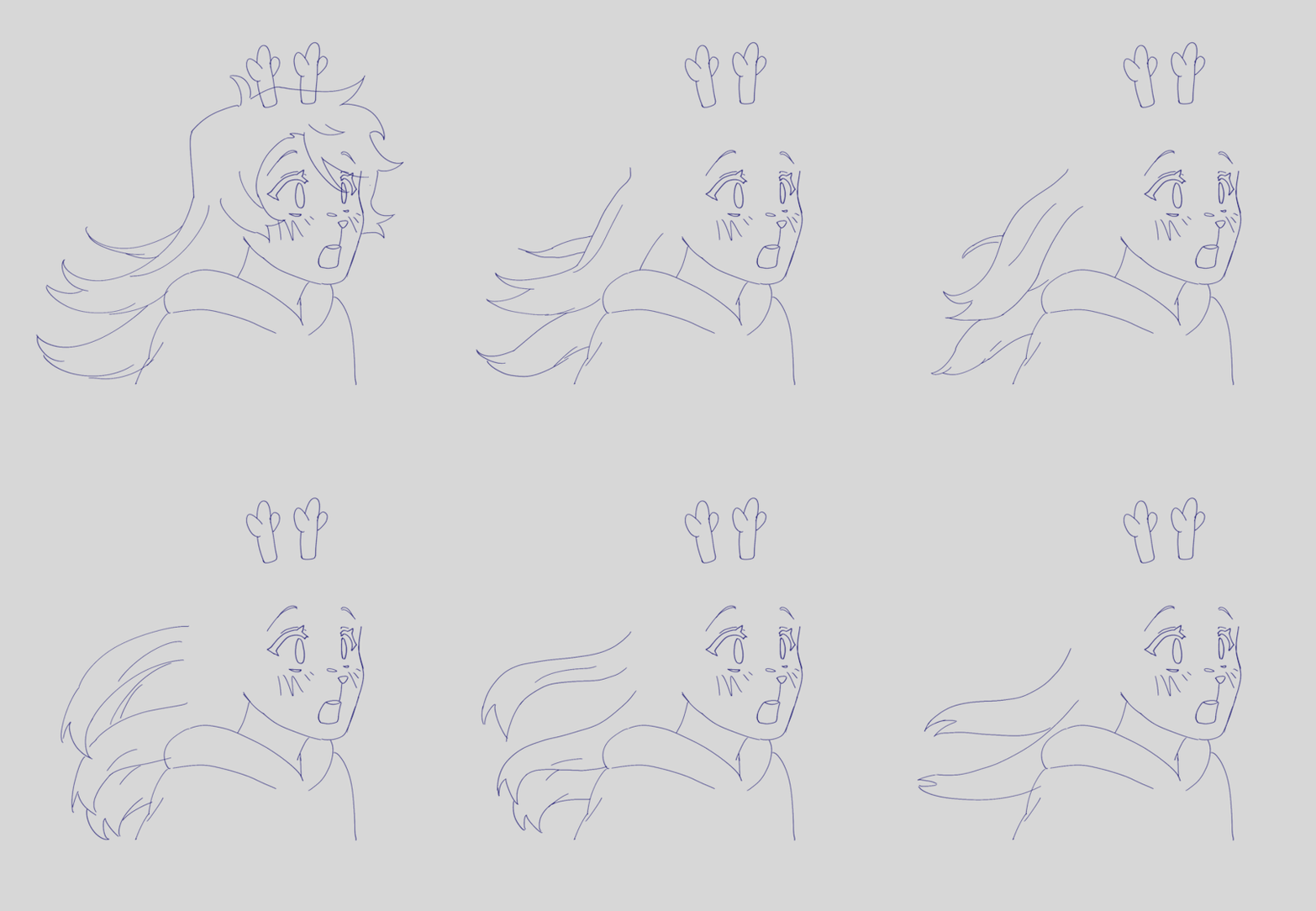
had my animator gf hype me up thru the whole thing... i was having a great time based on the filenames alone

aaaand then ummmm i edited it. i learned after effects like 1 month ago. never touched it before. i learned it for internship purposes and then used my newfound powers for evil it seems
i split the whole thing up into multiple compositions of course, but i probably could have split things up more... im sorry for having 84 layers on comp 3 its not my fault
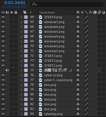
editing a video in 12 fps was a fun change though -- very easy for my brain to go frame-by-frame, and yet still some of the timing ended up being off... tis the goomy way
like i said before, i started editing when i barely had half the drawings done, but seeing it all start to be in motion really pushed me to finish it up. and i mean Really. like i finished the whole thing maybe 48 hours after i first started editing.
and...i think that's it? i do a lot of discord art streaming to friends lately but i kinda kept this one more under wraps compared to usual, i think i just wanted to surprise everyone... look guys i remembered how to make a video! and it's three minutes! waow
sorry if this is way more than you asked for LMAO
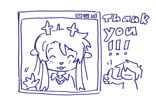
also, the AMV hit 5k views on youtube today! ive never had a video do well like that so quickly! thank you!!
171 notes
·
View notes
Note
I caught myself staring at your stop-motion art again and I'm curious about some parts of your process because this whole medium is fascinating and really impressive! And I think you're neat!
How do you plan out your animations? Is there storyboarding? (Especially for something like your TSunderswap amv that has a lot of shots, and some longer ones!) I also love seeing how you ease in and out of movements, do you just do those by feel? Crazy if true
I think I remember hearing that your puppets have a wire skeleton underneath the felt tops. Does that wire ever get brittle or harder to work with after bending them so much?
Would you ever try making puppets from different materials? 👀 Mostly because I think a mimirobo claymation would be news of the century
Auughhh my goooshh THANK YOU!! I think YOU'RE neat!!? I love your art!! It's so GOOOOOD!! So this means a lot!! :DDD Stop motion IS really impressive!! And I'm glad you also find it so interesting!! If done right I think it's one of the best mediums when it comes to storytelling, you can show so much with so little. And there's something so... Touching? Personal? I'm not sure what but you can really feel something in it...
Ok, to the questions!! Most of the time I don't really plan it out, I have a rough idea on what I want to happen and that's it. Straight to the animation table! I usually get carried away as well, keep animating more to it and add different things going on. Sometimes I play it out, just get up and act what I want to happen, it helps sometimes, I know what would feel more natural or better. (It mostly makes me look crazy tho XD)
Yes!! The TS!US had storyboarding!! Not sure if you could call it that... Mostly just a messy comic thingy which I made while listening to the music I wanted to use and imagining scenes for it!!
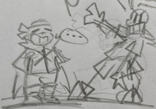
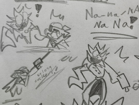
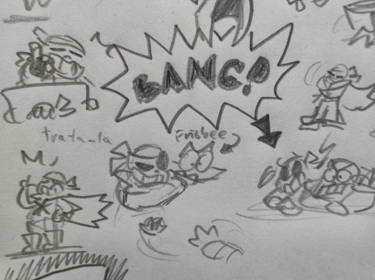
I lost the paper a while ago, but here are some pictures!! You can probably recognise a few scenes, most didn't make the final cut unfortunately :(
I'll definitely keep doing storyboarding for longer videos like this, keeps me more organised and I actually know what scenes I need to do. (Also I can skip a few scenes and then come back and do them later! Power of post production!!)
And yes! I do easing in and out a LOT! One of my favourite parts to do when I'm animating actually. I'm glad you like it!! And again, yes, it's all done by feel XD
Yeah the puppets all have a wire skeleton sort of frame underneath. The wires haven't been a problem really, AND I HOPE THEY NEVER WILL. Maybe they're just not old enough yet? Or I haven't used them enough for it to start to be an issue? The only real problem is that the arms sometimes fall off, the wire slips out of its place!! Which is annoying... But I have changed wires before, so it's not a very hard fix if it does become a problem!
OH PUPPETS FROM DIFFERENT MATERIALS!!? That'd be so cool!! Apart from this I've only worked with LEGO, whiteboard animation and some random objects. So CLAYMATION sounds epic!! I actually even did something really quickly!!
Here's a lil lizard guy, not exactly from clay, but close enough! :D
Wanted to try out what it'd look like... I really like it!! His tail kept falling off tho XD But I think doing stop some motion with clay would be awesome!! Thanks for the idea!!
#answered ask#nice person#stop motion#long post#news of the century huh#XD thx!#i THINK this is my first “claymation”?#the lizard isn't out of clay and is nearly a year old#THANK YOU FOR THE ASKS AND KIND WORDS!!#so happy someone as cool as YOU likes my stuff!!#stay awesome!!#:D
62 notes
·
View notes
Text
Phineas and Ferb Season 5A Initial Reactions
Yep, we're here. And Disney+ (regrettably) is dropping the entire first half of the season on the platform. So I'm gonna post my episode reactions here. I'm gonna try and keep things short and snappy, not only because I know I could EASILY get carried away breaking things down (I'm gonna try and do those later however), but because I wanna see these new episodes! Curse you binge model!
Cloudy With a Chance of Mom
I've already talked about Summer Block Buster since it released earlier, so I'm gonna jump right to this, and at most acknowledge it in relation to this being the second half of that story.
"Miss it and my future mother in law is gone forever" I ACTUALLY SQUEALED
Also Monogram accidentally helping Doof lol
Oh yeah Kyle Menke storyboarding this big opener, not surprised. Think the other boarders are new, Chris Ybarra the director did storyboards on MML tho!
Well that was fucking awesome. Big explosive opener, lots of funny moments but also a surprising amount of proper pathos even as we're looking at such an absurd situation with Linda being vaporised meaning the literal vapour that was Linda's remains condensed into a cloud. Doof I guess never tested it on anything living, lol. Funniest parts were Baljeet trying to show off constantly and Doof getting his new plan from Monogram. Loved that everyone got their moment here, even Irving got a sweet moment at the end where Candace hugged him and asked him to take this year's family picture! Even Perry helped saved Linda too! And this year's picture isn't just the family but all of their friends too!!!!! God I love this show. Animation for the most part was good, any issues are just nitpicks/adjusting to Snipple... that being said, I think someone forgot to animate Baljeet in the group hug with Linda, because he's just standing there, and Isabella is hugging just him even though I feel like it's meant to be her participating in a group hug? Uh, win for Isajeet shippers, I guess? :P But gosh what a start, if this is a showcase of what we're getting then bring it on!
Submarine Sandwich Submarine
Okay the modified title sequence is a little tacky, the old animation with the edits to Phin's shirt and the updated voice lines are kind of jarring. Do think it's kind of neat the images at the end are upcoming eps this season instead of Season 4's though, kind of a nice tease of what's come.
Is bread bowl hot tub gonna be a running gag for a few eps
Also they animated Isa's entrance so well, so cute and flirty, feels almost like a callback to her OG entrance in Rollercoaster
wow has isabella been saving buford's ass a lot lately, to the point buford seems to call her "little miss safety patch", wonder if this is an allusion to time between summers or just general backstory
someone had fun storyboarding those filters
So first regular ep, wasn't super extraordinary but I still enjoyed it! Many nice gags that got genuine laughs out of me, and definitely a wild time for Candace, that's for sure. IDK how they got in and out of the Mariana Trench so fast, but it's a cartoon. :P The safety thing was kinda random but it does make sense, Isabella knows how to be safe BECAUSE she regularly does dangerous shit, Buford just wants to rush in without thinking (and again, if the patch thing was literal, love the implication of stuff between Summers). Don't have much to say on the B plot besides there being some pretty funny moments and a few neat interactions.
Also, first ep from new writer Oscar Lemus, co-written with PnF regular Joshua Pruett! I'm sure the giant fish was Josh's idea, lol. Director is James Kim, who storyboarded on MML. One new boarder, but also Wendy Grieb who was on OG PnF.
License to Bust
SHE'S 16! I meant that in a celebratory tone, I'm not yelling at people hitting on Candace. :v
"of course geckos don't have springs so we added that part" i don't think their feet stick in the way you made them either lmao
buff monogram... and it's real????
the hair swap is gonna last the whole episode lol
wait were they gonna just leave the gecko gear there
That was also pretty neat! Again, nothing too extraordinary or outstanding, but it's classic PnF, which is great to see! Lots of really funny moments here, love the gecko gear, love that the driving instructor (Brian?) not only was super impressed with Candace but actually related to her (also wow, his sisters seem way nastier than PnF if they're mocking him)? Song is probably gonna grow on me too. Nice to have Kim Roberson back too, she's been on the show since Season 1 and well there's a reason they had her around for so long! Doof plot had fun moments, also kinda funny that Doof actually did something good by driving that pregnant woman to the hospital. Good guy Doof is still around in there! Also lol, guess another ice-cream fell out of the air once Buford was satisifed with his pork.
Dry Another Day
lol the show is now rated PG in Australia, scaryyyyyy
"futility for teens" candace is sisyphus
candace's scream at the tortoise sounded like a bird squawk omg
oh shit perry swamp UP the oil
huh another inator that dries things like moon farm, tho this is for drying and that was dehydrating
So that was neat! Don't have too much to say but Doof's plot was pretty out there, the ice luge was pretty unique, and there were many pretty funny moments. Also, first Danny Jacob song? Also not sure if all the swimsuits for the kids are returning, I think at least Phineas had orange shorts vs blue ones.
Also, first ep from Sunny Karnan! He definitely has a hang of the PnF style, I'll say that!
Oh yeah, first Stacy speaking appearance! Now we just need Jeremy.
Deconstructing Doof
was that a platypus controlling me reference
WAIT THAT WAS THE ORIGINAL PHINEAS DRAWING ON SHAMAI'S BOARD
HMM... well that was interesting! Definitely one I'm going to be eager to revisit. Less laugh out loud, but Dr Shamai's performance alone carried so much humour to it. Shamai himself was a really memorable one off character, the idea of an outside perspective realising what's going on and they basically become obsessed with it only to be driven mad when the truth can't be exposed is... wild. The songs were neat too, especially the therapy one. The hype for this ep was worth it. A little confused about some of the timeline implied by the first song, like is therapy only talking about last Summer, or this one too? But yeah, lots of really neat moments (I love that Baljeet was surprisingly close to getting Candace's whole deal, he's not exact but he's on the right track... also Ferb saying nothing in the interview, lol), and a very unique protagonist in Shamai (I keep writing Shumai cuz of a Danganronpa ship thing where that's a character's nickname given by the other person lol). The disco looks were cute too when that showed up. Also this ep is unique for showing stuff from an extended period of time. But yeah, very unique premise that shows there's still more things that can be done with this wild show.
First ep from Olivia Olson! Also written with her dad Martin, which doesn't surprise me.
Before I forget - neat how we still have the old style credits instead of the slide show thing MML and HaG does. Still yet to get a unique scene but hey replaying the songs is always nice.
Tropey McTropeface
wait is this the same heatwave featured in dry another day, is this an ongoing thing like bread bowl hot tub
"animation is so easy"
linda implying she'd be angry and pnf for tropey oof
were the van stomms flossing
also wondered if the parents were separated, nah i think they just argue a lot, and both sides look like buf lol
the news guy is the umbrella thief????
zoetrope god??????
isabella was clearly looking to having that ferris wheel ride with phin, the weird zoetrope ferris whell romance definitely set the mood
WAIT THE ZOETROPE AND FERRIS WHEEL REPRODUCED??????
Well... that was something. Is Scott now just writing shitposts? First giant mum cloud, now a zoetrope that isn't sentient but maybe actually is, Schrodinger's sentience? Anyway... yeah, that was certainly something alright. A zoetrope going on an adventure and having a romance with a ferris wheel while somehow becoming everyone's hero and everyone loves him. The self insert Phineas and Ferb fanfiction... from a zoetrope. Very cool unique.
Biblio-Blast!
ISABELLA JUST STEALS THE MINI PHIN IN A TUX FOR HERSELF LOL
AND BALJEET SAYS IT SHOULD BE ON A WEDDING CAKE, NO WONDER ISA YOINKED IT
"why would we need perry to build a bookcase?"
posh isabella
ferbenstein is a book
baljeet ain't falling for buford not liking reading when he disses kafka lol
wait is vanessa vegan now
"i'll put you in the NICE senior care facility"
Well that was a fun one. Josh clearly wanted to show off a love of books and reading. Lots of funny moments and weird goofy Doof plants. Surprised there was no direct callback to eg Pharmacists or something. The Doof plants singing is weirdly catchy. Not much else to say, I enjoyed it a lot! ...okay, fine, they seemed to like putting Phineas and Isabella together quite a bit, lol.
A Chip to the Vet
finally jeremy... credits don't specify who plays him tho
"protagonising"
okay the queer buford fans are gonna love the jeremy bit
screaming goat???
Feral Ferb????
Well that was neat! Glad this episode built exactly on the premise it sets up. Only thing I think wasn't necessary was the Phineas scene where he declines Perry being chipped, I feel like that didn't make too much sense (unless you wanna read into it and it's him subconsciously remembering Agent P but that's another story). The stuff was Candace was funny, the pet wash was cute with a neat song, and Perry outsmarting Doof was very cool and amusing.
More Than an Intern
lol the budget being blown on lair entrances
was that fuckin anton ego from ratatouille
oh he's just a screenwriter who happens to have notes
FERB'S DOUBLE LIFE IS AS A FOOD CRITIC????
wait random but is evil for extra credit based on the regular carl theme? hearing the remixes here made me wonder
love the weird girl who seems to like the fish lol (Brittany?)
"i have an engineering degree" rough, between this and carl working multiple jobs and an unpaid internship uhh yeah
dan and swampy, lindana AND love handel pizza
yay for using cute phinabella as a screen wipe
I liked this one a lot! I don't talk about it as much but I enjoy Carl a lot, so getting an episode focused on him was really neat. Guy really is working his ass off, poor dude. Monogram at least pays him for the pizza and says he'll validate his parking? So Monogram's still being shit, but he's giving Carl breadcrumbs... it's something. I really loved Tyler Mann's speech at the end, like you could really feel for Carl there. He really is just only sticking with the unpaid internship because he's that passionate about the job. But yeah, especially with stuff like worsening cost of living, I think Carl's story is gonna be very relatable to many. The bit with the kids play cross continental lacrosse was neat too, IDK if the people in Kilimanjaro were the same ones as Save Summer but I do love how this kinda lowkey expands the world they have regardless.
Wait, is Sunny a fan of the farmer and his wife bit? They've shown up in both of his eps lol. Also, bread bowl hot tub is definitely building to something, it's gonna save the day in a pivotal episode or some shit, isn't it?
The Aurora Perry-Alis
oh hey, derek thompson is back
AAAAAAA PERRY AND STACY HANGING OUT... i literally had to stop myself from screaming
HA STACY IS BEING PAID TOO, GIRL GOT LUCKY
MONTY'S BACK
did vanessa basically ghost monty
oh vore time
"it's not my pet, we have a complicated relationship"
are the clowns dating
Okay this one was actually really good! Phineas and Ferb doing stuff was a thing, but the standout was the B plot stuff for sure, with Doof and Perry going on their weird shrunken down adventure, and Vanessa and Monty being addressed. So they seem like an on again, off again thing, I guess? Vanessa evidently got tired of the whole gimmick hence the ghosting, but yeah. Do kinda wish Vanessa had more to say on her dad trying to be good but being evil but oh well. XP Also... Stacy and Perry bonding. Love it.
Lord of the Firesides
oh god i'm actually here time to see what's going on finally
wow those girls are serious about their cupcakes
not doof's bday yet if he's still 47
"he's more of a frenemy but our boundaries are fluid"
uh oh phineas is what makes isabella finally snap
OH NO PHINEAS IS SHOWING UP
"i guess girls do mature faster than boys" what does that even mean omg
omg the drum is isabella, rip
SON OF A PATCH
they keep cutting away from the fighting omg
IT WAS AN INATOR THE WHOLE TIME, AND IT WAS THE FUCKING PIGEON'S FAULT
oh many returning voice actors, neat
the hug with gretchen at the end aww
Lol little Melissa still being crazy
WOW THAT WAS SOMETHING ALRIGHT. Honestly, it might just be my personal investment in Isabella, but wow, this was something. Surprisingly tense. Like you knew SOMETHING was wrong, but you couldn't pinpoint what, but then everything just descends into further chaos as Isabella is the only one staying level headed... until even her limits are tested. Okay, the Doof stuff was fun and cute with Perry tagging along. But yeah... Fireside Girl chaos. They had no goal, they just wanted to be chaotic and follow their own interest. Kinda reminds me of "The Giggle" in Doctor Who (also rip using anarchy as a perjorative, actual anarchists believe in genuine cooperation). What I have to mention though is... Isabella didn't give in to the effects until very late. I definitely would love to hear if there's a specific reason why she managed to hold onto her sanity the longest, but my personal take is that she just has the strongest will, especially having to run the troop and all. But of course, even she has limits and can't fight this force forever... making fun of Phineas definitely seemed like one of the breaking points (she even recognised she wasn't feeling herself), but also damaging the Fireside Girl book was probably the final straw, given this is what she devotes herself to so much being treated so flippantly. Any will to hold on to being a rational leader was then gone, so time to duke it out. Gosh, I hope Phineas and Ferb have a chill time when they come back over. But yeah, the cute sweet but tough girls who always work together being made to embrace discord... this was begging to happen at some point, lol.
Also Oscar Lemus' first solo episode... what an impression to make.
The Candace Suit
oh back to the normal intro... but the voice lines are still updated, lol
oh a mysterious force namedrop
"we have breaks?"
buford all dressed up omg
BALJEET IS IN ON IT
oh yeah the dark lighting in some of these eps looks a lil weird, like this and the carl one
so he has a lot of candace... but even more of baljeet, WOW shippers are gonna go crazy
"it's nice to be appreciated" heh phineas looking for validation for once... and specifically from isabella... shipper brain shut up for now lol
wow isabella being mean over ducky momo, cancelled :v
ok what is even happening
they agree to put them on, and phin and isa in sync when agreeing to ferb hehe
pnf sharing a suit heh
wait is that one candace suit gonna come back later omg
Well uh... that was something. Very weird episode, I'll say that much, lol. I think my brain is getting scrambled from all this so apologies if I'm less coherent now. Phineas looking for compliments from Isabella is cute, though definitely something new, lol. Nice to see Candace and Stacy team up with Buford and Baljeet for a bit. Doof plot wasn't much overall. Candace suits are weird and creepy. Isabella thinks Ducky Momo is cringe, boo. Cliffhanger?
Agent T (For Teen)
stacy cow noise wtf
Uruguay??? In the Stacy ep???
monogram 4th wall break
pnf winning everything omg
stacy be kinda badass tho
doof accepting a beating cuz he didn't realise it would be this dangerous lol
stacy's 16, so it's been her birthday hehe
BOOO DISNEY+ SHRINKS THE EP DURING THE CREDITS (it's candace suit creepy baljeet room anyway but lol)
Okay that was awesome. Honestly so happy for Stacy, she's finally finding her own purpose in life. Honestly love that she's pretty badass but in such a mundane normal way. Love the friendship she has growing with Perry, like honestly it's like she could almost even be like a sidekick to him or something. Love that Stacy was even accepted as basically an agent too! Yay for Stacy!
The Haberdasher
"oh, it's just you" SAVAGE ISABELLA
rip hot tub
Baljeet: "and Ferb" WOW THEY ARE NOT HOLDING BACK TODAY
shouldn't it be more than 104 after the new summer started linda, also another rip to dan's claim that they do more than one thing a day
baljeet is so done with isabella forgetting ferb lol, tho he does kinda smirk at her when she corrects herself lmao, even buford raises an eyebrow
hey alan cumming is mad hatter willy wonka guy
eww proboscis
isabella has a candace moment hehe
Okay this was another really good one. I know Josh had this idea for a while, so nice to see him realise that. Moth Doof is gross. Haberdasher is a neat guest character. Enjoyed PnF's friends try to do something without them, not sure if we've actually seen them like this before without having some other thing motivating them. So yeah, they're forced to just work together, even if they refuse to at first because their own egos clash, lol. Now Phineas and Ferb get to see what Linda experiences I guess.
Out of Character
LUMBERZACKS
more nickel gags
was that a gravity falls gnome
buford's look of shame when the others eye him for taking the bed down lol
filming here for tax credits huh
"There you are, Ferb! That other guy talked too much" literal LOL
buford has schedules for everyone, not just jeet????
That was a smaller ep, but still neat! I can see how Baljeet would have this dilemma of being too literal minded to accept the pretend (more Autism fodder hehe), and then they actually get him to pull off acting by deceiving him. He's clearly not into the idea, but he does accept that it helped him. Wonder if we'll see him show up in this Space Adventure movie sometime down the line? B plot didn't have much for me to comment on, Doof's inator is wild tho, especially with how it helped Roger (who seems to have wanted to boost his own ego lol).
Meap Me in St. Louis
okay jon colton barry finally writes something
the counter for the trailer scenes is a funny touch lmao
oh my god jerry
BREAD BOWL HOT TUB
okay candace helping suzy despite their feud is cute
also does jeremy realise suzy still has it out for candace even after she was exposed in let's bounce lol
NOOOOO NOT THE BREAD BOWL HOT TUB DELAYED AGAIN
the mitch is back
wait so... stabbybarfpain was in fact... a made up hybrid season of every kind of weather at once... oh my god
sunny gloriousweather... is this by any chance named after sunny karnan esp since he is an actual scientist or at least studied science
somehow, balloony returned... guess he just randomly dies every now and then but doof blows him back up
wait is that baljinger content in the song
also yes phinabella together again lol i'm predictable
alyson stoner song is really nice as expected, even as the humour of the name stabbybarfpain is not lost of me
rip colin jr
was that the other dimension baby that eats guys
hey news guy weren't you arrested earlier
meap totally wanted to say "my ass"
phineas and isabella led song yay
candace looks so proud of herself hehe
wait... stabby barf pain... fifth season
also heh meap's wife chasing after him as a fugitive, what roleplay lol
ok no meap 4 trailer lmao
Holy shit that was crazy, lots of laugh out loud moments, nice Candace and Meap team up (the justice obsession feels foreshadowy too esp with her studying law in AYA hehe), Stabby Barf Pain is wild... yeah, so much crazy shit. Trailer stuff was hilarious. Doof and Balloony adventure too! IDK about how cop-y it felt but I'll think about that later lol
No Slumber Party
double sleepover omg
isa's little wave when phin said lady aww
are they doing the candace disconnected gag of never saying what they made
buford wants the girl talk
lol candace goes bust mode anyway
That was cute! Just everyone hanging out, and it's all a chill time. Some funny moments, song was cool too.
The Ballad of Bubba Doof
imo the biggest issue with westerns is the colonialist origins of the genre but ANYWAY
isa sick of the boys fighting lol
swole perry
jon isn't co story editor anymore, it's just scott after meap it seems, oscar is now staff writer tho
IDK if I'm just finally getting tired but this one was just fine. The forced perspective thing was fun, and more Doof relatives, cool. Maybe just not vibing with the Western thing (like Baljeet lol). Neat western outfits. IDK about Baljeet changing his mind deciding to watch Westerns at the end and IDK if the Carl stuff was meant to be an arc or just a gag. Wow I AM tired.
OKAY FINALLY I'M DONE NOW I CAN SLEEP AAAAAAAAAAAAAAAAAAAAAAAAA
24 notes
·
View notes
Note
genuinely want to see a full animated series of the poly comic! Their dynamic is just SO cuter!
ANIMATING A SERIES, LETS TALK ABOUT IT.
1. The idea
Well, as wonderful as that would be, it would take me a very long time to make something like this. Animation involves a lot of time and a lot of wrist work, planning, storyboarding, and much much more.
2. The reality
I'd likely have to work full time on it. If we wanted to achieve 1 episode per week at most (and that's if I'm unrealistic)
Why would I only do 1 a week?: Because 1 episode in a week would already be asking a lot for a 1-man team. Once more, animation IS HARD.
which means I'd need donations so I could still have an income for food, rent, and possibly to buy the program and equipment necessary to animate. Not to mention other expenses that might come up in the future.
3. How would I do it?
It would probably be small episodes since those yield faster results and be more doable.
Furthermore, I'd need a plot and deadline for every episode! (The plot would be the fun part)
I don't know how I'd receive payments though, I've always been very nervous about asking for money even though I have a PayPal & Payton set up (I've never used them)
4. Where would I post it?
I know I'd probably post it on YouTube so it's more accessible to everyone! I'd hate for someone to be left out because of a pay wall, so that's my best option so far.
5. The animation?
I'd have to take some time to figure out how I'd best animate the characters and backgrounds.
I'm very unfamiliar with 3D, I only ever briefly dipped myself in that end of the pool. HOWEVER.
I'm quite familiar with 2D. the only issue is that I absolutely suck at it ever since leaving animation.
I'd have to do a lot of practice before revealing a semi-decent result.
6. The characters
A, B and C all look EXTREMELY similar to one another, to the point I can only tell them apart because A has a mole on their cheek, B is the tallest and C is the smallest. It's very confusing and definitely not an ideal character design.
I do think I'd be able to play around with the style while keeping them minimalistic, though maybe add hair (Are they bald??) To distinguish them apart more easily.
#animation#g/t community#polyamourous#gt community#giant/tiny#g/t#gentle giant#my ocs#oc#my characters#own character#my oc art#giant tiny#giant
38 notes
·
View notes
Text
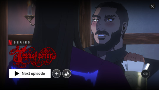
ANIMATION BREAKDOWN PROCESS OF THIS LETS GO (Sorry for any grammatical errors!)
SCRIPT/STORYBOARD: (you can watch here)
Now THIS. The script was very weak because I wanted to board immediately, so it started strong then fell off at the end (also generally I'm not a stronger writer, which haha fics my beloved). Now I know this, spending more time simmering with the script will genuinely only 1) stronger compositions for storyboards 2) it will be so much faster to board. Like I can board fast, but I can board fast AND well if I sit with the idea a bit longer. This will be a massive running theme how I like my shots earlier rather than further in.
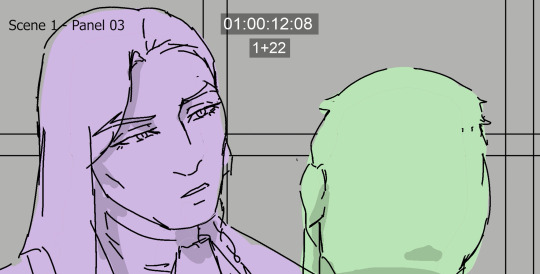
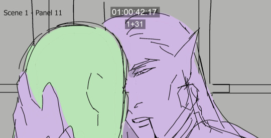
side note I LIKE PANEL 11 A LOT, I just feeI didn't translate it well enough into animation which sucks because its a pretty panel and you get a softer moment from Olrox which I found was important to get across.
Also at some point, the 180 rule (which keeps characters on like one line behind the camera... not sure if I worded that right) gets broken and it bugged me for AGES but decided I had to just move on LOL.

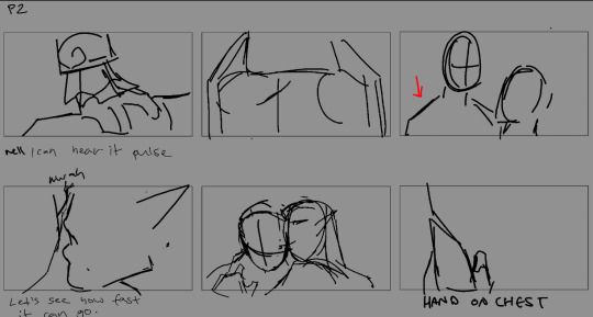
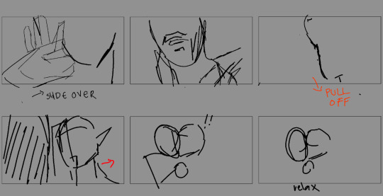
These are my thumbnails b4 I go to animatic/cleaned storyboards which are SO MESSY (I'm a lot better at annotating my thumbs now LOL). The original prompt was top service blood bag x powerbottom vampire and i don't think i portrayed that well enough throughout BUT i think the intro did a good establishment. Which fun fact, this was scrapped but there was actually 20 seconds of Mizrak eyeing Olrox "What is it like? Blood?" Then Olrox leans down and commences the thigh glide.

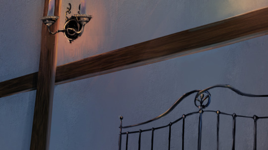
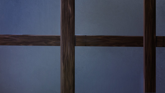


These backgrounds are a mix of texture-bashing (walls/floors) along with some good ol' painting materials from scratch. Also, these are olddd and I can do a lot better yay, but was a good test to see how to make a consistent-ish scene.
ANIMATION: (You can watch the rough anim here)
I'll be super upfront how I don't like most of it AHHA. From starting this in July to posting this in September, I've improved a lot since then.

Since this was a bit ago, I don't remember too much but I remember going ham onto learning material from Dong Chang and animation servers. However in all honesty I think this was only really applied to the earlier shots. I got super frustrated with my "slow speed" so I tried to jump ship and do cleans super early on, which like lets be honest- pumping out two rough anims a day with uni on top is not slow idk what I was on about. This ended up giving me MORE work during the line/colour stage PFFT because I would end up correcting my mistakes in my roughs. Like Myst stop, this is for fun and you're learning, please take it easy LOLOL.
COMPOSITING:
Working on compositing this time around was slightly different, and I'll also admit it is not my favorite composite I've done (and again, I like my earlier shots then my later shots). My after-effects layers looked insane keeping track of the highlight glows on their clothes BUT it definitely paid off. Skin tones however were SO DIFFICULT (mostly in part to the fact I decided to experiment with how I approached it, so it definitely skewed how I worked with this)
I also definitely struggled between the dreamy look and keeping it clean and crisp, and while the dreamy blurred aesthetic does work in some cases, I opted out for the sake of clarity.
Beloved edge light my friend. It's making me learn SUPER late into it how I probably should have planned out a third shadow pass since edge light at the point is a crutch and I think planning it out ahead would get nicer more precise shadows LOL.
Because I brain rotted so hard for this animation I actually commissioned two people to help me work on this! I'll briefly talk about their stuff but please check out their work!
MUSIC: Astralbardkeep
Due the fact I don't have voiceactors, and I had a very specific vision in mind, I decided to go "you know what, let me be super self-indulgent". I had a lot of notes and inspirations for the music, BUT i wanted to have Olrox's theme from the original games peek through, which you will notice happens at the bite AND at the end.
TITLE CARD: Hataui0
This might've seemed overkill, but this friend of mine is very talented at making graphics/typography to suit the requirements of each individual project. (Also a secret ploy to make him make nocturne fanart /lh). So that entire end bit, he illustrated it along with that title, in which the themes I bestowed him were Mucha and Gothic art.

Thank you for reading if you got this far! Suffice to say this was supposed to be a compare and contrast between the animation I did in February, and while I may not quite find this body of work up to my normal standards, it substantial amount of improvement, which is the most important thing here! With the ten billion other things in my life going on, I can only be happy with the progress thus far :D
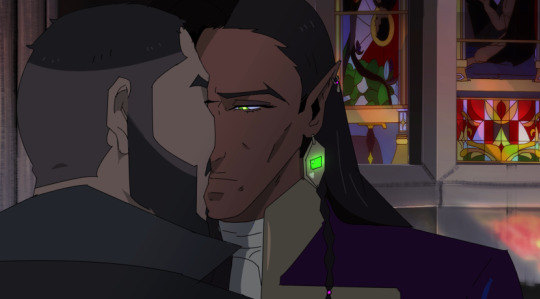
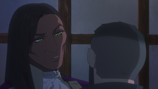
February on the left/September on the right
#mystery talks#castlevania#mizrak#olrox#animation#castlevania nocturne#i didnt realise how many ppl enjoyed reading this stuff which is so nice wtf I'm just a guy LOL
51 notes
·
View notes
Note
how do you plan the panel layouts for your comics? i always get stuck and it feels cramped or unsatisfying
okay so i went to college for 2 whole semesters and one of the only art classes i took (and definitely the only one i retained much from) was my sequential art & comics class. so i'm gonna try to explain my process in so many words, but there's a LOT of stuff that goes into a successful comic and i'm by no means a professional. i can however throw some tips and tricks and some recommended reading your way (another longpost ahead!)
first, know what you want to do. know where your comic starts and ends. if you find any joy in writing scripts, you can also do that, but i'm not the best at writing with no visual aide so i usually script while i thumbnail, but always make sure you've got a concept and a goal.
next, start thumbnailing. my initial thumbnails usually look like this:


(incidentally, my storyboard thumbnails look a lot like this, too)
there's no real structure, and i'm just noodling my way from the top left of the page to the bottom right. if you've got what you want from your comic in mind, this part can sometimes just pour out of you. i feel a very strong attachment to these characters and the situations i put them in, so that definitely has to do with how smoothly this part goes. draw the panels as small and as detail-free as possible. i usually don't do speech bubbles, and instead treat it like a storyboard, writing my rough script under the panels as i go.
once you're satisfied with the way your story is coming together, THEN you start laying your panels out. this part looks like this when i do it:

(these are actually from a gfalls comic i never cared to finish from like. five months ago but who's counting?)
honestly, it's best to do this as small as you can possibly get it, to really get your head out of the "but i have to fit all the panels exactly as i drew them on the page" funk. remember that, at least if you're writing the comic in english or other languages read in the same direction, that you're trying to lead the reader's eye from top to bottom and left to right. this is really hard to keep track of, and i still make mistakes and flub up the readability all the time. like here:

the panel layout should be reversed here. the panels in the top left and bottom right should be smaller than the other two, so the gutters would actually guide you to read it left to right instead of top to bottom, but laziness and initial drawing blindness struck me and i never fixed it.
once you have a layout that makes sense to you, it's as simple as blowing your thumbnails up to comic-size and going over your very rough sketches with your final clean panels & inks, or, if you're doing it traditionally, re-sketching your page on your big bristol board after doing some measuring to see where your panels should actually be.
there are other rules to keep in mind when you're in the thumbnailing phase of your comic, like the 180-degree rule (something that carries from film to animation to comics to, really, any form of sequential art), which is easiest to explain with a little diagram:


keeping this in mind really helps with readability. you can do a bunch of things with your angles, you can even omit the other character, but keeping them on the side of the frame you establish them on is very helpful. this is mainly for dialogue, but it does also help if you want to display one character walking in one specific direction, or if you want a fight scene to read as well as possible, etc.
and, if you look at your comic sketch now and think, hey, this looks great, this is so clear and easy to read, i highly recommend stepping away for a few hours to look at it again, or, if you're impatient like me, sending it to a friend. you're also totally welcome to send it to me, if you just need someone to tell you whether your comic is easily readable.
to learn more about drawing comics, i recommend two things. one, read some comics. by professionals in the industry, ideally, though there are many many competent and incredibly detailed comics by independent creators out there. people in the industry will (MOST of the time) be held to slightly higher standards of readability than the average independent artist, and the workflow for professional comics involves several people at once reading and reviewing and revising what's made so that it'll be digestible to the average audience.
two, i recommend getting your hands on a copy of "understanding comics" by scott mccloud. love this book. lots of comic artists love this book. it's fun and informative and packed full of tips, while also being a comic, which makes it even more fun to read. mccloud goes into a lot of detail on stuff i didn't mention, from the gutters between panels to lettering to working with other artists and writers and finding an art style that fits the story you want to tell. great stuff. go to the library, check it out. you won't regret it.
#ask#myart#wander over yonder#comics#rambling#comics are HARD man it's tough stuff to learn and even tougher to put onto paper#but when you learn about comics you also pick up lots of stuff for animation and writing and even film#because visual art is all connected. peace and love. but comics are one of the most involved mediums of storytelling out there#also quite possibly The best. because you get to read through it as fast as you want#but you can also hang back and look at the panels forever and really think about what makes them work as well as they do.#live laugh love sequential art
38 notes
·
View notes
Text
I finally watched Transformers Earthspark Season 2 today. I have a lot of thoughts and I wrote some paragraphs for every episode. As you can see I wrote a LOT, enjoy my way too long cartoon analysis:
Episode 1: the cracks are showing but it hasn't crumbled yet
The animation feels less alive than in season 1 even if strong storyboarding still carries some scenes, as I know several of the season 1 storyboarders did work on this episode. It has a couple good sequences, a couple incredibly stilted ones. The overreliance on slowmo feels weird, and the animation struggles to properly convey things, like how we're supposed to take Hashtag's injury very seriously, but it just looked like she got bumped lightly.
the Decepticons are butchered and watered down into "evil because they're Decepticons". Chaos Terrans is an interesting concept and the way they're executing Aftermath would provide a foundation for exploring topics such as delinquent youth, but knowing how the series will go on to treat them in later episodes, I'm not hopeful.
the Maltos feel like they're sleepwalking. They have a lot of screentime but for some reason they don't feel present at all, it's like I'm watching their shadows move around on screen without the things that made them feel alive shining through.
If I didn't know beforehand what this season would eventually stagnate into, I could see myself being fooled into thinking the gripes I have with this episode are just growing pains, however i'm not so hopeful.
Episode 2: Improved in some ways but not in others. The episode premise is decent, and the narrower focus compared to episode 1 does help make the focus characters feel a bit more like themselves again. Unfortunately i just don't think the premise was utilized well at all. Introducing quintessons to the conflict is kind of a big development, but it doesn't flesh them out well IMO. They treat them like wild animals with no characterization for a majority of it, and then hint at some deeper conflicts at the very 3nd before promptly disposingof them. So ultimately it feels unsatisfying (although we do get some expositon in episode 9, but it doesn't add up to much).
And once again i must comment on the character acting on the humans especially being severely lacking.
Robbie and Mo having helmets for like half their screentime definitely feels like a cut corner not to animate their faces
Episode 3 review: some well animated sequences this time around, i'd seen the storyboards for them on twitter and they're really well done, but then there's some others that really werent as decent, so big ups and down in animation quality. Most of the episode did feel like a slight return to formula for Earthspark tho, with how it felt like it was actually making a point about something for once, which so far has been rare in season 2, although the conclusion wasn't the most satisfying with the whole "you can't have everything" message but then hashtag kinda gets most of what she wanted anyway.
Episode 4 is like.... baffling.
Like the fact that they swapped to a wholly different and much cheaper animation studio was so far just somewhat shining through, but now it's impossible to unsee. The animation here feels BEYOND stilted, in every way. Like not even the 2D FX animation looked convincing this time. That clip of Robbie dropping a cake is the weirdest animated thing i've ever seen. It's like it gets sucked out of his hands by a magnet.
The Faire Maestro is a type of character I feel like would have been handled really well in Transformers Animated but was just kinda nothing here, super ugly design too and very odd voice direction. Lots of just bizarre and mindboggling things in this episode, like them seeing faire maestro having an emberstone shard, and then deciding to steal it right in front of his face for absolutely no reason even though they think he's a normal guy and not a villain. And tiny inconsistencies like Mo knowing his name even though he never said it. Bizarre episode all around, Weird Al cameo is cute but then he's gone.
Episode 5 review: Finally Jawbreaker gets to be in it. Except now he feels like a baby. Just a big stomping juvenile baby.
And speaking of big stomping babies, Aftermath is one too. He feels like he's supposed to be a representation of troubled/delinquent youth who don't get along with their peers and who don't have positive role models or a support network, but he really comes off as being just... chaotic, no real sense of interiority to him other than "I'm mean and I enjoy being mean and I can't help it". He's entertaining on a surface level vibes basis, but it doesn't feel like any attempts are being made at making a point. He's barely been in the show so pretty much anything that could make his character interesting is completely missing. Like there's no development of how the decepticons are raising him other than the basic assumption of "bad role models", and the decepticons barely get to be characters this season either. Aftermath feels like an Afterthought, as Chaos Terrans have basically been less than a footnote, and the series has attempted to do no form of storytelling with them beyond surface level observations that honestly feel insulting to the other characters like how the decepticons are just evil now, and the autobots/terrans have lost all nuanced expressions of empathy and solidarity in favor of just "they're generally friendly"
oh and also the evil mushrooms are boring.
Episode 6 review: Man this episode just *feels* wrong, like viscerally.
The show's handling of the chaos terrans just keeps getting worse. There's absolutely NOTHING about spitfire that compels any form of empathy. Like there's not even a mote of her being a troubled and misguided youth, she's just straight up ontologically cruel, like nothing about the conflict in this episode regards a failure to understand, communicate, or empathise with each other, it's just a straight up rejection of those things on both sides. For this chaos terran delinquent analogy thing to work you NEED there to be a sense of humanity or waywardness to them. You NEED to be able to conceive of them as being capable of more than just anger. This just feels meanspirited, especially the way the Maltos have no desire for Spitfire to be better. They just wholeheartedly accept that she's ontologically evil, and honestly, the way she's presented in this episode you'd think they were right, but they're not SUPPOSED to be right.
It sucks too cuz chaos terrans are a great idea
season 1's terrans were all representations of good natured minority kids, particularly third culture kids, who despite their best intentions and kindness end up having to fight for acceptance.
The chaos terrans are a natural progression of that, with depicting kids who end up on the fringe of society because they're inherently different from others and have a harder time being understood, and who don't have a support network to set them straight.
So it starts out in a place where they'd easily be able to build on it, but it's squandered imo. And for several reasons:
1. the Decepticons are 1 dimensional bad guys this season so they fail to capitalize on any potential storytelling they could have done with how their generational resentment might be passed down to the younger generation. They also fail to build any sort of relationship between the Chaos Terrans and the decepticons, so any obligation to stay or debt of gratitude that they might feel is just not there. You get no sense of why they'd want to be decepticons other than wanting to be enabled and encouraged for cruel behavior. They could have given breakdown an actual father son dynamic with aftermath but instead undercut it and play it for laughs.
2. Because the malto's solidarity have been completely watered down into just being "good guys", and never really get to articulate any sort of deeper point in their attempt to appeal to the chaos terrans, so you don't get a sense of how they might help them if they were allowed.
and 3. because the chaos terrans themselves don't really feel like they have much of an inner struggle, interiority, or conflict, it doesn't really feel like there's much of a foothold for
Anyone to latch onto to get through to them. Which makes them feel unredeemable.
so to reiterate and summarize these 3 points; 1. there's no sense of how the chaos terrans are being given negative reinforcement, 2. there's no sense of how the Maltos might help undo this, and 3. there's no sense of how the chaos terrans might want to be helped or not helped.
I understand that like part of the point is that they don't understand the chaos terrans, which supposedly makes them feel more alienated and further pushed towards anger, but there's no nuance or attempt at solidarity to the way these misunderstandings occur. Like there's no hint of Twitch and the Maltos trying their best to reach out to spitfire in meaningful ways. There's no sense of there being some fundamental difference in perspective or circumstance that make them able to understand eachother's point of view, it's just straight up "i tried to be nice but you were mean so now i won't be nice anymore" and it never goes beyond that. It's insulting how easily the Maltos give up on them.
Episode 7: serving as a direct followup to the last, it continues a lot of the same flaws. It squanders any chance of giving Spitfire some depth, like they could have spun her obsessive competitiveness into a deep-seated need for approval or validation or something, but no, she's as one dimensional as her behavior would suggest. Her behavior just becomes more and more destructive to a cartoonish degree where it no longer becomes possible to feel empathy for her.
the whole freaky friday misunderstanding thing too also feels super forced, which isn't helped by the animation failing to convey a lot of ideas.
Comparing this season to season 1 so far, man it just really sucks at juggling the characters. We've had practically 0 focus or development for any of the autobots and decepticons, and the maltos for that matter, despite their overwhelming screentime.
This is likely a casting budget thing. Which is why bumblebee has been demoted from main cast member to a guy who maybe says 2 lines every 3 episodes.
The quality of season 1's writing would go up and down quite drastically between episodes, but so far season 2 has consistently been on par with some of season 1's worse entries. It's juvenile and it has next to nothing to say about anything. Barely even any basic surface level messages, just mostly meaningless antics with next to no focus on exploring characters.
Episode 8 review: it's fine. No notes. It's a competent comedy episode. Fun premise with the whole "thing getting continuously stolen by different people" trope. Basing an episode around optimus's trailer is funny. Animation isn't stellar. Overall it's just an ok episode. I have nothing to say about it other than it's well executed even if it's not very ambitious.
Episode 9/10: okay! End of the season. The finale's mixed for me. In a different universe, this would have been an OK finale for the most part, but the fact that the season has tarnished every single character and plotline from season 1 and made no successful attempt at building anything new of value makes it lack any impact it could have had.
Interesting angle to flip the quintesson creator race narrative that transformers fans are used to. Although they too were an afterthought for this season. Aftermath and Spitfire getting killed really was the rotten cherry on top of their miserable cake. First they're treated like dirt by the story and handled as poorly as they could possibly be, squandering the excellent potential they had, but then they just kill them. Just so starscream's heelturn is even more evil. It honestly feels sad to me that they even bothered to acknowledge the fact that starscream was redeemble in season 1. Just makes it feel even more annoying that they conciously gave up trying to make him nuanced. Some of the animation was good. The shots of terratronus rising were very well composited and communicated the scale extremely well. As for the actual climax, it felt pretty lacking.
Overall a dissapointing season. A shadow of what earthspark was. Most of the characters are completely sidelined (likely for lack of a casting budget), and the few who aren't don't get a single story that feels reminiscent of that immensely strong sense of confident identity that season 1 had.
Hasbro cannot help themselves can they
#transformers#earthspark#tf earthspark#media analysis#talking about cartoons for too long#cartoon#mecha#robot#review#tf#fuck hasbro#essay
36 notes
·
View notes
Text
twitlonger doesn't work anymore so i've decided to compile my thoughts on tumblr.
there are two reasons why tvskyle being arrested for csem enrages me aside from the obvious of the matter.
tvskyle was a known predator for years. if you google his name and "callout" there are troves of information about his harassment and predation to women. back when i had a professional art account despite that i was not an animator or heavily in animation circles this was public knowledge even to me.
2. this is what happens when people refuse to acknowledge predators can and will co-opt GOOD GUY / BAD GUY language to infiltrate and stay in circles.
anyways, that is the short version. this is the long version where i get into topics regarding abuse and harm that may be triggering.
first off, let's get over how using the word "paraphile/paraphilia" has become fearmongering and taking the words away from what they actually mean. "paraphilia", at its most base level definition means "a paraphilia is an experience of recurring or intense sexual arousal to atypical objects, places, situations, fantasies, behaviors, or individuals."
if you like BDSM, you're a paraphile. if you like bondage, you're a paraphile. if you like pregnancy, you're a paraphile. if you like fictional brothers kissing, you're a paraphile.
considering the DSM used to characterize homosexuality as a mental illness until 1973 (51 years ago, not that long in hindsight!) if you are not a cisheterosexual white man and like anything that is not cisheterosexual sex intended for the sole purpose of procreation with the intent to create children, you have a paraphilia.
paraphilia/paraphile in both proclaimed 'anti' and 'proship' spaces is becoming the new 'pedo', which is really just BAD PERSON. do not interact with me if you are a BAD PERSON who does BAD THINGS. BAD PEOPLE get away.
the reason why i do not have any disclaimers about "antis/pedos/zoos/etc dni" in my bio is because to me this is the same thing as saying "serial killers dni" ...i don't mean to sound snarky, this is just what it boils down to. if a person is out there harming someone, human or animal:
i do not know why they would proclaim this information publicly.
if someone is harming real beings, i do not think they would respect text on a screen if that very prominent line in the sand has already been passed.
tvskyle fits the mold for animation dudebro who was established in the industry of his choice despite the open knowledge of his predatory behavior. i cannot testify to if anyone knew he was possessing csem before he was officially arrested, but it was definitely open knowledge that he was the kind of man you wouldn't want left alone with female coworkers. some of this behavior was bad enough that even male coworkers would avoid him.
tvskyle also coopted proship/anti terminology.
this isn't me knocking on someone for their age, but when i first saw tvskyle posting about of all things, invader zim yaoi, my first thought was "why in the world would a 45 year old man who is an industry professional be so obsessed with arguing online about cartoon smut."
i guess you can argue about stupid things on the internet at any age at any level of industry success. but it was bizarre to me because it's not as though cartoon smut of any problematic variety should be news to someone working in animation in their 40s. The animators on the original Beetlejuice made jokes that BJ's fingertips were red from fingering Lydia on her period. The rugrats storyboarders drew horny jokes. There's infamous posts about animators finding the secret smut vaults for their shows. Cartoon smut has basically existed as long as cartoons have existed.
and then you find out tvskyle also drew pokemon porn that involved may (age 12), brock (age 15) and max (may's younger brother, age 8.)
wow, kyle! a threeway between a 12 year old and her 8 year old brother! that seems pretty problematic! incest and shota combo!
but i guess that's not an issue. it's not problematic when i draw it because i'm not a BAD PERSON.
tvskyle became weirdly obsessed with calling people out for cartoon smut despite that he drew smut you could categorize just as problematic in nature. and then he was found possessing some of the worst csem you can be found possessing. and he was found possessing over *600 images* of csem. that isn't something you gather overnight.
so there is the uncomfortable truth of the matter that predators can and will co-opt terminology to blend into any space. and this can happen anywhere. if someone wants to get under the radar in anti circles, they will rave about how bad cartoon smut is. if someone wants to get under the radar in proship spheres, they will adapt and use the appropriate terminology for that sphere.
and this is why to a whole, i find it incredibly reductive to use terms that reduce people into bad person / good person because at its most harmful, all it does is protect people who are continuing and perpetuating harm to real people.
i think everyone needs to acknowledge their capacity to harm as much as their capacity to heal. and before you think "wow peach that is a really wide assumption i would NEVER hurt someone like [x]" yes, i know, imaginary stranger in my head, this is not what i am saying.
what i mean when i say we all need to acknowledge our capacity to harm is because i believe the choice to be a good person or a bad person is a choice you make every day. if i am a "good person" my whole life and then one day...i don't know. i steal money from a homeless person, or i throw a drink made wrong in an overworked barista's face. all of the "good things" i have done would not cancel out that in those theoretical moments, i was not a good person. in fact, in these hypothetical scenarios, i was very nasty.
there have been days where i've had to be the friend who sits another friend down and talks with them about how something they said or did really hurt me. and likewise, sometimes i've had to come face to face with when i wasn't the good friend. it hurts both ways but let's be honest, someone hurting you doesn't come with the same fearful sting of "i hurt my friend. do they think i'm a BAD PERSON. am i the BAD PERSON now?"
and none of these conversations would have been productive or involved growth or greater understanding if they had come from the angle of YOU, a BAD PERSON, hurt ME, a GOOD PERSON. (on either end.)
i think acknowledging your capacity to harm simply means acknowledging you're human. you won't always be right. you will mess up and that's simply a part of the human experience. but being able to take accountability and examine when your actions have caused harm will be more beneficial to yourself and your loved ones in the long run.
the person who groomed me would not admit they had groomed and exploited a minor because in their mind, they are not a BAD PERSON.
the person who abused me would never admit to these things because in their mind, they are not a BAD PERSON.
to be a BAD PERSON is to lose everything because being a BAD PERSON is not to be any person at all.
of course these people never took responsibility for the harm caused to me.
only BAD PEOPLE do BAD THINGS.
the uncomfortable truth is there is no way to ping with 1000% accuracy someone intent on predation and harm. there are predators in white vans lurking outside of high schools, but the predators were also the charming and well spoken teachers who were very popular with coworkers, parents and their students. some people are simply better at adapting and blending in the system they want to exploit than others.
i think tvskyle fell somewhere in the middle. other inappropriate behavior of his was well known, but this wasn't enough for him to be blacklisted. as we all know, sexually harassing women is not a firable offense. for people missing the 50's, feel assured some thing have not changed. (<- very biting sarcasm.)
tvskyle is definitely not the last predator in animation, but what do you expect from circles that are essentially glorified high school cliques that only require ego stroking and circlejerking.
tvskyle may have been the most recent predator found, but he is definitely not the only one and anyone acting otherwise is just leaving the door open for these people to continue perpetuating harm.
32 notes
·
View notes
Text
Mel Medarda Is Alive probable evidence megapost (cope with me)
League of Legends UK calling the gold on Mel's back "armor" and then withdrawing the post, first pointed out by @moonsdancer:
This marks an "official" source calling Mel's gold "armor." It implies that once whoever made that post realized that most of the Arcane audience is expecting Mel to be dead, they recognized that hinting that she's wearing armor is actually a spoiler. So, they deleted the post.
Mel featuring in storyboards depicting a scene that did not happen in season 1, shown by @jshepardtsoni and @mollysunder and @miraofhearts2point0:
The Riot-Fortiche workflow has been described as: extensive time and resources spent on writing up front on Riot's side, and then the scripts are sent to Fortiche and storyboarding begins. If writing and storyboarding don't happen in parallel, then that's how Fortiche was able to showcase the one-to-one relationship between storyboards and the finished animated product. There's a lot less throwaway work for the animators, which would happen with major story rewrites.
This means it is less likely that the storyboards featuring Mel in a scene that did not air in season 1 were simply cut content from season 1, and more likely that it's a canon scene that we'll see in season 2. I think relatively little ends up on Fortiche's cutting room floor. The main scene that I'm aware of that did get cut was the "boy savior" scene where young Ekko tries to save Jinx (and I have high hopes that the scene will still be used in S2).
Toks Olagundoye, Mel's VA, saying she's "not allowed to say" whether she's returning to voice Mel in S2, and saying that it would be cool to come back for flashbacks:
instagram
If she's not allowed to say anything and Riot is taking pains to hide whether Mel or Jayce or Viktor (sorta, lol) survive the attack, then of course she can't hint that she is returning. Her comment about the flashbacks definitely says to me that she was told to hide whether Mel survived the attack - she probably was not instructed to hide whether Mel gets more flashbacks in S2. She's almost certainly implying that Mel does in fact feature in more flashbacks in S2. A fan asked the question, and she wanted to give a substantial and encouraging answer other than just "I can't say anything." Her tone did not personally leave me with the feeling that her character has been killed off.
Toks saying she doesn't know much about Arcane S2 and its airdate etc. doesn't mean anything serious, considering that voice acting for the season seems to have been completed a while ago. Like most actors and especially voice actors, Toks has probably already taken on several jobs since then, so her work on Arcane isn't the project that's freshest in her mind.
The German (and Hungarian, I think) S2 trailers have Ambessa say "Half of the Council is dead" and not "Your Council is dead":
I noticed people in the comments of this trailer analysis video by Necrit talking about how the German trailer says "Half of the Council is dead." After watching the German trailer, and then poking around the other dubbed trailers, I found that the German trailer and the Hungarian trailer both seem to say "half." (I would love it if someone here fluent in Hungarian could confirm!)
From a translation standpoint, I could see this happening because some languages don't have different words for "council" and "counsel" as in "advice." Even in English, the words are homophones. So saying "your counsel is dead" would make no sense. If a translator tried to instead say "your ENTIRE council is dead" to make the meaning clearer, then if some Council members survived, the translator would have to be corrected, so we end up with "HALF of the Council is dead."
If some Council members survived, then I think it's likely that Mel is one of them, considering her armor and her several unfinished plot threads.
Please feel free to add on to this post with anything else you find!
#arcane#mel medarda#mel arcane#arcane season 2#i know this post is going to make me cry buckets if i'm wrong but i'm positive that all the Mel Is Alive truthers out there are enlightened#there is way too much here ON TOP OF the plot implications of her being alive for her to be dead#also that insta video is how i found out that toks olagundoye had cancer and she seems to be in remission!
51 notes
·
View notes
Text
this is without a doubt the weirdest thing I have ever done
SALUTATIONS, HELLAVERSE FANDOM!
You probably don't know me, but my name is Godfrey. (Pleasure to be meeting you, quite a pleasure!)
To be quite honest, I'm not exactly sure what I'm doing here. As I type this, I'm unspeakably nervous.
"Why are you nervous, Godfrey?" I hear you ask.
Well...
I have a dream
I'm here to tell
About a fanfic I wrote for Hazbin Hotel
(sorry)
Okay okay serious director voice from now.
Look, this is gonna sound absolutely unhinged, but hear me out. (insane rambles under the cut, this bitch is LONG)
In April, a friend and I had a conversation about a song I wrote and how it was. Well, kinda coded to Vox and Valentino.
Then one thing led to another, and two-and-a-bit months and twelve thousand words later, I had written an absolutely sprawling shitshow of a fic (details later in the post)
Even as I was writing it, I knew the written word didn't do it justice.
Hence, this post.
(golly, this sounds really demanding, I am so sorry)
Fuck it, my mom always says "if you don't ask you don't get", and for once I want her to be right.
This is, I suppose, a sort of... call to action, for lack of a better term.
Artists, animators and voice actors, I'd like your help to turn this fic into an animatic, or if we can manage it, an actual animation.
ONLY if we can manage it, not if it's gonna stress anyone out.
IMPORTANT NOTE
Just to get this out of the way, not that I should even need to say this but it's unfortunately 2024. If anyone even SUGGESTS using A.I. your ass is getting blocked. I don't fuck with that artificial bullshit.
On to my next point: I am unequivocally in support of artists and actors being paid for their work.
However, I am a Broke Bitch. Unless we could somehow do crowdfunding or something, I physically would not be able to pay people. This makes me feel like a very shitty person, but unfortunately it's the truth, and I want to be upfront and honest about that.
This is why I hope to get as many people on board as possible for this project, so nobody has to do a shit-ton of work.
I understand that most of you are busy, with work, school/college, or life generally life-ing. Join the club, my life is hectic too.
This is why I really have no set deadline for this. Whether it takes a few months or a few years, as long as it's done well with a minimal amount of stress.
Well, now that that's out of the way, time to go into details a bit.
Characters in order of appearance (this is mainly for VAs)
Vox
Valentino
Velvette
Angel Dust
Charlie
Husk
Alastor
Vaggie
Lucifer
Niffty
Sir Pentious
Asmodeus (yeah this is slightly a Helluva Boss crossover)
Frank (the egg boi)
Fizzarolli
Katie Killjoy
Tom Trench
And lastly, depending on what everyone else thinks, I have an idea for how Verosika and Zestial can be involved.
Will there be musical numbers?
The short answer is YEAH, cause Hazbin is a musical. I cannot stress enough how much the music is My Problem. Literally, apart from people singing, I will take care of that.
My Idea Of The Process
(please bear in mind I have little to no idea of how the animation process works so this is almost definitely wrong, please feel free to correct me about it)
Step 1. Storyboard
Step 2. Voice lines and songs get recorded
Step 3. Animatic (this could very well end up being as far as it gets and that is absolutely cool beans)
Possible Step 4. Animation
Finally, I'd be more than happy to be the one to edit all the clips together. Editing is its own kind of hell, and I'm totally willing to take one for the team.
The Vision
This is. (fffffff) this is the part that's gonna make me sound like a Draconian jerk but I promise I don't mean to come across this way.
I'm hoping to have something that's as close to the style of the show as possible. (this video kinda has the right vibes) This is so the final project will look cohesive and somewhat professional. (god that probably sounded so bad but I genuinely have no idea how else to say it)
TO BE ABSOLUTELY CLEAR. I have nothing against artists with other distinctive art styles, in fact I've come across several that I absolutely love.
Regarding The Writing
I've never directed anything before, so forgive me if this is crossing a line, but like.
I have my vision for how I want this to go and I'm kind of. not overly flexible on that. Obviously ideas that people have to get this to work good are more than welcome, but they might not end up happening.
Not to be a dick, but I am sorta the director so I do kinda get to make the call on that stuff. (ew god that felt odd)
If this gets off the ground, I'd have to turn this 12,000 word fic into a script to make it easier for people to read it and not get bogged down by my weird old-fashioned poetic style. This would be sent out to people who express interest at some point.
Just a heads-up: If you're expecting an AO3 link I am so sorry but it's Google Docs, mainly because this thing is wildly self-indulgent and I, for one, do not fancy attracting potential haters. Most people are nice, some are very vocally not. Besides, what would be the fun if everyone knew the story in advance?
BASICALLY
If you're interested shoot me an ask and I'll answer privately (OFF anon pls, I wanna know who I'm workin' with here!) or DM me and I'll get back to you.
If you see this and know someone who'd be interested, feel free to tag them or send this post to them.
I am gonna tag @achilleanauthor (my right hand man over here) @emeraldcity1900 and @onesidedradiostatic as they're kind of the only blogs I know who are I guess. Active in the Hellaverse fandom.
If this gains enough traction and I get people on board, I'll be setting up a Discord server (another first for me).
Watch this space, and as Alastor would say, "Stay tuned..."
#the chaos duck has spoken#hazbin hotel#helluva boss#i felt like. such an asshole even writing this post#but yeah.#halp meh#hazbin fan project
18 notes
·
View notes
Text
comments on post about anniversary of airing of gankutsuou's last episode
This is one of the most important works to me, and I feel like I wouldn't be here today if I hadn't been involved in this project.
It's a work that will always remind you of those days and who you were back then, a piece you'll never forget.
Daisuke Hirakawa (Franz's VA)

I am where I am today because I encountered this work
Definitely one of my core roles

21 years ago, I was very quickly rejected from an audition for a certain production and was very depressed. But right after that, I was asked to audition for The Count of Monte Cristo. Both productions had the same filming dates and the same time. If I had been rejected even one day later, I wouldn't have been able to audition. I really felt that meeting a production is all about luck and timing.
The story of the anime adaptation of The Count of Monte Cristo was published in a magazine before the audition. I saw it and I thought, I want to be in it! I want to participate! But I didn't think that someone with a weak voice like me would have a chance in a genre with such a strong structure as an anime adaptation of a literary work. I never expected that it would be told from Albert's point of view, and it was just fate.
(Fukuyama Jun, Albert's VA)
RT> it's 20 years since "The Count of Monte Cristo" ended its broadcast?
The other day, some of this work was exhibited at the "Miscellaneous - Maeda Masahiro Exhibition," which brought back fond memories (^ω^). It's still one of my favorite works.
Just to give a feel for those who haven't seen it yet.
(Joji Nakata, Count's VA)
It's the 20th anniversary of "The Count of Monte Cristo." Time flies. But I'm really happy to hear that Jun Fukuyama still has feelings for "The Count of Monte Cristo." (Daisuke Hirakawa, who plays Franz, also said the same thing.) He was really sparkling then (still is) I don't know how to describe it, but his innocence was so convincing. (Still lol) The contrast with the Count played by Jouji Nakata was wonderful (Jouji was also very innocent), and the dubbing was really worth listening to. I think that had a big influence on the ending that Maeda drew. (I'm sure the storyboard for the final episode was recorded after the first episode.) I think it was an influence, or a sense of acceleration, that Maeda had the confidence that what he was aiming for would come true, and I think it gave birth to the power that converged towards the end. The actors and the "picture" were intertwined, watching from the sidelines was overwhelming, and the performance, including the scene, was very powerful. So when it ended, I definitely felt the same way as when Bertuccio offered the Count flowers in farewell.
(Taichi Hashimoto, producer)
#Maeda is still in eva hell#gankutsuou#the count of monte cristo#everything auto translated#Remember when Maeda said if not for Fukuyama's voice Albert would be just some stupid guy
9 notes
·
View notes