#I had this wip for like years and finally decided to redraw it lmao!!
Explore tagged Tumblr posts
Text
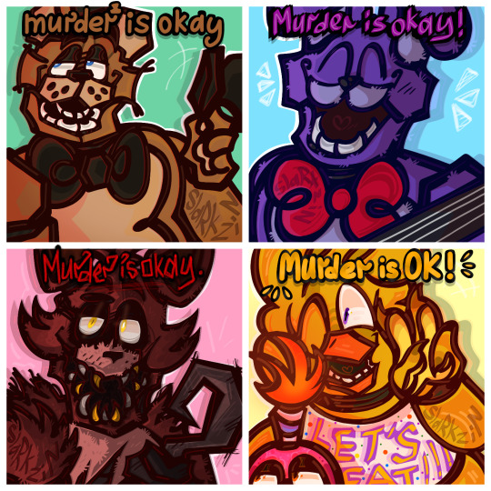
FNAF 1 Gang says...
#fnaf#fnaf art#fnaf fanart#five nights at freddy's#fnaf fandom#artists on tumblr#my art#fnaf freddy#fnaf freddy fazbear#fnaf bonnie#bonnie the bunny#fnaf chica the chicken#fnaf cupcake#mr cupcake#fnaf foxy#foxy the pirate#fnaf movie#fnaf movie fanart#five nights at freddy's movie#murder is okay#murder is ok meme#idk if theres a tag for it so uh 😰#meme redraw#fnaf meme#its ok to ask for help meme#I had this wip for like years and finally decided to redraw it lmao!!#fnaf shitpost#shitpost#technicalky shitpost with effort
211 notes
·
View notes
Note
hey corny. so i always see people recommending to outline their story before starting it, but could you talk a little bit more about what that means? what is an outline and how do you structure one? how long are the ones you write, depending on the project? do you focus on plot beats or feelings? how specific do you get? can u recommend any readings for learning more?
up front i don't have any resources for this, only experience. and outlines feel like one of those things where it's like... there are a million ways to do it and the way that works for me might not work for you. i have a friend who writes out all his ideas on index cards and that, for me, is insane. but he's also a better writer than me so who can say what is right or wrong.
anyway an outline is essentially a sketch but for a story. you go through the whole thing, start to finish, and figure out what goes where and what happens when. the idea is that this is the stage where you work out all the big picture stuff and make sure it all fits together, now, and not after you've drawn twenty pages and suddenly go "wait shit that doesn't work" and have to do it over. it is much easier to delete and rewrite a paragraph than to redraw several pages.
doing anything more, ie including dialogue or feelings, depends entirely on how useful that information is to you at that point in the process and whether the purpose of the outline is for your own guidance, or so somebody else can tell what you're trying to achieve.
this got really long with multiple examples
here is an excerpt from the original outline i used to pitch Hunger's Bite to publishers. this one had to be polished to a professional standard, because somebody else was going to read it and decide whether they wanted to give me thousands of dollars to tell this story. (also several of the details are no longer accurate. for instance it now takes place 9 years earlier lmao)

this paragraph represents the first eight pages of the book. the final book is 264 pages long, and the outline was 12 pages of paragraphs as dense as this one.
it establishes where we are, who's there, and what they're doing. i describe their conversation, but i don't commit to the dialogue. i will occasionally include snippets of literal dialogue, but usually only if it's Important Dialogue, or i just don't want to forget a good idea i had while outlining. it's not expected at this step.
an outline written as part of a pitch to a publisher should tell the whole story, with all the important details, and leave nothing ambiguous. they need to know the tone, shape, and the arcs. no secrets! all the spoilers. outlines for yourself should do this too, but outlines for others need to be as clear about your vision as possible. again, an outline like this exists for the purpose of getting you paid thousands of dollars. you should write it like that.
in comparison, here's an excerpt from the outline i wrote for revisions to my WIP prose novel, so i could show it to my agent (who already read the draft) to be like "do these changes sound good?" i'm not selling it to anyone yet, just making a guide so i can have a conversation about it. so it doesn't need to be neat, it just needs to be functional and clear. the first chapter was entirely new stuff. the second bit was just writing down what was already in the chapter that existed.
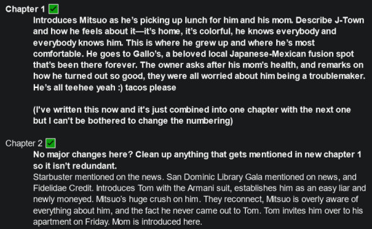
i have historically been very bad at outlining things when i don't think i "need" to, and only wrote this one after having written like 60k words of the book without any overall plan. i gave what i had to my agent for feedback and then sat down and figured out how i could apply it. it's made the whole revisions process significantly less daunting. now i have a checklist for things i need to do! this one was a paragraph or two for each chapter, with the ones that needed a lot of rewriting given a bit more detail.
lastly, here's a bit of the outline for the first roger crenshaw book. i was the only person who had to see this, and since the story was planned to be very short i didn't have to worry about a whole lot. as long as i knew what was supposed to go where, it would work. honestly it's not a whole lot different from the previous example.
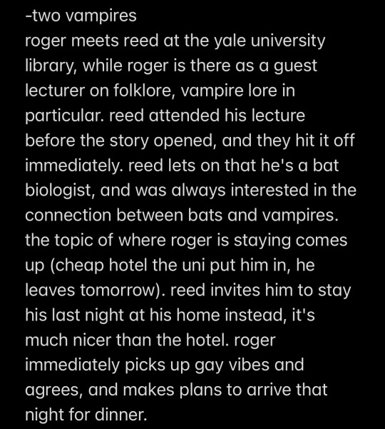
this one was like five paragraphs and it did the job, and this story was like 15k words. you only need as much or as little as will actually help you on the page.
basically if you take nothing else from this, it's that there are multiple ways to write an outline, that it does not need to be perfect if you're doing it for yourself, and that it only needs what you think is important (unless it is for other people. then it should have everything). and also it's a good idea to do it earlier in the project than after you've written 60k words or drawn--jesus christ i got up to 12 chapters in never satisfied? it's amazing i didn't quit sooner
143 notes
·
View notes
Text
part 2/6
2nd part of my old Black Sails scraps and doodles from 2016–2021. Not in any particular order.
This time the drawings are short comics that were abandoned for a reason or another, mostly because I lost the interest or felt like there was too much to redraw compared to the satisfaction of finishing something else more interesting. There’s also some talk about rigid mindset and how overthinking can lead to stagnation.
Contains early silverflint moments, specks of dust, rackham's glasses are found, jealous-Billy spying, desk-Flint gets caught, "squint-squint", a quiet moment and its bird dilemma etc.
And please do not steal and repost elsewhere. But if you do get inspired, feel free to make your own interpretations!
Long-ish post under the cut!
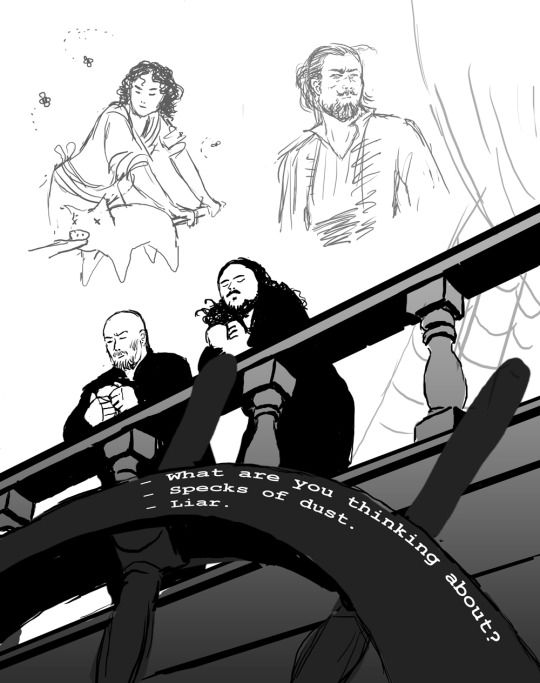
“What are you thinking about?”
“Specks of dust.”
“Liar.”
The idea was to show how much they and their relationship had changed. This was around 2016 when the season 3 began and I was still re-learning to draw with a tablet. Another art from the same time period (and idea) is this art: The Dynamic Duet.
And for some reason I was really stuck up thinking that I’d have to first do the sketch, then the clean line art, then planes underneath, then shadows etc. and I have always struggled with that kind of approach! Mainly because I hate doing clean line work, lol. And I was a fool for trying to start with a white canvas! It’s so much harder to find values and plan things, or at least in my opinion..
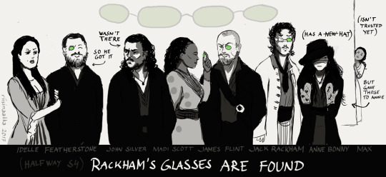
“Rackham’s glasses are found”
To celebrate their new pirate alliance, they share the four lenses of Rackham’s sunglasses as they were also found at the time (because I wanted it to resurface and they could be made into jewellery you know...). This was right after the episode where Anne fights and hurts her hands (here wearing protecting mittens from Max even though she’s not trusted at the moment). Uh, this doesn’t spark joy interest me much and it’s quite stiff and would recuire a lot of redrawing faces, so - discarded!
I somewhat like the idea still (them having something to share, although it’s on Jack’s detriment). I tried to find a stylished comical easier doodlier? way to draw them and draw clean lines etc, but it just wasn’t for me. Also here too, the background is blank and too bright. Later I started to think things as scenes and draw everything at the same time instead of adding the bg later or trying to show everything (and everyone) at the same time.
Here’s also Billy in the same story:
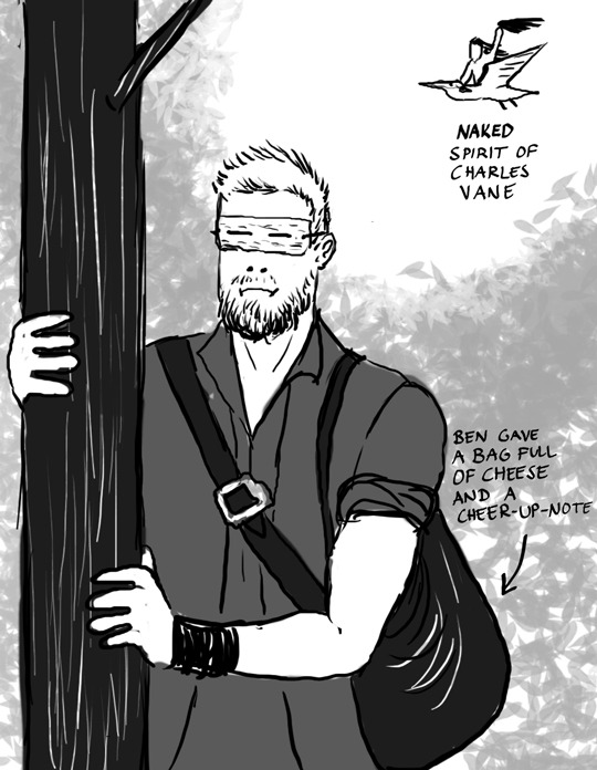
He’s spying on them and since it’s so bright he’s wearing his diy “sunglasses” and being envious to the others. *cough* uhhh...Idk? Also people were shipping Ben Gunn (and cheese) with Billy, so that bled into this too... Charles’ spirit is riding the “big white bird” that was mentioned in Teach’ story and in this case it’s a pelican.
As you can see, I also wasn’t using the brushes that I use nowadays. A hard (or soft) round brushes with no change in opacity just aren’t for me. For example, in traditional art, I struggle with markers and copics, but really enjoy charcoals and watercolours. I prefer ragged edges, layering and thus blending things into each other (and leaving the viewer to fill in the gaps) instead of having stark or definite things. I also struggle with vector drawings, although I have decided to finally start learning to use them...somedayyyy.
Also, I wasn’t paying attention to anatomy, like, at all LMAO. I was just so happy to be able to put something on the canvas.
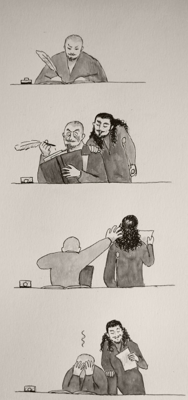
This is one of my first ink drawings, but I cannot find the original anymore. Again, I like the idea, but not how things look art-wise. And I was so adamant, that I have to get everything right in the traditional drawing and not fix anything later on on photoshop because then it would be cheating. And thus, I was never able to move on or finish this properly the way I liked it (idiot).
BUT! It was a good practise to just draw and test things on paper and gain confidense on drawing things in overall (as I was still getting back into art). To get over the fear of blank paper you know, and try to find my style whatever it would start to form into.
Oh, yeah, Desk Flint.
Desk Flint was a thing for a while (still is, lol). Another drawing from that time is this Slingshot Pirate (2016). And Desk Flint keeps repeating in many later works too. The point is mainly “Flint sitting behind his desk and people interrupt him and I don’t have to draw him fully”
Well, anyway... moving on.
Here’s a plan that has been stuck for years. It’s name is “Squint-squint.” Left is the sketch (with another sketch underneath because the expressions were clearer in the old one). On the right is the continued piece with colour scheme but I cropped the eyes panel and faces out (it was so ugly for some reason) but if I ever continue/finish this, it will be redrawn there in the middle.)
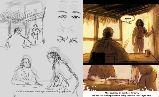
Left. “On that moment their eyes were literally open(ed).”
Right. “After squinting on the shore for days, they had actually forgotten how pretty the other idiot’s eyes were.”
I still like it, quite a lot, but my perfectionist ass only sees too much “boring” things to draw and get right, so it hasn’t been a priority for a long time and other works have kept me occupied and more interested in them.
--------------------
“Quiet Moment.” 2018 (a wordless comic happening after the events of Charles Town)
I’m going to explain after these pictures, but see how big the difference is when you start to look at references and plan things together (the space, “camera” movement, background etc). I also started to colour with coarser brushes:
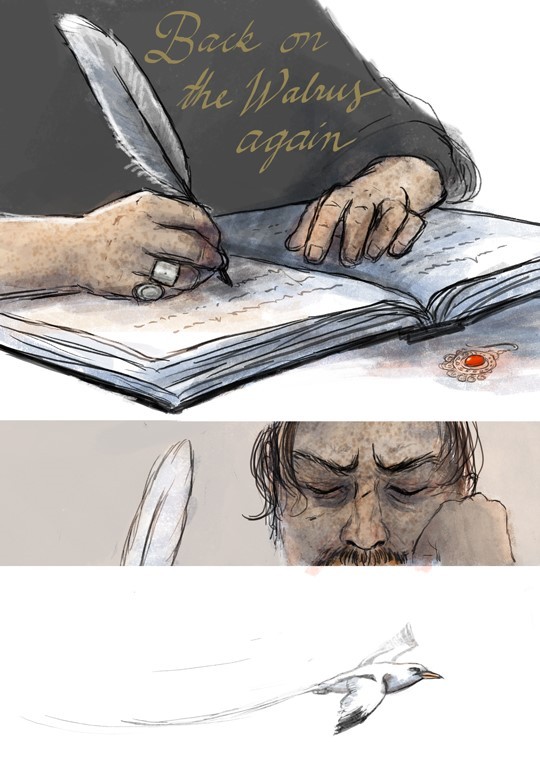
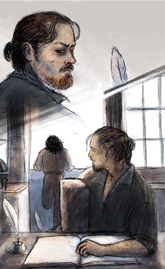
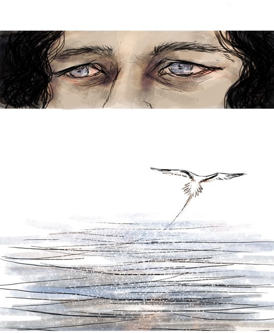
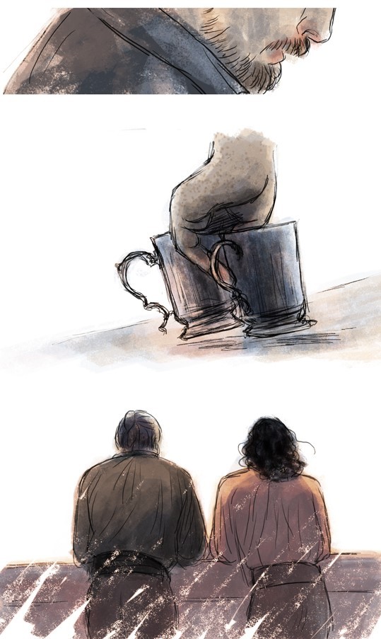
I drew this around early 2018. A lot of improvement! Still quite a lot of negative space (empty white backgrounds), but it fits this work. A few things tell where we are (the ship’s cabin and the balcony). Changing distances and how things are cropped/framed make things more moving and focused (and less to draw, lol). Colours and brush strokes are softer, more layered and so on.
But guess why it’s still a wip!
I couldn’t decide what bird is flying over there.
Yeap! At first it was an albatross (doesn’t go to Bahamas?). Then a seagull (but which seagull? there’s so many subspecies! Is the ship at sea or at the harbour? what birds are there on the open water/ close to the shore?? oh noo...) So, yeah, wayyyy too much over-thinking.
At some point I ended up with white-tailed-tropic-bird which was a plus! because it sounds like the bosun’s whistle, but at that point I was so tangled and frustrated and still had so much to finish with this that I left it be. Also Flint’s face looks different in every frame so I would’ve had to change some parts, lol. And then I forgot it for a couple of years! And then I had learned to draw a bit differently and again saw too much things to do, so it’s quite hard to take on this again, especially when there are so many other interesting wips waiting...
But I still really like the feeling of it! And the colour scheme. So I might just limit the things I’m allowed to fix and then post it as it own someday. I mean, it’s 90% finished, but the last reach just feels like miles.
And that’s what usually happens with my wips. They reach a certain point and it suddenly becomes really hard to finish or get back into.
But every time I learn things and then use the information in another work! :D
Final note for this post (altough this has been said hundreds of times): use references and look how things go and try to see the structure and form beneath things. And think where it is happening and how the light and surroundings affects the characters and/or spaces. And maybe think what you’re trying to convey with the art, what idea? what emotions? what purpose? or like, what are you trying to learn with the piece? and so on...
Thanks for checking this out, I hope you had fun <3
#black sails doodle#long post#but not as long as the future ones heh#tag for Block Spoils doodles#<- if you want to black list these
40 notes
·
View notes
Photo

Process and wip images for A House That Holds Long Limbs (Part 2)
See Part 1 process and wip documentation
Read the pages for part 2 here (full complete version will be linked from YYH North Bound master post)
As a story progresses, I tend to become more comfortable with jumping ahead and around in my so-called process. This is mainly because the idea of getting deeper into the action is exciting and I want to get to drawing the pages as quickly as possible. The downside is that it usually results in a lot of “oops” and rework on what was supposed to be a final page.
Here you’ll see that script/pagination/thumbnailing and final pages are all starting to drift even more than in Part 1.
The (last version of the) script
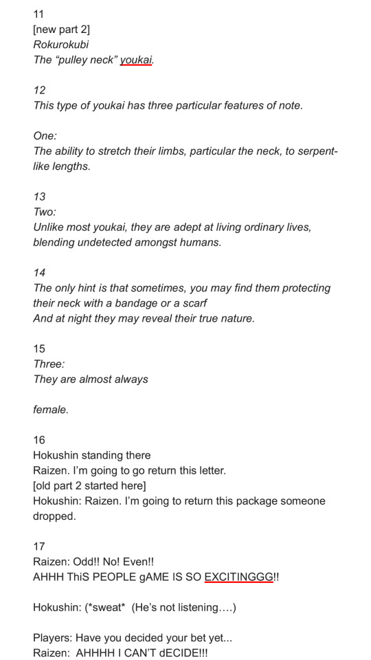
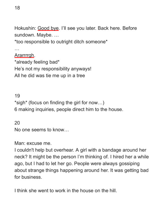
Earlier versions were even more point form and incoherent with typos. But, it only needs to capture enough that I can recognize key actions, points of dialogue, the mood, things to draw in the panels, etc. A few specific items to point out:
“[new part 2]”: The script originally had no exposition on rokurokubi - it went straight to Hokushin telling Raizen he was leaving. It occurred to me later, after I’d started thumbnailing, that inserting a few pages of storytelling narrative right here would help to further solidify the kaidan (traditional Japanese ghost story) effect and mood. More importantly, it creates a baseline reference for what the reader will know about rokurokubi for the purposes of this story. I was lucky that Part 1 and Part 2 were cut neatly enough that this wouldn’t be jarring.
I’m still not entirely happy with the text for this section, mainly the “features of note” about rokurokubi. Not just the fact that it’s oversimplification and slight adaptation of actual Japanese folklore - which can’t be avoided unless I want to write a historical essay here. I’m mainly not super keen on how each of the three items has been phrased. It’d be nice to make the three points more parallel in terms of length, but I couldn’t seem to edit, increase the number of points (by splitting them up), or reorder it effectively without negatively impacting other aspects of pacing and information reveal. More points would draw out the pages longer than I wanted, and some points were clearly sub to other points. The final here is the “good enough” version. JUST GET IT DONE ALREADY SO THAT IT CAN GO OUT INTO THE WORLD.
Sooo many word choice changes. The biggest one, done at the last second, was “They are almost always female” to “They are rarely male”. Other phrasings I debated - “They are very rarely male”, “They are almost never male”, etc. Lemme tell ya, it’s easy to get lost in the weeds… Anyways, the main reason for this was because after I drew it and ran the text through my head, the originally-intended juxtaposition of Hokushin on this page with the word “female” felt too subtle. I felt it would create a brief moment of cognitive dissonance that didn’t serve the flow of the story, so I changed it to create emphasis on the same gender instead with the rationale that it will flow more smoothly and allow the reader to focus their attention on the fact “males are very rare” more than the mental hiccup of processing the juxtaposition. DOES THAT MAKE ANY SENSE?? It made sense in my head.
Anyhow, I’m sure there are people who will disagree with many of the decisions I’ve made, but at least you can see what I was trying to do.
Thumbnails
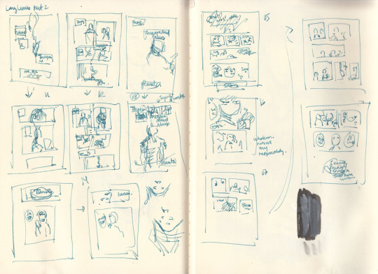
As mentioned, these thumbnails were done BEFORE I decided to insert the exposition at the beginning.
The first two rows on the left hand page are actually the same set of pages - you can see little arrows pointing down or to the right whenever I’m dissatisfied with a thumbnail and attempt to redraw it.
WIPs
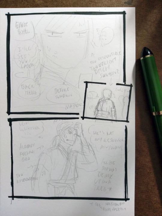
I really like how Hokushin turned out in the last panel here; I like the pencils more than the final inked version. It’s also another example of changing text up to the last second. In case it’s hard to make out, it says (along with what happened to them in the final):
First thought bubble: Ugh, whatever… (moved to the next page, seemed to work better as the end exclamation for this sequence of thoughts before he turns his attention to something else)
Over Hokushin’s head: Aaaargh (moved into the thought bubble)
Second thought bubble: He’s not my responsibility anyways! (no change)
First arrow: *already feeling bad* (no change)
Second arrow: *too responsible* (dropped, since a previous panel already said “too responsible”. Too redundant)
Next to Hokushin: All he did was tie me up in a tree (no change)
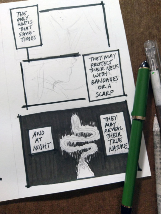
The above panel “And at night...” was a thrilling and scary thing for me lmao. I don’t usually tackle large patches/fills of black, since many of my comics are scribbly in style (pencils, hatching) or colour. I’m too lazy for screentones, traditional or digital. It’ll be interesting as parts of the story coming up will involve poorly lit/dim/dark spaces. I’ve been reviewing how other artists handle it, particularly those with styles driven by pure-ink or minimalist type approaches. Two immediate examples from Yu Yu Hakusho that I’ve been going back to are the dark room fights during Genkai’s successor trials (I’ve taken a similar approach here), and the haunted bedroom case in volume 19. Hardcore cross-hatching seems like a likely route, but that freaks me out when I have to do it over faces. I’d like to minimize or avoid screentoning out of principle, but I still want to create a clear mood, so we’ll see how it goes...

This was my view while inking this page - holding the book in one hand while inking Hokushin with the other. Using the more freehand, sketchy inking style for this comic was so helpful in terms of reducing my inking anxiety and allowing me to work faster.
It’s always great when you can find a reference for period armor (because I find armor very difficult) that is so close to the pose you’re already drawing. There are some small differences - for example, Hokushin’s head is turned more to the right; his left arm is turned and raised more as he’s pulling the sword upwards. But it’s close enough.
Also, spotlight on a few of the books I’ve referenced over the course of working on North Bound in general and this part specifically.
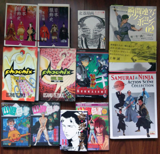
Clockwise from top left:
日本服飾史 女性編 and 男性編 (History of clothing/costume in Japan female and male editions). This marvelous set of books highlights Japanese fashion throughout history. I’ve actually been referencing these photos for a long time before I ever picked up these books - you can see them at the Costume Museum’s website here, alongside helpful line drawings and translations of some of the details. But the books allow me to see a lot more detail.
Hokusai manga vol 1 (this book is published as part of a set of 3). Sketches by Hokusai. This one focuses on “The life and manners of the day” and includes drawings of youkai, including rokurokubi, as well. You can check out the drawings online at places like The Pulverer Collection Online Catalogue.
Action references!! Real Action Pose Collection 02 (focuses on sword fights) and my favourite Samurai & Ninja Action Scene Collection. Not used as much in Long Limbs, but was helpful in some of the other chapters. The time frame is really much later than what I need for ideal clothing references, but it’s helpful for things like movement.
Kekkaishi volume 32. SPOILER a key flashback takes place about 500 years ago, which is actually a few centuries off give or take from but at least it’s closer than the Edo period. I’ve been looking at it for houses, some clothing.
Osamu Tezuka’s Phoenix - Civil War parts 1 and 2. I reference this so much while working on North Bound in general. It has scenes with peasants and commoners and some appropriate street and interior environments, not just stuff focused on the aristocracy or warrior classes. Just have to remember that they flipped all the artwork in the English version lol
Bunch of Yu Yu Hakusho manga and anime references from the end of the series, mostly for Raizen, the kudakusushi and just to check against things he or Hokushin said. The actual clothing and environments are not helpful at all lol
Last minute edits
After I posted, I discovered a few mistakes (of course). I used to freak out a lot and drop everything to fix it. Now I just sigh and laugh (and still freak out a little bit, depending on the mistake) and then decide what’s important enough to fix and what is like, “Oh well, whatever, move on with my life”.
I feel that seeing other artists share their frustrations and mistakes helps a lot of people feel better about it when they realize IT HAPPENS ALL THE TIME TO EVERYONE (including professionals. There are errors like this in professionally published series, like Yu Yu Hakusho, too). YOU’RE NOT ALONE.
So, these ones bugged me enough that I quickly redrew them on the computer.

#yu yu hakusho#comics#fanart#hokushin#process#wip#art supplies#sketches#art by Maiji/Mary Huang#yyh north bound#raizen
6 notes
·
View notes