#I had no idea my art had shapes or good silhouettes but it's something I've always wanted to achieve
Explore tagged Tumblr posts
Visit Tumblr Blog
Explore Tumblr blogs with no restrictions, modern design and the best experience.
Last Seen Tumblr Blogs


Fun Fact
Tumblr’s website traffic is steadily declining.
Text
I hope the new year is a creative one for all of us!!
#I've only posted here for a couple months#And I've gotten the sweetest tags idk how I could ever thank everybody#I had no idea my art had shapes or good silhouettes but it's something I've always wanted to achieve#Makes me so happy when people point it out#I wanna strive to push my anatomy a lot more bc I'm unable to draw how I wanna#But persona alone has inspired me to get out of my art slump that I'm actually excited to draw again#ty for taking the time to write in the tags#happy new year!!
12 notes
·
View notes
Text
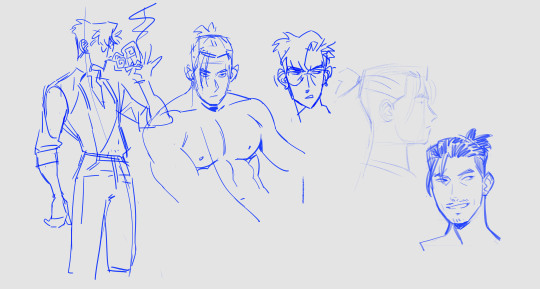
Here's a digital sketch dump of some pose/anatomy practices and some 2hu doodles, I think from now on if I don't have any big final piece to post, I'll just post sketches I liked that I did digitally (might also reblog some drawings of mine that I want more people to see, maybe idk).
Artist's Notes:
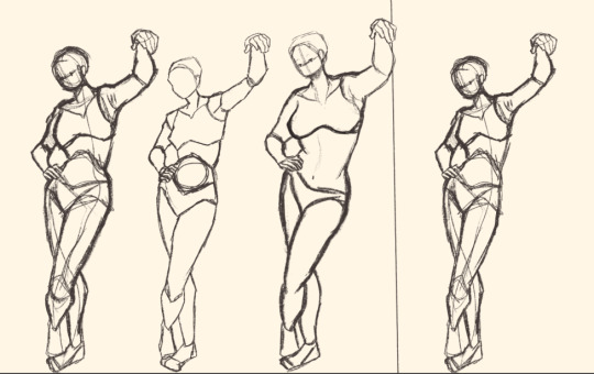
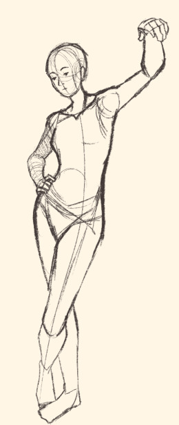
Ok so after the recent Hifuu fanart I did, I've been hoping to experiment more with how I draw faces, how I render, as well as how I stylize things. In some of the earlier sketches I did, I had an idea for a pose that I wanted to try drawing, so I took a ref pic of myself doing said pose (the leaning one btw) and then did a sketch over top of it just to get an idea for the shapes, negative space, and silhouette. After that, I wanted to do some simpler breakdowns of the shapes so I can get better at simplifying the body (these ended up being the bottom right sketches in the post). I also did some experimenting with how to push certain parts of said sketches to create a different body type (via liquify and then a more refined version based on that sketch), as well as figuring out what makes a pose feel natural and not stiff. This was also a bit of a foreshortening practice just so I can get more confident with it, and I ended up using the arms from the liquified version for the coloured Zanmu sketch I did since I liked them so much (dw I'll get to that).
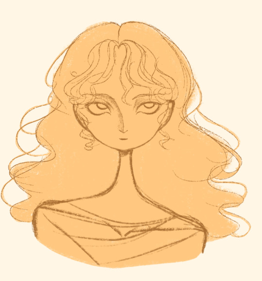
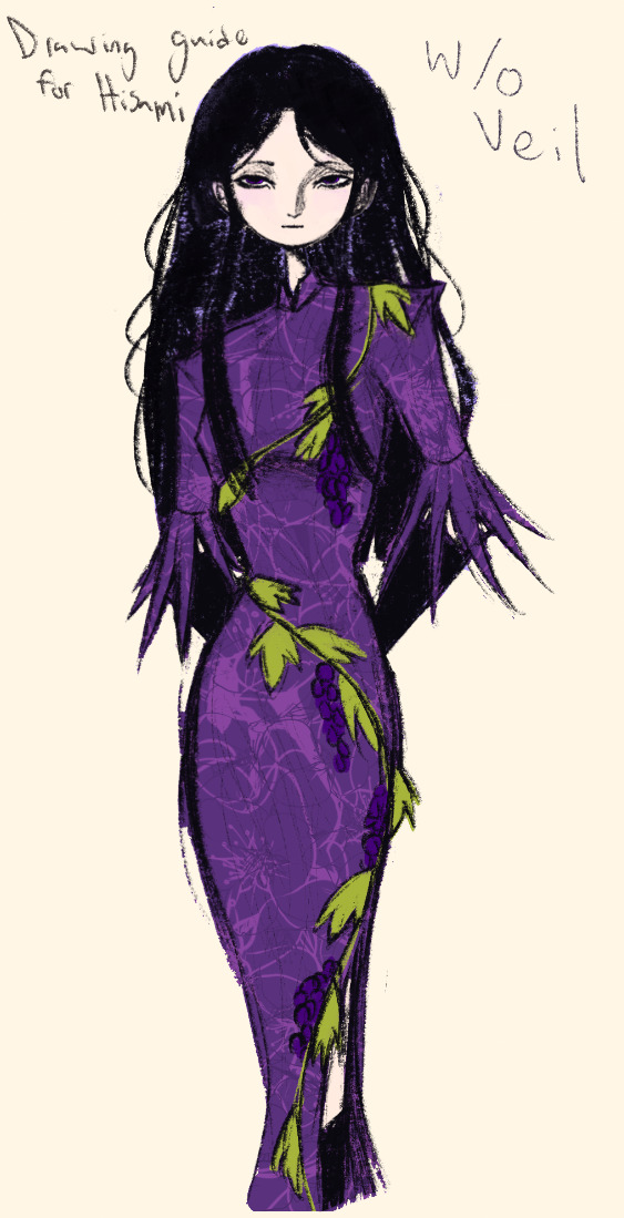
The next thing I wanted to try and draw was Hisami, mainly because.... I am very bad at drawing her in my style. Last time I drew her I made her look really creepy and spindly, and it is my headcanon now that she can switch between a more human, and more creepy look whenever she wants. I'm liking where the face is going a lot, might have to refine a few things about it in the future, but it's cute (I also made the blush purple which I think is what I'm gonna do with her face from now on). I also like how her hair in the sketch turned out a lot, but the outfit..... not as much... Ever since I started changing my style to something less cartoony, I've had a hard time drawing her outfit in my style. Especially the flower veil thing she has on, which, I did try to find a way to draw, but I ended up deleting that sketch because I didn't like it. I'm also not a fan of using the colour purple, like, pure purple, magentas are fine, indigos are fine, but not strict purple. I also have a hard time with drawing all the little pattern details on her dress. I also need to find a way to draw the flower veil in a way that looks good because everytime I try it ends up just looking off (very similar to whenever I try to draw Zanmu's blue spears). I think the only solution to this problem is to do what I normally do and make my own version of the outfit, but with adjustments to suit my style while still trying to keep core elements from the original design intact (like I do with Zanmu and Keiki, and yes I am going to get to that Zanmu drawing just gimme a minute).
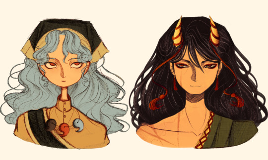
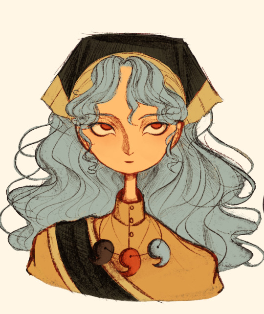
Ok next up is Keiki, my favourite Touhou character who I haven't drawn since the beginning of the year. Since my style has changed a lot, I wanted to just do a face sketch of her to get a hang of drawing her again, and I..... really really like how it turned out! When I drew her eyes, I realized that a good way of keeping faces too same facey can be via varying the sizes of their pupils, so that's an idea I'm gonna keep in mind from now on. I had a lot of fun with her hair, I initially was gonna do it like how it is in the official art, but I ended up not liking it, so now I'm gonna draw Keiki with wavy heir like this because it's fun and it looks nice. I also included my base sketch for Keiki's face since I was initially struggling with drawing her bandanna, and in the coloured sketch I added some more detail into her hair.
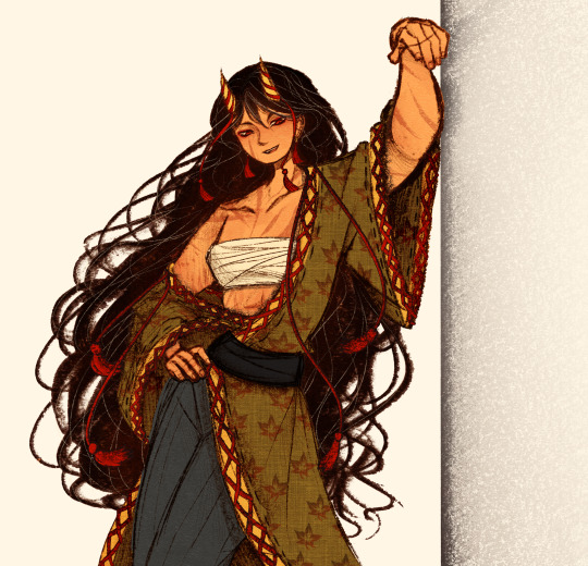
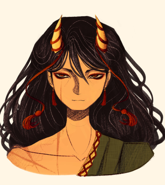
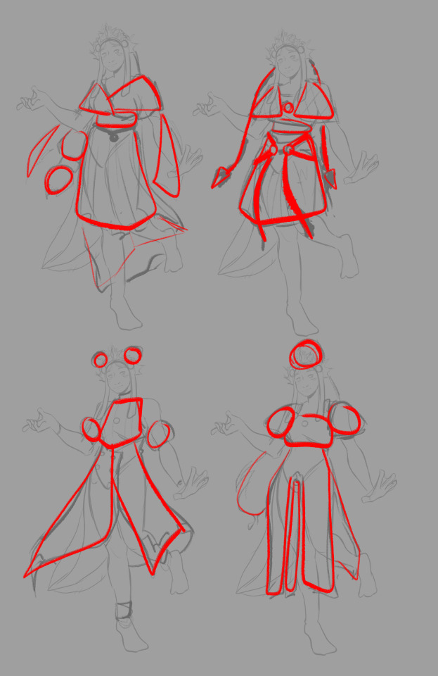
Now to finally talk about the sketches for Zanmu. Good lord was I having a tough time with her face. I also did this sketch before I figured out how I wanted to draw hair, so that's why the rendering on her hair is different (I did this soon after the Hisami sketch actually). Since I changed my art style a lot, I had to find a way to translate her face from my more cartoony style to my more detailed style, so while the face shape, nose shape and mouth was fine, I was really struggling with the eyes. I did get somewhere eventually though, and I am super happy with how it turned out. I wanted to lean more towards the androgynous side of the gender presentation spectrum, mainly because I think that makes sense for her character. Also made sure to include the silver hairs and some wrinkles just to bring some signs of her aging into her face because those are just staple features of how I draw Zanmu at this point lol. You will also notice that I gave her some scars on the right side of her face, and that's because I am a Zanmu-with-scars truther, I fucking love it whenever I see someone give Zanmu visible scars like that it just adds so much omg (I also tried to put a wolf bite mark on her arm in the full body drawing but idk if it reads well). While you can argue that her not having scars sells the idea of her being this "powerful, untouchable mastermind who is impossible to defeat," I'd say that instead of those scars representing times she got injured, they represent everyone who has failed to defeat her.
As I was drawing Zanmu's face, I referenced my sketch of to help with contrasting their features since I made Keiki's face more traditionally feminine. I also didn't mention this in my commentary on Keiki's face because I wanted to save it for here, but giving Zanmu scars also plays into the fact that she used to be human, wheras Keiki doesn't have any scars because she's a god who doesn't follow the rules of normal human biology. Plus I'm thinking about the two of them interacting again (return of Zan/Keik??? (I'm a multishipper btw) maybe???) so drawing their faces together will definitely help me in the future if I wanna draw them together (again, maybe as a ship? I've kinda been ironing out the kinks in their potential interactions (romantic and non-romantic) for a while now so idk maybe expect that in the future lol).
And now for the full body drawing, when I was doing the face sketch I did this little snippet of an outfit, had a vision, and the made it into a reality. I'll admit, part of me was worried that it would end up looking too much like Yuugi's outfits in the spinoffs and mangas, but I feel like I made enough changes to differentiate them. I tried to keep a few of the major details in Zanmu's design (i.e. the red tassles and yellow lining on her shirt) while putting a new spin on it. I also dialed up the scars to 11 since without them the whole thing kinda looked incomplete. Also, while I could say that the leaves on her kimono are "a nod to the fact that technically she should be a tengu because back then people belived that corrupt monks would turn into tengu but no Zanmu is an oni and they're maple leaves because...tengu...ahahahaha" what really ended up happening was that I looked up clothing patterns from Sengoku era Japan, liked the leaves the most because the red picked up on the red from the rest of her design and just ran with it. I also always had the idea to put Zanmu in men's clothing from Sengoku era Japan and while the accurate thing to do would be to put her in a Buddhist's clothes from that era.... from a character standpoint, I don't think Zanmu is pious enough to strictly wear the proper monk uniform, and also since she's basically the king of Hell, she would probably dress herself like royalty from that era. TBH, I probably could've been a bit more historically accurate, but again, this was mainly for conceptual purposes because I had a vision and I needed to see it through.
If I were to draw her in this sort of outfit again, I should probably try and use more references, although now that I look at it, if she were to wear it properly this would maybe, probably look a bit closer to a Kyūtai sugata (a very huge stretch, but it just kinda reminds me of that) just without the layers under and over the main piece of clothing (In the website that I searched up to try and compare the outfit in my sketch to, they name the outfit pieces but don't label them on the image, so I don't know 100% what everything is called) so I will definitely have to use that style of clothing as a reference going forward.
Also, I was kind of inspired by the ToTK design for Ganondorf since I have finished the game a while ago and I absolutely love what they did with his design (it's just so fucking cool omg) and I thought that sort of look would look good on Zanmu, so yeah got some inspo from that.
And those were all the notes for each of the sketches, I'm motivated to draw rn but kinda art blocked, so doing these little coloured sketches helps a lot.
#touhou project#art#fanart#sketches#sketch dump#zanmu nippaku#keiki haniyasushin#hisami yomotsu#touhou 19#touhou 17#unfinished dream of all living ghost#wily beast and weakest creature
344 notes
·
View notes
Text
Thank you!
A big thank you to everyone who got a copy of Mostly (h)Armless! I think that for an obscure little fancomic it did really well! About 30 copies have gone where none can ever take them away again. I've also finally received my own version and I am happy about the quality.
I've now unpublished it but turns out you can never entirely take a book off the store once published. You can't edit it to be something else either. (which is what I had hoped to do, I have a bunch of unpublished original comics lying around). So it's just kinda going to sit there for all eternity, unavailable for sale. I sincerely hope it won't give me problems later on.
Anyway, if anyone is curious about one day printing their own comics, here are a few things I have noticed that I will definitely remember for my future printing endeavors:
Most glow and blending effects like Lighten, Color dodge, Hard Light, Linear dodge (add), etc don't look that nice in print despite looking awesome in digital.
Make your line art thick enough.
soft shading looks bad, cell shading looks good. (But it's better to fully fill shapes with a contrasting color rather than doing fancy lighting.)
Consider shading in black rather than color. (optional)
Details and soft lines are usually lost and a waste of time (Mostly in case of a colored book. Black and white may be different)
Keep panels spaced far enough apart.
Draw big panels. Small panels aren't as nice to look at and the eyes are naturally drawn to the larger panels.
Gradients don't look very nice either. Unless they have a light color.
Vintage comic textures and effects actually looks nicer in print than digital (which surprised me).
In dark scenes, rim lights are essential to make the character pop out. M(h)A would've looked like ass if I hadn't added those.
Stay away from the borders of your page, especially the left and right ones. Not just for the text but for the drawings too.
Keep track of which side of your page will be closest to the spine, keep a distance from that side especially. Because your book will be folded and part of the page will be hidden (the thicker your book, the more will be lost).
fancy panel compositions are cooler in digital...
contrast contrast contrast...
Don't be afraid to use pure black a lot.
Don't be afraid to use white a lot.
The 3D shake effect is also not that cool on print. But looks gorgeous on digital.
To myself… keep the font size consistent…
If text is outside a text bubble, it should have a high contrast stroke
Text should always be high contrast in general.
Motion blur is really cool in digital but not so much on print.
Keep black silhouettes black, avoid adding any kind of subtle glow or texture.
Text bubbles can have color but they should be light (again high contrast) watch out for saturated green or blue or red. Test in greyscale. Contrast should be more than 70%.
Line art should not be colored. Keep it black for print.
Hard borders are better than soft borders. On everything.
white panel borders are better than black panel borders.
But white borders with a black stroke are probably the best (cause more contrast).
Again light colors are better than dark colors. To do dark scenes it might be better to just use black and contrast with a lighter color.
Line art perfection is not that interesting, especially in regards to hard surface shapes like robots. (Might be personal taste though. I enjoyed looking at robots with messier line art more than those where I did perfect brush strokes.)
Beware dark blue and purple...
Compositions and colors of both the left and right page should always fit together. I think I did that pretty well here at least.
If possible make your total amount of comic pages devisable by 4. (so 24 pages total, or 28, or 96, you get the idea) not including the cover and back. Or else add a little extra drawing to fill the remaining pages.
I think that's about everything I can see based on my own print. I'm sure that a fair few of the things that I found looking worse in print than digital could be resolved by just being... better at converting your files. There's the whole CMYK color mode thing but in my personal experience that has been such a pain to work with, and each time my prints looked worse attempting to convert the file rather than had I just left it in RBG and let the printer do the guessing work for me.
So if you're like me and you're hopeless at this technical mumbo jumbo printing stuff, I think just avoiding the things I mentioned while drawing should get you well under way to having a nice print. The most important thing to remember is that digital and physical media are two entirely different beasts and if you are interested in getting your comics printed it's easier to adapt your workflow to that from the start rather than going back and altering. A lot of the mistakes I made here are rookie ones and I should have known better. But it's very easy to get lost in the process once you've started. I hope to improve my next print significantly. Once I can make RBG look good, I might try CMYK again.... Maybe. Potentially. No.
Hope these tips can be of service to somebody. They'll be a useful archive for myself in any case. If anyone wants me to elaborate more on a specific point, I'm happy to explain.
39 notes
·
View notes
Text
This is going to be a really long post about my recent studies with character design, proportions, and improving other skills.


These are some drawings from my studies that I discuss below
It started when I picked Dragon/Olivia's story back up. To give some context about this character, she's a character I made along with 11 others that matched with the Chinese zodiacs (as we all have at some point I'm sure). I initially gifted her and the rest of the characters to my friend, so she had some character to write for. I've since asked if I could work on her story again and we work together with the setting for story congruency.

This kinda takes me to my current studies which is that I want to make interesting characters with appeal. I came into Dragon's redesign with some new tips from youtube about art appeal, specifically: Appeal - The MAGIC Tool to Improve Your Characters After watching that, I'd come faced with a long problem I've had in my art which is proportions, the bane of all artist. I remembered a rule that I've always chosen not to listen to for god knows what reason, the rule of heads (9 heads is like the proportion of a persons body blah blah yall know this one). I'm more of a "just get good" kinda person and prefer not to measure things as I get lost in them later in the piece.
I tested it out here as like a side by side to see how I normally draw, from imagination, just raw dogging it, and then did another drawing trying to incorporate the measurements and I realized how much I sucked at drawing then.
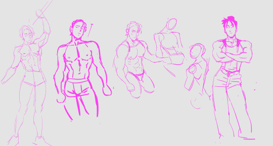
I looped back around to a character that I've had for a long time, oldies are the goodies, Brook, who I always seemed to draw with a head slightly to big for his body. I think this was a crutch at some point, I think the design may have gave him an innocent look that I've always visualized. So I was having fun making him actually look like a 20 something year old then a teenager.
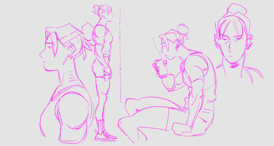
Eventually I circled back to Olivia and began working on her design with a little more confidence. When I initially made Dragon and all of the other zodiacs, I had big ideas of making their silhouettes easy to read and to show off their character.

My old crutch, as many share with me, was having different hair styles. You can see that between Jace and Brook who look very similar, but rock different hairstyles.

This was a bit ago trying to work on that problem, trying to distinguish them with their body types because the story kinda supports them looking the same. I decided to work with shape language to accomplish that.

At the same time as those drawings, I was making characters for my animatic called Unicorn Hunters (you can watch that there). Taking a break from that project, I drew those characters in an alternate universe where they're just alt kids.
Anyways, art is hard and I wanted to post this mainly for myself because I always forget the little steps like this that keeps my art in line.
35 notes
·
View notes
Note
got very excited when i saw u reblog the anon post thats been going around bc u deserve all the compliments. every compliment ever
as someone who's kinda still slightly new to this fandom, youre one of my favourite creators!! you're always interacting w others abt ideas and just having a blast discussing different aspects of the show, the amount of thought u put in all of ur posts is so incredible. the fact u love saf so!! much!! how u consider every aspect of the show w so much detail, how you have such beautiful complex characterisations of them. the way u write them in chwm is just sooooooo!!! you just care so MUCH about these characters and this show and it makes me so fucking happy. you really make such a wonderful impact on the community space. thank you sososososo much for caring as much as u do abt our silly little spies i cant explain how much we appreciate it <3
(also, the woodworking thing u made is actually SO CRAZY COOL IM OBSESSED W IT. YOU DID THAT. WITH YOUR HANDS. AND TREE SHIT. THATS SO FUCKING CRAZY. the detail is impeccable, the shapes of curtwen's silhouettes are made w such care, AUGH woodworking is such a cool art form and ur so amazing for being so good at it im lowkey jealous)
(also also so sorry if this is slightly incoherent, i am very sleep deprived but i really wanted to send something in)
Oh wow, thank you so much! I honestly worry sometimes because I can get kinda intense and write obscenely long responses and theories and headcanons, and I worry that it just makes me kind of tedious and irritating to everyone else. Just like our boy Agent Curt Mega, I am ADHD, so rejection sensitive dysphoria is something I have to manage pretty much constantly. So it really means a lot to know I'm not being a pain in the ass for everyone.
I'm absolutely thrilled to see chwm get a shoutout!!! So thank you for that. It was a total accident, it was only ever supposed to be that first chapter, but I sort of fell in love with that fic and decided I had to fold it into the larger series I was originally planning. I just adore getting to get inside these characters heads, to explain the way I see them in a more artistic way as opposed to long theory posts (although obviously I love those too). They're fascinating, messy, beautiful, horrible, compelling characters, and every chapter I post I just say a little prayer that I'm doing justice to them.
I'm actually finishing up the epilogue for chwm in between answering these asks, so that should be up by morning. I'm gonna spend most of May doing writing projects for Curtwen week, and then I have the sequel/next installment mostly mapped out to start working on after that!
I'm also thrilled to see a shoutout for the wood segmentation project! It was a lot of work, but I'm so happy with how it turned out! I can't really draw or do a lot of the immediate, visual stuff that our wonderful talented fandom artists can, but woodworking is something I love and I just had to find a way to honor this show I love so much with it. I've considered a few ideas for another SAF woodworking project, but I'll probably be focused on writing for the immediate future, so we'll see if I can make it happen.
Seriously though, thank you for this very kind ask, it really felt so good to read
3 notes
·
View notes
Text
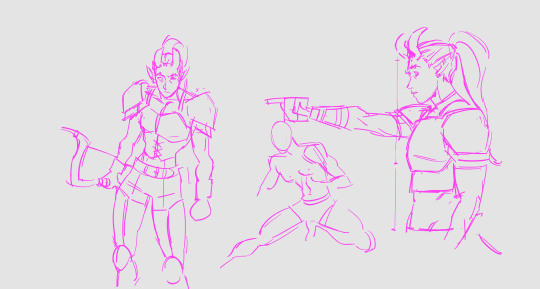
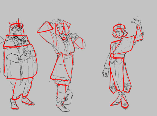
For assignment 1 I have settled on the words Elegant, Regal, Cunning, and Cruel. For some time now I have been planning and world building a potential D&D campaign in my head, and there is a particular character from that who brought the words to mind. So for this assignment I will be working on a design of that character who I had named Lady Celeste Rima or The Cloud Queen. My first step in the design process was to begin sketching poses that I felt evoked those words, with the intention of working out costuming on top of the pose sketch once I had chosen one.
During my tutorial with Leo we narrowed sown to poses to a couple options (3&4). We also began discussing the word which I hadn't managed to work into the poses as well as others. Cruel. Something which might be somewhat difficult to work in amongst the other words. Especially with a character I intended to give a cloud/sky based aesthetic, which often uses very different shape language than is generally used for cruel characters. We discussed achieving this through the character's facial expressions, or possibly even a facial covering to communicate an apathy for those around her. Leo also had the very interesting idea of adding some areas of smoke to the costuming, thereby adding menace in a way that might resemble clouds, so I hope to find ways to work that in during my next steps.
After the tutorial session I began working on some outfit designs trying my best to block things into silhouettes as suggested by Leo. I know this practice is quite common in concept art, and as a painter blocking in should come naturally, but I always feel somewhat clumsy doing it. Probably due to my constant urge to start working on details right from the offset. However after making myself do a few I'm getting a touch more comfortable, and can see there place in the concepting process. Though towards the end of this sheet I did do a few designs as sketches in the way I'm more accustomed to, using them also as an opportunity to explore color. I had originally been thinking a simple blue and white palette, but decided to pull colors from sunsets to allow me to bring in some darker, "crueler" colors, like blood red.

As I've been working on these I have found myself drawn to 1, 7, 9, 11 and 12. I have begun refining the sketch for 12, though am moving slowly and plan to see which design I am most drawn to after receiving critique in Wednesday's lecture.
References and Inspirations:
Abcnews.com. (2025). Available at: https://s.abcnews.com/images/Entertainment/GTY-Christine-Baranski-MEM-170315_4x5_992.jpg
Shein.co.uk. (2024). Women’s & Men’s Clothing, Shop Online Fashion | SHEIN. [online] Available at: https://www.shein.co.uk/goods-p-22534475.html?goods_id=22534475
Art deco inspired bustier corset top, futuristic costume. (2016). Etsy.com. [online] doi:https://doi.org/1021810226/il_1080xN.1021810226_dl25.
Artstation.com. (2025). Available at: https://cdna.artstation.com/p/assets/images/images/060/909/632/4k/volta-luminous-forspoken-rp2a-tantasila-final-v01.jpg?1679580753
Wmomall.space. (2022). Best Sellers. [online] Available at: https://www.wmomall.space/?path=page/ggitem&ggpid=2003922
thescarletlibrarian (2015). Butt Capes: Vintage/Couture Edition. [online] Tumblr. Available at: https://www.tumblr.com/thescarletlibrarian/123165903487/butt-capes-vintagecouture-edition
Los Angeles County Museum of Art (n.d.). Woman’s redingote. [Photo] Available at: https://commons.wikimedia.org/wiki/File:Woman%27s_redingote_c._1790.jpg.
1 note
·
View note
Text
Voiceteam roundup part art
Since there´s still a couple of the round three works I contributed to that haven't been made public I figured I could make a cover art round up today. I ended up making a lot of cover art for other people's podfics and turns out I really enjoy it! I have learned so many new things in photopea, it's been great. I'll try to go in chronological order from first to last. Here goes!
I (as always) began very ambitiously (is it even a bite if it doesn't look like more than you can chew?) with this coverart:

It was quite a bit of work isolating all the hats from their background and covering the musicians on the stage in a way that looked natural by copying other parts of the background. This was also before I found out you could make a border around text in photopea so that was done by putting the same words in a slightly bigger font behind the other words and fiddling and cursing until it looked decent, I do think it's a nice effect.
Then comes this one:

This story is so beautiful. It's a moment between Max and Robin right after Starcourt where they sit and talk on the edge of an ambulance. I really wanted to show their backs, but I couldn't find any good screengrabs that would fit, so I went with this idea of the silhouettes. The robin one is actually taken from the bathroom scene and I can't remember where the Max one is taken from, just that I made sure she had the two braids in it like she has in the final Starcourt scene. I had to do so much fiddling to get their silhouettes properly shaped, because both of them had complicated backgrounds that photopea wanted to lump in with them. That is also part of why there's the slight glow around them, it softened the edges and made them more forgiving. This is probably the cover art I've ever made I am the most proud of.

I had so many ideas for this one. I'm pretty glad I ended up going with this one though. The neon lettering was harder to get to work than expected, I spent ages fiddling with that, and then making the poster fit in more with the picture and not feel stamped on took a bit too. I was really glad to find that background on pixabay since it really helped making the edges of Eddie's hair not stand out so much (that hair is a nightmare to remove background for). This one feels like a study in crucial details that no one would know that I spent so much time on, but would stand out if I hadn't spent that time.

Speaking of things I had a hundred ideas for. This one is actually the one where I worked on the most separate ideas. I think I had four beginnings on drafts that all looked wildly different plus an idea that never saw light of day because I am still suffering from the lenovo AAAA prank.
See, the thing is there is this bouquet of flowers that is absolutely central to this story and also extremely well described, so I at first wanted to include that on the cover or at least something resembling it. As it turns out when wondering the free-to-use pictures on the net that might not be as easy as that and even finding a bouquet with just about the right colourscheme turned out to be hard, and so did tuning the hues of a bouquet nicely.
In the end what decided it most of all was also having to include so many names and that I really fell in love with this specific flower mentioned in the fic.

Making the coverart for this one was mostly about learning how to manipulate the shape of text and exploring the many different colours of fire until I found the right one to pick for the text. (It's a Dutch translation of a Good Omens fic for those of you wondering)

This one, for me, ended up being an exploration in remembering what my grandma's videotapes used to look like, and yet not at all being able to find a good base image for making a more film-like tape case before going with this simple option. I do kinda enjoy making covers that seem like real things that could exist.
Aaaand last, but not least:

This one caused me trouble. Mostly because my ideas where too hard to execute and also because it's a very short fic that doesn't give many visuals. All the others are rooted in some visual from the fic, but this one is a conversation on parenting that doesn't include many visuals that I felt like vibed with the fic as a whole. So I ended up grabbing onto the fatherly aspect of it all.
This photo originally had a black background, but I felt like that would clash with the vibes, so I decided to change that, then cursed a bunch when I found out that was easier said than done, did a bunch of things that felt illegal and arrived at this little thing.
Thus ended my voiceteam cover art journey. I have really taken a liking to doing this, which maybe shouldn't have taken me by surprise since I also love illustrating songs. There's something about having text and a story and a picture all mixing together that I really enjoy. I plan to make many more, I kinda had a day where I was just itching to make some, two days after the regular rounds of voiceteam ended, but I didn't want to take any points from tie-break participants. We will see what the future brings.
#I got less elaborate with time since I got more busy during voiceteam#but I enjoyed making every one of them#kirokiro#artkiro
0 notes
Note
hiii if your comfortable, could you possibly walk us through what designing a character is like? like the steps you go through? i really admire your cahracter designs and since its something i struggle with, it'd be nice to know your process :]
Oh boy, my process is a bit of a mess, but I'm going to try my best to say what goes through my brain.
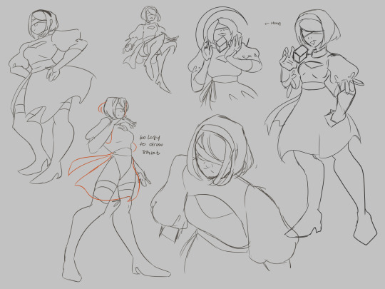
I redesigned Lizzie like 5 times in the past few weeks because I couldn't find a design that was appealing, so I think she's a good one to talk about.
Since we already have a base (read: personality), I usually start with a pose that fits their personality, then figure out clothes. I settle on a body type before hand (that's something purely from headcanons, making an original character is more chaotic to do)

The first one that I did has a very awkward pose, the silhouette isn't clear and not really telling of anything on her.
Silhouettes are very important (and why character designers start by doing that first instead of... jumping in like I did)

You should be able to get who it is, and what their personality is just from the silhouettes, plus have it clear enough that you get the pose (empty spaces are really important! it helps the understanding of the picture and pose)
Going back to Lizzie, I restarted all over again (2nd design in that first drawing), got rid of the buns, kept the same dress. Pose is nice, silhouette passes, but I thought the simple dress just?? Did not fit a giant fish goddess... So I took the pose and restarted the clothes all over again (I loved the dress, but its just ehhh on her)

So for clothes inspiration, Pinterest is your best friend honestly. I have a complicated relationship with Pinterest, but for finding inspo it is literally the best thing. (I've also been using ArtStation a bit more lately though). Make pinterest boards for characters, or at least different boards for general vibes . You can also make moodboards for every design you're doing. (I often do these, or at least slap my reference pictures onto the canvas, but I won't show them as I sometimes use art and don't want to repost stuff)
I did a mix of like several clothes / character designs that I found cool, then did put them all next to each other to see which one I liked more.
Now we can jump on the second important thing: shapes!
If you've watched like any youtube tutorial on chara design they will tell you this: cercles are soft and kind, rectangles are rough and sturdy, and triangles have something mischevious (its often linked to evilness as well). When you design a character, you should write down next to them like 2 to 5 words that describes their personality, and associates those traits with those shapes.
Though do not be afraid to mix up shapes (especially if you tend to have a more realistic art style); if your character is kind and generous, them having a few squares isn't going to ruin everything.
My Scott design is very triangular, but he has a few squares and circles to break it a bit.
Fish hybrids would usually be triangular as well, but by giving soft edges to him, he ends up looking much .. well softer.
I won't describe everything there, but you get the idea (I hope).
While I did end up chosing her clothes by asking people, I do think its worth looking at Lizzie's shapes.
I draw her face very round, same for her eyes , and the two bottom rows makes her look too... serious? Like it isn't the Lizzie that tries to scam everyone. I chose the 2nd one mostly because the 1st one had too simple clothes (what I was trying to avoid), but I know many people liked the 1st one better.
I just really like my clothes to have tons of details. Which can be a flaw? But my biggest inspiration lately is League of Legends, so I enjoy adding unnecessary details that would look cool in a splash art I will never draw.

Yay! We got a proper sketch now! Unfortunately my color picking process is extremely chaotic. It consists of finding a base color that I color pick from an art that I like (usually the skin color), then basing my whole palette around it. I can only suggest to not be afraid to color pick from art that you like, and before putting proper base colors, messily put the colors that you want, they might not all end up looking good next to each other and you want to easily change it. I would suggest to learn color theory as well, but I'm not going to lie I've always winged that part lmao
Hope that could be of any help to you anon,
#if you have further question dont hesitate because i fear that this isn't very clear#i might take more screenshot process for lizzie when ill clean her for the coloring process??#ive said i would stream but i kept procrastinating on that hh#ive also been meaning to try to do simplified character designs to work with shapes even more... just havent had the time#i dont do lots of oc stuff#but when i do iits similar to this except with way more trial and errors#and i always start with the silhouettes#i would show the stuff i did for school but theyre all incredibly ugly lmao#but yeah most of my process is actually looking for references on pinterest and tumblr#also watching subjectively and#t b skyen videos on LoL helped me a bunch???#maybe go check them out swdfth#answered#anon#sol mumbles#Help
27 notes
·
View notes
Text
Thumbnailing: Subject's Way
Thumbnails are an important workflow tool artists use to make creating their works more efficient. They are essentially tiny, low detail versions of the idea you may have in mind, and save time by helping you catch potential compositional errors, clashing colors in palettes(if you blob some colors on), and poses that simply might not.. work in character art as well as many other things not mentioned.
I am a very visual person and sometimes putting ideas to paper really helps me focus better on the task at hand. Organizing things into steps on the page really helps me not get overwhelmed. It might prove helpful to you as well.
In this tutorial, I'll take you through my workflow process when planning paintings and simple character illustrations.

I start off the process by doing a ton of sketches of whatever thing from many angles, poses, etc. Usually if I have a certain image in mine I simply sketch that and adjust little things like angle, placement of limbs, etc. Work teeny tiny, you can enlarge it later. I,t really depends on what the goal is for that piece what the process looks like. Here the goal was to just draw a character, so I have many options.
environment sketches look a bit different for me, as I will sketch them in literal cubes. I am still working through the technique. I just haven't gotten good enough at them yet to consider a tutorial by me would be helpful to anyone though.
Like with piece D, it's good to plan compositional elements here too. I added the moon that would go in the eventual background, swords in the hands of B and E, etc. Had I had more time, F would have gotten rough roses, but I digress.

After I have base sketches, I do very rough lines so I know what I'm looking at, and it primes me for what I could possibly have issues with in doing the final. I keep it VERY loose and don't dwell too much on details. If I'm drawing a character, I'm not even going to look up references, unless their silhouette is very complex. There is not much need for accuracy here. Just to nail down your subject's silhouette.
At this point, you can start eliminating which poses you don't want. Here I was very indecisive so I went through with sketching all of them.
At this step ill also take the time to plan variants if I feel like I would be indecisive about them/need them for certain platforms (optional).

Here's where things start to actually take the form of thumbnails. I work large and draw most of the anatomy of the subject so that things are positioned correctly in the frame. Draw the whole of something, even if you know it's going to get cropped out. There is nothing worse than trying to draw in a way that is already cropped, it messes up your anatomy bad, and you'll spend more time trying to fix it, especially if you are just starting out as an artist.
Physically drawing a box around them to help with framing is really good to help plan the composition of the final piece. Again, you can eliminate stuff here as well if they don't make interesting compositions. Consider the rule of thirds and how much breathing room you want or need in your piece. The one not in a box was eliminated because I didn't like the pose nor would it make a very interesting piece.
I also use different colors on the boxes so I can overlap them and keep my eyes from getting confused where one "drawing" ends and one begins.

If I'm planning portraits/art in my painterly style, I'll take the time to block in some colors just to see what I should shoot for in the final. I will also do several pairings of colors in their own sets of thumbnails if the piece needs it/i want varients. I highly suggest blobbing so that you can see how potential colors will play with one another. Learning the teeniest bit of color theory will help, I promise, but for now, i'lI'lll refrain from the mini-lecture.

these three two (you'll see), I figured would make better cel-shaded/quicker pieces due to how zoomed out they are, any true details I would want to focus on don't exactly work for my current style faraway. Be sure to tailor compositions that suit your style. I will be keeping these sketch ideas for future reference.
It's important to remember that just because an idea doesn't get used in this piece, that doesn't mean it can't be used in a further piece down the road. I actually have a horrible habit of deleting my thumbnails after I'm done with them, but if I'm thumbnailing in a sketchbook? I find myself browsing back over them for future pieces to get some rough ideas of what could work later.
One last thing, you don't have to plan as many thumbnails as I did, but I do suggest at least 3 or 4 to really stretch your creativity.
Thumbnails also make for a good warm-up. If you're curious, I did the initial sketches in this order: A C E D B F. I think it helped me loosen up a bit, but you can be the judge of that.

I went back and tried another approach for a painting, but now I have the base for 3 paintings I could pursue, albeit rough, but it's good to learn how to paint like a sculptor, I digress.
That's all there is to it. the key is being clean enough to get the idea down, but rough enough to save time. work small, using basic shapes to create silhouettes. You can enlarge it later and use it as a base sketch.
Last two cents: I've also learned that sometimes if a piece is just not working, it's probably more than likely a compositional issue, anatomy, or perspective, Which is why thumbnailing can help you catch these issues early.
happy drawing :)
a/n: this is my first time really creating a tutorial. this might not be groundbreaking information for some of you and that's okay. this tutorial was initially created for someone in an art server I'm in on Discord, hence the slide-text-slide format. I have taken the images and text from that and compiled them here to make it easier to pick up the tips. I do not consider myself a pro on any of the things mentioned by any means, merely my take on it all. Get multiple sources, educate yourself, practice, and find what works for you. - Sub
#its not perfect#but i hope it helps#tutorial#composition#digital art#digital illustration#digital painting#reference#art tutorial#art#sketch#thumbnails#illustration#medibang paint#medibangpaint#digital drawing#drawing
21 notes
·
View notes
Note
ok so tlh is set in 1903 and there are a few things we know about the clothes from the books themselves- 1. we have a vague idea of the silhouette, as briefly described in the book and the dresses on the cover (although those are mostly incorrect, they do, I suppose, set the reader into the general mindset.) and 2. apparently only pastel colors are fashionable, they do not look nice on cordelia specifically (not all poc girls look 'washed out' in these colors, Kamala, who is often depicted in official art with a similar skin tone to cordelia is stated in the books to look very nice in her pastel dresses)
firstly, the 1900s were a rather odd decade for clothes silhouette wise. this decade was the transition from the 1800s dresses with foot-length hemlines and fuller skirts into the 1910s trends of dresses that reached to the bottom of the calf and a more utilitarian and accessible style. Dresses in the 1900s still had the tubular shape of the 1890s, although it was less severe and it eventually faded out by about 1906 or 1907.
Speaking for now only about the first half of the decade as the books do take place in 1903, the dresses would have had a very structured bodice with flowing skirts that reached to about the ankle. Their undergarments would have included at least three layers (something in between the corset and their body, the corset, and a corset cover) with drawers, stockings, padding at their hips and bust, and at least 1-2 petticoats. dresses consisted of the bodice and skirt as separate pieces, with lace and embellishments used to bring the attention to the bodice.
Day clothes were more structured and less busy, most of them including high necklines and long sleeves. (yes this means that the stupid thing with james always staring at cordelia's chest is not realistic.)
The ballgowns and party dresses that are often mentioned are slightly more accurate. These dresses tended to be very busy with lots of patterns and lace on them, often toward the bust line to achieve an ideal silhouette. skirts were longer and fuller than the day dresses and gloves were always worn with these dresses to make it appear more modest as it had low necklines and short sleeves.
a couple of notes about historical accuracy- number one being the corset. there is a part in chain of gold where cordelia complains about her corset that makes me mad every time I read it. corset were modern bras but more comfortable, they were incredibly supportive and didn't mess with anything permanently. there was always a layer between the skin and the corset as protection for both the skin and the corset as they were intended to be worn for years on end and needed protected from oil and dirt from the body. tight lacing is essentially the historic equivalent to people today who get dressed up in their fanciest clothes for an 8 a.m college class. it wasn't standard and it was only done in very specific situations in which the wearer wanted to look a certain way. for the most part, the super narrow waist wasn't actually all that small, and it looked that way because of padding on the hips and chest.
number two on the standards for fashion at the time. at this point being fashionable was less about standing out as it was about fitting in. If you were wearing something out of fashion it was abnormal and you would be ridiculed for it, along the lines of wearing jeans and a t-shirt to a formal wedding. it was a matter of propriety and respect. Getting dressed a certain way wasn't chore or special thing, it just was.
number three is on the aesthetic dress movement. this would be the category the cover dresses fall into. the aesthetic dress movement encouraged women to dress individually by rejecting the high fashion and emphasizing freedom of movement and practicality. (that is not to mean that high fashions weren't practical and comfortable, its basically just the equivalent of wearing a t-shirt and sweatpants as opposed to something like jeans, a blouse, and five accessories. both are good, its just that they feel very different.) these clothes took from greco-romanic traditions as well as that of eastern asian cultures, with flowing, airy fabrics and loose silhouettes. this style was usually only worn around the home.
next we're going to talk about color. first of all, pastels do not wash cordelia out, she is absolutely stunning in them, as well as the jewel tones. on a more historical note, clothes in the 1900s weren't all pastels????? lighter colors were in trend, as more of an aesthetic dressing style was in fashion, but dark colors could never actually go out of style from a practical standpoint. day dresses from the early half of the decade usually had darker colors, I will link or send another ask with two examples. one, from 1900, is a dark red and gray dress and the other is a walking dress actually from 1903 and is a perfect example of something cordelia could have worn. (it has a very nice brownish gray color with gold embellishments and a high neck.)
now evening dresses on the other hand were usually light colored, almost all of the surviving ones from this decade are a creme or gold color (there are a few in black and some in other colors as well, but the majority are creme, gold, or extremely light to the point they look white.) this is where the biggest plot hole is in my opinion. so it would have been most fashionable by mundane standards to wear a white or gold, which are the mourning and wedding colors respectively, so they obviously couldn’t have done that, which means that the women are either wearing day dresses that wouldn't come into creation until 3-5 years later, they are breaking mundane fashion rules, or they are breaking strict shadowhunter tradition. (out of all the shadowhunter things, the color code seems to actually be the one most consistent through all of the series, aside from the line about the youth in london wearing white sailing outfits.)
cordelias jewel tone wardrobe from anna is incredibly unrealistic in multiple aspects. for one, multiple dresses that would have had to have been custom made by hand plus, correct me if i'm wrong, accessories or undergarments, would have been WILDLY unrealistically expensive. there are plenty of money questions for the shadowhunter universe, but an entire wardrobe like that isn't even historically accurate for the british royal family even with all their blood money. on top of that is the fact that with the cultural implications of certain fashions cordelia very well could have become an outcast for wearing something so wildly out of fashion. there isn't really a modern correlation for it, but while she wouldn't necessarily have become a complete outcast or pariah, with the way we are told the shadowhunters align with societal values of the time (I.e cordelia being ruined) accepting that wardrobe would have been completely counterintuitive to her mission of being accepted by the shadowhunter society.
so that was a lot and i'm not sure if I got everything. let me know if you need any clarification, or want anything continued!!! thank you so much for letting me info dump and rant in your inbox, you are amazing!!
links for photos:
Worth 1903 evening dress
Worth 1903 walking dress
Worth 1900 day dress
plus an article that is the best thing i've ever read
I also have some other video/article links if anyone wants them!!
I will be honest with you anon
I really have nothing to add to all this besides that this is absolutely fascinating
I love how you compared clothing to different types of modern day equivalent that genuinely made it so much easier for me to visualize
I had actually heard complaints about the corset thing before! I had actually seen that many authors seem to write them as if they are the bane of many ya historical fantasies, when in reality it wasn't that at all. So in that scene in chog Cordelias corset was the equivilant of dressing in your fansiest clothes for a class?
See I would have never guessed it!
So more flowy greco-roman inspired clothing got it!
The movement mostly went towards freedom and practicality
Oh that does seem like a problem
The confiction between being appropriate in shadowhunter culture and in the fashion of the time
THE MONEY THING ALWAYS BAFLED ME TOO LIKE HOW ARE THESE HUNTERS WASTING SO MUCH TIME IN THIS WHEN THEY DESPISE FASHION-
Anyways
This is amazing
I will be refering to it more for ficts :D
THANK YOU I WILL BE WATCHING ALL THAT
28 notes
·
View notes
Note
hi! so i have a question? i was looking through you art (i love it and think it is soooo good) and i was wondering how you like got(?) your own style? like right now i feel like i dont have a style or something that is me, and i was wondering if there was something you did to get that?
(sorry idk how to properly word this)
hiya! thank you so much omg ❤️ and I totally get that feeling, that's actually smth I'd torture myself with for a long time!!
the one advice that you will find most of the time is: c o n s u m e all sorts of visual content. Comics, cartoons, illustrations, classic art, but also live action movies, catwalks, etc...! You'll pick up little things here and there that speak to you, "I love the way this artist draws eyes" or "this movie's ambiance is so good I want my art to express that"
Don't be afraid to go over the top when experimenting! going from clean lines to rough sketch, from realism to abstract shapes silhouettes, etc.. you may find techniques you never thought of, just by going nuts and giving up control lol
Determine what you really like to draw! I love all kind of styles, but what I enjoy to do are expressions, unpolished-looking techniques and characters, textures. I forced myself for a long time to do clean lines and flat colors because I loved it in other ppl art but it wasn't satisfying for me to do
also don't feel bad if you feel like copying someone else's style. everyone did at some point! the more you draw and develop your own culture, the more you'll add your own quirks and twists to your art. I've had the chance to go to art school for a bit: I've met tons of other young artists there, sometimes with similar backgrounds, yet by the end of the year we could all identify each other's art! because of the subjects, the lines, the colors, the way they draw noses, etc.. but also one's humour, another one's nervous stroke.. with no hindsight its hard to realise how unique your art is, how much of yourself you pour in it! It's a bit like having no idea what you're like as a person, or not knowing how to introduce yourself while other people have no trouble describing you.
And finally, most importantly, you've got all the time in the world <3
4 notes
·
View notes
Note
Heya, I really like your art and I was just wondering if you had any quick tips on lineart because lately I've been trifling to make my art appealing especially with lineart. Thank you for your time!
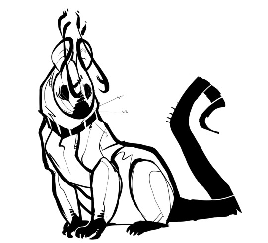
so I’ve been thinking about this for a while, and fighting with artblock and trying to figure out exactly what I value most in my lineart choices and after finally making a shitty drawing of kib to use as an example so I could think things through this is my answer
When I was like 12 I read about a million “How To Make Lines Like The Cool Animes“ tutorials, and since then I’ve spent a long time throwing out things I learned that I didn’t like, and changing things I did like to suit my personal aesthetics.
The broad-stroke b/w style I use most often is currently my favorite application of lineart, but it’s all done without much conscious understanding of what’s going on at this point, so it’s sort of hard for me to break it down, but lemme see what I can do
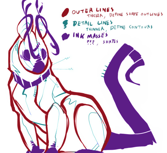
Generally I just think of things “Outer Lines” and “Inner Lines”.
Outer lines are thicker, and define the edges of objects and shapes. They show Silhouettes and Overlapping.
Inner lines are there for details. They show structural elements, shapes, patterns, textures, and contours.
I also just like using large ink masses to show coloration, shadow, and idk other things. That’s not really linework?? I think. but I like having them flow together organically anyway, bc I like the idea of the gestalt play it creates.
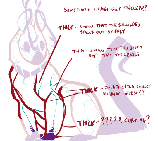
Line Weight and Line Variation and w/e are all big words in linework, but as far as I can tell their rules are all very ambiguous. I like thickening lines to show contrast in how much things stick out, how much shadow they gather, and how clear the silhouette is
Lines are a pretty much?? fictional concept honestly. Most shapes you look at don’t have any ‘lines’, so what you’re drawing is just “points of contrast” and “edges” and “disruptions in visible patterns.” My artistic theory is basically making lines thicker where the contrast is stronger and thinner where it’s less so.

I use inner lines to show the structures of things (as well as play with implying structures that don’t necessarily make sense bc I like that sort of thing) idk anything and I’m really sleepy
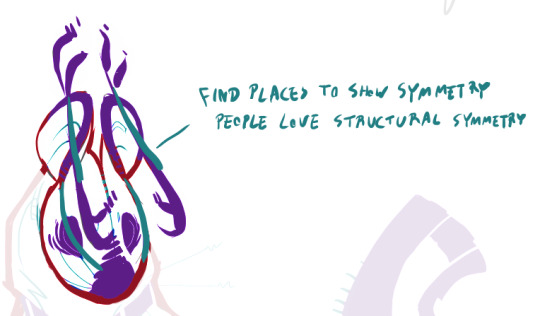
One thing to keep in mind is that if you draw something on one side of something that’s supposed to be symmetric, it’s a good idea to imply it on the other side (and also a good idea to make sure it’s lining up approx right in perspective) I also did this Wrong in my example, since the two lines I highlighted on the face are not eachother’s symmetries, since the right one is the cheek marker and the right is the eyemarker. so woops???
So that’s basically it?? I think. I’d love to talk more later but my lineart is really something that I’m not?? very sure about. I love varying widths and I love using lines like paint and like ink and making messes
One thing that some people notice when I’m working is that I don’t really?? use sketch layers, I just transform them into the final piece, and I end up using a lot of the throwaway lines for texture and flow reinforcement. Honestly I just do this bc I hate Layers and I love things that don’t 100% make structural sense.
Art is an experimental and personal process and I encourage you to use any words I (or others!) say to inspire yourself, try out techniques and see how they work for you, and eventually come up with your own internal formulas!
#Anonymous#replies#what's my tag for these again#I have no idea#tutorial like thing#a significant amount of my style comes from me being angry at teachers being condescending towards people for their art choices#this style I use is primarily made bc my teachers never saw me draw like this#so I wasn't haunted by critique telling me how inadequate I was#a firm believer that the answer to 'why' should be 'because it seemed fun to'
108 notes
·
View notes