#I finished the lineart for it pretty early but then a lot of stuff came up including motivation loss and just straight up getting sick lmao
Explore tagged Tumblr posts
Note
For the requests, can I get a Medkit doodle please?
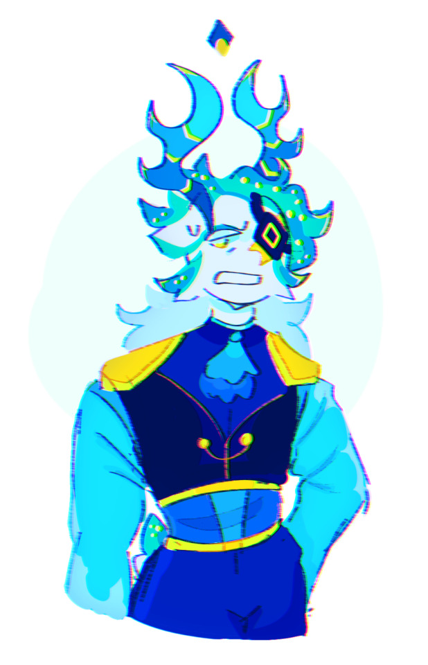
Here ya go :3
#No clue what to comment on this one for#Tumblr murdered my quality#WELL#This took longer to do then expected#I finished the lineart for it pretty early but then a lot of stuff came up including motivation loss and just straight up getting sick lmao#But I finished it :3!#HOPEFULLY I should be able to get to the other ones soon!#I have another comm I gotta finish beforehand but yeah!#art#artists on tumblr#phighting!#phighting fanart#digital art#phighting#roblox phighting#phighting roblox#phighting art#medkit#medkit phighting#medkit fanart#phighting medkit#phighting! art#phighting! roblox#roblox#roblox fanart#my art#ask reply#ask response#ask#Back to my hole in the Everglades I go….
87 notes
·
View notes
Text
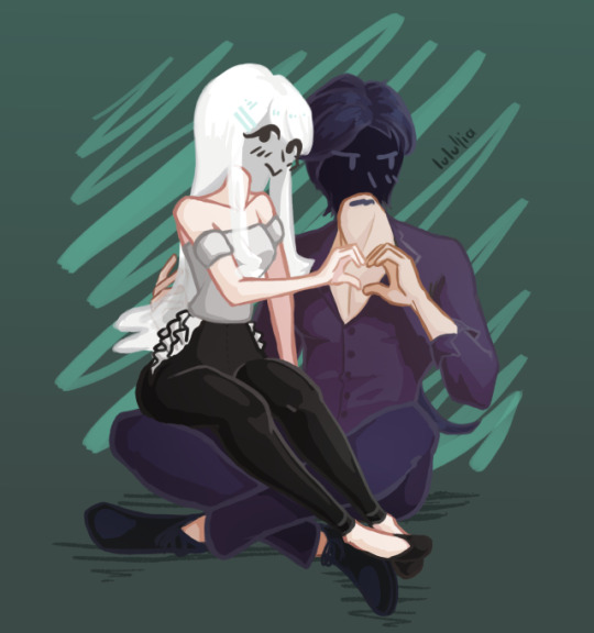
Vladleen Photo | Lyphuriaa
Isn't Lulu so cute?? She probably had to beg for days to convince Vlad to make such a cheesy gesture…
God this one was especially hard, not really because of what I was drawing but because of how. It made me learn about a bazillion things not to repeat ever again.
All things considered though, it came out pretty good! I wanted to give up so many times and there were so many catastrophes I'm really surprised in how clean it looks.
I'm even more surprised that I was able to push through and bring it to the finish despite it all, it's something to celebrate ;-;
A lil' summary of what this piece taught me ⤵
I really need to study the rest of the human anatomy. The legs were difficult, the feet too. I only realize this now because I mostly draw torsos and simple poses. Also, first time I draw characters interacting – it was fun but it's really something I need to practice more!
If I plan on using the sketch as lineart, please for the love of God use an opaque brush. The amount of time I spent fixing the lineart because it was semi-transparent, I might as well have drawn 3 layers of proper lineart.
Keep an eye on the background color. Because of some transparency stuff, I didn't realize some parts of the drawing only looked right with the current bg color – so when I thought I was done and changed it, I stared in horror at the ugly artifacts all around the drawing. It was painful to fix.
Sometimes it's easier to just draw over the sketch, taking the lines I like, instead of cleaning it up. Because using the sketch layer – especially with an opacity brush – leaves around a ton of barely visible artifacts. I had to "select opaque" to see them and clear them out, and it was also painful.
Generally, going into a drawing without a plan for what style it's gonna be is a bad idea and results in a lot of problems down the line.
Better fix any problems I have with the drawing as early as possible, because I'll end up fixing it anyway, only if I'm too far in the process it'll cost me more time.
I need to stop drawing too detailed an anatomy if I know it's gonna get covered by clothes anyway… T-T
Phew, I'm still shocked that I managed to make a decent piece even after all these problems. Somehow I feel pretty good about it, I think the joy of seeing it finished made all my bad experience with it go away.
It's great, especially since I've been struggling a lot with self-doubt about my creative projects recently; this shows me that no matter how crappy something seems to be, if only I push through and finish it, all that bad energy turns into incredibly good feelings of accomplishment and pride.
Hope that's useful; now I really want to make a mini story game and see how it turns out…
#lulullia#artists on tumblr#art#lyphuriaa#vladleen#illustration#cel shaded#drawing#i feel good about it
3 notes
·
View notes
Text
Process Breakdown: Starfall
Since I got some positive responses to my question on process stuff I’m gonna do a behind the scenes breakdown for my most recent piece to help people see the process I use and how I problem solve. I didn’t plan to do this initially so I won’t have a ton of process shots but I did save a handful. There’s a few scattered hyperlinks to other pieces I reference too. Just a warning this is mostly train of thought so it’s super verbose.
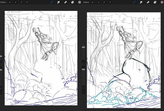
So base sketches were mostly focused around me defining the shape of the girl since she was the focal point and building the environment around her. Going in the things I knew I wanted were a girl precariously balanced on top of a massive capybara catching a falling star, while surrounded by smaller sleeping capybaras on rocks. I layered out a general forest scene surrounding it but didn’t really commit to much in the sketches. Messed with the angles of the large capybara a few times to make it feel less flat and more 3D in the space, used a lot of reference photos of capybaras and sorta simplified them to what I thought was cute/ what stood out to me as their defining features.

Skipping ahead a solid amount is midway through the initial lineart, with some areas just colored in to define them as separate. Initially this piece was supposed to be in a similar style as my “Stratosphere Dreaming” art, with a single uniform line thickness, bright colors, and no gradient shading at all, but I realized pretty soon after I finished the lineart and started coloring that I had done what I tend to do a lot and made it too complex to pull off successfully in that style so I had to pivot to using gradient shading and other non-cell style techniques (though you can see a lot of those methods still in the coloring of the girl). This caused an even bigger challenge as I was drawing on a large canvas with high DPI in Procreate which resulted in me having a cumulative 50 layers to work with at any given time (hell).
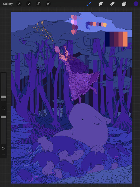
Now once I made that rendering style pivot is when the really hard part began, and why on top of my persistent arm injuries this took me about two months to finally finish.
1.) I had an extremely difficult time trying to figure out the color pallet for the piece. I had an idea of the values and general colors I wanted (you can see some pallets and random base color tests in the image above) but I just couldn’t get them to look right and I became extremely more aggravated as I kept trying new and different things. My biggest mental block was feeling like I was stuck trying to make the initial pallet idea work, but eventually I was able to bump it to a slightly adjacent pallet and it worked far better. Essentially a lot of angry experimenting and testing.
2.) I made the piece too complex for its own good when it came to the foliage and scene. After finding success with a very specific way to render foliage in one of my favorite pieces I started to use it as my standard, but that standard started to show cracks when I had foliage heavy scenes like in my Hollow Knight piece from last year. The rendering style became insanely too time consuming, and incredibly distracting when used in abundance, taking away from the focal point. I knew this but I still attempted to use the same style to render the foreground foliage MULTIPLE times in increasing states of frustration until I stepped back, evaluated it wasn’t working, and tested out a very similar style with the same effect but that I could throw together twice as fast without the aggressive distraction and minuscule details that were irrelevant in the scheme of the art. This frustration in the rendering not working was only exacerbated by the color pallet indecision making a lot of the attempts just look bad both color and style wise.

Due to the limited layers I had to finish rendering out the girl very early and merge her together to free up layer space, and couldn’t keep my lineart layers as separate as I would have liked to allow for quick line color swaps. She ended up being a key point in defining the rest of the color pallet of the piece. The dress shape was indeed inspired by the Lirika Matoshi strawberry dress, but with my own twist.
Once I got a more solid color pallet down the rest started to come a lot easier and I was able to begin filling stuff in and doing general color adjustments to make the backgrounds darker and give it more depth. I don’t have any more process shots beyond the initial color pallet exploration unfortunately, but the last hurdle I hit was at the very end once I was doing final touch ups. I found that with the only light source/ lighter color being the falling star that it washed out a lot of the rest of the pieces and made the details I spend so much time on feel unnoticed. I found though that adding the bright orange stardust specks into the trees, the girls hair, and falling from the star itself gave the last bit of color I think it needed without completely destroying the atmosphere. Originally (you may see it in some of the process shots) there were going to be jars with stars already in them illuminating the bottom of the piece, but after multiple trial and error iterations it just didn’t work out and ended up taking the focal point away from the girl and the star too much so I scrapped it.
Finally once I got everything done I made a copy of the entire art file to save as a backup, then with one of the copies merged all the layers together. Once all merged I made a copy of the fully merged layer, and went and adjusted the entire layer copy using a Gaussian Blur, reduced the opacity of the blurred layer to a super low percent, and put it on top of the original merged layer. This gave it that ethereal sort of feel that is difficult to notice unless you zoom in but really helps soften the piece and make it more dreamlike overall. Then I merged that blur layer down, and turned on about a 3% noise layer on it all to give it a bit of texture.

But that’s enough rambling from me, hope this helps give a bit of background to my process and decision making and it wasn’t just a wall of random musings.
My last piece of advice is if you’re looking to do art professionally, do commissions, or make a lot of pieces in a short period of time I would highly advise against directly copying techniques I use. Because while I’m always working to improve I do only do this as a hobby rn so I have the luxury of being able to invest a lot of time, energy, and details into higher complexity pieces that would take way too long in a professional environment. I can put a lot of time into making a single piece exactly as I want it since I’m not reliant on art as my sole income. As I improve I can make things faster, but it’s still an overall slow process and I just end up moving my quality standards up with any level of improvement anyway. Use stuff I do as inspiration but I cannot stress enough to learn as many shortcuts as possible (I’m still struggling with this myself).
If y’all have any questions about bits feel free to dm, if I do something like this again I’ll try to get better screenshots during the process n try to be less verbose.
52 notes
·
View notes
Text
“LET US SPEAK OF THE TERRIBLE BEAUTY OF BECOMING OURSELVES”
Illustrating Destiny’s Books of Sorrow with community artist Francine Bridge
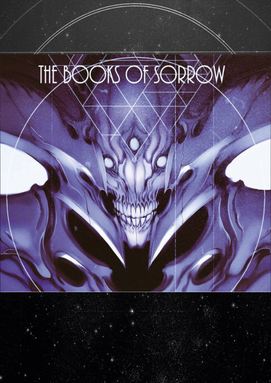
One of the most impressive Destiny fan-projects we’ve seen to date has been Francine Bridge’s incredible illustrated rendering of Destiny’s Books of Sorrow. Francine, otherwise known as Witnesstheabsurd, agreed to take some time to answer a few of our questions about her work, its impetus, and what the project means to her.
Written by Seth Dickinson, the Books of Sorrow tell the story of the Hive - and by extension Oryx and his siblings - and give deep, rich background to one of the game’s largest and most important conflicts. Lyric and evocative, the books offer insight into both the Hive themselves and the universe they inhabit, and remain Destiny’s most impressive and most in-depth piece of lore-building. For those who may have joined the community in Destiny 2, or never had the chance to read the original books, they can be read in their entirety here. Francine’s project shows the same impressive attention to detail, and most importantly, the same level of empathy as the works that inspired it. We’re ecstatic to be able to share this conversation with the Destiny community, and we hope you’ll take the time to admire the full project.
You can find Francine on Artstation, as well as on Twitter and Tumblr.
Written in Light: To get things started, tell us a bit about yourself. What you're studying, what field you work in, what you like to do for fun - give us a brief summary of who you are and what's important to you!
Francine Bridge: HI! I'm Francine, although I'm better known online as Witnesstheabsurd. I work as a freelance illustrator and concept artist in the UK - you might have seen some of my work in the game Hiveswap or at labels like Killstar. I do album covers, shirt designs, character/monster etc design work for games, comics, private clients. I'm currently in my 4th and final (I took an extra sandwich year to do a supplemental diploma in professional studies) year of my Illustration and Visual Media BA degree in London, after which I'm probably going to look for more permanent studio/contract work rather than the one-off freelance stuff I've been pursuing while I've been in school.
A couple of years ago, prior to starting the degree, I came out as a trans woman, which is probably an important detail, and it's informed a lot of my work. However, my driving impulse has always been monsters - my preoccupation with Destiny started entirely because a friend of mine showed me screencaps of Oryx after the The Taken King release and I was smitten. Pretty much all of the media I consume, the games I play, the art I create is in pursuit of ever greater or more unique creature and monster design, and they're very dear to my heart.
As far as what I do for fun - my day is 90% working at the tablet, but I find time to play some games and build "gunpla" model kits as well as paw through my artbook collection. Almost everything I do is informed by my profession, so I use my hobbies as a means to access and process more referential or inspirational visual material or techniques. I only recently started sincerely learning how to actually "paint," rather than just do some basic rendering under lineart, so that's been a major part of my work lately.
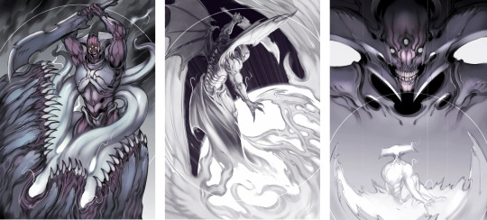
WiL: Was there anything in particular about Oryx that really drew you to him? Did Oryx come across as particularly great and/or unique to you, or is there something else that struck you with his character or design?
FB: Well, as I said, I'm transgender. In the ‘pitch’ my friend made to me about Oryx as a character, the most interesting aspect to me was that he's a transgender man (although I'm a trans woman, the experience has some shared parallels obviously).
In media, it's incredibly difficult to find trans characters not wholly defined by that aspect of their identity, or who aren't constantly wallowing in the Misery and Tragedy of being trans. I want trans characters who occupy all roles - villain, hero, supporting and main - and it's rare to find anyone who's more than a token or like, tragedy porn. Oryx super resonated with me because he was this figure who acquired power and immediately transitioned, asserting his identity in a way that couldn't be defied - Oryx's story is very much one about self-definition and the value of existence under your own terms, which are very important concepts to me.
When I decided to start work on illustrating the Books I actually reached out to Seth Dickinson, the author Bungie contracted to write them (and the Cabal Booklet/odd flavour text, by the way) to get some specific questions answered and he was kind enough to respond and was very cooperative and supportive. Among the things I asked about I wanted to know if Oryx was consciously written as transgender character or if it was just a coincidental "weird alien race" flourish. I was very happy to learn Seth had purposefully written Oryx that way, and that he was happy people took strength from it.
It's very novel to have, like, a "trans power fantasy"... a character who acquires absolute power over the self and instantly rewrites the contract between themselves and their body that so many of us spend our entire lives making adjustments to and renegotiating for some measure of peace. It was satisfying, refreshing.
Oryx is super cool to me on multiple visual levels obviously as well, being a mineral-encrusted deep space insect mummy warlord, but that element specifically sets him apart for me, and always will. It's cool to know that a trans character in Destiny can also be a hideous monster from beyond the stars.
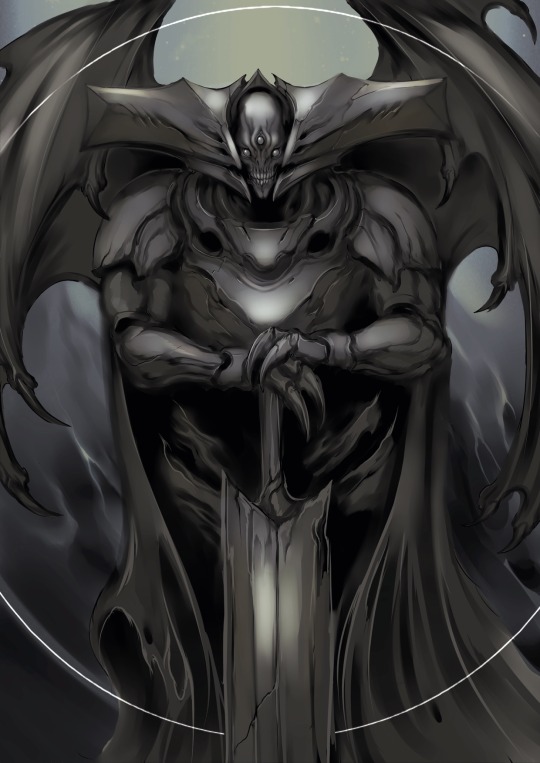
WiL: Nice! I've wondered if Oryx was intentionally written to reflect a transgender person. I'm glad to hear a positive answer to that question, and I'm glad you found strength in it!
My next question is, why did you decide to take on this project? I mean, it's very clear that you love Oryx, so that factor is a given, but you mentioned in your original post that this was something you did for your degree. Care to elaborate on that?
FB: So, the structure of my illustration degree is such that while we’re given specific "briefs," such as topics or techniques, the final year gives us significantly more free rein. We're obligated to complete three "projects" and author a thesis over the course of the final year, but the subject matter, material, everything about those projects is our call. The outcomes are judged based solely on technical and professional development rather than adherence to a specific brief.
This left the field wide open for me to kill two birds with one stone and bring in a project I had intended to do anyhow, but hadn't had the time or space for; something that I was sincerely passionate about rather than an edict handed down by a tutor. Illustrating the Books of Sorrow was something i'd wanted to do ever since I first read them back in The Taken King, and I jumped at the chance. In addition, while i've produced and formatted artbooks before (My first published work, The Occult Supergiant Primer, can be found here ), I've been able to recoup the time invested away from client work in sales and funding. The Books are obviously material belonging to Bungie and I can't justify selling copies, digital or otherwise, of my illustrated version, so I had to find some other reason to make this investment of time and unpaid work worthwhile as well as enjoyable.
Being able to use the work produced to further my degree was the perfect "excuse.” That said, I've received so much attention from the Destiny community at large, including commissioned work from several new clients, that it would have easily been worth it regardless.
WiL: Your work definitely deserves the attention, you clearly have a strong sense of design! Would you be willing to tell us a little bit about the process you went through to make the Books of Sorrow? Do you have any early versions or storyboards that you'd like to share? Or did any of the illustrations go through any major changes from start to finish, and would you be willing/able to show us that process and talk a bit about why you made the changes you made?
FB: The greater part of the Books came together incredibly smoothly and naturally, with very little iteration required on specific pieces. The images had been stewing in my mind ever since I read the original verses a few years ago and they were more than ready to be rendered. What did require a lot of research, development and false starts were the designs for the sisters, Savathûn and Xivu Arath. Both of them have yet to appear ingame in any major capacity (although it's looking likely Savathûn is going to be a Year 2 DLC), so it was up to me to create designs for them that:
Satisfied the descriptions appended to them in the verses, as light as they were, and also matched the info Seth gave me
Satisfied my own personal expectations and interpretation
Conformed to the lore and the existing known morphology of the Hive in a way that would make them recognizable to a player with no prior familiarity with the Books
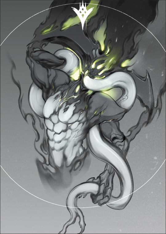
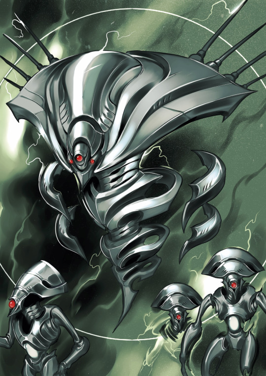
Balancing these principles lead to a lot of internal back and forth - Savathûn was easier because we had already seen her brood in D2 on Titan, so I knew to emphasize ornate crests, bonelike texture and a slightly less mineral, more biological look by comparison to Oryx's brood, the hive we exclusively encountered in D1. She was tough at first but ultimately fell into line with something satisfying for me, which actually drew a lot from the Xenomorph Queen in Aliens.
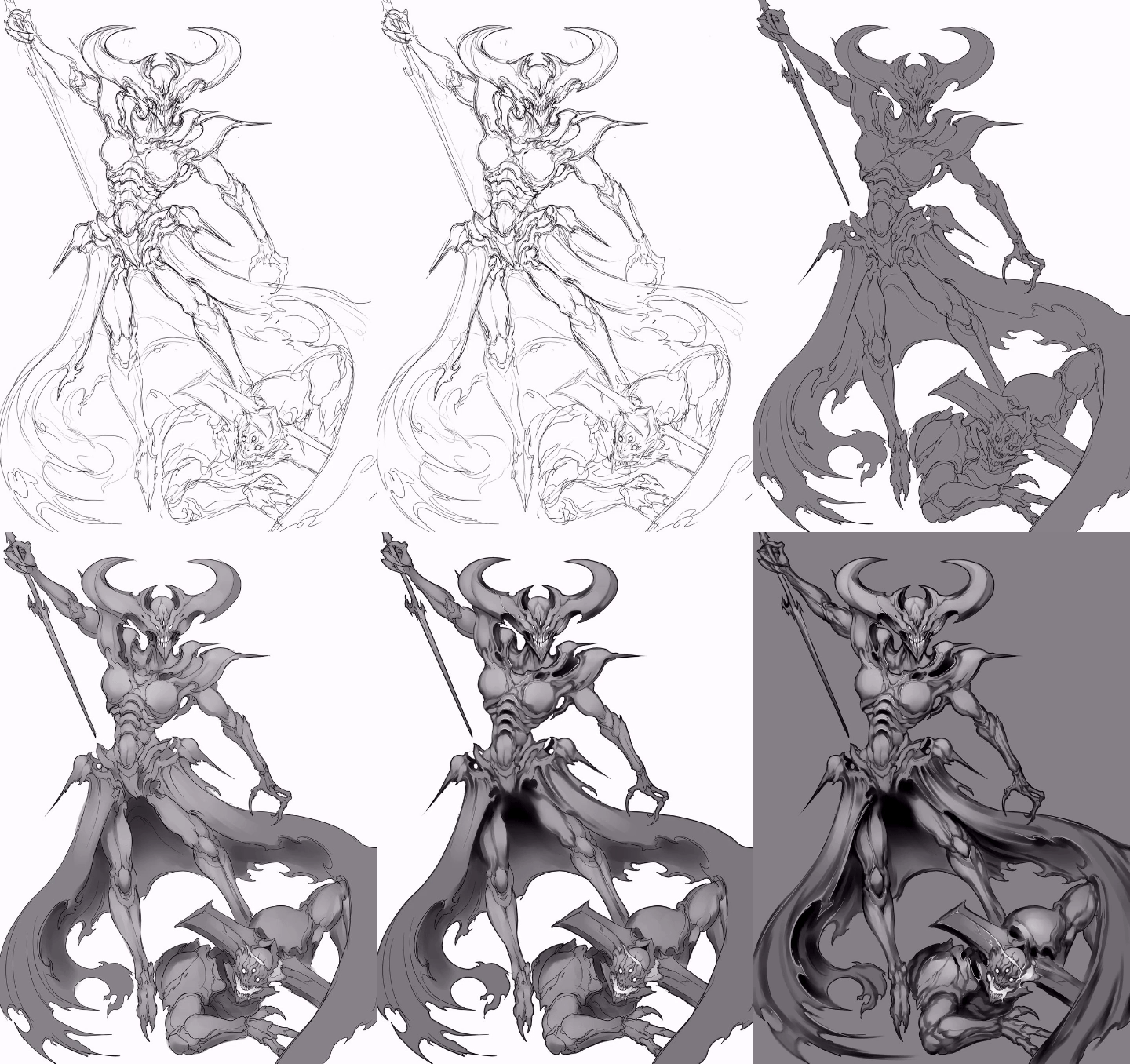
Xivu Arath was a little trickier because she had to be distinct from Oryx, who kind of already occupies the "big mineral/bone-encrusted bruiser" archetype visually, so I had to take her even further. I spent a lot of time wondering whether she would have any ornamentation like some of the bigger Knights (Alak-Hul comes to mind), given that she represents the "ultimate" Knight morph, but I eventually eschewed all decoration in favour of something reflecting her nature in the narrative: blunt, implacable, spartan. She dispenses with the ritual and hierarchical trappings the other siblings indulge in - notably she decides that all battlefields are her Court, rather than entertaining a court herself, and she tends to default to just brutally bludgeoning whatever stands in her way rather than making an appeal to the Deep or engaging in trickery. I was very satisfied with how she turned out, and the piece featuring her is easily one of my favourites.
WiL: I was going to ask which piece is your favorite! Do you have a Top 3 that you're most proud of?
Is there anything about the Books that you wish were different, or is there something you wish you had the opportunity to draw for this project but couldn't justify including it?
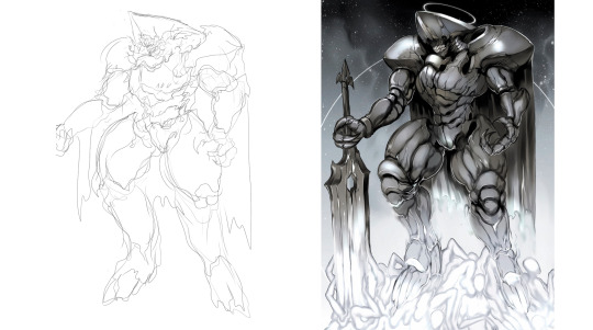
FB: I have a strong tendency to favour whichever the last piece I completed was, because by default I'm always proudest of my most recent work and very rapidly lose favour with pieces even like, a week old. That said, I think overall the strongest piece for me personally would be Oryx slaying Akka, alongside the final Wormfood painting and the Savathun piece, although honorable mentions go to Xivu Arath and Quria, Blade Transform.
I can't say there's anything about the Books specifically I wish was different. The part of me that's purely consuming it as a narrative wishes that they had found Taox, that there had been some confrontation there. I feel like there's a very strong "childhood vengeance" element to the Taox subplot, like when you're put down by an adult for drawing in class and you fantasize about coming back to the school years later as a wildly successful artist and making them admit they were wrong to have stopped you. A key part of that fantasy is recognizing it as a remnant of childhood, this impulse born out of a narrower perspective and inflated self-worth, and realizing you can move past that shit (Although if/when I do become a wildly successful artist there might be a few teachers I'll look up).
Ultimately, I think the arc of the books and what the story is trying to say about distortion of intent and self makes Taox disappearing a much more emotionally resonant and interesting turn. It would be neat if Taox turned up somewhere in-game, and became the focal point of a new Hive offensive. An entire species/culture with such a specific individual grudge is a fascinating concept.
With about a month and a half of time allotted for the project and 50 verses, there was a lot of stuff I had to cut despite how much it hurt - in a complete version I would have wanted a painting for every verse, but specifically I would have liked to draw Akka in full, the Dakaua War Angels, the Harmony/Gift Mast, the Qugu; basically I would have given form to the many species and cultures Seth conjures up with a few phrases and a loose description but still manages to make incredibly evocative.
WiL: Do you think you'll ever return to the project and draw those images, either as standalone pieces or as an update to the PDF you've already made?
FB: An update to the .pdf itself is unlikely. I tend to consider projects released to be complete, and usually by the time I revisit a subject I'm not obligated to work on it will have been a few years at the very least. I tend to have developed my technique and approach enough that new pieces inserted retroactively would look somewhat disjointed in terms of quality and style. The chance of releasing standalone paintings - especially of points of specific interest for me like say, Akka in his entirety, the Dakaua war angels, the Qugu, etc. - is significantly higher. Whether that happens sooner or later depends entirely on what my current workload looks like, and aside from the incredibly generous and supportive response to the project from the larger community the Books are very much a passion project and have to be weighed against, say, contract or school work going forwards.
WiL: That makes sense. What other projects do you have going on right now, if any?
FB: Just this morning I decided on the subject of my final degree project, which I'm also planning to run as my second artbook with an accompanying Kickstarter and print run - something I can actually sell as well as being material that excites me! It's entirely too early to disclose any specific details about it though.
Other than that, I continue to produce odd pieces of fanart in between a regular flow of client work both from private individuals and studios. I guess I can safely say I'll be doing more work on the second Homestuck game after contributing to the first, as well as doing some designs for a music video I was contracted for, and also finishing my thesis for the aforementioned degree.
The key thing, I think, is to keep moving - I get very anxious when I'm spinning my wheels between projects, and the temptation to linger on the threshold a while longer is incredibly strong, especially when there's always the fear your new work will fail to surpass what's come before. Reaching a personal peak like some of the paintings I did for the Books of Sorrow is a double-edged sword, and it can signify both a great accomplishment and a raising of the bar that can be daunting to follow. I'm confident that whatever you see from me next will manage it, though!
WiL: Believe me, after talking with you for a while, I'm confident your next project will meet your expectations. You are a very talented and very ambitious artist, and we can’t wait to see where your career takes you! It’s been a pleasure to talk to you, and we’re looking forward to your next Destiny passion project.
//
This interview has been edited for length and clarity
All images courtesy Francine Bridge
#destiny#destiny the game#bungie's destiny#destiny lore#destinylore#destiny fanlore#destiny fan lore#destiny community#destiny art#destiny fan art#destiny fanar#destiny the zine#written in light#unknownkadath#witnesstheabsurd#the hive#destiny hive#oryx#destiny oryx#xivu arath#savathun#the books of sorrow#the taken king#destiny 2#monster art#monster artists#sci fi monsters#sci fi art#sci fi artists#artist interview
546 notes
·
View notes
Text
AMA Transcript: Simple Melody
For our final AMA of Resbang 2017, @alliope, @bbbutterfingers & @daciafu stopped in to answer questions about their Resbang, Simple Melody! Here’s some of what went down:
Q: My first question for Allie is what inspired you to do this AU?
Allie: Well I've generally had the idea for an Over the Garden Wall AU for a while, not necessarily for SE, but as the first check-ins deadline was approaching I ended up rewatching bits of Over the Garden Wall and it just kinda clicked? Mainly I think it came from Crona's betrayal and Beatrice's betrayal and everything fell into place from there. I thought the eerie atmospheres would work well together! So I ended up scrapping my previous idea and wrote 3k plus a summary like three days before the first check-ins, rip.
Q: For butter/dacia, what went into how you decided which scene(s) to art?
butterfingers: HM well there was some chitchat when we started about what kind of work we wanted to do and I said that I loved the Boom comics covers, and then I shouted WHAT IF I MADE COMIC BOOK COVERS! and I think Dacia went WHAT IF I DID BACKGROUNDS and I guess we just approached it as if we were doing something comic-y haha!
Allie: You two were the power duo.
daciafu: I've always been in love with the style of the backgrounds of OTGW since that's where all those cozy and spooky feelings of fall and the Unknown really shine and I'm honestly HORRIBLE at designing backgrounds so I wanted to take the challenge and push myself to get better! Mimicking other people's styles really helps me break down how they make their choices and teaches me how to make things look Decent so I was super hyped to pick up the OTGW style! And then when Butters and I were trying to figure out What Do and she said she wanted to tackle covers, I decided to do background-heavy scenes. 😊
Q: What is generally your guys’ process (writing for Allie and arting for butters and dacia)?
Allie: Well, I wrote in little scenes, like I would get an idea for a scene and just go for it, the fic wasn't at all coherent until maybe a few days before posting. This actually posed a problem since linking scenes took longer than I thought it would. Because I had most of my scenes written, I thought I had more finished than I really did. By the end of Resbang, I had 56k written but only 20k remotely post-able. I'm a super obsessive planner though, so my whole fic was outlined in detail early on, which was nice cause I knew what I was doing lol
butterfingers: I loved going through Allie's notes, I was always excited to see how they'd connect the dots! My art process is as follows: scribble something, put it aside, look at it a lot throughout the day with the thought that maybe I can surprise myself into seeing something new, find something I hate, fix it, rinse and repeat. For this project I actually... have a friend who works with Boom Comics and she was able to hook me up with a nice little gallery of illustrations for the OTGW comic so I got to go through and put together my mood board for it 😊
daciafu: I read over the gloriousness that was Allie's draft and immediately picked out some neat scenes or wanted to reimagine the classic OTWG ones. I spent a lot of time studying first! Looking at the art books, and poring over the show’s scenes and kind of getting a feel for the color palettes, textures and compositions. Then I watched a tutorial on Youtube where someone just deadass uploaded their painting process on a piece of official art that made it into the show. So that was EXTREMELY helpful to watch the way they painted back-to-front and kind of blended the planes without like, losing depth?? The internet is so, so wonderful. And then I got to work! Started with a soft brush for lineart so it wouldn't be too prevalent, moved onto base colors, then shading, and then really trying to establish textures and make the atmosphere Just Right(tm).
butterfingers: Genius!! Oh damn that sounds like such great advice vis à vis backgrounds. /takes notes
Q: You sound like the dream art partner Allie, I weep for my artists and my last minute HERE IS 10K I JUST TYPED UP BC IM A MESS.
Allie: Ahh geez, these two were the dream partners honestly, like I'm so glad they could gather stuff from my notes, cause I've always got everything together in my head, but then it gets out there and it's a mess, these two deserve all the love.
butterfingers: There was one thing I regret that I didn't have the chance to draw and it was like a throwaway line somewhere in your notes about Maka presenting Soul with a praying mantis and him freaking out. I resonated with that so hard hahaha.
Q: What was the hardest scene for you to write?
Allie: The hardest scene to write that's actually posted was anything with Justin really, I don't get his character and it was tough to write him. There were a few scenes that were hard to write because I rushed them, but I wouldn't say they were genuinely difficult scenes, I just gotta rewrite 'em! But overall the ending scene I'm still struggling to write and there's a dream scene that occurs which has been difficult to write just for making it dream-like enough?
Q: And what was the hardest to art? :o
butterfingers: I had a hard time with Maka's expressions. I had many scribbles designing a Ragnarok lantern, too, but it was very fun!!
Allie: Your design for the Ragnarok lantern was so good, I still cry over it.
butterfingers: Ahaha thank you! He was very Calcifer inspired ;)
daciafu: I struggled quite a bit with the first one I painted, just because it was all so new to me. I had to base color 3 different times because the soft lineart bothered me if something extended too far, or there was white background peeking through. And then reimagining the texture in the leaves and the ground to try to separate the planes there but also wanting them to be cohesive was a bit of a headache. If I had to go back and do that one over again I think I'd be more prepared to deal with the foliage lmao.
butterfingers: Your textures were very excellent, that was a quality I struggled with as well!
daciafu: The first one I painted was the Golden Light scene where Maka and Soul are leaving the woods and entering the fields.
butterfingers: Trees r hard.
Allie: They all came out so incredible though, I'm in awe of how you were able to create those leaves.
daciafu: Omg ;;;;; At the same time trees are so organic and flowy and the chances of getting them wrong are pretty slim considering they can get janked as hell lol they're super fun to just zone out to. "I’ll just put a happy little leaf here, ooh and how’s about another one right next to it. They can be happy friends. Oh look, the squad showed up!!" Channeling my inner Bob Ross... but yeah you can just do whatever with them and they somehow come together.
Q: Daciafu how do u.....background, like you did so well and all I hear from art friends is various levels of pterodactyl screeching when the word background is mentioned.
daciafu: I heavily based the Leafing the Forest scene and the church scene after stills from the show so I don't get composition points there, but I built the pumpkin fields just based off of the environment’s design elements. I really wanted to push the depth of that scene but also give it that same never-ending quality to it, and I'm super happy with the results. Another note is that I omitted the characters entirely while building the backgrounds. Since I'm usually a pretty character-heavy artist, I wanted to tackle it like I was preparing the scene for an animator later. And then once they were done, I added in our sweet kids. Doing it that way first really helped to cement the characters in the space rather than my usual "character is done, how can I put them in an interesting physical space?" struggle lmao.
Q: Did you guys feel like your writing/arting changed at all or that you learned anything/picked up new skills/honed old ones etc. etc. during Resbang?
Allie: Gosh yeah, it changed a lot. In hindsight a bad idea, but this was the first fic I'd ever written with intention of posting and the longest piece I'd ever written. Before this I had written very little and my longest piece was maybe 10k. Throughout Resbang I've learned most of everything from the ground up, it's taught me a lot about my limits, how I work and writing in general. I've definitely improved a lot from the experience!
butterfingers: Let me tell you all about the airbrush tool that I discovered during Resbang. Amazing. Incredible.
daciafu: I learned how to paint backgrounds!!! Which is something I've always wanted to get better at. And I got super comfortable in Clip Studio (I'd just gotten it) as well as using texture brushes, so overall it was a very helpful and wonderful experience as a Resbang participant and as an arteest.
Q: Oh that reminds me butters, what program do you use?
butterfingers: Paint Tool SAI for the most part, and then Photoshop for color correction, borders, and, like, finesse things! :)
Q: Did you guys listen to any music that inspired you or helped you create?
Allie: Ah, yeah! I had a playlist actually! https://www.youtube.com/playlist?list=PLjTCaFkFU6rkD1edJwCZmHvJiUwlSUeGZ
If you want I can explain some bits of it? I use music a lot when writing aha. I like to associate certain songs with characters and character relationships, so most of the songs are connected to a particular part of the story. The Monroe Transfer, Wayfaring Stranger, and Mountains were all more general atmosphere stuff. Blame was very much related to Maka, which may not be apparent now, but yeah. Ragnarok I actually connected a lot with Willow Tree March. Soul was probably closest with A Lady. Crona had a lot of songs, but Neptune was most specific to them, as was probably Ghost Towns. Some character relationships I associated with certain songs, Crona-Ragnarok and Soul-Maka were both pretty connected to Always Gold, especially that dang last line "there were holes in you, the kind that I could not mend" oh man. Crona-Maka was definitely We Could Be Friends, Bloom, and Spell. Meet Me in The Woods I thought was a pretty good group song! Those are just some general bits of my thinking with the music aha.
daciafu: Definitely checked out Allie's dope playlist. For most of my working time, tho, I was either listening to TAZ: Commitment or MBMBaM oddly enough lol. I will forever think of Justin's uproarious laughter whenever I look at them lmao.
Q: Were any of the relationships difficult to characterize?
Allie: Mmm this may sound weird but early Maka-Crona was weird for me, cause they were kinda at that point where they want to (or at least Maka wants to) like each other, but they don’t like or trust each other at all and it's a weird spot for them. I'm used to writing them as at least interested by one another, if not enemies or already fond of one another, so this felt like a very odd place to start with them.
Q: Do you guys have future plans for writing/drawing? Aside from polishing and posting the rest of the fic!
Allie: I have,,, too many plans,, I need less plans,, someone please take them away from me, I can't be trusted with them,,,, I do want to do a sequel for this when I get it finished, playing on the detail about crows memory lasting five years so. Beyond that I have a SoMa fic to finish for the prompt challenge!! I'm working on a gift for Crescentcrona, which is a fantasy Kirona fic called Eat The Rich. I have polyam week fics that I'm cleaning up, I think my favorite so far is a Azusa/Naigus/Sid/Mifune one for Through The Seasons. And God I have so many CroMa fics I want to write, I gotta fill the AO3 tag. I think the biggest one right now is a wings-related soulmates au that I've been working on on the side since October I think?
daciafu: Yo there's one scene that I'm like sUPER hyped to do if Allie does the sequel because I already know exactly how I wanna draw it but I wasn't able to fit that in near the end, and it didn't end up in the first part. But there are a couple of other scenes Allie and I workshopped that would be super fun to do and I would love to draw them. Other than that, my drawing plans are pretty much working on commissions as they come in. Surprisingly my queue has been maxed out and I just got a full time job so of course now I'm like.... hm.... I'll get 'em done eventually!!
----
That’s the end of the AMAs for the 2017 season! Thanks again for reading along with us, and see you next year! :)
7 notes
·
View notes
Note
Tell us about how you got into art.
WOW this got super long, I’m so sorry!
I was given a metric assload of coloring books, glitter crayons and stuff by my grandma when I was a kid. I don’t remember ever starting, it’s just always been like that. Also I really liked Pokemon, like REALLY liked it, like any other small child in the 90s. So I had some established characters to draw, like pikachu and eevee! Those were my fave to draw. Any I just never really stopped.

Luckily my elementary school still had an “art class” back then. For one whole year it had an actual room, but then it was just a little cart pushed around. Nothing really groundbreaking, but since it was fun and I liked it (and was proud of being “better” than everyone else there) it just kept going. it was really just a bunch of kids scribbling stuff with very little direction.
My art tteacher gave me a book about drawing things realistically. I really read that book and took it all to heart. Except for the grid thing, I thought the grid thing was stupid because all it let you do was COPY a photo, and I didn’t WANT to COPY! I wanted to make my OWN stuff!

I dont remember, but I think it was in first grade, maybe before that? Maybe after idk but it was really early on. I wrote stories about a wolf who’s name was Fear, and she was a pup when the forest she lived in burned down, and she got separated from her pack. So she ended up having to traverse the desert and run into other packs who wanted to use her in different ways (usually as a disposable labor or to watch the pack’s pups while their mothers went to have fun and stuff like that) and she would have to fight them to keep going. And so on. It was pretty in depth but I never actually got them on paper except for some shitty doodles.
Here’s a quick rendition of her from memory I made just now, using some free lineart. It’s probably missing some aspects of her design, but the main thing was that she is orange, had the dark stripe, and a white tail-tip. I know, looks like a fox. Of course my actually drawings of her were crude and done in crayon.

I really liked wolves. A Lot. So Much. I guess that’s probs why I’m a furry?
Similar to that time, like at the same time as Fear, I was makign my own TCG based on my own pet-sim website (heavily inspired by neopets and one gem-creature that i think was on a yugioh card). I made a “functioning” website in front page, it really just made me happy to click through on the previews and do pointless stuff that didn’t actually DO anything because it wasn’t a live website. But it was cool and fun. I made a lot of websites on front page lol. A LOT.
I made custom buttons and graphics in Paint and just came up with all this shit to “do” and ran with it. I also made some sites that were like, just really bad personal homepages. But I was also like somewhere between the ages of 7-11, I don’t remember what age specifically? BUT anyway frontpage is really fun to work with and I basically know all of my HTML and CSS from that and neopets.
What’s really funny is… I never had a home computer! I didn’t have computer until like 2009, and we still didn’t have internet at home until like 2013-ish. I might be off on those dates a bit but you can’t expect me to remember specifics when I struggle to remember things that happened yesterday lol.

Oh yeah I found Jay Naylor art and a comic called Good Cheese and accidentally got into furries bc of it, and yeah some of it was porn and my POOR LITTLE CHILD BRAIN COULDNT HANDLE bahahahahaa im fucking kidding, it WAS porn but it’s cool and I don’t think it really damaged me. I thought it was ~wrong~ but I still printed that shit out in black and white after school to take home with me oops.
Like RIGHT after that I got into Redwall and Serenity Rose. Redwall has this huge roleplay community online, it was really cool. i never had the guts to RP tho, so I just looked at pretty art and tried to emulate it. I made my own OCs and stuff. With Sera Rose I entered my first foray into online forums, the Bubblegum Noir. Where I posted doodles I did. I was also a really fucking obnoxious teenager lol. This was middle school bee tee dubbs.

Sometime in middle school I think my focus shifted a bit from my self-driven and pokemon fuel’d vigor for creating things. I certainly still drew fanart, I got really into anime (kinda, i read loveless and then was smitten by cat eared boys forever after that lol) and started drawing Neopets related stuff by then. (Yes I still plaid neopets in middle school, hush.) I think I scanned some art in to enter into the beauty contest.
Uhm in middle school I was introduced to all sorts of New Cool Tools like BRUSH PENS and stuff! WOAH! But yeah I actually tried to do shit for realsies. I did stain glass cutting and silk screen printing after school. Neato!
In middle school I also had a “running” comic I called My Life Unlimited, and it was like the bizzare megatokyo-esque thing where I drew me and my friends having everyday normal lives. Except my cat was Literally Satan. No I mean like actually, Satan was on vacation in the Real World disguised as a cat, but OFC I found him and was like oh no a poor lost kitty, let me put a collar on him and take him home n feed him. Which, as we all know collars = ownership and eating the food of the land etc etc. Which lead to me owning Satan, literally, who could shift inbetween cat form and human-ish-looking form. Also he couldn’t open the peanut butter once and it became a running joke.
There was this whole plot with angels and demons or whatever and the demons were the good guys and angels were generally manipulative assholes and uhhhh yeah. It was dorky but I liked it. Still kinda do. I dated a “fox demon” in the comic, he had a scythe, it was cool. B3
And uh, I just drew a lot of fanart, fancharacters. My own comic stuff.
And then I dropped all of it in high school, where I only drew furries and school assigned artwork. It was neato, the only thing I learned was about negitive space, lineart quality and VAGUELY hue and value (but not terribly in detail, and it was muddy and mucky). I made an FA account, found artists like CorrieZodori and ForcesWerwolf, and joined the Hungry Pokemon Forums (as a minor and completely ignoring ALL the rules about being 18 or over.) WHOOPS guess I was into vore. No wait, I joined HPF in… middle school I think? IDEK.
Anyway I started drawing MORE furries and more maws. And back then I was like “only oral vore, mawshots or pre-vore, no stomach internals and NO DIGESTION” but look at me now mom, if it aint Dying I ain’t Buying.
Lots of highschool is a blue of bad decisions and general fuckery. I had a cool AP art history class tho. I don’t remember jack fucking shit, sorry.
And uh… that’s where I am now???
Now I’m actually taking art seriously, and with internet access I can look for tutorials and references no problem. I’ve got a few good art books, but mainly I reccomend one by James Gurney called Light and Color for the Realist Painter. Or whatever, I cannot be assed to google it rn I’ve been typing for like an hour. Maybe two… idek. Also some good youtube chanels, sinix design, sycra, istabrak, bobby chiu and ahmed aldoori, really recommend those for learning!
Anyway I’m more aware of my shortcomings, and working hard to fix them, all while still ejoying doing what I do. Although lately I feel like I’ve gone backwards in quality and launched myself into more stress and difficulty. And I certainly do much less, and finish things less also. I wonder why… :T
UHM I’m not even sure if I answered your question i just kinda went on a tangent oops. Hopefully this is an entertaining read if nothing else?
2 notes
·
View notes
Photo


Just some random stuff in varying stages of completeness. The first one dates to...January? February? The other two are more recent.
Anyway, the first one was done sometime during the early-ish edit of Heart of Steel -- I’d introduced two ‘new’ characters, Set and Anubis and was just sort of doodling something out to get an idea of what they looked like. Set was done first, and I managed to finish the picture, but when it came to Anubis, who assumed the role of Lisa’s “stepfather”/father figure (due to apparently Bastet being paired with Anubis for a brief period of time, before Anubis got paired up with Anput and Bastet with Khonsu and/or Ptah) -- not her biological father, and Anubis isn’t married to Bastet any more, but still cares about her and doesn’t like the distance being called ‘Uncle’ implies. I was originally going to have her call him ‘Papa Anubis’ but that got dropped; she just calls him ‘Papa’ (like how her Mama is her mother but not her biological mother; you see, there is logic to this) and I can’t remember wtf his ‘human’ name is supposed to be ninety percent of the time.
The whole thing was me playing with an idea I saw in a video tutorial by Loish, where she lays down some of the colours and shades, merges all of the layers, and then paints on top of it. I did something similar with the Set picture, shading everything as I usually would, then merging all the layers (lineart included) and painting on top of that to do the blending. I tried something more akin to Loish’s usual way for this, got frustrated by having to be stupid careful around those glasses, and gave up. Then it just sat there.
I’ve been meaning to draw the second picture since February, since that was the time I had the dream that originally inspired it but...was dealing with a lot of issues from birth control, because hormones are a finicky thing, and I really think it was fuelling a lot of the depression and anger I had in earlier this year so motivation to do stuff, or like anything I did do, was just non-existent, so nothing actually got drawn until now (I mean I stopped taking that pill back in February but between the edit and now this, time to draw has been pretty nonexistent too).
And, you know, going to see Beauty and the Beast helped, just a bit. Thank God I actually bothered to write out what the gist of the dream was, mostly because this won’t make sense without.
“I had a dream last night about Lisa being from the 18th century.
Details are kinda sketchy because I was thinking about it for a little while after I woke up, such that I can't remember what I thought after the fact and what actually happened?
I actually don't even remember the plot of the dream beyond barebones details, but I have a vague image of Lisa in a robe a l'anglaise like this, maybe in a pinkish colour -- not dark like her usual red. This is sort of what I remember her looking like, although it's not particularly accurate (I imagine for everyday wear she'd be a bit more covered up). To be fair, i barely remember what she looked like so this is more a shot in the dark than anything.
But basically, her mother was (I believe) one of the slaves of Martin Harris (who looked basically the same as that picture but with longer hair and...you know...18th century clothes), although I don't remember her actually showing up in the dream. But basically Lisa was understood to be Martin's illegitimate daughter, as she is canonically, except in a time where that's actually kind of a big deal and could affect your prospects in life significantly. Martin raised her as a free woman from birth, that I remember.
I think she had all of her powers and such too, I can't remember.
I just remember...some...stuff...happened, and then Stephen comes along looking to do business with her father and he's all 'heyyy sure, if you're serious about this deal you can marry my daughter here and our companies can be joined that way,' and he did. Which doesn't sound terribly romantic but such was life back then. And then I can't remember much else besides that.
The concept reminds me a little of the movie Belle, and now I feel like I should watch that or something. It was an interesting dream. I should get back in the habit of writing them down again -- I had more vivid dreams and better recall when I did that...it's just that it's an absolute bitch to do when it's three in the morning and you want to try and get back to sleep because you have to get up for work. It's even more so when I have to put on glasses, except when I don't because that's an added hassle.:P
(I used to have an app that did that, called SHADOW, but it stopped working after an OS update a while back, which was a real shame -- it was a little more convenient and was designed to look good in the dark - dark background and light text, etc. I think it was a beta so maybe I should go digging around the App Store again; maybe there's a new version I'm unaware of.
Anyway. That's it. Enjoy this drawing that I spent too much time on.”
I do love the conical shape of eighteenth-century bodices. Sure, she looks like she has no boobs, but they tend to push them up so they look ginormous. This is a real change of pace for the Lisa I draw, which is usually in baggy clothes that don’t really accentuate her figure.
Also, quilted petticoats are The Shit, let me tell you.
I keep forgetting non-photo blue pencils are basically coloured pencils, i.e. waxy and should only really be used for light under-drawings. I think that’s the reason some of the inking was a pain, it was sitting on top of the wax. It scanned funny too, blurry around the face, like I’d moved it even though it was sitting on my scanner bed and not moving.
Clearly the solution is to ramp up the levels and make the lines as thick and dark as possible, and slap on some colour to distract from that, that fixes everything
(To be fair there are legitimate issues; her face and the proportions look a bit weird but shut UP, it’s in colour that automatically makes it better)
Finally, a shitty doodle of Stephen that I spent little time on and even less time inking. I keep discovering my pens running dry (in this case, my sepia ‘1′ pen because I wanted a thicker line than the .08 and that’s more like a thin-tip marker) after I’ve made that initial mark and have to hastily struggle to cover it up. In this case, it was with the sepia brush pen, which is even worse, and I’m not wondering if I should just invest in some Copics or more Prismacolor pens or something refillable -- Microns are archival but disposable.
Anyway yeah, it sucks, but i spent like, zero time on it so make of that what you will
0 notes