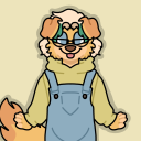
#I don't really know what I'm doing when it comes to shading/rendering
Explore tagged Tumblr posts
Visit Tumblr Blog
Explore Tumblr blogs with no restrictions, modern design and the best experience.
Last Seen Tumblr Blogs


Fun Fact
There were a total of 171.5 billion posts on Tumblr in 2019.
Text
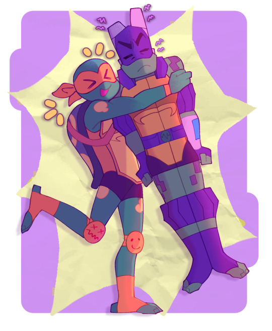
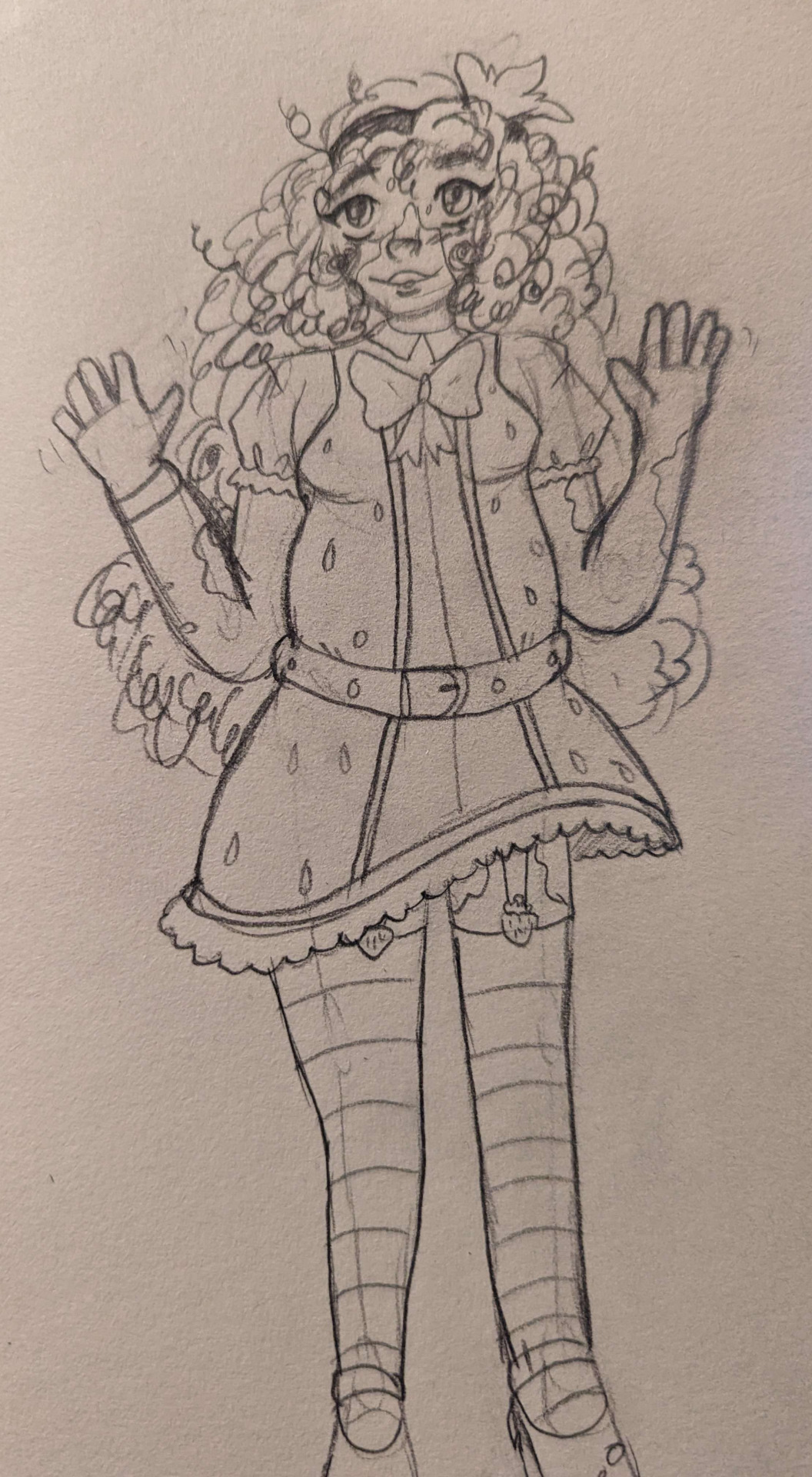
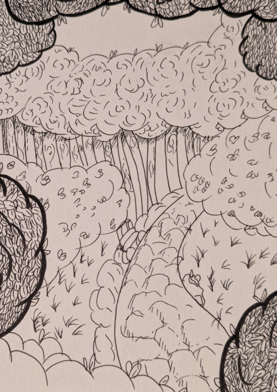
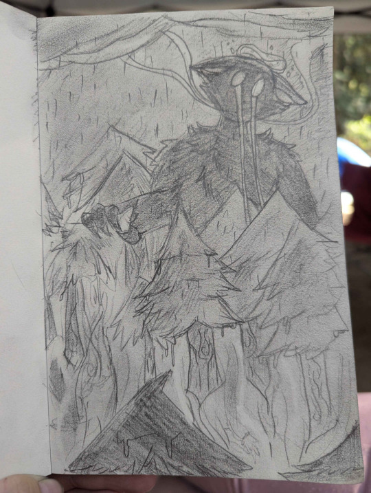
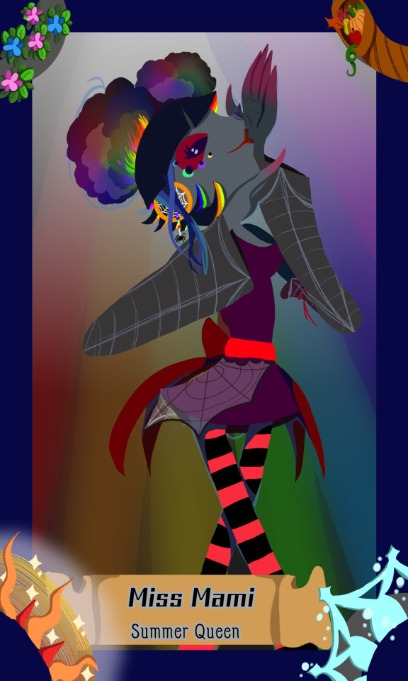
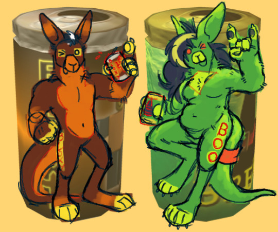
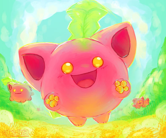
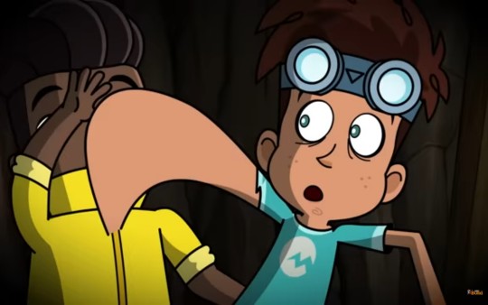
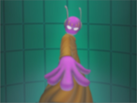
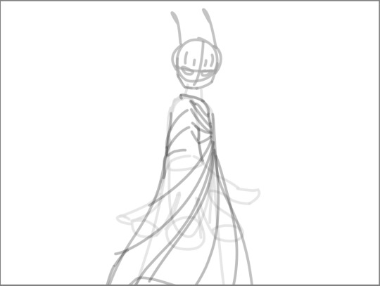
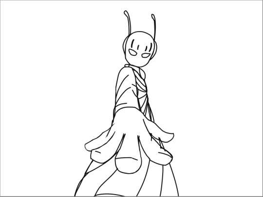
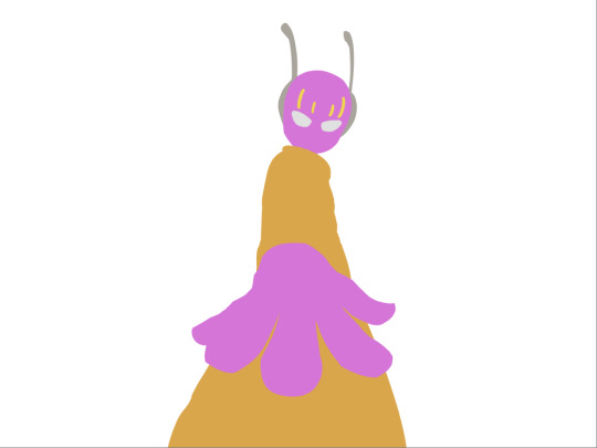
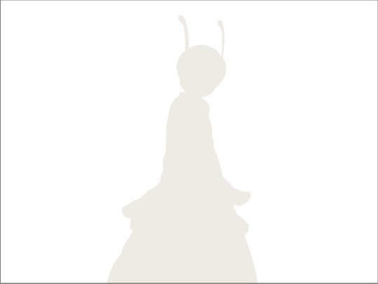
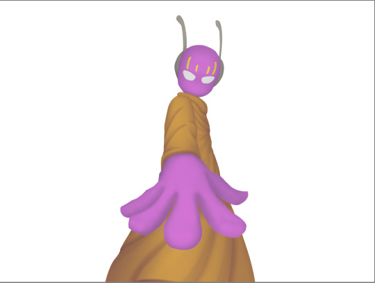
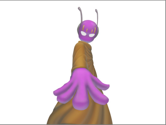
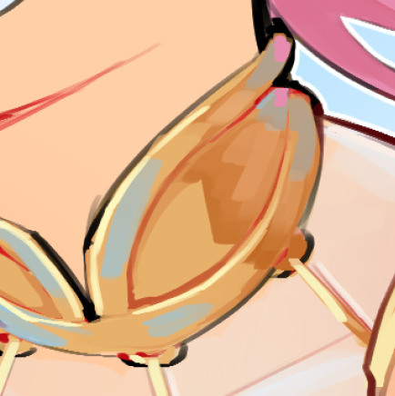
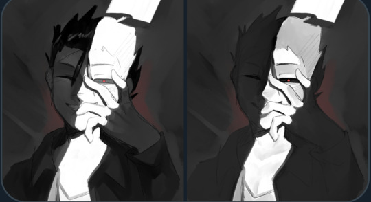
Shading test?
And two different versions. (╥﹏╥)
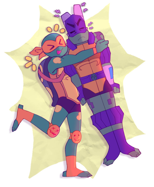
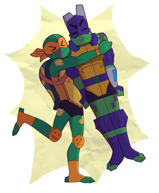
#rottmnt#rottmnt fanart#rise donnie#rottmnt donatello#rise mikey#rottmnt mikey#I don't really know what I'm doing when it comes to shading/rendering#And I suppose my art is pretty inconsistent when it comes to that#But I do want to get better at it (*^-^*)#pb&j duo#smarts and crafts
922 notes
·
View notes
Text
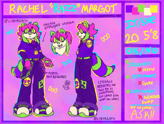
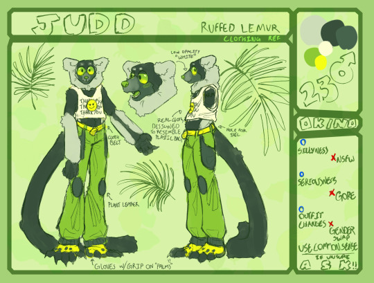
Emergency Commissions
tl;dr, I was in a car accident. I need help to get it back on the road if possible as my insurance isn't going to cover it. I don't know the total cost yet, will update once I do, but I'm going to set a starting goal as of now. Longer explanation and details below the read-more
This will be a Pay-as-you-Want through Ko-fi
kofi: https://ko-fi.com/moonlightsylph

----
Basics
This is the starting point, where you pick the level of what you want. From sketch (basic blocking out and concept, typically will be done in traditional pencil) to full (shading and rendering)
Sketch- pay-as-you-want (done traditionally, in pencil, before scanned/photographed to be resized and uploaded. Can also be done as digital line if preferred) Lines- pay-as-you-want (Digitally, Unless specified. If traditional, it will be done in ink. It will be scanned/photographed before resizing) Flats- pay-as-you-want (Digitally, Unless specified. If traditional, we can discuss materials wanted. It will be scanned/photographed before resizing) Full- pay-as-you-want (Digitally, Unless specified. If traditional, we can discuss materials wanted. It will be scanned/photographed before resizing)
Examples


Traditional Only: Flairs. This will be done in gold and/or silver pen to add flourishes
eaxmples:


----
Background
Backround options. Simple (for me is either a solid background or a gradient. I pick the colours for this one unless you have requests.) to Basic detail (being in a room, set-dressing for the character, ect) to Complex (fighting scene, detailed background like cityscapes or nature scenes. Here you have more control on what exactly you want, instead of a generalized idea. I will complete this to the best of my ability)
Simple background- free Basic detail- pay-as-you-want Complex scenes- pay-as-you-want
Example:


----
Style
Here is where we get a little creative. I've toyed with different styles and challenges. For limited pallets, you can provide me with a colour pallet you want to see me transform into your character, or I can generate a few for you to pick from.
As for the Random Blorbo, this is a fun challenge I wish to do where I build you a new character. You can give me a few details you want seen, otherwise its completely up in the air what you get.
Lineless- pay-as-you-want Limited pallets- pay-as-you-want Chibi- pay-as-you-want Random blorbo machine- pay-as-you-want [comes with two-three head shots and one full body]
Examples:


----
Fun Stuff
For this section, you can have custom borders done for your personal use. Be it for framing a picture you like, to spruce up your page or blog, or to frame up a personal project you have going (example: making your own tcg, tarot card, ect)
As for the cards, this is where I create a card featuring one of your characters each. Like a tcg or a tarot, or whichever you want to see.
Ref sheets are pretty straight forward. I'll provide two-three headshots + full body + interesting facts you want included. This also included, if you wish it, personal items said character may have to showcase.
Custom borders- pay-as-you-want Cards- pay-as-you-want Ref sheets- pay-as-you-want
Avatars: pay-as-you-want
Examples:

Hello,
I know this is out of the blue, but when things happen they don't give you a forewarning.
I was involved in a car accident yesterday. Fresh with a new N, only had my car for a week to myself, I found myself hydroplaning into a traffic control post and side-swiping a car in the process.
Thankfully, they got off with cosmetic damage and a cracked tail-light as i avoided rear-ending them.
Myself, however, ended up with a banged bumper, a passenger mirror nearly beheaded and a crack radiator. Lucky, considering what could have happened, but still terrifying.
It was after this i learned that my insurance wouldn't cover the collision, meaning I'd have to cover everything out of pocket. Money I don't really have at the moment. Not with the other debts I've been steadily paying off.
I don't know the grand total yet, I'm still waiting for my car to be released so I can take it to a body shop. But from how expensive cars can be, with some insight from those around me, I can make a good guess at a "starting" amount. I'll update the total once I know though.
But I'm now asking for help. I don't expect anything for free, I will be making things in exchange. I've wanted to open commissions for a while, its just sad that what made me finally pull the trigger is when I'm in trouble. I'll link my kofi, the prices will be set to pay-as-you-want. I'll work out details for what people want, and I'll have a list of things I don't think I can do.
But I appreciate that you took the time to read this. Any help will be greatly appreciated and even if you can't, please share. If you just want to donate and not get a work in exchange, just say so in the notes. (that said, you might end up with a doodle anyways as thank you <3)
#commisions open#emergency commissions#tw car accident#moon spam#art stuff#artist on kofi#kofi commission#kofi
223 notes
·
View notes
Note
Hellooooo! I’m working on a clangen blog of my own, so I’m going around asking my favorite clangen blogs some questions. I’m happy to get answers to whichever you feel like answering (or none at all if you don’t feel like it!)
What program and file size do you use?
If you use a font, what font is it?
How far ahead do you recommend playing?
Do you have any advice for layouts?
Do you have any tips for lighting/drawing fur?
Do you have any tips for making cats look more unique?
If you do backgrounds, do you have any advice for creating them?
If you use them, where do you recommend finding reference images?
NYELLO! 1. I use Procreate on Ipad! File size is pretty small because i feel more easygoing working small. it forces me not to worry too much about details. Dewclan comic pages come in 1200px wide and.. however tall the page calls for. 1200 DOESN'T SEEM SUPER TINY BUT!! when you think about adding in the speech bubbles and doing usually two panels per 'row', make space for the panels themselves, etc, you end up with only like.. 350/400px to work with. s'LIL 2. FONT is copperplate! 3. this entirely depends on you. if you wanna be able to plan ahead to connect some events, you gotta go a few moons ahead to know what to connect. but sometimes going moon by moon really keeps up your muse and excitement, because even YOU wonder what's gonna happen next. if you need to stay excited about something to keep up with it like ME, i recommend not going too far ahead. keep it Fresh 4. advice would be.. keep in mind/sketch out the placement for your characters AND their speech bubbles in their panels. i don't do this and it shows ALSDNKLSD. sometimes my speech bubbles are squARSHED, or sometimes i have to adjust the size of the font to make it fit. it's silly. PLAN AHEAD. otherwise i'm not so great at layouts and composition in that i don't have a lot of confidence in it, so i can't give much advice OGH 5. shade fur like you'd shade anything else! don't overthink it. but drawing fur can be done in a billion ways so that's a tough one to answer. in my clangen comic it's very simple, bc there's just the illusion of fur. YOU JUST.. ASSUME THERE IS FUR BC.. cats. but there isn't much definition really. sometimes i throw in a tuft or two bc for fun. outside of clangen, uHHHGH.. my fur rendering is sort of a mess. look at how your favourite artists do it! there's no one single way 6. unique cats.. play with shapes! cute round soft shapes, pointy angular shapes. play with the shapes of their ears, give em tufts or give them no tufts. think about silhouettes if you're not going with realism! if you figure out what makes a cat look like a cat enough, you can warp that anatomy and keep them looking cattish 7. i do backgrounds!! i dabble, i partake, in the backgrounds. BUT UAA advice is hard there too. what kind of bgs do you wanna do? :( I'M SORRY I NEED VERY SPECIFIC QUESTIONS I'ASKDNLK I'M EASILY CONFUSED. general advice is again, look at ones you like! think about what you like about the bgs you see and HAVE AT EM. do studies :3 8. Pinterest is good for references. at least it was last i checked before the big AI boom.. bc it'll recommend you similar things. tho i find the layout pretty disorienting. IF YOU CAN GET USED TO IT, IT'S HELPFUL THO
58 notes
·
View notes
Text
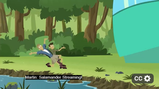
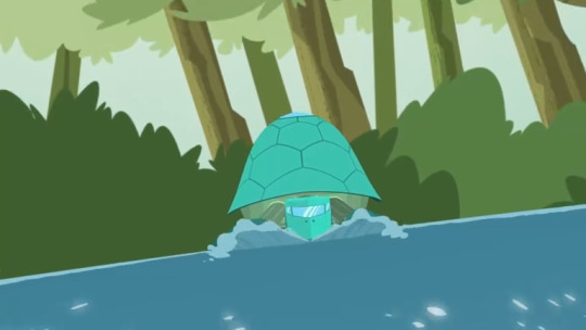
Wild Kratts - Salmander Streaming - Thoughts
Spoilers!!

I've a good feeling that this isn't actually a clip from a movie, but just something the animators whipped up. The fact that the animals running are in blue and green gives me the impression.
But also, the characters being able to stream movies makes me feel old.
If I had a nickel for every time a red squirrel fucked up high tech structure in this show, I'd have 2 nickels.
Also, how efficient are the tellurium crystals (which we saw earlier in the season premiere) are, if shit like THIS can render the turtle ship's power efficient??
Roll credits!
Also, this is the first of MANY moments in the episode that made me laugh unironically.

Martin, that is a fucking exoskeleton. I don't think I have to explain why that is incredibly gross (although it does make for an efficient boat).
Also, random fact: The largest crayfish on the planet has weighed up to 11 pounds. That's huge!
This is another thing about the episode that regularly comes up (and that many people have noticed). The animation is suprisingly fluid. I mean, not surprisingly, there were new riggers on board for the show, which likely explains why it took nearly 2 years for the new season to drop, but still. Screenshots alone do not do several scenes or shots (this included) justice when talking about how eye-catching or interesting the animation is.
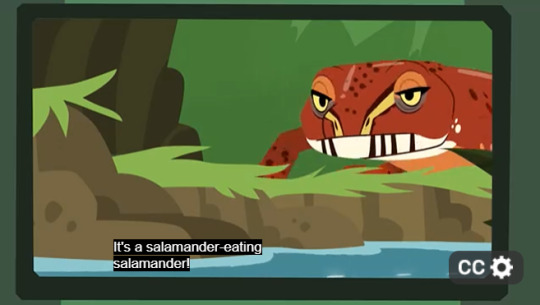
I did not know that some salamander species were cannibalistic! This show always manages to teach me new things every day, even at the age of 18.
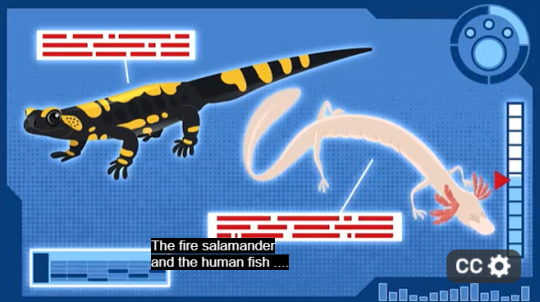
Am I the only one who is the tiniest bit miffed when they call it "the human fish" and not "the olm." I get that it's a nickname like "Wolf Hawks" but, it's not the only name. 😭😭
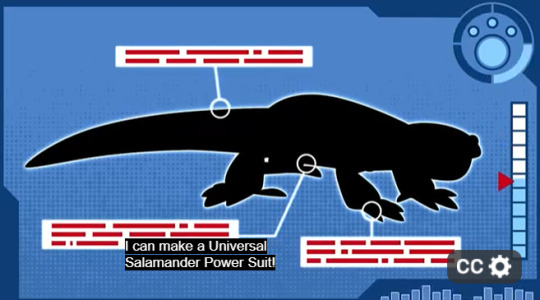
I feel like this is yet another moment where I should needlessly harp into the "lore" of Wild Kratts. Because she describes the suit as "universal" and as we see in the episode, the Salamander Power Suit can be reactivated based on species. So why didn't she do this with the Spider, or Wolf Suit. I'm 100% looking too much into this, but just saying.
Also, I really hope that a Universal Salamander Power Suit implies that we'll be getting an Axolotl episode and a Power Suit. I was kinda hoping we'd see some of them in this episode, but the potential is there!
There is DEFINITELY no way I could've done this joke justice using screenshots. You need to see it in video form to see my point. Because the joke was predictable in every sense of the word. I knew what the punchline was. I knew when the punchline was gonna hit. But because the animation was so fluid throughout the frames, and because of how detailed the shading and lighting were and how overtly obvious the punchline was because of the visuals, it still made me laugh my ass off. I legitimately had to look up if James Baxter (yes THAT James Baxter) worked on this episode because it reminded me of a lot of scenes he did for Steven Universe and Owl House. Was surprised to know that he wasn't, but regardless, whoever animated these episodes, whether veterans or newcomers, deserves their fucking raise.
I know that he's referring to the salamander, and yes, the joke has been made before, but like, if someone told you that there's an episode of Wild Kratts where they [by technicality] said the word "hell" *checks notes* twenty-four times in one episode, would you believe them? Yeah that's what I thought.
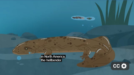
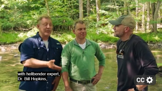
Also, indeed hellbenders are the largest salamander in North America, the third largest in the world. Adult healthy hellbenders have very few predators and that's because of how gigantic they are.
I used up my one-video free-card on a previous joke, but once again, it's so silly, you know what the joke/punchline is, yet it's presented in such a way that is still really humorous, either because of how it doesn't bring too much awareness to the fact that it's a joke, embraces said fact of it being a joke, or both. Complete with straight-up fucking Looney Tunes style anticts, it's just really fun.
Also, another thing I find funny is that the hellbender ate the crayfish exoskeleton. Like, would that even be tasty?

Spoilers, but Chris does NOT Activate Tiger Salamander Powers. Yes, I am also miffed.
They're so besties.
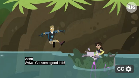
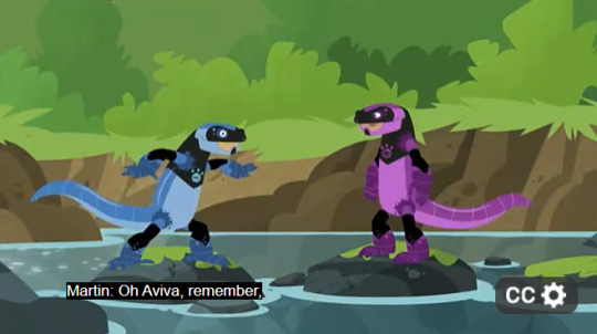
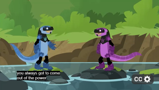
Ok but like I'm sensing a pattern where Martin activates a Creature Power Suit with Aviva whenever he's not activating it alone or with Chris. Which at first I didn't think much of, but then I realized. Blue is a component color to make up purple. So this occasional running theme/pattern could be a reference to how similar they are, and how both rely on each other in some fundamental way in their adventures, much like how the colors blue and purple are interconnected in a way. Am I looking too much into this as well? Yeah, but I actually enjoy it!

Ok not gonna lie, I actually liked the fourth-wall break. Mainly because they could've easily fucked it up badly by having it drag on for too long, or making it too meta, but quick cuts and gags like this make it all the more worthwhile. And unlike the Camel Chris gag in the camel episode, it sticks around once and doesn't wear out its welcome.
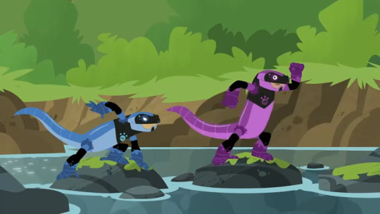
Also, the Salamander Suits were activated by touching a Hellbender, which we've established, is bigger than every other salamander shown in the episode.... so... why the fuck are they that tiny?? They should at least be way bigger than the rocks they're standing on.
Also, the Salamander Suits genuinely look like Dinosaur Suits. At least... from this angle.
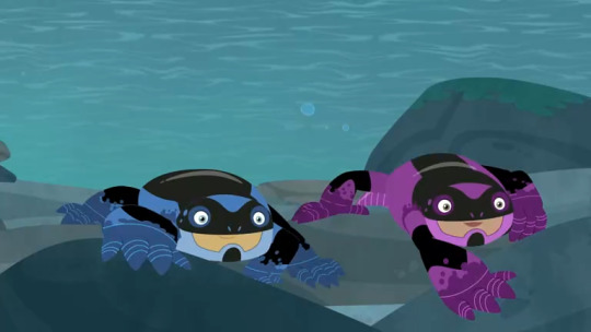
-... because from THIS angle they look so. FUCKING. CUTE. I so badly want to hug them like plushies (now I'm even more disappointed that Chris wasn't in one of these)

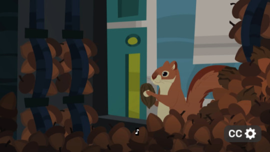
How the fuck was this guy able to stuff a huge-ass butternut underneath his vest and shirt.
Also, Chris, you do realize that keeping squirrels from eating the nut is a good way to make them endangered as well? Bro is petty 😭
I think this is the first time we've seen the Tortuga miniaturized by someone on the actual crew, not a villain or an accident.
As someone who didn't know or care that much for salamanders (at least in comparison to frogs and toads), this episode enlightened me a lot. I actually hope I do see a hellbender sometime in my life
CONCLUSION:
PROS:
The humor. Like, every single joke in this episode either got me to crack a grin, or laugh out loud
The animation. Once again, the animators have got their rent due. So many memorable facial expressions and cool color designs that just make it nice to look at.
The salamander species themselves.
CONS:
Chris definitely should've activated the Tiger Salamander Suit. Bro was robbed
No mention of Axolotls? The most well-known salamander in the world? For shame.
Final Ranking: 8/10. A nice slice of life mini-adventure with no huge or real stakes, but overall a pretty fun romp. Before this episode came out, there were a lot of positive reviews of this episode on IMDB and Rotten Tomatoes, and while I generally take those with heaping grains of salt (because opinions are opinions at the end of the day), I definitely agree that this episode is fun. The very epitome of "camp."
#pbs kids#wild kratts#kratt brothers#martin kratt#chris kratt#pbs kids go#2d kratt brothers#2d martin kratt#2d chris kratt#wk#wk season 7#spoilers#opinions#review#Would totally recommend this episode to a causal newcomer of Wild Kratts because it has such a vibe that it would make a decent entry-point#also I didn't say much of it but Koki's subplot was nice#it was short but seeing her struggle to fix the Tortuga was very relatable and I liked how she got to save the day at the end#even if it was a low-stakes climax/throwaway joke at the end
53 notes
·
View notes
Note
what's your process for coloring and shading? I'm a beginner when it comes to those elements with art and I'm super inspired by your artstyle! <3
well I'd say there isn't really a process behind it!
I'm very simple. bc I quickly get overwhelmed by ADHD.
I line my sketch... and then I bucket-tool fill it with the canon eyedropper-picked colors... and then I throw some cell shading on there. on the exact same layer.
I got 2 layers; lines, and colors.
since it's a cartoon character you'll wanna keep it simple and limit the amount of colors you use to 1-2 shades for any surface max. even the shading color is actually just color picked off canon screenshots. I don't use layer modes.
the only tip I can give is to not put all the shading just on the edges of everything. use big shapes, be confident, don't blur or airbrush it if you don't know what you're doing with those tools. triangle shapes are especially nice for clothes.
think of where exactly the light source comes from before starting to shade/render, if necessary literally draw a small lamp into the corner.
the magic in my art comes from duplicating and Gaussian blurring my lineart and the particular settings I use to adjust the colors with Correction Layers (in CSP. if curious I could simply give out all of my exact settings here or you're freely allowed to color pick off my art, no credit since I don't own colors.) trust me you don't wanna see my art without those tweaks

here's a doodle of Flug with TJ_beastboy's tats
Thank you💜💛
#I know which of you guys will love this one#it honestly suits him so well#Flug should always draw tattoos on his bag I mean he has the easy opportunity#that would have swag#villainous#vilanesco#villanos#dr flug#flug#kenning flugslys#villainous flug#villainous dr flug#cartoon#fanart#my art#ask reply#anon ask
62 notes
·
View notes
Note
What advice would you give beginner artists?
it's fine to want to do more stylized art, but nothing will help you improve quickly like studying from life. even if you want to draw very stylized figures, life drawing is still going to help you understand how the human body works and then you can build your stylization off of that understanding. I also recommend studying specifically things you're looking to improve--if you feel like your poses aren't dynamic, ask your model to do some quick (1-2 min) dynamic poses and work on getting the gesture down. if you're looking for anatomy, ask for longer, more static poses and really study the contours of the body. this also applies for portraiture and character art--my expressions and facial structure improved like CRAZY when i started doing portrait studies from life! (note: i know live model sessions aren't accessible for everyone. i'm a huge advocate for nude models, if you can find a studio nearby that's affordable to you that offers sessions, that's the best you're gonna get. however, there are sites that will give you photos of nude models to draw from, too, or you can even just ask friends or family to pose for you when they aren't busy, that's what i did before i started getting model sessions from my school!)
materials are not everything but sometimes a good material can make a difference. it's important to know what's worth it and what isn't for your skill level. invest in some decent-quality supplies or a good art program, but understand that you're still going to need to work to understand your materials and use them to their fullest potential. (if you're a digital artist buy csp. trust me on this. get it on sale. it will change your life. also do not fucking use photoshop)
tracing is ok. listen to me. TRACING. IS. OK. tracing is how you learn. don't trace other people's art and pass it off as your own, obviously, but there is literally no problem with tracing real-life reference photos. I routinely trace references for backgrounds and the like. there is no reason for you to kill yourself trying to make complex perspective and shit up from your head when you can very easily just overlay a photo and get what you need.
in that same vein, USE REFERENCE PHOTOS. find pics online or take pics of yourself and USE THEM to see how your poses work. it makes it SO SO SO much easier. the understanding that you need to create a pose out of nowhere will come with time but you're not going to get that skill unless you have a foundation of understanding how the real human body works, and the easiest way to get that understanding is by copying photos of real people.
last but not least, there's generally a sort of 'rulebook' that new artists are expected to go by, especially online, when it comes to digital art. when i was first learning, it was all about lineart and cell shading, two things that I didn't really like. Nowadays it seems to be all about rendering. the single most important thing i can tell you is if it sucks you don't have to do it. if you hate lineart just color your sketches. if you hate shading don't shade, or find a different way to shade that you enjoy more. if rendering is annoying or difficult for you DON'T BOTHER!! art is supposed to be fun. if part of your process is annoying or upsetting to you, cut it the fuck out. don't torture yourself just to do art the "right" way. i guarantee your art will look better when you're having fun making it anyway!
#asks#ALSO don't go in expecting to monetize your social media presence/go viral as an artist. make art for YOU and make what you want to make.#if your art has passion behind it then attention will come naturally!
330 notes
·
View notes
Note
I think SVSSS as a 2D cartoon would be the best moving medium for it imo.
I mean, personally, yeah, that's how I'd enjoy seeing it as well! My ideal slightly pretentiously artsy SVSSS screen adaptation would probably look only a little more detailed than linograph prints (2D or shaded 3D?) (someone hit me up in like two weeks to draw an example of what I mean, if I don't remember on my own, I don't have access to art stuff right now), very stylized and vibrantly colorful, because that's one of the art styles that I particularly enjoy.
I'm not a personally a fan of the 3D SVSSS show because I find the characters a little too doll-like and same-facey for my tastes? It's fine! It works! It's serviceable! It's just all, backgrounds included, a little... safe? I tend to like over-the-top bright colors and intricate details and impractically weird shapes and yet also coherent world production design in my fantasy, which is a lot to demand of any production, perhaps especially with animation productions, which are always squeezed for time and money.
(EDIT: I know the SVSSS show was under heavy constraints and the results are impressive considering their resources; it doesn't change the fact that I just don't like the art style and nevertheless find the results underwhelming. I don't like a lot of "realistic" modeling / rendering styles, not just "anime" ones, even if they are extremely technically impressive. Believe me when I say that I know the vast majority of the entertainment industry is overworked and underpaid and creatively restrained.)
Slightly tangential general note: I don't think 2D is inherently superior to 3D (EDIT: NOT trying to imply asker is saying this, just having some general thoughts), especially because, with the realities of production, each have their advantages. 2D has a lot of stylistic advantages still, but 3D shaders are catching up and doing some incredible things these days! More advanced puppet controls and particle effects and such are doing some beautiful things for 2D shows as well these days. A lot of stuff has been subtly mixed media as soon as 3D became possible. It is potentially possible (note: not saying any studio would actually greenlight this) to do an equally slightly weird and artistically stunning 3D SVSSS show, given the freedom to work. (Good boarding and writing is also sooooo important in both mediums, obviously, it's not just about the art design. You can get away with incredibly limited animation with good boarding, writing, and art design.)
Another slightly tangential ramble: both 2D and 3D have the potential for stiff animation and poor character acting, which also comes down to production limits and animator skills? (I often think of character animators as a type of actor!) There are a lot of 2D shows that I don't really like because I find the animation incredibly stiff, both puppet and handdrawn (there's great 2D puppet stuff out there these days), which pretty much always comes down to production limits (deadlines and budget and software, saving up their animation for the coolest scenes). One of my favorite things about Studio Ghibli films (which as features get a lot more space to focus on art compared to the demands and restraint of television) has always been the squash and stretch in otherwise relatively realistic action, making things like hugs look SO nice for example. But 3D stuff is getting better at that these days! The ways characters slumped into each other in "Nimona" for example was great. And it's just fascinating to look at the elasticity / stylized sculpt of expressions in "Puss in Boots: The Last Wish" compared to the technical limits of the models / rigs in "Shrek" or "Shrek 2".
Adding these side notes because I want to be clear about my respect for both 2D and 3D artistically! A lot of video games are doing cool stuff in 3D that looks very close to 2D with stylized shaders, which you can sometimes spot by the large or small rotations in character action / acting, which is difficult (and therefore often expensive) to do in 2D with all of those extra drawings / angle poses. Also, I think the current push towards funky shaders in 3D is so cool and it's hard not to gush about them!!!
77 notes
·
View notes
Note
Ive recently just started doing art, and i apologize in advance if you've gotten this question before frequently, do you have any tips for beginner artists and how did you find your art style? I'm constantly amazed by how you do anatomy and expressions, their so distinct and expressive!
Thank you!
And I actually don't get asked a lot of questions about myself when it comes to art. Many come to this account so I can put my OCs on the phone for questions, so this is lowkey a new question. I might have been asked it before years ago but I am better at drawing now.
HOWEVER, I have to state that I am simply a hobbyist artist and not a freelancer or professional so my tips will be kinda off brand compared to their word. ANYWAYS...
THINGS THAT I FIND HELPFUL FOR ARTING (besides practicing because I mean...we all know the only way to get better is to practice so it'd be kinda redundant say it - we all know to do it)
Practice drawing in pen. Pen can't be erased. So instead of sketching and erasing and sketching and erasing, it is nonstop sketching. It helped me a lot with speeding up my sketching, even in digital, because I got used to making little goofy mistakes. It also helps to fight perfectionism
Use references. I know that's just as redundant as saying to practice but references are genuinely underrated. Whether they be colors or poses - references are your friend. I use them whenever I am having a hard time drawing something.
Redraw things. I occasionally redraw memes or scenes from animated movies with my OCs. It's stranger really helpful, especially if there is a certain expression in the original image because it lets you play around with how to draw it to catch the correct vibes. PLUS redrawing funny stuff helps take the stress off creating art because it reminds you not every drawing has to be amazing.
Don't neglect your body when you draw. STOP DRAWING WHEN YOU ARE HUNGRY, THIRSTY, OR NEED THE BATHROOM! THE DRAWING CAN WAIT - YOU WILL HAVE A MUCH EASIER TIME CREATING ART WHEN YOU ARE NOT SUFFERING FROM THE HUMAN CONDITION.
Stretch your hands. Drawing puts strain on them and your fingers will ache and your hand may get stiff. Practically hand and finger stretches keeps your hands happy. I do them all the time just because I use my hands a lot for art AND my day job.
Numbers are the devil and the algorithm is a warlord. If you post your art online, it's easy to get into the mindset that you aren't good enough because you have low interactions on your work. THIS IS FALSE - NUMBERS DO NOT EQUAL QUALITY. It's better to draw for yourself and the enjoyment of art rather than drawing to attract a fanbase and attention
As for how I figured out my art style, what you all see is the result of me taking bits and pieces from things I like and blending it all together. An art style is really just figuring out what stuff you like from other people's styles and doing your own thing with it.
To break down some of my own style, the way I shade the underside of noses is something I got from Soul Eater since I loved how the anime marked noses with little dots.
The way I draw lips was a journey. I used to only line the top lip like how the manga for D Gray Man would. Then I saw how Steven Universe stylized fuller lips and sort of started playing with that. Over the course of me exploring - I found more online black artists and learned from how they shade and render lips.
Style is very much something that takes a long time to develop. I've been active online since 2011 and it took me until this year to finally figure out a style I really vibe with.
30 notes
·
View notes
Text
COMMISSIONS! FROM ME! YAY!
Status: Open!
okay, gonna start this with.. i have no idea how to make a comms info post. i was going to try and make a carrd but it's... a lot! so, under the cut, i'll have some examples and prices and some info on what to expect! (LONG POST) (YE BE WARNED)
Rules! (and some general info)
because we need that
Don't haggle with me. I'm not selling you old furniture, you're paying me for my time and effort.
For smaller commissions, I require pay up-front
Larger commissions (over $30) can be paid half up-front, and half later. For both ours' insurance!
I can do cashapp, zelle, or paypal.
Time taken on each piece will vary, of course, and I can give you an estimate when we hash out details. I can provide updates as well! Don't be afraid to check in whenever! I won't feel rushed or hassled if you just want to know how progress is :)
If you have literally ANY questions. ANY OF THEM. at all. just message me. Even if you're not sure if you want to commission, or don't intend to at the moment. Have a curiosity? My dms are open, friend. And my ask box too, if you'd rather. I'm so open to questions it's unbelievable. I am almost begging you to ask... If you have something to ask.
YAY / NAY / MAY(or, what i will and won't do)
YAY!
Furries
Humans
Roblox avatars/characters
Fandom
Oc
Light/medium mech
Ships (including selfship)
Suggestive
(Artistic) nudity
Multiple characters
Whatever's not on my "no" list! Please please just message me and ask if you're unsure. Even if you're not sure about commissioning and just want to see if it would be possible! I won't bite, I promise. :)
NAY!
Nsfw
Fetish (even if not explicit)
Heavy mech
Heavy gore
Anything proship/comship/whatever the hell they're calling it. NO KID DIDDLING! OR INCEST!
Anything vivziepop related. I don't like her or anything that she makes.
Celebrities (actors in a role, sure, but just the guy? the plain dude? just some guy on our earth who works a job? a real person with a life? no.)
MAY! (or, things I'm on the fence abt)
Horror
Minor gore
Large scenes (not my strongest skillset)
Whatever! I'm okay with stepping outside of my artistic comfort zone, so long as you're okay with the result varying in quality (and possibly taking longer, depending on what you ask for) Again, and I CANNOT say this enough, JUST ASK ME!!
WHAT I HAVE TO OFFER!
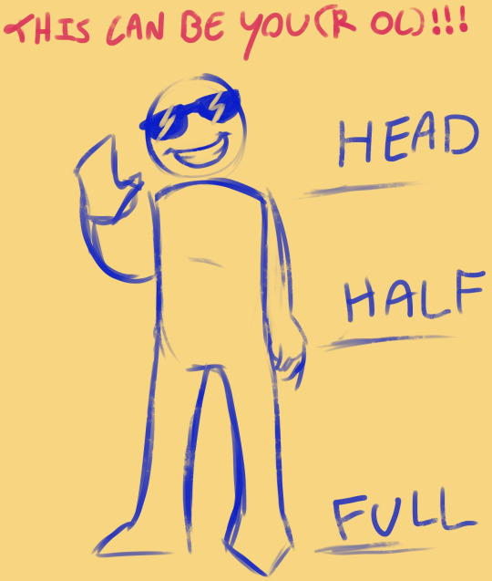
Okay, so, as shown here, for a standard commission i'll have 3 sizes, along with 4 stages of completion.
The stages are sketch, line art, flat colors, and render (shading/lighting)! sketch is the cheapest, and render is the most expensive. I'll list some prices for each size below :3
Head
Sketch - $5
Line art - $7
Colors - $10
Render - $15
Half
Sketch - $10
Line art - $15
Colors - $20
Render - $25
Full body
Sketch - $20
Line art - $25
Colors - $30
Render - $50
Add-ons!
Background (any commission automatically comes with a simple one, free, to be pictured in examples) - $15
Extra character - $7-$20 depending on what you're getting! just ask
COMPLEX object (like a weapon) (simpler ones r free) - $5-$10 (again, depending. just ask)
Anything that would take me more time and effort than usual, really. Time and effort is what you're paying for! I try to keep most of these pretty cheap, cus you're already paying for the drawing itself lol. Just ask if you're unsure.
Other kinds of stuff I'll do!
Icons! (or emojis, they're very similar)
These are basically just the head w/ colors, so $10 If you want an emoji set (or icon set, i guess?) it'll be +$5 for each additional one!
Reference sheets!
These are fun to make! They'll include 2/3 full-body shots of your character (front, side, and/or back), 1 head shot, flat colors, and some spaces for info! You can add in the info yourself, or have me add it in for you (no additional cost). They'll run you around $50 (however, you can add/take away stuff to change the price.)
Character page!
I will just. draw the character a bunch of times. $30 base price (sketch quality) can go up to $70 if you want them VERY spruced up (full render)
FINALLY. What we've all been waiting for... Examples!
These are fullbodies! (with their categories and prices in alt) (First is a commission of one of my friends ocs, last one is moff, @/sneablebeable 's character!)
these are rendered pieces w/ backgrounds! (though pokémon like these, I would consider chibi, making them a slightly lesser price.)
Reference sheets! Highly customizable, these are 2 I did for art fight a lil while ago :)

sketches! (with complex background, with extra character) For these, I can include basic values to help with composition, but usually done just cus i feel like it. (no extra charge if I do).
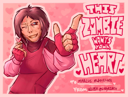
Half body (in the style of a valentines card)
Icons!
Thanks for considering me! or... just checking this out! reading this far! whatever!
#labyposting#take a fucking drink for every time i say “just ask”#or a hit or WHATEVER#god. guys. you know you can ask me stuff right. did i pound it into you enough? should i say it again just to be sure?#commission#commission info#commission example#commission promo#commission open#commissions open#commissions#FEED ME MONEY!#labyart#posting this on my art account first because. it's my fucking art account LMAO#long post#took me over an hour to make holy shit
42 notes
·
View notes
Text
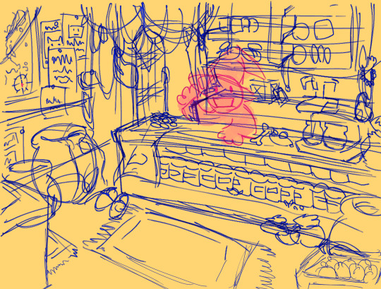
Whilst I'm working on my dsmp Roleshuffle AU, take a timelapse I took of page 175 of the comic! And now, for a blurb about me and my art style...
As I'm working on the next arc, I'm thinking of changing up my process. The good thing about the process I was doing before is that it's usually pretty easy to color in (fill bucket), and the shading is all one unanimous color. Similar deal with the highlights and overlays. But, I don't know if I really like that style of coloring (rendering?) for a comic. It can end up looking really drab as compared to my sketches, and feels kind of lazy tbh.
So, even though it's probably easier to just stick with what I was doing before, I'm going to try out some different stuff in the next arc. It might not be a super big change, since I'm not really sure what direction to take it, but I am going to try and change it up.
Point being, whether or not I fully implement a new style in the Election arc or the next, I'm going to try and keep you guys in the loop once I get there. I want to post some experimental coloring pages--maybe they'll be re-colorings of one of the old comic pages--and get some opinions on them.
All of this may be a long time coming, though, I just wanted to share my thoughts on the current state of my art and comic. Thanks for listening, and let me know if you have any thoughts as well! If art class taught me anything, it's that collaboration can be essential when improving your art, so don't feel scared to say anything.
#dsmp#dream smp#dsmp au#dsmp roleshuffle#artists on tumblr#dsmp comic#dsmp fanart#mcytblr#mcyt#mcyt tag#mcytbr#mcyt fanart#mcytumblr#mcyt art#dsmp technoblade#dsmp techno
26 notes
·
View notes
Note
Have u ever posted your comic or animation workflow anywhere? Im super curious on how you tackle the process, especially not using a drawing tablet. I know you have a very simple (and adorable) style so that probably helps in terms of workflow -- Im just curious about the steps you take.
Thank you! With both comics and animation my key thing is to not spend too much time on any particular thing, just draw loose and fast. Honestly the only downside to drawing with a mouse is that I can tell my arm has extremely specific muscle memory regarding it- if my mouse breaks and I get a new one I have to spend a good month or so just letting my hand get used to it again lol. Same with if my setup gets readjusted too much- right now my setup is my mouse on one of those padded mousepads, on top of 2 books, with my elbow resting on my 3DS case (I'll get an actual pillow or something for it eventually lol). But luckily thanks to this I suffer very minimal wrist pain 👍
(...Okay I started to go really in depth in my process here, so sorry if this is way more than what you were asking. Putting it under a readmore just to save space lol)
With MFM in particular, I start by writing out the entire script for the next story arc, which really is just all of the dialogue and vague notes about any important actions. Then I do the paneling with very loose stick-figure like sketches of where the characters are and what they're doing. I prefer having very little planning when it comes to character poses and panel shapes, coming up with those on the fly makes things much more exciting and faster to make. But it's the opposite with dialogue... it needs to be 100% FINAL before I draw a single line lol.


That's part of my script for my most recent chapter, as well as what my extremely loose goofy thumbnail sketching is like. I write the script as one big thing and don't separate it into pages until I actually start drawing- then I go and color change it just to keep track of what dialogue goes on each page
After that, I go back and do the ACTUAL sketch, as well as the lettering (I don't believe this is how it's done professionally. I used to do lettering as the very last step in the process... but then found it hard to cram speech bubbles in the right places lmao.) After that is lineart, coloring, background flat colors, then shading/rendering for all of it. I do each step in batches, as in I sketch out ALL pages of a chapter before moving to lineart, I line ALL pages before starting coloring, etc. I find it way easier to be productive when it's broken up like that, though when I first started the comic I used to draw each page to completion before starting the next (but also, the comic's style was DRASTICALLY simpler back then haha)
(Unfortunately I merged some of the shading to the background flat colors so it's not entirely accurate... oops) FireAlpaca has a sand texture feature that I only found out about last year- adding that to the backgrounds makes them look 10x better with WAY less effort.
With animation, it depends on the project. For simple 5-10 second animation I make for fun, there's very little planning lol. I skip some steps in the process- I'll sketch out the keyframes (and maybe any difficult inbetweens if necessary), line those, then go straight into making linework inbetweens. I'm not a cleanup artist and have no experience in that, so I always find trying to line my rough animation makes everything jittery and wobbly. If I do it with a clean line from the start then I can avoid that and save a lot of time 👍
For my bigger projects (such as the Parvey cartoon and the MFM Kickstarter trailer), I do the whole animatic with final audio first and foremost, with the animatic being almost like the keyframes. I split them up into individual shots, .mp4 files anywhere between 1-30 seconds usually, and animate those one at a time. I'm a huge fan of free to use programs and try to use them as much as I possibly can, here's a list of the ones I use:
FireAlpaca- for the actual drawing part itself (storyboarding/animating/etc). FireAlpaca has a feature that lets you export every frame as it's own drawing, as well as an onion skin mode
Windows Movie Maker- for compiling all of those frames into video format, creating individual shots. If you upload all of your frames and set them to around 0.08 seconds, it equals about 12fps (I usually animate at 0.10 seconds/10fps, its a bit slower but looks nice)
Onlinesequencer.net- for making music. It's the place I've made all of my songs on, like the timeloop song, hyperworkaholic, and the background music for the MFM Kickstarter trailer.
Audacity- for editing audio/music. Also great for recording things directly from your desktop
DaVinci Resolve- for editing and putting together all of the shots into one big video. Can get kind of intensive on the computer during rendering, so watch out.
YouCut (app)- also for editing and compiling shots, I used this one a lot a couple years back but I'm not sure how well it holds up. Doesn't need much phone storage to download but needs a lot to render videos.
MS Paint (yes really)- for typing up text. FireAlpaca has a text option but I don't like it as much as Paint's.
...The only thing I genuinely can't do alone is voice acting. Luckily there's a big voice acting community on Twitter and they're all amazing to work with!
This got... way more in depth than I planned for it to be, so sorry if this is way more than what you were asking lol. But that's my general process when it comes to my art 👍
32 notes
·
View notes
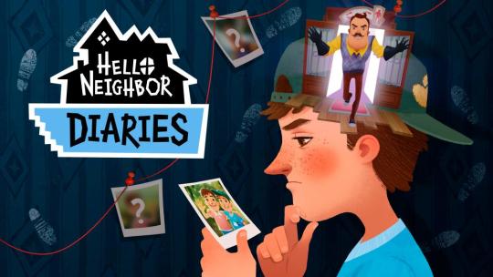
Note
Can i just say how much i freaking love the work you two are doing, Holly hell this is some wild stuff as veteran of hello neighbor you two are making me proud of this small community that is running on tumblr!
Also i hope you two don't mind me asking two questions.
Firstly, If one of you two had the control over welcome to ravenBrooks show what will be some things you two will change.
Secondly, What are you're thoughts on the artstyle of the show considering that Man of Action is working on the show?
Okay to start, I know I say it every time we get asks like this but y'all are genuinely so sweet and nice and it's just really really cool to see people enjoy our stuff. Like- especially fellow old fans of the franchise. I know Kaydin also really appreciates how sweet you guys are but just idk it feels like my fandom dreams come true when people like things like our au and art for this series
As for your questions...
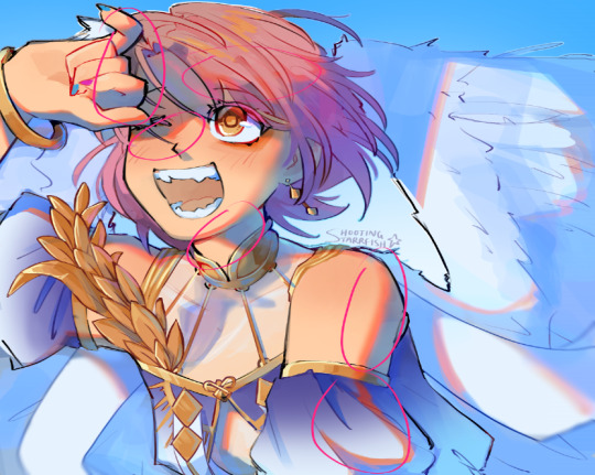
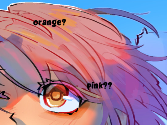
Personally, to start, and this is Jack being slightly particularly- idk nitpicky? But there are three things I'd want to just- fix immediately and all three of them are Nicky related.
Number one, his shirt. I'm sorry guys but I've been here since the alphas and I didn't even realize this was his Sharkotron T-shirt. It's- It's just an egg
Number two, I realized after intense studying of Nicky's- face that it looks really weird when he's front facing, but his nose is facing right. So scenes like this suddenly seem- off model for no reason? I've poorly edited the image below to fix both of these
Yes I am too lazy to edit them properly, sadly. Did make his shirt logo still one colour for ease of animation. Idk why but left facing nose Nicky just looks less weird. Just me and kaydin? Maybe.
Number three- uh... that hairline is atrocious /lh
I know he wears his goggles in the show like constantly but also- this is a 13 year old boy guys. I was 13 once and I have a very flat (minus a widows peak) hairline, but it did not stop my hair from falling all over my face, and I think it's fair to assume the same for the kid who's hair refuses to behave anyway
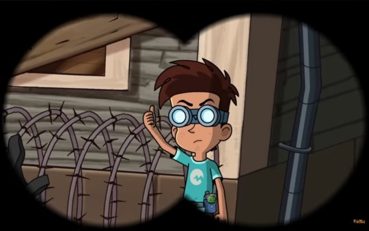
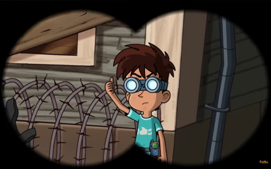
Just fluff him up a lil (again I'm sorry these aren't better edits lol)
You don't even have to have it show when his goggles are up because like a headband or headphones it pushes hair back, or otherwise

Although ironically while I'm explaining what I would change in the designs, I don't mind the art style at all, actually I kind of love it. Sure some things you kinda of have to get used to, like their ears being pretty low to the head, but in general I think it really fits the franchise. I know it didn't look too drastically different from the pilot, but there's so many little nuances in the designs that just make it better (especially when you look at characters like Trinity)
I've told Kaydin a dozen and a half times how I think show Nicky is the franchise's second best design for him. The first being this singular piece of art from Nicky's Diaries, like I have gone on for hours about why this rendering of him is just perfect.
Third being fan renders, followed by the book artstyle, the pilot and finally games
And while other designs I wasn't sure about when watching through the show the first time, really just lore hunting instead of caring about anyone who wasn't Trinity or Nicky ngl, when I started doing my expression analysis I realized just how nice the designs and individuality of the characters are. If you put Nicky's expressions oh Enzo or Ivan's on Trinity it wouldn't fit and that's something I don't think people would expect from a Hello Neighbor cartoon.
They also have things I can just appreciate as someone who's special interest is animation (but doesn't have the patience to animate TvT gotta love audhd) for example, just having shading even in shots where they could completely go without it. It makes it less drastic and a smoother transition when lighting gets intense. They're also now afraid to switch up camera angles and push the rigs for a more intense shot.
Also something I really appreciate
Smear frames!
God I love smear frames!!! It's another one of those things that It's like- knowing how much this cost Tinybuild, they could've easily cut it down to save money. But it just wouldn't have been as nice without it.
Sure there are probably people who look at the fact that Man of Action is working on the show and are disappointed by the art style. But I say this entirely genuinely when I say I couldn't picture this show looking any other way and working as it does.
Yeah, they could've used more realistic proportions for these kids, but it works so much better when it's pushed like this when Mr. Peterson is nearly double their height. He's visibly a hulking intimidating man who could lift a middle schooler and lock them away. You fear his build which contrasts his outfit best (really feels like they took the book description of him and just pushed it, as we know he doesn't have this same stature in the games)
Plus it feels like in general, they stopped focusing on that dumb "Oh we need to hide things in every frame" which- thank God. Sure they are still hiding little details, hell I have changed a whole chunk of theory about Theodore's relationship with his son because of something I found on accident
This photo of (seemingly) 12 year old Aaron Peterson.
I'm not gonna go into it here lol because this is already long and it's supposed to be about the animation.
Are they still building mysteries and people are still crafting theories? Absolutely! Not a day goes by that I haven't been thinking about whether or not Aaron will ever be seen in the series in the present day and if he is, what he will be like mentally.
But the point is, they're focusing on crafting something GOOD over just theory fodder. Both animation and story-wise, and I can appreciate that so much.
Like- this is gonna be a really hot Jack take here so be aware.
I enjoy this franchise and it's spinoffs much more than the FNAF franchise.
Sure, Hello Neighbor one is and will always be awful. But I am 100x more likely to play Hello Neighbor 2 or Secret Neighbor than I am to play any fnaf game myself.
When I make fnaf content it is almost entirely AU based. Because the idea of getting lore super wrong since I just can't be bothered to try and figure that convoluted mess out is annoying. Why even try to solve lore if I need to read more than 10 books for a minor detail that becomes a major antagonist? We can't even get a full confirmed backstory for the main antagonist!
But with Hello Neighbor they realized that people don't want to be jumping through 50 hoops for lore. Yes we want mystery, but one we can solve without dumb contrivances and plot holes.
Do I still love FNAF? Of course. My senior quote is from William Afton ffs ("You may not recognize me at first, but I can assure you, it's still me") but one of these franchises is growing to better itself and gain more love, while the other is slowly becoming more of something I enjoy without trying to understand, and I think the Hello Neighbor animated series is- the pinnacle of this difference.
I love Welcome to Ravenbrooks. I love Hello Neighbor. I can’t wait to see what comes next from TinyBuild, and how season two will be even better than season one. (As proven by the fact that Nicky gets to yell louder in that one teaser clip alone than anyone got to in season one lol)
#welcome to raven brooks#hello neighbor welcome to raven brooks#hello neighbor#hnas#answering asks#ask response#nicky roth#seriously kinda love fluffed up Nicky though#he's so silly#also nicky's hairstyle in show matches his in book description very well to me#how it sticks up to the side no matter how much he wets it#so real as someone with fluffy hair too
20 notes
·
View notes
Note
hi sry this is a lil long but i just felt like giving my own comments about ur post re: feeling left out/regarding more detailed work, and wanted to say that your work singlehandedly has inspired me SO much to the point that because of your more simplistic coloring/shading and focus on movement/body language, i was finally able to find a coloring/rendering style that i actually like aesthecially and enjoy doing! i've struggled w replicating color in a way i like digitally for over 6 years but your work, and especially so your sketchbook scans on patreon have been so useful for inspiration and for my own understanding of anatomy and what not. we're always our own worst critics with comparison and whatnot, but please know that your work and your style are a huge accomplishment and skill in their own right, and your comics inspire me to keep studying so i can one day make my own!!! i'm so thankful you share your work with us and to have come across it and be able to draw inspiration off it! your colors, expressions, and the palpable intimacy and dynamic character interactions are so amazing and specifically unique to your work, never doubt the impact it has just because of other's having a different style or approach or something <3
This is so extremely nice I don't even know what to say!!! I honestly feel so hyped that my style inspired someone else, I feel like it's not something I expected and its SO COOL. I sometimes feel like my style isn't particularly STYLISH you know, I often admire really strong punchy styles, so it's nice to hear my own kind of chiller style is inspiring! And that the things I enjoy come across as strengths, too! Also I am so happy to hear someone enjoys my sketchbooks haha, they're really precious to me but I also try not to be too fussy about my art in them which means it's not 'beautiful'*- they're for studying and/or chilling out, so it's SO nice that it's inspiring nonetheless! Wishing you the best in your art journey and also I think if you want to make comics you should just give it a go! Make teeny tiny comics! [it does not have to be good] [tangent oh my god] I feel very hypocritical because for the longest time comics were something my friends made and I didn't know how to, and I felt like my style didn't work for comics, but honestly when I eventually sat down and started a long comic the style happened out of necessity, I Had to simplify or I wouldn't be able to keep up. And you can see from the links that I just did sketchy comics before and that was fine! I think it was just as valuable as making polished pages. I actually probably ended up making comics For Real because I made a silly fandom ask blog, where I kept wanting to say more than I could do in one image, and that gave me the confidence to try something longer with OC's.
ANYWAY thank you so much!
*I find polished sketchbooks so inspiring, but its so limiting imo to try to make a beautiful sketchbook HAHAHAH
#this is so many backhanded negatives about my own work im sorry i swear I am not fishing#I love my work!#but i always want to get better!#I get really excited about learning new stuff#opening my sketchbook to draw fucking collarbones or some shit lol#mal talks
35 notes
·
View notes
Note
hi hi! i love your art so much & specifically how you use shapes, especially when you’re drawing heads and faces. i was wondering if you have any tips about how to incorporate shapes this way! pls feel free to ignore if course!
Thank you! I was mulling over this trying to figure out an answer that makes sense. I usually go for what "feels right" which is not a great answer lol so come deconstruct my choices with me in real time--
When i'm drawing figures i'm never aiming particularly for realism when it comes to movement. I go for flashy, poster perfect-esque compositions, so if having Vash's coat-tails flit around him unnaturally don't make sense but it looks cool, then i'll go for it! I think i'm always looking for a solid silhouette so whatever pose the character is striking, you can tell what's going on. Finding the right balance between making a silhouette with too much vs not enough is not something I know how to explain, but something I believe is important! :']
I also tend to extend a characters "energy" outward:

you can see in all these corners and edges everything points outward and even curves a slight bit away. I think this is one of the reasons people tend to call my art sharp/spikey! I don't tend to shade/render my work a terrible amount, preferring a flat graphic look most of the time or just playing with blacks (which is a whole shape language in itself) but when I do, all the shadows and highlights shapes tend to take on a spikey/lightning bolt shape even tho it wouldn't look like that in real life!

It's just really pleasing to me and I like how it looks! The spikier something is for me, the better! If you couldn't guess at this point, starts/lightning bolts are my favorite shapes haha Another thing I tend to do is avoid is curved lines. They're definitely still there! But my flow is more jerky straight lines so that if I drew a circle in my style it'd look like a messed up pentagon with soft points, that basic rule in my art brings forth funky shapes that otherwise wouldn't be there if I was trying to stick to realistic shapes This probably didn't answer a lot ToT but I hope my rambles brought something to light, whatever that may be!
95 notes
·
View notes
Note
I just found this blog and I noticed that a lot of your stuff seems, well, oddly 3D. I don't mean like in a bad way but it feels like rendered but untextured 3D models? I kinda want to ask what your art process is (sorry for mini-rant)
thanks for checking out my blog! and no need to apologize for anything.
hmm, my art process. honestly i have no idea what to say, i dont know how people normally answer this question so i cant base it off anything either. i'm still kinda new to this whole art thing but i'll try and answer, super sorry if i get this completely wrong and this was all a waste of time.
i guess i'll just talk about how i draw things step by step? for the high effort pieces at least.
ok, so for starters like step 0. when it's a high effort piece, i can already see the image in my mind. i see the pose, i see the general lighting, the layout of stuff, but it's a bit blurry. if i cant see this mental image, the drawing usually comes out extremely poorly.
this is kind of an example of what i see in my head? this might be all useless info idk, but this is i guess where i start.
well step 1 is just the sketch and line. i start with just sketching the general shapes, then slowly refining it until it fits close enough to the image in my head. then in the line layer i'll fix any mistakes the sketch had and add more details to it. oh and for brush, it's just a round brush, like default. i dont know how much of a difference using a drawing tablet does, but i dont use one so... yeah.
i should've put more effort into the sketch for this drawing, but i did not.
next i do flat colors. pretty simple, i just select the smart select the outside of the line layer, invert the selection and now i can't paint outside the lines. i dont really think about what colors i use, i just use whatever the characters normal colors are.
next i do the shading, but first. i duplicate flat layer and recolor it to like a cream color
like so. for high effort pieces, i was told online to shade in pretty much black and white. now actually onto shading. there's 2 kinda shading i do, 1 from the proper light source, and 1 that's kinda just a shadow because things are close together (like corners and stuff). and i'll shade them on separate layers so i can adjust them individually however i want. oh right, i'll either use a very dark color, pretty much black and the the layer blending mode set to multiply. or i'll use a light kind of gray, tinted slightly yellow or something and set the layer blend mode to difference. then i just use a soft air brush and shade in the ways i described above. shading from regular light source, and the corner stuff thing.
normal lightsource - - - - - corner thing
then toggle both layers on and mess with the opacity of each layer until you get what you want.
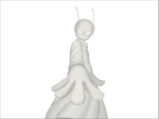
then you can toggle the normal flats layer, the one that has color and it should apply the shading decently. you can mess with the opacity again on the shadows.
next i do lighting. i just grab a very light color, usually pretty close to white and set the layer blend mode to overlay. then i use a soft airbrush and "light" it? idk i just do like the opposite of the normal shadows, lighter the closer it is to the light source
mess around with the opacity as usual. then i do pretty much the same thing if there's another light source. in this case there was a blue light kinda coming from underneath, so i did that.
now from here i would go back to the flats layer, make a copy, and mess around with different layer styles and properties and settings. sometimes just messing around is useful. in this case, i felt it was too bright and colorful, so i decreased the brightness and saturation of it.

i think it helped a little bit but who knows.
now i do some kinda highlights and details. i grabbed the colors that were in the background and used those. it was a weird pale blue. i had 2 layers for this, 1 of them was specifically for his antenna things at the top, and one was just for his "skin". anyway, the antenna layer was normal, just kinda gave it an outline with the random reflective circles you see normally in pictures, no thoughts behind them. the skin tho had the layer blend mode set to soft light, i thought it looked best this way. it was just more random things to imply it was slightly reflective.
together the layers looked like this. i think it makes him look glossier which is what i was aiming for.
next, and it pretty much the end for pebbles, i got someone to look at it and let me know if they think anything was missing. they said it looked a little unsaturated. which it does. so i made a new layer, set the blend mode to saturation, grabbed the airbrush and made it pretty inline with the lighting layer.
that's kinda it. the background i didnt really care about, just drew and colored it. blurred it a bunch and added a bunch of shadows. i did add some like, "overshadows" is what i call it, i just draw some big shadows down the screen as the top layer.

but yeah thats literally everything i did to draw this. i would like to apologize if this was not at all what you wanted to know, i'm certain i've screwed this up bigtime. super sorry for wasting your time. if there's anything i can do to help, please ask. i owe you a proper answer to your question, i'm just really dumb. sorry for rambling. sorry. and sorry if the drawing i used for example didnt showcase what you wanted to know.
also, i really like your art! please keep up the great work!
#i think i did this all wrong#i'm so sorry#i feel incredibly stupid#:I#rambling :I#now everyone get's to see how little i know about drawing
26 notes
·
View notes
Note
Do you have any tips on how you do shading ?? Your art really inspires me and I literally suck at shading lmao.
hello anon!!! im honoured i can inspire you sdfhkjh it's crazy to me that i can inspire literally anyone :,DDD <33
tbh i do all my shading purely based on vibes/what makes me happy so im not sure im a good advice person but ill show you a breakdown of how i go about shading and hopefully that might help a bit? :o i've left it below the cut because i have too much to say and it ended up being really long LOL
of course if there's anything you want more details on i'm always happy to explain, just let me know!
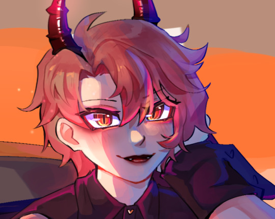
okay SO ill use this asmo as my example, i think there's enough to talk about here that it should be helpful hopefully
so here's my lineart and flats! i do all my flat colours in one layer because i find it easier to make everything look more cohesive when the pieces arent separated (i usually like it when the colours bleed into each other a lil), but i also just dont like the process of having to switch between layers for everything too LOL flats are unfortunately my least favourite part :,D probably because my lineart is so messy hahah
as you can see, the shading is very minimal here, just some subtle stuff in the wings/sheer parts of the fabric and some blushing on the skin, i also stole the orange under eye/liner thing from TBHK because <3
and then i clean up any messy stuff by just painting over top of everything on a new layer, i also rendered the metal at this stage because i felt like it i guess???
i dont think i did a suuper good job at rendering the metal here (because i was lazy), it looks fine but something to note about metal is that usually you want to push the highlights and the shadows a lot more, as well as the reflections because it is so shiny and smooth this is why you'll see a lot of pink and blue in the metal, to show the reflections of his hair and the sky
i would recommend using reference to get a better idea of how metal ACTUALLY works but again, i was lazy lol so that's a simple explanation based on what little i know/have observed
the jump here is a bit drastic and you might be like woah starr where'd all this come from?? but this is all in one layer-
('hard light' - 62% opacity)

this is how that layer looks as a normal full opacity layer, for reference:
lately i've been using hard light layers to shade! they're very versatile because unlike multiply layers i can do my shading and my highlights within one layer (do you sense a theme of me disliking having too many layers lmao)
SO this is where i have a bit more to say about shading you'll notice the prominent shading colour here is blue, this is because the main environment here (the sky) is blue. i dont know if that's how things work in the real world but it works for me LMAO i usually prefer to have my shading lean cooler purely for aesthetic reasons, i like how it looks more
you might also notice some areas where the blue is a bit brighter, this is to imitate reflected light, again because the environment is blue light tends to bounce around on things and reflect back even into the shadows so this is the effect im trying to get, i like to typically go with a brighter blue cause it gives things a sort of shinier? quality that i enjoy aesthetically, idk if its very accurate to real life tho it also helps me to give depth to the shading since shading isnt usually just one flat blob, and this is a bit of a shortcut to having more dynamic (?) looking shadows

i also want to point out my use of bright reds on the edge of the shadows:
i believe this is called diffraction- there's a real legit scientific reason why it happens but i... dont know what that is i just know it happens in real life (maybe not to this extent?) and it looks cool so i do it SFHJKSFH i usually blend it into the shadows though as opposed to into the lighter parts, i find that tends to look better
some miscellaneous things-
don't be afraid to throw random colours around!! who cares about realism, it's fun lmao
this artwork is a spoiler for asmo's bday so shhhhh but i did want to quickly show that you can also use hard light layers to create a glowy effect, i literally just painted the pink/orange directly on the shadows layer and it helped to make his eyes more glowy
of course i do go in and paint over a little after and add some layer effects but it helps to have that base there
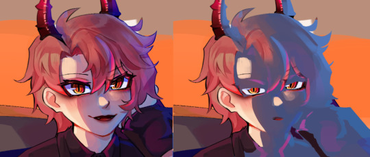
now that you've learnt that i dont know what i'm doing, i wanted to highlight a couple of resources that have helped me! i hope they help you as well <3
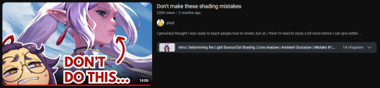
this video gives some really interesting insights into this artist's process and some problems they had throughout, as well as how they overcame them! it looks a lil clickbaity but i promise it's good!!
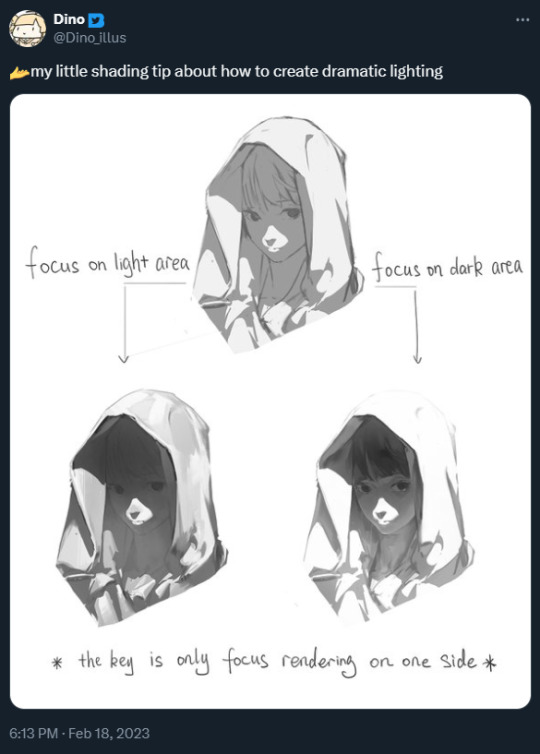
this tweet also shifted how i think about rendering when i want to do something with dramatic lighting!
+ an attempt i made to replicate this (i wanna try this again lmao it was fun)
i hope that helps even a little bit, i did my best to explain but sorry if it was mostly nonsense though :,DDD best of luck with your art, anon!! <3333
19 notes
·
View notes