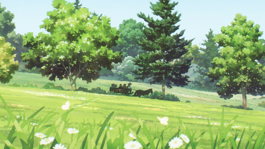
#I digitally painted then blurred the background + added a texture for the ground
Explore tagged Tumblr posts
Visit Tumblr Blog
Explore Tumblr blogs with no restrictions, modern design and the best experience.
Last Seen Tumblr Blogs


Fun Fact
After the announcement of the deal with Yahoo!, there were 170K signatures of unhappy Tumblr users petitioning to prevent the sale in 2013.
Text

Goodbye... but not farewell
In the timeline of “that fic I’ll never write”, this takes place about 12 hours after this.
Story under the cut :)
So, the morning after Taylor and John’s last night together in her bunker, which was also the first they—chastely—spent in each other’s arms, he packs his belongings, dresses nicely (because John Seed simply can’t wear sweatpants in public), and she drives him back to his ranch.
When they arrive, she stops her pickup truck a few meters away from the house… and from the small group of cultists gathered at the entrance, eager to celebrate the return of their Herald.
Upon seeing them, Taylor chuckles softly.
“Looks like they organized a little homecoming party for you”, she comments.
John, sitting next to her on the passenger seat, is also looking at them, a tender expression on his face.
“Yes. I’m back home, I suppose.”
His smile then slowly fades, and he turns to Taylor. When their eyes meet, she notices a hint of regret in his. He’s back among his brothers and sisters, sure, but she’s not coming with him...
“Well... I guess this is goodbye, then,” she says, trying not to let her own sadness show.
“But not farewell,” he assures, nodding.
The Baptist gets out of the car, grabs his coat and his bag, goes around the vehicle, and stops at the driver’s open window.
“Thank you for the ride.”
“You’re welcome.”
“In fact…” he adds in a low voice, placing his hand on hers but making sure that, from his followers’ point of view, it looks like he’s just touching the door, “…thank you for everything.”
She smiles fondly in response, and he just stands there in silence for a moment, seemingly studying her features, maybe trying to engrave them in his memory.
“How I regret not kissing you again earlier this morning when I still had the chance,” he finally murmurs.
The cultists are too far away to have heard him, but Taylor isn’t, and her right hand tightens on the wheel.
“See you again soon, ‘Deputy’.”
He hasn’t used this nickname in a long time, and she lets out an amused huff when she hears if. John, now mischievously smirking, discreetly winks and starts walking toward his ranch.
Although he briefly turns around halfway to give her one last, small wave and bittersweet smile (which she returns), she realizes each step he takes hurts more than the last, and that the further away he gets from her, the deeper her heart sinks into her chest.
It was at this moment Taylor knew there would be no going back.
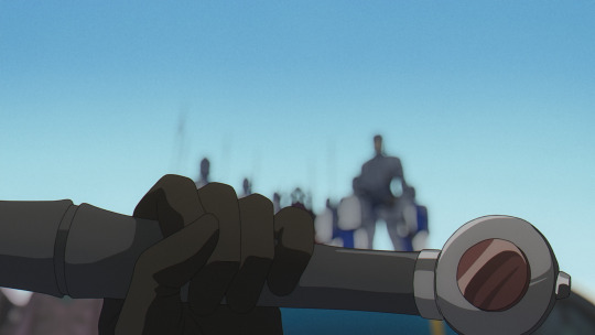
#the next scene is her going back to her bunker and realizing everything reminds her of and/or smells like him and just wanting to scream#taylor rook#my deputy#the deputy#john seed x deputy#john seed#my art#fan art#traditional art#digital coloring#drawn in december 2023#I have to post them I just keep drawing more!#because no this was not the one I was working on during the anniversary livestream haha#far cry 5#the car is a 'kimberlite TCZ'#drawing cars is hard#not as much as I expected but still#I’m not sure I’ll do it again :’)#I digitally painted then blurred the background + added a texture for the ground#story: 'that fic I’ll never write'
47 notes
·
View notes
Text
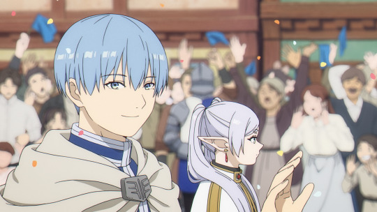
last season's anime: that elf show (1-6)
Belatedly watching Sousou no Frieren, the darling of the... previous anime season four months ago. So old news as far as most are concerned!
I have held off on watching this one because, well, videogamey elves-and-dwarves European fantasy is ehhhhhh! I can get into it if it's really well done and puts the focus somewhere interesting (c.f. Dungeon Meshi), or if its medievalism is a bit more historically grounded than your average videogame-inflected fantasy anime (actual European history is full of fascinating/fucked up shit which rarely makes it into fantasy). But Frieren didn't strike me as having that vibe.
Nevertheless I heard Madhouse were the ones that did it and somehow that was enough to finally tip me over into watching it. So lol. I was a baby or even an ovum when Madhouse were doing most of their best known work, and yet...
Anyway, it turns out, not only was it a Madhouse project, but none other than Yoshiaki Kawajiri actually boarded a good few of the episodes, although he's not the enshutsu [episode director/storyboarder] whose people are most excited about. The series director's last work was Bocchi the Rock after all! And this sure is another hit.
The first two things that jumped out at me in the first episodes were: the bgs are insanely good looking and the photography department is absolutely in love with a digital bokeh filter. I don't think I often see this specific kind of blur filter in anime (though I think you'll see it the works of some directors who like to emulate realistic photography like Yamada or Shinkai), and it was interesting the effect it had of eliding the lines and creating an effect kind of similar to posterisation.
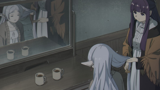
Bokeh aside, the background painting and layouts in this anime are really incredibly good. When I occasionally watch fantasy anime - I have a friend who is quite into isekai and will occasionally show me one of her faves such as Ascendance of a Bookworm - one thing that often bothers me is the architecture, you have identical box-shaped houses with big windows, wide flat streets, it generally doesn't feel like a lived-in city. This is something that particularly bothers me about Attack on Titan.
By contrast, Frieren is routinely dropping scenes like this:
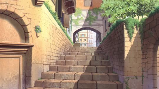
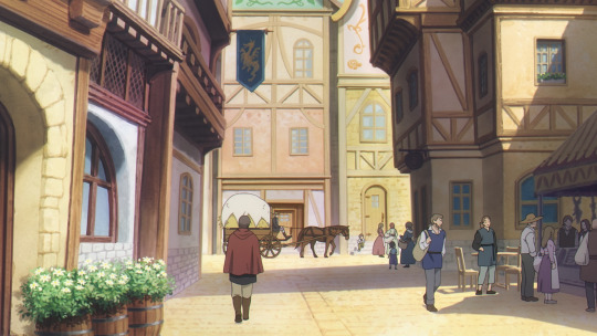
Split levels, varied colours and heights, accurate depiction of features like jettying, mixing up the verticals a bit. It's an impressive attention to detail and it does so much to sell the setting.
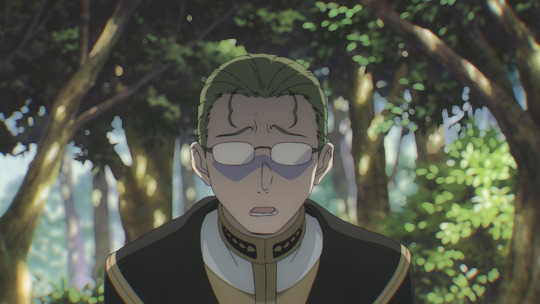
And the nature scenes are outstanding as well. Although I'm pretty sure they're painted digitally, it has the feeling of older physical media. The bg painters clearly understand the power of hinting at form with brush stroke shapes and a few flat colours - a technique similar to the bg paintings at Ghibli. There's rarely an obvious digital texture and they exercise restraint in overwhelming everything with glows and flares. The flat colours and paint-like textures are allowed to shine on their own. Plus everything has a subtle grain (pretty sure it's just good old Perlin noise), adding to the analogue feel.


But yeah, look at the subtle atmospheric perspective in the last one there! The layers of forest in the background are painted with less saturated colours, creating a powerful sense of layering and distance, without having to draw more trees than the immediate foreground. I could learn a lot from this painting alone when it comes to forest scenes.
While I'm going on about technical stuff, the animation also stands up. The first episode in particular has some real flexes with crowd scenes containing dozens of moving characters. The character animation is generally very restrained, but naturalistic. There is constantly a strong sense of space. The action animation later does less for me - it's not at all bad, but it's within the conventions of modern shounen adaptations - but it's generally speaking strong.
All that said, what about what it's actually, y'know, about?
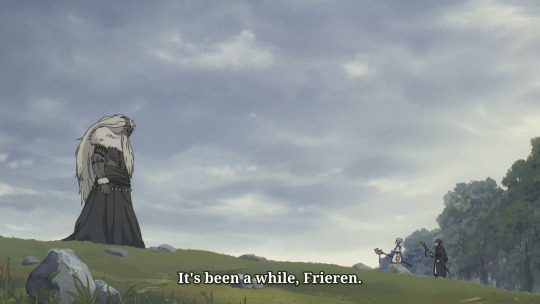
Frieren wastes little time in establishing its premise. The title character is a nigh-immortal elf, who was part of the RPG party that defeated the demon lord just prior to the outset of the show. Frieren has a pretty flat affect in general - not to say she's emotionless, far from it, but rather the heavy lifting of what she's feeling has to be conveyed through cinematography and implication of her actions. Though that said, it does plenty to humanise (elfise?) her too - she is not a morning person, and there are moments where she will get visibly excited about small things. Mostly, Frieren is a character who really doesn't understand herself very well.
Comparisons to the prototypical emotionaless girl Rei Ayanami come to mind to me - especially the version of Rei we encounter in Eva 3.0+1.0. Both characters' affect is shaped by transience - for Rei, she's a short-lived clone, for Frieren, her perception of time is completely miscalibrated to all the people around her so she'll accidentally disappear for decades while they get old and die. And both characters' arcs involve learning about how to understand human connections.
As kvin has said in his impressively detailed article on the background to this show, this premise is used to tell a story about the passage of time. In the specific, it's about the grief of realising you did not spend enough time with someone after they've gone. Frieren is retracing the steps of the party after disappearing from their lives for nigh on 50 years, returning just in time to catch the human characters as they die of old age. The episodes are usually constructed around her memory of that adventure, paralelled by the connection she's forming in the present with her new apprentice. She's trying to do things that she never managed to do when they were alive, get in touch with her own feelings, etc. etc. Lots of mono no aware in the air.
So each episode tends to develop two stories in parallel. There will be the immediate impetus - Frieren and co. find something that needs dealing with and coincidentally links back in to the past - and also flashbacks which help flesh out the rest of Frieren's party and why the journey was such a big deal to her. The writing and editing generally does a very good job of knowing what to leave unstated, what can be implied by a cut and a closeup.
More than anything I think I'm reminded of Seirei no Moribito. Frieren herself reminds me a little of Balsa - they're quite different characters, but the way they relate to others and the general arc of being changed by their connections - and while the dynamic between her and Fern is a little less parental than Balsa and Chagum, the use of scenery and the general approach to setting up of episode plots feels quite similar.
Predictably, stories about grief touch a nerve! 'I didn't properly appreciate the time I had with her' is something I feel particularly with my friend Fall, who we lost nearly two years ago now. A story about figuring out just what someone meant to you after they are gone is resonant, shall we say.
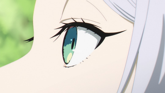
The first and second episodes as a pair end up particularly affecting. I talked about the technical stuff above, but the editing is also really strong. A couple of moments that stood out to me: moment of ephiphany communicated with a sudden eye closeup, an L-cut to bells which you don't hear until there's been another cut to the actual funeral. Since I've been in the sakugabooru server I've been learning to pay a lot more attention to individual enshutsu, so the names to credit in this case are Saito himself for the first, and Tomoya Kitagawa for the second.
The third episode (Daiki Harashina) stumbles a bit in my view, not so much because of the direction but because the script brings in some less-interesting magic mechanics and fighting-a-demon elements. The fourth episode, the first directed by Kawajiri, falls back into the rhythm: the stakes are small but we feel the development of Frieren and Fern's dynamic.
The fifth (Kenichi Shimizu) and sixth (Toru Iwasawa) episodes are a two part story, introducing a new character Stark as a second young apprentice character - the sixth episode has a really exceptional action scene with its dragon fight, bringing in a lot of familiar action animator names, and moreover the preceding episode does the work to set it up so we're invested in the culmination of the character arc it represents! Also there's that one sitting down cut I heard about. I wasn't sure I'd be on board with Stark at first, but he's growing on me through his interactions.
By this point we're starting to have more present-day 'villagers have a monster problem' type setups, but they're still primarily instruments to advance characterisation: the conflict of Stark with cowardice and responsibility is paralelled by one of Frieren's former party members, Frieren and Fern get to face ghosts of people they've lost, etc.
The first few episodes jump forward in years at a time in between, and even within the episodes tend to elide huge periods of time with montages - very effective for driving the central theme of tiiiiime. That seems to be slowing down a little now, although we'll see.
I think if anything weakens it, it's that the demons and monsters feel undercooked as setting elements - and I'm a little worried by hearing that they become increasingly central elements as the show goes on. Of course, they're kinda mandated by the RPG setting, and being able to just say 'back when demons attacked the village' lets the show put its time into characterisation. But to take episode 3 for example - surely there is drama to be had in the idea of a senior underling who was frozen for nigh eighty years, unaware that his master had been overthrown? But nah, he just attacks immediately, and then it turns out that human magic science has advanced so much building out from his technique that he's not a big deal anymore (ratfic ass concept). Mostly demons and monsters exist as plot devices, opportunities for characters to prove themselves or experience an epiphany.
It's a shame because the show goes to such enormous lengths to flesh out everyone else's motivations. 'Why did character x do or feel y' is kind of the thrust of every episode (c.f. that kinda questionable stuff people say about JP storytelling being more about causality than conflict). Next time they supply us a demon character, I hope they're willing to give them a comparable treatment. 'Kind, peace-loving villagers vs ontologically evil baddies' is just such a boring dynamic, and with such love poured into everything else, it seems a shame.
Overall, I don't think Frieren is going to displace Tengoku Daimakyou as my fave of 2023, or stand alongside Dungeon Meshi as elves-and-dwarves fantasy goes, but it's definitely a memorable one. As an adaptation it's absurdly strong. Looking forward to watching the rest.
24 notes
·
View notes
Text
Digital Art Process
**this is for my art class pls ignore lol**
Step 1: Sketch
I always start off with a very rough sketch to get a crude idea of what I’m going for. Normally I do this on whatever scrap paper I have lying around. I normally work in black ballpoint pen so I don’t fret over details and so I can work in tone

Step 2: References
Next up I gather references that fit the scene landscape/colour/feeling
These ones are from Game of Thrones


Step 3: Blocking Colours
For most landscapes I work using 1047x884px at 300dpi
Normally I start with the horizon and land (dark at bottom, light at top) and then using a gradient (light from the bottom dark towards the top) add the sky, everything in this will be using the same brush unless specified

Next I work form background to midground to foreground noting that the closer the object gets the darker it will become

Once I’ve done that I add in the detailing to the ground, in case went over it with a oil paint texture brush and added snow to the ground and tree branches

Step 4: Details
I add a picture set on overlay at 40ish percent to add some more life to the background, I also add 2 adjustment layers, hue and saturation and black and white so the image blends in better

Here’s the image I used

And here’s how it looks added in
Next I add details and lighting to the mid and foreground using a clipping mask for efficiency

here I added wood grain and a lighter shade for a bit more dimension. I also applied a subtle gaussian blur to the midground
After that I sketch in a person to add a bit more life to the drawing

I also add a shadow on a sperate layer with it set to normal with around 20-35% opacity and a gaussian blur effect added
Finally I add an overlay to add some texture, I add an hue and saturation adjustment layer using a clipping mask and shift the hue a bit and desaturate it

for a large majority of my art I use this texture on a layer set to overlay at about 25-30% opacity

Here’s how it looks after the texture is applied
Step 5: Lighting and Atmosphere
I add some ambient lighting in 2 passes with both layers being set to overlay at around 35% opacity. For this a use the default soft round brush set to around 400ish px (depends on the drawing). I always have these layers on top of everything with the exception of texture.
Pass 1 is more of a general light

Pass 2 is to add more of a specific light

Next up I add more specific lighting

In this case I added some light to the lantern. For this type of light I bounce between hard light, soft light or overlay and adjust the opacity depending on my specific need. Again I use the default soft round brush
I add some atmosphere (I adjust the opacity of these layers to my liking)
here I used a cloud brush from Kyle’s concept brushes and I went over in two passes
Pass 1 - Mist across the horizon to add more of a general feel

Pass 2 - A surrounding Mist to add more ‘dynamic’

Lastly I convert the image to greyscale to check value and tone (here’s a link as to why that’s very important)

And its done!

1 note
·
View note
Text
Dissecting the Art of SING “YESTERDAY” FOR ME Part One
SING “YESTERDAY” FOR ME, the anime adaption from Doga Kobo of Toume Kei's manga of the same name, tells the story of four young adults right outside of Tokyo trying to find their purpose in life. Through their personal struggles, they try to better themselves, but more importantly, the people around them in their time of personal uncertainty.
One of the highlights of the show is its attention to detail, capturing the feeling of a Japanese suburb with the concrete and developing landscape of 2001 Japan. Crunchyroll was offered the opportunity to publish a translated version of a two-part interview series featured on the SING “YESTERDAY” FOR ME website to highlight how the team brought that world to screen.
Part one of the original Japanese interview with Usami Tetsuya and Fujii Yuta can be found here. The translated text follows.
One of the essential parts of the anime SING “YESTERDAY” FOR ME is the background art. The ones in charge of the background art are the art director Usami Tetsuya-san and Fujii Yuta-san, who’s in charge of the art design. Both are from STUDIO EASTER and we asked them a few questions looking back on the production of the series.
01: Please tell us about your jobs
Usami Tetsuya (left) and Fujii Yuta (right)
Fujii: My jobs are art design, 3D modeling, and 3D layout. Being in charge of the art design means that I’m in charge of all the designs for things other than props ... For example, the rooms, the outside of buildings, what the town looks like, etc.
Once the script is done, I will do art design so that the director can do the storyboards. They’ll tell me what kind of scene they want to do and what they need and then I’d create that for them. The director actually did the initial design of the town, and then with the photos I receive, I put all that together and add details to go along with the script and the scenes.
Usami: As the art director, once the storyboards and the art design are done, I would work on bringing the director’s requests together like what colors they want to use or where they want the light coming from in certain scenes. I believe it’s the art director’s job to create the “atmosphere.” I add color to the world that art design created and then think like, “Older looking wood would look better here.” It’s up to me to decide what the atmosphere of the room, the city, and basically everything is going to look like, and it’s up to the art design to work on all the details up to that point.
Fujii: My world is black and white. The art director’s world is filled with color.
The kotatsu in Rikuo’s room.
02: What did you concentrate on when recreating what Tokyo looked like 20 years ago?
Fujii: The story takes place in 2001 and around the Setagaya Line. The director loves the original story and definitely wanted to make sure we made it obvious that the story took place along the Setagaya Line. (From Episode 2, the story takes place from 2002 and on.)
At first, the director was having a hard time putting everything together, so we went to find locations together and would interview people who actually frequented through those locations. That helped him figure out how he wanted the animation to look to express the world of the original story along with some trial and error. Watching him work all of that out still comes to mind. He also talked about how he wanted the TVs, traffic lights, and LEDs all to look older like they did back then.
Usami: Yeah, or like erasing “taspo” [Note: a smart card used for buying cigarettes in Japan introduced in 2008] from the cigarette vending machines. And he wanted the cigarette packs to look more like they did back then. It may not be that far back, but it was actually very hard finding references for all of this.
I was reading this series as a student, and simply as a fan, I totally understood why the director wanted things to look this way. We mostly work with cells, but I did create a 3D model for an old school game. (lol)
Fujii: I heard we were doing cel animation so it definitely wasn’t that detailed. (lol)
Usami: I thought, “Man, this series really likes to concentrate on the little details.” (lol) Is it okay for a TV series to worry this much about minor details?
Fujii: It really does almost feel like we’re making a movie. (lol)
Director Fujiwara looking for a reference for the photography studio that Rikuo works at.
The director was also seen talking to the studio staff so he could figure out how the studio would look different in the anime.
The design for the analog TV in Shinako’s condo.
03: The town that exists between reality and realistic graphics
Fujii: The director had decided the initial layout of the town, so he’d give me some stairs and ask me to just create a certain part of the stairs, or like for the outside of a building, he’d give me a photo of a building and ask me to expand certain parts of it. I created everything under his direction. I had the director do the initial design of how he wanted the inside of the room to look and then I would fine-tune it, trying to make sure everything was within the limits of reality.
The original sketch and 3D model of Rikuo’s room.
Fujii: You can do some pretty extreme things in anime if you really wanted to, but I didn’t want that to happen, so while keeping the director’s vision, I did my best to make sure all the art design and 3D models all looked realistic still. Because all the characters live near each other, we do reuse the 3D model of the town. Depending on what the characters do in their daily life, we add and subtract things from the scene and adjust as needed. For example, with the convenience store, I was asked to create a back entrance because they wanted to do some scenes there. I then show them an example of what it’d look like and go from there.
04: The art of SING “YESTERDAY” FOR ME that balances reality and the story
Usami: At first, I was asked to keep things as realistic as possible, as if we were looking at photographs. But if we went too far, we’d lose the hand-drawn feel of SING “YESTERDAY” FOR ME, which was a problem that we discussed. So how do we balance the two?
So the more realistic we make it look, the more the hand-drawn feel seems to stand out in a way that we don’t want it to. So I’d look at the director’s storyboards and think, “I should add a bit more of the brush here,” or “If I mess with this anymore, it won’t look as realistic.” While I kept asking myself those things, I’d add a few extra touches and take some away. I basically kept trying to find a happy medium.
First, I thought about what kind of “brush” I would use. I wasn’t sure if I should use a brush that would make things look a bit more hand-drawn or more like watercolor. In the end, I wanted things to look like they were done in pencil.
When I tried that and we agreed that it looked pretty good, so we went with that. My biggest reference was Toume Kei-sensei’s artbooks. The director was really attached to the flashback scenes, so we went heavier with the hand-drawn feel there.
Usami: With more recent series, they try to lay on more realistic textures to make everything look more realistic, but we decided not to use as many textures this time, and I was asked to make everything look more hand-drawn. If we just use wooden textures, you can make trees look like trees, but we decided to use brushes instead. Or like using textures for the tatami mats would look too detailed, so we used brushes. There were a lot of times where I blurred some of the details in this series.
In this day in age, efficiency is top priority in this industry, so I wondered if my job would be okay at times... (lol) A lot of our staff were first-timers when it came to hand-drawn animation, so they said that this series was harder to work on and different. (lol)
What’s difficult is when you try to add some finishing touches to something, you can’t let it look “dirty.” A lot of the staff grew up in the digital age so there are a lot of them who have never done any paintings, so there were some who couldn’t tell the difference between touching up and something just looking dirty. But through trial and error, all of them made SING “YESTERDAY” FOR ME the best it could be. Normal series would usually only have 4 to 5 people to do all the art department stuff, but this time, we had 15. So basically 2 to 3 times more than usual (lol).
I think the whole company worked very hard on this project.
The scene from episode 1 with Rikuo and Haru talking at the park.
If you look closely, you can see that some hand-drawn nuance has been added to the ground and stairs.
Next time, we ask them how they used art to craft this multi-character story!
Kyle Cardine is an Editor at Crunchyroll. You can find his Twitter here!
0 notes