#I DID NOT MAKE THIS IN ILLUSTRATOR it was done in csp and i saved it so i could open it in illustrator/ photoshop
Explore tagged Tumblr posts
Text

Everythings so big in this thing wtf.
#ramblings#I DID NOT MAKE THIS IN ILLUSTRATOR it was done in csp and i saved it so i could open it in illustrator/ photoshop#i have never used illustrator b4 i just had some adobe products downloaded from like 4 years ago and looking somehting up#gave me the hint that this is how im gonna get them assets as a proper vector LOLLL#the art converted here looks weird tho so im gonna make the background then save it as its own image to import to the CSP vers of this#undescribed
3 notes
·
View notes
Text
Quick update + A little treat!
Hello! I won't be very active during July because of ArtFight and a few illustrations i have planned (on top of my job, send help), so to make up for the upcoming lack of content, here's some insight on how i animate my Twst Chibis :)
(shoutout to the person who sent an ask about this topic! idk if i misclicked or if you took it down yourself, but it made me really happy to be asked and i spent 4 hours writing this as an answer, so i'm posting anyway lol)
Rigging & Animation talk below the cut, feel free to scroll by if you were just here for the update (and have a great day 👋)
I'll be taking Mafuyu as the exemple here, because he's the most complete one i made so far.
Firstly, here's some WIPs i saved showing off his faces and hair bones
Basically i went ahead and made an entire rig for him, since i know i'm eventually going to come back and make him more reactions and outfits. I started from scratch so it took a while, but at least now i have a nice base ready to go!
The original sketch was made on CSP, then the model itself and animation were made on Toon Boom because i haven't learned to use Live 2D yet.
Great thing about that is that it ended up being fully vectorized, which is always a plus if i ever need to resize him.
Here's a zoom (or huh, as close up in as my screen will allow) on all the elements, and their hierarchy. From the left are the elements that show up on top of everything (pearls, hair, head & face), to the ones that are behind everything on the right (cardigan back, braid, shadow):
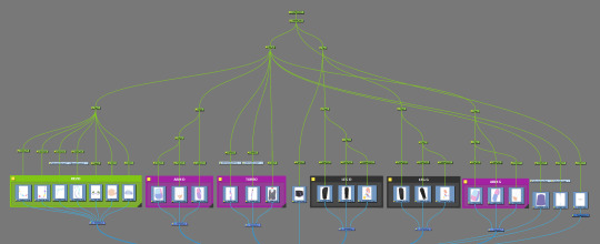
It's kinda tricky to describe but all elements have their individual pegs (the green bits), which then get linked up additionally and in groups, so for example if i start selecting from the hand and go up, it goes:
Hand -> Hand + Forearm -> Hand + Forearm + Upper arm -> Both Arms + Torso + Head + Hair -> Upper Body + Pelvis + Both Legs
Once the model was done it was onto animating!
No secrets here, i really just tried my best to match the rhythm of how the in-game models move, what movements came back regularly etc... So typically: the heads often bop up and down in a specific way when they laugh or look up, the entire body stretches slightly when they jump or get startled, things like that.
I keep thinking that technically i shouldn't have animated the bangs because the in-game models have pretty limited hair animations, but hhh it felt too important to skip for Mafuyu (and mostly i was just having fun lol).
Just for fun, here's what most of my timeline looks like for the idle animation:
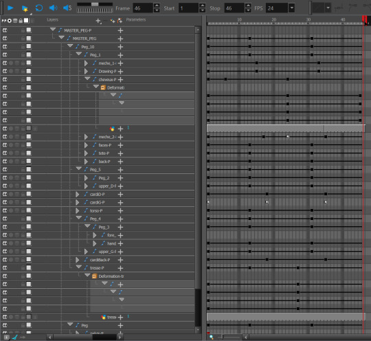
I'm confident that the og animations are fully tweened, so i did that too. But ofc with some adjustments to the timing so it doesn't look stiff. Since everything is on ones I didn't have the patience to go back and modify frames by hand lol.
It was especially tricky to figure out how to make the elbows look good, because of the pattern on his cardigan. I had to redraw the arms like 4 times to have them work in all positions. I spent many minutes looking at in-game models that had checkered sleeves (White Rabbit Deuce ended up being my main reference) to analyse how they made theirs work. I could've bothered making a clipping texture that I could warp to match the movement of the arm but,,, that probably would've killed my motivation entirely, i was determined to make this look good, but not THAT much lmao
The bangs, braid and cardigan were the only elements that i animated with bones and warps, for everything else i just used basic pegs to rotate and stretch the limbs
After that i just threw a Ramshackle themed bg behind him and gifed him up, and Voilà!
Random/fun facts, because why not:
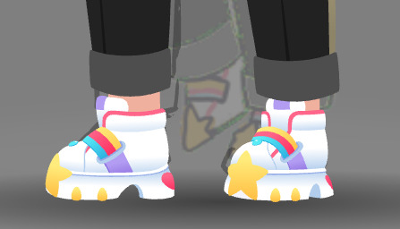
The shoes took me 4 hours to make, because im really not used to drawing with vector tools, all those details made it hell lol
His proportions are mostly based off of Ruggie's model :)
I think that about covers it! I tried going into details without being boring, so hopefully it's still understandable, and maybe even interesting for curious folks 🤞
If you made it all the way here, holy shit thank you!!
18 notes
·
View notes
Text
anyways here's a quick list of steps I had to do for Star Clock Silver both for those curious and also bc I Will Forget My Own Process due to having a bad memory lol. There's a reason why the thing took me like a month or 2 of work-
Thumbnailing and sketching
Layout Part 1 - The Clock
Painting the Clock
Layout Part 2 - Silver
Drawing Silver in literal pieces like a vtuber model
Drawing the background and other elements
Making a reference image
Rigging Silver (Agony Part 1)
Animating Silver (Agony Part 2)
Putting it all together in After Effects and experiencing 10 different problems (Agony 2.5 ReMix)
Compositing for real this time (Agony III Re:Mind Chain of Memories 358/30 Days)
Done ✨
Software I used:
Note: I am not paying for any subscription for any of these :^)
Adobe Illustrator - Completely optional. I only used it because it's easier to draw circles there. Used to draw the initial layout for the clock.
Clip Studio Paint - For everything that actually involved drawing or painting. Silver was drawn entirely in CSP, but I saved everything as a photoshop file because it's more compatible with the other programs I used.
Photoshop - I used it mostly for layout-ing also tbh.
DragonBones Pro - Opensource✨. For rigging + animating Silver. Tedious to use but it's free and gets the job done.
Adobe After Effects - For putting it all together + some extra effects. All the other parts of the Star Clock illustration--such as the clock itself, the gears, etc were all animated here. They didn't need fancy animation like Silver did; only basic rotations and opacity ones.
#im using words#there's a lot of steps but the basic process is. actually pretty straightforward.#im feeling way too chatty rn. hi#ask me about my thought processes I love talking about my thought processes
7 notes
·
View notes
Text
sorekara setting design
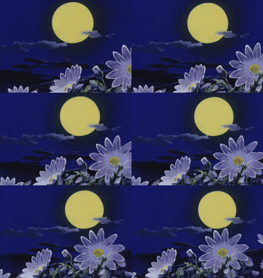
Here are some notes on the development of SOREKARA's style and presentation. If you couldn't already tell, SK takes a lot of inspiration from 70's/80's anime, Nobody's Boy Remi being the reference point for much of it. I've always respected Dezaki for his monumental work so I've always wanted to pay tribute to it (especially the early stuff). I don't think I was as successful as I'd like to have been, but alas! There is still more to come! So without further ado!
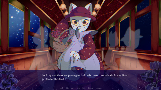
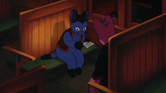
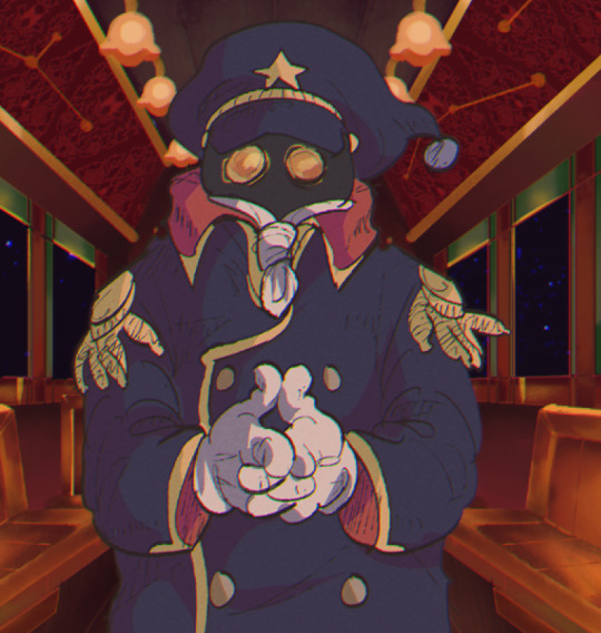
I was just talking about Dezaki , but now I shall talk about something completely different. To set the tone, I created the cat and the trolley setting first. The Girl's design should be plenty obvious (lol). But the background here I paid special attention to... I find the paints of Night on the Galactic Railroad to be very unique. They have a line less, airbrushed quality to them that blends in surprisingly well with the characters. I did some research and studied 児玉喬夫 Takao Kodama's work, as they were credited with setting design for this film as well as Genji Monogatari. Actually, if you look at Genji Monogatari's backgrounds, they have the exact same airbrushed quality! I had never done a background like this before (I am certainly not an environmental artist) but I think I did a fairly good job of it.
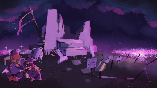

...I immediately switched gears and without thinking, went back to Dezaki works. I can't say I was very faithful at all. The night sky is easy to paint, with it's notable color spray and paint blots, but I diverged quite a bit with the watercolor textures. Shichiro Kobayashi is the artist I looked to the most, and this project made me appreciate him more than ever before. Just looking at his paints gets me emotional... The vibrant colors, the dramatic angles, you can just feel his reverence for life overflowing from the work. There really isn't anyone better. I need to study more if I'm to capture even a fraction of his skill. That being said, I did make sure to animate the backgrounds slightly with the sparkles on the water-- The reflection of light on water is my favorite to draw! Also, flowers are a very important motif (for various reasons, ohohoho). Kobayashi seemed to love drawing flowers, the paint around the edges give is a delicate look. Actually, if you look at the textbox...
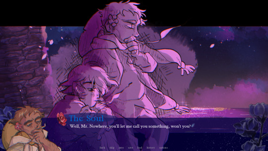
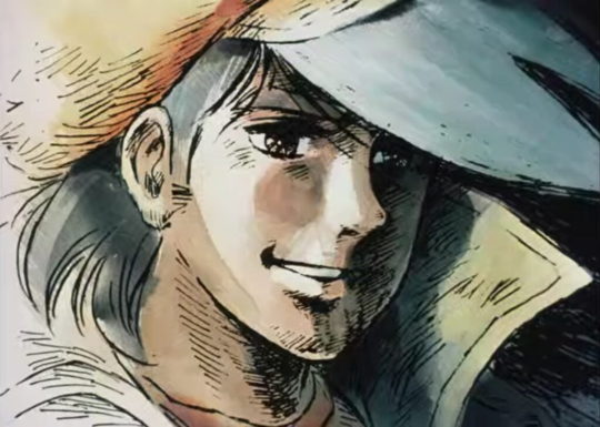
Instead of full-color CGs, I opted to use "postcard memories". This was a technique Dezaki used where he would show a detailed, scratchy-lined illustration to highlight important moments instead of fully animating them. It creates a really memorable image that draws out all of your emotions! I tried to emulate them (the more single-toned ones, that is) for the game. It was 1/3 Dezaki worship, 1/3 time-saving technique, and 1/3 excuse to draw lots of scratchy lines. I love scratchy lines. This way, I could make a lot of memorable shots that were visually interesting without overworking myself.
As another note, I looked to Akio Sugino's character art when drawing. The characters don't really look like Sugino characters, but I was emulating his shading technique with (once-again) the scratchy lines. Ah, I was in heaven. Looking at his older work, the linework is hardly ever clean-- but the rough, hand-drawn edge gives everything a tactile quality and the strong anatomy makes everyone so gorgeous. It's like an engraving come to life.

Finally, the anime effects! On the left you can see soothat before his values are adjusted (very dark, isn't he?) and on the right you can see he is in-game, values adjusted with a more appropriate "anime" look. This is because anime cells are put onto a CRT screen, so they end up looking very different. I created an auto action in CSP to adjust the color grating and line quality of every asset before popping them into the game for the chromatic aberration to take effect. The lines are slightly crunched a blurrier compared to the original. It gives it a more "physical" look. The colors are fixed up-- you'll see there is no pure black. If you look at a physical anime cell, you'll see they more often than not do not include pure black. There is usually a tint of green or red in there.
The chromatic aberration filter... I don't know how noticeable it is to the average player, but the game actually has a built-in filter that creates a slight "chroma" effect to emulate the look of frames through a crt/light. This means the red + blue + green values of the entire screen are split up and adjusted to layer slightly off from each other, giving it a little visual interest. It was AN EXTREME doozy to put in, with my poor programmer coding it and re-coding it until the end. It seemed simple at first, but there are parts where the game zooms in which totally broke the filter! It made out eyes bleed! But it was repaired in the end, so blessing upon you, Sandy. You saved my life.
The reason why I looked to Ie Naki Ko/Nobody's Boy Remi specifically is because that's where I feel the most "pure" energy from. It is a show that leans incredibly hard on it's techniques to get by but because of that it really embodies what I love about old anime-- It has a selfless reverence for its subject that drives you to watch and surrender your heart. Dezaki's powerful directing, Sugino's gorgeous drawings and Kobayashi's majestic paintings come together to make a work that shines. The setting is truly at the forefront with the characters getting lost in the grandeur. That's the attitude I had with SOREKARA: "There are things much greater than us, so isn't it wonderful that we are able to see them side-by-side?" There are many animation techniques that are cost-effective while still being utterly beautiful, I would love to copy them someday but I wasn't able to go that far yet. At least not in the demo. There's still time, I suppose... Studying limited animation from old anime is actually extremely useful when creating visual novels. Understanding the placement of cells and their layering/movement has given me even more ideas for stories!

I ended up going on a rant about anime again ^^" But it's so beautiful, you must now understand my heart going into the work. I always think of my characters and their journey, of course, but before that I think of the setting. I want the player to experience beautiful and mysterious things alongside their traveling companions. There is still so much more to make. I hope to incorporate more Dezaki-style techniques in this and future works. Please remember the true message of my works.... Not that love finds a way, or that your connections can transform your world...it's that....anime is very, very cool.
Thank you for reading 🙇🏽♂️
18 notes
·
View notes
Note
and now i can ask about the difference between animation and writing for you :D aside the obvious things, and since it's a sequence of events/actions/a story and going back to senseific: are there any parts there that you feel you'd have an easier time drawing/animating vs expressing it with words? and is there anything particular you were/are tempted to visualise in an artform (but haven't)?
more long answers below!
animation is certainly a special medium because you not only have way more control over how your audience experiences it (audio, pacing, etc) but you have to pay the cost of it being way more time and effort. so the most distinctive part of making my last project was that i had to stretch my resources as hard as i could. in other words, you can do a lot more! (/pos) but oh god, you HAVE TO DO A LOT MORE (/neg).
you kind of have to compromise somewhere -- your time, the quality of your work, your vision, your motivation. i know i'm inexperienced and that my motivation would give out, so my plan had to be practical. 30 seconds is a long span of time to fill.
i used colour to set the mood -- quick and low effort i used only lines, didn't colour anything in -- saving me time the movement is minimal -- i knew i couldn't do a lot at once, so i had to focus my efforts --
the shot of the eyes moving and of the kiss have the most movement, but are also the most sparse shots, allowing me to focus on getting the movement of this one thing right, without distraction
i create interest in other sections through contrasting shots, rather than using movement -- kuwana and yagami in bed together, then him alone -- the meaning is conveyed through the sequence, rather than any movement, and the music helps make the progression feel natural. following the beat, yknow
i also had to accept that the quality of my work was going to vary, and some of the illustrations would look good and others would just have to be serviceable, or it would never get done
and of course, my own experience -- i know the basics of csp's animation tools, but i don't know enough to make my life easy, you know? i was fighting the program, doing things inefficiently.
i had to think about how i was organising my layers/folders, i had to grab the audio and trim it and make sure it sounded right and... blah blah blah. you see what i mean, right? the format itself has so much potential, being able to create meaning through movement and contrasting shots and audio is great, but it's so strenuous (and i am not used to it) (not to gloat about how wow i did this and it was soooooo hard, nah, but this is what it was like for me at the novice level so like. for more involved work, just imagine... just imagine...) (or better yet, imagine with an example. you'd probably get more interesting answers about animation from @/phantasy14 than me)
by contrast, one of the best things about writing is that, at its core, you can just... open a document and type. not to downplay the effort that writers take, and yeah part of it is that my fanfic writing is Not That Complicated, but in the end... words are free, you know? i don't have to worry about straining my wrist, or if this would look better with an extra frame here or over here, what function i should be using in my program... i can kind of just get to the heart of the matter. i guess i kind of said something similar in the last post as well -- that writing makes it easier to dig into details and context, and the same applies here. since Words Are Free, you can really dig into the meat as much as you'd like. in a process like animation, any decision could add hours or days to your workload, so you have to be absolutely certain that the decision is worth it. this conflict between the artist's idea and the effort is a very defining difference in the mediums, i think.
so, aside from Fighting The Art Process, i suppose i should talk about why this idea ended up being an animatic instead of say, writing. first of all, the song, ofc -- it was the whole inspo, and it's nice to work with it directly. secondly, i think, is because i was trying to convey an emotion more than anything. this is where that ambiguity/detail difference between mediums comes in. i'm portraying yagami missing kuwana, and just that alone. i'm not trying to explain what he's thinking specifically, or why, or even the exact nature of their relationship before all this. what i'm conveying is i miss you. and the most direct, most blunt way to express this is to contrast being together with being apart. to fixate on the features of the other person so to depict a yearning for them. the ending contrasts a remembered(/imagined? you decide) smiling kuwana against kuwana walking away, of him leaving.
you were here (smiling, with me) + you left = i miss you
it just makes sense. writing this would have necessitated detail, would have necessitated more context, and muddied the feeling which is conveyed so concisely through the video instead. look at how i've written yagami missing kuwana so many goddamn times. it takes so many more words, it forces you to hold onto something more concrete like thoughts and events in order to convey the emotion, instead of depicting it on its own. so yeah, the ambiguity of illustration combined with the contrast achieved via sequence, these were necessary to convey this feeling as directly as possible. i also just think it feels more elegant. there's room for the audience to breathe and really feel the difference between kuwana being there and kuwana being gone. the imagery is blunt but the feeling itself surprisingly isn't... at least imo. it just wouldn't feel the same written, would it? i hope that answers your question.
anyway onto the next part... senseific <3
it's good that you named that as a specific example because i never thought about it, but now that you mention it there are absolutely some parts i would probably have an easier time drawing than writing
your honour..... (with a massive sigh) THE FIRST KISS SCENE. HAS BEEN BOTHERING ME. FOR MONTHSSSSSS. it's. sigh. well where do i start with this one... the thing that makes this difficult for me is that it's very much a "wow this is a bad idea but we're doing it anyway" kind of kiss, right? and like. because they shouldn't be doing it, it's been troubling me all this time if their trains of thoughts even make sense. i don't want to force it, but it's difficult to direct things into that direction when i know that they know they probably shouldn't be doing it... i have revised it and i think it reads kind of alright now? but i'm still worried about it...
and this. would be great. for illustration. i wouldn't have to explain shit, i just have to make sure i convey an atmosphere that lends itself for them to make this dumb decision. that's not to say that i wouldn't care if it didn't make sense, of course not, but if it was a visual format, i could just let the atmosphere speak for itself, you know... they're alone together, they'd both been drinking a few hours ago, kitakata comes close, and though yagami sees it coming he doesn't seem to stop him... and it just. there it is. it's happened. no need to say anything, just let the atmosphere and the audience's imagination do the work. the lack of detail in the medium would work in my favour. no issue.
the other one that comes to mind is a scene where kitakata and yagami smoke on the roof together. it's a similar situation where ambiguity would play better for the scene. there comes a point where the conversation stops between them and it just kind of sits. it feels really clumsy having to explain in words that this is one of the first few peaceful moments between them, that yagami doesn't mind being around him for once. this would be better expressed with just visual space. letting the audience feel that peace, that quiet moment between them. i'd draw them apart, so you can see the visual distance between them, and yet they're together, and they're quiet and maybe just maybe they could become closer, could choose to spend time around each other without getting on each other's nerves... or at least that would be the implication. it's much cleaner than having to spell it out in writing.
oh! and i remember i was tempted to draw kitakata's messy desk at some point. that one's easier depicted with words but i just think it could be fun.
AND IF I MAY BE SELF INDULGENT AND BRING UP "are you seeing anyone?" AGAIN..... that gag. just that gag and nothing else around it. i mean. now that i think about it, it's kind of joke-comic-y.... but the joke itself relies on a bunch of stuff beforehand... perhaps not...
a group photo would be nice too... a club photo perhaps... get everyone in there. just some mundane snapshots of everyone in their daily lives... hell, i could even throw sawa in there! i definitely should do that!
and something sexy... i should draw something sexy with kitakata and yagami...
i ought to add some of these to my mental list of things to draw...
#jitxt#kitakata sensei#now that i think about it. i wonder how animation compares to something like. fancams and video editing#cause they're like cousins. both video format#but one forces you to work with existing material (restrictive) and the other forces you to MAKE all your material (strenuous asf)#restrictive in different directions if you will#anyway i was hoping to throw some of my animation wips into this post but they ended up not being that relevant lol#i didn't go TOO hard into detail as to my process so. maybe another time#i mostly just find it interesting how my first draft looks compared to the final thing#i kind of dread looking at the first kiss scene bc i still feel like i'm overexplaining everything and that it STILL doesn't make sense 😭#i have got to stop bringing up “are you seeing anyone” because it'll raise everyone's expectations too high#but. i said i liked it didn't i? lol#it's just one joke but i dunno i like it#not elaborating on the 'something sexy' to keep this post sfw but i have a vague idea
5 notes
·
View notes