#Grabhorn-Hoyem
Explore tagged Tumblr posts
Photo


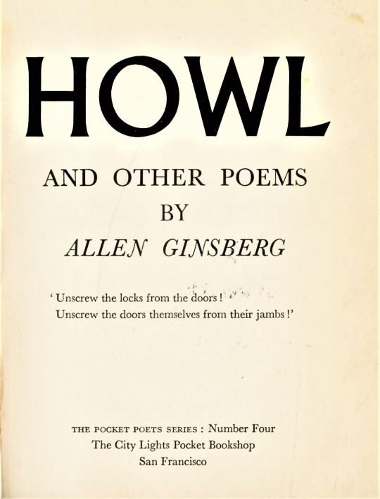
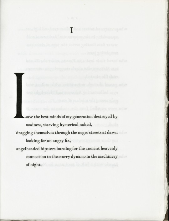
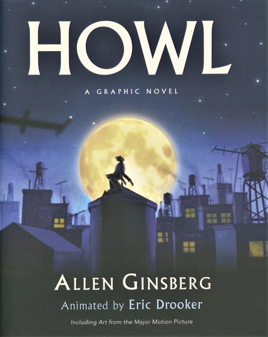
On this date, October 3 in 1957, the California State Superior Court ruled that the book Howl and Other Poems by Allen Ginsburg was not obscene. High in the pantheon of American literature and an icon of the Beat Generation, Ginsburg started working on Howl in 1954. It was first published in 1956 by Beat poet and San Francisco bookstore owner Lawrence Ferlinghetti through his City Lights Books imprint. Containing many references to sex and drugs, the publication was seized, deemed obscene, and Ferlinghetti and his bookstore manager Shig Murao were arrested and brought to trial. The trial was widely publicized, and Ferlinghetti won the case with the help of the ACLU, with California State Superior Court Judge Clayton Horn declaring that the poem was of "redeeming social importance."
Shown here are the title page to the 8th 1959 printing of the City Lights 1st edition; the title page, signed by Ginsburg, and opening lines from the 1971 Grabhorn-Hoyem limited-edition printing of 275 copies on handmade paper; and the cover for the 2010 graphic novel version with illustrations by American graphic artist Eric Drooker, published by Harper Perennial, which were originally created as animation for the 2010 movie Howl. The image of Ginsburg working on the Howl manuscript in 1955 is from Drooker’s graphic novel.
View other Milestone Monday posts.
#Milestone Monday#milestones#Howl#Howl and Other Poems#City Lights Books#Lawrence Ferlinghetti#Shig Murao#Grabhorn-Hoyem#Robert Grabhorn#Andrew Hoyem#Eric Drooker#graphic novels#Harper Perennial#obscenity trials#Beat poetry#Beat Generation
64 notes
·
View notes
Photo


For centuries it was common belief among cartographers and explorers that California was an island which, of course, would place Oregon where? In any event, almost always the island of California would be topped with Cape Blanco, which is firmly in Oregon and not on an island of any kind. These wonderful maps from 16th-18th centuries are from a beautiful book in our special collections, California as an Island printed at the press of Robert Grabhorn & Andrew Hoyem in San Francisco, for the Book Club of (the island of) California...
13 notes
·
View notes
Photo


It’s Fine Press Friday!
Today we present The Ballad of Lemon and Crow, a spooky Southern Gothic tale by Glenn Todd, with photogravure collaborations by Bruce Conner (1933-2008) and anonymous artists, published in San Francisco in 2002 at the Arion Press. Glen Todd began his career in printing in 1964, working for San Francisco publisher Grabhorn-Hoyem (formed by Robert Grabhorn of the iconic San Francisco fine printers Grabhorn Press and Andrew Hoyem of the Auerhahn Press), and later became an editor for Hoyem’s Arion Press (the successor to Grabhorn-Hoyem after Robert’s death in 1973), where he wrote introductory essays for several of its books. Todd first met the artist Bruce Conner in 1953, when Conner was a student of the University of Nebraska. They were both a part of a Midwestern literary and artist circle that moved to San Francisco in the early 1960s that was associated with the Beat Generation.
Writing in the Southern Gothic style of Tennessee Williams, Carson McCullers, and Eudora Welty, Todd’s story takes place is rural Oklahoma and chronicles the lives of three generations of neighboring families, one white and the other black. Old Lady Lemon and Granny Pearl Crow are the matriarchs of these families, and the story focuses on the interwoven lives of their children and grandchildren.
The Ballad of Lemon and Crow was produced in an edition of 326 signed copies. The book was designed and produced by Andrew Hoyem at the Arion Press in Monotype English Old Style type composed and cast at Mackenzie & Harris (also owned by Andrew Hoyem) and printed letterpress. The ink-blot patterns at the bottom of each page and the rebus on the title page were made from photopolymer plates. The photogravures were printed by R. E. Townsend in Georgetown, Massachusetts. Our copy is yet another donation from our friend Jerry Buff.
–Sarah, Special Collections Undergraduate Assistant
View more Fine Press Friday posts.
#ballad of lemon and crow#arion press#glenn todd#bruce conner#andrew hoyem#southern gothic#fine press fridays#grabhorn press#sarah#jerry buff
26 notes
·
View notes
Photo


Staff Pick Pick of the Week
For my staff pick this week, I chose to double dip with an item I selected for an assignment recently submitted to Max for the course he teaches, History of Books and Printing (you can see more of what we’re up to in that class here).
The World by Polish poet Czeslaw Milosz is a beautiful specimen of fine press and also a prime example to demonstrate how books can be object lessons and representatives of movements in bookmaking and publishing history.
This book was published in 1989 by Arion Press. It was letterpress printed in two types, Monotype Ehrhardt and handset Janson, on Curtis Ruysdael paper. The book hss 57 numbered pages (plus several unnumbered endpapers) and was bound by hand in boards and covered with a combination of brown cloth for the spine and a yellowy-tan handmade paper for the covers. The book includes a series of Czeslaw Milosz’s poems as well as a dry-point engraving of the poet done by the American artist Jim Dine, which was printed on an intaglio press using chine collé by master printer Robert Townsend. An introductory essay was written by Helen Vendle, the length of which makes the letterpress printing done by M & H Type in San Francisco all the more impressive. Our copy is part of a limited edition of 275, of which 250 were for sale and have been signed by both the poet and artist. Our copy also has the publisher’s announcement and order form laid in.
The book is striking—not just for the content or aesthetics but the merging of the two. Designed and produced under the direction of Andrew Hoyem, The World demonstrates how handsome books become when produced with diligence and through multiple collaborations of artists, writers, fine press publishers, and bookmakers. Take for instance that the poems are presented in both the original Polish as well as an English translation done by the poet; each version is printed on an individual page but face one another. The Polish version has been arranged at the top of the left-hand page in an 11-point font and is mirrored in the diagonal by its English version done in a 14-point font at the bottom of the right-hand page. The effect is that the reader finds their attention pulled across the pages and poems in a fluid motion and pace. In conjunction with this is the slight translucence of the paper, allowing the reader to see the ghost image of the poems that both precede and follow the one the pages are open to, giving a visual depth as well as encouraging the reader to recognize the relationship of the poems to one another.
It is worth mentioning as well that The World is the 29th publication of Arion Press, based in San Francisco. The city is known to be one the main centers in the US for fine printing and bookmaking. Visit the Arion Press website to read their history. Importantly, this history includes their very own “genealogy” of fine press printers dating all the way back to 1867, with notable printers and designers such as Edwin Grabhorn, Bruce Rogers, and John Henry Nash attributed in their lineage. That Arion traces this lineage says something about the book arts and fine press movement itself—that printers and book designers see themselves in relationship to one another and to other artists. That is to say, the contemporary book arts movement values heritage and recognizes that it’s not just materials (like the type itself) that are passed down through the generations, but also skills and traditions.
If you liked this post, you might want to explore other posts we’ve done about Arion Press items or, you can check out more of our Staff Pick of the Week posts.
-- Katie, Special Collections Graduate Intern
#Staff Pick of the Week#fine press printing#Arion Press#czeslaw milosz#jim dine#poetry#Polish#handmadepaper#letterpress#letterpress printing#intaglio#bookarts#Andrew Hoyem#Robert Townsend#M & H Type#Katie
11 notes
·
View notes