#Google Bar Chart Integration
Explore tagged Tumblr posts
Visit Tumblr Blog
Explore Tumblr blogs with no restrictions, modern design and the best experience.
Last Seen Tumblr Blogs


Fun Fact
Tumblr is available in 18 languages.
Text
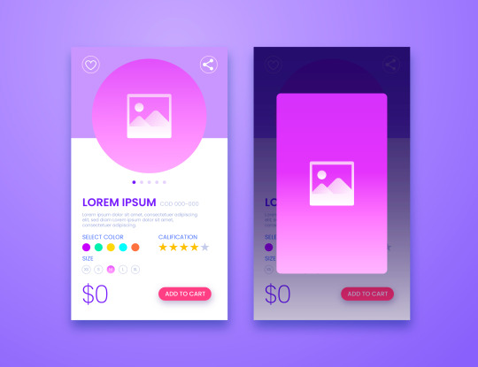
Crypto trading mobile app
Designing a Crypto Trading Mobile App involves a balance of usability, security, and aesthetic appeal, tailored to meet the needs of a fast-paced, data-driven audience. Below is an overview of key components and considerations to craft a seamless and user-centric experience for crypto traders.
Key Elements of a Crypto Trading Mobile App Design
1. Intuitive Onboarding
First Impressions: The onboarding process should be simple, guiding users smoothly from downloading the app to making their first trade.
Account Creation: Offer multiple sign-up options (email, phone number, Google/Apple login) and include KYC (Know Your Customer) verification seamlessly.
Interactive Tutorials: For new traders, provide interactive walkthroughs to explain key features like trading pairs, order placement, and wallet setup.
2. Dashboard & Home Screen
Clean Layout: Display an overview of the user's portfolio, including current balances, market trends, and quick access to popular trading pairs.
Market Overview: Real-time market data should be clearly visible. Include options for users to view coin performance, historical charts, and news snippets.
Customization: Let users customize their dashboard by adding favorite assets or widgets like price alerts, trading volumes, and news feeds.
3. Trading Interface
Simple vs. Advanced Modes: Provide two versions of the trading interface. A simple mode for beginners with basic buy/sell options, and an advanced mode with tools like limit orders, stop losses, and technical indicators.
Charting Tools: Integrate interactive, real-time charts powered by TradingView or similar APIs, allowing users to analyze market movements with tools like candlestick patterns, RSI, and moving averages.
Order Placement: Streamline the process of placing market, limit, and stop orders. Use clear buttons and a concise form layout to minimize errors.
Real-Time Data: Update market prices, balances, and order statuses in real-time. Include a status bar that shows successful or pending trades.
4. Wallet & Portfolio Management
Asset Overview: Provide an easy-to-read portfolio page where users can view all their holdings, including balances, performance (gains/losses), and allocation percentages.
Multi-Currency Support: Display a comprehensive list of supported cryptocurrencies. Enable users to transfer between wallets, send/receive assets, and generate QR codes for transactions.
Transaction History: Offer a detailed transaction history, including dates, amounts, and transaction IDs for transparency and record-keeping.
5. Security Features
Biometric Authentication: Use fingerprint, facial recognition, or PIN codes for secure logins and transaction confirmations.
Two-Factor Authentication (2FA): Strong security protocols like 2FA with Google Authenticator or SMS verification should be mandatory for withdrawals and sensitive actions.
Push Notifications for Security Alerts: Keep users informed about logins from new devices, suspicious activities, or price movements via push notifications.
6. User-Friendly Navigation
Bottom Navigation Bar: Include key sections like Home, Markets, Wallet, Trade, and Settings. The icons should be simple, recognizable, and easily accessible with one hand.
Search Bar: A prominent search feature to quickly locate specific coins, trading pairs, or help topics.
7. Analytics & Insights
Market Trends: Display comprehensive analytics including top gainers, losers, and market sentiment indicators.
Push Alerts for Price Movements: Offer customizable price alert notifications to help users react quickly to market changes.
Educational Content: Include sections with tips on technical analysis, crypto market basics, or new coin listings.
8. Social and Community Features
Live Chat: Provide a feature for users to chat with customer support or engage with other traders in a community setting.
News Feed: Integrate crypto news from trusted sources to keep users updated with the latest market-moving events.
9. Light and Dark Mode
Themes: Offer both light and dark mode to cater to users who trade at different times of day. The dark mode is especially important for night traders to reduce eye strain.
10. Settings and Customization
Personalization Options: Allow users to choose preferred currencies, set trading limits, and configure alerts based on their personal preferences.
Language and Regional Settings: Provide multilingual support and regional settings for global users.
Visual Design Considerations
Modern, Minimalist Design: A clean, minimal UI is essential for avoiding clutter, especially when dealing with complex data like market trends and charts.
Color Scheme: Use a professional color palette with accents for call-to-action buttons. Green and red are typically used for indicating gains and losses, respectively.
Animations & Micro-interactions: Subtle animations can enhance the experience by providing feedback on button presses or transitions between screens. However, keep these minimal to avoid slowing down performance.
Conclusion
Designing a crypto trading mobile app requires focusing on accessibility, performance, and security. By blending these elements with a modern, intuitive interface and robust features, your app can empower users to navigate the fast-paced world of crypto trading with confidence and ease.
#uxbridge#uxuidesign#ui ux development services#ux design services#ux research#ux tools#ui ux agency#ux#uxinspiration#ui ux development company#crypto#blockchain#defi#ethereum#altcoin#fintech
2 notes
·
View notes
Text
How to Master Data Visualization with Power BI
Data heavily influences modern life, making strong analytical and presentation skills essential. Mastering data visualization allows business analysts and data scientists to communicate insights effectively and make informed decisions based on data. Power BI is a powerful business intelligence tool that enables users to convert complex information into interactive dashboards and reports.
Students pursuing a data science course in Jaipur should focus on learning Power BI, which can significantly enhance their job prospects. This blog offers guidance on mastering Power BI for data visualization, covering essential principles, practical applications, and the necessary technical skills.
Understanding Power BI and Its Importance
Power BI is an essential business analytics platform that allows users to connect to various data sources, conduct analyses, and create visual reports. Its user-friendly interface includes drag-and-drop functionality, making it accessible even to those without programming skills.
Why Should You Learn Power BI?
The user-friendly Power BI interface supports smooth data analysis and visualization activities, which serve both beginner and professional users.
The system provides smooth connectivity between Excel files, SQL databases, cloud platforms, and other information sources.
Real-time data analysis is possible with Power BI because of its capability to process active data.
Many data science training institutions in Jaipur leverage Power BI as their foundation because the field needs such expertise.
Steps to Master Data Visualization with Power BI
1. Learn the Basics of Power BI
The first step for Power BI mastery requires a basic comprehension of its fundamental elements:
Power BI Desktop – The primary tool used for creating reports and dashboards.
Power BI Service – A cloud-based platform for sharing and collaborating on reports.
Power BI Mobile – The mobile application for accessing reports on the go.
If enrolling in a data science institute in Jaipur, ensure the curriculum covers these fundamental components for mastering Power BI.
2. Connect and Transform Data
Through Power BI, users can establish connections to several database sources, including Excel and SQL Server, together with Google Analytics. The data connection process requires subsequent data cleaning steps before data transformation.
Use Power Query Editor to:
Remove duplicates and errors.
Power Query Editor enables users to convert data types and modify formatting protocols.
The system enables joint analysis of several data sets to create complete understandings.
Users can integrate multiple data sets to view total revenue, product information, and customer segmentation information, achieving comprehensive insights.
3. Build Interactive Dashboards
The ability to generate dashboards is a vital strength within Power BI. A well-designed dashboard should:
Present key insights at a glance.
The platform allows users to enhance their screen displays through functions that include sliders and filters to interact with data.
Highlight significant trends and anomalies.
Example: Sales Performance Dashboard
Your role in a retail firm requires tracking sales results throughout different cities within the company. Power BI dashboards present the following characteristics:
A map visualization displays the company's total region-level sales.
A line chart shows monthly revenue data.
Best-selling products with a bar chart.
4. Choose the Right Visuals
Reporting success depends entirely on selecting appropriate visuals for presentation. Power BI offers multiple chart options to meet unique data requirements.
The graphical representation of bar charts is best used to display categorical data sets.
A line chart delivers the best results when showing the historical evolution of data.
Using proportion-based information in pie charts is beneficial, yet applying it too frequently reduces effectiveness.
Heat maps function best for showing geographical data.
A bar chart showing customer retention rates over different periods will be more effective than a pie chart for analyzing customer churn in data science training in Jaipur.
5. Master DAX (Data Analysis Expressions)
Power BI uses DAX as a dedicated formula language to enable powerful calculations within the platform. Some essential DAX functions include:
SUM() – Calculates the sum of a column.
AVERAGE() – Computes the average value.
IF() – Applies conditional logic.
Mastering DAX functions allows you to create custom calculations and derive deeper insights from your data.
6. Implement Advanced Analytics
After mastering basic Power BI operations, you should advance to more intricate analytical processes:
Power BI gives users access to AI-powered visuals, including key influencers and decomposition trees, to find hidden patterns in the data.
Build forecasting models by utilizing Power BI's forecasting capabilities.
Your organization can strengthen security through Row-Level Security (RLS), which allows users limited access to different data ranges based on their roles.
RLS enables data science institute managers in Jaipur to secure student performance databases by allowing instructors to view only information about their assigned classes.
7. Share and Collaborate
With Power BI, users can connect easily due to its cloud-based ability to publish reports. Everybody working within the system gets immediate access to updated reports, thus enabling teams to make better and faster decisions.
Users can utilize Power BI Service to distribute their reports among their colleagues.
Scheduled Refresh allows users to automate data update functions to maintain reports that display real-time characteristics.
The marketing team collaborates by monitoring real-time campaign performance across multiple locations. Power BI's cloud-sharing capabilities allow team members to access the most recent data anytime.
Final Thoughts
Power BI data visualization knowledge will enable proficient individuals to advance their business intelligence and analytics careers. Those who want to study a data science course in Jaipur or learn independently can develop Power BI expertise by implementing the structured instruction presented here.
Mastering Power BI requires understanding basic principles and establishing data connections before creating interactive dashboards and enhancing analytical capabilities. Proficiency in Power BI can lead to well-paying job opportunities as businesses increasingly rely on data-driven decision-making.
Your commitment to data science training in Jaipur provides comprehensive instruction in Power BI techniques. Gaining hands-on experience and working on real-world projects throughout your learning journey will contribute to your success in this field.
0 notes
Text
How Google Slides Helps Kids Express Their Ideas
Branded Google Slides design of high quality: Top Inquiries Answered
1.Is Google Slides ok for kids?
Yes, Google Slides is suitable for kids, as it offers a user-friendly interface that promotes creativity and collaboration. It allows students to create presentations easily, enhancing their digital skills and understanding of multimedia. With features like templates, animations, and the ability to share projects with peers and teachers, it can support learning in various subjects. However, parental guidance is recommended to ensure safe usage and to help children navigate online features responsibly.
2. How popular is Google Slides?
Google Slides is highly popular, especially in educational and business settings. As part of Google Workspace, it benefits from integration with other Google services, facilitating collaboration and accessibility. Millions of users worldwide utilize it for creating presentations, and it boasts features like real-time editing and cloud storage. Its free access, user-friendly interface, and compatibility with various file formats further enhance its appeal. While exact user numbers are not publicly disclosed, its widespread use in schools and organizations underscores its significant popularity in the realm of presentation software.
3. How to make RGB text in Google Slides?
To create RGB text in Google Slides, first select the text box or highlight the text you want to modify. Then, click on the "Text color" icon in the toolbar (it looks like an 'A' with a color bar beneath it). Choose "Custom" to open the color picker. Enter your desired RGB values (0-255) in the respective fields for red, green, and blue. Click "OK" to apply the color. Your text will now display in the specified RGB color.
4. How to make letters in 3D in Google Slides?
To create 3D letters in Google Slides, follow these steps:
1. Open your slide and insert a text box with your desired text.
2. Highlight the text and choose a font that has a bold appearance.
3. Duplicate the text box by right-clicking and selecting "Duplicate."
4. Change the color of the lower text box to a darker shade.
5. Move the duplicated text slightly to the right and down to create a shadow effect.
6. Adjust the layering by right clicking the top text box and selecting "Order" to bring it to the front.
This gives the illusion of depth!
5. How to make a chart in Google Slides?
To create a chart in Google Slides, first open your presentation and select the slide where you want the chart. Click on "Insert" in the top menu, then choose "Chart" and select the type of chart you want (e.g., Bar, Column, Line, or Pie). You can either create a new chart or import one from Google Sheets. If you choose to create a new one, a default chart will appear, and you can edit the data by clicking "Open Source" to modify it in Google Sheets. Once you're done, close Sheets, and the chart will update in your slide.

Visit: VS Website See: VS Portfolio
0 notes
Text
Top Data Visualization Tools for Financial Data Analysis
In the finance industry, data is everything. Making sense of complex financial metrics, stock trends, and economic indicators requires robust financial data visualization tools. These tools help analysts, investors, and business leaders make data-driven decisions quickly and accurately. But with so many options, how do you choose the right one?
In this article, we will explore the top data visualization tools for financial data analysis, discuss key data visualization components, and analyze the latest data visualization trends. Whether you’re a data visualization consultant or an industry professional, this guide will help you navigate the best tools available today.

1. What is Financial Data Visualization?
Financial data visualization refers to the graphical representation of financial metrics, stock performance, market trends, and economic indicators. It helps businesses and investors understand patterns and insights more effectively than raw numbers.
2. Why is Data Visualization Important in Finance?
Finance professionals deal with huge datasets that can be overwhelming. Data visualization tools simplify complex data, allowing quicker decision-making, risk analysis, and forecasting. Would you rather analyze thousands of numbers in a spreadsheet or quickly spot trends in a well-designed chart?
3. Key Features of Financial Data Visualization Tools
Real-time data updates for stock market tracking
Interactive dashboards to drill down into specifics
Customizable graphs and charts for deeper analysis
Integration with financial databases for seamless reporting
Predictive analytics for forecasting trends
4. Top Data Visualization Tools for Finance
Let's dive into the best financial data visualization tools that are widely used in the industry.
5. Power BI: Best for Business Analytics
Power BI by Microsoft is a top-tier tool with AI-powered insights, automated reporting, and seamless Excel integration. It is widely used for financial dashboards in enterprises.
6. Tableau: Advanced Data Exploration
Tableau is ideal for finance professionals who need interactive dashboards and in-depth data exploration. It offers drag-and-drop functionality and advanced analytics for detailed insights.
7. D3.js: Customizable and Powerful
D3.js is a JavaScript library that enables highly customized, dynamic visualizations. Financial analysts who need specific, tailored visual representations benefit the most from this tool.
8. Google Data Studio: Best Free Option
Google Data Studio offers free, real-time interactive dashboards for those on a budget. It connects easily with Google Analytics, Google Sheets, and other financial tools.
9. Python & R: Coding for Custom Visuals
For those comfortable with coding, Python and R provide advanced statistical visualization capabilities through libraries like Matplotlib, Seaborn, and ggplot2.
10. Key Trends in Financial Data Visualization
AI-driven analytics for predictive insights
Cloud-based financial dashboards for remote accessibility
Real-time visualization to track live market trends
Augmented analytics to automate data insights
11. Role of a Data Visualization Consultant
A data visualization consultant helps financial firms choose the right tools, design impactful dashboards, and optimize their data visualization process. Their expertise ensures that businesses leverage data effectively.
12. How to Choose the Right Tool?
Consider factors like:
Budget and licensing fees
Ease of use
Integration capabilities
Customization options
Scalability for large datasets
13. Best Practices for Financial Data Visualization
Use clear, simple visuals to avoid clutter
Choose the right chart types (e.g., line charts for trends, bar charts for comparisons)
Ensure real-time updates for accurate decision-making
Use interactive elements to allow deep dives into data
14. Conclusion and Final Thoughts
Selecting the right financial data visualization tools is essential for making informed decisions in the finance industry. Whether you're a data visualization service company, a financial analyst, or a business leader, using the right tools can enhance data interpretation and strategy. Tools like Power BI, Tableau, and Google Data Studio offer powerful insights tailored for different needs.
0 notes
Text
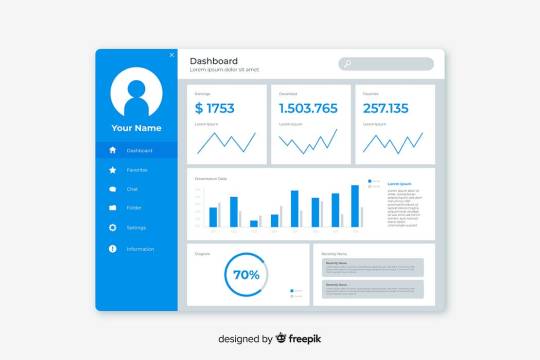
Top 10 Trends in Admin Dashboard Design for 2025

As technology continues to evolve, admin dashboard design is undergoing significant transformations. With businesses relying heavily on data-driven insights, intuitive dashboards play a crucial role in streamlining operations, enhancing productivity, and improving decision-making. In 2025, the focus is on efficiency, user-friendliness, and smart automation. This blog explores the top 10 trends in admin dashboard design that will shape the future of digital interfaces.
1. Minimalist and Clean UI
Simplicity remains a priority in admin dashboard design. A clutter-free interface enhances usability, making navigation seamless and efficient.
Key Elements:
Use of whitespace for better readability.
Reduced visual clutter with a focus on essential data.
Soft color palettes and clear typography.
2. Dark Mode and Customizable Themes
Dark mode is becoming increasingly popular as it reduces eye strain and enhances user experience. Admin dashboards in 2025 will offer customizable themes to accommodate different user preferences.
Key Benefits:
Improved readability in low-light environments.
Energy efficiency, especially on OLED screens.
Enhanced aesthetic appeal and modern look.
3. AI-Powered Data Analytics
Artificial Intelligence (AI) is revolutionizing dashboard functionalities by providing predictive analytics and personalized recommendations.
How AI Enhances Dashboards:
Automated insights based on user behavior.
Predictive trends for better decision-making.
Smart alerts to notify users of critical data changes.
4. Voice-Controlled Dashboards
With the rise of voice assistants like Alexa and Google Assistant, voice-activated dashboards will offer a hands-free experience.
Advantages:
Quick access to reports and metrics.
Improved accessibility for users with disabilities.
Efficient multitasking with voice commands.
5. Real-Time Data Visualization
Interactive and dynamic visualizations make data more accessible and actionable.
Key Features:
Live charts and graphs for instant updates.
Heatmaps to identify trends at a glance.
Animated transitions for better data comprehension.
6. Mobile-Optimized Dashboards
As mobile usage continues to rise, dashboards must be responsive and fully functional on all devices.
Best Practices:
Adaptive UI that adjusts to different screen sizes.
Touch-friendly interactions for mobile users
Offline capabilities for seamless access.
7. Enhanced Security and Privacy Controls
Data protection is a major concern in admin dashboard design. In 2025, dashboards will integrate advanced security measures to ensure user privacy.
Security Enhancements:
Two-factor authentication (2FA) and biometric login.
End-to-end encryption for data security.
Role-based access control to prevent unauthorized access.
8. Drag-and-Drop Customization
Users prefer personalized dashboards that cater to their specific needs.
Customization Features:
Drag-and-drop widgets for flexible layouts.
User-defined settings for data display.
Saved presets for frequently used configurations.
9. Integration with Third-Party Tools
Seamless connectivity with other software applications enhances dashboard functionality.
Integration Benefits:
API support for easy third-party app connections.
Syncing with CRM, ERP, and other business tools.
Real-time collaboration features with cloud integration.
10. Gamification Elements
Incorporating gamification techniques can improve user engagement and productivity.
Gamification Features:
Progress bars to track tasks and goals.
Achievement badges for completing key actions.
Leaderboards to encourage friendly competition.
Conclusion
Admin dashboards in 2025 will focus on enhancing user experience, improving accessibility, and leveraging AI-driven insights. Businesses must stay ahead of these trends to create efficient, intuitive, and visually appealing dashboards that drive productivity. By implementing these design advancements, companies can ensure seamless interaction with data, leading to better decision-making and operational efficiency.
Devoq Design is a top-rated UI/UX Design Agency in Visakhapatnam and UI/UX Design Agency in Vijayawada, delivering innovative and user-friendly digital solutions. With a strong focus on creativity and functionality, the company specializes in crafting seamless user experiences for websites, mobile apps, and digital products. Their expert team blends cutting-edge design trends with user-centric strategies to enhance engagement and brand presence. Whether for startups or established enterprises, Devoq Design ensures high-quality UI/UX solutions that drive success in the ever-evolving digital world.
0 notes
Text
How do I move a Canva template to Google Slides?
Transferring your Canva presentation to Google Slides allows you to leverage Canva’s design power and Google Slides’ collaboration features. Follow this detailed guide to make the process seamless and efficient.
Step 1: Open Your Canva Presentation
Log in to your Canva account and locate the presentation you wish to transfer. Open it to confirm that it is finalized and ready for download. Double-check the slides to ensure all elements are correctly positioned and no further edits are required.
Step 2: Download the Slides from Canva
With your Canva presentation open:
Click the Download button located in the top-right corner of the screen.
Select the file format as PNG or JPEG. Both formats provide high-quality images, making them ideal for this process.
Choose to download each slide individually. Canva does not currently support exporting presentations as editable slides for Google Slides, so downloading slides as images is the best approach.
Once downloaded, verify that all slides have been saved correctly to your device.
Step 3: Open Google Slides and Create a New Presentation
Visit Google Slides and:
Log in with your Google account credentials.
Either create a new blank presentation by clicking the “+ Blank” button or open an existing presentation where you want to insert your Canva slides.
This step ensures that you have a workspace ready to import the slides.
Step 4: Import Canva Slides into Google Slides
To add your Canva slides to Google Slides:
Go to the menu bar and click on File > Import Slides.
Choose the Image option to upload your Canva slides.
Navigate to the folder where your Canva slides are saved, select the files, and upload them one by one.
Once uploaded, Google Slides will insert them into your presentation as static images.
If you prefer, you can insert images slide by slide:
Go to Insert > Image > Upload from Computer and select the desired slide.
Step 5: Adjust and Optimize Slides in Google Slides
After importing the slides, some adjustments may be necessary:
Resize Images: Ensure that each image fits perfectly within the slide frame.
Add Text: If your Canva presentation included text, you’ll need to manually add text boxes in Google Slides to recreate it.
Enhance Design: Use Google Slides’ tools to add shapes, animations, or transitions to enhance your presentation further.
Spend some time reviewing each slide to ensure it aligns with your original design vision.
Benefits of Migrating Canva Presentations to Google Slides
By transferring your presentation to Google Slides, you gain access to:
Collaboration Tools: Google Slides allows multiple users to work on the same presentation simultaneously.
Cloud-Based Access: Your presentation will be accessible from any device with an internet connection.
Integration Features: Google Slides integrates seamlessly with other Google Workspace tools, enhancing productivity.
youtube
Frequently Asked Questions
What File Format Should I Choose When Downloading Canva Slides?
The recommended formats are PNG or JPEG. These formats ensure high-quality visuals and are compatible with Google Slides.
Can I Edit Imported Canva Slides Directly in Google Slides?
While you cannot edit the images themselves, you can use Google Slides’ editing tools to:
Add or modify text.
Adjust image properties like brightness and contrast.
Incorporate additional elements such as shapes, charts, or animations.
Are There Any Limitations During the Transition?
Yes, some limitations include:
Text and design elements from Canva must be manually recreated in Google Slides.
Interactive elements like animations from Canva are not transferred.
By following these steps, you can effectively transfer your Canva presentation to Google Slides, combining the design strengths of Canva with the collaborative power of Google Workspace. This process enables you to create, share, and refine your presentations effortlessly, ensuring a professional and polished result.
0 notes
Text
Best Practices for Using SEM & PPC Reporting Tool Effectively
In the fast-paced world of digital marketing, search engine marketing (SEM) and pay-per-click (PPC) campaigns are essential tools for driving traffic and generating leads. However, managing and optimizing these campaigns requires precise reporting and analytics. SEM and PPC reporting tools provide marketers with invaluable insights, but to truly unlock their potential, it’s important to use these tools effectively. Below are some best practices for maximizing the impact of your SEM and PPC reporting software.
1. Define Clear Goals and KPIs
Before diving into your reporting software, outline the specific goals for your SEM and PPC campaigns.
Are you aiming for higher click-through rates (CTR)?
Do you want to boost conversions or reduce cost-per-click (CPC)?
Establishing measurable KPIs ensures that the software's insights align with your objectives, making it easier to assess campaign performance and make data-driven decisions.
2. Choose the Right Reporting Tool
Not all reporting software is created equal. The best tool for your needs depends on factors like your campaign size, budget, and desired features. Look for software with customizable dashboards and automated reporting features. Consider integration capabilities with platforms like Google Ads, Bing Ads, or social media, PPC campaigns. Popular options include Google Analytics, SEMrush, HubSpot, and Supermetrics. Research each tool to find the one that suits your needs.
3. Leverage Automation
Time is of the essence in digital marketing. Use the automation features in your reporting software to streamline repetitive tasks:
Schedule regular reports to track performance over time. Automate alerts for significant changes in campaign metrics, such as spikes in CPC or drops in CTR. This ensures that you’re always informed and can address issues promptly.
4. Use Segmentation for Deeper Insights
Segmentation is key to understanding how different factors impact your campaigns. Analyze data by audience demographics, location, device type, or keyword groups. Compare performance between search and display networks. Segmentation allows for targeted optimization, helping you allocate resources more effectively.
5. Focus on Visualizations
The human brain processes visual information faster than text. Use your reporting software’s visualization tools to create easy-to-read charts, graphs, and dashboards. Highlight trends with line graphs or bar charts. Use heatmaps to identify high-performing keywords or locations. Clear visualizations make it easier to communicate insights to stakeholders. All these features should be in a SEM & PPC reporting tool.
6. Integrate Data from Multiple Sources
For a holistic view of your campaigns, integrate data from various platforms. Most reporting tools allow you to connect data from Google Ads, social media ads, and even organic search metrics. Include some other features like; cross-platform comparisons can reveal which channels deliver the best ROI, identify correlations between PPC performance and organic traffic trends and so on.
A unified reporting system saves time and reduces the risk of overlooking valuable insights.
7. Monitor Trends and Adjust Strategies
SEM and PPC landscapes change quickly due to algorithm updates, seasonal variations, and competitor activity. Use your reporting software to:
Identify emerging keyword trends.
Monitor ad performance during seasonal peaks.
Adjust bids or pause underperforming campaigns based on real-time data.
Staying agile ensures your campaigns remain competitive.
8. Share Reports with Stakeholders
Transparency is crucial for maintaining trust with clients or internal teams. Use your software to create tailored reports for different stakeholders:
High-level summaries for executives.
Detailed performance data for marketing teams.
Customizable reporting templates save time and ensure consistency.
9. Stay Updated on Software Features
SEM and PPC reporting software developers frequently update their tools to introduce new features and improve functionality. Subscribe to newsletters or follow release notes from your software provider. Attend webinars or training sessions to stay ahead of the curve. Being proactive about updates ensures you’re using the tool to its full potential.
Conclusion
Effective use of SEM and PPC reporting software can make a significant difference in the success of your campaigns. By defining goals, leveraging automation, and focusing on actionable insights, you can optimize performance and drive better results. Remember, reporting isn’t just about collecting data—it’s about using that data to refine your strategy and achieve measurable outcomes.
Start implementing these best practices today, and watch your campaigns soar to new heights!
Would you like me to expand on any section or add more examples?
0 notes
Text
Temi, the personal robot
Temi is a sophisticated personal robot with cutting-edge capabilities to make your everyday tasks easier. Temi, a robot that can help, amuse, and connect, was created by Roboteam, a world leader in robotic solutions. It integrates voice recognition, autonomous navigation, and artificial intelligence (AI). Temi, who is just over three feet tall, is small but strong, able to move through your house or place of business with ease to suit your demands.
Key Features of Temi
Autonomous Navigation: Temi can navigate on its own, avoiding obstacles and charting your surroundings thanks to its sophisticated navigation system. With the use of simultaneous localization and mapping (SLAM) technology and 3D mapping, Temi guarantees safe and easy mobility on a variety of surfaces.
Voice Assistant Integration: With its integrated voice recognition, Temi easily connects to well-known virtual assistants such as Google Assistant and Amazon Alexa. Temi will react quickly to your voice commands, whether you want to play your favorite music, get answers to your queries, or operate smart home appliances.
High-Definition Screen and Sound: Temi's 10.1-inch HD touchscreen and top-notch speakers make it perfect for presentations, video chats, and streaming media. No matter where you are in the room, you will always have a clear view thanks to its rotating head.
Telepresence: Use Temi's telepresence feature to stay in touch with family members or coworkers. You can attend meetings or check on your house from a distance thanks to a smartphone app that lets you regulate Temi remotely.
AI-Powered Interactions: Temi can learn your preferences and adjust to your routines thanks to its AI capabilities. Temi's user-friendly interface makes it a proactive assistant that can be used for anything from reminders to activity suggestions.
Why Choose Temi?
Ease of Use: Even non-technical individuals may easily run Temi thanks to its user-friendly UI.
Cost-Effective Solution: Temi combines various functions into a single, affordable device, saving money when compared to hiring multiple assistants or purchasing separate devices.
Future-Proof Technology: Temi stays at the forefront of innovation by regularly updating its software and integrating new features to meet the changing needs of its users.
Sustainability: Temi's robust construction and energy-efficient design guarantee long-term use without the need for regular replacements.
Temi is a doorway to the future of human-robot interaction, not merely a personal robot. Temi meets all of your needs, whether you're searching for a dependable helper, a tech-savvy friend, or a cutting-edge tool for business and play. Temi has raised the bar in the field of personal robots with its combination of AI-driven intelligence, useful functionality, and intuitive design.
Rethink how you connect, work, and live by joining Temi in the revolution. The future is here, and Temi is bringing it into your life.
To know more, click here.
0 notes
Text
Using Data Studio to Create Automated Reports for Social Media Campaigns
In today’s fast-paced digital environment, effective social media reporting is crucial for optimizing campaigns and achieving measurable results. At Digital Rhetoric, a leading provider of Social Media Marketing Services in Pune, we understand the importance of tracking performance in real-time. Google Data Studio has emerged as a powerful tool for creating Automated Social Media Reporting and dashboards that provide insightful analytics to measure the impact of your campaigns effectively.
Why Choose Google Data Studio for Social Media Analytics?
Google Data Studio is a free tool that simplifies Social Media Analytics by allowing marketers to create customizable reports. These reports pull data from various sources like Facebook, Instagram, LinkedIn, and Twitter, and transform it into easy-to-understand visuals. By consolidating metrics in one place, marketers can quickly interpret trends, measure performance, and make data-driven decisions to improve Social Media Marketing efforts.
One of the biggest advantages of Google Data Studio is its ability to automate data updates. With automated reporting, you can monitor performance in real-time, eliminating the need to manually gather data or create new reports each time. This feature allows marketing teams to save time and focus on implementing strategies to optimize engagement, reach, and conversion rates.
Benefits of Automated Social Media Reporting
Real-Time Insights: With automated reports, you get access to real-time data, helping you make swift adjustments to your campaigns.
Time Efficiency: By using templates and automation, Social Media Marketing Services in Pune can produce detailed reports with minimal effort.
Data Integration: Google Data Studio supports multiple data sources, allowing you to track all your platforms in one report.
Improved Decision-Making: The visuals in Google Data Studio reports simplify complex metrics, making data easier to understand and actionable.
Steps to Create an Effective Google Data Studio Social Media Dashboard
An Automated Social Media Reporting dashboard in Google Data Studio involves setting up data sources, selecting relevant metrics, and customizing the layout to focus on your key performance indicators (KPIs). Here’s a step-by-step guide:
Choose the Right Data Sources Begin by connecting Google Data Studio to the platforms you’re tracking. This may include Facebook Insights, Instagram Insights, Google Analytics, and other third-party connectors. The Data Studio library provides connectors for most major social media platforms.
Define Your Social Media KPIs Define what you want to measure. For most campaigns, KPIs may include impressions, reach, engagement rate, click-through rate, and conversions. Depending on your objectives, you might also want to track metrics like cost per click (CPC) or return on ad spend (ROAS).
Use Data Studio Report Templates for Social Media One of the great benefits of Data Studio is the availability of pre-built Data Studio Report Templates for Social Media. Templates streamline the reporting process, allowing you to set up visually appealing dashboards quickly. Customizable templates make it easy to track specific metrics and adjust the layout to highlight the most important data.
Organize and Customize Your Dashboard Structure your dashboard to show an overview first, followed by a breakdown of metrics for each platform. Visuals like line charts for growth trends, bar charts for engagement rates, and pie charts for demographic breakdowns enhance understanding and make it easy to interpret data at a glance.
Automate Report Scheduling Data Studio allows you to schedule automatic email deliveries of your reports. This feature ensures that everyone in your team or stakeholders receives up-to-date insights, even without logging into the platform. By scheduling regular updates, you can maintain Data-Driven Social Media Campaign Insights that fuel your strategy.
Key Elements for a Successful Social Media Dashboard
To create an impactful social media dashboard, here are some elements to incorporate:
Audience Demographics: Display age, gender, and location of your audience.
Engagement Metrics: Track likes, shares, comments, and overall engagement rate to measure how users interact with your content.
Traffic Sources: Analyze where your traffic is coming from (organic, paid, referral, etc.) to optimize ad spend.
Conversion Tracking: If your goal is to drive conversions, integrate conversion data to monitor lead generation or sales.
Platform-Specific Performance: Break down performance by platform to identify where your campaigns are succeeding and where they may need adjustments.
Maximizing Social Media ROI with Data-Driven Insights
The insights provided by Google Data Studio Social Media Dashboard empower marketers to maximize the return on investment (ROI) for social media campaigns. By analyzing which content resonates most with your audience, you can create more targeted strategies. This approach helps you allocate resources more efficiently and optimize ad spend across platforms.
Automated reporting also enhances transparency and accountability. By sharing visual reports with stakeholders, you can demonstrate the tangible value of social media marketing and make informed decisions on future investments.
Customizing Reports for Various Stakeholders
Data Studio makes it easy to create customized views for different stakeholders. For example, a report for a marketing director may focus on high-level metrics like overall engagement and reach, while a report for social media managers might delve into day-to-day metrics like post-performance and audience growth. Custom views make it easier to communicate insights that are relevant to each role, improving the efficiency of Social Media Marketing Services in Pune.
Staying Ahead with Data-Driven Social Media Strategies
In a competitive market, staying data-driven gives you an edge. Regularly reviewing your Social Media Analytics with Data Studio enables you to adapt quickly to changes in audience behavior and platform algorithms. Whether it’s testing new ad formats, adjusting your content strategy, or experimenting with posting times, the insights you gain from automated reports can guide your decisions.
As a leading Social Media Marketing Services in Pune provider, we at Digital Rhetoric use Data Studio to ensure our campaigns deliver maximum value for our clients. Through customized, data-driven dashboards, we transform complex analytics into clear insights that drive success for social media campaigns.
Start Automating Your Social Media Reporting Today
Automated reporting is a game-changer for modern marketing teams. By setting up a Google Data Studio Social Media Dashboard, you can easily access and share valuable campaign insights, empowering your team to achieve better results in less time. At Digital Rhetoric, we help businesses make the most of their social media marketing efforts through cutting-edge analytics and customized reporting solutions.
#Social media marketing services in pune#Automated Social Media Reporting#Google Data Studio Social Media Dashboard#Social Media Analytics with Data Studio#Data Studio Report Templates for Social Media#Data-Driven Social Media Campaign Insights
0 notes
Text
The Flutter App Development Journey from Concept to Launch
Mobile applications have become so essential to our lives that it’s almost impossible to function without them. But have you ever wondered how a mobile app idea is transformed into a full-fledged software product? This post will walk you through the app development process, focusing on Flutter, one of the most popular technologies in mobile app development.
Why is Flutter a smart choice?
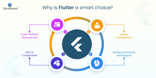
With this Google-developed powerful UI toolkit, you to create stunning, natively compiled apps for mobile, web, and desktop—all from a single codebase. A report published by the popular research portal Statista in June 2024 states: ‘’ Flutter is the most sought-after cross-platform framework globally; with 46% of developers using this technology in the time period of 2019 to 2023”.
Cross-Platform Development: With Flutter, you can develop apps for both iOS and Android simultaneously, saving time and resources.
Speedy Development: Thanks to Flutter’s hot-reload feature, developers can view the changes in real time, leading to a faster development process.
Rich UI Components: Flutter comes with a vast library of customizable widgets; developers can utilize these to create visually appealing and highly responsive apps.
Strong Community and Support: Being backed by Google, Flutter boasts of a huge community, extensive documentation, and continuous updates.
Flutter App Lifecycle Phases
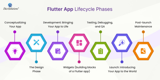
Take a peek through the fundamental aspects of Flutter app development.
Conceptualizing Your App
Create comprehensive wireframes or sketches to visualize the structure and user flow.
The Design Phase
Make the app look catchy and create a seamless and intuitive UX. Focus on the layout, color schemes, typography, and overall aesthetics.
Development: Bringing Your App to Life
Now that you have a solid concept and design in place, your app’s functionality is built and transformed from an idea into a working product.
Widgets (building blocks of a Flutter app)
Developers use widgets to create every component of the application right from simple buttons to complex layouts. The Dart programming language is used to write code for creating widgets and implementing features.
Built-in libraries offered by the Flutter ecosystem
bottom_navy_bar for sleek navigation bars
intro_slider for onboarding experiences
local_auth for integrating biometric authentication
fl_chart for creating dynamic charts and graphs
cached_network_image library for handling image caching and loading
Pre-built widgets offered by the Flutter ecosystem
Text for displaying text
Container for creating layout structures
Stack for layering widgets on top of each other.
Testing During the development phase
It's crucial to test the app during development to identify and resolve any issues early on. Flutter’s hot-reload feature is a game-changer in this regard, allowing developers to make quick adjustments and view the results immediately, without the need to restart the entire app.
Testing, Debugging, and QA
Developers perform unit tests, integration tests, and user acceptance testing (UAT) to identify and fix bugs, optimize performance, and ensure the app functions as expected. Flutter’s testing framework allows for efficient testing of individual widgets, app functionalities, and the entire application.
Debugging goes on throughout the development and testing phases. Flutter provides various debugging tools that help developers track down issues, optimize code, and ensure that the app runs smoothly across different devices and platforms.
Launch: Introducing Your App to the World
Deployment of the app to Google Play Store or/and Apple App Store and ASO (App Store Optimization) to promote the app to your target audience.
Post-launch Maintenance
The journey doesn’t end here. Post-launch, it’s crucial to monitor the app’s performance, gather user feedback, and release updates to improve functionality and user experience. Flutter’s flexibility makes it easier to roll out updates and new features, ensuring that your app stays relevant and competitive in the market.
Here’s an example of how to develop, test, and deploy a Flutter app
Step # 1 Configuring the Development Environment
Download the Flutter SDK Flutter’s official Flutter website and then install it.
Use an IDE (Integrated Development Environment) like Android Studio, Visual Studio Code, or IntelliJ IDEA. These IDEs have Flutter and Dart plugins available.
Set up an Android emulator or iOS simulator, or use a physical device to facilitate testing.
Step # 2 Budling a New Flutter Project
Open your IDE and use the IDE’s interface or the command line to create a new Flutter project. flutter create project_name
Now, navigate to your project directory: cd project_name
Open the project in your IDE.
Step # 3 Understanding the Project Structure
lib/main.dart is the application’s entry point.
The file pubspec.yaml manages the assets, dependencies, and other configurations of the app.
Android and iOS folders: Contain platform-specific code.
Step # 4 Developing the Application
Use Flutter’s widget tree structure to design the UI. Flutter’s MaterialApp, Scaffold, Container, Text, Image, and other widgets come in handy when crafting the app’s UI.
Manage the app’s state using tools like setState, InheritedWidget, Provider, Riverpod, or Bloc.
Modify pubspec.yaml to include the necessary libraries and packages; then run the command: flutter pub get
Step # 5 Testing
Using the IDE’s debugging tools, set breakpoints, inspect variables, and debug the app; and then, run your app on an emulator or a physical device using this command: flutter run. Write unit tests, integration tests, and widget tests to ensure QA.
Unit Testing:
Create a test file in the test/ directory, e.g., test/widget_test.dart.
Write a simple test:
import 'package:flutter_test/flutter_test.dart';
import 'package:my_flutter_app/main.dart';
void main() {
testWidgets('Check Hello, World! text', (WidgetTester tester) async {
await tester.pumpWidget(MyApp());
expect(find.text('Hello, World!'), findsOneWidget);
});
}
Now, use the flutter test command to run this test.
Integration Testing:
Create an integration test under the integration_test/ directory, e.g., integration_test/app_test.dart.
Example integration test:
import 'package:flutter_test/flutter_test.dart';
import 'package:integration_test/integration_test.dart';
import 'package:my_flutter_app/main.dart';
void main() {
IntegrationTestWidgetsFlutterBinding.ensureInitialized();
testWidgets('Integration test', (WidgetTester tester) async {
await tester.pumpWidget(MyApp());
expect(find.text('Hello, World!'), findsOneWidget);
});
}
Run the integration test using the command: flutter drive --target=integration_test/app_test.dart
Step # 6 Building the App for Release
For Android: Set up signing for your app by configuring the key.properties file.
Use the below command to create the APK or app bundle.
flutter build apk
flutter build appbundle
For iOS: Configure app signing in Xcode and build the app for iOS with this command: flutter build ios
Step # 7 Deployment
Android Deployment:
Update the android/app/build.gradle file with your app’s version and other configurations. Build the APK: flutter build apk –release Locate the APK at build/app/outputs/flutter-apk/app-release.apk and distribute it via the Play Store.
iOS Deployment:
Open the ios/ directory in Xcode. Update the app’s version, build number, and other settings in the project settings. Archive the app and distribute it via the App Store.
web Deployment:
If you’re targeting the web, build the web app: flutter build web The output will be in the build/web/ directory. Now, you can host the application on the web server of your choice.
Step # 8 Post-deployment Maintenance
Keep an eye on user feedback, monitor performance, and roll out the necessary updates whenever needed using the same process for building and deploying.
Step # 7: Deployment (CI/CD) and Ongoing Integration
Set up CI/CD pipelines for automated testing and deployment using tools like GitHub Actions, Bitrise, or Codemagic. Integrate services like Firebase Analytics and Crashlytics for monitoring the app in production.
Example GitHub Actions workflow:
name: Flutter CI
on: [push]
jobs:
build:
runs-on: ubuntu-latest
steps:
- uses: actions/checkout@v2
- uses: subosito/flutter-action@v1
with:
flutter-version: '2.5.0'
- run: flutter pub get
- run: flutter test
- run: flutter build apk --release
End Note
A Flutter app’s journey from concept to launch is a complex yet rewarding process requiring a blend of creativity, technical expertise, and strategic planning. Engaging software development professionals to guide and execute the workflow ensures a smoother and more successful outcome.
Whether you’re a startup looking to break into the app market or an established business aiming to expand your digital presence, Flutter provides the tools you need to turn your app idea into reality. So, what’s your next big app idea?
0 notes
Text
Mastering Microsoft Power BI: A Guide to Business Intelligence

In today’s data-driven world, Microsoft Power BI has become a powerhouse for turning raw data into insightful, visual stories. As businesses look for streamlined ways to manage and interpret data, this tool stands out with its powerful analytical capabilities and user-friendly interface. This article will dive deep into how Power BI can transform the way you handle data, showcasing its key features and offering practical tips to get you started on your journey to becoming a Power BI expert.
What is Microsoft Power BI?
Microsoft Power BI is an interactive data visualization tool that transforms scattered data into clear and actionable insights. Built with non-tech users in mind, Power BI enables you to connect, analyze, and present data across a variety of sources—from Excel and Google Analytics to databases like SQL and Azure. Whether you’re working with big data or small data sets, Power BI’s capabilities cater to a broad range of needs.
Why Should You Use Microsoft Power BI?
The world of business intelligence can seem overwhelming, but Power BI simplifies data analysis by focusing on accessibility, versatility, and scalability. Let’s explore why this tool is a must-have for businesses and individuals:
1. User-Friendly Interface
Unlike many complex data tools, Power BI’s interface is intuitive. Users can quickly navigate through dashboards, reports, and data models without extensive training, making it accessible even to beginners.
2. Customizable Visualizations
Power BI allows you to turn data into various visualizations—bar charts, line graphs, maps, and more. With these options, it’s easy to find the format that best conveys your insights. Customization options also let you change colors, themes, and layouts to align with your brand.
3. Real-Time Data Access
Power BI connects with various data sources in real time, which means your reports always display up-to-date information. Real-time access is particularly helpful for businesses needing immediate insights for critical decision-making.
4. Seamless Integration with Other Microsoft Tools
As part of the Microsoft ecosystem, Power BI integrates smoothly with tools like Excel, Azure, and Teams. You can import data directly from Excel or push reports into SharePoint or Teams for collaborative work.
5. Strong Security Features
Security is essential in today’s data environment. Power BI offers robust security protocols, including row-level security, data encryption, and permissions management. This helps ensure that your data is safe, especially when collaborating across teams.
Core Components of Microsoft Power BI
To get a full understanding of Power BI, let’s break down its main components, which help users navigate the tool effectively:
1. Power BI Desktop
Power BI Desktop is the main application for creating and publishing reports. You can import data, create data models, and build interactive visualizations on the Desktop app. This tool is ideal for those who need a comprehensive data analysis setup on their personal computers.
2. Power BI Service
This is the online, cloud-based version of Power BI, where users can share, collaborate, and access reports from any location. It’s especially beneficial for teams that need a collaborative platform.
3. Power BI Mobile Apps
With Power BI Mobile, you can view reports and dashboards on the go. Whether you’re on a tablet or smartphone, this app gives you access to all Power BI services for mobile data insights.
4. Power BI Report Server
This on-premises version of Power BI offers the flexibility of running reports locally, ideal for organizations that require data storage within their own servers. Power BI Report Server supports hybrid approaches and data sovereignty requirements.
Getting Started with Power BI: Step-by-Step Guide
Ready to dive in? Here’s a quick guide to get you set up and familiarized with Power BI.
Step 1: Download Power BI Desktop
To start, download Power BI Desktop from the Microsoft website. The free version offers all the essential tools you need for data exploration and visualization.
Step 2: Connect Your Data
In Power BI, you can connect to multiple data sources like Excel, Google Analytics, SQL Server, and even cloud-based services. Go to the “Get Data” option, select your data source, and import the necessary datasets.
Step 3: Clean and Prepare Your Data
Once you’ve imported data, Power BI’s Power Query Editor allows you to clean and structure it. You can remove duplicates, handle missing values, and transform the data to fit your analysis needs.
Step 4: Build a Data Model
Data models create relationships between tables, allowing for more complex calculations. Power BI’s modeling tools let you establish relationships, add calculated columns, and create complex measures using DAX (Data Analysis Expressions).
Step 5: Create Visualizations
Now comes the exciting part—creating visualizations. Choose from various chart types and customize them with themes and colors. Drag and drop data fields onto the visualization pane to see your data come to life.
Step 6: Share Your Report
When your report is ready, publish it to the Power BI Service for sharing. You can also set up scheduled refreshes so your report remains current.
Essential Tips for Effective Power BI Use
For the best experience, keep these tips in mind:
Use Filters Wisely: Filters refine data without overloading the report. Use slicers or filters for more personalized reports.
Leverage Bookmarks: Bookmarks allow you to save specific views, helping you and your team switch between insights easily.
Master DAX: DAX functions provide more in-depth analytical power. Start with basics like SUM, AVERAGE, and CALCULATE, then advance to more complex formulas.
Optimize Performance: Avoid slow reports by limiting data size and choosing the right visualizations. Performance tips are crucial, especially with large datasets.
Common Use Cases for Microsoft Power BI
Power BI’s versatility enables it to be used in various industries and scenarios:
1. Sales and Marketing Analytics
Sales teams use Power BI to track sales performance, identify trends, and make data-driven decisions. Marketing teams can track campaigns, measure customer engagement, and segment data for tailored marketing.
2. Financial Analysis
Finance professionals turn to Power BI for analyzing budgets, forecasting revenue, and creating financial reports. Its ability to aggregate data from multiple sources makes financial insights comprehensive.
3. Human Resources
Power BI aids HR in tracking employee performance, analyzing turnover rates, and understanding recruitment metrics. HR dashboards offer real-time insights into workforce dynamics.
4. Customer Service
Customer service teams use Power BI for tracking support requests, measuring response times, and analyzing customer satisfaction. It helps in identifying service gaps and improving customer experience.
Why Power BI Matters in Today’s Business Landscape
Power BI has revolutionized business intelligence by making data accessible and actionable for everyone—from executives to analysts. Its ease of use, coupled with powerful analytical tools, has democratized data within organizations. Businesses can now make faster, more informed decisions, enhancing their competitive edge.
Final Thoughts
Whether you're in sales, finance, HR, or customer service, Microsoft Power BI offers the tools you need to turn complex data into a strategic asset. Its approachable design, coupled with robust analytical power, makes it the perfect choice for anyone looking to improve their data skills. By mastering Power BI, you’re not just investing in a tool—you’re investing in a future where data drives every decision.
0 notes
Text
The Power of Data Visualization Software: Transforming Numbers into Insightful Stories
In today’s data-driven world, the ability to effectively visualize information is more important than ever. With businesses and organizations collecting vast amounts of data, the challenge lies in making sense of it all. Enter data visualization software—a powerful tool that not only presents data but also tells compelling stories, aiding decision-making and enhancing understanding.
Why Data Visualization Matters
Data visualization transforms complex data sets into visual representations, making it easier to identify trends, patterns, and outliers. A well-designed chart or graph can convey information much more effectively than a table of numbers. By leveraging visual elements like colors, shapes, and sizes, these tools help users grasp concepts quickly and retain information longer.
Key Benefits of Data Visualization Software
1. Simplifies Complex Data
Data visualization software simplifies the complexity of data analysis. Users can transform raw data into intuitive visuals, making it accessible to both technical and non-technical audiences. Whether it’s a bar chart, scatter plot, or interactive dashboard, these visuals provide clarity that raw numbers simply can’t.
2. Enhances Decision-Making
In the fast-paced world of business, quick and informed decision-making is crucial. Data visualization allows stakeholders to grasp insights at a glance, facilitating discussions and strategy development. By visualizing key performance indicators (KPIs) and other metrics, organizations can respond swiftly to changes in the market or operational performance.
3. Fosters Collaboration
Effective data visualization encourages collaboration across teams. When data is presented visually, it becomes a shared language that can bridge gaps between departments, fostering communication and teamwork. This collaborative spirit often leads to innovative solutions and more effective strategies.
4. Engages Audiences
A compelling visual can capture attention and engage audiences in ways that static reports cannot. Whether in presentations, marketing materials, or social media, visually appealing graphics can spark interest and drive engagement. This is particularly important in an age where information overload is a common challenge.
Popular Data Visualization Tools
There are numerous data visualization tools available, each with unique features catering to different needs:
Tableau: Known for its robust capabilities, Tableau allows users to create a wide range of interactive and shareable dashboards. Its drag-and-drop interface makes it user-friendly, while its powerful analytics features provide deep insights.
Power BI: Microsoft’s Power BI integrates seamlessly with other Microsoft products and offers strong data modeling capabilities. It’s an excellent choice for organizations already using the Microsoft ecosystem.
Google Data Studio: A free tool that allows users to create customizable reports and dashboards using data from Google services and other sources. Its collaborative features make it ideal for teams.
D3.js: For those with coding skills, D3.js offers unparalleled flexibility and control over visualizations. It’s a JavaScript library that enables the creation of dynamic and interactive data visualizations for the web.
Infogram: This tool is perfect for marketers and content creators. Infogram allows users to create infographics and reports with ease, making data storytelling visually appealing.
Best Practices for Effective Data Visualization
To make the most of data visualization software, consider these best practices:
Know Your Audience: Tailor visuals to the audience’s level of understanding. Avoid technical jargon when presenting to non-experts.
Choose the Right Visual: Different data types require different visualization methods. Bar charts are great for comparisons, while line graphs excel at showing trends over time.
Keep It Simple: Avoid clutter and focus on the most important data. A clean, straightforward design helps convey your message clearly.
Use Color Wisely: Colors can enhance understanding but should be used thoughtfully. Stick to a consistent color palette and ensure good contrast for readability.
Tell a Story: Structure your visuals to guide the audience through the data. A compelling narrative can make the insights more relatable and memorable.
Conclusion
Data visualization software is revolutionizing the way we interpret and communicate data. By transforming complex information into visual formats, these tools not only enhance understanding but also empower decision-makers. As the demand for data-driven insights continues to grow, investing in effective data visualization software is essential for any organization looking to stay competitive in today’s landscape. Whether you're a business analyst, marketer, or educator, harnessing the power of data visualization can turn your data into impactful stories that drive results.
Original Source: Data Visualization Tools
0 notes
Text
How to Create Perfect Data Visualization

Businesses have expanded their data processing scope and encountered challenges when presenting all the data insights to the stakeholders. However, reports based on visualization best practices facilitate user-friendly report creation. Therefore, it is vital to ensure clarity of thought and message delivery to encourage multidisciplinary discussions for informed decisions. This post will explain how to create perfect data visualization and which tools can assist you.
Importance of Data Visualization
Visualization in business intelligence (BI) reporting allows for efficient and effective information communication. It converts big datasets into context-appropriate visuals. As a result, your team and target audience can quickly grasp what you want to express. For instance, the top data visualization tools famous worldwide excel at simplifying complex, tabulated data presentation. You can use them to reveal critical data patterns or statistical outliers.
Attractive visual reports will hold your audience’s attention for an extended duration. Consequently, global enterprises leverage visualized data across marketing, packaging, pitch decks, and performance disclosures. After all, integrating modern dashboards helps make your message delivery more memorable.
How to Create the Perfect Data Visualization
1| Understand the Audience’s Subject Familiarity and Expectations
Determining your target audience and finalizing the reporting approach helps brainstorm new ideas relevant to data storytelling. Why must you prioritize estimating their knowledge or subject familiarity? Reputed data visualization services recognize that each stakeholder with a distinct professional background might take longer to interpret jargon, abbreviations, and lengthy terminologies from another discipline.
In other words, your BI report visualization must be suitable and straightforward based on audiences’ pre-existing knowledge. For instance, in-house experts, industry peers, and investors will demand scatter plots and detailed graphs. Meanwhile, consumers expect standard charts with a minimalist design philosophy focusing on a few metrics at a time.
2| Decide the Type of Visual Reports
Bar charts demonstrate comparative facts, but line charts are the perfect data visualization style for continuous values changing over time. Likewise, pie charts help discuss percentage breakdowns. On the other hand, heat maps highlight varying intensities over a two-dimensional canvas.
The above data visualization types are available in top reporting platforms like Tableau, MS Power BI, and Google Data Studio. You want to select the visualized reporting components based on how you want to discuss insight, the number of variables, and the core problems necessitating a data-backed solution.
3| Make Data Visualization Dashboards Safely Customizable
Some audiences might be dissatisfied with your presentation, requesting flexibility to develop a derivative BI report visualization based on their unique preferences. Therefore, your visual reporting systems must support multiple data categorization, re-labeling, filtering, and separate data view features. At the same time, the central dashboards must not lose the initial configuration to preserve each report’s integrity and assist in version control.
Safely customizable, interactive data visualization dashboards empower audiences to adjust reports to share them with others. Accordingly, you can foster an exceptional collaborative spirit during meetings and interdepartmental knowledge exchanges.
Conclusion
Genuinely respecting your audience’s expectations and choosing purpose-relevant types of visualized reporting is vital to business intelligence professionals wanting to create a perfect data visualization and storytelling strategy. An ideal dashboard powered by versatile customization and collaboration capabilities will accurately deliver your ideas. Unsurprisingly, the most noteworthy brands in each industry seek reliable visual reports for compelling team communication, efficient multidisciplinary brainstorming, and simplified consumer education.
1 note
·
View note
Text
Data Visualization: Making Complex Information Beautiful
In the age of information overload, data visualization has emerged as a powerful tool to simplify, communicate, and make sense of vast quantities of data. Whether it’s tracking global trends, analyzing customer behavior, or presenting business performance metrics, the ability to transform raw data into visually appealing and easy-to-understand formats is crucial for driving better decisions and engagement.
This blog explores the art and science of data visualization, covering its importance, principles, tools, and best practices to make even the most complex information beautiful and meaningful.
Why Data Visualization Matters
1. Clarity Through Simplicity
Complex datasets can be overwhelming and time-consuming to analyze. Visualization condenses this complexity, offering clarity through graphs, charts, maps, and infographics that present key insights at a glance.
2. Enhancing Decision-Making
When decision-makers can quickly grasp trends and patterns, they’re empowered to make informed choices. For instance, a sales dashboard with real-time visual data allows businesses to identify growth opportunities and areas of concern.
3. Storytelling with Data
A well-designed visualization tells a story. It highlights the most critical data points, creating narratives that are more engaging and memorable than spreadsheets or plain text.
Core Principles of Effective Data Visualization
1. Know Your Audience
Before designing a visualization, understand who will use it and their level of data literacy. A technical audience might prefer detailed visualizations, while a general audience benefits from simpler formats.
2. Highlight Key Insights
The goal of visualization is to make data actionable. Identify the most critical insights and ensure they stand out, avoiding clutter that detracts from the message.
3. Use the Right Chart for the Right Data
Not all charts are created equal. Selecting the appropriate format ensures that your data is both accurate and impactful:
Bar charts: Compare categories or groups.
Line graphs: Showcase trends over time.
Pie charts: Represent proportions (use sparingly).
Heat maps: Highlight intensity or concentration.
Scatter plots: Display relationships between two variables.
4. Keep It Simple
Minimalism is key in data visualization. Avoid unnecessary 3D effects, excessive colors, or overly complex layouts. A clean design ensures your audience focuses on the data itself.
Design Elements That Enhance Data Visualization
1. Color
Color is a powerful tool for guiding attention and conveying meaning. Use it strategically:
Stick to a consistent color palette.
Use contrasting colors to differentiate data points.
Avoid overusing bright or clashing colors.
2. Typography
Typography communicates hierarchy and context. Use bold or larger fonts for headings and ensure data labels are legible even at smaller sizes.
3. White Space
White space helps reduce visual clutter and improve focus. By balancing elements with adequate spacing, you create a more user-friendly design.
4. Interactivity
Interactive visualizations allow users to explore data further by clicking, hovering, or zooming. Tools like Tableau, Power BI, or Flourish make it easy to add interactivity.
Popular Tools for Data Visualization
Tableau: Ideal for creating interactive dashboards and advanced visualizations.
Power BI: A Microsoft tool perfect for business analytics and reporting.
D3.js: A JavaScript library for creating custom, dynamic visualizations.
Google Data Studio: Free and easy to use for integrating and visualizing data.
Excel: Still a staple for creating simple and effective charts and graphs.
Chart.js: A free JavaScript library for lightweight, customizable visualizations.
Best Practices for Making Complex Information Beautiful
1. Start with Clean Data
Dirty or unorganized data leads to misleading visualizations. Ensure your dataset is accurate, complete, and well-structured before designing.
2. Focus on One Key Message
Every visualization should answer one main question or convey one primary insight. Avoid cramming too much data into a single chart.
3. Tell a Story
Start with a title that explains the purpose of the visualization. Use annotations or callouts to highlight critical points, guiding your audience through the narrative.
4. Maintain Consistency
Consistency in design elements (color schemes, font styles, label formats) creates a cohesive experience, especially in dashboards with multiple charts.
5. Test for Understanding
Before publishing your visualization, test it with a small audience. Ensure they can interpret it as intended without additional explanation.
The Future of Data Visualization
1. AI-Powered Insights
AI and machine learning will revolutionize data visualization by automating analysis and suggesting the most relevant visuals for given datasets.
2. AR and VR Visualizations
Augmented and virtual reality offer immersive ways to explore data, enabling users to interact with 3D charts or maps in a virtual space.
3. Real-Time Visuals
With the growing demand for instant insights, real-time data visualization tools will become more prominent, offering immediate updates and actionable information.
Conclusion
Data visualization is more than just a tool — it’s an art form that transforms complex information into meaningful, beautiful insights. By adhering to design principles, leveraging the right tools, and keeping your audience in mind, you can create visualizations that not only inform but also inspire.
In an increasingly data-driven world, mastering the craft of data visualization ensures that your message stands out, resonates, and drives impactful decisions.
View my profile for : UI/UX design, Web design & Mobile design
0 notes
Text
Popular Data Visualization Tools:
H,
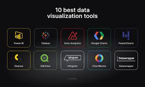
Data visualization is essential for interpreting complex data, and there are several tools available for businesses to create meaningful visual representations. Tableau is one of the most widely used tools, known for its ease of use and ability to connect to multiple data sources, including spreadsheets, databases, and cloud services. It offers a variety of visual options, from bar charts to geographic maps, and allows users to create interactive dashboards. Microsoft Power BI is another popular tool, especially for businesses already using Microsoft products. Power BI integrates seamlessly with Excel and other Microsoft tools, and provides a robust platform for data modeling, visualization, and reporting. Google Data Studio is a free tool that’s great for creating simple, shareable dashboards, particularly when working with Google Analytics data. Other tools like QlikView and D3.js offer more advanced customization for those with specific needs.
These tools not only help businesses understand their data but also communicate insights to stakeholders in an intuitive and visually appealing way.
#datascience#bootcamp#lejhro#data visualization#python#data analytics#machinelearning#data science course
0 notes
Text
How to Use SEO Data Visualization to Simplify Complex Metrics

In the dynamic field of SEO, data visualization has emerged as a powerful tool for making complex metrics more understandable and actionable. As the volume of SEO data grows, turning intricate details into clear visual representations helps stakeholders grasp insights quickly and make informed decisions. This blog post explores how to effectively use SEO data visualization to simplify complex metrics and enhance your SEO reporting.
The Power of Data Visualization in SEO
SEO data visualization involves transforming raw data into visual formats such as charts, graphs, and dashboards. This approach helps distill complex information into easily digestible visuals, enabling better interpretation and communication of SEO performance. Effective data visualization can reveal trends, patterns, and outliers that might be missed in raw data, providing a clearer picture of how SEO efforts are impacting your website.
Choosing the Right Visualization Tools
Google Data Studio
Google Data Studio is a versatile tool that allows you to create customized dashboards and reports. By integrating data from various sources like Google Analytics, Google Search Console, and other SEO platforms, you can design visualizations that cater to your specific needs. Whether it's tracking keyword performance, organic traffic, or backlink quality, Google Data Studio offers a range of charts and graphs to present your data effectively.
SEMrush and Ahrefs
Both SEMrush and Ahrefs offer built-in data visualization features that help you analyze SEO metrics such as keyword rankings, traffic sources, and backlink profiles. These tools provide pre-designed visualizations and customizable options, allowing you to focus on the most relevant data for your reporting needs.
Excel and Google Sheets
For more straightforward data visualization, Excel and Google Sheets can be powerful allies. These tools offer a variety of chart types and customization options. You can create visualizations that track SEO metrics over time, compare different data sets, and highlight key performance indicators.
Effective Visualization Techniques
Use Charts and Graphs for Trends
Line charts and bar graphs are excellent for displaying trends in SEO metrics over time. For example, a line chart can illustrate changes in organic traffic or keyword rankings, helping you identify periods of growth or decline. Bar graphs can be used to compare different metrics or performance across various channels, providing a clear view of relative performance.
Leverage Pie Charts for Proportions
Pie charts are useful for showing proportions and distributions. For instance, you can use pie charts to visualize the distribution of traffic sources or the share of different types of backlinks. This helps in understanding the composition of your SEO efforts and identifying areas that need attention.
Incorporate Heat Maps for Intensity
Heat maps can represent data density or intensity, such as showing which pages on your site attract the most traffic. By using color gradients to indicate varying levels of engagement, heat maps provide an intuitive way to spot high-performing and underperforming areas.
How Agency Simplifier Enhances Your Visualization Efforts
At Agency Simplifier, we understand the importance of clear and effective SEO data visualization. Our solutions are designed to help you create impactful visual representations of your SEO metrics, making it easier to communicate insights and drive strategic decisions. Whether you need advanced reporting tools or customized dashboards, Agency Simplifier provides the expertise and technology to simplify complex data and enhance your SEO reporting.
In conclusion, SEO data visualization is a critical tool for simplifying complex metrics and improving the clarity of your reports. By using the right tools and techniques, you can transform raw data into meaningful insights that drive better decision-making. Embrace data visualization to make your SEO reporting more effective and to provide valuable, actionable insights to your stakeholders.
Contact Us
Agency Simplifier
Chh. Sambhajinagar, MH. India
+91-982-229-8988
https://agencysimplifier.com/
Find Us Social Media
Facebook
LinkedIn
Twitter
YouTube

youtube
0 notes