#Gesso 3D
Explore tagged Tumblr posts
Text
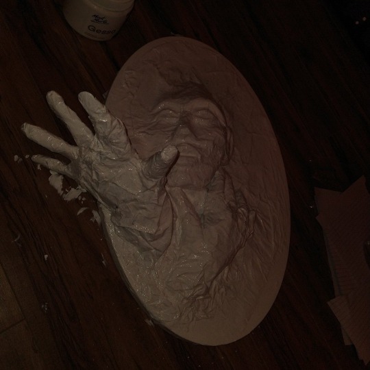
Can't wait to forget I made this, and get fucking jump scared when I walk into my office tomorrow.....
#not 3d related#chaotic academia#dark academia#gothic#sculpture#clay art#paper mache art#well i guess it is 3d...#but irl#Irl 3d art#gesso#my love#dark aesthetic#dark art#not finished#original art#artists on tumblr#traditional art#painting
9 notes
·
View notes
Photo
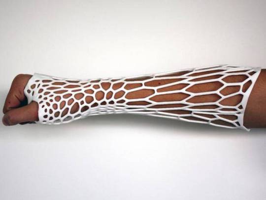
Osteoid https://www.design-miss.com/osteoid/ Deniz Karasahin, con l’ausilio delle stampanti 3D in ambito medico, ha ideato “Osteoid”, un gesso realizzato sul caldo 3D dell’arto fratturato che, grazie all’integrazione con il sistema LIPUS, capace di […]
0 notes
Text
23:37 || ༻`` 26 Dec 24 — Friday
Overall a very productive day, however I still procrastinated a ton by doing less important and urgent tasks, (despite needing to get a few things done before the 31st).
My chemistry notes are finished. I'll read through and highlight the last booklet another day, but as we haven't gone over it in class I won't make any notes on it yet. 🦎
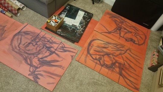
I roughly sketched out my final piece for art! (I'm doing a 3D painting set rather than sculpture) I do have to change one of the sketches (there are 4 side boards + 1 top board) to sign up with the others properly and I'm waiting for my gesso to arrive because with the amount of heavily watered down paint I've used, the wood needs sealed in. Also, why is there no affordable (white) gesso anywhere anymore??
I fully finished an art study with my new acrylic paint markers and I'm in love with them! They're so smooth and the colours are really nice
I also started carving out another lino board for more prints (I really hope this will come out a lot better than my last one....)
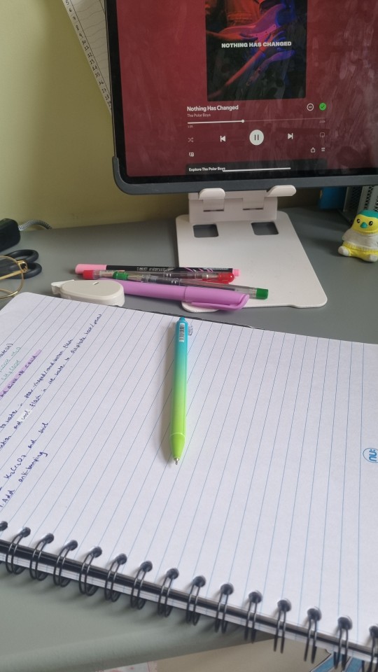
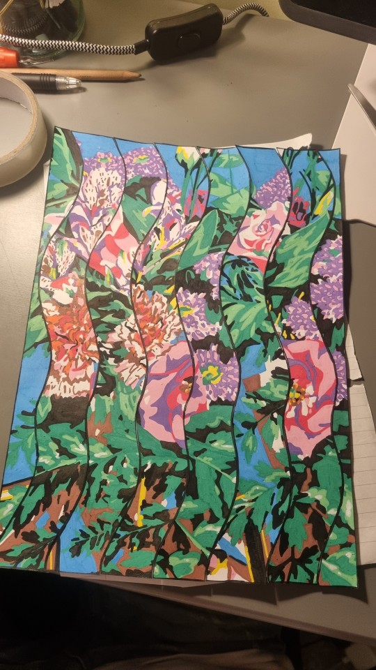
Day 100 clean!!! 🎉 K is the absolute sweetest, I told her it was day 99 yesterday and she remembered and congratulated me today 😊
Day 0
Floor time ✅️
I've also made plans with some friends for New Year's and I cannot wait!!! // 🍊
26 notes
·
View notes
Text

No costumes lately, but I've been working on this Majora's Mask for my office! I'm doing the final bits of priming and sanding loop right now (spray primer over a thick gesso primer base), and I think I just about reached the smoothness I wanted with this 1000-grit sanding pass. I don't work with 3D prints often (I feel it's a bit too brittle for costuming, and I don't have the workspace to make cast copies that are more resistant), but man this one was a MESS. I'm surprised I even managed to salvage it with how broken the print initially came in. (not to mention the severe print lines on some pieces)
But hey, I've wanted one of these on my wall for a long while now, so I'm happy it's working out!
#The Legend of Zelda#Majora's Mask#TLOZ#3D Print#Original Content#Mask#Prop#Oof I don't have a good tagging system for non sewing non costume crafts. Gotta figure something out.
11 notes
·
View notes
Text


Chimaera Gallery
3502 Scotts Lane #2113
Philadelphia, PA 19129
“Sky Bound as Titans”
March 8th-29th 2025
Opening March 8th 6-9
Closing March 29 with artist talks and performance by Megan Bridge and Max Kline 2-5
“The heaventree of stars hung with humid nightblue fruit.”
― James Joyce, Ulysses
Transmedia artist Tyler Kline’s exhibition Skybound as Titans is the result of searching, error, iteration, mistakes, endurance, failure, folly, and vision. The artist collaborates with AI to build space ships; the hubris, arrogance, faith, and audacity to undergo such an endeavor is propellent towards a destination.
Sky Bound as Titans unfolds as a multi-dimensional epic, melding mythology, speculative science, and interspecies communion into a compelling meditation on the liminal moment in which we exist—a pivot between collapse and rebirth, the Anthropocene, Chthulucene, and the Sednacene. Channeling a hybrid sequential art narrative that traverses Earth’s environmental crises, Martian industrialization, and telepathic communion with hyper-sentient beings called the Kai-Sawn, Kline crafts a speculative cosmology that invites viewers to consider humanity’s fragile position within an interconnected universe.
AI-assisted portrait paintings serve as one of the sequential narrative currents.The portraits—bearing intricate, biomorphic distortions and vapor-wave growths—represent individuals transformed by their contact with the Kai-Sawn, a telepathic species of cephalopods trapped beneath Europa’s icy crust. These images evoke a narrative of mutual evolution, where humans and other beings merge minds, unlocking interstellar potential through shared consciousness (Geistdenkenheit).
The technique folds into the conceptual framework of the exhibition, braiding technology, biology, and spiritual mythologies. The technical journey of the portraits consists first of photographing the sitters. The digital photographs are entered into Midjourney, coupled with text prompts, the AI bot responds with forms that are printed out on an inkjet printer. These prints are then transferred to board using a gesso printing method, and the image becomes a support for an oil portrait painting that becomes a soft-machine communion between sitter and painter. Photographs of the end results create the next image iteration in a positive feedback loop. In conversation with Western art history, Kline nods to the Baroque tradition of dramatic yet personal portraiture while subverting it with surreal, hybrid-sapien aesthetics. The meticulous attention to detail in the painted faces recalls German New Objectivity, particularly the movement’s focus on clarity, precision, and subjective psychological intensity. Yet, Kline tempers this mediated objectivity with layers of emotional vulnerability, reflected in the expressive eyes and gestural brushstrokes surrounding the figures.
CAD-aided, 3d print modeled, lost wax cast bronze sculptures embody Kline’s conceptual framework of materializing myth, craft, and science, acting as artifacts and figures from a speculative future cosmology. The sculptures, such as abstracted heads of mythical entities and speculative technological forms, function as relics of a not-yet-realized epoch. The intricate latticework and alien materiality of the cast bronze is a poetic metaphor, forming the architecture of the Iron Cities of Mars and shaping the organic complexity of the Kai-Sawn themselves. The inclusion of braided, human hair in some sculptures heightens the tension between the signatures of human DNA and the post-human, creating a dance between carbon based life, silicon based life, and polymer entities.
Kline’s visual language oscillates between the ancient and the speculative, evoking a synthesis of mythos, theoretical physics, and contemporary technology. The turquoise patinas and intricate textures of the sculptures suggest an otherworldly membrane, as if these forms were artifacts excavated from a distant future. Meanwhile, the portraits’ luminous skin tones and textural disruptions point toward beings in flux, undergoing a profound transformation, the materiality of their being indistinguishable from the theoretical aesthetics. The forms carry the weight of a digital and visceral journey, resulting in palimpsest that speak of cyphers and sigils.
This aesthetic duality reflects the exhibition’s conceptual narrative: the emergence of the Sednacene, an epoch where humanity transcends its destructive tendencies and collaborates with other species to explore the cosmos. Kline draws on post-humanism and fluid identities, suggesting that survival in the Sednacene depends not on dominance but on interspecies kinship and adaptability—a far cry from the colonial ambitions that underlie humanity’s historical conquests. Issues of post-colonialism are critiqued, satired, and meditated upon; the Iron Cities of Mars is both utopic and a mirror into humanities hunger, raising questions about the ethics of planetary colonization and the persistence of extractive ideologies.
The narrative emphasizes the necessity of communion with other beings, reflecting a growing recognition of non-human intelligence and its implications for science, ethics, and spirituality ; probing humanity’s role in the cosmic order and using the concept of autopoiesis through an interactive journey transforming new media into intuitive viscera. The experience invites viewers to step into a world of flux, where humanity’s destination is arrived at not by domination but on the wings of symbiosis, adaptability, and radical imagination. In doing so, Kline offers a glimpse of a future where the shadows of our present crises are cultivated in service to the boundless potential of collective transformation.
…Philosophy has an affinity with despotism, due to its predilection for Platonic-fascist top-down solutions that always screw up viciously. Schizoanalysis works differently. It avoids Ideas, and sticks to diagrams. Networking software for accessing bodies without organs BwOs, machine singularities, or tractor fields emerging through the combination of parts(rather than into) their whole: arranging composite individuations in virtual/actual circuit, They are additive rather than substitutive, an immanent rather that transcendent: executed by functional complexes of currents, switches, and loops, caught in scaling reverberations, and fleeing through intercommunication, from the level of the integrated planetary systems ti that of atomic assemblages. Multiplicities captured by singularities interconnect as desiring-machines: dissipating entropy by dissociating flows, and recycling their mechanisms as self assembling chronogenic circuitry…nothing human makes it out of the near future. - Nick Land, Meltdown, Fanged Noumena
2 notes
·
View notes
Text


Part 2 of 3!
I just got the 3D print of the Armstrong Chibi after many failed attempts of trying to go back and forth from the library since the original ones kind of failed but here we are.
Next I will try to gesso the body and paint it to fit his character model for portfolio works.
1st post for context btw!
17 notes
·
View notes
Text
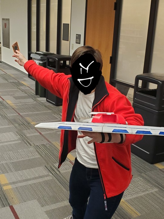
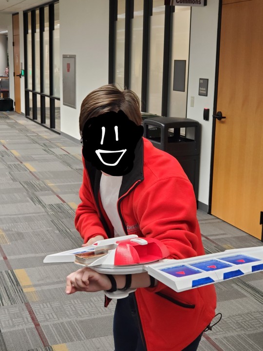
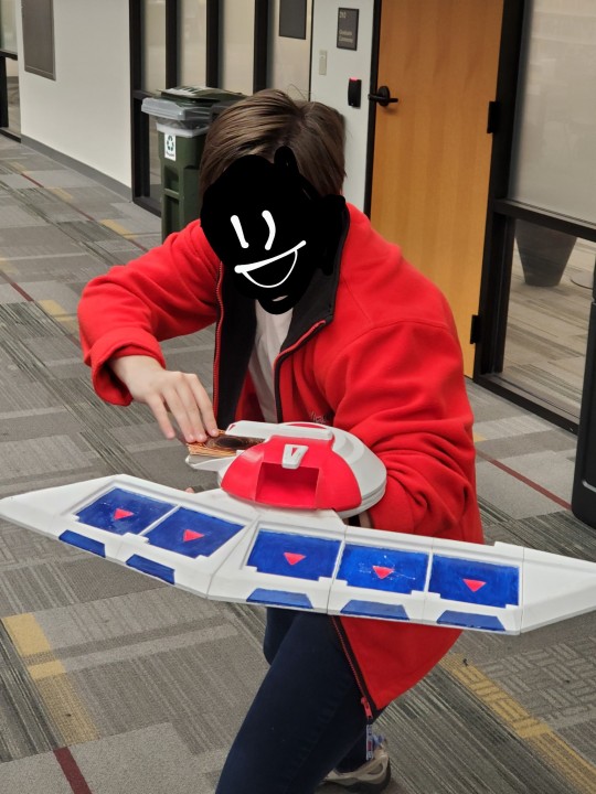
Thought yall might wanna see my Halloween costume!! I went as Jaden Yuki from Yugioh :D
The biggest and hardest part of my costume was making the duel disk. If u wanna know how i did it, see under the cut! I kind of rambled lol
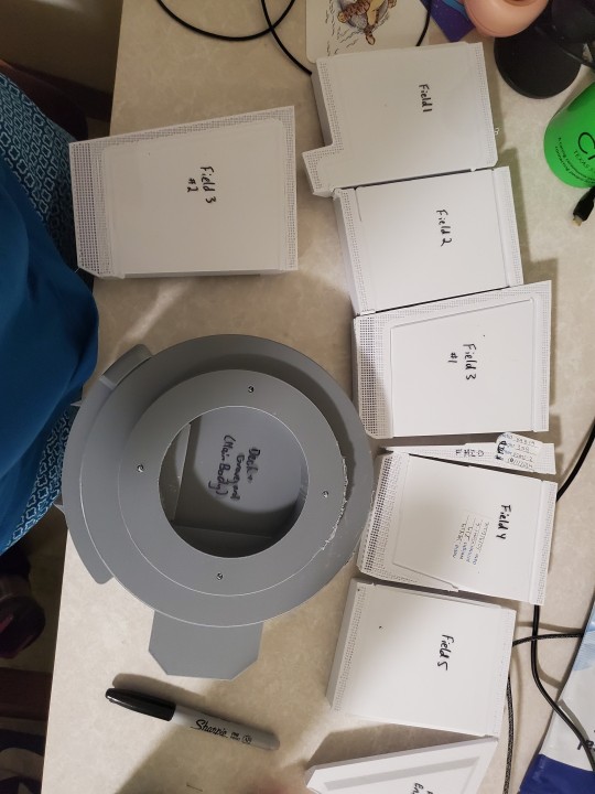
I 3d printed the parts from AmyCantFlyNow on Thingiverse, which took like 2 weeks:
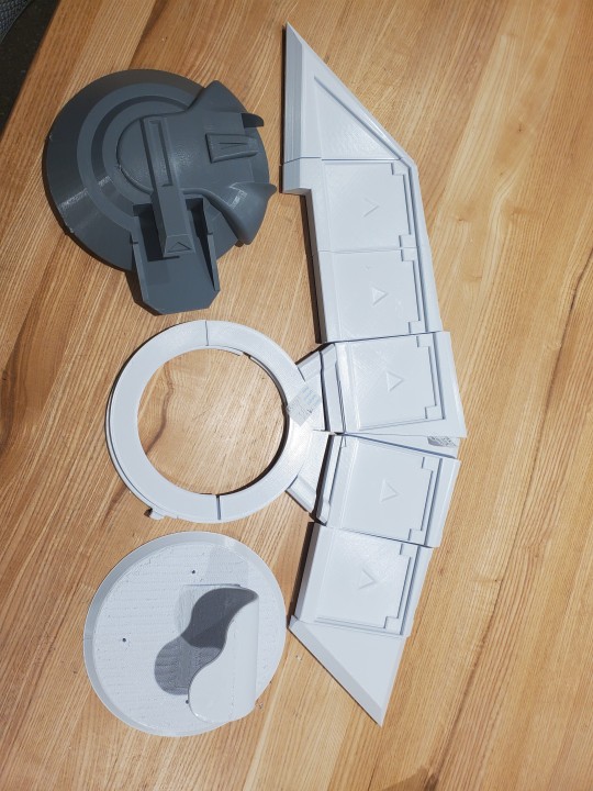
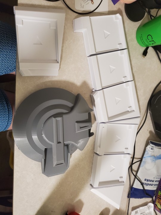
I wish I had a printer big enough to make the field in just 2 big pieces instead of the individual field slots, but alas. I accidentally made 2 of field 3 so i used that as a tester.
Also the deck/graveyard area is gray bc i printed it first and didnt have white available at the time. This was a mistake.
I sanded down all the edges and painted the parts. I had to do 5 coats of gesso on the gray to get it to the same color as the others. I should definitely have spray painted these things, it would've looked way cleaner and been way faster. I shouldve also saved painting until after I glued, as i needed to do adjustments and ended up sanding some of the paint off.
Then i had to glue them together.
I first tried loctite superglue but it was nowhere near strong enough. Also i used a full bottle of it and didnt have enough.
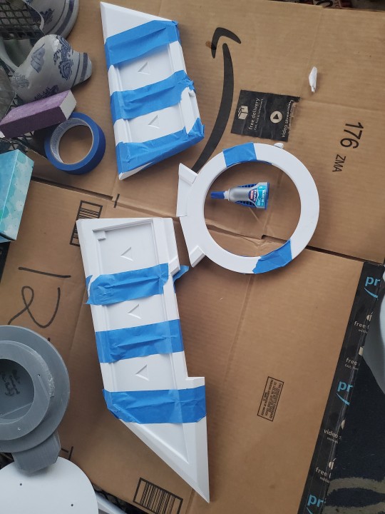
So then i used JB Weld plastic bonder which worked like a charm. Super easy to apply, dried relatively quickly, and most of all, it was study. I had to reglue the larger field side to the circle twice over, but that was partially because I set it wrong.
When i tried to put it together, the bottom of the deck/graveyard was too wide to fit the two field areas so I spent several hours sanding it. I honestly would have reprinted the darn thing if i wasnt doing this the night before halloween XD.
Also, there was a lot of friction between the two field areas and the deck/graveyard, so I put Scotch tape on it to smooth it out. Definitely a temporary solution, but it worked well enough.
I screwed the bottom (the handle) onto the disk, and that's when i found another problem.
There was no way to hold the duel disk upright, as it was waaay too lopsided towards the field and there is no built-in strap to attach it to my arm.
I, at this point, had like 2 hours until i needed to be ready, so I grabbed some extra strength extra wide ponytail holders. With a mixture of hot glue and the screws holding the duel disk together, i put 3 holders in which strapped it to my arm okay. It was (and is) still lopsided but I couldnt do much abt that at that point.
If i were to make this with more time, I wouldve put some sort of handle to hold with my left hand under the duel disk to stabilize it and dtop it from slipping sideways.
You can see in the final pictures I'm kind of holding the duel disk up with my hand to keep it from falling to the side.
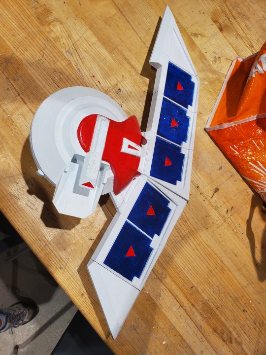
Also for next time i wouldve added something to keep my cards in place, they were going everywhere XD
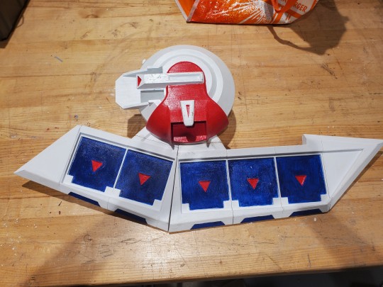
#halloween#costume#cosplay#yugioh#jaden yuki#art#3d printing#prop#propmaking#halloween costume#yugioh gx
2 notes
·
View notes
Text
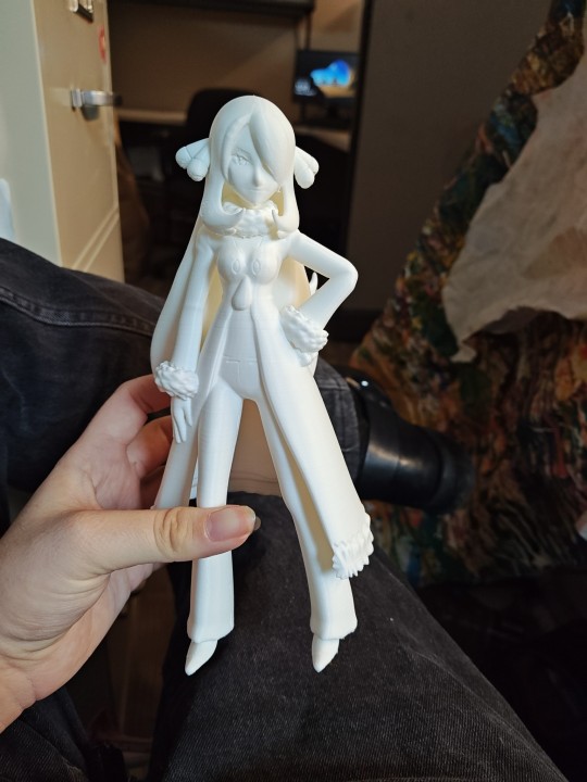
I am so fucking jazzed rn
A coworker has a 3D printer and is willing to print shit for me . Supposedly I have Diantha coming soon too
She's a lil rough but that's ok, I'll sand her and maybe put a lil gesso on her before painting her
6 notes
·
View notes
Text
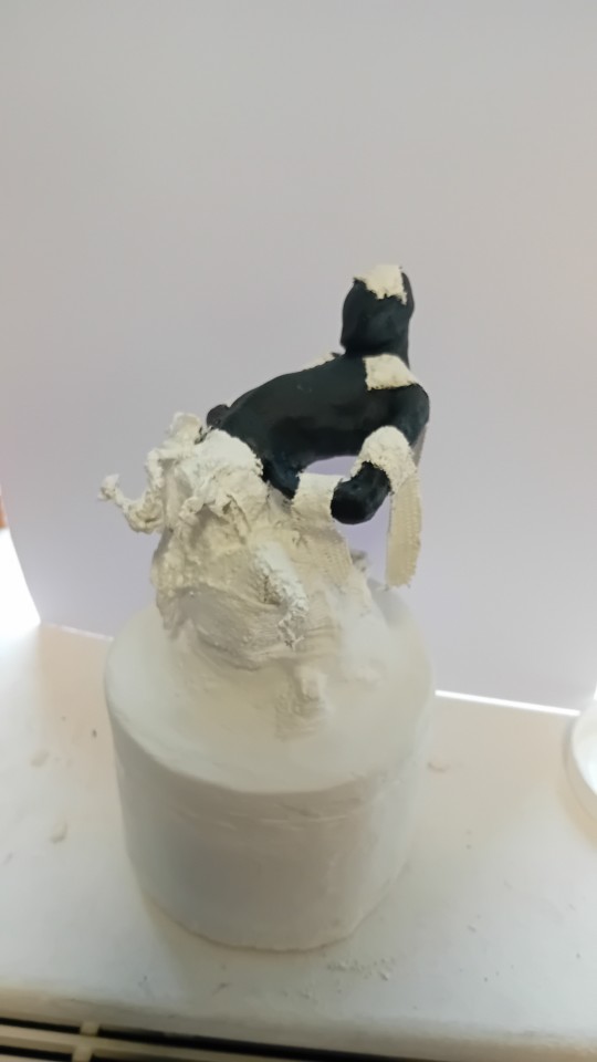
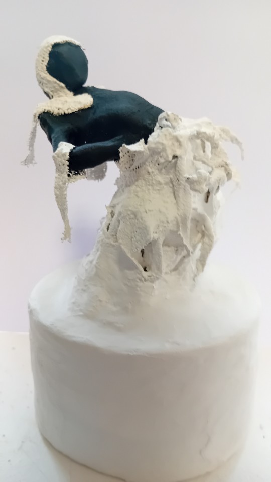
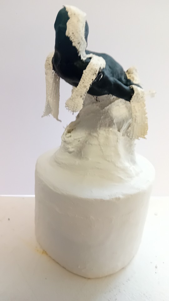
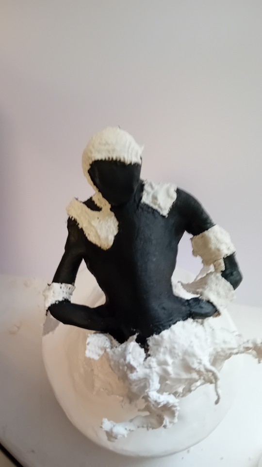
Disrupt Project- Exploring 3D Materials
I painted the base with white gesso and black paint for the figure to contrast it from the base and shrapnel.
2 notes
·
View notes
Text
Wanted a shiny Ralts figure to go with all the other little 3d printed Pokémon figures I've bought and painted, but the etsy shop I usually buy from didn't have Ralts and I can't find any others at this scale, so I'm figure modding again!
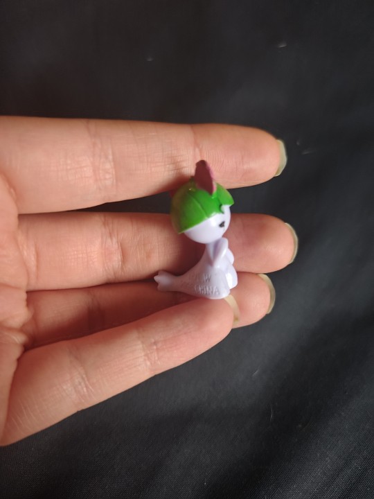
(progress photos and process below)
Bought a lil Ralts figure pretty cheap. It's very glossy and the manufacturer's paint on it has a kinda strong smell despite it being marked as made in 2006 (and p deeply engraved with that). I'm getting the impression the head may have been painted with acrylic paint or something.
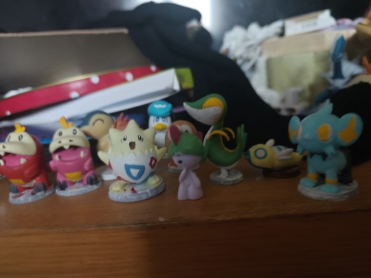
It's pretty small compared to some of the other figures, but I think once I make it a base it should match good enough!
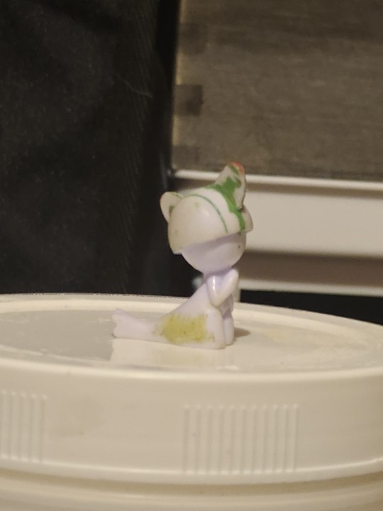
Sanded most the paint off, as well as sanding the rest of the body as much as I could. Filled in the text on the side as best I could with milliput before sanding again. The 'A' in china is still kinda visible, but a few coats of gesso should fix that.
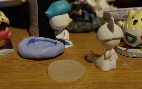
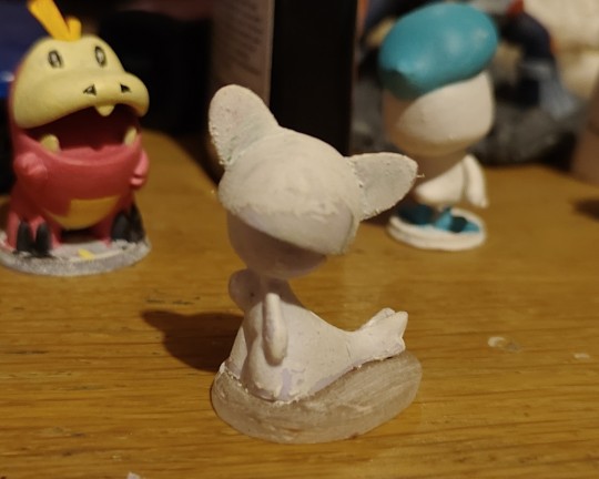
I also made a lil base with UV resin (and made the mold for it w epoxy molding putty and the shinx figure I have). Don't have much experience with it and definitely don't have all the equipment for it really, but let it cure w a uv light in a covered up empty plastic drawer and left the window open, hoping that'll do 🤞 sanded the base and superglued it together, so just some priming and painting left.
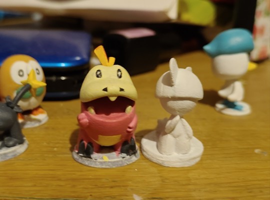
Aaaand gesso priming done! Just the paint job to go now and Ralts should blend in nicely with the others 😊 may update with the paint-job when done!
#pyro crafts#ralts#(the reason they don't all have painted bases is bc i *might* be modding the bases later#I'm aiming to make a pmd diorama with interchangeable figures on top#hopefully w magnets in the bases too#but that's pretty far off rn with my current progress i think lol#and yes the shiny ralts is bc i have a shiny fuecoco and I want my pmd kris and susie to be able to go on there lol
6 notes
·
View notes
Text
She probably thought "I wanna make it shiny" and then did that.
Tbh the art explanation is that the above person is overcomplicating it in their head and making it seem wayyy more difficult than it would be.
1. This is definitely not a bas-relief. A bas-relief sculpture is, well, sculpted. She didn't sculpt anything. She used some kind of impasto medium to make a thickened/raised texture on a surface. So no, she didn't make a bas-relief and didn't really need to think about sculpting. She needed to think about rendering a 3D object in 2D like any artist does, and then gave that some texture and dimensionality by adding to a 2D image.
2. This means there aren't actually three different mediums of art happening here. The white impasto (maybe an impasto thick gesso or similar material) is being painted on, and then she's painting color. All she did was trace paint the lines of her drawing to make the outlines raised. She possibly used a palette knife to spread some of the thickness/layer, but that's still just impasto painting techniques.
3. Her coloring is done fine, but I don't think it takes anything crazy to paint a peacock feather peacock colored, yanno? Like the technical skill is fine, but I don't think it takes imagination to come up with, so much as solid color theory knowledge to mix/blend and practice to render it in a pleasing way. Basically I don't think she had to "come up with" that?
4. Mirror work doesn't seem crazy to me, but then again, I did once break a bunch of old trash CDs up and glued them to the tops of my converses in junior high so that I had shiny discoball like shoes. Literally the thought process is sometimes "but what if I make it shiny?" [See also: Klimt with gold leaf, and Louis Comfort Tiffany with glass/gems as mixed media.] It's cool, don't get me wrong, and it IS different from just straight painting (everything else being done until this point). But it's like...oh okay. It's just adding mosaic/glass cutting techniques. This is a way to make it mixed media. But I'm not as baffled by the desire to be like "okay but shiny or reflective also??" It's cool that people's brains do this when I don't always think about it, but sometimes I also have the magpie urge.
5. This makes me such a killjoy, but resin pouring over a mixed media painting is just a way to seal it. Painters varnish their paintings all the time with resins/varnish, it's just that this one is a thick poured layer of a polyresin rather than thinly brushed on. It takes work to do, but it's not particularly difficult to just dump resin on it and avoid bubbles when it sets.
Like...looking at all of this, I think it's much easier than people might think to do the same thing. Practice will improve people greatly, but also (minus the mirror cutting, and a full resin pour) i think I could teach kids how to do this pretty easily. Maybe with pre-cut mirrored pieces that aren't sharp for preteens/teens. Her lack of safety gear for the mirror cutting is stupid and alarming lol.
But elementary kids you could do deffo this with shiny plastic shiny cut out shapes, some glue, (maybe flour glue?), caulk, or plaster paste in like, pastry bags, and have them paint on a canvas or gessoed board.
Pretty simple techniques, basic subjects and colors, just rendered well with practice! But anyone could try to do something like this if they felt brave.
18K notes
·
View notes
Text
I like her style. Working in tinted gesso, acrylic and oil on canvas painter and 3D sculptor P J Crook’s work is interesting and different. You may recognize her work and style from King Crimson album covers


0 notes
Text
Buy Exquisite Tanjore Paintings – Handcrafted Traditional Art – Taani Treasures
Introduction to Tanjore Painting
Tanjore painting, also known as Thanjavur painting, is a classical South Indian art form. It originated in the town of Thanjavur in Tamil Nadu. Rich in color, this art stands out with its surface richness and compact composition.

The History Behind Tanjore Paintings
Tanjore paintings date back to the 16th century. The Nayakas of Thanjavur under the Vijayanagara Empire supported it. Later, the Maratha rulers promoted this tradition. The paintings were originally created for temples and royal households.
Unique Characteristics of Tanjore Art
Tanjore paintings are known for their vivid colors, dense compositions, and gold foil work. Artists use gesso, a mixture of chalk and glue, to add relief work. This adds depth and texture to the artwork.
Materials Used in Tanjore Painting
Traditionally, artists use wooden planks called “Palagai Padam” as the base. The image is first sketched, then layered with gesso. Gold foil and natural colors follow. Precious stones are sometimes added to enhance visual appeal.
Themes and Subjects of Tanjore Paintings
Most paintings depict Hindu gods and goddesses. Lord Krishna, Lord venkateshwara, and Sai Baba Tanjore Painting are popular choices. Scenes from Hindu epics like Ramayana and Mahabharata are commonly featured. Some paintings also include Jain, Sikh, and even Christian icons.
The Making Process Step-by-Step

Sketching the Outline: Artists begin by drawing the design on the wooden base.
Applying the Gesso: Relief areas are built using gesso to create a 3D effect.
Sticking the Gold Foil: Thin sheets of gold are applied over the raised designs.
Coloring the Artwork: Natural and synthetic colors are added to bring life to the painting.
Final Touches: Detailing and embellishments are completed, sometimes with gems.
Modern Adaptations of Tanjore Painting
Contemporary artists have embraced canvas and acrylic colors. Modern themes include abstract ideas and fusion art. Even so, they retain traditional techniques like gold foil work.
Why Tanjore Paintings Are Still Popular
Tanjore Paintings as Gifts and Heirlooms
These paintings are often gifted during weddings and festivals. They’re treasured family possessions passed through generations. Their timeless charm never fades.
Where to Find Authentic Tanjore Paintings
You can find them in art galleries and Taani Treasures. Discover the timeless artistry of Taani Treasures, where tradition meets expert craftsmanship. Our exquisite collection of handcrafted décor and spiritual treasures is designed to bring beauty, positivity, and heritage into your home. Each piece showcases intricate detailing and authenticity, making it a perfect addition to your space or a thoughtful gift for someone special.
Shop now and elevate your home with elegance!
#Tanjore Paintings#Tanjore Painting#Tanjore#Thanjavur painting#Thanjavur#art galleries#home decor#decor#usa paintings#treasures
1 note
·
View note
Text
✨ Transforme seu ambiente com a excelência da **Muller Gesso & Drywall**! ✨ Montagem de Drywall com qualidade e inovação, trazendo um toque de sofisticação para seu espaço. Contamos com: - Forros e divisórias de drywall - Molduras e faixas de gesso - Sancas abertas, fechadas e invertidas - Revestimentos em gesso 3D e decoração personalizada Ligue agora para orçamento e transforme seu espaço com a gente! 📲 Entre em contato pelo WhatsApp: (18) 99179-2317 **Indique-nos**
#mullergesso #maodeobra #drywall #regentefeijo #Indiana #presidenteprudente #anhumas#taciba #machado #martinopolis #adamantina #paraguacupalista #Pirapozinho
1 note
·
View note
Text
'Michelangelo': arriva la mostra in Danimarca con le repliche 3D
‘Michelangelo’ è il titolo della mostra che aprirà i battenti a partire dal 29 marzo allo Statens Museum for Kunst, il museo nazionale della Danimarca. Si tratta della più grande esposizione che mi sia mai stata dedicata nel Paese e metterà assieme calchi in gesso dell’Ottocento direttamente provenienti dalla collezione permanente del medesimo museo con repliche tecnologiche realizzate con una…
#antonietta bandelloni#art#artblogger#arte#bellezza#disegni#Michelangelo Buonarroti#rinascimento#scultura
0 notes
Text

Chimerea Gallery
3502 Scotts Lane #2113
Philadelphia, PA 19129
“Sky Bound as Titans”
March 8th-29th 2025
Opening March 8th 6-9
Closing March 29 with artist talks and performance by Megan Bridge and Max Kline 2-5
“The heaventree of stars hung with humid nightblue fruit.”
― James Joyce, Ulysses
Transmedia artist Tyler Kline’s exhibition Skybound as Titans is the result of searching, error, iteration, mistakes, endurance, failure, folly, and vision. The artist collaborates with AI to build space ships; the hubris, arrogance, faith, and audacity to undergo such an endeavor is propellent towards a destination.
Sky Bound as Titans unfolds as a multi-dimensional epic, melding mythology, speculative science, and interspecies communion into a compelling meditation on the liminal moment in which we exist—a pivot between collapse and rebirth, the Anthropocene, Chthulucene, and the Sednacene. Channeling a hybrid sequential art narrative that traverses Earth’s environmental crises, Martian industrialization, and telepathic communion with hyper-sentient beings called the Kai-Sawn, Kline crafts a speculative cosmology that invites viewers to consider humanity’s fragile position within an interconnected universe.
AI-assisted portrait paintings serve as one of the sequential narrative currents.The portraits—bearing intricate, biomorphic distortions and vapor-wave growths—represent individuals transformed by their contact with the Kai-Sawn, a telepathic species of cephalopods trapped beneath Europa’s icy crust. These images evoke a narrative of mutual evolution, where humans and other beings merge minds, unlocking interstellar potential through shared consciousness (Geistdenkenheit).
The technique folds into the conceptual framework of the exhibition, braiding technology, biology, and spiritual mythologies. The technical journey of the portraits consists first of photographing the sitters. The digital photographs are entered into Midjourney, coupled with text prompts, the AI bot responds with forms that are printed out on an inkjet printer. These prints are then transferred to board using a gesso printing method, and the image becomes a support for an oil portrait painting that becomes a soft-machine communion between sitter and painter. Photographs of the end results create the next image iteration in a positive feedback loop. In conversation with Western art history, Kline nods to the Baroque tradition of dramatic yet personal portraiture while subverting it with surreal, hybrid-sapien aesthetics. The meticulous attention to detail in the painted faces recalls German New Objectivity, particularly the movement’s focus on clarity, precision, and subjective psychological intensity. Yet, Kline tempers this mediated objectivity with layers of emotional vulnerability, reflected in the expressive eyes and gestural brushstrokes surrounding the figures.
CAD-aided, 3d print modeled, lost wax cast bronze sculptures embody Kline’s conceptual framework of materializing myth, craft, and science, acting as artifacts and figures from a speculative future cosmology. The sculptures, such as abstracted heads of mythical entities and speculative technological forms, function as relics of a not-yet-realized epoch. The intricate latticework and alien materiality of the cast bronze is a poetic metaphor, forming the architecture of the Iron Cities of Mars and shaping the organic complexity of the Kai-Sawn themselves. The inclusion of braided, human hair in some sculptures heightens the tension between the signatures of human DNA and the post-human, creating a dance between carbon based life, silicon based life, and polymer entities.
Kline’s visual language oscillates between the ancient and the speculative, evoking a synthesis of mythos, theoretical physics, and contemporary technology. The turquoise patinas and intricate textures of the sculptures suggest an otherworldly membrane, as if these forms were artifacts excavated from a distant future. Meanwhile, the portraits’ luminous skin tones and textural disruptions point toward beings in flux, undergoing a profound transformation, the materiality of their being indistinguishable from the theoretical aesthetics. The forms carry the weight of a digital and visceral journey, resulting in palimpsest that speak of cyphers and sigils.
This aesthetic duality reflects the exhibition’s conceptual narrative: the emergence of the Sednacene, an epoch where humanity transcends its destructive tendencies and collaborates with other species to explore the cosmos. Kline draws on post-humanism and fluid identities, suggesting that survival in the Sednacene depends not on dominance but on interspecies kinship and adaptability—a far cry from the colonial ambitions that underlie humanity’s historical conquests. Issues of post-colonialism are critiqued, satired, and meditated upon; the Iron Cities of Mars is both utopic and a mirror into humanities hunger, raising questions about the ethics of planetary colonization and the persistence of extractive ideologies.
The narrative emphasizes the necessity of communion with other beings, reflecting a growing recognition of non-human intelligence and its implications for science, ethics, and spirituality ; probing humanity’s role in the cosmic order and using the concept of autopoiesis through an interactive journey transforming new media into intuitive viscera. The experience invites viewers to step into a world of flux, where humanity’s destination is arrived at not by domination but on the wings of symbiosis, adaptability, and radical imagination. In doing so, Kline offers a glimpse of a future where the shadows of our present crises are cultivated in service to the boundless potential of collective transformation.
…Philosophy has an affinity with despotism, due to its predilection for Platonic-fascist top-down solutions that always screw up viciously. Schizoanalysis works differently. It avoids Ideas, and sticks to diagrams. Networking software for accessing bodies without organs BwOs, machine singularities, or tractor fields emerging through the combination of parts(rather than into) their whole: arranging composite individuations in virtual/actual circuit, They are additive rather than substitutive, an immanent rather that transcendent: executed by functional complexes of currents, switches, and loops, caught in scaling reverberations, and fleeing through intercommunication, from the level of the integrated planetary systems ti that of atomic assemblages. Multiplicities captured by singularities interconnect as desiring-machines: dissipating entropy by dissociating flows, and recycling their mechanisms as self assembling chronogenic circuitry…nothing human makes it out of the near future. - Nick Land, Meltdown, Fanged Noumena
#tylerkline #chimereagallery
1 note
·
View note