#GOD I HATE THAT SHADE OF YELLOW 😭
Explore tagged Tumblr posts
Text


this Halloween will be so good.
#HEHEHEHEHEHEHEHEHEHEH#I’m so readyyyyyyyy#one of my friends is gonna be Luigi too#MWAHAHAHAHAHA#GOD I HATE THAT SHADE OF YELLOW 😭#but I love Daisy more#bb’s rambles#halloween
19 notes
·
View notes
Text
Remember that rlly old Morro fanart i talked about but never posted the completed version of? Yh, i finished it today

Rant under the cut+a clearer morro picture
DUDE I HATE IT. LIKE MORRO LOOKS PERFECT EXACTLY LIKE HOW I IMAGINED HIM BIT EVERYTHING ELSE FEELS LIKE IT DOESNT LOOK RIGHT OR FEELS LIKE TOO MUCH BUT I TOOK SOOOOO MUCH TIMEEEE DOING IT.
It took me AGES guys you don’t understand and even after that you can barely see some of the details.

You can see morro better in this image, where i took away the background, chains, tentacles and a few other things.
When colouring his face i made a slight mistake before realising it could look like a sick scar so now morro has a scar that could be caused from whatever on his face.
I also forgot his green streak so that was quickly added too.
Morro’s clothes took a lot of time (Morro was drawn months ago, and i did the background today, so somethings I’ve forgotten) but i believe i used Pinterest to find i thinkkk Japanese male clothing to base it off of and then used my own twists to its actual design. Morro’s clothing consists of different shades of green and teal, and well as gold and yellow to represent Wu and his effect on Morro, such as the golden rope around his waist that was given to him by Wu. The silver-ish thing on his chest was placed there and inspired by the ones that men and women may wear on their chest, and on the cloth that lays between Morro’s legs (with the wind like patterns on top of the skirt-like garment (PLEASE someone tell me what it is actually named i tried genuinely)) at the bottom where it looks like am arrow is a skull like picture.
Morro also has a brown skin tone in this because i head canon him to be both east and south asian. Also I put Morro is very ‘flowy’ or baggy clothes because he’s the wind elemental and likes to freely feel the wind.
Overall the scenario if this image was Morro still being trapped by the preeminent, but as he is known as the second to only the preeminent, he us held in high standards and strength with all the other cursed ghosts, almost like a prince (Respected but is also someone who is constantly threatened, as expected). Morro is also depicted to be alive, showing him to be trapped and forever affected by her influence for the rest of his existence. But also show his innocence and naivety when this is before he ever died and was groomed to the person we know today.
And for the love of God, ignore the hands and feet i do not know how to draw them 😭
#lego ninjago#ninjago#morro ninjago#lego emo#ninjago morro#morro wu#ninjago fanart#lego ninjago morro#morro headcanons#the preeminent#the cursed realm#ninjago realms#ghosts#japanese clothing#lego fanart#fanart#asrikal art
99 notes
·
View notes
Text
Random things in my MHA DR about 1-A!
Mineta was originally part of the class, however during the quirk apprehension test at the start, he got the lowest score and that Aizawa noticed him acting creepy so he acted on his threat to expel someone and gave Mineta the boot. That way, it'd also serve as a warning to others.
Mineta was actually hilarious though on first day. Actually made me crack up a lot, especially since I also have a dirty sense of humor. But then he he tried to peek under Yaomomo's skirt and the illusion was shattered. (For a moment I thought he could've been great </3)
I unironically voted for Sero during the class rep elections. Him and Yaomomo had a tie and he dropped out of the nominations saying that Yaoyorozu should be the vice-representative for 1-A over him. (Sero is such a sweet soul in my DR.)
Bakugo Katsuki, despite having fashion designers for parents, only ever dresses in the most basic clothing. Black compression shirts and sweatpants are his go to and when he feels like it he sometimes wears graphic tees and jeans. But he also criticizes others a lot on their fashion sense. (He one time straight up scolded Mina for an hour because she wore a shade of yellow that didn't go with her skin tone.)
Sato, without fail, will always have a box of some type of sweets on him. Man is a god send. He brings like this little lunchbag and he has two tupperwares of sweets. One time he had these donuts and each of them were a cool new flavor I've never seen before, like a raspberry donut with candied bacon, it sounds gross but he makes it taste good somehow.
Most Sundays, Aoyama usually goes out to visit this stray kitten in a park near U.A. He feeds all the time too. He has little cat treats in his bag always. He doesn't even like cats that much, but he sees himself in the kitty. Weak and can't do anything about it (Aoyama deserves better.)
Sero makes the MEANEST avocado salads ever. Like actually godsent. It's avocados, tomatoes, red onions, bell peppers, cucumbers, cilantro, parsley, garlic, black beans, jalapeno, lemon juice, olive oil, salt and white pepper, and queso fresco all tossed together. (Yes, I memorized the recipe because I wanted to make it in my CR 😭)
Oddly enough, Koda sleeps really loudly. Like he snores, talks in his sleep, grinds his teeth, even clears his throat sometimes. He fell asleep in the common room once on a sat evening watching Princess and the Frog with Tsu and my god, everyone in the first floor could hear it, even on the second floor only it was a little more muffled.
Iida dresses wrong. Not bad, wrong. He doesn't dress ugly, in fact he's one of the most well dressed in 1-A. The issue is, he never knows what outfit for when so he either always ends up overdressed or underdressed. We went out to get groceries and he was wearing a first date outfit (He looked fine asf but like for groceries?? 😭)
I don't know how it happened but for some reason, Monoma and Yaomomo are friends. Like not frenemies or just acquaintances. Like real actual friends. They hang out sometimes and gossip with Kendo. He even tones down the 1-A hate passion canon in her presence, it's actually amazing to see.
#mha#mha dr#my hero academia#my hero academy fanfiction#shifting#shifting blog#my hero acedamia#Alli's mha dr 。𖦹°‧ !!
142 notes
·
View notes
Text
OK. ok. i identified that weird-ass bug next to nine from my last post.

do any of y'all know who the hell this is? google tells me it's the james webb space telescope but...

OH MY GOD DID YOU GUYS SEE THAT???!!!? GOOGLE WAS RIGHT???!!!!
ahem. OC REVEAL! not even 17776 is safe from OCfication. i actually made this whole collage infocard thingy about a month and a half ago i just only felt confident enough to post it now 😭 so uhh yeah meet the James Webb Space Telescope! otherwise known as JAWS! they're color coded with magenta-ish purple cause they have pinkish elements irl and i wanted that to translate over here. i'll draw her someday I PROMISE. also they're old friends with hubble (they go WAY back) so she really misses them :( on text they have their base purple, two shades (one for regular convos, other for sharing info on their pics and such), but i've been wanting to incorporate their honeycomb mirrors by making her text go yellow whenever she screams cause typically they're all lowercase and DIE BY IT. i've seen other webb telescope OCs around here so I wanted to do my own take and i'm just especially fond of this telescope in particular :] ok byebye!
extras under cut
in the back of JAWS' card, there's some dialogue i did for her to give me a quick perspective into how i think their character would translate onto text!
here's the thingy:
.i hate the sense of loneliness. and that we're just doomed to forever be alone
.we're all just forced into the fact that well, humans will never know otherworldly beings that can interact with them as intimately and closely as they do to eachother and have to accept it out of necessity.
.cause if they don't? they're aimlessly jumping in the air reaching for dying stars, making themselves look like idiots, draining resources to hit the same wall over and over again.
.but it just eats away at me. what do you mean there's really nothing left after this? that there's really nobody home? where's any of the fun in that?
.i think it's better to speculate with hope, wonder, and the truths we know now without always having to put those thoughts into motion, or prioritize the debilitating facts over it too. sometimes it really is just fun to think about what could've been.
.
.
.pfft but what do i know. i'm just another one of many probes man left behind in space when they shifted their end goal from exploration & conquest to leisure & play. the truth about ourselves is sad but we don't let it weigh us down anyway.
.
.are there any fun games on right now? i'm quite partial to a good 500 wild goose chase myself.
she's painfully wordy and she knows it and isn't planning on stopping >:)

old thingy from the webcomic swap but since i haven't revealed JAWS until now it's here instead!
on another note, been thinking about the spitzer and kepler space telescopes too. has anyone else considered '76ifying them? I NEED MORE TELESCOPE LOVE 💔 ok byebye
#17776#17776 football#17776 fans 𝓱𝓲𝓽 𝓶𝓮 𝓾𝓹...#17776 OC#???#teehee#20020#20020 football#20020 fans 𝓱𝓲𝓽 𝓶𝓮 𝓾𝓹...#what football will look like in the future#ya#james webb space telescope#jwst#I LOVE TELESCOPES#is it okay to add to the tags#jaws#thats gonna confuse so many shark enjoyers#why's there a telescope in my sharks?#man#can't have anything anymore!!#lol#hubble & jaws interactions wull happen shortly#this is all part of the hubble agenda#co-run by jaws#>:]
31 notes
·
View notes
Text
get to know me<3
tagged by @reddedmiller (hiiiiii)
what's the origin of your blog title?: I don't have one yet ahah I literally just made this blog (I've been on Tumblr on and off for like 10 years tho)
OTP(s) + shipname: it's always gonna be MSR for me. good god I love those lesbians
favorite color: it's been yellow for the longest time but lately certain shades of green are becoming a very close second!
favorite game: y'all are gonna hate me for this but im actually not a video game girlie. im gonna say scrabble
song stuck in your head: babydoll by ari abdul bc im in the planning stages of making a Joel edit for TikTok to this song (because well...he's my babydoll)
weirdest habit/trait?: probably the way I talk to my cats 💀
hobbies: video editing, photography, gif making, crocheting, and writing. I went a long time without writing and im finally getting back into it thanks to tlou and im very happy about it
if you work, what's your profession? I founded and run a nonprofit animal welfare organization! I don't earn income from that despite it being a full time job though so in addition I do odd jobs like petsitting and I also sell crafts and art.
if you could have any job you wish what would it be? I'm pretty happy (relatively) with what I do currently, but if I was ever going to do something else I'd either go to vet school or try to make a career out of my photography hobby
something you're good at: parallel parking (WHO WANT ME)
something you're bad at: taking care of myself unfortunately
something you love: hanging out with my best friend and my nieces + nephew!<3
something you could talk about for hours off the cuff: why you should spay your pets!!!!!!!!
something you hate: the public relations side of my job
something you collect: i collect thrifted trinkets and wall art and also cameras!
something you forget: literally everythingggg girl help (I have memory problems)
what's your love language?: im actually not sure bc every time I think I know something happens and im like no THIS is my love language. I am just a lover forever
favorite movie/show: of all time?? fringe or the x files or tlou
favorite food: right now I cant lie I am on a huge veggie stix kick....they are like hard drugs to me
favorite animal: cats lol can u tell
what were you like as a child? undiagnosed autistic
favorite subject at school? science fs
least favorite subject? in school I was actually not so bad at math but now that I have to use it all the time for work I am suddenly very bad at it so im gonna say math
what's your best character trait? I got jokes
what's your worst character trait? literally all I do is complain all da freakin time
if you could change any detail of your day right now what would it be? I would love for the sick cat im caring for rn to start getting better and stop scaring tf out of me!!!!
if you could travel in time who would you like to meet? I am too pussy to ever time travel bc what if I fuck something up and then im walking down the street and everybody's like ugh theres the bitch who fucked up the timeline. id be so embarrassed
recommend one of your favorite fanfics (spread the love!): here's one from my recent bookmarks because I can never pick favorites: confirmation bias by sporadicallyceaseless
I just remade a few days ago so I have like 3 mutuals and idk any of y'all yet so I dont wanna be annoying 😭 that said @littlegrungegirlaf @lavendercoloredglasses @hearteyesforjoel @joelsprettyprincess @weirdero @daydreamingmiller
9 notes
·
View notes
Text
Rating Pyro designs
TAS (Earth-92131)


8/10
Love him
His hair is PHENOMENAL
THE VOLUMEE
He looks really British
SUPER HERO SQUAD (Earth-91119)
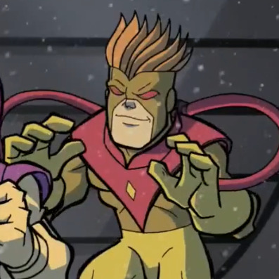
6/10
Don't get me wrong I love this Pyro with all my heart
Butttt his design doesn't really appeal to me
That is the UGLIEST shade of yellow my eyes had ever had the displeasure of witnessing
His hair is orange and it's not even a nice shade
He gets points for being a silly little guy I love him
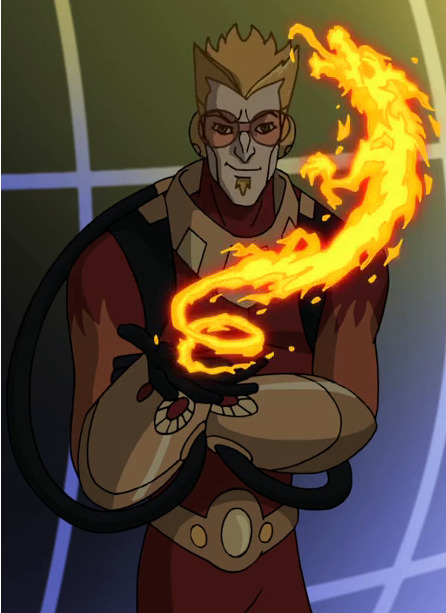
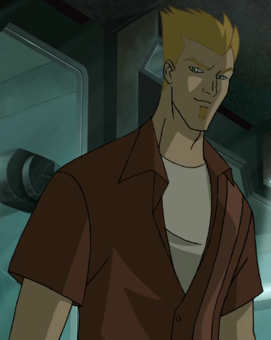
WOLVERINE AND THE X-MEN (Earth-8096)
8/10
Design would have been SO peak
The only thing messing it up is the soul patch
Other than that, I love it
The design in unique the colors go well together
He also has a canon casual wear, which I love
COMICS (Earth-616)


6/10
Ehhh
It's okay
He looks SO English I completely understand why the writers of TAS thought he was British.
MARAUDERS (Earth-616)


8/10
Kinda generic, but they saved it with the tattoo
He's so cool
His hair looks better
EVOLUTION (Earth-11052)
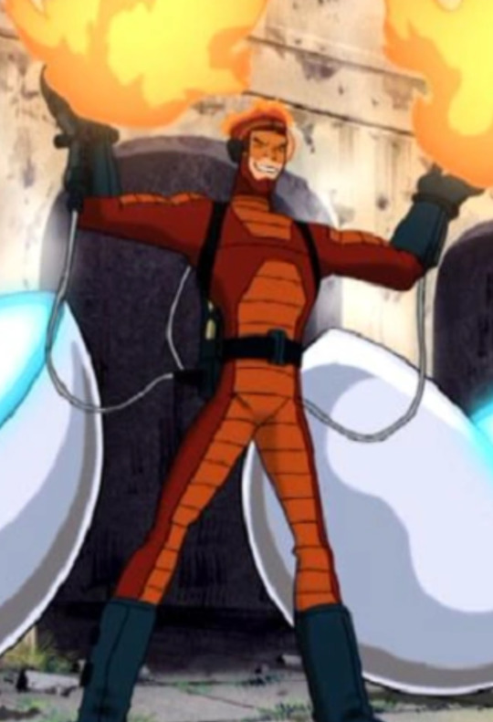
10/10, duhh
Y'all already know
One of his best eras
The blue gloves and boots go so well with the red suit imo
His hair is SO COOL
Definitely one of his best designs
Earth-TRN656
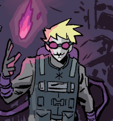
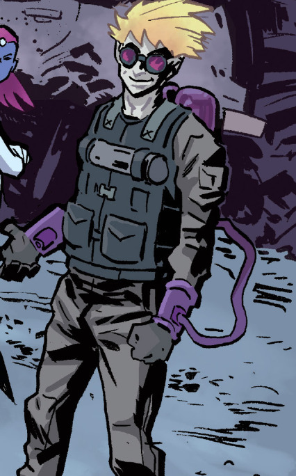
11/10
BOOM SHAKALA YES GAWDDDD
MOST PEAK DESIGN IMO
THE PURPLE LOOKS SO GOOD???
THE PURPLE FIREE??
He's so cool.
HIS OUTFIT BEING ANOTHER COLOR OTHER THAN RED/YELLOW...OMG..
😍
I LOVEEE characters with goggles 💜💜💜
Earth-652975

4/10
LMAO
Guys I could never hate a Pyro design
I don't HATE it but it looks pretty goofy
His hair is throwing me off 😭
Earth-13122... LEGO Pyro

6/10
Now THIS is peak character design 😼
I don't LOVE this but I would buy the hell out of it if I ever saw it at the LEGO store
XMEN DESTINY (Earth-TRN064)

7/10
I like it
I don't like how his headpiece doesn't cover up his entire forehead though
Nice and non generic outfit
Earth-10197

4/10
What am I even supposed to say
"Why the long face"
I like his hair
😭
WORLD OF HEROS (Earth-TRN1423)
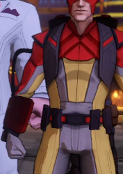
7/10
I kinda fw this one
I like the outfit and hair
I'm not used to seeing him without some kind of eye protection
THE FALL OF MUTANTS (Earth-90613)
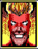
3/10
Oh god
This is scary
I don't like this
Earth-5423

8/10
AWWW
WAIT I LOVE HIM
THE RED ACCENTS ON HIS OUTFIT?? YESSIR
I like his little mask ehe
im getting tired I might do a part 2 of this does well at all
7 notes
·
View notes
Text
tagged by @blyszczopies to answer questions and tag mutuals id like to get to know better :3 tag list is at the bottom!
⭐ Favorite color:


i honestly have had some 'color opinions' sloshing through my head for a while.. its complicated but you can rarely go wrong with these ones 👆 these are the ones I like the most! specially when combined together!
for favorites.. it depends a lot on how you use the colors and if they're alone or accompanied! some things look bad if they're just completely sky blue and such..
(putting this under a read more bc its a Very long post)
for the purposes of having an ultimate favorite color.. man i honestly don't know. it's a completely even match between purple and blue, though only the non-100% saturated shades of blue bc true blue is quite unbearable. I think the ultimate champion in questions of how many things can work with it would be blue. sometimes too much purple can be unbearable, but too much blue not so much
red Can be beautiful in many cases, but orange is simply superior between pure yellow and pure red. pure yellow specifically is literally unbearable for me. i hate it so much. for me to like a yellow it HAS to be going towards orange or its nothin'. lime green is super beautiful but pure green is also too much, and so is cyan. though the specific range of teal/green-blue can be nice, but it does not come close to lime green, instead it accents it quite nicely.
we don't talk about pink. or magenta. or any of its hideous nicknames. perish the thought!
⭐ Last song played: erm. well. you see, most of the music i have downloaded came from youtube. and quite a bit of them from compilations of songs all in one usually 30+ minute video..
the one currently playing is by Lauren Bousfield. i've tried searching for the - actually paragraph cancelled. i thought it was one of the comps by the pavor nocturnus1 channel but it turned out to be from some random other channel. i was having trouble identifying which song it was because it's a single audio file but it turns out the song currently in that queue to be playing is the song Cascading Retail Spaces!
youtube
i've had this album compilation downloaded since.. 2017! damn! and other albums of hers too. I don't know anything else about her though, but her music slaps :3
⭐ Currently reading: ah.. i dont read at all sorry 😭 does looking at the drawings from the morpho books series grant me any pity points perchance..
⭐Currently craving: WAFFLES!!!! GOD PLEASE!! and cookies..

^my cookie pile in project zomboid. can you tell?? (no waffles bc they're randomly found and not able to be baked like cookies..)
⭐Coffee or tea: neither soz.. i did try to enjoy coffee like 10 years ago but its just meh. tea as well, very boring. not counting the fact i have to load these suckers with sugar for them to even be worth drinking >.> but i suppose i'd choose tea over coffee simply due to variety and that some are naturally sweet :J
tagging: @moodycarcass @oxu @crazysodomite (maybe even u again timo if u wanna awnser my curious inquiries below.. muahaha)
additionally might i add my own questions... for funsies :33
favorite stone pattern:
favorite time of day:
favorite cloud pattern:
actually hm its quite hard to come up with somewhat potentially universal interesting questions. fuck. erm
FAVORITE ANIMAL!!! this question never disappoints. additionally favorite family of animals maybe?..
also from the makers of the best question ever above.. what's the silliest/weirdest animal off the top of your head?
last dumb mistake in a game?
last triumph in a game? (life cant all be losses afterall..!)
favorite clothing pattern?
worst + best texture(s) to feel?
and finally.. name one cool thing that happened this week. no matter how small. it is your duty now! commence!
actually i suppose it'd be weird to not awnser my own questions.. well here goes:
i like the one stone pattern that's a bunch of thin slabs slotted together. the ref image i have says its name is cliffstone/bluff stone! i also like the 'bavarian castle' one!

time of day: DUSK!!! MY LOVELY DUSK!!! though dawn is veeery nice as well. i used to be fonder of the night but dusk is just sooo niceys. dawn loses points for giving way to the boring middays though. but every time of day has its charm
cloud pattern; i actually dont know their names besides cummulonimbus..? lemme search..

according to this chart ive found on ddg. nimbus! i love gray skies and i love rain and i love fog. stratus and scuds are also nice
fav animal: erm.. got myself in my own question! i dont think i have a true favorite? i suppose ill go with jerboas.. as for the family. rodents of course. im the rodent mutual how could i not choose rodents! blasphemy!
silliest animal: off the top of my head? its a worm-like animal with a goofy face.. i thought it was legless lizards but that's not quite it.. i dont remember the name 😞

though there is a guy that's named worm lizard apparently.. oh such a foofy goofus
last dumb mistake in a game: most recently i was trying to go back to my base in a car in project zomboid and ran straight into a insane zombie crowd. the car got stuck in the grass bc it was loaded to the brim and i tried to move it backwards and let zombies approach me with the hope i'd run away from them on time, but it was not moving and then i panicked and stepped outside the car near a zombie with the sprint key enabled, bumped into the zombie, fell on the ground and by the time the get up animation started the zombie was already eating my guy. i was so mad
last triumph in a game: not much of a triumph but i got to fitness and stregth to lvl 6 in pz which are grindy time consuming skills to lup. but i have a base and crops and my coogieeees
favorite clothing pattern: i also dont know!! id say checkers that arent too busy or its derivatives. but also star/celestial patterns of course


^ from my fashion inspo folder
worst + best texture(s) to feel: i hate silk and those ones that are like a million little hairs that i dont know the name in english. best i suppose would be plush/cotton? i dont know their names either lol
and finally.. name one cool thing that happened this week: hmm. i suppose the nice sky i saw earlier today? though also one my af attacks has gotten a lot more notes than i expected. which is epic 💪🐁
#sorry if tagged folks dont like to be tagged or do tag games. let me know if u dont please!! though i recall ask games being reblogged.. heh#i love being tagged and questioned btw. peace and love on planet earth#dextxt#Youtube
3 notes
·
View notes
Note
Man I hate the new green playing jersey. Why God why. Will the ODI one be like this too??!!!!!!!
And also, I think this jersey is damn unlucky. Yeah I'm a "little stitious", what can I say🙃
They have changed their practise jersey too, which looks fine - I like the shade of blue there. But pls the green one is not it.
[HOWEVER, considering that for the past few months, the opposite of what I've seen saying or wanting is happening, I should just say that I love the new jersey. Maybe...idk. Maybe you guys can manifest or something😭]
oh mate i couldn't disagree with you more 😭
it's absolutely just a matter of taste of course!! but i hate the new practise jerseys 😔 the sky blue is lovely but the neon yellow accents don't match either of those blue shades one single bit 💀
and i personally love the green t20 kits, yeah they look even more like pyjamas than usual but that just means they're probably comfy as hell 😆 if it makes you feel better they are just for t20, and i believe they were a two year deal so we'll get a redesign for next summer
not to go on a complete tangent but the yellow kits are a huge pet peeve of mine 😭 yeah the canary yellow is 'iconic' or whatever the fuck but they're just simply the wrong colour!! at least they haven't tried to repeat the horrific lime green again 🤢


look at these vintage kits!! we used to wear green and gold!!! we used to be a proper fucking country!!!!


#sorry to just go on a rant nonny afjkfsgkssgkkfs#what can i say i have opinions#i hope the next t20 kit is one you like more! maybe they'll give up on green and go back to black
0 notes
Text
Long comments take so long to write, but they're so fun 😭
Corvus is somehow even stupider than rayla. A 15 year old.
As one of the kids (sort of anyway), I. An very confidently tell you that I have no idea if that's a thing that the kids say. I am clearly not very well-versed in kid culture 😔
Corvus is gonna want to ask someone if they're together so bad and the others will silently bully him over it
Hey at least he realised *now*, instead of trying to intimidate them later in and getting punched in the face or something
Fair
THIS IS EXCELLENT KNEWS!! I wish we'd seen them in the show :( where did you find the concept art?
... this onfromation has unfortunately left me dead
So she wasn't trying to actually kill them, just trying to get away from them?
But like... they had food? Unless they ran out by that point, in which case fair (not fair. Not at all. But.)
Pft, everyone hates them. Sad really
Oooh ok, I always thought callisto had yellow eyes? Unless you mean you actually changed the colour of his eyes here, and not just the shade/tone
It does. It's the story of everyone is Always Confused but it Works Out
HE WASNT EVEN TRYING?? Damn my guy is hilarious and he dosent even know it
Corvus. Seriously you cannot mess up at all from now on. I think he knows that already, but I can almost garuntee he's gonna say something stupid or something
Please carry on pushing your humour onto the characters it's amazing
True true. I can imagine him finding out the very basic details from amaya at somepoint later on maybe? Also, I feel that saying corvus has 3 brain cells is a bit generous
Skor: "urgh why can't that human just leave" "oh he's gone finally thank god" "...wait no come back. You were nice :("
You're really making *everyone* reevaluate their personal beliefs and life choices leading up to this moment, aren't you? I love it
Different Path Taken Ch18 P2: Corvus' Loyalties
This section picks up at the exact moment the last one leaves off, it's just a shift of perspectives from Andromeda to Corvus.
Corvus blinked at the elf for a moment, confused by the question. “I thought I’ve made it clear where my loyalties lie.��
“I want to hear you say it. And explain it.” Runaan replied evenly, his gaze seeming . . . critical, but perhaps not as cold as before.
Corvus glanced at the other elves. Andromeda still looked thoughtful more than anything, though she nodded at him when she noticed him looking. Callisto was scowling at the fire, black brows furrowed in deep thought. The last one, whose name he didn’t know, was still glowring at him with his lips slightly pulled back from his teeth, ears lying flat. Something about his posture looked more like a frightened cat than an aggressive one, though, and Corvus wondered if something else was going on here that he didn’t know about.
Runaan was raising a brow at him when he looked back, and he folded his hands in front of him to reply. “I’m loyal to the general, mostly.” He started, and tensed when he felt the temperature drop from the elves’ reaction to that. “But it’s because I believe she has the best future in mind for us. She’s a protector more than anything, and I don’t think she would harm anyone without reason.”
The elf whose name he didn’t know made a rough, angry noise and shoved himself to his feet. He left the cave without saying a word, shoving the blankets over the entrance out of his way, ignoring Callisto when the healer called, “Skor?”
“Let him go.” Runaan said softly, placing a hand on Callisto’s shoulder when the other elf made to stand too. “I’ll speak with him when we’re done.”
Callisto frowned, but sank back into their seat with a soft breath, folding their good arm over the broken one.
“We have a very different perspective on your general.” Runaan informed Corvus, almost dryly, but his face was still deeply serious.
Corvus almost scoffed. “I had noticed. If I may ask - you told her you’d met her before. What happened between you that makes you distrust her so much?”
Runaan tilted his head at him and apparently decided to answer him truthfully. “Many years ago, when I was young, I led one of my first teams on a simple reconnaissance mission on the border, investigating the new human incursions on the Breach.” He smiled humorlessly. “We knew, of course. Another mission had discovered the new bases there some months before. We were in the caves around the Breach itself when a cave-in trapped us beneath the stone. As it turned out, the then-lieutenant Amaya was also trapped within the caves. My people could still see in the dim light of the caves, and hers had the only torches. None of us could escape, and our fighting only harmed us both.
“We agreed to work together to escape the caves. Nearly a week we were trapped there, trying to navigate our way out of that horrible maze. Luckily we all had some food in our packs. We knew there was a way, because there were too many animals inside that must have been coming from somewhere - some less friendly than others. After the humans ran out of torches, my scouts were not enough. One of the soldiers was lost to a pack of three-eyed nightfoxes. We tried to warn them not to wander into the darkness alone. We found their remains when we moved the next day.
“Things soured between the groups after that. Became colder. My people guarded the rear more fiercely in an effort to keep it from happening again. I led the way out, as I could see better in the darkness. Following the nightfoxes’ trail we found the exit, but not without a cost. More creatures were pursuing us, forcing my assassins to hold the line, doing battle in the rear as the humans escaped the cave. Then your general betrayed us. Once her people had escaped, she had her men throw lit bags of your firepowder on the cave entrance, collapsing it with my people still inside. The efforts we had put in to save her, to work with her, the truce we had worked under, the temporary trust we had built - all just a lie. It took them weeks to die, starving in that cave, tracker. So yes, I struggle to trust your general’s word for anything.”
Corvus had bit his tongue through the story, but he knew his eyes were wide with realization by the time the elf was finished. “I . . . know this story,” He said carefully. “From the general’s perspective. I may have a bit of insight for you, if you’re willing to hear it.”
Runaan tilted his ears back, appraising him, and nodded silently.
“The general is deaf,” He clarified. “She couldn’t hear anything you had to say, and was relying on her soldiers for your words, especially after they ran out of torches. She didn’t know what killed the soldier. She thought your people had killed him.”
“We found the body half-eaten - never mind.” Runaan rubbed the bridge of his nose tiredly. “I am not certain what appalls me more, that she thought we were capable of that while under a truce or that she thought we would be so shameless as to lead her directly to the scene of the crime.”
Corvus shrugged weakly. “Our stories about Moonshadow elves aren’t exactly . . . complimentary.”
“No one’s stories about us are complimentary.” Callisto said flatly. “This also assumes she was tellin’ the tracker the truth, and that he’s being truthful with us, I have to point out.”
“The trust has to start somewhere.” Corvus pointed out, managing to sit up straight despite the elf’s distrustful orange stare. “I’ve helped you this far. I don’t know exactly what’s going on any more than you do. I give you my word, which I’ve kept every time you’ve tested me, that what I’m telling you is, as far as I know, true. My mission is simple. I’m to keep the princes safe, and to return them safely. As of now, not knowing what happened in Katolis, all I can do is prioritize their safety. I don’t know if your dragon queen can really be convinced like they’re hoping, but I can help protect them on the way there. And you believe it enough to go through with the plan, which is something.”
Callisto made a frustrated noise and looked at Runaan, seeming to sign something. Corvus blinked in confusion, as he recognized the sort of cadence of a sign language, if clumsy with only one hand. The movements made no sense to him despite the years he had spent learning and using it around the general. “Is that sign language?” He heard himself ask in confusion, before kicking himself with the thought that they must have their own form that was more friendly to four fingered hands.
“Yes. And if we wanted you to know what we were saying we wouldn’t be using it.” Runaan said blandly and signed back. Callisto frowned deeply at whatever his response had been and said something else.
Corvus looked over at Andromeda for an indication of what they might be talking about, and found her expression vaguely apprehensive. That didn’t tell him much. He guessed they were likely deciding what to do with him, and helplessness welled up in his chest as he didn’t know what else he could do or say to earn their trust. What would they do to him if he didn’t? The children weren’t around anymore, he imagined he’d lost any protection he had from death with their absence.
“For now, you remain with us under guard.” Runaan finally said with a grimace. “It seems the most viable option, as we do not want to antagonize the general further, and for the moment, our goals align. However. If you give us a reason - any reason, no matter how small - to doubt you, you will be asleep before you know what’s happening, and you will wake up miles behind us with no indication of where we have gone. We will not kill you - the first time. That abandonment will be your only warning. If you hunt us down again after losing our truce, the next who comes after you will not have Andromeda’s mercy. Are we clear?”
Corvus nodded, blinking, shocked at the quick turn from what he had expected to be his execution. “Yes. Crystal.”
“Good.” The big man stood up and dusted himself off. “Stay here. I’m . . . going to talk to Skor about all this.”
“Runaan.” Callisto said as he made to exit.
Runaan paused to look back.
Still signing clumsily with one hand, Callisto quickly gave up and just sighed. “Just . . . be kind.”
Runaan’s face softened, as Corvus looked between them in sudden curiosity, and he nodded. “I know, Callisto. He will be fine.”
Corvus opened his mouth to ask about it after Runaan left, and snapped it shut with a click and thought better of it the moment he looked back at Callisto’s glower. The elf was tense, as if daring him to say something, which meant he probably shouldn’t. He wasn’t sure what to say, actually, with that confusion still on his mind, reeling from his near-death experience turning into an abrupt truce with people he had thought, yesterday, to be bent on the political collapse of his country and specifically his own death.
Andromeda scrubbed her face with both hands and groaned. “Let’s hope Ram and the children are having a nicer time than we are, eh?” She said dryly, and Corvus couldn’t help but snort a laugh at the unexpected humor. To their credit, Callisto at least cracked a smile at it, and Corvus took a bit of hope in that. Whatever was going on, they would make this truce work, somehow.
At least as long as he managed not to make things worse with the other elf - Skor. Which would be easier if he knew what the hell had happened with him. Corvus resolved to just keep his distance, as much as he could traveling in the group, and try to stay out of his way.
16 notes
·
View notes