#Fine art paintings artist New Zealand
Explore tagged Tumblr posts
Text


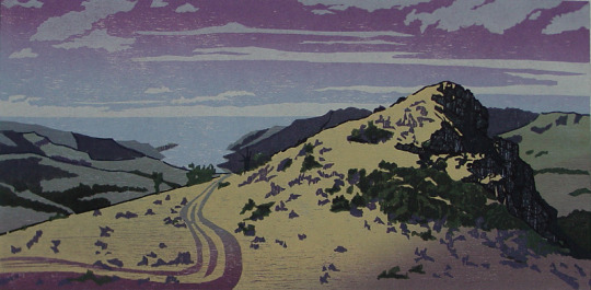


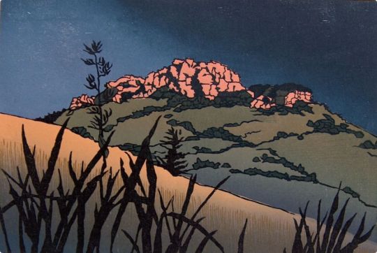

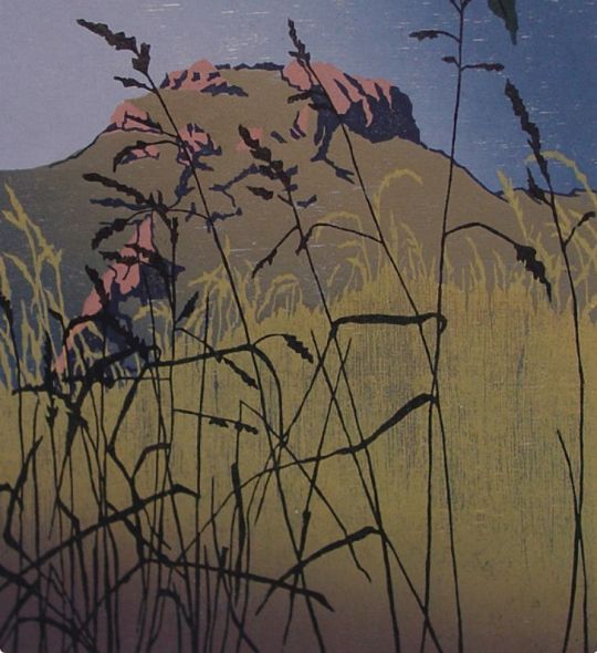

SASKIA VAN VOORN was born in 1958 in the Netherlands. Growing up in an artistic environment it was part of daily life to draw and paint, meet other artists and visit art galleries and museums. She studied painting and printmaking at the “Minerva Academie of Fine Arts” in Groningen and graduated in 1981. It was during her years at art school that she met Siene de Vries, a fellow student, who was to become her husband. After a successful early arts career she and her family immigrated to New Zealand in 1988. They now have their home and studios at Le Bons Bay on Banks Peninsula.
Landscapes, plants and people feature in Saskia’s paintings and prints. She generally works on a small scale in a figurative manner. The natural environment is her favourite subject and main inspiration. Saskia specialises in woodblock printing using a technique inspired by the 18th and 19th century woodcuts of Japan, Ukiyo-e (pictures of the floating world). She makes detailed drawings, made “en plein air” and photos, which she uses for her woodcut designs, capturing the mood of a particular moment in the often-changing landscape. For one print she uses multiple woodblocks, mostly 7 or 8, each block chosen for its own specific texture/grain. She makes extensive use of gradation in the colours to achieve depth and subtlety.
18 notes
·
View notes
Text

Moniek Darge @ BOEM 2019, Antwerp, Belgium
source: toneglow 📸: Logos Foundation
Born in Bruges, Belgium in 1952, Moniek Darge has worked as a composer, violinist, performer and installation artist. She studied music theory and violin at the Music Conservatory of Bruges as well as painting at the Ghent Royal Academy of Fine Arts, Arthistory, Philosophy and Anthropology.
She has published extensively on her musical experiences in Kenya, Rwanda, Japan, China, Brazil, Australia and New Zealand, both in 'Logos-Blad', the monthly magazine of the Logos Foundation (of which she is editor), and on numerous radio programs.
She is currently assistant professor at the Hogeschool Gent where she teaches 20th Century Art History, Audio Art, Non Western Art Studies and introductory Ethnomusicology. (Discogs)
#photography#artist photograpy#Moniek Darge#Belgium#women in electronic music#BOEM 2019#Antwerp#photo by Logos Foundation
7 notes
·
View notes
Text
Megan Archer - Artist Research


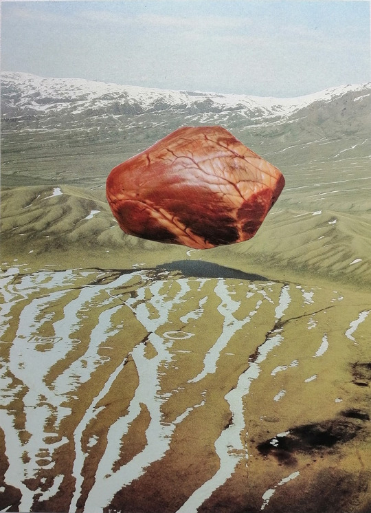
‘My painting practice is concerned with the intersection of digital processes and traditional art-making techniques, playfully connecting digital and analog methods of production.’
Graduated from the University of Canterbury's Ilam School of Fine Arts with a BFA majoring in painting, Megan is a painter and collage artist from New Zealand.
Her medium explores the symbiotic and harmonious connections between humans and technology. She is also known for her manner with analog and digital methods of production. Manipulating cut-outs, before rendering her results on oil on canvas, she depicts collages of human bodies into near-abstract forms - typically aimed to shift aesthetic observation.
Keeping old books and magazines from the 70s-80s, Archer was influenced to creating photomontages - typically of human bodies - manipulating them digitally, Archer forms abstract ideas by furnishing them into oil on canvas. Her work is humorous, uncanny and nostalgic and stirs cognitive dissonance as the manufactured images bring down the norms and expectations, establishing a sense of surreal realms that viewers would be drawn to question notions of taste.
2 notes
·
View notes
Text
Week 4
This week I was inspired by the concept of creating a sense of weight and volume with 'empty' forms by the artist Judy Watson and her work Tow Row at GOMA, and the way it creates such a strong sense of presence with such a seemingly hollow form. I experimented using wire, first creating a flat and rippled form, and then slowly building it up to be a more spherical piece.

I used quite a thin wire for this, and it seemed to create a strange flattening as I was aware that it was a 3 dimensional form, but in places that it overlapped, because it was so fine it seemed to almost flatten and become 2 dimensional. I like the way that this spoke to the shadow it cast as well, as the shadow was quite literally the 2 dimensional embodiment of the somewhat deceptive 3 dimensional sphere. I also tried experimenting with a thicker wire, and created a smaller piece to complement my initial sphere. I found it interesting how the thicker gauge gave it so much more weight in the space even though it was such a comparatively small piece. It is fascinating how proportion is not only influenced by overall size of a piece, but also the perceived 'weight' of the parts making it up.


I loved the shadow, so I decided I wanted to display this piece in a flat, open space where the sun could really give it emphasis.
Judy Watson is an Aboriginal Australian woman who takes an emotive and constructive approach to art making, as she explores the history of Aboriginal culture, and of reconciliation efforts through Australian history. She often specifically hones her artworks through material references (such as her choice of metal from the very mines she was protesting against in her piece Fire and Water (Carroll, 2014)). In the piece Tow Row, Watson is emphasising the material practices of the Aboriginal people in the land, considering the bark that would have made up their nets, and the processes by which they would have been formed. She creates a simple acknowledgement of the site and the traditional owners of the land through her thoughtful and compelling consideration of the thousands of years of craftmanship and connection to the land.
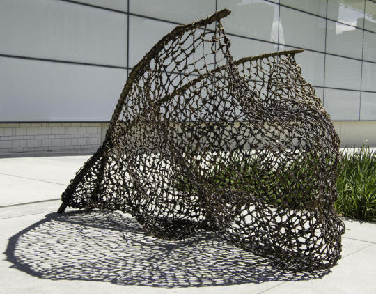
Judy Watson, tow row (2016), bronze, dimensions not listed. Image source: https://learning.qagoma.qld.gov.au/artworks/tow-row/
I was also very interested in Werner Turtschi's work Wolken (Clouds), which makes use of Turtschi's background and experience in weaving to create fascinating abstract woven masses that fill the area of the forest and seem to envelop their small area. They create a stunning sense of scale as they seem simultaneously small in the context of the forest, and yet are capable of completely dwarfing the viewers who move through the space. They create balance and tranquillity, and they make extremely effective use of proportion. Unfortunately there is not a great deal of information on this artist and their work, but the visuals do in many ways speak for themselves.

Werner Tutschi, Wolken (Clouds) (N.D.). Woven Fibres, 3.4 by 1.6 meters. Image source: https://www.flechtereien.ch/index.php/werner-turtschi
Archer, C. (2006). The Ambivalent Paintings of Judy Watson,. Australian and New Zealand Journal of Art, 7(2), 62-76. https://doi.org/10.1080/14434318.2006.11432775
Carroll, K. V. Z. (2014). The presence of absence: Tommy McRae and Judy Watson in Australia, the imaginary grandstand at the Royal Academy in London. World Art, 4(2), 209-235. https://doi.org/10.1080/21500894.2014.921863
GOMA. (N.D.). Judy Watson: tow row. GOMA. https://www.qagoma.qld.gov.au/exhibition/tow-row/
N.A. (N.D.). Werner Tutschi. Fletchereien. https://www.flechtereien.ch/index.php/werner-turtschi
0 notes
Text


Pitch Deck (Draft)
+newly crafted introduction
My name is Avena An, I am an 18-year-old student designer from Auckland, New Zealand. I have recently started my full-time study at AUT, majoring in Communication Design. I embarked on this degree to broaden my creativity, with the intention to provide myself with the necessary skills to navigate various career opportunities.
Growing up, I found myself immersed in arts and crafts as well and experimentation, such as creating little trinkets with any available raw materials I could get my hands on. This early creative journey in crafts majorly shaped my artistic interests. As I matured, I found that my passions did not lie in academics but rather in creative pursuits such as fashion, makeup, film, social media, painting and crafts. Throughout high school my interests in fine arts had developed, particularly in painting and drawing still-life objects and scenery. In addition to analogue crafts, I became intrigued to what the digital world of arts had to offer. I had taken design in high school however; I did not enjoy the structure of their design program. This led me to explore the offerings of AUT, as I felt that I was not able to express my art through the structured programme at secondary school. I hope to apply my traditional skills of crafting and drawing into today's opportunities presented by digitization and social media. I forward to seeing my creativity and skills develop, hoping that my designs will lead me to an exciting and fulfilling career pathway.
0 notes
Text
exhibition reviews (all)
Karl Maughn, Sprung at PAGE 21 September - 14 October
https://www.pagegalleries.co.nz/exhibitions/172-karl-maughan-sprung/works/ PAGE gallery on Victoria street
The work was all presented in the space to show it in the most sellable format, a beautiful clean space with white walls and presentable sitter. The work was at a standard eye level, all evenly distributed through the space.
Work was placed around the space in symmetrical series and individuals. repeated forms and colours as the exhibit seemed to be a study on one particular garden. As his work all is colourful representations of gardens this exhibit was clearly a show for sales and distribution. Which was successful, as every work on the website but one from this exhibition has been sold. As that was the intention I see the hang and presentation only as a way to present a product rather than a way to bask in one's creation, immerse your senses or enjoy a space
This was not the intention of our exhibition. Going into the exhibition paper our group had the intention of breaking away from a white cubesque space, creating a space not for sales and perfect presentation of work and one for obstructed view, crammed corners and tripping hazards. Not ideal for selling work, as Maughn does - at the price and scale. So the space was well lit, clear and calm. To showcase the work that he makes. With neutral white walls and gray floors.
In picking a space we wanted something that wasn’t going to be absurdly far from that space at
PAGE gallery, I appreciated the medium level hang and the symmetry of the show but intentions for exhibiting work were clear and definitely clashed. Though selling work for a Karl Maughn price tag would be excellent.
image from PAGE gallery website. taken by

Sione Tuívailala Monū the way we were at Robert heald, 24 august - 16 September
A different dissemination of similar artwork by the same artist (Sione Tuívailala Monū) as another survey done by Cailin.
This exhibition was at Robert Heald, a dealer gallery at the top of left bank. One that usually presents paintings/ wall work. This work that was shown on the 24th was a video work and used the usually very cold space in a way that changed it. Not drastically but slightly. An iPhone format video work projected onto the main wall of the gallery. A white wall. The gallery usually has big wide-open windows and an archway that leads you into another room. Today it had curtains to block light and close the space off so the viewer can engage with just the projected video work and not be distracted by the surroundings - surroundings that usually wouldn’t distract from the presented art work but as this was video work the curtains were a necessary touch.
The way we intended to use the space we acquired for our own exhibition was to transform it - to not distract from the work but embellish it and also create an artificial, slightly experimental and definitely exciting atmosphere. Cailin had projected video work so covering up external light, similar to the use of curtains in this show, was crucial to make sure the work was visible and honored. As for the rest of the works we exhibited - mostly paintings and some photographs, the natural and external light being taken away was very important to make sure the works would be presented and read in an experimental way rather than just being placed in a space designed for artwork to go into.
(Isla)
Photo from Robert Heald gallery website

The Barbie Collector Exhibition at Wellington Museum
As a somewhat alternate exhibition space, I visited The Barbie Collector Exhibition at the Wellington Museum. While not a typical gallery space (the white cube) with a display of (fine) art, the exhibition did present an array of “artworks”, Barbies of varying makes and models strewn across the room. This collection is privately owned by the Barbie aficionado Patsy Carlyle. The exhibition was intended to be both a space to witness the Barbie mayhem while also getting to know Pasty and a collector and as her own person. I recognise this exhibition serves a different purpose/intention as a informative, museum backed exhibition, over our intended art focus.
The room had a wide entrance but was not overly big. The room felt smaller still with the wall to wall case of 500 Barbie figures and the room full of visitors. The atmosphere was therefore busy but not chaotic, the brightly coloured displays kept up an optimistic atmosphere. The scale of the main shelves was quite impressive, almost overwhelming. The stacking and positioning of the Barbies (all still within their boxes) meant each Barbie could be seen. The bright overhead lighting lit up the shelves as well as the room (as opposed to a dim space with specifically placed spotlighting). The lights directed towards the shelving looked to be angled in a way as to avoid a direct glare coming off the glass case and obscuring the memorabilia. There were other facts to the space, including interactive features like a childrens colouring table. There was also informative wall/plinth texts speaking to the historical relevance of some of the Barbies on display. A video was also displayed on the opposing wall, being an interview of Patsy Carlyle on her extensive Barbie collection. I did not notice a specific publication on the works although there were purchasable museum mementos (postcards, bookmarks etc).
While the technical display of the work does not align with the direction our exhibition group is heading (an alternative space, low lighting, spotlighting etc), the visual craziness does align with some of my own aesthetic favourings within my work (loud, colourful, vintage). I liked the brightness of it, and the evident consideration for the Barbies being the full focus.
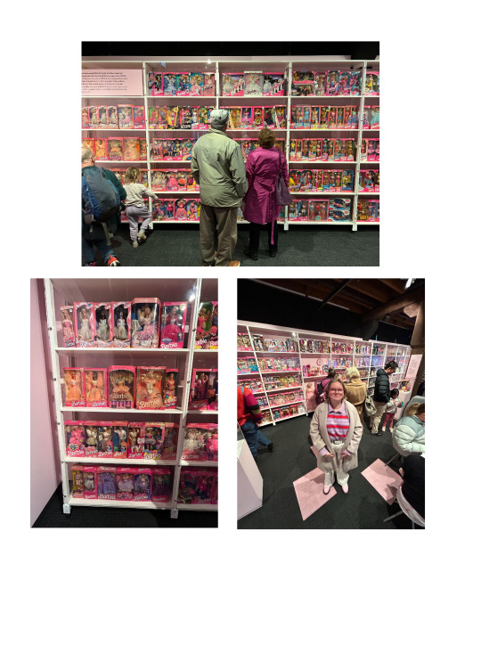
(Felix)
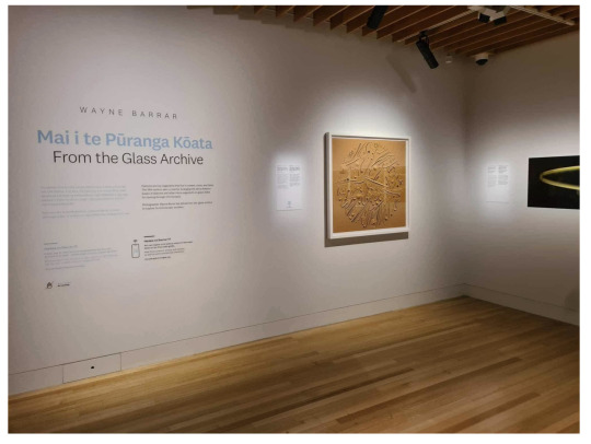
Mai i te Pūranga Kōata | From the Glass Archive Exhibition at Wellington Museum
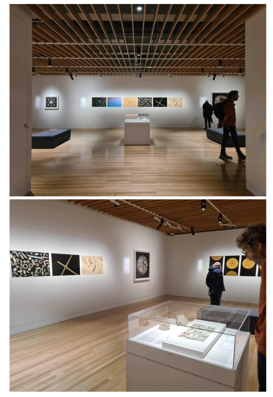
I recently visited Wayne Barrar’s From the Glass Archive Exhibition, currently on display at Te Papa Tongarewa. The work explores diatoms, silica skeleton fossils, arranged into microscopic mosaic formations, as a past fad of the 19th century.
The gallery was a white walled, wooden floored space, a side room to the larger Toi Art component of the museum. Some works were framed while others were pinned prints. From my understanding, this framing vs pinned prints was partially dependent on what was owned by Te Papa and what was owned by Wayne (I went during his talk in the space). This also affected the lighting. The space was spotlit, and the level of brightness varied slightly, due to how long the work was meant to be on display. The length of time affected the max level of brightness Te Papa was willing to light things under for the sake of the artwork's longevity. Some of Wayne’s (owned) pieces were therefore brighter, as he was less concerned with the ageing of the work and more concerned with how dimly lit the pieces were. The atmosphere within the space was calm and cool, being a temperature controlled space. The works varied in scale, with some larger prints (framed) being quite captivating, although not overly large (approx 1m tall and wide by eye). There was also a central island with a glass top, displaying the diatom arrangements in real size (microscopic) as a recognisable sense of scale between the real thing and the microscopic photography around the room.
I didn’t see a publication specific to the exhibition, but they did have a Te Papa owned copy of Wayne’s previous publication for the displayed work. Being in the space, you could argue there’s potential overlap in wanting to create a dim, spotlit space, albeit to different extremities (we intend for ours to be more dramatic and not a white cube). I did like the work in itself, (although very different to my own) but found the necessary dimness of the images frustrating as a viewer (although its purpose was respectable). I also liked the clean white frame and matte board choices, leaving the image to take full focus.
(Felix)
Nova Paul
Ngā Pūrākau Nō Ngā Rākau
City Gallery, 1 July - 8 October 2023
During my visit to the City gallery, I viewed Nova Paul’s large scale four channel video work. The works' video, sound and its dramatic installation created an ‘other-worldly’ feel to the otherwise white wall gallery space I am used to in that room of the City Gallery.
I spent an extended amount of time with this work. The four projections that extend around the whole room, with slow paced narratives, allows for an extended moment of quiet and ‘awe’ with the work. The long benches in the middle of the huge space made me feel like I was sitting alone with the work even when others were in the room too, which added to the intimacy of the content of the work. The long thin benches also allowed you to turn around and view the different channels as a 360 when they were displaying different visual content. The video works had a neutral simplicity to them, a peering into different lives and location sites, not trying to convince you of anything but more of a presentation of appreciation. This resonated with me and the way I want our exhibition to feel, a look into our lives, experiences and senses of self without trying to convince the viewer of anything but just an honouring of experiences.
The scale and sounds of the work, particularly during the shots of nature made you feel like you were really there amongst a field with children playing or sitting staring up at a big landscape or looking out at a running river. The floor was varnished and shiny which allowed for the projections to reflect on the floor, allowing the work to take up the space further. This reflective quality was something I wanted to bring into my own video work to add depth, light quality and immersion.
This work spoke to me because, as a video artist, I am always looking for ways to unconventionally display video work in ways that takes it out of conventional screen and into an atmospheric experience for the viewer, which is exactly what this work did for me. I'm interested in the ways installation elements can both inform and change the way a video is received. It showed the utilisation of install methods to align the content of the work with how you want your audience to feel when they are viewing it. This show felt beneficial to the curation of our show as it presented ways in which you can change the energy of a space with use of scale, sound, light and movement. Although it was changing a white cube gallery space into an atmospheric space I feel we are doing something similar with transforming our underground space.
(Cailin)

Sione Tuívailala Monū
Stories
City Gallery, 6 May - 3 September 2023
Sione Tuívailala Monū’s mixed media video installation at the City Gallery was a youthful and playful show, with colourful hanging sculpture and video work in the format of raw iphone footage and snapchat videos. The video works were shown on a mixture of projection, monitors and mounted iphones. I felt a sense of connection and inspiration to the content and installation of this work and our ‘Still or Sparkling’ exhibition due to the themes of youth and of nuances of gender and identity in the contemporary world. On the City Gallery website they describe that “ Their films and floating ‘Ao Kakala embody the vibrancy and contradictions inherent to diasporic life.” The playful and relatable format of iphone and snapchat videos made the work personal and intimate, a factor that is prevalent in all our individual practices and the coming together of us as a group as we explore ideas of self and identity.
I enjoyed the bright plastic flowers used for the hanging sculpture, they replicated tropical flowers that don't typically grow in Aotearoa so were sourced from dollar stores. The synthetic and ‘kitschy’ yet beautiful plastic flowers were aesthetically appealing to me, much like the dollar store fake candles I’m using in my work. I like that they suggest something real being represented but not present, the fabricated nature of them speak to the themes of the work, much like the elements of constructed reality within my work and what they can communicate.
Colour was a large aesthetic factor of the show, Monū didn't shy away from utilising a rainbow of colours in their work. The embracement of so much colour brought a sense of fun to the work, while still a presence of careful consideration felt apparent within the use of all these colours. Bright and various colours are shown throughout each of our members' works, which actually brought them together rather than clashing. With the use of lighting and placement we were able to make connections between our works through shades of pinks, oranges and blues. Use of colour within our lighting in order to connect our works in the show was important to us, Isla and Elenas works both feature pinks and oranges and drew to my video work and candles. Felix’s prints were lit with a cool toned spot light which related to Isla’s glowing blue forms in her outer paintings. (Cailin)

Brent Harris, Transfiguration at Robert Heald - 21.9.23 — 14.10.23
Robert Heald is a commercial gallery in Wellington. To me, the gallery often feels cold and sterile due to its white walls, concrete floors and fluorescent lights. Because of this very simple gallery setting, Brent Harris’s paintings have a lot of room to breathe and hold themselves in a way that speaks to the viewer, with no distractions around them.
It may be the sterile room or Brent Harris’s paintings, but the exhibition feels a little sombre. Brent Harris is a very successful contemporary New Zealand born artist who has spent most of his career in Australia and recently moved back to his motherland. The imagery in his paintings, the colours and the title of the exhibition Transfiguration, makes me believe that the room is meant to feel nostalgic and contemplative.
Overall, this exhibition is very simple and doesn’t push many curatorial boundaries, but it is an effective way of showcasing the beauty of these paintings without any distractions.
(Elena)
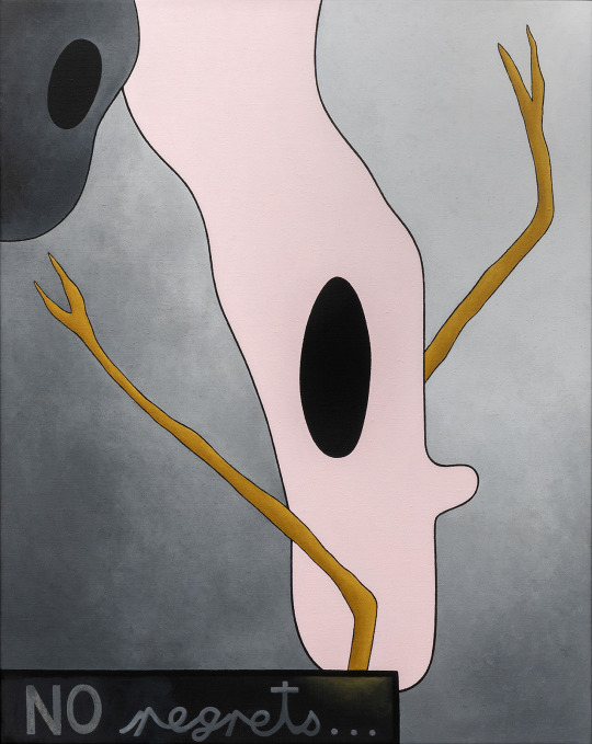
Ayesha Green: Folk Nationalism
1 July–15 October 2023 at Wellington City Gallery
This show includes a range of work in different mediums all done by the same artist Ayesha Green, presented in some very interesting ways that push white cube boundaries. Which makes sense since this exhibition “interrogates the ways that power is upheld by images” and “examines histories of Māori and Pākehā representation, often questioning the particular ‘truths’ or myths they perpetuate”.
Because Ayesha Green works across sculpture, drawing, and painting, the show feels full of life and you can feel her artistic expression coming through each work. I have found in the past that many people sense that rooms feel empty when there is just work on the walls, and to “fix” this, the most common solution is to put sculptures in the middle. I personally think this can be a hit or a miss. It’s true, sometimes rooms feel empty when there is only work on the walls, but I think that if that is the case, it is because the work on the walls don’t captivate the viewer as they should, rather than the room being “empty”. Sometimes having sculptures in the middle can distract the viewer from fully taking in the work that’s on the walls. I found that Ayesha Green’s sculpture in the middle worked really well in the context of the exhibition and I found it very intriguing and an extension of the other work, rather than a distraction from it.
Overall, this exhibition made me think a lot about how different mediums can work together harmoniously in the same exhibition as long as they each hold themselves up in their own way.
(Elena)

0 notes
Text
Sara Hughes
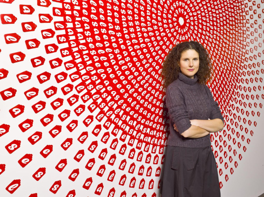
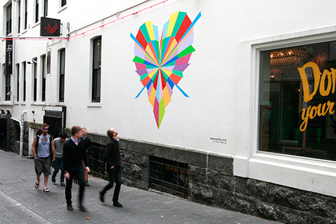
Sara Hughes is a New Zealand artist who exhibited in public galleries throughout New Zealand and private and public collections in Australasian collections. Her work explores light and time and how days are defined by cyclical rhythms. In 2001, she completed an MFA in painting at the Elam School of Fine Arts and won the Wallace Art Award and the Norsewear Art Award (Hughes, n.d.).
Reference:
Hughes, S. (n.d.). Bio. Sara Hughes Artist. http://www.sarahughes.co.nz/about
0 notes
Text
Artist 8: Milli Jannides
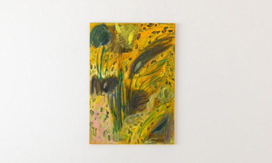
Milli Jannides was born in Sydney, Australia, but moved to New Zealand and received her Bachelor of Fine Arts in Painting conjoint with a Bachelor of Arts in English Literature in 2009 from Elam School of Fine Arts in Auckland while spending one semester in 2007 abroad on exchange at the Glasgow School of Art. In 2010 she was a guest student at the Düsseldorf Art Academy. In 2013 she received her Master of Arts in Painting from the Royal College of Art in London. In August 2013, Jannides exhibited work at the Hermes' lack of words exhibit at Artspace NZ in Auckland, together with Manon de Boer, Eleanor Cooper, William Hsu, and Rosalind Nashashibi. In her paintings, she knots vision and memory together, with each work beginning with a quote or passage from literature and often connecting the physical landscape of the scene with the emotion of a character. She uses symbols like a tree, chains, an hourglass, and steps.
0 notes
Text

01 Work, CONTEMPORARY Interpretation of the Bible! Fiona Maclean's Madonna, With Footnotes - #47
A Madonna is a representation of Mary, either alone or with her child Jesus. These images are central icons for both the Catholic and Orthodox churches. The word is from Italian ma donna, meaning 'my lady'.
The term Madonna in the sense of "picture or statue of the Virgin Mary" enters English usage in the 17th century, primarily in reference to works of the Italian Renaissance. In an Eastern Orthodox context, such images are typically known as Theotokos. More on Madonna
New Zealand born Fiona Maclean is a Painter and Visual Artist. After studying Art, Design and Production in New Zealand & Australia she continued her studies..
Please follow link for full post
Art,Paintings,RELIGIOUS ART,Fine Art,biography,History,religion,mythology,Zaidan,Ancient,Madonna,Fiona Maclean,Australia,footnotes,
Art #Bible #biography #History #Jesus #mythology #Paintings #religion #Saints #Zaidan #footnote #fineart #Calvary #Christ
#Art#Bible#biography#History#Jesus#mythology#Paintings#religion#Saints#Zaidan#footnote#fineart#Calvary#Christ
1 note
·
View note
Photo
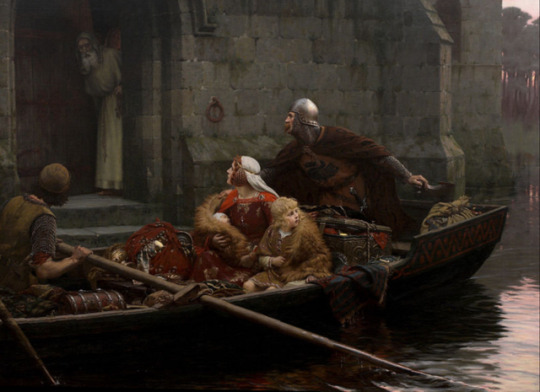
Edmund Leighton (1852-1922) "In Times of Peril" (1897) Oil on canvas Located in the Auckland Art Gallery, Auckland, New Zealand The painting's subject does not appear to represent any specific historical subject, but an invented incident from the Middle Ages where a young boy and a baby are in flight with their mother, a soldier or father, arrive at a monastery with chests and bundles of treasures.
#paintings#art#artwork#genre painting#refugees#edmund leighton#oil on canvas#fine art#auckland art gallery#museum#auckland new zealand#english art#british artist#refuge#fleeing#hiding#seeking shelter#mother and child#children#1897#1890s#late 1800s#late 19th century
240 notes
·
View notes
Text

Painting myself into the landscape of beautiful Glenorchy in South Island, New Zealand. Attempted a more impressionistic style.
#oiloncanvas#oil painting#fine art#artist#female artists#artists on tumblr#landscape painting#impressionism#painting#new zealand#art
7 notes
·
View notes
Text

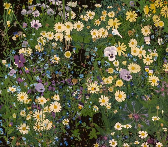
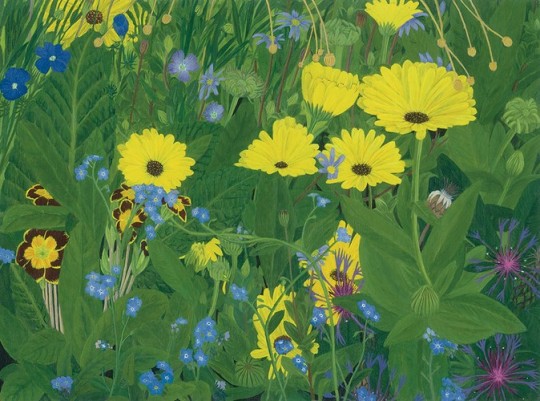


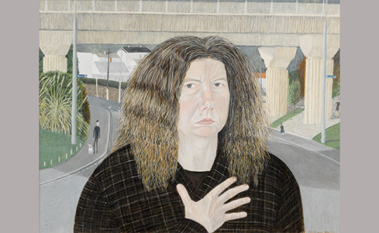
Joe L’Estrange was born in 1960 in Ōamaru, New Zealand, the birthplace of Janet Frame, but has lived in Dunedin since 1973. She graduated with a Diploma of Fine Arts from Dunedin School of Art in 1980. Her grandparents owned a house in Concord, and she has often painted her local neighbourhoods of Concord, Caversham, and now Corstorphine, where she currently lives high up on a hill.
In 1992, on her thirty-second birthday, L’Estrange won the Adam Portraiture Award with the painting Georgiana, judged by artist Shona McFarlane. With the $10,000 prize money, she bought her first house, by the motorway in Caversham, a working-class Dunedin suburb. Back then, she described herself as a "purely-what-the-eye-sees person, and that’s terribly out of fashion". But realism is never out of fashion, just out of the way, like Caversham. Representational art is timeless.
As an artist, L’Estrange has been described both as an enigma and as Dunedin’s worst-kept best-kept secret. I’m told she hates symbols and is allergic to ‘isms’. Her professional CV includes only a few wayfaring stops outside Dunedin: Balclutha and Whakatāne, Auckland and Wellington. https://www.newsroom.co.nz/readingroom/dunedins-cat-lady
“There are numerous artists who have painted flowers and gardens, but not many who have articulated these with the level of hypnotic intensity, delicacy, spatial complexity and energy that is evidenced in L’Estrange’s paintings.
“Everything L’Estrange paints has a potency about it, even if it’s a tin can. This is intrinsic to the way she paints what she sees and why her art is not like anyone else’s.
37 notes
·
View notes
Text

Sending positive energy and vibes to New Zealand 🇳🇿🗿🌙❤️💙
#contemporary art#artist#pop art#street art#fine art#art#painting#graffiti#auckland#wellington#christchurch#australia#new zealand#nz#maori#kiwi#kiwi bird#kiwis#lord of the rings#the hobbit#travel#flag#love#peace#heart#positivity#positive energy#positive vibes#illustration#drawing
32 notes
·
View notes
Photo

Colin McCahon, A Handkerchief for St Veronica (1973). Synthetic polymer paint on unstretched canvas, edition unique. 177.5 x 179.5 cm Image credit: Tobias Kraus.
#colinmccahon#painting#painter#new zealand art#new zealand artist#fine art#gow langsford gallery#gow langsford#auckland#ocula#ocula art
13 notes
·
View notes
Text
*ALEXIA SINCLAIR * The Art Of The Historical Present
BIOGRAPHICAL
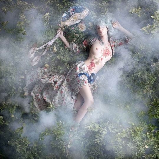
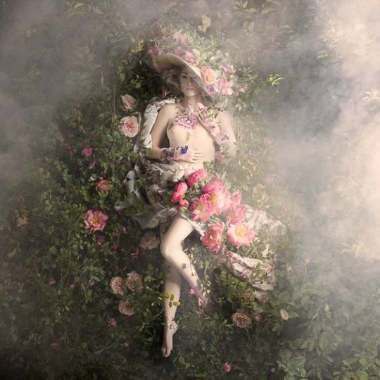
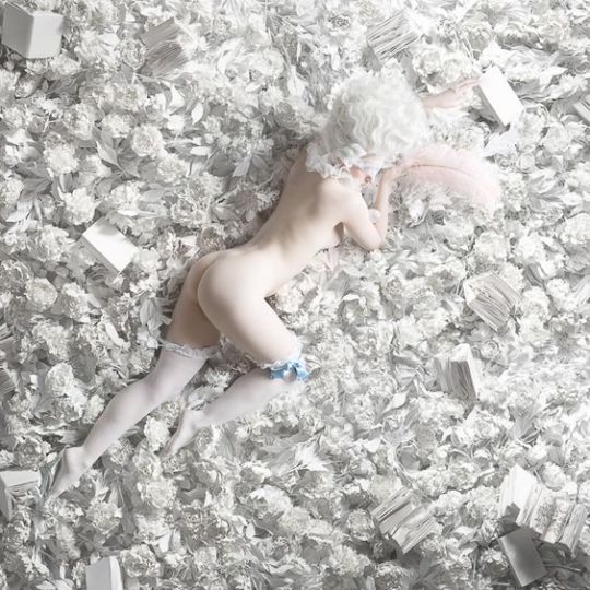
Alexia Sinclair is best known for her intense color photographs portraying historical and allegorical figures. Her elaborate compositions take on the complexities of history painting by depicting a moment in a narrative story. The abundant detail and symbolism in her work are devices that allow her to tell complex stories. Her pictures combine the elegant finesse of contemporary fashion design with the sumptuous aesthetics of the Golden Age of painting.
From the age of four, Sinclair grew up on the stage, performing as a ballerina into her late teens. Being immersed in the fantasy world of the theater has profoundly impacted the way that she approaches her work. She often creates dramatic staging of her characters by lighting her scenes in the chiaroscuro style. Her creative process involves designing and hand producing elaborate costumes, sets and props to produce extraordinarily detailed large-scale photographs.
Born (1976) in Newcastle, Australia. Alexia Sinclair studied Fine Arts in Sydney at The National Art School (1995-1998). She majored in traditional photography, and her studies in painting, drawing, sculpture and art history have heavily influenced the way that she approaches her practice. Completing a Master of Fine Arts at the University of Newcastle (2007), she went on to win several national awards for her MFA series ‘The Regal Twelve’. Celebrating the lives of twelve powerful women in history, the series took three years to complete and involved compiling over 2,000 plates of medium format film through hand illustration and digital montage.
In her series ‘A Frozen Tale’, Sinclair embarked on a journey to Skokloster Slott, following an invitation from the Armory at the Royal Palace of Stockholm. Set on frozen Lake Mälaren, the Swedish castle is considered one of the finest examples of Baroque architecture in all of Europe. Housing vast collections of rare books, artworks and weaponry, the museum has remained untouched for hundreds of years. Respecting the constraints of conservation, she photographed her subjects within the castle, later adding the atmospheric elements that are typical of life in a 17th century castle, such as the smoke of large fireplaces or the geese of a castle kitchen. The large-scale artworks were exhibited on site before exhibiting in festivals in Seoul and Dubai.
The ‘Rococo’ series is a collection of sensual portraits inspired by the 18th century pleasure playgrounds of French court. The project is guided by the design aesthetics and flamboyant fashions of the period. Through extensive research, Sinclair handmade costuming from richly embroidered silks, muslins, flowers, beads and feathers, to accessories and reimagine iconic women of the court. Over a two year period, she grew thousands of flowers for the elaborate sets, arranging the exotic flowerbeds around her models in a studio setting, and shooting the series in two stages, during Spring of 2014 and 2015. Large pigment prints from this series series have been exhibited in two solo shows, first in Sydney in 2015, and London in 2017.
Sinclair is a creative artist whose practice spans both fine art and commercial application. Her artworks have been exhibited in the National Portrait Gallery, London, the Australian Center for Photography, the Art Gallery of New South Wales, the National Portrait Gallery, Canberra and internationally in photography festivals from Paris to Pingyao, Seoul and Dubai. Her commercial clients include the United Nations Children’s Fund (UNICEF), the Bill and Melinda Gates Foundation, Christie’s, Queensland Ballet, New Zealand Opera, Qantas Airlines, Harper’s Bazaar.
*FROM THE ROCOCO SERIES*





Copyright © 2022 Alexia Sinclair • Sinclair & Hill • Melbourne, Australia
#rococo#photography#photographers on tumblr#fine art photography#women photographers#female photographers#fine art portraits#female photographer#photo-art-lady#photography blog#art
12 notes
·
View notes
Photo

Christian Zacho - Winter Scene in Brittany; First Snow - 1881
Peter Mørch Christian Zacho, usually known as Christian Zacho, (31 March 1843, in Grenå – 19 March 1913, in Hellerup) was a Danish landscape painter who is remembered for his idyllic scenes of Danish beech woods.
His education at the Royal Danish Academy of Fine Arts from 1862 to 1867 was followed by additional instruction under P. C. Skovgaard and Vilhelm Kyhn who was particularly successful in communicating a grandiose style which allowed Zacho to benefit from new artistic trends. When he was 30, he went to Italy with Anton Thiele, Otto Haslund and Christian Blanche, visiting the Vienna World Exposition on his return in 1873. He was particularly impressed by the French landscape painters, especially those from the Barbizon school, whose work he saw in Vienna. He spent a year with Léon Bonnat in Paris (1875–76) together with Godfred Christensen and William Groth, creating interest for French art and culture in Denmark. Together with P. S. Krøyer, he spent a summer in Brittany.
Zacho began to exhibit at Charlottenborg as early as 1865 with En Septemberdag (A September Day) painted in Jutland like most of his earlier works. Later landscapes were of Zealand, Møn and Bornholm. Some of his most successful works are those of woods in the springtime where streams run under tree tops bathed in sunlight. Two of his most appreciated works are his painting of Vinterbillede fra Bretagne, Den første Sne (The First Snow, 1881) and Et stille Vand i Dyrehaven (Quiet Waters in the Dyrhave, 1884). His works can only be described as talented. From a historical viewpoint, his paintings from France, executed with a well-developed technique and a strong sense of colour, are important as they give us a better understanding of the painters who followed in his footsteps. A good example is Vinterbillede fra Bretagne (Winter Scene from Brittany), 1881). Zacho continued to follow the style of the older generation of French landscape painters, especially Théodore Rousseau. There is no sign of Impressionism in his work as can be seen from his paintings of Brittany. Taken as a whole, he work can be said to fall in the Danish landscape tradition. His paintings of Bornholm and Zealand are delicately conceived but are a little conservative. In later life, he also painted portraits. He is however remembered above all for his more traditional, idyllic works which often depicted scenes of Danish beech woods. Zacho was awarded the Thorvaldsen Medal in 1884.
30 notes
·
View notes