#FillRect
Explore tagged Tumblr posts
Visit Tumblr Blog
Explore Tumblr blogs with no restrictions, modern design and the best experience.
Last Seen Tumblr Blogs


Fun Fact
Tumblr’s reach among the 26-to-35-year-olds in the US is 11%.
Text
#CreateSolidBrush#SendMessage#GetClientRect#WM_KEYDOWN#WM_KEYUP#WM_CHAR#WM_PAINT#FillRect#SetBkColor
0 notes
Text
プロトタイプベイズドな言語のコンストラクタ

ES2015 で JavaScript に追加されたという、class 構文を ClojureScript で書いてみることに。 内部で保持する情報(canvasElement)が重たいためか、コンソールログを吐かないと、メソッド定義「drawRect」が有効にならない、という挙動がみられた。 greeting 処理(「こんにちは、〜さん」的な)に渡すような、文字列(名前)程度なら、保持させても問題なかったんだけど…)。 ;;=================== (defn Canvas2DUtility [canvas] (this-as this (set! (.-canvasElement this) canvas) (set! (.-context2d this) (.getContext (.-canvasElement this) "2d")) ;; これがないとメソッド定義が有効にならない。バグ? (.log js/console "constractor: Canvas2DUtility") )) (set! (.. Canvas2DUtility -prototype -drawRect) (fn [color x y width height] (this-as this (let [ctx (.-context2d this)] (set! (.-fillStyle ctx) color) (.fillRect ctx x y width height)) )))
;;=================== (defn initialize [] (let [canvas (.querySelector js/document.body "#main_canvas") util (Canvas2DUtility. canvas)]
(.drawRect util "white" 50 50 10 15) )) ;;=================== Inheritance in JavaScript & ClojureScript [ https://nextjournal.com/joe-loco/inheritance-js-cljs ]
0 notes
Text
HTML APIs

HTML APIs (Application Programming Interfaces) provide a way for developers to interact with web browsers to perform various tasks, such as manipulating documents, handling multimedia, or managing user input. These APIs are built into modern browsers and allow you to enhance the functionality of your web applications.
Here are some commonly used HTML APIs:
1. Geolocation API
Purpose: The Geolocation API allows you to retrieve the geographic location of the user’s device (with their permission).
Key Methods:
navigator.geolocation.getCurrentPosition(): Gets the current position of the user.
navigator.geolocation.watchPosition(): Tracks the user’s location as it changes.
Example: Getting the user’s current location.<button onclick="getLocation()">Get Location</button> <p id="location"></p><script> function getLocation() { if (navigator.geolocation) { navigator.geolocation.getCurrentPosition(showPosition); } else { document.getElementById('location').innerHTML = "Geolocation is not supported by this browser."; } } function showPosition(position) { document.getElementById('location').innerHTML = "Latitude: " + position.coords.latitude + "<br>Longitude: " + position.coords.longitude; } </script>
2. Canvas API
Purpose: The Canvas API allows for dynamic, scriptable rendering of 2D shapes and bitmap images. It’s useful for creating graphics, games, and visualizations.
Key Methods:
getContext('2d'): Returns a drawing context on the canvas, or null if the context identifier is not supported.
fillRect(x, y, width, height): Draws a filled rectangle.
clearRect(x, y, width, height): Clears the specified rectangular area, making it fully transparent.
Example: Drawing a rectangle on a canvas.<canvas id="myCanvas" width="200" height="100"></canvas><script> var canvas = document.getElementById('myCanvas'); var ctx = canvas.getContext('2d'); ctx.fillStyle = "red"; ctx.fillRect(20, 20, 150, 100); </script>
3. Drag and Drop API
Purpose: The Drag and Drop API allows you to implement drag-and-drop functionality on web pages, which can be used for things like moving elements around or uploading files.
Key Methods:
draggable: An HTML attribute that makes an element draggable.
ondragstart: Event triggered when a drag operation starts.
ondrop: Event triggered when the dragged item is dropped.
Example: Simple drag and drop.<p>Drag the image into the box:</p> <img id="drag1" src="image.jpg" draggable="true" ondragstart="drag(event)" width="200"> <div id="dropzone" ondrop="drop(event)" ondragover="allowDrop(event)" style="width:350px;height:70px;padding:10px;border:1px solid #aaaaaa;"></div><script> function allowDrop(ev) { ev.preventDefault(); } function drag(ev) { ev.dataTransfer.setData("text", ev.target.id); } function drop(ev) { ev.preventDefault(); var data = ev.dataTransfer.getData("text"); ev.target.appendChild(document.getElementById(data)); } </script>
4. Web Storage API
Purpose: The Web Storage API allows you to store data in the browser for later use. It includes localStorage for persistent data and sessionStorage for data that is cleared when the page session ends.
Key Methods:
localStorage.setItem(key, value): Stores a key/value pair.
localStorage.getItem(key): Retrieves the value for a given key.
sessionStorage.setItem(key, value): Stores data for the duration of the page session.
Example: Storing and retrieving a value using localStorage.<button onclick="storeData()">Store Data</button> <button onclick="retrieveData()">Retrieve Data</button> <p id="output"></p><script> function storeData() { localStorage.setItem("name", "John Doe"); } function retrieveData() { var name = localStorage.getItem("name"); document.getElementById("output").innerHTML = name; } </script>
5. Fetch API
Purpose: The Fetch API provides a modern, promise-based interface for making HTTP requests. It replaces older techniques like XMLHttpRequest.
Key Methods:
fetch(url): Makes a network request to the specified URL and returns a promise that resolves to the response.
Example: Fetching data from an API.<button onclick="fetchData()">Fetch Data</button> <p id="data"></p><script> function fetchData() { fetch('https://jsonplaceholder.typicode.com/posts/1') .then(response => response.json()) .then(data => { document.getElementById('data').innerHTML = data.title; }); } </script>
6. Web Workers API
Purpose: The Web Workers API allows you to run scripts in background threads. This is useful for performing CPU-intensive tasks without blocking the user interface.
Key Methods:
new Worker('worker.js'): Creates a new web worker.
postMessage(data): Sends data to the worker.
onmessage: Event handler for receiving messages from the worker.
Example: Simple Web Worker.<script> if (window.Worker) { var myWorker = new Worker('worker.js'); myWorker.postMessage('Hello, worker!'); myWorker.onmessage = function(e) { document.getElementById('output').innerHTML = e.data; }; } </script> <p id="output"></p>
worker.js:onmessage = function(e) { postMessage('Worker says: ' + e.data); };
7. WebSocket API
Purpose: The WebSocket API allows for interactive communication sessions between the user’s browser and a server. This is useful for real-time applications like chat applications, live updates, etc.
Key Methods:
new WebSocket(url): Opens a WebSocket connection.
send(data): Sends data through the WebSocket connection.
onmessage: Event handler for receiving messages.
Example: Connecting to a WebSocket.<script> var socket = new WebSocket('wss://example.com/socket'); socket.onopen = function() { socket.send('Hello Server!'); }; socket.onmessage = function(event) { console.log('Message from server: ', event.data); }; </script>
8. Notifications API
Purpose: The Notifications API allows web applications to send notifications to the user, even when the web page is not in focus.
Key Methods:
Notification.requestPermission(): Requests permission from the user to send notifications.
new Notification(title, options): Creates and shows a notification.
Example: Sending a notification.<button onclick="sendNotification()">Notify Me</button><script> function sendNotification() { if (Notification.permission === 'granted') { new Notification('Hello! This is a notification.'); } else if (Notification.permission !== 'denied') { Notification.requestPermission().then(permission => { if (permission === 'granted') { new Notification('Hello! This is a notification.'); } }); } } </script>
HTML APIs allow you to build rich, interactive web applications by providing access to browser features and capabilities. These APIs are widely supported across modern browsers, making them a vital part of contemporary web development.
Read More…
0 notes
Text
Retro Racing 🏎️ https://t.co/P3l6qHECVa #javascript #tinycode #generativeart for(t?T++%Z?o+=a+=(b-a)/99:b=C(T*T)*2:o=a=b=T=0,c.width|=s=9,X=i=960;i--;s*=.99)x[f='fillRect'](i*2,Z=281,3,-((i+o*5>>4)**4)%99),x[f]((X+=a)-s*99*(i%2),i*s/9+Z,s*((T/2-i/19|0)%5&&i%2?99:89),s*9) https://t.co/MhzBcrak25
— Frank Force 🌻 (@KilledByAPixel) Jan 28, 2023
from http://twitter.com/KilledByAPixel via IFTTT
0 notes
Text
Simulating Drop Shadows with the CSS Paint API
Ask a hundred front-end developers, and most, if not all, of them will have used the box-shadow property in their careers. Shadows are enduringly popular, and can add an elegant, subtle effect if used properly. But shadows occupy a strange place in the CSS box model. They have no effect on an element’s width and height, and are readily clipped if overflow on a parent (or grandparent) element is hidden.
We can work around this with standard CSS in a few different ways. But, now that some of the CSS Houdini specifications are being implemented in browsers, there are tantalizing new options. The CSS Paint API, for example, allows developers to generate images programmatically at run time. Let’s look at how we can use this to paint a complex shadow within a border image.
A quick primer on Houdini
You may have heard of some newfangled CSS tech hitting the platform with the catchy name of Houdini. Houdini promises to deliver greater access to how the browser paints the page. As MDN states, it is “a set of low-level APIs that exposes parts of the CSS engine, giving developers the power to extend CSS by hooking into the styling and layout process of a browser’s rendering engine.”
The CSS Paint API
The CSS Paint API is one of the first of these APIs to hit browsers. It is a W3C candidate recommendation. This is the stage when specifications start to see implementation. It is currently available for general use in Chrome and Edge, while Safari has it behind a flag and Firefox lists it as “worth prototyping”. There is a polyfill available for unsupported browsers, though it will not run in IE11.
While the CSS Paint API is enabled in Chromium, passing arguments to the paint() function is still behind a flag. You’ll need to enable experimental web platform features for the time being. These examples may not, unfortunately, work in your browser of choice at the moment. Consider them an example of things to come, and not yet ready for production.
The approach
We’re going to generate an image with a shadow, and then use it for a border-image… huh? Well, let’s take a deeper look.
As mentioned above, shadows don’t add any width or height to an element, but spread out from its bounding box. In most cases, this isn’t a problem, but those shadows are vulnerable to clipping. A common workaround is to create some sort of offset with either padding or margin.
What we’re going to do is build the shadow right into the element by painting it in to the border-image area. This has a few key advantages:
border-width adds to the overall element width
Content won’t spill into the border area and overlap the shadow
Padding won’t need any extra width to accommodate the shadow and content
Margins around the element won’t interfere with that element’s siblings
For that aforementioned group of one hundred developers who’ve used box-shadow, it’s likely only a few of them have used border-image. It’s a funky property. Essentially, it takes an image and slices it into nine pieces, then places them in the four corners, sides and (optionally) the center. You can read more about how all this works in Nora Brown’s article.
The CSS Paint API will handle the heavy lifting of generating the image. We’re going to create a module for it that tells it how to layer a series of shadows on top of each other. That image will then get used by border-image.
These are the steps we’ll take:
Set up the HTML and CSS for the element we want to paint in
Create a module that draws the image
Load the module into a paint worklet
Call the worklet in CSS with the new paint() function
Setting up the canvas
You’re going to hear the term canvas a few times here, and in other CSS Paint API resources. If that term sounds familiar, you’re right. The API works in a similar way to the HTML <canvas> element.
First, we have to set up the canvas on which the API will paint. This area will have the same dimensions as the element that calls the paint function. Let’s make a 300×300 div.
<section> <div class="foo"></div> </section>
And the styles:
.foo { border: 15px solid #efefef; box-sizing: border-box; height: 300px; width: 300px; }
CodePen Embed Fallback
Creating the paint class
HTTPS is required for any JavaScript worklet, including paint worklets. You won’t be able to use it at all if you’re serving your content over HTTP.
The second step is to create the module that is loaded into the worklet — a simple file with the registerPaint() function. This function takes two arguments: the name of the worklet and a class that has the painting logic. To stay tidy, we’ll use an anonymous class.
registerPaint( "shadow", class {} );
In our case, the class needs two attributes, inputProperties and inputArguments, and a method, paint().
registerPaint( "shadow", class { static get inputProperties() { return []; } static get inputArguments() { return []; } paint(context, size, props, args) {} } );
inputProperties and inputArguments are optional, but necessary to pass data into the class.
Adding input properties
We need to tell the worklet which CSS properties to pull from the target element with inputProperties. It’s a getter that returns an array of strings.
In this array, we list both the custom and standard properties the class needs: --shadow-colors, background-color, and border-top-width. Pay particular attention to how we use non-shorthand properties.
static get inputProperties() { return ["--shadow-colors", "background-color", "border-top-width"]; }
For simplicity, we’re assuming here that the border is even on all sides.
Adding arguments
Currently, inputArguments are still behind a flag, hence enabling experimental features. Without them, use inputProperties and custom properties instead.
We also pass arguments to the paint module with inputArguments. At first glance, they may seem superfluous to inputProperties, but there are subtle differences in how the two are used.
When the paint function is called in the stylesheet, inputArguments are explicitly passed in the paint() call. This gives them an advantage over inputProperties, which might be listening for properties that could be modified by other scripts or styles. For example, if you’re using a custom property set on :root that changes, it may filter down and affect the output.
The second important difference for inputArguments, which is not intuitive, is that they are not named. Instead, they are referenced as items in an array within the paint method. When we tell inputArguments what it’s receiving, we are actually giving it the type of the argument.
The shadow class is going to need three arguments: one for X positions, one for Y positions, and one for blurs. We’ll set that up as three space-separated lists of integers.
Anyone who has registered a custom property may recognize the syntax. In our case, the <integer> keyword means any whole number, while + denotes a space-separated list.
static get inputArguments() { return ["<integer>+", "<integer>+", "<integer>+"]; }
To use inputProperties in place of inputArguments, you could set custom properties directly on the element and listen for them. Namespacing would be critical to ensure inherited custom properties from elsewhere don’t leak in.
Adding the paint method
Now that we have the inputs, it’s time to set up the paint method.
A key concept for paint() is the context object. It is similar to, and works much like, the HTML <canvas> element context, albeit with a few small differences. Currently, you cannot read pixels back from the canvas (for security reasons), or render text (there’s a brief explanation why in this GitHub thread).
The paint() method has four implicit parameters:
The context object
Geometry (an object with width and height)
Properties (a map from inputProperties)
Arguments (the arguments passed from the stylesheet)
paint(ctx, geom, props, args) {}
Getting the dimensions
The geometry object knows how big the element is, but we need to adjust for the 30 pixels of total border on the X and Y axis:
const width = (geom.width - borderWidth * 2); const height = (geom.height - borderWidth * 2);
Using properties and arguments
Properties and arguments hold the resolved data from inputProperties and inputArguments. Properties come in as a map-like object, and we can pull values out with get() and getAll():
const borderWidth = props.get("border-top-width").value; const shadowColors = props.getAll("--shadow-colors");
get() returns a single value, while getAll() returns an array.
--shadow-colors will be a space-separated list of colors which can be pulled into an array. We’ll register this with the browser later so it knows what to expect.
We also need to specify what color to fill the rectangle with. It will use the same background color as the element:
ctx.fillStyle = props.get("background-color").toString();
As mentioned earlier, arguments come into the module as an array, and we reference them by index. They’re of the type CSSStyleValue right now — let’s make it easier to iterate through them:
Convert the CSSStyleValue into a string with its toString() method
Split the result on spaces with a regex
const blurArray = args[2].toString().split(/\s+/); const xArray = args[0].toString().split(/\s+/); const yArray = args[1].toString().split(/\s+/); // e.g. ‘1 2 3’ -> [‘1’, ‘2’, ‘3’]
Drawing the shadows
Now that we have the dimensions and properties, it’s time to draw something! Since we need a shadow for each item in shadowColors, we’ll loop through them. Start with a forEach() loop:
shadowColors.forEach((shadowColor, index) => { });
With the index of the array, we’ll grab the matching values from the X, Y, and blur arguments:
shadowColors.forEach((shadowColor, index) => { ctx.shadowOffsetX = xArray[index]; ctx.shadowOffsetY = yArray[index]; ctx.shadowBlur = blurArray[index]; ctx.shadowColor = shadowColor.toString(); });
Finally, we’ll use the fillRect() method to draw in the canvas. It takes four arguments: X position, Y position, width, and height. For the position values, we’ll use border-width from inputProperties; this way, the border-image is clipped to contain just the shadow around the rectangle.
shadowColors.forEach((shadowColor, index) => { ctx.shadowOffsetX = xArray[index]; ctx.shadowOffsetY = yArray[index]; ctx.shadowBlur = blurArray[index]; ctx.shadowColor = shadowColor.toString(); ctx.fillRect(borderWidth, borderWidth, width, height); });
This technique can also be done using a canvas drop-shadow filter and a single rectangle. It’s supported in Chrome, Edge, and Firefox, but not Safari. See a finished example on CodePen.
Almost there! There are just a few more steps to wire things up.
Registering the paint module
We first need to register our module as a paint worklet with the browser. This is done back in our main JavaScript file:
CSS.paintWorklet.addModule("https://codepen.io/steve_fulghum/pen/bGevbzm.js"); https://codepen.io/steve_fulghum/pen/BazexJX
Registering custom properties
Something else we should do, but isn’t strictly necessary, is to tell the browser a little more about our custom properties by registering them.
Registering properties gives them a type. We want the browser to know that --shadow-colors is a list of actual colors, not just a string.
If you need to target browsers that don’t support the Properties and Values API, don’t despair! Custom properties can still be read by the paint module, even if not registered. However, they will be treated as unparsed values, which are effectively strings. You’ll need to add your own parsing logic.
Like addModule(), this is added to the main JavaScript file:
CSS.registerProperty({ name: "--shadow-colors", syntax: "<color>+", initialValue: "black", inherits: false });
You can also use @property in your stylesheet to register properties. You can read a brief explanation on MDN.
Applying this to border-image
Our worklet is now registered with the browser, and we can call the paint method in our main CSS file to take the place of an image URL:
border-image-source: paint(shadow, 0 0 0, 8 2 1, 8 5 3) 15; border-image-slice: 15;
These are unitless values. Since we’re drawing a 1:1 image, they equate to pixels.
Adapting to display ratios
We’re almost done, but there’s one more problem to tackle.
For some of you, things might not look quite as expected. I’ll bet you sprung for the fancy, high DPI monitor, didn’t you? We’ve encountered an issue with the device pixel ratio. The dimensions that have been passed to the paint worklet haven’t been scaled to match.
Rather than go through and scale each value manually, a simple solution is to multiply the border-image-slice value. Here’s how to do it for proper cross-environment display.
First, let’s register a new custom property for CSS that exposes window.devicePixelRatio:
CSS.registerProperty({ name: "--device-pixel-ratio", syntax: "<number>", initialValue: window.devicePixelRatio, inherits: true });
Since we’re registering the property, and giving it an initial value, we don’t need to set it on :root because inherit: true passes it down to all elements.
And, last, we’ll multiply our value for border-image-slice with calc():
.foo { border-image-slice: calc(15 * var(--device-pixel-ratio)); }
It’s important to note that paint worklets also have access to the devicePixelRatio value by default. You can simply reference it in the class, e.g. console.log(devicePixelRatio).
Finished
Whew! We should now have a properly scaled image being painted in the confines of the border area!
Live demo (best viewed in Chrome and Edge)
Bonus: Apply this to a background image
I’d be remiss to not also demonstrate a solution that uses background-image instead of border-image. It’s easy to do with just a few modifications to the module we just wrote.
Since there isn’t a border-width value to use, we’ll make that a custom property:
CSS.registerProperty({ name: "--shadow-area-width", syntax: "<integer>", initialValue: "0", inherits: false });
We’ll also have to control the background color with a custom property as well. Since we’re drawing inside the content box, setting an actual background-color will still show behind the background image.
CSS.registerProperty({ name: "--shadow-rectangle-fill", syntax: "<color>", initialValue: "#fff", inherits: false });
Then set them on .foo:
.foo { --shadow-area-width: 15; --shadow-rectangle-fill: #efefef; }
This time around, paint() gets set on background-image, using the same arguments as we did for border-image:
.foo { --shadow-area-width: 15; --shadow-rectangle-fill: #efefef; background-image: paint(shadow, 0 0 0, 8 2 1, 8 5 3); }
As expected, this will paint the shadow in the background. However, since background images extend into the padding box, we’ll need to adjust padding so that text doesn’t overlap:
.foo { --shadow-area-width: 15; --shadow-rectangle-fill: #efefef; background-image: paint(shadow, 0 0 0, 8 2 1, 8 5 3); padding: 15px; }
CodePen Embed Fallback
Fallbacks
As we all know, we don’t live in a world where everyone uses the same browser, or has access to the latest and greatest. To make sure they don’t receive a busted layout, let’s consider some fallbacks.
Padding fix
Padding on the parent element will condense the content box to accommodate for shadows that extend from its children.
section.parent { padding: 6px; /* size of shadow on child */ }
CodePen Embed Fallback
Margin fix
Margins on child elements can be used for spacing, to keep shadows away from their clipping parents:
div.child { margin: 6px; /* size of shadow on self */ }
CodePen Embed Fallback
Combining border-image with a radial gradient
This is a little more off the beaten path than padding or margins, but it’s got great browser support. CSS allows gradients to be used in place of images, so we can use one within a border-image, just like how we did with paint(). This may be a great option as a fallback for the Paint API solution, as long as the design doesn’t require exactly the same shadow:
Gradients can be finicky and tricky to get right, but Geoff Graham has a great article on using them.
div { border: 6px solid; border-image: radial-gradient( white, #aaa 0%, #fff 80%, transparent 100% ) 25%; }
CodePen Embed Fallback
An offset pseudo-element
If you don’t mind some extra markup and CSS positioning, and need an exact shadow, you can also use an inset pseudo-element. Beware the z-index! Depending on the context, it may need to be adjusted.
.foo { box-sizing: border-box; position: relative; width: 300px; height: 300px; padding: 15px; } .foo::before { background: #fff; bottom: 15px; box-shadow: 0px 2px 8px 2px #333; content: ""; display: block; left: 15px; position: absolute; right: 15px; top: 15px; z-index: -1; }
CodePen Embed Fallback
Final thoughts
And that, folks, is how you can use the CSS Paint API to paint just the image you need. Is it the first thing to reach for in your next project? Well, that’s for you to decide. Browser support is still forthcoming, but pushing forward.
In all fairness, it may add far more complexity than a simple problem calls for. However, if you’ve got a situation that calls for pixels put right where you want them, the CSS Paint API is a powerful tool to have.
What’s most exciting though, is the opportunity it provides for designers and developers. Drawing shadows is only a small example of what the API can do. With some imagination and ingenuity, all sorts of new designs and interactions are possible.
Further reading
The CSS Paint API specification
Is Houdini Ready Yet?
CSS Paint API (Google Web Developers)
CSS Houdini Experiments
Another example that uses the Paint API to draw triangles and radio inputs
The post Simulating Drop Shadows with the CSS Paint API appeared first on CSS-Tricks.
You can support CSS-Tricks by being an MVP Supporter.
Simulating Drop Shadows with the CSS Paint API published first on https://deskbysnafu.tumblr.com/
0 notes
Text
So, Greeblizers Are A Thing Now
So I got Super Mario Maker 2 recently, and that means it's a perfect time to start talking about one of the linchpins of this whole game development effort -- one which I mentioned before, but said I'd only really work on once the basics are in place.
That's right, folks. It's finally happened. I've finally started implementing greeblization. This is basically the jewel in the NullAwesome crown. It's a big part of why the game exists in the first place. In every game I write, I try to incorporate a central idea or algorithm that does something cool while still serving the purpose of the game -- and for NullAwesome I wanted to build a simple platformer that could take levels that were described in a very simple, succinct format and build them out into something that looked cool and ripe for exploration. The hacking mechanic came later -- basically I thought, I always wanted to make a game about "Hollywood hacking", so I combined it with the platforming idea, loosely following the template established by Watch_Dogs, and I had a starting point.
But greeblization is not a new concept. The word is just a private coinage of mine for something that has existed for quite some time within the gaming world -- much like "jump aftertouch", my term for being able to bend the trajectory of a jump in midair. Games have probably had procedurally generated scenery from simple descriptors -- or even from random numbers -- ever since I was a kid. What really crystallized the greeblizer concept for me, though, was seeing it at work in Super Mario Maker.
Super Mario Maker is basically an editor that lets you create your own Mario levels, as well as a game where you can download and play levels you or others have created. You're given a grid in which to work and can add ground, blocks, pipes, coins, enemies, etc. to your heart's content. Different level elements interact in different ways, and this has opened the door for clever designers to build machines, gadgets, and traps with an almost Minecraft-like sense of endless possibilities. But even in something as simple as placing the ground, the brilliance of Super Mario Maker shows through -- because you can paint with the ground brush all over the place and the game chooses specific ground tiles to make sure that the ground looks consistent with its setting (taken from one of several Mario games). It will even add embellishments to make the scenery more convincing -- for example, adding portholes, pillars, and masts if you paint appropriately-shaped ground in an airship level. Also, the algorithm for choosing ground tiles (in a word: greeblizing) appears to be deterministic, always producing the same painting of ground tiles. In this way, Mario Maker lets even a beginner create levels that look as if they came from Nintendo themselves, without having to know about each individual tile in the tileset.
So this concept -- and the fact that I'm a lazy git who doesn't want to hand-place tiles on a map -- inspired the greeblization engine for NullAwesome. Basically the mechanism consists of an interface, Greeblizer, which contains a single method fillRect, as well as an array of such Greeblizer objects, one for each tile type. A tile type is conceptual: ground, lava, etc., and each type maps to a set of individual tiles all having the same properties but a different appearance. Whenever it paints a rectangle from the JSON level description onto the tile map, the TileMap class selects the currently installed greeblizer corresponding to that particular tile type, which in turn will place the tiles on the map according to some criteria. Currently I have a couple of very basic greeblizers in place, as well as a sexy new tile set -- and I'm glad to say that the results look very promising so far. I mean, look at this radness:
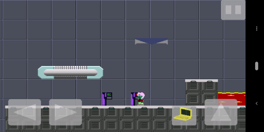
Don't tell me you don't want to totally play this game that much more now.
Another nice thing about this game that makes developing it really fun is the fact that I made some design choices early on which makes changing things -- even ripping out, rearranging, and putting back together entire chunks of the engine -- relatively easy. I think the decision to go with an entity-component system was a good one, as I can simply add an update agent to do something new with the already-existing entities and components if I want some new piece of functionality. And if I change one agent's behavior, it really doesn't affect all the others. In this case, I had intended to put greeblization in from the very beginning, and I had a fillRect method inside the TileMap itself as basically the stupidest thing that could possibly work. It wasn't hard to extract that functionality into greeblizers, expand upon what each greeblizer did, and then have TileMap dispatch to the appropriate greeblizer in its fillRect method rather than having a complete implementation of that method itself.
This isn't me going "look at me, I'm a super genius programmer". Rather, it comes from being an old, grizzled programmer who's made a lot of stupid mistakes in the past. It is encouraging to know that the painful lessons learned from those mistakes have sharpened my instincts to a point where I can sit down and build out a system that is, from the beginning, reasonably well-structured and easy to maintain and evolve. Because holy smokes, have I still got a long way to go. Game development, like any truly joyous pursuit, is hard -- and I don't want to make it any harder on myself than it has to be.
0 notes
Text
NOOB Javascript Beginner #19
關於 canvas animation: 1. 在起頭要清除目前的畫布內容 ctx.clearRect() 2. 在變形之前要先記錄一次當前畫布狀態 ctx.save() 3. 變形動畫的結尾要恢復到「變形之前的畫布狀態」ctx.restore() 4. 最後才是使用 requestAnimationFrame()
function draw() { var ctx = document.getElementById('basic').getContext('2d'); // clear canvas ctx.clearRect(0, 0, 300, 300); // 圖形樣式 ctx.fillStyle = 'rgba(0, 0, 0, 0.4)'; // 記錄變形之前的畫布 ctx.save(); // 移動變形的中心點 ctx.translate(150, 150); // 用 Date() 得到一��數字 var time = new Date(), rotate = ((2 * Math.PI) / 60) * time.getSeconds() + ((2 * Math.PI) / 60000) * time.getMilliseconds() ctx.rotate(rotate); ctx.translate(10, 0); ctx.fillRect(0, -12, 50, 24); // 恢復到變形之前的畫布 ctx.restore(); window.requestAnimationFrame(draw); }
若是少了 restore 的動作,會發現第二幀的 fillRect 依然會吃到先前設定的 rotate 與 translate,造成這兩個動作疊加,動畫就會失敗。
1 note
·
View note
Text
HTML5 canvas要素
HTML5 canvas要素 に関してノート。 HTML5 canvas要素 canvas要素を使用すると画像ファイルを用意しておかずともJavascriot経由で図を描くことができる。 長方形の描画 HTML側にはcanvasタグを記述し、必要であればwidthとheightを指定しておく。 Javascriptで該当のcanvasを取得し、getContextメソッドを取得し適当な変数に格納しておく。 短形の色を指定する場合はfillStyleもしくはstrokeStyleを4の前に指定しておく。 strokeRectメソッドでは線画を描写し、fillRectメソッドでは塗りつぶしの図を描写することができる。 実装サンプル: 三角形の描画 短形以外の図形は点と点を繋ぐパス形式で描画していく。 beginPathメソッドで図形を書き始めることを宣言…
View On WordPress
0 notes
Text
Making moves in JavaScript and HTML
This is a very basic tutorial on how to set up a canvas in HTML and create movement using JavaScript.
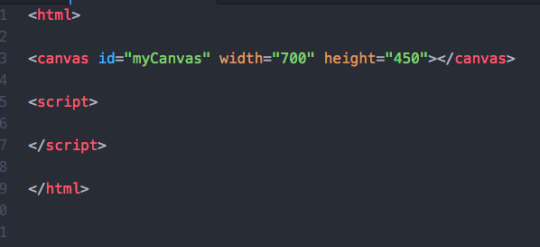
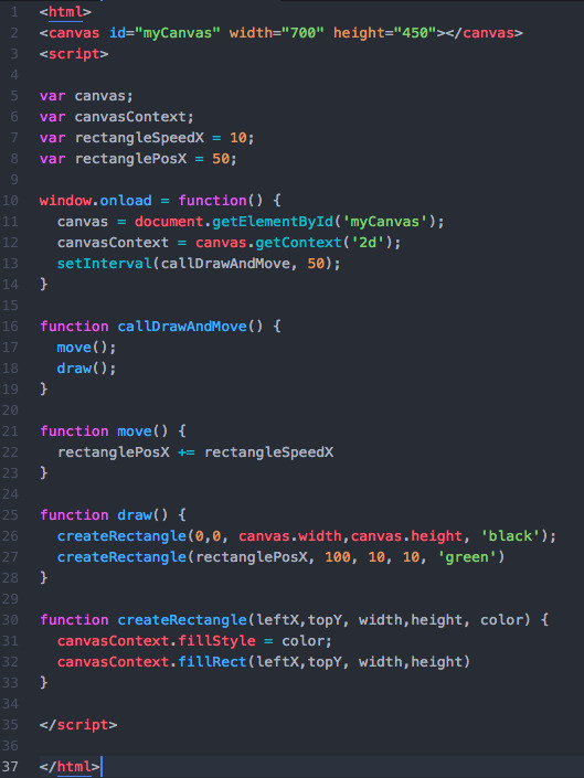
The first thing we’ll do is make our .html file with html tags, script tags (for JS), and a canvas.
The width, height, and ‘id’ of the canvas are up to you — but we’ll be referencing the name of the canvas ID later on.
Next, we’ll define some variables. In this tutorial we’re only going to take into account horizontal movement along the x-axis. There are probably a few ways to go about this but here’s my way:
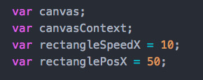
The canvas and canvasContext variables we’ll leave undefined for now — we’ll get to those real soon.
The rectangleSpeedX refers to the speed at which you want your future rectangle to move. You’ll want to play around with this later.
rectanglePosX refers to the X coordinate that at which you want your rectangle to start at. Remember this is in pixels, and is the amount from the left side of canvas (the origin).
Next, lets use those canvas and canvasContext variables:
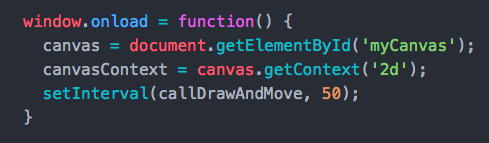
window.onload will load the contents of the function as everything on the page loads. We’ll use the canvas and canvasContext variables to get handles on our canvas id we created earlier, as well as specify the context of the canvas as ‘2d’. This will allow us to draw stuff on it.
setInterval is probably the most important part of all this, but ignore it for now. We’ll be back at the end of this and it will tie everything together.
Time to draw some rectangles..
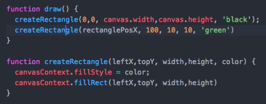
The createRectangle function contains all the logic to build a rectangle. Take a look at the arguments here. canvasContext.fillstyle will set the color, and .fillRect will set the position and size (in pixels).
As of now, draw() will create two rectangles — one as the black canvas and the other as a 10x10 green square. If you open your file in the browser it should look something like this:
Time to get things moving..
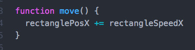
Here, move() is going to take the value of the current position of rectanglePosX and increment it by the speed we defined in rectangleSpeedX.
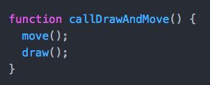
Below is a handy function used to call draw() and move() at the same time. We’re going to come back to setInterval() and use this.

Now we can finally use setInterval(). This is really important. Basically, setInterval is going to allow you to refresh the page as slowly or as quickly as you want. This is how movement is made.
The first argument to setInterval is the function you are calling. In our case, that’s the drawing and movement. The second argument is the frequency (in milliseconds) that you want to run that function. The higher the number, the slower your object will move.
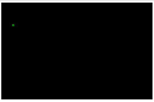
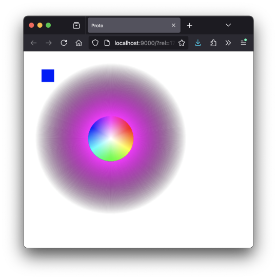
And there you have it! Refresh your page and watch that green box speed off the canvas. It should look something like this (minus the looping):

Here’s all the code in one snippet just to see it all together:
And that’s a very basic intro to making things move with JavaScript. You can apply the same pattern to add more objects, or create a Y coordinate/speed and move along both axes. You can also play around with conditionals to make the object bounce off the walls of the canvas.
0 notes
Text
Canvas 入門 その10
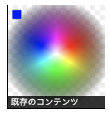
参考にしたサイトの JavaScript のコードを ClojureScript にトレースしてみたけれど、同じ見た目にならない。 …なんで? ;;=================== (defn genHSVData [n] {:H (rem (+ n 300) 360) :S 100 :V 100}) ;;=================== (defn genRGBData [hsv] (let [s (/ (:S hsv) 100) v (/ (:V hsv) 100)] (if (= 0 s) ;; ここに入ることはないみたい {:R (Math.round (* v 255)) :G (Math.round (* v 255)) :B (Math.round (* v 255))} (let [h (/ (:H hsv) 360) h2 (if (>= h 1) 0 (* h 6)) d (- h2 (Math.floor h2)) a (Math.round (* 255 v (- 1 s))) b (Math.round (* 255 v (- 1 (* s d)))) c (Math.round (* 255 v (- 1 (* s (- 1 d))))) v2 (Math.round (* 255 v))] (case (Math.floor h2) 0 {:R v2 :G c :B a} 1 {:R b :G v2 :B a} 2 {:R a :G v2 :B c} 3 {:R a :G b :B v2} 4 {:R c :G a :B v2} 5 {:R v2 :G a :B b}) )) ))
;;=================== (defn colorSphere [ctx] (let [width 360 halfWidth (/ width 2) rotate (* (/ 1 360) Math.PI 2) offset 0 oleft 0 ;; -20 otop 0 ;; -20 gradient (.createLinearGradient ctx (+ oleft halfWidth) otop (+ oleft halfWidth) (+ otop halfWidth))] ( doseq [n (range 360) :let [hsv (genHSVData n) color (genRGBData hsv) rgb (str "rgb(" (:R color) " " (:G color) " " (:B color) " / 100%)")]] (.addColorStop gradient 0 "rgb(0 0 0 / 0%)") ;;(.addColorStop gradient 0.4 rgb) (.addColorStop gradient 0.7 rgb) (.addColorStop gradient 1 "rgb(255 255 255 / 100%)") (.beginPath ctx) (.moveTo ctx (+ oleft halfWidth) otop) (.lineTo ctx (+ oleft halfWidth) (+ otop halfWidth)) (.lineTo ctx (+ oleft halfWidth 6) otop) (set! (.-fillStyle ctx) gradient) (.fill ctx) (.translate ctx (+ oleft halfWidth) (+ otop halfWidth)) (.rotate ctx rotate) (.translate ctx (- (+ oleft halfWidth)) (- (+ otop halfWidth))) ) (.beginPath ctx) (set! (.-fillStyle ctx) "#00f") (.fillRect ctx 15 15 30 30) (.fill ctx) ))
;;===================
0 notes
Text
Canvas 入門 その9
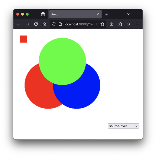
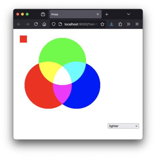
「コンポジットオペエレーション」という、描画したときの色に影響をあたえる項目の値(source-over、lighter など)を変えると、いろいろ変わるのね、と。 ;;=================== (defn lightMix [ctx] (do ;;(set! (.-globalCompositeOperation ctx) "lighter") (.beginPath ctx) (set! (.-fillStyle ctx) "rgb(255 0 0 / 100%)") (.arc ctx 120 210 100 (* Math.PI 2) 0 false) (.fill ctx) (.beginPath ctx) (set! (.-fillStyle ctx) "rgb(0 0 255 / 100%)") (.arc ctx 240 210 100 (* Math.PI 2) 0 false) (.fill ctx) (.beginPath ctx) (set! (.-fillStyle ctx) "rgb(0 255 0 / 100%)") (.arc ctx 180 110 100 (* Math.PI 2) 0 false) (.fill ctx) (.restore ctx) (.beginPath ctx) (set! (.-fillStyle ctx) "#f00") (.fillRect ctx 0 0 30 30) (.fill ctx) )) ;;=================== 以下のサイトを参考にした。 [ https://developer.mozilla.org/ja/docs/Web/API/CanvasRenderingContext2D/globalCompositeOperation ]
0 notes
Photo
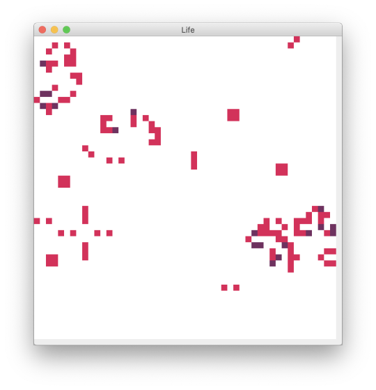
動いた、動いた。 (ns examples.life (:import (java.awt Color Dimension) (javax.swing JPanel JFrame Timer JOptionPane) (java.awt.event ActionListener KeyListener))) ; ---------------------------------------------------------- ; functional model ; ---------------------------------------------------------- (def height 50) (def width 75) (def point-size 10) (def turn-millis 200) (def state-dead 0) (def state-born 1) (def state-alive 2) (def neighbours { 1 [-1 -1] 2 [ 0 -1] 3 [ 1 -1] 4 [ 1 0] 5 [ 1 1] 6 [ 0 1] 7 [-1 1] 8 [-1 0] }) ; ---------------------------------------------------------- (defn add-points [& pts] (vec (apply map + pts))) (defn point-to-screen-rect [[i j]] (map #(* point-size %) [i j 1 1])) (defn get-neighbours-location [i j] (map #(map + (vector i j) %) (vals neighbours))) (defn get-target-state-current [stat i j] (nth (nth stat i) j)) (defn cnt-neighbours-state [stat i j h_max w_max] ((comp count filter) #(> % state-dead) (map (fn [[h w]] (if (or (> 0 h) (>= h h_max) (> 0 w) (>= w w_max)) state-dead (get-target-state-current stat h w))) (get-neighbours-location i j)))) (defn calc-target-state-next [stat i j h_max w_max] (case (cnt-neighbours-state stat i j h_max w_max) 3 state-born 2 (let [state_target (get-target-state-current stat i j)] (if (> state_target state-dead) (inc state_target) state_target)) state-dead)) (defn get-next-states [stat h_max w_max] (mapv (fn [h] (mapv (fn [w] (calc-target-state-next stat h w h_max w_max)) (range 0 w_max))) (range 0 h_max))) ; ---------------------------------------------------------- ; mutable model ; ---------------------------------------------------------- (defn update-states [d] (dosync (alter d assoc :states (get-next-states (:states @d) (:height @d) (:width @d))))) ; ---------------------------------------------------------- ; gui ; ---------------------------------------------------------- (def cell-color { state-dead (Color. 255 255 255) state-born (Color. 210 50 90) state-alive (Color. 110 50 95)}) (defn fill-point [g pt h w color] (let [[x y h w] (point-to-screen-rect pt)] (.setColor g color) (.fillRect g y x h w))) (defmulti paint (fn [g object & _] (:type object))) (defmethod paint :dots [g {:keys [height width locations states]}] (doseq [idx (range 0 (* width height))] (let [pos (nth locations idx)] (fill-point g pos height width (get cell-color (get-target-state-current states (pos 0) (pos 1))))))) (defn create-dots [h_max w_max] { :height h_max :width w_max :locations (for [h (range 0 h_max) w (range 0 w_max)] (vector h w)) :states (for [h (range 0 h_max)] (for [w (range 0 w_max)] (rand-int 2))) :type :dots}) ; ---------------------------------------------------------- (defn game-panel [frame dots height width] (proxy [JPanel ActionListener KeyListener] [] (paintComponent [g] (proxy-super paintComponent g) (paint g @dots)) (actionPerformed [e] (update-states dots) (.repaint this)) (getPreferredSize [] (Dimension. (* (inc width) point-size) (* (inc height) point-size))) (keyPressed [e]) (keyReleased [e]) (keyTyped [e]))) (defn life [] (let [ frame (JFrame. "Life") dots (ref (create-dots height width)) panel (game-panel frame dots height width) timer (Timer. turn-millis panel)] (doto panel (.setFocusable true) (.addKeyListener panel)) (doto frame (.add panel) (.pack) (.setVisible true)) (.start timer) [dots timer])) ; ----------------------------------------------------------
0 notes